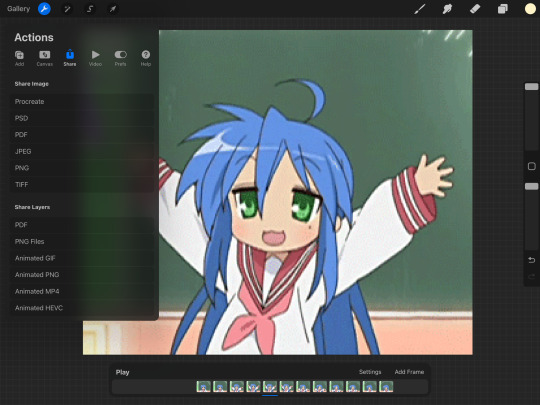
#graphics tutorial
Explore tagged Tumblr posts
Visit Tumblr Blog
Explore Tumblr blogs with no restrictions, modern design and the best experience.
Last Seen Tumblr Blogs


Fun Fact
After the announcement of the deal with Yahoo!, there were 170K signatures of unhappy Tumblr users petitioning to prevent the sale in 2013.
Note
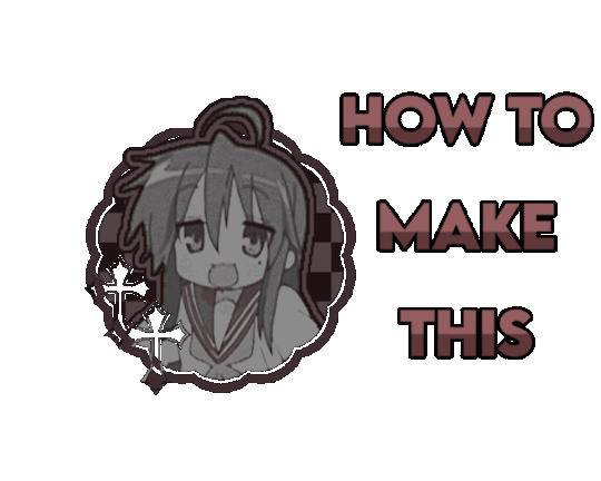
how does one make graphics (i need to . improve)

Well, the Princess' methods are very simple! She would be glad to teach you.
A bit long graphic tutorial under cut ^_^ (all art by Iinquint on twitter)

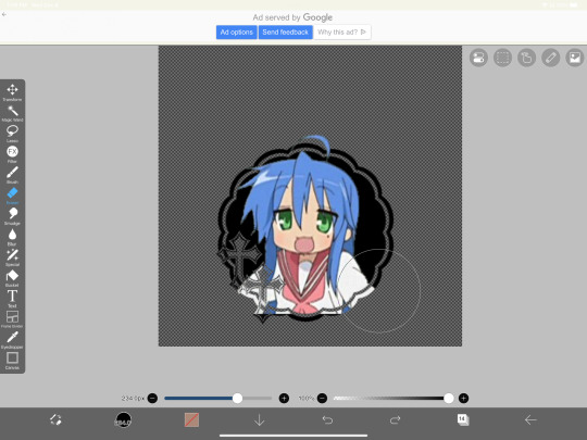
First, we import the frame or mask you will use. You can find these by searching "rentry frame".

Then, we will import our picture and erase any excess outside of the frame.

Then we usually add a chibi, You can do this by finding chibi art and erasing the background.

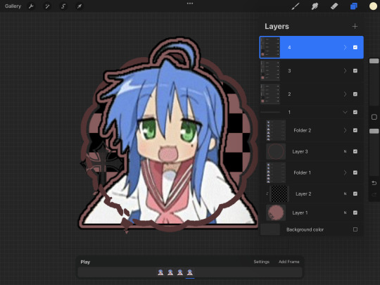
And now we will add any PNGs to the graphic. We chose circle laces for this.

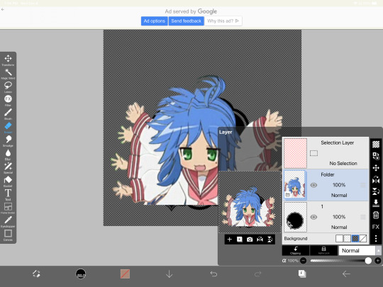
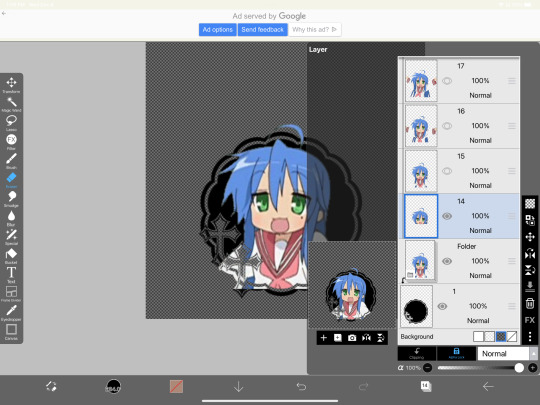
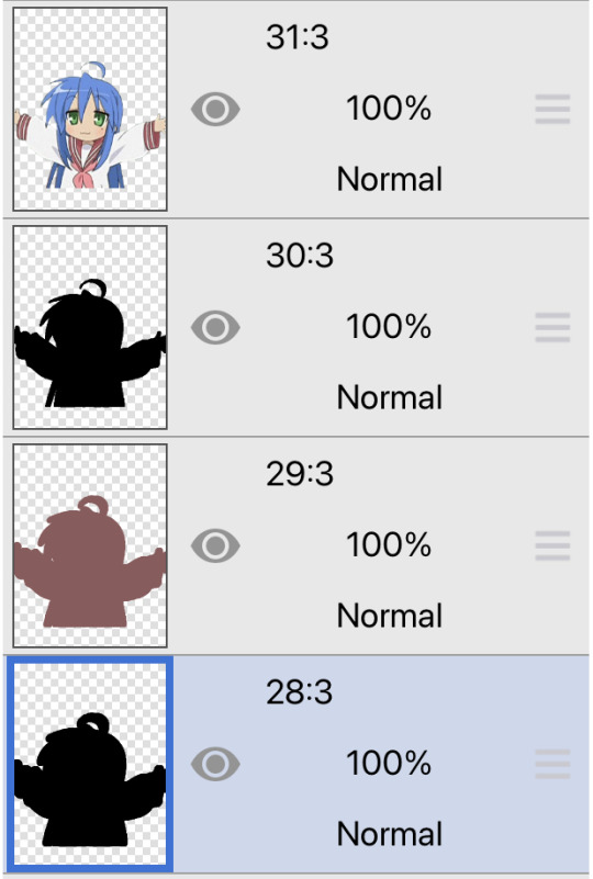
Now we will duplicate the layer of our chibi.

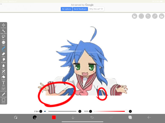
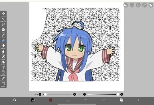
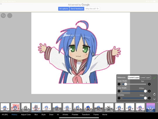
We then use the Stroke Outer filter to find dots that weren't erased, we will go to the top original later and erase where all the exposed dots are.

After that, we delete the layer & reduplicate it. Then we use stroke outer for a white outline, and then a black one. If the chibi or whatever you are using is white or very light already, feel free to reverse the white & black.

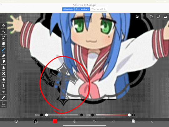
Then we add glow outer (usually around 1-2px)

Continue this process for everything

Save it

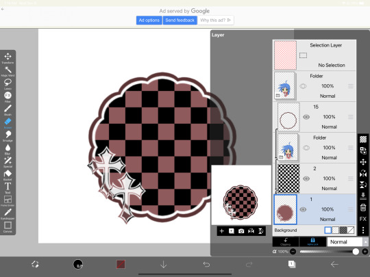
And then we will import it into a new canvas through 'import picture' & then use the grayscale.

Now, We do not always use a gradient map. But feel free to try out gradients to see if it looks nice on the graphic. Either of the 2 top sites work.

Find a gradient that looks nice. If none fit your vision, feel free to skip it.


Now, import the new image and then add textures. Play around with blending modes & opacity until it looks right.

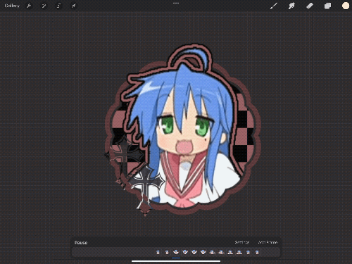
Boom! You've made your very own graphic.
Now for animated graphics...
(No visuals) If you'd like one where the small chibi moves, move it to be angle -5, save it, and then angle 5 and save it. (Also adjust angles if the 5 looks weird.)
Import the images into ezgif gif maker and turn on "Don't stack frames" and adjust delay time. (I usually use 80ish)
--
Animated graphics 2

Import your graphic into capcut. Add a green background or whatever color is not present on your graphic at all. Add the gif you want on the graphic. Adjust for all the images to go on for equal times so it works.


Ezgif > Mp4 to gif > Remove Background > Select hex code of background > "Replace hex with transparency" > Adjust Fuzz > Optimize

And voila, your graphic is completed! Feel free to adjust in ezgif effects if needed.

#ᛝ a chat with the lady spawn .ᐟ#rentry decor#rentry inspo#rentry resources#rentry#rentry stuff#rentry graphics#rentry banner#rentry coloring#ibis paint colorings#graphic tutorial#rentry tutorial#editblr#pr3typriincess#pr3ttypriincess forsaken#pretty princess forsaken#forsaken roblox#roblox forsaken#roblox#forsaken rentry
360 notes
·
View notes
Text

𓆩♡𓆪 divider tutorial ˖˚
꒰ step one ꒱ ↳ first, find an image or two on a search engine or pinterest/something like it. it's best to use images with plain color (like white or black) backgrounds.
꒰ search terms to try ꒱ ↳ lace trim ↳ lace divider ↳ floral divider ↳ heart divider ↳ clouds divider ↳ bow/ribbon divider ↳ divider clip art
꒰ step two ꒱ ↳ either copy and paste the image or download and upload the image into remove.bg. use erase/restore as needed.
꒰ step three ꒱ ↳ you're done! pretty simple, right? good work \(^_^)/

#aesthetic dividers#tumblr dividers#post dividers#carrd dividers#divider packs#divider#page dividers#text dividers#cute dividers#tumblr layouts#divider tutorial#graphics tutorial#rentry tutorial#carrd tutorial
144 notes
·
View notes
Note
hi ^-^! Can you do a tutorial on how to make this icon? I would like to learn :3
https://64.media.tumblr.com/64eb5472b1d49fc941ccefbae558846e/cb2b70c34ebba0a7-b4/s1280x1920/d9e44a125324b309a533a1e56be842355046d740.gifv
Hello! I apologize in advance for my poor explanation skills, and also for how convoluted this process can get 😭 But I saw this as a worthy challenge, so here’s how you too can make a gif icon where the character comes out of the frame like this and this:
This is going to be very long so the full tutorial is under this cut!
Programs I use: IbisPaintX and Procreate*
*full disclosure, procreate is exclusively for iPad and costs 10 USD. however every thing I do in procreate you should also be able to do in Photopea
1. First things first, after finding the gif you’ll want to use, you’ll need to download each individual frame. By importing it into either procreate, photopea, or any program that’ll allow you to view individual frames, you’ll be able to save each frame
A note about gifs: The best gifs to use are ones with less frames due to the fact you’ll be editing the individual frames. Not to say you can’t use gifs with higher frame counts, however it is much more time consuming the more frames there are
2. Next you’ll have to remove the background from each frame. You can remove the background by hand, but I like to use this website to help make things a bit easier. Just pop your frames into it and download each one

It is unfortunately not always accurate and often misses things on images where the background isn’t clearly defined or is lower quality, and you most definitely will have to do touch ups on your frames For example here, for some reason, the first two frames (on the left) were left with a semi transparent gray background and in the image in the middle, you can see sizable areas where the website missed. And also as of recently there as been practically invisible dots it leaves where the background once was that stroke filter picks up some how. You’ll need to hit each frame with the magic wand tool or similar to remove these dots if you plan on adding strokes

3. Now add all your frames into your program and stick them in a folder. Then, reposition the frames on top of the image mask you are using (in ibis, make sure all frames are visible and select the folder before repositioning the frames, in other programs, you should just be able to select multiple layers and move them that way). Once you’ve repositioned them, duplicate the folder then select clipping on the bottom folder like shown in the right image (I know I forgot to duplicate the folder then 💀)

4. Now here’s where the tedious stuff comes in. Make sure you number your frames, because it’ll help you out a lot. In the top folder, erase the bottom part of your gif that you want to be in the frame (I’ll call this the clipping layer) but keep the top where you want to be coming out of the frame intact (this’ll be the overlapping layer). Repeat this process for all of the frames
Note: Try to use a simple shaped frame for these kinds of icons. However, if you choose to use something with a more complex shape, be weary of where you erase! You will need to be more precise with shapes like these depending on where you want things to go
And if you haven’t edited the frame itself, you should do so now
5.5. After that, you can leave things off there and skip this step if that’s what you’re going for! However, if you want to add things like strokes, it’ll get a lil more complicated
Firstly, I duplicate my clipping layer and then select stroke (both). You can also use stoke (outer) or whatever your program has, but this is my personal preference. I then duplicate that layer and keep applying stroke till I get what I want (if you use stroke (outer) duplicating your layer isn’t necessary). I think merge my stroke layers together, but I keep it separate from my main frame
That way I can duplicate my stroke layer and add it to my overlapping layer. Then I erase the unnecessary parts shown on the left. You may need to clean up the stroke on certain frames or reapply it depending on the position of things and what you’ve erased and what not. It takes a lot of trial and error. You can also apply the stroke before you make your overlapping layers, however when I was making this graphic I fucked it up in the process of making this tut and had to remake it so that’s what I did the second time around 💀 if you were wondering why I didn’t just do that in the first place, now you know


6. Now it’s time to export your layers as a psd and import it into procreate/photopea! You’ll now have to merge your clipping layer into your image mask then merge your overlapping layer on top of it to create one layer. Repeat this for all the frames and you’ll be finished!

Tada! Now you can add filters and whatever else if so desired. And that’s my process for making these kinds of graphics! There’s definitely an easier way of doing this but that’s just what I’ve got figured out for now. Don’t hesitate to ask any questions for the things that make zero sense lol
345 notes
·
View notes
Note
hey balu, do you know how to recolor skin / how a coloring psd works for that? like for a character that's pale and not the shade they should be ( cough cough natlan ) asking bc I want to that but idk how
Hiya, anon! I can explain how I personally do it, but here's a huuuuuuge disclaimer: I'm colourblind, so I heavily rely on colour wheel pointers. Throughout this tutorial, you'll see me constantly comparing where the pointer is and trying to use my somewhat limited knowledge of colour theory. I'm sure other creators have other ways to do this that are much simpler and/or more effective; you should look for and check out other tutorials here on Tumblr, YouTube, or Twitter!
Due to the limited previews of images on Tumblr, you can also open the images on new tabs to see more details.
For religious and political reasons, I will not use a Natlan character as an example. Instead, I'll use Candace (also from Genshin Impact) as our muse. Specifically, I will use her character card art image, which can be found on the Genshin Impact fandom wiki. The image quality is not so great, so that's why we'll see some bleeding pixels here and there. Dealing with those is another tutorial altogether. Also, if you meant an absolutely pale character (with littler to no melanin), that would be another tutorial, too. So, I'll be sticking with these examples and explanations here! This can give you a starting point.
In this tutorial, we will go from this before (left) to this after (right):

Also, I'd like to point out that these steps are for this specific picture/character. Though the same logic can be applied to other characters and images, it's imperative to remember, especially when you're starting your editing adventures, that there is no fool-proof and 100% universal PSD. I'm just explaining the logic behind how a colouring PSD works and some of my mental processes behind it.
Please consider reblogging, liking this post, and/or supporting me on ko-fi if this helped you! That way, I can keep bringing you tutorials like this faster and more effectively. ~
Now, let's begin!

First, we must notice that skin colours (even paler ones) are shade variations of yellows and reds. If we check the hex code colour/colour pointer on the colour wheel, we will see that Candace's skin colour is at the intersection between red and yellow, and is on the lighter/less saturated part.

Here, I am deepening/saturating the blues of her clothes by creating a Hue/Saturation layer, changing from Master > Blues and adjusting the Hue and Saturation values. Colour theory basics: opposing colours on the colour wheels will give a more significant idea of contrast; the bluer colours will appear colder, and the warmer colours will appear hotter and, therefore, more saturated.

In this second step, I am creating a Selective Colour layer, focusing on the Reds. I want this to be highly reddish for now, so I'm lowering the Cyans to the minimum values I can. Notice how the colour wheel pointers went down, meaning we are in a redder, more saturated and more precise zone. The darker the skin, the redder its colours will be in pictures.

Thirdly, I am now creating a Colour Balance layer. Since I want to adjust the warmer colours (e.g., Reds), I am adding more reds, magentas, and yellows.

The exact process I did for Candace's clothes, I'll do for her accessories. Her accessories blended too much with her skin tone (hex code-wise and I imagine that for the normal eye, too). So, to make the yellows on her accessories pop and be more different from her skin, I created yet another Hue/Saturation layer and changed from Master > Yellows, altering the Hues, Saturation and Lightness values.

Now that we have the image's primary colours (blues, reds, yellows) separated, it is time to deepen/saturate the reds. So here, I made another Selective Colour layer, also focusing on the Reds. Notice that now I'm also increasing the Cyan values. Why? Because Cyans make the reds look darker, and I want exactly that. So everything will increase in value.

To further deepen these colours, I created a Curves Layer and tweaked each RGB curve. I made the blues lighter; meanwhile, the greens and reds went darker. Again, colour theory! Notice on the colour wheel that her skin is extremely red and saturated. This is precisely what I want. Why? Well...

... Because now, by using a Selective Colour layer again, I can make her skin magentaish. Pure magentas are rare in pictures, even fantasy/2D characters. Generally, you will find variations of purples, pinks or reds, but magentas are more difficult to find. Therefore, they're easier to work with/edit. Even if the character had magenta colours, we could've isolated them beforehand, too. This step guarantees that my PSD will solely focus on her skin tone, basically.

Our final step is to create another Hue/Saturation layer and change the setting from Master > Magentas. We will decrease the Saturation and Lightness values and slide the Hue bar to the right. And now, check the colour wheel: it's a beautiful dark brown! It's popping a lot against the yellows and blues. ~
This is where we started vs where we finished!
So there you have it! A speedy but hopefully informative tutorial on how colouring PSD works and how you can quickly love your characters a bit more when doing edits and graphics for them!
Again, please consider reblogging, liking this post, and/or supporting me on ko-fi if this helped you! That way, I can keep bringing you tutorials like this faster and more effectively. ~
If you have any questions, please let me know!
#♡: tutorials! *#gfx tutorial#graphics tutorial#graphic tutorial#gfxs tutorial#resources#rolep#ps tutorial#ps tutorials#photoshop#photoshop tutorial#photoshop resources
50 notes
·
View notes
Text
how to use icon frames!
go to ibis paint!

go to the bucket tool, and change it to erase

erase the parts you don’t want

add another image!

move image to the bottom layer

resize!

erase the excess!

go to save image!

press save as transparent

And you’re done!
#endos dni#endos not for you#endos fuck off#cdd system#did system#dissociative system#polyfrag system#traumagenic system#system things#osdd#graphics#web graphics#page decor#rentry resources#Graphics tutorial#tutorial
60 notes
·
View notes
Note
not a request id jst like to know how you color your graphics :3

‧₊˚౨ৎ good day to you, patron. indeed you may know how I color my graphics. I should share a fair warning beforehand, I do not claim my method of coloring images as the best or only method- there are many viable methods, though, I have found this one works best for my needs.

chapter I ⠀⠀✧ ⠀⠀image choice + program

‧₊˚౨ৎ for this tutorial, I will be using argenti's lightcone, 'an instant before a gaze.' such a beautiful lightcone will do wonderfully for a profile picture in my next edit, which you may want to keep an eye out for. the program I use is firealpaca, it is a free and easy to use drawing app that I have also found suitable for editing. however, this tutorial should apply to all programs usable for edits, so long as it has filters.

chapter II ⠀⠀✧ ⠀⠀color choice

‧₊˚౨ৎ the next step is to choose your colors. I typically only need two to begin recoloring my images, and if needed, I will change throughout the process. however, for simplicity's sake, I've chosen two colors for this edit. I quite like argenti in red, so I will be keeping him in red for this edit. I tend to memorize the general placement of my colors upon the color chart, but if you hold concerns for memorizing your colors, do not fret. I suggest placing your colors on a different layer so you may color pick them as needed. now that we have our colors, we may continue.

chapter III ⠀⠀✧ ⠀⠀beginning the recoloring

‧₊˚౨ৎ to begin coloring, create a new layer, and make sure it is above the image. I start off by using the gradient tool provided by firealpaca to place both colors in a nice gradient, in either order, and then change the blending filter to 'color.' you will see the image change into your desired colors in a natural way; if it does not look like how you imagined, attempt to adjust the opacity or the colors you are using before continuing. as you can see, the image is extremely red, so I will be turning the opacity down for a more natural recoloring.

‧₊˚౨ৎ that is a much better recoloring. it is less bright, and more akin to ambient lighting. this satisfies my needs, so I will continue onto the next step. to continue, you may either create a new layer with the gradient of colors again, or you may simply duplicate the layer from before and adjust as needed. I have chosen to do the latter. after you have the new gradient layer, combine the original gradient layer down to the image after you are certain it suits your tastes.
chapter IV ⠀⠀✧ ⠀⠀continuing to edit

‧₊˚౨ৎ now that you know the basics on how I personally choose to edit, it makes continuing the recoloring much easier. after this, you can duplicate the gradient as many times as needed, or create new gradients and adjust the opacity and the blending filters. I typically tend to use the following filters during my editing, though I may not use all of them if not needed- multiply, overlay, screen, lighten, darken, soft light, hard light, and then color. these are simply my most used filters, and I may branch out into hue or saturation change as needed, though rarely do. feel free to play around with your blending filters, it's important to find which filters suit your preferences and needs most, patron. for this edit, I used mostly multiply, overlay, and screen, and adjusted filters opacity as needed.
chapter V ⠀⠀✧ ⠀⠀returning to old roots

‧₊˚౨ৎ this step is entirely optional, but I enjoy doing this. I like to add a touch of different colors during my recoloring, and in this case, I would like to bring back argenti's green eyes. fetch an image of the character once more, and use it to color pick the color you wish to bring into the edit. in this case, I've used argenti's chibi sticker in order to return his original eye color. you may create a new layer with these colors as well, if you wish to, but I am usually fine to just remember it. this method is the same one I used to bring back the green hues in my personal graphics when editing them.

‧₊˚౨ৎ using your brush tool and on a new layer, color over and fill in the area you wish to recolor. since the area is small, this step is fairly easy, and I simply recolor over the pupil. then, set the blending filter to color, and adjust opacity as needed. you may also attempt to set the filter to overlay or multiply, the blending filter which works best to you is to be discovered by you, but I personally find the color filter to be enough. after this step, I tend to add another layer; in this case, I added an extra screen layer, to add more into it. be sure to add as much as you feel is needed.

chapter VI ⠀⠀✧ ⠀⠀finale
‧₊˚౨ৎ and this is the completed product. though it may not be the best recolor I've done to this day, it certainly befits a good tutorial and sample of how I tend to do my projects. I do hope this helps you color your graphics and images as well, patron. thank you for the question, it was a very fun experience writing up a small tutorial such as this one. do have a good day, now, and until we meet again, patron.


#༒ ꒰ daphne ┊ small talk . ꒱ ⚰︎#༒ ꒰ myrica ┊ questions . ꒱ ⚰︎#tutorial#graphics#graphics tutorial#editblr#editblr tutorial#༒ ꒰ flos ┊ misc . ꒱ ⚰︎
39 notes
·
View notes
Text
Graphics tutorial requested by anonymous
All made with adobe photoshop 2023 (you can find free downloads of cracked versions on here occasionally, photopea.com is also good I've heard) I'm assuming basic knowledge of photoshop/similar editing platforms and their tools, but you can always message me or comment if you are confused about anything!
Also, I used keyboard shortcuts sometimes to change the size of a brush or toggle the brush options, I'm not going to annotate this because it's a lot but here is a resource for basic photoshop keyboard shortcuts
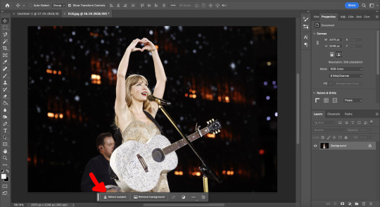
Firstly, the sizing of your edit matters! Max sizing for best quality on Tumblr is 1280 x 1920. If you want to put to put two images next to each other sizing should be 640 x 960.
Next, always try to find the highest quality picture of whatever you're using. Good resources include taylorpictures.net, 4k Taylor Swift, and if I can't find them here I do a google image search of my photo to see if any other websites have a bigger/hq file.
This video is a couple clips I screen recorded for you to see my process and demonstrate a few different tools I use regularly. I added timestamps for you to follow along as you read the rest of this.
Here's a photo of my workspace I am working with and what I will do first is cut out Taylor from this photo and move her to my correctly sized canvas. There are multiple ways to cut out an image in photoshop, the easiest I've found is the select subject function and using the quick selection tool (see toolbar beneath the photo). Other tools include the magic wand tool, lasso tool, and quick selection tool which I will show later.
Now you will see that my selection isn't perfect, so I will use the quick selection tool to fix a few areas that I'd like to manually select/correct. This isn't totally necessary at this stage as you can always perfect your cutout in the next few steps, but it does help save some time.
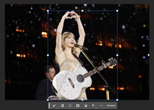
This is where I'll use the quick selection tool to either subtract or add to my selection. There are keyboard shortcuts to toggle between + and - to make this quicker.
See my screen recording of the process from 0:00-1:07
Now that we have our image selected and cut out, I copy and paste it to my canvas I want to work with (size 1280 x 1920) and this is what I've got:
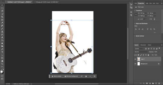
As you can see there's a few spots that need cleaning up in order to make our cutout perfect. You can do this with the eraser tool, magic wand, quick selection, or lasso tool.
See my screen recording of the process from: 1:08-3:50
Now that we're happy with our cutout, we can play around with it in any ways we want! Typically you're gonna do things like change the background color/texture, add elements with the square/circle tool to create what you're looking for, overlay elements and/or textures, and finally recolor it to your preferences.
This part is where you can try new techniques and play around to find what you like. I recorded some of my process of playing with different ideas and elements until I got to something I was happy with! The video explains the tools I was using as well
See my screen recording of the process from: 3:51 - the end
I hope this helps you with creating graphics in the future! The fun thing about photoshop is there are multiple ways to get what you want done. I showed you my way but there's plenty of other techniques and methods out there to try if you're unable to achieve what you want!
Best of luck and feel free to reach out to me if you are struggling/have questions! <3
#Tessa talks#requested#my tutorials#this took forever pls share!!!#photoshop tutorial#graphics tutorial#photoshop
46 notes
·
View notes
Note
How do you make your stamps? :0
Disclaimer: this is an obscenely long explanation, with pictures. Efficiency is stupid
So, for the static ones, I make a 99x56 px file on ibis paint x. Other programs are probably available online but I don't use them.
After that, I either upload an image I want to make into a stamp, or I draw one.
Then, I find a frame I want to use. Ill upload them here but let it be known I stole all of these right from deviantart


Most of them are from Lil-Devil-Melii on deviantart. The rest i have no idea. They're not all 99x56px but you can crop the canvas it's fine
Make sure to erase the edges of the picture , so they're transparent. It's not as cute otherwise
Upload those frames over your image in whatever art program you're using and viola, stamp.
For moving ones, it's a lot harder. Mostly because I refuse to download Photoshop.
There are a couple ways to do this. Some are simple animations, like with flashing text and whatnot. For these, you download the individual animation frames from your art program. Make sure it's transparent.
Then, upload each frame to ezgif.com under the option "GIF maker." You can play around with how fast each frame goes and whatnot but in the end, it'll be a stamp with some rad text that moves. This is easy, and doesn't make me want to shit my pants and cry. If you're new, do this. This is fun. This is good. This does not kill me inside
I made that↓ stamp with this method :)

this next one is how we turn gifs into stamps. This one makes me sad. It involves math and sucks. But we gotta do it. For the vibe
First, grab your gif. I'm using this cow gif because it's awesome

Then, I resize it using ezgif. Literally everything for this will be using ezgif. I am a simple man
At this point you should decide what frame to use. I'm using this one because its the first one I clicked
Figured out what size the inside of the frame is. That's what I resize the gif to, so the edges can be transparent. The inside of this one is 93x50 px, so those are the dimensions I'm making the gif.
Figure it out by putting the frame into ibis paint and realizing the canvas to fit just the inside of the frame, then seeing what the dimensions are. But there could be easier ways

Woah it's so small now
Then, still on ezgif, I go to the "crop" option.
Make sureeee to upload the smaller gif
press the button that says "extend canvas size", and then put the "width" and "height" as the dimensions for your FRAME. This'll put a bit of a transparent border around the gif. For this frame, I did 99px and 56px.
The "left" and "top" boxes show how many pixels the cropping happens from the edges of the canvas. The formula for finding that is
(width of gif / 2) - (difference between gif width and frame width / 2) = left box
For me it's (93 / 2) - (6 / 2) = 43.5
Then you do the same.for the height, which for me ends up being 22 from the top
This is reallyyy touchy and annoying though
Here's my result , with no visible difference

Okay so THEN you go to the "overlay" option, under "effects." And upload your frame. If the cropping was done right, you shouldn't have to move the frame at all and can just download it
Here's my result:

if you don't care about transparency, you can resize your gif to be the same size as the frame, and then put the frame over it. But I'm a slut for transparency
Anyways. I'm sorry if anything was unclear, it's two am. And I hope this was helpful :) these really are fun to make once you get it down
also if anyone has an easier way to make stamps from gifs, please god tell me
#web graphics#old web#neocities#custom#custom blinkies#stamps#page decor#web resources#da stamps#deviantart stamps#blinking gif#How to#tutorial#How to make stamps#Spacehey#deviantart#rentry graphics#old internet#early internet#stamp collecting#ezgif#stamp making#stamp template#Stamp frames#blinkies
6K notes
·
View notes
Text


easy tutorial for how i made this simple stylized "nebula" from my 'head full of stars' piece. note that this is not the only way, or the best way to do it, it's just the way i did it (and i made it up). enjoy
btw this was made with my 8 colour palette 'supernova' which you can download free here. eyestrain warning maybe
30% off pixquare pixelart app with code 'tofu' 💕
pixelart guide | support me | commission me | buy a print | buy a sticker
#pixel art#pixelart#artists on tumblr#art#dark art#dark aesthetic#pixel#illustration#pixel illustration#pixel aesthetic#pixel graphics#pixel art tutorial#tutorial#stars#space#nebula#eyes#cw#eyestrain#scopophobia#art tutorial
4K notes
·
View notes
Note
HIIIIIII!!!! sorry if this is like a stupid ask lol, but could you do a stamp tutorial? your stamps are always so high quality oml, how do you resize your gifs and images???


HIIII and no worries, I can totally make a stamp tutorial! (⌒▽⌒)
I’ll be going through on how to make a normal image stamp and then a gif stamp. By following these two tutorials, you’ll be able to make stamps just like these!


PROGRAM USED ★ Ibispaint
STAMP TEMPLATE BY ★ AHMED-ART on Deviantart.
To start off, you must find an image you’d like to make into a stamp. Then, find a stamp template you think would pair well with your image. There are many different types of stamp templates out there and you can find a lot of them on Deviantart.
Make sure to read the terms of use for the template before using though! Here is the template I will be using for this tutorial.

Making stagnant stamps is easy once you got the steps down. You can use any art program and follow a similar process, but I only use Ibispaint to create mine.
First, create a canvas that is the same width and height as your stamp template. This one is 97x57. Most stamp templates have super similar proportions. If you are unsure of your stamps dimensions, you can create a 100x100 canvas then crop it around the stamp template once you have inserted it.
(Brush icon -> Canvas button -> Trim)
To get higher quality on the image inside your stamps: the closer the better! For example:


See how the first stamp’s image is rather far away? This makes the quality appear much lower. However, once you zoom in, it becomes higher! So I recommend finding images to create stamps out of that you are able to zoom in on so the quality can pop.
You’ll need to erase the parts of the image that don’t fit inside the stamp so it remains transparent around the border.
If you want to change the border color of the stamp, fill in the canvas with the color you want. Then, clip it to the stamp border. Lastly, go and set it on multiply. This will change the stamp borders color!

If you want to put a line texture on your stamp, you can utilize the ruler tool in Ibispaint to draw lines over your stamp.

I’ll add these every once and awhile to my stamps for fun. If you set the opacity of the lines to 10%, it’ll end up looking something like this.
And that’s the completed stamp!
Changing the border color and adding the line texture is completely optional, though it’s always fun to customize stamps!

PROGRAMS USED: Ibispaint, Ezgif
GIF stamps are a little trickier, but the process is not too difficult once you got it down!
First, find a gif that you would like to make into a stamp. I’ll be using this one!

if you want to have a different colored or customized stamp border, you must edit it on Ibispaint before like explained above.
You can combine the layers and save them transparently so it’ll end up looking something like this.

I made this one blue and added a gradient to it to match the gif I want to make into a stamp! You can add a gradient to the border by adding a darker color onto the multiply layer then using an airbrush to blend both colors together in the middle on both sides of the template.
Now, open up Ezgif and click the tab called Crop. Then, insert your stamp template there. The way I find the dimensions of the inside of the stamp is by cropping my way around the inside of the template.
The dimensions inside this template in particular are 91x51. This is what we will resize our gif to! Before we can do that, click the crop tab again at the top of the page to refresh it and then insert your gif. This isn’t required to do, but I like to crop my gifs a bit so they focus more on what is going on inside my stamp. Like I said before, the closer the better, as it will make the quality higher!

Now that we have our cropped gif, click the tab called resize at the bottom of the page. The dimensions of the inside of this stamp are 91x51, so insert those numbers in the width and height boxes to then resize the gif.

Next step is to click the overlay tab at the bottom. You will need to click the button that says “extend canvas size” so we have room to overlay the stamp template on top of the gif. After extending the size, upload the stamp template as an overlay where it says choose file.

On computer, after clicking upload image, you can just drag the stamp template over the gif and situate it. However, you can also figure out the number coordinations to fix the template ontop of the gif by messing around with it a bit. I make my graphics on my phone so I use the numbers instead of dragging.

Left means to move the template left or right depending on the numbers you insert. Top moves the template up or down. The left for this template is 42 and the top is 21. It takes a bit of messing around to find the exact numbers.
Now that the template is ontop of the gif, all that is left to do is to crop the space around it. Click the crop tab again at the bottom of the page and then click where it says “trim transparent pixels around the image.” This will easily crop the extra space around the stamp.

Click download to save your gif and that’s it! Here is the finished product!
The whole process for making gif stamps is always the same, the only things that can vary or change are the dimensions of the gif (so it can fit inside different templates) and the left/right.
I hope you find this tutorial helpful and if anyone needs anything else explained, let me know. These stamps are free to use if anyone would also like to use them.
Happy stamp making everyone! ����
Dividers (c) @coco-coquette

#tutorial#web graphics#graphics#webcore#old web#rentry#stamps#web decor#gif stamps#alien stage#alien stage till#strawpage#spacehey#ᯓ ᡣ𐭩🐚asks
673 notes
·
View notes
Text

— how to recolor gifs ( easy ) tutorial
website used :
https://ezgif.com/instagif

#૮ ´ ཀ `𓏼 ა#rentry#rentry resources#rentry stuff#rentry graphics#rentry decor#rentry inspo#rentry divider#rentry pixels#rentry dividers#rentry frame#rentry icons#rentry mask#rentry template#rentry tutorial#tutorial#nahida#genshin impact
790 notes
·
View notes
Text
========================================================
[tutorial: build your own neocities/nekoweb page]
========================================================
a beginner's guide for making your very own home on the indie web—retro, personal, weird, and 100% yours.
this ain’t an average wix, squarespace, or tiktok aesthetic.
we’re talking full html/css with soul and attitude.
[ prerequisites ]
------------------
> an idea
> basic text editor (vscode, notepad++, or even notepad)
> account on https://neocities.org or https://nekoweb.org
> some gifs or tiles you love (dig deep or make your own)
> optional: image host or gif repo (or self-host everything)
[ feeling overwhelmed? read this. ]
-----------------------------------
you do *not* need to know everything.
html is not a mountain. it's a garden.
you plant one tag. then another. then a style. then a button.
you can build your site piece by piece.
and every piece is a portal to somewhere personal.
you are allowed to make broken pages.
you are allowed to use templates.
you are allowed to start over as many times as you want.
this is *your* world. you control the weird.
[ step 1: create an account ]
-----------------------------
> neocities: https://neocities.org
> nekoweb: https://nekoweb.org
register a name, log in, and enter your file manager.
this is where you upload your files and see your site live.
[ step 2: your first file - index.html ]
----------------------------------------
make a new file: `index.html`
basic starter:
<html>
<head>
<title>my weird little corner</title>
<link rel="stylesheet" href="style.css">
</head>
<body>
<h1>welcome to the void</h1>
<p>this is my page. it’s strange. like me.</p>
<img src="mygif.gif">
</body>
</html>
> upload to the dashboard
> boom. you’re live at
https://yoursite.neocities.org
or https://nekoweb.org/u/yoursite
[ step 3: add a style sheet - style.css ]
-----------------------------------------
create a file called `style.css` and upload it.
here’s some nostalgic magic:
body {
background: url('tile.gif');
color: lime;
font-family: "Courier New", monospace;
text-shadow: 1px 1px 0 black;
}
img {
image-rendering: pixelated;
}
marquee {
font-size: 20px;
color: magenta;
}
link it in your html and the vibes activate.
[ step 4: decorate it like a haunted usb ]
------------------------------------------
> use <marquee> for chaos scrolls
> embed gifs from https://gifcities.org/
> steal buttons from https://cyber.dabamos.de/88x31/
> set up a guestbook at https://www.smartgb.com/
> loop audio with <audio autoplay loop>
> add fake errors, 90s web lore, random link lists
[ step 5: resources, themes, and comfort ]
------------------------------------------
> templates & layouts: https://numbpilled-themes.tumblr.com
> glitchy gifs & buttons: https://glitchcat.neocities.org/resources
> layout builder: https://sadgrl.online/projects/layout-builder/
> free tiled backgrounds: https://backgrounds.neocities.org/
> beginner html intro: https://www.w3schools.com/html/
> pixel fonts & cyber assets: https://fontstruct.com/
remember:
you don't need to know js. you don't need to be a coder.
you just need a mood, a direction, a dream.
the html will follow.
[ bonus concept: shrine pages ]
-------------------------------
> a page just for one character you love
> a room to house digital fragments of your identity
> embed quotes, music, images like altars
> call it shrine.html and link it from your homepage
[ closing mantra ]
------------------
you are not here to be optimized.
you are not a brand.
you are a ghost inside the machine,
carving your initials into the silicon void.
welcome to Your website.
========================================================
#webcore#old web graphics#neocities#web graphics#carrd graphics#carrd resources#rentry decor#rentry graphics#carrd moodboard#carrd inspo#neopets#indie#indie web#early web#webdevelopment#web development#web resources#web design#old internet#old web#oldweb#nekoweb#transparent gif#tiny pixels#pixel gif#moodboard#tutorial#html page#html theme#htmlcoding
425 notes
·
View notes
Note
can u do a tut for sizing borders bc im rlly bad at coding in rentry


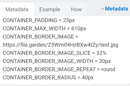
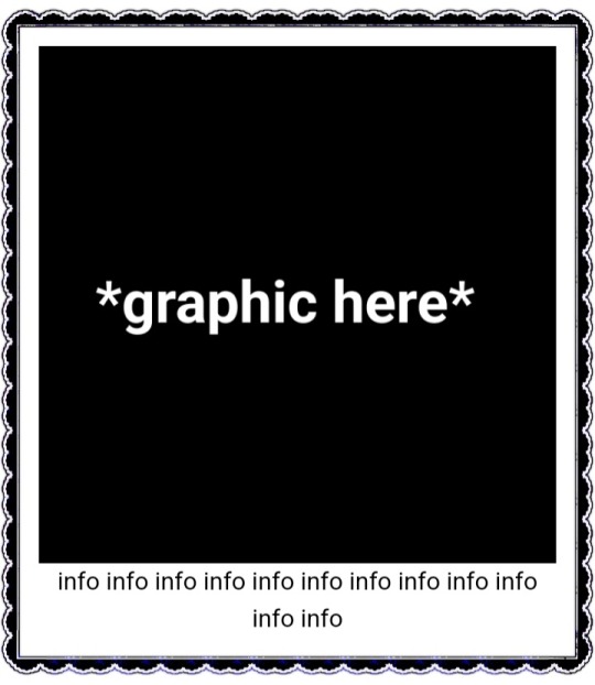
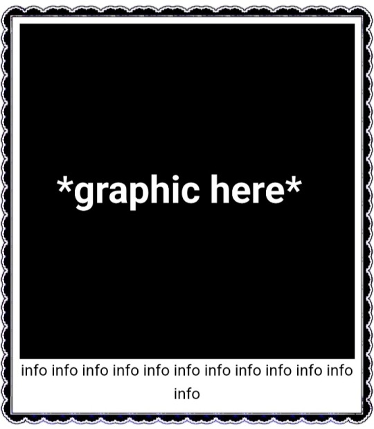
This is the code that I usually start out with, and it works most of the time without tweaking much. The thing I still tweak the most though is the CONTAINER_BORDER_IMAGE_OUTSET. I usually set it anywhere from 10px to 20px, and sometimes I will set two values to it if I want the outset to be diff for top+bottom and left+right
I prefer a more like bigger(?) Look to how my border are cut, so I do that by making the slice smaller (15% to 20%) or I make the width bigger (25px to 30px)
There are a lot of ways to playe around with the coding though like down below I set slice to 30% which I think I see a lot of people do idk. But to keep the bigger cut look I like I make the width 30px. I like to keep my widths at 20px to 25px though because of how much my outset is. My outset sometimes clips under the edit button when you save the code and view it normally, so I keep the width a bit smaller and use a smaller or equal slice. But there are a lot of ways to play around with this because it depends a lot on your rentry and what border you're using becuase there are out(?) Borders and in(?) Borders. Basically just play around with CONTAINER_BORDER_IMAGE_SLICE + CONTAINER_BORDER_IMAGE_WIDTH You can also have fun with the repeat options (round, repeat, space, and stretch iirc). I'll leave my code and examples below. I hope this helps Anon! I'm not sure if it's comprehensible or if I'm just yapping BS..


Above big slice big width, below big slice small width


Down below are what I call 'In borders' cause they're facing inwards. I usually have the outset on these a little bigger


CONTAINER_MAX_WIDTH = 300px
CONTAINER_BORDER_IMAGE = Your border image
CONTAINER_BORDER_IMAGE_SLICE = 20%
CONTAINER_BORDER_IMAGE_WIDTH = 25px
CONTAINER_BORDER_IMAGE_OUTSET = 10px
CONTAINER_BORDER_IMAGE_REPEAT = round
#rentry#rentry stuff#rentry decor#rentry inspo#rentry resources#rentry graphics#rentry pixels#sntry#stelluar#aesthetic#rentry tutorial#rentry metadata#metadata#tutorial#rentry border#borders#metadata border#rentry code#code#rentry help
687 notes
·
View notes
Text

the ultimate beginner metadata tutorial !! by a dummy :3

HEY PALS AND PEOPLE doing some tips and tutorials ,,,, kinda explaining the metadata that people do in rentry
the site already have a "tutorial" on the "how" window, these on the post are the ones who need further explanation
i will put in topics and try to do my best on this, its a long read!
• the border i will be using for example its by @/suturical on this post
• now, how to understand this and make the magic happen?
GOTCHA!!!
1. Borders: container adjustements
• the least important thing is the container width, you can put as you please but i use it on 400px — 610px, its just my recommendation
• now the padding is important, its basically the distance between the border and the elements of your rentry
• example: padding on 25px
• example: padding 20px
2. Borders: slice
• the image slice is basically how much it will slice your border and repeat it, i recommend using it 20% – 40%, however adjust as you please!
• example: slice 37%
• example: slice 23%
big difference isnt it? and i only changed the slice part, nothing else!
3. Borders: width
• basically the width of the border, adjust as you please but i also recommend to put on 30px as its the maximum size you can put
• example: width 30px

• example: 15px width

4. Borders: repeat
• this is another thing that dont have much secret and explanation about, there are 4 repeating types for borders, they are:
• stretch: will stretch the original size of the border across the entire container

• round: most used, 'normal', will make your border get around the container
• repeat: will repeat a certain part of the graphic image across the sides

• space: will give space between the repetitions

• onto the next part, text!

2. Text: font applying
• ngl its pretty simple, first catch ANY font of the google fonts site and do like the screenshot above, detail, if you font name has a space between the name (example: playfair display) you MUST put the _ to substitute the space, or it won't work
• but if the font name doesn't have any spaces, write it normally
2. Text: text size
• also really simple, explore the sizes on the rentry, i use it 10px – 25px, adjust to your liking!
2. Text: coloring
• tired of coloring all sentences manually? just do the code from screenshot and input your color! it can be written like i did or the hex code/whatever!
• you can still color things manually even when using this
• final with all these changes:


SO THATS IT! the most important actually :33
hope it isnt confusing, any questions please send an ask!
tagging oomfie @chokingonchairs bc finally got the courage to make this and yu asked for hehe ^___^
THANKS FOR READING!
# giftᧉd from 𐓟bove … ⟡#rentry tutorial#tutorial#rentry#rentry decor#rentry graphics#graphics tips#graphic tutorial#icon pack#icons#random headers#twitter icons#headers#icon#random icons#twitter header pack#twitter headers
629 notes
·
View notes
Text
Digital Stamp Making Tutorial
Hello, and welcome to the long-awaited(at least on my part) digital stamp-making tutorial from neosprites! I’d like to preface that I learned what I was doing from this tutorial so it may be a bit redundant, but if anything I get a bit more specific. Thank you so much to @graphic--horde for your work, it changed me as a graphic maker. This is gunna be a long post so feel free to bookmark it for later. Now, onto the show!

The frame I will be using for this tutorial (which is the frame I use on 99.9% of my stamps) I found from the above linked post, which I believe is from a creator that OP lost track of. Its inner dimensions are 94x50 pixels and its outer dimensions are 99x56 pixels. Here it is!

Find your material! - I recommend using websites like Tumblr and searching with the “GIF” filter only on, or alternatives such as Giphy or Tenor. Your browser may let you directly save the .gif file; if not and you are noticing it restricts you to save it as a .webp file you can try an extension like “Save webp as PNG or JPEG” (for Firefox but I image other browsers have similar functions, but I really recommend you switch to Firefox). To use this you will right click on your source .gif like normal but instead of clicking on “Save image as…” click “Save webP as…” and then click “GIF”. You should be redirected to the website ezgif.com where we will actually be doing all of our editing! Here’s the .gif we’ll be working with.

Convert to GIF (optional) - if you used the extension from the above step you should already be ready to click the blue “Convert to GIF�� button. If not, go ahead and open ezgif.com and click on “webP” and then “WebP to GIF”; then convert to a gif with the blue button.

Resize the GIF - now that we have a gif ready to edit, let’s make it the right size. The easiest method I have found is to change it directly to the frame’s inner dimensions, 94x50 pixels. [EDIT: Make sure in the aspect ratio drop drop menu you select "stretch to fit" and not "center and crop to fit" like I did in the photo example.] Click “resize” and then type [94] in for the width and [50] for the height. Next press the blue “resize image” button.


Add the frame - next click “overlay” then click the thin blue button that says “Extend canvas size(use if overlay exceeds GIF sizes)”. This will give us some extra room to add the frame onto the design. Next click “Browse…” and find the frame you have saved onto your device, then click the blue “Upload image” button.


After that it’s going to be misaligned, that’s normal! It will say you have the option to drag it into place, but don’t bother. That’s one of the reasons my old stamps look wack, it’s just harder to do. Instead type [44] in for the Left box and [22] in for the Right box. It took me a while to figure out these dimensions to be honest, and I’ve only tested it with this frame so I don't know if it works with others. Then click the blue “Generate image” button.


Crop the transparent edges - click on “crop”. You will have the option to check a box that says “trim transparent pixels around the image” however, I don’t recommend this as it tends to crop a few of the frame’s pixels with it sometimes. Next, set the Left position to [44] and the Right position to [22]. For the other dimensions we will use the outer dimensions of the frame which are 99x56 pixels, this will trim everything except the tiny spaces in between the stamp frame’s spikes. Type the width as [99] and the height as [56] and click the tiny blue button that says “set”. After that click the blue “Crop image” button.


Save and use! - all that's left is to click “save” and upload the graphic to your liking. (best seen on dark mode obviously)

If you’d like to tag me in stamps you’ve made using my tutorial I would love to see them, but it’s not required!! Make sure to always give credit for pictures/gifs when you can and try not to make stuff out of personal/fan art. Thank you to the person in my inbox who requested this tutorial, I had been meaning to for a while but it was just the kick I needed. :)
#carrd graphics#carrd resources#carrd stuff#rentry graphics#rentry resources#rentry decor#rentry pixels#rentry stuff#rentry inspo#deviantart#neocities#mine#my graphics#my tutorials#resources#tutorials#tutorial#how to#stamps#blinkies#graphics#web graphic#old internet#early internet#spacehey#da stamps#page decor#custom#old web#frames
407 notes
·
View notes
Text


jagged, crystalized and pixelated tumblr banner masks!
for the 2 anons that asked!
okay to repost, just dont claim as yours. and free to use (its what they were made for, duh!)
keep in mind gifs dont mesh well with translucent colors if youd like to use these with them :0
#🌫️ i know what you dread | creations#anonymous#carrd resources#rentry resources#rentry#web graphics#rentry tutorial#rentry inspo#rentry gif#rentry decor#rentry graphics#rentry template#image masks#edit resources#editing resources
1K notes
·
View notes