#AND CHANGE THE SITE THEME TO SEPIA
Explore tagged Tumblr posts
Visit Tumblr Blog
Explore Tumblr blogs with no restrictions, modern design and the best experience.
Last Seen Tumblr Blogs


Fun Fact
Tumblr has a 66 index score for customer satisfaction in the US.
Text
Ellipsus has now added several new themes to use on the site!

Light and dark are what the system match will use. Attaching images of the themes in use below the cut because it's going to make a long post even longer, but it's good to get your eyes on things.
Personally I really enjoy the nature and sepia themes even though most of my other apps I keep in dark/darkest modes. Having more options is also very nice if sometimes you need a little change of scenery to stimulate your brain while writing, and they’re very easy to switch to—the little paint roller icon is the easy-access theme change.
Examples will be both using the web app version (because I was too lazy to sign back in on my mobile browser) and the desktop browser version.
Have a mini-review!
First, sepia, which is a bit different from typical sepia tones from what I’ve seen.


Next, nature, which is the second darkest new theme.


And, finally, ultra dark, the darkest of dark modes.


Each theme also has its own default color to use, just like how the light/dark modes automatically change the default available text color to match.
This does also mean that the text colors they have made available for use have to be able to stand out properly against all these new themes, which it obviously does for sepia and ultra dark. But what about forest and that green color? Or the gray? Have no fear, because the colors are still vibrant and visible even on the forest theme!


All-in-all these are very good themes and very good additions, even though a lot of places still only offer light or dark mode, if that much at all. Even on GDocs you still have to jump through a few hoops to change things if you don't like looking at white-on-black or black-on-white.
Not only that, but readers, who don't have an account nor editing permission, can also change their site to read using these themes, too, through a gear icon on the top right! This means you can write using the light theme and your reader can read it in forest.
Another win for Ellipsus tbh
The Ellipsus Experience*
From someone who’s been using Google Docs for over a decade and LibreOffice for. Idk a year, probably.
*I don’t have a collaborator helping me out with this, so this is a solo-writer’s experience: please keep that in mind
Ellipsus is a writing website (not an app) that can be considered a collaborative alternative to Google Docs. They are [anti-AI] and don't plan on going back on this "barring significant regulatory changes." It has been compared both to Google Docs and LibreOffice. As stated above, I've used both of these other products (heavily) for a while and feel I'm properly familiar enough with both of them to say this one is... well deserving of the comparisons.
TL;DR
Ellipsus is essentially a GDocs/LibreOffice lovechild that is currently in open beta, works well, and I do recommend it as a Google Docs alternative for any collaborative needs just because it’s free and anti-AI, though it is only on par with LibreOffice so far as I can tell for solo work.
I was made aware of Ellipsus through a Blazed post here on Tumblr, though I haven't actually heard of it anywhere else, but I could just have completely and utterly forgotten if I'd ever seen them elsewhere. They also have a presence here on Tumblr, @ellipsus-writes, if you would like to have a browse for yourself.
All hyperlinks will be underlined and associated words will be between these [ ] brackets.
Getting Started
Ellipsus does not use a password system. You sign up/log in with your email, which will then send you a one-time code to get in. While signing up, the site asks a few questions while setting up, such as if you write with others (options boil down to yes, no, and not yet) and where you heard about Ellipsus from. You also initially choose your light mode/dark mode preference here. It can also use your system setting.
Once you’ve gotten through that, you’re taken to a document to introduce you to the features and capabilities of Ellipsus, though it doesn’t appear to really be… properly up-to-date… but it isn’t too badly divergent as to be too confusing (notably, there isn’t a “merge this draft” button to click like the doc tells you). It also offers several links to useful posts they’ve made to help you get started.
You will then be brought to the dashboard and unleashed.
Their layout is very simple, clean, and minimalist. There aren’t a thousand features, but sometimes you don’t need a thousand features. The site itself is easy to navigate and none of the toolbars or pages even look a little bit crowded, which is nice. Unfortunately, this does mean your settings are also very barebones. You can’t delete your account directly from the settings, but you can change your display name and email from the account settings page. Here, you can also download your logs or stored data. Unfortunately, though you can have an avatar/icon, you have to use Gravatar for it, with no exceptions. Other than that it displays the first two letters of the email associated with your account. This may be visible when collaborating with others.
On Desktop (and basics)
The dashboard (home page) shows your works, with a separate tab/page/button to show anything shared with you. Here is where you make new documents or manage existing ones, or make and manage folders.
Folders are named, and can have descriptions of their contents. They can be repeatedly nested for your highly-organized needs. (Or for organizing parts/arcs/chapters/etc. for your stories.) They can be bulk deleted by deleting the parent folder (the very first folder they’re all in).
When making a new document, you can either make a completely blank one or import a markdown (.md) file. Documents can be named here and renamed later. If you’re coming from Google Docs, you’ll have to use a desktop to download your documents as a markdown (.md) file in order to reupload it directly to Ellipsus. This is currently the only way to upload a file from elsewhere.
While writing, Ellipsus offers a focus mode (the cup icon) that will automatically hide all other panels/icons except for the outline (table of contents) and the icon to leave focus mode.
The other panels available are on the left- and right-hand sides of the screen. Both panels can be collapsed to increase screen space for the document. The right panel can be collapsed directly from within its additional menus through the arrow icon on the top left of the panel or returned to the expanded panel menu through the squares-in-a-square icon on the top right of the panel. It also has a keyboard icon (which the welcome doc calls a controller) to check available keyboard shortcuts, as well as a gear icon, both on the top right. (Will expand on the gear menu later.) The right panel also contains the “create a new draft” button, which becomes “compare changes” within drafts (expanded on later).
Formatting can be done through the bar on the bottom (basic* only) or through the formatting icon on the right panel. The default font is Literata and the default font size is 16pt. The default font color will change depending on your choice of light/dark mode, but you can pick from ten colors (nine, plus the default that changes per light/dark mode). If you don’t want to use the formatting bar/menu, markdown (like Discord) is also available for use while writing, and can be set to apply automatically.
Outline is simply a table of contents that allows you to jump between headers in your document. This makes it much easier to navigate a document, particularly if it’s long and you want to get from Point A to Point T but they’re a few tens of thousands of words apart (or more. Idk how much you write).
Find and replace is exactly that. It also has “match case,” “whole words only,” and “use regular expressions” toggles to better finess the find and replace experience.
Spellcheck will be elaborated on in the writing section.
Version history will open either the main document or the specific draft you’re on in a new page, where you can go between versions and pick on to overwrite with, if that’s what you want. I don’t fully understand how this works, but you can go through each day the document has been edited and pick a time you would like to replace the document with. These versions are saved at what appear to be every ten minutes of the clock, as every version of my stuff has shown only //:/0 am/pm as available within the version history.
Comments, chat, and collaborators will be expanded on in the collaborating section later.
Share and export is expanded on in the export section.
Document info becomes draft info when on a draft. This just gives you information like when it was made and last edited, as well as who edited it last and owns it (I think?). It also shows the word count, character count, and the estimated reading time.

The last option is “get support” and just opens to show you buttons to where to share feedback, find overviews/guides, or contact support from the team.
The left panel is where the main document and all associated drafts are kept. Remember to name your drafts appropriately so you don’t lose them; these can be duplicated, deleted, or renamed at any point.
*Basic formatting includes bold, italic, underline, and undo/redo. Ellipsus’s floating bar has these as well as a shortcut to the formatting menu, indent and unindent, and search. This is “basic formatting” for this review.
On Mobile
Since I first logged in on desktop, I’m not sure if this pops up when you do an initial login on mobile, but there was a pop-up that offered extra guidance in using the site on mobile, though I declined it. This is still a good feature, and not something you stumble on all the time. The site does look and work identically across devices, and the icons used are all identical. This is also a good thing.
On mobile, the basic formatting bar is moved to the top of the screen to account for pop-up keyboards, and side panels are hidden away. Thankfully, across screen sizes, the buttons for basic formatting aren’t absolutely tiny, though this does mean you may have to scroll to access parts of the basic formatting bar depending on the size of your display. The left panel has a “papers” icon on the top left, to the left of the cloud icon, and the right panel is within a “hamburger menu” (the three lines stacked on each other) on the top right, to the right of the bell icon (notifications for collaboration reasons).
Actually typing and working on mobile tends to be a bit buggy, but this is a beta so I’m not going to hold it against them. I’ll likely be using mobile as desktop through landscape full-screen on my iPad instead of vertically. The screen tends not to follow as you write, disappearing behind the basic formatting bar and/or the keyboard, which is a bit annoying. It says it will default to device settings with the double-spacing (expanded below) but doesn’t appear to always work on mobile.
Additionally
There are a few more settings on the right panel in the gear menu on the top right. These include features regarding smart formatting, collaboration, and display. This is the “editor settings” menu.
Smart formatting has quotes (from " to “ when typing quotation marks), ellipses (changing the three periods to one symbol …), markdown shortcuts (*and* such, like Discord), double-space period (tapping space twice will insert a period; unchecked will do as your device does), and en and em dashes (– and — from -; there is an option of “- - for —” or “- - for – as well as - - - for —”).
Collaboration has toggles for live cursors and collaborator avatars for when collaborators are viewing alongside you.
Display allows you to turn off the floating basic formatting bar (desktop/landscape only), turn on “invisible characters” (like paragraph symbols, spaces, etc.) or the word count, and is also where you can change from light/dark/system.
These additional settings (aside from light/dark/system) apply across your account, so you don’t have to do it per device as with other settings.
Actually Writing* With Ellipsus
*I used pre-written things for this review
Ellipsus synchronizes practically immediately. I don’t have anyone else to do this with, but between my own account on different devices, there’s a negligible amount of lag, which is notable considering my laptop is currently trying to die on me.* Different users** (or yourself on another device) are flagged with a colorful live cursor with their display name attached, which moves accordingly and swiftly to wherever they are in the doc, including if they’re navigating through the text using the arrows on their keyboard (for mobile hiding the keyboard might not remove your cursor, and for desktop opening a different window will not remove your cursor). When the other user** (or, again, yourself) highlights something, it is replicated in yellow for the other. The highlighting is surprisingly reactive and can follow per-letter (again, between me, myself, and I).
Spellcheck can add languages, has “accept” or “ignore all” options, offers multiple suggestions for (detected) misspellings, remembers what was “ignored” after leaving the document and returning. This has to be run through for every device you open the document on, which is a pain when you have fifty characters who have names the dictionary has beef with. The English dictionary appears to be on par with LibreOffice (disappointing) (the “se” in “per se” gets marked) (fanfiction will be painted in red). Detected misspellings (whether they are or aren’t) are both underlined and highlighted in red; the “first” detected misspelling with have both a highlight and an underline, but subsequent instances (“inactive” instances that you do not have selected) will only be underlined.
Additional languages currently available (Jan 2025) consist of: English (US, AUS, GB, CA), German, Spanish, French, Italian, Korean, Dutch, Russian, Polish, Portuguese, and Ukrainian.
If you want to change the font or text size, it currently (Jan 2025) applies across the entire document or draft’s corresponding paragraph style. This means the only way to have differently-sized portions in your document at this time is to have an individual paragraph with a different paragraph style (headings 1 through 4, paragraph/body, caption) applied, as they all have different font sizes associated with them.
There is also an optional word count displayed at the top of the screen next to the focus mode icon/notifications (depending on long or tall screen). It does display the word count with commas where appropriate.
My most favorite feature is that you can tab indent the start of your paragraphs. I’m not even kidding I love that so much. I don’t actually like the double-spacing (hitting the enter key twice for a new paragraph) format I do for fanfiction even though it looks better on AO3 that way, but having the ability to insert a tab indent just once and have it automatically carry through to each following paragraph…….. that’s so tasty. I’ve always hated writing on mobile because there’s usually no tab!!! It’s just there on Ellipsus!
Drafts are like a copy of the main document at the time of the draft’s creation. These are stored on the left panel menu and can be accessed simply by clicking them. This is useful more so for collaboration or when you’re struggling to pick an idea you like more. You can create these at any point, and merge them into the main document in order to make the content of the main document match that of the draft chosen.
Drafts can be compared to the main document through the “compare changes” page, accessible either from the “…” menu attached to the draft card on the left panel, or through the button on the right panel when you’re already in the draft. This “compare changes” page is where you’ll be able to do just that; additions are highlighted in green and anything removed is highlighted in red. On mobile you have to swap between the draft and the main document with the highlighted changes, but it’s laid out side-by-side on desktop. You can merge a draft with the main document from here.
You can also just make an empty draft and use it for things like notes and outlines and all that good stuff. They don’t have to be merged at any point. If you want a blank draft, though, you’ll either have to delete the whole doc within the draft or make a base blank draft at the start of your doc’s lifespan to later duplicate to edit when you need/want a blank draft.
*The responsiveness between me, myself, and I is notable because Google Docs lags so much for no reason, even if it’s just yourself on different devices in the same room. I’m doing this across three different browsers (Firefox, Safari, and DuckDuckGo) and three different devices (actively dying Windows laptop, iPhone, and iPad) it’s reactive and barely stutters, as opposed to how Google Docs needs to think about it across… itself (mobile app and Chrome browser, even!). Yes, I tested it to be sure.
**Disclaimer, again, I do not have friends to collaborate with to test otherwise.
Available Fonts
Here are all the currently available fonts (defaulted to 16pt when using the paragraph/body style). Photos* of just a few included because I’m doing this on mobile Tumblr and I can only use a few images so I’m picky. Also, this is all on dark mode, and the text color would be black if I were on light mode.
Baskerville
Caveat (#1)
Comic Neue
Courier Prime
EB Garamond
Inter
Literata (default font)
Merryweather
Monteserrat
Open Dyslexic
Raleway
Whatever this is? Doctor handwriting? Cursive Russian? (#2)
Roboto Mono
Sylexiad Serif (#3)
Ubuntu Mono


*Excerpt used is from the original concept Maddox and Li Hua, my ex-military dragon dad and his dragon daughter, were used in. It was originally in outside POV before I got bored with Darren. Sorry, Darren. (He’s still present later, just not as the POV character anymore.)
Importing
If you have a markdown (.md) file on hand, then go ahead.* Everything else you’re going to have to copy/paste in. Copy/paste will not automatically tab indent paragraphs like I extolled above even if there was a tab indent in the original text copied. The font will likely change to fit whatever you’re using on Ellipsus (it did for me between Liberation Serif -> Literata and Helvetica -> Literata) but it also won’t remove every single bit of formatting, so it’s not a completely exasperating exercise to copy/paste your works over. It won’t copy over things like headings properly, either, though that’s much less of a hassle than having to go back through and add all your italics back in.
For the sake of this review I did make my very first markdown (.md) file and... I honestly don't know what happened but about half of it was stuck in the "code" mode in the formatting section, which I couldn't figure out how to undo, outside of just copying the text (triple-clicking/tapping would select everything within the code block) and pasting it as plain text (ctrl/cmd+shift+v). I'm not sure you can paste as plain text on mobile (couldn't figure it out myself) so I, personally, am not going to be doing a whole lot of uploading previous stuff to Ellipsus. Other than this, importing a single-spaced (hitting the enter key once for a new paragraph) document will merge everything into a "single" paragraph, so I had to go through and separate all my paragraphs again so I could properly indent/unindent/apply other formatting as needed. I'll just completely re-type or batch copy/paste everything else in the future so I can have a better grip on the formatting.
*As stated way up at the start, you can upload a text file to Google Drive, open it in Docs (which makes into a .docx file, which they're working on allowing you to import as well), and then download that file as a .md file. This requires a desktop you can download/upload from. If you've never done this before, you can download as .md (and other file types) through the "File -> Download" section on an open document.
Exporting
This is accessed through the document directly instead of on the dashboard. It’s under “share and export” on the default right-hand panel menu.
You can “share” through two different methods. You can share a link to a document (logged-in users only or anyone with the link), which only allows for viewing the doc with zero editing abilities, and the entire document will be visible. The other option is a “snippet,” which is primarily what you’ll see pictures of when browsing the Ellipsus tag here; it’s a .png of a selected section of text* to create a slightly more interesting excerpt of what you’re working on. This helps your excerpt stand out without having to make it yourself. Example of a snippet with the default white background color:

(Snippets will export in only this font, but you can choose to keep any colored text.)
Exporting the entirety of the main document can be done by downloading as a PDF or markdown (.md) file. You can also copy it as HTML, markdown (.md), or rich text (.rtf). Most notable is a direct export to AO3 button! Ellipsus might tell you your blorbo’s name is spelled wrong, but it’ll let you upload your fic straight from the draft. ([Here’s] the official post about it.)
*You MUST make a selection of text in order to make a snippet; it won’t work if you don’t highlight anything for it to process. It also might be a bit slow, but a bit of patience will get you your .png to share.
Collaborating
… aha. I don’t know anyone currently using Ellipsus to review this with. Here’s paraphrased info off this [link].
Collaborating is done through email: your collaborator(s) have to have an Ellipsus account in order to actually work on the document. Inviting collaborators is done through entering their email, which will send them a link, which will bring them to the site where they will either make an account or log in to access the document. The owner of the document therefore knows the email of any and all collaborators, though other collaborators will only be able to see everyone’s display names. Collaborators can be given one of two roles with different permission levels: “can merge” means they can merge drafts into the main document, edit the main document, create drafts, as well as everything the next level can do; “can edit” can create drafts, edit existing drafts, and use the chat/comments features. Collaborators cannot invite or manage collaborators. Document owners can remove collaborators or change their role/access level at any time.
Information from Discord says this might be laggy and buggy, but the staff is looking into it.
Comments can be left through highlighting parts of the doc/drafts. Chat is a live chat to use while working together, or something, because I can’t test that.
Extras!
Their Discord server consists mostly of adults (age 18 or over) and offers opportunities to find collaborators of all stripes that also use Ellipsus. It has nearly 1600 members at the time of writing, though not everyone has chosen their roles, but of the approximately 500 reactions on the bot’s age role message, only nearly 40 chose the “under 18” role. It is a fairly active social space for the size, and doesn’t have an absolute hoard of channels. There’s even an art channel, with the description reading “original, human-powered art or credited or linked to the respective artist.”
They have a [blog] with resources/templates you can use to get started. You have to scroll through to find them since you can’t sort by the resource tag, but they’re pretty good templates for worldbuilding, story planning, and character information. I would recommend saving these as individual docs on their own and then copy/pasting the templates into the drafts of your stories to keep the information connected to the main doc you’re using it for. (Don’t forget to appropriately name all your drafts so you don’t lose anything.)
They have been in open beta since May 2024. There were apparently nine months of closed beta before this. They are also a former sponsor of NaNoWri(teNo)Mo(re) but [dropped them] when they made the stupid announcement about AI (2024).
Yes, you can use emojis on Ellipsus. Yes, you can have your leads text 🥴 to each other.
They are ellipsus_writes on Twitter/X and TikTok, ellipsuswrites on Instagram, and ellipsus-writes here on Tumblr (as mentioned way back at the start).
6 notes
·
View notes
Text
HOW TO RECOGNIZE REPOSTED GIFS/EDITS
lately, i’ve been seeing a huge rise in reposts of gifs and edits, and of spreading those reposts. i don’t think it’s a malicious thing at all from people who reblog them, but it’s important to be able to spot them in the future so that we can stop perpetuating this kind of behavior. so without any further ado, here are a few ways to recognize reposted gifs and edits. please keep in mind that it’s usually a combination of a few of these factors, and that one of them being present doesn’t necessarily mean the post is DEFINITELY a repost. be smart, but also be vigilant!
1. non-matching watermarks a watermark is a (usually) small/unobtrusive placing of the gifmaker/editor’s url or username somewhere on the gif. for example, here’s a gif i made; you can see my tumblr url, bringmoreknives, very lightly in the upper left corner.
now, just because you see a post from a blog with a different url than the one in the watermark doesn’t necessarily mean it’s a repost. editors and gifmakers change their urls, just like everyone else does. however, the watermark is a good place to start. you can always go to that original url and see if you can trace them to the blog that posted the post in question. and if you’re an editor, make sure you watermark your shit and leave a clear trail to your new blog -- i have redirect pages set up on all my old urls, all the way back to when i first made this blog in 2013.
2. mismatched gifs or edits being posted together, or media being posted in an awkward way in my opinion, this is the best indicator of reposts. oftentimes, because they don’t make the content themselves, reposters don’t understand the logic of making a cohesive gif or edit set, and so will cram a bunch of random gifs/edits of different sizes, video qualities, and psds/effects together into one post. they also might post gifs that were meant to be side by side on top of each other or vice versa, resulting in a reduction of quality and everything looking super pixel-y.
in a post, this will look like:
dramatically different colorings on gifs being posted side by side (not just, like, one or two black and white gifs in a clear color scheme, but one sepia-toned, one original colored, one extremely lightened, etc)
parts of some images being cut off due to different image dimensions
media from a bunch of different events, appearances, episodes, etc. that isn’t tied together by a common theme
3. use of tumblr mobile “fonts” in the caption this is a super obvious one, imo. again, on its own it’s not necessarily a giveaway, but i don’t know any editor who posts original gifs from their phone, simply because you need photoshop to make them, and therefore the files will be on your computer.
4. captions that comment on the content, or a lack of caption at all lack of a caption is less indicative of a repost than an odd caption is. but reposters often caption their reposted comment with something relatively irrelevant, like “omg he’s so cute” or something. additionally, many original posts will have a link to the video source in the caption -- so if everything else checks out AND there’s a source linked, it’s probably fine. (again, lack of a linked video source is not a marker of a repost: tumblr recently changed the rules where any post with an external link won’t show up in tags, so many creators leave off source links now.) also, worth mentioning that people DO often repost with the caption “not my gif/edit/pic,” and this is a great reminder that that is not an acceptable alternative to simply REBLOGGING POST FROM THE ORIGINAL SOURCE.
5. lack of a tag to indicate that the work is the poster’s own creators will often have tags for all of their original content. this can be anything from “mine,” “my stuff,” etc. to a series of asterisks or other punctuation marks that aren’t likely to be used for anything else. additionally, many creators will prominently display a link to this somewhere on their blog, if they have a custom theme. if a post doesn’t have some kind of tag indicating ownership that you can click on and browse to see more original content, that can be a major red flag.
6. crosstagging/adding irrelevant tags reposters want to get their posts seen, reblogged, and liked by as many people as possible. they thrive off clout for stuff they didn’t make. therefore, they have a tendency to add a SHITLOAD of tags that don’t really have anything to do with the actual subject matter. for example, if it’s mcr reposts, they might tag all of the band members, even if they’re not all featured, all of the album names, a ton of bands in the same musical circles, and even instagram-esque hashtags like “cute,” “emo,” “scenecore,” etc.
and there you have it -- here are some of the ways i know to spot reposts from seven years as a creator on this site. you get better at it the more time you spend in a fandom, because you’ll recognize content that popularly gets reposted, and also just learn to have a trained eye for this sort of thing. but until you reach that stage, i hope that this helps. please reblog to spread the word, and don’t be afraid to call out reposters, with links to the original post if you can find it, because creators on this site have a hard enough time as it is. and feel free to add anything else you use to spot reposts!
187 notes
·
View notes
Text
The Possibilities...Part 2
// After the last post of the CD covers I did went over so well with y’all, I decided to do the other 13 songs in the show and added in some character themed ones as well. Hope y’all like these ones as much as you did the last batch. I have 20, so they’ll be in 2 separate posts! 😊😄
** I also gave little descriptions for each cover to explain why I chose a certain pic, how I came up with the character or band specific logo in the top corner, and/or any other needed explanations (like college age looking characters or what’s up with Caleb).**
PART 1
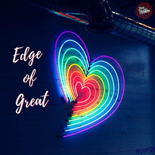
~ For this one, I was deciding between a neon sign of a rainbow or going for a more generic picture of someone on a cliff side for lyrics like “That we're standing on the edge of...Something big, something crazy...Our best days are yet unknown...That this moment is ours to own...'Cause we're standing on the edge of great”. In the end, I liked the rainbow neon heart the most because it felt like it connected with lyrics “Shout, shout...C'mon and let it out, out...Don't gotta hide it...Let your colors blind their eyes...Be who you are, no compromise” really well.
Logo: The band logo inside a Dahlia, which, depending on the CD cover, changes color to fit its background better

~ This cover I looked forward to as I worked on all the other ones, as I had found this art back when I was doing aesthetic/mood boards of the songs late last year. It is an amazing fit for the song and the control Caleb and his curse have over the boys as they perform it, a puppet master controlling his puppets for his own gain.
Logo: Took the logo I had done my best to recreate for OSOH and used it here
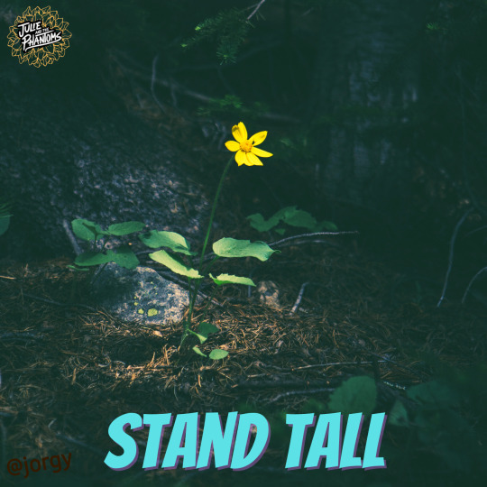
~ Finally, for this one I had between stuck between doing this flower (or weed, idek) picture or one of 3 options of ones with trees that were miraculously still standing in the middle of a lake or in a foggy field. All encapsulated the feeling of standing strong and lyrics like “Even if I'm the last standing...I'ma stand tall...I'ma stand tall” very well, but a mutual and I decided the flower best represented Julie and the incredible strength/bravery she showcased going up on that stage and performing without the boys. Like the flower, Julie was persevering and deciding even without her band, her family, by her side she would “keep on going when it's all falling apart” because she’s “gotta keep on dreaming...’gotta catch that feeling" like the strong, amazing performer she is and always has been.
Logo: The band logo inside a Dahlia, matching the color of the flower, Julie, because they’re a family now

~ For Julie and the rest of the teens, I decided that it would be alright to age up because trying to find an exact match to their ages and looks using the resources I had was going to be practically impossible. This pic I had used for a Julie/Rose, mother-daughter mood board last year and thought it would work great here. (If i did do something wrong with this representation of Julie in regards to skin tone, let me know)
Logo: The same thing, Julie’s initials inside a Dahlia, that I used in Part 1 of this post set for songs she performed alone

~ I had a few options for a Luke pic, including 2 that ended up being too Charlie for this post, but when I found this pic I thought this would work best. Trying to find a pic that captures his hair, the beanie, and his style while also somewhat resembling Luke is stressful and impossible without likely losing my mind in the process. So, I decided a vague resemblance would work and decided to use my artistic license to say this is how I am choosing to represent our ghost himbo leading singer. The beanie felt right and not having the person’s whole face visible allowed for use of the imagination and for that air of mystery Luke aims to give off.
Logo: I made a special logo for Luke of his initials in the same font as I used for them in the PH cover logo, but for this logo decided to put them atop a journal to represent the one he writes all his songs in and holds as sacred and many times off-limits to others
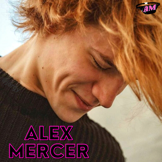
~ For Alex, I also had a hard time finding a close enough match that worked to represent him through hair, clothing, or even stature. I ended up finding this pic, of an actor from Outer Banks I believe, that seemed to fit the Alex vibe well enough to me, despite not have any of those matching clothing items or a perfect match for hairstyle.
Logo: For this one I went with the expected, default fanny pack with his initials on it because there wasn’t quite any other sticker options on the site I use for these that screamed Alex and the fanny pack is intrinsic to his character (and we love it)

~ Now for Reggie, I was able to find a pic that had both his look and allowed for him to have an instrument, even if I couldn’t for the other 2 himbos. It’s a pic of a member of The Neighbourhood performing and the leather jacket/white shirt, hair, and what I believe is a bass guitar fit with Reggie so well. I had 2 options of pics of this band member from 2 angles, but ended up deciding this one looked best.
Logo: A cowboy on a horse to represent Reggie and his country music career dreams, plus ‘Home Is Where My Horse Is’, with his initials in a fitting font over it

~ While I was hesitant to use a pic of 2 girls on the ‘Flying Solo’ cover in an attempt to not unintentionally represent Madi and Jadah’s skin tones wrong, for this one just aiming to represent Flynn by herself I did my best to find a pic of a girl that not only got Flynn’s hair as we see it in the show represented but also had a close match to her/Jadah’s skin tone. Here’s to hoping I did her justice (but if I still did do something wrong with this representation of Flynn in those regards, let me know)! I thought the outfit, while not as eclectic as Flynn’s on the show, worked well for a casual look for Flynn in like Senior year of high school or even college, since the pics age all these characters up a bit.
Logo: For the logo I went with a turntable sticker and Flynn’s initials, including letters for ‘no last name’ as people have used for her in post tags, until we learn of a last name for her hopefully in the future

~ While looking for neon sign pics for other CD covers in this post set I came across many with people in them, a handful that also would have worked for Carrie, before finding this one among them. I loved the neon glow off the girl and the close match, as far as I can tell in the lighting, to Carrie/Savannah’s strawberry blonde hair. The outfit, similar to Flynn’s, works for end of high school or during college, where Carrie might dress in toned down versions of her usual style, we see her in during the show. The piercing and more carefree demeanor being effects of her letting go of the image she hid behind in HS and becoming a more authentic Carrie.
Logo: I chose to put her initials over a diamond both because I wanted to use a diamond like I almost did for the pic in the ‘WOW’ cover and because of the diamond’s symbolism of things like strength/power, creativity, and balance/clarity

~ Finally, for Caleb I had originally had a sepia colored picture of a magician looking guy in a top hat looking out onto the ocean or some body of water with his back to the camera...then I found this one. My mutual, who has been helping me with this post set, and I nicknamed him ‘Sexy Caleb’! He just gives off that suave, over-the-top magician vibe that is kinda Caleb’s thing. Since the rest of the characters were merely resemblance pics of the characters, I thought why not just go that route with Caleb’s and have fun with it. This was the result and I hope y’all enjoy it as much as I do!
Logo: Went with the default sticker of a top hat for Caleb’s logo because it just works so well to represent him and the added initials on it almost look like goggles, like he wears in the very last scene of the season
#jatp cd covers#jatp edits#jatp fanart#jatp#julie and the phantoms#julie molina#luke patterson#alex mercer#reggie peters#flynn jatp#carrie wilson#caleb covington
26 notes
·
View notes
Text
New design!
Dear fans and followers, we have changed the design and the colours of our blog from a sepia/golden to a dark/blood theme.
Also, you will find the pages at the top of the page under the title and heather, not hidden in a corner anymore.
For those of you who are visiting our site from a mobile device and cannot see the pages, they are the following ones:
About
Victorian Era (needs to be changed/updated)
Whitechapel
Whitechapel Murders
Victims
Timeline
Investigation (needs to be changed too)
Tags List (work in progress)
Popular Culture
Links
Enjoy it and thank you very much for your support!
#Victorian Whitechapel#tumblr#tumblr blog#theme#design#layout#links#pages#content#victorian era#victorian inspired#whitechapel murders#victorian today
6 notes
·
View notes
Text
3/3 times that I’ve temporarily turned Dark Reader off and forgotten to turn it back on, I’ve realised it once the horrible migraine sets in.
You’re allowed to like beta, but it doesn’t change the fact that neopets dot com is the only website I’ve ever encountered that gives me migraines.
(InB4 Constellation Theme: Astigmatism+dark/night mode = headaches. I use Dark Reader with brightness turned the fuck down and sepia turned the fuck up. My Monitor is also set to warm, brightness and contrast turned the fuck down & Windows night mode is on. Yes, I can spend the less time on the site. Yes, to all the things.)
I know how defensive this post has turned out, but I’m sick of having to defend my own brain/eyes. You lit still can’t say anything without the “um actually” bullshit. Not including the people who are genuinely trying to help, there’s a clear fucking difference tho.
YOU CAN LIKE IT, IT CAN ALSO HURT ME.
(It’s still only a minority on here at least, but fuck do I get angry at having to justify a site causing me pain)
#neopets#neotag#swearing#neopets beta#beta#migraines#idk#suck shit anon my asks are turned off#go cry on the other site that im sooo angry uWu
11 notes
·
View notes
Text
Photoshop Tutorial - How to Cut Out unwanted Things From a Photo
The image cut out in Photoshop tutorial is about some of the basics in using image filters. One of the things that you need to know if you want to do image editing is how and why image filtering is important. Filters are a kind of software that allows you to modify or adjust image data or picture before displaying it to the viewers. You can do so many things with filters like making a photo look like a flower, turning an image of a man into that of a woman, or creating different effects on different objects or themes. It is because of this image cut out in Photoshop tutorial that you will understand how image filters work and how you can use them. Please check this site for better photo editing.
To cut an image in your photo, you need Adobe Photoshop. This is a photo editing software that is free to use and can be downloaded from the Adobe website. To cut an image in the photo, you need to click on "film" icon found at the top-right corner of the screen. After that, choose "properties" found below the image.
The properties of the image will show up in the right panel. Here, you need to choose "crop" function which is located in the middle of the right panel. By choosing this function, you will be able to cut an image out from the photo. If you would like to know more about the other options available in the Photoshop, you may look into the Adobe photo cut tutorial that teaches you how you can use these different functions.
One useful tip is to go through the image cut out in Photoshop tutorial. You may come across different tricks of the Photoshop tutorials. For example, when you click on "crop" function, you will find out that it has four different options namely, first crop, second crop, third crop and fourth crop. These four functions are used for cropping an image. However, you can make use of any other function for cropping your image.
To learn more about image cutout in Photoshop, it is better if you go through a photo cutout course. There are several photo cut tutorial websites online where you can find several photo cutout courses. If you search for an image cut out in Photoshop tutorial, you will be able to find several websites that offer photo cutting tutorials. Some of these websites offer free photo cutout tutorials. You can easily take a check whether the website is reliable or not by going through its terms and conditions.
If you have taken a free photo cutout course, then it would show how you can use image cut tool in Photoshop. It also gives you a clear idea about editing image such as contrast and colors. Moreover, you would get a clear idea about how you can blend photos together using photo cut tool in Photoshop. Moreover, the tutorials teach you how you can apply a variety of effects to your photos such as lightening, sepia effect, or glitter effect to your photo. If you have taken a good photo with a beautiful background, then you can achieve a beautiful and elegant photo in Photoshop.
When you learn about image cutout in Photoshop, you can add some finishing touches to your photo so that it looks more appealing. You can also add special effects to your image to enhance the look and feel of the image. The learning of this Photoshop technique enables you to cut unwanted objects or enhance and customize the appearance of an image. You can apply image cut out tool in Photoshop to repair any photo flaw.
You should not be afraid to edit the image when you are using photo cutout tutorials because you have complete control over the outcome of image editing. You can change the background of a photo or add some moving objects in the photo to create an appealing image. It is important to learn the techniques of cutting out unwanted items from your image before you actually begin editing. Once you are comfortable with this concept, you can begin doing photo shoots using these techniques. However, you should practice with your family and friends first before trying to edit your photographs with photo cutouts tool in Photoshop.
1 note
·
View note
Photo

Time to see if there’s anything relevant in this new HS^2 bonus or if it’s just fun!
I’ll be catching up with the commentary I’ve missed in a separate post.
(Off-topic, the ending of Steven Universe / SU:F recently was good and satisfying. I know everyone in my orbit was justifiably worried they’d take an Epilogues route with this, but they knew how to not screw it up like that and make it worth it, acknowledge the hurt endured and uplift enough to make up for it. I wouldn't be afraid to watch it if I were you. BUT WHAT WAS IN THE-)
As usual, since this is a paid Patreon Bonus I’ll be light on images and full descriptions, mostly only remarking emotionally or on plot-relevant, character-relevant stuff.
3/23/2020 - Diamonds, Dames, and Dads, Part 1 (NEW!)
Ooh, a new midnight site theme!
> Hours ago, but not many.
Spose we’ll see why DD was trying to handcuffarrest Dad?
Some fun mock-Noir narration I’ll omit.
> ==>
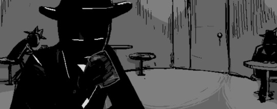
Your name is DIAMONDS DROOG and you are currently OUT OF WORK.
Wait, so he’s not in the crew or any sort of gang or enforcement? How handcuffs then--? Oh, right. Probably shenanigans. Guess we’ll see~
With your boss gone, there’s really nothing for this shitty little town to offer a guy like you. Nothing here ever changes.
Really? Guess he doesn’t have confidence he can throw together a ruthless team on his own, hm. (My previous classpect guess on Droog was... Mage of Mind I believe? About as subtle/vague as CD’s Rogue of Doom guess, not as clear-cut and well-evidenced as Jack’s Prince of Blood.)
> ==>
Aaand Dad walks in. Will this be a black thing? Cause red would be fun but seems a little unlikely.
> ==>
The newcomer takes a seat next to you. The sets your hackles up, because what the fuck. This place is basically empty. So many options to choose from and he gets right up in your personal space.
...Wait a minute. That’s right -- THIS Dad has met a different version of DD from the alpha session, when he was the one who kept him locked up but was on otherwise surprisingly good terms between the two. Maybe Dad recognizes him and figures he’d be useful helping find his daughter, dangerous as he is?
He’s certainly playing it cool from the dialogue, hasn’t brought it up yet.
> ==>
--Yep, he probably thinks if anyone knows if anyone new is in town, it might be this guy. That, or he doesn’t recognize him at all and is just asking dramatically. Dad IS a big fan of hardboiled sleuths and the likes of Harry Anderson (who sleuthed in Jane’s timeline), possibly for reasons.
> ==>
Showing him a news clipping of Jane... oh dear.
Who’s the broad, you ask. Gotta admit, you don’t blame him for looking for her in the slightest. There’s a lot there to look at.
Wrrrrong move.
> ==>
Watch your mouth, he says. That’s my daughter.
Already getting handsy!
> ==>
Maybe you shouldn’t be carrying around sepia pictures of your daughter and showing them off to sad drunks if you don’t want the conversation getting a little blue.
Fair. (And gotta remember that trolls aside, Gray Ladies in newsprint are what traditionally did it for this guy.)
The guy looks at you. He says that he thought he recognized you. He figured the two of you went way back, but now he’s not so sure. He’s starting to think that maybe he knew a different version of you, from an alternate dimension.
Yup.
Oh yeah, you say. You wouldn’t be surprised. That sort of shit happens all the time around here.
Pfffff.
So the you this guy knew in another dimension. What was he like? Were you friends? Partners in crime? He tells you that the other you once kept him locked in a room. Well, that certainly sounds like you.
PFFFFF.
Alright Boots, quit quoting in full, fun as it is.
> ==>
Wait, he IS going to help, out of pique at his uselessness lately in others’ possibly-imagined perception? (Very Mind.) But the handcuffs later in Catnapped--
> ==>
Think about this other guy. This gentleman who lit your cigarette when you needed it. This guy. You could really vibe with this guy. As in, kick back with a drink and discuss business and broads and share lingering, slightly sexually-charged eye contact.
THERE we go. Nice.
He asks you if you’ve been looking for someone too, since you seem to know all the best finders in town. You ask what’s it to him. He says, just a feeling he’s got.
Who? One of the former crew? Or the boss?
You tell him to watch his mouth. He tells you that maybe you better watch it for him. You ask him what the fuck that’s supposed to mean and he tells you to pay the man and meet him outside.
DD I expected, but Dad are you straight up flirting with this dude???
Maybe more happened in that locked room in the session than we thought.
> ==>
P.S. still isn’t out of his office.
> ==>
THE DOOR WAS OPEN? AGAIN???
--Oh wait. THIS is the guy DD said he knew.
> ==>
We got a job for you, Sleuth. Get out of that fort.
:)
Guess their relationship isn’t gonna evolve to handcuffs til later.
#Homestuck#hs2#Homestuck Liveblog#upd8#Homestuck^2#bladekindeyewear#blastyoboots#spoiler#spoilers#(also we never saw how Greg got tanbalded by magic which is prolly for the best that couldve been heavy)
26 notes
·
View notes
Text
Being Autistic on the internet is hard, so here’s some solutions to sites that can be sensory overload.
Long Post, with captioned images, Under Read More
I’m autistic, and spend a lot of time on the computer. So I use browser extensions, dark modes, night modes, blue light filters, and everything to make navigating a little easier.
My biggest problem is, for me, I’m really sensitive to bright lights and colors. So here are some browser extensions (for Firefox because that’s what I use) to make sites a little less bright.

Image: Dark Theme for Google ™ by belav
This is on the Firefox add-ons and browser extensions store, perfectly free. All it does is give google a dark theme, and it does have customizable colors.
Here is what my google looks like without the extension:

Image: A regular light themed Google page, google typed in the search bar. The background is bright white, with black text.
Note: I have a blue light filter on my computer, so the page may look less bright or a little off-white that will be addressed later
With the extension:

Image: Another picture of a google page, same content but the background is a desaturated black with white text.
Another cite I frequent is YouTube and the extension I like to use for that is:

Image: Enhancer for YouTube ™ by Maxime RF
Another entirely free extension on the Firefox add-ons and extensions store.
It has customizable colors as well and comes with other accessibility and personal preference settings:

Image: customization settings for the toolbar on Enhancer for YouTube, with color customization, options, and buttons.
It allows you to record, adjust playback speeds, volume settings, use “picture in picture” and maybe some more stuff I haven’t explored yet.
But what I mostly use it for the is the color customization, it comes with light and dark themes with different colors. I use the desaturated black and red theme,

Image: A screenshot of a YouTube homepage, with a desaturated black background and red links and buttons.
There are many more options, that’s just what I enjoy.
For other cites that don’t have night modes or a special extension of their own I use

Image: Dark Mode by Night Mode
Dark Mode has been a blessing, most blanket night mode extensions just invert colors and call it a day, but Dark Mode comes with customization.

Image: A drop-down menu with options for Dark Mode it has Dark/Light switch, Brightness slider, Contrast slider, Sepia filter, and Grayscale filter.
What I like is you can customize it for individual sites, and the level of certain things. You can also change fonts, and font sizes.
For my computer itself, I have a Windows 10, HP, and it comes with a built in blue-light filter most computers do.
For me it is located in the display settings under a “Night Light” option, you can schedule hours and intensity of the filter.
I hope this guide helped, if you want more tips on how I make my computer easier for me to use, just put it in the notes and I may make a part 2!
#adrian speaks#actually autistic#autism#autistic#autistic guide#blue light filter#browser extensions#firefox#mental illness#disablity
9 notes
·
View notes
Video
youtube
Divi Theme Gallery Hover Effect You May Not Know 👈👍👈
How to create a image gallery that has a color change hover effect and lightbox with the Divi Theme. In this video we will be creating a gallery, when you hover over a gallery image, it will change from sepia to full color. If you click on the image it will pop out into a lightbox. Today we will be demonstrating how to build this great feature with the Divi Gallery Module. This is a very eye catching and a great interactive elements to have on your Divi site.
In this video we will cover:
Adding A section. Adding A Row. Inserting A Gallery Module. Adding Images. Setting A Section Background Color. Setting Row Gutter Width. Configuring The Gallery Module. Using The Gallery Image Filters. Creating A Hover State. Adding A Sepia Filter. Setting A Transition Time.
We are going to be using the Divi theme to create some great effects in this series of videos. The Divi theme has some great modules and effects. With a little work you can achieve some great eye-catching effects to enhance the look and user experience of your website. So, follow along with the video and see how to create a image gallery that has a color change hover effect and lightbox with the Divi Theme.
Download this layout: https://www.system22.net/sepialibrary.zip
Try out the Divi theme: https://bit.ly/TryDiviNow
Divi Supreme Modules Pro Plugin 10% Off: https://bit.ly/DiviSupremeCoupon
Divi Supreme Modules Light Plugin: https://divisupreme.com/divi-plugins/?ref=6
Divi Supreme Modules Playlist: https://www.youtube.com/watch? v=ZAO2MH0dQtk&list=PLqabIl8dx2wo8rcs-fkk5tnBDyHthjiLw
Playlist page for more videos on this: https://www.youtube.com/c/System22Net/playlists
Full Ecommerce Site Build Playlist: https://www.youtube.com/watch? v=rNhjGUsnC3E&list=PLqabIl8dx2wq6ySkW_gPjiPrufojD4la9
Contact Form With File Upload Video: https://youtu.be/WDo07nurfUU
Divi 4 Theme Create An Ecommerce Store In One Hour: https://youtu.be/qP-ViPakoSw
My Blog : https://web-design-and-tech-tips.com
Check out our playlist page for more videos on this: https://www.youtube.com/c/System22Net/playlists
Sub: https://www.youtube.com/channel/UCYeyetu9B2QYrHAjJ5umN1Q?sub_confirmation=1
0 notes
Text
Graded Unit - Evaluation
The graded unit or 'personal project" is a brief where we need to produce 10 final digital images and 5 final prints all relating to a theme. As there were endless possibilities for themes, the first that came to my mind was creating different time period shoots. I had the idea of incorporating something i'm passionate about with this idea.
Some ideas I came up with were recreating influential album covers or movie posters, an astronomy theme shooting stargazers and enthusiasts and culture through traditional clothing. The initial idea I decided to go with was incorporating fashion with a train theme to show how train travel has evolved since the 1930s/40s.
This proved harder than I thought when actually planning locations and sourcing models - I can't afford regular online models, my friends are limited with time and travel and location wise I was very restricted. I wanted the images to feel somewhat realistic. So I amended this by changing my theme to centre around travel in general, and with editing I was able to create whatever effect I needed for each period.
Initially I divided my project into 5 shoots for decades skipping 20 years at a time; 1940s, 60s, 80s, 2000s and the 2020s. This ended up being a bust as two models became unavailable for the project and could only model after the submission deadline.
I compensated for this by skipping the 60s shoot and gathering a new model for the 80s shoot to fill in. This worked in my favour and it gave me one of my favourite shots I’ve taken so far.
Location wise, the original plan was for my 60s shoot to be held within the transport museum as I thought the old vehicles would suit the time period well. Upon visiting to gather my recce shots I learned all the vehicles were from the 1700s - 1940s, also the background had fake shops that looked considerably older than a 60s time period.
I decided to instead use this location for my 40s wartime shoot, focusing my two models around a car built around the late 30s. This ended up working really well and I was even able to use one of the fake shop windows for my composition, creating separation between the two models.
More complications arose when my original plan for the 2000s shoot was going to be shot in Bogside at abandoned railway tracks. When I was struggling to see what this idea represented and was unable to find access to the site I found inspiration at my local cinema. The sign has been up for two decades and still feels nostalgic, which is what I wanted to create with the editing. My friend Kelsey helped me out and we decided to incorporate her car since I wanted to use an active mode of travel for that time period.
I then had the issue of unfocused images in my 2020s shoot, and by this point I was ripping my hair out as the location (Wemyss Bay) isn’t the easiest to get to unless I'm already near the west coast. I took my time with the reshoot, focusing each shot manually as I did not trust my cameras autofocus at all by this point.
Editing was another mammoth task, one I’m not even sure I’m fully done with. I think I’ve tried at least 6/7 different edits on each individual photo with some retouching. The task of trying to edit each shoot in their own specific time period was very difficult, I wanted to perfect it but I didn’t want to rely too heavily on pre-sets.
I ended up using a sepia tone pre-set as a guide for my 40s shoot, which helped a lot. 80s shoot was so difficult to get right, I wanted a film style look but with a twinge more contrast to make sure it’s not too flat and uninteresting. 2000s editing was quite tricky as it’s hard to replicate a time period that doesn’t look super old in photographs, yet doesn’t look too modern. With all these older time period shoots it was a task as I’m shooting with a DSLR and not a film camera.
I feel Lightroom has remained my favourite program to use for importing, editing and exporting as I feel it’s most user friendly for me. This project was definitely the hardest brief I've completed this year, everything felt so stressful and time consuming. The only slight relief I got was when I was able to edit in post and I could realise they had potential. I felt good knowing that when I decided to share my images, people seemed to respond well to them.
If I were to complete this brief again with the same theme, I'd look to hire professional models that would reliably be on time and not drop out of shoots. I’d also get my recce shots well before I plan to shoot as it’d save time having to relocate and reconsider where I'll be shooting that day.
0 notes
Text
Divi vs Astra
Diese Divi vs Astra Bewertung für [2021] zeigt euch die neuesten Verbesserungen und die auffälligen Features von Divi. Wir werden keine langweiligen Aufzählungspunkte und Listen von Optionen geben, die auf der Elegant Themes zu finden sind. Mir ist aufgefallen, dass sie auch versuchen, ihre Seite so spannend wie möglich zu halten, und natürlich, dass die Divi-Website ein wahres Kunstwerk ist...
Da Webshops in [2021] sehr beliebt sind, beginnen wir mit dieser Funktion. Sehen Sie sich hier ein Video an, wie Divis Woocommerce-Builder funktioniert. Ein anständiges Theme bietet fantastische Möglichkeiten, damit einen Webshop zu erstellen, und das ist bei Divi mehr der Fall. Das Theme bietet unglaublich viele Möglichkeiten, Produkt- und Kategorieseiten mit dem WooBuilder und den WooModulen anzupassen. Schauen Sie sich alle 229 verschiedene Divi-demos (1685 Vorlagen) an. Wahnsinnige Zahlen!
Die Divi-Demobibliothek enthält viele schöne Shop-Layouts, die Sie mit 1 Klick in Ihrem Projekt installieren können. Das komplette Styling Ihres Shops ist mit dem WooBuilder wirklich ein Kinderspiel. Am Frontend lässt sich alles sehr schnell einstellen. Alle verfügbaren Demos wurden natürlich mit dem unten besprochenen Divibuilder erstellt, zusammen mit Elementor Pro gelten als die besten Seitenersteller auf dem Markt.
Der DiviBuilder ist der perfekte Page Builder für Wordpress und es macht absolut Spaß, damit zu arbeiten. Der Page Builder arbeitet sehr präzise, d. h. auf der Website selbst sieht es so aus, wie da wo Sie gerade arbeiten. Alles, was Sie verwenden möchten, wie Elemente und Effekte, ist leicht zu finden und Sie können damit sehr schnell Seiten erstellen.
Mit Divi Effects können Bilder blitzschnell abgestimmt werden. Ändern Sie die Belichtung, die Farben, invertieren Sie das Bild, wenden Sie Sepiafarben an oder machen Sie das Bild transparent (Prozentsätze können eingestellt werden). Das Ändern von Bildern in Divi und nicht in einem PC-Programm sorgt dafür, dass Ihr Bild unbeschädigt bleibt und jederzeit schnell weiter modifiziert werden kann. Wir geben 10 Punkte für dieses Tool in diesem Divi Theme Review.
This Divi versus Astra comparison for [2021] highlights Divi's most recent enhancements and eye-catching features. We're not going to provide you the same old bullet points and options lists that you can find on Elegant Themes. I noted that they also make an effort to keep their site as interesting as possible, and that the Divi website is, of course, a great work of art...
We'll start with this feature because web shops are quite popular in [2021]. Here's a demo of Divis Woocommerce Builder in action. A good theme is an excellent way to use it to establish a webshop, and Divi is no exception. With the WooBuilder and WooModules, the theme provides an astounding number of options for customising product and category pages. Take a peek at the 229 Divi demonstrations available (1685 templates). Those are insane figures!
Many gorgeous shop layouts are available in the Divi demo collection, which you can add in your project with a single click. With the WooBuilder, completely designing your shop is a piece of cake. At the front end, everything may be set up quickly. All of the demonstrations were created with Divibuilder, which, along with Elementor Pro, is often regarded as the greatest page builder available.
The DiviBuilder is a fantastic page builder for Wordpress that is a lot of fun to use. The Page Builder is quite precise, in the sense that it looks just like where you are now working on the page. Everything you need, like as elements and effects, is readily available, and you can quickly construct pages with it.
Images may be fine-tuned in a moment with Divi Effects. Changing the exposure, colours, inverting the image, applying sepia colours, or making the image translucent (percentages can be altered) in Divi rather than a PC software assures that your image is not harmed and that it can be quickly modified at any time. In this Divi Theme Review, we offer this utility ten points.
0 notes
Text
Themeforest vs Divi
Images may be fine-tuned in a flash with Divi Effect. Change the image's exposure, colours, invert it, use sepia tones, or make it transparent (percents can be set). Changing photos in Divi rather than a PC software means that your image is not harmed and that it can be simply adjusted at any moment. In this Divi Theme review, we offer this utility ten points.
Here's a video about Themeforest vs Divi, as well as further information. With Divi Transforms, you can do almost anything with words and images, including rotate, mirror, and skew objects, exactly like in Photoshop's "CTRL+T" command. As far as I'm aware, there is no alternative theme for this amazing utility.
This feature definitely helps your website stand out, and your competitors will be envious of it. Even expert site designers used to find it difficult to turn such forms into blocks. This is no longer the case with the DiviBuilder, because anyone with no technical experience, including you, can now accomplish it with ease. See a video and learn more about Divi's Shape Dividers here.
Colleagues who have worked on websites for a long time recall how we used to do things over and over again. You had to work six times if you wanted to change the style of six blocks. With Divi's Bulk Edit, you may make changes to all six blocks at once, eliminating the need for multiple steps. This function allows you to save a significant amount of time. View a video and learn more about Divi's Bulk Editing here.
0 notes
Text
TIMES - Extraordinary Newspaper Magazine Theme
New Post has been published on https://click.atak.co/times-extraordinary-newspaper-magazine-theme/
TIMES - Extraordinary Newspaper Magazine Theme
Briefly about features
TIMES is an extraordinary newspaper / magazine WordPress theme designed to redefine publishing by making content both easier to create and consume. It combines professional looks and unmistaken typography with impressive user experience (UX) and incredible attention to details.
Enjoy your content on mobile devices, tablets and more thanks to a responsive layout, now even faster and better with optimized images and support for high-quality retina screens. This theme supports menus 3 levels deep as more than this is a burden for users to navigate. If you have more questions, please email support.
Changelog
May 12th, 2018 — version 1.4.8
ADDED - Option to show "Unique posts only" on the homepage. While, previously, only posts of the same type were not repeated, with this setting you can choose to skip the same post from the entire homepage. That includes every post on the homepage and inside sidebars/widget areas. Of course, your handpicked posts on the homepage will be displayed as usual and won't be affected by this setting. ADDED - Option to "Copy link" to the article, in the share area below article. We've added yet another way to share your articles, your readers can now simply click the button to copy the post link and share it ony any site, community or platform. ADDED - Option to "Email" article link, in the share area below article. Your readers can also send the article link to a friend or colleague via email. IMPROVED - Visual tweaks and improvements. IMPROVED - Customizer experience.
March 17th, 2018 – version 1.4.7
ADDED - Font Editor - We've added a brand new section to the customizer that will allow you to change every font on the site effortlessly. There are three font families loaded with the theme by default, you can swap them all out with almost 900 fonts offered by Google Fonts or add your custom fonts with a link or code from your font provider. Using Greek, Cyrillic or Vietnamese script with your Google Fonts? Easily add font subsets straight from the customizer! Want to use only one font on the whole page? Sure! Just check the "Use universal font?" checkbox and you're good to go. All that available in the customizer from today! ADDED - Shortcodes can be inserted directly to the homepage as part of Custom Code module. IMPROVED - UX tweaks and improvements for customizer’s publish menu. IMPROVED - Moved the "Font Subset" option from Settings page to customizer. IMPROVED - Front-end, visual tweaks. IMPROVED - Performance.
November 24th, 2017 – version 1.4.6
ADDED - Custom Code module to the homepage builder. You can now insert any HTML, JavaScript code or text to the homepage. Great for adding advertisements, even if your code is not optimized to be responsive, you can use the module's tabs to enter different code for mobile, tablet and/or desktop devices. This module is very similar to WordPress’ Text Widget, once you toggle the "Include basic styling?" checkbox, it allows you to move some of that content from sidebars to the homepage. ADDED - Smart reload to the homepage builder. We think that this feature will greatly increase the productivity of assembling your homepage. The customizer now refreshes the homepage once it detects that you are done making changes, avoiding unnecessary updates and improving the customizer's performance, especially on older devices. ADDED - Compatibility with WordPress 4.9 and it's new features. IMPROVED - Few visual tweaks and improvements.
October 28th, 2017 – version 1.4.5
ADDED - Option to change ticker content font type: serif and sans-serif. ADDED - Option to disable/enable opening social media links throughout the site in a new tab, in customizer. ADDED - Checkbox to Social Media widget that allows to disable opening links in a new tab. ADDED - Option to hide posts date on the homepage, articles and across the site. IMPROVED - Social Media widget following count. Results are now loaded asynchronously to improve page loading speed in some cases. IMPROVED - Ticker content is now loaded asynchronously to avoid additional database queries on page load and to improve load speed. IMPROVED - Visual tweaks.
September 29th, 2017 – version 1.4.4
ADDED - Breaking News Ticker - This is a big one, we've actually created the whole ticker system from scratch, we started with creating the best experience by designing an intuitive and familiar UI to customize your ticker content, appearance and behavior. You can either show post: latest, oldest, most bookmarked / commented, from category(ies), handpicked or add your own content right from the customizer. Adjust the appearance and layout to fit your sites style, set your own colors, change the label text or choose the scrolling direction – all that with instant, live preview, which makes customizing a quick and productive task. ADDED - Option to disable rich menu dropdowns (Functionality ON/OFF > Other). ADDED - Option to the Social Media widget to open profile links in a new tab. IMPROVED - Few visual tweaks.
August 24th, 2017 – version 1.4.3
ADDED - New layout for Secondary Menu Bar called "Divider". You can check it out in Dashboard > Appearance > Customize > Header Layouts. ADDED - New layout for Secondary Menu Bar called "Shadow". ADDED - New background type for "Boxed" layout in Secondary Menu Bar: "Dark Background" ADDED - New background types for "Boxed" layout in Secondary Menu Bar: "Custom Light & Dark Color" which allows you to set a custom color, light or dark, for the bar’s background. ADDED - Added option to choose amount of padding / space for Secondary Menu Bar: Small, Medium, Large Padding. ADDED - Instant, live feedback in customizer for Showing / Hiding Secondary Menu Bar’s search button, date and social icons.
July 24th, 2017 – version 1.4.2
ADDED - Custom made, light and fast one-click demo importer designed specially for TIMES with clean, simple, intuitive and clutter-free interface. We've written, completely from scratch, brand new demo importer tailored specifically for TIMES, it's fast, light-weight and easy to use, you can add some demo content to your sites in minutes and remove just as fast, all that with a click of one button that conveniently turns into a slick progress bar. In short, it's awesome and to try it out just activate the free bundled Dash+TIMES plugin ADDED - New demo content called "TIMES Starter Pack". Contains everything you need to get started with the theme, a complete and lightweight package, ideal for new sites and easily removable. ADDED - Option to enable or disable "pinch to zoom" on devices with touch screens. IMPROVED - Few visual tweaks.
June 15th, 2017 – version 1.4.1
ADDED - Optional print button in the interaction area. You can enable it or disable it by going to the Dashboard > Appearance > Customize > Show/Hide and (un)checking the "Print Button Below Post" checkbox. ADDED - Option to remove all theme's meta tags in case you want to use a third-party plugin for meta tags. Meta tags include Open Graph tags, Twitter tags and meta description tag. ADDED - Updates for WordPress 4.8. IMPROVED - Visual tweaks.
May 31st, 2017 – version 1.4.0
ADDED - Homepage Builder - This is a big one... We've created completely from scratch a tool that allows you to modify any element on the homepage. You can rearrange every sections, have multiple sliders or any module, each with different settings. You can pick certain posts to appear in the section in most modules or, for example, set the post type to display most commented posts from this week. This tool allows for a total flexibility and customization of your homepage, on top of that it is very intuitive, nicely designed, clean and without unnecessary clutter. The builder is very smart and adaptable, for example, if you add two compatible modules that display the same type of posts, the second module will not show the same posts, they will be offseted. There are plenty of unique touches like that and this paragraph is already too long so I would recommend that you give the builder a try by going to the Dashboard > Appearance > Customize > Homepage Layout. Oh and don't worry! Every change you've made to the slider or other modules through the customizer will be converted to the builder so you don't have to redo your layout! IMPROVED - Slider section from customizer was moved to the Homepage Layout section and all your settings will be mirrored to the homepage builder. IMPROVED - Few visual tweaks.
April 30th, 2017 – version 1.3.9
IMPROVED - Few visual tweaks. IMPROVED - Main menu experience. IMPROVED - Hero image performance.
April 3rd, 2017 – version 1.3.8
ADDED - New widget called "Category Posts" that allows you to display articles from specific category in any post-excerpt format neatly in the sidebar. You can also pick the number of posts to show as well as set the time-range. IMPROVED - Few visual tweaks.
March 23rd, 2017 – version 1.3.7
IMPROVED - Customizer looks and experience. Biggest customizer redesign to date, we made the customizer much, much more organized, easier to navigate, less cluttered and gave it a more modern look. Every section has it’s own custom made icon and a description for easier navigation, similar settings are now grouped together to make the best use of space and each group has a short explanation to it. Words really can't do a justice once you compare the old customizer with the new one. Make sure to try it out and if find something not working properly, just go to Dashboard > Settings > General and uncheck the "Customizer tweaks" checkbox. ADDED - Dark mode. Yes, your website can now join the dark side. To change the color scheme of your site go to the Dashboard > Appearance > Customize > Change Colors and pick a dark color scheme. ADDED - Sepia color scheme. Give your site the old-school look with subtle brown shades. You can change the color scheme in the same section as the dark color scheme. ADDED - Option to change the default sorting for comments.
BUY From ENVATO Marketplace
#blog#clean#extraordinary#Magazine#modern#newspaper#parallax#professional#publishing#simple#social media#social sharing#theme#times#typography#wordpress
1 note
·
View note
Photo

MEMORABLE AND CRAZY PHOTOS FROM THE AUSTIN AND TEXAS WEDDING VIDEOGRAPH
A wedding video is an eternal abundance. I remember about the precious days in the life of a couple. However, it also gives an idea of the moments that may have been missed in a real day. The images of the first kiss, the first dance, the glasses raised for the toast and much more. But these moments are fleeting; The words and the progression of raw emotion will disappear and be forgotten once the moment passes. In 2021, Austin wedding videographer and Texas industry photographer will see tremendous change. How wedding videos and photographers are taken and edited. This change will turn wedding videos into movies. A wedding cameraman tries to show the story of a wedding day about the characters, their interactions and feelings. It will also become a remarkable event for the couple in the future. With new ideas, people are universally moving towards authoritative photographic techniques, through smooth forms and immersive photographs with new themes.
Specialized passion and superior camera technologies now help people take extreme close-ups of pests, ideas, and other never-before-seen images. High dynamic range images help cameras and photographs show more prominent fluorescence that is related to what the human eye can see. This has become very familiar to photographers. From black to white to sepia, the precision of the cool images has inspired viewers to return to classic images and the depth behind them. Now the days of bridal facial expressions and the pattern is about telling yourself unfathomably. Your model should call, yell, cry, etc., in front of your camera, as much as they want. Seasoned cameras are getting more mature and smarter, attracting not only photographers and videographers, but mainstream clients as well. Drones are now a common modern type of photography, used not only for casual shots, but also for Austin wedding videographers to capture the tone of the site. It is extremely popular in the film industry, modeling, shooting drones to take aerial photography to give its buyers a bird's eye view. You can see the photographers in Texas are also more skilled like the new one in Texas. They click bust photos and videos from all directions. Enjoy every moment with Casterona movies! Now you can book casteronafilms.com
Although the wedding videos have been a great resistance. In weddings for decades, the technology used, the style required, and the editing procedures have vastly improved over time. As the calendar enters the new decade, technology is only needed to continue to improve and styles will be adjusted to suit the mood of the moment. For 2021, there are some popular wedding video trends that future brides and grooms should know about. These trends are aimed at creating more intimate and personalized images of the couple's wedding. A wedding video aims to tell a story about a couple's special day in a creative and unforgettable way. Nothing tells a story better than a video. Austin, Texas videographers are the best at wedding videos and photos.
0 notes
Text
Divi v/s Beaver Builder Comparison Features (2020)
Page builder plugins are very famous. Beaver Builder and Divi offer one of the most popular options. Both plugins are fully responsive solutions that help users to manage the design and response of their custom posts, pages, and blog posts. I’m going to use this article to compare Divi vs Beaver Builder features, options, and pricing. You can then use this information to decide which option is best for you. The concept of creating pages shouldn’t have to alter code was not known till now. Nowadays, visual page builders accomplish all of the tasks that were formerly handled by expert web developers. Drag and drop interfaces make work a lot easier and faster. You don’t have to struggle like olden days and forth between backend and frontend to see how your changes look.

Divi vs Beaver Builder Comparison
In this comparison, lets analyze the modules, module settings, and structures of each of these page editors. let’s discuss each page builder template’s options, features, pricing, and advanced customization options. I’ll provide you with as many details as possible so that you can decide which is better for your needs. Divi or Beaver Builder?At the end of the post you can find side by side comparison.
User Interface
The user interface is one of the first things that should be reviewed when considering any tool. The interface is often a personal preference. You probably won’t use a particular page builder if you can’t comprehend or enjoy its user interface. An effective user interface needs to be intuitive. It should be simple enough to grasp after only a few minutes of use. A page builder interface should also be useful in helping you achieve the overall results that you want for your site pages.The interface alone doesn’t make a plugin great. However, the look and feel of a user interface can sometimes mean the difference between a project’s success and failure.
Beaver Builder
Beaver Builder’s frontend editor allows you to verify changes as they’re being made. The editor is easily used for custom post types, pages, and regular posts. You can either use a particular template and tweak it according to your requirements, or you can design from scratch. If you want to add new content to one of the pages, you’ll use Beaver Builder’s “rows” to add that content. Horizontal and vertical columns can be placed in these rows. These columns will hold the page’s content modules. Beaver Builder’s editor has nine column frameworks to use. You can resize, add, or delete columns as you see fit. One noteworthy shortcoming is the fact that Beaver Builder doesn’t have an edit history function. This means that you can’t go back to review previous changes that you’ve made to your pages and undo them.
Divi Builder
Divi’s interface,either you can us for the backend by overwriting WordPress’ standard editor or on the frontend by using the visual editor. Both methods allow you to use the editor for your custom post types, regular posts, and pages. Page layouts are where you’ll find Divi’s elements. You just have to select the element that you want and then arrange it on the page. You can also integrate additional elements from Divi’s extra modules.Divi’s editor can be used to create your pages in portions with rows, columns that you add to rows, and modules that you add to columns, much like Beaver Builder. Divi has many different column templates. Divi’s wireframe mode is one of its best features. You can switch to this view to see the structure for the page that you’re working on. This option can come in handy if you want to see how a particular page was designed or if you want to find the modules that were used on that page.
Content Modules
Both Divi and Beaver Builder refer to their elements as modules. Modules are smaller sections that are used to design page content in WordPress page builders.
Beaver Builder
Beaver Builder has over 30 different basic modules, which are divided into six categories. It also has a set of WordPress widget modules that can beadjusted anywhere in your WordPress content’s layout. The basic modules are typical content modules, such as an HTML module and modules for buttons, headings, text, and video. In the Action category, you can use a Call to Action module. It includes a text editor, heading and button that’s already built-in. Using this you can add any necessary calls to action to your pages faster.There’s also a Callout option that has all of the features and an additional image option. You can use the Subscribe Form and Contact Form modules to include specific actions for your site users to be get in touch. The Media category includes modules that lets you to integrate Font Awesome icons, galleries, maps, sliders, and testimonials to your pages. Modules in the Layout category useful to show images, data, pricing table, and other relevant content. There’s also a Sidebar module that allows you to use any of your current WordPress sidebars in pages edited using Beaver Builder.The final categories have post-based modules. These modules allow you to integrate various elements to your posts, in addition to the typical counter and countdown elements.
Divi Builder
Divi’s modules are broken down alphabetically instead of by category. There is no module just for headings. Divi lets you use the text editor mode to add headings. This shouldn’t be a big deal, but it can take a little more time. Another common hinrdance is the fact that you can’t put the sidebars from your theme into the Divi Builder content layout, and you can’t use Divi Builder to integrate WordPress widgets like you can when using Beaver Builder.
Both Divi and Beaver Builder are just like siblings. You get roughly the same number of modules in each, but they’re handled differently in each plugin.Divi has individual modules for a bar counter, circle counter, and numbers counter, whereas Beaver Builder combines all of these choices into just one Number Counter module. Both plugins are compatiblefor woocommerce, modules work well with woocommerce and other third-party plugins. These modules are activated when the particular third party plugin is activated and installed.
Styling
Styling which allows you to change style, such as colors, font, alignment, etc. This is an essential part if you want your site to look fantastic.
Beaver Builder
Each Beaver Builder module has settings that you can customize. These settings are divided into tabs based on the style, content, or features of that module. You can configure settings for alignment, colors, fonts, and other elements.The Colors which are nothing but RGBA or hex value or using the color picker that’s included. Google is used to add custom fonts. Other web fonts can be integrated by adding a few lines of code. Videos, images, slideshows, colors, and color gradients can be added to customize row backgrounds. Edge and border effects can be used to change how your row boundaries look. Similar but more limited settings are available for columns. Advanced tabs exist for almost all Beaver Builder columns, rows, and modules. These settings have lets anyone to go beyond the basic styling selections. They allow you to determine how each item will behave and appear. Options include padding that allows you to choose different values according to device sizes and establish margins. There are also HTML settings where you can define the appropriate classes or IDs to be used. You can also alter visibility settings. For example, you can pick from an impressive amount of different animations and then select their durations and delays. Modules can be limited to be shown only to users who have logged in or can be hidden on devices of particular sizes.
Divi Builder
Divi’s Content Section where you can arrange and integrate module content. The Design section can be used to customize the styles for each module.You get at least one unique setting or more for every module. For instance, the Blurb module unique setting allows you to adjust an element’s icon or image uses. Many Divi modules’ setting menus also include settings for text information. They allow to edit margin, padding, height, width, text alignment, colors, and font settings. Animations, box shadows, and borders can be customized in the Content section. You can apply filters for contrast and sepia tone, brightness, and saturation here. Animations, box shadows, and borders can be customized in the Content section. You can apply filters for contrast and sepia tone, brightness, and saturation here. The Advanced section lets you to integrate custom CSS and standard CSS ID and classes to your modules. Modules can be hidden on certain devices, and transitions can be edited.
Templates
Pages can be made using either an existing template and make changes to it or by creating a new page from scratch. Both Divi and Beaver Builder have a good selection of templates to choose from.
Beaver Builder
Beaver Builder templates are divided into three categories: Landing Pages, Contact Pages, and Saved Templates. There is no any Block templates in Beaver Builder, but you can integrate your own by installing and activating Beaver Builder addons, which are third party plugins. The templates are only available in the paid version of the plugin. There are no templates in the free edition of Beaver Builder. So that if you’re going to use a free version, you’ll have to create pages from scratch. Landing Page templates are used to create unique landing pages. There are more than 50 different landing page templates to choose from. Contact Page templates which goes well with home pages, contact pages, “about us” pages, and other particular content pages. Beaver Builder has about 25 contact page templates that can be used. Saved templates are your own customized templates. The Beaver Builder page builder can be used to craft templates that you can preserve for later use, similar to the option that Elementor offers. Beaver Builder also allows you to import templates, but the processbit complicated than elementor.
Divi Builder
Divi’s users have over a thousand different layouts to pick from you, and you can even add more features by using third-party Divi addons. Their layouts are broken down into website packs, which makes it easier to find specific templates from their growing library. Every website pack usually has layouts for “about us” pages, blog pages, contact pages, landing pages, portfolios, and other specific content pages.Everything you need is in one central location. This is a huge time saver. You can even mix and match layouts from different website packs if you want. Each layout can be used as-is or can be customized according to your requirements. You have a lot of templates (or page layouts, as Elegant Themes calls them) at disposal. You can load a layout that was already designed, and then customize the images, text, and other content to create a unique, appealing website. This is an excellent option for individuals, developers, and site owners who want to create their own sites but don’t have a lot of confidence in their coding and design abilities.
Divi vs Beaver Builder Conclusion
Beaver Builder is easy to pick up and understand, but Divi offers more customization choices. Both page builders provide very professional layouts that can be used for a variety of industries and niche sites.Beaver Builder has 50 templates, while Divi has over 140 layouts to use. At $89, Divi is also a little less expensive than Beaver Builder, and all Elegant Themes products are included in Divi memberships.One disadvantage of using Divi is that it is a little slow when compared to other popular page building plugins. Page builder launching is simple enough, but operating current modules and adding new ones can take more time than expected. Most operations seem to require just a few more clicks than performing those same actions in Beaver Builder. Another Divi weakness is the difficulty in transitioning away from the page builder. People who support Divi’s heavy shortcode use have stated that the number of shortcodes left behind when you deactivate the plugin shouldn’t matter because you’re going to have to rebuild pages anyway. However, you still need to remove each shortcode before copying and pasting content into a different page editor. This process can take a long time if you have many blog posts made with Divi. Beaver Builder is fast. It has a fresh, intuitive user interface. Its content modules are well designed, and there are plenty of template choices that allow you to customize your site however you want. You won’t have any difficulties moving away from the plugin, thanks to Beaver Builder’s clean code. Divi has more pre-designed layouts and customization choices than Beaver Builder. They also have five additional products that are included with Elegant Theme memberships at no extra charge. These features give users more bang for their buck.Drag and drop WordPress page builders with easy to use interfaces are great resources for creating appealing and effective web pages in a matter of minutes, and both Divi and Beaver Builder would be good choices.
The post Divi v/s Beaver Builder Comparison Features (2020) appeared first on The Coding Bus.
from WordPress https://ift.tt/3dBVvpk via IFTTT
0 notes
Text
How to Use Immersive Reader on Microsoft Edge
The immersive reader is the feature available on Microsoft Edge Chromium that offers the clutter-free practice to read content online. When you go through the timeline and get any interesting article online, many a time it becomes hard to concentrate on it including all the advertisement, visual elements, and links across the page.

It is the feature that removes the distractions and turns the page into an ebook with great background and fonts that allows you to concentrate on the content. It also includes settings to setup experience and features, including reading loudly and the grammar tools to improve text comprehension. If you want to use it, then you are on the right post. Go through the blog and follow the instructions to use the immersive reader on Microsoft Edge.
How to Disable or Enable Reader on Microsoft Edge
If you need to disable or enable the reader on Microsoft Edge, then you can follow the provided steps:
1. Launch Microsoft Edge.
2. Go to the site that you like to read.
3. Tap on the immersive reader option.
As you finish the process, the feature will delete litter and re-format the page via a more readable background or text via the warmer color to make it better for the eyes. If you need to disable it on the page, then tap on the immersive reader option from the address box.
How to Setup Text Preference for the Immersive Reader
If you want to set up text preference for the immersive reader, then abide by the given instructions:
1. Launch Microsoft Edge
2. Go to the site that you like to read.
3. Tap on the immersive reader option.
4. Drag mouse cursor to the top of a page to discover the immersive reader toolbar.
5. Press the Text preference option.
6. Use the Text size slider to create text larger or smaller on the page.
7. Use the Page theme button to change the background color, including Sepia, White, Dark, and Gray.
As you complete the procedure, pages you launch with practice will use the setup settings that you mentioned.
How to Use the Grammar Tools for Immersive Reader
Grammar tool is the feature designed to use in improving users' reading comprehension with the help of tools to divide words into syllables and the choices to highlight nouns, verbs, or adjectives. As the tool is going on with development, then you may have to enable it via hidden advanced settings.
How to Enable Grammar Tools
If you wish to enable grammar tools, then pursue the given instructions:
1. Launch Microsoft Edge.
2. Insert given command in the address bar then hit Enter:
edge://flags/#edge-reading-view-grammar-tools
3. Apply Grammar Tools in Reading View section then choose the Enabled button.
4. Tap on the Restart option.
As you complete the instructions, you will discover grammar tools in the toolbar of the immersive reading experience.
How to Use Grammar Tools
Follow the provided steps to use grammar tools:
1. Launch Microsoft Edge.
2. Go to the site that you like to read.
3. Tap on the immersive reader option.
4. Drag mouse cursor to the top of a page to discover the immersive reader toolbar.
5. Press the Grammar tools option.
6. Switch on Sy-lla-bles option to do a piece of words into syllables.
7. You can emphasize verbs, nouns, and adjectives via Parts of speech option on the page.
As you have completed the process, you can apply the tools to better reading comprehension.
How to Use Read Aloud for Immersive Reader
Read aloud feature is simple but strong on Microsoft Edge, which allows using a voice engine to read the text loudly via several voices and speeds.
In case you intend to use read-aloud for the immersive reader, go through the below-mentioned steps:
1. Launch Microsoft Edge.
2. Go to the site that you like to read.
3. Tap on the immersive reader option.
4. Drag mouse cursor to the top of a page to discover immersive reader toolbar.
5. Press the Read aloud option.
6. Use controls in the middle of the toolbar to begin or pause or jump to the next or previous paragraph.
You can trigger read loudly by highlighting text by right click on the selection and via read-aloud selection button. As a read-aloud is accessible for a long time back, Microsoft has created it better for Chromium Edge version by inserting new engines to create voice sound less robotic and more of a natural.
How to Setup Read Aloud
In case you need to set up read aloud, then you need to follow the offered steps:
1. Launch Microsoft Edge.
2. Go to the site that you like to read.
3. Tap on the immersive reader option.
4. Drag mouse cursor to the top of a page to discover the immersive reader toolbar.
5. Press the Read aloud option.
6. Select Voice options.
7. Apply Speed slider to customize voice speed to Normal, Slow, and Fast.
8. Use Choose a voice section to choose the type of voice you like to hear.
When you complete the instructions, you can hear the paragraph aloud. This may be handy as the convenience feature, which will help you to get the content better or catch different topics as you are working on other tasks.
Blair Lennon is a Internet Security expert and has been working in the technology industry since 2002. As a technical expert, she has written technical blogs, manuals, white papers, and reviews for many websites such as mcafee.com/activate.
Source:
https://blairlennonblogs.wordpress.com/2020/02/19/how-to-use-immersive-reader-on-microsoft-edge/
0 notes