#BILINEAR FILTERING...
Explore tagged Tumblr posts
Visit Tumblr Blog
Explore Tumblr blogs with no restrictions, modern design and the best experience.
Last Seen Tumblr Blogs


Fun Fact
The “We are the 99%” Tumblr blog became the slogan for the Occupy Wall Street movement.
Text
flirting vs sexual harrasment
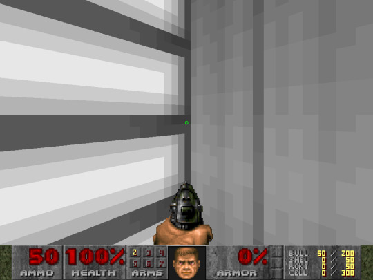
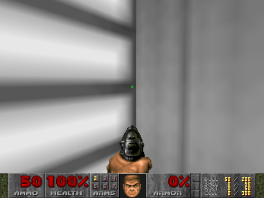
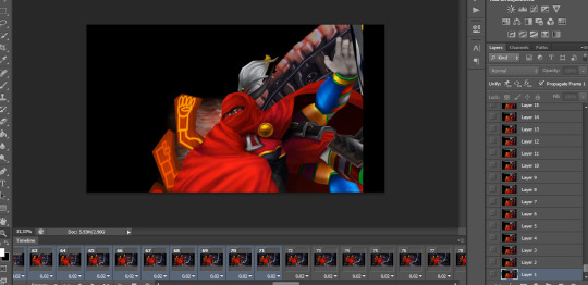
#doom#doom 1993#lzdoom#BILINEAR FILTERING...#yeah i use lzdoom cuz my fuckass of a pc can't run the latest gzdoom version
0 notes
Text
I've written like three different Karplus-Strong algorithms this week that produce identical rudimentary results... Girl! You've been fixating on digital filters all week! Don't you think it's time to implement the stupid filters in the feedback path instead of running in circles on the core functionality??
#in my defense - the latest algorithm is closest to the final implementation that will go onto a microprocessor#filters are scary okay? i gotta do bilinear transforms#synth diy#sdiy#modular synth#modular synthesizer
3 notes
·
View notes
Text
the rg35xxsp is still pretty cool to me i really like that i can do this


0 notes
Note
Hi! I saw a post where you had a game made in godot with old school rendering, do you maybe have any tips on how to make godot render a game like that instead of its normal rendering method?
I'd be right happy to!
I'll try to make this concise lol, I always end up overexplaining and then getting lost in the weeds. Buckle up, it's a loooooot of little little things that all add up.
First off, you should decide which look you're going for. N64 and PS1, the two consoles I'm emulating, both had drastically different specs. (plus, there's plenty of other early 3D systems I've not even touched!)
The N64 had texture filtering (textures were interpolated aka "blurry"), it had floating point vertex precision (points moved correctly), it had perspective correction on its textures (no warping)
The PS1 had no texture filtering, no floating point vertex precision (vertices snap and pop around), affine texture mapping (textures warp weird). I also think the color space they operate in is different? Don't quote me
So you can go hard one way or another or pick and choose what you think looks good! We don't have anywhere near the hardware restrictions they did in the 90s so go nuts.
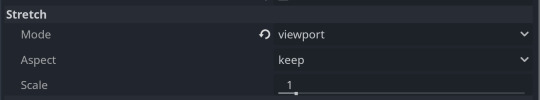
RESOLUTION
To get a low resolution window, I set the window size of the game and the window override size to different amounts

In green is actually how big the window is on my screen (4k monitor) and in red is the retro resolution I want. If you set the stretch mode correctly (an option a little further down the Window tab) then it'll make the pixels big
COLORS
Now the PS1 had the capability of showing you over 16 million different colors, but it could only display 50,000-150,000 at a time, so in order to get more fidelity out of it, the engineers implemented a dithering effect to better blend the otherwise sharp edges between colors.
I used this shader to achieve the dithering effect. If you don't understand shader languages, that's fine. There are a few different pre-built ones for looking like the PlayStation 1 out there.
TEXTURES
Textures for the PS1 could be as big as 256x256, but they were typically 128x128. And they would squish everything a model needed into there usually, at least with like player models and objects and such.
As mentioned, if you're not good with shader language don't worry. There are countless resources out there that people will either let you use or teach you how it works. But I'm gonna touch on it a little bit here.
PS1 textures had no pixel filtering, so you could see individual pixels.
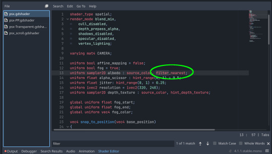
This is what determines that in the shader code. If you want it to look like the N64 (blurry lol), the proper hint is "filter_linear". Note that it won't be 1:1 with N64, cuz they used bilinear filtering (which kinda sucks and causes weird quirks) whereas now you'll only find linear or trilinear filtering. It's a negligible difference imo.
PS1 textures also were only saved using 15 bit color. I'm told that Photoshop's "Posterize" filter set to 32 can achieve this, but don't use photoshop if you can help it. I use GIMP, and while a newer version might have a posterize filter, or there may be a plugin out there, my version doesn't so I cluge it a little.
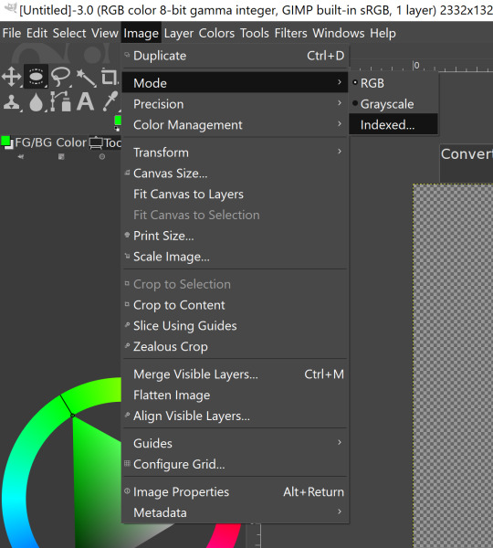

Change your color mode to "indexed", set color dithering to how you like it, and the number of colors in the palette to a number to get a good result. Usually I'll do 16, 8, 32, but occasionally I'll cheat and do a non-multiple-of-8 teehee >:3c
You can change it back to RGB after to make further editing easier.
LIGHTING
N64 and PS1 both implemented vertex lighting, as opposed to the more modern and (now) ubiquitous per-pixel lighting. Godot as it is right now (4.2 i think?) claims it has vertex lighting that you can set as a shader property but they're lying and it doesn't work yet.
The old consoles could only handle like, 2 lights though so it doesn't matter much.
The real star of the show, and in my opinion the one thing that makes a game most look like the 90s is the inclusion of vertex colors.
By multiplying the color of your texture by its stored vertex color, you can do all the shading yourself!
Plus you can reuse textures like crazy just by coloring them differently. The N64 also made heavy use of vertex colors by forgoing a texture on models entirely and just painting them using verticies. The only textures on SM64 Mario are his eyes, stache, hat emblem, buttons, and sideburns. Everything else is done with vertex colors.


Here you can see this level from my Crock Land with no vertex coloring, with some of the vertex colors only, and then with the two combined.
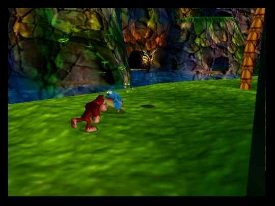
Rare loved this. Look at how colorful that cliffside is in Jungle Japes. It makes it so much more interesting than just a brown cliff face. Plus you can see the vertex coloration instead of textures at work on DK and the Gnawty.
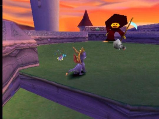
My go-to example for PS1 is always Spyro, what a gorgeous game. All of those colors there are not made by a light or an environment. They're hand painted babey! Also! With spyro! The skyboxes are actually just huge domes made up of vertices that are colored in different ways! That's how they can look so colorful and "hi-res".
There's plenty more you can do, like adding a CRT filter or a little bit of chromatic aberration which I haven't gotten into yet.
The way I've learned all this is just by being curious as to how the old consoles did their thing, and slowly accruing the knowledge over time. There's still infinite stuff I don't know too.
I hope that helped! And wasn't too longwinded or confusing! Like I said, it's all about piling up tons and tons of little things, small details, weird graphical quirks that really bring out the retro 3D feel for me.
And I didn't even get into the modeling side of things! That's an entirely different "color-of-the-sky"-sized post though.
I'd be happy to re-explain or explain more about any of this!
214 notes
·
View notes
Note
How do you make your gifs so good quality teach me mother so I may contribute to the VIII fandom 🥺
I use adobe photoshop cs (64 bit)
now you choose the video to gif, k
you can download videos with high quality to gif, I use 4k downloader to download videos from youtube and I record myself using camtasia too
now you will edit the layers first, delete them, you can hold shift and delete till its good for your aesthetic
now that you edited, you will adjust the speed of the gifs by doing this, click in other
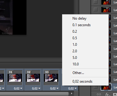
adjust to 5 or 7 seconds, I always choose 7 seconds
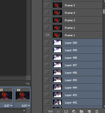
ok now you do this to flatten them frames

dont forget to hold all your frames using shift, just like you deleted them, but now you will flatten them
and then you will delete all the layer stuff till it reach to frame 1
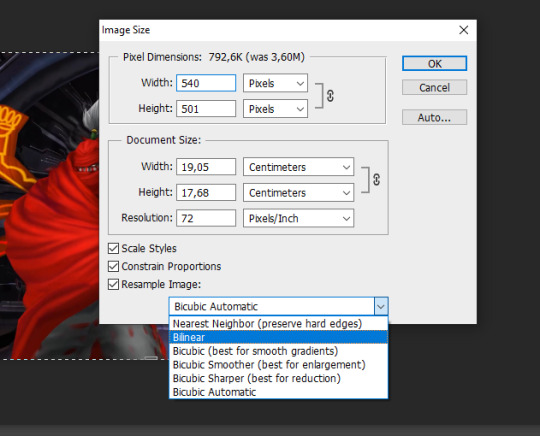
now its the fun part, crop the image with the width master of 540x, the height can be any number
and you will save as bilinear
now you will use an action to sharpen them frames by using an action you can find on google or do by yourself using smart sharpen and recording your action but I prefer a action that someone already did all the work and save us time
just type on google tumblr smart sharpen action, and download the action and use it

you edit the gif now, I like to always use this photo filter
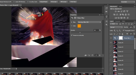
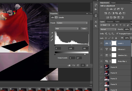
and you keep editing and coloring as you like, I use selective color and use vibrance to give a vivid image
levels I always diminish a little
its time to save the gif but first we will save as PSD so we cant lose the gif we already editted right
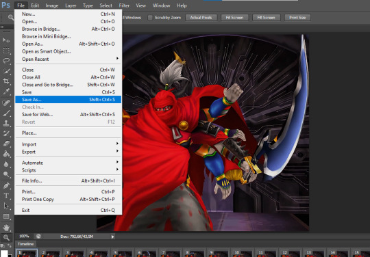
NOW
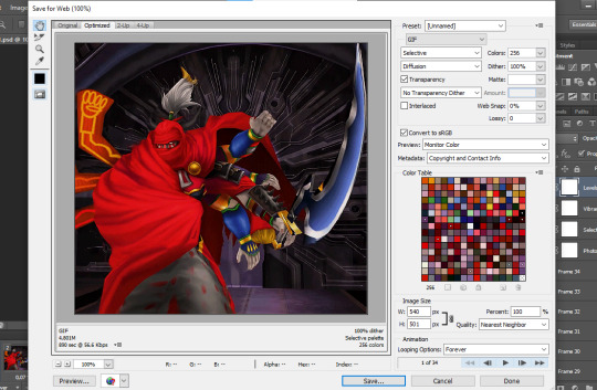
you click as save as web
k you can use my config to save the gifs with good quality
note that you cant make gifs higher than 5mb, so watch out before saving it
congratz, you now know how to gif wheeeeeeeeeeeeeeeeeeeeeeeeeeeeeeeeeeeeeeeeeeeeeeeeeeeeeeeeeeeeeeeeeeeeeeeeeeeeeeeeeeeeeeeeeeeeeeeeeeeeeeeeeeeeeeeeeeeeeeeeeeeeeeeeeeeeeeeeeeeeee

17 notes
·
View notes
Text
Tidbit: Persnickety About Posters
If you want to avoid overly dark or blurry posters in your fan adventures, then follow my lead:
1) Download JPEG off of Google Images.
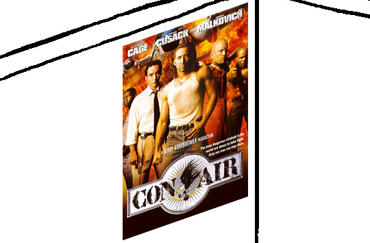
2) Import, scale down, and skew/shear it. Use an interpolation method such as Bilinear or Bicubic Sharper. Doing both transformations at once is better than repeatedly transforming the image (i.e. resizing it, applying the transform, and then skewing it), as it helps prevent the image and edges from becoming too blurry. This will be important later.
You can hold down Ctrl + Shift to constrain the Move tool along a single axis so it won't go out of alignment as you're skewing it. If you don't see the Transform Controls by default, enable it in the tool options bar at the top, or go to Edit>Free Transform.
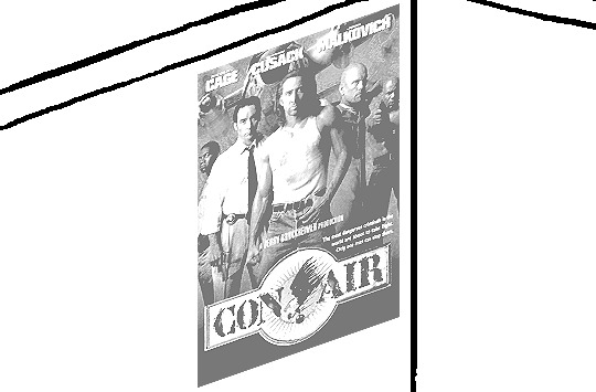
3) Desaturate it. Desaturate means to turn color grayer, until it becomes black and white.

4) Adjust the brightness and contrast using the Levels adjustment tool. It's much too dark as it is! In Photoshop, it is located under Image>Adjustments>Levels..., but I recommend creating an adjustment layer from the bottom of the layers tab instead. Doing so will allow you to make edits non-destructively, meaning you can go back and change any parameters until it looks right.

You could use a Brightness/Contrast adjustment with "Use Legacy" enabled instead to achieve a similar effect, but it won't clip the shadows and highlights as easily. You would have to create an additional duplicate adjustment and turn the brightness and contrast way down on the first one to do so. It's somewhat easier to use but less efficient than Levels in this case.
5) Apply a simple sharpen to the image as it is still too blurry for our purposes. In Photoshop, it is located under Filter>Sharpen>Sharpen... Do not use any other filter, such as Unsharp Mask, unless you absolutely have to in lieu of a basic one. If you must, turn down the radius a bit and the threshold all the way to 0.
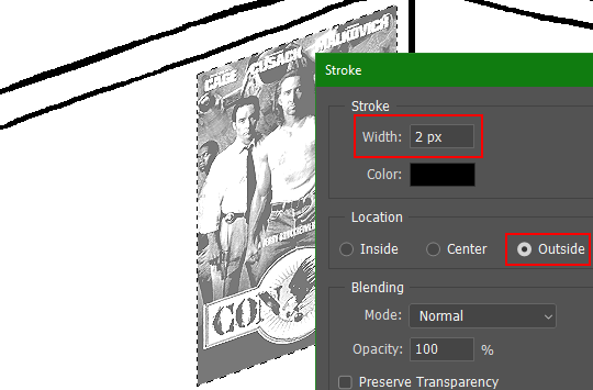
6) Make a selection around the image. Ctrl + left click on the layer's thumbnail to make a selection around it. Doing it this way makes it inherit the level of transparency any pixels have. If you can't, use the Magic Wand tool with "Anti-alias" enabled to select the transparent area outside, then invert it using Shift + Ctrl + I, or go to Select>Inverse.
Create a new layer above the image, then go to Edit>Stroke... and add a black stroke with a width of 2px located Outside. Leave everything else at the default. Doing it this way will create a stroke with anti-aliasing based on the selection you made. This should generally turn out pretty sharp if you follow my advice from Step 2. If you had used the Stroke Effect available from the Blending Options' layer styles, it will always result in a very smooth outline instead. You do not want this.
Voila, and Bob's your uncle, you're done!

The instructions above are Photoshop specific, but it should still be pretty software-agnostic. Here is the recreation PSD, and below the read-more link are additional notes, such as transferring the steps to something like GIMP.
ADDENDUM
You may be questioning why I deliberately made the stroke anti-aliased. "Isn't that an MSPArt cardinal sin??", I hear you clamoring. Well, my dear readers, let me briefly elucidate you on why your ass is wrong. Exhibit A:

The clearly semi-opaque pixels that can be found in every poster outline, which is especially pronounced here in the Little Monsters poster. I can also see that Hussie actually created a stroke on the same layer as the poster and merged it down into the white background like a dumbass. I omitted this in step 6 for the sake of convenience (and also the fact that you can't add a stroke to a smart object in Photoshop without rasterizing it first).
He had to use the magic wand tool in order to extract it from the layer for this panel, and then fill it in with the paint bucket tool. I can even tell he had the color tolerance set up very high on the magic wand to grab all those near-black and very light gray pixels, AND he had anti-alias enabled and the tolerance on the bucket tool set to be at least higher than 0 to tint similar colors. Exhibit B:


I also didn't address exactly how to desaturate something in Photoshop. Honestly it was because I was feeling pretty lazy. I would have had to rewrite step 4 to not include redundant information about adjustment layers. You can add either a Black & White adjustment layer or a Hue/Saturation one and turn the saturation all the way down to 0. The resulting tones will be slightly different from each other but I'll explain why that is in another tutorial.
Speaking of another tutorial, read this one if you believe this post is missing the step of using a posterize filter.
Now onto applying some steps to GIMP.
RE: step 2) In GIMP, there is a dedicated Unified Transform tool separate from the Move tool, unlike in Photoshop where both features are combined into one. This is how you scale and skew (AKA shear in GIMP) both at the same time, among other things such as rotating.
You'll also find that instead of any interpolation methods labeled "Bilinear" or "Bicubic", there are only ones named "Linear", "Cubic", "NoHalo", and "LoHalo". Basically, Linear and Bilinear are the same, so are Cubic and Bicubic, naturally. I guess NoHalo would be similar to Bicubic Smoother and LoHalo would be kind of similar to Bicubic Sharper as well. It's not an exact 1:1, though.
Honestly it doesn't really matter what you use to reduce the size as long as it isn't None/Nearest-Neighbor. You're going to have to sharpen it no matter what. This applies to Photoshop as well.
RE: step 3) Go to Colors>Hue-Saturation... and repeat turning the saturation down to 0, or go to Colors>Desaturate>Desaturate... and select the Lightness (HSL) method.
RE: step 4) Go to Colors>Levels... or Colors>Brightness-Contrast... The Brightness-Contrast adjustment tool already functions almost exactly like in Photoshop with "Use Legacy" enabled.
RE: step 5) In GIMP 2.10, the developers squirreled away the basic Sharpen filter, making it inaccessible from the Filters menu. To use it, hit the forward-slash (/) key or go to Help>Search and Run a Command... to bring up the Search Actions window and type in "sharpen". Select the option that just reads "Sharpen..." and has a description of "Make image sharper (less powerful than Unsharp Mask)". I find that using a sharpness value of around 40 to be similar to Photoshop's sharpen filter.
RE: step 6) Instead of holding down Ctrl, you hold down Alt and click on the layer thumbnail to make a selection around it. Make a layer underneath the image this time since there isn't an option to place the stroke outside the selection rather than the middle. Go to Edit>Stroke Selection... and create a stroke using these settings:

I recommend keeping anti-aliasing disabled however, as GIMP produces lines that are a little too smooth for my taste.

With "Antialiasing" enabled
Without
If you're using a program that doesn't have a stroke feature available, you could draw a straight 1px thick line across the top of your poster, duplicate it, and move it down 1px. Merge them together, duplicate it again, and move it all the way down to the bottom of the poster. Then repeat the exact same process for the sides. I used to do this before I even knew of the stroke feature, haha.
Another reason I had to do it this way was because my dumb ass did the thing I said not to in step 2, scaling down the image with the scale tool, and then shearing it separately with the shear tool. This caused the edges to become too blurry to be used for a stroke automatically. Oh well, live and learn.
148 notes
·
View notes
Text
Loopy (the 3DS capture card maker) has recently released a beta version of their capture software that finally enables 3D capture for their recent N3DSXL capture cards, so naturally I had to test and confirm that yes, it can run through a VR headset via Virtual Desktop!
It's pretty incredible looking, the one downside is the low resolution but you could switch to bilinear filters instead to mitigate the blockiness The 3D effect also gets way more intense due to the bigger screen size, and is where the slider really comes in handy.
If you have one of their current model N3DSXL capture cards you can grab the latest test version here!
44 notes
·
View notes
Text
Minecraft shader that makes the game look like Quake, like it makes everything slightly darker and adds bilinear filtering on all the textures and makes liquids stretch and distort and stuff, and also adds Minecraft PSX-like vertex wiggle. Also, if possible, it lowers the framerate of mob animations.
12 notes
·
View notes
Text
happy mar10, guys.
1 note
·
View note
Text
encoding this video for youtube which has a lot of dark values and subtle gradients which like. it's certainly proving educational, that's for sure.
youtube always reencodes. this cannot be avoided. so your best bet is to use an offensively high bitrate when you upload, to ensure that there are minimal encoding losses on your side of the fence. so far so good.
you try that. you're in macroblocking and banding hell. the video looks like utter garbage on youtube. grrr. you worked hard on this video! there has to be a workaround.
your video is in 1080p. you heard that if you upload a video in 1440p or 4k, youtube will enable its more efficient VP9 codec. your co-animator upscales the encode to test this. you make noises of consternation about encoding an encode, but it's a worthwhile experiment. the trick does enable vp9, but the 1080p still looks like shit, and even the 4k is macroblocking - the macroblocks just look smaller on a sub-4k screen.
you know about a thing called 10bit colour. this uses an extra two bits per channel, you can use it with hdr or sdr colour. most displays only take 8bit, but you can dither from the 10bit to get nicer gradients and stuff even on an 8bit display, which might be more efficient than trying to encode the dither patterns.
however, youtube only uses 10bit colour on hdr videos. you look up a guide on how to encode hdr from blender. it tells you to set up blender to use an industry standard set of colour profiles called ACES, then export a series of bt2020 16-bit tiffs, and then encode them with the proper hdr metadata using a program such as Hybrid. you aren't familiar with Hybrid so you try using an ffmpeg command you found on stack overflow instead. the result in your player is incredibly dark. turning on hdr on your monitor helps not at all, and on youtube it's butchered worse than ever. you must have done something wrong. you download Hybrid and try to encode to hdr exactly as the author of the guide did. it still looks like shit. you must have done something wrong. maybe it's a problem with the input.
you give up on ACES and bt.2020, and decide to just make the best rec.709 encode you can. you make some more 16-bit tifs using the familiar Filmic transfer function, and set Hybrid to encode them at 10bit - youtube will probably just truncate to 8 bits but at least it will look nice on your screen at home. and you set it to upscale to 4k - with lanczos, not bilinear, thank you very much - and also make a version with a debanding filter, just in case that helps.
it's now 6am. the encode is taking a while. (so much for fixing your sleep cycle.) will it work? who the fuck knows. maybe you've just found more ways to make the video look worse...
20 notes
·
View notes
Text
A handful of iconing tips & tricks that you may or may not already know.
Always lock your aspect ratio when scaling icons!
Don't scale your icons up- at least, not without a dedicated upscaling program / service. Upscaling with most programs' transform tools will look messy. Try to get the highest resolution scans / images you can and scale down.
Set the filter for your program's scaling tools to bilinear. I'm sure there are other options that get clean results, but whatever you do, don't set it to nearest neighbor, or you'll get crunchy / pixelated results. ( if you want pixelated results, I suggest using a filter instead. )
Windows often come with a free program called Snipping Tool already installed. You can bring up the snipping tool by pressing the Windows key + Shift + S at the same time, and set it to take caps of your screen, individual program windows, or a rectangle you click and drag. I recommend using the lattermost option.
You can also set snipping tool to automatically save any of your screenshots to a dedicated folder, though you will need to launch the program itself to access those settings instead of using the hotkey. This makes gathering caps quick and seamless- just click & drag away!
Many video players will let you use the , & . keys to go through the video frame-by-frame. Helpful for capping icons from animated sources.
You can use some programs' features to save your icons out all at once, layer by layer. What steps you need to take in order to set that up depends on your preferred program's capabilities, but I've made a tutorial for how to do it my program of choice ( Krita ) over here!
#not icons#tips & tricks#tutorial#I might remake this with screenshots sometime later#but for now I want to share my discoveries from over the years...#Save your time ( and your hands! )
2 notes
·
View notes
Text
Fell down a rabbit hole today and learned all about the exciting world of digital filters (bilinear transforms and discreet time domain and all that fun)
5 notes
·
View notes
Text
Как запустить SimCopter (1996) на Windows 10/11 в 2025 г?
Одна из самых любимых нами компьютерных игр 90х - SimCopter - вышла в далёком 1996 г., когда в России даже бюджетный компьютер считался роскошью, а интернет тогда только начинал набирать популярность.
В этой статье я вам покажу мой способ запуска этой игры на Windows 10/11. Это далеко не панацея, но всё же советую попробовать. Для этого нам понадобятся игра SimCopter (на примере версии 1.2) и программа Dxwnd (у меня версия 2.06.06).
Для запуска игры необходим эмулятор дисковода (у меня Alcohol 120%). Поэтому смонтируйте образ скаченной игры (если она не скачена - скачайте её).
Затем создайте новую папку в удобном для вас месте (у меня игра установлена в директорию D:\Application\Old Games\SimCopter).
Зайдите в корень образа игры (у меня образ смонтирован в виртуальный дисковод G:\, но у вас буква дисковода может быть другая), затем зайдите в папку "SIMCOPTER" и скопируйте всё её содержимое в вашу директорию с игрой.
Зайдите снова в корень образа игры, затем - зайдите в папку setup\System и скопируйте файлы glide.dll и sst1init.dll в директорию с установленной игрой. Не извлекайте образ диска с игрой, так как без него игра не запустится!
После всего этого у вас должно получиться так, как у меня на скрине:

Затем перейдите в папку с установленной игрой, кликните правой кнопкой мыши по файлу SimCopter.exe, перейдите на вкладку "Совместимость", кликните на кнопку "Изменить параметры высокого DPI", поставьте галочку "Переопределите режим масштабирования высокого разрешения. Масштабирование выполняется" и в списке ниже выберите "Приложение". Нажмите два раза OK.
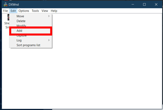
Но это ещё не всё. Скачайте (если она у вас не скачена) и запустите программу Dxwnd (ссылка на скачивание).
В самой программе Dxwnd выберите в меню Edit=>Add...
Во вкладке Main рядом с полем Path кликните "...", в окне выбора файлов перейдите в директорию установленной игры (у меня это D:\Application\Old Games\SimCopter), выберите файл SimCopter.exe и нажмите OK. То же самое укажите и в поле Launch. Затем в поле Name укажите название игры (у меня это SimCopter):

Перейдите во вкладку OpenGL и поставьте галочку Hook OpenGL:

Перейдите во вкладку Video, в разделе Window style поставьте галочку Lock win style, затем в разделе Initial virtual color setting выставьте переключатель в положение 8 BPP. После этого поставьте галочку Limit resolution и укажите разрешение экрана 640x480:

Перейдите во вкладку DirectX, в разделе AERO Handling снимите галочки Set AERO compatible mode и Optimize for AERO mode. Также в списке DirectX version hook выберите DirectX 7 и поставьте галочку Full bilinear filtering:

Перейдите во вкладку Compat., в разделе Fake version поставьте галочку и выберите Windows 95 или Windows 98/SE:

По окончании настройки нажмите OK.
Надеюсь, вам это руководство помогло освежить ваши воспоминания. Подписывайтесь, ставьте лайки, комментируйте и делайте репосты! Всем пока!
0 notes
Text
EE 569 Digital Image Processing: Homework #1
Problem 1: Image Demosaicing and Histogram Manipulation (45%) (a) Bilinear Demosaicing (10%) To capture color images, digital camera sensors are usually arranged in form of a color filter array (CFA), called the Bayer array, as shown in Figure 1. Since each sensor at a pixel location only captures one of the three primary colors (R, G, B), the other two colors have to be re-constructed based on…
0 notes
Text
Its a huge shame how adrenaline forces bilinear filtering when pressing the PS button.
I hope someone resolves that soon
1 note
·
View note