#BUT I MEAN JUST LOOK AT THE PREVIEW GRAPHIC DESIGN
Text
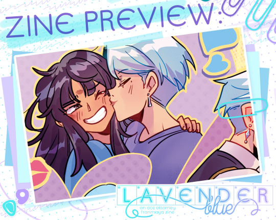
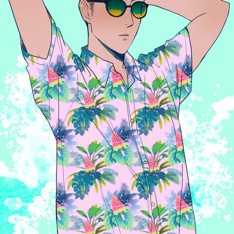
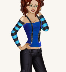
hi! franmaya zine preorders are open right now over with our friends @aafranmayazine 💙💜
please check it out for some super high quality lavender blue GIRRLLLS OH MY GODGe WOMEN HOGUHH WOWEE woah sorry something possessed me there. shop link below!!
🛒 aafranmayazine.bigcartel.com
#ace attorney#fanzine#preview#franmaya#franziska von karma#maya fey#PLEASE IT'S SO CUTE AND THE AESTHETICS POP OFF SO HARD#THE WEALTH OF FRANMAYA CONTENT... RIGHT AT YOUR FINGERTIPS#it is really really gorgeous I am at a loss for words at how to describe#BUT I MEAN JUST LOOK AT THE PREVIEW GRAPHIC DESIGN#DOESN'T IT GO SO INCREDIBLY HARD#LIKE LOOK AROUND MY ART FOR A SECOND#GRAAAHHHHHHH#and of course a stellar mod team as usual#everyone did such an AMAZING JOB!!#come get your franmaya JUICE!!!
206 notes
·
View notes
Text


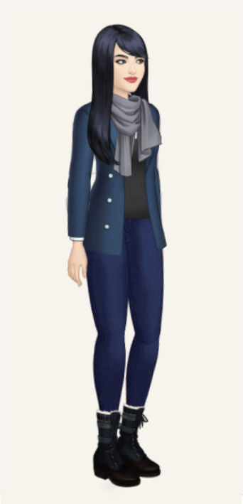
𖥨 ̟⊹♡ MUSEY .
she might be nearly late , but that doesn't mean she's not here to make a statement . . . introducing my latest theme , MUSEY. , a code designed with an indie / rp blog in mind . this theme will be receiving a muse page tab update next month , so please be on the look for that ! this theme is super customizable , easy on the graphics , and i am so excited to see what u all come up with when putting together this theme . as always , if u encounter any issue within the code , pls let me know and i will troubleshoot asap !
if u intend on using this theme or just want to be a supportive hottie , please give this post a like and a reblog ! stay hydrated and be sure to pet a cute animal today ! mwuah ! 🤍 🤍 🤍

ⅰ. THEME FEATURES .
x. optional top bar / wave design
x. optional top bar content / subtitle / icon container
x. optional grayscale top bar icon
x. optional full height right sided bar w / optional bg img
x. optional gradient overlay on sidebar img
x. optional subtle blinking stars w / toggles for the top bar stars and the sidebar stars respectively
x. toggle post size
x. accessible font size toggle
x. un - contained post design
x. gradients for an aesthetic pop
x. one extra link for ur use
x. navigation tab w / subtle fade in animation
x. 8 editable links within the navigation tab
x. for a more detailed compilation of credits and features , please see the google doc containing the code
𖥨 ̟⊹♡ this page is a patreon exclusive : want access ? consider signing up to join the fam - a - lam to get ur hands on this page as well as my entire coding catalogue . click here to learn more !
source link directs to a live preview of MUSEY.

#rph#rp theme#indie rp theme#rpt#premium theme#supportcontentcreators#fyeahpoc#mine#themes#rec#for patreons#for patrons
49 notes
·
View notes
Text
So my thoughts on the Dawntrail keynote:
Going feral over Solution Nine, they really went heavy on the cyberpunk and I'm here for it. Slightly concerned that they're going to be split too much between themes and fronts and it might end up like Stormblood 2.0, which I like Stormblood but I get the issues people have with it.
I called Pictomancer and it looks really cool I'm happy with it, I just think it would be better on Alphinaud since he was kinda the established Scion Artist, but Krile deserves the chance to shine and Alphinaud's arc into sage was fitting well enough so...
Do kinda wish we were just doing South Tural, not the entire new world, but I guess that means Meracydia sooner sooooo hurray!
Skipping the Stormblood MSQ ultimate and going right to the Shadowbringers Raid ultimate is an interesting move, I hope Stormblood doesn't get skipped forever. Also still holding onto hope that we'll one day get Trial Series ultimates, but that seems unlikely. I've also never cleared an ultimate or attempted any outside UWU so I don't really have the grounds to be talking about ultimates but the sudden inconsistency has me curious.
Character model graphics previews looked pretty good except some of the darker skinned example characters seems kinda shiny? like they'd been doused in baby oil.
Femroths looked really strange at first but I think the design is growing on me, have to wait and see how they look in game I guess? (Remind me of Khajiit from Elder Scrolls.)
So a decent couple of people were missing from the Key art shown at the end of the Keynote, like G'raha, Y'shtola, Estinien, and the Twins. My personal theory is that they're going to be on the other side of the Scion split, which is confusing because I can see Alisaie and Estinien siding opposite the WoL out of competitive spirit, Y'shtola doing it for fun, but Alphinaud and G'raha opposing us is breaking my heart and now I'm really curious about how the Scion split is going to be handled.
#ffxiv#final fantasy xiv#ff14#final fantasy 14#ffxiv scions#scions of the seventh dawn#ffxiv dawntrail#dawntrail#final fantasy xiv: dawntrail#ffxiv krile#krile mayer baldesion#g'raha#ffxiv g'raha tia#g'raha tia#alphinaud#ffxiv alphinaud#alphinaud leveilleur#alisaie leveilleur#ffxiv alisaie#thancred waters#ffxiv thancred#ffxiv urianger#ff14 urianger#urianger augurelt#y'shtola rhul#ffxiv yshtola#ff14 estinien#estinien#estinien varlineau#estinien wyrmblood
11 notes
·
View notes
Text
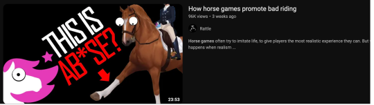
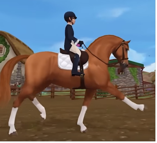
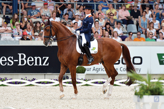
i haven't bothered to watch this video but based on the preview it seems they're saying that the hyper extended trot in dressage is abuse?
I hope we can all understand that the riding you do in video games has no real basis in reality, so I won't even touch on that beyond noting that this is what the extended trot looks like in the video game:
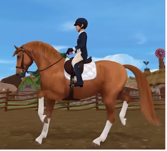
There is zero contact with that horse's mouth, lol. Also, not a dressage saddle. I assume it's due to the limits of what you can design in a video game. So no one should be learning how to ride dressage from a video game.
However, the hyperextended trot is not abuse, it's just a flashy thing bred into warmbloods at this point, like how hackney ponies naturally have high-stepping trots. Dressage judges love it, even though it often results in poor dressage.
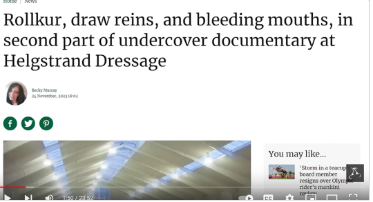
Dressage is full of abuse, most notably what we call "rolkur", which is forcing a horse's face into its chest. This can actually affect their breathing and can result in the sudden "blowups" you occasionally see of horses in the dressage ring, often caused by low oxygen to the brain (thus resulting in reactivity and confusion). It's very bad!

The video actually does point this out, but for whatever reason they focus on the toe flick instead of the news headline they actually show on screen, which yes, are actual abuse and a big problem in competitive dressage.
The video does discuss rolkur. But the video game doesn't show rolkur?? This horse's head is actually high by dressage standards, not pinned to its chest at all. Why would it be, you could drive a house through the loop in this rider's reins lol.
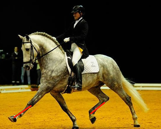
And honestly, its extended trot looks fine. There are much worse examples of how the toe flick can result in bad dressage. With the trot, you want to see full engagement from the HIND end, which means your horse must be driving itself from the rear. This should result in a hind leg and foreleg angle that matches. See that this more or less does:

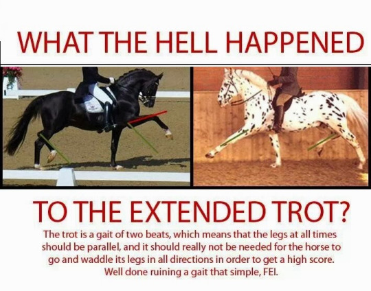
If you wanted to look at a bad example, THIS is very bad form:

Notice the angles are all out of whack. This is a horse highly engaged in the FRONT, not the behind.

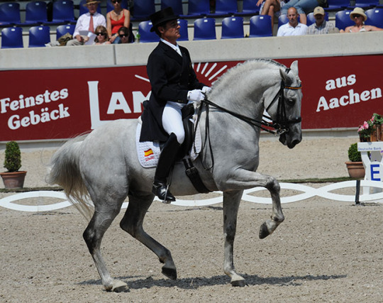
There ARE highly extended trots that are still GOOD extended trots. Look at this Andalusian

The toe is UP, but that hind leg is right there with it. This horse is still driving itself from the hind. Just because the trot is animated doesn't make it bad.
this disconnect is why you'll find graphics made by classic dressage people that look like this. There is a faction of (objectively correct) dressage riders who have come to associate the toe flick with bad dressage, but it's not necessarily always true.
These issues crop up in the piaffe, as well. The piaffe is the most extreme form of collection, and with all things dressage, should be driven by the HIND end. This means that a horse is so collected, so driven by its hind legs, that it basically "sits" back on them, which is why the Lipizzaners then continue onto the Levade.
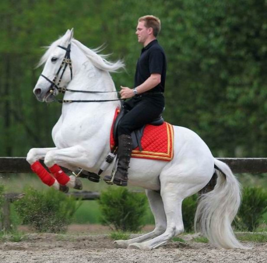
(This is not a rear; it's a dressage movement only highly trained and conditioned horses can do)
So if you don't have that hind end motoring you, you end up with a piaffe that looks like this, which is... bad.
compare it to the form of the correct piaffe, where a horse is almost "sitting down" in the back.
Also, because it's my favorite video of a piaffe, please enjoy this guy doing one backwards.
youtube
THAT is a classically trained horse; you can see the slack in the reins, so you know his head isn't cranked in. He's also a Portugese breed (Lusitano), and both Lusitanos and Andalusians have naturally animated/expressive movement that I think the warmblood world has tried to copy to mixed results (because they aren't nearly as small/compact). So you end up with toe flicks without any of the power that Andalusians/Lusitanos tend to bring with them.
However, it's not impossible to get a big horse to do proper dressage. This dude is like 18 hands. From what I can tell, he seems relaxed and happy, and his piaffes are great. The extended trot is big but still seems synced with the hind end. Notice he's not flicking his tail constantly (which can be a sign of irritation). Also, I think a lot of people seem to think a rein with contact=tight rein, but if you know what you're looking for, you can tell the difference between a cranked in rolkur rein and light contact. This guy has pretty light contact on this horse's mouth, so he's holding his head in that way because it's his natural (working) headset.
youtube
#for someone who doesn't ride dressage I have a lot of dressage opinions lol#i can see why older women like it tho#a lot safer than jumping aha#Youtube
4 notes
·
View notes
Text
Sim City Prints - Britechester Edition
Well here we are finally! Didn't mean for such a gap from teaser to post but life and such. Plus I went overboard on previews, thumbnails, general scope as always! lol
youtube
Preview video so you can see all the options!

Sim City Prints - Britechester Edition
The first of maaaany more! I went nutso this time around. Few things are different though. First, I've done one package per world so the full frame and matboard versions are combined. Bigger files but easier and less confusing. I over-complicate things just look at my bikini re-colour if you need proof. Second, I've heavily leaned into a theme for each world which I'll continue going forward. Kinda did this before. I'm a motion/graphic designer/illustrator by trade so I went beyond even my usual preview obsession and made a video lol. Previews arey my best life. Third, I'll be releasing the worlds separately as I've created much more work for myself of course. Evergreen Harbor and Sulani to come!
New mesh
Base game compatible
x8 prints x2 frame colours (black/white) x2 frame styles (full frame/matboard)
48 polygons, 76 vertices
Please let me know if there's any issues with the download!
Download!
#ts4#sims4#ts4cc#sims 4 cc#ts4 download#ts4 screenshots#ts4 buy mode#sims 4 buy mode#ts4 decor#ts4 deco cc#ts4 buy cc#sims 4 buy cc#stellarelitecc#stellarelite#Youtube
168 notes
·
View notes
Text
Was no one going to tell me that my beloved Lorem ipsum text block actually has a rad history and meaning???
So basically in the 1500s people would make little booklets to show off available fonts, and would use bits of old Latin Classics as the placeholder text. (Cause they were popular and cool and Latin was a language that like worked the same amount across the continent or whatever. Bc no one really spoke it but it looked good. Idk.)
That aside, the Lorem ipsum text block doesn't like, mean anything really, even in Latin. But! It's not totally nonsense.
It's actually sort of jumbled together from a Classical Latin text, De finibus bonorum et malorum ("On the ends of good and evil") by Cicero. Maybe someone's cat walked over the printing press or something.
From Wikipedia: "The first two words themselves are a truncation of dolorem ipsum ('pain itself')."
That's??? Fucking metal???
(My beautiful girl "Ain itself." Incredible.)
Wikipedia also has a section that highlights the bits of the text (with translation) that was put into the Lorem ipsum block, and if you read it, it's basically Cicero saying "There's nothing wrong with having nice things just cause it's nice and also there's nothing wrong with avoiding pain because it sucks. Just like, if it gotta be like that, it gotta be like that. Don't be a dumbass." Which is pretty cool of him, I think.
I can't believe I took three whole years of Latin in school and no one told me about this.
anyway my sources are Wikipedia and Britannica, links below if u wanna see for urself
and if u have any more info to add please share it i need to know, it's actually really essential that u tell me about it
#konword#Lorem ipsum#Latin#also i think it's important that everyone should know just for fun#the Romans pronounced Cicero's name 'Kee-keh-roh'#[ˈkɪkɛroː] in IPA
9 notes
·
View notes
Text
Breaking News from The Front Line: BTE Project Update and Goodies
Greetings, Dan here!
I come with news! Admittedly probably should have given you all an update before now. I'll see what I can do about that, but yes, the update! To begin with, Beneath Twisted Earth Free Version 1.2 along with an updated character sheet are now available to download. These new editions of the documents include some corrections, tweaks, and small additions. Specifically, the character sheet is mostly the same, just with a spelling correction. For the free rulebook, I made some small corrections in various sections, alphabetized the equipment in the garage to make it a little easier to find the equipment you're looking for, and in the same section added some rules for selling back your used parts to the garage.
Next, regarding the print and premium pdf versions of the game, progress has been slower than anticipated. They are about a third of the way completed. Unfortunately, that means my original estimate of Fall 2023 release is unlikely. I am currently in talks with a new graphic designer to see if we can speed up final production. With luck we might have it complete before end of year, but right now we're expecting a more conservative release of early 2024. The plan is still to have a print version go up on DriveThruRPG, as well as a premium pdf with some elements unique to that version on both platforms. For no though, enjoy some more previews of the art that JGD has been cooking up for it.

Lastly, I just wanted to touch on some other plans in the works. I'm working on creating a community discord for Beneath Twisted Earth to serve as a gathering place for anyone interested in the game, but also include the tools players would need to run games in a centralized place. I don't have an estimate on that yet, but will post again when it's ready to go live. Also, for those of you who stopped by to check out the Mech Showcases, I'm going to be reworking those builds to remove the copywritten names. The new versions will then be bundled together into a pregen-mech pack for GMs to use as needed. I may even squeeze in one or two more mech showcases before then for mechs I've been wanting to build. (I'm looking at you Scopedog.)
Ok, that's it for now. Hope you all enjoy the new art and Free Version of the game. I look forward to seeing you all at the full release of Beneath Twisted Earth.
Until then, thank you for your continued interest!
4 notes
·
View notes
Text
in addition to my usual top 10's the last couple of years i made an extra top 10 list for funsies (2020 list of top 10 wlw medias and 2021 list of top 10 webcomics for posterity) and i wanted to take this year's list as an opportunity to shout out some cool artists/shoprunners out there (and also drag myself for my poor self-control) so this year I present:
Sarah's Top 10 Impulse Purchases of 2022
(notes: links to stores where applicable; also this post features my personal pics so some of them include my face and/or body, don't be jumpscared)
10. Uchuu Summer (feat. Private Caller Hawaiian Shirt and Watermelon Pop Hawaiian shirt)

Shout out to Jacob & Karina Drawfee for wearing their cool shirts from this rad artist-owned store during a livestream which prompted me to buy two of my own shirts as the stream was happening. no model pics bc these shirts just recently came in (these previews are pulled from the website, also just want to say their preview art goes so hard) but when summer comes round again i will have infinite rights
9. Awesome Socks Club
(i don't have any cool pics yet for this one either because the subscription starts at the beginning of 2023 but look at the past designs on this website and tell me they don't absolutely fuck)
I saw a tumblr post from Hank Green about his socks subscription service where each month they get a new indie artist to design a pair of socks and all of their profits go to charity and look. i couldn't not do it. i fucking love weird quirky socks i was doomed from the moment i saw the words "awesome socks club".
8. REGALROSE (feat. Betrayal hoop dagger earrings)
REGALROSE is a UK based company that makes supremely badass jewelry. i picked up these dagger earrings to complement a wedding outfit and i think it worked very well if i do say so myself. Tbh very challenging to get good close ups of these lol so you're just gonna have to take my word for it that they're just as cool and badass in person as you might imagine. Favorite earring purchase of the year hands down!
7. Across a Field of Starlight by Blue Delliquanti
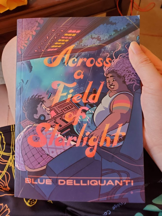
Became a huge fan of Blue Delliquanti after reading their excellent webcomic O Human Star (HUGELY recommend if you're in the mood for good sci fi with strong queer/trans themes btw!) and was thrilled to find out that they were coming out with a YA sci fi graphic novel with nonbinary protagonists earlier this year. Even more thrilled to discover how tender and heartfelt the story was!! Highly recommend for any graphic novel/sci fi enthusiasts!!
6. An Assortment of Records


My parents got me a record player for my birthday this year so obviously i had to buy the fuck out of some vinyls(there are plenty i bought that aren't pictured here but i was too lazy to scrounge up every single pic i have on hand of my records skdjfnskdnfs)
5. Sleepy Peach (feat. Choose Violence sweater vest, Locals Only bomber jacket, & Bird of Paradise cardigan)
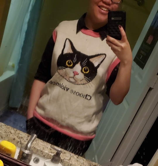


Sleepy Peach is an independent clothing store that makes some bombass clothing, so colorful and fun and eyecatching! a friend sent me a link to their Instagram and i went OOH and never went back. I basically lived in the bomber jacket for most of the year and i have absolutely no regrets
4. Classics but Make it Gay: Volume II (edited by Nova & Mali)

Nova & Mali are a small queer publishing house that puts out some really incredible queer-themed art books and projects. This is part of a series that reimagines classic art through a queer/trans lens and it's absolutely gorgeous from start to finish, featuring so many talented artists it honestly blows my mind. They're planning on putting together a Volume III next year which I'm really looking forward to supporting!! (i also have digital copies of Cover Me Queer, an art book of queer-themed romance novel covers, and their Our Flag Means Death fanzine and they're both fantastic, just some outstanding work from these folks)
3. The Calorum Cookbook (unofficial Dimension 20 inspired fanzine)


Dimension 20's "A Crown of Candy" has an INSANELY talented fandom, it's truly jaw-dropping. The Calorum Cookbook is a charity fanzine cookbook inspired by ACOC's world that collects original recipes and TONS of amazing accompanying fanart and spot art. The layout is so professional and aesthetically pleasing, the recipes look so delicious (can't wait to try my hand at some of them!) and they even all come with little blurbs of in-world fanmade lore that put the recipes in the context of the show's setting in such a fun and creative way! Everything about this zine delights me and I'm so glad i decided to purchase a physical copy so I can hold it in my hands with childish delight and wonder. unfortunately i don't think they're selling physical copies anymore but I still recommend checking out the featured artists and contributors, this is a cool bunch of people!
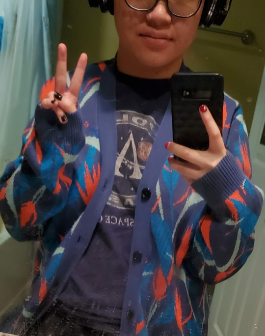
2. Kinwamonster (feat. Monster Train bag, Big Bad jacket, & Home sweater)
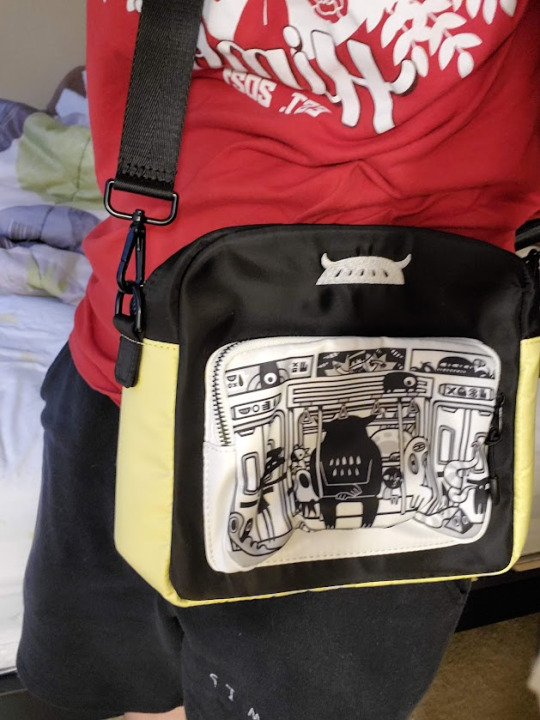

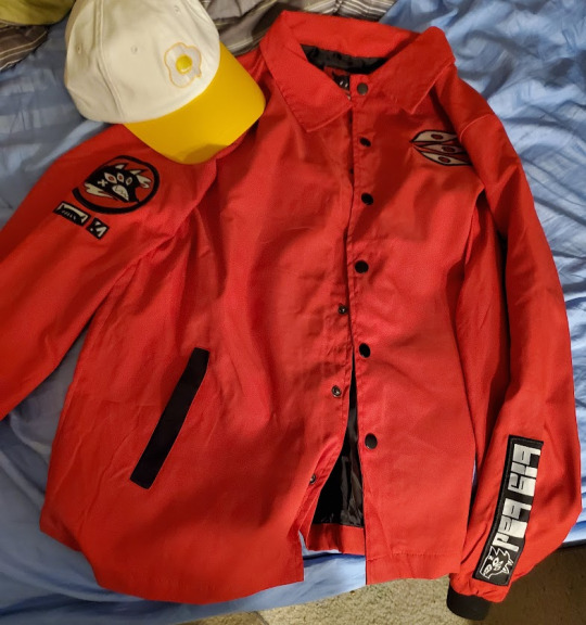

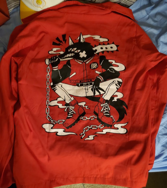
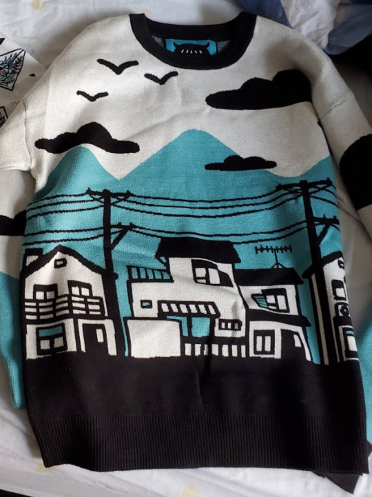

One of my favorite independent clothing brand discoveries of the year! run primarily by one artist, i'm just so in love with the aesthetic and the quality of these products. This sweater is seriously the comfiest thing i own and i use the monster train bag for everything, it fits basically everything i need when I'm out and about. don't even get me started on this jacket, if it were possible to put it on and never take it off I ABSOLUTELY WOULD. I think they're currently on break but I'm really excited to see what they'll release in the new year!!!
1. Original lineart of Princeps Zortch from Dimension 20's A Starstruck Odyssey (by Amy Reeder)
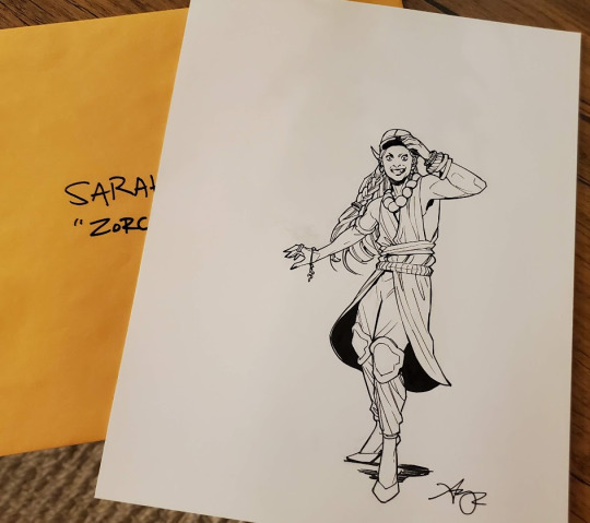


This is undoubtedly one of the coolest purchases i have ever made in my goddamn life. unfortunately i am so hopelessly lazy and haven't gotten a frame for it yet so it's basically just sitting on my bedroom wall right now but MY GOD it is glorious. Thank you Amy Reeder for making such wonderfully compelling character art for dimension 20 and for the amazing opportunity to get my hands on the real actual lineart of my favorite npc of my favorite d20 season!!!!
#sarah.txt#facepics#2022 recap#not sponsored lol#honorable mention to my nail polish obsession#i'm too lazy to take a pic of all the polishes i accumulated this year but rest assured. there are many.
2 notes
·
View notes
Text
how i make my posts: what should be a simple guide
i’ve gone through various formats of posts and i’m going to try to cover as much as possible in seven slides of text so bear with me
— FORMATTING —
there are so many options when it comes to choosing your format, and you can even combine some together which is what i do.
custom (most of my covers and my light academia theme)
twitter (my early posts)
tumblr (came later in my themes)
notes app (i haven’t done this myself but i’ve seen it before)
right now and for my past few themes, i use a combo of custom covers that i design myself using canva, tumblr to write my posts bc i find it the most versatile and easy to use, and twitter for my call out posts!
another thing to think of when it comes to formatting is how you want your account layout to look. a classic is the checkerboard, where you switch between too different formats of post covers like i do. you can play around with this too!
— ACCESSIBILITY —
one of the most important things is making sure that your fonts are readable, especially when it comes to making custom posts.
there’s nothing wrong with using stylized fonts—i’m a sucker for pretty fonts too—but if you do decide to use a font that may be harder to read, i strongly advise you to include an alt text as while. you can see this on my post covers too :)
i normally try to incorporate 4-6 different fonts that compliment each other well: one stylized font for titles, a sans font for alt text, a serif font for other text, and sometimes a few others.
also consider the colour of your font against the background. usually i go for a darker background image and a white font bc i think it looks more elegant, but that doesn’t mean you can’t make your own style too!
— APPS —
canva. that’s it. the app that will save. your. life.
i use canva for literally everything related to my account and i have since i started it. it’s very user-friendly and the more you use it the better at it you’ll get!
canva offers so many options even if you only use the free version like me. it has so many fonts and graphics and effects, the possibilities are endless!
i also use pinterest for photos and a feed preview for instagram that lets me see my post layout before i actually post anything!
canva!!
pinterest
picsart
feed preview
— CAPTIONS —
can you believe i put almost as much work into my captions as i do my posts. what can i say, i like pretty things.
the basics to include in a caption:
a space for what you want to say
qotd + aotd
follower count (if you want!)
the date
a mini promo space
hashtags
there’s a lot more you could put if you wanted, but i think starting off with the list above is the way to go.
i have font keyboard apps that let me stylize the caption further, and i also use online text divider sites where you can copy and paste the text dividers and add them where you want.
— ADDITIONALLY —
to increase reach and engagement, you can share your new post to your story to alert followers and remind them to check it out themselves!
another thing you can have is a tag list. this is a list of account mentions consisting of followers who have asked to be on it that you post in the comment section of your posts. a simple poll on your story for ppl to ask to be on it works great!
don’t add people to your tag list who have not asked to be on it. especially if they don’t follow you. it won’t encourage them to engage with your post and it’s blatantly disrespectful imo. so just pls don’t do it!
at the end of your posts, you can have a promo slide, commonly called an end card, that encourages ppl to follow for more of your content. i will do another post on how i make my end cards soon! <3
3 notes
·
View notes
Text
Game Informer Magazine (November 2019, Issue 319) Scans
I try to focus on mainly scanning older items, but I found this Game Informer magazine and couldn't pass it up.
I mean gosh, anything pre-Covid may as well be a relic, right? (jkjk)
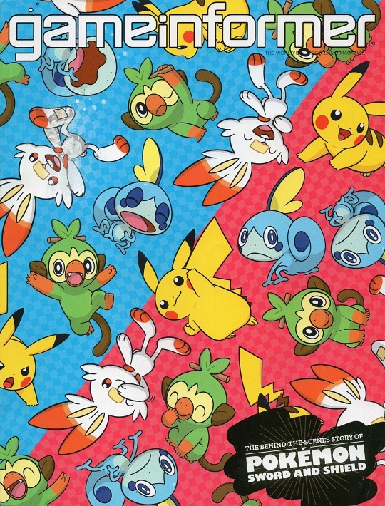
Unfortunately the front cover is a bit damaged, but I still really love this art collage of Pikachu and the Sword and Shield starters!
Here's some scans from this issue that I like!
Starting off, here's the fanart page.
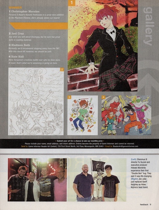
These fanart/personal creation corners are my favorite pages in hobby magazines. It makes me so nostalgic for being a preteen and wanting to make and submit my own art in hopes of it being featured!
When I was about 13, I was obsessed with DeviantArt. My dad showed me how to use the scanner so I could scan my own art and post it (on the family computer, of course). My sister came to me one day and asked me to scan her comic that she wanted to submit to the in-game Club Penguin newspaper/magazine.
I didn't play Club Penguin much (I was a Neopets girl), but I fondly remember her being so proud of that comic. I helped her scan and submit it, and asked her every day if it got put into the paper. I don't think it ever did, but it was a fun time waiting to see if it would.
Speaking of Neopets, I also really loved the Neopets paper. I'd spend hours browsing backlogs of the paper to look at the fanart and read the fanfiction that was posted there.
Good times!
----
I thought this League of Legends art was super neat, but the whole premise of this article is hilarious to me.
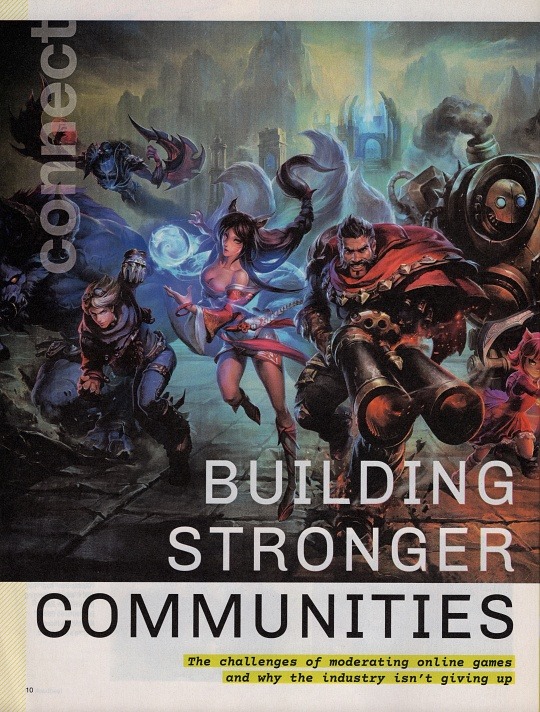
Like...ok, Riot/League. iykyk.
I'm a fairly new League of Legends player - I started playing after watching Arcane. My bf has been an on-again off-again League player, but I was always too intimidated to get into it. I actually got into it first from Team Fight Tactics, and then started playing ARAM, and only recently started dipping my toes into Summoner's Rift.
Anyways, as much as I love the game, people can be SO mean. So just seeing the article title and thinking of all the rudeness I've seen in-game is pretty funny. I know a lot of good people play and work on this game though, so I appreciate the optimism and work to make the community better.
Granted, this article isn't only about League of Legends. But I think having them as the front cover for the article is kind of hilarious.
----
As a Pokémon fan, I thought this top ten page was a fun look at past gym leaders, especially considering the cover story for this issue is about the new (at the time) Pokémon mainline games.
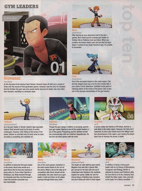
The judging criteria is not clear at all. That's ok, there doesn't need to be a reason to do a top ten list - I'm assuming these are just this guy's favorite gym leaders. It is refreshing to see some leaders who don't normally wind up on these kinds of lists though, like Wulfric, Maylene, and Korrina.
This is really wanting to make me go back and play Let's Go! Pikachu lol.
----
Ok, so admittedly I knew nothing about Baldur's Gate 3 until the day it came out and I was like 'What the heck is this game everyone on my friend's list is playing?"
My bf ended up buying it for me and we played it co-op. Definitely deserved all the hype and praise it got.
So color me surprised when I was flipping through this magazine from 2019 and saw mention of Baldur's Gate 3.
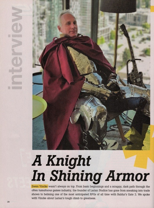
There's a whole interview in here with the founder of the BG3 game studio. I knew this game was in development for many years, but I just completely missed the hype leading up to it.
----
Now some scans from the main cover story about Pokémon Sword and Shield.
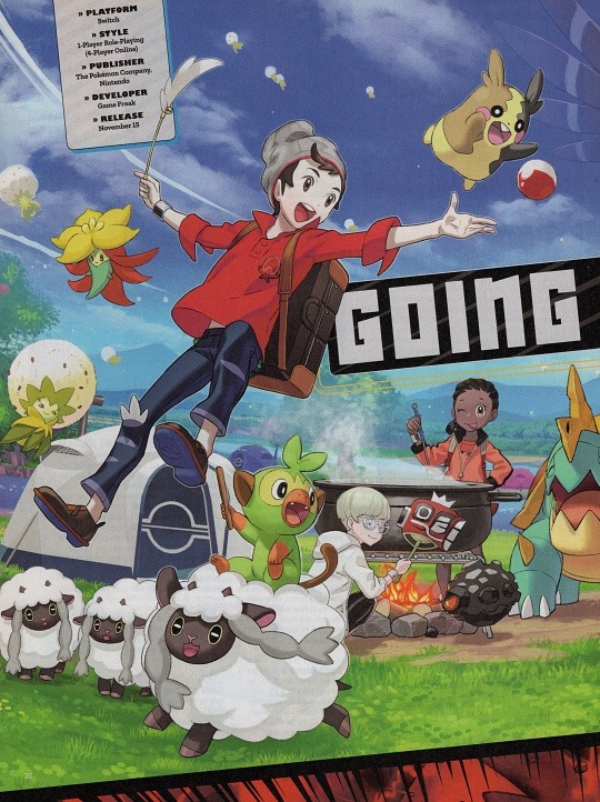
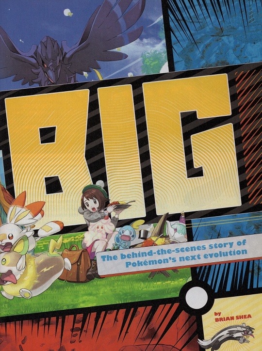

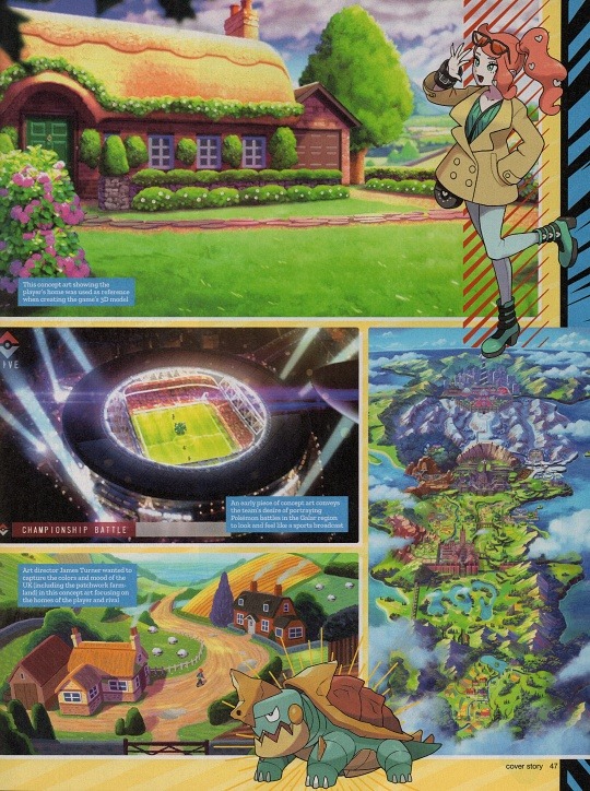
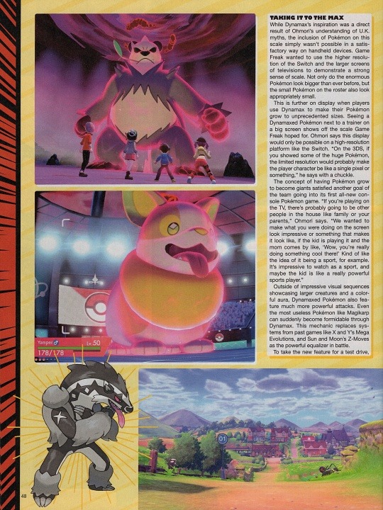
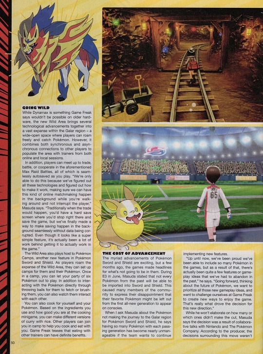
These aren't all the scans from the spread, but I just wanted to show some of them off! I love multi-page stories about things where they feel almost like scrapbooks with how the graphics are arranged.
----
Here's a preview about the Final Fantasy VII Remake.

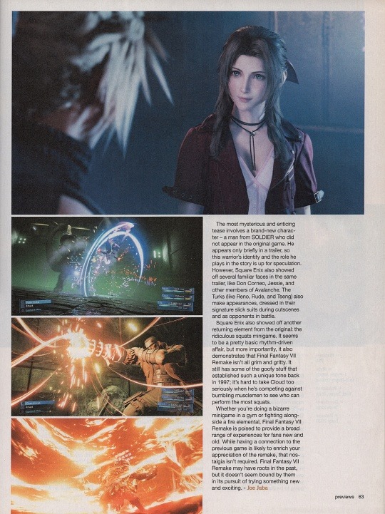
I've never played a Final Fantasy game, and though I'd love to someday, I'd have no clue where to start. I do love the character designs and I thought this game looked beautiful when it was announced.
And some more previews for various games.

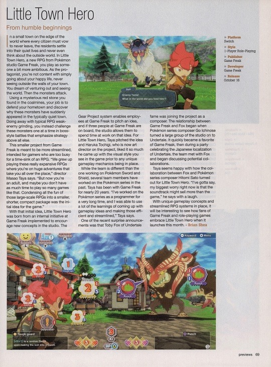
Little Town Hero was actually on my radar at the time, as it gave big Fantasy Life vibes (and I LOVED Fantasy Life). Also, I just learned from this article that Toby Fox was brought in to compose? Amazing.
I looked it up and it's available on Steam, but disappointingly the reviews seem pretty mixed. I'm gonna add it to my wishlist and grab it when it goes on sale.
----
Here's a couple of reviews from the review section.


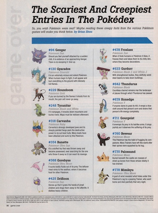
And an ending fluff page about creepy Pokémon pokedex entries.
And that's it for this one!
The full magazine is available to read over on my Internet Archive account.
Thanks for reading!
#txt#my scans#scans#game informer#game informer magazine#magazine#video games#video game magazine#pokemon#pokemon sword#pokemon shield#league of legends#baldur's gate 3#final fantasy
1 note
·
View note
Text
The Legend of Zelda: Ocarina of Time is the anti-Breath of the Wild
There have been few moments as iconic, through the beginning part of 3D gaming, as the primary time Hyperlink stepped onto Hyrule Subject in The Legend of Zelda: Ocarina of Time. It was 1998, and video games like Virtua Racing, Doom, Descent, and Nintendo’s personal Tremendous Mario 64 had already made epochal strides in graphics expertise and the chances of 3D area. However this was one thing else.
After finishing the tutorial part of the sport and navigating its first dungeon, Contained in the Nice Deku Tree, Hyperlink leaves the shut, misty confines of Kokiri Forest, walks by means of a tunnel, and steps out the opposite aspect. The sudden, expansive flowering of the world of Hyrule round him is breathtaking. There’s a rolling plain, citadel spires behind a wall, a hilltop farm, the brooding summit of Loss of life Mountain. There are sightlines to locations which may be dozens of hours of gameplay away.
Ocarina’s Hyrule Subject — previewed so elegantly within the recreation’s quiet, elegiac menu display — was not a technical first, and was achieved with a specific amount of smoke and mirrors. But it surely was maybe essentially the most powerfully persuasive translation but of the coded iconography of a 2D recreation into the realism of a 3D one; it turned a map right into a panorama. It hummed with promise, scale, and a romantic sense of journey, and created a world that felt huge but temptingly inside attain.

Picture: Nintendo
That second distilled the promise of what would finally change into the dominant type of each action-adventure and role-playing video games within the 3D period: open-world video games. But it will be nearly 19 years earlier than the Zelda sequence itself totally embraced open-world recreation design with Breath of the Wild. Regardless of Ocarina’s outsized affect on the following twenty years of recreation design, the Zelda sequence adopted a parallel path till 2017.
Returning to this revered basic in 2023 — for the primary time, personally, since Breath of the Wild exploded the Legend of Zelda custom — it’s gorgeous how totally different it feels. It’s the important thing textual content of what you may name Zelda’s second period (the pre-Breath of the Wild 3D video games), and to a big extent it outlined all of them — even these just like the sunny, seaborne The Wind Waker that wriggled as arduous as they may to get out from underneath its shadow.
Ocarina of Time was produced by Shigeru Miyamoto, main a group of youthful administrators that included present Zelda producer Eiji Aonuma. Miyamoto’s imaginative and prescient was of a classy, filigree, deeply authored recreation that might be as intricate because it was expansive. For Miyamoto, transferring into 3D area wasn’t about letting the participant run riot over an enormous space. It was an invite to look nearer, to get into the cracks, to actually study the atmosphere.

Picture: Nintendo
So Ocarina of Time unfolds like an epic, three-dimensional Metroidvania. You discover its world of Hyrule in a looping, backtracking means that's nonlinear, however guided by a dense community of paths, locks, and keys — in addition to by rumors and tales.
Hyperlink’s development is measured not in stat will increase however within the regular acquisition of recent instruments that stretch the participant’s energy over the atmosphere. Progressively, you study to govern not simply area and materials however time itself, turning day into evening or striding throughout the years. And each single new device or energy is an invite to return and comb over the world as soon as once more, continuously cross-referencing it in opposition to your increasing toolset. What can I attain now? The place can I'm going? Or when?
That is doubly true as soon as Hyperlink learns the Music of Time that permits him to step between sunlit current and darkish future. As in A Hyperlink to the Previous earlier than it, Ocarina of Time duties the participant with flicking forwards and backwards between twinned worlds, fastidiously learning the variations of their landscapes, and searching for out the wormholes of trigger and impact between them. Hyperlink’s private transformation as he strikes forwards and backwards between wild childhood and rangy maturity offers this time-travel mechanic a poignant, intimate dimension: Each time you play the Music of Time, it feels such as you depart part of your self behind.

Picture: Nintendo

Picture: Nintendo
Responding to this intricately conceived area, Ocarina of Time’s gameplay is closely laden with puzzles and secrets and techniques. Fight is dramatic and impactful, however surprisingly sparse. The sport is outlined by its 11 fabulous and forbidding dungeons — darkish, dense, and knotty labyrinths that pushed Miyamoto’s exploration of 3D area to its restrict. Generally, Ocarina pushes previous that restrict in a sequence of unforgettable, dreamlike, unattainable areas: the damp, natural cavities of Jabu-Jabu’s Stomach; the chamber of work out of which Phantom Ganon fees within the Forest Temple; the intense, fogbound limbo within the Water Temple the place Hyperlink confronts his personal darkish shadow.
These dungeons dominate Ocarina of Time, and never simply since you spend a lot of the sport inside them. In a means, the sport is one big dungeon, stuffed with traps, mysteries, secret doorways, and mazes, just like the Misplaced Woods.
For almost 20 years, each mainline 3D Zelda that adopted Ocarina of Time was made in its picture, however none of them fairly managed the natural density of its design. They’re all good video games, however all of them really feel extra compartmentalized, by some means: Majora’s Masks with its looping, clockwork diorama; The Wind Waker with its busy islands and empty sea; Twilight Princess with its robust narrative present; Skyward Sword with its discrete pocket universes, visited from above.
Picture: Nintendo
It wasn’t till Breath of the Wild that the Zelda sequence dared break from Ocarina’s template. Nintendo could have been late to the open-world occasion, however don’t underestimate the bravery it took to trash the foundations written for a title that also frequently tops lists of the very best video games of all time.
In Breath of the Wild — and much more so in its sequel, Tears of the Kingdom — the panorama is a contiguous wilderness the place obstacles happen naturally and occasions appear to unfold with none script. Hyperlink has lots of the instruments he’ll want at first, and the participant’s ingenuity is exercised as a lot in improvised responses to a teeming world as in unpicking the options to fastidiously constructed riddles. Dungeons, and the handfuls of micro-dungeon-like shrines, are usually not the dominant observe of the design. Relatively, they’re punctuation marks breaking apart the freewheeling exploration that actually defines the expertise.
It seems that, to get again to the way in which Ocarina of Time made us really feel, it was essential to reject nearly all the things about it. That’s a technique you realize it's a masterpiece. One other is that it nonetheless resists imitation, even by Nintendo itself. Ocarina gave us a profoundly influential imaginative and prescient of the place gaming might go, however a particular and singular path to that vacation spot. 1 / 4-century later, it’s nonetheless in a category of 1.
Join the
publication
Patch Notes
A weekly roundup of the very best issues from Polygon
Source link
Read the full article
0 notes
Text
The Front Preview (Steam Early Access)
For our The Front Preview, we play a survival open-world crafting shooter. We play the role of a resistance fighter sent back in time to stop the rise of a tyrannical empire. Collect resources, craft tech, build shelters, and fight monsters to accomplish our mission.
The Front Preview Pros:
- Decent high-quality graphics.
- 37.99GB Download size.
- Graphics settings - dynamic resolution, graphics preset, windowed mode, fps, shader effects, anti-aliasing, shadows, view distance, texture quality, visual effects, foliage quality, FSR, and gamma correction.
- Mouse and keyboard options - Invert axis and sensitivity sliders, the field of view slider, can remap controls, set aiming mode, advance mode, camera follow, and helicopter control styles.
- Streaming mode - profanity on/off.
- Server browsers are split into 3 types - Official, dedicated, and solo/hosted games.
- Create your own dedicated server with your own options for - name, password, player limit, survival mechanics, and how resources work. There is a lot to tweak.
- Solo/hosted also houses a crazy amount of settings just like the dedicated server. I mean you can edit jump height, exp rate, how much food will fill you up and so much more.
- Two modes of play - PvP and PvE.
- One main map with a second beta test version of a new map.
- Basic character creator - male/female, head, hairstyle, and hair color.
- Has Ark vibes for the game options, choosing a spawn point, etc.
- Open-world survival gameplay.
- Hunger, thirst, and stamina mechanics are in play by default.
- Punch and collect resources from the world.
- Full day and night cycle with different weather effects
- Earn exp from everything and unlock new quests, crafting, and more.
- Full crafting and recipe system.
- Play how you want but you do get quests to help keep you on track.
- On screen exp bar fills up as you earn exp.
- The ui can be tweaked to your liking but it's very clear and has a lot of trackers on it.
- All your hunger, thirst, health, etc is displayed in the corner.
- Compass helps navigate the world.
- The map lets you filter by points of interest, it fills in question marks as you explore and you can put your own markers down.
- Familiar controls.
- You can craft weapons and items to hunt the many animals.
- Massive tech tree that populates as you level up - basic, weapons, structures, vehicles, gear, supplies, and technology.
- Basic tools and weapons can be crafted in the inventory menu whilst bigger things require a crafting table.
- When starting out you have a protection status to help ease you in, after level 10 that's it you are all grown up!
- Just like Ark and Minecraft you hit trees, rocks, etc, and get the materials, different levels of tools change the speed and amount of materials you get.
- You can just hold down the action button for swinging axes and using weapons etc.
- There is AI in the game and they are usually hostile!
- Set more within the modern world with broken down cars, and settlements to find.
- By default when you die you drop everything in a crate and you can then try and get it back.
- Once dead you can respawn in a designated place or respawn where you died.
- Fantastic looking world.
- Very addictive for those who like to craft and explore.
- Territory flags help keep structures and items together but you can get raided in PvP.
- Weapons and tools degrade with use and eventually break.
- It does feel like a living world even in solo play.
- All the quests have progress numbers to help.
- Moving the mouse cursor on the map shows cos ordinates.
- You can fast-travel between your placed markers.
- Vehicles are a huge part and I mean you can build tanks! Or tractors, I mean you wanna eat.
- Traps can be for humans or animals.
- The base building is some of the best I've seen.
- It goes to the level of you can program doors to open, set up alarms and generators and so much more.
- Each time I advanced in the era of weapons and tools it felt like a whole new game and world again.
The Front Preview Cons:
- No controller support.
- Very daunting opening screens of menu options.
- No real tutorial as such and instead is just a load of quests and checklists.
- Very basic character creator and even calling it that is a stretch.
- So much to take in especially if this is your first foray into open-world survival games.
- Combat is very button-mashy.
- You can completely break the game with the settings.
- Takes a long time to get going in terms of base building and getting familiar with the combat.
- If you let it the game can just destroy your productivity in the real world.
- The animations of the Raiders and Ai is quite robotic.
- Animals don't move and react that well.
- A lot of the performance can be up and down.
- A big undertaking.
- Griefing can get out of hand quickly.
- Building and surviving on the PvP side of things is really tough.
- Few hit detection and building detection issues.
- The controls can be awkward and I mean more the ones where you have to hold a button to press a button.
Related Post: Truck Driver: The American Dream Video Review (PlayStation 5)
The Front:
Official website.
Developer: Samar Studio
Publisher: Samar Studio
Store Links -
Steam Early Access
Read the full article
1 note
·
View note
Note
Welcome to yet another Live Preview! I'm your host live from the opera house, and I'm here with the theme-maker to discuss her inspiration for this theme pack. This is a totally normal message and I'm most definitely not the theme-maker herself.
(I will split this response into two parts, the theme design, and the graphic design because they deserve a section of their own.)
About The Theme: having already released several themes throughout the year, I wanted to release one last theme pack going over everything I could improve and everything I wanted to keep. The general idea was to create something bigger, to create more pages, to discard any redundancies and unnecessary parts, and to optimize the spaces the best that I could. Leroux as a name and a concept had been bouncing off the walls in my head for months, all I needed was a word to describe it, and the only word I could think of was improvement.
Just like the first pack I released, this pack would be a direct interpretation of what themes like Dorian and Isadora would look like, if their general aesthetics were taken from character themes to group themes. I resolved to keep the main elements I used for them, with the goal of creating a composition that felt consistent, which, in my opinion, was the main issue I had with Augustus. Sometimes when you're working on a project and you're excited with one thing going right, you suddenly want to shove as many things into it as they will fit; and that's not always for the best. Augustus continues to be a source of pride for me, don't get me wrong, but I also told myself I wouldn't release another pack unless I could make it bigger and better. So here's hoping for bigger and better.
About The Graphics: after years working as a freelance designer, most of which I also spent working on graphic commissions for roleplay groups, I found this portion of theme-making surprisingly challenging. When you advertise a theme, a customizable theme at that, the last thing you want to transmit is that it will only work if you share the same specific vision. What you really want to show is a general idea of what the theme can look like, while alluding to the source of inspiration, if any.
And still, sometimes I feel a little silly claiming I was inspired by XYZ when whoever ends up using the theme gets pretty much a bunch of blank spaces. The message for me relies on the sample graphics I use—and by trying to avoid any suggestion, I feel like the sample graphics failed to communicate what was really in my heart when Augustus was created. I'm not saying the graphics were bad, I'm only saying they were subdued. That's why I decided to go all out with Leroux and pay homage to the works of literature and architecture that have influenced my stylistic choices the most.
I hope you don't mind if I share the story with you.
I have a thing for staircases. I have always loved them. So when I first saw the Palais Garnier as shown in The Phantom of the Opera (and by Palais Garnier I mean the soundstage they used for the movie) I became even more obsessed than I already was, seeing I was already a big fan of the book. This resulted in me using pictures of the Palais Garnier (more specifically the grand staircase) for every roleplay project I put out there whether it had anything to do with opera or not. I finally had the opportunity to use them for a good reason when a friend of mine and I started working on a ballet-themed roleplay group. I didn't get to see it open because I had to prioritize my education but I hold that place dear to my heart.
The Leroux RPG Theme Pack is inspired by a hypothetical horror roleplay set in an opera house, much like The Phantom of the Opera, by Gaston Leroux. The plot rotates around deaths and accidents that are originally credited to a killer on the loose, until the characters are locked inside the opera, and discover the killer is actually an evil spirit—opposite case to the book, where the phantom is just a really ugly guy who knew his way around the opera (RIP Erik, you would've loved Facetune.)
Another thing I have always believed when it comes to graphics is the power lighting can have in the general atmosphere of a project. Lighting can guide you toward what images to use, what colors to use, and even what type of fonts to use. Since apparently I like to suffer I went out on a limb and decided I wanted my graphics to look like the only source of light is candlelight! And here we are! Palais Garnier is probably the most famous amalgamation of neo-baroque and beaux-arts in the history of opera houses, and I decided to show my disdain for modern time's use of harsh lighting by going back to 1875! I found the idea of making this hypothetical roleplay group rotate around a haunting convenient because that way I could exploit those resources.
The backdrop is supposed to emulate candlelight. The header is supposed to evoke the feeling of catching a mysterious something out of the corner of your eye while being unable to shake off the feeling that something's not quite right—that's why I added the grainy ballerinas in the middle, which was supposed to look like walking into a flashback, but ended up looking a little like Fall Out Boy's From Under The Cork Tree album cover. I'm gonna leave it at that and try not to think about it too hard.
0 notes
Text
Week 8 - items list and desc v1
List of things for design research
------
PS3 & PSVITA: My Introduction to Videogames
Videogames - they quite possibly changed the trajectory of my life. I might have become a biologist or pursued something considered 'more important,' but videogames led me down a more creative path. Is this a bad thing? No. I'm in the field of design because of videogames; they've nurtured my creative inclinations. I'm even writing this essay because of videogames.
Recently, a videogame inspired a shift in my approach to interaction design. I used to find interaction design uninspiring. However, that changed when I played 'Persona 4: Golden' and 'Persona 5.' These games made me realize that Interaction design doesn't have to be boring. Interaction design doesn't have to remain the same bleak thing over and over again. Which I find the industry right now is encouraging.
CDs: An Inspiration from Music
Music is a tremendous source of inspiration for me, serving as a driving force behind my design work. My earlier design projects were heavily influenced by music, and these CDs and vinyl records stand as symbols of my deep passion for it.
Back when I was a kid, during the days when I used to download MP3 files onto my phone, mere music wasn't enough for me. I wanted an album cover to accompany the music. If a file lacked an album cover, I would painstakingly add one using MP3 file editing software. This connection between the album cover and the music held significant importance for me. I believed that the album cover should offer a preview of what the music would sound like.
While most of my music experience nowadays revolves around MP3 players and music streaming apps, I've to buy CD’s and Vinyl because of the experience that it comes with when holding a record or a cd. It comes with posters, liner notes, lyrics and just having something solid on your hands and putting it in a record player or a CD player is an experience by itself that cant be replicated by a music streaming service. So here I have chosen to share to you my collection rather than a phone with Spotify on it
Gaming Laptop.
I do everything on my gaming laptop. I Work on this gaming laptop, I game on this gaming laptop, I design on this gaming laptop and I “live” on this gaming laptop. Though it is not perfect but this gaming laptop is mine. I wish it was lighter, I wish it had better battery life, I wish, It had more storage space but this gaming laptop is mine.
This gaming laptop also represent my internet footprint and my internet identity. Im a kid that existed in video games and the internet. Unlike previous designers, if someone is a fan
Those Notebooks.
These notebooks archive some of my old drawings. Before I was really into graphic design and choosing to pursue it as my career. I was character designer by heart that means before designing posters I was designing characters, the clothes they wear, how they look like, what they are and who they are that was what I was designing. This notebook also includes the early drawing of my own personal brand called “Max Stookie”.
Max Stukie is my artist’s name. the music I create, the art that I create, and the character designs are all from an artist Max Stukie. While Max Stukie and me are the same person. I keep all the professional stuff and graphic design as myself and Max Stukie represent the more creative hobbies and illustrator side of me. These notebooks also represent him.
So, yes when I was a kid around 13 years old, I was already designing.
The Holy Bible.
Though the Holy Bible had little visual influence in my design directly, I think I can easily say it has influenced the whole way I think about things overall. As a Christian this book is important to me because its what guides me in life and what to do.
Biblical stories and Catholic art have always inspired me. the holy visions and trying to achieve greatness for the glory of God is a great force that pushes me to go further and further.
When I do work, I sometimes think about my actions will this action I’m about to do glorify God? Will this work I will create show my faith in him? If no, I do my best to avoid it. There already have been instances of commissions I had to turn down because I believe it was against my principles.
============
Casio F-91W
This watch keeps me humble in a era drowned by technology. Casio helps me disconnect rather than buying a watch that is always connected I choose the humble Casio F-91W to always be by my side through work and through leisure. This watch represents my refusal to join the world that is always connected to the internet. Though I don’t hate smart watches I just feel like for me personally being 24/7 connected has already affected my life negatively, I don’t want another piece of technology that will tie me up to the internet.
Casio F-91W also represents another side of me, the side of me that misses the older world, or nostalgia. If you knew me or have seen how I have composed this poster you can tell that I still cling on to “outdated” aesthetics. Like ascii or the consolas font. Again, I believe todays trendy design is too bleak and too corporate. Nothing has a soul anymore unlike the designs of the past (or maybe this is just my nostalgia goggles glued in a bit to tight). This watch represents the joyful past, and the edgier aesthetics of y2k. everything just feels a bit too safe these days and designed to sell a product. No one is jumping across the line to achieve something cool, fun or most importantly groundbreaking. Posters that makes me go “woahhh that’s cool” are rare these days. I salute to those spacemen who pursue designs that are controversial in the eyes of mainstream.
==================================================================
Printer.
my humble home printer. The printer is the designer’s best friend and worst enemy, specifically this printer though? Its only my worst enemy. If I had to print something of quality I will not use this printer, but for low quality? This printer…. Does its job.
this printer most important feature to me is the scanner. The scanner works well but I hater the fact that I have to log in just to use it, yes, log in to my HP DESK JET account just to SCAN! But because this is the most easily accessible printer and the only one I have at the moment I have to make do.
I had a long relationship with printer before my UX/UI class, printers were my primary source of aesthetic. During my high school years, I would use the scanner to break an image, print it and keep scanning it till it comes out all Janky and messed up. This was where my post-digital roots started. when my design teacher Mr Kearny introduced me to post-digital my reliance to the printer doubled. I believe the printer was the portal from the digital to physical and by tampering that portal we achieve something destroyed and messed up, a bad print job is both human error and printer error. The verry essence of the post-digital aesthetic, nothing is perfect. even if you designed the perfect printer, human input will make the output possibly imperfect
=======
Pen
As they say, the pen is mightier than a sword. This good ol ball point pen represents the most basic tool a designer will be using. The mighty pen. Regardless of what kind of designer you are or even what field of career you’re in the pen will be a trusty tool you will be needing.
I have used a pen for most of my designs. I plan everything on a piece of paper then draw it using an ink pen. An ink pen is permanent, forces you to be more careful and forces you to accept those mistakes, and sometimes those mistakes will be an essential part of your design, and that’s a wisdom that I believe in. even though I already own a apple pen and an Ipad the classic pen will never be outside of my toolset for creation.
The pen is a tool to create drafts, plans, stories, sketches and even a bored buster. The pen will never die the pen will live forever. I think even if technology advances to a point that having a digital table with a pen is cheap and accessible. I believe the mighty pen will be used forever.
Bass Guitar
Have I mentioned to you yet how I love music. other than visual design I also create music and I don’t create music, I design music. just like visual design, or UX/UI design, music also has to be designed, it’s an experience, it tells a story or a message. Obviously, you don’t just write music or tell a story as it is through music, no. you must pick the parts of the story that is important that you can fit into a song, what instruments and timbre does this song need? How long will it be and what will be my goal? What will be the audience reaction to this song, and how will create this song? Though these rules are arbitrary these days because really, what is music?
As I mentioned on previously, I’m very musically driven person. Sometimes I feel like I have an ability to translate music into digital design and vice versa, this is my design superpower.
I’ve chosen this bass to represent that part of me, though I have other musical instruments I could have shown you, I chosen the bass guitar because of the visuals I have attached to it. The memories and the fact it’s the first instrument I picked up.
=========
Wallet.
It’s simple really, MONEY MOVES. I’m probably more inclined to do work if you pay me a reasonable amount compared to doing something that is volunteer work.
MONEY MOVES, I moved to UX/UI design because I believe I can make more money from this career.
MONEY MOVES.
IPAD
This is my iPad represent Max Stukie the character designer and illustrator part of me. this is one of my more important hobbies that I have been doing as a kid. It’s a more laid back and relaxed type of design because simply put it, its fun! This is the design I’ve been doing even before I even knew what design meant.
Max Stukie isn’t just a brand I made. Its also me, It’s the creative side of me and it’s the rebellious teenage side of me that still stuck inside. I fear the day that I have to let go of Max is the day I lose my creative youth. His creativity really pushed me to go further and explore creative areas that I have not explored. Max Stukie pushed me to find an aesthetic that I can stand on, and through this creative research that max Stukie has pushed me to do I finally understood how I want to represent my self in a the community of designers.
ID
This is who I am, I choose these IDs to represent me. Who I am, what I stand for and what I believe in. these questions were a difficult thing for me, around 2021 I was asking this question for the first year of university as part of our concertina, because I realized I never really asked who I am. I always though “who I am is who I am|” but really it isn’t that simple. Only recently have I slowly understood myself, what I am, what I stand for and what principles I believe in. Alexander Hamilton once said, “Those who stand for nothing, fall for anything” and I believe that. I thank the people who pushed me to understand myself even more and through that understanding of self I have chosen something firm to build my house on.
Traffic Cone
The humble Traffic cone is a important figure in my history of design. at one point in time I had a weird obsession with traffic cone, first started as a gimmick in my Instagram stories and it devolved into taking as much photos of traffic cones as possible.
Traffic cones represents the design principles I believe in, the ideas of grit and mess of it; The clean orderly industrial design forged in a factory, so each one is the same; the orange and Hi-Viz that demands the audience’s attention and most often the controlled chaos that it comes with it when they’re in use with a group. Most importantly the light that shines the darkness.
Coffee
The working mans drink. If music drives my creativity, then coffee drive me literally. I get migraines when I don’t drink my coffee, I don’t work as well if I don’t have my coffee. As much as I hate to admit it, I’m dependent to coffee and I will suffer without it. I need to design with coffee, and I get mental clarity and focus with it. My ideas shine and flows when I’m boosted by caffeine, but sometimes you might get ideas of a schizophrenic man.
Idea of dependency to caffeine haunts me, because in my personal principles I prefer not to be dependent on any substance, but coffee has gotten a hold of me and the society around me. Is there something wrong with it? No, I wish not to be dependent to it.
95bFM poster
95bFM has served me well allowing me to experiment my ideas with an actual outside audience watching, I’m like an intern there. 95bFM supports the ideas that I follow of a music driven station., Its not about the money (kind of) but it’s about sharing the great works of local musician and I’m all for that.
This volunteer gig I’m doing with them allows me to improve and get used to an office like environment because other than doing graphic design with them. I also get to do news for them which also allows me to have a greater understanding of the world around me, because I literally have to find and read news to write about, through this greater knowledge I can extrapolate world news into my overall designs and creation.
I believe every little thing can inspire a design even world news that has nothing to do with anything design related. like a butterfly effect it can push little things in my mind and create something with it, create stories, create visuals, create chaos and deeper understanding not only with the world and the object I’m designing but also myself and how I fit in a society, a community and what I can do about it to make the world slightly a better place through my designs as well as my creations.
==================================================================
Swiss Grid
This book taught me the importance of staying in line and follow rules. The essentials of modern design all stem from following rules and understanding what is essential and what is not. This book represents my understanding of the complexity behind simplicity. Something simple isn’t just simple. Behind is rules, lines, principles, and deep thought buried in it that the audience don’t see. Though my designs don’t reflect Swiss and modern design and most of my designs are not simple either, my reliance to the rules has taught me how to break them the right way.
Since I was a kid I was taught how to follow rules and even growing up as a Christian I was taught the importance behind them. The older I get the more I realize some of these rules are arbitrary and useless, rules that don’t accept progression or self-expression; rules that doesn’t even follow my beliefs, though still even with this epiphany I still understood its importance. I understand why rules has to exist and why we must follow them. A world without rules is chaos and a world full of rules is depressing. I finally learned how to follow the thin line in between both worlds of Post modernism and modernism; and I have chosen a pdf printed copy of the Swiss Grid book to represent my rebellion and my allegiance to the rules.
Phone
The phone, we can never get away from it. Its around us and we need it. Our reliance to our technology that fits in out pocket has excelled humanity to the starts, figuratively and literally. Our phone clearly has changed how we designed things. for a lot of Instagram designers, you will see a trend of having over simplified posters and large text for readability since because its target audience is on Instagram. Though print isn’t dying, pocket screens will definitely a hard competition. A device that can show any information you want through a pic of a QR code or a download that your guest can access anytime, compared to a Pamphlet that has to be printed a million copies cause bigger and more expenses. These are one of the things I though about when I decided to choose to move my degree to interaction design, I don’t think print is dying but I prefer to be in the more technological side as it seems as if this is the one that is calling me. I choose this old beat-up Alcatel phone I had to represent the humble phone, the phone that change the landscape of design drastically.
THE ARCHIVE
The archive contains all the ephemera that I find valuable. A piece of historical importance in my own history. to most people all they see is a box full of posters, doodles, sketch, notes and documentation, but to me these are all piece of a puzzle that I can combine to make something new. I have always been a creator as a kid, back when I still used to live in the Philippines, we had a backyard full of stuff and junk and I would uses those junk to make something out of it, like that one time I made a taser. Back in year 12 and 13 my go to method of creation is collage both digital and physical. I always collect ephemera with me and with those dead documents will reborn a new piece of design. this box represents a grave and I’m a mad scientist that will ‘Frankenstein’ each pieces into another living piece of design
>EYE SEE YOU
The project that cemented my interest. Before this I didn’t really have a style yet. My design identity was lost in the sea of ideas I had in mind, but this project changed that. The awareness campaign zine/poster project I did in 2022 help me understand how I want to look like within my community, these are like the clothes I wear to the club. If I describe how it would look like, I like to describe it as “digital-punk with a hint of post-digital”. This aesthetic is a mix my punk origins and digital design ideas into one thing. I choose this poster to represent it as I believe this is the project that help me understand my aesthetics.
UTorrent
0 notes
Text
For those who don't know, Episode is a free app where you can read thousands and thousands of Choose-Your-Adventure type stories and there is two categories: The ones written by the Episode team themselves, or the ones that are written and submitted by the public. You get 2-4 passes (depending on how you have played the app) that will refill every other hour and everytime you finish one chapter of a story, regardless if it's a story from the team or from public submission, you will get a free gem.
The ones written by the Episode team are pretty good, albeit a little cliche at time, and as all micro-transactional games go, they allow you to use gems to buy the decision you want to get the best outcome from the adventure you choose. You could either pay for it, or you could save the story for later and choose to grind for gems by reading other stories to stock up on the gems.
The ones written by public submission is as it is, public submission. You basically just need to make an account to register into the app and you can automatically write stories to submit them into the app for people to read. Of course, to write the stories you will need to do it on your web browser and they will have tutorials and tips and easy coding guides for you as well as a preview slot to help you fine tune your story better. There are some really good stories posted by the public in there, and about 90% of them don't require gems to get the best outcome, so you will have to depend on your luck whether or not you would get a good or bad ending to your story. But there are some which... ehh... let's just say amateur might be a kinder word for them.
I joined Episode during its very infancy, when their characters design were as above and their animation is a little janky and limited, but still enough to help tell their story. This format is coined as "Classic" now, and was the very foundation of the app. Back then public submissions were limited as they were testing the waters, and I was one of the few who managed to be in the team part-time and submitted a story as a paid writer. It was one of my best part time jobs yet and I was raking in the dough, that is until I have actually finished my story and my contract was completed, and thus I was renegaded to become a public registered user instead, and now the only way I can earn anything out of my writing is if I hit a certain quota:
Sadly my daily life has been more hectic and busy, so I hardly wrote any stories nowadays...

And then we have the Ink platform, which started when the app has gotten more traction and even have some celebrity-featured stories to usher in the new art style (celebrity being Demi Lovato). They have more updated graphics and slightly more defined features, almost like a HD version of the old platform, and with slightly more anatomically-correct features and extra animation. I was a little iffy at first with this platform, being that I've always been used to Classic, but I slowly eased into it and more or less got used to it, especially when they have the additional animation in which I can express my characters better.
Finally we have the Limelight platform, when the hype got even more on this app and they brought in fandom-based storylines into their feature stories (Pretty Little Liars, Pitch Perfect, Clueless, Mean Girls etc...). Personally I'm not really a fan of this art style. Though it may have even more extra animation and more detailed features to make them look more realistic, it was kinda borderline going into Uncanny Valley territory, and it definitely felt a little off for me. Still, it does serve its purpose for certain types of stories that calls for this type of platform, so I wouldn't complain.
They also brought back an old classic as well called Spotlight, which used to be part of the old OG Episode app platforms, though now they've tweaked it in a way that can be used for both Ink and Limelight style. Not sure if they can be used for Classic style, but we'll see how it goes.
So there you have it, a lowdown (or recap for those in the know) about how Episode works and what I think about it. Hope it helps!
0 notes
Text


Bombardier Whiskers F1, preview
design notes: so how do we go about designing this electric F1 car, first the good news F1 tyres have went from 13" to a whopping 18" under the leadership of Pirelli starting from 2022
second F1 is pretty stringent if anything about the size of the wheels that are used, meaning that sizing up the wheels we can obtain the right scale for the rest
third we are going to have to modify our initial design especially in the back to fit our wheels there, Whiskers differently than other F1 car has a carenage over its 4 wheels
last but not least it should be to my knowledge the first F1 car designed in Morocco so it's an important project
so to go over what we have it's mostly aerodynamics, its not fuel engines we don't need to cool gears oil either, Brembo brakes, the platform in the back well we can't have all of it because rear wheels have to fit there, but if we can't keep all of it we might have a wind spoiler there
we kept those spots over the wheels as refractive surfaces should be cool to have them
we did this on Friday, September 07, 2018, 10:06:18 PM, now is the time to finish it
the wide air intakes in the front lead to the vents on the sides, the air is refunnelled into the rear using the intakes in the back, should work I don't see why not actually it places the car in a bind from both sides
what it should also is placate the car to the track, so we don't have the wind spoiler F1 cars have on the front, but we do in a way it's replaced by air intakes, air channelling completes on the platform in the back
if we're reducing it we are implementing a wind spoiler, that's about it
can you beat a fuel based F1 car with electrical engines, F1 cars have 1 engine ours has 2 engines, we can beat them
the 2 gray shapes on the sides of the car are platforms leading the airflow on a curve towards the rear intakes
last but not least the cool blue lights are not just a graphics effect, the car has them to show that its electric powered
in all a neat project that took some 5 years to make its way to a full concept phase, that should start by positioning the tyres in scale and taking it from there
Thank you for having followed
design notes continued:
800hp main 1 engine
600hp main 2 engine
1400hp total
some quick maths but basically it's what we're looking at, a fuel based F1 car will produce up to 1050hp, that said there is no restriction so
design notes continued: we have refreshed it a bit, mostly the logos, it turns out that a F1 car cannot be more than 200cm in width and 95cm in height so that's the other thing, mirror tint for the cockpit I don't know if its allowed but we'll figure these things as we go, what is important is that we have the car
so we will go for 200cm because very likely our car is going to be shorter than other F1 cars
0 notes
Last Seen Blogs
ziisaeo
Untitled
swnamii
gei di weld y byd mewn lliw

dannydoesbad
Exquisities.

royvalentine
OH HE'S SO PRINGLES

onedollarhostingprewebhost
Prewebhost