#CollapsingToolbarLayout
Explore tagged Tumblr posts
Visit Tumblr Blog
Explore Tumblr blogs with no restrictions, modern design and the best experience.
Last Seen Tumblr Blogs


Fun Fact
In 2020, 27% of US Tumblr users had an annual household income of over $100,000.
Text
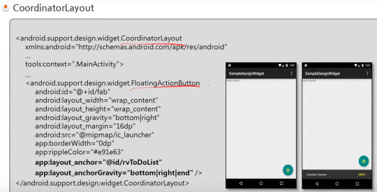
android 중급 11강 material design 2 tacademy
original source : https://youtu.be/7ep4effngGc
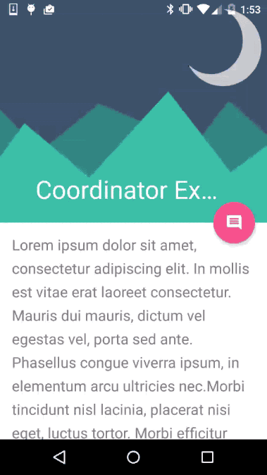
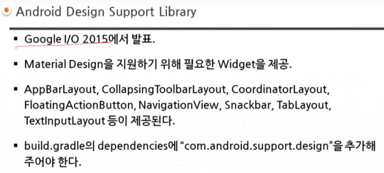
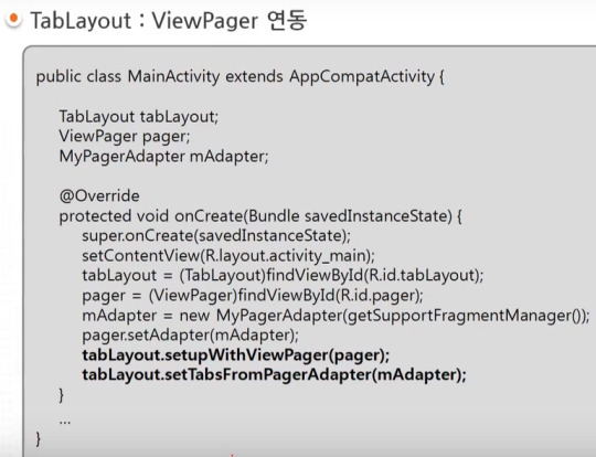
material design이 도입되면서 제공되는 새로운 widgets의 예를 보여주고 있다.
AppBarLayout 부터 TextInputLayout까지 모두 새로운 widgets에 해당한다.

=========================================================
.
.
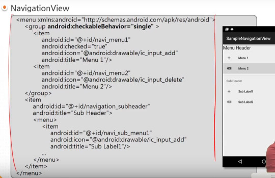
drawer layout 과 navigation view , navigation drawer 비교
https://stackoverflow.com/questions/44176576/navigation-drawer-vs-navigation-view-which-is-best-and-what-is-the-diffrence
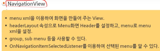
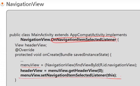
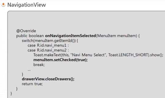
NavigationView를 DrawerLayout과 함께 사용한 방법을 아래서 보여주고 있다.

=========================================================
.
.


=========================================================
.
.

=========================================================
.
.
=========================================================
.
.
=========================================================
.
.

=========================================================
.
.
=========================================================
.
.
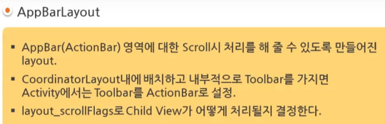
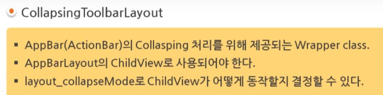
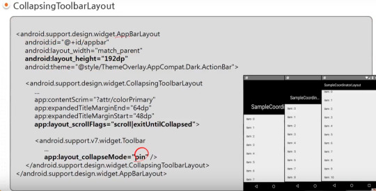
AppBarLayout과 CollapsingToolbarLayout 참고) 실제 예시 https://youtu.be/wCuM_di5M9Y?t=50

=========================================================
.
.
=========================================================
.
.

=========================================================
.
.
android studio 에서 blank activity template을 선택하는 경우 기본적으로 material design widgets이 어느 정도 설정되어서 시작된다.

#android#중급#11강#11#material#material design#tacademy#view#widget#navigationview#tablayout#textinputlayout#toast#snackbar#CollapsingToolbarLayout#AppBarLayout#CoordinatorLayout#tab
0 notes
Text
What you'll learn Implementing Material Design Feature at the end of this course will be a piece of cake for studentsThe concept of this awesome feature provided for Android App Development will be crystal clear.Material design is a comprehensive guide for visual, motion, and interaction design across platforms and devices. This course talks about all the important material design specifications, colors, design guidelines, and also using material widgets along with material themes and concepts. Curious about Android Material Design? This is the your final stop where you will get information regarding material design specifications and the related widgets being used with material design themes. The best part of this course is that you will learn to make several complete android demo apps from scratch - two major apps and several small apps - based on material design guidelines. Enhance your application user interface designing skills by implementing all new materialistic features introduced in Android Lollipop 5.0. Styling of Android Application is very important and one of the most critical feature in designing the app. To make this difficult task easy, I have come up with this course of Android Material Design, which begins with the basics of the material design and proceeds with covering some really complicated and most interesting stuffs like Android Material Design Animation. We will also dive into the material design support library and implement it in our demo applications. The topics we will be covering includes: 1. Material Design Themes and Colors Color PaletteMaterial Design ThemesMaintaining Backward CompatibilityExploring Tinting of Widgets 2. Material Design Toolbar Popup Menu or Overflow MenuContextual MenuToolbar Theme Customisation 3. Basic components of Android Material Design Floating Action ButtonSnackbarCoordinator Layout 4. Android Material Design Animation Ripple Effect: Touch FeedbackSlide Activity TransitionShared Element TransitionExplode Activity TransitionFade TransitionActivity Transition Overlaps 5. EditText with Floating Label Implementing Floating HintsValidation of TextFieldsValidation Error Resolution 6. AppbarLayout and CollapsingToolbarLayout Using AppBarLayout with Scroll FlagsHow to collapse Image along with CollapsingToolbarLayoutExploring various pin modes 7. RecyclerView and CardView Implementing RecyclerView in various orientationsUsing CardView to create list itemsAdding and Deleting an Item from RecyclerViewRecyclerView AnimationGrid, Staggered Grid Implementations 8. Navigation Drawer using NavigationView Inflate menu items in the Navigation Drawer using NavigationViewAdding dividers between the menu itemsGrouping the menu items under one category By the end of this series, you will be mastering the implementation of this features in your android app.Who this course is for:Students should have basic knowledge of Android Application Development. What are the basic components of an Android Application and the basic Hello World Program.
0 notes
Text
Tempo (Silver Edition) Great templates for incredible projects (Templates)
Tempo’s a mobile app templates built on top of material design that’s suitable for Android app developers. It Includes all the default screens with many elements that you would need and it is ready to use, just put your logo, change the colors and call your APIs.
Please note this is the Silver Edition, and you will get just the List Views section, if you want all the Package go to the Gold Edition. Tempo (Gold Edition)


Material Design: following Android Design Guidelines.
Many widgets: Toolbar, CollapsingToolbarLayout, SlidingPaneLayout, DrawerLayout, RecyclerView, SwipeRefreshLayout, FloatingActionButton, TextInputLayout, TabLayout, ViewPager, CardView.
Icons: A wide range of free Google icons and Fontello (Icon fonts).
Activity Transitions: Beautiful transition between Activities (For the list views and details).
Beautiful Animation for RecyclerView: Using Android Animations.
Supporting Tablets and Handsets: Multi-pane layouts on tablets and single-pane layouts on handsets.
Flexible Layout Design: Allows application to adapt to all variations of screen sizes.
Orientation change: Both landscape and portrait orientation supported. (except User login and registration and welcome screen interfaces).
High performance: Optimized for high performance and high-resolution displays.
Caching images: Using Universal Image Loader for displaying and caching images.
Sources and Credits
a wide range of free Material Google icons.
All the dummy graphics from freepik.com.
Material Ripple Effect library.
Universal Image Loader library.
Circle Indicator library.
Circular Image View library.
Merriweather Fonts from fontsquirrel.com.
What you Get:
Full source code in Android Studio.
Documentation.
All screenshots in PDF and PNG types.
Adobe Illustrator app design file organized and layered.
APK file
from CodeCanyon new items http://ift.tt/2Fi7aZL via IFTTT https://goo.gl/zxKHwc
0 notes
Text
Collapsing Toolbar for React Native
react-native wrapper for CollapsingToolbarLayout, easy to integrate with Animated.Event and FlatList out the box.
source https://morioh.com/p/bf995e29363a
View On WordPress
0 notes
Text
Android Design Support Library: Getting Started
Android Design Support Library to the rescue!
Have you been surfing through thousands of Github libraries to add a Facebook-like Sliding Navigation menu in your project? Or searching for a convenient widget that will show tabs with icons at the bottom of your app’s homepage?
Behold – the Android Design Support Library is for you!
The Android Design Support Library helps you implement those shiny, interactive design components with minimal code!
In this tutorial, you’ll create a marketplace app called iSell using the Android Design Support Library. By the end, you will learn how to:
Use common Material Design components like BottomNavigationView and FloatingActionButton
Get rid of needing different images for the same icon to support different device resolutions with VectorDrawables
Bring some wow-factors to your users with CoordinatorLayout and CollapsingToolbarLayout
This is gonna be awesome!
Getting started
To kick things off, start by downloading the materials for this tutorial (you can find a link at the top or bottom of this tutorial). Unzip iSell.zip folder into your desktop.
Now launch Android Studio 3.1.2 or greater and select Open an existing Android Studio project to import the starter project.
Choose iSell-Starter inside the iSell folder and click Open
Build and run by firing keyboard shortcut Shift + F10 (or Control + R if you are using a Mac)
And you will see a screen with the project name. Kudos – you’ve successfully kickstarted the project!
Managing Design Support Dependencies
Adding Design Support Library to your project is a piece of cake, but it requires a few different components. You should always use the latest version of each component, and make sure they’re the same version for all the components. To manage this efficiently, an external variable is defined in your Project level build.gradle file as following:
ext.supportLibraryVersion = '27.1.1'
You will use this version with all the Design Support Library components later.
Open the build.gradle file from your app module and append the following lines inside the dependencies section:
// 1: Design Support Library implementation "com.android.support:design:$supportLibraryVersion" // 2: CardView implementation "com.android.support:cardview-v7:$supportLibraryVersion"
Let’s take a moment to understand what each of dependencies provides:
Design Support Library: Adds all those “exciting” UI components we are talking about. For example: BottomNavigationView, FloatingActionButton. We’ll be adding one of each later in this tutorial.
CardView: Is a View component that shows its content in an elevated card, and highlights it to stand-out from the background. Most commonly used with list items.
Also, you’re are going to use VectorDrawables for the icons, so add this inside the defaultConfig section:
vectorDrawables.useSupportLibrary = true
Your app module’s build.gradle file finally may look like this:
apply plugin: 'com.android.application' apply plugin: 'kotlin-android' apply plugin: 'kotlin-android-extensions' android { compileSdkVersion 27 defaultConfig { applicationId "com.raywenderlich.isell" minSdkVersion 16 targetSdkVersion 27 versionCode 1 versionName "1.0" vectorDrawables.useSupportLibrary = true } buildTypes { release { minifyEnabled false proguardFiles getDefaultProguardFile('proguard-android.txt'), 'proguard-rules.pro' } } androidExtensions { experimental = true } } dependencies { // Kotlin implementation "org.jetbrains.kotlin:kotlin-stdlib-jre7:$kotlinVersion" // AppCompat implementation "com.android.support:appcompat-v7:$supportLibraryVersion" // Design Support Library implementation "com.android.support:design:$supportLibraryVersion" // CardView implementation "com.android.support:cardview-v7:$supportLibraryVersion" }
Notice that the build.gradle file has uses a plugin:
apply plugin: 'kotlin-android-extensions'
With kotlin-android-extensions, you can directly access a View‘s id without having to initialize it using findViewById(). Its just sweet syntactic sugar! If you are keen to know more about kotlin-android-extensions you can find out more here.
Before adding any Kotlin code, configure Android Studio to automatically insert import statements so that you don’t need to worry about imports for every change you make.
Go to Preferences\Editor\General\Auto Import, check Add unambiguous imports on the fly and Optimize imports on the fly checkboxes and click OK.
Again, don’t forget to click Sync Now in the top-right corner of your IDE. You’re now done with all the setup!
Showcasing Items with RecyclerView
First things first, you’ll display a list of items to sell. To show the list, replace the TextView inside activity_main.xml with a RecyclerView:
<RelativeLayout xmlns:android="http://schemas.android.com/apk/res/android" xmlns:app="http://schemas.android.com/apk/res-auto" xmlns:tools="http://schemas.android.com/tools" android:layout_width="match_parent" android:layout_height="match_parent" tools:context=".ui.activity.MainActivity"> <android.support.v7.widget.RecyclerView android:id="@+id/itemsRecyclerView" android:layout_width="match_parent" android:layout_height="match_parent" app:layoutManager="android.support.v7.widget.GridLayoutManager" app:spanCount="2"/> </RelativeLayout>
Here, RecyclerView will be identified as itemsRecyclerView and the width and height properties should match its parent layout.
app:layoutManager="android.support.v7.widget.GridLayoutManager" app:spanCount="2"
You’ll notice that you set the layoutManager directly in the XML to use a GridLayoutManager. Setting the app:spanCount tells the GridLayoutManager that you want to show 2 items in a row, so you tell the layoutManager to prepare layout for the grid.
Next, you need to design the layout for the items in the list.
Highlight with CardView
For each item in being sold, you’ll want to show the image, price and title. To make a layout for that, right-click on layout folder, select New, then select Layout resource file and name it layout_list_item.xml.
Now add following code inside layout_list_item.xml:
<?xml version="1.0" encoding="utf-8"?> <android.support.v7.widget.CardView xmlns:android="http://schemas.android.com/apk/res/android" xmlns:card_view="http://schemas.android.com/apk/res-auto" xmlns:tools="http://schemas.android.com/tools" android:layout_width="match_parent" android:layout_height="wrap_content" android:layout_margin="@dimen/default_margin" android:foreground="?android:attr/selectableItemBackground" card_view:cardBackgroundColor="@color/cardview_light_background" card_view:cardCornerRadius="@dimen/cardview_default_radius" card_view:cardElevation="@dimen/cardview_default_elevation"> <RelativeLayout android:layout_width="match_parent" android:layout_height="wrap_content"> <ImageView android:id="@+id/itemImage" android:layout_width="match_parent" android:layout_height="@dimen/item_image_height" android:scaleType="fitCenter" tools:src="@drawable/laptop_1"/> <TextView android:id="@+id/itemPrice" android:layout_width="match_parent" android:layout_height="wrap_content" android:layout_below="@id/itemImage" android:layout_marginLeft="@dimen/default_margin" android:layout_marginRight="@dimen/default_margin" android:maxLines="1" android:textAppearance="@style/TextAppearance.AppCompat.Headline" android:textColor="@color/colorAccent" tools:text="@string/hint_price"/> <TextView android:id="@+id/itemTitle" android:layout_width="match_parent" android:layout_height="wrap_content" android:layout_below="@id/itemPrice" android:layout_marginBottom="@dimen/default_margin" android:layout_marginLeft="@dimen/default_margin" android:layout_marginRight="@dimen/default_margin" android:ellipsize="end" android:maxLines="2" android:minLines="2" android:textAppearance="@style/TextAppearance.AppCompat.Title" tools:text="@string/hint_title"/> </RelativeLayout> </android.support.v7.widget.CardView>
It will look like this in the Preview pane:
Here the CardView and its properties may seem new to you, but other components are quite familiar – you are just adding views to show the image, price and title inside a RelativeLayout sequentially.
Using CardView makes your item appear elevated with the use of drop shadows around the element.
card_view:cardBackgroundColor="@color/cardview_light_background"
The above property adds a light-themed background color for the CardView from Design Support Library.
card_view:cardCornerRadius="@dimen/cardview_default_radius"
This property makes the card’s corners to look rounded. You are using the default radius provided in Design Support Library. You can play with the values for this property, the edges will look more rounded with a larger value.
The most interesting property of CardView is:
card_view:cardElevation="@dimen/cardview_default_elevation"
This property allows a CardView to look more or less elevated. This elevation of the view determines the size of the drop shadow. The larger the value you provide, the more elevated it’ll look.
RecyclerView in Action
It’s time to bind some data to the layout. Consider the DataProvider class inside util package as a storehouse of all your Items. You need an adapter to show items in the RecyclerView added earlier. To do so, add a new class inside the adapter package named ItemsAdapter as follows:
// 1 class ItemsAdapter(private val items: List<Item>) : RecyclerView.Adapter<RecyclerView.ViewHolder>() { // 2 class ViewHolder(itemView: View) : RecyclerView.ViewHolder(itemView) { fun bind(item: Item) = with(itemView) { itemTitle.text = item.title itemImage.setImageResource(item.imageId) } } // 3 override fun onCreateViewHolder(parent: ViewGroup, viewType: Int): RecyclerView.ViewHolder { val view = LayoutInflater.from(parent?.context) .inflate(R.layout.layout_list_item, parent, false) return ViewHolder(view) } // 4 override fun onBindViewHolder(holder: RecyclerView.ViewHolder, position: Int) { (holder as ViewHolder).bind(items[position]) } // 5 override fun getItemCount(): Int { return items.size } }
That’s a lot of code to digest at once! Let’s break it down���
ItemsAdapter is declared as a subclass of RecyclerView.Adapter which accepts a list of Item.
ViewHolder is a subclass of RecyclerView.ViewHolder. It inherits the power of being cached into memory and re-used to display an Item inside the RecyclerView. The bind(item: Item) function inside it does all the binding between the Item and the View.
onCreateViewHolder() function creates a new ViewHolder when the adapter needs a new one with the view you designed in layout_list_item.xml.
onBindViewHolder() glues each Item from the list with a ViewHolder to populate it using the bind() function.
getItemCount() function tells ItemsAdapter the number of items in the list.
Add a function that will set the data in RecyclerView according to the category you want inside MainActivity.kt:
private fun populateItemList(category: Category) { val items = when (category) { Category.LAPTOP -> DataProvider.laptopList Category.MONITOR -> DataProvider.monitorList Category.HEADPHONE -> DataProvider.headphoneList } if (items.isNotEmpty()) { itemsRecyclerView.adapter = ItemsAdapter(items) } }
This function accepts Category as input and fetches a list of items from that category through the DataProvider. Then it creates a new ItemsAdapter with those items and sets to itemsRecyclerView.
Call this function with a Category from onCreate() function inside MainActivity:
populateItemList(Category.LAPTOP)
Here you are fetching items from the LAPTOP category through the DataProvider. Feel free to play around with other categories also.
Run the app again. You’ll see the list as follows:
Listening to Click Events
You need to set a listener that’ll notify you when a user clicks on an item from the list. For that, you should declare an interface inside ItemsAdapter:
interface OnItemClickListener { fun onItemClick(item: Item, itemView: View) }
The onItemClick(item: Item, itemView: View) function will be called by the interface to let you know which specific Item object is clicked. Here itemView is the view that represents the Item in RecyclerView.
Now modify ItemsAdapter‘s constructor to match the following:
class ItemsAdapter(private val items: List<Item>, private val clickListener: OnItemClickListener)
ItemsAdapter now requires an OnItemClickListener instance when created so that you can use the instance later.
Modify onBindViewHolder() as follows:
override fun onBindViewHolder(holder: RecyclerView.ViewHolder, position: Int) { (holder as ViewHolder).bind(items[position], clickListener) }
This binds the clickListener instance to every ViewHolder.
At this point you might see a compiler warning like this:
but don’t worry, all you need is to update ViewHolder class to fix that:
class ViewHolder(itemView: View) : RecyclerView.ViewHolder(itemView) { fun bind(item: Item, listener: OnItemClickListener) = with(itemView) { itemTitle.text = item.title itemPrice.text = "\$" + item.price itemImage.setImageResource(item.imageId) setOnClickListener { listener.onItemClick(item, it) } } }
Notice that you are using listener.onItemClick(item, it) inside setOnClickListener for itemView. That means, onItemClick() function will be fired whenever user clicks on an itemView and passes the reference of it’s corresponding item and view through the listener interface.
You should navigate from MainActivity to DetailsActivity when a user clicks on a item to see its details. Implement the OnItemClickListener interface in MainActivity as follows:
class MainActivity : AppCompatActivity(), ItemsAdapter.OnItemClickListener { }
and override onItemClick() function inside MainActivity:
override fun onItemClick(item: Item, itemView: View) { val detailsIntent = Intent(this, DetailsActivity::class.java) detailsIntent.putExtra(getString(R.string.bundle_extra_item), item) startActivity(detailsIntent) }
When an item inside the RecyclerView is clicked on, the onItemClick(item: Item, itemView: View) function will notify MainActivity and navigate to DetailsActivity starting a new Intent. Update the creation of the ItemsAdapter
itemsRecyclerView.adapter = ItemsAdapter(items)
to include the OnItemClickListener inside populateItemList(category: Category) method.
itemsRecyclerView.adapter = ItemsAdapter(items, this)
Run again at this and click on a item from the list – you will see a white screen with a text like this:
But that’s ok for now, you will make it look good soon enough!
Before going any farther let’s import the icons you are going to use later…
Using VectorDrawables for Icons
VectorDrawables are graphic elements that consist of points, lines and color information defined in a XML. It adjusts itself to different screen densities without loss of image quality, so using one file is enough to support devices with different resolution which results a smaller APK!
Android Studio has a lot of VectorDrawables bundled with it for your convenience, but you can also use your own svg or psd icons as VectorDrawables. To import them, you would right-click on the res folder and select New > Vector Asset. This will open the Asset Studio.
The starter project for this tutorial has icons that have already been converted to vector drawables in a folder named SVG inside the project directory. Navigate to that folder and copy all the xml files into the res/drawables folder.
You can now use those vector drawables inside a BottomNavigationView.
Categorize items with BottomNavigationView
You may want to display items of different categories in different tabs. How about showing them at the bottom of MainActivity with a nice icons? Design Support Library provides a widget called BottomNavigationView that makes this task easy!
Implementing BottomNavigationView
Right-click on res > menu folder and add new Menu resource file.
Name it menu_bottom_navigation.xml and add following code:
<?xml version="1.0" encoding="utf-8"?> <menu xmlns:android="http://schemas.android.com/apk/res/android" xmlns:app="http://schemas.android.com/apk/res-auto"> <item android:id="@+id/nav_laptops" android:icon="@drawable/ic_laptop" android:title="@string/laptops"/> <item android:id="@+id/nav_monitors" android:icon="@drawable/ic_monitor" android:title="@string/monitors"/> <item android:id="@+id/nav_headphones" android:icon="@drawable/ic_headphone" android:title="@string/headphones"/> </menu>
The code is pretty straightforward here, you are setting an id, icon and title for each item in the BottomNavigationView which will be displayed as a Tab with an icon and title.
Now add BottomNavigationView inside activity_main.xml under RecyclerView:
<android.support.design.widget.BottomNavigationView android:id="@+id/bottomNavigationView" android:layout_width="match_parent" android:layout_height="wrap_content" android:layout_alignParentBottom="true" app:menu="@menu/menu_bottom_navigation"/>
You should also add
android:layout_above="@+id/bottomNavigationView"
to the RecyclerView so that it shows above BottomNavigationView instead of fullscreen.
Handling Item Selection on BottomNavigationView
The intention of the BottomNavigationView is to show Items of different categories when users select different tabs from the BottomNavigationView.
First, have MainActivity implement BottomNavigationView.OnNavigationItemSelectedListener. Modify the MainActivity declaration as follows:
class MainActivity : AppCompatActivity(), ItemsAdapter.OnItemClickListener, BottomNavigationView.OnNavigationItemSelectedListener { }
and add following function inside MainActivity class:
override fun onNavigationItemSelected(item: MenuItem): Boolean { when (item.itemId) { R.id.nav_laptops -> populateItemList(Category.LAPTOP) R.id.nav_monitors -> populateItemList(Category.MONITOR) R.id.nav_headphones -> populateItemList(Category.HEADPHONE) else -> return false } return true }
The onNavigationItemSelected(item: MenuItem) function fires each time a user clicks a MenuItem shown as Tab in BottomNavigationView.
This function, determines which MenuItem was clicked using the item.itemId and calls populateItemList() with it’s corresponding Category to show the items of that category in the RecyclerView.
onNavigationItemSelected(item: MenuItem) will return true to notify MainActivity that a NavigationItem is selected if item.itemId matches to any item defined in the menu_bottom_navigation.xml or returns false otherwise to keep things unchanged.
Add this line inside onCreate() function in MainActivity:
bottomNavigationView.setOnNavigationItemSelectedListener(this)
Run the app again you’ll notice the items changing after each tab is selected.
Adding New Items
Adding another button inside MainActivity to add new items will eat a lot of precious real estate in your landing page, but how about overlaying a button over the list of items? Did someone say FloatingActionButton?
Using FloatingActionButton
Add a FloatingActionButton at the bottom of activity_main.xml, to look as follows:
<?xml version="1.0" encoding="utf-8"?> <RelativeLayout xmlns:android="http://schemas.android.com/apk/res/android" xmlns:app="http://schemas.android.com/apk/res-auto" xmlns:tools="http://schemas.android.com/tools" android:layout_width="match_parent" android:layout_height="match_parent" tools:context=".ui.activity.MainActivity"> <android.support.v7.widget.RecyclerView android:id="@+id/itemsRecyclerView" android:layout_width="match_parent" android:layout_height="match_parent" android:layout_above="@+id/bottomNavigationView" app:layoutManager="android.support.v7.widget.GridLayoutManager" app:spanCount="2"/> <android.support.design.widget.BottomNavigationView android:id="@+id/bottomNavigationView" android:layout_width="match_parent" android:layout_height="wrap_content" android:layout_alignParentBottom="true" app:menu="@menu/menu_bottom_navigation"/> <android.support.design.widget.FloatingActionButton android:id="@+id/addFab" android:layout_width="wrap_content" android:layout_height="wrap_content" android:layout_above="@id/bottomNavigationView" android:layout_alignParentRight="true" android:clickable="true" android:onClick="onClickAddFab" app:srcCompat="@drawable/ic_add" app:useCompatPadding="true"/> </RelativeLayout>
Then add following function inside MainActivity.kt:
fun onClickAddFab(view: View) { startActivity(Intent(this, AddItemActivity::class.java)) }
This function will be called when user clicks on the FloatingActionButton and navigate from MainActivity to AddItemsActivity by starting a new Intent.
Run the app again, and click on the FloatingActionButton, you should see the app transition into the AddItemsActivity:
Before moving to the next section, update imageFromCategory() inside AddItemActivity.kt so that it returns an icon that matches with provided Category:
private fun imageFromCategory(category: Category): Int { return when (category) { Category.LAPTOP -> R.drawable.ic_laptop Category.MONITOR -> R.drawable.ic_monitor else -> R.drawable.ic_headphone } }
Interacting with TextInputLayout
Add a TextInputLayout in activity_add_item.xml to wrap titleEditText and priceEditText:
<android.support.design.widget.TextInputLayout android:id="@+id/titleTextInput" android:layout_width="match_parent" android:layout_height="wrap_content" android:layout_below="@+id/categoryTitle" app:counterEnabled="true" app:counterMaxLength="30"> <EditText android:id="@+id/titleEditText" android:layout_width="match_parent" android:layout_height="wrap_content" android:hint="@string/hint_title" android:maxLines="2" /> </android.support.design.widget.TextInputLayout> <android.support.design.widget.TextInputLayout android:id="@+id/priceTextInput" android:layout_width="match_parent" android:layout_height="wrap_content" android:layout_below="@+id/titleTextInput" app:counterEnabled="true" app:counterMaxLength="30"> <EditText android:id="@+id/priceEditText" android:layout_width="match_parent" android:layout_height="wrap_content" android:hint="@string/hint_price" android:inputType="numberDecimal" /> </android.support.design.widget.TextInputLayout> <EditText android:id="@+id/detailsEditText" android:layout_width="match_parent" android:layout_height="wrap_content" android:layout_below="@+id/priceTextInput" android:hint="@string/hint_details" android:lines="2" />
TextInputLayout is basically a wrapper for EditText enhancing it to display floating hint animations, error message and character counts in a more material way.
For example, adding
app:counterEnabled="true" app:counterMaxLength="30"
in titleTextInput inside activity_add_item.xml displays 30 character limit for titleEditText input and shows character count interactively and no extra line needed!
Showing error message is easy when using TextInputLayout. You might want to check if user inputs title and price before adding an item, and show an error near the input fields if empty or invalid. Write a function in AddItemActivity.kt that does exactly that:
private fun hasValidInput(): Boolean { // 1 val title = titleEditText.text.toString() if (title.isNullOrBlank()) { titleTextInput.error = "Please enter a valid Title" return false } // 2 val price = priceEditText.text.toString().toDoubleOrNull() if (price == null || price <= 0.0) { priceTextInput.error = "Please enter a minimum Price" return false } // 3 return true }
This section checks if user leaves titleEditText blank or inserts whitespace only. Then it'll set an error to titleTextInput field and stops proceeding farther by returning false
This section tries to convert user input on priceEditText to a Double value. toDoubleOrNull() returns null if the conversion fails due to and invalid input or even whitespace. Again, user must input a price greater than 0. So you set an error on the priceTextInput field which stops proceeding farther by returning false if the price is null or no more than 0.0
It returns true if all validation filters above passed and proceeds to add an item.
Call hasValidInput() from inside onClickAddItem(view: View) function like this:
fun onClickAddItem(view: View) { if (hasValidInput()) { val selectedCategory = categorySpinner.selectedItem as Category DataProvider.addItem(Item( imageId = imageFromCategory(selectedCategory), title = titleEditText.text.toString(), details = detailsEditText.text.toString(), price = priceEditText.text.toString().toDouble(), category = selectedCategory, postedOn = System.currentTimeMillis()) ) } }
You should clear all error message whenever user starts typing on the input fields again. To do that you need to modify beforeTextChanged() function as following:
override fun beforeTextChanged(s: CharSequence?, start: Int, count: Int, after: Int) { titleTextInput.error = null priceTextInput.error = null }
easy-peasy, huh?
Run the app and try to add an item without price - you'll be stopped with an error message!
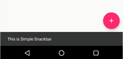
Using Snackbar for Temporary Messages
Snackbar is the smarter version of Toasts in Android. You can provide action buttons like "OK" or "CANCEL" along with a message using a Snackbar. Unlike Toast, you need to provide a view to display the Snackbar.
It's good practice to show a confirmation message after adding an item successfully and take back to the item list after user's acknowledgement. Let's add a function for that inside AddItemActivity:
private fun showAddItemConfirmation() { Snackbar.make(addItemRootView, getString(R.string.add_item_successful), Snackbar.LENGTH_LONG) .setAction(getString(R.string.ok)) { navigateBackToItemList() } .show() }
It shows a Snackbar in addItemRootView with a success message for a longer duration defined by Snackbar.LENGTH_LONG.
You added an action button with text "OK" by appending
.setAction(getString(R.string.ok)) { navigateBackToItemList() }
which performs navigateBackToItemList() action on button click.
Add showAddItemConfirmation() at the bottom of onClickAddItem() function:
fun onClickAddItem(view: View) { if (hasValidInput()) { val selectedCategory = categorySpinner.selectedItem as Category DataProvider.addItem(Item( imageId = imageFromCategory(selectedCategory), title = titleEditText.text.toString(), details = detailsEditText.text.toString(), price = priceEditText.text.toString().toDouble(), category = selectedCategory, postedOn = System.currentTimeMillis()) ) showAddItemConfirmation() } }
Run the app again and to add a new item title, price and details, The output should be like this:
Animating Item Details
Presenting item details is an attractive way of providing the user more information that may lead to more items sold. One approach to making the detail page more attractive is to use animation. In this section, you'll leverage what Design Support Library offers to make the app more lucrative...
Using CoordinatorLayout and CollapsingToolbarLayout
Combining CoordinatorLayout with CollapsingToolbarLayout is a killer-combo that can make your app lot more fascinating to the users. Before seeing them in action, replace everything inside activity_details.xml with the following:
<?xml version="1.0" encoding="utf-8"?> <!-- 1 --> <android.support.design.widget.CoordinatorLayout xmlns:android="http://schemas.android.com/apk/res/android" xmlns:app="http://schemas.android.com/apk/res-auto" xmlns:tools="http://schemas.android.com/tools" android:layout_width="match_parent" android:layout_height="match_parent" tools:context=".ui.activity.DetailsActivity"> <!-- 2 --> <android.support.design.widget.AppBarLayout android:id="@+id/appBar" android:layout_width="match_parent" android:layout_height="@dimen/app_bar_height" android:theme="@style/AppTheme.AppBarOverlay"> <!-- 3 --> <android.support.design.widget.CollapsingToolbarLayout android:id="@+id/collapsingToolbarLayout" android:layout_width="match_parent" android:layout_height="match_parent" app:contentScrim="@color/colorPrimary" app:layout_scrollFlags="scroll|exitUntilCollapsed"> <ImageView android:id="@+id/itemImageView" android:layout_width="match_parent" android:layout_height="match_parent" android:scaleType="centerCrop" app:layout_scrollFlags="scroll|enterAlways|enterAlwaysCollapsed"/> <!-- 4 --> <android.support.v7.widget.Toolbar android:id="@+id/toolBar" android:layout_width="match_parent" android:layout_height="?attr/actionBarSize" app:layout_collapseMode="pin" app:popupTheme="@style/AppTheme.PopupOverlay"/> </android.support.design.widget.CollapsingToolbarLayout> </android.support.design.widget.AppBarLayout> <!-- 5 --> <include layout="@layout/content_details"/> <!-- 6 --> <android.support.design.widget.FloatingActionButton android:id="@+id/shareFab" android:layout_width="wrap_content" android:layout_height="wrap_content" android:layout_margin="@dimen/fab_margin" android:onClick="onClickShareFab" app:layout_anchor="@+id/appBar" app:layout_anchorGravity="bottom|end" app:srcCompat="@android:drawable/ic_menu_share"/> </android.support.design.widget.CoordinatorLayout>
Switch to the layout-blueprint for a better overview, then you'll go over each item in the layout, one by one:
CoordinatorLayout is the root layout and the container for it's child views. By specifying a behavior to a direct child of CoordinatorLayout, you’ll be able to intercept touch events, window insets, measurement, layout, and nested scrolling. Don't panic - you'll learn to implement them in the next section!
AppBarLayout allows your Toolbar and other views (such as the ImageView) to react to scroll events in a sibling view.
android:theme="@style/AppTheme.AppBarOverlay"
You used the above property to overwrite relevant attributes for light overlay style.
CollapsingToolbarLayout is a wrapper for Toolbar which allows the Toolbar to expand or collapse as the user scrolls through a view.
app:contentScrim="@color/colorPrimary"
Using the above property gradually changes CollapsingToolbarLayout's color to the provided color when it's collapsing.
app:layout_scrollFlags="scroll|exitUntilCollapsed"
The above property means the view should scroll off until it reaches to its minimum height (?attr/actionBarSize in this case)
Toolbar is actually a more flexible and customizable ActionBar that holds your navigation button, activity title etc. Here, using
android:layout_height="?attr/actionBarSize"
assures the Toolbar has exactly same height of a regular ActionBar, and
app:layout_collapseMode="pin"
pins it on top when CollapsingToolbarLayout is fully collapsed. Finally
app:popupTheme="@style/AppTheme.PopupOverlay"
styles it to be elevated as like a Popup when the Toolbar is visible.
You are including a layout from content_details.xml that shows the price, title and details of the item.
The FloatingActionButton allows you to share your item via a share-intent.
android:onClick="onClickShareFab"
Setting the above property will fire the onClickShareFab(view: View) function inside DetailsActivity when user clicks on it.
app:layout_anchor="@+id/appBar" app:layout_anchorGravity="bottom|end"
These last two properties keep the button it attached to the bottom-end of the AppBarLayout. The CoordinatorLayout automatically manages the visibility of FloatingActionButton when AppBarLayout is collapsed as you set the appBar as layout_anchor.
Put everything inside content_details.xml within a NestedScrollView, so the layout will look like this:
<?xml version="1.0" encoding="utf-8"?> <android.support.v4.widget.NestedScrollView xmlns:android="http://schemas.android.com/apk/res/android" xmlns:app="http://schemas.android.com/apk/res-auto" xmlns:tools="http://schemas.android.com/tools" android:layout_width="match_parent" android:layout_height="match_parent" app:layout_behavior="@string/appbar_scrolling_view_behavior" tools:context=".ui.activity.DetailsActivity" tools:showIn="@layout/activity_details"> <LinearLayout android:layout_width="match_parent" android:layout_height="wrap_content" android:orientation="vertical" android:padding="@dimen/default_padding"> <TextView android:id="@+id/priceTextView" style="@style/TextAppearance.AppCompat.Display1" android:layout_width="wrap_content" android:layout_height="wrap_content" android:textColor="@color/colorAccent" tools:text="@string/hint_price"/> <TextView android:id="@+id/titleTextView" style="@style/TextAppearance.AppCompat.Title" android:layout_width="match_parent" android:layout_height="wrap_content" android:layout_marginBottom="@dimen/default_margin" android:layout_marginTop="@dimen/default_margin" android:transitionName="@string/transition_title" tools:targetApi="lollipop" tools:text="@string/hint_title"/> <TextView android:id="@+id/detailsTextView" style="@style/TextAppearance.AppCompat.Body1" android:layout_width="match_parent" android:layout_height="wrap_content" tools:text="@string/hint_details"/> </LinearLayout> </android.support.v4.widget.NestedScrollView>
app:layout_behavior="@string/appbar_scrolling_view_behavior"
With the above property, you share scroll events on the NestedScrollView with AppBarLayout so that it can expand or collapse accordingly.
Finally, set the Toolbar inside onCreate() function in DetailsActivity.kt:
setSupportActionBar(toolBar) supportActionBar?.setDisplayHomeAsUpEnabled(true)
and modify populateDetails(item: Item?) function like this:
private fun populateDetails(item: Item?) { supportActionBar?.title = item?.category?.name itemImageView.setImageResource(item?.imageId!!) priceTextView.text = getString(R.string.currency_symbol) + item?.price.toString() titleTextView.text = item?.title detailsTextView.text = item?.details }
This sets the category name in the Toolbar title and the Item's image to the ImageView.
Run the app again, and navigate to the DetailsActivity of any item - you should see something amazing:
Adding Parallax Scrolling Effect
As you already seen, Design Support Library does all the heavy-lifting when it comes to animation, providing your users a rich user experience. Why not add one more effect! add following to the ImageView inside activity_details.xml:
app:layout_collapseMode="parallax" app:layout_collapseParallaxMultiplier="0.7"
This adds a nice parallax-scrolling effect to the ImageView when AppBarLayout open or collapse. The layout_collapseParallaxMultiplier impacts on speed and visible area during scroll. Default value for this is 0.5, you can play around this value and check which suits you best.
Build and Run and see the changes in all its glory!
This completes your quest into making an awesome marketplace app! Don't stop here; keep working on it - and maybe you can make the next eBay!
Where To Go From Here?
You can download the final project using the link at the top or the bottom of this tutorial.
To take your Material Design skills to the next level, here are some additional things to explore:
Learn to implement Activity Transitions With Shared Elements, The Palette API and more from raywenderlich.com
Learn to use AnimatedVectorDrawables
Use Downloadable Fonts to improve overall look and feel.
I hope you enjoyed materializing your app with Android Design Support Library. If you have any questions, comments, or awesome modifications to this project app please join the forum discussion and comment below!
The post Android Design Support Library: Getting Started appeared first on Ray Wenderlich.
Android Design Support Library: Getting Started published first on https://medium.com/@koresol
0 notes
Text
Create CollapsingToolbarLayout with using Recyclerview

In the below example layout I have created CollapsingToolbarLayout with using Recyclerview. Here first I have created CoordinatorLayout created all layout in CoordinatorLayout. Now I have added AppBarLayout, CollapsingToolbarLayout, ImageView, Toolbar, RecyclerView and FloatingActionButton. You can see below program it will clearly describe how to create CollapsingToolbarLayout with using Recyclerview.
<android.support.design.widget.CoordinatorLayout xmlns:android="http://schemas.android.com/apk/res/android"
xmlns:app="http://schemas.android.com/apk/res-auto"
android:layout_width="match_parent"
android:layout_height="match_parent"
android:fitsSystemWindows="true">
<android.support.design.widget.AppBarLayout
android:id="@+id/app_bar_layout"
android:layout_width="match_parent"
android:layout_height="wrap_content"
android:fitsSystemWindows="true"
android:theme="@style/ThemeOverlay.AppCompat.Dark.ActionBar">
Read the full blog about How to create CollapsingToolbarLayout with using Recyclerview at Findnerd.
Explore Findnerd to read such more blogs of Android, iOS, Java,PHP etc.
0 notes