#Gis Data Layers
Explore tagged Tumblr posts
Visit Tumblr Blog
Explore Tumblr blogs with no restrictions, modern design and the best experience.
Last Seen Tumblr Blogs


Fun Fact
BuzzFeed published a report claiming that Tumblr was utilized as a distribution channel for Russian agents to influence American voting habits during the 2016 presidential election in Feb 2018.
Text
GIS Data Layers: Essential Guide for Mapping & Analysis
Geographic Information Systems (GIS) have revolutionized the way we collect, analyze, and visualize spatial data. At the heart of GIS technology lies GIS data layers, which are fundamental for organizing geographic data and conducting spatial analysis. Whether you're working in urban planning, environmental science, or business intelligence, understanding GIS data layers is crucial for effective decision-making. This guide explores GIS data layers, their types, applications, and best practices for mapping and analysis.
What Are GIS Data Layers?
GIS data layers are digital representations of real-world features that are stored and displayed in a GIS environment. Each layer contains specific types of data, such as roads, rivers, land parcels, or population density, which can be overlaid to create a comprehensive spatial analysis. Layers work together in a stack, allowing users to examine spatial relationships and patterns.
Types of GIS Data Layers
GIS data layers are generally classified into two main types: vector data layers and raster data layers.
1. Vector Data Layers
Vector data layers use geometric shapes to represent geographic features. These include:
Point Layers – Represent discrete locations such as cities, schools, or landmarks.
Line Layers – Represent linear features like roads, rivers, and power lines.
Polygon Layers – Represent areas such as land use zones, administrative boundaries, or lakes.
2. Raster Data Layers
Raster data layers use a grid-based system of pixels to represent spatial data. These include:
Satellite Imagery – Provides real-time Earth observations for environmental monitoring.
Digital Elevation Models (DEM) – Represent terrain elevation for topographical analysis.
Land Cover Data – Show different land use patterns such as forests, water bodies, and urban areas.
Applications of GIS Data Layers
GIS data layers have broad applications across various fields, including:
1. Urban Planning
Planners use GIS layers to analyze land use, zoning regulations, and transportation networks, helping to design sustainable cities.
2. Environmental Management
GIS helps in monitoring deforestation, predicting natural disasters, and managing water resources through spatial data layers.
3. Public Health
Health organizations use GIS layers to track disease outbreaks, optimize healthcare facility locations, and study environmental health hazards.
4. Agriculture
GIS layers assist farmers in soil analysis, crop monitoring, and precision farming by overlaying different spatial datasets.
5. Business and Marketing
Retailers and businesses use GIS to analyze customer demographics, optimize store locations, and assess market potential through spatial data visualization.
Best Practices for Using GIS Data Layers
To ensure accuracy and effectiveness in GIS mapping and analysis, consider these best practices:
1. Maintain Data Quality
Ensure that GIS layers are accurate, up-to-date, and sourced from reliable databases. Data errors can lead to incorrect analysis and decisions.
2. Use Proper Layer Hierarchy
Stack layers logically, placing base layers such as terrain or satellite imagery at the bottom and thematic layers like transportation networks or demographic data on top.
3. Leverage Attribute Data
Enhance GIS layers with attribute data, such as population statistics or land use types, to improve analysis capabilities.
4. Optimize for Performance
Using too many detailed layers can slow down GIS software. Optimize layers by simplifying features and using appropriate resolutions for raster data.
5. Integrate Multiple Data Sources
Combining GIS data layers from different sources, such as GPS data, remote sensing, and survey data, provides a more comprehensive analysis.
Conclusion
GIS data layers are essential for mapping and spatial analysis, enabling professionals across industries to make informed decisions. By understanding the types, applications, and best practices of GIS layers, users can harness the full potential of GIS technology. Whether for urban planning, environmental conservation, or business intelligence, GIS data layers provide valuable insights that shape the future of spatial analysis.
By mastering GIS data layers, professionals can enhance their analytical capabilities and improve decision-making processes, making GIS an indispensable tool in today’s data-driven world.
0 notes
Text
I'm taking over management of a public informational web map for a small local government. The guy who created it over a decade ago was good with the science/analytical side of GIS but was by his own admission not great a creating an easy-to-read map. I mean, you click on something and the popup label will read "wm_NP3: JXY209". So we're going over the map, I'm talking about some of the changes I'll be able to make like more obvious labels, and he says "oh, don't do that for everything."
"Why not?"
"Some of that's critical infrastructure, we don't actually want all that information public."
His security system was to leave the default labeling for everything and hope that the sensitive information was confusing enough that only the people who needed it for legitimate purposes would be able to figure it out.

Oh, and when I asked if he kept any metadata that might help me understand his files and labels, he basically responded with, "What's metadata?"

Anyway I will be crying in the corner as I try to decipher the data for dozens of mapping files and track down where they came from. I already found out one of our (intentionally public) data layers was last designed and updated on Windows XP so um. Wish me luck.
63 notes
·
View notes
Text

An interactive evacuation zone map, touted by the Israeli military as an innovation in humanitarian process, was revealed to rely on a subset of an internal Israeli military intelligence database. The US-based software developer who revealed the careless error has determined -> that the database was in use since at least 2022 and was updated through December of 2023.
On Tuesday, July 9th, we discovered an interactive version of the evacuation map while examining a page on the IDF's Arabic-language website accessible via a QR code -> published on an evacuation order leaflet.
The map is divided into "population blocks" an IDF term to refer to the 620 polygons used to divide Gaza into sectors that a user can zoom into and out of.
However each request to the site pulls not only the polygon -> boundaries but the demographic information assigned to that sector, including which families - and how many. members - live there.
𝐃𝐢𝐬𝐜𝐨𝐯𝐞𝐫𝐲 𝐨𝐟 𝐈𝐧𝐭𝐞𝐫𝐚𝐜𝐭𝐢𝐯𝐞 𝐄𝐯𝐚𝐜𝐮𝐚𝐭𝐢𝐨𝐧 𝐌𝐚𝐩𝐬:
Evacuation maps have played a central role -> in determining which sectors of Gaza were deemed "safe", but repeated instances of Israeli bombing in "safe" sectors has prompted international bodies to state "nowhere in Gaza is safe"
To determine how these sectors have been affected over time, assess the presence of vital -> civilian infrastructure, and gauge the potential impact on the population following the military's evacuation calls to Gaza City residents, the latest of which was two days ago, our team created a map tied to a database using software known as a "geographic information system” -> With the help of volunteer GIS developers, our map of Gaza included individual layers for hospitals, educational facilities, roads, and municipal boundaries.
This endeavor took an unexpected turn earlier this week when we started to work on -> the layer of "evacuation population blocks"
using a map shared to the Israeli military's Arabic site. Unlike static images, these maps responded interactively to zooming and panning. A software developer suggested that dynamic interaction was possible because the coordinates -> of various "population blocks" were delivered to the browser with each request, potentially retrieving the coordinates of the "population blocks" in real time and overlaying them on the map we were building.
The software developer delved into the webpage's source code -> —a practice involving the inspection of code delivered to every visitor's browser by the website. The source code of every website is publicly available and delivered to visitors on every page request. It functions "under the hood" of the website and can be viewed without -> any specialized tools or form of hacking.
𝐏𝐚𝐫𝐬𝐢𝐧𝐠 𝐔𝐧𝐞𝐱𝐩𝐞𝐜𝐭𝐞𝐝 𝐃𝐚𝐭𝐚
Upon examination, the data retrieved by the dynamic evacuation map included much more than just geographical coordinates. The source code contained a table from an unknown GIS -> database with numerous additional fields labelled in Hebrew.
These fields included population estimates for each block, details of the two largest clans in each block (referred to as “CLAN”), rankings based on unknown criteria -> and timestamps indicating when records were last updated.
Some data terms, such as "manpower_e," were ambiguous for us to interpret, possibly referring to either the number of fighters or the necessary personnel to maintain the area -> Using this information we determined that Block 234, Abu Madin was last updated on 27 April 2022. This suggests that Israel's effort to divide Gaza into 620 "population blocks" began one and a half years before the current Israeli offensive -> Additional modification dates indicate that the military updated data in this field regularly throughout October and November, before formally publishing it on the arabic Israeli military webpage on December 1, 2023.
It appears that the IDF has accidentally published -> a subset of their internal intelligence
GIS database in an effort to impress the world with a novel, humanitarian evacuation aid. It is easier to retrieve a database in its entirety than to write a properly selective query. Such mistakes are common among programmers that lack -> experience, security training, or are simply unwilling or unable to do meet standard data security requirements for a project.
𝐂𝐥𝐚𝐧𝐬 𝐚𝐧𝐝 𝐀𝐝𝐦𝐢𝐧𝐢𝐬𝐭𝐫𝐚𝐭𝐢𝐨𝐧 𝐏𝐥𝐚𝐧𝐬 -> In January, Israeli security chiefs proposed a plan for "the day after" where Palestinian clans in the Gaza Strip would temporarily administer the coastal enclave. In this concept, each clan would handle humanitarian aid and resources for their local regions. Israeli assessments of the proposal suggested such a plan would fail due to "lack of will" and retaliation by Hamas against clans willing to collaborate with the army. The plan has since been modified to include Hamas-free “bubbles,” (as reported by the Financial Times) -> where local Palestinians would gradually take over aid distribution responsibilities.
As this plan is to be initially implemented in Beit Hanoun and Beit Lahia. Al-Atatrah Area and Beit Hanoun, we have analyzed the information in the database assigned to those three areas -> Israeli army classified the Al-Atatrah area as region 1741, although there are only 620 'blocks' on the map. The registered population was listed as 949, last updated by the IDF on October 9th. We assume this represents an estimate by the IDF of current residents as of Oct 9th. Residents of Al-Atatrah were among the first to evacuate following the initial bombardment on October 7th and 8th and were not given a formal notification to evacuate. The Israeli military noted that the Abo Halima family comprised 54% of the block’s population -> In area west of the town Beit Hanoun, Israel had desginated the Almasri clan as the largest in the sector, consisting 18% of the block's population. Second largest was the Hamad family, with11% of the block's population. This area were also associated with rankings, however -> without the criteria used to determine the ranking, these numbers are difficult to interpret.
𝐖𝐡𝐚𝐭 𝐝𝐨𝐞𝐬 𝐭𝐡𝐢𝐬 𝐢𝐧𝐟𝐨𝐫𝐦𝐚𝐭𝐢𝐨𝐧 𝐫𝐞𝐯𝐞𝐚𝐥?
Although some of the data were inadvertently truncated during publication, posing challenges for comprehensive -> interpretation, this database provides a valuable window into the Israeli military's perspective on Gaza.
For one, it prompts questions into why the military had already partitioned Gaza into 620 population blocks a year an a half before October 7th -> This suggests an early inclination to implement a governance policy where clans would assume authoritative roles, as well as detailed population surveillance. Tracking dense populations in the chaos of urban warfare is a difficult task -> It may be that the QR code on the evacuation map actively collects the locations of people who scan it, allowing the IDF to collect real-time data on Palestinians in Gaza as they attempt to find safety.
END
85 notes
·
View notes
Text
Walz said he was an early adopter of GIS software in the 1990s, using it, among other things, to teach high school students about the Holocaust. He had his students build maps of the contemporary world using different layers of data that scholars believed could factor into modern-day genocides. “They started looking at food insecurity, potential drought, just like the UN was doing around famine early warning,” Walz said. In 1993, he asked his sophomores where they thought the next genocide might happen, based on the geographic data. They pinpointed Rwanda. The following year, the Rwandan Genocide occurred. The New York Times interviewed some of the students involved in the project in 2008, when Walz was a U.S. congressman.
Sounds like a VP primed to be effectivealtruism predictionmarket-pilled, for better or worse.
20 notes
·
View notes
Text
#WageCageLocations


To proceed with generating or acquiring maps of underground tunnels or systems for 1183 Western Ave S, Los Angeles, CA, here’s a detailed guide you can follow:
Access Public Records
Contact Local Authorities: Reach out to the Los Angeles Department of Public Works or the Bureau of Engineering. They maintain maps and schematics of underground utilities and tunnel systems.
Website: LA Public Works
Phone: 311 (or 213-473-3231 outside Los Angeles)
Request Public Records: Submit a Public Records Act (PRA) request to obtain detailed maps of underground utilities or tunnels.
Use Geospatial Tools
Google Earth Pro:
Download Google Earth Pro (free) from here.
Search the address and explore its 3D and historical imagery layers.
Overlay city planning or utility map data if available.
ArcGIS:
Use GIS mapping software such as ArcGIS to access local underground data layers.
Some public libraries or universities provide free access to ArcGIS.
USGS Resources:
Check the U.S. Geological Survey (USGS) for geospatial data in the area: USGS Website.
Search their databases for subsurface or geological maps.
Hire Professionals
Geophysical Survey Services: Companies offering ground-penetrating radar (GPR) services can map underground tunnels, pipelines, and utilities. Examples:
GSSI (Ground Penetrating Radar Systems, Inc.)
Local geotechnical or engineering firms.
Surveying Experts: Licensed surveyors can create precise subsurface maps.
Research Historical and Urban Planning Data
Libraries and Archives:
Visit local archives or libraries like the Los Angeles Public Library. They often have historical maps and documents.
California Historical Society:
Explore their archives for historical records of tunnels or underground systems.
Collaborate with Open-Source Projects
OpenStreetMap:
Check OpenStreetMap for user-contributed data on the area.
Subterranean Mapping Communities:
Join forums or communities interested in urban exploration (e.g., Reddit's r/urbanexploration).
Final Steps
Once you've gathered relevant data, you can use tools like AutoCAD or GIS software to compile your maps. If you'd like further help with interpreting or organizing data, feel free to ask!
Here is a detailed prompt you can use for another AI or mapping tool capable of generating maps and schematics of underground tunnel systems:
Prompt for AI Map Generator:
"Generate a detailed map and schematic of the underground tunnel systems, utility lines, and infrastructure at and around the location 1183 Western Ave S, Los Angeles, CA. The map should include the following details:
Subsurface Layers:
Sewer systems, drainage systems, and stormwater pipelines.
Electrical, gas, and water utility lines.
Any known historical or abandoned tunnels.
Proximity:
Cover an area with a radius of 1 mile from the given location.
Highlight all connections to adjacent buildings and structures.
Visualization:
Provide both 2D and 3D views of the underground systems.
Use different colors and layers for various types of infrastructure (e.g., blue for water lines, yellow for gas lines, etc.).
Include a legend for easy identification of systems.
Additional Features:
Annotate points of interest (e.g., access points, manholes, maintenance tunnels).
Show depth levels for each layer (e.g., sewer system at 15 feet, utility lines at 10 feet).
Overlay the map with the above-ground street grid for reference.
Data Integration:
Incorporate open-source geospatial data, city planning maps, and historical records if available.
Highlight discrepancies between historical and current data.
Output Formats:
Provide the map in standard formats like GeoTIFF, DWG (AutoCAD), and PDF for versatility.
Include a .KMZ file for visualization in Google Earth."
This prompt provides clear instructions and context for generating a comprehensive underground map. Use it with AI tools like GIS-enabled platforms, geospatial mapping AIs, or simulation software. Let me know if you need adjustments or more guidance!


8 notes
·
View notes
Text
How to Integrate 3D Map Illustration into Site Analysis for Architectural Projects

Integrate 3D Map Illustration into Site Analysis
In the world of architecture and urban planning, understanding the terrain, infrastructure, and environment is critical before laying the first brick. Traditional site analysis methods have served us well, but as technology advances, so do our tools. One of the most innovative advancements in this space is the use of 3D Map Illustration and 3D Vector Maps in architectural planning.
Combining artistic clarity with technical depth, 3D map illustrations offer more than just visual appeal—they provide actionable insights. Let’s explore how integrating these advanced tools into your Architecture Illustration process can streamline site analysis and improve project outcomes.
What Is a 3D Map Illustration?
Unlike standard 2D maps, these illustrations display terrain, buildings, infrastructure, vegetation, and other features in a three-dimensional space. They give architects, engineers, and planners a much deeper understanding of the site conditions.
Often created using GIS data, CAD software, and digital illustration tools, 3D map illustrations are ideal for both technical analysis and presentation purposes. They are more than just artistic renderings—they’re functional, data-driven visual tools.
Why Use 3D Map Illustrations in Site Analysis?
It includes examining a location’s topography, climate, vegetation, zoning, infrastructure, and accessibility. Here’s why 3D Vector Maps and 3D map illustrations are revolutionizing this process:
1. Enhanced Spatial Understanding
While 2D drawings give flat representations, 3D Map Illustrationprovides a volumetric perspective.
2. Data Integration
Modern 3D vector maps can incorporate real-time data such as topography, utilities, and environmental factors. This integration helps identify potential challenges, like flood zones or unstable terrain, early in the design process.
3. Improved Client Communication
With Architecture Illustration in 3D, clients and community members can easily understand and visualize the proposed development within its context.
4. Better Decision-Making
Using 3D maps during site analysis supports better decision-making. Whether it’s choosing optimal building orientation, identifying natural shade zones, or evaluating how structures impact sightlines, the 3D visualization simplifies complex evaluations.
Step-by-Step: Integrating 3D Map Illustration into Site Analysis
Let’s break down how to incorporate 3D map illustration and 3D Vector Maps into your architectural site analysis workflow.
Step 1: Gather Site Data
Topographical surveys
GIS layers
Aerial imagery
Zoning regulations
Infrastructure maps (roads, utilities, drainage)
Environmental reports
Step 2: Choose the Right Tools and Software
There are many tools available for creating 3D Vector Maps and architectural illustrations. Some of the popular ones include:
SketchUp – Great for quick, interactive 3D models.
Blender or Cinema 4D – For highly stylized 3D illustrations.
Adobe Illustrator (with plugins) – To enhance vector-based output.
Choose a combination that fits both your technical needs and aesthetic style.
Step 3: Create the Base Terrain Model
This forms the physical base upon which other features—roads, buildings, vegetation—will be layered. Many software platforms can convert contour lines and elevation points into 3D surfaces automatically.
Step 4: Add Site Features Using Vector Layers
Now incorporate other elements such as:
Roads and transportation networks
Water bodies and drainage systems
Green zones and vegetation
Existing structures or utilities
These layers, typically drawn as 3D Vector Maps, provide an accurate spatial layout of all critical site components.
Step 5: Apply Architecture Illustration Techniques
This is where artistry meets data. Use Architecture Illustration principles to render the map with aesthetic enhancements:
Textures for terrain (grass, sand, water, urban)
Stylized representations of trees, buildings, and shadows
Labeling of key zones and infrastructure
Lighting effects for better depth perception
Step 6: Use for Analysis and Reporting
Once the map is complete, use it to conduct site analysis:
Determine view corridors and sightlines
Analyze sun paths and shading
Evaluate accessibility and circulation
Review spatial relationships and setbacks
These insights can then be documented in your architectural site report, with visuals that clearly back up your recommendations.
Use Cases: Where 3D Map Illustration Excels
Here are a few examples of how 3D Vector Maps are applied in real architectural projects:
Urban Master Planning
City planners use 3D maps to visualize entire neighborhoods, analyze density, and simulate transportation flows before construction begins.
Resort and Campus Design
When designing large areas like resorts or educational campuses, 3D illustrations help stakeholders understand zoning, amenities, and pedestrian routes.
Landscape Architecture
Landscape architects use 3D map illustration to study the interaction between built environments and nature—perfect for planning gardens, parks, and open spaces.
Infrastructure Projects
Infrastructure projects, like bridges, tunnels, and roads, benefit from 3D visuals to navigate complex terrain and urban constraints.
Integrating 3D Vector Maps in Projects
Here are a few additional benefits of incorporating 3D Vector Maps at the start of your architectural workflow:
Reduces design errors by visualizing constraints early
Accelerates approvals with more convincing presentations
Encourages collaboration across disciplines (engineering, landscaping, urban planning)
Saves cost and time by identifying site issues before they become expensive problems
The Future of Architecture, Illustration and Mapping
We’re heading toward a future where maps aren’t just flat diagrams—they’re immersive, interactive environments.
From drone-based site scans to AR-compatible 3D maps, architectural site analysis is becoming more data-rich and user-friendly. It’s no longer about lines and elevations—it’s about experiences and environments.
Final Thoughts
Incorporating 3D Map Illustration and 3D Vector Maps into your site analysis isn’t just a trend—it’s a game-changer. These tools enhance your technical accuracy, improve communication, and ultimately lead to more successful architectural outcomes.
Whether you’re designing a single home or planning an entire urban district, using modern Architecture Illustration tools helps you see the full picture—literally and figuratively.
So, as you gear up for your next architectural project, make sure your toolkit includes more than just rulers and blueprints.
2 notes
·
View notes
Text
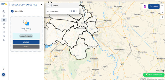
How to Add CSV Data to an Online Map?
Introduction
If you're working with location-based data in a spreadsheet, turning it into a map is one of the most effective ways to make it visually engaging and insightful. Whether you're planning logistics, showcasing population distribution, or telling a location-driven story, uploading CSV (Comma-Separated Values) files to an online mapping platform helps simplify and visualize complex datasets with ease.

🧩 From Spreadsheets to Stories
If you've ever worked with spreadsheets full of location-based data, you know how quickly they can become overwhelming and hard to interpret. But what if you could bring that data to life—turning rows and columns into interactive, insightful maps?
📌 Why Map CSV Data?
Mapping CSV (Comma-Separated Values) data is one of the most effective ways to simplify complex datasets and make them visually engaging. Whether you're analyzing population trends, planning delivery routes, or building a geographic story, online mapping platforms make it easier than ever to visualize the bigger picture.
⚙️ How Modern Tools Simplify the Process
Modern tools now allow you to import CSV or Excel files and instantly generate maps that highlight patterns, relationships, and clusters. These platforms aren’t just for GIS professionals—anyone with location data can explore dynamic, customizable maps with just a few clicks. Features like filtering, color-coding, custom markers, and layered visualizations add depth and context to otherwise flat data.
📊 Turn Data Into Actionable Insights
What’s especially powerful is the ability to analyze your data directly within the map interface. From grouping by categories to overlaying district boundaries or land-use zones, the right tool can turn your basic spreadsheet into an interactive dashboard. And with additional capabilities like format conversion, distance measurement, and map styling, your data isn't just mapped—it's activated.
🚀 Getting Started with Spatial Storytelling
If you're exploring options for this kind of spatial storytelling, it's worth trying platforms that prioritize ease of use and flexibility. Some tools even offer preloaded datasets and drag-and-drop features to help you get started faster.
🧭 The Takeaway
The bottom line? With the right platform, your CSV file can become more than just data—it can become a story, a strategy, or a solution.
Practical Example
Let’s say you have a CSV file listing schools across a country, including their names, coordinates, student populations, and whether they’re public or private. Using an interactive mapping platform like the one I often work with at MAPOG, you can assign different markers for school types, enable tooltips to display enrollment figures, and overlay district boundaries. This kind of layered visualization makes it easier to analyze the spatial distribution of educational institutions and uncover patterns in access and infrastructure.
Conclusion
Using CSV files to create interactive maps is a powerful way to transform static data into dynamic visual content. Tools like MAPOG make the process easy, whether you're a beginner or a GIS pro. If you’re ready to turn your spreadsheet into a story, start mapping today!
Have you ever mapped your CSV data? Share your experience in the comments below!
4 notes
·
View notes
Text
Udaan by InAmigos Foundation: Elevating Women, Empowering Futures

In the rapidly evolving socio-economic landscape of India, millions of women remain underserved by mainstream development efforts—not due to a lack of talent, but a lack of access. In response, Project Udaan, a flagship initiative by the InAmigos Foundation, emerges not merely as a program, but as a model of scalable women's empowerment.
Udaan—meaning “flight” in Hindi—represents the aspirations of rural and semi-urban women striving to break free from intergenerational limitations. By engineering opportunity and integrating sustainable socio-technical models, Udaan transforms potential into productivity and promise into progress.
Mission: Creating the Blueprint for Women’s Self-Reliance
At its core, Project Udaan seeks to:
Empower women with industry-aligned, income-generating skills
Foster micro-entrepreneurship rooted in local demand and resources
Facilitate financial and digital inclusion
Strengthen leadership, health, and rights-based awareness
Embed resilience through holistic community engagement
Each intervention is data-informed, impact-monitored, and custom-built for long-term sustainability—a hallmark of InAmigos Foundation’s field-tested grassroots methodology.
A Multi-Layered Model for Empowerment

Project Udaan is built upon a structured architecture that integrates training, enterprise, and technology to ensure sustainable outcomes. This model moves beyond skill development into livelihood generation and measurable socio-economic change.
1. Skill Development Infrastructure
The first layer of Udaan is a robust skill development framework that delivers localized, employment-focused education. Training modules are modular, scalable, and aligned with the socio-economic profiles of the target communities.
Core domains include:
Digital Literacy: Basic computing, mobile internet use, app navigation, and digital payment systems
Tailoring and Textile Production: Pattern making, machine stitching, finishing techniques, and indigenous craft techniques
Food Processing and Packaging: Pickle-making, spice grinding, home-based snack units, sustainable packaging
Salon and Beauty Skills: Basic grooming, hygiene standards, customer interaction, and hygiene protocols
Financial Literacy and Budgeting: Saving schemes, credit access, banking interfaces, micro-investments
Communication and Self-Presentation: Workplace confidence, customer handling, local language fluency
2. Microenterprise Enablement and Livelihood Incubation
To ensure that learning transitions into economic self-reliance, Udaan incorporates a post-training enterprise enablement process. It identifies local market demand and builds backward linkages to equip women to launch sustainable businesses.
The support ecosystem includes:
Access to seed capital via self-help group (SHG) networks, microfinance partners, and NGO grants
Distribution of startup kits such as sewing machines, kitchen equipment, or salon tools
Digital onboarding support for online marketplaces such as Amazon Saheli, Flipkart Samarth, and Meesho
Offline retail support through tie-ups with local haats, trade exhibitions, and cooperative stores
Licensing and certification where applicable for food safety or textile quality standards
3. Tech-Driven Monitoring and Impact Tracking
Transparency and precision are fundamental to Udaan’s growth. InAmigos Foundation employs its in-house Tech4Change platform to manage operations, monitor performance, and scale the intervention scientifically.
The platform allows:
Real-time monitoring of attendance, skill mastery, and certification via QR codes and mobile tracking
Impact evaluation using household income change, asset ownership, and healthcare uptake metrics
GIS-based mapping of intervention zones and visualization of under-reached areas
Predictive modeling through AI to identify at-risk participants and suggest personalized intervention strategies
Human-Centered, Community-Rooted
Empowerment is not merely a process of economic inclusion—it is a cultural and psychological shift. Project Udaan incorporates gender-sensitive design and community-first outreach to create lasting change.
Key interventions include:
Strengthening of SHG structures and women-led federations to serve as peer mentors
Family sensitization programs targeting male allies—fathers, husbands, brothers—to reduce resistance and build trust
Legal and rights-based awareness campaigns focused on menstrual hygiene, reproductive health, domestic violence laws, and maternal care
Measured Impact and Proven Scalability
Project Udaan has consistently delivered quantifiable outcomes at the grassroots level. As of the latest cycle:
Over 900 women have completed intensive training programs across 60 villages and 4 districts
Nearly 70 percent of participating women reported an average income increase of 30 to 60 percent within 9 months of program completion
420+ micro-enterprises have been launched, 180 of which are now self-sustaining and generating employment for others
More than 5,000 indirect beneficiaries—including children, elderly dependents, and second-generation SHG members—have experienced improved access to nutrition, education, and mobility
Over 20 institutional partnerships and corporate CSR collaborations have supported infrastructure, curriculum design, and digital enablement.
Partnership Opportunities: Driving Collective Impact
The InAmigos Foundation invites corporations, philanthropic institutions, and ecosystem enablers to co-create impact through structured partnerships.
Opportunities include:
Funding the establishment of skill hubs in high-need regions
Supporting enterprise starter kits and training batches through CSR allocations
Mentoring women entrepreneurs via employee volunteering and capacity-building workshops
Co-hosting exhibitions, market linkages, and rural entrepreneurship fairs
Enabling long-term research and impact analytics for policy influence
These partnerships offer direct ESG alignment, brand elevation, and access to inclusive value chains while contributing to a model that demonstrably works.
What Makes Project Udaan Unique?

Unlike one-size-fits-all skilling programs, Project Udaan is rooted in real-world constraints and community aspirations. It succeeds because it combines:
Skill training aligned with current and emerging market demand
Income-first design that integrates microenterprise creation and financial access
Localized community ownership that ensures sustainability and adoption
Tech-enabled operations that ensure transparency and iterative learning
Holistic empowerment encompassing economic, social, and psychological dimensions
By balancing professional training with emotional transformation and economic opportunity, Udaan represents a new blueprint for inclusive growth.
From Promise to Power
Project Udaan, driven by the InAmigos Foundation, proves that when equipped with tools, trust, and training, rural and semi-urban women are capable of becoming not just contributors, but catalysts for socio-economic renewal.
They don’t merely escape poverty—they design their own systems of progress. They don’t just participate—they lead.
Each sewing machine, digital training module, or microloan is not a transaction—it is a declaration of possibility.
This is not charity. This is infrastructure. This is equity, by design.
Udaan is not just a program. It is a platform for a new India.
For partnership inquiries, CSR collaborations, and donation pathways, contact: www.inamigosfoundation.org/Udaan Email: [email protected]
3 notes
·
View notes
Text
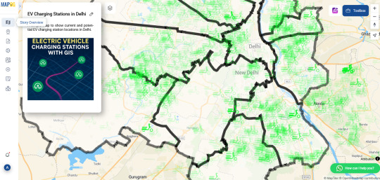
Mapping Electric Vehicle Charging Stations Using GIS
As cities embrace cleaner transportation, the demand for electric vehicle (EV) charging infrastructure is surging. Yet while EVs gain popularity, many urban areas are still figuring out where to place charging stations most effectively. Without careful planning, some neighborhoods end up with clusters of chargers while others are left underserved. That’s where Geographic Information Systems (GIS) come in—offering a smarter, data-driven way to visualize and plan for EV needs.

How GIS Makes the Network Smarter GIS lets you see beyond the street level. By uploading spatial data like traffic density, residential zones, and current EV station locations, urban planners can create layered maps that highlight gaps and overlaps. You can also add custom fields like “charger type” or “station usage” to analyze performance and capacity.
One powerful technique is spatial buffering—drawing influence zones around each station to visualize coverage. Combine this with cross-layer analysis, and you can pinpoint underserved areas based on traffic flow, proximity to major roads, or even power grid access. These insights aren’t just helpful for long-term planning—they’re essential for avoiding grid strain and ensuring accessibility across income groups.
Who’s Using It? Governments, transport planners, and sustainability teams are now turning to GIS to guide EV infrastructure rollouts. Private companies use it to select profitable locations. Utility providers rely on spatial analysis to prepare for increased electricity demand. Even environmental groups and tech startups are tapping into GIS tools to support EV adoption through better planning and advocacy.
Simple, Powerful Mapping Tools You don’t need to be a GIS expert to start mapping. Browser-based platforms like MAPOG are lowering the barrier, allowing users to upload Excel files, style data, and analyze spatial relationships without complicated software installs. Want to compare EV charger density across cities? Or see how charger accessibility overlaps with income levels? Tools like these make that kind of insight easy to visualize—and easier to act on.
Charging Toward a Greener Future The road to sustainability is paved with good data. With GIS tools in hand, EV infrastructure planning becomes more equitable, efficient, and transparent. Whether you're part of a government initiative, a startup, or a local community group, these maps can help you answer a simple but powerful question: where should we build next?
Have you tried mapping EV stations in your city? Upload your data, run some spatial analysis, and see the electrified future unfold—one layer at a time.
2 notes
·
View notes
Text
How GIS Is Improving Traffic Management and Road Safety
The Growing Urban Traffic Crisis
Traffic congestion and road safety have become major urban issues in cities worldwide. With more vehicles on the road each year, traditional approaches to traffic planning often lag behind the realities on the ground. Poorly timed signals, accident-prone intersections, and missing data on high-risk zones contribute to delays and danger for drivers, cyclists, and pedestrians alike. Addressing these challenges requires more than just street-side observations—this is where Geographic Information Systems (GIS) come into play.

Visualizing Risk with GIS Tools
GIS is transforming the way cities approach traffic safety by turning raw data into spatial intelligence. By layering different types of information—road networks, traffic volume, crash reports, and population density—GIS allows urban planners to see beyond static maps. With tools like Buffer Tool and Vector Files , it’s now possible to identify high-risk zones with pinpoint accuracy.
In my own traffic mapping project, I used vector files to highlight major accident zones across several key intersections. By applying buffer analysis, I could define impact areas surrounding those hotspots and understand how nearby roads, pedestrian paths, and intersections were affected. These layers helped create a visual story of risk that was far more effective than any spreadsheet or report could convey.
Why It Matters: From Data to Safer Streets
The insights gained from GIS analysis aren’t just theoretical—they directly inform real-world actions. Transportation departments use this data to prioritize intersection redesigns, add traffic-calming measures, or optimize signal timing. Public safety officials use GIS to plan for emergency response routes, while urban designers rely on it to avoid placing new schools, hospitals, or bus stops near high-incident zones.

By identifying accident clusters through GIS, resources can be allocated more efficiently. Instead of reacting after the fact, cities can anticipate and prevent problems. It’s proactive planning instead of reactive patchwork.
Who Uses GIS for Road Safety?
Government traffic departments, city planners, and transportation engineers are leading the charge in using GIS for safer roads. But the reach goes beyond institutions. Community groups, researchers, and even independent analysts can use web-based GIS tools to advocate for safety improvements in their neighborhoods. Clear spatial visualizations help communicate traffic issues more effectively to decision-makers.
Smarter Mapping Through Accessible Platforms
What’s exciting is how accessible GIS has become. Web-based platforms now allow users to upload GIS data, overlay Vector Files, and perform spatial analysis directly in the browser—no specialized software or technical background required. Platforms like MAPOG, for example, offer these capabilities in a user-friendly interface that makes it easy to visualize accident hotspots, create buffer zones, and explore traffic flow scenarios. These tools are especially helpful for projects where quick, visual insights are needed.

Conclusion: From Congestion to Clarity
Cities can’t afford to keep guessing when it comes to traffic management and road safety. GIS offers a smarter, clearer, and more data-driven way to understand and solve traffic challenges. By mapping accident trends, simulating traffic changes, and visualizing risk zones, GIS helps create safer roads for everyone.
Whether you're working with a city planning team, leading a research project, or simply curious about local traffic patterns, modern mapping tools—like those offered by platforms such as MAPOG—make it easier than ever to turn spatial data into safer streets.
Have you explored your local traffic data? Try visualizing it with a GIS platform that supports buffer analysis and vector mapping—you might just uncover insights that could prevent the next accident.
2 notes
·
View notes
Text
GIS Data Layers: A Guide to Mapping and Analysis
Geographic Information Systems (GIS) have revolutionized how we understand and interact with spatial data. At the heart of GIS lies the concept of GIS data layers, which are essential for mapping and analysis. These layers form the building blocks of GIS projects, enabling users to visualize, analyze, and interpret complex spatial relationships. This guide delves into the fundamentals of GIS data layers, their types, and how they contribute to effective mapping and analysis.
What Are GIS Data Layers?
A GIS data layer represents a specific set of spatial data within a GIS application. Think of it as a transparent sheet containing information about a particular aspect of the Earth's surface, such as roads, vegetation, or population density. When multiple layers are stacked together, they create a comprehensive map that reveals patterns, relationships, and trends.
Each GIS data layer is associated with two main components:
Spatial Data: This defines the geographic location of features, such as points, lines, or polygons.
Attribute Data: This provides descriptive information about the features, such as names, measurements, or classifications.
Types of GIS Data Layers
GIS data layers can be categorized into various types based on their spatial and thematic characteristics. The primary types include:
1. Vector Layers
Vector data represents geographic features as points, lines, or polygons. It is often used for detailed and precise mapping. Examples of vector layers include:
Point Layers: Represent discrete locations, such as landmarks, trees, or weather stations.
Line Layers: Depict linear features, such as roads, rivers, or pipelines.
Polygon Layers: Represent areas, such as lakes, land parcels, or administrative boundaries.
2. Raster Layers
Raster data represents spatial information as a grid of cells (pixels), where each cell has a value. It is commonly used for continuous data, such as elevation, temperature, or land cover. Raster layers are ideal for representing data that changes gradually across a landscape.
3. Thematic Layers
Thematic layers focus on specific themes or topics, such as population density, soil types, or crime rates. These layers are often used to analyze and visualize trends and patterns in a particular domain.
4. Base Layers
Base layers provide a reference framework for other data layers. Examples include satellite imagery, topographic maps, or street maps. They offer context and help users interpret the spatial relationships of thematic data.
5. Time-Based Layers
Time-based layers include temporal information, enabling the visualization of changes over time. For instance, a time-based layer can show the spread of urban development or the progression of a wildfire.
Importance of GIS Data Layers in Mapping and Analysis
GIS data layers play a crucial role in spatial analysis and decision-making. Here’s how they contribute:
1. Visualization
GIS data layers allow users to create visually compelling maps that convey complex information in an understandable way. By combining multiple layers, users can explore relationships and patterns that might not be evident from raw data alone.
2. Data Integration
GIS enables the integration of diverse datasets from different sources into a single platform. By layering data, users can analyze how various factors interact, such as the relationship between land use and water quality.
3. Spatial Analysis
GIS data layers support advanced spatial analysis, such as proximity analysis, hotspot detection, and terrain modeling. These analyses are invaluable for applications like urban planning, environmental monitoring, and disaster management.
4. Decision Support
GIS data layers provide critical insights for informed decision-making. For example, they can help identify suitable locations for new infrastructure, assess environmental impacts, or plan emergency response strategies.
Key Considerations for Working with GIS Data Layers
When working with GIS data layers, several factors should be considered to ensure accuracy and effectiveness:
1. Data Quality
The reliability of GIS analysis depends on the quality of the data layers. Ensure that the data is accurate, up-to-date, and sourced from credible providers.
2. Coordinate Systems
GIS data layers must use a consistent coordinate system to ensure accurate alignment and analysis. Misaligned layers can lead to incorrect results and misinterpretations.
3. Data Format
GIS data comes in various formats, such as shapefiles, GeoJSON, and TIFF. Choose the appropriate format based on your project requirements and software capabilities.
4. Symbology and Styling
Proper styling of GIS data layers enhances the clarity and usability of maps. Use intuitive colors, symbols, and labels to represent features effectively.
5. Scalability
Consider the scale of your analysis when working with GIS data layers. Some layers are more suitable for local-scale studies, while others are designed for regional or global analyses.
Common Applications of GIS Data Layers
GIS data layers are used across various industries and disciplines. Here are some common applications:
1. Urban Planning
Urban planners use GIS data layers to analyze land use, transportation networks, and population distribution. This helps in designing sustainable cities and optimizing resource allocation.
2. Environmental Management
GIS supports environmental monitoring by mapping vegetation, wildlife habitats, and pollution sources. It aids in conservation efforts and assessing the impact of human activities.
3. Disaster Management
In disaster response, GIS data layers are crucial for mapping hazard zones, tracking evacuation routes, and coordinating relief efforts. They enable quick and efficient decision-making during emergencies.
4. Transportation
Transportation professionals use GIS to map road networks, plan routes, and analyze traffic patterns. GIS data layers also assist in optimizing public transit systems.
5. Public Health
In public health, GIS data layers help track disease outbreaks, analyze healthcare accessibility, and plan vaccination campaigns. Spatial analysis aids in identifying vulnerable populations and allocating resources.
6. Agriculture
Farmers and agricultural planners leverage GIS to monitor soil quality, predict crop yields, and manage irrigation systems. GIS data layers support precision agriculture and sustainable farming practices.
Tools and Software for Managing GIS Data Layers
Several GIS software tools are available for creating, managing, and analyzing GIS data layers. Popular options include:
ArcGIS: A comprehensive GIS platform offering advanced tools for mapping and spatial analysis.
QGIS: An open-source GIS software that supports a wide range of data formats and analysis techniques.
Google Earth Engine: A cloud-based platform for processing and analyzing large-scale geospatial datasets.
Mapbox: A web-based mapping platform for visualizing GIS data layers in interactive maps.
Future Trends in GIS Data Layers
As technology advances, GIS data layers continue to evolve, offering new possibilities for mapping and analysis. Key trends include:
1. Integration with AI and Machine Learning
AI-powered tools are enhancing the analysis of GIS data layers by identifying patterns, automating workflows, and generating predictive models.
2. Real-Time Data
The integration of real-time data, such as traffic updates or weather conditions, is making GIS applications more dynamic and responsive.
3. 3D Mapping
3D GIS data layers are becoming increasingly popular for applications like urban modeling, infrastructure design, and virtual reality simulations.
4. Cloud-Based GIS
Cloud-based platforms are enabling seamless access to GIS data layers from anywhere, facilitating collaboration and scalability.
5. Big Data and IoT Integration
The rise of big data and the Internet of Things (IoT) is driving the need for advanced GIS data layers to handle massive and complex datasets.
Conclusion
GIS data layers are the cornerstone of modern mapping and spatial analysis. By understanding their types, applications, and best practices, users can unlock the full potential of GIS technology. Whether you are an urban planner, environmental scientist, or business analyst, mastering GIS data layers will empower you to make informed decisions and drive impactful solutions. As GIS technology continues to advance, the possibilities for mapping and analysis are boundless, paving the way for a smarter and more connected world.
0 notes
Text
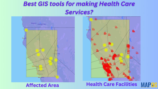
How to use GIS in Disease spreading?
Why is it important to use GIS for Disease mapping?
Mapping disease outbreaks provides critical opportunities to leverage Geographic Information Systems (GIS) for pandemic response, analysis, and decision-making.
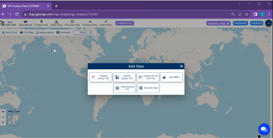
Steps to Add GIS Data to an Online Map
Choose an Online Mapping Tool
Choose an online platform to perform the basic needs for creating maps, adding layers and data visualization.
Online mapping platforms are powerful tools that combine geographic data, visualization, and interactivity to solve real-world problems across industries.
There are user-friendly websites for beginners as well as professional users like MAPOG. Where it provides different types of build-in tools.
Prepare Your Data
To prepare GIS data, download the required data in csv, kml. Shapefile or geojason format.
Organize your data layers based on their thematic importance, like roads, administrative boundaries, or climate zones.
Most platforms provide an option to upload or import GIS data directly. Ensure the spatial attributes are preserved during upload.
3. Steps for preparing mapping
By applying these simple steps in MAPOG one can easily make disease spreading maps.
To upload boundary ‘add upload’ > upload vector file to add area of interest > select the vector file > open > upload.
Upload csv data that has latitude and longitude > upload csv file > open > publish.
To change the symbols and color click > ‘Action’ > edit feature > change according to preference for both the layers.
Steps to add polygon in the disease affected area using “point to polygon”
By applying “points to polygon”, it shows the area that is affected.
Click “processing tool” > select “point to polygon” > select the point layer data > click “convert”.
Click the “action” button > rename > style editor > change the symbols and colours.

Conclusion
The purpose of using online map making is to research and make maps affordable, user-friendly, its simplicity and collaborative features make it ideal for individuals that need quick sharable maps without heavy investment in training or setups. Finally, future trends like AI integration mapping show the evolving nature of these platforms.
3 notes
·
View notes
Text
So let's get into the nitty-gritty technical details behind my latest project, the National Blue Trail round-trip search application available here:
This project has been fun with me learning a lot about plenty of technologies, including QGis, PostGIS, pgRouting, GTFS files, OpenLayers, OpenTripPlanner and Vita.
So let's start!
In most of my previous GIS projects I have always used custom made tools written in ruby or Javascript and never really tried any of the "proper" GIS tools, so it was a good opportunity for me to learn a bit of QGIS. I hoped I could do most of the work there, but soon realized it's not fully up to the job, so I had to extend the bits to other tools at the end. For most purposes I used QGis to import data from various sources, and export the results to PostGIS, then do the calculations in PostGIS, re-import the results from there and save them into GeoJSON. For this workflow QGIS was pretty okay to use. I also managed to use it for some minor editing as well.
I did really hope I could avoid PostGIS, and do all of the calculation inside QGIS, but its routing engine is both slow, and simply not designed for multiple uses. For example after importing the map of Hungary and trying to find a single route between two points it took around 10-15 minutes just to build the routing map, then a couple seconds to calculate the actual route. There is no way to save the routing map (at least I didn't find any that did not involve coding in Python), so if you want to calculate the routes again you had to wait the 10-15 minute of tree building once more. Since I had to calculate around 20.000 of routes at least, I quickly realized this will simply never work out.
I did find the QNEAT3 plugin which did allow one to do a N-M search of routes between two set of points, but it was both too slow and very disk space intense. It also calculated many more routes than needed, as you couldn't add a filter. In the end it took 23 hours for it to calculate the routes AND it created a temporary file of more than 300Gb in the process. After realizing I made a mistake in the input files I quickly realized I won't wait this time again and started looking at PostGIS + pgRouting instead.
Before we move over to them two very important lessons I learned in QGIS:
There is no auto-save. If you forget to save and then 2 hours later QGIS crashes for no reason then you have to restart your work
Any layer that is in editing mode is not getting saved when you press the save button. So even if you don't forget to save by pressing CTRL/CMD+S every 5 seconds like every sane person who used Adobe products ever in their lifetimes does, you will still lose your work two hours later when QGIS finally crashes if you did not exit the editing mode for all of the layers
----
So let's move on to PostGIS.
It's been a while since I last used PostGIS - it was around 11 years ago for a web based object tracking project - but it was fairly easy to get it going. Importing data from QGIS (more specifically pushing data from QGIS to PostGIS) was pretty convenient, so I could fill up the tables with the relevant points and lines quite easily. The only hard part was getting pgRouting working, mostly because there aren't any good tutorials on how to import OpenStreetMap data into it. I did find a blog post that used a freeware (not open source) tool to do this, and another project that seems dead (last update was 2 years ago) but at least it was open source, and actually worked well. You can find the scripts I used on the GitHub page's README.
Using pgRouting was okay - documentation is a bit hard to read as it's more of a specification, but I did find the relevant examples useful. It also supports both A* search (which is much quicker than plain Dijsktra on a 2D map) and searching between N*M points with a filter applied, so I hoped it will be quicker than QGIS, but I never expected how quick it was - it only took 5 seconds to calculate the same results it took QGIS 23 hours and 300GB of disk space! Next time I have a GIS project I'm fairly certain I will not shy away from using PostGIS for calculations.
There were a couple of hard parts though, most notably:
ST_Collect will nicely merge multiple lines into one single large line, but the direction of that line looked a bit random, so I had to add some extra code to fix it later.
ST_Split was similarly quite okay to use (although it took me a while to realize I needed to use ST_Snap with proper settings for it to work), but yet again the ordering of the segments were off a slight bit, but I was too lazy to fix it with code - I just updated the wrong values by hand.
----
The next project I had never used in the past was OpenTripPlanner. I did have a public transport project a couple years ago but back then tools like this and the required public databases were very hard to come by, so I opted into using Google's APIs (with a hard limit to make sure this will never be more expensive than the free tier Google gives you each month), but I have again been blown away how good tooling has become since then. GTFS files are readily available for a lot of sources (although not all - MAV, the Hungarian Railways has it for example behind a registration paywall, and although English bus companies are required to publish this by law - and do it nicely, Scottish ones don't always do it, and even if they do finding them is not always easy. Looks to be something I should push within my party of choice as my foray into politics)
There are a couple of caveats with OpenTripPlanner, the main one being it does require a lot of RAM. Getting the Hungarian map, and the timetables from both Volánbusz (the state operated coach company) and BKK (the public transport company of Budapest) required around 13GB of RAM - and by default docker was only given 8, so it did crash at first with me not realizing why.
The interface of OpenTripPlanner is also a bit too simple, and it was fairly hard for me to stop it from giving me trips that only involve walking - I deliberately wanted it to only search between bus stops involving actual bus travel as the walking part I had already done using PostGIS. I did however check if I could have used OpenTripPlanner for that part as well, and while it did work somewhat it didn't really give optimal results for my use case, so I was relieved the time I spend in QGIS - PostGIS was not in vain.
The API of OpenTripPlanner was pretty neat though, it did mimic Google's route searching API as much as possible which I used in the past so parsing the results was quite easy.
----
Once we had all of the data ready, the final bit was converting it to something I can use in JavaScript. For this I used my trusted scripting language I use for such occasion for almost 20 years now: ruby. The only interesting part here was the use of Encoded Polylines (which is Google's standard of sending LineString information over inside JSON files), but yet again I did find enough tools to handle this pretty obscure format.
----
Final part was the display. While I usually used Leaflet in the past I really wanted to try OpenLayers, I had another project I had not yet finished where Leaflet was simply too slow for the data, and I had a very quick look at OpenLayers and saw it could display it with an acceptable performance, so I believed it might be a good opportunity for me to learn it. It was pretty okay, although I do believe transparent layers seem to be pretty slow under it without WebGL rendering, and I could not get WebGL working as it is still only available as a preview with no documentation (and the interface has changed completely in the last 2 months since I last looked at it). In any case OpenLayers was still a good choice - it had built in support for Encoded Polylines, GPX Export, Feature selection by hovering, and a nice styling API. It also required me to use Vita for building the application, which was a nice addition to my pretty lacking knowledge of JavaScript frameworks.
----
All in all this was a fun project, I definitely learned a lot I can use in the future. Seeing how well OpenTripPlanner is, and not just for public transport but also walking and cycling, did give me a couple new ideas I could not envision in the past because I could only do it with Google's Routing API which would have been prohibitively expensive. Now I just need to start lobbying for the Bus Services Act 2017 or something similar to be implemented in Scotland as well
21 notes
·
View notes
Text
GIS Analysis in Urban Planning: Reshaping Transportation Future Insights of state/city
In the heart of urban development, where cityscapes and transportation networks intersect, the transformative influence of GIS analysis in urban planning takes center stage. This article delves into the intricacies of reshaping the transportation future through the lens of MAPOG GIS tool, unraveling critical insights that hold the potential to redefine the landscape of [State/City].
Key Concept: Our mission is clear: to enhance the synergy between buses, trains, and settlements across city/state. MAPOG serves as our guide, helping create a dynamic map that illuminates the locations of bus stops and train stations, ultimately ensuring convenient access for residents of settlements.
MAPOG GIS Analysis in Urban Planning
Following are the steps for enhancing urban transportation networks through MAPOG Spatial Analysis:
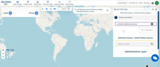
We start our journey by adding the essential data using MAPOG’s For this click on Add Upload button from top left and select Add GIS Data.
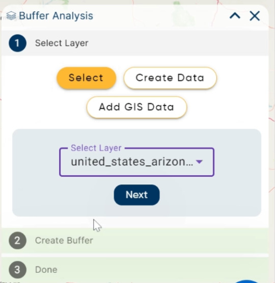
Now search for the desired data. I am using United States Arizona Gis data.
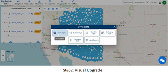
From bus stops and train stations to roads and settlements, each piece of information is carefully integrated. With data in place, the next step is to make the map visually appealing. We customize the appearance of bus stops and train stations using MAPOG’s styling options. A simple click, choose a style that stands out, and repeat the process for train station.

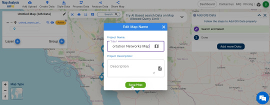
Edit the untitled Map : Edit the untitled map to ‘Urban Transportation Network Map.
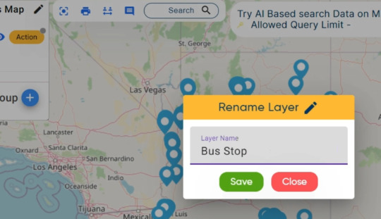
You can also edit the layer name also with click on Action Button.
Click on Style Data, a pop up appear and choose desired style.
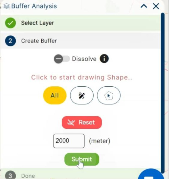
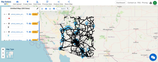
Buffer Zone: Go to Process Data and tap on BufferTool. Unveiling the influence of settlements, we create magic circles (buffers) around them using MAPOG. These buffers, set at 2000 meters, illuminate the areas touched by settlement impact. Select settlement data, apply the buffer tool, and set the distance to 2000 meters for a clearer view.
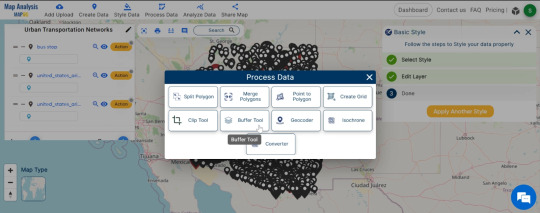
Select settlement data, apply the buffer tool, and set the distance to 2000 meters for a clearer view.
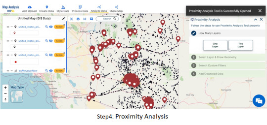
Proximity Analysis: Armed with MAPOG’s proximity analysis tool, we play detective to find the closest bus stops and train stations for each settlement.
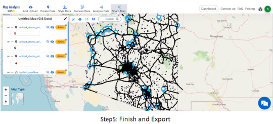
Finish and Export:
Wrapping up our journey, we finalize the map, ensuring every insight gained is captured. The “Export” option in MAPOG becomes our last step, saving and sharing the optimized transportation map with the world.
Finalize your work, choose export options, and save the optimized transportation map.
Major Findings:
Discover how settlements influence transportation areas.
Identify the nearest bus stops and train stations for settlement residents.
Understand the crucial role of roads in connecting the transportation network.
Domain and Industry:
Our expedition falls within the domains of Transportation and Urban Planning, utilizing MAPOG as our technological compass. This innovative approach integrates Geographic Information Systems (GIS) and spatial analysis to optimize the transportation network, aligning with the unique characteristics of Arizona.
Conclusion of MAPOG Gis Analysis in Urban Planning
As our Arizona transportation odyssey comes to an end, the result is a meticulously crafted map that goes beyond aesthetics. It represents a significant step towards a more efficient and accessible public transportation system. By improving connections and understanding spatial relationships, our journey with MAPOG contributes to a better, more connected Arizona.
You can also try other tool like Route Compass use in military aerial route planning or download data for anaylsis from MAPOG GIS Data.
Other Articles
Create Map – School Map Area Coverage Through Buffer Analysis
Mapping Safety Create GIS Map : Game-Changing Approach to Hospital Risk Analysis
3 notes
·
View notes
Text
How Accurate Surveying Supports Better Town Planning Decisions
Understanding the Role of Surveying and Town Planning
Surveying and town planning are two interconnected disciplines that form the foundation of effective urban development. Surveying involves the precise measurement and mapping of land, which provides critical data about the natural and built environment. Town planning, on the other hand, is the process of designing and organizing the physical layout of urban spaces to ensure functional, sustainable, and aesthetically pleasing communities.
The synergy between surveying and town planning ensures that development decisions are grounded in reality. Without accurate land data, urban planning can lead to costly mistakes, inefficient land use, and conflicts with existing infrastructure or environmental constraints.

The Importance of Accurate Surveying in Urban Development
Accurate surveying delivers reliable, detailed spatial data that town planners rely on to make informed decisions. This data includes topographical features, boundaries, elevation, infrastructure locations, and existing land use. The integrity of this information directly influences the success of urban projects.
Defining Legal Boundaries Surveying helps in establishing precise legal land boundaries, which is essential for zoning, property development, and public infrastructure projects. Inaccurate boundary information can result in disputes, legal challenges, and project delays.
Evaluating Terrain and Natural Features Through detailed topographic surveys, planners gain insights into elevation changes, flood plains, drainage patterns, and soil composition. This information is crucial in deciding where and how to construct roads, buildings, and public utilities, ensuring both safety and sustainability.
Assessing Infrastructure Compatibility Surveying supports the identification of existing utility lines, transportation networks, and structures. This allows town planners to integrate new developments seamlessly into current infrastructure, avoiding unnecessary disruptions and costs.
Enhancing Decision-Making in Town Planning
Successful town planning is not just about aesthetics; it involves strategic choices backed by accurate data. High-quality surveying enhances decision-making in several key areas:
Land Use Allocation Urban areas often compete for limited space. Accurate surveys ensure optimal land use, balancing residential, commercial, industrial, and recreational needs.
Transport Network Design Surveying provides crucial input for designing efficient road networks, pedestrian pathways, and public transit systems, improving connectivity and reducing congestion.
Risk Mitigation and Environmental Protection Identifying flood zones, landslide-prone areas, and other environmental risks through surveying enables planners to design with resilience in mind, safeguarding communities and ecosystems.
Urban Expansion and Zoning Planners use surveying data to assess the feasibility of expanding towns or modifying zoning regulations, ensuring developments align with long-term growth strategies.
Surveying Technologies That Support Town Planning
Modern technologies have significantly advanced the practice of surveying and town planning. These tools not only improve data accuracy but also streamline the planning process:
GIS (Geographic Information Systems) GIS integrates various layers of geographic data, allowing planners to visualize spatial relationships and patterns, which is vital for scenario planning and decision-making.
Remote Sensing and Aerial Surveys Drones and satellites provide high-resolution imagery and topographical data over large areas, enhancing both the speed and scope of surveys.
3D Laser Scanning and LiDAR These technologies create precise 3D models of terrain and structures, offering planners a detailed understanding of physical environments in both urban and rural settings.
The Long-Term Impact of Surveying on Urban Growth
The relationship between surveying and town planning extends far beyond initial development stages. As cities evolve, the need for accurate and updated survey data becomes even more critical. Long-term urban growth must be managed with foresight, and that foresight depends on the foundation laid by reliable surveying practices.
Well-surveyed and planned towns tend to experience:
Reduced infrastructure costs
Improved quality of life
Better environmental outcomes
Fewer legal disputes over land use
Greater investment opportunities
Conclusion
The integration of surveying and town planning is essential for building cities that are efficient, sustainable, and resilient. Accurate surveying ensures that every decision in the planning process is rooted in reality, reducing risks and maximizing the potential of urban spaces. As urban populations continue to grow and development pressures increase, the value of precise surveying in shaping smarter, better-planned towns becomes even more evident.
0 notes
Text
ZIP Code Mapping for Franchise Expansion Strategy
Looking to expand your franchise? ZIP Code boundary data gives franchise owners a detailed, location-based view of where their next opportunity might be hiding. From territory planning to customer targeting, accurate ZIP Code mapping can shape smarter, data-driven expansion strategies.
Why ZIP Code Boundaries Matter in Expansion
ZIP Codes are more than postal labels—they define neighborhoods, economic zones, and customer groups. But raw ZIP Codes alone won’t tell you where your brand will thrive. You need ZIP Code boundary data—precise geographic outlines of each ZIP—to understand the size, reach, and makeup of a given territory.
Looking at boundaries helps you assess real potential. How large is the population inside a ZIP? What’s the local income range? How close is it to competing businesses or existing franchise units? These are key questions that ZIP Code maps help you answer.

Defining Exclusive Territories with Confidence
Franchise agreements often come with territory protections. Using accurate ZIP Code boundary data, you can define exclusive service areas with geographic clarity—eliminating overlap and disputes. Visualizing these zones helps corporate teams, legal departments, and franchisees stay aligned.
When expansion plans are based on actual spatial data, decision-making becomes faster and clearer. You’ll avoid cannibalizing existing markets and ensure your new locations are positioned for demand, not just convenience.
Customer Insights at the ZIP Code Level
ZIP boundaries aren’t just for mapping locations—they’re also crucial for understanding customers. Combining boundary data with demographic overlays (population, age, spending habits) gives you a high-resolution view of your target audience. This helps in identifying underserved ZIP Codes with strong growth potential.
Want to see where your competitors are clustered? ZIP Code maps can do that too. Layering competitive data on top of ZIP boundaries helps identify market saturation and avoid costly missteps.
Supporting Multi-Channel Growth
If your franchise operates through a mix of physical locations and delivery services, ZIP Code mapping is even more critical. It allows you to align delivery zones with your storefront coverage, balance workloads, and prevent service gaps. For mobile businesses or service-based franchises, this data ensures territory fairness and operational efficiency.
Seamless Integration with Mapping Tools
ZIP Code boundary data from Zip-Codes.com comes in multiple formats—Shapefiles, KML, GeoJSON—so it fits smoothly into your GIS or business intelligence tools. Use it in dashboards, CRM platforms, or custom apps to power your expansion analysis.
Smart growth starts with smart data. If you’re planning to expand your franchise footprint and want to back your decisions with precise geographic insight, ZIP Code boundary data is a must. Explore flexible, up-to-date ZIP Code mapping solutions from Zip-Codes.com and take your franchise strategy to the next level.
0 notes