#Helvetica Now
Text
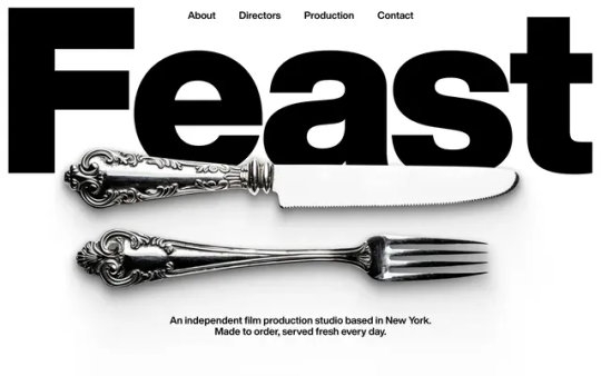
Feast Studio
#Feast Studio#independent#film#production#New York#directors#portfolio#black and white#typography#type#typeface#font#Helvetica Now#2024#Week 24#website#web design#inspire#inspiration#happywebdesign
8 notes
·
View notes
Text

Pinks computar screen
24 notes
·
View notes
Text

and if you close the door
the night could last forever
leave the sunshine out
and say hello to never
(objectober day 10: story)
#dandy's doodles#objectober#grt3d#geometropolis#grt3d octagon#grt3d hexagon#grt3d pentagon#grt3d trapezoid#helvetica is so dear to me... you have no idea...#this scene was so fun to write... so cute... so sweet...#trapezoid is the ultimate entertainer. dad jokes + insane personal stories?? life of the party material#he's actually kinda based on my dad now that i think about it
17 notes
·
View notes
Text
i need to step up my redbubble game. some of these fuckers really just upload shit like anne carson's name in plain black arial font slapped onto a white shirt & call it a day
#not even helvetica? poppins? garamond??? times new roman?????? smh#also i need the payment to come thru soon it's so unfair how huge the account fees are now... $7.20 ??? i'm gonna kill you
9 notes
·
View notes
Text

Just received these stickers I purchased on Etsy from liddobeanstudio - aren't they amazing????
(The card has my legal name, which is why I decided to edit over it, sorry that it looks weird)
#etsy#smallbusiness#stickers#frutiger aero#webcore#frutiger aqua#helvetica aqua aero#frutiger warm#i am in love with these!!#planning to use some of them when I eventually get a new phone#for now ill just be keeping them around#im so excited
2 notes
·
View notes
Link
Chapters: 2/?
Fandom: Vampire: The Masquerade – Bloodlines (Video Game)
Rating: Mature
Warnings: Graphic Depictions Of Violence
Relationships: Sebastian LaCroix/Original Female Character(s), Sebastian LaCroix/Nines Rodriguez
Characters: Nines Rodriguez, Sebastian LaCroix (Vampire: The Masquerade), Original Characters, Andrei (Vampire: The Masquerade – Bloodlines), Ming Xiao, Gary Golden, Damsel (Vampire: The Masquerade – Bloodlines)
Additional Tags: everybody's bisexual because i am, playing with the time line of bloodlines, what if seduction allowed you to beat vtm bloodlines. what if, horny. y'all it's like. HORNY, will update tags as fic progresses but i got directions in mind
Series: Part 1 of Helvetica Demands
Summary:
an OC with a complicated past takes the place of The Fledgling in VTM: Bloodlines. But with this change in the timeline, comes a few others......
#vtm bloodlines#sebastian lacroix#vtm oc#vampire the masquerade bloodlines#original fiction#hey jude#so i write fan fic now#helvetica rigoletto#helvetica demands
4 notes
·
View notes
Text
youtube
this nichijou ed but aichi
#like uhh nichijou adjacent au#where choro ichi and jyushi sort of take the places of sakamoto nano and hakase#and ai totoko and homura take the places of yuko mio and mai#auu now I wanna make aichi art that’s like helvetica standard…#with all the cute little animal and creature and item things and the angels and stuff
4 notes
·
View notes
Text
What Fonts are used for the BEYOND: Two Souls Logo? (Gaming) (BEYOND: Two Souls) (Fonts Blog) (What Fonts)

Logo ©Quantic Dream; SONY PlayStation XDEV; SONY Computer Entertainment Europe
Article by @warrenwoodhouse #warrenwoodhouse
The fonts used for the logo are:
The font that is used for the lettering BEYOND is called Helvetica Now Pro Display Black by Monotype
The font that is used for the lettering TWO SOULS is called Kipp Pro No. 1 Regular by FontFont
#warrenwoodhouse#2024#gaming#beyondps4#beyondps#BeyondTwoSouls#beyondtwosouls#beyond: two souls#beyond two souls#PSshare#PS4share#PS3share#beyondps3#playstation#quantic dream#logos that use the helvetica now pro display black font#logos that use the kipp pro no. 1 regular font
1 note
·
View note
Text


Assemblage de panneaux imprimés. Invitation à un accueil paroissiale et promotion d'un camping
📍Aumont-Aubrac
Typographie
Premier panneau
Calibri, Arial
Deuxième panneau
Melts Script
Helvetica Now Pro Display Black
Futura
Description
Les deux affichages sont au format A4
La première affiche, construite vraisemblablement sur word est fixée sur une planche en bois à l'aide d'agrafe et est protégée des intempéries avec un feuille.
La deuxième affiche, est fabriquée à l'aide d'une feuille plastifié et est fixée avec des punaises.
Analyse
L'assemblage propose un contraste entre un panneau amateur et un panneau professionnel. Le premier panneau utilise un wordart à coté d'une image de jalon de saint jacques de Compostelle La composition est deux blocs distinct. Un premier bloc autour du titre avec un texte qui vient supporter le titre. Ce bloc amène la proposition de valeur (La possibilité de faire tamponner sa crédenciale, illustrer en dessous par des images des tampons qui seront apposés sur le document des pèlerins.
Le deuxième bloc, construit autour du lieu permet d'accéder aux informations sur le lieu et l'horaire.
Le surlignage du texte en deux couleurs vise à faire ressortir les informations clés.
La proposition de valeur sur la crédenciale peut sembler incongru. On s'attendrai peut-être plus à avoir du café, ou à découvrir du patrimoine, mais de ce contexte, elle est pertinente car de nombreux pèlerins s'attachent à leur crédenciale et espèrent avoir un tampon avec un motif élégant et souvent les paroisses ont des tampons de bonne qualité.
Point notable, l'auteurice de l'affiche à choisi de faire le distingo entre Crédential ou Créanciale, hors ce ne sont pas des documents différents mais bien deux orthographes différentes qui désignent un même document, parfois aussi appelé "Passeport du Pèlerin". On peut trouver de nombreuses variations orthographiques de ces deux mots pour désigner ce morceau de papier que font tamponner les pèlerins à différents moments de leur parcours. Par exemple, l'auto-correct de chrome indique l'orthographe juste comme "crédenciale" Le diocèse de paris utilise l'orthographe créanciale, le site de presse chrétien la croix utilise l'orthographe crédentiale et Compostelle france (Fédération Française des Associations des Chemins de Saint-Jacques-de-Compostelle) utilise le mot identique à l'espagnol credencial (sans accent).
Quel est la bonne orthographe ? En tout cas cette affiche a préféré laisser la question ouverte.
Le deuxième panneau qui parle du camping municipal, met en avant les dates et horaires d'ouverture.
Il présente trois niveaux d'information:
Le nom du camping et sa qualité de camping deux étoiles.
Le fait qu'il soit ouvert
Et enfin les modalités pour réserver le camping (Obligation de passer par l'office de tourisme).
Malgré l'aspect plus professionnel, lié à la qualité de l'impression et du support, ainsi qu'a l'utilisation d'une image sur tout le support, il manque quelques informations.
Comment se passent les informations aprés mai ?
(La ville l'a précisé sur le post facebook où elle a partager un visuel très similaire)
Quel est l'adresse du camping ? Si l'adresse de l'hôtel de ville est indiquée, celle du camping ne l'est pas, ce qui est utile pour les pèlerins, particulièrement pour évaluer si il y a un détour à faire pour bénéficier de ce camping.
Est-il possible de réserver par téléphone comme pour les autres gite ? (l'indication "uniquement" indiquerait une réponse négatif, mais un numéro de téléphone est pourtant précisé.)
Le camping est il ouvert le dimanche si on a une réservation ?
Il y a ici un choix sur les informations et un équilibre a du être fait entre la qualité et l'impact du visuel et les informations qui sont utiles pour les marcheurs. Ce n'est pas forcement un mauvais choix car ce panneau invite à se rendre à l'office de tourisme, lieu ou certaines autres questions pourront être répondu.
Texte
Affiche 1 : Amis Pèlerins
Amis pèlerins
Bienvenue à Aumont-Aubrac
Un accueil paroissial de jour vous est proposé avec tampon de votre créanciale ou crédential.
Salle St Etienne (en face l’église)
De 9h30 à 12h30 et de 15h à 18h30
Affiche 2: Camping Municipal d'Aumont-Aubrac
Camping Municipal d'Aumont-Aubrac
Ouverture le jeudi 2 mai 2024
Du 2 au 31 mai 2024 : Réservation et paiement à l'Office de Tourisme Rue du Prieuré, 48130 Aumont-Aubrac Tél : 04 66 42 88 70
Ouvert du lundi au vendredi : de 9h à 12h30 et de 14h à 18h
Le samedi : de 9h à 12h30 et de 14h à 17h
Paiement en espèces ou chèque uniquement
—
Une erreur ? Une question ? Quelque chose à ajouter ? N'hésitez pas à me contacter.
#panneautique promotionnelle#panneau#panneautique religieuse#calibri#arial#Melts Script#futura#Helvetica Now Pro Display Black
0 notes
Text
ok so whats that weirdass spykids-looking movie where theres a magic rainbow rock you can use to make wishes and a girl named helvetica and her theme song is helveticaaa helveticaaa helveticaaa blaaaack
#i SWEAR on my LIFE im not making this up#i watched this movie ages and ages ago and its one of those things i assumed everyone knows and i started singing the helvetica song#and my friend was like wtf is that and i had that moment where i realized i have not in fact lived a universal experience#but now i cant even remember the name or like anything else about it...#if this turns out to be some weird mandela fuckery im going to scream#screeds#txt
0 notes
Text


so many weird little things. awesome <3
#so many :P also i didnt notice that until now#its been a while since i've drawn the older cinnamon! i did a high ponytail instead of low tho whoops#i also remembered her fucking freckles tho. finally.#oc - cinnamon#oc - friend#oc - lumie#oc - rooney#oc - charli#oc - voi#oc - helvetica#oc - kasey#also! i dont have access to orange so i improvised >:) i think it worked quite well
0 notes
Text
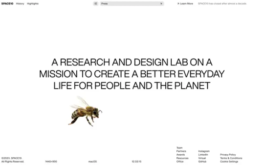
SPACE10
#SPACE10#Ikea#2015-2023#research#design lab#Copenhagen#community#Gallery#experimentation#white#type#typeface#font#Helvetica Now#2023#Week 42#website#web design#inspire#inspiration#happywebdesign
21 notes
·
View notes
Text

@synthrocket drew this for me and i colored and put shit all around it n_n finally some human cannabis on this blog
#my sketchbook#helvetica st#friend art#i remembered i have a cricut machine so now i get to cut out so many shapes yayyyy#ocs
14 notes
·
View notes
Text
Making Accessible Interaction Banners - a Guide by Binoo "ChildrensWard"
Interaction or "DNI" (do not interact) banners are a staple of the age regression community, but too often are they made without taking accessibility in mind, whether it's because they're unreadable, have excessive eye strain, or aren't marked with alt text.
Therefore, in the hopes that I can help people out with this, I decided to write a mini guide on how to make your banners accessible for as many people as possible!
Under the "read more" cut, this guide will cover the following:
Fonts, and how to choose the best ones
Text, and what your interaction banners should say
Colour contrast, and why it's important in making your graphics accessible
Eye strain, and why it generally should be avoided
Alt text and image descriptions, and how to write them
And an example of an interaction banner I made using the criteria I've written in this guide!
So, without further adieu, let's get into the real meat of this guide!
Fonts
Fonts are easily the most important thing about an interaction banner! It's how you're going to best convey the contents of your banner in a way that's readable to the viewer. Here's a quick and firty rundown of the different kinds of fonts, as well as which ones you should (and shouldn't!) use for your banner:
Body Copy fonts are your basic Sans and Sans Serif style fonts that you'll most often find on books and websites, because they're some of the easiest fonts to read in smaller text (10-14pt) due to their lack of details. Examples of Body Copy fonts include PT Serif, Arial, Comic Sans, Roboto, and Helvetica Now.
Display fonts are often used for headers and subheaders and include features such as being thick, having unconventional letters, and, on occasion, being in all caps. However, these fonts should not be used for body or small text, as they will be very hard to read. Examples of Display fonts include Futura PT, Elephant, Noto Serif Display, and Shoreditch.
Script and decorative fonts are subtypes of display fonts, with the former having a handwritten quality to them, while the latter are considered to be the fun display fonts. However, you should be very careful with using either of these fonts- not only can they be hard to read on their own, but neither should be used specifically for body or small text in any circumstance. For the sake of readability and accessibility, however, I'd be more inclined to avoid using these fonts.
Text
Aside from the fonts that your text will be written in, the text itself is also a mandatory aspect of your banners. After all, it's what banners are entirely based on, and it's the very thing that tells you who can and can't interact with your posts.
However, there's something important to keep in mind, and that is how much text you're trying to cram into your banner because you're trying so desperately to fit your entire DNI criteria onto it.
What I think is important when it comes to making your banners is to keep any text you have on there as short as possible. If you bombard your banner with all this specific criteria, then you're more likely to make your readers confused, whether or not they happen to be a screen reader user.
When making your banners, ask yourself the following questions when deciding on your criteria:
How likely is it for someone interacting with the age regression or similar communities to fit this criteria? Have I come across a good number of people who fit this criteria that makes it worth mentioning?
Is this criteria at all relevant to the content I'm presenting? Do I need things like inter-community discourse terms from other communities on my banner if I'm making content specifically for age regression?
Is there any "unspoken" criteria that everyone agrees upon that doesn't need to be included? These might include nazis, racists and white supremacists, homophobes and transphobes, ableists and eugenicists, misogynists, anti-choice, etc.
If your answers show that the specific criteria is not relevant, then it's best to leave it out to keep the information on your banner more clear and concise.
Colour Contrast
While colour contrast is something often talked about in web development circles, it's also an important skill to learn when making any sort of graphic design- which is what interaction banners essentially are. Without taking colour contrast into mind, you're left with a banner that may not be easy for most people to read; let alone those with low vision or blindness. We also need to think about things like people who may be using old or outdated monitors, people reading on smaller screens (like a smart phone), and bad lighting and glare. As Contrast Rebellion puts it: aesthetics are important, but aren't the ultimate goal of design.
Okay, so you've understood the reason why colour contrast is important, but how do you put it into action? How do you know your colours of choice are readable?
Well lucky for us, there's many resources out there that help us in choosing the right colours! Here are a few of my favourites:
CSUN: Color Contrast - An introduction article on colour contrast, why it's important, and some examples of good and bad colour contrast choices.
Random A11y - If you don't have any colour combinations in mind, Random A11y is here to help! With it's vast amount of randomly generated colour contrast combinations, you'll have plenty of options to work with. Don't like the combination you're given? Just click on the "new colours" tab to generate a new palette!
Colour Contrast Analyzer - This is a free program for Windows and Mac that helps you with colour checking with a variety of different features; including multiple ways to select colours (CSS color formats, RGB slider, colour picker tool), and a colour blindness simulator.
Accessible Colors - If you don't want to or can't download the program above, then this website works just as fine with checking colours, too! Just enter in the hex codes of your colours, the font size and weight, and which level of conformance you'd like your colours to pass.
Eye strain
A bit of a sore topic for some, but I feel I must put it bluntly for people to understand: making your colours easy on the eyes of the viewer should be your top priority over your aesthetic. Some people, like myself, have certain health conditions that are triggered by eye strain, and by continuing to slap extremely contrasted rainbows on your banners, you're continuing to put disabled people through worsening symptoms, all because you feel the need to retain your aesthetic.
Many of the same resources shared in the Colour Contrast section can also help you to rule out any eye-straining palettes. Also, a general rule of thumb to keep in mind is: if a colour palette is eye straining enough to cause you some mild problems, then it's enough to cause someone with a disability more severe symptoms.
Alt text and image descriptions
I think a lot of us find writing alt text to be daunting- I know I did for a long while, which is why I never wrote any for my posts until recently. But really, once you get the hang of it, it can be very simple and easy to write! Even so, people who don't know how exactly to write alt text often fumble with this- either writing too much or too little, not being clear enough, or just copying the image caption and calling it a day.
Here's some tips and tricks on writing better alt text:
Alt text generally follows the Object-action-context rule. In the words of Alex Chen at Medium: The object is the main focus. The action describes what's happening, usually what the object is doing. The context describes the surrounding environment.
Be specific and concise, and even consider the content of the post or webpage it's on as well. You'll also want to consider the function or purpose of the image, and what you want your viewers to gain from it.
Keep your alt text short, as long descriptions with too much flowery language and filler words can be distracting when using a screen-reader. Generally, most screen-readers will cut off alt text at around 125 characters.
Avoid using "image of..." or "picture of...," as HTML codes will already identify your images as such. However, in this case, mentioning what type of image it is can add context.
Always check for spelling mistakes, as this can affect the user experience, causing interruptions and confusion.
Not related to interaction banners specifically, but avoid including alt text for decorative images that are used to make your post prettier. In this case, insert the word "null" in your alt text fields.
Image descriptions are a little different in the fact that they're allowed to be more descriptive than alt text, considering screen readers won't be able to cut off any alt text at 125 characters. Even so, it's still best to keep your image descriptions as short as possible to save from redundancy and confusion.
Please remember that writing alt text and image descriptions can take a lot of practice and trial-and-error, so don't give up if you can't get it right the first time! Write and rewrite it as much as you need to, or even consider changing your interaction banner altogether if you think it can't be described in words concisely.
An example
Taking what we've learned above, let's take this banner I made just for this post as an example of these characteristics put into action.

In this example, I have chosen the hex colour #4D0000 for my text colour, and the colours #B5F3DC and #E3B158 for my background. According to CCA, the contrast ratios for my colours of choice are 12.8:1 and 7.9:1 respectfully, which both meet the minimum contrasts of 1.4.3 for AA and 1.4.6 for AAA.
I have chosen the font FS Lola Bold, which is a type of display font that's best for headers and subheaders, but not so much any body or small text. I don't have to worry about this though, because I don't have any small text in my banner.
I've also kept my criteria to a simple "No DDLG/CGL interaction," because I feel that this is the most relevant information regarding the content of my blog and the posts I make. Short and simple, yet specific to who I don't want interacting with me. I also like the idea of my favourite fictional characters protecting my blog, which is why I've included another short sentence for it!
Here's an example of what the image description or alt text for this banner could look like:
[Image description: Banner that reads "Toopy and Binoo protect this blog, no DDLG/CGL interaction!" On it are the titular characters from the show. /End ID]
And if I were to have both alt text alongside an image description, then the alt text could be as simple as what the banner reads, which would be:
"Toopy and Binoo protect this blog, no DDLG/CGL interaction!"
Remember, you don't have to go into every little detail with your image descriptions or alt text, because then it can become very confusing for certain people to decipher! Keep it simple and state the minimum.
Closing words
I think that's everything that I wanted to cover in this post. Of course, there's more to accessible design than just text and fonts alone, but when it comes to interaction banners, it's usually the focal point of the images, which is why it's so vital that people with disabilities can also read your banner- especially when they contain important information about your personal boundaries.
Age regressors often pride themselves for the image we've set up for our community, that it's safe for everyone to join and no one will be judged or excluded for who their are. But the reality is, we still have lots of work to do before we're ever at that place, and making our community more accessible is just one of these steps that we should all be encouraged to take. Besides, what kind of message are we sending if we don't take the steps to make our space as accessible as possible? How do you think it'd feel to realize that a community you wanted to join is actively hostile towards you because of the refusal to learn how to accommodate for them? Especially when we have such a huge demographic of disabled people in the community, we can and should be doing better to accommodate for everyone as much as we possibly can.
Learning accessibility is a skill that requires time and practice, and I don't expect anyone to be perfect at it the first time around. The aim of doing these things isn't to make sure that every single thing is 100% accessible in every single way imaginable and with no mistakes whatsoever; but to instead encourage, develop, and incorporate good accessibility practices into our every day lives.
Thank you for reading,
- Binoo
#age regression#agere#agere community#sfw age regression#sfw agere#age dreaming#agedre#sfw agedre#dni banner#interaction banner#accessibility#a11y#long post
166 notes
·
View notes
Text
so i live in london and i just rode past a café that was fully white with only the words ‘100% HOLY CAFÉ’ written in terrifyingly bland orange sans serif helvetica point 46 font. now look me in the eyes and tell me that’s not crowley running a little scheme
#i know it’s him in there#what is he plotting#crowley#ineffable husbands#good omens#good omens 2#anthony j crowley#aziracrow#go 2#go#aziraphale
352 notes
·
View notes
Text
DONATELLO X READER "a Night Ride"
Relationship status: Romantic
Reader prounouns: She/Her
Words: 2739
TW: Slight angst (I guess? I'm not sure), Some grammatical errors because english is not my first language.
Author's note: Yooo, this is my first time writing a oneshot in the last few years, i'm kinda proud of it, lmao. Anyway, enjoy.
.⋆。⋆˚。⋆。˚。⋆. .⋆。⋆˚。⋆。˚。⋆.
The pale moonlight slightly illuminated the sky above, much like New York itself, adding to the charm of the colorful lights that refused to fade despite the late hour of the night.
The Turtle Tank gracefully maneuvered through the uncrowded streets, its loud engine echoing around, serving as an unspoken warning to pedestrians to watch their step when crossing the road. Two people were inside the vehicle: Donatello, who else? He usually didn't allow his brothers to take the tank without him because he knew how chaotic they could be and how they might destroy everything in their path. The only exception was when April needed help with Mayhem, and as a reward, she offered pizza. That's when Raph took the Turtle Tank. He didn't cause much damage to the vehicle's body, so the purple genius spared him a strong reprimand. This time.
The other person was [Y.N], another human acquaintance of the turtles. Why was she there? And at this hour? Well...
"I can't believe I had to pick you up at this hour because some guy stood you up!" Yes, that was the reason. You see, [Y.N] had a date scheduled for tonight with a guy from her school, which was supposed to take place at a restaurant on the other side of New York. She wasn't a fan of such fancy outings, but the excitement of the meeting had gotten to her, and that's how it ended up. She had waited for a few hours for the no-show date instead of going straight to her apartment and crying into her pillow. At least then, she would have had a slight chance of catching a taxi and not having to call Donatello, who was clearly annoyed. Tough luck.
"I'm not a fan of such vocabulary, oh, who am I kidding? I am, so I'll say it: Didn't I tell you!?" The purple enthusiast began waving his hands during his monologue, trying to express his emotions somehow. Right, Donnie had warned the teenager, and not just once. If she had to say anything now, she'd confess it lasted a whole week.
"[Y.N], going on a date with such a normie won't end well," Soft-shell casually declared, appearing out of nowhere in the kitchen. Well, maybe not 'nowhere,' as it was their base's kitchen, so he had every right to be there - but no one expected the turtle to emerge from his workshop.
The teenager had a puzzled look as she nibbled on one of the sandwiches she and Leo had made for their movie night. "Why?" She didn't want to dismiss Donatello; she knew he genuinely cared about her and was trying his best to help despite his quirks, but this was already the fourth 'rational' argument this week! "He's not Dale, so nothing more annoying can happen!"
"Sorry, but I disagree," his robotic arms unfolded a whiteboard with potential threat assessments or risky behaviors. [Y.N]'s eyes flattened to read the small font; was that Helvetica? "According to my calculations, the chance that this guy is not suitable for you is precisely 76.43 percent. Of course, this number didn't come out of thin air. It's based on a series of algorithms and data analyses I conduct every day. I take into account factors like communication and conflict resolution skills, emotional availability, attachment style, and even past behaviors. It's quite a sophisticated model, if I may say so." The science enthusiast's proud smile said it all.
"Wow."
"My calculations are always reliable, sure, sometimes I make mistakes, but not in matters like these!" It wasn't entirely true. Matters of the heart weren't Donatello's strong suit, which often led to friction between him and his family. Heck, even Doctor Delicate Touch had to help him when Shelldon went through his rebellious phase! But when it came to someone as close as [Y.N]? He didn't want to be wrong.
The girl bit her cheek from the inside, tilting slightly to the side as the turtle turned left again. Her eyes occasionally tracked the new streetlamp, trying to gather her thoughts.
"Don't tell me you're showing her that board," a red-slider turtle peeked out from behind the whiteboard. "Yeah, you're showing her." His eyes didn't express surprise, more like indifference to his righteousness.
Donatello rolled his black eyes, tucking the presentation back into his battle shell as Leonardo sidestepped him gracefully, grabbing a plate full of sandwiches. His gaze settled on the teenager, who had her back turned to him and was slightly bent over.
"You were snacking, weren't you?" [Y.N] twitched slightly at her friend's keen observation. She slowly turned her head towards Leo, her smile seeming somewhat embarrassed.
"No?"
"Spots around your mouth from mustard say something else," Leonardo pointed out, pointing with his finger. The embarrassed teenager chuckled softly, feeling her posture slightly break.
"Okay, you caught me!" Despite being in despair, her voice also conveyed false drama. "But what can I do when you make such awesome sandwiches?? You guys live in the sewers, after all!" Donnie chuckled quietly to himself, knowing where his friend picked up these habits. It might not be a matter of great pride, but it made an impression. "Well, give me another one!" Before anyone could react, the girl practically lunged at Leo to reach the plate of food he had deliberately moved away from himself.
"Nuh-uh, because there won't be enough for the others." He easily comically pushed his friend away and headed towards the exit, winking at his brother in passing. Donatello rolled his eyes, knowing what was going on. He wasn't happy about it, but there was nothing he could do about his (not) twin's foolishness, or at least he didn't want a repeat of the last time he meddled in his brothers' affairs.
Finally, his dark eyes settled on the girl, who chuckled with a smile. She wanted to wipe her face with the sleeve of her hoodie, but the mechanical hand had her wrist in its grip. "Huh?"
"Didn't your mom teach you good manners?" Donnie approached her, taking a single sheet of paper towel from the red kitchen countertop nearby.
"I repeat, you guys live in the sewers, so what I wanted to do is the least of your worries." [Y.N] laughed, trying in vain to free her hand from the scientist's robotic grasp. "Can you let me go, Dr. Octopus?"
When she attempted to jerk her wrist again, Donatello began gently wiping her lips with the paper towel in a slow, deliberate motion, getting narrowed pupils in response. The boy didn't have the courage to look into her eyes, despite the brave activity he was currently engaged in, especially when his thumb lingered at the corner of her mouth for a second longer than it should have.
Once he finished wiping, he took the paper and stepped back slightly, realizing what he had done. When they both locked eyes, warmth flooded their cheeks, and the shock added to the turtle's expression. It was clear who was more in control of their emotions here, hm?
The boy coughed abruptly, averted his gaze, and straightened up - he didn't even notice when he had been slouching. "Living in the sewers doesn't compromise my hygiene," he commented a bit too loudly, feeling his voice crack with each word. "I'd say it's Leo who's more likely to." He chuckled slightly, and the girl joined in. "Well, anyway! Movie marathon coming up, so, see you in a few minutes??" Since when was he feeling so hot?? "See you!" He finally shouted, panicking and fleeing the kitchen.
[Y.N] chuckled with a smile, covering the lower part of her face.
[Y.N] sighed shakily, covering the lower part of her face.
"Oh, for Newton's sake, I feel like punching someone! ... Is this how Raph usually feels when he looks at us?" The red light appeared on the traffic signal, reflecting off the dark Turtle Tank's body. When the boy stopped the vehicle for a moment, he heard quiet sobbing. Confused, he looked to the side and saw [Y.N], who had started crying uncontrollably.
"I'm sorry."
The turtle's eyes widened. Her voice seemed to slowly shatter like transparent glass between each tear drop, and her posture was completely destroyed as she bent in half on the soft seat, completely covering her face.
Donatello glanced out of the corner of his eye at the front windshield, wanting to check if the light had changed - it was still red, so he immediately got up and approached the girl, squatting by the seat. He didn't handle his emotions well, especially someone else's, but he felt a pang in the depths of his heart that he wanted to get rid of. With a slight hesitation, he placed his three-fingered hand on her back, gently moving it up and down - Splinter, and then Raphael often did this to comfort the science enthusiast when he struggled with something.
"I should have listened to you," the teenager began, "It was a mistake to hope for a good time with that person." The boy felt terrible. Yes, he had wanted to help her understand her mistake at the time, but he still hoped that despite his unpredictable intellect, he was wrong. "God, I just want to hide in my room and never come out."
"Don't apologize, it's not your fault." Her eyes peeked out from behind her fingers. Donnie's eyebrows furrowed seeing [Y.N]'s bloodshot and red eyes. "Who would have thought he wouldn't show up after all?"
"You," she sighed heavily, straightening up. Her expression conveyed sorrow. "Your calculations turned out somewhat effective."
Donatello looked at her with empathy, trying to find the right words that could comfort her. He gently raised his hand and lightly tapped her shoulder, trying to convey support.
"Science... doesn't always get it right." [Y.N]'s eyes widened at his words. Why did he think that way? Science was practically one of Donnie's defining characteristics, it was unthinkable. Sure, Leo or Mikey might say that, but not him, not her genius acquaintance who would want to rule the world! [Y.N] was now certain that something was going on deep within him.
"What are you saying?" Her voice wasn't supposed to sound less casual, slightly mocking, but she couldn't help it. "Science doesn't get it right? That's so... illogical of you!"
Her eyes met his dark ones again, expressing strong uncertainty and... enchantment, quite enchantment. His face was perfectly illuminated by the city lights, causing a slight blush of astonishment on the teenager's face.
"Science doesn't always have it right," he repeated and stood upright. His fists were tightly clenched, and his posture was rigid. "And I'll prove it to you."
"How?"
His mouth opened for a second, but he closed it again, momentarily struggling with whether to confess one thing, but now there was no turning back, he had to do it. 'Calm down, Donatello, calm down...'
"When I calculated our 'compatibility,' the result came out excessively negative..." he began, trying with all his might not to take his eyes off the young girl. He didn't want his friend to think he was weird! Although, could there be anything weirder than a teenage mutant ninja turtle with a high IQ? "But... but I feel something else."
'Wait, he calculated our compatibility?' [Y.N] repeated in her thoughts, trying to understand the meaning of those words as quickly as possible. Compatibility. Compatibility... the teenager's blush deepened. 'Is he into me...?!'
She was snapped out of her thoughts by a touch. She felt the boy grab her hands in his, gently squeezing them.
"Numbers don't make sense in this situation," he began. "So... will you go on a date with me?" His voice seemed uncertain, not in terms of his words but about himself. As mentioned earlier, he was a mutated ninja turtle; what chance did he have? But for some time now, he couldn't resist the growing feelings for [Y.N], who, as one of the few, had gotten close to him and understood him. He knew how annoying he could be with his habits, strong sarcasm, or introverted nature, but it didn't bother her, at least most of the time, and he really appreciated that.
The silence stretched on infinitely, causing even greater nervousness on Donatello's part.
"... I've only just been dumped by one guy."
"Oh, right!" Donnie looked startled, like a deer in headlights. Yes, what an idiot! He should have thought this through, or at least used less direct words! How does it look now? "I'm sorry, this was inappropriate; we can forg--!"
"But I'll go." Another silence.
"..."
"..."
"What?"
"Well, you know, let's wait a week for today's emotions to settle," she smoothly took his wrists in her hands. Her smile, despite the slight nervousness of the situation, radiated a pleasant feeling, full of strange comfort, as if not judging him at all. "But after that, I'd be happy to go on a date with you."
Donatello seemed... disconnected. A million thoughts swirled in his mind. Was this real?
"Donnie?" He blinked a few times and looked at the person in front of him again. After a brief moment, he smiled, tilting his head slightly.
"Thanks." That's all he said, and the traffic light turned green. Without waiting, he took the driver's seat and drove on.
"So, on our date, maybe we can watch something? Like... Oppeinhamer?"
"Oh, you know me so well!"
Bonus:
"I'm in position, Tails," the nonchalant voice of the red-slider turtle was audible through a small communication device. [Y.N] chuckled softly, watching out of the corner of her eye as Donatello, with a grimace on his face, sat down next to her on the edge of the residential building's roof.
"My code name is 'Shadow,' Leo!" The turtle sighed heavily, furrowing his brows. "And no, it's not a reference to Sonic!"
"You can't fool me," Leonardo laughed, leaning out from behind the building's wall, sticking his tongue out in the same direction where the pair is.
"Be quiet, Bluey," this time [Y.N] spoke up, bringing the communicator closer to her lips. Seeing the gloomy expression on Leo's face instead of his usual smile, the pair burst into mocking giggles.
"Yeah, yeah, keep making fun of the fact that I watched that show at 3 in the morning." The teenager muttered quietly, resting his weapon on his shoulder. "If you couldn't sleep, you'd watch it too!"
Donatello rolled his eyes, accompanied by his rare smile, and discreetly took the girl's hand. Meanwhile, [Y.N] gently rested her head on his shoulder, giggling again.
"Wasn't your code name 'Purple Knight' by any chance?" She asked, lightly moving her feet.
"It was, but you know, most changes are good, and I'm getting older, so it's natural that I change my nickname~."
The girl raised one eyebrow slightly, adjusting her position a bit to look at Donnie. He met her gaze, which weakened after a moment, and a hint of embarrassment appeared on his forehead.
"FINE, maybe it is a reference to Sonic!" He declared loudly, gesturing. "I've been catching up on Sonic Prime lately; you can't blame me!"
[Y.N] burst into laughter, hugging the boy. For the first few seconds, his body stiffened, but after a while, he put his arm around her. However, out of the corner of his eye, Donatello noticed someone walking on the sidewalk.
"It is Shadow. Bluey, stay alert, the target is approaching," he said through the headset, putting on his special goggles.
"Mhm."
The target was the same boy who had stood [Y.N] up a few weeks earlier on the day of their almost date. Yes, it was Donatello's idea, wanting to seek revenge for his almost-partner.
"Now, Bluey!"
Leonardo leaped out from behind the wall, right in front of the unsuspecting boy who needed a few seconds to grasp the situation.
"Hey, buddy, how's life treating you?" The turtle asked with a malicious grin.
"A talking turtle?!"
"One who happens to be an awesome ninja!" He chuckled, swinging his sword. After a brief moment, a bright blue portal appeared beneath the teenager.
His scream lasted only a nanosecond as he disappeared into the blue void, eliciting laughter from Leonardo. "Have a nice trip to New Jersey~!"
#rise donnie x reader#rise of the teenage mutant ninja turtles#rottmnt#rottmnt x you#rottmnt x y/n#teenage mutant ninja turtles#Donatello#Donatello x reader#Punkeccentricenigma
80 notes
·
View notes
Last Seen Blogs
lakshmisreelakshmi
Lakshmi

dlstmxkakwldrlarchive
we love every shining thing especially you!!

peachvein-blog
rin

stickywinnersoulhoagie
Sem título

sakizlilolipop
Başınabuyrukbirdeli