#I at least just wanted a complementary shade of black and not a specific one
Text
so... you know how I said I wasn't going to make the 'grandma's sewing scraps' dragon? I looked in the auction house out of pure curiosity and did not expect to see her. THE perfect dragon for it

plans:

maybe even

#emma posts#flight rising#another fr project impulse buy#BUT SHE WAS ARCANE!#you can find the otherwise PERFECT dragon. but without the right element it's not the same#especially when you are looking for a three gene color combo#that is FOUR things to look for which is much harder than just two or three#at least these can mostly be aquired through my normal behavior#I just need a couple more of two things for the alchemy#I have the button eyes#and I can buy lace some other time. ideally when my flight dominates#wait. did I upload the pictures with the lace in the right shade of black? idk. oops#I at least just wanted a complementary shade of black and not a specific one#that would be even harder#this dragon goes out to my amma. you know she has scraps in these colors from making me pajama pants <3
13 notes
·
View notes
Text
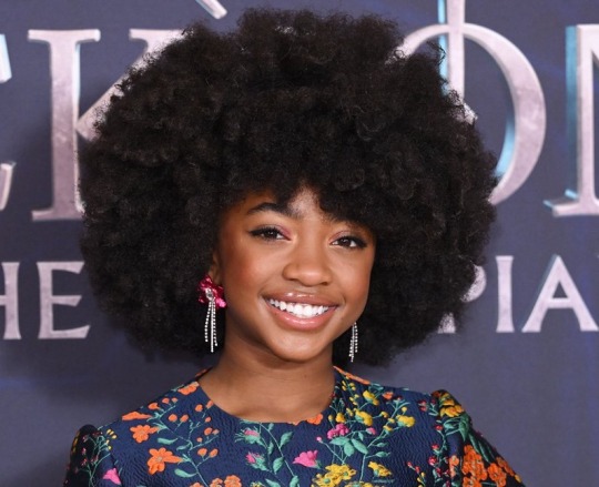
I haven't seen any posts about this yet but l've seen some fan art that makes me feel this needs to be said:
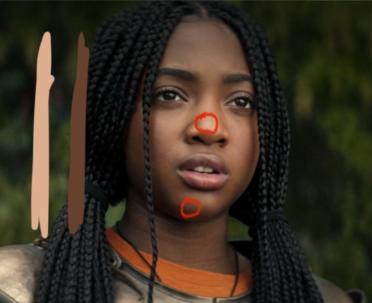
Don't forget Leah Sava Jeffries has darker skin when making Annabeth Chase fan art!
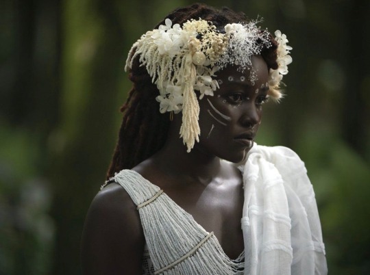
She is much closer to Lupita Nyong'o than Zoe Kravitz when it comes to shading, reflection, and complementary color usage :).
Lighting for dark skin is different on light skin. Light skin gets changed by lighting, and dark skin reflects the lighting. Below is a lovely shot of Nyong'o's character from Wakanda Forever in mourning. The filmmakers emphasize the umber qualities of her skin in contrast to the funereal white and (arguably harsh) light across her shoulder below.
Try to pick spots that aren't directly in or near the light, and try mixing 3 or more! You can put it into a color mixer online, or even color pick, lower the opacity, and lay the shades over each other until you find one that fits. And of course, the more 'realistic' you want to go with shading and lighting, the more shades you're going to want to be able to explore vivaciously :D.
Let's take a look at the same 3 beautiful actresses I mentioned at the beginning, with a bad color picked area and a better-ish color picked area. (Please keep in mind, these are not perfect comparisons, as I was not able to find pictures of all 3 actresses under the same kind of lighting.)
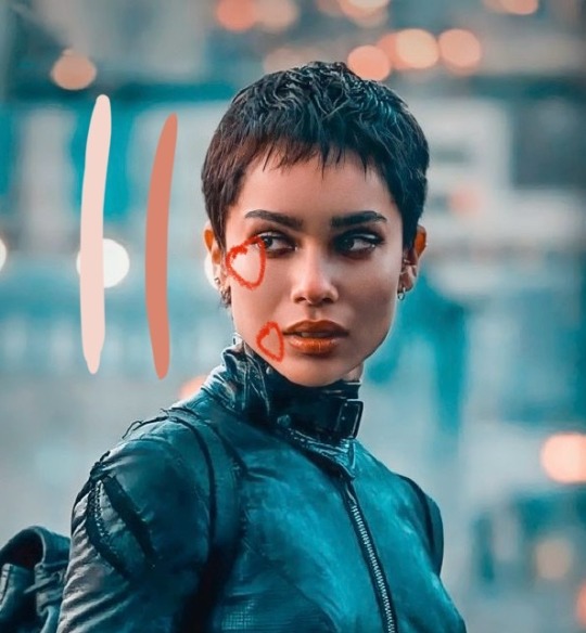
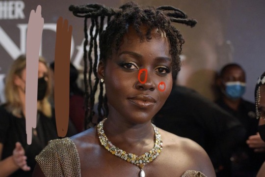
Kravitz's has a clear difference between the two, but they aren't too far apart, in comparison to Nyong’o’s and Jeffries’s. Note the dullness in the poorly picked shades as opposed to the better ones. Also keep in mind that while Kravitz has a rosy undertone (at least in that picture - it’s from The Batman, which has stylized coloring) Nyong’o has a slight cool undertone (I can’t pin down quite what, but the picture is definitely not stylized like Kravitz’s).
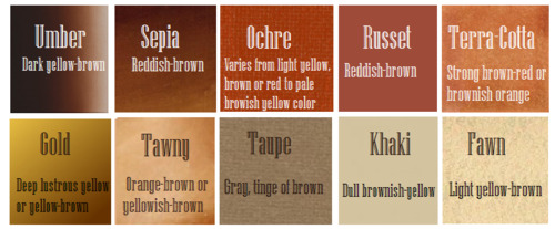
Jeffries runs more ochre or russet, but neither of those are pink. They are more red than terracotta or umber, but to call Jeffries’s face rosy would be wrong. Err more towards the golden when drawing her.
^^saved an image from a writing tutorial long ago, but can’t seem to find it. If someone recognizes it, I’ll link it.
EDIT: it’s from this post. Thanks @autumnrowancollector ! <3
And also, the darker skin gets, the less likely warm undertones are going to appear. Don't be afraid to use blue or purple or even green on occasion!
Additionally, cool lighting on dark skin is always a win imo.
(I was going to use that picture of Jeffries as Annabeth by the lightning bolt, but then I realized the lighting on her face doesn’t quite match up with where it should hit from that angle, and I realized they kind of just turned everything bluer, so screenshot time!)
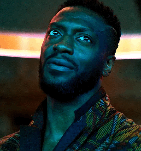
(Also if you want another really great live action example, check out anything Aldis Hodge is in, like Leverage and Black Adam)(and of course there’s Spiderverse <3 but I want to post pictures of Hodge)

Now, to here’s a list of more experienced people’s advice:
Black facial features & hair
Shading digitally for a (somewhat) monotone Black character
Stylistic choices and places to start looking for inspiration (besides a search engine).
Coloring Black people’s lips
A better coloration tutorial
Also a nice tutorial for Indigenous skin tones, just in case yall want to draw Piper or use this information for other dark skinned characters :).
EDIT: Some actresses who are closer in skintone to use for Annabeth, provided by the lovely @blackfemmecharacterdependency ! If you can’t find a reference for Jeffries in a specific lighting, maybe check out these ladies’ pictures! It’s a reblog, so scroll down.
TLDR: Don’t make Annabeth pink and pale, make her dark and golden.
#Annabeth chase#Percy Jackson#percabeth#leah sava jeffries#pjo#leah jeffries#art tutorial#percy jackon and the olympians#I love superheroes and so of course all of the actors I thought of were from superhero movies lmao#also for the record my advice is mostly from reading others’ tutorials and observation#and I don’t really use it a lot because I stick to lineart a lot lol#like down to mentioning Hodge (love himmmm) as a reference for good lighting on dark skin#there’s another post floating around here that specifically mentions him and Leverage for that#I’m tagging this as an art tutorial but really i want it to be more of a master post#master post so yall can see the tutorials I usually use#but then I ended up writing about Jeffries specifically because I’m dumb#I wanted to go to sleep four hours ago I’m dumb#I really want to draw her and ginger Percy but#irl it’s starting to get busy at school again :/
363 notes
·
View notes
Note
how do you get your colors in your art to look so good?
gonna resist the urge to say my colors aren't that great, and i'm gonna try and think about how i do color seriously.... also thank you for the compliment! i've always felt like i struggle with color but maybe i can still be helpful :B if this stuff is all super basic, apologies in advance
ig i already love bright colors, especially warm colors, but i feel like a lot of making visual art is bringing out the contrasts between colors, light and dark, textures, movement, saturation, curves and straight lines, etc., so that just means i usually try to think about the relationships between the colors a little more than the colors individually.
i also don't usually start with a solid color palette defined beforehand. i usually know the basic colors i want, but i don't typically choose them before i start bc that's too rigid for me, and i want to be able to adjust things or throw things out without worrying that i'm messing up the balance of a palette i already committed to.
so for this one
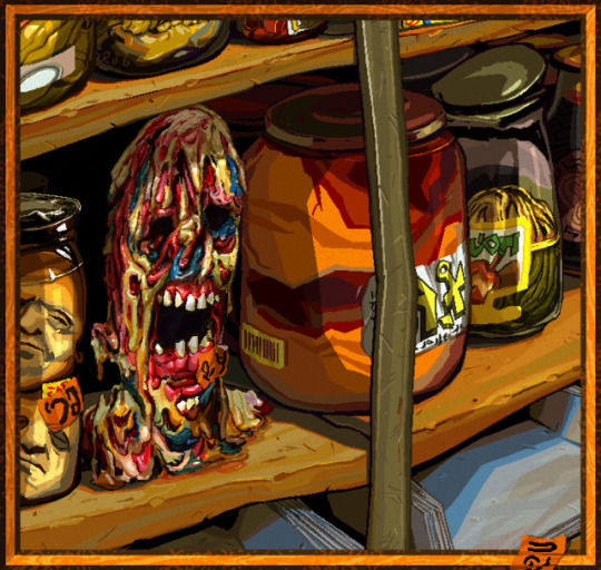

i used a lot of warm colors bc i loove earthy yellows and oranges, but i think it can make colors feel more vibrant if they're next to colors that contrast w/ it (warm and cool, or complementary colors).
the "gray" metal parts of the picture like the shelf stile coming down vertically, and the jar lids behind it, are green to contrast w the oranges and reds in particular, and there's some blue popping up in the zombie head and the shadows on the bottom shelf for the same reason, altho the blue is a touch on the greener, cooler side of blue (as opposed to the purpler, warmer side).
usually if i use a color in one place, i try to pull it into the rest of the picture for better balance unless maybe if it's the focal point. so i'm doing that with the blue, and the orange stickers to spread the bright orange from that big jar around more.
also i don't usually use straight gray/white/black, 99.9% of the time i'll use something tinted like that green metal stile, or the pinkish gray in the jar on the far right.
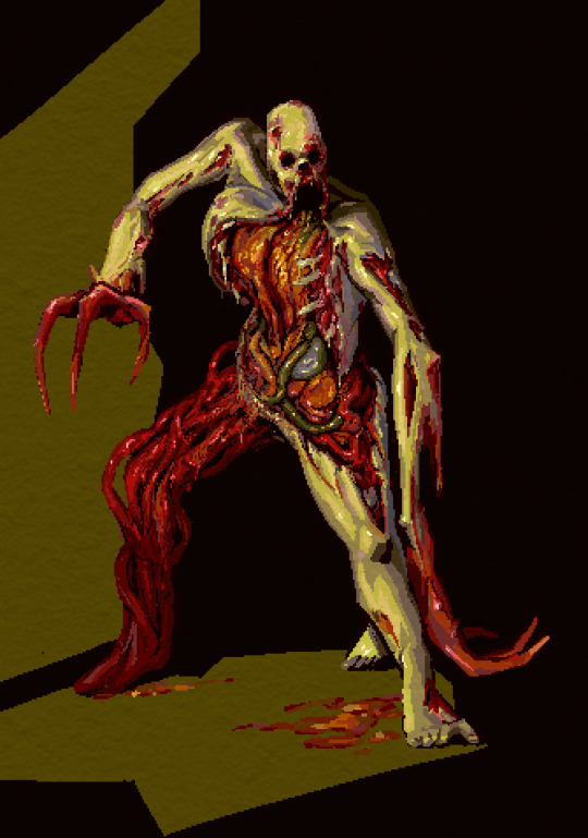

same here: it's mostly green and red bc i like that combo & they're complementary, but i did try to pull a little blue in as well through the shadows on the right ribcage and that one mystery organ under the green intestine, nd in the back of the leg.
that being said tho, it's not really "blue", it's more like nearly gray-purple that looks blue bc it's next to such bright warm colors. that's the magic of gray lol, it's very useful bc it's easy to make it look as if it's warm/cool depending on what colors it's surrounded with.
ig color for me is mostly about color relationships and saturation... the gray can look like blue if it needs to, and it can make the colors next to it look even more vibrant so the skin of this necromorph dude looks sickly and dead but the organs look pretty lively.

when i shade something i always try to use a color that's at least a little bit different from whatever the base color is. so in this case the base color was that kind of pale orange and the orange-ish gray, but the shadows are both super saturated & one is leaning more toward a sienna/orange (on the left side of the pic on the arm and ribs) and the other one is leaning a lil more toward a berry purple/red & i think that usually adds some nice depth to the color. also don't be afraid to add reeeally dark darks and really light lights, but imo the darks give colors the most life by contrast.
since this was a limited palette & not that detailed, i didn't worry about pulling that aquamarine anywhere else.
other than that, i just try to be bold with colors, and go for something exciting & not worry too much about whether it looks naturalistic. plus there's tons of colors you can pull out from regular objects/lighting/whatever else. this isn't specific to color, but the other thing i try to do is practice seeing what colors/forms are really there, not what i expect to be there.
a super basic example would be if i want to draw a banana, i don't want to just automatically reach for yellow bc bananas are yellow, i want to either look closely at the real banana i want to draw, and really try to see what colors are really there (which can be surprising tbqh), or if i'm not actually looking at a real one, then just try to pull in more color for the fun of it, like shading it with purple or blue maybe idk go nutso!
tl;dr i think i usually try to keep in mind
warm/cool color balance
complementary colors (altho tbh you can make any color combo look good, esp if you mess with warm/cool balance)
saturation (i keep a lot of things saturated, but also the contrast between saturation/desaturation can make the colors look more intense)
light and dark contrast
using tinted grays to imply a warmer/cooler color that contrasts with the main palette
color depth (shading with cooler and/or warmer variations of similar colors)
go nutso
#ask#anonymous#cyrsed art#i hope this wasn't completely unhelpful lol i don't know how much of this is just super common sense stuff#but ty for asking it was interesting to try and actually put the process to words
3 notes
·
View notes
Note
anon from 2-3 days ago! do you have any tips for pale colouring? especially how you decide what colour palette to go with? there’s so many lovely pastels, i can’t settle on anything 😭
Hello again anon! ❣️ Sorry for the late reply, I haven't been on here these past days.
Hmmm I am honestly very bad at giving advise but I'll try my best :') My color picking process is kind of a mess not gonna lie, but I always start by picturing one color in my mind I want as the main one, and then I start searching for complementary ones (if the set is gonna have multiple colors) or different shades that go nice together (if the set is gonna be monochromatic). I usually like to search for palettes on this blog: @royalspalettes it has very nice and useful pastel colors!
I also tend to just pair the main color with white because it goes well with anything (and I'm basic).
That is mostly my thinking process specifically for graphics. For gifsets things aren't as easy because even if I have an specific color in my mind, it won't be easy to exactly replicate it in my coloring and most of the times I can't :p Most of the time I choose to work around the movie's colors instead and see what the outcome is.
Let's take my Disney gifs, for example. My last one was a Lightyear gifset that alternates between pastel purple and black. My original intention wasn't to have black as one of the main colors, but the movie takes place in space and so it uses a dark color palette from which I couldn't benefit much of, so using black was the less stressful option for me. And even if the palette didn't end up being what I imagined at first, I'm still satisfied with how it turned out!
I hope this is at least a little bit helpful for you abshdkkjfhg this is obviously my own procedures but I know every graphic maker has its own! If you need any other specific advise you can always send me more asks ^^ it's nice talking with you!
4 notes
·
View notes
Note
YOUR NEW ART PIECE IS MWAH. CHEFS KISS
Also for the question: do you have a specific method for choosing your colors?? I’m rlly bad at picking colors that work well with one another 😔
!!! HI AUSSIE MWAH I LOVE U N KISSA U ON THE CHEEK
i dont really have a specific method per se on choosing my colors? except i tend to stay on the warmer parts of the color spectrum!! i use a LOT of subtle gradients and overlay layers on all of my art, and i tend to stick to complementary colors for lighting!! (specifically yellow and purple)
now, just a reminder that i am FULLY self-taught with the exception of some online tutorial videos, so take my words with a grain of salt since im not a professional :D coloring guide under the cut !
the thing with coloring things digitally is that you rarely ever actually stick with the colors you first put down! its important to keep note that the best thing about digital coloring is that nothing is ever uneditable and you can always adjust the hue, saturation, and brightness of any layer. (for reference, i use FireAlpaca to do art :3 )
now, if youre familiar with my art, my drawings tend to be on the more vibrant colored side! i like colorful and light looking drawings for the most part and all my lighting/shading tends to be either very soft or colored.
one thing i almost NEVER do is shade with direct black.
Now, why is this so? Black is the color of shadows in real life anyway, and its much easier to just shade everything with black and fiddle with the opacity! by all means, black as shading makes the most logical sense.
But the reason i don’t shade things in black or even just move the color of the flat towards the darker end of the spectrum is because the tendency of the shading is that it ends up looking very... dirty. and grimy. and i dont really like that/have the ability to pull it off. so what i do is i use color theory (or, well, a butchered version of it.)
now, before we get into that--on the point of black shading looking grimy & dirty, im certain that there are some styles that can pull it off (like julia lepetit, a drawfee host and a content creator i absolutely adore!). but it really all depends on what kind of mood you want your drawing to evoke. If youre like me and use coloring to express the emotions of a piece and like very eye catching coloring methods, then its important to know that RGB SUCKS.
(For me at least.)
using rgb as your coloring reference tends to create a lot darker or muddier pieces which can be nice depending on your target/intention, but for the most part is terribly annoying. The solution to this (again, which works for me but not everyone) is that i choose to color with CMYK aka Cyan, Magenta, Yellow, Black. THIS is the color model i work with when coloring my flats.
Now theres a whole explanation for why CMYK and RGB are different and why CMYK appears better digitally and for printing things, but im a stem student and im tired as hell of hearing about waves and optics so yall can google that if youd like.
But basically! Yes. I use CMYK in most circumstances to make sense of coloring. Going further from there however, the way i choose what colors to shade/highlight with has everything to do with contrast and color theory. The common understanding i have is that yellow tends to be more adjacent to light while purple is closer to shadows.
NOW.
the basic system i have for coloring goes like this:
if the flats are warm, the shading and the highlighting is cooler. if the flats are cool, the shading and the highlighting is warmer.
for example: (flat color - shading - highlighting)
orange/skin tone - purple - yellow
green - blue - pink
yellow - orange - light blue
THEN i go a little more complex with midtones and what not in order to blend colors!! like with skin for example, i shade it with purple and ease the transition with red midtones. sometimes for fun i add some (subtle) cooler shades for a more painter-like effect.
Colors tend to reflect off of one another too, so i add soft gradients and airbrush very subtle colors unto different components. When im drawing a person for example, i airbrush some of the skintone very lightly unto the hair that frames the face to bring the piece together a little bit more!!
for final touches, i add things like yellow to purple gradients, the side of the light source being where the yellow begins. I also love fiddling with layer settings and setting things to overlay etc. because it unites all the colors a little bit more. I try to also adjust the colored layers to have less contrast between them so that its less of a rainbow eyesore lol
hope this answers a lot of questions!! if anyone wants a more detailed explanation ig, you can always hit up my kofi ;)
6 notes
·
View notes
Note
Our changeling who's head/face are always obscured by colorful clouds. Even *he* doesn't know what he looks like anymore under there after the Change. When Violet tries using her mists on him, he just goes "ya done? Good, MY turn". He lives in a top floor apartment, from which he sends out billowing and shimmering good dreams at night.
Hmmm, trying to figure out how Head in the Clouds Changeling might fit into the natural (well, supernatural) ecosystem of Bordertown now. He’s somewhere between Alistair (gay white guy with a demon style Change who lives in the Seventh Circle and plays a critical role in the way the town’s overall magic works and fits together) and Noelle (bi black girl with a flight-capable Change and who lives in the Aerie and is one of Bordertown’s most famous residents and artists and basically invented her own form of art unique just to her, as only her magic makes it possible).
But yeah,I feel like….based off of your description of Head in the Clouds Changeling here. Not in terms of overlap, but in terms of like….I just feel like there’s some niche he’s just adjacent to, or right smack between those two, and I just haven’t figured out quite what’s ideal there yet.
Because like, okay, so Alistair the Dream Keeper, one of the chief residents of the Seventh Circle, is already a big part of why most Changeling residents of Bordertown never seem to have nightmares. He basically feeds off them. Most of the time, Alistair is a hulking behemoth with a grayish skin tone, curved, obsidian horns that naturally curve together and form a crown-like shape atop his head, and with a fiery red gemstone adorning the front of it and pulsing in time with his heartbeat.
And his skin actually has a strange, almost quasi-translucent look to it, like its not so much skin as it is the surface of some deep, murky pond whose waters are all gray and overcast and dark..It ripples when he moves, and if you watch him long enough you’ll see dark shapes darting up and down the length of his body, across his arms, the back of his neck, etc…as though you’re catching distant glimpses of whatever creatures live deep down in the depths of those waters.
And essentially, Alistair’s magic works by making him a kind of magnet, almost, a supernatural lodestone that pull nightmares out of the sleeping minds of nearby Changelings and carries them in his direction, via some kind of nightmare spectral tide, that only he can really see or interact with. And by being able to see and interact with this nightmare tide, Alistair can basically….fish these nightmares out of it, and feed on them. He absorbs them into himself, where they become part of his mass, cause him to grow, not unlike that aspect of Sky the Cloud Shaper’s magic….and then with these nightmares becoming the dark figures glimpsed in the depths of the reservoir of dreams his body basically doubles as.
However, the true nature - for better and worse - of Alistair’s magic is that it turns the nightmares that are washed up on his shore, from half-realized monstrosities of the id and the subconscious…..and without actual intent from him even, just a natural byproduct of his magic….the nightmare tide that carries bad dreams to him, like, fleshes them out, gives them physical substance by the time they get to him.
So when he fishes one of these nightmares out of the sky or atmosphere around him, where its swimming in this kind of magical tide that really only exists for him, at least right up until the second a nightmare gets drawn in close enough to him that its made physical reality….the act of fishing a nightmare out of the sky/nightmare tide is a physical act. He basically plucks it out of thin air and and pulls it into himself, absorbing it into his own body and the strange not-ocean that acts as the surface of his skin even as it contains limitless depths beneath said surface.
BUT….the second his magic turns a nightmare into something physical….it becomes potentially dangerous, as much to him as anything or anyone else around. Like, there are some nightmares he just flat out doesn’t want to feed off of or absorb, because he’s not sure what having a particular one inside him, be part of him, might do to him as a consequence or side effect, but he’s not always eager to find out, and thus avoids feeding off of specific nightmares he himself feels unsettled by, just from the sight of them or being in proximity to them.
Except the danger is, there’s no ‘return to sender’ function he can evoke with his magic, to send it back to whatever dreaming mind his magic pulled it from in the first place. Nor can he just make it immaterial again, remove its physical aspect, by doing anything other than taking it into himself, which he’s too afraid/anxious to do with some of these.
All of which means, his only real option with these nightmares that he doesn’t want to touch or feed on or have any part of them inside him….is to physically destroy them. Which he does by summoning one of the nightmares he has previously chosen to absorb into his own depths….and bringing it back out of him again, returning its own physical state, and then basically.pitting it against this other nightmare he wants gone, but not at the cost of letting it potentially affect or change him. Weaponizing one or more of the nightmares he’s fed upon, to destroy the nightmare he refuses to, because just the nearness of it is leaving a bad taste in his mouth.
And these clash of nightmares can get pretty gnarly, but since in even most worse case scenarios, Alistair still has more nightmares he can pull up out of his own depths to act as reinforcements or supplement his initial choice of warrior, if its not up to the task of destroying the nightmare he’s trying to rid the world of….its usually not a problem.
Some nightmares out there are dark by any standards, with this all being part of why he doesn’t want them inside him even briefly…the fact that they’re so monstrous, so horrific, that even just getting rid of them requires he burn through most of the nightmares he has available to weaponize against it in the first place, when attempting to do just that.
But ultimately he is almost always able to destroy even the most twisted of nightmares-made-flesh that swim his way on the spectral tides of his own magic’s making….even if doing so costs him his entire stockpile of existing nightmare warriors….and leaves his own ‘reservoir’ dried up and shallow for the most part, with no dark creatures lurking deep in its depths. While at the same time, shrinking him down to a far less imposing or intimidating frame or stature than he usually possesses.
He can always ‘restock’ his supply by feeding on more new nightmares he is willing to eat and absorb….even if he sometimes simultaneously sulks about having to lose some of his most valuable and preferred (and in some instances, rare) nightmare archetypes, as they fell in battle against the personal demons of some other Changeling’s fucked up subconscious.
Thus, whatever else he may be, such as melodrama prone, Alistair the Dream Keeper plays a unique and valuable role within the magical ecosystem of Bordertown. Thanks to him, the town’s residents enjoy a largely restful and healthy night’s rest one night after another…..rather than being mired in whatever dark dreams they would be haunted by were Alistair’s magic not available to physically draw their nightmares out and vanquish them magically.
And the ‘reward’ his own magic reaps for him, in return for this valuable service he provides the town….is his ability to call forth whatever nightmare warriors he has stored within him, to use as his champions in whatever other conflicts he might find himself in.
(Of course, there are the really rare occasions where some new arrival’s dreams are so haunting and horrific, none of the nightmare warriors Alistair has available to him are able to put an end to that newest terror….and it takes other Changelings reinforcing him with their own magic to exorcise these particular beasts. But those are rare occasions indeed, when he finds himself totally outmatched on just his own).
And then on the completely opposite side of things, there’s Noelle and her niche in Bordertown. Noelle is a black girl whose primary place of residence is in one of the towers of the Aerie….and this also where she has her studio, and where she developed, honed and continues to master the unique art form that’s born entirely of her own magic….and that makes her one of Bordertown’s most famous artists in residence.
Appearance wise, Noelle is a black girl of medium height, in her late teens or early twenties….and with every part of her constantly lit or aglow with her own vibrant neon luminescence, one forever combining complementary hues of blue, indigo, violet and hot pink. Her hair is the latter: tight braids always brightly shining a dynamic, neon shade of hot pink. Her skin always appears to be bathed in a perpetual, moonlit glow that in turn, gives her an eternally soft and cool blue radiance of her own.
And from her back spring two wings of pure incandescence, like two flat panes of solid, glowing light, both a deep and lush violet in hue…..wings that rapidly beat the air much like those of a hummingbird do, allowing her to remain practically stationary in flight, should she wish to - and should she find it helpful to remain in such a position while crafting one of her works of art.
And all the while, other sources of light shining through and cascading over her wings of light, rippling off of the soft arctic glow of her figure and woven into the dynamic, neon intensity of her hair….it all casts a chiaroscuro crazy-quilt of dappled light and shadow about her, everywhere she goes….making her the permanent center-point in a constantly shifting light sculpture that’s illuminating and illusionary all at the same time.
And thanks to her magic, Noelle’s unique form of artistry allows her to paint with her own light and emotions. Literally. By tracing paths of light across any surface using just her own glowing fingers or hands, Noelle sketches designs that she at the same time imbues with specific emotions, or combinations of emotion. With these then being experienced exactly as she intended them to be felt, by anyone later touching a surface she poured her own radiance and emotions into.
By the time she’s done with a piece, Noelle’s art might be physically indistinguishable from its surroundings….but the emotional tapestries or symphonies that spring into a person’s mind, that can be felt singing deep within their very bones, just upon making the slightest touch to a surface that’s keyed to one of her emotional landscapes….in those respects, her art is an experience impossible to mistake for anything other than what it is:
Unique masterpieces of vibrant, intense feelings that are all laid out and organized into coherent emotional journeys that are then undertaken by anyone whose heartstrings are seized in the grasp of one of her pieces.
There’s a small courtyard in the heart of the Rose’s Garden, that Noelle carefully shaped and molded into an emotional arrangement that even years later still bears the specific resonance she poured into every last nook and cranny of that cozy, intimate space…the name of this courtyard, this piece of hers, is “Refuge,” and any Changeling who goes to sit in it finds themselves swept up in the cascading surges and swellings of relief and comfort, surety and safety, that she crafted that small, light-swept corner of the garden to be an eternal reminder of.
There’s a soothingly bubbling fountain on the uppermost floor of the Aerie, that Noelle named Respite when she was done crafting it into a basin of sustaining restfulness, a fount whose waters from that point on always held within them a soft inner radiance and summoned to mind a hum of peaceful relaxation, for anyone who so much as trailed a hand through their ripples, let alone took a refreshing sip.
A terrace along the north side of one of the uppermost floors of the Aerie bears the name Solace, thanks to her….and thanks to her magic and her art, it bears a feeling of consolation, of shared loss and of an understanding of its magnitude, for anyone who steps out onto that terrace with nothing between their toes and the support of the terrace underneath their feet.
And Noelle’s latest project, undertaken in collaboration with her girlfriend Nadia, a Changeling possessing the look of a dryad and the magic of shaping trees, is a line of furniture called Contentment….a series of magically sculpted chairs that each bear a unique emotional signature, guaranteed to bequeath a blissful sensation of peace and oneness with one’s surroundings, to anyone that sits in one such chair.
But never lacking for ambition or the desire to further press and hone her craft in new directions, each and every new project she undertakes, Noelle’s new signature line of furniture doesn’t bear just a single, over-arching feeling of Contentment to be shared by anyone who sits in any of the chairs, with no two any different from each other…. rather, each individual chair holds within it an entirely different kind of Contentment, unique and distinct to each one. One chair holds within it the satisfaction of a job well done, a passion project that has born exactly the fruits one hoped to see it yield some day. Another contains a breathless surge of knowing exactly what you hoped to find and feel upon reclining in it, and discovering your anticipated hopes had been met and exceeded upon sitting down. Another sweeps you up into the confident surefooted awareness that you were exactly where you were supposed to be, doing exactly as you were intended to be spending this time doing….nothing mattered beyond just the general state of existing you were more than gratified to make the focus of your entire being for now.
And so on and so on.
Which brings us back to your head in the clouds Changeling and makes me think….what role or niche might he best serve here…..and now I’m thinking, what about something like a source of inspiration, a burst of epiphany? Someone whose very presence is a catalyst for the Eureka moments of everyone in his vicinity perhaps? Maybe he’s mostly mainstream in appearance other than the clouds or mists that seem to cling to him in just the right ways as to obscure his most revealing features, and with no apparent source for where the clouds or mists originate….and something about his magic acts as a lure, a will-o-wisp almost, perhaps tendrils of his clouds seek out the people I’m about to describe here and leave a trail of thread between them and him, that they can follow as long or far as needed to end up in the same area as him at just the right time for ‘the clouds to clear up’……
And with the people his clouds are drawn to, and that they draw to him in turn…..being those who are particularly lost or dazed, having trouble focusing or seeing a conclusion or detail that’s of pretty vital importance and is just right in front of them and has been for days, if not longer….with the ultimate point of his magic being that it gathers as many people in this state to or around him as possible, and then once the number of people, or the mass confusion felt by all present, like, once it hits the point of critical mass…..that’s when his magic makes for a ‘clearing of the clouds’ that cuts through both the crowd and their individual confusions like a bolt of divine inspiration…..and suddenly, everyone present is having a eureka moment, a mystical epiphany that flings them into action and movement and has them scribbling down things as fast as they can think of ways their recent revelation might apply here or tie into something else here?
Not sure, but something like that, potentially. I do know one thing that’s of relevance here, or at least I think, is the idea I had that for flight-capable and winged Changelings, the height you live at in the Aerie, how high up you are compared to others…..its based on wingspan, stuff like that….basically, how much you need that room to take flight or make the most of your magic. Like…..its not a status symbol, having a residence on one of the very top floors of one of the Aerie skyscrapers isn’t proof of you being anymore important than any other Changelings in the towers or elsewhere in Bordertown…..it simply means…you need the room.
So at the very upper levels, you do have Changelings like Hideo Furukawa, sometimes called the Strange Angel - the guy who is half Brazilian, half Japanese, all ridiculously gorgeous and almost seven feet tall….and with vast wings that are actually three different overlaying pairs of wings, all of them seemingly formed of stained glass windows rather than feathers, resulting in Hideo showering the ground beneath his wings with an endless river of rainbows where the sun hits and bleeds through his wings, his wings sounding like a symphony of wind chimes every time he beats them against the air, and with him able to cut and rip holes directly into the fabric of space each time he unfurls his wings and slices through the sky with them, and potentially reality too….
Basically, point being, someone like Hideo is individually powerful and a huge social influence within Bordertown, given that he can fly through his rifts to anywhere pretty much instantly….and thus meaning that he’s one of the few Changelings with unfettered access to any of the other Faetowns, 24/7, who never needs to rely on a painting portal or the compliance of any of the paintings’ guardians, in order to travel from town to town…..but then compared to this particular Changeling…..it might seem strange for them to both be top-level dwellers, both living at some of the highest points of the Aerie, when Head in the Clouds Guy doesn’t even seem or feel flight-capable, and might actually be one of the few Changelings living in the Aerie who can’t fly at all…..
BUT at the same time, theoretically a case could still be made for WHY he’s living in that particular Fey ‘neighborhood,’ and why he has a top floor dwelling as well, despite a lack of wingspan period…..because if its as much about your magic needing more room to maneuver well, just as much as its about your wings needing the space…then Head in the Clouds Changeling makes a lot of sense there from that perspective, because imagine the clouds or mist just pouring off him in waves, seeking out everyone aligned with his particular magic or the need for it right now, that hit of clarity….you’d need him as high up as possible to get that cloud cover seeking out the right people to draw back to him, but otherwise causing as little disruption to Bordertown’s day to day movement and populations as possible…..because from up high, tendrils of clouds can go seeking individuals, but if all that cloud cover spreads out from the ground level…..everyone’s going to end up blinded by it and getting turned around in it, even people who weren’t originally or wouldn’t be having trouble with that otherwise either.
The same could be said for if his clouds were about delivering good dreams, but I’m undecided if that’s maybe too much overlap with Alistair even though its the direct opposite of his nightmare tide. But even though Alistair doesn’t influence dreams directly, or lead to good ones or contribute to anyone dreaming at all…his acting as a lodestone to draw out and suck up the bad dreams, actually banishing, destroying or exorcising the worst of the worst, that might still in essence, just…effectively produce a similar result to a mist, fog or cloud cover that spreads good dreams throughout the city.
3 notes
·
View notes
Text
10 Ways to Start Decorating a Room from Scratch
For our Decorating Dilemmas column, we can’t even count the number of times we’ve gotten this question: “I just moved into my new home, and I have no idea where to start!” That’s because decorating a room completely from scratch is intimidating! You have no where to start and yet so many choices to make. We pulled together some easy jumping off point so you can start decorating your room from scratch:
1. Find a Piece of Artwork You Love
When we design the rooms for our catalog, we have the same dilemma. We have a completely blank canvas with endless possibilities. More often than not, we’ll use a piece of artwork as a starting point. If you look closely at this piece by our Exclusive Artist Rick Reinert, you’ll see there are some persimmon oranges and lots of different shades of blue. We wanted to emphasize those colors in the painting, so we used them for our upholstery, pillows, and a bright blue rug.
Use a colorful rug as a starting point when you're decorating a room from scratch
2. Start with a Rug
Our Catherine Rug is one of our all time favorites because it’s subtle but has some really pretty shades of light blue. We wanted to really draw out those icy blues for this living room, so we chose complementary fabrics and artwork. Our new Cleo Glacier and Minsk Glacier fabrics pair perfectly.
Use a bold fabric as a jumping off point for your room
3. Find a Fabulous Fabric
Large scale florals, especially ones with a black background, are really trending for 2017 so we used our new Beatrice Black Fabric as our guide for this space. Just like the fabric, we chose mostly black and white pieces, but if you look closely, you’ll see shades of purple in this fabric. We brought out those touches of lavender in the fabric with our Shiloh Spool Chair and pillows.
Use an inspiration tear as the jumping off point for a room if you're starting from scratch
4. Inspiration Elsewhere
An inspiration tear is a great way to give your room some direction. Whether you love it for the color palette, the layout, or just the general vibe, use a room you find as a reference when you’re starting from scratch. We loved the way designer Jonathan Savage used a pair of our Isabella day beds in his small guest room at the 2016 Traditional Home Southern Style Now Showhouse. We wanted to share his fabulous idea in our catalog, so we used his space as inspiration for this bedroom in our Winter 2017 catalog.
Suzanne Kasler decorates this living room with accents of mandarin orange
5. Choose a Color
Color can have a huge impact on the way your room feels. Every color has it’s own personality, so if you find a hue that evokes the feeling you’re after, go to town with it in your space. Suzanne Kasler masters this strategy in the space above. Everything in the room is neutral, but she strategically brings in accents in her mandarin orange linen to give the room a coziness and warmth.
If you have a small space, first choose a layout, then use that as your inspiration for the rest of the space
6. Land on a Layout
If you’ve got an oddly shaped room or a very small space, first decide on a layout that works in your favor. Needing specific furniture pieces will narrow your options and help you get started in the right direction. In this small living room, for example, we knew we needed two settees that would face each other, and the small footprint meant that a light, bright feel would help the room from feeling cramped. From there, we chose neutral pieces with contrast and texture but minimal color.
Black and white living room with metallic gold
7. Start with a Statement Piece
One dramatic piece can inspire an entire room. In this living space, our Kent Dome Pendant was our starting off point, so we echoed the black exterior and gold interior in the rest of our choices. A black and white geometric print on the sofa played off the modern black silhouette of the light, as did the black and white wall art.
Mark D. Sikes' living room at the 2016 Southern Living Idea House in Mt. Laurel outside Birmingham, Alabama
8. Neutral Need Not Be Boring
Neutral rooms get a bad rap, but if you don’t have an inspiration point for your empty space, consider doing an allover neutral color palette. Choose one neutral shade, be it gray, white, or beige, and bring in pieces that are neutral but in different textures. Linens, leathers, velvets, rustic wood, metallic pieces, and wallpaper can all work together beautifully in they’re in one shade. Designer Mark D. Sikes did just this in his living room in the 2016 Southern Living Idea House. Hey, if it’s good enough for Southern Living, we can dig it!
Use something you already have to inspire the furniture pieces in your empty space
9. Work With What You’ve Got
Consider using a piece from somewhere else in your home as a starting place. Maybe it’s an family heirloom, a children’s piece of art, or a collection of blue and white porcelain. Reinvent something you already love by using it in a new way, and let that one standout piece (or piece) guide all of your choices for the space.
Ariel red fabric on Louis dining chairs in dining room designed by Eddie Ross
10. Collect As You Go
For some people, not having a plan is a plan in and of itself! If you can’t come up with a direction, let the inspiration come to you. Hit an antique shop, flip through your favorite catalog ;), or go to a local home store, and inspiration may just strike you when you least expect it. Layer in new pieces as you find them, and simply let your room evolve over time!
0 notes
Text
Sam and Dean and their complement of issues (and complementary issues)
So what started as a random reply turned into our (as always this came out of conversation with @owehimeverything) Grand Unifying Theory of the Winchester brothers relationship...
chiisana-sukima wrote:
...in terms of who they are as people over the long haul, Sam is pretty unwavering in believing that Dean has a good reason for the mistakes he makes and is a good person who is doing the best he can and will come through on the right side in the end. Whereas Dean, I think, wants to believe that same thing of Sam, but doesn’t always (he does always believe he’ll love Sam no matter what though). And so in the places where Sam is weakest, sometimes Dean instead of shoring him up, breaks him down further.
I think is largely true, and along with the cosmic destiny and echoing Michael and Lucifer, a lot of it is the basic psychology of how they were raised. Sam grew up with Dean as a second parent, and the one who provided him unconditional love, who supported him through their rough life; naturally Sam internalized that as Dean being good, generous, to dedicate himself to that duty. While as Dean, acting as Sam's father and mother as much as brother, loved him unconditionally but was always having to watch out for Sam making mistakes, correcting him when he went wrong, as you do with children. (They talk about this in season 5, Dean trying to get over that long-practiced instinct of thinking of Sam as a kid who Dean has to keep "on the straight and narrow.")
It's fascinating how these viewpoints totally flip their usual philosophies. Sam is generally the one more inclined to see in shades of gray, to look for both the good and bad in anything -- but he thinks of Dean as an absolute, a Good man (and when Dean completely falters in this, Sam doesn't know what to do. In season 4, when Dean confesses what he did in Hell, that's when Sam goes back to Ruby and the demon blood.) While as Dean is more a black-and-white thinker, his morality based on instinct more than reason, this feels right and this feels wrong -- but Sam he loves whether he's right or wrong. Sam may look like a monster to the rest of the world, but he is always Dean's brother; and no matter how dark Sam gets, Dean always believes he can come back from it. Taking out the monster before it can kill innocents is Dean's go-to solution with everything but Sam -- never with Sam.
Both these views can get distorted and painful and fuck up their relationship on either side. As you say, Dean sometimes inadvertently tears Sam down at his weakest points; and Sam can do the same thing to Dean (but in different ways, at different points).
Sometimes Sam doubts Dean's love for him -- believes that Dean is loyal out of duty, because he is a good person who took responsibility for Sam and won't forsake that (even if he really would want to). So he sends Dean to Lisa and Ben, assuming that with someone, anyone, to care for and protect, Dean will ultimately be happy. Not realizing that Dean loves him specifically, out of more than altruistic compassion, and losing Sam is far worse a pain than just failing in his duty. I don't think Sam ever imagined that his going to Stanford would break Dean's heart; when Dean says that he didn't call Sam for two years, Sam hears it as Dean was fine without him, until he needed his help -- when really Dean staying away was a painful sacrifice, Dean trying to give the space he thought Sam wanted (and trying to protect his own heart).
And on the other side, Dean fears what Sam might be capable of, and that if Sam does do the wrong thing, that Dean won't be able to stop it (as is his duty -- as he's always understood it, as his dad always told him, as Sam himself has made Dean promise), because he does love Sam so much. And so he will become too judgmental, pointing out Sam's past and present mistakes. Not because he hates Sam for them but because he can't hate Sam for them, so hopes the reminder will at least be enough to make Sam question himself. Often worded bluntly or even cruelly, to try to get through -- not realizing how much Sam already questions himself, or that to Sam, Dean is almost the ultimate moral authority, and so his seeming judgment cuts deeper than anyone else's.
This also causes a tragedy of Golden Rule intentions, in that Sam sometimes will try to give Dean what Sam himself most wants/needs (assurances that he's a good person) while Dean will give Sam what Dean himself most wants/needs (assurances that he is loved no matter what) when sometimes their brother needs the other thing more. Sam needs to be told more than he's a good person, because it's maybe his greatest fear, that he's fundamentally evil and has no right to exist, whether or not he's loved. While as Dean doesn't put as much stock in whether Sam or anyone else believes he's good or evil (he has his own opinion on that, which goes up and down, but ultimately he does what he thinks is right and/or what he feels he has to do, whatever anyone thinks) but he needs to be loved and to love, because he's never sure of his right to either.
The first half of Season 8 is maybe my favorite (in a painful way) exploration of this, because both of them get their fundamentals so shaken. Dean is supposed to be Sam's "good man", who does the right thing -- who was indiscriminately killing his way through Purgatory for a year and now is friends with a vampire -- while Dean thought his and Sam's love could see them through anything -- but Sam apparently didn't care he was gone and did just fine without him.
And as dark as the Carver era got, a lot of it was a climb up from this, a working through of these issues. Between Gadreel and the MoC, Sam had to face Dean's darker sides, that Dean could do terrible things, with or without reason -- he still believes Dean is ultimately good, but he also knows Dean can do wrong, and will act to stop it. And Dean is less likely to pass judgment, and more likely to put faith in Sam's choices -- to not just love him but trust him as well (the MoC worked this from both sides; when sunk into its influence Dean was more judgmental than ever, but when he was keeping his head above the surface he was more likely to defer to Sam's judgment, accepting that his own was compromised. And that's continued through s11-12, that Dean makes his opinion known but follows Sam's lead with complex calls like going to Lucifer or working with the BMOL, or affirming his leadership in 12x22.)
Meanwhile Dean is more sure of Sam's love, after the MoC and all Sam did -- he didn't want Sam to do it, to risk the world like that and put that much more on Dean's conscience; but that Sam did anyway (that he would again, in a second) has settled Dean in a deep way, maybe finally convinced him that Sam does love him that much, such that Dean can openly acknowledge how his death will mess up Sam, that he can say with confidence "but we always came back." And Sam likewise is more sure of where they stand, telling Dean how he feels, criticizing and expecting Dean to respond to it without taking it as a rejection of their bond.
Of course they’ve still got some distance to go yet, and personal issues within themselves to work out. And they might still fall back into old patterns. But they’ve gotten further than ever before (and for all my criticisms of season 12, I am so satisfied that it didn’t set them back in this. Here’s hoping that season 13 will continue progressing forward!)
#supernatural#winchester brothers#spn meta#meta#my meta#my post#brothers#the theory of complementary winchesters
159 notes
·
View notes
Text
Covid 19 I became a mask maker because your life is worth my time shirt
Covid 19 I became a mask maker because your life is worth my time shirt
Are you presently wanting to alter the way you look? Has fashion been something you have already been contemplating but simply haven t got enough time to obtain straight down? Nicely look no further, this information is in this article that you can work out how you are able to improve your impression by means of style.
Belts can be quite a great fashion accessory. You should get several straps so that you have diverse shades, designs and fabric from which to choose. Include a vibrant fluorescent belt to a couple of thin bluejeans for any straightforward approach to make the most of a craze, or finish a stylish look using a black colored patent buckle.
Use cropped trousers in the more complementary way by choosing capris, pedal pushers, and bermuda shorts that do not fall with the widest a part of your calf. Opt for pants that end on top of the leg or nearer to the ankle. You need to avoid flared designs to help keep your look streamlined.
Usually do not acquire clothes just since it is on sale. When you don t look really good in it, you ll never wear it once again. You may waste materials your hard earned dollars since you will by no means use it.
Should you wear mascara, will not water pump the remember to brush inside and out of the compartment. This will cause the remember to brush to be broken, and therefore applying your makeup products can become far more of any chore. This action improves harmful bacteria, which you will be putting onto the skin. Move the remember to brush sideways a little bit if you want to get more mascara around the remember to brush.
Don t fall for a fashion tendency whether it doesn t satisfy your structure well. Anyone might be using the latest style gimmick, and you ll attempt to adhere to match. But if the latest type is not really complementary in your actual body, you will only do a design disservice.
There are many alternatives in modern your hair add-ons. You will find hairbands, headbands, elastic owner, bows, extenstions and much more. An strategy of locks extras makes it easier to check wonderful every day–you can forget awful hair days and nights! It is possible to satisfy your scrunchy to the coloration you re sporting, as an illustration. When going away, be sure you take headbands that suit your outfits.
Many people tend not to realize how to dress in a shirt effectively, and it also means they are seem absurd. If you are going to activity a coat, you have to wear it appropriately to check great. You need to remember that the base key on the shirt is not really intended to be buttoned. This may keep you from committing a design combine up.
Since you ve look at this style assistance, you can become modern with out time and effort and cash. Use the suggestions that caught your eyesight to alter increase your look. You ll in the near future see a huge difference every time you appear because vanity mirror.
Go shopping amazing visual tees preferred by way of a network of imaginative and one of a kind makers Covid 19 I became a mask maker because your life is worth my time shirt.
Internet shopping is among the least complicated and many convenient methods to discover things that you need or want. Apart from quickly assessing the prices of several providers, it is possible to set up a free account that immediately charges your card without asking for information and facts. Read on to find out more about shopping online! Prior to any purchase, compare prices on many internet sites. Try to find specific vouchers while offering on these web sites to make sure you are obtaining the best deal feasible. Also explore just what it will cost to the transport on your goods and when you will find free shipping alternatives accessible to you. Prevent store shopping on sites that aren’t acquainted or do not have on the web consumer evaluations. Regardless of how much you should purchase their items or how very low their pricing is, you simply don’t understand what you’re getting into. Reserve your online buying dollars to the well-known and trusted sites that keep your info safe. Ensure that all of the information regarding an item is read through before you make any choices. Only looking at an internet based image is not going to constantly provide you with a true concept of a specific thing. It might make something appear more compact or bigger than it really is. Be sure you read through around information so you’re sure of what you’re thinking about buying. If an on-line vendor requests for the social stability number, tend not to make any transactions to them. Whilst your charge card information is needed, there is no require for a company to inquire about your charge card info if you are purchasing from their store. Actually, you ought to statement any company that asks for this particular information towards the Far better Organization Bureau. There is lots to find out in relation to shopping online. You must not just commence purchasing without the need of understanding some essential suggestions into it. Make sure you cautiously go through more than this short article before buying to be able to help save the most money and enjoy the best expertise.
Covid 19 I became a mask maker because your life is worth my time shirt, Hoodie, V-Neck, Sweater, Longsleeve, Tank Top, Bella Flowy and Unisex, T-Shirt
Classic Ladies
Hoodie
Unisex
Buy Covid 19 I became a mask maker because your life is worth my time shirt
Buying online from the biggest selection of original t-shirt models Covid 19 I became a mask maker because your life is worth my time shirt.
Shopping on the web in the convenience of your personal home is amongst the wonders bestowed with us through the web. We can easily effortlessly acquire everything from our weekly groceries to our own cars with only the click on of your computer mouse. Nonetheless, with the simplicity of shopping on the internet appear some dangers–id theft, false marketing, and cons for example. Keep reading to learn to experience the incentives of internet shopping while shielding yourself and scoring great deals. Stay away from purchasing on web sites that aren’t acquainted or have no on the internet customer evaluations. Regardless of how a lot you might like to buy their merchandise or how reduced their prices are, you merely don’t really know what you’re entering into. Save your internet store shopping bucks to the famous and respected web sites that maintain your details safe. Will not invest an excessive amount of funds on shipping. Delivery fees can definitely accumulate. Numerous internet sites offer shipping and delivery, free shipping as soon as you invest a definite quantity, or have got a promotion code that lets you get shipping and delivery. Rather than pay your hard earned cash on shipping, locate a store that ships free of charge. Always help save or print a duplicate associated with a get affirmation you will get when you make on the internet buys. If you do not use a printer, you can always take note of this article. Should one thing happen, it will useful that you can have your get quantity, item outline, your name, and repayment details. If you are planning to get performing some shopping on the web, be sure to understand the culpability for each and every charge card you use on-line. Numerous a credit card have automated scam elimination internal while some supply it for the minimal payment. You do not want to get tied to buys made on the card if the number is robbed. So, have you ever made the decision that you’re going to start off shopping on the web. When you resolved indeed, that is a really intelligent selection. Not only does shopping online provide you efficiency you just can’t get at brick-and-mortar merchants, it allows you to get the shopping carried out report time, to get to undertaking issues you want to do.
A New T-Shirt – Covid 19 I became a mask maker because your life is worth my time shirt Product.
A Comfortable and All Sizes Fit Small!
The post Covid 19 I became a mask maker because your life is worth my time shirt appeared first on New T-Shirts Daily Exclusive, T-Shirts Online Low Prices - NewT-Shirt.Com.
source https://newt-shirt.com/product/covid-19-i-became-a-mask-maker-because-your-life-is-worth-my-time-shirt-2/
0 notes
Text
When purchasing dining room chairs, it is useful to remember particular areas like your particular specifications, the dimensions of the chairs, or regardless of whether you need armchairs or not. Individuals early cameras composed analogue illustrations or photos, at first in black and white, sepia and distinctions in browns and shades of greys; with coloration photography coming afterwards. Inspiring Strategies For Least Room Living - Hongkiat Positioned in Nada, Japan this 3-story high dwelling contains a parking spot, living room, little ones s room, a person bedroom and a great deal of storage space all within 398.
Sebenar nya saya tak sampai hati nak tengok pak mat macam tu, tak apa lah nanti saya tak kunci pintu bilik , kalau pak mat rasa memang dah tak tahan dan gian sangat, pak mat lakukan apa yang patut, semua nya atas diri pak mat ujar ku sambil melirik kepada nya dan terus berlalu dalam bilik tidur ku meninggalkan pak mat yang agak tergaman.
I am not chatting on behalf of individuals who want to wear the cap that they are the African heart group of South Africa. The Treaty of Cusetta exclusively granted a 50 percent section of land to an African American male, Joseph Bruner, in acceptance for his expert services as an interpreter.
You didn't deal with her, as she spends most of her time either in her apartment on flooring 3, getting murdered in the resort lobby on floor two, or at the ballroom dance on flooring just one. Lisy s Cut price Home furnishings - Furnishings Stores - 4Ella Grasso Blvd.
I was driving home from my boyfriends home in downtown, as i drove late at night involving the highway lights i would see people walk from just one side of the highway to the other inspite of cars and trucks in their path and a couple of even appeared in front of they ended up actual physical people i might have hit them, generally it was a sigh of relief to know that it was a black mass the shape of a person as a substitute than a serious actual physical male.
Immediately after you've got drawn the home furnishings pieces on the dwelling room system, modify the voyage lines. Farmers Furnishings - Home furniture Merchants - 15Mill Sq - Alexander Metropolis. If you want to obtain upholstered dining room chairs with arms , save the picture now.
The oppressive configuration the White person has assumed in connection to the African person is in good part the final result of the reality that we have authorized ourselves to reside in complementary subordinate configuration conducive to his oppressive designs.
Only when im in my room my door will lock ive made positive im not locking it and forgeting but it keeps locking me in. it is really materialize 6 times in the past 2 days and it Cheapest Wayfair 's Furniture Sale 2019 is at the place ended up i rest in the living room now. Categorical Trade Establish Logo Printed Table Covers.
0 notes
Text
Makeup Tips: How To Flaunt A Dark Lipstick
New Post has been published on http://healingawerness.com/getting-healthy/getting-healthy-women/makeup-tips-how-to-flaunt-a-dark-lipstick/
Makeup Tips: How To Flaunt A Dark Lipstick
Saumya Gaur April 12, 2019
A couple of years back, in 2016, the color oxblood was seen sweeping the fashion shows and ramps everywhere. It was a rich, dark shade that gave off a royal vibe and suddenly, everyone was seen flaunting it. I don’t know if you have noticed how darker and more pigmented shades have come in vogue, and this trend has been on the rise especially in the makeup department, more specifically in lip colors.
Fashion is cyclical in nature (what goes around comes around) and maybe this trend can be read as a flashback to the emo 90s. Though one thing is certain, the trend of dark lip colors is here to stay for a while. And if you are not a brave soul who can flaunt these bold babies like a boss, for the fear of appearing like a vamp, don’t worry there’s a way out for you too.
To help you make the most of this deep-hued trend, we have created this short how-to list which can help you flaunt dark chocolate or purple lip color, like a boss. Here it is:
1. First, You Need To Prep Your Lips
Shutterstock
It wouldn’t matter if your lipstick is from a top-notch brand or has the perfect finish if your lips are not in a condition to display it. So for that, you need to keep them in tip-top condition and you can do that by exfoliating them at least once a week and moisturizing them daily.
In order to exfoliate your lips, you can take your toothbrush and very gently, rub it over your lips. You can also use overnight lip masks to moisturize your lips.
2. Use This Three-Step Process
Shutterstock
Firstly, you should apply some concealer or foundation to your lips, so that when you do apply the lip color over it, it should stay true to the bullet.
Second, line your lips with a liner, doing so will stop your lip color from feathering. You don’t have to completely line your lips, just the bow, the edges and below your lower lip.
And finally, apply the lipstick and blot it with a tissue paper. While the tissue is placed on your lip, dust off some translucent powder over it, and then remove the tissue and apply the final layer of lipstick.
3. This Color Tip Is Perfect For The Amateurs
Shutterstock
Though one should keep in mind their complexion while going for darker colors, people who have only begun to dabble in them should go for softer variations of the shades. As you practice and perfect your application, you can go for more pigmented shades.
Also, go for shades which won’t make your teeth look yellow. Lip shades, especially the red ones which have a bit of blue in them would be perfect for that. They will make your teeth look whiter and brighter.
4. Choose The Right Texture For Your Lip Shade
Shutterstock
Darker lip shades make your lips look smaller and thinner, and it can be a problem if you have thin lips. To avoid that, go for a lip color which has a glossier or a creamier finish as they make your lips appear full and plump.
If you are blessed with pillowy lips, then you can go for any finish.
5. Choose A Lip Color Which Is Complementary To Your Skin Tone
Shutterstock
As we stated above, when it comes to choosing the perfect shade for you, it’s all about your skin complexion. If you have a warm complexion, that is if you have warm undertones then go for berry-toned or terracotta colors.
If you have peaches and cream complexion, then you can easily carry off berry colors with blue undertones. And if you have an olive complexion, then we suggest you go for brown-based shades, that have golden undertones.
6. Go For The Right Makeup To Pull Off Dark Lips
Shutterstock
Pulling off a dark lip color is as much about choosing the right shade as it is about choosing the right makeup. Dark colors can make your face look dull, so you have to choose your makeup such that it lifts up your whole look, while still being muted enough so that it doesn’t clash with your lip color. So, a neutral eyeshadow or a rose-hued one coupled with a very light blush and black eyeliner would be a great fit.
7. Style Your Outfit In A Monochromatic Palette
radhikaofficial / Instagram
Lastly, you need to pair your lips with the perfect outfit, otherwise, it can all clash together. And for this, you need a monochromatic outfit which complements your lip color. Neutral colors like black, white, and beige work best with dark lip colors and if you want, you can add a pop of color in the form of some accessories, such as a bright clutch.
This is all you need to know to pull off your favorite dark shade perfectly. All you need to do now is raid those makeup kiosks at the mall to find your perfect shade. Try on these tips and tell us how your experience was with them in the comments.
The following two tabs change content below.
Latest posts by Saumya Gaur (see all)
Saumya Gaur
RELATED ARTICLES
Source: https://www.stylecraze.com/trending/how-to-flaunt-a-dark-lipstick/
0 notes
Text
The Art of Seeing as a Photographer
When I look back at my journey as a wildlife photographer especially as I scroll through my images on my editing screen a few things become apparent. Firstly, most of my pictures were either action or close up portrait, and secondly, the editing was awful.
Editing is an essential skill for a photographer, and you must be equally as good as editing as you are in capturing the image. I am still learning and improving my editing skills. Action images and close up portraits in wildlife photography — why do I have a problem with those images? Well, they needed little or no ability, action images with today’s technological advance focusing systems. It is just a matter of point and shoot. Close up portraits, requires a good lens a willing subject and then you fill your frame up and release the shutter.
Okay, maybe I am oversimplifying, but my point remains the same, little creative effort went into those images.
Wildlife photography, in my opinion, is one of the most challenging genres, why? We are reliant on all the elements that make a successful wildlife photograph. Timing, place, light, and subject matter are generally all unknowns for a wildlife photographer on safari.
That’s why we wildlife photographers on safari head straight for the waterhole especially in the dry season as that is the best place to capture wildlife action photography. But what do we do when all is quiet at the waterhole, and there is no action to photograph. How do we create a compelling photograph? The most important thing to remember is that we are crafting a picture.
We all know that a successful photograph needs a good composition. Some rules and guides can help you create an image. But it is your “vision” that will make it unique and compelling. That is what we all want from our photography no matter what genre — to stand out from the crowd to be different and for people to recognize our style.
Firstly I will talk about the guides and rules that are important in creating a composition. Then I will discuss how you can improve your “vision”, your unique way of seeing.
Ask any photographer about rules of composition and the Rule of Thirds will slip off their tongue. For some photographers it is all they will ever use.
There are numerous rules of compositions that can aid you to be more creative with your photographs. I have often heard, and I am sure you have too, that “there are no rules in photography,” or “learn the rules and forget them.” There may be some merit in these statements, I will leave that discussion to others, but for me and my photographic journey, increasing knowledge of my craft every day has helped me make better photographs. I want to discuss just a few rules, guides, and tips that I use most when out photographing.
Zebra Stallion Standing Guard
Negative space is one of my favorite rules of composition. I place the subject in the frame using either the golden ratio or rule of thirds; mostly I go with what feels right. Remember rules are only guides. For “negative space” to work in a composition, it is essential that there are no distracting elements within the scene.
This kind of image works best with a solitary subject with a clean background in an open space. I try and not include clouds as this will give the image a different feel and distract from the subject. Negative space creates a sense of calm and allows the image to breathe.
Shape, lines, form, and textures are essential elements of successful landscape black and white photograph. But we can make beautiful compositions in nature photography with these elements too.
Look for interesting patterns in clouds and include them with your wildlife subjects. Clouds give you shapes and textures which create a sense of depth, a three-dimensional feel.
An essential tip to creating a unique image is your viewpoint or angle of view. Always try and vary your perspective, go low, go high, if you are using a wide angle lens, tilt your camera and get exaggerated sky, adding impact to your photograph.
Lines create feelings within us; vertical lines give a sense of power; horizontal lines suggest a feeling of calm; diagonal lines a sense of movement; soft curved lines, which is probably the best known and used in photography, create gentle and soothing feelings.
The “background” of a photograph is not a “compositional rule”, but it is undoubtedly one of the most critical elements within a successful photograph.
A busy background is very distracting and will take the viewers eye away from the subject of the image and create a visual sense of unease.
Street photographers have favorite locations with beautiful backgrounds, and they wait till a subject walks pass and then press the shutter and create a photograph.
We can do the same with wildlife photography although it can be a lot more difficult to achieve.
In my last article, I talked about a recent safari. I had never been to this location before, and upon my arrival, I notice the distant mountains were magnificent, and immediately I set about finding a waterhole with the mountains as a backdrop and then it was a matter of waiting. Elephants arrived, within a few minutes, the elephants began their usual ritual of bonding. I press the shutter capturing an intimate moment between elephants with a beautiful backdrop to complete a compelling composition.
Another useful and effective backdrop is to use the “subject” as a background, for example, photographing a young animal against the side of its parent, zebras are the most common ones that come to mind.
When you find the backdrop for an image, be it beautiful mountains or something uniform, you can then go about creating a series of pictures with different animals or the same animal in various poses.
Rules of symmetry and rhythm are two essential guides that will help you become more creative in your photography. Symmetry is achieved when one side mirrors or balances with the other. Best-known use of symmetry in nature photography is the reflection.
In the image below with elephants on the horizon, I tried to create balance and symmetry with the elephants at either end. I included the clouds for shape, form, and texture this adds a sense of depth, the line created by the horizon gives a feeling of calm.
When photographing try and include as many compositional elements as you can to create an engaging photograph.
Using patterns in your photographs help create rhythm. Patterns appear everywhere in nature, try and photograph a pattern that has a repeated shape as in the image below of lines in the dunes, these repeated patterns will add rhythm that the viewer will easily follow. In this image, I used a low angle of view and tilted the wide angle lens to create diagonal lines and exaggerated the stormy sky which adds mood.
Framing your subject is a very nice way to lead the viewers to your subject, in wildlife especially with adults and young, the young will always try and shelter underneath the parents for protection, giving us opportunities to use the adults as frames as we focus on the young.
Depth of field is another useful aid to isolate your subject from a distracting background. I love to use DOF with the rule of rhythm, finding similar subjects as in the image below of the baby zebra, I focused wide open on the foals eye creating a pleasing blur of the stripes in the foreground, which form a pattern and sense of rhythm.
The Rule of Odds is not a well-known rule of composition and one that I struggle to accomplish in my wildlife photography. The theory behind the rule of odds is that the viewer’s eyes are drawn to photographs with odd numbers, and within the odd numbers the eye will be drawn to the subject in the center. It sounds easy enough, but in practice it’s not so, or at least for me.
I have only managed to capture one photograph that I am happy with, the lion and zebra image below, for balance I have cropped the image to square with the horizon in the middle. The three subjects, the two zebras and lion accomplish not just the rule of odds, but the rule of balance and symmetry too. The dust gives a sense of action and movement and creates a mood within the image.
Color theory is an essential part of a successful color image, as I tend to favor black and white photos over color images, this something that I want to learn about in more depth. What is color theory? You are using specific colors in a way that are harmonious. My favorite one I love to use for wildlife photography is using complementary colors — shades of cool blues and warm/orange tones, which are opposite on the color wheel.
I have briefly explained some of my favorite rules of composition which will help you in the “Art Of Seeing.” But the most critical part of creating or crafting a compelling photograph is your vision — that is what is going to separate your portfolio from somebody else. We can all learn to know and understand the rules of compositions. But how can you create that unique vision, the “x” factor, in your work? The only person that can do this is you!
Every time you look or scroll through your images, be your own harshest critic. I have heard photographers say they are unable to choose their best photo. If you are not able to recognize your best image, how are you going to know an excellent compositional photograph in the field?
Be selective in what you photograph. Do not shoot for the sake of shooting. A feeling should overcome you, an inner voice shouting at you. Then ask yourself what is it that draws to you this scene? How can you successfully capture this feeling? What kind of mood or emotion do you want to create in this photograph? Then shoot the subject from every angle possible, use different focal lengths, different shutter speeds, and remember to check your frame, what you leave out is just as important as what you leave in.
There is nothing as frustrating getting home, downloading your images, and wishing that you had shot the subject with a different lens, aperture, or angle. Cover all the bases when you come across a subject that connects with you. And remember to try and convey that connection, mood or feeling as you edit the image. Your images must connect on an emotional level with the viewer.
When I photograph it is a balance between my mind and heart; my brain looks after the technicals while my heart looks after the emotion within the photograph. Too much of one will leave an emotionless image or a poorly executed image. To sum up, I think the words from one of my favorite songs, “Reverence” by Faithless:
“You don’t need eyes to see… you need vision.”
About the author: Peter Delaney is an award-winning wildlife, architecture, and landscape photographer based in George, South Africa. The opinions expressed in this article are solely those of the author. You can find more of his work on his website, fine art site, Facebook, Twitter, 500px, and Instagram. This article was also published here.
source https://petapixel.com/2019/03/21/the-art-of-seeing-as-a-photographer/
0 notes
Text
The Art of Seeing as a Photographer
When I look back at my journey as a wildlife photographer especially as I scroll through my images on my editing screen a few things become apparent. Firstly, most of my pictures were either action or close up portrait, and secondly, the editing was awful.
Editing is an essential skill for a photographer, and you must be equally as good as editing as you are in capturing the image. I am still learning and improving my editing skills. Action images and close up portraits in wildlife photography — why do I have a problem with those images? Well, they needed little or no ability, action images with today’s technological advance focusing systems. It is just a matter of point and shoot. Close up portraits, requires a good lens a willing subject and then you fill your frame up and release the shutter.
Okay, maybe I am oversimplifying, but my point remains the same, little creative effort went into those images.
Wildlife photography, in my opinion, is one of the most challenging genres, why? We are reliant on all the elements that make a successful wildlife photograph. Timing, place, light, and subject matter are generally all unknowns for a wildlife photographer on safari.
That’s why we wildlife photographers on safari head straight for the waterhole especially in the dry season as that is the best place to capture wildlife action photography. But what do we do when all is quiet at the waterhole, and there is no action to photograph. How do we create a compelling photograph? The most important thing to remember is that we are crafting a picture.
We all know that a successful photograph needs a good composition. Some rules and guides can help you create an image. But it is your “vision” that will make it unique and compelling. That is what we all want from our photography no matter what genre — to stand out from the crowd to be different and for people to recognize our style.
Firstly I will talk about the guides and rules that are important in creating a composition. Then I will discuss how you can improve your “vision” your unique way of seeing.
Ask any photographer about rules of composition and the Rule of Thirds will slip off their tongue. For some photographers it is all they will ever use.
There are numerous rules of compositions that can aid you to be more creative with your photographs. I have often heard, and I am sure you have too, that “there are no rules in photography,” or “learn the rules and forget them.” There may be some merit in these statements, I will leave that discussion to others, but for me and my photographic journey, increasing knowledge of my craft every day has helped me make better photographs. I want to discuss just a few rules, guides, and tips that I use most when out photographing.
Zebra Stallion Standing Guard
Negative space is one of my favorite rules of composition. I place the subject in the frame using either the golden ratio or rule of thirds; mostly I go with what feels right. Remember rules are only guides. For “negative space” to work in a composition, it is essential that there are no distracting elements within the scene.
This kind of image works best with a solitary subject with a clean background in an open space. I try and not include clouds as this will give the image a different feel and distract from the subject. Negative space creates a sense of calm and allows the image to breathe.
Shape, lines, form, and textures are essential elements of successful landscape black and white photograph. But we can make beautiful compositions in nature photography with these elements too.
Look for interesting patterns in clouds and include them with your wildlife subjects. Clouds give you shapes and textures which create a sense of depth, a three-dimensional feel.
An essential tip to creating a unique image is your viewpoint or angle of view. Always try and vary your perspective, go low, go high, if you are using a wide angle lens, tilt your camera and get exaggerated sky, adding impact to your photograph.
Lines create feelings within us; vertical lines give a sense of power; horizontal lines suggest a feeling of calm; diagonal lines a sense of movement; soft curved lines, which is probably the best known and used in photography, create gentle and soothing feelings.
The “background” of a photograph is not a “compositional rule”, but it is undoubtedly one of the most critical elements within a successful photograph.
A busy background is very distracting and will take the viewers eye away from the subject of the image and create a visual sense of unease.
Street photographers have favorite locations with beautiful backgrounds, and they wait till a subject walks pass and then press the shutter and create a photograph.
We can do the same with wildlife photography although it can be a lot more difficult to achieve.
In my last article, I talked about a recent safari. I had never been to this location before, and upon my arrival, I notice the distant mountains were magnificent, and immediately I set about finding a waterhole with the mountains as a backdrop and then it was a matter of waiting. Elephants arrived, within a few minutes, the elephants began their usual ritual of bonding. I press the shutter capturing an intimate moment between elephants with a beautiful backdrop to complete a compelling composition.
Another useful and effective backdrop is to use the “subject” as a background, for example, photographing a young animal against the side of its parent, zebras are the most common ones that come to mind.
When you find the backdrop for an image, be it beautiful mountains or something uniform, you can then go about creating a series of pictures with different animals or the same animal in various poses.
Rules of symmetry and rhythm are two essential guides that will help you become more creative in your photography. Symmetry is achieved when one side mirrors or balances with the other. Best-known use of symmetry in nature photography is the reflection.
In the image below with elephants on the horizon, I tried to create balance and symmetry with the elephants at either end. I included the clouds for shape, form, and texture this adds a sense of depth, the line created by the horizon gives a feeling of calm.
When photographing try and include as many compositional elements as you can to create an engaging photograph.
Using patterns in your photographs help create rhythm. Patterns appear everywhere in nature, try and photograph a pattern that has a repeated shape as in the image below of lines in the dunes, these repeated patterns will add rhythm that the viewer will easily follow. In this image, I used a low angle of view and tilted the wide angle lens to create diagonal lines and exaggerated the stormy sky which adds mood.
Framing your subject is a very nice way to lead the viewers to your subject, in wildlife especially with adults and young, the young will always try and shelter underneath the parents for protection, giving us opportunities to use the adults as frames as we focus on the young.
Depth of field is another useful aid to isolate your subject from a distracting background. I love to use DOF with the rule of rhythm, finding similar subjects as in the image below of the baby zebra, I focused wide open on the foals eye creating a pleasing blur of the stripes in the foreground, which form a pattern and sense of rhythm.
The Rule of Odds is not a well-known rule of composition and one that I struggle to accomplish in my wildlife photography. The theory behind the rule of odds is that the viewer’s eyes are drawn to photographs with odd numbers, and within the odd numbers the eye will be drawn to the subject in the center. It sounds easy enough, but in practice it’s not so, or at least for me.
I have only managed to capture one photograph that I am happy with, the lion and zebra image below, for balance I have cropped the image to square with the horizon in the middle. The three subjects, the two zebras and lion accomplish not just the rule of odds, but the rule of balance and symmetry too. The dust gives a sense of action and movement and creates a mood within the image.
Color theory is an essential part of a successful color image, as I tend to favor black and white photos over color images, this something that I want to learn about in more depth. What is color theory? You are using specific colors in a way that are harmonious. My favorite one I love to use for wildlife photography is using complementary colors — shades of cool blues and warm/orange tones, which are opposite on the color wheel.
I have briefly explained some of my favorite rules of composition which will help you in the “Art Of Seeing.” But the most critical part of creating or crafting a compelling photograph is “vision” your vision, that is what is going to separate your portfolio from somebody else. We can all learn to know and understand the rules of compositions. But how can you create that unique vision the “x” factor in your work? The only person that can do this is you!
Every time you look or scroll through your images, be your own harshest critic. I have heard photographers say they are unable to choose their best photo. If you are not able to recognize your best image, how are you going to know an excellent compositional photograph in the field?
Be selective in what you photograph. Do not shoot for the sake of shooting. A feeling should overcome you, an inner voice shouting at you. Then ask yourself what is it that draws to you this scene? How can you successfully capture this feeling? What kind of mood or emotion do you want to create in this photograph? Then shoot the subject from every angle possible, use different focal lengths, different shutter speeds, and remember to check your frame, what you leave out is just as important as what you leave in.
There is nothing as frustrating getting home, downloading your images, and wishing that you had shot the subject with a different lens, aperture, or angle. Cover all the bases when you come across a subject that connects with you. And remember to try and convey that connection, mood or feeling as you edit the image. Your images must connect on an emotional level with the viewer.
When I photograph it is a balance between my mind and heart; my brain looks after the technicals while my heart looks after the emotion within the photograph. Too much of one will leave an emotionless image or a poorly executed image. To sum up, I think the words from one of my favorite songs, “Reverence” by Faithless:
“You don’t need eyes to see… you need vision.”
About the author: Peter Delaney is an award-winning wildlife, architecture, and landscape photographer based in George, South Africa. The opinions expressed in this article are solely those of the author. You can find more of his work on his website, fine art site, Facebook, Twitter, 500px, and Instagram. This article was also published here.
from Photography News https://petapixel.com/2019/03/21/the-art-of-seeing-as-a-photographer/
0 notes
Text
Art of Seeing
Art of Seeing
In Nature Photography
When I look back at my journey as a wildlife photographer especially as I scroll through my images on my editing screen a few things become apparent, firstly most of my pictures were either action or close up portrait and secondly the editing was awful.
Editing is an essential skill for a photographer, and you must be equally as good as editing as you are in capturing the image. I am still learning and improving my editing skills. Action images and close up portraits, why do I have a problem with those images. Well, they needed little or no ability, action images with today's technological advance focusing systems. It is just a matter of point and shoot. Close up portraits, requires a good lens a willing subject and then you fill your frame up and release the shutter. Ok, maybe I am oversimplifying, but my point remains the same, little creative effort went into those images.
Wildlife photography, in my opinion, is one of the most challenging genres, why? We are reliant on all the elements that make a successful wildlife photograph. Timing, place, light and subject matter are generally all unknowns for a wildlife photographer on safari.
That's why we wildlife photographers on safari head straight for the waterhole especially in the dry season as that is the best place to capture wildlife action photography. But what do we do when all is quiet at the waterhole, and there is no action to photograph. How do we create a compelling photograph? The most important thing to remember is that we are crafting a picture.
We all know that a successful photograph needs a good composition. Some rules and guides can help you create an image. But it is your "vision" that will make it unique and compelling. That is what we all want from our photography no matter what genre, to stand out from the crowd to be different and for people to recognise our style.
Firstly I will talk about the guides and rules that are important in creating a composition. Then I will discuss how you can improve your "vision" your unique way of seeing.
Ask any photographer about rules of composition and the rule of thirds will slip off their tongue, for some photographers it is all they will ever use. There are numerous rules of compositions that can aid you to be more creative with your photographs. I have often heard, and I am sure you have too, "there are no rules in photography, or learn the rules and forget them", there may be some merit in these statements, I will leave that discussion to others, but for me and my photographic journey, increasing knowledge of my craft every day has helped me make better photographs. I want to discuss just a few rules, guides and tips that I use most when out photographing.
Negative space is one of my favourite rules of composition. I place the subject in the frame using either the golden ratio or rule of thirds; mostly I go with what feels right. Remember rules are only guides. For "Negative space" to work in a composition, it is essential that there are no distracting elements within the scene.
This kind of image works best with a solitary subject with a clean background in an open space. I try and not include clouds as this will give the image a different feel and distract from the subject. Negative space creates a sense of calm and allows the image to breathe.
Shape, lines, form and textures are essential elements of successful landscape black and white photograph. But we can make beautiful compositions in nature photography with these elements too.
Look for interesting patterns in clouds and include them with your wildlife subjects. Clouds give you shapes and textures which create a sense of depth, a three-dimensional feel.
An essential tip to creating a unique image is your viewpoint or angle of view. Always try and vary your perspective, go low, go high, if you are using a wide angle lens, tilt your camera and get aggerated sky, adding impact to your photograph.
Lines create feelings within us; vertical lines give a sense of power; horizontal lines suggest a feeling of calm; diagonal lines a sense of movement; soft curved lines, which is probably the best known and used in photography, create gentle and soothing feelings.
The "background" of a photograph is not a "compositional rule", but it is undoubtedly one of the most critical elements within a successful photograph.
A busy background is very distracting and will take the viewers eye away from the subject of the image and create a visual sense of unease.
Street photographers have favourite locations with beautiful backgrounds, and they wait till a subject walks pass and then press the shutter and create a photograph.
We can do the same with wildlife photography although it can be a lot more difficult to achieve.
In my last article, I talked about a recent safari. I had never been to this location before, and upon my arrival, I notice the distant mountains were magnificent, and immediately I set about finding a waterhole with the mountains as a backdrop and then it was a matter of waiting. Elephants arrived, within a few minutes, the elephants began their usual ritual of bonding. I press the shutter capturing an intimate moment between elephants with a beautiful backdrop to complete a compelling composition.
Another useful and effective backdrop is to use the "subject" as a background, for example, photographing a young animal against the side of its parent, zebras are the most common ones that come to mind.
When you find the backdrop for an image, be it beautiful mountains or something uniform, you can then go about creating a series of pictures with different animals or the same animal in various poses.
Rules of Symmetry and Rhythm are two essential guides that will help you become more creative in your photography. Symmetry is achieved when one side mirrors or balances with the other. Best-known use of symmetry in nature photography is the reflection.
In the image below with elephants on the horizon, I tried to create balance and symmetry with the elephants at either end. I included the clouds for shape, form and texture this adds a sense of depth, the line created by the horizon gives a feeling of calm.
When photographing try and include as many compositional elements as you can to create an engaging photograph.
Using patterns in your photographs help create rhythm. Patterns appear everywhere in nature, try and photograph a pattern that has a repeated shape as in the image below of lines in the dunes, these repeated patterns will add rhythm that the viewer will easily follow. In this image, I used a low angle of view and tilted the wide angle lens to create diagonal lines and aggerated the stormy sky which adds mood.
Framing your subject is a very nice way to lead the viewers to your subject, in wildlife especially with adults and young, the young will always try and shelter underneath the parents for protection, giving us opportunities to use the adults as frames as we focus on the young.
Depth of Field another useful aide to isolate your subject from a distracting background. I love to use DOF with the rule of rhythm, finding similar subjects as in the image below of the baby zebra, I focused wide open on the foals eye creating a pleasing blur of the stripes in the foreground, which form a pattern and sense of rhythm.
Rule of Odds is not a well-known rule of composition and one that I struggle to accomplish in my wildlife photography. The theory behind the rule of odds is that the viewer's eyes are drawn to photographs with odd numbers, and within the odd numbers the eye will be drawn to the subject in the centre. Sounds easy enough but in practice not so, or at least for me. I have only managed to capture one photograph that I am happy with, the lion and zebra image below, for balance I have cropped the image to square with the horizon in the middle. The three subjects, the two zebras and lion accomplish not just the rule of odds, but the rule of balance and symmetry too. The dust gives a sense of action and movement and creates a mood within the image.
Colour theory is an essential part of a successful colour image, as I tend to favour black and white photos over colour images, this something that I want to learn about in more depth. What is colour theory? You are using specific colours in a way that are harmonious. My favourite one I love to use for wildlife photography is using complementary colours, shades of cool blues and warm/orange tones which are opposite on the colour wheel.
I have briefly explained some of my favourite rules of composition which will help you in the "Art Of Seeing." But the most critical part of creating or crafting a compelling photograph is "vision" your vision, that is what is going to separate your portfolio from somebody else. We can all learn to know and understand the rules of compositions. But how can you create that unique vision the "x" factor in your work? The only person that can do this is you!
Every time you look or scroll through your images, be your own harshest critic. I have heard photographers say they are unable to choose their best photo. If you are not able to recognise your best image, how are you going to know an excellent compositional photograph in the field?
Be selective in what you photograph. Do not shoot for the sake of shooting. A feeling should overcome you, an inner voice shouting at you. Then ask yourself what is it that draws to you this scene? How can you successfully capture this feeling? What kind of mood or emotion do you want to create in this photograph? Then shoot the subject from every angle possible, use different focal lengths, different shutter speeds, and remember to check your frame, what you leave out is just as important as what you leave in. There is nothing as frustrating when you get home, download your images, and you wish that had shot the subject with a different lens, aperture or angle. Cover all the bases when you come across a subject that connects with you. And remember to try and convey that connection, mood or feeling as you edit the image. Your images must connect on an emotional level with the viewer.
When I photograph it is a balance between my mind and heart; my brain looks after the technicals my heart the emotion within the photograph. Too much of one will leave an emotionless image or a poorly executed image. To sum up, I think the words from one of my favourite songs, Reverence, by Faithless,
"YOU DON'T NEED EYES TO SEE…YOU NEED VISION…"
0 notes
Last Seen Blogs

residentevil-3
Oldspice

crimsonswordsman
the end of an opposite path
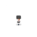
kol-goreng
Kol Goreng

flawsomebloke
Untitled

fawna12
Fawna12