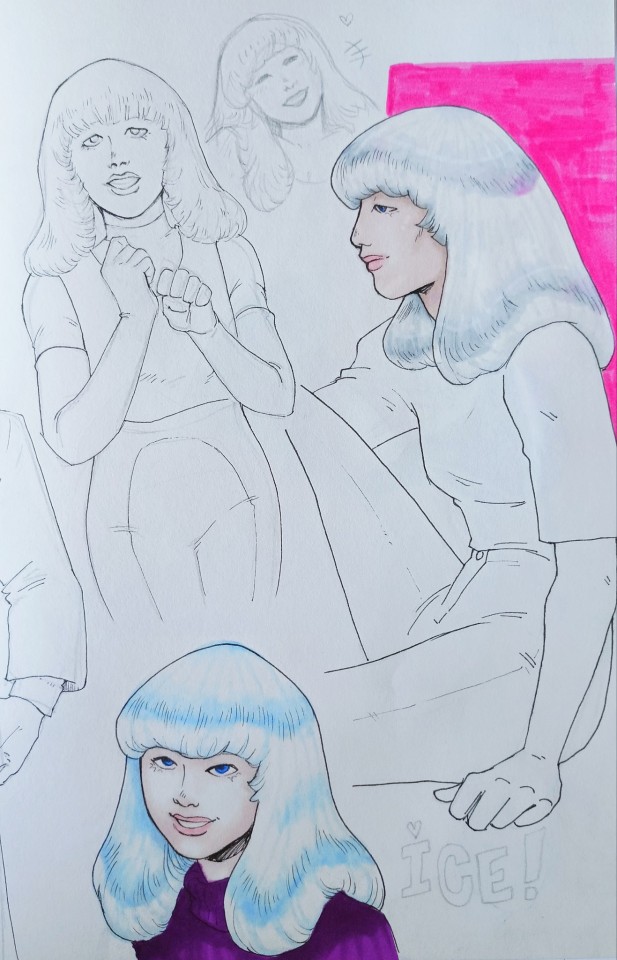
#I couldn't see it when I checked
Note
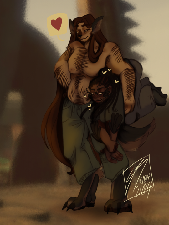
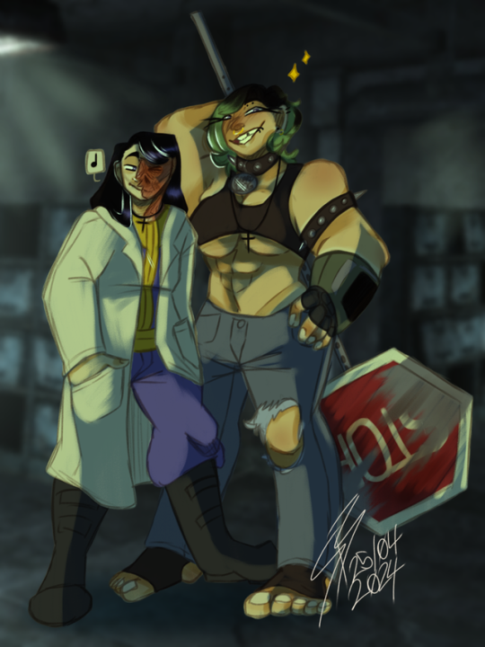
Wait why are they ALL bisexual? What was happening on that ship?
I have a mod (two mods, actually: Sexuality Traits and Rational Romance 2) that assigns every pawn a sexuality (gay, straight, bisexual, or asexual). I think bisexual is the "default" one.
The majority of my colony is bi. There are only 12 out of 29 colonists who aren't bi, and only 7 of those 12 are straight. The others are gay or asexual.
But yes, there was potential for some wild shenanigans on that ship! Perhaps that's what caused the space battle that destroyed them?
#asks#rimworld#gracie plays#The Animist Alliance#The other rescued survivor Armstrong is asexual#She's the one who decided not to stay (thank-you Armstrong)#I don't know if “sexuality traits” is on the steam workshop anymore#I couldn't see it when I checked#But that's alright#I don't think I'll use it after this run is finished#Rational Romance 2 does the trait thing anyway so I don't need it#thanks for the ask!!#Have a great day!! <3
13 notes
·
View notes
Text
Small indie artists in need of support for moving out by September!
💜 These lovely folks [@QuinsCurse (they/them) & @sswitchblade03 (xe/xem and he/him)] are part of a small queer-owned Youtube community I'm in. 💖
💖 If you could lend a helping hand by reblogging & queueing this post up until the start of September, I'd greatly appreciate it & I'm sure these fine folks would too! 💜
⚠️ Do not tag as d*nations or anything like that! ⚠️

"Hi everyone! Requests are officially closed as I am opening emergency commissions! Please consider supporting me as we are getting kicked out and have managed to find a place that’s affordable but need to save up 5k by the end of the month! Anything helps! I also have a dontations page if you are willing to help do that! All the money received from commissions will be going to the deposit!
https://ko-fi.com/quinscurse/commissions
https://ko-fi.com/quinscurse/goal?g=32"
⚠️ Do not tag as d*nations or anything like that! ⚠️

"https://ko-fi.com/sswitchblade03/commissions
https://ko-fi.com/sswitchblade03/goal?g=0
EMERGENCY COMMISSIONS!! My roommate @QuinsCurseand I are needing about $5000CAD for a down payment on a new place as we need to be out of our current place by September! Every bit counts!
My goal is to be set to $3000CAD. I will draw anything (coloured and rendered) for $5 CAD each! If you are willing to give more it will be appreciated.
Examples of my work below!"

⚠️ Do not tag as d*nations or anything like that! ⚠️
#I tried to replicate the youtube posts to the best of my ability#text is in alt descriptions as well as the post itself because idk how to navigate tumblr in this way for these uses#couldn't get the images from yt itself without it messing up the formatting so hope this is good enough <3#I just went to one of the pages itself to find the closest possible images I could that looked like the ones on the original post#highlighted the links on the 2nd part though to make it easier to find the links in the post#the pronouns listed are accurate as of time of posting for those who see this post in the future; just so you're aware; go check if you wan#I have on idea what mutual aid tags are okay in our increasingly worsening internet of 2024 so I'm just gonna not tag it & queue a bunch#I just said I would post it; idk currency conversion or anything of that sort; this is my first time doing something like this so apologies#if it's not up to par with expectations#mine#op#indie artist#yknow what for the sake of not having people block my post tags; ill add a unique tag for this sort of thing#roses campaigns#FILTER THIS PREVIOUS TAG IF YOU FEEL IT NECESSARY; ill try to remember to use it when stuff like this comes up
283 notes
·
View notes
Text
#this is one of my favorite pokémon of ALL time. this is one of those pokémon that#when it first came out‚ i had such a Visceral reaction to. i couldn't get over this fucking dog. and i still can't#THEY CAN'T FUCKING SEE!!!!!! AHJGSAKDGASJGDSKCGAJVCKABCKB#i love it SO much it's so fucking. cute. it's so fucking cute. so happy to see that blue haired bitch in the sv dlc having one#DAS IST MEIN BABY. I LOVE IT. lord this is the best. gushing over this dog#while also listening to discO-zone for the first time in a Long time#which is one of my favorite albums of all time. right next to probably vylet pony's cutiemarks and the things that bind us#and burn pygmalion from the scary jokes#there you go. there's my music taste lain out flat. kinda all over the place but discO-zone is one of those that i've loved since i was#a real youngin. and i just rediscovered it last night and UUUUUUUGGHHHH IT'S SO GOOD#MUSIC!!!! AND DOGS. feeling GOOD this morning#by the time this posts‚ it'll be like. two weeks later. but past me was feeling great when she posted this#about to start shiny hunting pawniard for a friend's birthday. technically getting eggs as i write this#wish me luuuuck..! it'll probably be his birthday by the time this posts. lemme check#oh yeah this is gonna post two days After his birthday. hopefully by the time this goes up i've already got the pawniard#HI FORGOT TO TAG THIS ONE#hisuian growlithe#hi from the future again lol his birthday was like a month ago by this point because i ended up queueing up this guy before all the gmax#forms. i totally forgot them. and this whole time i've been queuing them up and shoving them Above this guy. so it was even longer ago#that i queued this guy up at this point. teehee!
181 notes
·
View notes
Text
Thinkin' about "didn't know they were dating" Phinabella but Isabella is the one who doesn't know.
She's been pining for years and finally can't take it anymore and blurts out that she's in love with him, and Phineas immediately and enthusiastically returns the sentiment, saying that he's glad she's finally felt comfortable enough to say it after all this time. (Isabella is loading, but manages to say, "what?")
Turns out that Phineas always returned her feelings, he just doesn't show them in big, flowery ways like he does in her fantasies. ("You didn't think Paris was romantic? I had so much fun looking for airplane parts together!" and "You've always been special to me, Isabella. I don't treat Buford or Baljeet like I treat you." and "You always seemed so nervous, I didn't want to push it." and "I'm happy as long as you're around, anyway — we don't have to be holding hands or kissing.")
Isabella is casually having an existential crisis as years of their friendship recontextualizes itself in her head. Phineas is waiting for her to finish processing very patiently. (He's waited this long, after all.) And with the confusion cleared up, they both agree to "continue" "dating" and have their first kiss 💕🥺
#phineas and ferb#phinabella#kind of obsessed with the idea of phineas just. casually being in love with isabella#he already thinks the world of her!#she's the first person he checks on when something's wrong he always has a compliment for her he's always happy when she just shows up#i think his feelings are soooo. quiet. in contrast to how loud isabella's can be sometimes#Phineas literally couldn't care less if Isabella never wanted to kiss him—#he just wants to be able to see her every day for the rest of his life <3#imagining this as them ~14/15
227 notes
·
View notes
Text
House M.D. but it's when a character says the name of the episode
#house md#prince's talk tag#flashing#repitition#so as i was watching this show i noticed they'd say the episode title in the episode#so i wanted to see how many times they did it#the people on livejournal who made transcripts of the episodes are my saviors and without them this would of been so much harder to do#thank you all for your service and i hope wherever you all are you're having a great day#sometimes they would use a variation of the word like in the episode poison they would say 'poisoned' or 'poisoning'#i did not include those instances#there was an instance in 'merry little christmas' where they do play the song in the show#but since ella fitzgerald was not a character in the show i did not include it#where as in the episode 'joy to the world' the students are singing it in the concert so i did include that#i apologize for the tonal whiplash when you get to that part but it did make me laugh#one of the times kutner says 'locked in' is overshadowed by the POTW's voice over but i assure you he says it and thats why its in there#out of the main characters from the one who said the title the most to least are#House > Foreman > Wilson > Chase > Cuddy > Adams > Cameron and Taub > Kutner > Thirteen and Park#this took a bit to do lolol its probably been done already but i wanted my own#there is a chance im missing some on technicalities but idc. im fine with this#there are two more i wanna do but with a character saying another character's name but ill do that some other time#EDIT: When I was making this video I was unaware that the Pilot episode went by two names: 'Pilot' and 'Everybody Lies'#Basically everywhere I looked the first episode was only referred to by 'Pilot'#which I found weird bc i remember seeing somewhere that the last episode was paired with the first episode in terms of title#but i couldn't find hard proof so I decided to leave it out at the time#well i checked again last night and yea the pilot IS also called Everybody Lies so I updated the video#I also think it goes well with the fact that House does say 'Everybody Dies' in the finale so another reason to fix it#AND he says it without Wilson while he and Wilson say the title of the pilot sooooo yea hehehehehe
361 notes
·
View notes
Text
I wanted to share this informative little comic for International (Working) Women's Day:
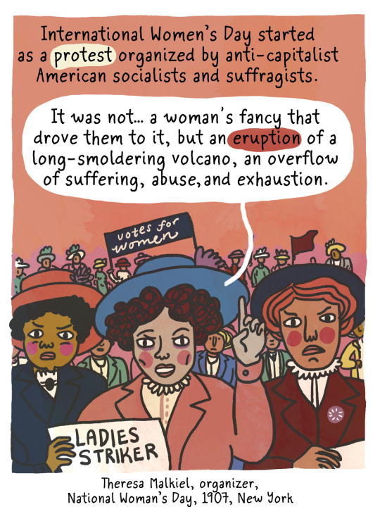


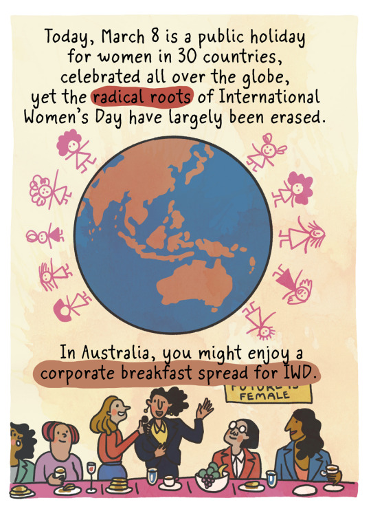
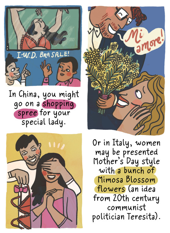
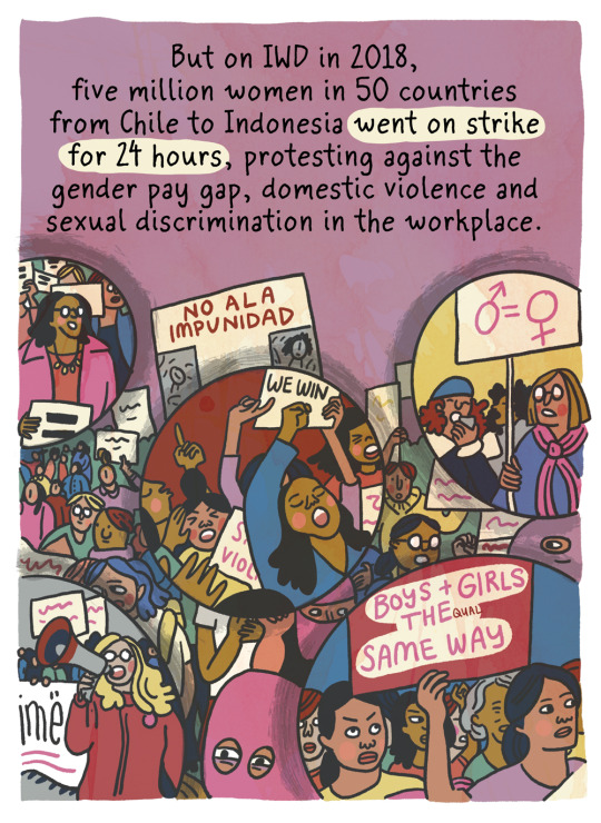
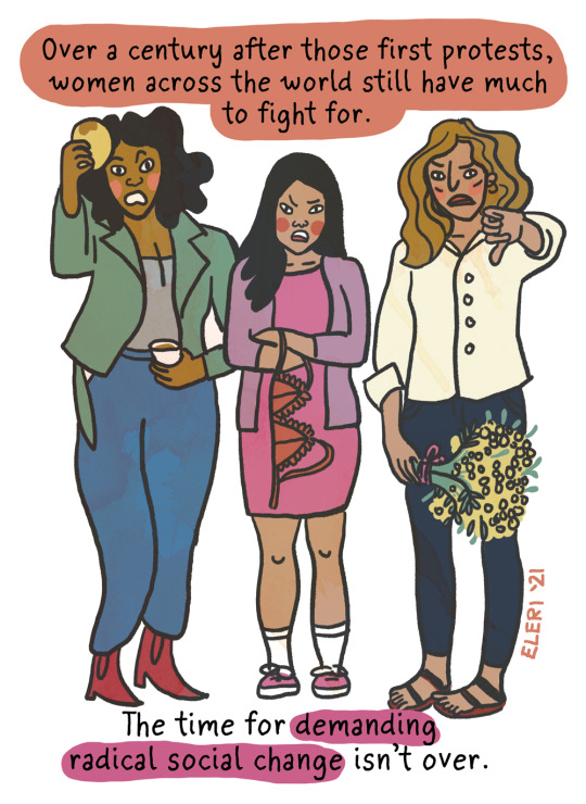
#international working women's day#international women's day#eleri harris#herstory#worker's rights#herstory blogging#lesfem blogging#women's art#i couldn't find any good posts in a brief tag search.. apparently must do everything myself on women's day smh#i hate seeing lame corporate meaningless soundbytes when this is actually us working women's labor rights day#some of the dates in the comic may be a bit off... will have to check again later
836 notes
·
View notes
Text

サニー坊っちゃん
(なんか未完成。もう諦めたよ)
#if you know what this is referencing: may you recover . i know i never will#(to my friend secret if she ever sees this: you already know what it's referencing. anyways thank you ily forever & goodluck w everything)#(p.s. please check your messages from time to time bhie 🫶)#dungeon meshi#dunmeshi#dungeon meshi fanart#toshiro nakamoto#nakamoto toshiro#i think the soul of fionil possessed me when i was drawing this cus i couldn't stop crying. i dont even know why#i had to take a break for an hour n go eat since i got a massive headache from crying for atleast THREE HOURS. tearsmaxxing or whatever#even while eating i felt like crying . staring at my lumpia and feeling the tears abt 2 pour out#this is kinda rough im sorry but i couldnt bring myself to really finish it eofjebf
68 notes
·
View notes
Text
Can't even be on TikTok..
Again, let's look at the full picture of how it was a chain reaction that was bound to happen when everyone bunches up like that when you should've taken the corner as you previously did under the safety car so Lance has some fault but it's literally not entirely his and yeah..

Also, Lance locked up because he desperately tried to brake so he did use his brake ^^ His tyres weren't allowing him to brake because of the lockup ^^
#I'm so tired guys.#you can literally see on Lance's onboard that someone ahead locked up (Fernando) and that before that they started to accelerate a little#they could've taken the corner at that speed and they speed they slowed to was extremely slow even for that hairpin#oh yeah did you also know that Lance was mad at whoever caused the chain reaction and not Daniel? and that's why he was upset over the pen?#also reportedly Laurent Mekies told Daniel that Lance was blaming him when Lance never mentioned his name#and it is super fucking easy to imply that Lance was upset over who caused the mass brake check#and Daniel almost couldn't stop himself and rear ended Piastri#please I fucking beg that you all pay attention to the entire picture and not just the big incident because you get so much more info 🤗#lance stroll#f1#formula 1
59 notes
·
View notes
Text
Daily reminder that most of the sect members follow their sect leaders because they were born to that sect, or that sect was stable and powerful enough to provide them with security, and the Wen Remnants followed Wei Wuxian even though they were afraid of him because that was their only option, but the YMJ members that followed Jiang Cheng ever since the Sunshot Campaign freely CHOSE to do so. He was 17. And an extremely traumatized seventeen-year-old at that. He was simultaneously looking for his brother and participating in a war while rebuilding his sect. Lotus Pier was destroyed. There were only 3 people left of the YMJ sect (2 as far as they knew with WWX missing.) The sect was brought to ruins. The YMJ sect couldn't have had much riches left. But the new sect (and they were enough for YMJ to be called a sect again) CHOSE to follow Jiang Cheng.
#also reminder that Jiang Cheng is not randomly rude to people#he's rude to WWX and later WN (and for good reasons as far as he knows) and those he suspects of demonic cultivation#he's not even rude to LWJ before that ancestral hall incident even though LWJ is rude to both him and his nephew#from what we see of his interactions with others he's polite and respectful if (after the time skip) cold and severe#jiang cheng#jiang wanyin#canon jiang cheng#the untamed#mdzs#cql#the grandmaster of demonic cultivation#mo dao zu shi#yunmeng jiang#yeah Amino Apps JC page stfu about him ruling with fear or not being so popular or sth to that effect i don't have the time to check#it's bs anyway#like it says that JC in the donghua has short hair when we literally see his hair loose and it's very long#short hair was not even sth that existed among the chinese as they saw their hair as a gift from their parents#& cutting it as a disrespect to them#whoever wrote JC's profile couldn't even see what was in front of them how do we expect them to read subtext
153 notes
·
View notes
Text

I got Guy fever yesterday, I think I died.
#jerry draws#guy gardner#martian manhunter#max lord#tora olafsdotter#beatriz da costa#shoutout to those two people who are really into jonnmax! i couldn't draw J'onn alone - had to (try to) draw Max next to him#i thought it was a much bigger ship. i got shocked when i checked out their ao3 tag. well. i guess i should draw em some#also shout out to Guy for being the Guy ever. I hate him (affectionate)#who knew i could draw something that's not two men making out??? i surprise myself everyday#justice league international#jli#thanks. thats all! see ya in a few days!#(Max is the worst fucker to draw i swear. i should do him better. business men are my enemy nr1)
47 notes
·
View notes
Note
you don't play on the en server?
nope, I play JP! been there since day one, babyyyy ✌️
I do sometimes try to check in on where EN is, but it's not always super clear (I think they might've finished episode 6? except in only two parts...?) so I try to spoiler-tag over-judiciously just in case. :') though I did see it's getting Kelkkarotu soon, which is -- well okay the first part kind of drags but once it picks up it's one of my favorites, I'm excited for EN to get it! REVEL IN THE COMFY WINTER OUTFITS
#i did think about checking out en when it came out#but then i realized i'd have to be leveling up and unlocking everything all over again#more power to people that can keep up with that but i am not one of them#i did see you guys got the diasomnias IMMEDIATELY and i was jealous :(#it took a while for them to be implemented into jp so you couldn't pick any of them for your free robes sr#belor on the production team going 'i DENY you the malleus'
221 notes
·
View notes
Text
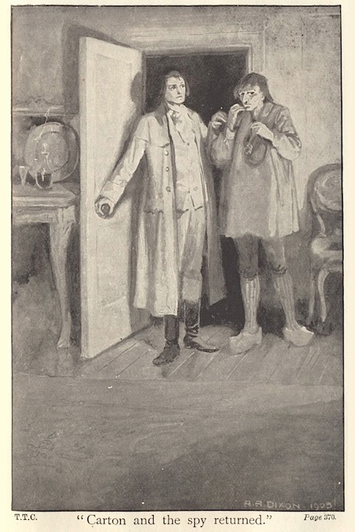
The Many Illustrators of
A Tale of Two Cities
7: A. A. Dixon

"'Collins' Clear-Type Press, let me ask you a question.'"
This is a very long post.
This week's edition has, in my research, become quite the edition.

Sadly, this image is the best source for the cover wrapper illustration that I could find.
You are likely familiar with Arthur Augustus Dixon's illustrations for the 1905 Collins Pocket Edition of A Tale of Two Cities. Several of them are very common to find in Internet searches and articles about the book, if not other editions of the book itself.

But the question raised by my research for this week's edition is:
Are you familiar with all of them?


Thing is, as the source above states (read the whole article if you have the time, it's very interesting!), Dixon created twelve illustrations for this novel.


And sure enough, this source from the Internet Archive and this source from @oldillustrations (hello!) both have eleven of the same illustrations - with the twelfth presumably being for the wrapper, as seen in this source (previously cited) from the Victorian Web.


Alright, so that's three separate sources, all with (effectively) the same set of elaborate illustrations from 1905. Neat!


...


...but if you start counting...

...you'll notice that this seems...


...like a lot more than twelve!
Basically, there are five illustrations by A. A. Dixon that are completely unaccounted for in any of the three sources previously cited.


For the purposes of this post, the cover wrapper is considered #0 and is not pictured in these banners.
In full-size set of illustrations in this post, this source from Google Books is the source of four of those mystery illustrations:
#3: "'He stared at her with a fearful look.'"
#6: "'Drive him fast to his tomb.'"
#7: "He said, 'Farewell!'"
#12: "'She appeared with folded arms.'"
#9 ("'Patriots and friends, we are ready!'") and #11 ("'You are consigned to La Force.'") are sourced from Google Books in the full-size versions in this post simply because the Internet Archive versions of those two illustrations had cropping issues.
To me, this is mystery enough on its own. Why would another version of the book suddenly have more than the originally-stated number of illustrations by this artist? Especially considering that the Google Books source does not have #13 ("''I know you, Evremonde!''") - why would it be missing one of the "main" set?

It gets even more interesting.
As you'll notice in the banner, we're still one off: Keen-eyed observers of the full-size set of illustrations might have already noticed that #14 ("'Carton and the spy returned.'") looks a bit different than the rest of them - a bit like what happened in the previous edition of this series!
That's because that Dixon illustration comes from this completely random source - a post from a blog called the Paperback Palette dating back to 2018 - that I happened across on Google Images of all places while sitting on an airplane trying to set up this post last week!
And to top it all off, that source is missing #6!

At this point, if your first instinct is, reasonably, that perhaps Dixon didn't actually illustrate these extra five and that it was someone imitating him for later editions, then know that that was my instinct too - until I (dare I say it again) checked those signatures!!!

(I edited the colors to prevent flashing.)
All five of those illustrations bear Dixon's signature, so it's safe to assume that they are A. A. Dixon originals - from 1905, even.
Interestingly, #s 1, 10, 13, 15, and 16 don't have signatures!
Does this mean anything? Probably not - as an artist myself, I often forget to put my own signature - but still, I can't resist mentioning it!
So the most likely explanation here is simply that the publishing house originally commissioned A. A. Dixon for more than twelve illustrations and then held on to some of them, eventually choosing to publish them in other editions. Still, we can't say for sure.
And as to why some are missing from the more "complete" sets - human error, most likely!
If you scrub through the Google Books source, you'll notice that #s 11 and 12 actually repeat (one even changes color, which I have no explanation for) - it's most likely either that the book was accidentally printed with repeats of #s 11 and 12 where 13 and 14 were supposed to go or that the person scanning this edition made a similar error.

As an aside, it's so interesting that the illustrations are evenly spaced throughout the book - I had not noticed that until now!
And as for the Paperback Palette source, it's most likely that the blogger accidentally skipped over an image while combing through their edition or just glossed over it when posting the batch (I understand that from experience!)
We can see this by adding up the letters in some of the illustrations' captions - doing so reveals that the letters are meant to go to P, the sixteenth letter of the alphabet.

Thus, one must be missing! Case closed!
Except...
It's actually (going by both the chronology of the book and the order in which this set was found in Google Books) missing the wrong letter!
Here, it seems that In the Google Books source, #7 in the full set is given the seventh letter in the alphabet, G - whereas in the Paperback Palette source, "#7" is labeled as the sixth, F:

This implies not only that #6 is absent from the Paperback Palette source but also that there is a missing mystery illustration located between this source's H and K - that is to say, before or after #9!
EXCEPT...
For one, this isn't the only inconsistency I've noticed - there are several places where the letters seem shifted in a strange way. I've seen #2 listed as "C" and #9 listed both as "H" and "I2i" (???), just as two examples.
(My theory is that the cover wrapper and the frontispiece may be at play here, but who knows?)
More importantly, though, it seems that, for some mysterious reason, all of the sources with relatively consistent use of these letters (i.e. all but the Victorian Web) - even the sources with only eleven interior illustrations - still give #15 in the full set the fifteenth letter, O.
Which, of course, may make all of this pretty moot anyway.

Dare I say..."Oh."
Suffice it to say, just as much as major sources like the Internet Archive and Google Books are vital to this sort of research and preservation work, so are smaller websites and bloggers!
After all, without the Victorian Web and the Paperback Palette, we as collective netizens likely wouldn't have ever known about the cover wrapper or illustration #14 (not to mention that the versions of the illustrations from the set posted by @oldillustrations have by far the best image quality and standardization that I've found! Please go check them out if you haven't yet!).
As for the reasons behind Collins' Clear-Type Press not publishing all of the illustrations from the beginning (if that's the explanation we're to go with here), I suppose the question I'd like to ask is:

why? why would you put us through this?
& the standard endnote for all posts in this series:
This post is intended to act as the start of a forum on the given illustrator, so if anyone has anything to add - requests to see certain drawings in higher definition (since Tumblr compresses images), corrections to factual errors, sources for better-quality versions of the illustrations, further reading, fun facts, any questions, or just general commentary - simply do so on this post, be it in a comment/tags or the replies!💫
#A Tale of Two Cities#AToTC#dickens#charles dickens#bookblr#litblr#literature#classic literature#victorian literature#vintage illustration#illustration#illustrators#A. A. Dixon#1900s#UGH oh my GOD oh my GOD this one#like. hours. so many hours.#You Can See Why I'm Late With This One I Think#so yeah based on the pretty consistent thing with the letters I do believe there are very simply 16 interiors & a cover wrapper and no more#but Still like. why. whywhywhy couldn't they just be consistent#and again Why Why Why don't all of the versions just have all of the illustrations!! like hello! What Is Going On#maybe it Is significant that not all of them have Dixon's signature...but even then that raises so many questions#I'm also of course gonna keep my eye out for that cover wrapper because I want to see it in full and it does also confuse me#also check out number16 in a lot of those sources because there's a halo effect on Carton's head that isn't super visible in the one I used#anyway. 1) yes I accidentally said this was the 8th when it's the 7th 2) this month features a two-parter!#3) the results of the previous poll were a tie between Congratulatory and A Plea. the latter of which was my vote so nice work everyone#4) I'm either gonna skip the off-week's post this week and do it double for next time or just post it later in the week this week#so. until next time! & enjoy!
19 notes
·
View notes
Text

GW2 VS Art Party (oct), of Laerling for @sylvaridreams!!
Damaaaa, I loved your pretty icey sylvari!!! They're so cool!!! (metaphorically and physically). Sorry I got a bit carried away and took some artistic liberties~ I gave them icicles and their encased root hair crown into ice as well (based on a really pretty weather phenomenon I've seen irl).
#artgallery#sylvari#vsartparty#gift art#gw2 fan submission#gw2#gw2 OC#sylvari OC#I'm glad you were able to make it!!#also it was neat to see you first thing; it was a very nice greeting upon arriving!#I also got a bit carried away with the bark/root shapes on their face lskjdf. I couldn't help myself~#also I was having doubts and second thoughts afraid that it wasn't you for some reason#I had to search your blog to double check bc I didn't see their name in your roster asjdfldskf#Also I'm doing these VS art party pics at my own leisurely pace; so I'll be done when whenever I'm done! :D#also sorry it's kind of a boring facing portrait; I'm doing that with everyone bc it's the only way to get them done in a decent time lskjf
93 notes
·
View notes
Text


Posting this by itself because :) I just feel like he should have gotten to wear the mech pilot suit at least once..
(my AU black version and the og green)
#Legend of Korra#Baatar Jr.#LoK#WIP#[ since this is from something silly I wanted to post this bit because he is serving very cunty#even if you know he's talking about accidentally ingesting caustic chemicals lol#this was def self indulgent but also why couldn't he have worn the suit at least once sobs#we had one chance#I don't actually think he uses the mech suit hardly ever even though he has his own personal one#but on rare occasions he does and gets in this outfit and Kuvira are you okay? Are you good? Has anyone checked on her?#I feel like this outfit is what causes her to take a serious sanity hit LOL#she just drags him away by the hood and no one sees them again for like 4 hours#or she's just like “You know what I think he could use my help :)” and proceeds to be everything but helpful#idk how anything in this regime gets done I swear#the most Baatar ever used the mech suits was when they were first being built#idk dude I love a man in a working uniform sobs#I knew someone would recognize the mech pilot suit hehe that made me smile because yeah :)))#it felt good to draw Baatar again sobs I love him so much I've missed him#I do kinda wish this sketch was cleaner but I wanted to at least post it now in case I never did lol#I should to a proper illust of him in the pilot suit one day just for the pure self indulgence of it all#give myself a lill treat you know? ]#Neon Ocean Art
40 notes
·
View notes
Text
Dropping 3 episodes at once is such an evil thing to do to gifmakers! Just saying!
(jk I love it)
#yes i'm dutifully downloading and converting files#the most unsung part of making gifs lmao#i watched the first episode in the morning (in a room i couldn't black out which was a mistake!) and then went to work#and i'm about to get off work to finish watching#and then i'll probably rewatch tonight just so i can absorb every dimly lit scene in all its glory#also i think we can all agree that halbrand!sauron is the embodiment of 'if evil why hot'#like#i can't check the tag before finishing watching but i'll be surprised if there aren't a million sets of him come tomorrow and well-deserved#i don't even know where i want to start#also i'll probably be taking requests in the coming weeks#and i'll be using 'rop spoilers' for the really spoiler-y parts bc i know not everyone will be able to watch asap#(idk why i'm doing all this via tag commentary in the year of our lord 2024 but here we are lol)#(also i should probably tell y'all my main so you know when it's me liking posts in this fandom... i'm shy tho so we'll see haha)
9 notes
·
View notes
Text
Guys do things actually show up in tags if you spell them out in your post but don't tag them or was that person lying to me. I have made posts before that I didn't tag on purpose and I've never seen them show up in the tags I follow even when I spell it out. I'm really thinking that's not a thing that happens.
#Like I did tag the main game tag but I didn't tag the ship at all yet they claimed it still showed up in the ship tag??#But when *I* checked I couldn't see it so like???
11 notes
·
View notes
Last Seen Blogs

plumblossomsreveries
_meiihuaa

heyarnoldmemes
HeyArnoldMemes

bandaidsroom
Alê

tomorokoshihata
Zamorysh Shorek

wheelchairguy1997
Hearts, Boobs and Gore.