#I have to keep taking the sketch layer on and off and the grid is there so I can actually draw straight lines that are like
Text
WE’RE DRAWING DIRT TODAY BOYS!!!!!!!
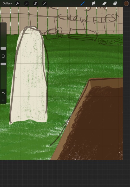
#pg 44#yeah this is what I’m working with#I have to keep taking the sketch layer on and off and the grid is there so I can actually draw straight lines that are like#symmetrical#idk why what was split up sorry#anyways this page was one of the less worked on pages and I really want to get this done so yippee#happy birthday deare!
1 note
·
View note
Note
your last post made me think about how I loooove how you use color in your art, it's so vibrant and full of life and movement and expression! I was wondering if you had any advice on how to do color studies? perhaps doing drawings with limited palettes? or anything similar?
First things first, thank you, I really do appreciate comments like these!
this post now also has a follow up for finish limited palette pieces
I'm obviously very fond of limited palette art and color studies/color thumbnailing are great ways to get that done. When people think limited palette there's often the association of unrealistic and fantastical color palettes, but learning to limit your color use absolutely applies to semirealism and just builds stronger color theory in general. I was planning to talk about limited palettes in more realistic color use in this post, but this already ended up way too long. If that's something people want to hear about I can talk about it later.
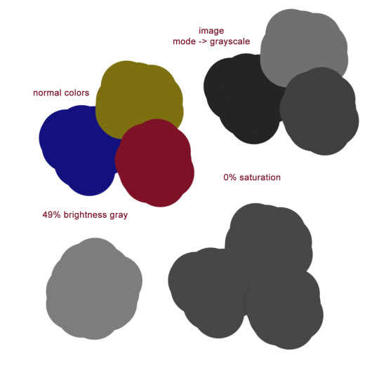
Color theory basics crash-course! I'm sure almost anyone who has colored anything is familiar with this, so I'll be SUPER brief, but I want everyone to be on the same page for this. Color has three qualities you need to take into account: Hue, saturation, and brightness. Hue is what we think of as the 'color'. Saturation is the vibrancy of this color; how bold or dull it is. Brightness is how light or dark the color is. Here's this all labeled on a color picker I stole from google.

As a rule of thumb, things that look good in color should look good in grayscale. Having a strong range of values (brightness) makes for a strong image. Keep this in mind when you're picking colors – knowing what areas need to be light and what areas need to be dark before you start coloring will make your life easier. I'm going to teach you when and how to break this rule later, but for now let's just talk about picking a palette. I've found five to seven different colors to be a really nice sweet spot for working with limited palettes.
There are three main types of color palettes ill work with and ill provide examples each of them. I expect you to all politely refrain commenting on the amount of homestuck fanart that's here.
Monochromatic, where the piece is all within one color family with slight variations in hue, and larger variations in brightness and saturation

Accent, which is essentially the same as a monochromatic type with the addition of a strong, contrasting secondary color in one or two variants. Normally the accent color is lighter and serves as a highlight. This is not any kind of a hard rule, but is instead just what I like.
Split. There are two (or more) main colors at play, each with a couple of different shades.

Cool. Now lets see how we'd go about making one of these palettes.
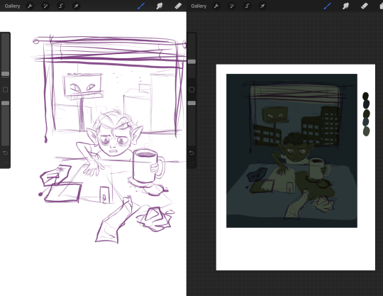
I'm grabbing an inconsequential sketch i've already got and we're gonna slap some color on it. Let's start monochromatic – I've gone and just tossed six pretty random shades of green on it, picking what goes where based on what I want to be light and what I want to be darker.
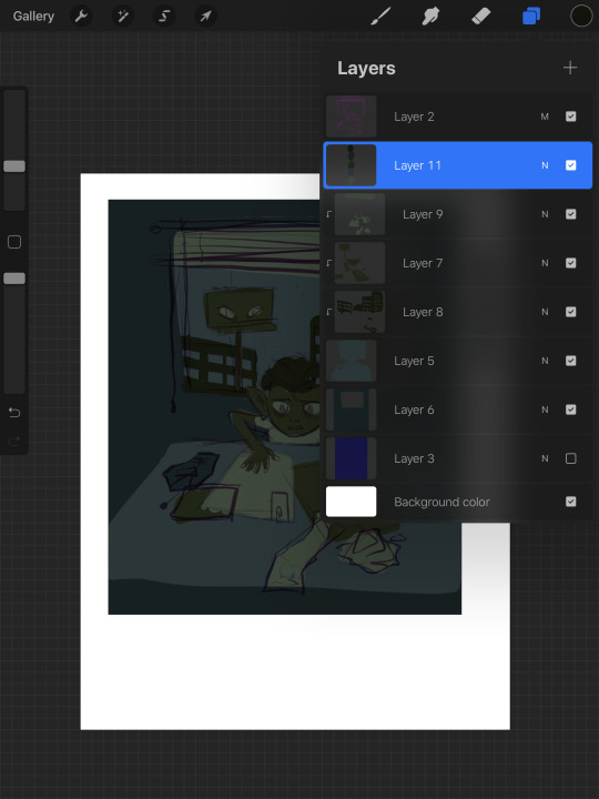
Keep in mind, by monochromatic, I don't mean just picking one color and making it lighter or darker! Adjust your hue within the same color family – some of these are very blue, definitely more blue than green, and some are much warmer and yellower. Play around. In this stage I like to have every color on a distinct layer, so I can just recolor the entire layer at once as I tweak the palette.
On the right, I have each color lined up in order of lightest to darkest just so I can get a sense of what I'm working with. Lets go ahead and call this one thumbnail. Now I'm gonna group the layers, duplicate them, and flatten the copy. I'll shrink it down and shove it off to the side so I can compare it to the other ones I make later.
Okay, I did a few more almost completely arbitrary monochromatic palettes. Here they are compared with their grayscale counterparts.
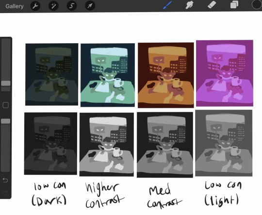
All of them have the same number of colors, and lights stay lights, darks stay dark, midtones stay mid consistent between all of them, but the range of values is different between them all. The difference in light or dark between each tone is different and it gives a different mood that you can see even in black and white. None of them is more 'correct' than any other, and it's all about establishing the tone and atmosphere you want. Experimentation is key.
Now lets try making this a complimentary palette. With a strong accent color, your accent should be placed at areas of importance. People are naturally drawn to contrast and when using an accent color in a piece it'll make that area stick out, so make sure you're placing your colors with intent. For this I went back to that first set of greens I had because it was my favorite. Since this palette is over all very dark, I am going to make my accent the lightest color, because that'll stand out more. In a lighter palette, try making your accent the darkest color. Once again I must stress these are not hard rules – there are very few hard rules in art at all – but these are very useful tips for getting emphasis in the right place. This is just an example piece so I'm not being huuugely thoughtful with how I'm placing the color.
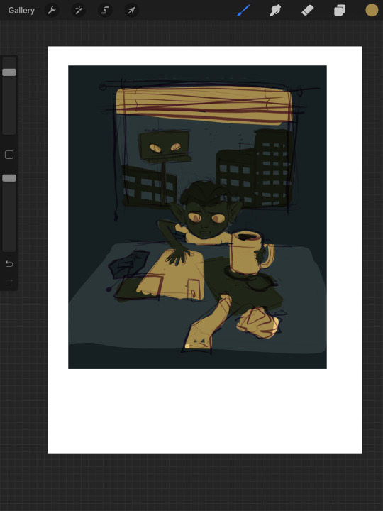
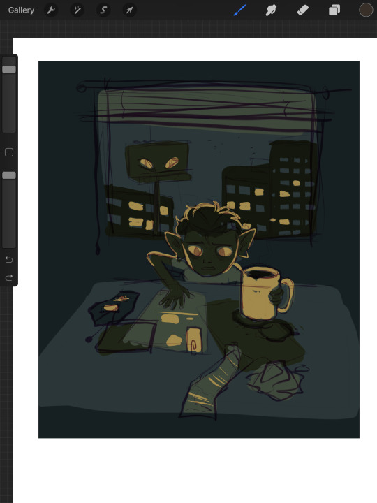
Here's the same image but with the lightest green just swapped out for a far more vibrant accent of yellow. Looks pretty terrible. I don't want all of the papers and blinds to seem so prominent. So let's scrap this and try a different approach. We're gonna instead add our accent as a sixth color to our palette.
By adding another color, I've added another level of detail. Figuring out how to manage detail isn't just dependent on how many colors you have, but this is already going to be ridiculously long so I'll spare you that spiel. This is another one of those things I'll talk about more later if people want to hear my #thots. Using the new yellow accent, I emphasized the eyes, the mug, and added some interior detailing to the objects on the table. I also decided to place yellow in some of the windows of the outside buildings, to add a bit more interest in that area, and to justify giving yellow back lighting to our little goblin lad here, which makes him stand out nicely.
A split palette makes things a whole lot more complicated. Now that you're gonna be working with two different base colors you don't just only have to worry about which one is lighter or darker, you have to worry about how the hues look next to each other. Lets work with an orange on top of our original green here. I picked two of the greens and replaced the darker one with a darker orange, and the lighter one with a lighter orange. Now our palette is six colors split 50/50 between orange+yellow, and green.
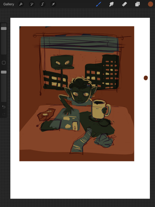

But now something interesting is happening. Let's take a look. If you're particularly keen eyed, you might have noticed that there's a third set of colors here, using a greyish brown in place of the oranges. What's up with that?
Well, what's up with that is, they are orange. The palette on the far right is what happens if, instead of choosing my own oranges, I simply hue-shifted the bluegreens until they were technically orange in hue.


The oranges I chose just based on how they looked without actually checking the value and saturation of actually changed the value hierarchy of the whole piece. The table, instead of being in between the objects stacked upon it in terms of brightness, is lighter than either. This isnt bad at all – there's absolutely nothing wrong here. It's just important to be aware of things like this! This is why I said a split palette is the most complicated of the three I'm talking about here – in many occasions, the hue hierarchy can top the value hierarchy. Keep that in mind for slightly later.
I think split palettes work really well for comics, and I like to make my comics with split palettes. Whereas with a single illustration, you can just putz around with your color thumbnails until you get something good, for a comic you're locked into your palette once you've done the first page. Unless you're some sort of insanely meticulous person, in which case I envy you, you probably don't have every single page of your comic blocked out with respective values and can't apply your palette to the whole thing at once to test it. This means you'll need a palette that's pretty versatile. Having a split palette where one of the hue sets is lighter than the other overall allows you to decide whether you're going to create an overall light panel with dark accents, or vice versa. I'm gonna compare two palettes I'm using for comics to make this point.
Here's a sampling of the comic pages in full color, at 0% saturation, and adjusted for grayscale respectively. You'll notice a slight difference between the desaturated colors and the grayscale colors – grayscale seems to hold truer to the full color version, doesn't it?
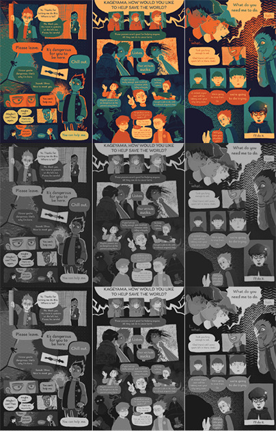

Now, here are the palettes themselves, and some grids showing the relationship between every pair of colors. When you don't know exactly what you're going to be using any given palette for, the relationship between any two colors becomes more important than ever. The bottom palette is split three ways, red yellow and blue each with a light and a dark, and then a completely neutral dark gray color. I'm using it for a long ongoing ace attorney comic I'm drawing. The top one has 4 shades of blue that go from darker and cooler to lighter and warmer, then 3 shades of orange that get yellower as they get lighter. Underneath is just the values – you'll notice that the top palette has a larger value range, with its lightest color being lighter than that of the bottom palette, and it's mid tones spaced further apart.


What you'll also notice about the bottom palette is that instead of the reds being lighter than the blues and darker than the yellows, the value alternates dark red dark yellow light red light yellow. Take a look at the color grids. You'll notice that for the most part, every color in the palette on the right looks good with every other color. That's not nearly as true for the palette on the left. The light blue has a weird vibration where it meets either of the reds, and a few of the pairings just aren't particularly pleasant. Honestly, from any objective ideas of color theory, this palette kind of sucks shit. Lets make some adjustments to it.

I've changed the dark yellow and light red hues so now the light red is slightly darker than the dark yellow. That's the palette that's on top now. Looks better, doesn't it? But so now the question becomes why am I using a palette that looks awkward, disharmonious, and visually strained when I know exactly how to fix it? The simple answer is because I wanted a color palette that's awkward. I wanted that visual strain. I have trouble working on comics and general, especially anything as long as this one, and I wanted a color palette that already meant things would come out looking a little bit wonky, so I wouldn't be as concerned with nitpicking all the details and making everything pretty. I think the sort of visual upset also fits the tone I'm keeping with a lot of the comic.
Remember earlier when I said I'd talk about breaking the rule of stuff looking good in gray scale and in color? That's now. Take a look at this image.
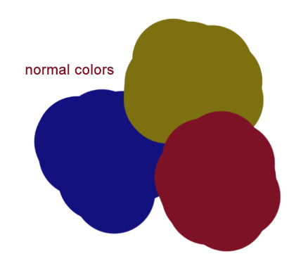
Which of the three colors is darker: the red, blue, or yellow? The stupid truth of it is that there's not really a proper way to tell. All three are technically the same 'brightness' but our brain tells us that the blue is the darkest, and the yellow is the lightest. Why do our brains do this? Let’s make em gray now.
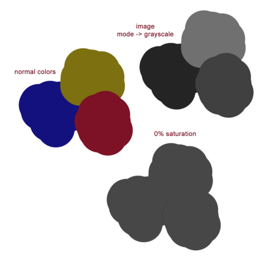
On the bottom you can see what the colors look like when they are set to 0% saturation; as you'd expect it's a homogeneous gray blob. So then what the fuck is going on with the grayscale one? The grayscale one is closer to the way our brains interpret the colors, but we know this to be an improper rendering of their respective values. Which is the correct version, then – the grayscale or the desaturation? Luckily, we're using a computer, so we can have photoshop tell us the exact balance of hue, saturation, and brightness of any given pixel. Let's take a look now.
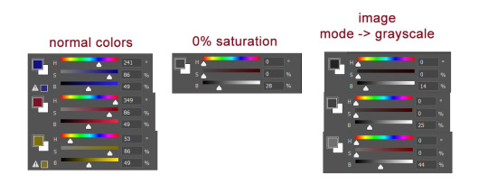
Wait, huh? We can plainly see that all three of the colors are at 49% brightness. But neither the desaturated value or any of the 3 grayscale values have a brightness of 49%. So what does a brightness of 49% look like?
Okay. Sure. Why not.
All of what I've just shown you regarding grayscale is to emphasize the point that your best judgment for which colors look good is a far better measuring stick for a good color palette than any technicalities. Even if the value is the same, the hue can differ enough that you can still get a beautiful finished drawing. Color and our perception of it is so, so vastly technically complex. You can not allow yourself to be bogged down by this. Simply practice, and color will become intuitive to you over time. I have a lot more I could say on the subject of picking and using your colors, but this is already insanely long. Feel free to ask any follow up questions, I hope this was of literally any use!
450 notes
·
View notes
Note
Hey I'm Fred's fourth daddy anon! I sent that to you, and what felt like five minutes later you came in with that gorgeous sketch. Do you have any art tips or videos that have taught you cause I've been stuck draw trying to draw anything not resembling a lump for two years. Also yeah it was whirlwind episode, f*ck Rose, and Fred should have turned that loon in.
Hey FD Anon, thanks so much! I don’t draw a lot of “horror” art so I’m really happy with it’s progress so far!
While I do agree with you that Rose is The Worst, I think she added in an interesting dynamic and I’d be happy if she became a recurring character in the Scooby mythos at large. As for Fred not turning his dad in... I agree, but I also understand why he didn’t.
The episode went out of it’s way to show off how frightening and weird he is but Fred made it very clear that when he wasn’t wearing the mask he was a good parent, and that all of his crimes were shown as nonviolent. He didn’t seem to steal anything (unless I missed that line?) he just liked messing with people by confusing them.
As for art tips, I... honestly never expected anybody to ask for advice from me? That’s super flattering wow.
Okay, so I’m still pretty much a novice, but lemme give you some of my best tips and tricks:
1) Notice how my last sketch had a grey background? This wasn’t just for that sketch, this is how I use ALL of my digital canvases. I do this because the grey causes less strain to my eyes, and allows me to work longer and more easily. Being so close to a screen, especially a blue or white one, can make it harder to work for long periods of time.


2) If you want to do digital art, you need to learn “traditional art” (pencil and paper) first. It makes transitioning to digital more easy and it’s pretty much what any art teacher would recommend, for good reason.
3) Using one method of art not only limits you, but stops you from learning other techniques which can be incorporated into what you typically prefer. Not only that, but you can also discover a medium you really love that you never would have thought of before!
4) Whenever you get the chance, work in black and white or monochrome. This is a great way to help yourself learn about values and intensity, and just looks cool in general.
5) Piggybacking on that last point, if you’re ever worried about your shading, values, etc becoming muddled either A] take a picture and use a filter to make it black and white, or B] create another, pure white layer on top of the others and change it from “Normal” to “Hue”. Doing this can really help change your approach to coloring (black and white effect may be different for every art program).
6) If you want to get better at realistic faces, I was taught using the grid system. You have squares on your reference picture, squares on your paper, and then match up the body parts to the squares. I personally didn’t like this method, but it’s a really solid style of learning.
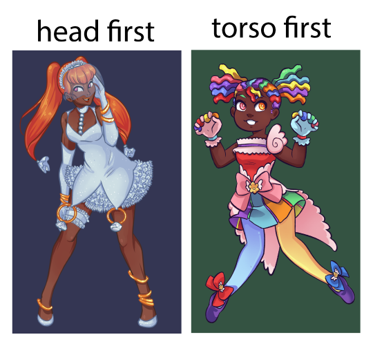
7) Start with the torso instead of the head. what you start with the head, the body may end up becoming wonky and having the neck stretched out at an odd angle or having a too small cranium. This is easier to fix in digital art but I suggest just remembering the importance of that rib cage (this is something I’m still training myself out of).
8) Asking for feedback can be an invaluable tool. For example, last year I had this really weird thing where I drew my eyes way too close together- I never noticed until I had it pointed out to me, and it took MONTHS to break this habit.
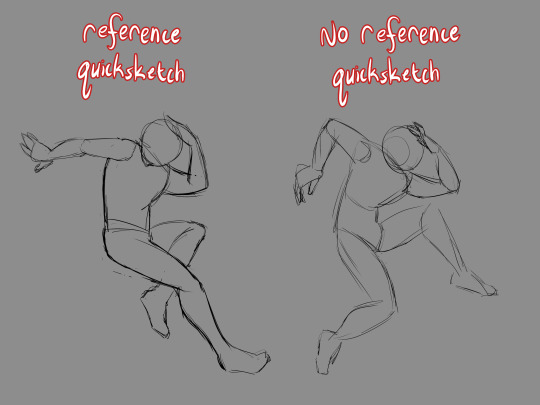
9) References are very useful, and one fun technique I’ve found great use in is to draw a pose, first with no reference, and then following that reference very strictly. This can be helpful when you want to see where you are developmentally.
10) Every now and then while drawing, you want to put the pencil down, prop up your paper, and walk away so that you can see the full image from a distance. If you’re working digitally, you zoom out a great deal so that the image appears smaller. This is a GREAT tool for seeing which sections of the piece need the most attention and how those smaller details hold up.
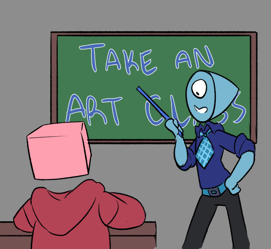
11) If you have the opportunity, you REALLY want to participate in an actual art class. Having a teacher that can see what you’re doing in real time and knows where you’re at skill-wise is an INVALUABLE thing to have- these people were specifically taught how to teach you these skills, recognize your problems and how to fix them. Don’t be afraid to talk to them and ask for advice about non-classwork art, either! You can’t receive help if you don’t ask for it.
12) Flip your canvas! I know you’ve probably heard this before, but this is one of the best ways to check for anatomy inconsistencies.
13) When it comes to youtube artists, I don’t really actively follow any, but I do know of some!
Mark Crilley: While I don’t watch his videos much now, I used to follow his videos RELIGIOUSLY. He’s got some really solid advice on how to map out comics and mangas, and he taught me the importance of silent scenes and keeping your work from getting too wordy. He mostly does the soft anime look, but he also does some pretty stellar realism.
mikeymegamega: I’m not going to lie to you, anon- this man likes his cheesecake. This guy is all about the cute anime girls, so if you’re not looking for that, skip him, but I really can’t recommend his videos on hands, feet, and faces enough.
Proko: Has a video about best drawing exorcises and is the guy you turn to when you want to know about figure drawing. He tends to focus on the more realistic anatomy, and while his videos may be long he’s got some good advice. I’d say to check out his studying anatomy correctly video, and then just kinda scroll through his pages.
Ethan Becker: THE KNIFE MAN. The first time I clicked on him I thought he was making a troll video- but then he Got Into It and my dudes, my guys, he has some CRAZY good advice. The way he words things and shows you examples in his videos are amazing and I really can’t recommend him enough. He did a video called “Fixing PROKO's LAZY Drawings“ and while you’d think it would be a bash fest his advice on shading in it is just so incredibly useful. Click on pretty much any of his videos and you’ll be entertained and learning.
I'd also suggest watching speedpaints. Even if it was unintentional, I’ve learned several really solid art hacks from speedpaint and storytime videos- so always be aware that you have an option for that.
…. Oh! And also, practice! I know you’ve probably been given this advice from everyone already, but it’s worth remembering.
Sorry if this got a bit long, I just figured I’d try to give you some good hacks- and even if you have already heard of most of these, I hope I could at the very least entertain!
119 notes
·
View notes
Note
Hello! May I ask how you draw? I'm currently learning how to myself and would be highly interested into a step to step process by you! Like from sketch to the done thing (no color necessary)
Hello there!
I dunno how I feel about showing how I work/giving advice to someone who’s learning (and I say it as a pro artist who went through years of traditional art education) because when I do the illustrations you see here on my tumblr I BREAK THE RULES you’d learn though life drawing routine, and give in to bad habits, and my methods are rather unplanned and chaotic which makes it difficult to pinpoint significant stages. But I used my portable potato to take some photos during working on my last piece, so I’ll throw it here with a bit of an explanation of what’s going on.
Before I begin - and because you’re about to look at a mess of a WIP - I’d like to give you some general advice that generally makes life easier when you draw (again, things that I learned in traditional arts education - another artist might advise you the complete opposite, dunno!)
Work holistically. Forget them satisfying-to-look-at clips on instagram showing someone produce a hyperrealistic portrait starting from an eye, with each and every element emerging being finished before they proceed to another part. It takes a lot of talent, yes, but these are ppl redrawing a photo in a kind of a mechanical manner. Most artists don’t work this way. Especially if you’re working without a reference, or if you’re doing a life drawing - your process will be layering and changing and finding what works best to give an impression of what you’re drawing rather than reproduce the exact image, and your artwork is likely to look messy most of the time.That said: don’t start with the details. Don’t spend too much time on a particular part while neglecting others. Your goal is to keep the whole piece at the same level of ‘finished’ (even though it’s unfinished - do I make sense?) before you’re confident that everything is where it should be and proceed to the details. So sketch out the composition first. See how things fit, what’s the dynamics. You’ll save yourself from limbs sticking out from the frame, odd proportions etc etc.
Because it’s a game of relationships between different parts of the picture/scene. I ask you not to worry about finishing a single element before laying out the rest because you’ll find that said element will look different once the other part appears! For instance - you might think that the colour you picked for a character’s hair is already very dark. But once you’re done with the night sky background, you’ll find that it’s in fact too light, and doesn’t work well with the cold palette. You’ll have to revisit different parts of the image as you go to balance these relationships and make the picture work as a whole.
Give an impression of something being there without actually drawing it ‘properly’- because details are hard, mate. You’ll see that my lineart usually has hardly any, and my colouring is large unrefined stains, but the finished thing looks convincing. Like, fuck, I can never focus on how Crowley’s eyes are really shaped. So I just turn them into large glowing yellow ellipses crossed by a line, and heard no protests so far.
Don’t panic if you messed up (you probably didn’t anyway). It might turn out to be a completely unnoticeable mistake - because, remember, things work together to balance each other, so another finished off prominent element will probably drown that badly placed line that looked so visible and out of place a second ago.
It might not look good before it’s finished. I’m mostly immune to it after years of drawing, and my recent illustrations all follow a specific method (ykno, my sunset glow effects and all that) so I can kinda predict the next stage. But I do my linearts on a specially picked crap paper, I don’t bother erasing the smudged graphite, and it looks messy af until I make the background white in Photoshop. Conclusion: you might have a moment of doubt as you work through a piece, but try to break through it - I often suddenly start to like what I cursed a minute before! - and try to finish it even if it’s meant to be bad. This way, looking through your past pieces, you’ll see the progress. And trust me, I can’t even look at my art from literally three months ago. It’s normal.
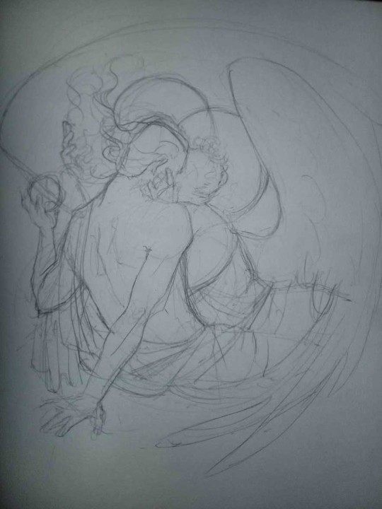
Now, pics! The sketches are paler in real life, but I increased the contrast a little so you can see something.
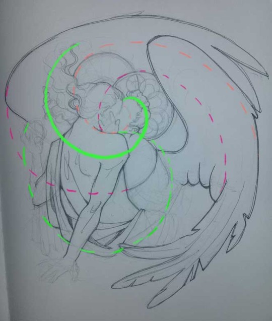
1. Laying out the composition!
I wanted to just show them kissing, but I got carried away due to some Art Nouveau inspiration. As you might have noticed, most of my illustrations are quite self-contained (ykno - they look like a sticker on a plain background). So I wanted a tight swirl bordered by Aziraphale’s wings creating a sort of rounded, yin-yang like bubble around them. Consequently I made the whole composition revolve around their heads.

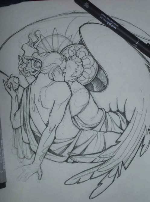
2. Adding more details to the sketch. It’s messy af. It will be messy until I’m done. It’s fine.
3. These are the fineliners I use for the linearts! They are made by Uni-ball and come in light and dark grey. I also sometimes use the guy on the left - ‘Touch’ sign pen by Pentel, when I want more brush-like, wider strokes. I work in grey because when I scan it and do my usual boring trick with sunlight highlights - which is an Overlay mode layer in Photoshop - the highlights ‘burn out’ the lines too and make them vanish a little, and the lighting effect gets more striking. I also like to use the light grey ones to make something look pencil-y without actually using pencil, because pencil fucking smudges.
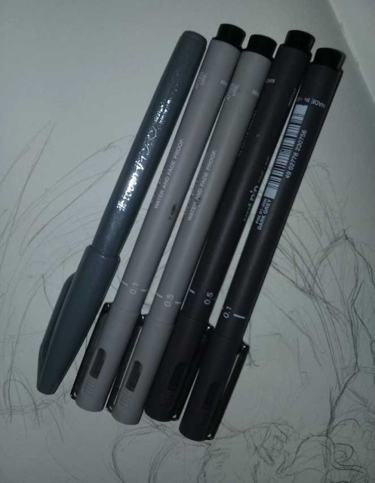
4. It smudges! So because I am right handed, I start inking from the right hand side, no matter how tempted I am to do their faces first.
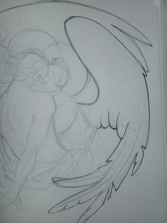
5. You can see the composition directions here. I made it intuitively, but ofc some ppl actually use grids etc to lay out their drawings.
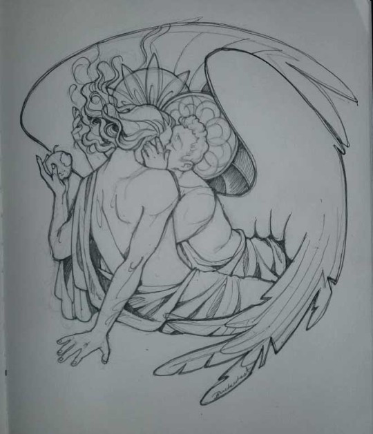
6. See how pale ans thin the lineart was at first? I kept adjusting it as new inked parts were appearing. It starts to look nice and consistent now!
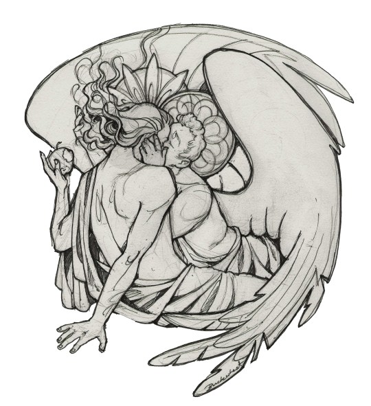
7. Finished lineart? There are some mistakes which I later corrected in PS. Notice that Aziraphale’s face has hardly any details on it - I tried to make the drawing suggest his expression rather than risk overdoing it.
8. Photoshop time!! You can totally do what I did here even if you don’t have a graphic tablet. I used Curves tool to enhance the lineart, then Quick Selection Tool to select the background around around my sticker-like piece and filled it white (on a new layer ofc). I keep this white layer on top of the layer order so it works as a mask as I colour. I decided I did not like the hatching shading underneath Aziraphale’s halo, so I erased it with a Stamp tool (because I wanna keep the textured grey fill my crap paper naturally gives me!). It’s done roughly but won’t be visible once the thing is coloured.
9. And the reason why I keep the grey shade instead of easily getting rid of it by using Curves/Levels is because when I set this layer to Multiply mode and colour underneath, it gives me this nice desaturated look like from an old cheap paper comic page. It works as a natural filter! But of course I can’t do bright colours this way, so all my glowing highlights happen ABOVE the lineart layer - on a separate layer in Overlay mode!
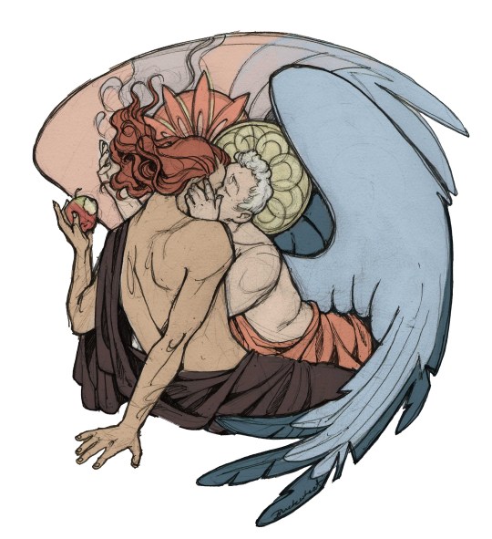
Finished thing here!
_____
Commission infoBuy Me a Coffee - help me with my transitioning expenses!Prints and stickers and things on my Redbubble!
#ask the buckwheat#long post#tutorial#drawing advice#drawing tutorial#good omens#ineffable husbands#good omens fanart#good omens art#my illustrations#doodles#toastedbuckwheat
1K notes
·
View notes
Text
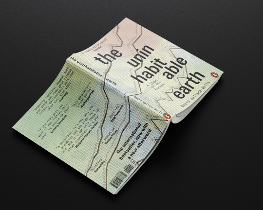
Concept 3: Alarming Data
Inspiration
For this cover, I wanted to represent the books outpouring of data, facts and figures that had been collated and carefully researched. The book was originally based on an article for the New York magazine and was expanded to become a non-fiction book. The book isn’t a story, it’s an essay, a collection of data, put together in one book to show exactly how much evidence there is that climate change is happening, and fast.

My original ideas on this were based around incorporating data on climate change as part of the imagery. I found a few examples of data visualisation that had been used by NOAA AND NASA and decided to use these as the jumping off point for conception.
In terms of design style, I was drawn to the works of designers like Roy Cranston.
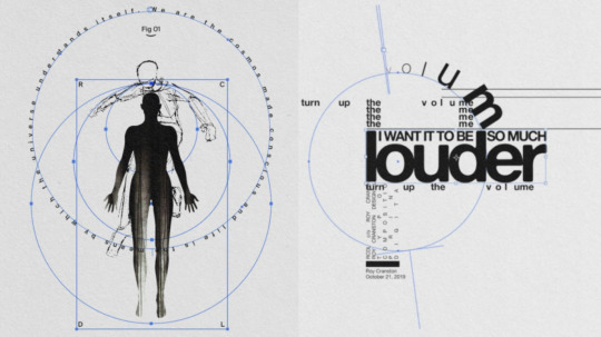
I really liked the way he played with the typography shapes and sizes, changing the paths the type was on to compliment the shapes in the visual. I wanted to incorporate the shapes of the data in the cover and relate it to the typography.
Experiments
I began experimenting with the different graph shapes that might work for the cover. The line graph was the most commonly used in my research of this data, although some featured bar graphs and other representations. When playing about with the different orientations, I felt like the lines were the the ones I wanted to use.
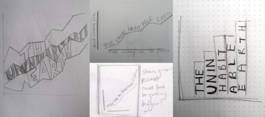

I felt pretty strongly about representing real data on the cover, as much as the inside uses facts and figures. I took the shapes of the lines from real data on the rising levels of CO2, sea-levels and global temperature.

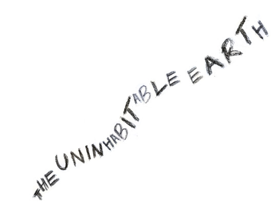
After I had sketched out these graphs, I looked at the different ways the type could interact with them.
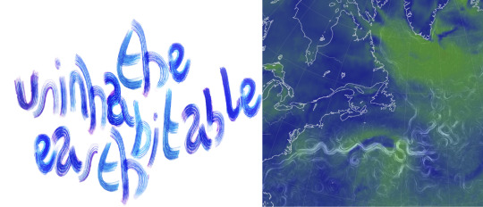
I tried creating some lettering that might work alongside the graph data lines as well. I initially thought it would be good to create letters that looked like the ocean current visualisations. I used an old paintbrush and ink to get the line effect I wanted. I was happy with the end result, but thought overall it seemed too playful to suit the cover of this book.
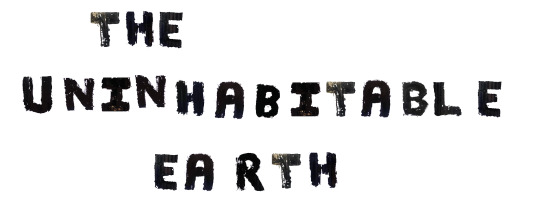
I also looked at using charcoal and paint to create some more textured letters. I liked this but felt with the rigidity and clean lines of the data I wanted to represent, it felt disjointed. Taking a look at the style I wanted to emulate, I decided it might be better to use a sans-serif typeface.
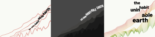
After playing with the different ways of layering the line graphs, I took the patterns into illustrator and starting working with the selected type face. I enjoyed playing about with the blending tool in illustrator to create something visually impactful, but I felt it took away from my original concept, and although interesting to look at, it was hard to interpret what was happening. I decided as well that instead of creating shape with the title itself, which I wanted to be bold and clear - I used quotes from the book relating to the data to represent.
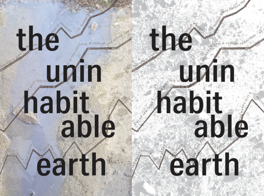
For the background, I tried a variety of different textures. I thought a ground texture might work to loop it back to this idea of ‘Earth’ but similarly to the charcoal, it didn’t feel like it connected as well. I instead went back to the graph paper I used originally. I soaked it in water to make the grid lines bleed a little, to give just a hint of the chaotic events suggested in the book.
Reflection
My final piece was something I was really proud of. I wanted to create something that didn’t directly link to climate change events itself, but much like the book alluded to the overwhelming data that alerts us to a need for intervention. The type I choose was the sans-serif Bhanschrift which, although dark and bold, was written in lowercase. I felt that this was better than all uppercase because the book does not feel like it is shouting ‘This is your fault!’ so much as it is stating matter of factly ‘We need to do something” - clear and concise. I paired this with the ‘Letter Gothic Standard’. The style seemed to go well with the data theme, having a slight monospace feel as well as looking like traditional typewriter font.
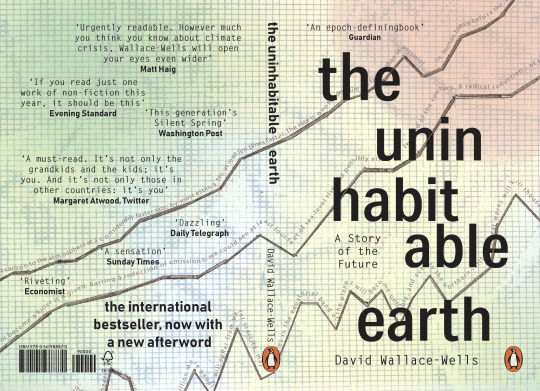
By using the quote from the book to sit along the lines of information from NASA’s website, I felt I was able to create something visually intriguing, representative of the book, as well as snippet of what’s inside. Using the background of gridlines keeps in theme, but by adding subtle hints of colour and bleeding to the ink, kept the imagery from looking flat, and also linked to the colour palette of other data visualisations.
I think although I choose to do with a font, I would have been interested to find a lettering style that suited the cover. The way the lines of data are drawn may have allowed for a hand written type, although having them different creates a contrast.
3 notes
·
View notes
Text
My Lazy, Poor, Stupid Person’s Attempt to Paint Tabletop Miniatures
by headless
This has nothing to do with covid-19 really, it’s just something I reckoned I’d share. For several years I’ve played Dungeons & Dragons, and occasionally others like Call of Cthulhu and Delta Green, or Shadowrun. Though, I say ‘play’, when I mostly run games as a Dungeon Master. It’s one of those “hobbies” that is a lot of fun for someone like me, but requires a ton of dedication, so it isn’t always easy to get a dedicated group together.
Anyhow, I generally homebrew settings and adventures, never really been too big on running pre-written games, even if some of them are fantastically written. And one of the most frustrating things is I some times want to have a miniature on the battle grid that looks a certain way. This is hardly a big deal, since miniatures are just markers meant for reference in combat encounters, the real image of the characters is in all of our heads.
Still, I sometimes want to have something especially specific, a lot of the players in my current group appreciate cool looking miniatures, and seeing as I’m usually hard-up for cash, I can’t always buy pre-painted mini-figures, unless I get a good bulk deal on ebay or something.
One of my recent attempts to acquire bulk miniatures came a few years back when I realized during the 4E days, Wizards of the Coast had released boxed board games themed with the D&D style, which all came with a great deal of unpainted miniatures; these came in sets like Wrath of Ashardalon, or The Legend of Drizzt, with lots of themed minis for the board game’s scenario.
Anyhow, I’ve had a ton of these unpainted miniatures forever and use them often for nobody-NPCs and other characters the players run across. Lately, however, the group I’ve been running in a campaign for about eleven months (usually weekly), ran across a problem where their dragonborn ranger Grixxis was captured by and then negotiated his away out of the clutches of this ancient entity who calls herself Gorgoth (who appears to be a pale, beautiful young woman, but probably isn’t; even the not so arcane-y Grixxis intuited that much). She was actually impressed that he resisted her Sleep spell, and offered him a deal, she’d let him go but he needs to complete a task for her in the next seven days, and if it isn’t completed in that time frame his soul will be bound to her forever.
The task was to go to a mountaintop and retrieve something that resides there, though Gorgoth did not explain what the object was, so the party set off to find this mysterious mountain. The journey led them to an area of bad wilderness where no one lives, and where roving bands of orcs constantly hunt and war with one another, so only a few people know anything about that region. The party ended up hiring a guide, who was a wood elf exile named Skaya. They seemed to be intrigued by her because she’s living in a city which is currently at war with wood elves, so there’s a lot of prejudice and racism against her kind. Skaya does have facial tattoos that indicate she’s been exiled from her tribe and therefore no longer truly considered by her people to be a wood elf (their worst form of punishment in this universe), but still, the party seemed immediately fascinated by this single NPC among the potential seven or so they might’ve hired for this expedition.
Anyhow, my players have only gotten truly invested in one other NPC they’ve met before this; a small little orc toddler named Gruuba who they saved from a bunch of slave trading bandits early on in the campaign. I’ve had difficulty finding a good miniature for Gruuba too (because she’s really small and scrawny), but since she’s at the same developmental level as a human six year-old they try to keep her out of combat scenarios (despite Gruuba’s excited insistence that she enjoys using clubs “for smashings”). Since the party have begun to really enjoy Skaya as character, the longer they’ve slowly, slowly gotten to know more about her stand-offish personal history, I really wanted to get a miniature for her that reflected my image of her better than the one I’d been using.
So, even though I got basically no experience doing so, I bought a miniature from Reaper Miniatures, and after looking up a few tutorial vids for beginners like me, I set about trying to paint my first mini-figs.
Two things, if you’re looking into this yourself;
First, I’m not totally unartistic, I write creatively and I sketch with pencils and ink. Painting’s fairly new to me, but it’s not like I have absolutely no artistic talent. I also solder a lot of really small wires and components in my normal daily job, so I may have better muscle control for this sort of thing than some people. I only mention this because I may have had a few advantages in this undertaking. I just don’t want to make people overly confident, keep things in perspective. So whatever your level of expertise at this, if you want to start just try to patiently measure your expectations, and don’t get discouraged if your first results aren’t so great. All things improve with time.
And B. if you’re poor, lazy, and stupid like me, there’re ways to get around that. This video I watched gave me a good rundown of the basic steps which are;
- scrub the plastic down with some dish soap, luke-warm water, and a toothbrush; allow at least 1 hour to dry (I let them sit for a day because I’m paranoid), and be sure there’s no lingering moisture before you start painting
- get a good primer or base coat on the model before you start adding other colors; lighter base coats allow more colors to show up easier, while darker base coats tend to make the colors you paint over them darker
- stay calm and take your time
- try to paint the colors that’ll go under other colors first, like, if a barbarian dude is shirtless but’s wearing a few pieces of armor, paint his shirtless skin first, then paint the armor he’s wearing second because it layers over better that way
- use thinner paints and multiple coats of a color to get an even final color instead of one thick coat
- allow each coat of paint to dry for 10 - 20 minutes before applying the next coat
- learn about washes, pigments, and inks, because they’re awesome
- get a decent varnish for a final protective coat, matte varnishes make the model look dryer and flat, gloss varnishes make the model look shiny and wet, if you do a coat of gloss and a coat of matte varnish it equalizes it pretty good
And this video here sort of laid to rest my fears that I’ll need to spend $600 on paints and washes and stuff. The very helpful lady in that video explains how she uses generic acrylic paints from the craft store (I got mine at Wal-Mart) to paint her Warhammer miniatures, and she even offers a method of making your own washes from a combination of paint and flavorless mouth wash. It’s genius. So try not to stress too much about buying the really nice brand name paints, because it’s not necessary, those paints just have an optimal mix I think, otherwise they’re the same damn thing as generic acrylic paints. Also, you’re just trying to learn, so unless you really, really feel like emptying your bank account, just use the generic stuff.
I started out painting something I didn’t care about. I wanted my miniature for Skaya to look badass and awesome, so I wanted to start with some practice miniatures. Grabbed a few from those 4E board game sets and gave it a shot. But I had also recently gotten hold of a Goliath Barbarian miniature from the Player’s Handbook Heroes sets (also from the 4E days) a rare find, since it usually goes for like $60.00 by itself. Randomly found some dude on ebay selling an unopened box set for $20.00, so I got a wild elf druid and a human berserker along with it. So I started out touching up the goliath’s armor to make it look more like armor and less like weird blue stuff.
Here’s a before-and-after for him (I didn’t take photos of them before because I wasn’t anticipating this, so I just found examples from around the web):


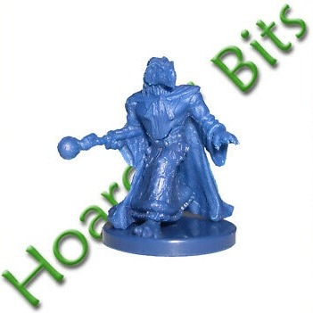
Next I tried a re-paint. A friend of mine had recently guest-played in my campaign and created a half-drow monk (his backstory was fantastic), so since nothing like that exists, I took a Soulknife Infiltrator miniature seen here:

And repainted it to sort of look like his half-drow Monk of the Open Palm:

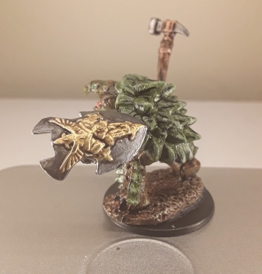
I finally had the courage to do a full paint, so I grabbed the Dragonborn Elementalist from the Wrath of Ashardalon box, and painted her up with reddish scales (I’m one of those who thinks dragonborn should have physical attributes of their heritage).
In the box her name’s Heskan. I definitely used way too much wash on this one so she looks super shiny.

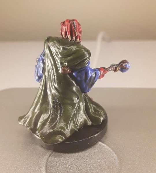
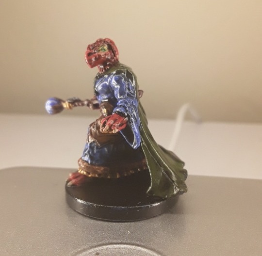
I then took the orc archers in that same box, and not really paying too much attention this time, quickly painted them, because I lack many orc archers:

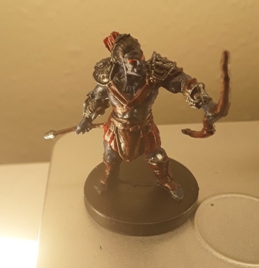
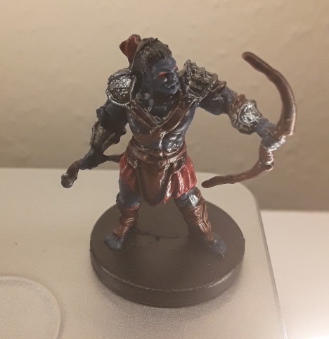
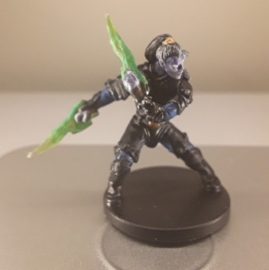
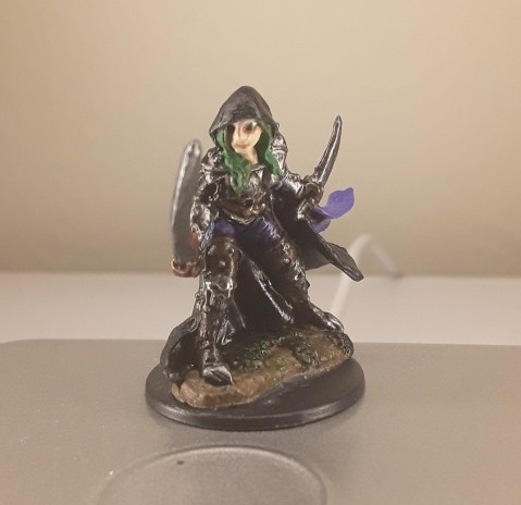
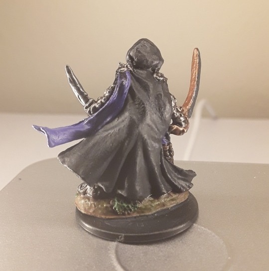
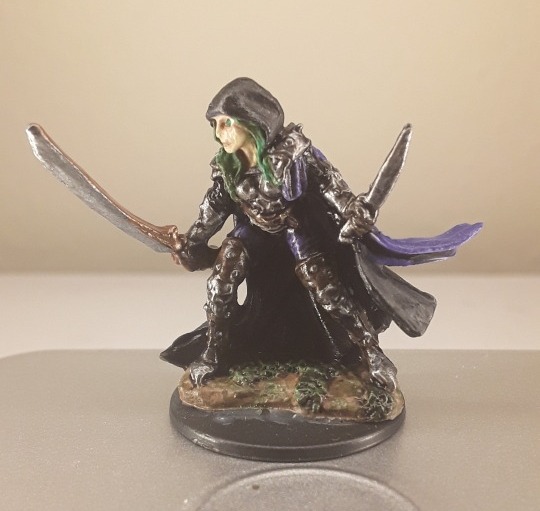
At this point, I felt it was time to finally paint Skaya, the wood elf exile. I used the Reaper Bones model Deladrin, Female Assassin ($1.99) for Skaya’s mini.

And taking way more hours than I did on the others, which were only about 1-3 hours each, when you count waiting for the coats to dry, I managed to sort of make her look like Skaya, I guess:
After this, the fact that it wasn’t complete and utter shit, which is what I expected, I was encouraged. So I tried to do out party’s tortle cleric, named Daruuk of Chult (who oddly speaks with a Slavic accent, so that’s how people from Chult sound in our campaign), for whom we’ve lacked an accurate mini-figure for some time. I bought a pack of Spikeshell Warriors ($2.99) from the Reaper Bones line.

But Daruuk characteristically wields a large shield and a warhammer, so for some reason I got super detailed and bought a pack of loose shields from the Reaper Bones line ($0.99), then bought Halbarad ($1.49) a human cleric.

I clipped off Halbarad’s hammer at the hilt, then I trimmed the spikes off of the spikeshell warrior’s club, and used a dremel to carfully mill a hole inside the shaft of the spikeshell’s club, then pinned the hammer inside and secured it with gorilla gel. I used an actual cork board pin to push the shield onto the spikshell’s offhand after cutting off his turtle shell shield in order to pin it before gluing, then clipped off the rest of the cork board pin. Somehow, this ended up making the shield look meaner because it now has a like pyramidal spike sticking out the center. After allowing the glue to dry I painted him up, and my attempt at Daruuk the Death Cleric turned out thus:

I guess his hammer looks sort of Acme-level cartoony, but he’s a giant 350 lb. turtle-man who talks like Omega Red from X-Men The Animated Series, so I’m okay with that. The spikeshell also fits well with the razorback sub-race feature I allowed Daruuk’s player to homebrew for himself. I was really proud of this one.
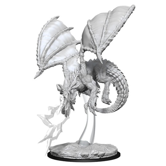
Finally, because I’m an insane asshole who is getting obsessed with my new hobby, I decided it was dragons or bust. So I bought a pre-primed unpainted Young Blue Dragon from WizKids ($13.99).
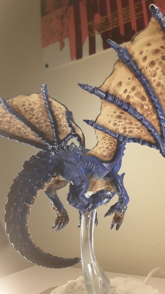
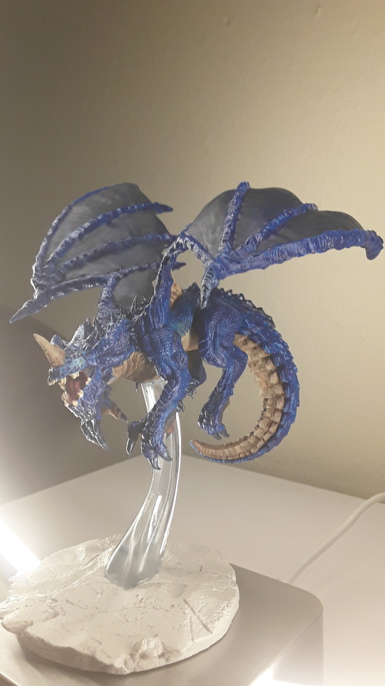
And spent, like, three days meticulously testing different paint layers to see how they come out. I tried to paint her in the tradition of blue dragons as they appear in the art of Forgotten Realms material, but gave her a somewhat darker cast, and added metallic blue layers to her claws and spinal ridges. I still need to paint her base, put some highlights on her eyes to accentuate the glowing effect and add my washes to give her a final layer of dimension, but here’s how she came out so far:


Behold, Stormfang! Mistress of Thunder...
Anyhow.
This is super long and I wonder if anyone will bother to read any of it. But just wanted to put this out there. From a dude who, if you asked me a year ago if I thought I could do this, I’d have said I’m too stupid, poor, and lazy. I still think of myself as all of those things. The real pros use crazy detailed techniques with like seven layered highlights on their models, and airbrushes and all kinds of other madness. I use maybe three coats total and I don’t get too worked up if I make a mistake here and there, and I haven’t spent more than maybe fifty bucks total across six weeks, and most of that was wasting paints because I was still learning how to mix different shades.
So if you got something you feel like you’ve always wanted to do but are too stupid, poor, and lazy to figure out, just go for it yo. I managed to crack out these bastards and I still think I suck, but it’s way better looking than I expected. For real though, you should see some of those Warhammer players, they got mad crazy god skills at this stuff compared to me. But your level of skill isn’t the point. The point is to have that moment with that thing you did, and look at it, and just go “Yeh, I did that” when at one time you never believed you ever could.
There’s always going to be somebody better than you, but even they, like all of us, are still learning.

侍 headless
#painting miniatures#hobbyists#you can do it#encouragement#young blue dragon#just do it#my weird little world#dungeons & dragons#forgotten realms#dungeon master#painters#tabletop gaming#role-playing games#critical role#wood elves#shadowblade#turtle-men#death doman#half-elf#drow#monk#and matthew mercer
19 notes
·
View notes
Text
Yuumi’s art process (with pics!)
This is how I go about doing the art palettes, and generally how I do art (specially on lose, not so long pieces such as these). I’ll breakdown the process under the cut so I don’t spam people’s timelines (´・ω・`)
I was going to put these final advises at the very end but someone else might make use of these instead of going through the whole thing so here:
Important things to keep in mind in case you’re learning and actually think I’m worth being listened:
References are GOOD. No one is perfect and no one knows how to draw stuff from their memory so go google weird things, Google-sensei won’t judge. Hopefully. (else set your navigation on private).
Brushes and whatnot don’t make the artist, but it sure as hell help you feel like you’re doing what you like or not. I can’t stress enough how many times I’ve just not finished works because my brushes felt “off”.
Posemaniacs is very good for both anatomy and speed practise (I’m aware I’m really fast compared to my fellow artist friends but by no means it’s a standard, I just got used to work fast uwu)
Be careful with your wrist!!! use your whole arm when drawing!! and also T a k e · b r e a k s.
Art block is a bitch and strikes anyone. I’m usually artblocked but if you find something you’re passionate about go draw that, whatever it is. (I hadn’t consistently drawn in p much 5 years after college and thanks to MLB season 3 here I am LOL)
And now for the actual breakdown:

Step 1: Sketch
My first step is the sketch, which some of you might think “but it’s SO CLEAN!!”, yes, sometimes I leave my sketches as lines and polish them a bit. Anyways, these is what my sketch looks like and next an important thing:
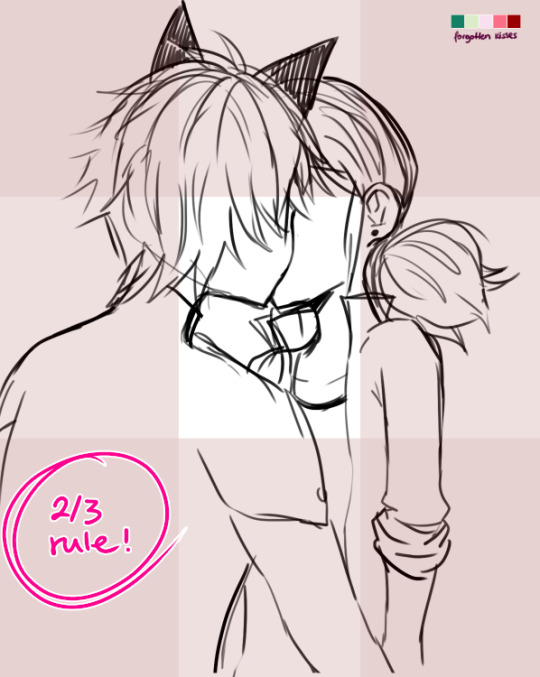
...which is the 2/3 rule! Photoshop blabbery ahead, tl:dr how i made the grid
I’ve been doing this small trick by filling a layer of any color, lowering the opacity to 50% and transforming it to 33,33% it’s height duplicate and place on each side of the canvas and then merge, and then another layer doing the same but doing 33,33% width instead of height. Then I merge both layers, set the opacity to 30% and the result is that perfect 2/3 rule.
If you don’t really know what the rule is, I kindly suggest this instead of my explanation bc words are not my forte.
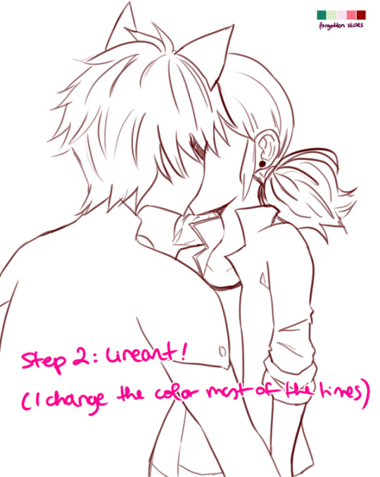
Step 2: Lineart!
Nothing to say here other than cleaning the lines from earlier with a different (or the same in this case) brush as the sketch one. Opacity varies from day to day.
I have several styles of lineart and they all come with the mood I feel on that day, so don’t be afraid of experimenting and finding what you like most! I personally like thin lines a lot but also thick lines too! i’m constantly looking for the perfect line™ and to give an idea this is what my brushes look like:
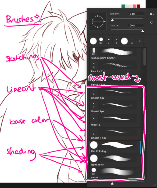
in summary, practise with as many tools you can find around and see which ones you like most uwu

Step 3: Base Color
This is probably the part where I give up the most bc it boooooores me LOL. I try to spend as little time as possible in order to overcome this step. These are usually colors I use in 99% of my pics, since... idk years. If you look in my old arts in twitter you’ll see them haha.
Something important I’d like to mention here is ✨LAYERS✨:
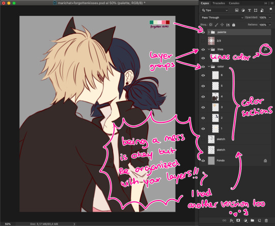
This is how my layers look like in the base color part. I tend to do 1 for skin color, 2 for hair / eyes, 3+ for clothes and stuff. I tend to separate them in colors so they don’t merge! I go with numbers because... I think it’s faster to type and I’ve been using this way of naming for years so it works for me, what matters is that you group your layers and keep them organized uwu (specially if someone else has to look at your psd files >>)

Step 4: Shading!
Normally, I shade every single layer with a proper shade but on the case of the palette challenge I’m doing just the skin because I want to stress the light mood. Liiiike if I want to go with a softer light I’d use lighter shades or a stronger light = stronger shades. To pick colors, I usually go with that brown from Chat Noir and Marinette’s jacket as my universal black (I don’t like working with black, I’m weird), and most of the colors I just eye pick from the Color Picker on Photoshop. In the right you can see my swatches:
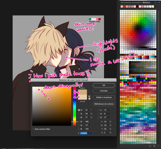
To choose the shade tone (in this example we’ll use Chat Noir’s hair), I picked a Yellow -Adrien’s hair is specially hard to color ugh- And then with that same tone I’d choose its shade going diagonally looking for a darker tone. This way you can find interesting colors! On this pic I did that for Adrien’s hair and... the rest I did the following:

I did my lazy shading™ : which consists in a layer set to Multiply with 50% opacity (this varies depending on the light, again), and I shade everything with the same tone (my to go is purple, but sometimes I use other colors too). This gives a sense of uniformity and the resulting shades are way nicer in my opinion.

Step 5: But Yuumi... where are the palettes???
I take that people straight handpick the palettes and use them to shade all the way and I respect them for that. I instead decided to do whatever floats my boat so I color regularly but add the palettes over the whole thing to change the overall mood and colors of the illustration. I randomly use the Gradient Tool and use the palettes’ colors around and then set that layer to Screen, Multiply, Focal Light, Overlay... etc etc, whatever I feel like doing in that moment, and so the magic happens! :’D
I don’t usually do this on my works but this is a new way to experiment for me and I’m having fun with it!
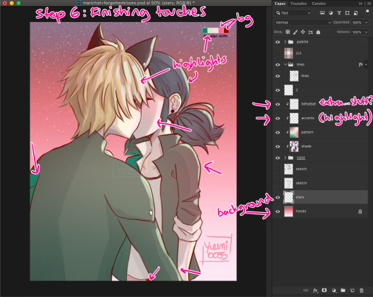
Step 6: Finishing Touches
Here is where I use the palettes the most, adding random highlights in whatever way I feel like. Yep, I pretty much Ladybug my whole coloring process: Wing it and go with the flow™. I’m still learning about lighting and whatnots but I really don’t care at this point LOL
To which you’ll say: But Yuumi?? In art school they told me that---
To which I say: shhhhhhhhhhhhh assigntments are over for me. go watch some Bob Ross (I am serious). Do whatever you feel like. Be happy. No one is going to judge you, and if they wanna judge they better be paying for your work first. so. whatever you do: BE HAPPY. or don’t do it. unless it’s a school assignment, in that case go do it or i’ll kick your ass.
✦ Finishing Notes ✦
So yea, that’s my art process in how I’ve been doing these Miraculous Color Palettes and generally how I go about my illustrations most of the time. For more complex illustrations, I need to remember how I did those (oops). And actually, do them. These illustrations usually take up 2 or 3 hours to make, on other pieces i’ve been working on them for up to 8 hours, it really varies from piece to piece, but I hope this was helpful!
Please let me know if you have any questions, commenting in this very post will help me -and others?- keep track of things and learn together! My asks are also open and I’ll reply as fast as I can uwu (my requests are still waiting there, don’t worry).
aaaaand that’s all, folks. Stay Peachy!
53 notes
·
View notes
Text
Reverse-engineering the Two Ronnies crossword sketch
Among the catalogue of classic sketches by the late and much-missed Two Ronnies, sits this little piece: https://www.youtube.com/watch?v=cVWdbO6FFfw
Give it a watch all the way through then come back here.
Done? Okay.
Being of a cruciverbal mindset, it occurred to me to try and see whether the clues Ronnie Corbett’s character was struggling with could actually be worked into a plausible grid. When writers have characters doing crosswords, they often throw out clue numbers willy-nilly, without paying much attention to their structural plausibility – something I found pretty quickly when I tried to reverse-engineer The Owl crossword from Jasper Fforde’s Lost in a Good Book (but that’s a post for another time).
Ronnie reads out the text of seven clues. In four of these, he’s already got some letters in. Can we assume that’s because those letters are from crossing answers? The only alternative, that they (or at least some of them) are “givens” (i.e. actually printed in the grid by the publisher) is too dull to contemplate for the purposes of this (admittedly silly anyway) exercise, so let’s assume they are from crossing answers.
For three of the clues, we are told the actual clue position and number.
This, in essence, is what we have to go on:
2ac. They peck holes in your milk-bottle tops (4). ? ? T S
6ac. Often found in the bottom of a birdcage (4). ? ? I T
16ac. It’s green and often found on football pitches (5). G R A ? ?
??. It’s red, it smells, and it’s often picked in the garden (4). ? O S E
??. Place where fish are kept (4).
?ac. Strange animal found in a hive (5,3).
?dn. He always plays with Big Ears (5).
We are told that the fifth letter of the penultimate of these crosses with the first letter of the last of these.
For the fifth clue, Ronnie Barker’s character mocks Corbett’s for having filled in “coop” (or “Co-Op”) but doesn’t suggest a correction, and we’re not told what letter or letters he might have had in already. There are plenty of four-letter possibilities for where fish might be kept – tank, bowl, pond, maybe even pool – and note that many of them share the second letter “O” with Corbett’s guess, so let’s make it one of those (instead of “tank”) and make the second letter check with another crossing word.
For the sixth and seventh clues, Barker’s character confirms that the correct answers should be “queen bee” and “Noddy” (not “queer bee” and “Roddy”).
Let’s make one more basic assumption: since this is in a daily newspaper (Corbett describes it as the “Sun Junior Coffee-Time Easy Clues”), it should abide by the normal standards of crossword symmetry. That is to say, most likely 180° rotational symmetry. We initially don’t know the dimensions or style of the grid, but it’s not likely to be huge. If we start trying to construct a grid that would take these clues in the positions indicated, come constraints quickly start to show themselves.
Firstly, if there’s a 2 across, we can pretty much rule out there being a 1 across (since it would have to have no more than the first letter checked), so 1 is a down answer only.
Secondly, note that we have the third and fourth letters of 2ac in already – T S. Likewise the second, third and fourth letters of that “It’s red…” clue; the first, second and third letters of that “It’s green…” clue, and so on. Multiple consecutive checked letters? Well, for a blocked-grid crossword you might be able to envisage that somewhere in the middle of the diagram, but 2ac is clearly in the top row (and 6ac very likely is as well). No – this is sounding distinctly like a barred-grid puzzle. This puts our own meta-joke layer on top of those intended by the writers, since barred-grid puzzles are normally used for advanced/difficult puzzles (probably akin to the “Financial Times Mephistopheles” that Ronnie Barker is trying to concentrate on), and peppered with recondite vocabulary – not the sort of thing one might describe as a “Junior Coffee-Time Easy Clues”.
So my initial attempt to fit the answers we know into the positions we know, gave me something like this:
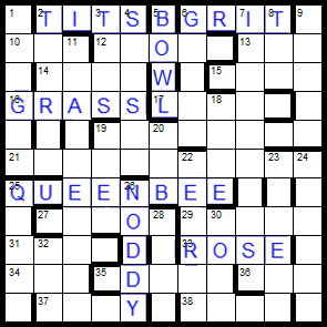
A bit of careful work with the grid-filler function and we can populate the rest of the diagram with a mix of common, harder, and obscure words typical of the barred-grid puzzle.
But we have a problem. Look at 16ac: the two letters that Corbett says he hasn’t got (the fourth and fifth) are parts of 3dn and 4dn – which also supply the last two letters of 2ac, the very two letters that he says he has got. If he’s solved 3dn and 4dn, then he’ll have both sets of these final letters, and if he hasn’t, then he’ll have neither. This arrangement of bars can’t support both scenarios. Therefore, if 16ac is going to be positioned there on the left side of the grid, we need bars above those letters, making 3dn and 4dn both three-letter words. We need to think again about the position of the bars.
Because we need to have the last two letters of 2ac not give away the last two letters of 16ac, and we need the second letter of 16ac not to give away the first letter of 2ac, those parts of those two words need to be cut off from each other by bars, and that in turn means adding more three-letter words into the grid. There are already going to be quite a few of them, and we really want to keep the number down as best we can (because it’s poor form in crossword setting to have too many three-letter words), so this means removing bars in other areas of the grid to make longer words (making sure as we go along that we don’t introduce or delete bars that would change the clue number for “grass”). That in turn increases the likelihood that we will have to accept some pretty obscure words.
In the next screenshot I’ve marked the given words in green, the known letters in blue, and then re-done the pattern of bars preparatory to trying another grid fill.

So – having filled the grid (and yes, as was inevitable, there are a few obscurities – but actually fewer than I expected) – it’s time to write the remaining clues. So, do we attempt to give all the other words “easy clues” like the ones the Ronnies read out? Or do we contrast those seven with cryptics more in keeping with the style of grid?
I went for cryptic clues in keeping with the style of the grid, and then decided to omit the clues for the seven given words and get the solvers to seek out the sketch for themselves (I circled the letters ‘TWO RONNIES’ in the grid to give a nudge in the right direction). Okay, link to the puzzle here: http://crossword.info/skirwingle/coffeetime/
Next here’s a long scrolly bit so you don’t see the answers by mistake. (see you after the dots)
.
.
.
.
.
.
.
.
.
.
.
.
.
.
.
.
.
.
.
.
.
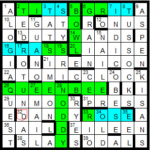
Let’s have a look at the words I fitted around the givens, and separate them out by vocabulary difficulty:
EVERYDAY WORDS (26)
legato, onus, duty, wands, liaise, atomic clock, press, dandy, sail, Eileen, slay, ted, tat, sty, grain, tussocks, aspen, guano, rotundas, Simeon, obese, quest, email, Rio, old, eel
IN-BETWEEN OR GUESSABLE WORDS (6)
unmoor (to cast off moorings), Indic (the Indian branch of Indo-European languages), nailer (a maker of nails!), sri (an Indian title roughly equivalent to Mr.), cep (a mushroom), ryes (slightly unusual plural of the grain or the whiskey derived from it)
“HARD” WORDS (4)
irenicon (same as eirenicon – a peace-making scheme)
odal (same as udal – an Orkney or Shetland estate without feudal superior – possibly the most obscure word in the grid, and therefore the one most in need of a simple clue that gives you the necessary letters – such as a hidden or initials clue; thankfully 75% of it is checked by down words)
alogia (inability to speak, due to a brain lesion)
kisans (Indian peasants – probably the next most obscure word, and only 50% checked, so again in need of a plain clue)
I don’t think that’s too bad! If you add the “hard” words to the in-between words, that’s still less than half as many as regular familiar words (and then there are the seven original answers from the sketch as well).
2 notes
·
View notes
Note
Hi Sammy! Sorry if this has been asked before, but I'm trying to work on my first digital comic and I was wondering if you have any tips to share? Your work is so beautiful and the composition is amazing and so inspiring! I usually work in CSP when I draw, and I've done some paper drafts, I'm just starting the digital process now :) thank you so much! And I hope that mine will come out to be even remotely as incredible as yours!
hi there, omg thank you so much!!
for me, the process i’ve usually been doing for digital comics goes like this:
1. planning/research - this can go on throughout the entire process of making the comic, but it’s a good idea to get a big chunk of it done before you start so you have ideas and know what you’re doing! grab ref photos if you need, look stuff up on the internet, do whatever
2. write script and create characters (usually i write scripts in microsoft word, but for “dream” i worked off of an account i wrote up on the notes app of my phone after i woke up from the dream, and improvised the script page by page) - i frequently make up characters before i even have a story, but if i do have a story in mind i tend to do the characters at the same time as the script
3. sketch comic, insert placeholder text - i do all of my comics in FireAlpaca! i use the box/shape tool to lay out where i think i want panels to go and what size they should be. i usually work at the same size i would be printing at, but you could work bigger! i usually combine the sketch stage with the thumbnail stage because it’s easier for me to layout panels on the actual page so i can see how they fit instead of tiny thumbnails. here i sketch out placement of objects and poses, and make sure perspective makes some kind of sense, and any other important things i don’t want to forget in the lining stage (or coloring, like lines where i want certain shading to go). i also include placeholder text that may or may not be final, but i highly recommend laying out words as early as possible bc they can take up a lot of space you need to account for
4. draw comic - i go right into ink/lines! i don’t do a pencil stage (the pencil stage is the same as my sketch stage). to start i always draw the panels by hand (i don’t use a tool because i like an organic line, but to make sure they’re somewhat straight i use the boxes from before as a guide). i also do the word balloons by hand, and then i do figures/backgrounds. sometimes i leave out details that i will include in the coloring stage, like certain textures (texture of trees or grass, for example)
5. color - i start with flat color and then shade! usually i hand pick the colors i want to shade with instead of using a multiply layer or something like that, but for really complicated things i do tend to use different kinds of special layers.
6. (this is throughout the process) but sometimes i will take the FireAlpaca file and put it into photoshop to use their guide tools to adjust things, or use a textured brush for something, or to insert text. for “dream” i went back and forth regularly with FireAlpaca and photoshop
TIPS
- for composition, i like to consider mood and keeping the eye interested. lately, i don’t tend to break the mold of the grid without a reason (this is just me, you can do whatever you want!! tons of people don’t adhere to the grid and do other really cool stuff. i’m still learning!). the reason for breaking it could really be that i just need more room for words or to show something and i’ll extend the panel into the margins or bleed area. or maybe the shape of a panel needs to be changed bc it’s a dream or a flashback, or maybe you need to go into the bleed area bc something dramatic is happening! you can also mess with the colors of your panels, and the colors of the margin space. consider too, if you like the look of the page overall as an individual piece!
- if you plan on printing your comics, make sure you print out your sketched pages/layouts at actual size so you can make sure the panel sizes and font sizes are legible when a person is going to read it! this can take a lot of attempts, but once you find what you like hopefully you won’t have to do it a million times again
- for longer comics, i recommend creating a palette of colors that include all the ones you use most frequently so you don’t have to constantly eyedrop them from other pages
- don’t get too hung up on any 1 panel, remember that the average person spends something like 6 seconds (probably less) looking at one panel before moving on
- i work at a very high dpi, like 400, which has always been fine (so far), i always recommend working higher bc i think it’s safer, even tho it does make bigger files
- remember to save your work, and save it in MULTIPLE places!! back it up!
- this is just a taste thing but i love comics with custom type/handwritten type styles! you could try out doing a handwritten font or something! i used Calligraphr for mine, and i’ll prob use it again to make more
- i think it’s important to try and best recreate how your audience will experience reading your comic! since it’s impossible as the author/artist to see your own work for the first time as a finished piece, make sure that before you call it done, you give it a couple days without looking at it, and then come back to read it with fresh eyes. see if you think you’re getting the effect you want and if you like the flow! sometimes this can be hard to see/feel though, so you’ll have to just trust your gut sometimes haha!
that’s all i can think of for now but you can always ask me if you have more specific questions!! good luck with your comics!!
7 notes
·
View notes
Text
Nectar
Happy Galpalentines Day!! Have a NSFW Chargestep
@fallenhero-rebirth
Solana hasn't hung around the Rangers much, in the months since the Gala and her rebirth, but for Ortega…
For her, Solana would make some exceptions, however the cards may fall.
The elevator opens to uncover Lady Argent, eyes lost somewhere far beyond the drab walls of the base, until she focuses on her drab grey overalls and the beers she carries.
"Argent."
“Birchwood.”
The rest of the ride up is just as silent. Argent's presence is a heavy weight as always, both in mind and in flesh - silver or not.
The bottles in her hand clink softly against another, and for a moment she's tempted to offer her one. Bridge the gap of years and animosity with a gift.
The elevator chimes, and the door to her floor opens unceremoniously. Too late, then.
She walks out, head held high, and doesn't smile.
"Hey, Ilio," she says softly as the door closes behind her. It feels wrong to speak any louder.
"Hey, Sol," Ortega replies, parsing through a thick beige folder. "What are you doing here?"
Solana puts down the beers on a stack of old files, newspapers and police sketches.
"Shouldn't I be the one asking you that?"
"What do- mierda. Oh, Sol, no, I'm sorry, I forgot. Let me finish up and I'm all yours."
Solana can't help the wry smile on her face. Ortega's mind runs a thousand miles a second, able to switch tracks in the span of a breath, but there are times she focuses so much she loses track of everything else. Solana doesn't know if she'll ever be used to it, but. It's very Julia, and she missed her sun so, so much. Too much to be healthy, too much for what she has to do. Too much to move on. She shakes her head, warding away some of the cobwebs.
"I don't mind. I'm just here for you anyway. And those beers."
"I'll take you up on that."
Solana goes to hand her one, unsure of what to say. Ortega always did keep her on her toes, and not being able to glean anything other than Julia's body language makes it... difficult, at times. But it's also been a comfort.
She's holding her.
Solana looks down, sees Julia's tanned skin against her scarred flesh, wants to jerk her limb out and cradle it close and punch her and-
"Oh. You cut your nails," Julia says, not letting go of her hand.
Solana nods. She shouldn't, but she's blushing now, entire body and mind focused on the fingers linked with hers. Ridiculous; she's thirty... something, not some foolish teenager who's never made out with her only friend (and supposed enemy) by now. But Ortega - Julia, Ilio, her sun - brings out something fragile in her.
Something that shouldn't be alive anymore.
"Sol," Julia says, shit-eating grin spreading across her face like the rising dawn, and then, leaning in close as if sharing a secret, "so did I."
She still hasn't let go of Solana's hand.
It doesn’t feel as bad now.
And like in the hospital, Solana pulls Julia down and presses her lips to hers, too afraid to second-guess herself. Julia smiles against her lips, and deepens the kiss.
So, two problems now. One, Julia's zipped up in her blue Ranger skinsuit, which isn't easily taken off. Two, Solana absolutely cannot let her reciprocate.
The offensive it is.
"Sol," laughs Julia, lips open on the "o" as she breathes out her name, as Solana corners her against the table, as wandering hands run over the deep blue of her Ranger suit, "stop tha-a-at, I've got a meeting soon."
"Liar," Solana answers, and reaches up to untie Julia's ponytail. "Like that's ever stopped you before."
Julia's hair falls, grey streaks at her temples framing her face. Perfect for running her hands through it, kiss the laugh and worry lines that turn the larger than life Greek Statue that is Charge into just a woman. Scars she left, scars she didn’t. Old and New.
Solana is enamoured with the softness of Julia's flesh, with the way the taller woman's skin and muscles move and bend and hold to her own. It's not what she needs - no way to stay detached and harden her heart for what's ahead, the terrible choices and revelations. But it is what she wants.
Who she wants.
Julia lets Solana raise her arms to unzip the skinsuit along her ribs, though she does her best to distract Solana from her chosen path with slow kisses. Getting one of Julia’s legs out of the skinsuit is difficult, and Solana has to take a second to laugh when the matching neon blue sports bra and lightning patterned undies emerge from underneath. Trust Ortega to wear her own merch regularly and willingly.
“I know you like them,” Julia winks, hooking her hands in Solana’s salopette’s suspenders. “I can get you some so we match.”
“I’ll pass, Ilio. Blue never was my colour.”
A lie, what with the mask that is Blue Rocket; but Julia doesn’t have to know. Not yet.
The legs on either side of her waist bring her back to the present. Nonchalantly, she helps Julia shrug off the suit, steps back to let her take off the underwear, running her hands up the newly-uncovered skin. Scars again, a lifetime of fighting and modding and, well, life.
Solana kneels at last, her cheek to Julia’s thigh, and takes her time.
The one advantage to this weak, scarred body of hers without the armor is this: how easily it bends and contorts as she needs it to. How she can feel, taste, touch - and be touched - without shedding any of the layers upon layers protecting her secret. Like now:
The hand in her hair tightens with every secret she hums between Julia’s thighs. The sort of secret that would make one go half-mad, set ears bleeding and alight flames on the edge of thought. The sort of secret an ex-almost-hero should never have heard of.
One of Julia’s knees hangs off her shoulder, ankle digging at her upper back, and she holds the other spread out, nipping at the soft skin of the bare thigh until it is as marked as she dares, so sensitive that any pressure seems to be the source of excruciating discomfort. The soft breaths she tears out from flushed lips are worlds away from the screams of agony that should be the only thing a villain takes from a hero, but not... unwelcome.
Every moan and shallow breath shoots heat through her spine, unfurling in her belly like a fire threatening to start again, and yet bare embers to the furnace when Solana looks up to meet Julia’s gaze, half-lidded and focused entirely on her. This is her work. This is something she's done; and that thought shouldn’t be as frightful as it is.
Julia suddenly stands upright, spine straight like someone's stuck a stick up her back with her suit only on one leg, and Solana's been pushed back on her ass on the floor of a messy office, with a knee to the face for her trouble, she's about to snarl when she hears-
"-done with the reports?"
Oh, she grins. Opportunity for torment. She crawls forward, one of her hands sneaking back to Julia’s skin, climbing ever upward across her body.
"Yes, yes,” the taller woman mutters on her brick of a phone. “I'll have them done in time for the end of the week. Was there-" she shivers as Solana’s mouth finds her skin, "- anything else?"
Julia’s voice is steady. Too steady, Solana thinks. She presses an open-mouth kiss to a bruise. With her other hand, she nudges Julia’s knees apart again, enough to allow her to breathe a path up the woman’s inner thigh, kissing the already bruising skin she left there not minutes ago. The only visible reaction is a hand to her cheek, calloused palm comforting. Urging her on.
Time to bring out the big guns, she thinks, and teases a hand higher and higher up.
She starts rubbing small circles on Julia’s clit with her thumb, light enough to tease, heedless of the foot digging into her ribs. She's not really listening to what is being said, focused as she is on Julia and her limits. To Julia’s credit, her only reaction is to clench around Solana’s fingers, the foot still in the skinsuit digging a bit more harshly into her ribs.
She hears hastily exchanged goodbyes and the thump of the phone thrown somewhere close by before hands knot themselves in her hair. Solana laughs at the sensation, scalp stinging as Julia pulls her closer; swallows the sounds her maybe-but-not-quite… lover? Girlfriend? makes, hungry mouth on hers, before she kneels again between Julia’s thighs.
It’s a full-on moan that answers Solana’s lips pressed to Julia’s ones; and her name is the answer she receives when she kisses as deeply as her lungs allow. Warm, the taste of Julia and sickly sweet sweat and her need, her want, drawn out syllable by syllable and the desire that lances straight to Solana’s gut.
It doesn’t take long for Julia’s breath to quicken, the hard pane of her stomach tensing, one hand to the back of Solana’s head. Solana keeps at it, picks up the pace of her tongue and fingers, even as Julia’s thighs tremble on either side of her head, as modded hands tighten in her hair, as her sun unravels above and around and before her.
There's nothing but the two of them in an off-grid office, no shady past or torturous secrets; just two souls with nothing to hide.
Solana stands up once she's drunk her fill, wipes her mouth on the sleeve of her shirt.
“That was fun,” Julia grins, and runs her hands through her loose hair. “C'me here, we're not done yet.”
“I have to go,” is all Solana can say. At least her voice doesn’t shake, doesn’t betray anything but how sorry she should feel about running away. No, not that. She’s not running, she’s walking. Deliberately. Minor victories.
“So soon?”
“You’ve got a meeting, don’t you?”
The look Julia throws her is painful. Solana is weak, knows she would stay if Julia asked. And that same small part that should have stayed buried wants her to.
She leaves before Ortega gets the chance.
#fallen hero#julia ortega#sidestep#chargestep#oc: solana birchwood#no matter the universe solana will take *charge* of the situation
40 notes
·
View notes
Text
Summative assignment reflection
Georgia Campbell Group 14 reflection - Designer: Alistair McCready
My final 12 page publication about Alistair McCready has exposed me to his design work and life as well as teaching me various new skills on Illustrator, InDesign and Photoshop. McCready is a designer that focuses majorly on type design. His signature colour palette in early works is often black and white. In more recent works and collaborations colour has been introduced. I found by looking at his work throughout his career green seemed to be a common colour used even in some of the older projects. I felt that I could acknowledge his signature aesthetic of black and white through parts of my publication and the use of green would create a second layer of cohesiveness. The green I chose was a median of the ones I had seen in his work.
Another reason I chose to add colour stemmed from some of Alistair’s ideologies. For him, acknowledging the origins and history of design - specifically typography- is an important factor when creating his works. He also believes in balance in various ways whether that be; analog vs. digital, grids vs. no grids, old vs. new. From my findings Alistair’s origins are black and white type, the basics, perfecting the basics. He is also from Napier, Hawkes Bay too which is also where I grew up. This connection also gave it a full circle feel when designing because I knew the places he was talking about. Alistair’s balances that I discovered was incorporating his own personal design aesthetic that was reflective of the past while still adding subtle modern and refined elements. The way I applied the themes of origins and balance to my publication was by keeping the text black and white, something simple, readable, classic and also acknowledging his roots with the illustration of Te Pania, a statue well-known by Hawkes’ Bay residences. To balance my publication I had variation in grid systems and added in the colour green/green lines for that modern twist, I also tried balancing the analog and digital process so I wasn’t restricted by one or the other.
The way McCready positioned his body text in his own publications inspired me to use a wider line length rather than skinnier columns. He often has wide and long rectangles of text which can be seen prominently in his Stemme Magazine publications.
Something I included in the poster was a chalk background that was inspired by his Huia typeface. The Huia work displays character sketches with chalk. Instead of using the chalk background for every page - as it would look too busy- I changed it to black background with white text to hint at that chalkboard theme and the origins. This publication process has taught me so many new skills from grids to postscript files and many more inbetween. Something I want to improve on for next time is my stapling skills. I had trimmed everything and was ready to staple and they were off by quite a bit from the spine. I was going to attempt to take them out and restaple but I didn’t want hole in my work and since I used 160 gsm paper which was quite thick I didn’t want it to distort the paper by bending and creasing trying to get the staples out. I am proud of my design that I have done, for never having used adobe applications before I am proud of my outcome. There are small bits and pieces that I can see that could be improved, like my text alignment but those skills also come with time. I’m sure there are other things to improve when a professional designer might view my work and I am excited to find out what those improvements are so I can work on them.
0 notes
Text
Double Exposure


This is the first double exposure outcome I created and also the most simple of the three. To create this I first opened two of my own photos in photoshop and arranged them with the opacity on the top layer turned down slightly so I could see the layer below. I then went into the layer style options of the top layer, which was my blossom photo, and experimented with turning off different colour channels at a time to find the one that worked best with the images. I wanted to keep to the red and blue as this is the double exposure colours I talked about in my previous research, so I left the green and blue channels on to create that effect. I then made a Selective Colour adjustment layer which helped to refine the red and blue and make them bolder. Then for the same reason I added a Levels adjustment layer where I could make final edits to the highlights and shadows. This is a very simple way to create a very effective outcome. Using the adjustment layers can also completely change the outcome into something new and is defiantly something I want to try more when creating bright, bold outcomes.


This is the second outcome I created which only uses one image. Within my social compliance theme I also wanted to put some focus on the police as this is where many forms of compliance stem from and is also currently very topical. So for this I found a portrait online of someone holding a skateboard with the letters ‘ACAB’. First I had to remove the background from this image, which I did with the quick selection tool. I then made a white background on a layer behind and selected both layer to convert them to a Smart Object. Then I duplicated this layer and clicked Edit -> Transform -> Flip Horizontal. By double clicking the top layer that I just flipped I could now experiment with turning off the colour channels. As with the last outcome I turned off the red channel and left the green and blue on to give me the anaglyph effect. I then added a selective colour adjustment layer to make the red and blue bolder and I also focused on adjusting it so that the red ‘ACAB’ on the skateboard stood out. As with the last outcome I also added a levels adjustment layer to adjust highlights and shadows. Next I added the circle effect by clicking Filter -> Filter Gallery... where I could select Halftone Pattern within the Sketch filters. I then changed the pattern type to circle and adjusted the size and contrast. To blend this with the rest of the outcome I changed the layer blending mode to Subtract and turned the opacity of the layer down to 25%. I think this effect work well with the image I chose. I also like the way the continuous circles begin in the centre of their head.


This is the third double exposure outcome I created. For this one I again decided to focus on police so I found an image online of metropolitan police and a picture of central London from a low perspective. I first had to remove the background from the police, which I did by using the magic wand tool and clicking Select Subject and then Select and Mask... to adjust the selection and smooth the edges. Then with this adjusted selection I created a layer mask which allowed me to make the selection even more precise. Once I was happy with this selection I made I white background on the layer below and selected both layer to click Convert to Smart Object. This meant I could now edit the colour channels of this layer. As with the other two I turned the red off and left the green and blue on. I repeated the same step; making a Colour Balance adjustment layer to refine the colours and then with this outcome instead of adjusting the levels I added a Hue/Saturation adjustment layer. Which allowed me to completely adjust the colours to get the exact shades and colours I wanted. Once this was finished I wanted to try adding in one of my type outcomes. I used the grid type I created that spells ‘conformity’. I wanted this to blend in with the rest of the outcome and not take too much of the focus, so I set the layer blending options to Divide and I also set the layer opacity to 40%. I really like how this one came out and how the police jackets stand out more then the rest of the outcome. Although this would have turned out better if the image of the police was a higher quality.
0 notes
Text
While searching YouTube to find videos of typewriter demos (there are lots) I came across this guy named Joe Van Cleave from Albuquerque, USA who has a whole series of videos of him test-driving numerous manual and electronic typewriters in his collection (216 episodes!). I stumbled upon another series of his called ‘confessions of an office supply junkie’ where he reviews different types of stationery. Now it’s my turn to confess: this is also one of my obsessions, and it goes as far back as my early primary school years. I’ve always had a soft spot for nice stationery, but I tend to favour stuff that’s practical rather than novel. Pen and paper (in the form of pads and notebooks) are the bread and butter, and are amongst my favourite objects. I’m lucky that I live above a large shopping centre where there is no shortage of good stationery merely steps away from home, mainly from Japan. To this day, my favourite stuff comes from Japan. But in the past year or so I’ve noticed that the stationery departments of the two Japanese department stores nearby have shrunk in size. I might be one of the culprits of this demise, as roughly a year ago I replaced my paper notebooks with an iPad Pro and the Goodnotes app that I’ve been raving about. Guess visions of a ‘paperless office’ has finally caught on, after its prophecy in Business Week more than 40 years ago. Of course the first vision of it dates further back by Vannevar Bush in 1945 in an article in The Atlantic Monthly titled ‘As we may think’.
As for many art school-educated people like myself, we have been taught to keep a ‘sketchbook’. We were told to keep it close by at all times, even by your bedside, as you never know when ideas may strike. (Before art school I only had a Filofax, remember those?) Not being much of an artist-type, I struggled to fill the pages of my thick sketchbook. The standard kind that you could buy in Canada had a black hardcover with a heavy cartridge stock inside, casebound. The form of this kind of sketchbook carries the weight and pressure of having to draw a lot and all the time, which just isn’t me at all. I much prefer writing and sorting out ideas by means of words, with occasional drawings as annotations to figure ideas out and to structure concepts. I do sketch layouts, even to this day, and of course to explore letterforms as a type designer.

By the second year of art school I moved away from these black casebound sketchbooks to something I was more familiar with: black hardcover with bright red spine and reinforced corners, casebound with a light weight paper inside, faintly ruled in light grey. I bought these from Vancouver’s Chinatown, which I used in secondary school back in Hong Kong. This cheaper alternative immediately provided a freedom that the more expensive ‘artist’s sketchbooks’ didn’t have, and the ideas and thinking process suddenly felt less precious. I began to fill up the pages quickly and went through a few of them.

After that I tried different kinds of notebooks and wasn’t loyal to any particular kind/brand. I mainly used ruled paper, and experimented with different increments. How I felt about them depended on the typical size of my handwriting at the time and the kinds of pens that I used. My handwriting has shrunk over the years and now consider 6mm to be optimal. Off and on I tried using ruled index cards and carried a stack of them around held together with a bulldog clip (a so-called ‘hipster PDA’). Or just carrying one A4-size piece of random paper folded twice in my pocket (with a tiny pen) to think things through at a café. Off and on I had also used yellow legal pads and quad pads. My absolute favourite pad is ‘Project Paper’ by Okina Company Limited which won the ‘Good Design Long Life Award’ in 2010. It has been in production since 1985. This ultra smooth paper is very crisp and is extremely high quality, with a very faint non-repro blue 5mm grid. An absolute joy to write with. Not exactly cheap but worth every penny.

For a short while I was into the Moleskine ‘Cahier’ ruled journal. Softcover with a smooth yellowish paper, saddle stitched, 128×210mm. Portable and with a nice proportion. The 6mm line rules are not quite faint enough unfortunately.

Size and thickness of the notebook are important, and so are the smoothness and thickness of the paper stock. I find page sizes that are too small restrict thinking. Standard sizes like A4 or US Letter are a bit too big and document-like. B5 seems to be ideal for note-taking, planning and ideation. The paper stock should be rather thin and smooth, and with not too many pages for portability. Line rules should not be printed too dark or they will detract from the content (see Edward Tufte’s ‘layering and separation’ principle). My last favourite paper notebooks have been Kokuyo’s Campus 3BTN notebook. The paper is super smooth, with 6mm rules and dots, which makes it essentially a grid paper without the distractions of vertical lines. How ingenious.

Well, paper notebooks are now a thing of the past for me. When I started using Goodnotes almost two years ago, I never looked back. Writing on an iPad is still not entirely satisfactory, even with the fantastic Paperlike screen protector. But being able to have any pen thickness and colour at one’s disposal, and the ability to search, bring in images, export in vector PDF format and sync across devices far outweigh traditional pen and paper in my opinion. I replicated the Campus 3BTN pattern as a Goodnotes template to make the rule increment to be exactly 6mm wide when displaying in full width on my iPad Pro 11-inch. The size of the device, incidentally, is almost exactly B5 as well. That is by no means to say that my stationery obsession has been cured – not quite just yet!


Thank you for reading this far. Next up: pens – watch this space.
(written in Byword)
1 note
·
View note
Text
We won a “Best Places To Work” award. So what’s in it for you?
Ryan Mauter ventures into the wilderness to explore how taking time off work makes us better at our jobs and better at serving our clients.

The Frontier Project’s recent recognition on Outside Magazine’s Best Places to Work List got me thinking: if I were a prospective client of ours I’d be asking myself something like “what’s in it for me?”
It’s a fair question.
Landing a coveted spot on a superlative list has a lot of upside in the business world. It’s a third-party recognition that companies can take with an “aw shucks” smile, basking in the recognition of a well-known publication. It also spares businesses named to a “top ten,” “best of,” and “most likely to” from gloating about how great they are, at the risk of projecting arrogance. There’s so much upside, like attracting candidates and helping with brand differentiation.
And, well, there’s a lot of emphasis on perks. Not so much on ability to make good on the promise of product or service. Take a scroll down the list, through all the free beer, unlimited PTO, go-kart racing, and mediation lounges, and you could end up picturing a big party you’re helping to pay for.
“What’s in it for you?” Here’s an answer. For a company like ours, investments in ourselves are an important investment in our clients and partners, and the people they serve too.
One perk we enjoy here at The Frontier Project, and the one that raises the most eyebrows, is unlimited vacation. On the outside it sounds too good to be true, or at the very least bad for business. But this perk is treated as a responsibility - you still have to carry your weight and fulfill project and client obligations before heading for the hills.
Here’s what that means for the clients I work with directly. It means that I have the ability to disconnect from my day-to-day, often to learn something new or challenge myself with a new experience during that seemingly superfluous time off. It’s anything but. As part of that time, inevitably, I do a lot of reflecting on what’s happening with the people inside of the companies we partner with. I chose to go off the grid and I also chose to mentally work on their problems and initiatives. I’m looking for new ideas, solutions, lessons learned. I’m doing the thing all the research tells us we need to do for fostering innovation, creativity, and growth. I think about the way our own business is operating and my own practice as a consultant and facilitator.
With a traditional allotment of two weeks for vacation, after tending to family events, unpredictable emergencies, short-term commitments, and travel time between holidays and other occasions, there’d be little time left for, well, me. In this past year, this scenario would have played out and left my bank of days empty by end of summer.
Instead, I was able to paddle out into the Boundary Waters wilderness of Minnesota this past September for a 10-day canoe expedition. I voyaged with two other fellas, navigating two canoes loaded with gear and food across a 50-mile route that passed over and through lakes, rivers, creeks, beaver dams, and some hefty portages.

Frontier Academy Facilitator Ryan Mauter used his unlimited vacation time to go on a 10-day canoe excursion in Minnesota where he was free to think about “big ideas” for our clients and our company - and to take the occasional selfie.
Sure, this is a vacation. It’s also anything but. On an expedition like this, there’s time here and there for what you may think of—the book under the tree, a warm fire. It’s also a ton of work.
It’s packing, unpacking, then repacking several huge packs, several times a day. It’s cooking, cleaning, hiking with those heavy packs, pulling layers on and off, sleeping and eating on the ground, hanging bear bags, treating water, building tarp shelters, conferring maps, anticipating and re-anticipating weather, monitoring bug bites, fixing broken camp chairs, being exhausted at dark, waking up early, and ingesting way too much textured vegetable protein. It’s working out different opinions and negotiating who cleans dishes and who rolls up the soaking wet tent. It’s more days of rain than sun. It’s being totally removed in big, wild terrain, and needing to plan and then do dozens of things differently as navigation of terrain and weather and the team’s needs requires. It’s being careful not to roll an ankle. It’s paddling next to the ghost-like presence of risk.
It’s the friggin’ best. And I’m really grateful.
I come out of the woods with new ideas. Most always, I’ve come face-to-face with a real life risk (that happened on this trip, for sure, but that’s another story). These encounters reset my perspective. It’s easier to let go of the small stuff and refocus.
Literally, a day after returning from my latest trip, I walked out in front of an 80-person group to lead a session about decision making and delegation within large organizations. Two days later, I’m kicking off storytelling workshops back-to-back with a new client. I felt fresh, I had new ideas, I’d reset my focus and refilled my personal tank. I’d talked with people in a tiny town that makes or breaks on tourism, hearing the perspective of a small business owner about what it means to run a recreation-based business in the midst of external pressures to dramatically alter the natural world he depends on.
I’ve got more ideas to pull from, and another touch point with the world, which makes me more creative when responding to questions. It gives me metaphors and stories that I’ve mentally sketched on long, quiet paddles across the water. With no cell phone. It means that full tank was ready to burn at the start of what has been a tremendously full Q4.
And I’ll tell you, people share with me, all the time, that they don’t feel creative. That they don’t have time for ideas. And these people are working in businesses that need them. Burnout is real, disengagement is real, and this takes not only a toll on the bottom line, but on the thing I care most about, and that’s people. Breakthroughs don’t happen at your desk.
Last note: I trust the science on much of this because I’ve felt it. Physiologically, the natural world is a potent human elixir. Here’s a suggested read: The Nature Fix, by Florence Williams. My brain is my most important asset, as it is for so many of us in the working world these days, and specifically the structures in my brain that support creativity, problem solving, analytical functions, and emotional intelligence. All of which are nourished by my time in the backcountry.
Colleagues currently, and in my past, too, almost always use the more-than-status-quo time off to invest in themselves. Traveling to another part of the world, competing in a triathlon, volunteering, or immersing themselves in a cultural or professional learning experience. Taking that sabbatical and dedicating it to family. These things keep them whole and they return to work committed. Other perks, like maternity leave policies and additional supporting elements for a new parent, support another aspect of people on the homefront. Bundle all this together, and you move the needle on quality of product and service—period.
Our society acknowledges that we can’t do good work if we’re exhausted, worried about our newborn, or disconnected from the things that personally drive us. My hope is that any company on a “best of” list is one customers and clients find to be “best of” for them, too, because they are taking action on these fronts.
Here’s the deal. We help our clients develop their people and support them through massive changes pushing through big organizations. Smart perks are one of several parts in the mix that help make a place a great place to work, and our teams need to use them. They allow us to grow, increase our engagement, and keep us healthy. We need to be. We must be present to do good work. If we aren’t, we can’t deliver. And that list—“best ability to deliver on promises”—is the one we all want to be on.
1 note
·
View note
Text
Project essay
Harvey
Westwood
28 November 2017
Harvey Westwood.
Graphic communication
Beginning of the project will put into groups where we chose individual poems to analyse and pick apart under the categories of summary context meaning syntax Synaptics and structure this small project I chose the poem meeting at midnight by Robert Browning this poem shortly describes a man’s journey to get to his love through secrecy. In this short analysis I learnt how not just the poem can influence My design stuff for context where the poem was written in June 2016 at the same time that same-sex marriage was starting to be legalised in America this puts a twist on how we may receive this poem has not been a poem between a male and female but maybe of two men or two women. Learning different ways to approach a brief allows me to come up with different ideas and find inspiration.
After this I’ll began the first of my two briefs which was international poetry day I was to design an aid to interactive poster advertising a selected Poet learning what I have from the previous poetry task I set out to look for a poem to deconstructive and was I came up with the poem Valentine by carol ann Duffy this poem is about how one person presents and onion as a valentines present to there other half and the poems context is of our how they describe the onion to be this beautiful and romantic item. To start this project I wanted to look at the onion in a lot more detail I started by doing some simple sketches of an onion and start describing and thinking of ways to be using this item in the form of design. What are gathered from the poem was that the onion was converted to romantic items such as a rose and the moon I wanted toIncorporate this into my design I initially thought of editing a flower to look like it was blossoming and onion or two rearrange the night sky so that the moon was an onion on further thought looking at this I didn’t want to make too much of an artistic approach to the way that I was designing this work knowing that my skill set my photo shop was intermediate are not experts I do not wish to bite off more than I can sa incorporate this into my design I initially thought of editing a flower to look like it was blossoming and onion or two rearrange the night sky so that the moon was an onion on further thought looking at this I didn’t want to make too much of an artistic approach to the way that I was designing this work knowing that my skill set my photo shop was intermediate are not experts I do not wish to start editing or making something that wouldn’t look professional. Otherwise I looked at researching was experimenting with wordlists where I described the onion in which I found the word layers this point was very important to me because I found that I could use this word in particularly to revolve around how I wanted to design. Shortly after this we did a small project where we used the risograph printer, within this project we use the scrap piece of paper and material to make a quick and simple collage design which we would then scan in to the risograph Printer to get a feel for how it works and what are the facts and designs they can create. What I gathered from this technique was that the printer allows you to merge different layers of design and colours where you have stuck down the photo and some text may look like they don’t belong together but through the riser graph they have merged in a duotone print. This immediately made me want to incorporate what I’ve looking into with the National poetry Day poster. When designing to use the riser Graaf what I forgot to consider was how the dark colours within the photo get turned to complete black when transferred through the printer my designs came over the contrast and therefore lacked context as to what the images were. After this I proceeded to look at different ways to approach this brief fixated on this duotone style breaking image down to two tones.
As the middle to the development stage of the project I made scamps using a simple read technique where I arranged three assets of type and one of image the type would consist of the poem name the poets name and the word onion then I would also include a photo of an onion edited with a euro to own filter After creating these initial designs and they’re just like in text I thought there was something missing and that the design felt a bit shallow and empty large spaces of colour and shape came with no context of a reason. Looking back at research I came across F you K yo after creating these initial designs and they’re just like in text I thought there was something missing and that the design felt a bit shallow and empty large spaces of colour and shape came with no contacts or reason. Looking back research I came across Fuku’s work from this I saw that text within a column arrangement worked well when being next to large shapes I then moved on to scampi out where I would arrange this text I found that if I wrote out the poem in paragraphs I could then columnise this within the poster. This led to my final design which worked of three tones yellow blue and white the palate was designed to keep very simplistic. I was happy with how the final piece going out, in the future I would of liked to of proceeded with this duotone design and maybe looked at different colour pallets to see how that would’ve worked.
Another project that run alongside this national poetry day project was an editorial piece where we designed A cover page and two double page spread for a magazine called architect. Working in class we deconstructed double bass friends that had been made by other companies such as Vogue and others. From this I learned that in editorial design I had to use the grid method as my backbone. When looking at other peoples work I clearly saw that the grid method of 3 x 3 was where most of the text and image sat on. After this I went out on a shoot around Birmingham photographing buildings and other key bits of architecture and construction I loved for clear lines within the photos of maybe the angle of a rooftop need to align other bits of design to these lines within the photo this way the photo with seamlessly work with the huge blocks of time I found to be difficult as the viewer couldn’t really tell that the text was lining up with the lines with in the photo after this I went for a different approach I worked with: structures where I would edit my photos to work with them and then the text would line up after that into columns of the own. With this I focused on experimenting and learning how to use drop caps avoiding mistakes by leaving out a widower at the end of the paragraph and also working with point Size and type hierarchy. This project I feel enlightened me to a completely new world of design I now have a new found respect for editorial design. If I had more time I would reshoot taking more photos and work on using lines with in photos that lineup with my arrangement of type within double page spreads.
Other tasks that I had throughout this five week period were the type Anatomy is more task took up 2 to 3 hours where I looked at key terms describing the anatomy of type such as counter serif leg spine and more. This knowledge will benefit me more when I come to designing my own typefaces in the future. After that we then received letterpress blocks where we had to measure out the individual letters and redraw them as accurately as we could. This allowed me to look at how angles and curvature is strongly influence the way the typeface is read. We also did another project where we focus our attention on storytelling through drawings and scams and how they can be useful when designing already knew the stamps were very important through the design process but this project was based on finding different ways to scamp, we sketched out single drawing that showed story. This was to show how mood boards and scans could be used to plan out ideas and also teachers want to include when stamping and making mood boards.
In the future I wish to learn more about different printing methods. I also wish to explore more photographic designs and do more club different briefs with other members of his garden such as illustrators and photographers. I have seen is introduction to visual communication as a brief insight to different parts of design.
1 note
·
View note
Text
3 Essential Design Trends, April 2019
Sometimes design trends take a little while to emerge and sneak up on you, others seem to pop out of the blue all at once. The latter is true of each of our web design trends this month.
Animated image frames, gold metallics and obvious grids seem to be everywhere (and we are guessing you might be taking notice). Here’s what’s trending in design this month.
Animated Image Frame Distortion
The verdict on this trend is still out. Do you love it or hate it?
For a lack of better description, we’ll call this one animated image frame distortion. You’ll know it when you see it for sure. Image frames shift and shape when the mouse gets close to the element.
Some images maintain their positions in the frame with no distortion to the original image while other tend to shape shift with the frame.
The shape movements are pretty cool and the animation is attention grabbing. But are you weirded out when the image in the frame gets distorted? (Personally, I have always been a fan of maintaining the integrity of a photo and tend to like the frame distortion but not on the image.)
Faze Models uses this technique as a focal point with little else on the homepage. The image frame and image distort with hover action, moving from left to right and back. The movement also changes the color of the background, which is pretty nifty.
Jorik, another fashion-based site, uses animation on the image frame from every angle. The photo inside does not change and it almost looks like a 3D layer on top of the background. The best parts of this animation is that it works anywhere on the screen and when your mouse leaves the browser, everything snaps back to the original position.
Baunfire uses animation to tilt image frames as a cue that there’s a click action therein. The technique is more than something designed to grab user attention; it’s designed to help users better understand the functionality of the website and interact with it.
Gold Metallics
You can never go wrong with gold.
It’s classic and strong and creates a sense of importance and luxury.
Maybe that’s why gold is one of the most popular colors in design right now. (Even though it can be exceptionally difficult to use.)
Each of the examples below has mastered how to use gold elements and accents in projects to represent their brands in entirely different ways.
Chateau Margaux matches its gold-branded wine labels to the website design with a simple gold logo, lettering and hints of gold in the images. Using muted backgrounds helps gold emerge from the color palette to create just the sense of luxury that a wine brand emanates.
Crystal Brook Advisers uses gold imagery in the main photo to create a sense of wealth. (Seems like a great option for financial planners.) The palette is striking thanks to so many visual elements with gold or metallic coloring – from the wallet to the keys to money with a golden hue. This is a nice change from the more bland financial websites we often see; it’s a risky color choice that pays off. Not only does the brand create a sense of wealth, it also creates warmth with potential clients.
Hatched uses a gold and bright green color palette with a minimal design scheme. That combination is what makes a color that could otherwise feel dingy, seem metallic. (It’s amazing what the right color combinations and space can do for a design.)
Obvious Grids
Use of grids is at the root of design theory. Every web designer knows that the grid is at the foundation of a solid design.
These trending website designs feature grids that are obvious to even the casual user. And they are stunning.
What’s great about obvious grids is that they can take on so many different shapes and styles. The three featured styles here include a masonry grid, block grid and asymmetrical grid.
The great thing about using grids is that they provide a way to organize complex content in a manageable way. Grid-based styles have been a popular choice for portfolios for that very reason.
What sets these designs apart is that they use grids – not only in an obvious way, but also in a smart way.
Juco Photo uses a masonry grid with photos of all different heights. While the vertical grid is the same, it’s a modern spin on the technique with photos of varying depths. What’s exceptional about it is that the grid never gets messy, partially due to the rainbow style-placement of photos. There’s a lot going on here visually and all of it is good.
We are Yellow uses a traditional grid to showcase projects (yes, another portfolio). The best parts of this grid are the “empty” top left square which give the grid an asymmetrical feel (even though it isn’t) and the hover states for each project image. The simple animations work well and with each other to keep the design interesting.
Marcus Eriksson uses an asymmetrical grid to display varying image elements with a similar style. This design works well because of the minimal nature of the background with the striking nature of each image on display. Even as the viewport changes, the responsiveness of this website design and grid, maintains perfect spacing between elements – a factor that makes you want to keep scrolling to explore more of the design and his work. (You’ll want to scroll, too, to really see how this grid comes together.)
Conclusion
I love it when trends just jump out of new designs, such as the collection this month. And what’s nice is that these are pretty usable techniques. Personally, I am a huge fan of the gridwork featured in the designs above, but the gold color palettes caught my eye in a way that was somewhat unexpected. Animated image frames are interesting; we’ll see if designers respond favorably to them.
What trends are you loving (or hating) right now? I’d love to see some of the websites that you are fascinated with. Drop me a link on Twitter; I’d love to hear from you.
Add Realistic Chalk and Sketch Lettering Effects with Sketch’it – only $5!
Source p img {display:inline-block; margin-right:10px;} .alignleft {float:left;} p.showcase {clear:both;} body#browserfriendly p, body#podcast p, div#emailbody p{margin:0;}
3 Essential Design Trends, April 2019 published first on https://medium.com/@koresol
0 notes
Last Seen Blogs


