#Michael Bierut
Text

Unpacking My Library: Architects and Their Books, Edited by Jo Steffens, Featuring an Essay by Walter Benjamin, Yale University Press, New Haven, CT, and London, 2009, in association with Urban Center Books, The Architecture Bookstore of the Municipal Art Society of New York
Conceptual Design: Matthias Neumann
Photography: Carlos Solis
Design: Michael Bierut and Yve Ludwig, Pentagram Design
Exhibition: Unpacking My Library, The Urban Center, New York, NY, [opening] May 2009
#graphic design#architecture#exhibition#catalogue#catalog#book#cover#book cover#jo steffens#walter benjamin#matthias neumann#carlos solis#michael bierut#yve ludwig#pentagram design#urban center books#yale university press#2000s
20 notes
·
View notes
Text
If typography is calling attention to itself it's taking that attention away from what the words are saying.
Michael Bierut
14 notes
·
View notes
Text

Some design reading in Bryant Park. Michael Bierut's book.
2 notes
·
View notes
Text

Artist Research 1: Michael Bierut
I always appreciate other artists ability to use structure in order to simplify their drawings. Graphic Designers such as Bierut, constantly use design theory and compositional knowhow to create visually appealing designs. In my art, I often think that a lack of compositional planning leads to visual disruption, and makes my art disordered or 'messy'. Moving forward, I will experiment with composition and structure by sketching, similarly to Bierut, before beginning my artwork. Also, I will take in to consideration foreground/background in terms of visual hierarchy to ensure a comprehensive artwork.
0 notes
Text


Please join us for our next Open Houses! March 20-21, 2024 10am-4pm.
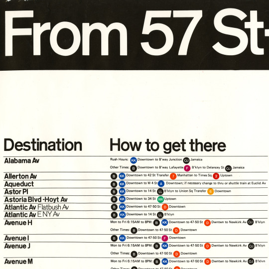
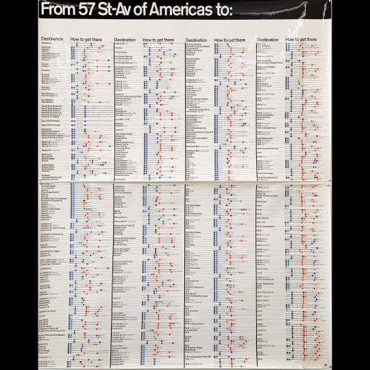
The NYC subway map that never was. Or at least it was never implemented.
The NYC Subway graphics are some of the most requested artifacts from the Vignelli archives. We acquired this unique “verbal map” aka “The Directory” aka the “How to get there” map in 2022. Our archivist put it on display for the first time in 50 years at our Open Houses in September 2022!
“The Verbal Map described how to reach a destination, which train to get, where to change, and when to get out.” – Massimo Vignelli [comment on Michael Bierut’s essay “Mr. Vignelli Map” for Design Observer]
Printed on very glossy paper in full color, this map is large like the station size maps. Printed in two parts [top and bottom] each half measuring 29.5” x 47.5”.
In the Graphic Standards Manual on Page 3 “Diagram of Basic Sign Distribution” it describes the various maps to be installed:
Maps: System maps (implemented, the famous one),
neighborhood map (not implemented),
‘How to get there’ map (not implemented but we have the prototype!)
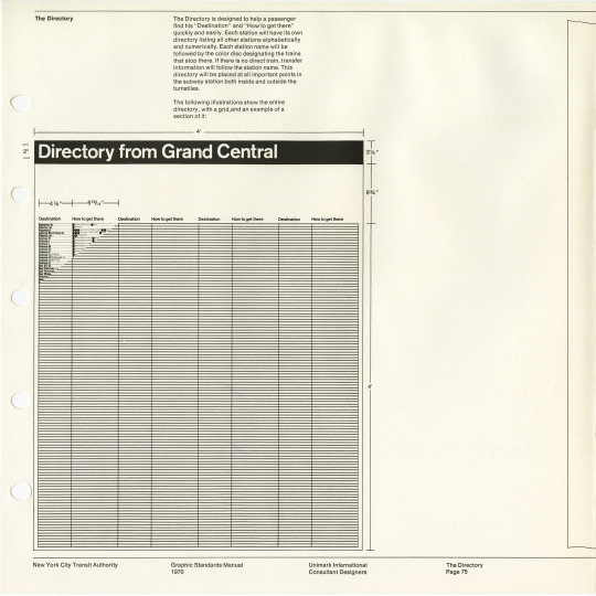
From the Graphics Standards Manual on page 75, “The Directory”:
“The directory is designed to help a passenger find his “Destination” and “How to get there” quickly and easily. Each station will have its own directory listing all other station alphabetically and numerically. Each station will be followed by the color disc designating he trains that stop there. If there is no direct train, transfer information will follow the station name. This directory will be placed at all important points in the subways station both inside and outside the turnstiles.”
We also have the Dekalb Av Signage Study “analyzed and completed by Joan Charysyn and Virginia Macintosh” for Unimark International in 1971 which shows a mockup of the various maps and states “A directory and three maps will eventually be in use in all subway stations.”
Be sure to join us for our next Open Houses and see what other surprises you can discover! Learn more opn our events page: https://www.rit.edu/events/vignelli-center-spring-open-house
Image descriptions:
Detail of “verbal map” aka “The Directory” aka the “How to get there” map
image of entire map
Video clip of map
Photo of Open Houses with logo
vintage 35mm slide of detail of “verbal map”
NYCTA Graphics Standards Manual pg. 75 “The Directory”
NYCTA Graphics Standards Manual pg. 75 “The Directory”
Slideshow of Dekalb St study: coversheet, Directory from Grand Central, System Map, Neighborhood map, and 5 Boroughs map
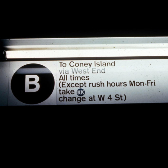
Vintage 35mm slide of 57th Street station signage
Vintage 35mm slides of 57th Street station signage
26 notes
·
View notes
Text
Michael Bierut: “Not everything is design. But design is about everything. So do yourself a favor: be ready for anything.” Also true of writing, photography, etc. Reminds me of this Dale Carnegie quote: “To be interesting, be interested.”
3 notes
·
View notes
Note
Hey! I wanted to know what you think is a good example of a design that also has a function (so not just a work of art that exists only for aesthetics). So random lol but doing a poll for a paper im writing
Product design:
Muji by Kenya Hara
Braun by Dieter Rams and look up his 10 rules of design
Crescent Downworks, Champion Sweatshirts, Red Wing boots, Jack Purcell shoes, or other high quality functional clothing
Rolex
Boston Whaler
Land Rover
Massimo Vignelli for Heller
Look for the brand Final Home – hard to find conceptual Japanese brand from early 2000s
In terms of graphic design, I would look to information graphics such as Massimo Vignelli's design systems for the National Parks or the New York MTA, and Michael Bierut has done some similar systems with Pentagram, e.g. the informational kiosks in NYC, and his design thinking is extremely admirable.
Hope that helps!
3 notes
·
View notes
Text


While reading the first reading for this class it made me understand graphic design more. Before coming into this class I wasn’t even sure what this class was particularly about. In the reading, Michael Bierut explains how graphic design is very complex. He explains how graphic design is always a learning process and how you going to go through trials. This made me feel better about my first project because I was nervous about how my work was going to be perceived since I'd never done graphic design before. I think that it's important how Micheal Bierut explains how the graphic design process is, and it's okay to learn after your mistakes and take criticism to improve on your work. I can relate to Micheal when it comes to how he didn’t know what graphic design was at first but he later came to love the works of it.
2 notes
·
View notes
Quote
(...) Every design presentation is inevitably, at least in part, an exercise in bullshit. The design process always combines the pursuit of functional goals with countless intuitive, even irrational decisions. The functional requirements — the house needs a bathroom, the headlines have to be legible, the toothbrush has to fit in your mouth — are concrete and often measurable. The intuitive decisions, on the other hand, are more or less beyond honest explanation.
Michael Bierut
3 notes
·
View notes
Text
ARTS 346 Blog Post #4

Inquiry 4 / Reading
For this project. I wanted to find a way to convey my message without just directly telling you the message. I wanted to make an experience that makes you glance at it and look closer. For the most part, I think I achieved that with the first poster on the three. I do wish I that I would have spent more time on it. I think if I allowed myself more time to experiment and sit with the posters, they would have turned out way different.
The chapter reading kind of spoke to me in that department. I got to see/read the entire process of Michael Bierut's New World Symphony unfold. Having that detailed view on his process changed my perspective on graphic design a little bit. I was under the impression that artists should be able to crank out ideas/projects with ease. But I think artists should have time for trial and error. Micheal says that you have to allow enough time for work to "comfortably unfold", in relation to client work. His work looks very simple, but it took days to refine it to what it is. Its what makes it look "effortless". I think that's what every artist is striving for and I think I should allow myself more time in my creation process.
2 notes
·
View notes
Text

Courtesy of the Association of Registered Graphic Designers, welcome to the DesignThinkers podcast!
“In celebration of 25 years of the DesignThinkers Conference we dig into our archives and reconnect with past speakers about the talks and ideas that have shaped their careers—and the event. You’ll hear from powerhouses such as Paula Scher, Lauren Hom, Michael Bierut, Karin Fong, Sagi Haviv, and Erin Sarofsky — just to name a few.”
Listen
0 notes
Text
Michael Bierut - Graphic Designer | The Creative Influence Ep.13
youtube
0 notes
Text
Notes on Helvetica documentary, reflection on the expressions of aroha posters
Thoughts on Helvetica
Would you use Helvetica in your designs?
In the designs that I produce, be they for academic/work purposes or for pleasure, I would utilise Helvetica as a tool to help communicate a message where the more consistent, streamlined style of sans-serif type would be more warranted.
Would you use Helvetica for one context (type of work/audience) but not another? WHY OR WHY NOT?
I would use Helvetica for a range of different designs & styles of communication, as to cite Jonathan Hoeffler (29:38) it has been used with contrasting connotations of both "cheeky" and "sober", indicating that Helvetica's versatility "invites this sort of open invitation" to be used in many different ways.
However, although I believe Helvetica has proven itself to be a versatile typeface, transcending time, intent and tone, I do also believe that there are instances where its usage may not be warranted. I must cite the testimonies of the documentary from 44:18-46:55. The first of these concerns Rick Poynor stating that "the more the designer uses (those) typographic and graphic solutions, the more familiar, predictable and ultimately dull they become" indicating that Helvetica's overuse has stripped its language and tone away from it over time. Designer Michael Bierut states that when he started in the field, the "one trick in town" was how to best utilise "ABH (Anything But Helvetica)" since Helvetica had been "associated with so many big, faceless things that it had lost all capacity, to (his) eyes at least, to look nice." Bierut's statement adds onto Poynor's stance that Helvetica had become "dull", adding that it no longer possessed the additional appealing qualities that would have otherwise vouched for its wide-reaching usage. Designer Paula Scher states that coming into design herself, corporate design was "persuasively Helvetica" and "looked alike" and "a little fascistic", while stating that from a social stance, she stood opposed to its usage at the time, viewing "the big corporations that were slathered in Helvetica as sponsors of the Vietnam War." For the reasons mentioned, I do approach Helvetica as a whole with a mindset balanced between two opposing viewpoints; although I do appreciate the sleek, refined form of such a sans-serif font, I do, at the same time, think that there should be ample room for design to be lauded as a more experimental art form too, where avant-garde approaches can be lauded in contrast from conformity.
Reflective notes on the expressions of aroha...
Excerpt "Dogwhistle"
The experimentation on this one, trying to emulate the shape/nature of a poi, is something I'd like to continue along the vein of design-wise, whilst maintaining a sort of consistency and legibility. It definitely taps into the curved, slightly distorted aspects of designs I've created before starting this class, and if there's anything I keep consistent from here on out, it may rather be my desire to tap into the experimental. Isn't it ironic?
Excerpt "Resilience on Checkout 7"
I tried to limit my colour palette & expand the amount of negative space in the overall piece, colour coding each line with a particular colour that corresponded to the emotions/sentiment I associated with each one. Overall I do feel like this one could have been a little more spread out & done something a little more to let the negative space act more as a defining, dynamic aspect of the piece as a whole. I do however think that the minimalist aspects of this one could be a further vector of exploring some "less is more" philosophy in my coming works.
Excerpt "Winter Conditions"
"Create outlines" and "envelope distort with mesh" are my lovers. The thought process behind this one was that the cold environment of Auckland nights was one blanketed in dark greys and an air of unfamiliarity, hence the text being envelope distorted beyond its original form. It was an interesting experiment (not really, I've done this many times before) and although I am a big fan of the tools I did end up using for this piece, I could have used it as more of a dynamic, moving vector for the plot than simply for show as parts of it were.
Bibliography:
Hustwit, G. (2007) Helvetica [Video]. Kanopy https://www.kanopy.com/en/aut/video/2874825
Gildea, A.M. (2022) Dogwhistle. Best New Zealand Poems. https://www.bestnewzealandpoems.org.nz/2022-contents/anahera-maire-gildea/
Brown, J. (2022) Resilience on Checkout 7. Best New Zealand Poems. https://www.bestnewzealandpoems.org.nz/2022-contents/james-brown/
Steven, M. (2022) Winter Conditions. Best New Zealand Poems. https://www.bestnewzealandpoems.org.nz/2022-contents/michael-steven/
0 notes
Photo

Open Houses are back this week! Theme: Photography
Wed 3/22/2023-Thu 3/23/2023 10am-4pm each day. Free and open to all!
Want to see original artifacts from the archives but don’t know where to start? Now you can have a look! No appointment required.
Theme: Photography
The Vignellis’ archives is full of examples of photography. They partnered with photographers again and again in their designs for the artwork in posters, catalogs, and numerous monographs on nature, culture, and even photography itself. Vignelli Associates created graphic identities for photographers and photography exhibitions. We’ll display marketing photographs alongside their actual design artifacts and see for yourself how their thoughtful use of images showcased their designs. The archives contain numerous examples of photo formats from vintage Polaroids to digital images. In some cases, photography is all that survives as record of a design. Join us in highlighting the importance of photography and the Vignellis.
We will have a vintage slide projector straight from the Vignelli Associates office up and running! Stop by and see original slideshows assembled by the Vignellis’ themselves!
As always, our galleries are open to the public and feature the greatest hits of the design work of Massimo and Lella Vignelli. But for the Open Houses, our archivist will be digging deep into the archives to show you one-of-a-kind original sketches and other artifacts of the Vignelli design process. You can see the designs that you know and love, but expect many surprises even if you are a Vignelli “superfan!” Please drop in and stay for a few minutes or stay for hours.
More details about Open Houses can be found on the events page on our website: https://www.rit.edu/events/vignelli-center-open-house-1
Image descriptions:
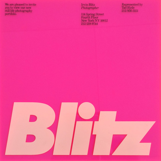
Irvin Blitz graphic identity (invitation on transparent plexiglass), c. 1986, Vignelli Associates (designer: Michael Bierut executed by: Tamar Cohen)
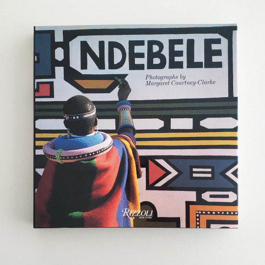
Ndebele: Photographs by Margaret Courtney-Clarke book cover, 1986, book design by Massimo Vignelli
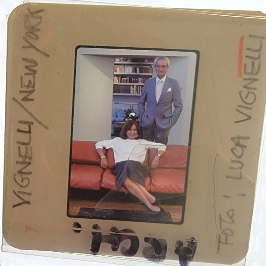
Portrait of Lella and Massimo Vignelli (35mm transparency), c. 1980s, Photographer: Luca Vignelli
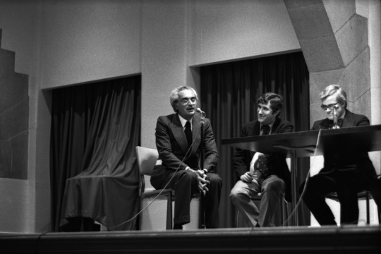
NYC Subway Map Debate (b&w 35mm negative), 1978, Photographer: Stan Ries
Kroin graphic identity examples (35mm transparency), c. 1980s, Photographer: unknown
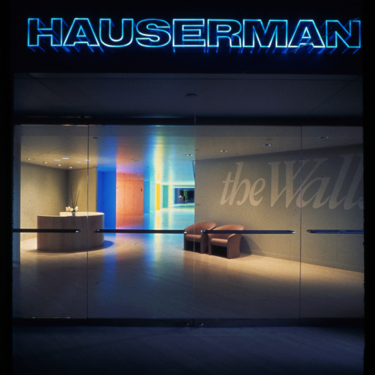
Hauserman Los Angeles showroom (35mm transparency), 1982, Photographer: Toshi Yoshimi
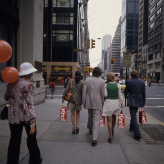
Knoll shopping bags being carried during Designer’s Saturday (35mm transparency), 1973, Photographer: Alessandro De Gregori
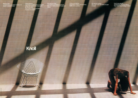
Knoll Bertoia poster, 1979, Photographer: Don Kennedy
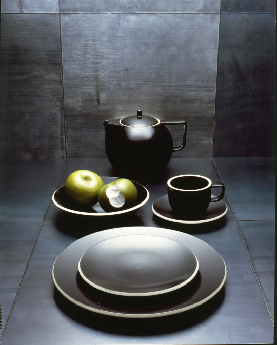
Sasaki Colorstone dishware (4” x 5” color transparency), 1985, Photographer: Luca Vignelli
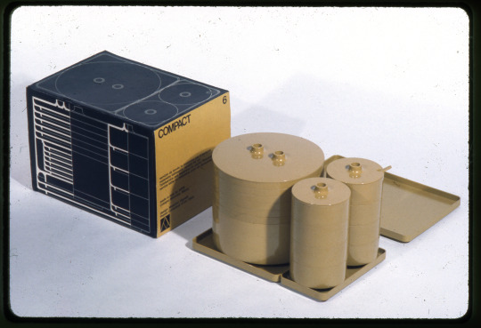
Compact stacking dishware (35mm transparency), 1964, Photographer: Norman McGrath
#vignelli#design archives#design history#photography#graphic design#product design#furniture design#interior design#architectural graphics#open houses#archives for all
57 notes
·
View notes
Text
Helvetica


rough notes
-”Helvetica is like being asked what you think about off white paint it's just there.” (2.10)
-New york city transit signage Massimo Vignelli 1966 (3.20)
-”its like music its not the notes, its the space you put between the notes that makes the music.” (3.30)
-1950s post war idealism attempt to rebuild which becomes the emergence of swiss style with designers such as Karl Gerstner 1957, Armin Hoffman 1959, Max Huber 1957 were experimenting with modernism design.
-1957 helvetica emerges as there felt need for rational typefaces for things such as signs/cooperate identity and this could be done in a legible way. (8)
-using few typefaces to have clear designs and using grids to have order (10.10)
-Helvetica was neutral and that was liked/prefered by some designers.
-Matthew Carter type designer (14.10) horizontal terminals. Original name of Die Neue Haas Grotesk.
-Eduard Hoffman wanted to make a modern version of german 19th century sans serif to make it clean. This was created by Max Miedinger who created helvetica.
-Alfred Hoffman Former Director of Haas Type Foundry (19.00)
-Mike Parker Director of Typographic Development Mergenthaler Linotype USA 1961-1981
-Helvetica is all about the interrelationship of the negative shape the shapes between and within characters.
-haas was a salesman who traveled around switzerland. (21.30)
-stemple hass controlled by lino type
-Otmar Hoefer Director of Font marketing, Linotype
-Bruno Steinert Former managing Director, Linotype
-stemple suggested the name of helvetia which is the latin name for switzerland.making it the swiss typeface.
-Hermann Zapf Type Designer
-Michael Bierut Graphic designer (25.30)
-Life Magazine 1953 visual bad habits of typeface
-Leslie Savan Media Writer government and cooperations love helvetica because on one hand it makes them seem neutral and efficient and on the other its the smoothness of the letters that makes them come off as more accessible, transparent, and accountable which are the key buzz words which these corporations are looking for. (28)
-Tax forms use helvetica, the EPA (environmental protection agency) use helvetica as they want to look clean and official.
-Jonothan Hoefler and Tobias Frere-Jones helvetica is not limited to one thing it can be used for everything which is why it's become so popular. (29.50)
-Gotham Typeface Tobias Frere-Jones 2002 (32)
-its the ultimate typeface
-Erik Spiekermann Typomaniac typography is an extension of words (35.20)
-Helvetica was good at the time but has now become the default typeface.
Erik Spiekermann - ”its like air you have to use it”
-1970 reaction against bland sameness (45.30)
Paula Scher - graphic designer/painter that works with type. (46) (48.30)
-post modernism designers where wanting to get away from the clean lines and slickness
-life images of type (53.40)
-Massimo Vignelli 60s company Unimark looking and this unified composition. Looking at expressive, subjective, and irrational new way of designing. (54)
-70s psychedelic type
-80s confused by postmodernism against helvetica
-David Carson breaking the system exciting/emotional to do subjective and interpretive designs (56)
-raygun magazine experimental designs
-Don't confuse legibility with communication (58.45)
-rise of grunge typography for roughly 5 years
-typography was broken
-Erwin Brinkers, Marieke Stolk, and Danny van den Dungen
-modernism in subversive modernist movements such as dadaism, futurism, and surrealism they went against something.
David Carson - American graphic designer and Emigr
-Michael C. Place using ordinary everyday things to get an emotional response (1.06.00)
Max Miedinger creator of Helvetica type
-Manuel Krebs and Demetri Bruni they like restrictions influenced by graphic designers like Brody Carson and then later Joseph work 60s swiss structured design and reduced and refined elements (1.11.00)
Questions
Would you use helvetica in your designs?
Helvetica when it was first created was a revolutionary typeface. I don’t find that there is anything particularly exciting about it. However I can acknowledge that when it was first created it was what everybody had wanted/dreamed of due to its sleek legible qualities, hence why it quickly became a universal typeface. This is still a key point in new design today. So it could be useful for designs that require simple clean cut type. I would consider using helvetica for certain designs but I would tend to lean towards a more artistic, striking typefaces depending on the purpose of the design.
Would you use helvetica for one context (type of work/audience) but not another? Why or why not?
I may lean towards using Helvetica for certain purposes e.g advertising if I wanted a familiar, neutral, and legible look that the viewers/audience would already be comfortable with.
1 note
·
View note
Text
Helvetica Movie Week 3
Helvetica to me does have a scene of being timeless, it is a typeface that doesn't take or add to what you are trying to say. It's like a neutral party. I don’t think I would use Helvetica in my poster designs for a few reasons. One because I want the typeface to add a layer to what I'm trying to say, because my poster is about myself and my experience in New Zealand, Helvetica has no meaning to me and doesn't speak to me like I want the typeface I choose would. The type of work it is good for is something like a political party's posters and signage as it is neutral or signage for bathrooms. It is a typeface that doesn't try to intrigue and pull you in to read, it is just there. Michael Bierut a graphic designer says at 2:10 "It seems like air, it seems like gravity." Which reforms what I think of it too.
0 notes
Last Seen Blogs

swisskickboxingacademy
Herzlich Willkommen!

cursedzebra
Cursed Zebra

cree-n-jewish-thoughts
My Knees Will Not Tremble For You

playing-with-fire01
Pleasure and Obsession

aisy-shopstore
Aisy shopstore