#Module1
Explore tagged Tumblr posts
Visit Tumblr Blog
Explore Tumblr blogs with no restrictions, modern design and the best experience.
Last Seen Tumblr Blogs


Fun Fact
Tumblr posted its first advertisements in May 2012 and subsequently earned $13M in revenue.
Text


Image 1 - Mystique Belgian Chocolate Packaging: The packaging is designed to convey a sense of luxury and quality. The gold foil accents suggest an exotic and premium chocolate experience. The inclusion of the Belgian flag color indicates the origin, known for high-quality chocolate. The cocoa percentage is prominently displayed, catering to consumers who are specific about the intensity of their chocolate.
Image 2 - Caution Wet Floor Sign: This is a standard safety sign used to warn about slippery surfaces. The bright yellow color is used for high visibility and to draw immediate attention. The bold, capitalized "CAUTION" text and the universally recognized triangular warning symbol with a person slipping denote the purpose of the sign even from a distance. This sign is a good example of functional design that prioritizes clear communication over aesthetic considerations.
Image 3 - Ice Breakers Ice Cubes Gum Container: The container features a vibrant and refreshing design, with cool blues and whites to represent the peppermint flavor. The use of a clear, icy motif, along with the image of ice cubes, reinforces the product's promise of a burst of freshness. The branding is clear and modern, appealing to a young, energetic demographic.
Image 4 - Clorox Disinfecting Wipes Canister Container: This product packaging uses the recognizable Clorox brand colors of blue and white, with a hint of yellow to suggest the lemon scent. The label communicates effectiveness with phrases like "Kills 99.9% of Viruses & Bacteria," which is especially reassuring in a health-conscious market. The packaging is practical, with a focus on the ease of use and the benefits of the product.
Image 5 - Spartans Banner: The banner uses the school colors and the Spartan helmet logo to represent Michigan State University. The message "WE ARE SPARTANS OF A BETTER TOMORROW. SPARTANS WILL." is inspirational, suggesting that the students and community strive for improvement and success. The design is simple yet effective, with a clear message that aligns with the university's branding.
These descriptions highlight the varying objectives of graphic design in different contexts, from selling a product to communicating a hazard to inspiring a community. Each design balances aesthetics with functionality to achieve its specific purpose.
2 notes
·
View notes
Text
different career paths in Data Science
It seems like the path to becoming a Data Scientist is very blurry...meaning there are tons of different pathways that lead here. A lot of STEM people seem to find their way to Data Science, since a lot of same job opportunities that STEM people have usually involve similar responsibilities. BUT do not lose hope, even Psychology students, and I even know a personal trainer dude who is transitioning to Data Science, all you really need is CURIOSITY and WILLPOWER to learn new skills and tool.
0 notes
Text


1) image of two hands poised to high five bookending the 5.00% apy on the checking account, use of symbols and typography to promote the checking account
2) get out & go over a boat leaving a wake, evocative of feeling free and being on the water. Poster is designed to encourage people to take out a loan to feel that feeling for real
3) two bandaids are arranged a heart, indicative of both health and compassion. With the caption, the stickers message is that getting the vaccine is the healthy and compassionate thing to do
4) poster in the style of old timey travel fliers, but for a fictional location in a book. Imagery and text are intriguing and mysterious, with cool tones. Designed to make the reader want to go there, or at least learn more, both options lead them to read the book
5) box that a package arrived in, company is called dragonsteel. Logo is symbolic of dragons and swords, and also the letter s. Design on the side is evocative of dragon scales
0 notes
Text
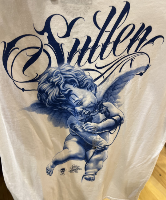


Image 1: It is a picture of a shirt I saw while shopping at Buckle. The lettering above the angel is the brand of the shirt and the typography is very distinguished and unique to that brand, you see that typography and you associate it with the brand.
Image 2: This is a picture I took while volunteering at Ronald McDonald House. There logo can be seen in the left corner, it has the icon clown arm and hand and also the colors that represent McDonald's red and yellow.
Image 3: Anyone But You is a movie that I saw a while back but the poster for it is still up. The poster provided just enough information for the audience to be integrated and go in and watch it.
Image 4: This is an image and text that is displayed in Tesla when you turn the A/C on without the key in the car. The typography and white balloon dog is very known to be Tesla.
Image 5: This is the front cover of my physics book, the cover offers a bit of insight of what lies being the cover.
1 note
·
View note
Text

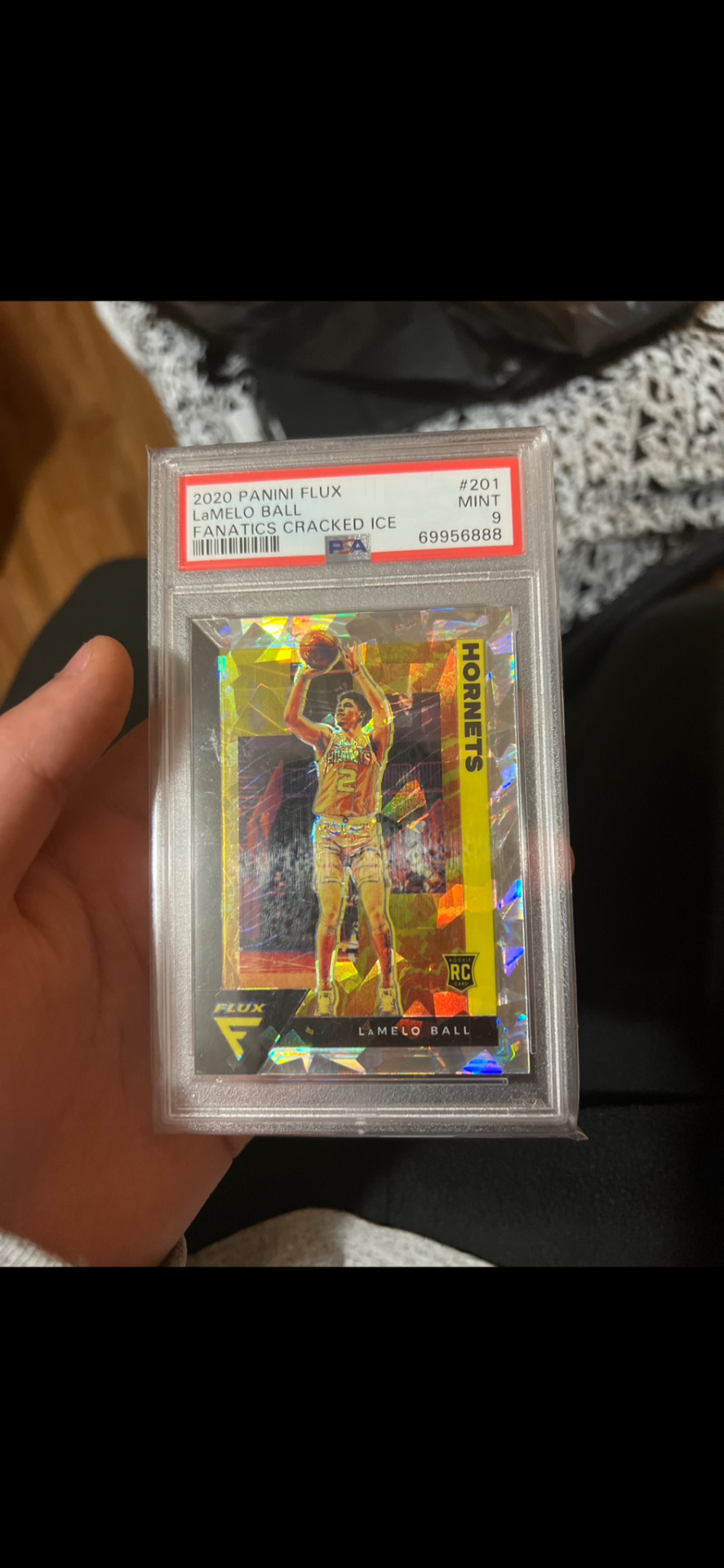
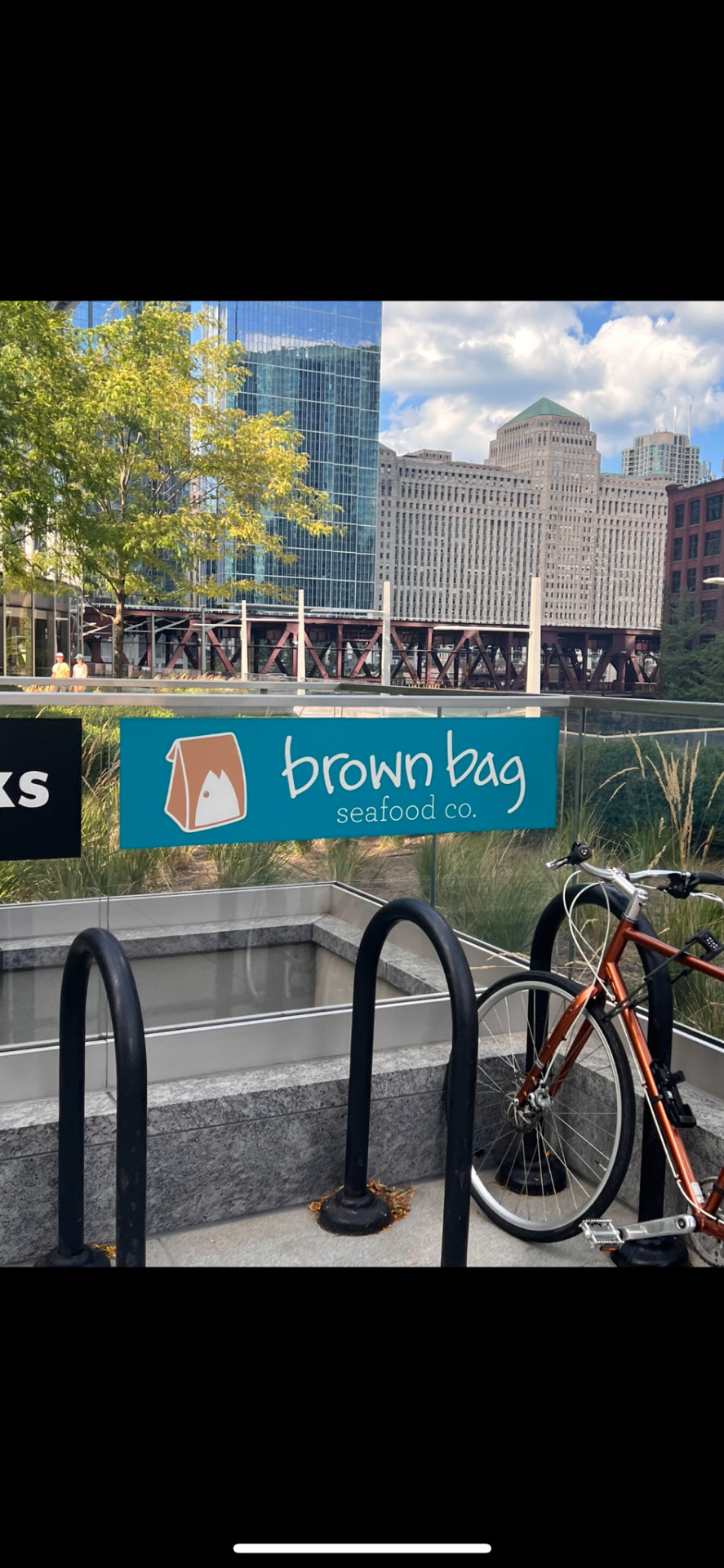


Image 1: Hot Wheels - This is a Hot Wheels toy cover where it shows their logo across the packaging with a big print of the car that is in the card. This text and design is meant to explain the car such as the model and which category it belongs in.
Image 2: Sports Card - This is a sports card. The card itself is very creative and appealing but there is also a design in which what is called “PSA Grading,” the top red part of the card. This is on cards that get graded.
Image 3: This was a sign that I saw for a restaurant while walking in Chicago. It is an advertisement and the logo and name itself are graphic design.
Image 4: This is a ZBar, which shows a visual with the flavor. Also, shows nutritional labels which is an aspect of design.
Image 5: Book Cover - This is a cover of the 48 Laws of Power. The colors go well together and you see the title is vertical showing text and letter placement.
#module1 #gd260
1 note
·
View note
Text
IT'S THE WAY YOU ACT. . .
Social Media plays a huge role in how someone people perceive a certain person. It's called self-branding look it up, sweetheart. Though these posts are completely unrelated topics we see how influential the way someone presents themselves on social media can impact if people choose to like the creator or not.
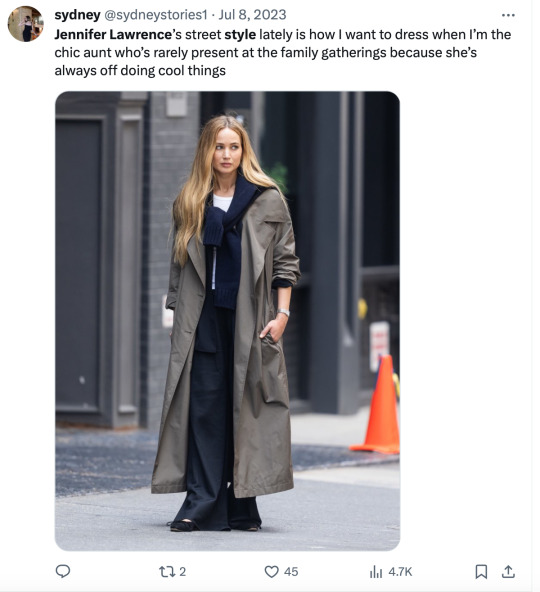
To give some context the first post is something I personally saw an influx of. People talking about Jennifer Lawrence's new wardrobe and how she has rebranded herself. Gone are the "Hunger Games' days where people would wonder what outfit she would wear, and what would be a hit versus a miss. Lately, all Jennifer has done is hit. After getting a new stylist and rebranding her image people have again begun to love Lawerence. She has become a topic of conversation and it is because of her rebranding in a positive way. People enjoy the "old money" vibe she gives and she hits all viewership demographics. It only makes you wonder what she will wear next? What pieces of her outfits could be duped to create your own similar style. This type of social media awareness can bring positive light to a person's social media presences.
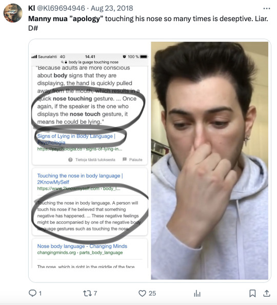
Alternatively on the other side we see makeup artist Manny MUA. Who after a scandal with another beauty influencer with a lot of fans was called out on his lack of authenticity in his apology. After having posted a photo with his group of friends that seemed to diss influencer Jeffree Starr people quickly back lashed Manny and his other influencer friends. Due to this public outrage Manny partnered with his publicist to apologize in a Youtube video that people thought was fake and unauthentic. Body language of touching his face, reading off the screen and fake tears caused people to create a cancel culture against Manny MUA. Again we see the power of how you represent yourself on social media can impact the viewership people have towards your brand.
1 note
·
View note
Text
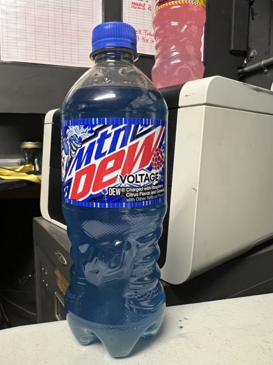
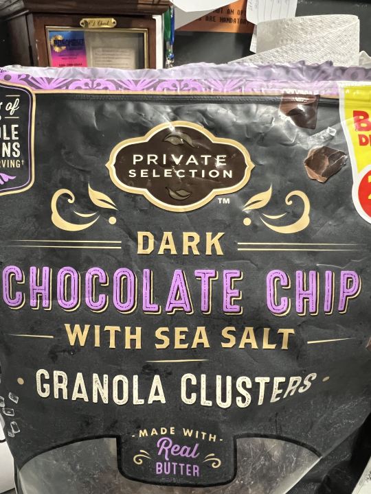
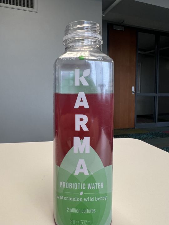
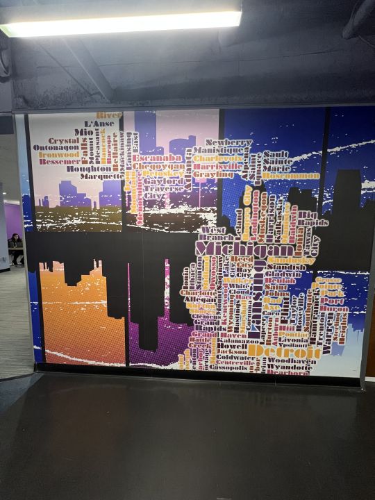
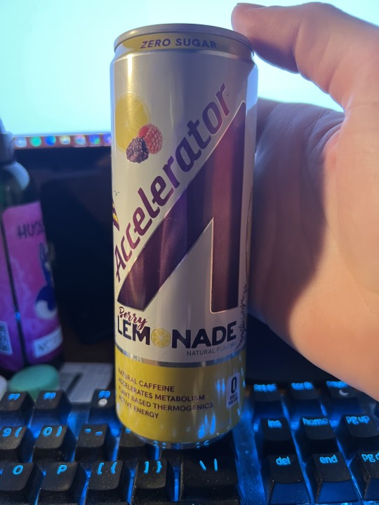
Image One: In the first image, we have a bottle of Mtn Dew Voltage. The graphic design shown in the logo where it says voltage shows sharp edges reminiscent of lightning or electricity. Sharp diagonal edges also are used in the font of the text, along with bold lettering to give a electric feel.
Image Two: The graphic design in this image is shown in the flowing lines of the logo to give off elegant and luxury energies to fit the brand name of, "Private Selection". It also uses flowing lines reminiscent of Art Deco design which is commonly used in high luxury applications.
Image Three: In this image, part of the logo of Karma is the spreading leaf at the bottom to give the message of health, as greenery and plants on packaging is used to insinuate a natural or healthy product. Another fun fact is once the flavor is added in, the liquid turns red and the contrast between the green logo and the red liquid signifies a watermelon's colors.
Image Four: In this image, the cities of Michigan are sized and placed in their general geographic locations to create the shape of the state of Michigan.
Image Five: As mentioned prior, sharp diagonal lines signify movement which is characteristic of the message energy drinks want to show. Another very interesting detail about the image is the main logo is shaped like a car gas pedal which is where the name, "Accelerator" fits. It also looks like an abstract version of a capital A.
1 note
·
View note
Text


Picture 1: The first image is a plastic cup I got at a cafe. The design of the cup uses the word recycle in different languages, plastered around the cup. This bold and clear typography makes the graphic easy to read. By having the word written in languages also makes it inclusive to all cultures.
Picture 2: The second is a MSU graphic poster that talks about "Winter Blues". The illustration of a sad squirrel in winter apparel instantly conveys the graphic message. The bold and colored font also makes the information easy to read.
Picture 3: The third picture is the Amazon prime logo stickered on a shipping box. The logo's blue font allows it to stand out from the black background. An arrow makes the logo look like a smile, but also conveys the idea of Amazon shipping from one location to another.
Picture 4: The fourth image is the box for Blackwing 602 pencil. The front side shows the name of the pencil in a clear and understandable font. The Blackwing logo is isolated at the bottom. The left side of the box shows a minimalist line design that also high lights the letter B.
Picture 5: The last image is a sign shows writes "filtered water". The font is white, clear, and easy to read. It also shows the symbol of a water drop with an arrow moving up the side to represent the recycled aspect of the water.
#module1
1 note
·
View note
Text


Image 1: This chocolate chip bar focuses on the iconic KitKat, utilizing the classic red packaging. The design emphasizes the brand's recognizable logo and highlights the visual appeal of the product. Graphic elements convey the traditional and well-loved features of KitKat, showcasing the power of design in creating a memorable and instantly recognizable product identity. Image 2: The Milka chocolate chip bar takes center stage with its signature purple packaging and indulgent imagery. The design showcases the Milka logo and emphasizes the smooth and creamy qualities of the chocolate. Through thoughtful graphic elements, this design captures the luxurious and delightful aspects of Milka, underlining the role of design in communicating the unique identity of the brand. Image 3: The vibrant green background, synonymous with highway information, instantly conveys a sense of navigation. The attention to detail is evident in the crisp lettering and ensuring legibility for drivers. The close-up view emphasizes the rounded corners, a subtle yet purposeful design choice contributing to the overall sleek and modern aesthetic of road signage. Image 4: The structured composition mirrors the grid principles discussed in the book, with orderly elements representing the 'making' aspect. However, the intentional disruption of the grid in certain areas symbolizes the 'breaking' exploration. The interplay between order and chaos on the cover reflects the dynamic nature of design, emphasizing the book's exploration of both adhering to and transcending the traditional grid. Image 5: The muted color palette reflects the gravity of the historical narratives, while the bold typography commands attention. The imagery, carefully chosen to convey the depth of these unsettling histories, invites contemplation. The intentional design seeks to foster awareness and dialogue, emphasizing the importance of acknowledging and understanding the complexities of our collective past.
1 note
·
View note
Text
core attributes of data science
Even though there are 2192301924091820 ways of describing what Data Science means to someone, everyone can agree that Data Science involves hella data analysis. Now not only do we have way too much data collected from us regular folk, we also have super strong computers to run analysis and reveal new insights.
Data Science Project -> Clarify the questions the big man wants answered -> What data do we need and where does it come from? -> Use multiple models to reveal patterns and outliers -> Storytime with fancy data visualization tools to help the board understand the results and recommend stuff
0 notes
Text


Picture 1: A Gogo Squeez box; the box uses a combination of photography and graphic design to illustrate what is included in the box. I believe that the pictures of the apples on unicycles help appeal to children, which is the majority of this product's targeted audience.
Picture 2: A Court of Thornes and Roses(book), this book cover uses red as its background while the title is printed in yellow to contrast/ stand out from the background. This book also includes a picture of a creature printed in a unique and old art style.
Picture 3: UX textbook, the textbook has a geometric-focused design, that includes a variety of colors. The design helps complement the title very well, as the depth placed in the shapes makes it harder to see how big the "room" is when compared to the person sitting down on the edge of one of the shapes.
Picture 4: My laptop cover; my cover includes various types of stickers that each have their own art style. Some of them are very minimalistic, while others are very illustrative which helps describe the stories behind them.
Picture 5: A concert poster; the poster has a retro/ vintage design. It follows a very "out of the box" theme, that helps to make it stand out. It is also typography-based, as it only includes two colors throughout the poster.
1 note
·
View note
Text


1: Jimmy Johns Typography Graphic Design for their popular Kickin' Ranch. Uses colors to catch the eye without making it seem cluttered, does a great job of explaining the product in an appealing way.
2. Arabic/Spanish childrens book cover, Uses fun typography, colors, shapes, and images, to portray the point of the book in a fun way to grab the audiences attention.
3. Raos jar, uses bold typography, while making use of imagery in a way that conveys tradition within the product (using an old looking family owned italian restaurant). Keeps it simple, yet portrays the product well.
4. liquid death cans: Clearly the graphic design team took their job seriously with the liquid death graphic design on the cans. There is immense detail on the can from the different colors depending on flavor, the unique typography and imagery as well. They did a great job creating a visual for their brand.
5. Playing cards from budapest hungary, These cards are beautifully designed with graphics that resemble traditional hungarian print, each card is printed very unique as shown on the Ace. A mix of typography and print.
1 note
·
View note
Text


Figure 1: "Origin of Form" uses the form of the sketch to express the similarities between natural design and humanistic design. In this book, most of the pictures are hand-drawn. Figure 2: The interactive posters in the square allow customers to truly participate in the design and have a greater sense of identity. Figure 3: A classic poster that highlights the theme with larger fonts and also shows a very tough feeling. Figure 4: A promotional flyer for a performance. The logo in the upper left corner highlights the location of the performance, and the larger font shows the name of the performance. Figure 5: "When Nature Inspires Technology" also uses hand drawing to express human design. Many inspirations come from animals.
1 note
·
View note
Text


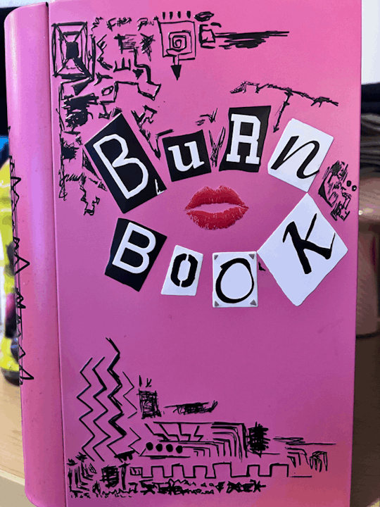
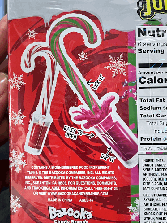

Image 1: Cattleman's meat truck. An advertisement is meant to persuade people to buy or interact with their product. The image of the meat, the font and size of the name, the natural wooden background. I myself, would buy their meat. In fact, I did.
Image 2: A book about crazy faith. The cover of the book persuades anyone to want to read it, especially people who believe in God and are looking for a miracle. The word choice, the authors "crazy" look on his face, the bold colors, the newspaper background. That's probably why I bought it.
Image 3: A "Burn Book" popcorn tin from the movie "Mean Girls." This very unique because it sends different messages and contains a lot of graphic elements: The font size play, the random designs in the corners of the book, and then the lips in the middle.
Image 4: Juicy Drop candy canes. The graphics clearly show that it is for Christmas. They also persuade people to buy it because it looks delicious and makes your mouth water. Then it contains small phrases that show the buyer how simple it is to eat.
Image 5: A case of water. The water graphic on this case makes the water look so refreshing. You might walk in the store to buy water, but this makes you want to open it right away before you buy it.
Overall, I believe that graphic design sends a message and includes elements that further relay the message.
1 note
·
View note
Text


Image #1 - This image captures a curated collection of books in the Michigan State library. This composition reflects the fundamental role of typography in graphic design, showcasing how the careful selection of fonts and layout contributes to conveying information effectively and aesthetically. It leaves a visual impact.
Image #2 - This vibrant poster I saw at a store features Spiderman and Green Goblin, serves as a visual pleaser to the viewer with its dynamic colors and bold pop art/comic style. The strategic use of contrasting hues, dynamic composition and illustrations show key graphic design principles. The poster is able to show the power of color theory and visual elements to captivate and communicate. Makes it more memorable.
Image #3 - In this image it's a picture of a project I worked on for my Chicano Latino Studies class. It features the theme Hispanic/Latino Culture, accompanied by a picture of person playing guitar . This image underscores the fusion of text and visual in graphic design to convey cultural narratives. The blending information and visual elements to engage and enlighten audiences and diverse cultures.
Image #4 - Graphic design is a great way to demonstrate emotion through creation. Like the image shows a resilient doll, adorned with patches, tears, and a broken heart yet still resiliently smiling. This was a hobby project I had in mind and created. The sign "Good Gone" shows a narrative of endurance amidst challenges. This exemplifies how graphic design serves as a medium of storytelling. This allows emotions and messages to be conveyed visually.
Image #5 - Graphic design is able to pick up two separate things and fuse them to make one. The fusion of culinary and visual storytelling in this example. The illustrations and text not only show case the essence of Korean cuisine but also exemplifies the graphic design's role in making the culinary experience visually enticing. The page where it shows "Intro to Korean barbecue" recipe demonstrates how gd transcends cultural boundaries, providing a universal language that enhances our connection to diverse cuisines and traditions.
1 note
·
View note
