#Photo Viewers for Windows 10
Explore tagged Tumblr posts
Visit Tumblr Blog
Explore Tumblr blogs with no restrictions, modern design and the best experience.
Last Seen Tumblr Blogs


Fun Fact
There are dozens of funny blogs to kill time on Tumblr.
Text
Bro, Windows Photo App ain't working 😖

Rekindling my love of Windows Photo Gallery instead 🥰

#microsoft windows#windows photo gallery#microsoft#windows photo viewer#windows 10#windows update#old software
0 notes
Text
So. Funny thing happened last week. I had a video file that wouldn't play on my freshly installed fedora. I installed libavcodec-freeworld and it worked.
5 days later I'm at my gf's, we're trying to watch a show we pirated (<3) and it doesn't play on VLC on windows 10 (11?). She opens it in Photos (or whatever is the media viewer nowadays). And how helpful! It says "hii :33 you have to install a codec for this!"
thanks! Let's go to the ms store and install it! I don't like windows for some things but I have to admit in some other areas we could learn fro-
It's paid. You have to pay. To install the hevc codec. To watch a video file on your computer. How the fuck
192 notes
·
View notes
Note
please never stop talking about loverboy phil
anon i do everything for you
thinking abt how phil was there when dan dropped out of law school. thinking abt how phil argued to bring dan on the jamaica trip that dan was not supposed to be on originally so phil could be with him. thinking about how dan comes to the lesters for the holidays, "tagged along to a lester thing", how dan came to phil's family home and how phil's family accepted dan with open arms. how hyper and annoying dan is in some of the younger era videos (like old cooking videos, the tree etc) and how it makes phil smile. how phil bought him a tonberry and bought him that fancy candle and won him a plush from a claw machine. how phil keeps bringing up dan's solo work not even just in the videos focused on them (think haircut vid, dan is leaving me, etc) but in all other videos-- like dan's book kept getting brought up by phil. an underrated moment in wdapteo 2 that i think about CONSTANTLY is the fact that at the end phil plugs some of dan's merch too and does his little smile as he does. "for treating us with your presence". how in the date night video when asked what animal dan would be phil immediately went with bear. wdapteo 3 where phil is wearing one of dan's viewers pick my outfit sweaters, and how we would see years later that phil took like 100 silly photos of dan in the minion fit from that video (which proves my belief that half of phil's camera roll is just dan). how dan walks faster and ahead of phil but phil takes photos while dan is walking like the one in türkiye. how phil made him spaghetti when he was ill. how constantly phil talks about dan needing to wear color. him hyping up gay but not proud (and also BEING in gay but not proud). him being in the audience of dan's one off comedy routine about being gay. him being in the we're all doomed audience. him probably being dan's first subscriber. love eyes lester which is SO LETHAL it's so lethal. how dan will ramble and get annoyed at phil and phil will just giggle and laugh. phil playing with dan's hair. "you > everyone in the universe." the recent press the button video where phil said (when given the option to live forever alongside all of his now immortal loved ones) that dan would be immortal. "i haven't seen you for 10 hours i wanted to tell you about my lexicon". texting dan nonsense in wdapteo 4 for 3 days straight and not receiving a reply and pouting about it. taking the photo outside his window when dan asked to see if he could see him. being endlessly the no.1 sister daniel fan, accepting dan's experimentation with sister daniel relentlessly. there's so many more. there's so many more.
i'm really normal about htis by the way.
358 notes
·
View notes
Text
Dan and Phil 2025 predictions
(I didn’t come up with all these on my own)
1. Dan and Phil get a dog
2. Dan and / or Phil actually join only fans and donate the money to a good cause
3. Dan uploads to his channel
4. Dan video essay about gender
5. Divorce joke on the gaming channel
6. Dan and Phil play it takes 2
7. Phil gets a tattoo
8. Dan and Phil start live streaming again
9. Slutty Dan photo shoot
10. “Our room” mentioned casually
11. Viewers pick our outfits (please please please please) - they dress as Bert and Ernie
12. Phil solo project
13. Dan and Phil ghost hunting video
14. They finally put windows on the sims house
15. Super blurry far away video of them kissing is caught
16. Dan gives up on the phullet and we all cry
17. Slutty Phil outfit or Halloween costume
18. “Our niece”
19. Dan comes up with another devastating metaphor for him and Phil
20. Another tortoise metaphor mention
21. Another medical emergency
22. Dan blames us for another thing he said
23. Dan and Phil react to 2009 tweets and dailybooths (I would die)
24. Dan reads the dan is philslion doc on a livestream
25. Dan and Phil recreate fan fiction video
26. Pride merch!
27. They go to pride together
28. They join Bluesky finally
29. Dab and Evan have a baby
30. Another story that doesn’t make sense unless they were kissing
31. Day in the life of Dan and Phil where is starts with them in bed together
#phan#dan and phil#dnp#dip and pip#amazingphil#daniel howell#phil lester#danisnotonfire#dan howell#dnpgames#danandphilgames#dan and phil 2025#I have so many more but didn’t want to make it too long
74 notes
·
View notes
Text
HUGE M*A*S*H NEWS!
Direct of the MASH Matters Facebook Page

M*A*S*H: THE COMEDY THAT CHANGED TELEVISION, AN ALL-NEW TWO-HOUR CELEBRATION OF TELEVISION’S MOST INFLUENTIAL SITCOM
NEW ORIGINAL SPECIAL AIRS MONDAY, JANUARY 1, ON FOX
Featuring New Interviews with Cast Members Alan Alda, Gary Burghoff,
William Christopher, Jamie Farr, Mike Farrell, Wayne Rogers and Loretta Swit,
as well as Original Series Executive Producers Gene Reynolds and Burt Metcalfe
Plus Rarely-Seen Archival Interviews with Writer/Producer Larry Gelbart,
and Stars Larry Linville, Harry Morgan, McLean Stevenson and David Ogden Stiers
In the all-new two-hour special, M*A*S*H: The Comedy That Changed Television, premiering Monday, January 1 (8:00-10:00 PM ET/PT) on FOX, join the men and women who made M*A*S*H as they celebrate one of the most beloved, enduringly popular, often quoted and influential comedies ever created.
As the definitive look at the 14-time Emmy-winning television classic, the special centers around new interviews with original cast members Alan Alda (Capt. Benjamin Franklin "Hawkeye" Pierce), Gary Burghoff (Cpl. Walter "Radar" O'Reilly), William Christopher (Father Francis Mulcahy), Jamie Farr (Cpl./Sgt. Maxwell Q. "Max" Klinger), Mike Farrell (Capt. B.J. Hunnicutt), Wayne Rogers (Capt. "Trapper" John McIntyre) and Loretta Swit (Maj. Margaret "Hot Lips" Houlihan) and series executive producers Gene Reynolds and Burt Metcalfe. In these intimate, highly personal remembrances, the creation and evolution of the show’s iconic characters are revealed, alongside rare and never-before-seen behind-the-scenes footage, photos and stories.
Writer/producer Larry Gelbart, as well as additional series stars Larry Linville (Maj. Frank Burns), Harry Morgan (Col. Sherman T. Potter), McLean Stevenson (Lt. Col. Henry Blake) and David Ogden Stiers (Maj. Charles Emerson Winchester III) are remembered through a vibrant collection of clips from the series as well as in rarely-seen archival interviews. With unique experiences, observations and memories from 11 seasons of M*A*S*H, this special will make audiences laugh, touch their heartstrings, and leave them on a nostalgic high while celebrating the sustained brilliance of the iconic sitcom.
“M*A*S*H is not only a great television series, it is a cultural phenomenon. It has made multiple generations of viewers laugh, cry and think, often in the same episode,” said Executive Producers John Scheinfeld and Andy Kaplan. “We are excited to team with FOX to create this unprecedented window into an innovative television classic.”
"M*A*S*H is among the most iconic sitcoms in the annals of television history. It's a timeless show that comedically captures the 4077th medical corps and how they managed to maintain their sanity while saving lives on the front lines of the Korean War,” said Dan Harrison, EVP, Program Planning & Content Strategy, FOX Entertainment. “Larry Gelbart, Gene Reynolds and Burt Metcalfe brought this incredible comedy to life thanks to their ensemble cast led by the incomparable Alan Alda. FOX is proud to celebrate the landmark achievements of one of the best comedies ever created."
The M*A*S*H two-and-a-half-hour series finale that first aired on CBS in 1983 remains the highest rated telecast in television history, delivering an incredible 77 audience share and 60.2 rating. To-date, the show has never left the air, continuously running in syndication, on basic cable and now streaming on Hulu. The series was produced by 20th Television.
M*A*S*H: The Comedy That Changed Television is directed by John Scheinfeld (Reinventing Elvis: The ’68 Comeback, The U.S. vs. John Lennon and What The Hell Happened To Blood, Sweat & Tears?) with Scheinfeld and Andy Kaplan as Executive Producers.
Viewers can watch M*A*S*H: The Comedy That Changed Television next day on Hulu, Fox.com, On Demand and FOX Entertainment’s streaming platform, Tubi. On Demand is available for customers of Cox Contour TV, DIRECTV, DISH, fuboTV, Hulu + Live TV, Optimum, Spectrum, Verizon FiOS, XFINITY, YouTube TV and many more.
#m*a*s*h#mash#mash 4077#m*a*s*h 4077#hawkeye pierce#mash4077#alan alda#trapper john mcintyre#mike farrell#wayne rogers
91 notes
·
View notes
Text
The suspected gunman in a violent shooting at a Target store in downtown Los Angeles was arrested Tuesday, just a few short blocks from where the crime occurred.
The unidentified suspect, who police referred to as a person of interest, was arrested after an hourslong standoff at an apartment building on the 1200 block of Ingraham Street in the Westlake District.
Police say the suspect barricaded himself inside the apartment as officers attempted to serve a warrant at the residence. Viewer footage from the scene showed several broken windows and KTLA’s Chris Wolfe reported several canisters of tear gas were delivered into the man’s makeshift bunker.
Images later shared with KTLA showed a person being detained at the scene surrounded by several heavily armed officers, including special enforcement bureau officers wearing gas masks.
The arrest came hours after the Los Angeles Police Department held a press conference to discuss the ongoing search and released the first images of the gunman, who shot two security guards at the Target store located in the FigAt7th shopping mall.
According to police, the suspect, a man believed to be in his early 20s, shot the two security guards after they confronted him for shoplifting.
The suspect entered the store carrying a briefcase and filled it with stolen items before walking past the registers without paying, police officials said during a Tuesday press conference.
“He was confronted by the security guards outside the Target where a confrontation ensued,” LAPD Capt. Raul Jovel said. “During that scuffle, the suspect produced a pistol and began firing indiscriminately, shooting two people.”
Police also confirmed that one of the two security guards was armed and exchanged gunfire with the assailant. “This was a gunfight,” Jovel added.
At least 10 rounds were fired between the two with several walls hit. At the time of their afternoon press conference, LAPD officials said it was unclear if the gunman was hit by return fire.
Photos shared by LAPD Tuesday morning showed the man who fired and struck the two security guards. He was described as being between 5 feet 8 inches and 6 feet tall and weighing around 160 pounds. At the time of the shooting, he was wearing a black jacket, purple scarf, gray pants and a black do-rag.
The man’s weapon was described as a 9mm pistol.
Prior to his arrest Tuesday evening, he was considered to be armed and dangerous.
The shooting, which happened around 9 p.m. at a Target store located at 735 S. Figueroa St. in the FigAt7th shopping mall in downtown L.A., left the two security guards hospitalized, one of whom was in critical condition.
During Tuesday’s press conference, LAPD officials provided a positive update, saying that one of the security guards had been released from the hospital.
The armed security guard was employed by the shopping center, police said, while the other works in loss prevention for Target.
FigAt7th said in a statement that the mall was “deeply troubled” by the incident that occurred Monday night and was working closely with police in their investigation.
A statement from Target added that the company was “saddened by this horrible act of violence and our thoughts are with those who were injured, their friends and families.”
The store where the shooting took place remains closed as of Tuesday night, store officials confirmed.
Jovel said the LAPD and its law enforcement partners were committed to combating retail theft as they “strive to make downtown a safe location to visit, live and work at.”
The shooting remains under investigation and anyone with information is urged to contact LAPD Central Robbery Detective Alvarez at 213-833-3750.
2 notes
·
View notes
Text
webp IS technically superior to PNG, as it has lossless compression and makes smaller file sizes than PNG and can make gifs while being the same file type, but there is a very small list of programs that support it, and most of it is either open software or major corporate software like Coreldraw and photoshop. also the windows 10 photo viewer technically doesn't support it, which may have been a big reason as to why its so unpopular
me when i meet the person who created webp files

98K notes
·
View notes
Text
DES303 Week 10 + 11 - No regrets, no regrets
My journey of arduous walks had been a full, hands-on couple of days, and my prototyping had been stalled due to my hectic schedule and some personal circumstances I won't get into; I had a week's worth of coursework to catch up on. A few days had passed since the window for completing my prototyping for the ninth week had closed, and due to unforeseen circumstances, this blog will cover both weeks 10 and 11.
There will be no new explorations this time around; I will just dedicate myself to refining my prototypes to a better state. No time will be wasted on the clock, as I am deep into finalising my prototyping, ready for what comes next. As an old teacher once told me, when you enter your final weeks, you'd better have no regrets, because what's done is done, and there's no turning back. So, no regrets.
A [even more] simplified visual explainer of the game:
Speaking of potential grievances, my grave concern is that my work appears too convoluted to audiences, so I have done another round of chipping away at what is clutter and getting to the core of the structure. Here is the updated system diagram, now without the clutter. It reads and follows up better than the last, at least this time around.

Because of how vital a good mechanics explainer is to a game of my scale, I want to take the time to get it right, even if it feels repetitive. I hope this works better than the intricate systems diagram. Meanwhile, I will put my skills to the test to improve my visual communication skills.
Simple explainer
In this version, I repurposed my images from the previous upload and added captions to help viewers grasp the basic principles of the game without being overly complicated. I focused on removing clutter and showing only what is essential and concise.

The visuals are still under the realm of RPG or tabletop board-game RPG, but localised to Aotearoa from a Tauiwi stance. It shows that by the end of the game, each player should have taken turns rolling the dice and collected at least one card. To be fully functional, group sizes ideally range from 3 to 4, but playing between two people can also be a fun and exciting activity, even in the most ideal of outcomes. After all, who doesn't love a 'multiplayer' session?
Teamwork visual representation:
Recently, I realised I hadn't found a method of communicating how multiple people could join in on a table to play the card game. So, another element was added from a tough Photoshop session. Here is one way of laying the cards out on a table when you are playing with a group of three people.

It looked pleasing to the eye, but the crafting table mat didn't quite fit the design presentation aesthetic for a higher-fidelity visual output, so I went back into Canva and created some templates to use for my photomanipulation.


For the near-final stage, I inserted this template onto my PSD concept design, and here was the result. As a hobbyist photo editor, it always bugs me whenever something is off in the picture. An element of mise-en-scène consistency was what I found lacking, and this was my attempt to rectify that.


Huzzah! What manner of wizardry is this? Cooperation? Blasphemous! This more balanced image explains how the game is played between a group. Think of it as one of the final visual representations of what I want to achieve and its scale.
Reflection:
As I mentioned, schedule imbalances and other outside factors limited my time to complete my prototypes in higher fidelity. I acknowledge the limitations of this prototype, as it is constrained by a time window. I have put in many hours trying to put the final touches on it, and I am still doing so, attempting to make this iteration as close as possible to the final result at the finish line. If I am again, putting on the hat of being critical of my own work, it is far from perfect.
For example, one point is that I am not 100 per cent decided on the curated topics of discussion and whether they are relevant to narrative creations. Given the factored-in circumstances, it's still rudimentary, but I hope there is that element found in the games we love that keeps people engaged and connected. On the positive side, I believe tailoring this proto-game for a younger audience is a more suitable choice.
Aside from those challenges, introducing Te Reo Māori in my card content as an English-dominant language is difficult, not because of language preferences per se. It has to do with my positionality and how my past education has taught me to see systems and patterns through the dominant lens of my country. This pathway is a lifelong process of unlearning to loosen my rigid worldviews, or, as many people would call it, decolonising oneself. I see it as not something that should've reduced lifestyle choices, but a commitment to values and beliefs that benefit all of this land.
Theory:
After a careful evaluation of my work, I concluded that this stage of my prototype would be in better condition if I considered the degree of autonomy that is layered and more profound than just the surface-level addition of having multiple choices of cards. Looking back at last week's article and text, I'll add a revised note that a game's autonomy is defined by the freedom of an autonomous player, which hinges on the intersection of players' freedom, measured by the spatial or systematic openness of the game's rules (Cheung & Ng, 2021).
In basic terms, would I feel I have room to breathe, or would this game suffocate my agency to the point that I have to urge myself to quit and play something else? For my card game, I intentionally used vague language with open-ended questions on each to create room for open interpretation between collaborative partners. It is what many successful games struggle to accomplish, let alone amateur student designers like me. Linking back to the design concepts we have been learning, it is also considered a wicked problem because games not aligning with players' values and expectations, which confines them, is a complex issue caused by more than one variable or system of derailment.
What's next? What remains to be addressed is the dissonance between this prototype and its relevance to the placemaking stream brief. This was due to my time constraints, and I also wanted to take a reasonable amount of time to polish and refine my designs for the final presentation week. So my work didn't look rushed or incomplete. Before presenting my case to the entire class, I need to continue my research and carefully explore how a prototype like this might impact the world. Hypothetically, in addressing wicked problems and the implications of designs, a designer must engage in critical self-reflection. I need to consider complex issues such as public infrastructure, poverty, education, and the climate crisis, and examine how these issues intersect with our daily lives. Additionally, I recognise that my primary demographic for the card game is younger Gen Z. Therefore, my approach has been to focus on their interests without overly catering to broader audiences beyond our core demographic.
References:
Canva. (n.d.). Canva Visual Suite. Retrieved from Canva: https://www.canva.com/
Cheung, S. Y. and Ng, K. Y. (2021). Application of the Educational Game to Enhance Student Learning. Front. Educ. 6:623793. doi: 10.3389/feduc.2021.623793
0 notes
Text
Best practices for using digital signs kiosk during sales and promos

In the modern retail landscape, grabbing customer attention is more competitive than ever. As foot traffic fluctuates and consumer expectations evolve, one tool has risen to prominence for its ability to captivate audiences and drive results: digital sign kiosks.
These dynamic displays are no longer optional; they're a core part of in-store marketing strategy—especially during sales and promotional events. Whether you're launching a new product, offering a limited-time discount, or hosting a holiday blowout, digital signage can make the difference between a browser and a buyer.
In this blog, we’ll explore best practices for using digital sign kiosks to their full potential, from content design to placement strategies, integration with sales efforts, technical maintenance, and performance analysis.
Designing Effective Digital Sign Content for Sales and Promotions
An effective digital sign doesn’t just look good—it sells. Your content must be optimized to grab attention, deliver value, and inspire action, all in a matter of seconds.
Use of Bold, Clear Messaging and Calls to Action
Digital signage is often viewed on the move. That means your messaging needs to be short, sharp, and direct. Use large, bold fonts for key promotional messages like:
“Buy One Get One Free”
“Limited Time Offer – 50% Off”
“Scan Here for a Free Sample”
Include compelling calls to action (CTAs) like “Shop Now,” “Grab Yours,” or “Tap for More Info” to prompt immediate engagement. These CTAs act as psychological triggers, nudging customers toward conversion.
Incorporating High-Quality, Vibrant Visuals
Visual content reigns supreme. High-resolution product photos, animations, and bright color schemes naturally attract more eyes than static text alone. Pair your promotional offers with dynamic visuals—such as rotating banners, gifs, or short videos—that showcase the product or highlight its benefits.
Stick to brand-aligned colors but amplify vibrancy during promotions to differentiate sale content from regular messaging.
Optimizing Content for Readability and Viewing Distance
Readability is key. Ensure:
Font size is legible from 6–10 feet away.
High-contrast colors (like white on blue or yellow on black) enhance visibility.
Clean layouts with plenty of negative space prevent visual clutter.
Place critical information—like discount percentages or dates—at eye level or in the upper third of the screen for quicker recognition.
Leveraging Animated and Video Content Wisely
Motion is magnetic, but less is more when it comes to animation. Use subtle animations—like pulsing CTAs or gently rotating product displays—to draw attention without overwhelming viewers.
Short-form videos (under 15 seconds) are ideal for highlighting limited-time offers or showing a product in action. Ensure autoplay videos start silently, with captions or overlays for clarity.
Placement and Timing Strategies for Digital Sign Kiosks
Even the best content can fall flat if your kiosks are hidden or misaligned with customer flow. Strategic placement and timing are critical for maximizing impact.
Selecting High-Traffic, High-Visibility Locations
Place digital sign kiosks in customer-rich zones, including:
Store entrances: Capture attention the moment shoppers walk in.
Main aisles and promotional zones: Direct foot traffic toward sales items.
Near checkout counters: Promote impulse buys or loyalty rewards.
Mount signage at or slightly above eye level and avoid placing it behind obstacles or near competing distractions (like reflective glass or cluttered shelves).
Scheduling Content Based on Peak Shopping Times
Time-based scheduling increases relevancy and effectiveness. For example:
Display lunch-related promotions from 11 a.m. to 2 p.m.
Run clearance ads during evening hours when budget shoppers frequent the store.
Use historical footfall data to determine peak times and align your most compelling offers with those windows. For multi-day promotions, rotate messages to avoid “ad fatigue.”
Adapting Content Dynamically Based on Real-Time Data
Smart digital signage allows real-time content updates based on:
Inventory levels: Promote overstocked items or remove out-of-stock ads automatically.
Weather or seasonality: Suggest hot coffee on cold days or sunscreen in summer.
Audience data: Use facial detection or loyalty program insights to tailor promotions.
This flexibility ensures your content stays relevant and increases the likelihood of conversions.

Integrating Digital Kiosks with Overall Sales Strategy
For maximum ROI, digital signage must work in harmony with broader marketing goals and in-store efforts.
Coordinating Digital Sign Messages with In-Store Promotions
Align your on-screen promotions with actual offers on the floor. If a shelf has a “20% Off” tag, your kiosk should mirror that message, perhaps with more visual flair or added urgency (“Today Only!”).
Promoting product launches, bundles, or storewide events? Let digital signage build anticipation and guide customer behavior with clear, complementary messaging.
Using Kiosks to Collect Customer Data and Feedback
Interactive digital kiosks can collect valuable insights while enhancing the shopper experience. Examples include:
Surveys: “Rate your shopping experience”
Email collection: “Sign up and get 10% off your next purchase”
Polls: “Which new flavor should we launch next?”
Data from these engagements helps personalize future promotions and strengthen customer relationships.
Training Staff to Support Digital Signage Use
Your signage strategy is only as strong as your team. Ensure staff are:
Familiar with kiosk features
Prepared to assist customers with navigation
Able to interpret kiosk data to optimize merchandising or upselling tactics
Make signage a part of your sales training to fully integrate the technology into your retail culture.
Technical Best Practices for Managing Digital Sign Kiosks
Smooth performance is non-negotiable during critical sales windows. Here's how to keep your digital signage running at full power.
Ensuring Reliable Network Connectivity and Power Supply
Use wired connections where possible for stability. If using Wi-Fi, deploy enterprise-grade routers and redundancy systems.
Backup power solutions (like UPS units) ensure that kiosks remain operational during unexpected outages—protecting both customer experience and promotional momentum.
Regular Content Updates and Quality Checks
Keep your signage content fresh by:
Scheduling weekly or bi-weekly content reviews
Assigning team members to check for spelling errors, outdated offers, or broken links
Using cloud-based CMS platforms to push updates remotely and instantly
Visual content should be optimized for screen resolution and tested across multiple devices before going live.
Implementing Security Measures to Protect Digital Kiosks
Protect customer data and your own system integrity by:
Using encrypted connections and firewalls
Regularly updating kiosk firmware and software
Physically securing the units with locks and tamper-detection features
Include access controls for staff and use monitoring tools to detect and respond to suspicious activity.
Measuring and Analyzing Effectiveness of Digital Signage in Sales and Promotions
Digital sign kiosks provide a wealth of performance data—if you know what to look for.
Tracking Engagement through Interaction Data
For touch-enabled kiosks, track:
Dwell time: How long users engage with your content
Navigation paths: What sections are clicked or ignored
Conversion behaviors: E.g., scan a QR code or sign up for a coupon
These insights help you refine content, improve UX, and prioritize high-performing messages.
Analyzing Sales Uplift Correlated with Digital Sign Campaigns
Use before-and-after comparisons to assess:
Units sold during campaign periods vs. baseline
Revenue generated from featured items
Traffic increase to promoted sections of the store
Some POS systems integrate directly with digital signage platforms, making this analysis even easier.
Gathering Customer Feedback to Enhance Future Promotions
Ask customers directly for input on signage by:
Prompting feedback via touchscreen kiosks
Offering incentives for survey completion
Analyzing open-ended responses for content ideas and improvements
This continuous loop of feedback and optimization ensures your campaigns stay fresh and effective.
Conclusion
Digital sign kiosks are a powerful marketing tool—especially during sales and promotions—but to realize their full potential, they must be approached strategically.
To recap:
Design content that’s visually compelling and action-oriented.
Place kiosks where they’ll make the most impact, and update them based on real-time behavior.
Integrate signage with in-store promotions and staff efforts to create a seamless customer journey.
Maintain your technology to ensure uptime and relevance.
Analyze your results to improve future campaigns.
When used correctly, digital sign kiosks do more than display offers—they elevate the shopping experience, engage customers, and drive significant increases in sales.
#technology#kiosk#selfservicekiosk#kioskmachine#innovation#digitaltransformation#kiosks#ai#customerexperience#panashi
0 notes
Text
Week 10 Contact Sheet Imogen


At the begging of this photoshoot i did not have a clear plan as i was visiting Christchurch and did not have any set locations in mind me and Imogen just walked around the city.
I started by taking some images at the cafe we where getting lunch at but i fount that the natural light was creating too harsher shadows.
Once we started walking around I took photos of Imogen behind any interesting backdrop including the graffiti, plant and city scape.
when taking photos in front of the city scape I wanted to use bokeh to show the disconnection of the place to my subject as the narrative i am trying to tell is a teenage girl moving far away from here family and home town. I also wanted to frame the image using the traffic light and use the road as a leading line into the scene.
I then wanted to show distortion and movement by taking an image using a low shutter and have my subject still while having people moving looking distorted in the background. Unfortunately i could not find a populated area to be able to take an image like that so i improvised and took photos of Imogen beside moving car to still be able to movement and distortion.
I then wanted to take photos inside of Imogen's room I wanted to take images that convey sadness to show the turbulence of emotions of teenagers and the ups and downs of life. to do this i limited the amount of light coming into the room and used a light reflector to bounce the limited amount of light back onto the face and to also minimised harsh shadows. Along with this i Instructed Imogen on how to pose and showed her reference images that I was taking inspiration from. While doing this i also tested out using a coloured blue light to inherence the feeling of sadness.
I wanted to use her room because it is a reflection of yourself it is a very personal space that is your own and it feel very intimate to see it and creates a connection with the viewer it is more intriguing.
I then wanted to try take some more portraits of Imogen. I used a shower curtain to try and diffuse the light coming from her window. I also wanted to covey feelings of anxiety using movement, so I used my tripod and set my camera to a low shutter speed but I found it hard getting the iso correct as the window was letting too much light in and I was not sure what moments Imogen should do to make it too distorted. This images did not come out how I had imagined but i want to try again when I take my images of Ella.
I also wanted to try use a glass of water as a prop to show the perception of self identify and how unclear it is at a young age.
0 notes
Text
PhotoScape X - Free Photo Editor for Mac and Windows 10
Everything you need to edit photos
PhotoScape X is an all-in-one photo editing software which provides photo-related features
such as Photo Viewer, Editor, Cut Out, Batch, Collage, Combine, Create GIF, Color Picker, Screen Capture, RAW images and More
#photo #editor
0 notes
Text
A Complete Guide to OnyxCeph Software Download: Unlocking Digital Orthodontics
What is OnyxCeph Software?
onyxceph software download is a comprehensive imaging and diagnostics software platform for orthodontic and dental professionals. Designed for Windows-based systems, it supports both 2D and 3D image processing, including cephalometric analysis, virtual setups, and aligner staging.
Created by the German company Image Instruments, OnyxCeph is built on a modular architecture that allows practitioners to select only the tools and functions they need, offering flexibility and cost-efficiency.
2. Key Features and Benefits
OnyxCeph offers an impressive suite of features designed to meet the demands of modern orthodontics:
📌 2D Image Management
Import and organize patient photos and radiographs.
Automatic landmark recognition and cephalometric tracing.
Create customizable report templates.
📌 3D Model Management
Import intraoral scans or models in STL/PLY formats.
Segment teeth, perform occlusal analysis, and simulate movement.
Design appliances like aligners and retainers.
📌 Virtual Treatment Planning
Create multi-phase treatment simulations.
Set target occlusion and define step-by-step movement.
Generate output stages for 3D printing or lab workflows.
📌 Cephalometric and Superimposition Tools
Perform various cephalometric analyses (Ricketts, Steiner, etc.).
Compare pre- and post-treatment scans using superimposition.
📌 STL Export and Appliance Design
Export printable files for 3D model production.
Design clear aligners, indirect bonding trays, and splints.
Common Troubleshooting Tips
⚠ Installation Fails or Freezes:
Run installer as admin and disable antivirus temporarily.
Check that your system meets the minimum requirements.
⚠ License Not Detected:
Make sure the USB dongle is inserted properly.
Try a different port or update dongle drivers.
⚠ 3D Tools Not Available:
Ensure your license includes the 3D module.
Contact Image Instruments support for verification.
⚠ Exported Models Misaligned:
Double-check segmentation and arch alignment in OnyxCeph.
Use STL viewer to inspect geometry before printing.
10. Conclusion
The OnyxCeph software download is the gateway to a powerful ecosystem designed to enhance every step of the orthodontic workflow. With tools for imaging, analysis, appliance design, and patient communication, it allows practices to modernize and grow in a competitive landscape.
Unlike generic CAD platforms, OnyxCeph is tailored for clinical applications, offering precision and reliability that dental professionals need. Whether you're planning a full treatment setup or creating models for aligners and retainers, OnyxCeph provides a robust foundation for delivering exceptional patient outcomes.
From integration with advanced slicers like chitubox download to compatibility with popular scanners and printers, OnyxCeph ensures that your practice stays at the cutting edge of digital orthodontics.
0 notes
Text
Windows Color Calibration: A Guide for Artists, Gamers & Perfectionists
PSA: Your screen’s colors are LYING to you. Unless you’ve mastered Windows Auto Color Management, HDR calibration, and ICC profiles, that sunset photo looks radioactive and your game’s shadows are probably sludge-green. Let’s fix that.
The Aero 15X Question: Does Smart Manager Use a Color-Calibrated Profile?
Short answer: Yes, but—
The Aero 15X Smart Manager has presets (sRGB/Adobe RGB) for factory calibration.
Always double-check with Windows color management tools. Trust no one.
Windows Auto Color Management: The Lazy Genius
Auto Color Management Windows 10/11 does the heavy lifting:
Toggle it on: Settings > System > Display > Advanced Display Settings
Lets Windows pick the best ICC color profile for your monitor.
Still confused? Blame your GPU driver.
HDR Calibration: Make Your Screen Go
Turn on Windows 11 HDR: Settings > System > Display > HDR
Run Windows 11 HDR calibration tool (it’s hiding there).
Adjust HDR calibration color saturation until explosions look explodey, not neon vomit.
Debate endlessly: Windows 11 HDR on or off for Netflix? (Spoiler: On for HDR, off for memes.)
Pro Tip: If you own an AMD GPU, AMD Auto HDR upscales SDR content. NVIDIA users get Color Accuracy Mode instead. Choose your fighter.
ICC Profiles: The Secret Sauce
ICC color profiles tell your screen how to not disappoint you.
Find them in Color Management Windows 10/11 (Control Panel > Color Management).
Use an ICC profile viewer to spy on your profile’s secrets.
10-Bit Color: Because 8-Bit is Basic
How to enable 10-bit color Windows 11:
Pray your GPU/monitor supports it.
Settings > System > Display > Advanced Display > Display Adapter Properties
Set Bit Depth to 10-bit.
Flex on peasants still living in 8-bit.
Troubleshooting: When Colors Go Rogue
Windows 11 color profile not working?
Throw out conflicting apps (looking at you, f.lux).
Update GPU drivers. Cry if it doesn’t help.
HDR display calibration looking washed out?
Re-run the Windows calibrate HDR tool in a dark room.
Blame your cheap monitor.
FAQ:
Q: Should I use Windows 11 HDR for Excel? A: Only if you want spreadsheets to blind you.
Q: How do I fix my Aero 15X’s weird colors? A: Reinstall Smart Manager. If that fails, sacrifice a USB drive to the tech gods.
Q: What’s the point of an ICC profile viewer? A: To feel like a hacker while doing nothing useful.
#Windows HDR calibration#Color management Windows 10#ICC profile viewer#Aero 15X Smart Manager#AMD Auto HDR
0 notes
Text
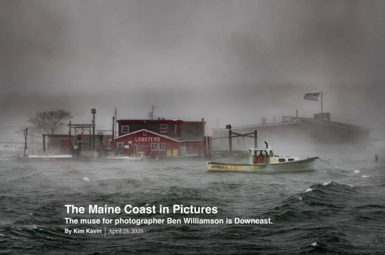
For a guy who takes such captivating photos of boats and coastal maritime settings—especially during ferocious storms—Benjamin Williamson has a surprisingly limited amount of experience being out on the water when the waves kick up and there’s a nasty blow.
He grew up in Mississippi, where he spent a fair bit of his childhood paddling around a lake in a canoe. When he was 16, his family moved to Maine, where he would go out on his father’s 23-foot catboat about 10 or 20 times a year. The family would mostly sail in and around Brunswick, but never when there was any significant breeze. “My mom was always terrified any time we’d heel over in the wind, so we didn’t get to enjoy it that much,” he says. “But I’ve always been on the water.”

Commercial Boats in Portland. Benjamin Williamson
It was in Maine around 2011 that he realized he had a knack for, and then a passion for, photography. He was taking walks around his house in Brunswick when he started picking up a camera for fun. Quickly, he says, he became obsessed.
“It was beautiful beaches and the fishing culture that involves a lot of lobstering,” Williamson says. “The lighthouses drew me in too. I thought those were really unique from an aesthetic perspective and culturally significant for the area. They tell a story about humans caring about each other.”
Taking photos became the only thing he wanted to do, even if his kit was, by most professional standards, quite limited. He started out by shooting with a Canon PowerShot and then upgraded to a Canon Rebel. “I had the lens that it came with, and for two years, that’s all I had for gear, but I would take tons of photos, and I would scour books that I checked out of the library,” he says. “I networked with other photographers and asked a bunch of questions like, ‘How do you edit a photo to make it look better?’”

The Fishing Shack on Bailey Island in Harpswell. Benjamin Williamson
At the time, he was married, but yet to have the three kids who are part of the family today. His wife was in school back then too, so he had time to take photographs and post them online. Within a few years, he got the attention of Down East magazine, whose team started requesting photos and then sending him on assignments. “My first assignment was a good one,” he says. “They sent me to Lubec to photograph a state park. I got lucky with the weather.” In 2016, the magazine offered him the job of staff photographer.
Since 2022, Williamson has been his own boss with Benjamin Williamson Photography. Half his business comes from hosting photography workshops and seminars, with the other half coming from print sales in gift shops, at craft fairs and elsewhere around Maine. Williamson says his specialties are lighthouses and lobster boats. He’s not shooting pure landscape images, he says. “It’s really about the places and spaces where man and nature come together and interact in beautiful ways.”
He has a serious knack for capturing weather events, which have fascinated him ever since he was a child. He remembers being a boy and running to the window when storms came through. He also was a dedicated viewer of The Weather Channel. “As a teenager, when the Internet came around, I would watch what the forecasters were talking about behind the scenes,” he says.
That passion now translates into his photographs, including two of the favorite images he has captured so far. An image (shown above) titled “December 23, 2022 Portland Head Light,” he says, includes “the most dramatic wave I’ve ever seen. That was an absolutely catastrophic storm. After the wave hit, I walked around to the lighthouse and saw lots of damage—a door blown up, a window blown out, the slate walkway washed away. It showed me how powerful these storms are.”

Portland Head Light, Cape Elizabeth. Benjamin Williamson
Another of his favorites is an image titled, simply, “Maine Lightning,” (shown at right). He shot it from the trunk of his car, with the hatchback open to protect him from the storm. It includes a purple-blue sky. “That’s the real color,” he says. “It was late twilight, with a bolt of lightning filling about two-thirds of the frame. It’s so picturesque, the structure of the bolt, the branching nature of it,” Williamson says. “I’ve seen a lot of lightning bolts, but never one that’s almost perfectly symmetrical like that.”
That particular photograph, he adds, is an example of how simply being in the right place at the right time and taking a lot of photographs can often yield an exceptional result. “Mother Nature was the artist for that one,” he says. “I was just lucky enough to be there at the right time to capture it.”

Lightning at Lookout Point in Harpswell. Benjamin Williamson
0 notes
Text
10 Essential Tips for Stunning Baby Photography
Capturing the pure innocence and beauty of a baby through photography is a rewarding yet challenging task. Babies are unpredictable, so preparation and patience are key. Whether you're a professional photographer or a parent looking to take better baby pictures, these essential tips will help you achieve stunning results.
1. Use Natural Light for a Soft, Warm Glow
Lighting is one of the most important aspects of photography. Natural light creates a soft and flattering effect that enhances a baby's delicate features.
Best times for outdoor photos: Early morning or late afternoon (golden hour).
Indoor tips: Position the baby near a large window with sheer curtains to diffuse harsh light.
2. Keep the Background Simple
A clean, uncluttered background helps keep the focus on the baby.
Use neutral-colored blankets, soft fabrics, or a plain wall.
Avoid distracting objects that take attention away from the baby.
3. Capture the Tiny Details
Some of the most touching photos focus on small features like tiny hands, feet, eyelashes, or a soft curl of hair.
Take close-up shots of a baby's fingers wrapped around a parent's hand.
Capture details of a baby’s feet against soft fabric for a timeless look.
4. Get Down to Their Level
Photographing from the baby's eye level creates an intimate and engaging perspective.
Lay on the floor or use a lower angle to make the viewer feel connected to the baby.
Try different angles, including overhead shots of a sleeping baby.
5. Timing is Everything
Babies are happiest when they’re well-rested and fed. Plan your photoshoot accordingly.
Newborns are easiest to photograph when they’re sleepy (typically within the first two weeks).
Older babies are more expressive, so capture their giggles and reactions during playtime.
6. Keep the Baby Comfortable
A happy baby makes for beautiful photos.
Keep the room warm (especially for newborn shoots).
Use soft, breathable fabrics and avoid outfits that might irritate the baby’s skin.
7. Capture Natural Expressions & Candid Moments
The best baby photos often come from natural moments rather than posed ones.
Interact with the baby by making gentle sounds, playing peek-a-boo, or using a favorite toy.
Photograph yawns, tiny smiles, or even a baby’s curiosity as they explore their surroundings.
8. Involve Parents & Siblings
Including family members in the photos makes them more meaningful.
Capture tender moments like a parent’s hand holding the baby’s fingers.
Have siblings lie down next to the baby for an affectionate shot.
9. Use Safe and Gentle Posing
Safety should always come first in baby photography.
Avoid props or positions that require the baby to balance on their own.
Always have a parent or assistant close by when using props or elevated surfaces.
10. Edit with a Soft Touch
Post-processing can enhance baby photos without making them look unnatural.
Use soft tones and avoid heavy filters.
Reduce blemishes carefully while keeping the baby’s natural skin texture intact.
Final Thoughts
Baby photography is all about patience, creativity, and capturing those fleeting, precious moments. By using natural light, keeping the baby comfortable, and focusing on candid expressions, you can create timeless and heartwarming photos that families will cherish forever.
0 notes
Text
This week's assignment was to create a 10-second video with 6 or more moving layers. Like my previous homework, I chose to revisit one of my first projects on Premiere Pro from a class I took when starting my journey with Adobe Projects. The project's theme was to show the transitions between seasons, and I chose to depict the changing weather between winter and spring. To do this, I started by taking an image of a tree in a field and used the photo manipulation capabilities of Photoshop to edit the image to make it look like it had snow on the grass and leaves. Additionally, I also used a noise filter in After Effects to create a snowfall effect to further add to the atmosphere of the wintery landscape. I then created a transition between the seasons by having a build up of frost grow on the screen, mimicking what would happen to a window in cold weather, with said transition then fading away once spring comes in. Upon the frost fading away, the viewer would be exposed to a now lush, green landscape with the leaves on the tree blowing in the wind, via moving separate layers, and having their position being changed just enough to mimic the effect of branches moving in the wind. I also added a sunray effect to further add to the feeling of warmth that spring brings after the cold winters, with the rainbow being added for similar effect. The text for both sides was also a challenge to improve upon as previously they were just simple fonts, and I knew I would have to find a new angle to showcase the skills I have learned over the past few years. To do this, I had the font be showcased on top of frost and flowers for their receptive seasons and added new animations for them that better fit the aesthetic of their respective seasons.
0 notes