#Repetitive patterns (Decorative arts)
Explore tagged Tumblr posts
Visit Tumblr Blog
Explore Tumblr blogs with no restrictions, modern design and the best experience.
Last Seen Tumblr Blogs


Fun Fact
Mobile Tumblr US users spend an average of 4.04 minutes per session on the app.
Video

flickr
Whiting's Standard Papers by MCAD Library Via Flickr: Creator: Will Bradley (American illustrator, 1868-1962) Date: 1896 Materials: color lithograph Measurements: Work type: advertisements; posters Image Description: advertising poster for Whiting Paper Company Image_Filename: 06110115 Subjects: Advertisements; Flowers in Art; Fruit in art
#MCAD#MCAD Library#Art of the Poster#Prints#color lithographs#Posters#Will Bradley#Advertisements#Fruit in art#Poppies in art#Decoration and ornament--Plant forms#Repetitive patterns (Decorative arts)#American#Flowers in art#Graphic design and illustration#Lithography#flickr
0 notes
Text
Little HCs about Gunmar to help him to be a bit more humanized in this AU
He is really sensitive and gets his feelings hurt pretty easily, but he tries to hide it as well as he can.
He enjoys carving and mosaic art.
He loved sleeping under Kára's fluffy tail as a whelp (as well as a little bigger boi too).
This plushie was made because Gunmar was so attached to Kára that he would freak out when she was gone. It was made with her fur, so it had her scent. (He replicated this same technique in a plushie he made for Bular.)


When Gunmar was younger, he had a habit of repetitively rubbing his hands when nervous. His claws left marks on his hands, which he later took engravings to decorate and hide them.


Overall, when he took engravings, he specifically asked for chaotic and asymmetrical patterns because "it fits his style" and more importantly, to hide his natural scars. (+ His "tattoo artist" hates him for his order).
Gunmar is a "helicopter parent".
He got little bit of the "daddy physique" when Bular was small, since he prioritized him a lot.
The Decimaar Blade's grip and pommel were modified by Gunmar to give it more personality and comfort, as well as putting the time spent at working for a blacksmith as a teen to use.


At first, he was scared to taste human meat. He didn't think that a disgusting creature could taste so good.
When he lost his eye, he bumped into things pretty often, until he learned to live without depth perception.
Gunmar enjoys the starry night sky, it reminds him of his father and his obsession with the starmap (that Gunmar got to hear over and over again as a whelp).
He chuffs when he's happy, like tigers.
Sometimes Gunmar loafs when he sleeps.
Anyway, what do you think? Here's all that comes to my mind at 6am...
But if you have any more, I would like to hear them. And if I like them, I can adopt them 😉 (if I may? If that's okay with you?)
- HuttuHarakka
#trollhunters#tales of arcadia#trollhunters au#tales of arcadia au#wicked by nature au#gunmar#gunmar the black#whelp gunmar#trollhunters gunmar#tales of arcadia gunmar#trollhunters headcanon#tales of arcadia headcanon#wicked by nature au / headcanon
80 notes
·
View notes
Text

Dragonfly lamp screen, c. 1910
Tiffany Studios, NYC, USA (dragonfly design attributed to Clara Driscoll)
Leaded glass, 6 3/4 x 10 1/4 in.
The Charles Hosmer Morse Museum of American Art 2004-005
“Hovering and gliding winged insects are commonly attracted to gardens filled with blooming flowers. Tiffany Studios, inspired by such insects’ flight, created decorative glass lamp screens. These screens were suspended from a long chain, which was attached to the finial, or topmost part of a lamp, and intended to hang just below the lower rim of a lampshade. The insect designs—a moth, dragonfly, butterfly, or, at rare times, a winged nymph—were paired with garden-themed shades to soften the light from the harsh lightbulbs of the lamp.
Sold as fancy goods, the lamp screens were made in the same way leaded-glass windows and lampshades were—by employing the keen eye of the glass selector to imagine the glowing colors of each insect. Glass sections were then cut to shape based upon patterns made in copper, so that they could be used in repetition, and joined together using a copper foil technique. In addition to a dragonfly lamp screen, the Museum also has an example of its copper pattern from the family of Tiffany Studios workman Henry Salzer (1879–1943).”
#animals in art#20th century art#art glass#dragonfly#insect#Clara Driscoll#Tiffany Studios#Art Nouveau#Tiffany#1910s#Charles Hosmer Morse Museum of American Art#lamp screen#women artists#American art
22 notes
·
View notes
Text
Nails
Emmet x Reader
Just a little warmup. I wrote this because I, too, have a thing for hands, but also because having pretty nails is something that makes me feel good about myself and I just wanted to put that into something.
(cw: slightly suggestive, but nothing explicit. hints of body worship. reader is non-binary. Emmet has a thing for hands.)
Ingo: Lips -> here

Emmet loves it when you paint your nails.
He loves to hold your hands, playing with your fingers, fitting his own between yours and gently stroking them just to feel your skin against his. It’s grounding, his favorite stim, and he’ll seek it out absently when he has a build up of energy he needs to let out but doesn’t have the room to pace or the desire to flap his hands. Or, if he’s feeling anxious, he’ll squeeze your fingers gently but rhythmically, keeping time with the nervous tapping of his heel against the floor. It keeps him sane in crowded space when he’s so overstimulated he feels like crying angry, stinging tears.
But your nails are his favorite part. If you keep them short he likes to trace the edges of them with his fingertips, enjoying the blunted shapes and trying to memorize them. If you keep them long he likes to stroke the pad of his thumbs across the tops of them, feeling how smooth they are and memorizing the texture.
If you wear fake nails then he’ll move his touch in a repetitive pattern, up and down and around, seeking out the faint outline where the acrylic meets your natural nail bed. It’s like a fun little maze with no real stakes that he can navigate over and over again as many times as he wants and never get frustrated. Sometimes they’re all the same; sometimes they’re not - tiny little differences that he likes to explore on each nail.
But oh. If you paint your nails. That’s another story entirely.
He likes to help you pick out the colors, whether they’re glossy or matte or glittery; if it’s a special event or a date night he’ll help you coordinate your nail polish to your outfit, or even just to match something he’s wearing if it’s more casual. He’ll often pick out several different colors all of the same hue and watch as you slowly stroke the colors along your fingernails, finding satisfaction in how easily they glide on. It’s calming to his mind, nearly hypnotic, something to help him quiet the constantly racing thoughts brought on by his ADHD.
Eventually he’ll ask you to teach him, watching you closely as you show him just how to hold the brush, how to smooth the polish down the length of each nail one at a time until the entire thing is evenly coated. He’ll be a little sloppy at first but he’ll learn quickly, until he’s gliding something bright and pretty across your nails with expert grace.
His hands are steady despite his usual constant movement, his grip gentle and sure, and as he leans down to softly blow on the newly-applied polish, he’ll look up at you with eyes like moonstone and desire before kissing your knuckles slowly.
Tell him he did well. Praise him softly. Watch the way his eyes darken and the way his steady hands begin to tremble.
Later, when your nails have dried enough that you can touch things without ruining all of his hard work, Emmet will pin you to the bed by your wrists and smirk at the way the polish on your nails glints in the low light of your shared bedroom, almost like his signature on the canvas of your body, because to him you are nothing less than art.
His favorite colors on you are metallic - chrome and glittering gold and rusty red, anything shiny, bronze-y, icy silver-white. He loves the way they catch the light and seem to glow, so when he covers your body with his own and holds your hands while he rocks against you, makes you gasp his name, he’ll keep his gaze on the flash of shining paint on the tips of the fingers he loves so much and feel the warmth of pride in his chest that he’s the one that helped to decorate such a beautiful being as yourself.
And once he lets go of your hands to let you wrap your arms around him, to let you hold him close as though you never want to let him go, he’ll close his eyes with a groan and imagine the way your painted nails must look as you drag them down his back and mark him in return.
#emmet x reader#subway master emmet#submas#spark writes#suggestive#body worship#or i guess hand worship to be specific#hands
94 notes
·
View notes
Note
I COME BARING HOBBY HEADCANONS
Mostly fibre craft headcanons but some miscellaneous hobbies as well
Gunpowder tim: needle felting. Stab thongs >:D other than that I think he'd like gardening and metal working/welding. But for the gardening I think she mostly likes the Really Weird plants that they come across. Plants that tow the line between animals and plants, plants from deep oceans or tall mountains that have unusu growing patterns, things like that. Probably has a corpse flower tbh. Hates the smell but loves the thing to death. Also abdutely names all og their plants.
Also I think they used to enjoy sewimg and embroidery a lot but haven't been able to do it much bc of the strain it puts in their fingers and wrists
Ivy: knitting and embroidery. Must the vibe I get from them idk. Likes book binding and leather working as well. Also shes absolutely a hobbyist writer. Idk what she writes but I feel like it oscillates between deep existential horror and the sweetest sappiest romcoms known to man. Fluff so soft it rots your teeth. She also paints.sometimes when wordsarent adequate to explain her feelings. Or just bc she got a new set of oil paints and wants to do a portrait of one of his partners.
Jonny: sewing. A common one. I think he secretly really likes reading though. will stab someone if the mention it, but he does enjoy it. I think he might also make his own alcohol.
Brian: macrame and crochet. And quilting probably. Makes little planter holders for the garden with macrame and sweaters for the octokittens and crew with crochet. I think the toy soldier also showed him how to do ceramics one time and shes obsessed.idk how often she does sculpt bc it's time consuming and involves a lot of leaning over (his poor back with her silly sjrimp posture lmao) but I think he'd enjoy it nonetheless. I think he likes throwing on the wheel the most
Marius: I don't think hed like fibre crafts, but I do think he'd enjoy paper mache. Its really messy and just based on vibes, its sculptural, idk I just think it matches xyr vibe. I think he'd start seven new hobbies a week though.
Raph: weaving. Idk something about her just makes me think she could sit at a loom and get lost for hours. She totally makes those awesome art dolls or ooak dolls too
Ashes: knitting. And I think wood burning, they also make their own dice and card decks. Is this to cheat? Yeah but they also enjoy the process of making them. I think they might join Brian in the occasional quilting session though.
Nastya: i think she doesnt have the patience for fibre crafts (mildly ironic with what I'm abt to say), but probably likes needle felting with tim. What I do think she likes to do as a hobby is make armor. No reason just vibes. Mostly decorative chainmail peices, and probably likes it because its a metal working skill and the repetitiveness. Besides I don't think she ever mentions it so the looks on the crews face when theyre randomly gifted with a chainmail peice is priceless every time. Probably also makes scalemail, but prefers chainmail. I think she might like wood burning too, and welding
The toy soldier: its hobby is collecting hobbies. It does anything and everything. just always trying something new. Of course its favorites are woodworking/wood carving, pottery/ceramics, baking, and anything that it can involve the others/the others involve it in. It loves to be included :D
(+bonus lyfrassir and Bertie)
Lyf: another knitter. Also probably dyes their own fabrics and makes really pretty cloaks and jackets and blankets. So a sewist as well. I think they also might like styling and making wigs. Idk something abf them gives that vibe
Bertie: idk wjat fibre crafts he'd like, but I know he likes to dance amd do calligraphy. Aldo probably liked drawing/watercolor painting. Something in my soul is telling me he was an avid bird watcher.
-✨who had been cursed by thoughts of them
all of this is so yes. i want all of their hobbies,
11 notes
·
View notes
Text


Judy Ledgerwood (b. 1959, Brazil, Indiana) received a BFA from the Art Academy of Cincinnati and an MFA from the School of the Art Institute of Chicago.
Gray gallery representing Ledgerwood writes:
"In a painting career spanning four decades, Judy Ledgerwood has confronted and expanded the history of abstract painting by decentering perceptions of its neutrality and prioritizing visual engagement and pleasure. Drawing upon rich and diverse sources from the realms of both fine art and popular culture, Ledgerwood’s optically bold, large-scale canvases engage viewers in active looking and challenge conventional notions of beauty and taste. She explores light, color, and structure with great specificity, and early on in her career, she embraced traditionally feminine colors like pastels, pinks, and fluorescent hues to undermine the male-dominated milieu of abstract painting. Through repetitive circular shapes and her signature quatrefoil pattern, Ledgerwood bends and relaxes the grid, bringing influences from the Pattern & Decoration movement, quilting, and textiles into the arena of her paintings. Ledgerwood’s work includes an exploration of architectural spaces through her creation of monumental wall paintings and environmental installations, which have been exhibited at The Art Institute of Chicago and Museum of Contemporary Art Chicago, among other venues."
https://hyperallergic.com/.../judy-ledgerwood-pattern.../
19 notes
·
View notes
Text

Sake Ewer (Hisage) with Chrysanthemums and Paulownia Crests in Alternating Fields
Japan early 17th century
The Kōdaiji style was the most prominent development in the history of Momoyama-period lacquer art, and is characterized by bold, large-scale patterns, autumn grass motifs, and crests executed in gold hiramaki-e (“flat sprinkled picture”) on a black ground. Patronage and construction of the temple for which the style is named are associated with Toyotomi Hideyoshi and his wife Nene (Kōdai-in, 1548–1624), and with shogun Tokugawa Ieyasu (1543–1616), who generously supported the creation of the temple precinct and mausoleum in 1605 in honor of his opponent Hideyoshi. The application of the flat maki-e and large repetitive patterns made it possible to decorate everyday household objects with gold designs. Hideyoshi used this style to represent his political power and authority.
34 notes
·
View notes
Text
classical architecture
[ancient greek, roman, & neoclassical styles]
- columns, marble + stone, ornate, decorative friezes, domes/rotundas
gothic architecture
[ex. notre dame cathedral]
- pointed arches, ribbed vaults, stained glass, flying buttresses, gargoyles
baroque architecture
[dramatic designs w/ grandeur & dynamic shapes]
- chiaroscuro, ceiling frescos, solomonic columns, lavish, grand staircases
modern architecture
[simple & functional, using innovative materials]
- flat roofs, industrial materials, functionality over decoration, curtain walls
postmodern architecture
[playful designs w/ decorative elements]
- nonlinear shapes, bold colors, mixture of textures + finishes, unique materials
renaissance architecture
[revival of classical forms, ex. florence cathedral]
- arched windows + doors, barrel vaults, sculptural details, ornamental pilasters
islamic architecture
[ex. taj mahal]
- domes w/ muqarnas, minarets, arabesques, mosaic tiles, fountains, ogee arches
art deco architecture
[geometric designs w/ luxurious materials]
- marble, geometric patterns, streamlined + aerodynamic forms, sunburst designs
brutalist architecture
[concrete structures w/ minimal decoration]
- béton brut, monolithic shapes, geometric repetition, angular forms
sustainable architecture
[environmentally friendly designs]
- green roofs, living walls, recycled materials, solar panels, passive heating/cooling
2 notes
·
View notes
Text
Wall decoration of pomegranates—Ctesiphon, Mesopotamia, 6th century CE

According to the Met: "Stucco reliefs were commonly used to decorate the iwans and reception halls of elite Sasanian houses. Many examples were found in excavated houses in the Ctesiphon area including this fragment from Tell Dheheb consisting of a repeating pomegranate in palmette design. The use of molds to make stuccos allowed for the creation of large scale repetitive patterns such as geometric and vegetal motifs.
The city of Ctesiphon was located on the east bank of the Tigris River, 20 miles (32 km) south of modern Baghdad in Iraq. It flourished for more than 800 years as the capital of the Parthians and the Sasanians, the last two dynasties to rule the ancient Near East before the Islamic conquest in the seventh century. Systematic excavations in the Ctesiphon area were undertaken by an expedition in 1928–29 sponsored by the German Oriental Society (Deutsche Orient-Gesellschaft). The Metropolitan Museum of Art and the Staatliche Museen, Berlin, undertook a joint expedition for one season in 1931–32. Several excavations were conducted, including at the main palace (Taq-i Kisra), in a small fortified area south of the palace at Tell Dheheb, at multiple houses at the mounds of Ma’aridh, and at additional houses at a small mound called Umm ez-Za’tir.
Tell Dheheb (Hill of Gold), located south of the Taq-I Kisra, is a small, square mound about 165 meters on each side. The excavations revealed a roughly symmetrical square enclosure wall with various internal and external buttresses. Within the walls, however, the buildings and streets did not follow any symmetrical or orthogonal planning. Rooms and buildings of various shapes and sizes were uncovered along one excavated street. Toward the center of the mound a free-standing building of rectilinear rooms was excavated. In some places the walls were preserved to a height of 16.5 meters with stuccos still on the walls. Small windows, probably for ventilation, were found toward the tops of the walls."
5 notes
·
View notes
Text
The Art of Kirigami: Paper Cutting Redefine
introduction
Kirigami is an intricate and captivating form of paper art that combines the precision of cutting with the creativity of folding. Unlike its cousin, origami, which solely involves folding, kirigami invites the use of scissors or blades to transform a single sheet of paper into beautiful, delicate designs. Whether you’re crafting greeting cards, decorations, or intricate 3D art, kirigami provides a versatile and meditative way to express your creativity.
What is Kirigami?
Kirigami (切り紙) is a Japanese word that comes from "kiri" (to cut) and "kami" (paper). It’s a variation of origami but incorporates cutting into the process. Traditionally, kirigami is performed with a single sheet of paper, which is folded and cut to create symmetrical designs. The art form is used for a variety of purposes, from simple greeting cards to complex architectural models.
The Origins of Kirigami
Kirigami has its roots in ancient Japan, where paper was an important material for rituals, decoration, and communication. While origami became more globally recognized, kirigami remained a more niche art form. However, its influence can be seen in various cultures around the world. For instance, in Chinese culture, paper cutting is a popular practice for festivals and special occasions, often featuring intricate designs of animals and plants.
Basic Techniques and Materials
Getting started with kirigami is surprisingly simple. Here’s what you’ll need:
Paper: You can use any type of paper, but thinner paper is easier to cut. Beginners might start with printer paper or origami paper, while more advanced artists may use specialized craft paper.
Scissors or X-Acto Knife: Depending on the complexity of the design, you’ll need either a pair of sharp scissors or an X-Acto knife for precision cutting.
Cutting Mat (optional): If you're using a craft knife, having a cutting mat will protect your work surface and give you more control.
Templates (optional): For beginners, using kirigami templates is a great way to practice before creating your own designs.
Basic Kirigami Techniques
Folding: Like origami, kirigami starts with folding the paper. This allows you to create symmetrical cuts and patterns. Simple folds, like in half or diagonally, can already lead to stunning results.
Cutting: After folding, you make precise cuts into the paper. The patterns often involve repetitive shapes like circles, triangles, or waves, and when unfolded, these cuts reveal intricate symmetrical designs.
Unfolding: This is the exciting part—gently unfolding your paper to reveal your design. Kirigami reveals its true beauty when the cuts and folds come together to create a unified piece.
Popular Kirigami ProjectsThere are endless possibilities for what you can create with kirigami. Some popular projects include:
Pop-up Cards: Make your greeting cards extra special by incorporating a pop-up kirigami element. These can range from simple shapes like hearts or stars to complex, multi-layered designs.
Snowflakes: A classic beginner's project, cutting paper snowflakes involves folding a square piece of paper and cutting small shapes along the edges.
Paper Sculptures: Advanced kirigami artists create three-dimensional structures like buildings, bridges, and even landscapes using precise folds and cuts.
Kirigami for Relaxation and Mindfulness
One of the unexpected benefits of kirigami is its potential to enhance mindfulness. The act of carefully folding and cutting paper demands focus, allowing your mind to relax. It’s an excellent hobby for those looking for a meditative and creative outlet. Additionally, the satisfaction of revealing your final design brings a sense of accomplishment and joy.
Tips for Beginners
Start Simple: Begin with basic designs like snowflakes or stars before moving on to more complex projects.
Take Your Time: Precision is key in kirigami. Rushing through cuts can lead to mistakes, so be patient and take your time with each step.
Experiment with Paper Types: As you gain more experience, experiment with different types of paper like tissue paper, cardstock, or even metallic paper for added texture and dimension.
Conclusion:
Kirigami is more than just cutting paper—it's about transforming a simple sheet into a work of art. Whether you're looking to create something decorative, practical, or simply explore a new hobby, kirigami offers endless opportunities to innovate and create. Give it a try, and you may find yourself immersed in the meditative beauty of this ancient craft.
2 notes
·
View notes
Text
An essay on modern decoration.
By Thérèse Magniant. La Mode illustrée, no. 26, 27 juin 1897, Paris. Ville de Paris / Bibliothèque Forney.
For several years, a transformation has taken place in furniture and decoration. Traditional tapestries were followed by simpler fabrics, with less conventional ornamentation and inspired more directly by nature. The scientific discoveries of this century, by upsetting our morals and our lives, have led us to also modify our taste. Not only are the means of transport no longer the same, but our clothes and our homes have undergone radical transformations. Our apartments, which are more cheerful, brighter, more comfortable, and enjoying much better lighting, require new decorations. Also, modern art has taken care to replace the Louis XV, the Louis XVI, all this learned and complicated decoration which corresponded to the sumptuous luxury of the last century, to the floral dresses of our grandmothers, to the jabots of our grandfathers, but which formed such a singular contrast with our dark clothes and our woolen suits!
There is a very strong need on all sides to transform the environment in which we live
There is a very strong need on all sides to transform the environment in which we live: we would also like to put our readers in a position to follow the new path which is opening up in the art of decoration, and allow them to bring their personal touch to their furnishings.
Instead of copying Louis XV or Louis XVI subjects, by disfiguring them, which inevitably happens, even to the most skillful, would it not be more pleasant for them to choose, for example, their favorite flower, to compose decorative motifs for their living room and thus leave a bit of themselves in everything around them? How many banal salons through the repetition of the "déjà vu" could finally disappear and make way for original and interesting furnishings, the different pieces of which would only be variations of the same theme.
There are very few young girls who do not know, for having wished to see the walls of their room hung with them, these fresh fabrics, the initiator of which in France was Liberty. Wouldn't it be nice to be able to recall in the multitude of tapestry or embroidery accessories that adorn our apartments (cushions, chair tops, piano tops, centerpieces, etc.) the decoration of the hanging, but simplified and appropriate to the shape of the object to be decorated?
This is the pleasure that will be easily obtained by those of our readers who are willing to lend us a little of their attention and follow the advice that we are going to give them. The task is easy: all it takes is a little good will to see it through.
I.
Decoration of a flat surface.
When we have a surface to decorate, we must first look for the general aspect that the decoration must have, the shape that we want it to affect. This done, it will be necessary to divide this surface by lines of construction: these lines will determine a certain number of parts intended to receive, in a general way, the same reason for decoration.
Construction lines are temporary, but still essential; for, in drawing, as in all things, one must prepare one's work well to obtain good results. These lines are to composition what scaffolding is to the construction of a house. There can be neither regularity nor precision without them, and far from complicating the work, they simplify and make it easy.
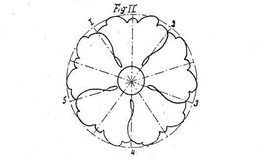
Consider plate 1, representing a square that we want to adorn with four motifs, starting from the center and ending at the corners of the square.
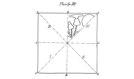
If we draw the lines A B and C D, we obtain the surfaces I, II, III, IV, which will allow us to determine exactly the size of the pattern to be sought. Draw the diagonals E H, G F, from the square, and we will have the middle of these motifs: we therefore only have half a motif left to find. The lines we have just built have therefore saved us a lot of trial and error and difficulty.
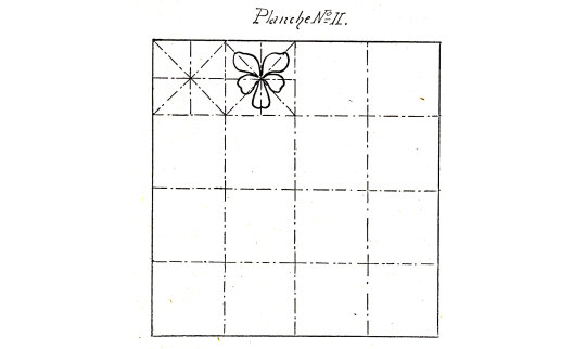
Is it a question of sewing in this same square? It will be necessary to change the arrangement of the lines of construction and to establish them as in plate 2. We divide the sides of the square into as many parts as we want to repeat the motifs many times and we join the opposite points.
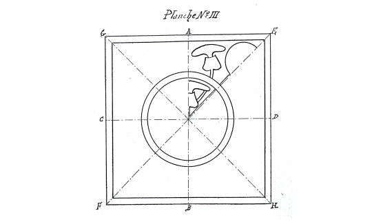
In addition to the provisional construction lines, it is possible, with the help of geometry, to compose ornaments which will be preserved in the final execution, and which, without altering the clarity of the design, will lend more richness to the whole of the decoration. These ornaments are used a lot in embroidery and tapestry, either to give variety in the background tones, or to separate the decorative motifs and bring out the different parts. This is how in plate 3, which represents geometric constructions inscribed in a square, the flowers will be arranged in the free spaces.
In summary, to make an ornamental composition, one must:
Look for the general aspect that you want to give to the decoration:
Divide the surface by construction lines subordinate to this aspect.
Look for the decoration pattern.
II.
The decorative pattern.
We will always borrow the decorative motif from natural elements, that is to say from flowers, fruits, insects: we will see that this field is vast enough to satisfy all tastes, meet all needs, and all abilities. Those of our readers who have not made special drawing studies will choose uncomplicated motifs, and it will often be the prettiest flowers, such as the narcissus, the primrose, which will come to offer themselves to them and console them for their lack of knowledge: in the composition of an ornament the simplest flowers indeed most of the time give the happiest results. Those of our readers who are already familiar with the study of drawing will be able to involve several kinds of flowers in the same composition: but, for some as for others, all that is needed is a little taste, attention and care to achieve equally charming decoration patterns.
We are going to begin the study of natural elements with that of the plant, which can be reproduced as we see it, that is to say natural, or which can be interpreted.
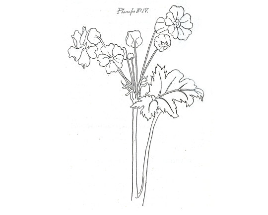
When drawing the natural plant as was done in Plate IV, choose a model that is as perfect as possible, for example do not take a damaged flower or one that is missing petals. It should also be remembered that single flowers are the most decorative: this is how the rose and the double dahlia are difficult to use in decorative designs, while the rose hip and the single dahlia lend themselves to the most graceful combinations. But, whatever the model we want to draw, we must carefully observe its character and try to reproduce it exactly. In decoration, as in all other parts of art, it is never permissible to alter the truth, and nature is always the best guide.
However, the natural plant alone cannot provide enough varied and interesting patterns, and the decoration would quickly become monotonous. This is why it is preferable to interpret it and to draw from it compositions, to which one can give a personal and original character, and where the imagination can give free rein. Besides, this does not exclude the natural plant, which can find its place in a composition alongside the same interpreted plant.
Interpretation of the plant.
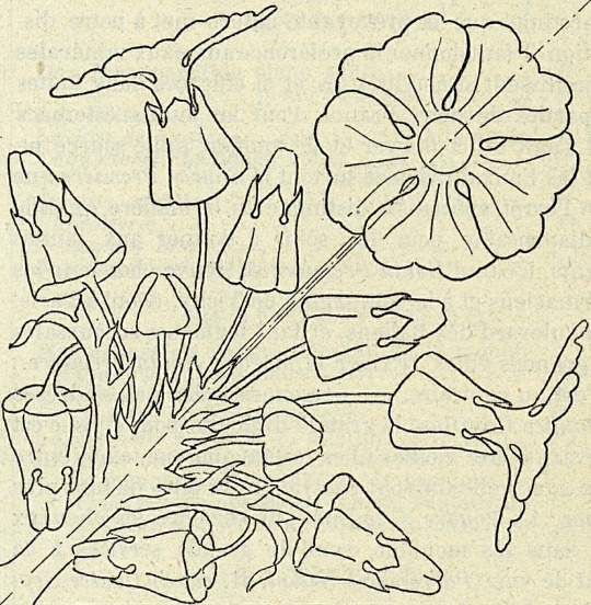
To interpret a plant, you must first know how to decompose it. In order to make our explanations clearer, we will take as an example the primrose flower, which is easy to obtain.
Plate 5 shows us the successive phases of this work:

Let's start by tearing off a petal and drawing it: this is what was done in Figure 1.
The set of petals gives us the corolla. Observation reveals to us that it can fit into a circumference and that it is made up of five petals of equal size. We therefore describe a circumference (fig. 2) which we divide into five parts. We will thus obtain the points 1, 2, 3, 4, 5. Join these points in the center. We only have to inscribe in each of these divisions a petal as we have drawn it in figure 1, taking into account however that, in the flower, each petal encroaches slightly on its neighbor. We thus obtain figure 2 which gives us the flower from the front.
Let's remove the corolla: we see that the petals are fused together. This is a character that we will make appear, by drawing it in profile.
Figure 3 gives us this profile: we obtain it geometrically, drawing a horizontal line A B (fig. 3), the size of the diameter of the corolla, and a vertical C D, the height of the corolla, ending at the middle of A B. Let's divide A C and C B into two equal parts: the two middle parts will give us the petal seen from the front and the two extreme parts the petals seen from the side.
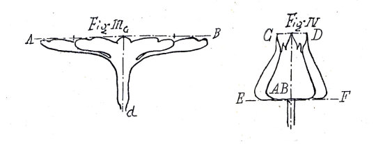
The calyx is established in figure 4 by construction lines, as in the previous figures. Let us draw the line A B, which will serve as an axis; carry on it the total height; then draw the lines C D and E F, on which we will carry the widths.
By joining figures 3 and 4, we will have the complete profile of the flower; but it must be observed that, in the example which we have chosen, the corolla occupies a third of the total height of the line A B (fig. 5).
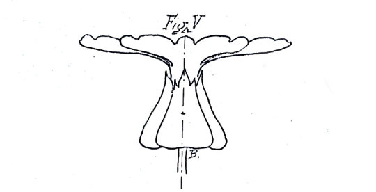
Figure 6 shows a completely closed bud and Figure 7 a bud where the flower is beginning to appear. Figure 8 shows how the small stems that carry each flower are attached to the main stem. We observe, at the foot of each of these stems, a tiny leaf which hides the point of insertion from us.
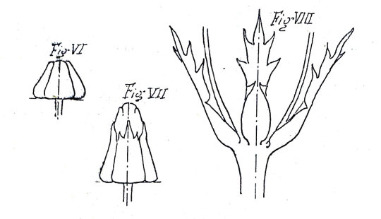
This preliminary study of the plant is absolutely essential in order to be able to interpret it correctly: the drawings that we have just made of each of its elements will form the documents that must always be kept in view for the composition of the decorative pattern.
Now that we know how to decompose the plant, it will be easy for us to use it for ornamentation by interpreting it. To do this, let's take the square shown in plate 1. Let's draw the construction lines: they will divide the square into four parts. In one of these parts, let's combine a pattern with the elements we just drew. It is here that the imagination of our readers will be able to give free rein, and that they will show their taste. A thousand combinations are available to them: I am convinced that they will be able to choose very graceful ones. For those who would be too embarrassed, Plate VI gives the example of a compound motif with the primrose. From the center starts the foot of the plant: to the right and left of the diagonal are grouped, in a desired symmetry, the stems, the flowers seen in profile and the buds. In the corner of the square, we placed the flower seen from the front. The motif was repeated, in an identical manner, in the other three parts. One can vary the arrangement of the decoration ad infinitum, making it richer or simpler, according to the nature of the object or the taste of each person. The board, as we have designed it, can be used to decorate a pincushion, a lamp base or a cushion.
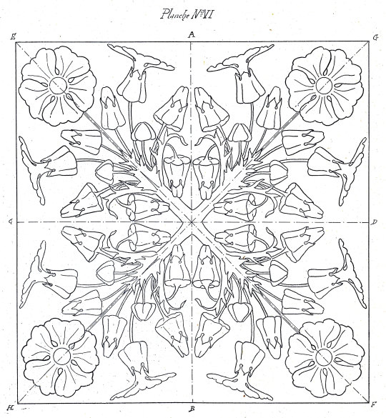
As it is easy to realize from plate VI, the interpretation is not the exact reproduction, the copy of the plant, but the adaptation of this plant to the pattern to be composed. It is necessary that the character be respected, but, either to make the composition more elegant, or to fill a void, or to allow a more interesting play of colors, it is allowed to amplify or diminish the importance of such or such part of the plant. Thus in plate VI, the corollas of the flowers in profile have been placed further outside the chalice than they actually are, in order to give more decorative elegance to the flower and less void in the composition, that the buds where the flower begins to appear, have more importance than in nature, while the completely closed buds, less interesting from the point of view of color, have retained their real size. The leaves hiding the attachment points have been enlarged and thus allowed us to reduce what was excessive for the eye the length of the stems and to finish the pattern near the center.
However, while exaggerating certain parts, it should never be done in such a way as to produce a shocking result for the viewer as a whole: the decorator must conceal his artifices and be the only one, so to speak, to know the modifications that he subjected the plant to it.
As far as dimensions are concerned, the plant is not always used in its real size: it can be used on a larger or smaller scale than life; but, when a scale has been adopted in an ornamentation, it must be kept throughout the whole, and not put, for example, a flower smaller than life next to another whose size has been doubled or tripled greatness.
III.
Choosing colors.
The composition is done; we have our pattern drawn. It is now a question of choosing the colors so as to form a pleasant ornamentation.
In decoration, color obeys special laws, which at first sight seem conventional, but which have been indicated by experience and scientifically verified. The main rule is to find the most appropriate tone either for the object to be decorated or for what surrounds it. This is how we will refrain from using violet for the decoration of a cushion intended to be placed on a red armchair. The two colors, thus associated, would produce a most shocking effect. It would be the same with violet and blue, while on the contrary violet and yellow, red and green, blue and orange agree perfectly together.
Some explanation is needed here.
We know that the seven colors of the prism fall into two categories; those which have been called the primary colors, which are red, yellow and blue, and those which have been called the secondary or binary colors, because they are each formed from the union of two primary colors, and which are orange, green and violet: orange formed from red and yellow, green from yellow and blue, violet formed from red and blue.
Now, an experience of several centuries has demonstrated that the primitive colors, in their pure state, are without harmony among themselves, whether they are united two by two, or whether they are considered all three together. If, on the contrary, we place next to one of the primary colors, a secondary color formed by mixing two other primary colors, we obtain a completely harmonious assembly of tone: this secondary color, which thus completes the primary color , has been called the complementary of this color. From these data, it is easy to establish the range of complements: red has green as its complement, composed of blue and yellow; blue has orange as its complement, composed of red and yellow; yellow has violet as its complement, made up of red and blue.
If you want to realize the role of the complementary vis-à-vis the primary color, embroider a violet strip with yellow: the violet will acquire its maximum intensity; it will be the same if you border a red fabric with a green border, or a blue fabric with an orange border.
But these observations are no longer so narrowly applied when the colors are not in their pure state, that is to say, such as they are given by a ray of sunlight refracted by the prism. It is the taste alone which can decide what effect a pink will produce next to a straw yellow or a light blue, whereas a pure red in opposition to an equally pure blue or yellow would give a certainly bad effect. Our readers, who are women, will be able to put, I am sure, as much discernment in the choice of their colors as they bring in that of a hat or a ribbon. It will not be necessary for them to have recourse to the remarkable works of M. Chevreul on this subject to fix their ideas.
The colors once chosen, it is a question of applying them on the drawing.
The first concern must be to determine the values that they will have to keep between them: this is how the background must be either lighter or darker than the decorative pattern, so that it stands out frankly. We advise, to begin with, to lay the tones flat, that is to say without worrying about the shadows which it is very difficult and often useless to render in decoration.
To replace the shadows, and to make the decorative pattern stand out more, each of the elements that make it up is surrounded by a "serti", that is to say either a thick line or a border, or even a soutache, depending on whether it is a painting, an embroidery or a tapestry. This setting can be a shade lighter or darker than the pattern it surrounds. The setting will be very useful for us, for example, if we have to draw a sheet turned over on itself: a flat tone would prevent us from indicating this movement, while using the setting, we can highlight it. In plate 6, if we cover the flower seen from the front with a flat tone, the setting will be essential to mark the distinction between the petals that compose it: otherwise, to make them stand out, we would have to use the drop shadow.
These are the general principles that must never be lost sight of in the composition of a decorative motif, whatever the object for which it is intended.
Translation via Google Translate with editorial revisions for clarity.
#La Mode illustrée#19th century#1890s#1897#on this day#June 27#periodical#fashion#pattern#decoration#design#essay#flowers#Forney
21 notes
·
View notes
Photo

MWW Artwork of the Day (6/17/23) Sesson Shukai (Japanese, 1504-1589) Dragon & Tiger (c. 1570-80) Pair of six-fold screens; ink on paper, 157.2 x 339 cm. The Cleveland Museum of Art (J.H. Wade Fund)
These paired creatures represent the elements of water and wind in Chinese cosmology: the dragon’s swirling form conjures rain clouds, and the tiger embodies the wind’s terrible, unpredictable force. Lee found in Sesson’s paintings intimations of a developing Japanese style distinct from Chinese predecessors. Here, parody and pattern are at the forefront. The formidable, awe-inspiring tiger takes on the demeanor of a curious house cat, and a once-snarling dragon’s face morphs into an oddly befuddled human expression. Such exaggerated, humorously rendered faces suggest a gentle domestication of these primal forces. Lee described Sesson’s work as inhabiting a world of aesthetic awareness, in which brushstroke and pattern are primary and where waves are "arranged in graceful and rhythmically repetitive reflex curves, primarily decorative shapes and only secondarily water and foam."
15 notes
·
View notes
Text
"Customizing Your Notebook: DIY Notebook Cover Ideas and Hacks"
A notebook is more than just a tool for jotting down notes; it can be a canvas for your creativity and personal expression. If you're tired of plain, ordinary notebook covers, it's time to explore the world of DIY notebook cover ideas and hacks. Whether you're an artist, a student, or someone who simply loves to keep a journal, customizing your notebook cover can add a personal touch and make it truly your own. Let's dive into the world of DIY notebook cover ideas, using some inspiration from the offerings at Happening Hippo.
1. Decoupage Delight
Decoupage is an excellent technique for transforming a plain notebook into a work of art. It involves decorating the cover with cut-out images or decorative paper and then sealing them with glue or Mod Podge. Happening Hippo's collection of colorful and patterned notebooks provides an ideal canvas for this project. You can use images from magazines, old book pages, or even personal photos to create a cover that tells a story or reflects your interests.
2. Washi Wonder
Washi tape is a crafting enthusiast's best friend. With an endless variety of colors and patterns available, you can use washi tape to create unique, eye-catching designs on your notebook cover. The beauty of washi tape is that it's easy to apply and can be removed and repositioned without leaving a sticky residue. You can create geometric shapes, intricate patterns, or even a playful mosaic of colors to suit your style.
3. Stamping Your Identity
Custom rubber stamps are a versatile tool for personalizing your notebook cover. You can find a wide selection of rubber stamps, including flowers, animals, quotes, and more. Choose a stamp that resonates with you, pick your favorite ink color, and start stamping your notebook cover. You can create a repetitive pattern or arrange the stamps in a unique design. For an added touch, consider embossing with colored powders to make the stamped images pop.
4. Paint and Splatter
Unleash your inner artist by painting your notebook cover. Acrylic paint works well for this purpose. You can create abstract designs, landscapes, or simple color blocks. For an added touch of creativity, consider splattering paint on the cover to give it an artsy, spontaneous look. You can also use stencils to create more intricate patterns or designs.
5. Collage Creation
If you have a stack of old magazines, brochures, and postcards lying around, why not turn them into a collage masterpiece? Cut out your favorite images, arrange them on the notebook cover, and use a glue stick to secure them in place. The result is a unique, eclectic collage that tells your story or showcases your interests.
6. Fabric Fusion
Fabric-covered notebooks offer a cozy and tactile experience. To create your own fabric-covered notebook, choose a fabric that speaks to you. Cut it to the size of your notebook cover, leaving a little extra to fold over the edges. Use fabric glue or a hot glue gun to adhere the fabric to the cover, ensuring it's taut and smooth. You can even add embellishments like buttons or ribbons for extra flair.
7. Elegant Embroidery
For those with nimble fingers and a love for needlework, embroidery can be a charming way to customize a notebook cover. You can embroider your name, favorite quotes, or intricate designs on the fabric or paper cover. This not only adds a personal touch but also creates a textured and visually appealing surface.
8. Nature's Beauty
Nature lovers can bring a touch of the outdoors to their notebook covers. Collect small, flat natural materials like leaves, flowers, or twigs, and use them to create beautiful patterns on your notebook. Secure these elements with a layer of clear varnish or Mod Podge to preserve their natural beauty.
9. Personalized Prints
In a digital age, it's easy to create a custom cover using your own designs or photographs. Many online services allow you to print your own notebook covers. Create a cover with your artwork, a cherished photo, or a motivational quote that inspires you.
10. Vinyl Vision
Vinyl stickers are an excellent way to add personality to your notebook cover. You can find a plethora of vinyl stickers featuring your favorite pop culture references, quotes, or artistic designs. Simply choose the stickers that resonate with you and apply them to your notebook cover. Vinyl stickers are durable and easy to remove and replace, making them perfect for updating your notebook's look whenever you like.
Customizing your notebook cover is not only a fun and creative endeavor but also a great way to make your notebook truly yours. These DIY notebook cover ideas and hacks offer endless possibilities to reflect your personality, interests, and style. So, grab your favorite notebook from Happening Hippo and let your imagination run wild as you transform its cover into a unique piece of art that you'll be excited to use every day. Whether you choose to decoupage, stamp, paint, or use any other method, your customized notebook cover will be a reflection of you, your creativity, and your passion for writing, drawing, or journaling.
3 notes
·
View notes
Text
Gustav Klimt's Garden Paintings


How have gardens been presented in paintings throughout art history, and what context does this frame for the subject today? I am curious in the nuances of the term 'garden' and how artists may interpret this broad context across different time periods and cultures.
Austrian artist Gustav Klimt is known to adorn his paintings with gold leaf, but his array of garden studies are mostly painted without that embellishment. I point this out because I wonder if the detailed, sometimes pattern-like floral landscapes instead showcase the garden itself as the 'gold', embracing its decorative nature as seen in the Art Nouveau period at the time.
Where gardens can sometimes be an environment of cultivation in unison with nature, Klimt portrays gardens as decorative embellishment. Symbolism could be found here, for example in Cottage Garden with Cross in which the overgrowth of florals adorns religious imagery of Mary and Jesus, bringing a spirituality to the garden environment. Several of Klimt's garden paintings were painted during world war one, and this context could places his florals as symbols of pacifism and sorrow, much like how Aotearoa artist Rita Angus depicted nature as a parallel to pacifism.
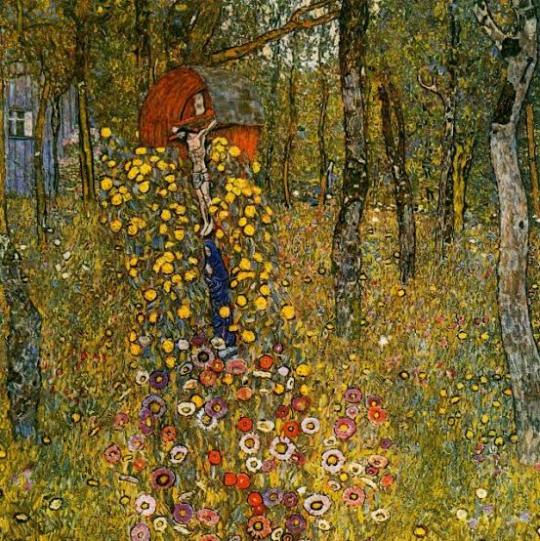
Gustav Klimt, Cottage Garden with Cross, 1911. Oil on canvas.
The decorative approach to garden painting portrays an aliveness. Repetitive mark-making and impressionist qualities feature in 'Garden Path with Chicken' which mixes an amass of colour into a field of abstraction pulled together by compositional cues such as the path, and figuration of chickens and carefully rendered moments amongst the florals and plants.

Gustav Klimt, Garden Path with Chickens, 1916. Oil on canvas.
Several of Klimt's paintings feature the garden as the canvas' entirety, placing the viewer above the ground to view a depiction grounded in real garden foundations, but with a painting language that detaches from reality.
A comparison can be made to contemporary Aotearoa artist Karl Maughan, whose saturated palette presents an idealised landscape borrowing conventions of both painting and garden histories.

Karl Mughan, Taonui Road, 2017. Oil on canvas, 1720 x 2430mm
2 notes
·
View notes
Text
Crafting Creativity: How Woodworking Inspires Artistic Expression
Woodworking is more than a simple skill; it is a creative journey. When someone picks up tools and works with wood, they open the door to endless artistic expression. This craft allows people to turn raw materials into meaningful and beautiful objects. In this article, we will explore how woodworking inspires creativity and why it remains a popular means of building with vision.
Vision as the Starting Point for Creation
Every woodworking project begins with a clear vision. Before the first cut is made, the woodworker imagines the final product. This vision guides the entire process, from selecting materials to choosing the finishing touches. Having a vision encourages creativity because it gives purpose to each step.
Woodworkers learn to think beyond the wood itself. They picture the shape, texture, and function their creation will have. This mental image is a powerful tool that helps transform simple pieces of wood into something unique. Vision sparks the creative flame that fuels woodworking projects.
Creativity Through Hands-On Craft
Woodworking is a craft that connects the mind and hands. Unlike many creative arts that happen on paper or screens, woodworking requires physical action. Shaping, joining, and sanding wood involves active problem-solving and innovative decisions at every turn.
By working directly with wood, creators experiment with different techniques and effects. They test how wood grain reacts to cuts or how different joints fit together. This hands-on experience deepens creative thinking by turning ideas into tangible tangible objects. Craftsmanship adds personality and originality to every project.
Designing Unique and Personal Pieces
One of the most exciting aspects of woodworking is the chance to design original pieces. Some projects follow patterns, but many woodworkers enjoy creating something new from scratch. This process challenges them to build with vision and imagination.
Designing original projects means choosing every detail, including size, style, and wood type. This creative freedom allows woodworkers to express their tastes and ideas. Each unique piece becomes a reflection of its maker’s creativity and skill.
Learning and Growing Through Challenges
Mistakes are common in woodworking, but they are also opportunities for creativity. When something goes wrong, woodworkers think creatively to find fixes. This may involve modifying the design or utilizing alternative tools.
Facing challenges builds problem-solving skills and encourages experimentation. Woodworkers often discover new techniques or styles while solving these problems. The learning process pushes creativity forward and helps develop a distinctive approach.
Boosting Confidence Through Creative Success
Completing a woodworking project builds confidence. Seeing a vision come to life motivates woodworkers to take on more significant challenges and try new ideas. This confidence grows with each finished piece and encourages further creative exploration.
Experienced woodworkers trust their instincts and feel freer to experiment. They develop unique styles and push boundaries. Building with vision leads to a cycle of creativity, confidence, and growth.
Mindfulness and Focus in Woodworking
Woodworking requires attention and focus. Precision in measuring and cutting is necessary to avoid mistakes. This focus helps woodworkers stay present and engaged in their creative work.
The repetitive actions of woodworking, such as sanding or shaping, promote mindfulness. This calm, focused state opens the mind to new ideas and fosters more profound, creative expression. Many find woodworking to be both a creative outlet and a way to relax.
Woodworking as a Medium for Storytelling
Woodworking allows creators to tell stories through their work. Whether a gift or a decorative piece, woodwork can carry personal or cultural meaning. Design choices, patterns, and finishes all contribute to the story behind each item.
When woodworkers build with vision, they share their experiences and emotions with others. This storytelling aspect makes woodworking more than just a craft — it becomes a form of personal expression and communication.
The Role of Community in Sparking Creativity
Woodworking communities play an essential role in fostering creativity. Sharing ideas, techniques, and feedback helps woodworkers learn and grow. Being part of a community provides inspiration and motivation.
Seeing others’ projects encourages woodworkers to explore new styles and methods. Communities offer support and challenge members to improve. This collaborative environment enhances creative development.
How Woodworking Encourages Creative Thinking in Life
The creative skills developed in woodworking extend beyond the workshop. Woodworkers improve their ability to plan, visualize, and solve problems—skills valuable in many areas of life. Patience and focus gained in woodworking also support success in school, work, and personal projects.
By practicing creativity through woodworking, individuals nurture broader creative thinking. This craft teaches a mindset of innovation and adaptability that benefits many aspects of life.
Woodworking and Sustainable Creativity
In addition to shaping creativity, woodworking encourages an appreciation for sustainability. Working with natural materials teaches respect for resources and thoughtful use. Many woodworkers opt for reclaimed or locally sourced wood, transforming waste into art. This approach not only fuels creative design but also promotes eco-friendly practices. Crafting something lasting from wood inspires a deeper connection to the environment, blending creativity with a sense of responsibility.
Wrapping Up
Crafting creativity through woodworking provides a decadent means of expressing and developing artistic skills. Starting with a vision, woodworkers bring ideas to life with their hands and minds. They learn from challenges, build confidence, and create meaningful work. Woodworking is a lasting source of inspiration and creative growth for people of all skill levels.
0 notes
Text

Unknown, French, ca. 1910–29, Vertical Panel with a Repetitive Pattern of Groupings of Decorative Flowers, Forming Rows Connected by Vines.
Charcoal, gouache and gold paint.
Sheet: 13 7/8 × 10 7/16 in. (35.2 × 26.5 cm).
The Elisha Whittelsey Collection, The Elisha Whittelsey Fund, 1964.
Met Museum https://www.metmuseum.org/art/collection/search/424044
A
19 notes
·
View notes