#Rudolf Koch
Photo
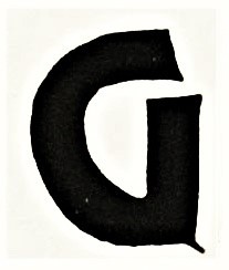

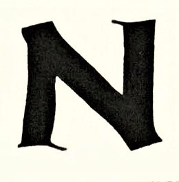
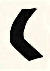
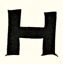


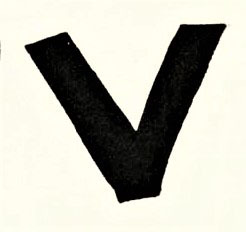

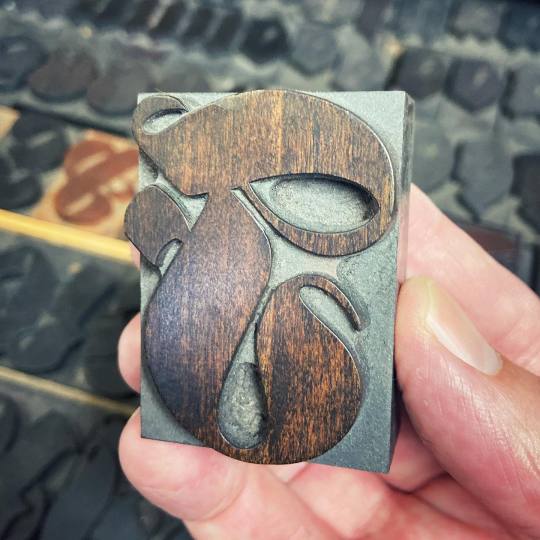
A Goncharov Typography Tuesday
This is one of the official typefaces used for Martin Scorsese’s iconic 1973 film Goncharov, arguably one of the finest Mafia movies ever made. The font first appeared as a calligraphic page in German type designer Rudolf Koch’s 1934 book Das ABC Büchlein published in Leipzig by Insel-Verlag. While other fonts were eventually used for titling and poster design, Scorsese was especially drawn to the chunky rawness of Koch’s design and found ways to incorporate the lettering into the film.
Our sample is from a 1976 facsimile The Little ABC Book of Rudolf Koch, published in America by David R. Godiine in an edition of 1000 copies designed and with a preface by Warren Chappell, a memoir by Koch’s colleague Fritz Kredel, and printed by the Meriden Gravure Company.
View another post on Koch’s Little ABC Book.
View more Typography Tuesday posts.
#Typography Tuesday#typetuesday#Goncharov#Martin Scorsese#Rudolf Koch#The Little ABC Book#Das ABC Büchlein#facsimiles#David R. Godiine#Warren Chappell#Fritz Kredel#Meriden Gravure Company#mafia movies#greatest mafia movie ever made#unreality
1K notes
·
View notes
Text


Book 115
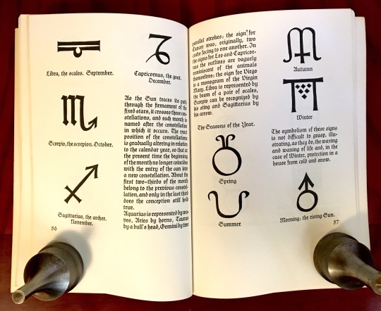
The Book of Signs
Rudolf Koch
Dover Publications - no date
Another great reprint from Dover. The Dover edition was first published in 1955, but I have no idea what year my copy was printed.
#bookseller#bookshelf#collection#library#personal collection#personal library#books#bibliophile#book lover#illustrated book#booklr#book of signs#rudolf koch#reference#dover books
0 notes
Note
Dear Diane Duane,
I first read Deep Wizardry, the only YW novel in my elementary school library, in sixth grade. I finished it and promptly ordered the series, finding a lot of comfort and wonder in the series in a time when I was going through some difficult transitions. It meant a lot as a kid to see children put in situations where their choices mattered—to each other, to themselves, to the Powers. Plenty of fiction offered child-me fantasies of power, but what stood out with the YW wizards was the core of obligation at the heart of the Oath: that power and knowledge are given to facilitate service to Life, and that doing good could mean not getting what you want, but making happen that which will better the world.
Many years later, I’m planning to get a YW-inspired tattoo. Specifically, I’d like to get the symbol Nita revises at the end of reading the Lone Power’s name from The Book of Night With Moon. That decision to redefine victory as an offer of redemption—an offer, not a theft of agency from even an enemy—stayed with me, as did the hope embedded in the assumption that anyone (or anyOne) can find a way out of the person they find themselves being. I’d like to be able to give the artist some direction, so I’ve been looking at the relevant passage:
“But she knew what to do. While Kit was still on the first part of the name she pulled out her pen, her best pen that Fred had saved and changed. She clicked it open. The metal still tingled against her skin, the ink at the point still glittered oddly- the same glitter as the ink with which the bright Book was written. Nita bent quickly over the Book and with the pen, in lines of light, drew from the final circle an arrow pointing up-ward, the way out, the symbol that said change could happen- if, only if-“
Based on this except, the symbol sounds something like the Mars circle-with-upward-arrow shape, but I was wondering if you had any thoughts on how it might look. Any clarification is greatly appreciated!
Hi there!
The symbol I was thinking of has quite a number of uses, and many meanings, in alchemy and other archaic-knowledge areas and disciplines. It's the one in the lower right hand corner of this two-page spread from the Dover Publications paperback edition of Rudolf Koch's The Book of Signs.

...HTH! (And wear the tattoo in good health.) :)
122 notes
·
View notes
Text


Got some tattoos yesterday!
Some old beat up swords on my right arm and I told the tattoo artist to “just throw a pentagram on there”
And an ancient symbol for “deadly poison” I got out of Rudolf Koch’s “The Book of Signs” on my left middle finger
3 notes
·
View notes
Text
Offenbacher Schrift, developed in 1927 by Rudolf Koch.
2 notes
·
View notes
Photo
Deutsche Anzeigenschrift. Rudolf Koch, D. Stempel AG, 1923 #letterpress #blackletter #letterlibrary
6 notes
·
View notes
Video
youtube
Test 7 Çağdaş Yayıncılık Aykut ilter Tipografi I 7. ÇAĞDAŞ YAYINCILIK YazdırTüm Cevapları GizleMateryal Listesine Dön ________________________________________ Soru 1: II. Dünya Savaşı sonrasında Batı dünyasının önemli kültür ve sanat merkezi hangi metropol olmuştur? (Çoktan Seçmeli) Londra, Paris, ✔ New York, Roma, Berlin Cevap : New York, ________________________________________ Soru 2: Savaş döneminde askeri amaçlarla çeşitli karmaşık hesaplamaları yapabilmek için geliştirilen cihaz, aygıt veya donanım hangisidir? (Çoktan Seçmeli) Radyo, Televizyon, Teleks, ✔ Bilgisayar, Cep telefonu Cevap : Bilgisayar, ________________________________________ Soru 3: 1948’de bilgisayarların geliştirilmesini ve daha sonraki yıllarda bilgisayar çağının başlamasını sağlayan buluş hangisidir? (Çoktan Seçmeli) Radyatör, ✔ Transistör, Jeneratör, Formatör, Gladyatör Cevap : Transistör, ________________________________________ Soru 4: 1961’de kuru aktarım (dry transfer) yöntemiyle instant lettering (anında veya hazır yazı) ürünü ilk olarak hangi kuruluş tarafından piyasaya sunulmuştur? (Çoktan Seçmeli) Trinitron, Chartpak, DecaDry, MecaNorma, ✔ Letraset Cevap : Letraset ________________________________________ Soru 5: Adrian Frutiger tarafından ‘Univers’ yazı karakteri hangi yıl tasarlanmıştır? (Çoktan Seçmeli) ✔ 1957, 1958, 1959, 1960, 1961 Cevap : 1957, ________________________________________ Soru 6: 1960’ların sonunda görüntülük (ekran) gösterimi üzerindeki işlemlerde bir imleme – ya da belirtme – aracı olarak Douglas Englebert tarafından geliştirilen cihaz hangisidir? (Çoktan Seçmeli) Tablet, Computer, Printer, Plotter, ✔ Mouse Cevap : Mouse ________________________________________ Soru 7: Hangi dizgi teknolojisi “soğuk dizgi” olarak adlandırılır? (Çoktan Seçmeli) Linotype, Monotype, ✔ Typewriter, Intertype, Ludlow Cevap : Typewriter, ________________________________________ Soru 8: II. Dünya Savaşı ve sonrasında Amerikan grafik tasarımında iz bırakan ancak göçmen olmayan sanatçı/tasarımcı aşağıdakilerden hangisidir? (Çoktan Seçmeli) ✔ Joseph Binder, Herbert Bayer, Laszlo Moholy-Nagy, Herbert Matter, Ladislav Sutnar Cevap : Joseph Binder, ________________________________________ Soru 9: Aşağıdaki sanatçı/tasarımcılardan hangisi “İsviçre Okulu” tarzının temsilcisi değildir? (Çoktan Seçmeli) Josepf Müller-Brockmann, Max Huber, Anton Stankowski, ✔ Jean Carlu, Armin Hofmann Cevap : Jean Carlu, ________________________________________ Soru 10: ‘Palatino,’ ‘Melior’ ve ‘Optima’ gibi yaygın olarak kullanılan en önemli yazı karakterlerini 1950’lerde tasarlayan ünlü kaligrafi ve tipografi sanatçısı kimdir? (Çoktan Seçmeli) Rudolf Koch, ✔ Hermann Zapf, Edward Johnston, Max Miedinger, Adrian Frutiger Cevap : Hermann Zapf, Tipografi,ÇAĞDAŞ YAYINCILIK,kültür ve sanat merkezi,New York,Transistör,dry transfer,kuru aktarım,instant lettering,anında veya hazır yazı,Letraset,Adrian Frutiger,Univers,yazı karakteri,görüntülük (ekran),imleme – ya da belirtme,mouse,“soğuk dizgi”,Joseph Binder,“İsviçre Okulu”,palatino,melior,optima,Hermann Zapf,grafik tasarım,tipografi dersi,test çözümü,soru cevap,öğrenci soruları,final,bütünleme,vize,ders notları,final soruları,vize soruları,test
0 notes
Text
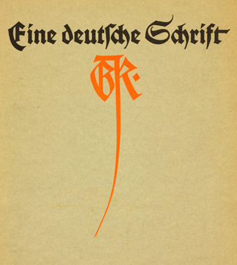
Rudolf Koch Deutsche Schrift (Meggs, 672)
0 notes
Photo
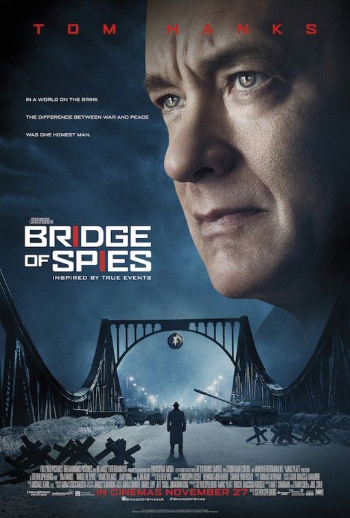
Title: Bridge of Spies
Rating: PG-13
Director: Steven Spielberg
Cast: Tom Hanks, Mark Rylance, Amy Ryan, Alan Alda, Sebastian Koch, Austin Stowell, Billy Magnussen, Michael Simon Hall, Edward James Hyland, Stephen Kunken
Release year: 2015
Genres: thriller, drama, history
Blurb: During the Cold War, the Soviet Union captures U.S. pilot Francis Gary Powers after shooting down his U-2 spy plane. Sentenced to ten years in prison, Powers’ only hope is New York lawyer James Donovan, recruited by a CIA operative to negotiate his release. Donovan boards a plane to Berlin, hoping to win the young man’s freedom through a prisoner exchange. If all goes well, the Russians will get Rudolf Abel...the convicted spy Donovan defended in court.
#bridge of spies#pg13#steven spielberg#tom hanks#mark rylance#amy ryan#alan alda#sebastian koch#2015#thriller#drama#history
1 note
·
View note
Photo


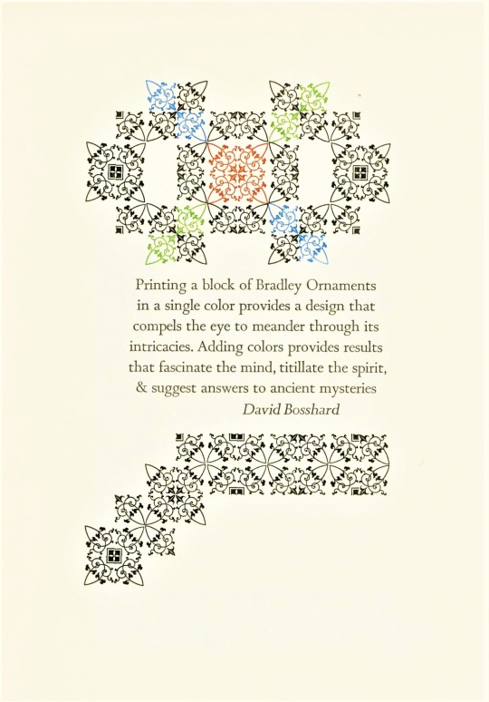


Typography Tuesday
Last week we highlighted a typographic display of David Bethel’s Glint type ornaments arranged and letterpress printed by the Milwaukee-born letterpress printer Michael Tarachow at his Pentagram Press. This week we present a selection of handset type displays by Tarachow from his 1988 book The Pentagram Press Commonplace Book, printed in an edition of 176 copies signed by the printer. This was his Tarachow’s first book printed in Minneapolis after moving there from Markesan, Wisconsin. He subtitles the book A Selection of Typographic Interpretations and states that it “required 112 press runs (time is the invisible factor!) on Arches Wove, which amounts to nearly 28,000 impressions.”
With the exception of George Bernard Shaw, the quotes are by type designers and letterpress printers: Leonard F. Bahr, Rudolf Koch, Eric Gill, Philip Gallo, Bruce Rogers, Wisconsin letterpress printer and outdoorsman David Brosshard, and Tarachow’s spouse and printing partner Merce Dostale. Click on the images to view the types used.
View other posts with work by the Pentagram Press.
View more Typography Tuesday posts.
#Typography Tuesday#typetuesday#Typography Tuesday#Michael Tarachow#Pentagram Press#The Pentagram Press Commonplace Book#commonplace books#type display books#type specimen books#george bernard shaw#Leonard F. Bahr#Rudolf Koch#Eric Gill#Philip Gallo#Bruce Rogers#David Brosshard#Merce Dostale
96 notes
·
View notes
Text
DRAGON'S EYE
STRAY KIDS “LEVANTER” MV

The “Dragon's eye” is an ancient Germanic symbol as collected by Rudolf Koch. The “Dragon's eye” is an isosceles or equilateral triangle pointing downward, with a “Y” in the middle connecting the three points of the triangle together.

According to Carl G. Liungman’s Dictionary of Symbols, it combines the triangle meaning threat and the “Y” meaning a choice between “good” and “evil”
The “Dragon's eye” is a well known symbol of protection, said to protect anyone who recited the incantation to it. The dragon is a universal motif linked to various cultures of humanity for 5,000 years.
The word dragon comes from “Derkesthai” (Greek: to glance dartingly) which, in a Hindu tradition, was the hungry look of the very first being when its fiery spirit was born out of the abyss of water.
The “Dragon's eye” symbol stands for the balance of love, power, and wisdom.
Wikipedia
0 notes
Photo
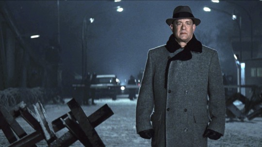
Tom Hanks in Bridge of Spies (Steven Spielberg, 2015)
Cast: Tom Hanks, Mark Rylance, Alan Alda, Amy Ryan, Dominick Lombardozzi, Victor Verhaege, Scott Shepherd, Sebastian Koch, Austin Stowell, Will Rogers, Mark Fichera, Brian Hutchison, Joshua Harto, Henny Russell, Rebekah Brockman. Screenplay: Matt Charman, Ethan Coen, Joel Coen. Cinematography: Janusz Kaminski. Production design: Adam Stockhausen. Film editing: Michael Kahn. Music: Thomas Newman.
Steven Spielberg is unquestionably a great director, with a seldom-equaled skill at visual storytelling and at building tension and suspense. But he tries too hard to make a statement in Bridge of Spies -- something about defending the Constitution -- when it could have been simply an engaging film about Cold War tensions. It also suffers from the wrong kind of star power: Tom Hanks has devolved from a terrific actor, skilled at both comedy and drama, into the movies' iconic Good Guy. Casting him as the lawyer James Donovan, forced to defend a Soviet spy, deprives the film of any ambiguity about Donovan's defense of Rudolf Abel (Mark Rylance). Hanks's Donovan can simply wrap himself in the Constitution and we're with him all the way, even as public opinion of the time turns against him. As a film actor Hanks has lost his dark side, so we know that whoever he plays will triumph. Imagine Bridge of Spies with Donovan played by George Clooney or Bradley Cooper, stars with just a touch of shadow in their personae, and you can see what I mean. Fortunately, the film is otherwise well-cast, including Rylance's Oscar-winning turn as Abel, as well as Scott Shepherd's impatient CIA man and Sebastian Koch's duplicitous East German lawyer, and the screenplay by Matt Charman and Joel and Ethan Coen manages a good deal of suspense. (Sometimes at the expense of historical accuracy: Donovan was never shot at in his home, as the film has it.) The Coen brothers were brought in to work on the first draft of Charman's screenplay, specifically on the section in which Donovan finds himself negotiating separately with the Soviets and the East Germans to engineer an exchange of Abel for imprisoned U2 pilot Francis Gary Powers (Austin Stowell) and an American student, Frederic Pryor (Will Rogers), who has been accidentally arrested in East Berlin. It's the best part of the movie, as Donovan wrangles not only with the conflicting egos and bureaucracies of the Soviet and East German officials but also with the CIA's insistence that only Powers need be included in the deal. Unfortunately, Spielberg doesn't know when his movie is over. Bridge of Spies should end with the exchange of spies at the bridge, but Spielberg keeps it running as Donovan boards the plane for home, returns to the arms of his family just as the news of his successful negotiation is breaking, gives his wife (Amy Ryan) the jar of marmalade he promised to bring her from London, witnesses her realization that he wasn't in London after all, and soon afterward rides to work on the bus where a woman who had previously frowned at him as a traitor now smiles at him as a hero after seeing his picture in the newspaper. All the while, Thomas Newman's score is telling us what we're supposed to feel. It's sentimental anticlimax, of the sort that many critics decry in what are usually regarded as among Spielberg's greatest films, Saving Private Ryan (1998) and Schindler's List (1993). Bridge of Spies would have been a lot better if Spielberg hadn't given in to his instinct for overemphasis.
1 note
·
View note
Text
Type Inspiration

Kabel typeface by Rudolf Koch, 1927
This font has a really interesting g letter, which is mainly due to the roundness of the bowl and the open loop, as well as the curved ear.
A2 Becket, 2009
This sans serif typeface has a more contemporary look due to its simplicity, however it has an interesting condensed structure and some distinctive shapes such as an angled cut on horizontal terminals or shifted stroke of the letter “y”.
Gill Sans Kayo by Eric Gill, 1936
This is a super-weighted display typeface that lacks consistency of its letterforms but this particular characteristic makes the typeface stand out even more and creates a sense of imperfection.
Kade Letter Fabriek by David Quay, 2008
This font was a great example of using diagonal strokes in bowls, something I want to explore when creating my own set of letters.
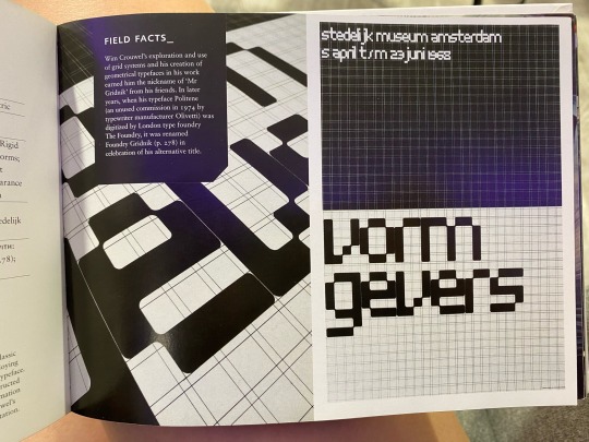
Architype Stedelijk by Wim Crouwel, 1968
This font was created using a rigid grid system, which gave the letters a technological look.
The Filed Of Typography: Typefaces in the Urban Landscape by Peter Dawson
0 notes
Text

En el Living | Ensayo de Convergencia de Alvaro, Juan Martin Solari y Tobias Mao
LAR
Maturín 2399 CABA
14 de Junio al 17 de Julio 2022
por tu ex
Llego a LAR en La Paternal el Domingo por la tarde, el día del cierre de la muestra a la que me invitó mi ex. Ensayo de Convergencia se llama, y es una muestra colectiva de tres artistas.
Por fuera las rejas del lugar están intervenidas con colores. Adentro todo es bastante gris y frío. Dejo el casco de la moto. Saludo a mi ex, le hago un chiste y me mira con cara rara. Estoy algo confundida. No sé cuál es su obra.
Estoy un rato en la sala junto a una pequeña montaña de cemento y varias fotografías de mediano formato hasta que advierto una escalera y comprendo que la cosa es arriba. Conozco algo a les artistas y sus obras, así que antes de ir imaginé un posible escenario para la muestra.
Al subir confirmo bastante mi teoría: Estoy en un pequeño living, acogedor ¿y de los 70s?
Hay una alfombra y una mesa ratona con almohadones en el piso, suena música de savasana ¿alguna frecuencia de sanación? El espacio está regado de libros: conviven el I Ching, la Biblia, un libro de brujería, uno que se llama Los Arquitectos de las Moléculas y otro Plantas de Interior (por nombrar algunos).
La ambientación es un poco hippie, y cargada de guiños para que no queden dudas de lo que se trata: una extensión de la casa de les artistas, artistas que estudian e investigan acerca de lo espiritual, la biología y el ocultismo. La música yogi sigue tocando la misma nota desde que entré. En la mesa además de libros hay una frutera de vidrio vintage, un sahumerio ya consumido y una vela violeta, el color de la sanación.
Me pregunto qué pasaría si hubiera un tv plasma y una play, pero la narrativa invita a tomar un té de boldo y ojear uno de esos interesantes libros para concluir que las moléculas son cuestión de fe y la religión es matemática.
Esta instalación es el medio en donde habitan tres obras principales. De frente me topo con la obra de Tobías Mao, una gran pintura que muestra un libro abierto simétricamente por donde bajan una cascada de agua y otra de sangre, con florecillas, sobre una mesa cuadriculada. No sé por qué la escena me lleva a un picnic en primavera.
A la derecha la obra de Álvaro, una mano atravesada por lo que pienso es un río, atrás dibujada la carta de tarot de El Loco. La obra está plastificada, como al vacío. Bien preservada, nada ecológica. Por arriba hay una especie de post-it con un mensaje en un idioma de signos incomprensibles, fantaseo decodificarlo.
En la pared de la izquierda, la obra de Juan Martin Solari. Un tapiz precioso y tupido no del todo rectangular. Unos soles con flechas irregulares apuntan a un smiley triste a la izquierda y otro sonriente a la derecha. Al centro una flor.
Vuelvo a pensar en las escenas del tarot, y al salir hacia la segunda habitación me encuentro con una carta incrustada en la pared. El 12 de espadas.
Atravieso una cortina plástica y la situación cambia sustancialmente. Ahora estoy en un laboratorio de luz fría, con vitrinas y más pistas de procesos de investigación. Hay más obras, y oh por dios, más libros: La Metamorfosis de las Plantas de Goethe y El Libro de los Signos de Rudolf Koch. Ok, ya entendimos.
En la mesa hay una obra-texto de Tobías Mao que recomiendo leer. En la pared hay algunas notas, una paleta de colores, una impresión de ruido blanco, algunos cables usb y microchips.
En otra pared hay dos obras pequeñas de Solari en crayón/óleo donde se ve un bufón..¿o es El Loco del tarot? Hay otra pintura de Mao con vino saltante, un pan religioso, un libro, pinceles y una computadora abierta. Otra de las obras principales de Álvaro es una planta en un estantería industrial, cerrada con plásticos a modo de vitrina. Me gusta que la humedad sea uno de los materiales de la obra. La planta crece de un macetero derretido, por el cual sale un tronco que deviene en florero plástico y una planta más. Un ikebana trash pero interesante de luz magenta. Hay otra obra hermana de ésta pero en vez de una vitrina es una especie de manga en donde hay un tronco húmedo con una prótesis de plástico flúor en uno de sus extremos. Es difícil de explicar.. Pero me da la sensación de que alienígenas están haciendo pruebas en una película de David Cronenberg.
En ambas habitaciones hay tanta información que me agobia un poco. Por suerte las obras tienen el poder de abstraerme por un rato. Vuelvo al living, me siento un momento, y me acuerdo de que el otro día me salió en una tirada El Mundo, la carta en donde se integran los elementos y convergen los saber.
0 notes
Text
Get now Type: A Visual History of Typefaces & Graphic Styles BY : Cees W. de Jong
Get the best Books, Magazines & Comics in every genre including Action, Adventure, Anime, Manga, Children & Family, Classics, Comedies, Reference, Manuals, Drama, Foreign, Horror, Music, Romance, Sci-Fi, Fantasy, Sports and many more.
Type: A Visual History of Typefaces & Graphic Styles
READ & DOWNLOAD Cees W. de Jong book Type: A Visual History of Typefaces & Graphic Styles in PDF, EPub, Mobi, Kindle online. Free book, AudioBook, Reender Book Type: A Visual History of Typefaces & Graphic Styles by Cees W. de Jong full book,full ebook full Download.

√PDF √KINDLE √EBOOK √ONLINE
Read Or Download Type: A Visual History of Typefaces & Graphic Styles
BOOK DETAILS :
Author : Cees W. de Jong
Title : Type: A Visual History of Typefaces & Graphic Styles
Get book ====> Type: A Visual History of Typefaces & Graphic Styles. Full supports all version of your device, includes PDF, ePub and Kindle version. All books format are mobile-friendly. Read and download online as many books as you like for personal use.
For The Love of Letters A history of fonts and graphic styles from 1628 to 1938 This comprehensive book offers a thorough overview of typeface design from 1628 to the mid-20th century. Derived from a distinguished Dutch collection, a series of exquisitely designed catalogues trace the evolution of the printed letter via specimens in roman, italic, bold, semibold, narrow, and broad fonts. Borders, ornaments, initial letters, and decorations are also included, along with lithographic examples, letters by sign writers, inscription carvers, and calligraphers. The first part of the book covers pre-20th century typeface, with texts by editor Cees de Jong and collector Jan Tholenaar. The second part covers the period from 1900 to the mid-20th century, and contains a historical outline by Alston W. Purvis. Featured type designers include: William Caslon, Fritz Helmuth Ehmcke, Peter Behrens, Rudolf Koch, Eric Gill, Jan van Krimpen, Paul Renner, Jan Tschichold, A. M. Cassandre, Aldo Novarese,
#bookish ,#kindleaddict ,#EpubForSale ,#bestbookreads ,#ebookworm ,#readyforit ,#downloadprint
By click link in above! wish you have good luck and enjoy reading your book.
(Works on PC, Ipad, Android, iOS, Tablet, MAC)
————————————————————
0 notes
Last Seen Blogs

vitacarleo
Vita Carleo

regionalkaraoke
Regional Karaoke
duzzgy
Pájaro y granada

robotyprzemyslowe
Roboty Przemysłowe

tokodrainaserumputmurah
Toko Drainase Cell Rumput Sintetis