#Snippets:
Explore tagged Tumblr posts
Visit Tumblr Blog
Explore Tumblr blogs with no restrictions, modern design and the best experience.
Last Seen Tumblr Blogs


Fun Fact
Tumblr was named as a finalist in Lead411’s New York City Hot 125 in Aug 2010.
Text
Come to the light-dark() Side
New Post has been published on https://thedigitalinsider.com/come-to-the-light-dark-side/
Come to the light-dark() Side
You’d be forgiven for thinking coding up both a dark and a light mode at once is a lot of work. You have to remember @media queries based on prefers-color-scheme as well as extra complications that arise when letting visitors choose whether they want light or dark mode separately from the OS setting. And let’s not forget the color palette itself! Switching from a “light” mode to a “dark” mode may involve new variations to get the right amount of contrast for an accessible experience.
It is indeed a lot of work. But I’m here to tell you it’s now a lot simpler with modern CSS!
Default HTML color scheme(s)
We all know the “naked” HTML theme even if we rarely see it as we’ve already applied a CSS reset or our favorite boilerplate CSS before we even open localhost. But here’s a news flash: HTML doesn’t only have the standard black-on-white theme, there is also a native white-on-black version.
We have two color schemes available to use right out of the box!
If you want to create a dark mode interface, this is a great base to work with and saves you from having to account for annoying details, like dark inputs, buttons, and other interactive elements.
Live Demo on CodePen
Switching color schemes automatically based on OS preference
Without any @media queries — or any other CSS at all — if all we did was declare color-scheme: light dark on the root element, the page will apply either the light or dark color scheme automatically by looking at the visitor’s operating system (OS) preferences. Most OSes have a built-in accessibility setting for your preferred color scheme — “light”, “dark”, or even “auto” — and browsers respect that setting.
html color-scheme: light dark;
We can even accomplish this without CSS directly in the HTML document in a <meta> tag:
<meta name="color-scheme" content="light dark">
Whether you go with CSS or the HTML route, it doesn’t matter — they both work the same way: telling the browser to make both light and dark schemes available and apply the one that matches the visitor’s preferences. We don’t even need to litter our styles with prefers-color-scheme instances simply to swap colors because the logic is built right in!
You can apply light or dark values to the color-scheme property. At the same time, I’d say that setting color-scheme: light is redundant, as this is the default color scheme with or without declaring it.
You can, of course, control the <meta> tag or the CSS property with JavaScript.
There’s also the possibility of applying the color-scheme property on specific elements instead of the entire page in one fell swoop. Then again, that means you are required to explicitly declare an element’s color and background-color properties; otherwise the element is transparent and inherits its text color from its parent element.
What values should you give it? Try:
Default text and background color variables
The “black” colors of these native themes aren’t always completely black but are often off-black, making the contrast a little easier on the eyes. It’s worth noting, too, that there’s variation in the blackness of “black” between browsers.
What is very useful is that this default not-pure-black and maybe-not-pure-white background-color and text color are available as <system-color> variables. They also flip their color values automatically with color-scheme!
They are: Canvas and CanvasText.
These two variables can be used anywhere in your CSS to call up the current default background color (Canvas) or text color (CanvasText) based on the current color scheme. If you’re familiar with the currentColor value in CSS, it seems to function similarly. CanvasText, meanwhile, remains the default text color in that it can’t be changed the way currentColor changes when you assign something to color.
In the following examples, the only change is the color-scheme property:
Not bad! There are many, many more of these system variables. They are case-insensitive, often written in camelCase or PascalCase for readability. MDN lists 19 <system-color> variables and I’m dropping them in below for reference.
Open to view 19 system color names and descriptions
AccentColor: The background color for accented user interface controls
AccentColorText: The text color for accented user interface controls
ActiveText: The text color of active links
ButtonBorder: The base border color for controls
ButtonFace: The background color for controls
ButtonText: The text color for controls
Canvas: The background color of an application’s content or documents
CanvasText: The text color used in an application’s content or documents
Field: The background color for input fields
FieldText: The text color inside form input fields
GrayText: The text color for disabled items (e.g., a disabled control)
Highlight: The background color for selected items
HighlightText: The text color for selected items
LinkText: The text color used for non-active, non-visited links
Mark: The background color for text marked up in a <mark> element
MarkText: The text color for text marked up in a <mark> element
SelectedItem: The background color for selected items (e.g., a selected checkbox)
SelectedItemText: The text color for selected items
VisitedText: The text visited links
Cool, right? There are many of them! There are, unfortunately, also discrepancies as far as how these color keywords are used and rendered between different OSes and browsers. Even though “evergreen” browsers arguably support all of them, they don’t all actually match what they’re supposed to, and fail to flip with the CSS color-scheme property as they should.
Egor Kloos (also known as dutchcelt) is keeping an eye on the current status of system colors, including which ones exist and the browsers that support them, something he does as part of a classless CSS framework cleverly called system.css.
Declaring colors for both modes together
OK good, so now you have a page that auto-magically flips dark and light colors according to system preferences. Whether you choose to use these system colors or not is up to you. I just like to point out that “dark” doesn’t always have to mean pure “black” just as “light” doesn’t have to mean pure “white.” There are lots more colors to pair together!
But what’s the best or simplest way to declare colors so they work in both light and dark mode?
In my subjective reverse-best order:
Third place: Declare color opacity
You could keep all the same background colors in dark and light modes, but declare them with an opacity (i.e. rgb(128 0 0 / 0.5) or #80000080). Then they’ll have the Canvas color shine through.
It’s unusable in this way for text colors, and you may end up with somewhat muted colors. But it is a nice easy way to get some theming done fast. I did this for the code blocks on this old light and dark mode demo.
Second place: Use color-mix()
Like this:
color-mix(in oklab, Canvas 75%, RebeccaPurple);
Similar (but also different) to using opacity to mute a color is mixing colors in CSS. We can even mix the system color variables! For example, one of the colors can be either Canvas or CanvasText so that the background color always mixes with Canvas and the text color always mixes with CanvasText.
We now have the CSS color-mix() function to help us with this. The first argument in the function defines the color space where the color mixing happens. For example, we can tell the function that we are working in the OKLAB color space, which is a rectangular color space like sRGB making it ideal to mix with sRGB color values for predictable results. You can certainly mix colors from different color spaces — the OKLAB/sRGB combination happens to work for me in this instance.
The second and third arguments are the colors you want to mix, and in what proportion. Proportions are optional but expressed in percentages. Without declaring a proportion, the mix is an even 50%-50% split. If you add percentages for both colors and they don’t match up to 100%, it does a little math for you to prevent breakages.
The color-mix() approach is useful if you’re happy to keep the same hues and color saturations regardless of whether the mode is light or dark.
In this example, as you change the value of the hue slider, you’ll see color changes in the themed boxes, following the theme color but mixed with Canvas and CanvasText:
You may have noticed that I used OKLCH and HSL color spaces in that last example. You may also have noticed that the HSL-based theme color and the themed paragraph were a lot more “flashy” as you moved the hue slider.
I’ve declared colors using a polar color space, like HSL, for years, loving that you can easily take a hue and go up or down the saturation and lightness scales based on need. But, I concede that it’s problematic if you’re working with multiple hues while trying to achieve consistent perceived lightness and saturation across them all. It can be difficult to provide ample contrast across a spectrum of colors with HSL.
The OKLCH color space is also polar just like HSL, with the same benefits. You can pick your hue and use the chroma value (which is a bit like saturation in HSL) and the lightness scales accurately in the same way. Both OKLCH and OKLAB are designed to better match what our eyes perceive in terms of brightness and color compared to transitioning between colors in the sRGB space.
While these color spaces may not explicitly answer the age-old question, Is my blue the same as your blue? the colors are much more consistent and require less finicking when you decide to base your whole website’s palette on a different theme color. With these color spaces, the contrasts between the computed colors remain much the same.
First place (winner!): Use light-dark()
Like this:
light-dark(lavender, saddlebrown);
With the previous color-mix() example, if you choose a pale lavender in light mode, its dark mode counterpart is very dark lavender.
The light-dark() function, conversely, provides complete control. You might want that element to be pale lavender in light mode and a deep burnt sienna brown in dark mode. Why not? You can still use color-mix() within light-dark() if you like — declare the colors however you like, and gain much more fine-grained control over your colors.
Feel free to experiment in the following editable demo:
Using color-scheme: light dark; — or the corresponding meta tag in HTML on your page —is a prerequisite for the light-dark() function because it allows the function to respect a person’s system preference, or whichever single light or dark value you have set on color-scheme.
Another consideration is that light-dark() is newly available across browsers, with just over 80% coverage across all users at the time I’m writing this. So, you might consider including a fallback in your CSS for browsers that lack support for the function.
What makes using color-scheme and light-dark() better than using @media queries?
@media queries have been excellent tools, but using them to query prefers-color-scheme only ever follows the preference set within the person’s operating system. This is fine until you (rightfully) want to offer the visitor more choices, decoupled from whether they prefer the UI on their device to be dark or light.
We’re already capable of doing that, of course. We’ve become used to a lot of jiggery-pokery with extra CSS classes, using duplicated styles, or employing custom properties to make it happen.
The joy of using color-scheme is threefold:
It gives you the basic monochrome dark mode for free!
It can natively do the mode switching based on OS mode preference.
You can use JavaScript to toggle between light and dark mode, and the colors declared in the light-dark() functions will follow it.
Light, dark, and auto mode controls
Essentially, all we are doing is setting one of three options for whether the color-scheme is light, dark, or updates auto-matically.
I advise offering all three as discrete options, as it removes some complications for you! Any new visitor to the site will likely be in auto mode because accepting the visitor’s OS setting is the least jarring default state. You then give that person the choice to stay with that or swap it out for a different color scheme. This way, there’s no need to sniff out what mode someone prefers to, for example, display the correct icon on a toggle and make it perform the correct action. There is also no need to keep an event listener on prefers-color-scheme in case of changes — your color-scheme: light dark declaration in CSS handles that for you.
Adjusting color-scheme in pure CSS
Yes, this is totally possible! But the approach comes with a few caveats:
You can’t use <button> — only radio inputs, or <options> in a <select> element.
It only works on a per page basis, not per website, which means changes are lost on reload or refresh.
The browser needs to support the :has() pseudo-selector. Most modern browsers do, but some folks using older devices might miss out on the experience.
Using the :has() pseudo-selector
This approach is almost alarmingly simple and is fantastic for a simple one-pager! Most of the heavy lifting is done with this:
/* default, or 'auto' */ html color-scheme: light dark; html:has([value="light"]:checked color-scheme: light; html:has([value="dark"]:checked color-scheme: dark;
The second and third rulesets above look for an attribute called value on any element that has “light” or “dark” assigned to it, then change the color-scheme to match only if that element is :checked.
This approach is not very efficient if you have a huge page full of elements. In those cases, it’s better to be more specific. In the following two examples, the CSS selectors check for value only within an element containing id="mode-switcher".
html:has(#mode-switcher [value="light"]:checked) color-scheme: light /* Did you know you don't need the ";" for a one-liner? Now you do! */
Using a <select> element:
Using <input type="radio">:
We could theoretically use checkboxes for this, but since checkboxes are not supposed to be used for mutually exclusive options, I won’t provide an example here. What happens in the case of more than one option being checked? The last matching CSS declaration wins (which is dark in the examples above).
Adjusting color-scheme in HTML with JavaScript
I subscribe to Jeremy Keith’s maxim when it comes to reaching for JavaScript:
JavaScript should only do what only JavaScript can do.
This is exactly that kind of situation.
If you want to allow visitors to change the color scheme using buttons, or you would like the option to be saved the next time the visitor comes to the site, then we do need at least some JavaScript. Rather than using the :has() pseudo-selector in CSS, we have a few alternative approaches for changing the color-scheme when we add JavaScript to the mix.
Using <meta> tags
If you have set your color-scheme within a meta tag in the <head> of your HTML:
<meta name="color-scheme" content="light dark">
…you might start by making a useful constant like so:
const colorScheme = document.querySelector('meta[name="color-scheme"]');
And then you can manipulate that, assigning it light or dark as you see fit:
colorScheme.setAttribute("content", "light"); // to light mode colorScheme.setAttribute("content", "dark"); // to dark mode colorScheme.setAttribute("content", "light dark"); // to auto mode
This is a very similar approach to using <meta> tags but is different if you are setting the color-scheme property in CSS:
html color-scheme: light dark;
Instead of setting a colorScheme constant as we just did in the last example with the <meta> tag, you might select the <html> element instead:
const html = document.querySelector('html');
Now your manipulations look like this:
html.style.setProperty("color-scheme", "light"); // to light mode html.style.setProperty("color-scheme", "dark"); // to dark mode html.style.setProperty("color-scheme", "light dark"); // to auto mode
I like to turn those manipulations into functions so that I can reuse them:
function switchAuto() html.style.setProperty("color-scheme", "light dark"); function switchLight() html.style.setProperty("color-scheme", "light"); function switchDark() html.style.setProperty("color-scheme", "dark");
Alternatively, you might like to stay as DRY as possible and do something like this:
function switchMode(mode) html.style.setProperty("color-scheme", mode === "auto" ? "light dark" : mode);
The following demo shows how this JavaScript-based approach can be used with buttons, radio buttons, and a <select> element. Please note that not all of the controls are hooked up to update the UI — the demo would end up too complicated since there’s no world where all three types of controls would be used in the same UI!
I opted to use onchange and onclick in the HTML elements mainly because I find them readable and neat. There’s nothing wrong with instead attaching a change event listener to your controls, especially if you need to trigger other actions when the options change. Using onclick on a button doesn’t only work for clicks, the button is still keyboard-focusable and can be triggered with Spacebar and Enter too, as usual.
Remembering the selection for repeat visits
The biggest caveat to everything we’ve covered so far is that this only works once. In other words, once the visitor has left the site, we’re doing nothing to remember their color scheme preference. It would be a better user experience to store that preference and respect it anytime the visitor returns.
The Web Storage API is our go-to for this. And there are two available ways for us to store someone’s color scheme preference for future visits.
localStorage
Local storage saves values directly on the visitor’s device. This makes it a nice way to keep things off your server, as the stored data never expires, allowing us to call it anytime. That said, we’re prone to losing that data whenever the visitor clears cookies and cache and they’ll have to make a new selection that is freshly stored in localStorage.
You pick a key name and give it a value with .setItem():
localStorage.setItem("mode", "dark");
The key and value are saved by the browser, and can be called up again for future visits:
const mode = localStorage.getItem("mode");
You can then use the value stored in this key to apply the person’s preferred color scheme.
sessionStorage
Session storage is thrown away as soon as a visitor browses away to another site or closes the current window/tab. However, the data we capture in sessionStorage persists while the visitor navigates between pages or views on the same domain.
It looks a lot like localStorage:
sessionStorage.setItem("mode", "dark"); const mode = sessionStorage.getItem("mode");
Which storage method should I use?
Personally, I started with sessionStorage because I wanted my site to be as simple as possible, and to avoid anything that would trigger the need for a GDPR-compliant cookie banner if we were holding onto the person’s preference after their session ends. If most of your traffic comes from new visitors, then I suggest using sessionStorage to prevent having to do extra work on the GDPR side of things.
That said, if your traffic is mostly made up of people who return to the site again and again, then localStorage is likely a better approach. The convenience benefits your visitors, making it worth the GDPR work.
The following example shows the localStorage approach. Open it up in a new window or tab, pick a theme other than what’s set in your operating system’s preferences, close the window or tab, then re-open the demo in a new window or tab. Does the demo respect the color scheme you selected? It should!
Choose the “Auto” option to go back to normal.
If you want to look more closely at what is going on, you can open up the developer tools in your browser (F12 for Windows, CTRL+ click and select “Inspect” for macOS). From there, go into the “Application” tab and locate https://cdpn.io in the list of items stored in localStorage. You should see the saved key (mode) and the value (dark or light). Then start clicking on the color scheme options again and watch the mode update in real-time.
Accessibility
Congratulations! If you have got this far, you are considering or already providing versions of your website that are more comfortable for different people to use.
For example:
People with strong floaters in their eyes may prefer to use dark mode.
People with astigmatism may be able to focus more easily in light mode.
So, providing both versions leaves fewer people straining their eyes to access the content.
Contrast levels
I want to include a small addendum to this provision of a light and dark mode. An easy temptation is to go full monochrome black-on-white or white-on-black. It’s striking and punchy! I get it. But that’s just it — striking and punchy can also trigger migraines for some people who do a lot better with lower contrasts.
Providing high contrast is great for the people who need it. Some visual impairments do make it impossible to focus and get a sharp image, and a high contrast level can help people to better make out the word shapes through a blur. Minimum contrast levels are important and should be exceeded.
Thankfully, alongside other media queries, we can also query prefers-contrast which accepts values for no-preference, more, less, or custom.
In the following example (which uses :has() and color-mix()), a <select> element is displayed to offer contrast settings. When “Low” is selected, a filter of contrast(75%) is placed across the page. When “High” is selected, CanvasText and Canvas are used unmixed for text color and background color:
Adding a quick high and low contrast theme gives your visitors even more choice for their reading comfort. Look at that — now you have three contrast levels in both dark and light modes — six color schemes to choose from!
ARIA-pressed
ARIA stands for Accessible Rich Internet Applications and is designed for adding a bit of extra info where needed to screen readers and other assistive tech.
The words “where needed” do heavy lifting here. It has been said that, like apostrophes, no ARIA is better than bad ARIA. So, best practice is to avoid putting it everywhere. For the most part (with only a few exceptions) native HTML elements are good to go out of the box, especially if you put useful text in your buttons!
The little bit of ARIA I use in this demo is for adding the aria-pressed attribute to the buttons, as unlike a radio group or select element, it’s otherwise unclear to anyone which button is the “active” one, and ARIA helps nicely with this use case. Now a screen reader will announce both its accessible name and whether it is in a pressed or unpressed state along with a button.
Following is an example code snippet with all the ARIA code bolded — yes, suddenly there’s lots more! You may find more elegant (or DRY-er) ways to do this, but showing it this way first makes it more clear to demonstrate what’s happening.
Our buttons have ids, which we have used to target them with some more handy consts at the top. Each time we switch mode, we make the button’s aria-pressed value for the selected mode true, and the other two false:
const html = document.querySelector("html"); const mode = localStorage.getItem("mode"); const lightSwitch = document.querySelector('#lightSwitch'); const darkSwitch = document.querySelector('#darkSwitch'); const autoSwitch = document.querySelector('#autoSwitch'); if (mode === "light") switchLight(); if (mode === "dark") switchDark(); function switchAuto() html.style.setProperty("color-scheme", "light dark"); localStorage.removeItem("mode"); lightSwitch.setAttribute("aria-pressed","false"); darkSwitch.setAttribute("aria-pressed","false"); autoSwitch.setAttribute("aria-pressed","true"); function switchLight() html.style.setProperty("color-scheme", "light"); localStorage.setItem("mode", "light"); lightSwitch.setAttribute("aria-pressed","true"); darkSwitch.setAttribute("aria-pressed","false"); autoSwitch.setAttribute("aria-pressed","false"); function switchDark() html.style.setProperty("color-scheme", "dark"); localStorage.setItem("mode", "dark"); lightSwitch.setAttribute("aria-pressed","false"); darkSwitch.setAttribute("aria-pressed","true"); autoSwitch.setAttribute("aria-pressed","false");
On load, the buttons have a default setting, which is when the “Auto” mode button is active. Should there be any other mode in the localStorage, we pick it up immediately and run either switchLight() or switchDark(), both of which contain the aria-pressed changes relevant to that mode.
<button id="autoSwitch" aria-pressed="true" type="button" onclick="switchAuto()">Auto</button> <button id="lightSwitch" aria-pressed="false" type="button" onclick="switchLight()">Light</button> <button id="darkSwitch" aria-pressed="false" type="button" onclick="switchDark()">Dark</button>
The last benefit of aria-pressed is that we can also target it for styling purposes:
button[aria-pressed="true"] background-color: transparent; border-width: 2px;
Finally, we have a nice little button switcher, with its state clearly shown and announced, that remembers your choice when you come back to it. Done!
Outroduction
Or whatever the opposite of an introduction is…
…don’t let yourself get dragged into the old dark vs light mode argument. Both are good. Both are great! And both modes are now easy to create at once. At the start of your next project, work or hobby, do not give in to fear and pick a side — give both a try, and give in to choice.
#:has#Accessibility#ADD#API#applications#approach#aria#Articles#background#Blue#blur#box#browser#buttons#cache#canvas#Capture#change#classes#code#Code Snippet#coding#Color#colors#content#cookies#course#CSS#custom properties#Dark
0 notes
Quote
Reflection questions: How does anger appear in your day to day? What message is being unheard and how can you honour and validate your own message? How have you contributed to the tone policing of women or BIPOC? What has your tone policing of women or BIPOC looked like in the past, how would you notice it again in your future, and what do you plan on doing to shift away from it?
#quotes
#This is a snippet from Michelle unfolding her story of how her life and career#her children’s lives were put on put on pause as she navigated around her husband’s chase for his career.#The most empowering part is that she acknowledges his needs and dreams and avidly supports him#yet continually reflected and returned to a central spot where she did not let her husband’s grand dreams overshadow her own career and rol
0 notes
Photo

PORTO ROCHA
1K notes
·
View notes
Photo

(vía Another America 50 by Phillip Toledano)
77 notes
·
View notes
Photo
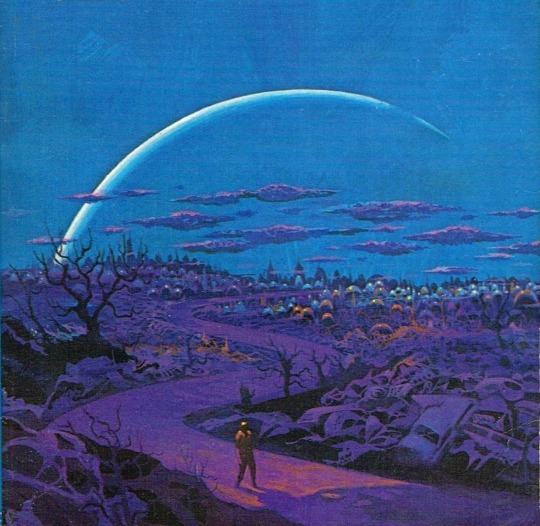
One of my favorites by Paul Lehr, used as a 1971 cover to "Earth Abides," by George R. Stewart. It's also in my upcoming art book!
1K notes
·
View notes
Quote
もともとは10年ほど前にTumblrにすごくハマっていて。いろんな人をフォローしたらかっこいい写真や色が洪水のように出てきて、もう自分で絵を描かなくて良いじゃん、ってなったんです。それで何年も画像を集めていって、そこで集まった色のイメージやモチーフ、レンズの距離感など画面構成を抽象化して、いまの感覚にアウトプットしています。画像の持つ情報量というものが作品の影響になっていますね。
映画『きみの色』山田尚子監督×はくいきしろい対談。嫉妬し合うふたりが語る、色と光の表現|Tokyo Art Beat
156 notes
·
View notes
Photo


#thistension
XO, KITTY — 1.09 “SNAFU”
#xokittyedit#tatbilbedit#kdramaedit#netflixedit#wlwedit#xokittydaily#asiancentral#cinemapix#cinematv#filmtvcentral#pocfiction#smallscreensource#teendramaedit#wlwgif#kitty song covey#yuri han#xo kitty#anna cathcart#gia kim#~#inspiration: romantic.#dynamic: ff.
1K notes
·
View notes
Photo


No one wants to be here and no one wants to leave, Dave Smith (because)
111 notes
·
View notes
Text
CSS Functions and Mixins Module Notes
New Post has been published on https://thedigitalinsider.com/css-functions-and-mixins-module-notes/
CSS Functions and Mixins Module Notes
Most days, I’m writing vanilla CSS. Thanks to CSS variables and nesting, I have fewer reasons to reach for Sass or any other preprocessor. The times I reach for Sass tend to be when I need a @mixin to loop through a list of items or help keep common styles DRY.
That could change for me in the not-so-distant future since a new CSS Functions and Mixins Module draft was published in late June after the CSSWG resolved to adopt the proposal back in February.
Notice the module’s name: Functions and Mixins. There’s a distinction between the two.
This is all new and incredibly unbaked at the moment with plenty of TODO notes in the draft and points to consider in future drafts. The draft spec doesn’t even have a definition for mixins yet. It’ll likely be some time before we get something real to work and experiment with, but I like trying to wrap my mind around these sorts of things while they’re still in early days, knowing things are bound to change.
In addition to the early draft spec, Miriam Suzanne published a thorough explainer that helps plug some of the information gaps. Miriam’s an editor on the spec, so I find anything she writes about this to be useful context.
There’s a lot to read! Here are my key takeaways…
Custom functions are advanced custom properties
We’re not talking about the single-purpose, built-in functions we’ve come to love in recent years — e.g., calc(), min(), max(), etc. Instead, we’re talking about custom functions defined with an @function at-rule that contains logic for returning an expected value.
That makes custom functions a lot like a custom property. A custom property is merely a placeholder for some expected value that we usually define up front:
:root --primary-color: hsl(25 100% 50%);
Custom functions look pretty similar, only they’re defined with @function and take parameters. This is the syntax currently in the draft spec:
@function <function-name> [( <parameter-list> )]? <function-rules> result: <result>;
The result is what the ultimate value of the custom function evaluates to. It’s a little confusing to me at the moment, but how I’m processing this is that a custom function returns a custom property. Here’s an example straight from the spec draft (slightly modified) that calculates the area of a circle:
@function --circle-area(--r) --r2: var(--r) * var(--r); result: calc(pi * var(--r2));
Calling the function is sort of like declaring a custom property, only without var() and with arguments for the defined parameters:
.elenent inline-size: --circle-area(--r, 1.5rem); /* = ~7.065rem */
Seems like we could achieve the same thing as a custom property with current CSS features:
:root --r: 1rem; --r2: var(--r) * var(--r); --circle-area: calc(pi * var(--r2)); .element inline-size: var(--circle-area, 1.5rem);
That said, the reasons we’d reach for a custom function over a custom property are that (1) they can return one of multiple values in a single stroke, and (2) they support conditional rules, such as @supports and @media to determine which value to return. Check out Miriam’s example of a custom function that returns one of multiple values based on the inline size of the viewport.
/* Function name */ @function --sizes( /* Array of possible values */ --s type(length), --m type(length), --l type(length), /* The returned value with a default */ ) returns type(length) --min: 16px; /* Conditional rules */ @media (inline-size < 20em) result: max(var(--min), var(--s, 1em)); @media (20em < inline-size < 50em) result: max(var(--min), var(--m, 1em + 0.5vw)); @media (50em < inline-size) result: max(var(--min), var(--l, 1.2em + 1vw));
Miriam goes on to explain how a comma-separated list of parameters like this requires additional CSSWG work because it could be mistaken as a compound selector.
Mixins help maintain DRY, reusable style blocks
Mixins feel more familiar to me than custom functions. Years of writing Sass mixins will do that to you, and indeed, is perhaps the primary reason I still reach for Sass every now and then.
Mixins sorta look like the new custom functions. Instead of @function we’re working with @mixin which is exactly how it works in Sass.
/* Custom function */ @function <function-name> [( <parameter-list> )]? <function-rules> result: <result>; /* CSS/Sass mixin */ @mixin <mixin-name> [( <parameter-list> )]? <mixin-rules>
So, custom functions and mixins are fairly similar but they’re certainly different:
Functions are defined with @function; mixins are defined with @mixin but are both named with a dashed ident (e.g. --name).
Functions result in a value; mixins result in style rules.
This makes mixins ideal for abstracting styles that you might use as utility classes, say a class for hidden text that is read by screenreaders:
.sr-text position: absolute; left: -10000px; top: auto; width: 1px; height: 1px; overflow: hidden;
In true utility fashion, we can sprinkle this class on elements in the HTML to hide the text.
<a class="sr-text">Skip to main content</a>
Super handy! But as any Tailwind-hater will tell you, this can lead to ugly markup that’s difficult to interpret if we rely on many utility classes. Screereader text isn’t in too much danger of that, but a quick example from the Tailwind docs should illustrate that point:
<div class="origin-top-right absolute right-0 mt-2 w-56 rounded-md shadow-lg">
It’s a matter of preference, really. But back to mixins! The deal is that we can use utility classes almost as little CSS snippets to build out other style rules and maintain a clearer separation between markup and styles. If we take the same .sr-text styles from before and mixin-erize them (yep, I’m coining this):
@mixin --sr-text position: absolute; left: -10000px; top: auto; width: 1px; height: 1px; overflow: hidden;
Instead of jumping into HTML to apply the styles, we can embed them in other CSS style rules with a new @apply at-rule:
header a:first-child @apply --sr-text; /* Results in: */ position: absolute; left: -10000px; top: auto; width: 1px; height: 1px; overflow: hidden;
Perhaps a better example is something every project seems to need: centering something!
@mixin --center-me display: grid; place-items: center;
This can now be part of a bigger ruleset:
header @apply --center-me; /* display: grid; place-items: center; */ background-color: --c-blue-50; color: --c-white; /* etc. */
That’s different from Sass which uses @include to call the mixin instead of @apply. We can even return larger blocks of styles, such as styles for an element’s ::before and ::after pseudos:
@mixin --center-me display: grid; place-items: center; position: relative; &::after background-color: hsl(25 100% 50% / .25); content: ""; height: 100%; position: absolute; width: 100%;
And, of course, we saw that mixins accept argument parameters just like custom functions. You might use arguments if you want to loosen up the styles for variations, such as defining consistent gradients with different colors:
@mixin --gradient-linear(--color-1, --color-2, --angle) /* etc. */
We’re able to specify the syntax for each parameter as a form of type checking:
@mixin --gradient-linear( --color-1 type(color), --color-2 type(color), --angle type(angle), ) /* etc. */
We can abstract those variables further and set default values on them:
@mixin --gradient-linear( --color-1 type(color), --color-2 type(color), --angle type(angle), ) --from: var(--color-1, orangered); --to: var(--from-color, goldenrod); --angle: var(--at-angle, to bottom right); /* etc. */
…then we write the mixin’s style rules with the parameters as variable placeholders.
@mixin --gradient-linear( --color-1 type(color), --color-2 type(color), --angle type(angle), ) --from: var(--color-1, orangered); --to: var(--from-color, goldenrod); --angle: var(--at-angle, to bottom right); background: linear-gradient(var(--angle), var(--from), var(--to));
Sprinkle conditional logic in there if you’d like:
@mixin --gradient-linear( --color-1 type(color), --color-2 type(color), --angle type(angle), ) --from: var(--color-1, orangered); --to: var(--from-color, goldenrod); --angle: var(--at-angle, to bottom right); background: linear-gradient(var(--angle), var(--from), var(--to)); @media (prefers-contrast: more) background: color-mix(var(--from), black); color: white;
This is all set to @apply the mixin in any rulesets we want:
header @apply --gradient-linear; /* etc. */ .some-class @apply --gradient-linear; /* etc. */
…and combine them with other mixins:
header @apply --gradient-linear; @apply --center-me; /* etc. */
This is all very high level. Miriam gets into the nuances of things like:
Applying mixins at the root level (i.e., not in a selector)
Working with Container Queries with the limitation of having to set global custom properties on another element than the one that is queried.
The possibility of conditionally setting mixin parameters with something like @when/@else in the mixin. (Which makes me wonder about the newly-proposed if() function and whether it would be used in place of @when.)
Why we might draw a line at supporting loops the same way Sass does. (CSS is a declarative language and loops are imperative flows.)
Scoping mixins (@layer? scope? Something else?)
Miriam has an excellent outline of the open questions and discussions happening around mixins.
That’s, um, it… at least for now.
Gah, this is a lot for my blonde brain! Anytime I’m neck-deep in CSS specification drafts, I have to remind myself that the dust is still settling. The spec authors and editors are wrestling with a lot of the same questions we have — and more! — so it’s not like a cursory read of the drafts is going to make experts out of anyone. And that’s before we get to the fact that things can, and likely will, change by the time it all becomes a recommended feature for browsers to implement.
This will be an interesting space to watch, which is something you can do with the following resources:
#amp#background#Blue#Brain#centering#change#classes#Color#colors#container#content#course#CSS#CSS Snippets#csswg#custom properties#deal#display#dust#fashion#Features#form#functions#Future#Global#gradients#grid#how#HTML#indeed
0 notes
Photo

PORTO ROCHA
770 notes
·
View notes
Photo

Beautiful photo of the Princess of Wales departing Westminster Abbey after attending the Commonwealth Day Service. --
#catherine elizabeth#princess catherine#princess of wales#princess catherine of wales#catherine the princess of wales#william arthur philip louis#prince william#prince of wales#prince william of wales#william the prince of wales#prince and princess of wales#william and catherine#kensington palace#british royal family
84 notes
·
View notes

Text
GENERAL MEMES: Vampire/Immortal Themed 🩸🦇🌹
↳ Please feel free to tweak them.
Themes: violence, death, blood, murder, depression/negative thoughts
SYMBOLS: ↳ Use “↪”to reverse the characters where applicable!
🦇 - To catch my muse transforming into a bat 🌞 - To warn my muse about/see my muse in the sunlight. 🩸 - To witness my muse drinking blood from a bag. 🐇 - To witness To catch my muse drinking blood from an animal. 🧔🏽 - To witness To catch my muse drinking blood from a human. 🦌 - For our muses hunt together for the first time. 🏃🏿♀️ - To see my muse using super speed. 🏋🏼♂️ - To see my muse using their super strength. 🧛🏻♂️ - To confront my muse about being a vampire. 🌕 - For my muse to lament missing the sun. ⏰ - For my muse to tell yours about a story from their long, immortal life. 🤛🏽 - To offer my muse your wrist to drink from. 👩🏿 - For my muse to reminisce about a long lost love. 👩🏽🤝👩🏽 - For your muse to look exactly like my muse's lost love. 👄 - For my muse to bite yours. 👀 - For my muse to glamour/compel yours. 🧄 - To try and sneakily feed my muse garlic to test if they're a vampire. 🔗 - To try and apprehend my muse with silver chains. 🔪 - To try and attack my muse with a wooden stake. 👤 - To notice that my muse doesn't have a reflection. 🌹 - For my muse to turn yours into a vampire. 🌚 - For my muse and yours to spend time together during the night. 🧛🏼♀️ - For my muse to tell yours about their maker/sire.
SENTENCES:
"I've been alive for a long time [ name ], I can handle myself." "I'm over a thousand years old, you can't stop me!" "Lots of windows in this place, not exactly the greatest place for a vampire." "Do you really drink human blood? Don't you feel guilty?" "Vampires are predators, [ name ] hunting is just part of our nature, you can't change that." "You just killed that person! You're a monster!" "Tomorrow at dawn, you'll meet the sun [ name ]." "Can you make me like you?" "Do you really want to live forever?" "You say you want to live forever, [ name ], but forever is a long time, longer than you can imagine." "What was it like to live through [ historic event / time period ]?" "Did people really dress like that when you were young?" "What were you like when you were human?" "We’re vampires, [ name ], we have no soul to save, and I don’t care." "How many people have you killed? You can tell me, I can handle it." "Did you meet [ historic figure ]?" "Everyone dies in the end, what does it matter if I... speed it along." "Every time we feed that person is someone's mother, brother, sister, husband. You better start getting used to that if you want to survive this life." "[ she is / he is / they are ] the strongest vampire anyone has heard of, no one knows how to stop them, and if you try you're going to get yourselves killed." "Vampire hunters are everywhere in this city, you need to watch your back." "Humans will never understand the bond a vampire has with [ his / her / their ] maker, it's a bond like no other." "Here, have this ring, it will protect you from the sunlight." "I get you're an immortal creature of the night and all that, but do you have to be such a downer about it?" "In my [ centuries / decades / millennia ] of living, do you really think no one has tried to kill me before?" "Vampires aren't weakened by garlic, that's a myth." "I used to be a lot worse than I was now, [ name ], I've had time to mellow, to become used to what I am. I'm ashamed of the monster I was." "The worst part of living forever is watching everyone you love die, while you stay frozen, still, constant." "I've lived so long I don't feel anything any more." "Are there more people like you? How many?" "Life has never been fair, [ name ], why would start being fair now you're immortal?" "You want to be young forever? Knock yourself out, I just hope you understand what you're giving up." "You never told me who turned you into a vampire. Who were they? Why did they do it?" "I could spend an eternity with you and never get bored." "Do you really sleep in coffins?" "There are worse things for a vampire than death, of that I can assure you [ name ]." "You need to feed, it's been days. You can drink from me, I can tell you're hungry." "The process of becoming a vampire is risky, [ name ], you could die, and I don't know if I could forgive myself for killing you." "I'm a vampire, I can hold a grudge for a long time, so believe me when I say I will never forgive this. Never." "You were human once! How can you have no empathy?" "You don't have to kill to be a vampire, but what would be the fun in that." "You can spend your first years of immortality doing whatever you want to whoever you want, but when you come back to your senses, it'll hit you harder than anything you've felt before." "One day, [ name ], everything you've done is going to catch up to you, and you're never going to forgive yourself." "Stop kidding yourself, [ name ], you're a vampire, a killer, a predator. You might as well embrace it now because you can't keep this up forever." "You can't [ compel / glamour ] me, I have something to protect me." "When you've lived as long as me, there's not much more in life you can do." "You want me to turn you? You don't know what you're asking me to do." "You really have to stop hissing like that, it's getting on my nerves." "I'm going to drive this stake through your heart, [ name ], and I'm going to enjoy it."
#ask meme#symbol meme#roleplay sentence meme#sentence starter meme#rp sentence prompts#vampire ask meme#ask box#ask memes#vampires#tw : blood#tw: violence#tw: death#tw: depression#tw: vampires#tw: murder
162 notes
·
View notes
Quote
よく「発明は1人でできる。製品化には10人かかる。量産化には100人かかる」とも言われますが、実際に、私はネオジム磁石を1人で発明しました。製品化、量産化については住友特殊金属の仲間たちと一緒に、短期間のうちに成功させました。82年に発明し、83年から生産が始まったのですから、非常に早いです。そしてネオジム磁石は、ハードディスクのVCM(ボイスコイルモーター)の部品などの電子機器を主な用途として大歓迎を受け、生産量も年々倍増して、2000年には世界で1万トンを超えました。
世界最強「ネオジム磁石はこうして見つけた」(佐川眞人 氏 / インターメタリックス株式会社 代���取締役社長) | Science Portal - 科学技術の最新情報サイト「サイエンスポータル」
81 notes
·
View notes
Photo

The Delian League, Part 2: From Eurymedon to the Thirty Years Peace (465/4-445/4 BCE)
This text is part of an article series on the Delian League.
The second phase of the Delian League's operations begins with the Hellenic victory over Mede forces at Eurymedon and ends with the Thirty Years Peace between Athens and Sparta (roughly 465/4 – 445/4 BCE).The Greek triumph at Eurymedon resulted in a cessation of hostilities against the Persians, which lasted almost six years. Whether or not this peace or truce followed from some formal treaty negotiated by Cimon, son of Miltiades, remains unknown.
Nevertheless, the Greek success at Eurymedon proved so decisive, the damage inflicted on Persia so great, and the wealth confiscated so considerable that an increasing number of League members soon began to wonder if the alliance still remained necessary. The Persians, however, had not altogether withdrawn from the Aegean. They still had, for example, a sizeable presence in both Cyprus and Doriscus. They also set about to build a great number of new triremes.
REDUCTION OF THASOS & THE BATTLE OF DRABESCUS
A quarrel soon erupted between the Athenians and Thasians over several trading ports and a wealth-producing mine (465 BCE). Competing economic interests compelled the rich and powerful Thasos to revolt from the Delian League. The Thasians resisted for almost three years. When the polis finally capitulated, the Athenians forced Thasos to surrender its naval fleet and the mine, dismantle defensive walls, pay retributions, and converted the future League contributions to monetary payments: 30 talents annum. Some League members became disaffected with the Athenian reduction of Thasos. Several poleis observed the Athenians had now developed a penchant for using "compulsion." They started to see Athens acting with both "arrogance and violence." On expeditions, furthermore, the other members felt they "no longer served as equals" (Thuc. 1.99.2).
The Athenians, meanwhile, attempted to establish a colony on the Strymon river to secure timber from Macedon, which shared its borders with the west bank. The location also proved a critical strategic point from which to protect the Hellespont. The Thracians, however, repelled the League forces at Drabescus. The Athenians soon realized the threats from both Thrace and Macedon made permanent settlements in the region difficult as they were essentially continental powers, and the League fleet could not reach them easily. Designs for the region, however, would not change, and the Athenians would return there again.
The Delian League had by this time demonstrated an inherent conflict from its beginnings: on the one hand, it engaged in heroic struggles against the Mede and extended its influence, reaping enormous benefits (especially for its poorer members). On the other hand, it also suppressed its members and soon demanded obedience from them.
The League engaged from the outset in a form of soft imperialism, collecting and commanding voluntary naval contributions and tribute while Athens used those resources and led all expeditions, enforcing continued membership but also showing little or no interest to interfere with the internal mechanisms of any member polis (unless it openly rebelled).
Continue reading...
35 notes
·
View notes