#THE FACT THIS PSD CAN COLOR THIS SCENE
Explore tagged Tumblr posts
Visit Tumblr Blog
Explore Tumblr blogs with no restrictions, modern design and the best experience.
Last Seen Tumblr Blogs


Fun Fact
Premium Tumblr themes are available from anywhere between $9 to $49.
Text


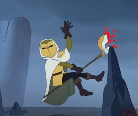
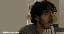
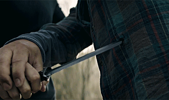
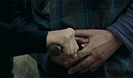
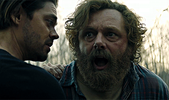
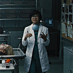
𝐄𝐃𝐈𝐓𝐒 𝐎𝐅 𝐒𝐀𝐌 ! 𝐄𝐏𝐈𝐒𝐎𝐃𝐄 𝟗 : 𝐑𝐄𝐐𝐔𝐈𝐄𝐌 𝟏𝟗𝟖𝟏 / 𝟏𝟗𝟖𝟕 𝐏𝐀𝐑𝐓 𝐎𝐍𝐄
#THE FACT THIS PSD CAN COLOR THIS SCENE#FUCK I HIT THE JACKPOT#thaT SCREAM#it has the same energy as mothers 'died screaminnng'#this sequence was immaculate and i will never shut up#& ── ⠀❪ sam ┊ and if you get in my face then you’ll get a taste; even god would run . 🍸#edits tbt.
1 note
·
View note
Text
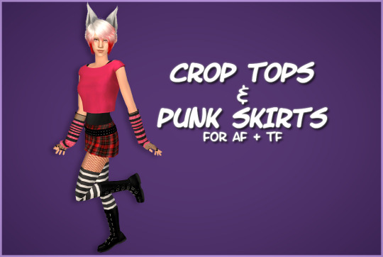

HAPPY BIRTHIVERSARY part 2 - Crop Tops & Punk Skirts
FUN FACT: The Sims 2 (2004) was released 3 days before the date upon which I was released from my mother's womb, therefore making me younger than The Sims 2 by 3 days as of September 14th 2024, but objectively older by 6 years as of September 17th 2024. As of this post, it is now my birthday. I can feel the hands of time slowly pulling me into the earth. Let's celebrate!
Today's Very Special Birthiversary post includes a set of stylish, vaguely Scene-inspired clothes for ladies: 24 recolors of the Urban Primitive skirt, separated from the Maxis outfit by Skell, and 5 Goth themed patterned recolors and 5 bright solid recolors of the 4t2 Bow Crop Top by MDPthatsme, with black tank top undershirts attached using textures by DeeDee. The clothes are for AF and TF, with Standalone and Repositoried options for TF, and they come with all morphs.
All meshes are included and special characters that would make the game load slower (specifically hyphens) have been removed from the filenames. Since the skirt is from the ever popular Maxis Match Repository Project, you probably have the mesh for the skirt lying around in your Downloads somewhere, so make sure you don't have duplicates.
For the skirts, there are two versions with tights - one of which is a mashup of fishnets by Io (colored red and black) and the Maxis black and white stockings, and the other is the Maxis shorts+fishnets texture because I liked it - and one version with bare legs, which can be used with @themeasureofasim's stockings accessory boxes. (actually only a handful work, see under the cut)
The crop tops and the skirts are 'meant' to be paired together but, being separates, you can mix and match with any other top or bottom you want.
CROP TOPS SWATCH | PUNK SKIRTS SWATCH
See under the cut for more (not very important) information.
DOWNLOAD (sfs)
Mesh credits: @mdpthatsme, Yuichen, @deedee-sims, Skell Texture and alpha credits: DeeDee, Ghanima Atreides, Creesims, Io, and Maxis Pattern credits: andrea_lauren, nerd-and-vine, ophelia_payne (@ Spoonflower), Blue Moth Fabrics, and VictoriaBat.
I have done my best to credit everyone who's resources I used. If I have misattributed or missed anybody, or if I have broken a rule in someone's TOU somewhere, please let me know.
Secondly, this is my first time 'retexturing' clothing instead of just recoloring it, as well as the first time I've done anything clothes-related in a very long time, so please be gentle to me with your criticisms and let me know if anything needs fixing <3
I wanted to recreate this outfit using only textures, because I know nothing about meshing and Milkshape scares me. As you can probably tell, I got a little carried away from the original goal.
I mashed a bunch of patterns, textures, and colors together on top of the crop top and skirt in an effort to learn 'advanced' recoloring of clothes in GIMP, as the most I've ever done before was just recoloring using pre-made PSDs. it was a bit of a disorganized disaster and there was quite a bit of blood, sweat, and tears. But the end results look... mostly nice, I think.
The arm warmers and fishnet gloves shown in the preview are a pair of accessories created by katsurinssims that I used to try to 'complete' the look, and are not included in this download.
Edit: im very sorry, I only tested a handful of the accessory stockings on the bare legs skirts, because I was very tired and there are A Lot of them, and assumed they would all work. But after a bit more testing, some of them have small gaps or poke through the boots, and the ones that are supposed to go over the crotch area end up looking like over the knee socks. Other than that, most of the knee high socks and tights work, but only on AF. I don't consider this a huge problem though, because a good amount of the tights work and the ones with gaps are barely noticeable.
There's a shoe swap that makes all of the boxes work with these skirts and I'll make another versIon of them with that mesh later.
#ts2#the sims 2#ts2cc#s2cc#sims 2 cc#sims 2 download#sims 2#happybirthiversary2024#the sims 2 anniversary#ssd cc#dl clothes#dl afclothes#dl tfclothes#i worked so fucking hard on this you don't even know
176 notes
·
View notes
Note
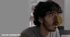
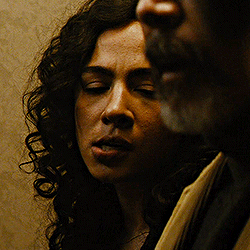
torturedpoets*tumblr*com/post/738611754795466752 hi! do you mind sharing what steps you use to color gifs like this? Some could assume that gifs with just one colour will be boring, but your colourings is always so nice 🥰
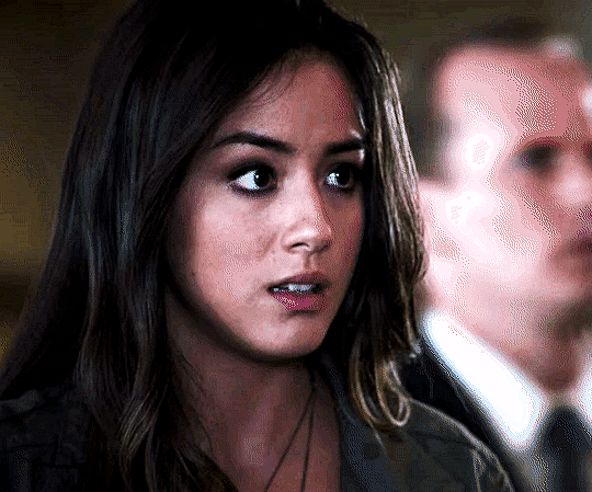
hi there!! i'd be happy to! i've never regretted saving a psd yet 😂 this is the post in question and honestly, for as... not great as the quality of my dl of the movie is, i'm still really happy with how it turned out! also i love women 😍

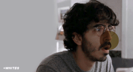
nothing too wild going on here, but even when i do "simple" coloring like this (gradient maps, my beloved), i still color the base gifs. once i have all the gifs made and plopped onto the canvas, this is what my coloring layers look like:
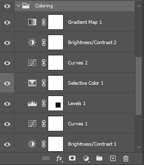
working from the bottom up, i almost always start with a brightness/contrast layer. i don't adjust either value, but instead set the layer's blending mode to screen. this movie is pretty dark, so i left the opacity at 100%, but sometimes, i'll drop the opacity as low as 20-30%.
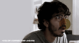
i follow that up with a curves layer, where i utilize the black and white eyedroppers. click the black eyedropper and then click the blackest point on your gif. then do the same with the white eyedropper. it's a good idea to play around with different points, especially when you're working with super tinted scenes. curves layers can be a lifesaver!
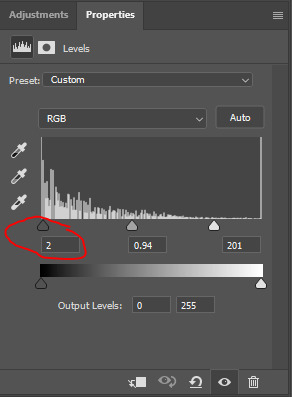
on the levels layer, i did the same exact thing with the eyedroppers, but oftentimes, i end up increasing the black value, like you see here:
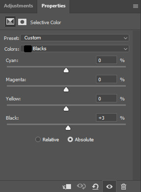
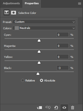
next, my FAVORITE adjustment layer: selective color! i like to color code my selective color layers, especially when i'm working on a super colorful set like my recent lisa frankenstein set. i always start with adjusting the blacks and usually the neutrals. you can right click on the eye/visibility icon to select a color. i use grey for these colors. here were my adjustments:
i'll occasionally adjust the white values when working with a really tinted scene, but these were fine, and it wouldn't make much difference anyway since we're putting a gradient map over top.
the next curves layer is just a slight adjustment for the top row of gifs to make the eventual gradient map layer more vibrant. i added this after the fact, but wanted it positioned here.
the subsequent brightness/contrast layer is the same thing. the top row just needed some more work. same as the original b/c layer, i didn't adjust the values and set the layer to screen. on this one, i dropped the opacity to 45%.
finally, the pièce de résistance, the gradient map layer! i just slapped on a gradient map adjustment layer. the color on the left should always be your darker color, and in this case, i want it true black. the color goes on the right, and bc this was a lesbian flag set, i just googled the specific hex codes for the lesbian pride flag and used those colors for each row! here's what that looks like for the orange portion of the set:
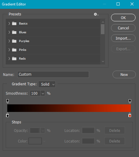
to change the colors, you just click on the lil square guys on the bottom of the gradient and you can choose a color from the color picker or just copy and paste a hex code.
and there you have it! i lovelovelove using gradient maps for big, vibrant pops of color, but also for gifs of scenes that are just. so hard to color lmao. call it a cop-out, but it makes my life a lot easier 😂
let me know if you have any more questions on this set or any others!!
#answered#Anonymous#my tutorials#gif tutorial#gifmakerresource#chaoticresources#dailyresources#completeresources
26 notes
·
View notes
Note
Well, as your coloring self proclaimed biggest fan, I would very much like to fistfight that anon. Because what the hell? Your level of color correction is impressive and that's a plain fact and it would absolutely be so so so helpful, especially with some 911 scenes that have some pretty intense orange filters (s1 lighting derogatory), even if you just need a place to start. I personally would love it to get rid of the yellow filter on the crossover because I legitimately believe you're a wizard when it comes to coloring those because that shit is impossible. I have literally cried trying to make them look like humans in some scenes of those scenes. A psd pack from you would be heaven sent and anon is just mean and hates nice things and needs to go find something better to do. Anyway, I love you and your sets and your coloring and I will fight the anon if you want me to 🩷
Anna I am sooo in love with u thank u so much for this. When nobody else got me I know Anna got me can I get an amen!!!!!!!!
#ur tags on my gif sets are literally like…..90% of the reason I post on here anymore#like I see u in my activity and I start frothing at the mouth#asks#office hours
6 notes
·
View notes
Note
i'm still new to gif-making & coloring (under a month) but i've seen lots of gifsets going around where the gifs are white/the background is so smooth and monotone. i don't understand how gifmakers can do this without making the subject of the gif (like the character) pale/washed out as well? i was hoping you might have some tutorials, tips or even psds to help with this sort of thing? thank you so much!
hi! welcome to the world of gif-making! <3
like most cases with gif effects, scene selection is key! my best advice for manipulating the background to be white is to select a scene where the background is mainly 1 color. even better if it's a color that doesn't match your subject's skin/clothes! in fact, the easiest way to do this would be if your background is any color but red or yellow, that way you can control and preserve their skin tone separately using the red/yellow settings in selective color or hue/saturation.
you can then isolate the background color using a hue/saturation layer. for example, if you used a scene where the background is a bright blue sky, on the cyan and blue settings of a hue/sat layer you could turn down the saturation all the way and increase the lightness to make a white background
here are a few tutorials that don't necessarily cover this effect specifically, but explain really helpful techniques that could help you get there:
how to change the background of any gif by usergif/fionagallaqher
bea's color isolation gif tutorial by useraelin
anti-whitewashing tutorial for pale & pastel gifs by fadenet
hope this helps!!
56 notes
·
View notes
Photo
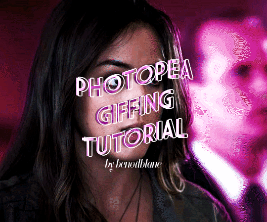
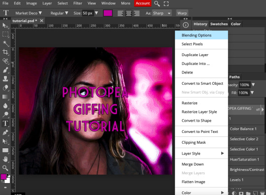
@murdocks asked for a tutorial of how to gif things using photopea, so here i am! for those of you who don’t know what photopea is, it’s a free online editing software that’s very similar to photoshop. in fact, you can import photoshop psds, brushes, etc. if you so choose, but for the sake of this tutorial, i’ve stuck with the basics. fair warning: this is quite long. i’ve started out with how to use the website, then moved on to a practical application.
onward!
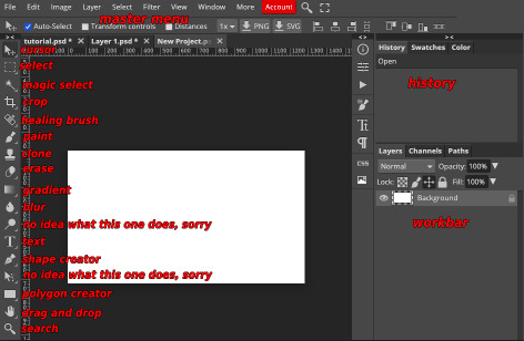
so, welcome to photopea. here’s the link if you missed it above. there are four areas you should know about right off the bat. at the top of the screen is kind of the master menu. you really only need to worry about file, image, layer, select, and filter. file is where you save your gif, image allows you to resize or flip horizontally and vertically, layer is where most of the hard-core editing happens, select does what is says on the tin, and filter allows you to sharpen.
to the left is the editor menu, which i’m going to annotate below.
the top right rectangle is your history, which allows you to undo things by clicking on previous steps. the bottom right rectangle is the workbar, which allows you to select and manipulate different frames and layers. to view a layer, click the little eye on its left. to select a layer, click it. if your layer has a raster mask, which i’m not going to go over in this tutorial, it’ll be the white rectangle on the right of the layer.
now, for daisy. step one is to make your gif however you so choose. i use quicktime player to screen record and then stick the recording through ezgif, which is probably why my gifs are never quite as crisp as the ones who turn video to frames or however else you do it. for the sake of this tutorial, i’ll assume you already know how to make a basic gif.
you then want to open photopea, click “open from computer,” and upload your gif. et voila! there’s your gif.
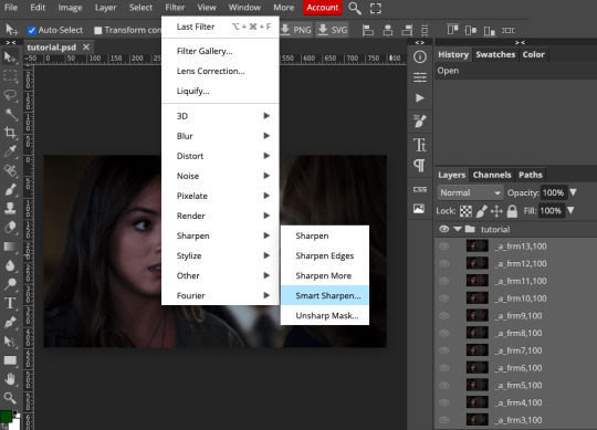
now onto sharpening. click on your last frame, hold down the shift key, and click on your first frame to select all. then go up to “filter” in the top menu, then scroll down to “sharpen” and select “smart sharpen.” you can then use whatever sharpening settings you’d like, though keep in mind you can’t do anything with sharpening opacity like you can on photoshop. i usually do this twice: 200% at 0.5px, then 10% at 10.0px.
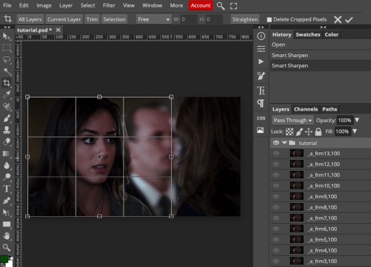
next, you want to resize and crop your gif. to resize, go to image, then click “image size” and plug in one of your desired proportions. this is not crop- if you plug in one dimension, the other will automatically readjust to match.

now to crop: go to the left-hand menu and click the crop icon. it’s under the magic wand but above the eyedropper. now you can crop to your liking, then click the check in the upper right.
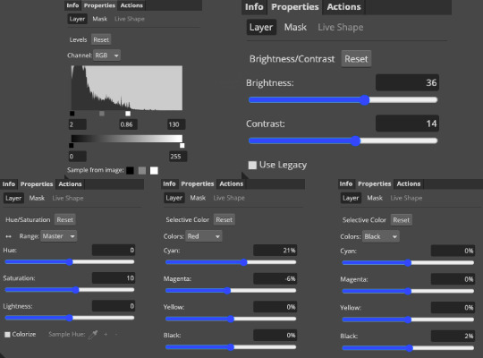
nice! you have a gif. let’s first work with basic scene coloring. you can find all your layers under the “layers” menu in the top bar. i usually use levels and brightness/contrast, then bump the master saturation up by 10 and fiddle around with selective color, hue, or color balance until the gif looks to my liking. we’ll assume you know vaguely how to do this.
and now you get something like this:
as you can see, the background is a little grainy, but that’s simply because i use ezgif to actually make my gifs. it has nothing to do with photopea. i honestly don’t mind it, which is why i haven’t switched from ezgif to another method.
but arwen, you may be thinking, what if i want to make the background another color? well, do i have news for you!
i first fiddled with color balance to make the whole gif a tiny bit more red, but that’s pretty much the same method as how i played with the other layers above so i haven’t included that. to change the gif color, you then want to go back to the layer menu, choose “new,” and select “layer.” then change the blending method of the layer to overlay.
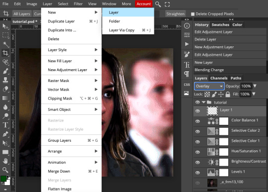
now go to the brush icon in the left menu. it’s right above the stamp. once you’ve selected your brush, make it as big as you’d like, then set the hardness to 0.
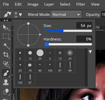
now choose whatever color you’d like from the color picker. i forgot to screenshot the color picker, but it’s at the very bottom of the left-hand menu. in the new layer photo, it’s the green and white squares at the bottom. you want to click the top one, then pick your color.
go back to your empty layer and paint over however much space you’d like.
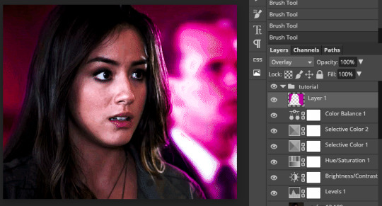
and now your gif looks something like this:
cool! we can make normal gifs and use fancy colors! now for the last part of the tutorial: adding text. photopea already has a TON of fonts to choose from, but you can also upload other fonts that you’ve downloaded in the same way you uploaded your initial gif. the program will ask if you want to save the font to your library, and you select yes.
so now you want to go to the text icon on the left-hand menu. it’s the T between the magnifying glass and the pen. click it, and you’ll get a new menu above your gif with options for font, bold/italic, size, color, and alignment. adjust those accordingly.
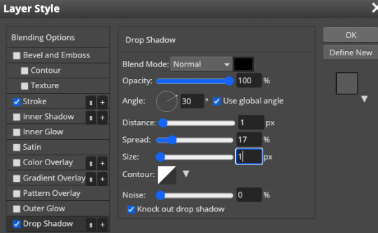
now you might want to add effects like shadow and outline to your text. do the two-finger click (for mac users) or right click (for pc users) on the text layer in your workbar on the right, then select “blending options.” you’ll have a whole slew of things to choose from. i usually set the stroke (outline) to 1px black...
...and do this to the drop shadow.
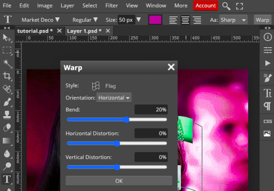
now you can play with your text a little bit. if you want it wavy, for example, go to warp in the text menu (right above your gif), then select the style of warp from the dropdown. i chose flag and played with the warp percentage a bit.
i then followed the steps in this text tutorial by @pietro-maximoff to get the text just a little fancier.
now, to save the gif, go to file on the top menu, then select “export as” and choose “gif.”
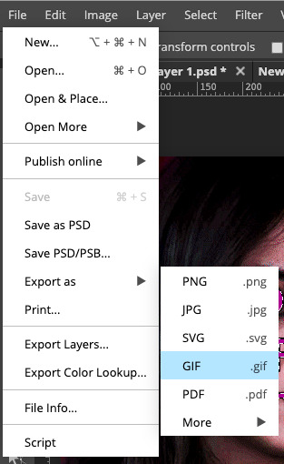
you can now adjust the speed.
and voila! a gif!
if you have any questions or want tutorials for things like “how to use raster/vector masks” or “how to cheat the no-timeline-feature aspect”, shoot me an ask!!! :)
#arwen.text#resources#tutorials#completeresources#allresources#userbrina#usermouffe#userpavi#usersae#userhella#usersmile#tusernico#uservalentina#usermarcy#dailyresources#gif tutorial
966 notes
·
View notes
Note
just found your blog and LOVE all your art!!!! the Matt and Gus art is especially cool I love the colors and poses you use.
Thank you kindly! It's heartwarming that you find palettes and poses so enjoyable.
And... I will use your message as a reason to ramble for a while about the latter because some may find it interesting. But, also, that's just something that I would REALLY like to know about many years ago. Plus, it made me think about composing and stuff. Plus, it's important to reflect a little. Plus it hit me hard because I hated it. Ready. Set. Go.
Posing is tedious for me, so I often turn to composite some elements in 3d early on. The thing is: it's way easier for me to sketch a character or a background when I have even the most primitive blockout in 3d. Basic blockout and 3d grid that comes along with it. It's a package.
Happily, I haven't deleted some of my files, so I can further elaborate.
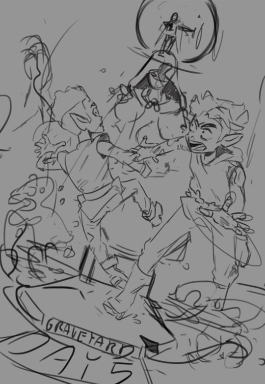
My first case in point is a Day 5 scene.
As usual, I have a vague idea of what I would like to make. I sketch it:
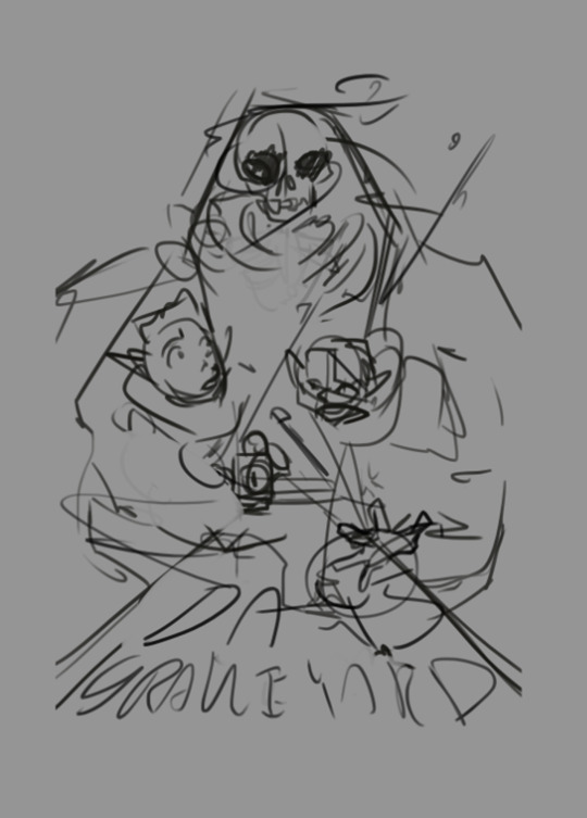
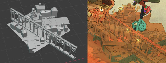
Then I use this... caveman of a sketch as a reference point when working in software. I'm familiar with 3ds Max, SketchUp, Maya, but the recent version of Blender is wonderful for modeling, so I'm happy to use it and preach about it. So this pic and every other comes from Blender 2.83 specifically:
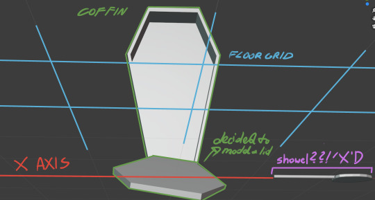
It looks like a rat's ass. It's not even rendered; it's a goddam print screen, which is what makes it hilarious and practical. So besides the object itself (initially a coffin), the 3D grid makes things turn. For the better. Because it makes me think about perspective and funny ways to skew things, find nice angles, and play with them. The blockout also makes you question the initial idea and ways to enhance it. And when I find a fairly nice angle, I create a Camera to 'save the view' (so I can later come back to it) and PrtScn to get the image to .psd file:
Wow. Messy.
And on that PrtScn, I sketch things, rotate stuff (again, angle changed) characters, background elements, effects, everything. My point is, this stage of wrapping things up is way nicer&faster because I have a grid and object somewhere in the background to keep me in check. The later stages are just... drawing stuff.
And the second case in point:
This shot.
Again, primitive as hell, but it works for me. Thanks to that, I can pose characters somewhat in relation to the shot, not ideally (I can pinpoint mistakes on two hands and few others), but uh, it's... okay.
So, that's my babbling about how posing works for me. I used the same method on days 2 and 3 (I can't draw stars. At all. So I have to model them X'D).
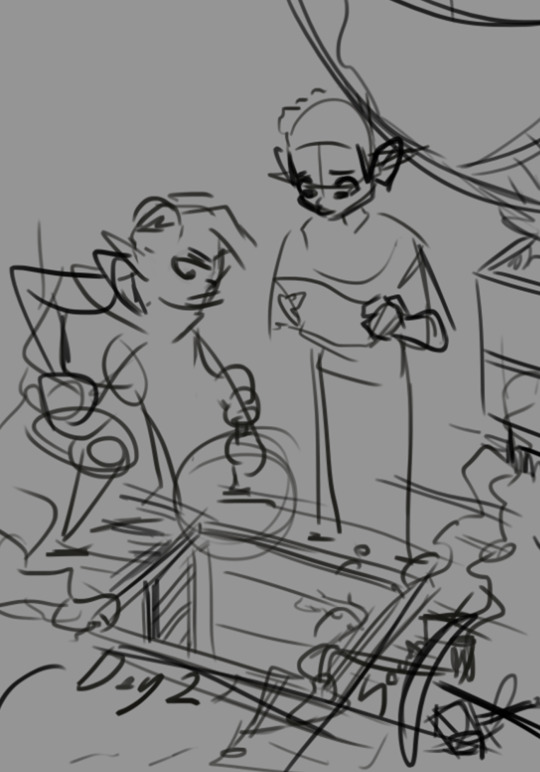
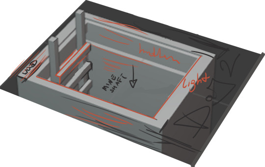
Again, initial sketch and modeled shaft with instructions.
It all may seem like taking too many extra steps. Turning to a completely different program and 'vaguely doing stuff in there' and then going back, isn't it a bit messy? Well, for some, yeah; for folks like me is reasonable and even necessary to create this fact-checker.
Well, I remember that at some point, I was very reluctant to use 3D software as a 'walking stick,' to the point I even considered it 'cheating.' Silly *bonk*. I call BS on myself. During internship, I remember seeing illustrators working on blockouts made specifically for them by 3d generalists. It's standard practice, makes things faster, better, and easier. 'Play smart not hard' as someone posted on Twitter a few days ago about gustholomule tags #. I couldn't agree more. I believe this rule also applies to more than one area of life.
Holy cow, that. is. lengthy.
Well, let's hope that my English is readable enough, perks of not being a native.
BYEEEEEEEEEEEEEEEEEEEEEEEEE
47 notes
·
View notes
Note
Hi! I hope I'm not bothering you, but I love your mood board edits and was wondering if you could explain how you go about making/colouring them? I see lots of places to find gifs but turning them into a set is so hard. Thank you in advance!
hi! first of all thank you so much and second of all it’s not a bother at all! i am happy to give some of my own tips even if my explanation probably isn’t super helpful. i won’t give like a ps tutorial but below the cut (since i included example gifs, it’s VERY long) is my process for my latest jily aesthetic:
i keep track of all my ideas/sets in a spreadsheet (which i won’t show bc there’s a lot of info i’d have to blur/black out) but i always have a list of what scenes i need to gif/what gifs i’m editing and where i’m getting them from. i also include a couple extra ideas in case the gifs i have planned end up being too hard to color or don’t fit in the set. i’ve found it’s best/easiest to start w the list bc there is literally nothing worse than spending hours on a set and then not being able to complete it.
as for actually finding the material, i have a pretty healthy number of scene packs saved in my giffing folder, esp. for things i know i will gif frequently. most of the time i will peruse youtube, vimeo, and instagram for any aesthetic scenes. i also have a lot of gif packs saved specifically for the purpose of making mbs (usually i mix my own gifs w gif packs), if you msg me i’m happy to direct you to some gif packs i use regularly or you can check my #resources tag. a couple tips for finding material:
always opt for download when possible, i used to screen record and the difference when i switched to downloading was astronomical. (it’s easy to lose quality and esp if you’re on mac, quicktime duplicates frames so either you have to manually delete those extras or you get sort of choppy gifs when you load them into ps.)
always use 1080p or better, 720p will work in a pinch for 268px or 177px gifs since you can make up some of that resolution loss with sharpening, but don’t go any lower than that, just love yourself.
for pale sets, look for the right colors. i tend to look for scenes w high color contrast especially if it features poc so it’s easier to color without whitewashing, ie if the subject is a person then i look for light colored or blue/green/violet/white backgrounds. it’ll make your life wayyyyy easier. this also means if you’re making a set try to find scenes with already similar lighting bc you won’t have to work so hard to make it look cohesive.
here’s a quick rundown of what i do before coloring:
import all frames and save all the files in a folder together!!
play around with frame delay so all the gifs are moving at about the same speed, usually keep it between 0.03-0.05s
crop and resize gifs (i use 268x145 most of the time)
convert to timeline
when it comes to coloring it can be really hit or miss, i’ve recently gotten back into my groove but i was having sooo much trouble earlier this year. in general, don’t stress yourself out!! sometimes it’s easier to just find a new scene/gif (hence my list of extras!) than to try too hard to fit a gif into your set. i color all my gifs by scratch (ie no psds) but i tend to follow the same pattern, i’ll explain using these gifs/psd as an example since then i can also explain how to fix white-washing:
first off when you’re coloring gifs with poc always always always make a layer mask so you can compare the edited and unedited skin tones directly! i use the marquee tool to make a selection in the middle of the character’s face, select the folder of my adjustment layers, and hit ‘add vector mask’ (the third button from the left on the layers panel, it’s a white rectangle with a circle in it).
i almost always begin by using hue/saturation layers to highlight and delete certain colors. here i highlighted red and raised the lightness on yellow by a lot since it’s a very yellow scene. then i use a combination of brightness/contrast, levels, and curves layers to brighten the scene. here’s what i have now:
i add a gradient map set to black/white, change the blending to exclusion, and lower the opacity to between 5-10% (depending on the scene) to lighten the contrast further:

then i add back a little depth with selective color in neutrals and blacks:
now i have two main goals: 1. add contrast between the background and the subject, and 2. brighten the scene into a pale gif. to do this, i use color balance to tweak the color of the background, taking out the yellows. this step works best if there’s at least some shade difference between your subject and background, otherwise isolating the two will be impossible. here’s what i have after adding color balance:

i use hue/saturation to selectively highlight the background color. in this case i chose to adjust magenta and used the color picker (the first eyedropper on the left) to identify the exact shade i wanted to lighten. now i have a fairly neutral background and a colorful subject, which gives a sort of pale effect:
and now i use a curves layer and a selective color (white) layer to brighten further:

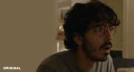
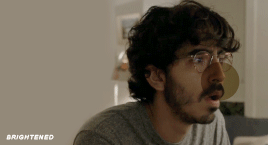
before i go further, i start fixing white-washing. keep in mind that some variance is normal since you are naturally changing the lighting of the scene; this gif shows it rlly clearly bc of how yellow and dim the lighting is, so some lightening is to be expected. however, both because the vector mask shows a lot of whitening and because i’ve giffed dev patel before and have a general idea of what he looks like in this type of lighting, i know what needs to be fixed, so i go back in under the psd/adjustment layers with a combination of selective color (red and neutral) and hue/saturation layers to darken his skin again:

now that some more contrast has been added in, i can go back to working on the psd and use curves and selective color to play around with the background again:

i use another hue/saturation layer and a black/white gradient to tone down oversaturation:


usually i leave those layers on top, so if i want to make any adjustments (like lightening the background more), i go in under those two. in this case i tweaked the whites and reduced the contrast a little to get this:
again, you can see his skin tone has changed from the original, but variation is to be expected given how much brighter the room is, the fact that i took out a lot of yellow lighting, and the brightening effect of the computer screen in front of him. some other things to keep in mind when coloring:
when you add layers to correct white-washing, you’re likely to end up with overly red/orange skin tones (red-washing). this can be fixed by upping cyans in the reds, desaturating/darkening the reds, or adding b/w or desaturation later on.
when in doubt, it’s better to be darker than lighter (the issue with white-washing is that it promotes colorism, and there is nothing inherently wrong with a darker skin tone) but really. just put in the effort to color poc correctly.
when changing the lighting a lot it helps to look at pictures of the subject in natural/bright lighting, since you get a better idea of what their normal skin tone is.
don’t try to squeeze all your selective color layers into one. you’ll get less grainy gifs if you separate them out and work one by one.
TURN OFF NIGHT SHIFT/NIGHT MODE! yes i KNOW it’s bad for your eyes (especially if you’re like me and gif at night, when the lighting outside isn’t changing every 20 seconds) but your gifs will look VERY different under f.lux or night mode compared to daytime screens. especially if you’re giffing at different times of day, blue light filters can really change the way your coloring appears. best to keep it consistent.
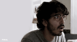
my sharpening settings vary depending on what i’m giffing but in general i do two layers of smart sharpen (500% with radius between 0.2-0.4, 10% with radius at 10px) and then gaussian blur at 2.5px and adjust the opacity so it’s somewhere between 15-20%. i try to strike a balance between smoothing out the graininess from selective color, and sharpening details like clothes and hair. here’s what i ended up with for the gif above:

then i rinse and repeat for the rest of the gifs in the set! i tend to start with the gifs that i know will be hardest to color, which is usually the darker ones (coloring is limited by how much i can brighten the scene) and those that include poc (again, limited by how much i can brighten and adjust the scene’s lighting without white-washing). then i check set cohesion as i go, using those first few gifs as benchmarks. once i have all 8 (or 9 or 10) gifs, i play around with composition and try to balance and vary the subject, colors, and composition of gifs next to each other. i go back and make a couple of adjustments here and there according to what i observe and what i think might improve the overall appearance.
and that’s pretty much it! i hope this was helpful, if you have other questions feel free to message me and i’d be happy to help/troubleshoot. happy giffing!
#Anonymous#*#resources#answered#sorry this was sO long but i hope it helped on the coloring end#tbh i exceeded my own expectations with the dev gif lol#yeahps#completeresources#chaoticresources#tutorial#coloring tutorial
55 notes
·
View notes
Text

The next person who commissions me for basic icons (with basic I mean a square or rectangular icon, colored and sharpened, not smaller than 80px but as big as you want) IF their faceclaim has a personal gallery available: can get a pack of 300 for 4 euro / 5.5 dollars ( instead of 6 euro / 7.5 dollars) or a pack of 500 basic icons for 7 euro / 9 dollars (instead of 10 euro / 12.5 dollars) or add to that 1.5 euro / 2 usd if I have to download screencaps folders of full episodes and sort thousands of caps (like the ones on screencapped).
-You can have one of my psds added but it will be for the regular psd price with built-in discount. If you want less icons or more icons this discount won’t apply. I will not download episodes to get the screencaps nor do horror/gore/shows with lots of s-ex. I can’t do people of color yet as I don’t have the skills to avoid whitewashing when making hundreds of icons and pre-made psds I have don’t allow commercial use.
If interested send me an ask or an im! If you aren’t interested but want to help please reblog to signal boost! Clearly my ‘regular’ prices aren’t that expensive to begin with, so feel free to check my blog to see what else I offer and at what prices.


a few more guidelines/rules:
-Keep in mind it may take me a few days depending on my health and on the fact that I crop them one by one and check brightness and color for each to ensure they are usable, I don’t do them in bulk. -I'm paid for time and effort: meaning that I'll do my best and initially double check with you to make sure the first icons I make are good enough for your standards in terms of coloring, but once the icons are made you'll have to pay me to have them and not tell me you changed your mind about some episodes and want 50 of them to be replaced. You obviously can ask me something like 'I want these to be a bit brighter if possible' (which is not always doable depending on the original light but if it is, I'll do it!) and obviously if I start making them and you realize you can afford them anymore text me right away and I'll stop, no harm done. This is just a matter of not making me do all the work and then expecting me to re-do it for free.
-payment is on paypal, if you know how to convert the money from usd to euro before paying you can obviously pay the price in euro, because the one in dollars has a bit more cents added to it to make up for change-taxes
-you'll have to tell me your fc's name and which show or multiple shows I should pick, you can ABSOLUTELY pick the episodes too or tell me if you have no specific preference, in which case I'll pick a few random episodes and see what's usable there (but you have to be sure you don't care, I'm not making 300 icons only for you to tell me that 200 of them aren't good because they are from the same 3 episodes). Just please know what you want before you ask because like I said, changing everything halfway through isn’t doable.
-if you don't make a specific request I'll pick how much of their face/body is in the frames depending on the scene and source material, how many icons per episode depending on brightness of scenes/expressions that I think may be useful to have.


#rp commissions#icons commissions#icon commissions#icon commission#rp commission#rpc#graphic commissions
6 notes
·
View notes
Text
i was tagged by @josephlevitt, thank you so much! your works are all absolutely spectacular, you’re so talented and creative!! 💖(i swear im gonna start watching the umbrella academy exclusively for your i know the end gifset tbh)
rules : it’s time to love yourself. choose your 5 favorite works you created in the past year (fics, art, edits, etc.) and link them below to reflect on the amazing things you’ve brought into the world. tag as many writers/artists/etc. you want (fan or original) so we can spread the love and link each other to awesome works !
the wizard of oz + “i know the end”: the wizard of oz (1939) was my first movie of the decade: i watched it on january 1st 2020, back when i still didn’t know “there is no place like home” would have been taken so literally, and i was dying to make a gifset about it cause it’s just so beautiful, i had made a bunch of psds for a couple of scenes but they were laying in some folder with no use, until i heard “i know the end” for the first time and its lyrics basically made me visualize this very same gifset in my head. it was absolutely wonderful to bring it to life cause it made me try many new things, from the settings of the big font, which makes me very happy with the way it turned out, to the blending: this wasn’t my first blending attempt, actually, but i don’t think i’ve ever tried it on such big gifs and i think the result is kinda good(??? i think). also i’m obsessed with the lyrics about having to go repeating “i know” three times matching the three clicks of dorothy’s heels;
joker(s) as fear/chaos/pain: (tw: blood, tw: clowns) so, right after watching tdk trilogy, i looked for something to reblog and i stumbled upon the gifset i mention as my inspiration and, like, i had an actual spark in my head (love that feeling tbh!) cause i thought the words on the original gifset were perfect for each one of the cinematic jokers and that it would have been interesting to portray three different shades of the same character. i think this is one of my favourite gifsets i’ve ever done, and, also, it allowed me to use a script as a caption, which is so cool;
phoebe bridgers’ nominations for the 2021 grammy awards: punisher is my favourite record of the year and, for a lot of reasons, it has become one of the most important records ever made, for me, so i was so hopeful about phoebe getting the grammy nomination(s) she deserved so much in my eyes, and when they announced not one but four (4!!) nominations my heart exploded with joy and i immediately decided to celebrate with something, which ended up being this gifset: originally i didnt plan to make it so violet, actually i was just happy i had an excuse to gif /that/ part of ikte music video and to gif again the seth meyers performance but i didn’t have any specific prominent color in mind, but i think i like this coloring a lot, although it was made in a kind of a rush. (but also with care, i swear!) also, i really wanted her handwriting to be one of the fonts for this, but i looked for the word “kyoto” handwritten by her everywhere and i couldn’t find it, so i chose to use elliott smith’s handwriting font for that word, instead, which isn’t the most consistent choice in the world, but i think it was kind of a nice touch, regardless;
“the terminal” gifset: my humble homage and take on one of my favourite movies ever made, i love the terminal so much!! this is so different from the original concept i had in mind cause at first it had more gifs and they were supposed to be blue-ish or, however, not like this, but when i started to color tom hanks’ gif i thought about adding a gradient background and i started to mess up with the settings and the original blue-turquoise gradient became red-orange (and the fact the sky blue is still visible in the middle/last frames of the gif kinda bothers me a lot aaaah anyway), then i repeated the process with the fountain gif and i loved the result so much i decided to just go with the flow and make these all red, orange and green shades, so yeah, another way to experiment new things while giffing another absolutely stunning masterpiece imo;
this is us’ “vietnam” gifset: i had to gif my favourite episode of this is us, which is still haunting me to this day (the panoramic on the babies’ birthdates??? c h i l l s). it is also the first gifset i published for this blog’s new era! (it’s a long story). despite it being pretty simple, i love how the coloring turned out and how pastel-y everything is, and how pretty every shot is (i mean, this show is unparalleled for both storytelling AND cinematography so it wasn’t hard to find pretty shots), i tried my best to keep it as delicate as possible to reach a sort of vibrant pastel and not to get too crazy with colours and i’m very happy with it.
+ bonus: bojack horseman + the four horsemen of the apocalypse, i’m adding it cause i’m still not sure if it falls under “clever ideas” or “pure shitpost”, either way this was something i thought about at 3 am once and i had to bring it to life and i kinda like how it turned out, so yeah (the funny thing is i though it could have been richer but i didn’t know what to add and like literally one, two days later all those gifsets about characters + tarot cards popped up and they had all those beautiful static images of tarots blended with gifs and i was like “shit,this is what i missed, i should have done something like that!”...yeah)
i’ll tag @alexturner, @caulfielings, @antaris, @colettes and whoever wants to do it!
#tag games#this was so nice im not used to say nice things about my works i only criticize them like harshly :)#josephlevitt#thanks again for the tag omg i feel so humbled your works are truly PHENOMENAL thank you!!!!#clowns tw //#blood tw //
8 notes
·
View notes
Photo
but before i go looking in the tags, let’s talk about my latest gifsets!
what a worker bee i was both yesterday and today with prodigal son AND loki <3 never have i created so many gifs in a short amount of time it’s a damn miracle that my photoshop didn’t straight up cough up blood and keel over. alas, us bitches are stronger than that! if this post gets flagged because of the scenes i included....that would just mean that i made the right decision to exclude those scenes ajsdksajkldsa
malcolm stabbing martin
when the episode finally downloaded, i took a peek at the ending before it aired to see how it all ends (just in case it doesn’t get renewed </3). GOSH, was i just in a TIZZY when i saw this happen and i couldn’t tell my dad what i saw because we were straight up watching the show as it aired. anyways, keeping my secret knowledge, i got to work on making this gifset. i missed a huge chunk of the episode bc it took me over TWO hours to make the six gif set. i was really torn on the “artistic” approach aka which scene to gif and which to leave out. because i saw the ending before anything else, i couldn’t play it out loud and i didn’t have my headphones to listen so i was like FREE FORMING THE SUBTITLES. plus the captions weren’t synced up so it was really hard to decipher what was being said :(
i really thought i would be able to create the set before 9 but i was running into unforeseen issues such as the subtitle problem, which on top of that, like i said earlier, my photoshop is c/racked and janky so....you catch my drift. i was actually going to gif the bisexual moment in the cafe which i think would’ve been MUCH easier but i jumped the gun and wanted to make the gifs of the shocking ending. funny part about that is the shocking part wasn’t even included in my set (malcolm driving the knife into martin) because i felt like the scene was too short...anyways, let’s talk about the positives:
i really do like the coloring of this one. i used a psd that i’ve used before and luckily it’s meant for outdoor scenes with greenery so the gif really popped. sharpening, buddy ole pal, love you sm. the caption was kinda last minute but i hoped to save it with the gradient. cropping was a bitch because for some reason, it takes forever when you’ve made multiple gifs beforehand (cache innit) pero we pulled through! i actually started not saving the psd files to try and save time which is very unusual for me pero i was getting frustrated with photoshop so i was like y’know what....so i just gave up entirely and stopped saving. i do save when i’m taking my time but jeez, it’s a bad habit. i like saving the psd file because i never know if there is a mistake i missed in post and when i go to publish it, it’s blatant and it needs to be fixed. please, save your psd files idc if it takes up space u can just delete them later. IT HELPS !! TRUST ME!!
first & “last” appearance
i actually premade gifs for this gifset! unfortunately, i didn’t realize that three of the five gifs were the wrong size (pictured above) because i flipped the ratio. instead of 268 x 250, i made them 250 x 268. i don’t know HOW i managed to fuck that up but luckily i saved the psd files (wink, wink) so the coloring was still intact. i think i had to restart photoshop or it was getting too late so i picked it back up in the morning. sucks that i had to remake the entire gif from scratch but we will take some wins xx
coloring is the same with the previous gifset (listen....it’s a good coloring) and i actually did have an alternative coloring that was very warm pero i didn’t end up using it. almost melted the two with the “last” appearance of gil but ultimately didn’t go through with it. also i was thinking of using baby malcolm as the first appearance because technically, that IS his first appearance in the show but i was like...just use adult malcolm lol. also i know that scene of dani isn’t the “first” but the first scene she has goes really quick and she is planked by gil so there isn’t much of a solo (even though this scene isn’t much of a solo either pero it’s better than the former). the lighting is weird in this episode and my coloring tried their best :/ i know gifmakers make each gif a diff coloring pero i’m lazy okay and looking to be time effiencent. another slight tangent is that i actually queued the post for the morning but since i woke up to a storm, i was like, i’m here so i’ll publish it myself.
other than that...i didn’t run into any other problem. i was actually hesitant to make the caption that because i wasn’t sure how to really describe the team. i have poor memory so if there was ever an official name, i do not remember it. i did a quick google search pero it turned up nothing. i stuck with “dream team” because, well, that’s what they are. plus i didn’t want to tarnish the gifset with any mentions of p/olice (i was thinking about putting sumn along the lines of ‘the nypd team’) so DREAM TEAM IT IS because it’s true! you cannot have the show without these five! also, i should’ve used quotations on “last” because there is a bunch of talk about a renewal pero...just in case... sorry y’all :/
odinson brothers parallels
this was made in the spur of the moment. i saw that the teaser trailer with shirtless loki dropped in hd, i came A-RUNNING! it was posted like 47 minutes after the fact and i was like...somebody probably already made a gifset of the scene so i was like...gosh, to make the gifset or not all the while i was trying to download the video. trying because again, this was in the middle of a storm so my wifi was acting up and wasn’t at its strongest (whatever that may be). so i was getting frustrated because neither cc nor 4kdownloader was downloading this small one minute clip. that’s when i knew i was gonna be too late to make the loki gifset so i was like whatever ig...
then i had an idea.
i love parallels so luckily it hit me that this paralleled with thor and how his hair got chopped off. so, i knew i had ragnarok downloaded and got to work <3 wasn’t sure what dimensions to use so i went with 268 x 268 to make perfect squares. because the loki scene was short, i could only make three so i was like..okay, i can work with this. three for loki, three for thor, they’re brothers and they share! i wasn’t planning to add subtitles but i had written them down for the plain gifset so i was like alright, we’re going all in. i didn’t take that long to make since again, they’re small gifs and i did have a coloring in mind that i always use for ragnarok (it’s my fave for non-marvel edits as well). there was a slight adjustment to the final loki gif because i realized the gif had that dark fade into the scene which i didn’t know if it was an artistic choice for the show itself or was added for the trailer only (it happens when companies cut a bunch of scenes together and it’s not at all how it actually plays out). i didn’t want to take any chances so i cut those parts out. i know the gifs are short on the loki side pero...that’s just how it is in show business.
thank you so much for listening and hearing me out! i like discussing my work and i try to have pride in them even if the numbers don’t reflect what i hope they would. either way, still learning, still growing, still thinking about buying p.s. like deadass this shit is RIDICULOUS -_- imagine opening up ps and like...it opens up in less than two minutes...shivers
#read more is because i typed up a lot hehe#i mean to me it doesn't look like a lot pero i don't want to clog y'all's tl
2 notes
·
View notes
Text
tutorial: how to make gifs (part 2)
Before proceeding, please check out the first part here. In this part, I’ll explain how to do gif colouring, how to add subtitles and how to save gifs.

PART A: GIF COLOURING
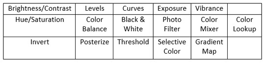
Gif colouring is done using the adjustment layers. If you haven’t enabled this option, you can do so by selecting Window > Adjustments. A panel of sixteen (16) adjustment layers will appear, as shown below:
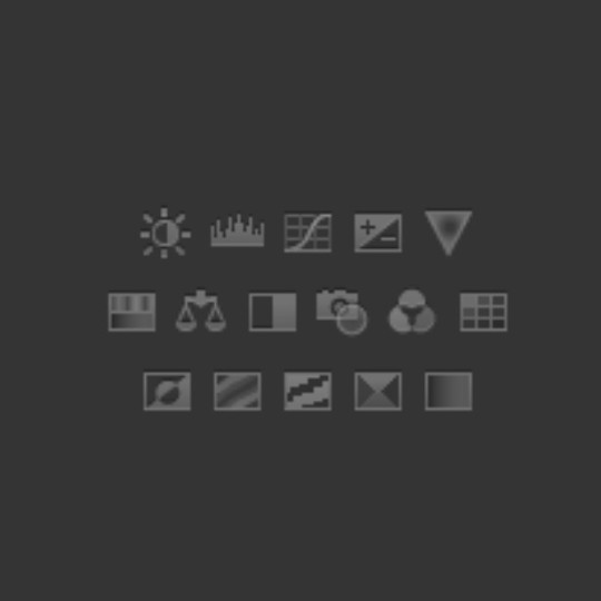
The adjustment layers, from left to right, top to bottom, are:
Now, there’s no hard and fast rules when it comes to colouring. My best advice is to experiment until you find your own colouring style. When I make gifs, the way I make gifs don’t change but the way I colour gifs will periodically change.
This is one of my earliest gifsets, made in 2015.
This is my latest gifset, made in 2019.
As you can see, I didn’t start off knowing how to colour gifs. Back then, I wasn’t concerned in making my gifs look nice, I wanted to make gifs because people don’t make the gifs that I want to see.
Despite my constant complaints of the reds, the blues and the yellows of the show, I don’t hate the colours themselves, I just hate the fact the colours don’t pop. Take a look at the scene below:

It looks fine after sharpening and blurring filters, but personally, the original colours look dull. 🤷♀
Step 1: Curves
I create two markers, then pull one downwards and one upwards, careful not to stray too far from the original line. If the scene is dark and you want to make it brighter, pull the marker that’s usually going downwards, upwards, but again, don’t stray too far from the original line.
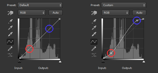
Besides ‘Curves’, you can also use ‘Brightness/Contrast’ and ‘Levels’.
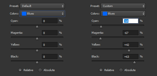
Step 2: Selective Color
The bulk of your colouring takes place here. There are nine (9) colours: Reds, Yellows, Greens, Cyans, Blues, Magentas, Whites, Neutrals and Blacks. For this scene, I adjusted seven colours, minus Neutrals and Blacks.
(I don’t recommend messing around with Neutrals and Blacks since they usually affect the entire scene instead of specific areas. If you are like me who want the black to be true black, you are better off adding another ‘Curves’ layer.)
I don’t have any specific method besides -- adjust the sliders until you see the colours that you want. In fact, if the scene is stubborn, you may use multiple adjustment layers. Below is how I remove the blues from Marinette’s hair:
Step 3: Gradient Map
I wish I know how to explain why I use Gradient Map besides it being part of my finishing touches. For this adjustment layer, it is set to Soft Light at 75% opacity. For the scene above, I used this gradient:
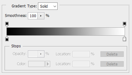
#000000 | #ffffff
My usual choice is this one:
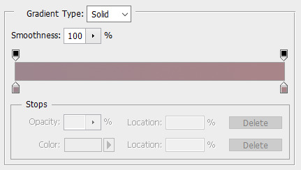
#9e868e | #a88589
My second usual choice is this one:

#383332 | #6f5b55
Do you have to make your own gradients? No. For my usual gradients, it’s actually from the gradient pack here. I encourage you to explore resources websites because they are helpful, besides, they are mostly free!
Q1: Do you need more adjustment layers?
For daytime scenes like the above, I usually maintain three adjustment layers. However, you may encounter scenes where one colour dominates the entire scene or the colours look out of place or the lighting is completely wack.
In order to fix the colours, I use either Hue/Saturation or Color Balance or Photo Filter, usually before, but may also be after, the three layers. It may or may not work successfully but at least it reduces your frustration at fixing the colours.
I will have mini tutorials covering how to colour these specific scenes later.
Q2: Do you have to use the same adjustment layers as mine?
Again, no.
As I said before, you need to experiment until you find your own colouring style. I may use 3 layers, you may use 6 layers, someone else may use 9 layers. In fact, I may use 6 layers for a specific colouring and then 9 layers for another.
It’s best to study the scenes and figure out what colours you want to bring out, what colours you want to eliminate, and what colour theme you want to present.
Q3: Can I use others’ colouring psd instead?
You can, but consider if it’s better if you learn how to colour from scratch, especially if the series in question has inconsistent colours, such as ML.
However, that doesn’t mean you aren’t allowed to use colouring psds. If you are making multiple gifs and they have the same theme (e.g. outdoor, daytime, blue skies), it’s easier to just use the same colouring for consistency.
Eventually, once you are used to colouring the series, you may find it easier and faster to colour manually because the results are more or less the same.
PART B: SUBTITLES
Subtitles are great for providing context, but it can be time consuming. I advise starting off with small scenes, then work your way up until you are comfortable with the entire scene.
Step 1: Choose your font
The most important aspect of your font choice is readability, even in small sizes. Common examples of fonts used for gif subtitles are Arial, Calibri and Myriad Pro. All are set to 'bold italic’.
Step 2: Add the text
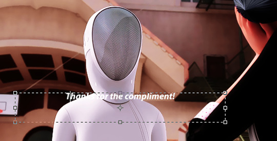
Drag your cursor to the right to create a text box, then type out the text. For 268px gifs, the font size is 14 pt. For 540px gifs, the font size is 18 pt. The font colour by default is black, so change it to white.
As you can see, the text is unclear. Before we solve that problem, we need to make the text box centered. Select the ‘Move Tool’ and choose the icon below:
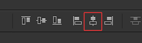
The text box will be centered, but the text is too far from the bottom. Using your keyboard, press the down arrow key until you reach the bottom, but leave some space between the text and the bottom.
Or, you can position the text box close to the bottom then make it centered. Either way, it should look like the above.
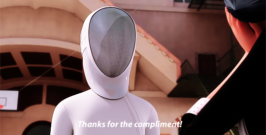
Step 3: Blending options
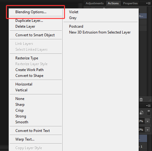
Right-click on your text layer and select ‘Blending Options’.
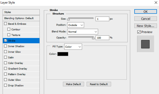
Select ‘Stroke’ and copy the settings.
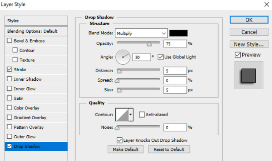
Select ‘Drop Shadow’ and copy the settings.
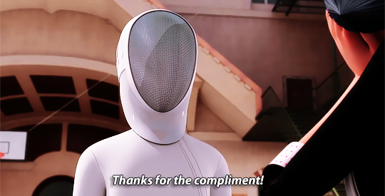
Press OK.
Your text should look like the above. Your text layers should look like below:

Step 4: Timeline
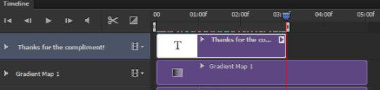
If you have multiple scenes in the gif but only one scene has subtitles, you need to adjust the timing so the subtitles don’t appear in the other scene. Use the slider to find the scene, then drag the text layer so it aligns with the scene.
Let’s say the scene is short and you want to find the exact frame but the timeline is short, use the icons below to shrink or expand the timeline:
The left is to make the timeline shorter, the right is to make the timeline longer.
PART C: SAVING GIFS
You’re almost done!
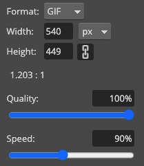
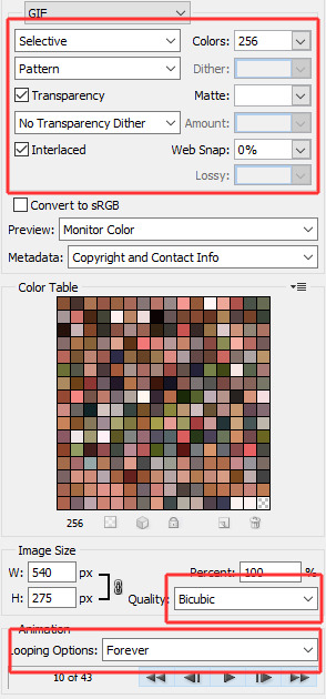
Use the markers to determine the scene you want to save, then select File > Save for Web (or Alt+Shift+Ctrl+S) and these are my gif save settings:
Voila, this is how a gif with subtitles look like!
If you have any questions, don’t hesitate to send me an ask or a DM. Thank you so much for checking out the tutorial and I hope it has been useful. I look forward to see gifs from you!
171 notes
·
View notes
Photo


ORIGINAL → EDITED | Gif Making Process
I was tagged by @stormborndean whose edition of this I fell in love with. Thank you so much, dear. 😘
Now to clarify why precisely those gifs, beside the fact they were one of the few for whom I could restore frames (who’d guess my horrible habit of keeping my bin full would be useful one day), to make unedited ones without having to take frames again:
Those gifsets are from three different shows with five entirely different lightnings: Bright interior, bright outsides, dark outsides, dark interior and dark interior with shadows. Yet they were all made using one and the same accidentally-lucky PSD as a base (made for my Michael Smites Lilith gifset, only back then I didn’t know how to sharpen), with little to no tweaking (1 and 4, my personal faves, are like the original), and absolutely no change to hue and saturation.
While making this PSD, my main goal was to make it shiny and glowy as much as it’s possible (notice faces on 1, 4 and 5, leaves and outfit on 2, and upper background and jacket edge on 3), without ruining the parts camera is not focusing on, and to preserve the eye color as much as I could, because I hate to no end how every light eye color ends up terribly changed as soon as you apply an effect. I just wanted a naturally looking edit that’s not gonna be dull.
And too much color lookups ends with unnatural shades, as well as hue/sat. Yeah, it looks pretty, but I wanted realistic. Exposure is a no-no, unless you’re left with no other options, as you’re gonna have to heavily sharpen out the background.
Which I achieved with this stupid trick: put an empty white background on top and blend it with soft light/overlay, depending which one fits better (overlay makes it too rosy or brownish sometimes) then fade or not, again depending whether it fits.
Note: PSD is heavy on levels and blending options, and whatever tweaking that I usually apply to it involves adjusting and or removing layers of the same, and very rarely adjustment of vibrance and brightness. As simple as that.
Heaviest adjustments were made on 3, as I’m absolutely horrible at doing nightscenes, and I truly hate working with night scenes from Supernatural, and 5, because that entire show loves going all pukishly green and yellow at most adjustments.
Tip: It’s all about blending for me, no matter what adjustment I add, and on which PSD. So just experiment with it and go wild.
Also, the same smart sharpen action and same size (540x304) were applied to all the gifs, except for the after 2, which you can easily notice as it’s slightly less sharp and was made for a different size. I’m horrible at resizing.
Okay, as to whom to tag now, I don’t really know much people who make gifs and colorings both at the same time, except you and @fierydeans and @blakechaos08. So, whoever else is interested, go ahead. ❤️
51 notes
·
View notes
Photo


ORIGINAL → EDITED gif making process
Thank you @letsmakesomeonehappytoday for the tag x3
Left: Cropped, resized, and timed Right: Cropped, resized, timed, sharpened, and coloured
I always try to find the highest quality video I can of whatever it is I want to gif. So I definitely prefer to work with 1080p or 720p.
Frame delay is almost always set to 0.05. I would only use 0.06 if the clip/scene was really short or if the purpose of the gif was to have a slow focus.
I use an action to sharpen, usually. If not, then my manual sharpening settings are: Smart Sharpen at 500% and then Gaussian Blur with ~63% opacity, depending on the video quality (which I made into an action anyways lol).
To start the colouring of the gif, I use a base of two psds. The first one lowers the contrast and lightens the gif. The second one ups the vibrancy with an added bit of red tone focus. After adding the two psds, I lower the opacity level of the first psd until the colour vibrancy looks alright. *When working with larger gifs, I don’t use these psds since they add quite a bit to the file size.
Next, I add a Levels layer, and usually set it to Increase Contrast 1. Then an Exposure layer is used where Exposure is increased to the point where the skin colour is brightened and enhanced without changing it too much and Gamma Correction is lightened. The latter step kind of resets the gif so I can better adjust the colouring in my own way. Starting now, and at random intervals hereafter, I add a Vibrance layer set anywhere around +10 to +60. And, not always, but I might use Curves to increase contrast.
I then play around with Selective Layer. In the case of Harry and Louis’ skin colours, I usually adjust the reds, yellows, and whites. Depending on what the gif is like - e.g., if the background is blue, or if their clothes are a certain colour - I adjust the appropriate colours to up the vibrancy on those. I might increase the blacks as well, but not to the extent of losing too much detail. By this point, I may choose to make the gif warmer-looking, so I would add a Color Balance layer and up the red a bit. Interesting fact: whenever anything is adjusted via those toggle bars, I like to have the numbers land on a factor of 5; the exception is 28.
Lastly, if the gif quality still looks a bit off, I may add a Noise filter at 2.45%. Sometimes it helps, sometimes it doesn’t.
Basically, I try not to change too much from the original, just enhance the colours and quality. A bunch of my steps may be redundant or unnecessary, but it’s what I’m used to doing heh. Also, I tag anyone that wants to do this and hasn’t yet!
17 notes
·
View notes
Note
1, 8, 21, 48
1. what are your top 3 favorite sets you’ve made?
uMMMm doing an all time thing off the top of my head is hard haha so this is just Some of my favorite sets that i can think of
this recent ele set i made for a mutual’s bday... i had been toying with this gifset for a while and i finally made it... i just... get rly emo about... the pilot of ele and how literally his FIRST WORDS to her (regardless of the fact that it’s not real) really are do you believe in love at first sight... because bitch it was love at first sight!!! and all the ways he says i love you without actually saying it afterwards... i am emo always
this mpi set i made wayyyy back in the day ha... by back in the day i mean 2019 which... feels like 10 years ago. anyways i just rly liked the colors in this it truly is a blessing to have Lighting after years of elementary gifs where things are lit by like. a goddamn candle or something. and the scene itself is also A+... pretty.
this minority report gifset... throwback!!! to when... she was everything. the like 10 of us that watched this show and tried to keep it alive... good times. when i redid all of my old edits, my minority report gifs looked like... 100x better, and they’re actually some of my favorite gifsets i’ve ever done. coloring is (mostly) pretty good and i’m proud of that...!
8. what gif trend do you hate?
i TRULY hate like... desaturated gifs like... please... color... i just want color...
21. PSDs or original coloring for each gif?
i used to WAY BACK when i first started actually download PSDs from people, but eventually i started to use my own coloring for all of my gifs. elementary though i gif so often that i eventually made my own psd that pretty much works for most scenes, at most i’ll just have to tweak color balance / curves a bit to make it look better. but most of my other sets i just wing it and pray what i come up with turns out okay!!!
48. how would you describe your giffing style?
my style is praying that things turn out okay lmao... i used to try to go with trends, like there are ppl who make super vibrant gifs, and i used to try to emulate that, then there was the trend of making things very subtle and not vibrant, and i guess i kinda am in the middle? it depends on the scene and my mood to see which way i end up going.
send me numbers!!
3 notes
·
View notes
Text
A GIF TUTORIAL 💫
ok so @mystic-scripture asked if i could do a lil GIF TUTORIAL so here’s a v v basic one! i know there’s a ton of different ways ppl make gifs and i know ppl have told me my way is wrong a ton of times, but i found this to be the easiest way when i was learning and it’s worked for me this long!
so bear with me as i try to explain, in the most simplest of terms, how i made this gif:

THIS TUTORIAL REQUIRES:
photoshop (i’m using cc2019)
source material from a video/mp4 file
patience (both with yourself and with me)
[ TUTORIAL CONTINUES UNDER THE READ MORE ]
so first thing’s first, in order to make a gif, you’ll need some source material. like tv shows/movies/trailers/music videos/etc. you get it. get your source material downloaded and ready 2 go.
after you have that, open up photoshop and go to FILE > IMPORT > VIDEO FRAMES TO LAYERS

from there, pick your source file from wherever it was saved to and then this little screen will pop up:

**NOTE: don’t touch the “limit to every ____ frame” unless you’re importing a screen recorded video (then put 2)
use the arrow heads as bookmarks to choose the section of footage you want to import frames from from the whole video. it can be a scene or a little moment from the tv show/movie as a whole.
**NOTE: that photoshop will only import 500 layers at a time

if this comes up, hit the CONTINUE button and photoshop will load your frames into the TIMELINE which is at the bottom of your workshop screen. so now you have something like this:

next, you’re going to want to trim down your frames so that your finished gif is just what you want it to be. you can do this directly in the timeline just by SELECTING ONE FRAME + HOLDING DOWN ‘SHIFT’ + USING THE HORIZONTAL SCROLL BAR AT THE BOTTOM + CLICKING ON THE LAST FRAME YOU WANT TO DELETE then hitting the small TRASH BIN icon:

after you’ve trimmed down your frames to an appropriate number, you’ll want to SHARPEN your frames. there’s a ton of sharpening tools from plenty of more experienced gif-makers. i currently use THIS ONE and it sharpens up to 100 frames so as long as your frame number is less than or equal to 100, you’re good to go!
in order to start the action, you’ll want to go to the top right hand corner where this icon is:

and open up the panel where your ACTIONS are located:

hit the PLAY button and let the action do the work! when it’s finished, and you’re under 100 frames, you’ll get this notif:

hit CONTINUE to make it go away and allow you to work with your frames again.
from there, it’s all about coloring, resizing and adjusting the frame delay! you can do this in any order you like, just make sure you do it lol
you can use this icon:

to access all the different ways to color your gif! like brightness, vibrance, selective color, etc. etc. play around with it! see what looks nice! if you think it looks good, then it looks good. you can also download PSDs from other gif-makers that help with coloring certain scenes like dark scenes or weirdly lighted ones.
**NOTE: make sure your coloring affects ALL the frames! you can see if the coloring layer does by clicking a frame, then looking at the layers to see if this icon (the eye) is on:

after you’ve finished coloring, set your frame delay! you’ll want your gif to be anywhere between 0.04 to 0.07 depending on what looks best to you! **hit OTHER to change the timing to your preference -- just make sure ALL your frames are selected!

once you’ve set your frame delay, make sure you resize your gif to the right tumblr sizes. i think the right sizes are 540px, 268px and then 170px, (i think -- fact check me pls) but i’m not sure bc now there’s apparently a new 8mb limit?? either way, just stick to those as your base! you can change your image size by going to IMAGE > IMAGE SIZE


change your dimensions to one of the three above (whichever you think looks the best) and make sure that your WIDTH AND HEIGHT ARE ALWAYS LINKED that way your gif won’t be stretched out like mine used to be
**NOTE: you can always use the CROP TOOL to crop down your gif so it’s focused on one thing in particular and then resize your image!

now let’s export our gif! you’re going to go to FILE > EXPORT > SAVE FOR WEB (LEGACY)

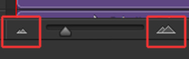
then you’ll get a screen that looks like this:

make sure everything is as it looks above: the right size, the right speed, make sure the loop is FOREVER and then hit SAVE! save it to wherever you want on your computer and there you have it! you made a gif!
**NOTE: i always like to save my gifsets as drafts before posting them on tumblr just to make sure the gif works and the speed is how i wanted it to be.
IF IT’S NOT WORKING/FREEZING: go back into photoshop and delete some frames.
IF YOU DON’T LIKE THE SPEED: go back into photoshop and change the frame delay. then re-save!
but yay! you made a gif! if you made it through this whole thing, i appreciate you! i hope this long ass tutorial has been helpful to you lol and if you have any other questions or need help with anything else, PLEASE SEND ME AN ASK! i’m pretty self-taught in this whole thing, but i can try to help as best i can – we can figure it out together!
can’t wait to see what you come up with! love you all very much! happy giffing! 💫
#blah blah blah#photoshop help#tutorial#photoshop tutorial#gif tutorial#**lizziestutorials#i hope this is okay! and makes sense!
51 notes
·
View notes