#Tableau Developer in 5 Simple Steps
Explore tagged Tumblr posts
Visit Tumblr Blog
Explore Tumblr blogs with no restrictions, modern design and the best experience.
Last Seen Tumblr Blogs


Fun Fact
Post activity is at the highest at 4:00 pm EDT; notes peak at 10:00 pm EDT.
Text
Cross-Mapping Tableau Prep Workflows into Power Query: A Developer’s Blueprint
When migrating from Tableau to Power BI, one of the most technically nuanced challenges is translating Tableau Prep workflows into Power Query in Power BI. Both tools are built for data shaping and preparation, but they differ significantly in structure, functionality, and logic execution. For developers and BI engineers, mastering this cross-mapping process is essential to preserve the integrity of ETL pipelines during the migration. This blog offers a developer-centric blueprint to help you navigate this transition with clarity and precision.
Understanding the Core Differences
At a foundational level, Tableau Prep focuses on a flow-based, visual paradigm where data steps are connected in a linear or branching path. Power Query, meanwhile, operates in a functional, stepwise M code environment. While both support similar operations—joins, filters, aggregations, data type conversions—the implementation logic varies.
In Tableau Prep:
Actions are visual and sequential (Clean, Join, Output).
Operations are visually displayed in a flow pane.
Users rely heavily on drag-and-drop transformations.
In Power Query:
Transformations are recorded as a series of applied steps using the M language.
Logic is encapsulated within functional scripts.
The interface supports formula-based flexibility.
Step-by-Step Mapping Blueprint
Here’s how developers can strategically cross-map common Tableau Prep components into Power Query steps:
1. Data Input Sources
Tableau Prep: Uses connectors or extracts to pull from databases, Excel, or flat files.
Power Query Equivalent: Use “Get Data” with the appropriate connector (SQL Server, Excel, Web, etc.) and configure using the Navigator pane.
✅ Developer Tip: Ensure all parameters and credentials are migrated securely to avoid broken connections during refresh.
2. Cleaning and Shaping Data
Tableau Prep Actions: Rename fields, remove nulls, change types, etc.
Power Query Steps: Use commands like Table.RenameColumns, Table.SelectRows, and Table.TransformColumnTypes.
✅ Example: Tableau Prep’s “Change Data Type” ↪ Power Query:
mCopy
Edit
Table.TransformColumnTypes(Source,{{"Date", type date}})
3. Joins and Unions
Tableau Prep: Visual Join nodes with configurations (Inner, Left, Right).
Power Query: Use Table.Join or the Merge Queries feature.
✅ Equivalent Code Snippet:
mCopy
Edit
Table.NestedJoin(TableA, {"ID"}, TableB, {"ID"}, "NewColumn", JoinKind.Inner)
4. Calculated Fields / Derived Columns
Tableau Prep: Create Calculated Fields using simple functions or logic.
Power Query: Use “Add Column” > “Custom Column” and M code logic.
✅ Tableau Formula Example: IF [Sales] > 100 THEN "High" ELSE "Low" ↪ Power Query:
mCopy
Edit
if [Sales] > 100 then "High" else "Low"
5. Output to Destination
Tableau Prep: Output to .hyper, Tableau Server, or file.
Power BI: Load to Power BI Data Model or export via Power Query Editor to Excel or CSV.
✅ Developer Note: In Power BI, outputs are loaded to the model; no need for manual exports unless specified.
Best Practices for Developers
Modularize: Break complex Prep flows into multiple Power Query queries to enhance maintainability.
Comment Your Code: Use // to annotate M code for easier debugging and team collaboration.
Use Parameters: Replace hardcoded values with Power BI parameters to improve reusability.
Optimize for Performance: Apply filters early in Power Query to reduce data volume.
Final Thoughts
Migrating from Tableau Prep to Power Query isn’t just a copy-paste process—it requires thoughtful mapping and a clear understanding of both platforms’ paradigms. With this blueprint, developers can preserve logic, reduce data preparation errors, and ensure consistency across systems. Embrace this cross-mapping journey as an opportunity to streamline and modernize your BI workflows.
For more hands-on migration strategies, tools, and support, explore our insights at https://tableautopowerbimigration.com – powered by OfficeSolution.
0 notes
Text
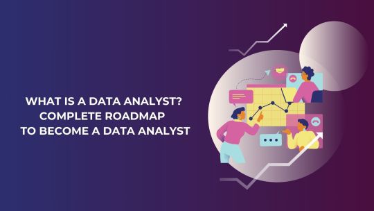
What is a Data Analyst? | Complete Roadmap to Become a Data Analyst
In today’s data-driven world, businesses rely on data analysts to convert raw data into actionable insights. Data analysts play a crucial role in enabling organizations to make informed decisions, optimize operations, and identify new opportunities. If you aspire to become a data analyst, understanding the responsibilities, required skills, and career path is essential. This article provides a detailed roadmap to guide your journey toward a successful career as a data analyst.
Who is a Data Analyst?
A data analyst is a professional who collects, processes, and interprets data to help organizations make data-driven decisions. Their work involves identifying patterns, trends, and relationships in datasets and presenting findings through visualizations and reports. Data analysts serve as the bridge between raw data and strategic decision-making, impacting various sectors such as healthcare, finance, retail, and technology.
Key Responsibilities of a Data Analyst
Data analysts perform a variety of tasks, including:
1. Data Collection: Gathering relevant data from multiple sources, such as databases, APIs, and spreadsheets.
2. Data Cleaning: Removing inconsistencies, duplicates, and errors to ensure data quality.
3. Data Analysis: Using statistical techniques to identify patterns and trends.
4. Data Visualization: Presenting data insights using charts, graphs, and dashboards.
5. Reporting: Preparing detailed reports to communicate findings to stakeholders.
6. Collaborating with Teams: Working closely with decision-makers to understand business needs and provide actionable recommendations.
Skills Required to Become a Data Analyst
1. Technical Skills
· Excel: Proficiency in Excel is essential for basic data manipulation and analysis.
· SQL: Knowledge of SQL helps you extract and manage data from relational databases.
· Programming: Skills in Python or R are crucial for advanced data analysis and visualization.
· Data Visualization Tools: Familiarity with tools like Tableau, Power BI, and Matplotlib enhances your ability to present insights effectively.
· Statistics and Mathematics: A strong foundation in statistical concepts is necessary for analyzing and interpreting data.
2. Soft Skills
· Critical Thinking: The ability to approach problems logically and think analytically.
· Communication: Skills to convey complex findings in a simple, understandable manner.
· Attention to Detail: Ensuring data accuracy and quality.
· Problem-Solving: Using data to address business challenges and propose solutions.
Roadmap to Becoming a Data Analyst
Here’s a step-by-step guide to help you achieve your goal of becoming a data analyst:
1. Understand the Role
Research the responsibilities, required skills, and career opportunities in data analytics. Read job descriptions and connect with industry professionals to gain a deeper understanding of the field.
2. Learn the Basics
· Start with learning Microsoft Excel for data manipulation.
· Gain proficiency in SQL to query and manage databases.
· Explore Python or R for statistical analysis and scripting.
3. Build a Strong Foundation in Statistics
Understand statistical concepts like mean, median, variance, standard deviation, and probability distributions. These are essential for interpreting and analyzing data.
4. Develop Visualization Skills
Learn how to create impactful visualizations using tools like Tableau, Power BI, or programming libraries like Matplotlib and Seaborn.
5. Work on Real-World Projects
Gain practical experience by working on projects such as:
· Analyzing sales data to identify trends.
· Creating dashboards to monitor KPIs.
· Performing customer segmentation based on purchase behavior.
6. Obtain Certifications
Certifications can validate your skills and boost your employability. Consider certifications like:
· Google Data Analytics Professional Certificate
· Microsoft Certified: Data Analyst Associate
· Certification programs offered by 360DigiTMG
7. Build a Portfolio
Showcase your skills through a portfolio that includes:
· Completed projects with detailed documentation.
· Visualizations and dashboards you’ve created.
· Contributions to open-source projects or Kaggle competitions.
8. Network and Apply for Jobs
· Join professional platforms like LinkedIn to connect with data analysts and recruiters.
· Attend webinars, workshops, and meetups to stay updated on industry trends.
· Apply for internships or entry-level positions to gain hands-on experience.
The Future of Data Analytics
The field of data analytics is rapidly evolving, with advancements in technology and the growing importance of data in decision-making across industries. Emerging trends and tools are shaping the future of the profession, making it an exciting time to enter the field. As a data analyst, staying updated with these trends can ensure long-term career success and growth.
youtube
1. Integration of AI and Machine Learning
Data analysts are increasingly using AI and machine learning tools to automate data preparation, identify complex patterns, and generate predictive insights. Familiarizing yourself with these technologies can give you a competitive edge.
2. Big Data Analytics
With the explosion of data generated every day, analysts are expected to work with massive datasets. Learning big data technologies like Apache Hadoop and Spark can be advantageous.
3. Data Storytelling
The ability to communicate insights effectively through compelling stories is gaining prominence. Developing skills in data storytelling and mastering tools like PowerPoint and Canva for presentations will be crucial.
4. Cloud-Based Analytics
Cloud platforms like AWS, Google Cloud, and Azure are becoming popular for data storage and analysis. Understanding how to use these platforms will enhance your job prospects.
5. Specialized Roles
As the field matures, specialized roles such as marketing analyst, healthcare analyst, and risk analyst are becoming common. Building domain expertise in a specific industry can open new opportunities.
Benefits of Becoming a Data Analyst
Pursuing a career in data analytics offers several advantages:
1. High Demand: With businesses across industries relying on data, the demand for skilled data analysts continues to grow.
2. Attractive Salaries: Data analysts often earn competitive salaries, with opportunities for bonuses and incentives.
3. Diverse Opportunities: Data analysts can work in various industries, providing flexibility and a chance to explore different fields.
4. Career Growth: With experience, you can transition to higher roles, such as data scientist, analytics manager, or consultant.
5. Intellectual Satisfaction: The role involves solving challenging problems and contributing to impactful decisions, making it fulfilling for those who enjoy analytical thinking.
Why Choose 360DigiTMG for Your Data Analyst Journey?
360DigiTMG is a leading training provider that equips aspiring data analysts with the skills and knowledge needed to excel in the field. Here’s how 360DigiTMG can support your journey:
· Comprehensive Curriculum: Learn essential tools and techniques, including Excel, SQL, Python, and Tableau.
· Hands-On Projects: Gain practical experience by working on real-world datasets and projects.
· Global Certifications: Earn certifications that are recognized by top employers worldwide.
· Experienced Faculty: Learn from industry experts with years of practical experience in data analytics.
· Placement Assistance: Benefit from resume-building workshops, mock interviews, and job placement support.
· Flexible Learning Options: Choose from online, offline, and hybrid learning modes to suit your schedule.
By enrolling in 360DigiTMG’s data analyst programs, you not only gain technical expertise but also the confidence to thrive in a competitive job market.
Conclusion
Becoming a data analyst is a rewarding journey that requires a mix of technical skills, problem-solving abilities, and industry knowledge. With a clear roadmap and the right guidance, you can build a successful career in this dynamic field. Whether you are just starting or looking to upskill, 360DigiTMG offers the resources and expertise to help you achieve your career goals. Take the first step today and unlock your potential as a data analyst!
1 note
·
View note
Text
How to Succeed in Your Data Analytics Course: Essential Tips and Resources
Enrolling in a data analytics course is a great step toward a lucrative and fulfilling career in today's data-driven world. However, succeeding in this course requires more than just attending lectures and completing assignments. To excel, you need a strategic approach and access to resources that can guide you through complex concepts. Below, we outline actionable tips to help you thrive in your data analytics course and recommend video resources for deeper learning.
1. Understand the Fundamentals of Data Analytics
Before diving into complex algorithms and statistical models, ensure that you have a solid grasp of the basics. Key concepts such as data cleaning, data visualization, and basic statistical measures form the foundation of data analytics.
Recommended Learning Approach:
Brush Up on Statistics and Mathematics: Strengthen your knowledge of descriptive and inferential statistics.
Learn Key Tools Early: Familiarize yourself with data analytics tools like Python, R, SQL, and data visualization software (e.g., Tableau and Power BI).
Helpful Video Resource:
Watch this detailed video on foundational concepts here.
2. Develop Strong Programming Skills
In the field of data analytics, programming plays a vital role. Python and R are the two most commonly used programming languages in data analytics. Python is particularly popular due to its simplicity and a wide range of libraries such as Pandas, NumPy, and Matplotlib.
Tips for Success:
Practice Coding Regularly: Spend time coding daily or at least a few times a week to enhance your proficiency.
Work on Mini-Projects: Apply your skills to real-world projects, such as data cleaning exercises or simple analyses, to deepen your understanding.
Helpful Video Resource:
Dive deeper into practical coding techniques here.
3. Master Data Visualization Techniques
Data visualization is crucial in translating complex data into easy-to-understand insights. Mastering visualization tools and understanding how to choose the right type of chart for different data types is essential.
Key Steps:
Explore Visualization Libraries: Use libraries such as Matplotlib, Seaborn, and Plotly for Python, or ggplot2 for R.
Understand Data Storytelling: Learn how to use visual elements to craft compelling data stories that resonate with your audience.
Helpful Video Resource:
Get comprehensive insights into data visualization techniques here.
4. Engage in Hands-on Projects
Theoretical knowledge is only as good as its practical application. Building projects not only helps you understand data analytics more thoroughly but also provides you with a portfolio to show potential employers.
Suggestions for Projects:
Analyze Public Datasets: Use platforms like Kaggle or public data repositories to practice.
Join Competitions: Participate in data challenges and hackathons to improve your skills and network with other data enthusiasts.
Helpful Video Resource:
For project-based learning and how to approach hands-on data projects, watch this video.
5. Stay Updated and Network
Data analytics is a rapidly evolving field, and staying current with trends and new tools is critical for long-term success.
How to Keep Up:
Follow Industry Leaders: Read blogs, articles, and follow key figures on platforms like LinkedIn and Twitter.
Join Data Analytics Communities: Engaging in discussions on forums like Reddit, Stack Overflow, and Data Science Central can offer valuable insights and answers to complex questions.
6. Leverage Online Resources
To build a deeper understanding of complex topics, take advantage of free resources and comprehensive videos. Here are some highly recommended sessions for anyone enrolled in a data analytics course:
Data Analysis Tips and Tricks: Gain insights into practical data analysis methods that professionals use.
Step-by-Step Data Analytics Projects: Learn through examples how to work on data projects from start to finish.
Data Visualization Mastery: Understand how to present data visually in an impactful way.
Deep Dive into Python for Data Science: Get an in-depth look at Python’s role in data analysis and data science.
7. Practice Consistently
Consistency is key. Set a schedule that includes time for learning, applying concepts, and revisiting difficult topics. Regular practice not only reinforces what you learn but also builds confidence.
Routine Ideas:
Dedicate 30 minutes daily to coding exercises.
Work on a new dataset weekly and create a mini-report.
Revisit complex topics regularly to ensure they stay fresh.
8. Focus on Communication Skills
Being able to present your findings clearly is just as important as the analysis itself. Sharpen your communication skills so you can tell a story with data, whether through written reports or presentations.
Enhancement Tips:
Practice explaining complex ideas in simple terms.
Incorporate storytelling techniques in your data presentations.
Use visuals that highlight your key points without overwhelming your audience.
9. Seek Feedback and Stay Adaptable
Feedback from peers or mentors can highlight areas that need improvement. Adaptability is vital in the ever-changing landscape of data analytics, so keep an open mind to new tools and methodologies.
10. Stay Inspired and Persistent
Lastly, keep your motivation high. Remember why you started this journey and the career opportunities that come with mastering data analytics. Celebrate small wins and maintain a positive attitude.
Conclusion
Mastering data analytics takes dedication, practice, and the right resources. By staying engaged, seeking out projects, leveraging expert content, and being consistent in your practice, you can excel in your data analytics course and carve out a successful career in this dynamic field. Don’t forget to make full use of community interactions and free learning materials, such as the recommended video sessions, to enhance your learning experience.
Ready to take your data analytics journey to the next level? Check out the resources linked above and start building a brighter future today!
0 notes
Text
Data Analytics Course in Rohini: Comprehensive Overview
Introduction to Data Analytics
In today’s data-driven world, the ability to analyze and interpret data is more valuable than ever. Businesses across industries rely on data analytics to make informed decisions, improve operational efficiency, and enhance customer satisfaction. The data analytics course in Rohini is designed to equip participants with the essential skills and knowledge required to thrive in this rapidly evolving field.

Course Objectives
The primary objectives of the course are to:
Understand the Role of Data Analytics: Participants will learn about the significance of data analytics in various sectors, including finance, healthcare, marketing, and logistics.
Develop Technical Skills: The course will focus on essential tools and programming languages used in data analytics, enabling students to manipulate and analyze data effectively.
Apply Analytical Techniques: Students will gain practical experience in applying statistical methods and analytical techniques to real-world data.
Build a Strong Foundation in Machine Learning: An introduction to machine learning concepts will help students understand advanced analytics and predictive modeling.
Prepare for Career Opportunities: The course aims to equip students with the necessary skills to pursue careers in data analytics, offering guidance on job opportunities and industry expectations.
Course Structure
The course is structured into several modules, each focusing on different aspects of data analytics:
Module 1: Introduction to Data Analytics
What is Data Analytics?: Understanding its definition, importance, and applications in business.
Types of Data: Exploring structured and unstructured data, big data, and data mining.
Data Analytics Process: Steps involved in data analytics, including data collection, cleaning, analysis, and visualization.
Module 2: Data Collection and Cleaning
Data Sources: Identifying various sources of data, including surveys, databases, and online resources.
Data Cleaning Techniques: Learning how to preprocess data to ensure accuracy and reliability, including handling missing values and outliers.
Tools for Data Collection: Introduction to tools like Excel, Google Sheets, and APIs for data gathering.
Module 3: Statistical Analysis
Descriptive Statistics: Understanding measures of central tendency (mean, median, mode) and dispersion (variance, standard deviation).
Inferential Statistics: Introduction to hypothesis testing, confidence intervals, and regression analysis.
Correlation and Causation: Distinguishing between correlation and causation and understanding their implications in data interpretation.
Module 4: Data Visualization
Importance of Data Visualization: Understanding how visual representation of data enhances comprehension and communication.
Visualization Tools: Hands-on training with tools like Tableau, Power BI, and Python libraries (Matplotlib, Seaborn).
Creating Effective Visuals: Best practices for designing charts, graphs, and dashboards that effectively convey insights.
Module 5: Programming for Data Analytics
Introduction to Python/R: Basics of programming in Python or R, focusing on syntax, data structures, and libraries used in data analysis.
Data Manipulation: Learning libraries like Pandas (Python) and dplyr (R) for data manipulation and analysis.
Automating Analysis: Writing scripts to automate repetitive data analysis tasks.
Module 6: Introduction to Machine Learning
What is Machine Learning?: Understanding the basics of machine learning and its applications in data analytics.
Types of Machine Learning: Overview of supervised, unsupervised, and reinforcement learning.
Building Simple Models: Introduction to algorithms like linear regression, decision trees, and clustering techniques.
Module 7: Real-World Projects
Hands-On Experience: Engaging in real-world projects that allow students to apply their skills to solve actual business problems.
Case Studies: Analyzing case studies from various industries to understand how data analytics drives decision-making.
Collaboration: Working in teams to enhance problem-solving and communication skills.
Module 8: Career Guidance and Industry Insights
Career Pathways: Exploring different roles in the data analytics field, such as data analyst, business intelligence analyst, and data scientist.
Resume Building: Guidance on creating an impactful resume and preparing for interviews in the data analytics domain.
Networking Opportunities: Connecting with industry professionals through workshops, seminars, and guest lectures.
Teaching Methodology
The course employs a blend of theoretical knowledge and practical application through:
Interactive Lectures: Engaging lectures that foster discussion and enhance understanding.
Hands-On Workshops: Practical sessions where students can apply their knowledge using real data sets.
Group Projects: Collaborative projects that promote teamwork and the sharing of ideas.
Guest Speakers: Inviting industry experts to share insights and experiences.
Course Duration and Format
The course typically spans several weeks to months, with classes held in-person or online, depending on participant preferences. Flexible scheduling options may be available to accommodate working professionals.
Target Audience
This course is suitable for:
Beginners: Individuals with no prior experience in data analytics looking to start a career in this field.
Professionals: Those seeking to upskill and incorporate data-driven decision-making into their roles.
Students: University students pursuing degrees in business, IT, or related fields who want to enhance their employability.
Certification
Upon successful completion of the course, participants will receive a certificate that acknowledges their skills and knowledge in data analytics, which can be a valuable addition to their resumes.
Conclusion
The data analytics course in Rohini is a comprehensive program designed to provide students with the essential skills needed to excel in the data analytics field. By combining theoretical knowledge with practical experience, participants will be well-prepared to tackle real-world challenges and seize career opportunities in this exciting and dynamic industry. Whether you’re looking to start your journey in data analytics or enhance your existing skills, this course offers the tools and insights needed to succeed.
0 notes
Text
How to Become a Business Intelligence Analyst

Are you curious about turning numbers into valuable insights and helping businesses make smart decisions? Well, becoming a Business Intelligence Analyst (BI) Analyst might be just the career for you! In this guide, we'll break down the steps to help you embark on your journey into the world of business intelligence, even if you're new to the field.
Step 1: Understand the Basics
Before diving in, it's essential to grasp the fundamentals of what a BI Analyst does. Simply put, BI Analysts analyze data to help companies make informed decisions. They work with data visualization tools, like graphs and charts, to present complex information in a way that everyone can understand.
Step 2: Acquire Education
While a formal education isn't always mandatory, having a degree in a relevant field can give you a head start. Consider pursuing a degree in business, finance, computer science, or a related field. However, many BI Analysts also enter the field with experience in areas like IT or data analysis.
Step 3: Develop Analytical Skills
To become a successful BI Analyst, you need to love playing with numbers and have a keen eye for detail. Sharpen your analytical skills by solving puzzles, practicing with data sets, and honing your ability to recognize patterns in information.
Step 4: Learn Relevant Tools
Get comfortable with the tools of the trade. Popular BI tools include Microsoft Power BI, Tableau, and Google Data Studio. There are plenty of online tutorials and courses to help you get hands-on experience with these tools, even if you're a beginner.
Step 5: Gain Practical Experience
Apply your knowledge in real-world situations. Seek internships or entry-level positions that allow you to work with data. This hands-on experience is invaluable and will make you stand out to potential employers.
Step 6: Develop Communication Skills
Being a BI Analyst isn't just about crunching numbers; it's also about communicating your findings effectively. Practice explaining complex data in simple terms, both verbally and through written reports. This skill is crucial for collaboration with non-technical teams.
Step 7: Stay Updated
The world of business intelligence is dynamic, with new tools and techniques emerging regularly. Stay current by reading industry blogs, attending webinars, and participating in online communities. Continuous learning is key in this field.
Step 8: Build a Portfolio
Create a portfolio showcasing your projects and analyses. This could include sample reports, dashboards, or any relevant work you've done. A strong portfolio is an excellent way to demonstrate your skills to potential employers.
Conclusion
Becoming a Business Intelligence Analyst may seem like a daunting task, but by following these steps, you can pave the way to a rewarding career. Remember, curiosity, a love for problem-solving, and a commitment to continuous learning are your greatest assets on this exciting journey.
0 notes
Text
How to leverage AI in finance with Christian Martinez
New Post has been published on https://thedigitalinsider.com/how-to-leverage-ai-in-finance-with-christian-martinez/
How to leverage AI in finance with Christian Martinez

Our sister community, Finance Alliance, recently held an Ask Me Anything (AMA) session inside our Slack community with Christian Martinez, Finance Manager at Kraft Heinz.
So, Christian answered members’ burning questions about how to successfully leverage AI tools in finance, and much more.
Below, you’ll find some highlights from the session, where Christian shared valuable insights and tips with Finance Alliance’s members. ⬇
The main use cases for using these types of tools, such as ChatGPT and Google Bard, include:
Identifying risks, opportunities, and trends.
Facilitating collaboration between departments.
Developing automatic AOP models.
Natural language processing (NLP).
Can ChatGPT interpret past trends and data to help automate financial forecasting?
I’ve seen that Google Bard, ChatGPT, and other similar language models are very powerful tools for many processes, but in order to help automate financial forecasting, they require an additional tool.
For example, Google Bard + Python.
How can ChatGPT help perform real-time financial analysis?
I see ChatGPT helping in two main ways:
Generating ideas on how to perform the analysis.
Providing Python code to use on Google Colab to perform real-time financial analysis.
How can you ensure buy-in from management in finance transformation projects/initiatives?
It’s really important to have that buy-in from management. In order to get it, you need to understand the ‘why are we doing this,’ and ‘why this matters.’ The answers will depend on the management and the project, but understanding those is key.
Another important thing you need to do is map your stakeholders/management people and understand how much interest and influence they have in your initiative.
I prefer to use Python (with Google Colab) for this! But for the MVM (minimum viable model), I sometimes use Excel.
I’m still in the process of exploring the potential of third-party tools. Right now, I’m using Tableau, Alteryx, Python, SQL, Microsoft Azure, and Power BI.
What are your top 5 methods to forecast data?
Random forests
Linear regression
Clustering
Monte Carlo simulation
Time series
How can AI help predict financial patterns?
They can primarily help through decision-making algorithms, predictive analytics, and automation.
What do you think are the best ChatGPT plugins for FP&A?
I have many articles on plugins:
3 Great ChatGPT Plug ins for Finance with Guide + Business Case
Generate your own ChatGPT Plug in guide in 3 Simple Steps
10 Amazing Ways to Use ChatGPT Plugins for Stock Analysis: Part 1
How can I use AI for financial modeling?
There are many good use cases for financial modeling. Some of the main ones are the creation of models (LBO, DCF, etc), research about models, generation of shortcuts guides on your financial modeling software, formula builder, etc.
Do you recommend using ChatGPT API in Python or is inaccuracy still a huge issue?
On its own, the API is the same as using the model on the OpenAI website. If you add things on top, it can then be valuable.
On accuracy, there are two things I’d recommend:
Use this before your prompts: “Act as a purely factual AI that doesn’t hallucinate. If you don’t know an answer or if it’s out of your training data, just say it…“
Treat ChatGPT as the most junior member of your team. They can contribute and help a lot, but you need to check their work before submitting it to your stakeholders/customers. Use your knowledge and expertise to assess the veracity of what they produce.
I mainly use Twitter and LinkedIn. I tend to follow a group of AI “general” influencers on Twitter, and then if I think it can be applied to finance and accounting, I post it on LinkedIn.
These are some of the accounts I follow:
About Christian Martinez
Christian Martinez is currently the Finance Manager at Kraft Heinz and has over six years of experience in financial planning and analysis (FP&A). He’s also the founder of The Financial Fox, a non-profit startup project which aims to democratize machine learning and data analysis.
Christian was named as one of the 30 under 30 in the Accounting and Finance industry in Australia in 2021. He also won the EMEA Data Democratizer Award in 2022 and was a finalist in the Young Leaders in Finance Awards in 2018.
Download Finance Alliance’s AI in Finance eBook
Artificial Intelligence (AI) is reshaping the finance industry and empowering finance teams to make smarter, data-driven decisions like never before.
But how can you incorporate AI into your financial workflow?
Welcome to the AI in Finance eBook, your trusted guide to merging AI’s vast potential with everyday finance operations such as forecasting, budgeting, analysis, and more.👇
#2022#accounting#accounting and finance#Accounts#ai#Algorithms#alteryx#amazing#amp#Analysis#Analytics#API#Articles#Artificial Intelligence#Australia#automation#azure#bard#bi#budgeting#Business#chatGPT#code#CoLab#Collaboration#Community#data#data analysis#data-driven#data-driven decisions
0 notes
Link
Tableau is one of the latest empowerments in the data visualization and analytics space. It enables professionals to do several tasks, including data manipulation, design visualizations, etc., and transform data into business-ready insights. Hence, Tableau developers are in high demand everywhere. But how to become a Tableau developer? ITView, the top for Tableau training in Pune, explains how to become a Tableau developer in five simple steps.
#Tableau Developer in 5 Simple Steps#Learn Tableau With ITView#Best Software Training Institute in Pune
0 notes
Text
Free Ways To Upskill In Industry

The days of paying a large sum of money to learn something are long gone. The system for online learning has changed.
In order to learn anything, you HAD TO BE IN THE CLASS, this educational pattern has now changed. The online learning should be thanked for the current, permanent changes in the educational world.Now, all you need to access vast sources of information and master the skills you want is a device and an internet connection.
The best aspect is that there is no requirement for skill. You have the option of learning something simple like "creating crafts" or something complex like "building software." There is something out there for everyone. What I'm referring to are the e-learning platforms that are listed after them.
Let me give you just a few additional benefits of online learning before I continue.
* Study at your own speed.
* Less expensive than actual learning facilities
* Unrestricted access to the information
* Regular updates
Let's look at the platforms right now.
1) Udemy
One of the most well-known online learning platforms is Udemy. They have a substantial collection of classes organised into many categories, such as:
· Development
· Business
�� Finance and accounting
· Software and IT
· Office Efficiency
· Individual Development
2) Coursera
The fact that this platform intersperses quizzes and practical projects with the course content allows you to apply what you have learnt. Their course categories include:
* In-depth learning
* Huge data
* Learning Machines
* Data science
* Internet advertising
Coursera might be the option for you if you're wanting to develop a talent for a prospective future career. They greatly bolster the legitimacy of your educational efforts.
3) Job Ready Programmer
You can choose from a variety of courses on our learning platform to learn how to code like an expert. They give students real-world programming challenges to evaluate their aptitude for learning, and they then have them carefully follow a video solution to break down the issues and offer a thorough step-by-step solution for greater comprehension.
Its course options include:
· SQL in Oracle
· Java for both novices and experts
· OOP
· For Data Science, SQL
· Python
· Tableau
· Spring Web + Spring Framework 5 + Boot 2
· Data structure + algorithms
5) LinkedIn Learning
LinkedIn Learning is a knowledge hub that makes it simple for you to learn the skills you want thanks to their sizable course selection.
Here are a few of the categories:
* Application Development
* Web Design,
* Web Development,
* Business,
* Photography,
* Marketing
You can access all of their courses on-demand with a single membership. Don't forget to take advantage of their present offer of a free month to test out their platform.
6) Google Career Cerification
Google Credential for Career Gain confidence, job-ready skills, and an useful career credential. Start a career in data analytics, UX design, project management, or IT support.
Conclusion
The best move someone can make is to acquire new talents because you never know when trends will shift. You can learn and master the talents you want on the aforementioned websites whenever and wherever you want.
The best instructor is available to teach you the most difficult skills in your house, right from your computer. The benefit of online education is that you can plan your study schedule and it is reasonably priced.
0 notes
Text
Learning Path: Your Guide to Get Tableau Services in Pakistan
BI #1 Tableau Services in Pakistan Data visualization is the art of displaying data in such a way that it can be understood by non-analysts. A precise balance of aesthetic aspects such as colors, size, and labels can result in visual masterpieces that offer startling business insights, allowing firms to make more educated decisions.
The use of data visualization in business analytics is unavoidable. As more data sources become available, corporate leaders at all levels are embracing data visualization tools that allow them to graphically examine trends and make quick choices. Qlikview and Tableau are currently the most popular visualization and data discovery solutions.
BI #1 Tableau Services in Pakistan

Tableau is a Business Intelligence (BI) and data visualization application that is rapidly evolving. It's simple to set up, easy to learn, and simple to use for customers. For those who are new to Tableau, here is a learning path. This program will guide you through a methodical approach to learning Tableau Services in Pakistan.
Beginners are advised to adhere to this course religiously. If you already have some knowledge or don't require all of the components, feel free to go your own way and let us know how it went!
Step 1: What is the Importance of Data Visualization?
Before we get started with Tableau, I'd like to stress the importance of data visualization and how it can help businesses make better decisions. To whet your appetite, here's a video:
Tour of Tableau's Products
Tableau is the market leader across all BI products, according to Gartner's magic quadrant 2015.
Magic Quadrant, Gartner, Tableau
Step 2: Download and install Tableau.
Tableau has five major products that cater to a wide range of visualization needs for professionals and businesses. They are as follows:
Tableau Desktop is a desktop version of Tableau Services in Pakistan that is designed for individual usage.
Tableau Server is a collaboration tool that may be used by any company.
Tableau Online: Cloud-based Business Intelligence Tableau Results
Feature Highlights
Tableau Public and Tableau Reader are free to use, while Tableau Server and Tableau Desktop have a 14-day fully functional free trial period after which the user must pay.
Tableau Desktop is available in two versions: Professional and Personal. Tableau Online is accessible for a single user with an annual subscription and grows to thousands of users. Tableau has gone through several iterations; in this article, we'll look at Tableau Desktop 9.0's learning curve.
Tableau Desktop can be downloaded as a trial version from the Tableau website, however, it is only available for 14 days. Follow the steps to install it on your system and begin using it.
Step 3: Tableau: Getting Started
Tableau Services in Pakistan offers free online, live, and (paid) classroom training. This is the ideal starting point for your quest. I recommend that you take the path outlined below. Here is a link to a free on-demand online training course with supplementary materials. All of these movies provide the data set that you can investigate on your own.
You must first register in order to see these training videos. Expand the "Getting Started" area and view the three videos that are offered. Connecting with data, data preparation, generating views, filters, dashboards, story points, and ways to disseminate will all be covered in these videos.
Step 4: Integrating Data
Tableau can connect to a variety of data sources, including text, spreadsheets, databases, and big data searches. We'll look at the fundamentals and advanced features of data communication with various sources in this part. We'll also examine at join types, data blending, cube connections, custom SQL, and Google Analytics in this section.
Step 5: Creating and Analyzing Points of View
Tableau Services in Pakistan offers a variety of ways to visualize data, including applying filters/drill-downs/formatting, creating sets, groups, drawing trend lines, and forecasting. Begin your journey!
You've now looked at a variety of data visualization objects. One of the most difficult decisions you'll have to make when building data visualization is which object to use to represent data.
The image below will assist you in deciding on the type of visualization to use. The tableau feature of automated view selection, on the other hand, takes care of this issue to a significant extent. This function triggers the optimal views for the selected dimension(s) and measures automatically (s).
Step 6: Workout
We've looked at data connectivity, various objects, and view generation in Tableau Services in Pakistan up until this point. It's time to get your hands dirty with data and draw conclusions using a variety of visualization techniques:
Kaggle organized a data science challenge to forecast crime categories in San Francisco based on 12 years of crime reports from all of the city's neighborhoods (from 1934 to 1963). (time, location, and other features are given).
Step 7: Dashboards and Narratives
The creation of Tableau's "Dashboard and Stories" is the product's USP (unique selling proposition). The dashboards that have been made are fantastic, and they take this product to the next level. Dashboards and Stories have their own component in the Tableau online training program. This section includes the following topics:
Storytelling and the Dashboard
Dashboards: Adding Views and Objects
Using Filters on a Dashboard
Options for different layouts and formatting
Story Points on the Interactive Dashboard
Services We Offer:
Strategy
Competitive Intelligence
Marketing Analytics
Sales Analytics
Data Monetization
Predictive Analytics
Planning
Assessments
Roadmaps
Data Governance
Strategy & Architecture
Organization Planning
Proof of Value
Analytics
Data Visualization
Big Data Analytics
Machine Learning
BI Reporting Dashboards
Advanced Analytics & Data Science
CRM / Salesforce Analytics
Data
Big Data Architecture
Lean Analytics
Enterprise Data Warehousing
Master Data Management
System Optimization
Outsourcing
Software Development
Managed Services
On-Shore / Off-Shore
Cloud Analytics
Recruiting & Staffing
Click to Start Whatsapp Chatbot with Sales
Mobile: +9233333331225
Email: [email protected]
#Banking Analytics solutions in Pakistan#BI Company in Pakistan#BI Consultant in Pakistan#big data consulting services in Pakistan#business intelligence solutions in Pakistan#Cognos Consultant in Pakistan#data visualization solutions in Pakistan#data warehouse solutions in Pakistan#Insurance Analytics Solutions in Pakistan#Manufacturing Analytics Solutions in Pakistan#Microstrategy Consulting services in Pakistan#Oil & Gas Analytics Solutions in Pakistan#Retail Analytics Solutions in Pakistan#Supply Chain Analytics Solutions in Pakistan#Tableau Consulting services in Pakistan#Cognos Consulting Services in Pakistan#Qlikview Consulting services in Pakistan#bi consulting services in Pakistan#business intelligence services in Pakistan#data warehousing services in Pakistan#Pharma Analytics Solutions in Pakistan#healthcare analytics solutions in Pakistan#healthcare business intelligence in Pakistan
0 notes
Text
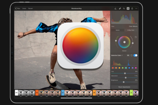
Pixelmator Photo

The Pixelmator Pro image editing engine is seriously sophisticated and incredibly powerful. It’s designed exclusively to take advantage of the full power of Mac computers, using advanced Mac graphics technologies like Metal and Core Image. Pixelmator Photo for iPad is here!In this live session I'll show you everything you need to know to get the very best out of this amazing iPad app.
The timeline for many a photographer — at least, this was the case for me — can be outlined somewhat as per the graph below:
Here, photography gear and kit starts out as the ultimate source of inspiration. This inspiration declines steadily over time, but rears its ugly head on occasion.
The inspiration derived from other photographers takes essentially an inverse effect as gear and kit do. When gear and kit delusions subside, the drive to emulate your favorite photographers rises.
And finally, your own skill set not only grows over time, it also becomes the main source of your own inspiration over time.
I’ve developed a bit of a list for the second step — photographers like Kate Holstein, Sam Nute, Finn Beales, Dan Tom, and more are stunningly skilled and worthy of emulation. Their compositions are great — often, near perfect — and their colors are their own.
I think the prevailing advice to improve your abilities as a photographer is to focus on composition. Work with prime lenses, learn to position your body and camera in the right spot, and ensure all the pieces of the puzzle fit into your photograph beautifully.
Color is just the icing on top of the composition cake, and everyone likes different brands of icing, right?
It is the largest aircraft in the Embraer E-Jet family. It is an extended version of the Embraer E-190 aircraft. X-Crafts‘ goal from the beginning was to create a great high quality add-on that would be very interesting for both, the hardcore simmers as well as new flightsim users out there! Check Out the Embraer E 170 by SSG avaiable on the X Plane Forum!!!Check it out at:http://forums.x-plane.org/index.php?/files/file/34117-embraer-e-170-e-jet. X plane erj. FS2004 Aeromexico Connect Embraer 190. Model by VirtualCol. Texture by Carlos Daniel Gonzalez. Author Diego Israel Correa Vazquez. Traffic Global for X-Plane 11 adds high quality AI aircraft in authentic liveries and will full 3D sound and lighting and effects. It comes with 65 aircraft types and over 860 liveries and is simple to use. Embraer E175 and E195 v2 package by X-Crafts. Embraer E-175 v2.4. EMB190YTxp11 for X-Plane 11 Part of the message is hidden for the guests. Please log in or register to see it. Please Log in or Create an account to join the conversation.
Pixelmator Photo’s latest update brought the power of Pixelmator Pro’s ML Match Colors from the Mac to the iPad, promising the ability to match the color palettes between sets of photos. ML Match Colors is wonderfully implemented, quickly performed, and easy to use. It promises to use all the powers of the iPad.
But does it promise the power of stealing your favorite photographers’ color palettes? Will it make your photos look as good as your favorite photographers’ photos?
Of course not!
As is always the case in photography, there are a multitude of variables at play. ML Match Colors handles one specific variable: color.
Using ML Match Colors to Match Your Own Photos
This is the method that I expect the Pixelmator team both wants and expects customers to implement when using ML Match Colors. At first blush, ML Match Colors seems best designed for applying a relatively close color palette to all of your photos in a set.
Rock Bookends OUR Freedom and Liberty solid rocks sandblasted for permanent gifts, like our great country GRoG1791 5 out of 5 stars (11) $ 70.00. Add to Favorites Liberty Bell Bookends - cast iron DecoDavesDen 5 out of 5 stars (1) $ 65.00 FREE shipping Add to Favorites. Rock Bookends OUR Freedom and Liberty solid rocks sandblasted for permanent gifts, like our great country GRoG1791. 5 out of 5 stars (9) $ 70.00. Favorite Add to Vintage Wood and Cast Iron Eagle Bookends/Vintage Eagle Bookends/Patriotic Bookends/Vintage Home Decor AimlessAntiques. https://huntergator65.tumblr.com/post/654191096322228224/freedom-bookends. Product description Organized Living freedomRail Book Ends prevent books and other belongings from sliding off shelf ends without taking up valuable space. Book Ends work perfectly in a home office. Cast Metal Liberty Bell Pair of Bookends - Patriotic Brass Tone Heavy Bookends - Liberty Bell Freedom Bookends - American Patriot Home Decor GlitteringDragonfly 5 out of 5 stars (1,287) $ 34.99. Add to Favorites Pair of Cast Metal Goldtone Liberty Bell Bicentennial Bookends - Federal Style - 1776 - Law Office - Colonial - Federal Style.
The original photo on the left and my personal edits on the right. Clearly, these two photos are very, very different.
To test the power of ML Match Colors, I used a single photo of my own from a few years ago. Evidently, I’ve heavily edited this photo, so I exported a copy of the original photo and a copy of the edited photo from Lightroom to my camera roll.
From there, I opened the original raw photo in Pixelmator Photo, dragged an instance of Photos into Split View, and dragged my edited into Pixelmator Photo to match the color palettes.
In general, if an app can or can’t deliver on a promise, it’s usually due to improper expectations. And since I originally came into this thinking ML Match Colors would also match saturation, hue, intensity, and exposure all at once, well, I was originally disappointed. Here’s the result:
But upon further inspection, Pixelmator Photo actually performed great work in matching the colors in these two photos. In retrospect, it’s obvious: the colors are properly matched. However, to get to my original end result, I had to jump into the color tools in Pixelmator Photo to dial back intensity, hue, and saturation of individual colors. After maybe a minute or two of experimentation, I came to this end result:
Not bad, actually! Not bad at all.
As I mentioned above, ML Match Colors is explicitly designed to match colors — matching any other elements of exposure, saturation, hue, and more either has to be done manually or through other forms of Pixelmator Photo’s machine learning features.
Using ML Match Colors to Match Someone Else’s Photos
This whole section likely gets dicey, so I want to ensure I give credit where credit is due, and I want to ensure that the end result of “stealing” someone’s color does not actually happen. I fully believe, after you’ve read through this section, you’ll agree that a photographer’s stylistic brand and color choices are not in jeopardy thanks to ML Match Colors.
So, Finn Beales is one of the professional photographers I mentioned above who I have a ton of professional respect for. Beales has one of my favorite photography blogs on the planet, shoots some of the best travel and brand photography in the world right now, and has provided a wealth of photographic knowledge in his photography course at Strohl Works. Tableau jira connector. If you want to get a behind-the-scenes look at how Beales works and how he achieves some of his results, that course was some of the best money I’ve spent in the last two years.
Finn Beales’s tremendous travel photography — known as “72 Hrs In…” — is showcased on his personal site. There are a wealth of photos to digest in that section of his blog. One of my favorites is his commissioned work for Travel Alberta, a province and location here in Canada I had the opportunity to travel to myself.
So, with that backstory out of the way, you can likely understand where I’m going with this. Here’s Finn Beales’ photo of a man at Lake Louise in Banff National Park, Alberta, Canada:
Photo by Finn Beales, used solely for color reference and nothing more.
And here’s my photo of that exact same location, albeit with slightly different composition:
It’s very hard to say whether Beales and I shot the photo at the same time of day or in the same kind of weather, among other variables. We were at Lake Louise in the earliest part of the morning, so the orange glows on the mountaintop peaks are about as close as I could get to the oranges in Beales’ photo.
And here’s the result after dragging and dropping Beales’ photo into Pixelmator Photo:
Did my photo change at all? You’d be hard-pressed to tell. I believe many of the colors indeed match those in Beales’ photo, but again, hue, saturation, luminosity, brightness, and other variables play a major role in keeping Beales’ stylistic color choices his own.
This is good news, in nearly every facet of the story. The learning lessons I’m taking away from this:
Composition remains the most important element of photography. If you don’t have good composition, the amount of beautiful color you add or take away from a photograph won’t magically transform it into a mystical work of art.
Understanding “color” involves much, much more than simply dragging and dropping one photo onto the other. To achieve a certain look, a full understanding of the color wheel, color and light curves, and color tools is still required.
For all the work professionals have put in to create their own style, brand, and “look”, they can be rest assured that other photographers like myself won’t be able to replicate that same look with a simple feature in an iPad app.
Other Updates in Pixelmator Photo 1.2
Despite the title ML Match Colors feature debuting in Pixelmator Photo 1.2, the 1.2 app update housed plenty of powerful features for photographers looking to utilize the iPad more and more in their workflows.
Notice the trackpad cursor right in the middle of the photo on the left and the re-shaped cursor in the top right in the right photo. Cursor support is very nicely baked into the latest Pixelmator Photo update.
Trackpad Support: iPadOS 13.4’s new trackpad and cursor support has taken the platform by rage. Any app designed with many custom elements has struggled to organically adopt cursor support out of the gate, so updates have been needed to have all apps feel at home in iPadOS 13.4. Pixelmator Photo 1.2 brings full-blown trackpad support to the app, allowing you to whiz around with a mouse or trackpad much like you would on a Mac.
Split View: We chose Adobe Lightroom CC as the best photo editing app for the iPad because of its ecosystem, and we chose Darkroom as the runner-up because of Darkroom’s adoption of iOS technologies. With Pixelmator Photo 1.2, you can throw another app into the runner-up column. Pixelmator Photo may now have the best iPadOS technology support of any photo editing app available. The app now supports Split View, which is very powerful in how ML Match Colors is used. The app adeptly uses the iOS photo library rather than maintaining its own photo library housed within the app. And all the machine learning features built into the app make it one of, if not the, most powerful iOS photo editor available for the iPad.
Adjustment Intensity and Recent Adjustments: Pixelmator Photo 1.2 now allows you to fine-tune the intensity of color adjustments and presets. As described above, these tools are fundamental to achieving a desired look after ML Match Colors has done its job.
You’re also able to quickly reference and copy the adjustments from your most recently edited photos in Pixelmator Photo 1.2. Legal audio transcription. This, combined with ML Match Colors, make for a quick and easy workflow to edit a batch of photos with the same colors and settings.
Wrap Up
ML Match Colors debuted as a powerful machine learning feature in Pixelmator Pro for the Mac. The feature alone almost had me download Pixelmator Pro. However, I held off, knowing my workflow was going to increasingly move to the iPad. I admit, I didn’t expect ML Match Colors to come to the iPad so quickly.
I’m glad I waited. Because I’m positive I would have been initially disappointed with the ML Match Colors feature on the Mac.
Now that I’ve had a chance to try the feature, I’m more likely to purchase Pixelmator Pro for the Mac, simply because of the feature.
Pixelmator Photo App
So much of the iPhone and iPad’s being is wrapped up in simplicity. The devices themselves are fairly simply to use and can somehow house multiple generations of people into their user bases. This air of simplicity, applied to photography, almost makes it feel like you should be able to take a boring photo of the tree in your backyard and turn it into a masterpiece worthy of the Louvre.
The machine learning features in Pixelmator Photo are a taste of this simplicity, but don’t let your imagination run wild. Machine learning features in Pixelmator Photo take advantage of the deepest iOS technologies, eliminate a plethora of difficult and complicated tasks, and make editing photos easier than ever. They aren’t a perfect, one-tap-done editing tool.
ML Match Colors may be the very best machine learning tool available inside Pixelmator Photo. Drag and drop your favorite photos — or perhaps you can create and use your own color templates — to match the colors, then tweak everything else inside Pixelmator Photo’s vast array of editing tools. If you really want to make it easy, enable all the ML toggles in the tool array, hit export, and you’re done.
We named Pixelmator Photo as the photo editing app with the most potential in our big review. This 1.2 update really, really builds out some of that potential. And if this is just the start, Pixelmator Photo may move its way up the ladder of the best photo editing iPad apps.
Must-Have, Most-Used Photography Apps
Pixelmator Photo Mask
We spend an inordinate amount of time sorting through hundreds of apps to find the very best. Our team here at The Sweet Setup put together a short list of our must-have, most-used apps for taking and editing photos on iPhone and iPad.
0 notes
Photo

The Way of The Knife
Adventures in Excel
If you've been following along with the posts in this series, and you've been putting some of the scenarios into practice, you've now crossed a crucial juncture in your never ending quest to master the bloated beast that is Excel. To put things in perspective, if you've conquered all the quests that I've set you upon, you should now be able to: * Open up and add macro code into an Excel Worksheet * Utilize lookup functions (particularly Index(Match)) to compare and validate data sets * Build a complex formula * Utilize IF/AND/and OR statements in order to manipulate data and finally... * Understand your role in the data underground If there was any running theme among the posts in the past, it's that if you're in the position in which you're forced to utilize Excel in order to analyze data, you're probably grabbing a dirty version of the data-set from an intermediary platform (such as Tableau or Business Objects) built by a developer who isn't informed as to how the end user is going to use the data. Your mission, whether you choose to accept it or not is essentially to take data from people who know data and don't know the business, and turn it into data for people who know business and don't understand numbers. If you're wondering if perhaps you're in this role and don't know it yet,there's a simple two question litmus test =IF(AND(COLORCODING,OR(SLICE,DICE)),"Analyst","Something Else" For those of you who are just joining the party, that essentially says that if: 1. If a superior of yours has ever asked you to "slice" and or "dice" the data 2. If you're asked to color code things arbitrarily. Then you might be an analyst. Now, while your sitting at your desk (in what's most likely an Aeron chair) and you read the above qualifiers, the first thought that pops into your mind should be: "WTF does slice and dice mean when it comes to data analysis?" The answer may surprise you in that it's not just meaningless business lingo, it's actually a pretty good explanation of what you're going to be doing A LOT of (but fear not, in all likelihood, your boss didn't mean it like that due to what I'd like to call the leveraging of the synergy paradigm ). Essentially, when one attempts to slap-chop a "data dump" (in the computer patois, that's how you say data that's pulled straight from the source), it often involves as the first step "normalizing" the data so that the format is logical, and is in a position in which you can start employing some of the wizardy that we've been speaking about. The normalization process often involves only a few steps, all of which are quite easy, but EXTREMELY un-intuitive, and if you follow these steps, you'll either be done with the normalization process, or you'll be able to figure out how (all data dumps are dirty, but not all shit is created equal). 1. Ensure that your data has headings! a. Headings are essential not just because they're a logical way to organize your variables, but they're are also REQUIRED to build a pivot table down the road, if even one of your columns doesn't have a heading, Excel won't play nice! 2. Ensure that your headings don't repeat themselves a. While this may seem obvious, if a heading repeats itself, Excel won't pivot properly, won't graph correctly AND won't upload properly in external tools (such as Microsoft Access, which we'll explore in a later post!) 3. Ensure that multiple sources are all located on the same Excel workbook (basically, if you're pulling data from multiple places, that you paste them all into the same Excel file). a. Note that since Excel 2007, this step isn't 100% necessary, but it makes things much faster in both ease of use, and in the computational sense. 4. And finally, ensure that your variables are in the correct format...which is what we'll focus on for the rest of this post. Often, data dumps combine multiple variables into one "string" (a set of characters with no other format) most often last names, first names, and ID numbers which is fine when you're trying to figure out how many Smith,Bob,8675309s exist in your data...so basically useless on it's own. This brings us to the title of this post: how we're going to slice up (or "Parse") this string so that it's useful to us. There are a few was of going about this, but in my experience the most useful is some combination of the following formulae: =LEFT which returns a specified number of characters from the start of a string. =RIGHT which returns a specified number of characters from the end of the string. =MID which returns a specified number of characters from a defined point in the string =LEN which returns the number of characters in the string, and =FIND which returns the location of a specified character or string within a string. Just a word to the wise, starting from the beginning is always 0, not 1 in any of these examples. Assuming you've got some android in you, you notice that =left and =right are basically useless if you need to break up a string (but can be useful if you wind up with a data dump that gives you a preset amount of garbage to throw away each time, or as a second step in this process). Instead, we're going to leverage the fact that Data Dumps are generally exported in Comma Separated Format (CSV) which means that there are going to be a lot of commas for you to set as "flags" where you want to break things up. Take the example I gave you before: Smith,Bob,8675309s. This is actually a particularly mean example because you're going to need to break it into three steps for which there are multiple solutions, simply because there's more than one comma to "put your flag down". One way you can go about it is as such: First use the "mid" function alongside the "find" command in order to separate the last name from the first name and ID, like so: =MID(A1,FIND(",",A1)+1,LEN(A1)) The result of this will be Bob,8675309, and the reason why the +1 is included is so that we don't include the comma (which would start this whole circus again) From there, you can repeat the steps on the newly created Bob,8675309 in order to obtain the ID. Once you have the ID number, if you return to the original string and perform =left(A1(find(",",A1)-1) (the -1 removes the first comma as opposed to the second) you'll get "Smith" Finally, you can go to the Bob,8675309 string (which we'll say is located in B1) and perform the same steps in order to get "Bob" all by itself. With all that being said, until we get a bit more advanced (yes, you can do this in fewer steps), assume you need one formula per comma in order to "parse" each section, and you'll find your way. The benefit of breaking it down this way is that you can drag the formula down and it'll perform the exact same steps regardless of how long the initial string is, as long as it has 3 commas. So, what have we learned? We've learned to slice up data dumps We've learned to dice up the resultant strings and finally We've learned how to take a small bit of useless garbage and turn it into variables that we can use in further analysis via slicing and dicing. So you see? Perhaps your boss knew something after all when they were asking you if you knew how to slice and dice data...juuuuuust kidding. Now that you have a basic fund of knowledge (and if you don't I implore you to read the rest of the Adventures in Excel series), the next few lessons are going to go into some of the crazier stuff that I've personally been asked to do (which my other friends on this blog could do in 5 minutes using something other than Excel) and you'll learn to start a fire with some flint and a bunch of sticks. -Snacks out.
- Max Mileaf Read post
1 note
·
View note
Text
Online data science
We educate as per the Indian Standard Timings, feasible to you, offering in-depth knowledge of Data Science. We can be found round the clock on WhatsApp, emails, or calls for clarifying doubts and occasion help, also giving lifetime access to self-paced studying.
In Hyderabad, IMS Proschool offers Data Science training course at Lakdikapul, Hyderabad. IMS Proschool is the main classroom provider of Analytics Education in India and has been constantly ranked among the Top 5 Analytics Institutes in India by Analytics India Magazine in the year 2016, 17, 18 and 19.
Data is in all places, which is rising exponentially, globally, and this could still develop at an accelerating price for the foreseeable future. Businesses generate huge quantities of information in the form of blogs, messages, transaction paperwork, cell system information, social media, and so forth. By utilizing this knowledge successfully, a enterprise firm can create important worth and grow their financial system by enhancing productivity, growing efficiency, and delivering extra worth to consumers. All these Algorithms will be explained using one case study and executed in python. Data Science today is taking child steps in the Indian market and it will only blossom to develop huge within the years to come back. Hadoop being the framework becomes a should know talent and a stepping stone to the Analytics journey.
The committee of Great Lakes college screen and select the candidates who could be asked to appear for an aptitude take a look at. The means of screening ends with the final spherical of private interviews. Click Here for Data Science Program Admission & Selection Process. Upon commencement from this system, candidates will be supplied placement alternatives for three months from the date of graduation of this system. In this era, candidates do get help from the staff in terms of placement. The team will help the candidates to arrange for the interviews by offering immense assist by mentoring, reviewing Curriculum vitae, preparation for upcoming interviews.
This Data Science Course is designed to enhance your Skills in Probability and Statistics, Machine Learning, Math, Excel, Python, R and Tableau with our Hands-on Classes. Learn tips on how to use the Python Libraries Numpy, pandas and matplotlib to develop Machine Learning algorithms for data evaluation from the Scratch and Boost your Data Science Skills to the Next level. Enroll for Data Science Certification training Course to become master in Big Data Analysis utilizing Apache Spark and Scala. This Data Science Training In Hyderabad program is completely aligned with the present trade requirements. We shall be updating the curriculum once in a while & new matters will be launched. So, students will keep related with the newest methods and instruments which might be currently in use in this trade.
The Data Science coaching program covers in-depth knowledge about the concepts of Data Science. It lets you master skills such as statistics, data mining, clustering, speculation testing, determination bushes, data wrangling, data visualization, linear regression and much more. The data science coaching in Ameerpet concludes with a capstone project that helps the candidates to make use of all their knowledge and create actual business products.
Yes, as a part of our Data Science Course In Hyderabad program, we do present a hundred% placement assistance for our college students. We are having tie-ups with high companies & might be recommending the profiles of our college students & get the interviews scheduled.
Please verify with the co-ordinators about training choices in your location. Hyderabad has a perfect talent improvement ecosystem to enable novices to senior professionals to change to Data Science subject. Be it a small company or an MNC, they want a Data scientist to handle their massive pool of data. In depth information on Data Mining, Data forecasting, and Data Visualization.
InventaTeq has tie-up with many IT and Non-IT MNC. Whenever a new opening is up we get them and share with our college students in order to get them a dream job as quickly as attainable. InventaTeq knowledge exhibits that the location in the field of Data science has a mean of four LPA with three.2 LPA being the minimum wage for a more energizing. The average wage for an skilled individual is 6.5 LPA with 20 LPA as a maximum salary with InventaTeq placement cell. You will get the course module in Data science over the mail and the bodily copy will be shared with you within the training middle. Help them reach out to you along with your certification placing a price in your resume. Learn the important thing parameters, and how to construct a neural network and its application. The advance MS excel training helps you to perceive the data and do knowledge visualization and perform multiple information set operations on the same.
We use expertise to complement LIVE teaching, whether or not online or offline, not to pre-empt it via recorded content material. Our focus on learning outcomes has led us to co-create and co-deliver globally recognized bachelor’s, grasp’s, doctoral and certificate applications for individuals and enterprises from various backgrounds. With the recognition of Big Data growing exponentially, opportunities as Data Scientist / architects has been rising in all main business sectors .etc.
Complex information requires to be investigated to establish hidden patterns and co-relations and affect the choice making course of. Analytics assist provide factual changes for enterprise optimisation as against hypothetical conclusions. Dataanalytics inherently has revolutionized knowledge analytics by offering fast answers with minimal effort as towards pre Big Data trade requirements by way of a framework as user pleasant as Data Science. It involves enhancing strategies of recording, storing, and analyzing information to effectively extract helpful information. The aim of data science is to achieve insights and data from any type of knowledge each structured and unstructured. is in high demand and additionally it is called as predictive analytics for official and industrial objective. Global Coach helps students to learn all of the advanced courses that are presently in large demand.
Also, we had periodic group discussions, whereby case research have been assigned to us. Learning Data Science, Artificial Intelligence, and Machine Learning via case studies made it straightforward to grasp.
In the continued pandemic, I researched for few online courses that I can do and I came across InventaTeq. I joined the course and accomplished the Data Science certification. This certification helped me to get multiple calls for various opportunities. InventaTeq has remodeled my career and given it a new dimension. Anyone who has a bachelor’s diploma, a passion for information science, and little data of it are eligibility standards for the Data Science Course. In Data Science, you will learn to find priceless knowledge, analyze and apply mathematical skills to it to use in enterprise for making nice choices, developing a product, forecasting, and building enterprise strategies. Dear pals, initially I struggled lots to find one of the best training centre for Data Science in Hyderabad.

I received a Data Science job presents from Goldman Sachs, Mindtree, and Barracuda at a shot. Currently placed in Mindtree, it was a pleasant expertise with DataMites, the process, and the experiences leading to success. Under the steering of Ashok sir, the ideas have been made simple to understand. The price of the course varies between INR 2,00,000 to INR 3,50,000. A lot of knowledge science institutes also allow the candidates to make the fee in installments.
The demand for knowledge scientists is excessive - however the provide is not but at a satisfactory level! For this reason, the beginning wage for a fresher within the data science area is considerably higher in comparison to other fields. We are One stop-answer for students to enhance their abilities, connect with consultants and share their tales. Our aim is to help faculty college students get access to finest profession counseling recommendation, coaching followed by mentoring by arranging profession events throughout the nation. Therefore, the above article provides the list of the highest Data Science Institutes in Hyderabad.
We train as per the Indian Standard Time with In-depth sensible Knowledge on every matter in classroom coaching, 80 – 90 Hrs of Real-time practical coaching classes. There are completely different slots available on weekends or weekdays in accordance with your decisions.
Learn the other ways to handle a big quantity of knowledge and classify the identical primarily based on totally different classes. The project aims to help you perceive the totally different scenario that arises from online and offline data and how to tackle the same. I have attended a webinar given by IBM’s Senior Expert Mr G Ananthapadmanabhan (Practice chief – Analytics) on Emerging tendencies in Analytics and Artificial Intelligence. It was a fantastic session and obtained a basic idea of how AI is being used in analytics these days. After the tip of the session, I was glad to hitch the Data Science program. The mentorship by way of industry veterans and pupil mentors makes the program extraordinarily engaging. We present Classroom training on IBM Certified Data Science at Hyderabad for the people who believe hand-held coaching.
The school have a lot of experience in their fields and they cleared all our doubts. I obtained alternatives in 2 companies, one in HSBC and the other in Genpact.
Our Data Science coaching will cover the ideas right from the scratch. You will study the basics of Statistics, R, Python programming to advanced AI, Machine Learning, Business Analytics & Predictive Analytics, Text Analytics and more. Innomatics Research Lab is likely one of the greatest data science training institute in Hyderabad. I joined here as quickly as I completed my bachelor’s to attain a giant job. This group suggested me to go along with a knowledge science course, for the primary two days I heard the demo and just received impressed by their teaching and with no second thought select data science course. I’m nearly about to complete my course and little doubt they're turning me into a very nicely qualified knowledge scientist. Besant Technologies Data Science Training course certification in Hyderabad helps the candidate to get positioned in the position of Data Scientist.
youtube
We are tied up with many MNC to offer finest placements and our placement team works rigorously for a similar. Empower your expertise with the skills You need to drive innovation. An experienced professional with 6 to 9 years gets a wage bundle from 9 LPA to 25 LPA. If you miss a class you can attend the class with recorded classes or an extra class may be supplied because the backup class for the scholars. For doubts, separate doubt clearing classes are arranged and students can ask any doubts in the reside classes as well. The lessons will be conducted on the heart in our training heart in Hyderabad.
Explore more on - data science course in hyderabad with placements
360DigiTMG - Data Analytics, Data Science Course Training Hyderabad
Address:-2-56/2/19, 3rd floor, Vijaya towers, near Meridian school, Ayyappa Society Rd, Madhapur, Hyderabad, Telangana 500081
Contact us ( 099899 94319 )
Hours: Sunday - Saturday 7 AM - 11 PM
0 notes
Text
Data Science Course in Hyderabad - Technology for all
Data science is indispensable for the future of many companies. Not only in traditional environments such as laboratories and industry, but in all technical fields. Data provides insight into the past and the present. It opens doors to the future: it is the basis for strategic decisions and creates opportunities to actively steer towards solutions and growth.
Data Science requires a large number of extra skills, most of which cannot be learned in the short term. In this blog we have listed why you have to learn data science course and its importance.
What is Data Science?
Data science is indispensable for the future of many companies. Not only in traditional environments such as laboratories and industry, but in all technical fields. Data provides insight into the past and the present. It opens doors to the future: it is the basis for strategic decisions and creates opportunities to steer towards solutions and grow actively. It’s also a relatively new field in which existing areas are combined:
Mathematics & statistics,
Computer science,
Business knowledge.
In terms of mathematics and statistics, a data scientist knows about developing mathematical models. For this, knowledge of statistics, linear algebra, logistics, and queue theory is essential. It goes further than calculating an average in Excel.
In terms of computer science, a data scientist has programming skills, i.e., Python and SQL. Furthermore, the amounts of data also require the correct hardware, which makes analyzes possible. A data scientist may even know of this. To add value, a data scientist must understand the organization and sector in which they operate. The data scientist must also be able to transfer the most technical skills to others within the organization. It is essential that as a data scientist, you can make the switch from technology to business value by doing a data science course in Hyderabad.
No longer ignore it:
After many definitions, you get many companies who claim that they can get the most out of the available data for your organization. Everyone wants a piece of the pie. Many companies want to do something with this data but do not have the resources themselves. Data scientists are in demand but still in small numbers, which leads to high demand but low supply. Logically, one of the big data trends is self-service providers. Software created with a simple UI so that every company can get started. Kind of a smarter and more advanced Excel. Significant players at the moment are Tableau, PowerBI, and Qlikview. These tools are useful, but nothing useful will come out if you don’t know which buttons to turn.
The benefits of data science for business
Data science has applications in all sectors and organizations where significant amounts of data are present. Because this is the case in almost every organization these days, data science is relevant for everyone. It sounds a bit silly, but it is.
You can probably imagine something with the following concrete applications, which are all based on data science algorithms:
A newspaper loses subscribers every day. With a smart data science model, you can:
Analyze why people are going to cancel.
Predict who will cancel soon.
Recommend proactive measures to keep people in the newspaper.
You have a webshop, and you don’t want to be much more expensive or cheaper than competitors. Thanks to data science, webtops can automatically adjust prices dynamically based on environmental factors.
A home care worker wants to have as much time as possible with clients and be on the road as little as possible because valuable time is lost. Route optimization algorithms are a typical data science affair.
When you call organizations or start a chat online, you will increasingly have to deal with robots. These may not always work well, but we train them better because we interact with these robots a lot. It is also data science.
More volume is traded on the stock exchange by data science algorithms than by humans.
Algorithms developed by data scientists make personal recommendations in your favorite webshops.
Within large organizations, data science is used in recruitment to determine which candidates have the most excellent chance of success for an open position.
The tax authorities apply automated fraud detection. For example, crime can be combated on a large scale through data science models.
In short, you come into contact with smart data science algorithms many times a day. And that will only increase.
Data science in marketing: 5 illustrative applications1. Identify different visitor types
We can track all steps of each website visitor. If we aggregate all these individual behaviors to a higher level, other groups display similar behavior. Marketing is also often referred to as personas.
However, personas are sometimes drawn upon gut feeling. A data scientist can identify different user groups on your website based on data. You do this with a machine-learning algorithm. You can then show other products for different user groups or even a completely different website per persona.
2. Automatically analyze content from the Social accounts
It can be challenging for large organizations to keep an eye on all social media messages related to their product or service. It is then more comfortable to have this done automatically by a model that, for example, retrieves all Tweets in which the company name was mentioned every 15 minutes and does sentiment analysis on them. This way, you can automatically identify very angry or very happy customers and receive a notification. It saves a lot of time and can be performed with superhuman accuracy.
3. Price optimization with dynamic pricing
Competitors’ prices are always changing. Because the price is a crucial selection criterion (especially for online consumers), many organizations are concerned with how competitors price their products. A data scientist can automate pricing by, for example, taking into account prices that competitors charge or by adjusting prices to specific personas (see application 1).
4. Chatbots for customer contact
We still think it feels a bit strange now, chatting with a robot. But in a few years, this will be precisely the opposite; then, you are fed up if you have to chat with a person. A robot can remember much more and react much faster. And that is what you want precisely: fast and useful advice. Data scientists program these robots.
5. A / B testing of marketing campaigns
Every online marketer has a multitude of marketing campaigns running. You used to work on one big TV commercial; online marketers are now often busy with perhaps 50 campaigns for 50 different products. For all these campaigns, a data scientist then creates different versions to determine which campaign performs best. Does a specific image or text give a higher conversion? A data scientist can figure this out. It is crucial not only to show that campaigns perform differently but also to investigate whether the differences are statistically significant.
Smart devices: Internet of Things
Another trend in big data is the “Internet of Things (IoT).” Data will be collected before companies can take advantage of this. Organizations and companies are partly due to the ever-increasing amount of electronic devices with more IoT applications. Everything is getting smart. Smartwatches, smart glasses, even smart refrigerators. All for the convenience of the consumer. However? Of course! But also for the fantastic data that can be collected with this.
A refrigerator that knows what to do precisely for groceries is, of course, perfect for advertisers who would like to let you know which brand of milk to buy this time. Applications for all these smart devices (including, of course, a smartphone or tablet) are also a perfect way to collect structured data and ultimately use it to your advantage.
Speaking of apps, these too are getting smarter. Apps are more often integrated with Machine Learning (ML) or Artificial Intelligence (AI) technologies. Think of it as an app that learns to work better as more data is stored.
Data Science Course in Hyderabad
A popular application of ML in apps are the so-called recommendation engines in entertainment or ecommerce applications and websites. You know them, the “you have viewed these articles so here are more articles that suit you too” advertisements on every webshop. More and more apps are also using finger or iris scans, another form of ML. Personal assistants or chatbots are also becoming more sophisticated and useful. Who still knows the next tune; “I am Chatman, super fast with MSN, there is no one who does not know me.” Although our yellow friend was, of course, fantastic, the difference with today’s Siri is immense.
The growth in the number of smart devices and technologically advanced applications are accompanied by more online security. Cybersecurity will thus be on the rise. In 2016, the first DDoS (Distributed Denial of Service) attack took place on many IoT devices, which by no means all meet the security requirements. This attack caused a massive internet outage for millions of people in America. You can bet it wasn’t the last attack either. Security organizations are increasingly using their data to predict where the next attack will take place to be able to prevent it subsequently.
Staying on top of big data
Data teaches you what works and what doesn’t and shows, among other things, where attention should be paid. The amounts of data and its complexity are overgrowing; big data, multivariate data, and time series are examples.
It is essential for every organization to update knowledge and skills of the field and to follow trends. Data science is no longer the domain of a small group of technicians but is prominently on the boards’ agenda.
New trends and applications
In addition to proven statistical concepts, numerous innovations offer new possibilities. The developments in Artificial Intelligence are going very fast. In more and more work areas, the added value is becoming clear through concrete applications. Machine learning plays an increasingly important role in responding to customer expectations in the future. By following the digital track of customers with data tools and using the data for forecasting models, you not only gain a lot of valuable information, but you also stay ahead of the competition.
Data science with Python
Python is a programming language developed by Guido van Rossum. It is a free (open-source) language that is easy to read and learn. Python has rapidly developed into an essential language for data scientists in recent years. The video below shows the advance of Python nicely. Large organizations such as Uber, Netflix, and Google often work with Python and are forerunners in data science. There is also a great data science community within the Python community. Therefore, we see learning Python as the primary focus for aspiring to a data science course in Hyderabad.
What does the future look like for data science?
In the future, companies that know how to use data intelligently will have the most significant competitive advantage. We already see that data-intensive organizations such as Google, Facebook, and Amazon have an incredible amount of power through all the insights they can gain from their own data sets.
We believe that gathering relevant data and transforming this data into valuable insights is also increasingly important for small organizations. Consider, for example, mining social media data or scraping individual web pages. These are simple applications with which an SME can distinguish themselves.
Besides, it is essential to point out that the fear that people will disappear entirely from organizations is unfounded. Algorithms will be able to take over more and more work in a fair and reliable way. Still, people will continue to be needed to monitor algorithms’ performance and devise and develop the algorithms.
What am I going to learn in Data Science?
The intelligence of an organization cannot be captured purely by data analytics and machine learning. The data science concept goes much further than that. That is why you will learn during this practical Data Science training where and how “data science, AI, business intelligence, data-driven working and the intelligent organization” meet. You will also learn why an analytical corporate culture is of great importance for data science and artificial intelligence concepts. Since data science is a broad field and contains many different ideas, tools, and technologies, the focus of this Data Science course in Hyderabad is on the interaction between data science, AI, machine learning, big data, and data analysis. You will learn to convert complex data issues into results for your organization.
In addition to technical aspects such as The Internet of Things, supervised and unsupervised machine learning, deep learning, neural networks, algorithms, etc., It will also introduce you to all other relevant business aspects. It includes project management, business cases, KPIs, risks and pitfalls, data quality, data governance, and privacy and ethical principles. During this training, we also emphasize the business and business applications of data science.
In essence, you will learn to provide your organization’s management with actionable and valuable insights that can generate enormous competitive advantages. You will learn to discover patterns and connections in large amounts of data to respond as an organization to future events. You will learn to distill new and valuable insights from your data with which data-driven decisions can now be made at a strategic and tactical level. As a data scientist, you play a crucial role in becoming a data-driven, more intelligent, and more successful organization.
How do I start learning data science?
Are you excited to get started with data science? Then we recommend that you make a kickstart and fully immerse yourself for a few days during one of our courses. We offer a Python course, a machine learning course, and data science course in Hyderabad.
If you have a working life or busy family life, classroom training works well in our experience. Do you have more free time because you are currently looking for a job or are still studying, for example? Or are you just extremely disciplined? Then you can consider an online data science course in Hyderabad.
After completing the Data Science training:
Provide the management of your organization with actionable and valuable insights that can generate substantial competitive advantages
Discover patterns in large amounts of data, make predictions for the future and thus anticipate future events as an organization
From now on, make data-driven decisions at a strategic and tactical level that can be justified at all times
Transform a data-driven, more intelligent, and more successful organization
Create added value for your organization and customers
Develop a better policy and optimize your earnings model
Encourage innovative applications within your organization
Achieve your business goals more efficiently and drive the growth of your organization
Valuing analyzes and conclusions for correctness and accuracy.
Benefits of doing Internship in Data Science
Internships assume a critical job while building the underlying foundations of a profession. It fills in as a scaffold in an expert profession. Internships in information science and AI assist fans with applying their insight, all things considered, applications. Different advantages remember insight for cutting edge specialized aptitudes, picking up industry experience, and that’s just the beginning. We are specialized in providing internships and job guarantees to build your career.
#technologyforall#technology for all#data science course#data science training#data science training in hyderabad#data science course in hyderabad
0 notes
Photo

Dealing with Dirty Data
Adventures in Excel
In my last post, we discussed how what separates a true analyst (read: technical) from a project manager wearing the mask of an analyst like some Scott Snyder era Joker (I figure that there's a solid overlap between fans of comic books and fans of the real world application of data. Note that this is a study with an N = 1 so it bares no statistical significance, but I have a funny feeling...call it spidey sense). Full disclosure, this post comes mostly out of my inability to sleep in my hotel room in Chicago following a grueling day of doing the very things I discuss in this blog, and preceding a day where I'll have to literally explain my last post to the suits, but perhaps this is the best mindset to begin discussing the myriad ways in which you may encounter dirty data in the wild, and how a savvy analyst may pivot and match their way around it. However, if my prose isn't as on point as you have grown accustomed...blame it on the 4AM haze. Alas, let's begin by discussing the organizational structure of the majority of corporate entities that leverage data to some degree (note, this isn't all corporations...and what does that say about the state of business?) and how, at each step of abstraction in this process that you are from the data, the data gets dirtier and dirtier. Essentially, there's always going to be a group of about 5-10 fewer-than-necessary legitimately skilled data scientists and/or computer programmers/DBAs who are really solid at building and maintaining a database as well as and some sort of compiling language (nowadays, that's probably python, but not exclusively, nor does this matter). However, depending on your industry (unless of course your industry IS data), it's nearly impossible to recruit people who have these skills to the level necessary AND have some familiarity with why this data is needed, and/or the ability to explain how the internal products that they build can be used by an end user. As such, this team has their own project manager(s) who's sole job is to keep these guys from developing a sentient AI that's sole goal is the annihilation of unfolded laundry...when your industry is healthcare. This team should also have at least one analyst who will take the raw code base and do the first step of translation to a more user friendly form. This generally takes shape as either dashboards in a system like Tableau, or if your company has a group of particularly strong data/business analysts (or particularly weak programmers) an interface written in plain(enough) English on a Business Intelligence platform such as Microsoft BI/SAP Business Objects or whatever other system your company utilizes. As a fun little note, this team ALMOST ALWAYS is referred to by some sort of acronym such as QDAR! (Quality data and reporting!) or KMnR! (Knowledge management and reporting!) or Those Fucking Guys (who have something to do with data) (TFG(whstdwd)). On a less fun little note...neither you, nor seemingly ANYONE ELSE will have contact with this team. In light of this information, how do the reports that they build get chosen or who decides how these databases are built? The world may never know. So let's assume the first type of reporting: the Dataratti (which is how I will refer to the acronym defined team described above moving forward) produces dashboards utilizing a tool such as Tableau or Crystal Reports. You may be thinking to yourself: "hey, isn't my job taking the data and putting it in a form where people who are scared by more than two nested groups of parenthesis, and thus this renders my job unnecessary?" The answer to the question is twofold: Yes, and of course not! As mentioned previously, the decision to create these dashboards, the data contained therein, and how you want them to look is decided upon by a mythical creature who has full access and understanding of the data warehouse, AND has full access to and understanding of the stakeholders (AKA, Those Who Sit Above in Shadow ; that's a reference from a famous run of Thor comics that refers to to a mysterious cabal of gods who perpetuate the cycle of Ragnarok in order to subsist upon the energies created by this strife...which as I write this, is an almost disgustingly on-the-nose metaphor for upper management). Now, if you believe that you may be this mythical creature (as I do), I DARE you to apply for a job with this job description, and once you clinch it with the advice from this blog, rapidly realize that your job will involve either one of these job duties or the other. With that digression, even if somehow a useful dashboard for YOU is created, the limitations inherent in these dashboarding tools make one CRUCIAL issue omnipresent: one can only effectively illustrate up to 16 different variables at a time before the system breaks down (for example, Tableau's documentation specifically warns against this). So even if you have the nicest, most illustrative dashboards on the planet from the Dataratti, there is a nearly 100% chance that the information that you actually need will be scattered across 2-3 different dashboards...rendering the nice looking dashboards essentially useless for your purposes, and as previously stated, you have no contact with the Dataratti, nor do you have access to the underlying data from which these dashboards are created. So pop quiz hot shot, what DO you do? Well, mercifully, all of these dashboard tools allow an end user to download a "data dump" (our parlance for "a buncha numbers with headings"). Using Tableau as an example, one can download either a "crosstab" or a text file of the data represented by the dashboard (in both "summary" and "full data" format). Now, just to get the truly gifted in Tableau off my back, yes, the functionality does exist to build in the ability to download the data in the exact format necessary for your needs through a specific combination of custom web server views and Javascript, but... If the users of the dash are exclusively using this function, why do the dashboard at all? And... This forces the developers in the Dataratti to have decent web design skills on top of really high level Tableau skills, and it requires someone to anticipate exactly how the data will be used by the end user by the Dataratti (which is incredibly hard as it's impossible to speak to this department directly, and as previously stated, the lack of this knowledge on their end is the entire reason why my department exists). A few things to note before downloading data from Tableau: You must highlight at least one element of the dashboard before downloading a crosstab. Depending on what kind of dashboard you're working with, you may need to highlight the entirety of one column in order to capture the entirety of your data (click the first element in any column and then scroll down to the bottom of the report...which may be enormously long, hit shift and click the last element in the report) before downloading either the data or the crosstab. If you are downloading a crosstab, be wary, Tableau web server caps how many rows you can download in this method at a time, this can be avoided by downloading the text version of the data (by clicking data as opposed to crosstab). HOWEVER... If you are going the data route, it defaults to summary view. Look over all the headings, and ensure that this covers everything you need, otherwise click "full data" . Interestingly, this still isn't actually the entirety of your data, and continue to check to make sure all of your headings are covered, otherwise, click the display all columns box, and then download all the rows as a text file. Now, repeat these steps until all of the data that you need in your report is contained across these text files (.csv, AKA the Comma Separated Value file type). With all that lunacy completed, you now have several sheets with some common columns, but all with different information; only some of which you need, so what do you think you do? Simple, you use the tools given to you in the previous posts: you lookup on the common factors across the sheets and return the data that you want until you have all the data you need, in the correct order, on one sheet, and then depending on the ask, you may want to pivot that data out in order to summarize the whole mess of data. THIS IS YOUR FINAL PRODUCT well done. Another protip: if you want to reposition data that you've obtained via a lookup, highlight the whole column, hit control+C to copy the data and then hit control+V pause a second (press NOTHING else) and then press control FOLLOWED by V . This takes the values generated by a formula and replaces them with the values obtained. Functionally, this looks exactly the same, but now you can move the data around without affecting or being affected by other data. As explaining only one possible dirty data scenario took over 1500 words, next time, we'll discuss the other most common form of taking the dirty data from the Dataratti and making it useful to you: using business intelligence portals as opposed to dashboards in order to grab the data that you need. Also, if I don't get roasted on a spit for being half asleep for tomorrow's (today's?) meeting, I'll try and write up a companion post with an example of how this works out in practice. In summary, in this post we've learned: How data is generally siloed and sequestered within the corporate environment, leading to a bevy of unnecessary steps on behalf of the analyst in order to distill a functional report for the powers-that-be Two major methods in which data comes from the data team (henceforth known as the Dataratti) to your team: Dashboards and Business Intelligence interfaces, and... Assuming you get data in the form of dashboards, how to take these dashboards, download the underlying data, recombine and manipulate the data, and package it in a way acceptable for your needs. Congrats, you've just learned the crucial skill of the Slice n' Dice ! Quite sleepily, -Snacks
- Max Mileaf
1 note
·
View note
Text
The Sheikah Slate Spread

Gather round, Heroes and Heroines of Time, for I am about to share with you a little something I have been working on for the past few days. I can´t think of a better item to base a Zelda Spread on than the Sheikah Slate for this blog´s main purpose´s reawakening.
It’s been over 100 years since we last fought against the forces of darkness and uncertainty on this very same blog (yes, I know it was just a year!). We shall begin anew and part for new adventures. But before venturing forth, take this. We all know that it´s dangerous out there, don’t we?

As a highly powerful technological device, the Sheikah Slate offers all kinds of functions to assist you in your quest. It has a Scope, a Map, it operates with well-developed apps Runes, and it even has advanced sensors for unopened Shrines. So, I went pondering about a Spread that could replicate those functions somehow. After all, a highly advanced piece of technology needs highly advanced divination techniques. So, I worked hard like a Sheikah these past days, trying my hand on every bit of divinatory techniques that could lend itself quite nicely to a Sheikah Slate Spread.
So, now, I didn´t invented these techniques at all. BUT, I took everything that could work for this project and gave it a twist here and there to make it functional. I used everything, from traditional tarot techniques, methods found in traditional cartomancy, and fun tricks found in Lenormand reading. In fact, the fabled Grand Tableau served as the basis for this spread… with proper Zelda twists to create a fun spread that offers the wonderful things found in the Sheikah Slate. Heck, I even think I managed to channel Steve Jobs to pitch this spread to my followers and lovers of all-things cartomancy!
So, without further ado, let me present the Sheikah Slate Spread!
HOW DOES IT WORK?
Begin by selecting a Significator for yourself. If there are other persons involved, select one for each of the. Don´t overstuff, though, keep it simple. And remember to take note on which card represents who. Proceed to shuffle the cards and pick the cards you need to complete a set of 16 cards, bearing in mind that from those 16 you already took one when you choose a Significator for you. Maybe you took more than one for each additional persons involved. It doesn´t matter, just pick as many as you need from the deck to complete a set of 16 cards.
Spread them out the following way, already face-up. I will guide you through this lengthy process to read this spread in an appropriate manner.

Part 1: The Scope and Pins Functionality
The Sheikah Slate uses state-of-the-art technology to zero in something of importance, that is maybe distant from where you stand. The Scope is represented by the Four Central Cards of the Spread (that is A, B, C and D). These cards zero in something very important for your life right now. It is not just about something simple, this four cards reveal the most important thing on your life journey as of now.
Once you read those four cards, read the Four Corner Cards, the give additional information regarding the Central Cards. These Four Corner Cards (I, IV, XIII and XVI) complement the Central Cards by showing more mundane and immediate things.

Part 2: The Map Functionality
The Sheikah Slate always pinpoints your exact location and/or that of other important individuals/things. Kindly, please, locate Your Significator Card and take notice of the Numbered Position it landed on. This Numbered Position corresponds to which part of the land of Hyrule you are currently residing on. This will give you further information regarding your current life position on the Map Functionality.
The cards above you deal with what is exerting the most pressure on your mind and emotion. The cards below you are those thing you have under control. The cards to your left represent your past. The cards to your right represent what is to come. If no further cards are on your right, then you are on the brink a new cycle in your life.
If there is more than one person involved, proceed to do the same for them. Also, take notice if you share the same row or column with them. If not, then you might not be on the best of terms with them and so you can use the Yiga´s Spell: to further explore that situation, trace imaginary lines parting from both Significator Cards in a Vertical and Horziontal way. Those lines emanating from both cards will intersect in two card positions. These two cards will let you explore what is happening between you two.

Part 3: The Places of Power
It is imperative to analyze the Map the cards offer you in much more detail. As a continuation from the Map Functionality part, we shall delve further into the Hyrulian Landscape as follows:
I. Shrine of Resurrection: Project in hand
II. Temple of Time: Hope
III. Sheikah Towers: Luck
IV. Great Hyrule Forest: Wishes
V. Hyrule Castle: Injustice
VI. Death Mountain: Trouble
VII. Karusa Valley: Rivals/Deceit/Gossip
VIII. Gerudo Desert: Sickness
IX. Zora´s Domain: Friendship
X. Kakariko Village: Joy/Home
XI. Spring of Wisdom: Love of any kind
XII. Tarrey Town: Marriage
XIII. Spring of Power: Money/Fortune
XIV. Great Fairy Fountain: Gift
XV. Spring of Courage: Kindness
XVI. Shrines: Prosperity
Each of the sixteen cards is located in one of these Hyrulian Places of Power, including the Significators. You must interpret the card that landed there, taking into consideration that its position in the spread is colored by what the Place of Power brings to that card.
Note: More information regarding the possible interpretations will come in a follow-up post. In said post we will delve on the significance of the Places of Power based on the suit of the card it landed on them.

Part 4: The Heroic Columns
The Sheikah Slate is equipped with powerful software capable of identifying your present quest for the day and assisting you in managing that day´s quest. Keep in mind that for the interpretation for these columns you are NOT required to take the Places of Power into consideration. And please, scale down the interpretation for we are dealing with more mundane situation, although certainly not less important.
E. Present Day Quest: This Column tells you about the present day´s most pressing concern.
F. Keys to the Shrine: The things that will open the way for you to make progress towards your goals. Could be anything, from pep-talks, to magick spells, to meditation, to affirmations, to prayers, to simple everyday actions like getting out of the house, doing homework, visitng friends, etc.
G. Puzzle Solving: The first two cards from top to bottom tell you about the obstacles. The last two cards are how they are meant to be resolved.
H. Spirit Orbs: The things you shall receive that at the end of the day you shall stop and appreciate the best you can. Every day you receive blessings, this are the things that you should shower with your appreciation to open the doors for even more blessings.

Part 5: The Malicious Rows
Of course, the Sheikah Slate can further analyze your Life Position, help you remember even things that are important, store revelations, and recall a compendium of information for you to review and reflect when you have the opportunity to do so. These are not be taken in a broader way than the Heroic Columns, for they reveal things that have happened in the last month. Also, you don´t need to take into account the Places of Power when interpreting the rows.
1. The Spirit: These are the Higher Things, those that are bigger than you and that explain your current Life Situation. These are active forces.
2. The Mind: These is the preponderant mind state for the month that colors all your interactions with all aspects of your life.
3. The Physical: Important aspects of your body, your needs and satisfactions that have dominated the last month.
4. The Undercurrent: Important yet subtle forces at work, that are born from other´s actions and decisions all around you that may directly or indirectly impact you. Again, this is information about last month.

Part 6: The Runes
Further powers can be unlocked for the Sheikah Slate. For that matter, part from the card that is directly placed under the Symbols of each Rune. Interpret the cards following the colored line. Each Rune reveals things, show you secret ways to influence the events and deal with both everyday problems and life problems.
The Remote Bomb Line: This line reveals a connection between the cards the line touches, how they overtly or secretly relate to each other, and how if you impact any of the cards in this line you will set off a chain reaction to help you blast through the obstacles one or more cards in the line represent. The preceding cards shall impact the next one, and so on and so forth.
The Magnesis Line: This line reveals a connection between the cards the line touches, how they overtly or secretly relate to each other, and how if you manipulate any of the cards in this line you will set off a chain reaction to help you moves things in your favor. Be careful, for it also generates enough force that could potentially damage you, and is represented by the line returning to its starting place.
The Stasis Line: This line reveals things that, for the time being, you should nurture and keep them as they are. When the effect expires after some time (probably withing the next lunar month), the “kinetic” energy that your kindness and nurturing bestowed upon them shall be released in a way that blesses yourself and make things fall into place for you, even the universe bending over itself to help you if you keep doing it consistently. Again, the arrow line flies towards its starting point, the second to last card represents that which you shall receive, be it the destruction of an obstacle or the securing of success. Even seemingly immovable objects can be impacted this way.
The Cryonis Line: The cards on this arrow line are stepping stones that you should use to balance your life. Keep in mind that they may also represent obstacles for your enemies, offering protection from their vicious attacks if you procure them.

Part 7: The Sheikah Sensor+
This sensor is the latest of functions added to the Sheikah Slate, giving you the ability to discover secrets hidden all around you that will give your more information regarding any of the Sixteen Cards that conform the Spread.
How you go about it by using the Lenormand technique called Knighting. Yes, this technique comes from the Knight´s movement in chess and works the same. You part from the card you want to learn secrets from and count three cards forming a letter “L”. You will arrive to a second card after you Knight, and this card will give you information about their secret.

Part 8: The Divine Beasts
Dealing in with the Main Computer in certain Sheikah Places can bestow power and the ability to take possession of one of the Four Divine Beast. These shall be taken with the power of your intuition from the deck of unused cards at the end of a Sheikah Slate Spread reading. So you will take four cards and place them, one by one in the order of your liking, over one of the 16 cards so you can summon further introspection, hints and solutions for what the cards reveal. Take in mind that the Divine Beast will bestow its power to the card randomly picked, and the interpretation must come from that perspective.
Vah Ruta: The powers of positive feelings will drive this card to affect a card of your choosing.
Vah Medoh: The powers of intellect will drive this card to affect a card of your choosing.
Vah Rudania: The power of direct confrontation will drive this card to affect a card of your choosing.
Vah Naboris: The power of spirits and magick will drive this card to affect a card of your choosing.

So there you have it. One fun way to kickstart and re-energize this blog once more. I hope you enjoy this spread as much as I did putting it together though I am reeeeeally nervous about this post. What if you hate it? Still, Power and Wisdom cannot be balanced without Courage, no? *Inhales deeply before clicking to post*
So, stay tuned because there is much, much more to come for all THREE of my blogs.

#pc hyrule#tarot spreads#tarot#tarot spread#tarot community#divination#pc paganism#pc tarot#lenormand#oracle#hyrulianfortune#pop culture magick#pop culture paganism#fortune teller
76 notes
·
View notes
Link
Python is an excellent programming language for creating data visualizations. However, working with a raw programming languages like Python (instead of more sophisticated software like, say, Tableau) presents some challenges. Developers creating visualizations accept more technical complexity in exchange for vastly more input into how their visualizations look. In this tutorial, I will teach you how to create automatically-updating Python visualizations using data from IEX Cloud using the matplotlib library and some simple Amazon Web Services product offerings.
Step 1: Gather Your Data
Automatically updating charts sound appealing, but before you invest the time in building them it is important to understand whether or not you need your charts to be automatically updated. To be more specific, there is no need for your visualizations to update automatically if the data they are presenting does not change over time. Writing a Python script that automatically updates a chart of Michael Jordan's annual points-per-game would be useless - his career is over, and that data set is never going to change. The best data set candidates for auto-updating visualizations are time series data where new observations are being added on a regular basis (say, each day). In this tutorial, we are going to be using stock market data from the IEX Cloud API. Specifically, we will be visualizing historical stock prices for a few of the largest banks in the US:
JPMorgan Chase (JPM)
Bank of America (BAC)
Citigroup (C)
Wells Fargo (WFC)
Goldman Sachs (GS)
The first thing that you'll need to do is create an IEX Cloud account and generate an API token. For obvious reasons, I'm not going to be publishing my API key in this article. Storing your own personalized API key in a variable called IEX API Key will be enough for you to follow along. Next, we're going to store our list of tickers in a Python list:
tickers = [ 'JPM', 'BAC', 'C', 'WFC', 'GS', ]
The IEX Cloud API accepts tickers separated by commas. We need to serialize our ticker list into a separated string of tickers. Here is the code we will use to do this:
#Create an empty string called `ticker_string` that we'll add tickers and commas to ticker_string = '' #Loop through every element of `tickers` and add them and a comma to ticker_string for ticker in tickers: ticker_string += ticker ticker_string += ',' #Drop the last comma from `ticker_string` ticker_string = ticker_string[:-1]
The next task that we need to handle is to select which endpoint of the IEX Cloud API that we need to ping. A quick review of IEX Cloud's documentation reveals that they have a Historical Prices endpoint, which we can send an HTTP request to using the charts keyword. We will also need to specify the amount of data that we're requesting (measured in years). To target this endpoint for the specified data range, I have stored the charts endpoint and the amount of time in separate variables. These endpoints are then interpolated into the serialized URL that we'll use to send our HTTP request. Here is the code:
#Create the endpoint and years strings endpoints = 'charts' years = '10' #Interpolate the endpoint strings into the HTTP_request string HTTP_request = f'https://cloud.iexapis.com/stable/stock/market/batch?symbols={ticker_string}&types={endpoints}&range={years}y&token={IEX_API_Key}'
This interpolated string is important because it allows us to easily change our string's value at a later date without changing each occurrence of the string in our codebase. Now it's time to actually make our HTTP request and store the data in a data structure on our local machine. To do this, I am going to use the pandas library for Python. Specifically, the data will be stored in a pandas DataFrame. We will first need to import the pandas library. By convention, pandas is typically imported under the alias pd. Add the following code to the start of your script to import pandas under the desired alias:
import pandas as pd
Once we have imported pandas into our Python script, we can use its read_json method to store the data from IEX Cloud into a pandas DataFrame:
bank_data = pd.read_json(HTTP_request)
Printing this DataFrame inside of a Jupyter Notebook generates the following output:

It is clear that this is not what we want. We will need to parse this data to generate a DataFrame that's worth plotting. To start, let's examine a specific column of bank_data - say, bank_data['JPM']:
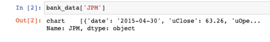
It's clear that the next parsing layer will need to be the chart endpoint:
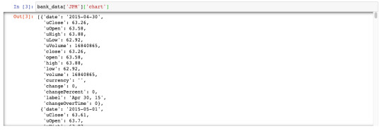
Now we have a JSON-like data structure where each cell is a date along with various data points about JPM's stock price on that date. We can wrap this JSON-like structure in a pandas DataFrame to make it much more readable:
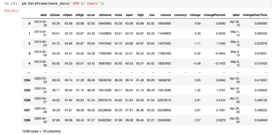
This is something we can work with! Let's write a small loop that uses similar logic to pull out the closing price time series for each stock as a pandas Series (which is equivalent to a column of a pandas DataFrame). We will store these pandas Series in a dictionary (with the key being the ticker name) for easy access later.
for ticker in tickers: series_dict.update( {ticker : pd.DataFrame(bank_data[ticker]['chart'])['close']} )
Now we can create our finalized pandas DataFrame that has the date as its index and a column for the closing price of every major bank stock over the last 5 years:
series_list = [] for ticker in tickers: series_list.append(pd.DataFrame(bank_data[ticker]['chart'])['close']) series_list.append(pd.DataFrame(bank_data['JPM']['chart'])['date']) column_names = tickers.copy() column_names.append('Date') bank_data = pd.concat(series_list, axis=1) bank_data.columns = column_names bank_data.set_index('Date', inplace = True)
After all this is done, our bank_data DataFrame will look like this:
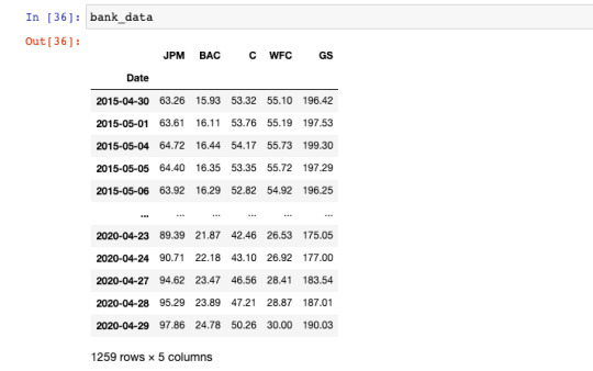
Our data collection is complete. We are now ready to begin creating visualization with this data set of stock prices for publicly-traded banks. As a quick recap, here's the script we have built so far:
import pandas as pd import matplotlib.pyplot as plt IEX_API_Key = '' tickers = [ 'JPM', 'BAC', 'C', 'WFC', 'GS', ] #Create an empty string called `ticker_string` that we'll add tickers and commas to ticker_string = '' #Loop through every element of `tickers` and add them and a comma to ticker_string for ticker in tickers: ticker_string += ticker ticker_string += ',' #Drop the last comma from `ticker_string` ticker_string = ticker_string[:-1] #Create the endpoint and years strings endpoints = 'chart' years = '5' #Interpolate the endpoint strings into the HTTP_request string HTTP_request = f'https://cloud.iexapis.com/stable/stock/market/batch?symbols={ticker_string}&types={endpoints}&range={years}y&cache=true&token={IEX_API_Key}' #Send the HTTP request to the IEX Cloud API and store the response in a pandas DataFrame bank_data = pd.read_json(HTTP_request) #Create an empty list that we will append pandas Series of stock price data into series_list = [] #Loop through each of our tickers and parse a pandas Series of their closing prices over the last 5 years for ticker in tickers: series_list.append(pd.DataFrame(bank_data[ticker]['chart'])['close']) #Add in a column of dates series_list.append(pd.DataFrame(bank_data['JPM']['chart'])['date']) #Copy the 'tickers' list from earlier in the script, and add a new element called 'Date'. #These elements will be the column names of our pandas DataFrame later on. column_names = tickers.copy() column_names.append('Date') #Concatenate the pandas Series together into a single DataFrame bank_data = pd.concat(series_list, axis=1) #Name the columns of the DataFrame and set the 'Date' column as the index bank_data.columns = column_names bank_data.set_index('Date', inplace = True)
Step 2: Create the Chart You'd Like to Update
In this tutorial, we'll be working with the matplotlib visualization library for Python. Matplotlib is a tremendously sophisticated library and people spend years mastering it to their fullest extent. Accordingly, please keep in mind that we are only scratching the surface of matplotlib's capabilities in this tutorial. We will start by importing the matplotlib library.
How to Import Matplotlib
By convention, data scientists generally import the pyplot library of matplotlib under the alias plt. Here's the full import statement:
import matplotlib.pyplot as plt
You will need to include this at the beginning of any Python file that uses matplotlib to generate data visualizations. There are also other arguments that you can add with your matplotlib library import to make your visualizations easier to work with. If you're working through this tutorial in a Jupyter Notebook, you may want to include the following statement, which will cause your visualizations to appear without needing to write a plt.show() statement:
%matplotlib inline
If you're working in a Jupyter Notebook on a MacBook with a retina display, you can use the following statements to improve the resolution of your matplotlib visualizations in the notebook:
from IPython.display import set_matplotlib_formats set_matplotlib_formats('retina')
With that out of the way, let's begin creating our first data visualizations using Python and matplotlib!
Matplotlib Formatting Fundamentals
In this tutorial, you will learn how to create boxplots, scatterplots, and histograms in Python using matplotlib. I want to go through a few basics of formatting in matplotlib before we begin creating real data visualizations. First, almost everything you do in matplotlib will involve invoking methods on the plt object, which is the alias that we imported matplotlib as. Second, you can add titles to matplotlib visualizations by calling plt.title() and passing in your desired title as a string. Third, you can add labels to your x and y axes using the plt.xlabel() and plt.ylabel() methods. Lastly, with the three methods we just discussed - plt.title(), plt.xlabel(), and plt.ylabel() - you can change the font size of the title with the fontsize argument. Let's dig in to creating our first matplotlib visualizations in earnest.
How to Create Boxplots in Matplotlib
Boxplots are one of the most fundamental data visualizations available to data scientists. Matplotlib allows us to create boxplots with the boxplot function. Since we will be creating boxplots along our columns (and not along our rows), we will also want to transpose our DataFrame inside the boxplot method call.
plt.boxplot(bank_data.transpose())

This is a good start, but we need to add some styling to make this visualization easily interpretatable to an outside user. First, let's add a chart title:
plt.title('Boxplot of Bank Stock Prices (5Y Lookback)', fontsize = 20)

In addition, it is useful to label the x and y axes, as mentioned previously:
plt.xlabel('Bank', fontsize = 20) plt.ylabel('Stock Prices', fontsize = 20)
We will also need to add column-specific labels to the x-axis so that it is clear which boxplot belongs to each bank. The following code does the trick:
ticks = range(1, len(bank_data.columns)+1) labels = list(bank_data.columns) plt.xticks(ticks,labels, fontsize = 20)
Just like that ,we have a boxplot that presents some useful visualizations in matplotlib! It is clear that Goldman Sachs has traded at the highest price over the last 5 years while Bank of America's stock has traded the lowest. It's also interesting to note that Wells Fargo has the most outlier data points. As a recap, here is the complete code that we used to generate our boxplots:
######################## #Create a Python boxplot ######################## #Set the size of the matplotlib canvas plt.figure(figsize = (18,12)) #Generate the boxplot plt.boxplot(bank_data.transpose()) #Add titles to the chart and axes plt.title('Boxplot of Bank Stock Prices (5Y Lookback)', fontsize = 20) plt.xlabel('Bank', fontsize = 20) plt.ylabel('Stock Prices', fontsize = 20) #Add labels to each individual boxplot on the canvas ticks = range(1, len(bank_data.columns)+1) labels = list(bank_data.columns) plt.xticks(ticks,labels, fontsize = 20)
How to Create Scatterplots in Matplotlib
Scatterplots can be created in matplotlib using the plt.scatter method. The scatter method has two required arguments - an x value and a y value. Let's plot Wells Fargo's stock price over time using the plt.scatter() method. The first thing we need to do is to create our x-axis variable, called dates:
dates = bank_data.index.to_series()
Next, we will isolate Wells Fargo's stock prices in a separate variable:
WFC_stock_prices = bank_data['WFC']
We can now plot the visualization using the plt.scatter method:
plt.scatter(dates, WFC_stock_prices)
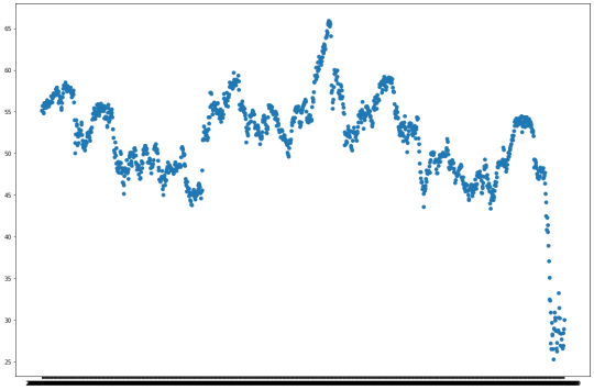
Wait a minute - the x labels of this chart are impossible to read! What is the problem? Well, matplotlib is not currently recognizing that the x axis contains dates, so it isn't spacing out the labels properly. To fix this, we need to transform every element of the dates Series into a datetime data type. The following command is the most readable way to do this:
dates = bank_data.index.to_series() dates = [pd.to_datetime(d) for d in dates]
After running the plt.scatter method again, you will generate the following visualization:
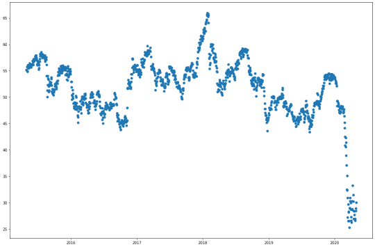
Much better! Our last step is to add titles to the chart and the axis. We can do this with the following statements:
plt.title("Wells Fargo Stock Price (5Y Lookback)", fontsize=20) plt.ylabel("Stock Price", fontsize=20) plt.xlabel("Date", fontsize=20)
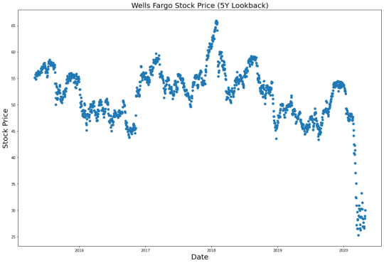
As a recap, here's the code we used to create this scatterplot:
######################## #Create a Python scatterplot ######################## #Set the size of the matplotlib canvas plt.figure(figsize = (18,12)) #Create the x-axis data dates = bank_data.index.to_series() dates = [pd.to_datetime(d) for d in dates] #Create the y-axis data WFC_stock_prices = bank_data['WFC'] #Generate the scatterplot plt.scatter(dates, WFC_stock_prices) #Add titles to the chart and axes plt.title("Wells Fargo Stock Price (5Y Lookback)", fontsize=20) plt.ylabel("Stock Price", fontsize=20) plt.xlabel("Date", fontsize=20)
How to Create Histograms in Matplotlib
Histograms are data visualizations that allow you to see the distribution of observations within a data set. Histograms can be created in matplotlib using the plt.hist method. Let's create a histogram that allows us to see the distribution of different stock prices within our bank_data dataset (note that we'll need to use the transpose method within plt.hist just like we did with plt.boxplot earlier):
plt.hist(bank_data.transpose())
This is an interesting visualization, but we still have lots to do. The first thing you probably noticed was that the different columns of the histogram have different colors. This is intentional. The colors divide the different columns within our pandas DataFrame. With that said, these colors are meaningless without a legend. We can add a legend to our matplotlib histogram with the following statement:
plt.legend(bank_data.columns,fontsize=20)
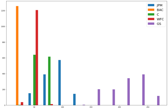
You may also want to change the bin count of the histogram, which changes how many slices the dataset is divided into when goruping the observations into histogram columns. As an example, here is how to change the number of bins in the histogram to 50:
plt.hist(bank_data.transpose(), bins = 50)
Lastly, we will add titles to the histogram and its axes using the same statements that we used in our other visualizations:
plt.title("A Histogram of Daily Closing Stock Prices for the 5 Largest Banks in the US (5Y Lookback)", fontsize = 20) plt.ylabel("Observations", fontsize = 20) plt.xlabel("Stock Prices", fontsize = 20)
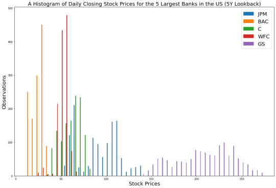
As a recap, here is the complete code needed to generate this histogram:
######################## #Create a Python histogram ######################## #Set the size of the matplotlib canvas plt.figure(figsize = (18,12)) #Generate the histogram plt.hist(bank_data.transpose(), bins = 50) #Add a legend to the histogram plt.legend(bank_data.columns,fontsize=20) #Add titles to the chart and axes plt.title("A Histogram of Daily Closing Stock Prices for the 5 Largest Banks in the US (5Y Lookback)", fontsize = 20) plt.ylabel("Observations", fontsize = 20) plt.xlabel("Stock Prices", fontsize = 20)
How to Create Subplots in Matplotlib
In matplotlib, subplots are the name that we use to referring to multiple plots that are created on the same canvas using a single Python script. Subplots can be created with the plt.subplot command. The command takes three arguments:
The number of rows in a subplot grid
The number of columns in a subplot grid
Which subplot you currently have selected
Let's create a 2x2 subplot grid that contains the following charts (in this specific order):
The boxplot that we created previously
The scatterplot that we created previously
A similar scatteplot that uses BAC data instead of WFC data
The histogram that we created previously
First, let's create the subplot grid:
plt.subplot(2,2,1) plt.subplot(2,2,2) plt.subplot(2,2,3) plt.subplot(2,2,4)

Now that we have a blank subplot canvas, we simply need to copy/paste the code we need for each plot after each call of the plt.subplot method. At the end of the code block, we add the plt.tight_layout method, which fixes many common formatting issues that occur when generating matplotlib subplots. Here is the full code:
################################################ ################################################ #Create subplots in Python ################################################ ################################################ ######################## #Subplot 1 ######################## plt.subplot(2,2,1) #Generate the boxplot plt.boxplot(bank_data.transpose()) #Add titles to the chart and axes plt.title('Boxplot of Bank Stock Prices (5Y Lookback)') plt.xlabel('Bank', fontsize = 20) plt.ylabel('Stock Prices') #Add labels to each individual boxplot on the canvas ticks = range(1, len(bank_data.columns)+1) labels = list(bank_data.columns) plt.xticks(ticks,labels) ######################## #Subplot 2 ######################## plt.subplot(2,2,2) #Create the x-axis data dates = bank_data.index.to_series() dates = [pd.to_datetime(d) for d in dates] #Create the y-axis data WFC_stock_prices = bank_data['WFC'] #Generate the scatterplot plt.scatter(dates, WFC_stock_prices) #Add titles to the chart and axes plt.title("Wells Fargo Stock Price (5Y Lookback)") plt.ylabel("Stock Price") plt.xlabel("Date") ######################## #Subplot 3 ######################## plt.subplot(2,2,3) #Create the x-axis data dates = bank_data.index.to_series() dates = [pd.to_datetime(d) for d in dates] #Create the y-axis data BAC_stock_prices = bank_data['BAC'] #Generate the scatterplot plt.scatter(dates, BAC_stock_prices) #Add titles to the chart and axes plt.title("Bank of America Stock Price (5Y Lookback)") plt.ylabel("Stock Price") plt.xlabel("Date") ######################## #Subplot 4 ######################## plt.subplot(2,2,4) #Generate the histogram plt.hist(bank_data.transpose(), bins = 50) #Add a legend to the histogram plt.legend(bank_data.columns,fontsize=20) #Add titles to the chart and axes plt.title("A Histogram of Daily Closing Stock Prices for the 5 Largest Banks in the US (5Y Lookback)") plt.ylabel("Observations") plt.xlabel("Stock Prices") plt.tight_layout()
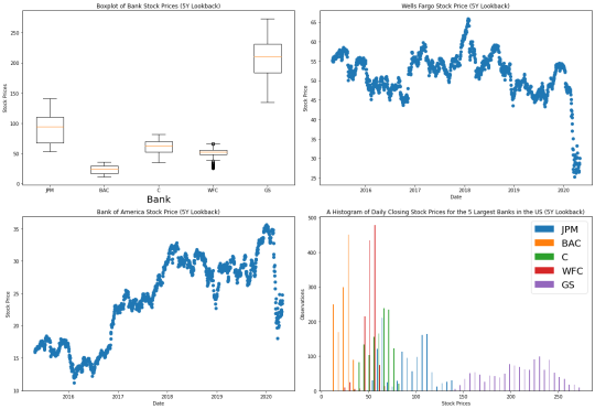
As you can see, with some basic knowledge it is relatively easy to create beautiful data visualizations using matplotlib. The last thing we need to do is save the visualization as a .png file in our current working directory. Matplotlib has excellent built-in functionality to do this. Simply add the follow statement immediately after the fourth subplot is finalized:
################################################ #Save the figure to our local machine ################################################ plt.savefig('bank_data.png')
Over the remainder of this tutorial, you will learn how to schedule this subplot matrix to be automatically updated on your live website every day.
Step 3: Create an Amazon Web Services Account
So far in this tutorial, we have learned how to:
Source the stock market data that we are going to visualize from the IEX Cloud API
Create wonderful visualizations using this data with the matplotlib library for Python
Over the remainder of this tutorial, you will learn how to automate these visualizations such that they are updated on a specific schedule. To do this, we'll be using the cloud computing capabilities of Amazon Web Services. You'll need to create an AWS account first. Navigate to this URL and click the "Create an AWS Account" in the top-right corner:
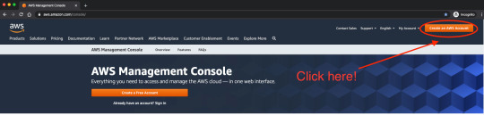
AWS' web application will guide you through the steps to create an account. Once your account has been created, we can start working with the two AWS services that we'll need for our visualizations: AWS S3 and AWS EC2.
Step 4: Create an AWS S3 Bucket to Store Your Visualizations
AWS S3 stands for Simple Storage Service. It is one of the most popular cloud computing offerings available in Amazon Web Services. Developers use AWS S3 to store files and access them later through public-facing URLs. To store these files, we must first create what is called an AWS S3 bucket, which is a fancy word for a folder that stores files in AWS. To do this, first navigate to the S3 dashboard within Amazon Web Services. On the right side of the Amazon S3 dashboard, click Create bucket, as shown below:
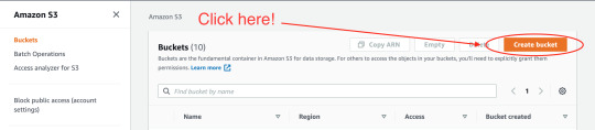
On the next screen, AWS will ask you to select a name for your new S3 bucket. For the purpose of this tutorial, we will use the bucket name nicks-first-bucket. Next, you will need to scroll down and set your bucket permissions. Since the files we will be uploading are designed to be publicly accessible (after all, we will be embedding them in pages on a website), then you will want to make the permissions as open as possible. Here is a specific example of what your AWS S3 permissions should look like:

These permissions are very lax, and for many use cases are not acceptable (though they do indeed meet the requirements of this tutorial). Because of this, AWS will require you to acknowledge the following warning before creating your AWS S3 bucket:
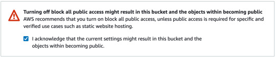
Once all of this is done, you can scroll to the bottom of the page and click Create Bucket. You are now ready to proceed!
Step 5: Modify the Python Script to Save Your Visualizations to AWS S3
Our Python script in its current form is designed to create a visualization and then save that visualization to our local computer. We now need to modify our script to instead save the .png file to the AWS S3 bucket we just create (which, as a reminder, is called nicks-first-bucket). The tool that we will use to upload our file to our AWS S3 bucket is called boto3, which is Amazon Web Services Software Development Kit (SDK) for Python. First, you'll need to install boto3 on your machine. The easiest way to do this is using the pip package manager:
pip3 install boto3
Next, we need to import boto3 into our Python script. We do this by adding the following statement near the start of our script:
import boto3
Given the depth and breadth of Amazon Web Services' product offerings, boto3 is an insanely complex Python library. Fortunately, we only need to use some of the most basic functionality of boto3. The following code block will upload our final visualization to Amazon S3.
################################################ #Push the file to the AWS S3 bucket ################################################ s3 = boto3.resource('s3') s3.meta.client.upload_file('bank_data.png', 'nicks-first-bucket', 'bank_data.png', ExtraArgs={'ACL':'public-read'})
As you can see, the upload_file method of boto3 takes several arguments. Let's break them down, one-by-one:
bank_data.png is the name of the file on our local machine.
nicks-first-bucket is the name of the S3 bucket that we want to upload to.
bank_data.png is the name that we want the file to have after it is uploaded to the AWS S3 bucket. In this case, it is the same as the first argument, but it doesn't have to be.
ExtraArgs={'ACL':'public-read'} means that the file should be readable by the public once it is pushed to the AWS S3 bucket.
Running this code now will result in an error. Specifically, Python will throw the following exception:
S3UploadFailedError: Failed to upload bank_data.png to nicks-first-bucket/bank_data.png: An error occurred (NoSuchBucket) when calling the PutObject operation: The specified bucket does not exist
Why is this? Well, it is because we have not yet configured our local machine to interact with Amazon Web Services through boto3. To do this, we must run the aws configure command from our command line interface and add our access keys. This documentation piece from Amazon share more information about how to configure your AWS command line interface. If you'd rather not navigate off freecodecamp.org, here are the quick steps to set up your AWS CLI. First, mouse over your username in the top right corner, like this:
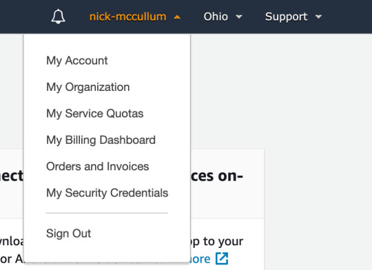
Click My Security Credentials. On the next screen, you're going to want to click the Access keys (access key ID and secret access key drop down, then click Create New Access Key.
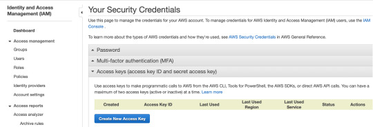
This will prompt you to download a .csv file that contains both your Access Key and your Secret Access Key. Save these in a secure location. Next, trigger the Amazon Web Services command line interface by typing aws configure on your command line. This will prompt you to enter your Access Key and Secret Access Key. Once this is done, your script should function as intended. Re-run the script and check to make sure that your Python visualization has been properly uploaded to AWS S3 by looking inside the bucket we created earlier:

The visualization has been uploaded successfully. We are now ready to embed the visualization on our website!
Step 6: Embed the Visualization on Your Website
Once the data visualization has been uploaded to AWS S3, you will want to embed the visualization somewhere on your website. This could be in a blog post or any other page on your site. To do this, we will need to grab the URL of the image from our S3 bucket. Click the name of the image within the S3 bucket to navigate to the file-specific page for that item. It will look like this:
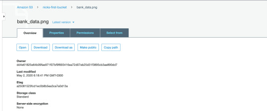
If you scroll to the bottom of the page, there will be a field called Object URL that looks like this:
https://nicks-first-bucket.s3.us-east-2.amazonaws.com/bank_data.png
If you copy and paste this URL into a web browser, it will actually download the bank_data.png file that we uploaded earlier! To embed this image onto a web page, you will want to pass it into an HTML img tag as the src attribute. Here is how we would embed our bank_data.png image into a web page using HTML:
<img src="https://nicks-first-bucket.s3.us-east-2.amazonaws.com/bank_data.png">
Note: In a real image embedded on a website, it would be important to include an alt tag for accessibility purposes. In the next section, we'll learn how to schedule our Python script to run periodically so that the data in bank_data.png is always up-to-date.
Step 7: Create an AWS EC2 Instance
We will use AWS EC2 to schedule our Python script to run periodically. AWS EC2 stands for Elastic Compute Cloud and, along with S3, is one of Amazon's most popular cloud computing services. It allows you to rent small units of computing power (called instances) on computers in Amazon's data centers and schedule those computers to perform jobs for you. AWS EC2 is a fairly remarkable service because if you rent some of their smaller computers, then you actually qualify for the AWS free tier. Said differently, diligent use of the pricing within AWS EC2 will allow you to avoid paying any money whatsoever. To start, we'll need to create our first EC2 instance. To do this, navigate to the EC2 dashboard within the AWS Management Console and click Launch Instance:

This will bring you to a screen that contains all of the available instance types within AWS EC2. There is an almost unbelievable number of options here. We want an instance type that qualifies as Free tier eligible - specifically, I chose the Amazon Linux 2 AMI (HVM), SSD Volume Type:

Click Select to proceed. On the next page, AWS will ask you to select the specifications for your machine. The fields you can select include:
Family
Type
vCPUs
Memory
Instance Storage (GB)
EBS-Optimized
Network Performance
IPv6 Support
For the purpose of this tutorial, we simply want to select the single machine that is free tier eligible. It is characterized by a small green label that looks like this:
Click Review and Launch at the bottom of the screen to proceed. The next screen will present the details of your new instance for you to review. Quickly review the machine's specifications, then click Launch in the bottom right-hand corner. Clicking the Launch button will trigger a popup that asks you to Select an existing key pair or create a new key pair. A key pair is comprised of a public key that AWS holds and a private key that you must download and store within a .pem file. You must have access to that .pem file in order to access your EC2 instance (typically via SSH). You also have the option to proceed without a key pair, but this is not recommended for security reasons. Once this is done, your instance will launch! Congratulations on launching your first instance on one of Amazon Web Services' most important infrastructure services. Next, you will need to push your Python script into your EC2 instance. Here is a generic command state statement that allows you to move a file into an EC2 instance:
scp -i path/to/.pem_file path/to/file username@host_address.amazonaws.com:/path_to_copy
Run this statement with the necessary replacements to move bank_stock_data.py into the EC2 instance. You might believe that you can now run your Python script from within your EC2 instance. Unfortunately, this is not the case. Your EC2 instance does not come with the necessary Python packages. To install the packages we used, you can either export a requirements.txt file and import the proper packages using pip, or you can simply run the following:
sudo yum install python3-pip pip3 install pandas pip3 install boto3
We are now ready to schedule our Python script to run on a periodic basis on our EC2 instance! We explore this in the next section of our article.
Step 8: Schedule the Python script to run periodically on AWS EC2
The only step that remains in this tutorial is to schedule our bank_stock_data.py file to run periodically in our EC2 instance. We can use a command-line utility called cron to do this. cron works by requiring you to specify two things:
How frequently you want a task (called a cron job) performed, expressed via a cron expression
What needs to be executed when the cron job is scheduled
First, lets start by creating a cron expression. cron expressions can seem like gibberish to an outsider. For example, here's the cron expression that means "every day at noon":
00 12 * * *
I personally make use of the crontab guru website, which is an excellent resource that allows you to see (in layman's terms) what your cron expression means. Here's how you can use the crontab guru website to schedule a cron job to run every Sunday at 7am:

We now have a tool (crontab guru) that we can use to generate our cron expression. We now need to instruct the cron daemon of our EC2 instance to run our bank_stock_data.py file every Sunday at 7am. To do this, we will first create a new file in our EC2 instance called bank_stock_data.cron. Since I use the vim text editor, the command that I use for this is:
vim bank_stock_data.cron
Within this .cron file, there should be one line that looks like this: (cron expression) (statement to execute). Our cron expression is 00 7 * * 7 and our statement to execute is python3 bank_stock_data.py. Putting it all together, and here's what the final contents of bank_stock_data.cron should be:
00 7 * * 7 python3 bank_stock_data.py
The final step of this tutorial is to import the bank_stock_data.cron file into the crontab of our EC2 instance. The crontab is essentially a file that batches together jobs for the cron daemon to perform periodically. Let's first take a moment to investigate what in our crontab. The following command prints the contents of the crontab to our console:
crontab -l
Since we have not added anything to our crontab and we only created our EC2 instance a few moments ago, then this statement should print nothing. Now let's import bank_stock_data.cron into the crontab. Here is the statement to do this:
crontab bank_stock_data.cron
Now we should be able to print the contents of our crontab and see the contents of bank_stock_data.cron. To test this, run the following command:
crontab -l
It should print:
00 7 * * 7 python3 bank_stock_data.py
Final Thoughts
In this tutorial, you learned how to create beautiful data visualizations using Python and Matplotlib that update periodically. Specifically, we discussed:
How to download and parse data from IEX Cloud, one of my favorite data sources for high-quality financial data
How to format data within a pandas DataFrame
How to create data visualizations in Python using matplotlib
How to create an account with Amazon Web Services
How to upload static files to AWS S3
How to embed .png files hosted on AWS S3 in pages on a website
How to create an AWS EC2 instance
How to schedule a Python script to run periodically using AWS EC2 using cron
0 notes