#Tutorial tag
Explore tagged Tumblr posts
Visit Tumblr Blog
Explore Tumblr blogs with no restrictions, modern design and the best experience.
Last Seen Tumblr Blogs


Fun Fact
Tumblr is used by 21% of adults online aged 18-29 years.
Note
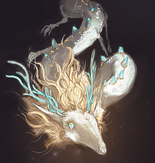
hiii….im trying to get into flamaking, where does everyone get their stripes from ? I have seen posts with them but all of them are white and I can’t see them at all, which makes flagmaking a use struggle for me…
~🍒💄 anon [so you can recognize me if I end up sending another ask :3]
hello dear anon! here is a list of the posts that i use for flagmaking purposes... if you cannot see the white stripes, i personally recommend changing your tumblr theme or opening the images— both of these options will help greatly with viewing the fancier stripes!
i've made a reply like this in the past but i cant find it, so, here goes ^_^
FLAG STRIPES & TEMPLATES:
divider bases by @\futwb (link)
@\scythidel's banner resource dump (link)
multiple-stripe flag templates by @\crowdsourcedgender (link)
@\shepherd4409's multiple-stripe flag templates (link; deactivatwd account)
part 1 of @\webby-mogai's resource dump (link)
part 2 of @\webby-mogai's resource dump (link)
@\laughdiamond's legendary stripe post (link)
FLAG SYMBOLS:
flaticon's open-source vectors (link)
the noun project's 'credit-to-use' vectors (link)
that should be all, i believe... i'll put this in the "link" section of my pinned post, so hopefully it becomes easy access to everyons ^0^ thank you anon for your ask! i might update this in the future :]
#mogai#liom#liomogai#liommogai#liom coining#mogai coining#qai#qai coining#term coining#flag coining#coining help#coinblr#mogaiblr#liomblr#qaiblr#tutorial tag#buhgposting#buhggytalk#𓏵⠀shiny coins⠀♡
25 notes
·
View notes
Text
Both of you wanted this so I made it a post lmao @etherealspacejelly @the-rat-1
ERM! I call this the Very Brief Guide To Human Faces (From A Furry Perspective)

Let's start with this guy.
This buddy is the absolute basics of the human face -- I guarantee that if you focused your camera on a version of it you drew, it'll recognise a face, because that's all a human is: neck, nose, under-lip, under-brows (which is also why I make the under-brow coloured darker in my style lol. Cheeky example below)

Anyways! Exaggerating and expanding outwards from these shadows are really important if you're trying to go for realism. But let's keep going with regular anatomy for now lol -- just, if you're stuck, make sure that those shapes are obvious. If they aren't, maybe that's the issue!

(That's what buddy looks like filled in. His brows are raised a bit lmao)
Mads Mikkelsen jumpscare:

(I chose him because his skull is SO OBVIOUS) Now, this is THE cheat code of all time: in the VAST majority of mammals, the inner corners of the eyes are exactly the same width as the widest part of the nose/nostrils. In humans, since we have bones in the front of our jaws, we have another sneaky thing with this same proportion: the CHIN. Wowie!


See? These two buddies have a very obvious line. It's amazing
More things that line up are: Top of ear: top of eye socket, bottom of ear: middle of upper lip Bottom of nose: top of earlobe (where the hole begins) Corner of the jaw: dip of the chin Aaaaand there's definitely more that I can't think of off the top of my head. Oh well

Here's a small turnaround of the head for you... which leads us onto the cranium (REMEMBER that the head isn't a perfect box! It's more like a trapezium prism; that's how you can see the tips of someone's opposite ear when they're facing 3/4 away from you)
THE CRANIUM!!!

This is what a white person's head would typically look like from the side -- they tend to have more flat craniums. I like to exaggerate the shape of the overhang because it makes me happy
Another thing to do with side profiles: the default human has the JAW and the FOREHEAD PARALLEL to each other. It's an epic cheat, because if you know the rough angle of the jaw, you know the angle of the forehead. It's saved me far too many times

This is closer to my own head shape, although it's still very exaggerated lol. In short: anything that isn't the xenomorph's level of head-dome is likely the shape of a real human. Everything can be customised; everything's connected
Last bit: customising the face. You know the default -- how do you change it while still looking realistic?
Remember the line I was talking about? Contains the nose, doesn't include the eyes? You change THAT. You make the nose wider than the corners of the eyes for a big nose, and you make it smaller for a little nose. That's how your brain can tell that someone's had plastic surgery lol (people often get nosejobs without also getting their chin shape changed. There's a lot of variation in eyes, so you don't often notice those if only 1/3 doesn't align)
Same thing with the forehead and jaw being parallel. You want a square jaw? Make the jaw more of a right angle while making the forehead rounder. That's how you build juxtaposition to draw attention to the 'striking' feature.
OKAY omg that was a lot but I hope it helped lmfaooo -- I also have a mini guide for the general body so let me know if you want that too
#SZART#Tutorial tag???#Tutorial tag#SZUTORIALS#Should I add to the general tags...#yes#tutorials#resource#reference#art#digital art#humans
18 notes
·
View notes
Text
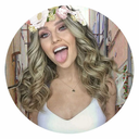
wire tutorial for a friend
#shoutout to data and ava for thinking this was a poem. my tendencies#machinery#art tutorial#idk how else to tag this
19K notes
·
View notes
Text
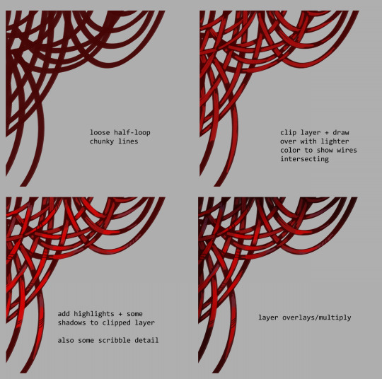
Needle Felt Siffrin Build Log: (oct 6 - nov 20, 2024)


Credits goes wholely to @insertdisc5 for creating ISAT and siffrin's design! I am just here to attempt to make cool fanart (and get more people to play isat.. my devious plans are going great so far :3) As always, this isn't a tutorial- it is just a log about how i go about approaching a sculpture and I hope this collection of resources can help others make their own sifs!!
PSA: this has some spoilers for endgame CGs/sprites on my references image board ( also might see it in the backgrounds of my process pics). And bc this is needle felting, you will see some sharp needles! beware!
my inspiration was the intro cutscene where Sif eats the star, so my main goal was to adhere to the style of ISAT as closely as possible while transfering it to 3D space. And I knew i also wanted to try making the cloak for stopmotion purposes, so my process was tailored towards having control over the fabric with wire inlaid within the cloak (more on that later).
I ended up not sticking eyebrows on top of siffrin's bangs lol but anyways, first order of business is Gather Reference! v important. pureref is free and an awesome program. I also do some sketches to visualize the pose and important details i wanted to include in the sculpt.
behold the isat wiki gallery page! tawnysoup wrote an awesome ISAT style guide that absolutely rings true in 3d space too!! adrienne made a sif hair guide here!! (sorry i couldnt find the original link, but it's on the wiki). It says ref komaeda hair so that's what i looked at, along with other adjacent hairstyles! I also like doing drawovers on in progress photos to previs shapes n stuff to get a better idea of the end result.
Also if you're like me and struggle with translating stuff into 3D space, take a look at how people make 3d models and figurines! sketchfab is also a great resource! I looked at the link botw model by Christoph Schoch here for hair ref. (I used Maya, but there's a blender version too ! you can pose characters too if your model has been rigged!)


Face:
Started off blocking out the main shapes of eyelids and iris, and then filling in the colour details in the iris and the star highlights before moving onto adding thin black outlines and eyelashes. I didn't take many in-progress photos cause i kept ripping stuff out to redo them many many times, sorry!! This eye took about 3 hrs bc i just wasn't happy with it!! Sometimes it do be the vibe to give up, go to bed and see how it looks in the morning (more often than naught, it looks fine and it was the "dont trust yourself after 9pm" speaking)
The Mouth:
Couldn't decide if i even wanted to add a mouth as per usual with all my humanoid sculptures.. but i did some drawover tests first to see what expression i liked and to try to visualize it from multiple angles. (I was also testing the placement of stars on the hat brim here)

And then I redid the mouth like 3 times cause the angle just wasn't right (this went on for about the course of a week yay!)
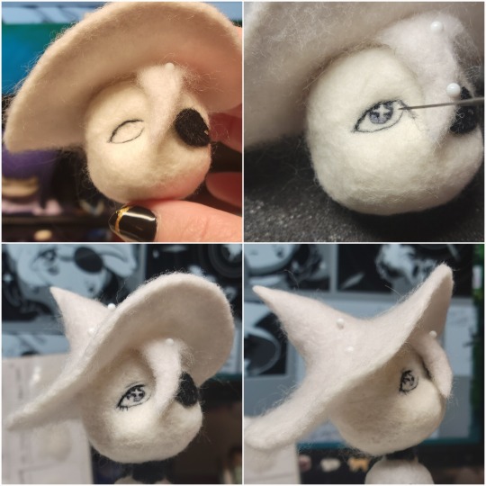
Hair: woe baldfrin be upon ye
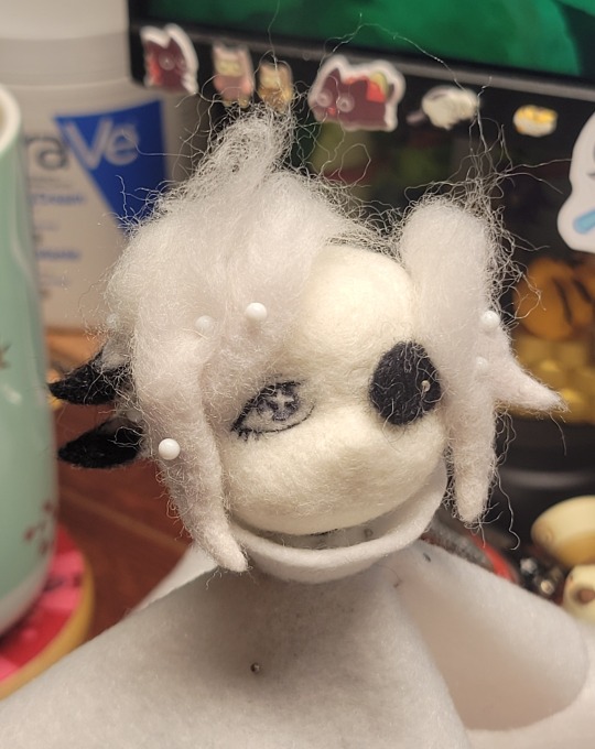
I made the hair strands individually first, and then since Sif has some of the hair at the back dyed black, i covered some of the tips with black wool (manually) (I think it would go much faster if i just took a marker to it, but hahaha i love pain and detailing!! )
And then the rest of it was positioning strands with sewing pins layer by layer, always looking at it from different multiple angles- sometimes tailoring the angle or swoop of individual hair flippies. At one point I thought the back looked too cluttered, but the hat covers a lot of it anyways!! yay for hiding mistakes! (imo this is a similar process to how cosplayers style wigs, but on a smaller scale and the same level of time consuming)
As always, look to your reference for guides, and I always do a whole bunch of drawovers over in progress photos to ascertain what was working and what wasn't.
Hat:
A trick to get a super pointy tip, make another tip seperately while keeping the connection point unfelted, and then combine the two to make super pointy hat!! (this also helps if you made the hat too short and need it to be taller. ask me how i know)

The embroidery on the hat brim was done in a hoop and then invisible stitched to the felted top portion. Technically you don't need a hoop but it helps keep the fabric tension, so you avoid puckers in your embroidery. You can also use iron-on stabilizer if your fabric is loose weave or particularly thin. this is the tutorial i used for the stars embroidery! particularly the fly stitch one, french knots, and the criss-cross stitches. highly recommend needlenthread for embroidery stitches and techniques! i learned all my embroidery from this single site alone.
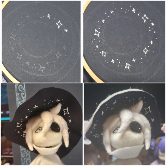
For fabric, I think I used a polycotton i had in my stash,, unsure of the actual fiber content bc i bought it a long time ago. I used DMC Satin floss which was nice and subtle shiny but frayed a lot so it was kind of a pain to stitch with... but keep a short thread length and perservere through it!! After the embroidery was done, I folded up the raw edges and invisible sewed it to the top portion of the hat.
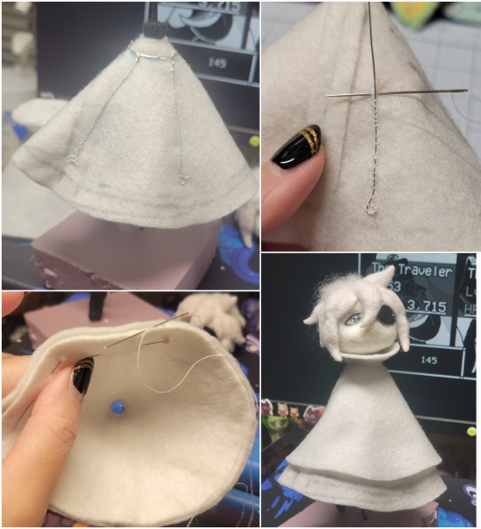
General shape:
Ok general structure of the body is this: wire armature body covered with black wool -> cloak lining & wire cage -> edge of lining is invisibly sewn to the main cloak at the hem -> head

Don't be afraid to mess around with the pattern, it's essentially a pizza with a slice taken out of it to form a steep cone shape!! Use draft paper before cutting into felt to save material! (i think i made like 3 cloaks before i was happy with the shape lol).
You can also hide the seam of the cloak and collars by gently messing up the fibers of the felt with your fingers or a felting needle btw! you can also sandpaper the seams according to Sarah Spaceman in this vid (highly recommend them for their in depth cosplay/crafting builds holy smokes), though since sif cloak is at such a smol scale, I just blended the seam with my felting needle.
For the lining wire cage section, I sewed in wire around the cloak, so the main rotation point is at the top neck area under the collar. These paddles are used to keep whatever pose I need the cloak to be in for stopmotion purposes. Then after the wire is done, I invisibly sewed the lining to the cloak at the hem (same technique as the hat brim to the lining there).
In hindsight, I should've used a thinner fabric for the lining, but i only had sheer white in my stash so had to go with double felt, thus resulting in a really bulky lining but oh well!
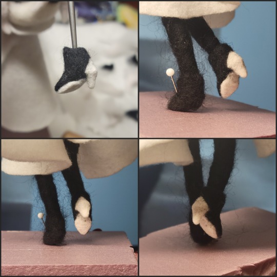
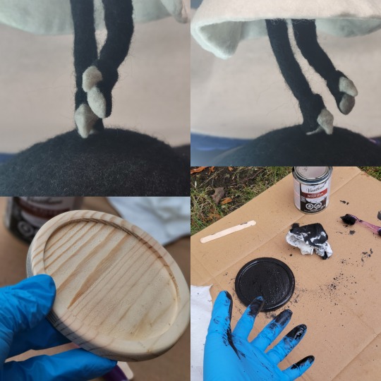
Heels:
started with the general boot shape, then tacking on the diamond shape heel stack and also diamond shape sole bc we're committed to the bit here. I skewer the boot onto the armature which also conveniently hides the connection point into the base to keep the whole thing upright and also I can rotate the boot to tweak the angle if needed.
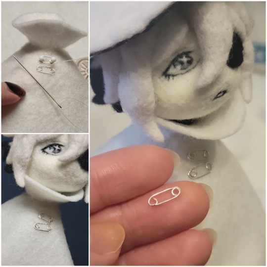
Pins:
I kinda just trial and error'd jewellery wire with pliers into the pin shapes. They're itty bitty!! had a whole bunch of fails before i got two nice ones. A hot tip is to use needle nose pliers and wrap the wire around the tip to get a smooth circle shape!
Base:
I smoothed out the edge of a circular wood base with a dremel, and then used wood stainer to get the black colour. It ended up kinda looking like I took a sharpie to it, but whatever.... now i have a whole ass can of black wood stainer........ I then made a rough mountain of black wool and stuck the feet armature in. And now he's standing!!
Normally at this point when I'm done felting everything, to get a smooth finish, I'd take a small pair of scissors and carefully snip away any flyaway fibers, but this time, I just left them fluffy cause i think that's what sif would do :3c
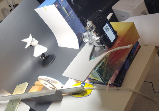
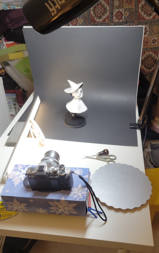
Photoshoot:
Normally I do shoots using daylight but it was winter so the sun was nonexistent. So I broke out the home lighting setup aka dollarstore posterboard for a nice smooth background, and then hit it with the overhead Fill, side Fill 2, and Rim light, and use white paper/posterboard for bounce light if one side feels too dark. But if things are overexposed, you can move the light sources away until the harshness dims down. I'm using a Olympus mirrorless camera (handed down to me by my sibling so i dont remember the model exactly), which can connect to my phone as a remote so I can avoid shaking the camera when i take photos. Pretty nifty for stopmotion purposes! (yes my camera stand is a stack of notebooks, a tissuebox and some eva foam under the lens, don't judge me)
Stopmotion animation:
I'm still figuring stopmo out on my part, but my process was straight ahead animation ... move the cloak a cm, take a pic.... move another cm, click.... and repeat until i get a version I was happy with. My ref was the cloak animation from Gris (beautiful game btw). The 2d star animation was also done straight ahead using procreate, exported in png with a transparent background, and finally stitched together with the stopmotion footage in photoshop.

My turnarounds are also stopmotion! also secret hack, the turntable is a fidget spinner sticky tacked to a cake platter.
And i think that's all! i mainly wanted to share how I go about thinking about taking a 2d concept and moving it to 3D. I also didn't go in depth into how to actually do the needle felting bc I don't think I''d be very helpful I'm a very good teacher by telling yall to just keep stabbing until it looks right (i'm self taught for this hobby),,, if anyone wants it though, i can share a bunch of tutorials and other felters' process that helped me learn more needle felting!
Hopefully this was helpful to someone! Feel free to send asks if ya got any questions or if anything needs clarification! Or show me your works! I love seeing other people's crafts :3
here have a cookie for making it this far 🥐
#in stars and time#siffrin#isat#isat siffrin#isat fanart#needle felt#soft sculpture#know that i am devouring all the nice words yall leave in the tags/comments of my posts :holding back tears:#I hesitate to call this a tutorial bc this is just how i fumble my way through crafting anything lmao#the only reason I know how long I worked on a project are timestamps on wip photos and however long the day's video essay or letsplay is#sorry time is immaterial when i get into crafting mode#reason why this log is so late is bc after i finish a project i'm perpetually hit with the ray of 'i dont ever want to look at this again'#hence why photos never get edited#AND THIS POST SAT IN MY DRAFTS FOR 2 MONTHS DUE TO BLOODBORNE BRAINROT SORRY#done is better than perfect!!!#sorry i dont control the braincell#sorry for using a million exclaimation points! i am not good at this.. conveying my anxiety in written form!!! my toxic trait
1K notes
·
View notes
Text
tears of a dragon
#Tears of the Kingdom#The Legend of Zelda#Light Dragon#Totk#not gonna tag this with spoilers because we see this dragon literally in the tutorial#i have more art ideas for it but I won't draw\post them until the game has been out for a longer while#have fun everyone i fucking love dragons
13K notes
·
View notes
Text
Using this anon hate I got as a teaching example
So if you get anon hate like this, there is a few things you can do. (Also once again the person linked is totally innocent, anon is just using a link to them for some reason, do not bother them)
First of all, Tumblr made it so only people who have accounts and are logged in can send anons AT ALL. So if you want to you can click the three little dots in the upper right corner and report them

Anyways once you're there, select the type of harassment you're getting, after consulting a few people on discord I decided it was the second to last one.

Then of course you fill out the little form

Afterwards you can hit "Submit and Block"

Fun fact: when you block an anon you permanently (there is no way to reverse it) block their IP address and they can't send you any more anons, also as a bonus, if you've received a LOT of anon hate and then you block one of them, reload your inbox to see how many it got rid of, because it might have just been one loser spamming you. If you don't feel like reporting them then that's fine too, just block those suckers.
And finally, you can take solace in the fact that you could never be as big of a loser as the anons sending people hate.
7K notes
·
View notes
Text
My Favorite Cheap Art Trick: Gradient Maps and Blending Modes
i get questions on occasion regarding my coloring process, so i thought i would do a bit of a write up on my "secret technique." i don't think it really is that much of a secret, but i hope it can be helpful to someone. to that end:

this is one of my favorite tags ive ever gotten on my art. i think of it often. the pieces in question are all monochrome - sort of.

the left version is the final version, the right version is technically the original. in the final version, to me, the blues are pretty stark, while the greens and magentas are less so. there is some color theory thing going on here that i dont have a good cerebral understanding of and i wont pretend otherwise. i think i watched a youtube video on it once but it went in one ear and out the other. i just pick whatever colors look nicest based on whatever vibe im going for.

this one is more subtle, i think. can you tell the difference? there's nothing wrong with 100% greyscale art, but i like the depth that adding just a hint of color can bring.
i'll note that the examples i'll be using in this post all began as purely greyscale, but this is a process i use for just about every piece of art i make, including the full color ones. i'll use the recent mithrun art i made to demonstrate. additionally, i use clip studio paint, but the general concept should be transferable to other art programs.


for fun let's just start with Making The Picture. i've been thinking of making this writeup for a while and had it in mind while drawing this piece. beyond that, i didn't really have much of a plan for this outside of "mithrun looks down and hair goes woosh." i also really like all of the vertical lines in the canary uniform so i wanted to include those too but like. gone a little hog wild. that is the extent of my "concept." i do not remember why i had the thought of integrating a shattered mirror type of theme. i think i wanted to distract a bit from the awkward pose and cover it up some LOL but anyway. this lack of planning or thought will come into play later.
note 1: the textured marker brush i specifically use is the "bordered light marker" from daub. it is one of my favorite brushes in the history of forever and the daub mega brush pack is one of the best purchases ive ever made. highly recommend!!!
note 2: "what do you mean by exclusion and difference?" they are layer blending modes and not important to the overall lesson of this post but for transparency i wanted to say how i got these "effects." anyway!
with the background figured out, this is the point at which i generally merge all of my layers, duplicate said merged layer, and Then i begin experimenting with gradient maps. what are gradient maps?
the basic gist is that gradient maps replace the colors of an image based on their value.

so, with this particular gradient map, black will be replaced with that orangey red tone, white will be replaced with the seafoamy green tone, etc. this particular gradient map i'm using as an example is very bright and saturated, but the colors can be literally anything.

these two sets are the ones i use most. they can be downloaded for free here and here if you have csp. there are many gradient map sets out there. and you can make your own!
you can apply a gradient map directly onto a specific layer in csp by going to edit>tonal correction>gradient map. to apply one indirectly, you can use a correction layer through layer>new correction layer>gradient map. honestly, correction layers are probably the better way to go, because you can adjust your gradient map whenever you want after creating the layer, whereas if you directly apply a gradient map to a layer thats like. it. it's done. if you want to make changes to the applied gradient map, you have to undo it and then reapply it. i don't use correction layers because i am old and stuck in my ways, but it's good to know what your options are.

this is what a correction layer looks like. it sits on top and applies the gradient map to the layers underneath it, so you can also change the layers beneath however and whenever you want. you can adjust the gradient map by double clicking the layer. there are also correction layers for tone curves, brightness/contrast, etc. many such useful things in this program.
let's see how mithrun looks when we apply that first gradient map we looked at.

gadzooks. apologies for eyestrain. we have turned mithrun into a neon hellscape, which might work for some pieces, but not this one. we can fix that by changing the layer blending mode, aka this laundry list of words:

some of them are self explanatory, like darken and lighten, while some of them i genuinely don't understand how they are meant to work and couldn't explain them to you, even if i do use them. i'm sure someone out there has written out an explanation for each and every one of them, but i've learned primarily by clicking on them to see what they do.
for the topic of this post, the blending mode of interest is soft light. so let's take hotline miamithrun and change the layer blending mode to soft light.

here it is at 100% opacity. this is the point at which i'd like to explain why i like using textured brushes so much - it makes it very easy to get subtle color variation when i use this Secret Technique. look at the striation in the upper right background! so tasty. however, to me, these colors are still a bit "much." so let's lower the opacity.

i think thats a lot nicer to look at, personally, but i dont really like these colors together. how about we try some other ones?

i like both of these a lot more. the palettes give the piece different vibes, at which point i have to ask myself: What Are The Vibes, Actually? well, to be honest i didn't really have a great answer because again, i didn't plan this out very much at all. however. i knew in my heart that there was too much color contrast going on and it was detracting from the two other contrasts in here: the light and dark values and the sharp and soft shapes. i wanted mithrun's head to be the main focal point. for a different illustration, colors like this might work great, but this is not that hypothetical illustration, so let's bring the opacity down again.

yippee!! that's getting closer to what my heart wants. for fun, let's see what this looks like if we change the blending mode to color.

i do like how these look but in the end they do not align with my heart. oh well. fun to experiment with though! good to keep in mind for a different piece, maybe! i often change blending modes just to see what happens, and sometimes it works, sometimes it doesn't. i very much cannot stress enough that much of my artistic process is clicking buttons i only sort of understand. for fun.
i ended up choosing the gradient map on the right because i liked that it was close to the actual canary uniform colors (sorta). it's at an even lower opacity though because there was Still too much color for my dear heart.

the actual process for this looks like me setting my merged layer to soft light at around 20% opacity and then clicking every single gradient map in my collection and seeing which one Works. sometimes i will do this multiple times and have multiple soft light and/or color layers combined.
typically at this point i merge everything again and do minor contrast adjustments using tone curves, which is another tool i find very fun to play around with. then for this piece in particular i did some finishing touches and decided that the white border was distracting so i cropped it. and then it's done!!! yay!!!!!
this process is a very simple and "fast" way to add more depth and visual interest to a piece without being overbearing. well, it's fast if you aren't indecisive like me, or if you are better at planning.

let's do another comparison. personally i feel that the hint of color on the left version makes mithrun look just a bit more unwell (this is a positive thing) and it makes the contrast on his arm a lot more pleasing to look at. someone who understands color theory better than i do might have more to say on the specifics, but that's honestly all i got.

just dont look at my layers too hard. ok?
2K notes
·
View notes
Note
pleasepleasePLEASE show us how you draw hands. It’s so eatable i love it
I have no idea how to teach things so I'm just gonna give you this and hope it helps
Ignore my horrid handwriting


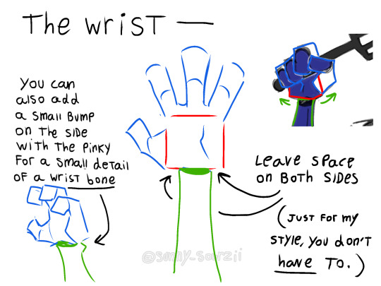
#sourzii answers#sun yapping#fnaf#art#fnaf fanart#art tips#art tip#art stuff#art tutorial#art tag#tutorial#hand drawings#drawing hands#sourzii art#sunny sourzii
415 notes
·
View notes
Text
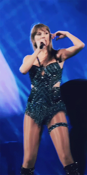
warsaw n3
#found a lifechanging gif sharpening tutorial#taylor swift#tswiftedit#taylorswiftedit#tscreators#tsedit#tswiftgif#candy swift#the swiftie tag#userrcmanticpoetry#networkthirteen#tswiftdaily#usertaylorswiftdaily#mine.#tegan .gif#warsaw n3#song: midnight rain#midnight rain#era: midnights#midnights#era: eras#the eras tour#best of teg#100.#200.#500.
591 notes
·
View notes
Note
how do you pick your colours? They're so rich and gorgeous
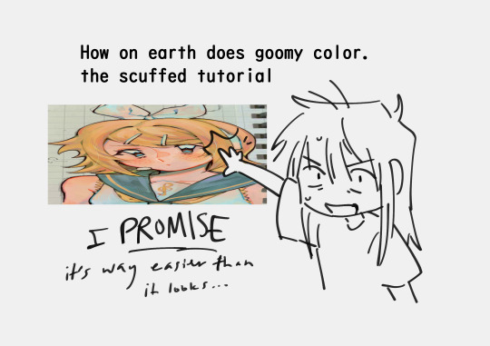
HII SORRY TY FOR BEING SO PATIENT i get a handful of questions like this so i thought i would try to make a (somewhat) proper guide kinda
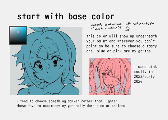
i also occasionally use orange, yellow, or Miku Blue as a base color
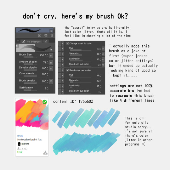
this brush has been saving my ass for the past year please download!
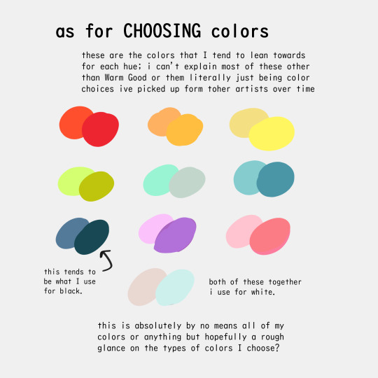
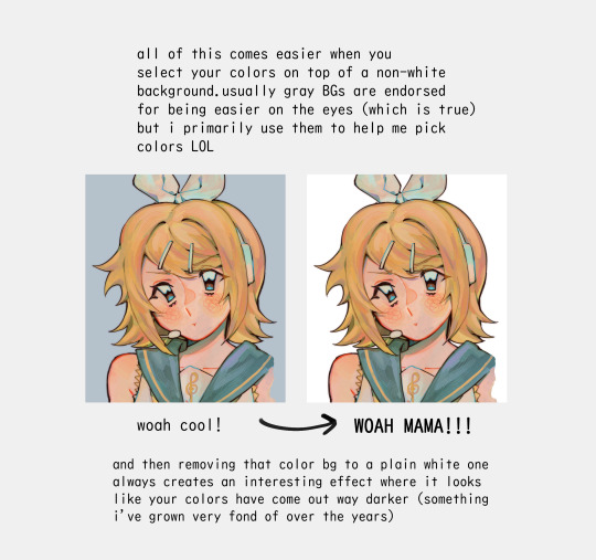
i think ive made a similar art tip waaaay in the past but having colored backgrounds in general (like bright pink or red, or even black) can really affect how you choose your colors!

i hope this made Some amount of sense!
1K notes
·
View notes
Text

brain rotting about how fucked it is to be a darkner again lately. how do you care about being abandoned by your gods if they never seemed to care that much about you in the first place
#my art#deltarune#rouxls kaard#utdr#this isn’t really what i had in mind when i tried first making this and im still really unsatisfied with how it looks but i need to just#stop and decide when something’s finished haha. i really wish it looked better but im not sure how to begin fixing it so it is what it is#also sorry that im trying to make genuine things with the blue thing. i know its stupid to try making something serious with him 😅#ah edit to the tags also to clarify this is in part based off of a hc i have that rouxls was the tutorial guy before the puzzles were.#rather useless job when there isn’t anyone who needs that guide
760 notes
·
View notes
Text

i would like to share this VERY handy tutorial on drawing cars by the ever-immaculate EtheringtonBrothers (twitter, instagram)
#tutorial#cars#etheringtonbrothers#knight rider#transformers#resources#tagging the two fandoms i can think of who might need this the most lmfao#thank you EB i would never be able to draw kitt without you o7 coupled with my gmod references of a kitt car model too of course#please check out their accounts they have so so so many good tutorials. absolutely phenomenal tutorials. on like Everything ever#i know cars are THE biggest pain in the ass to draw ever so here's where i learned it 👉👉#you still gotta do a bit of thinking but its amazing how much even just this one trick can do for you. it carries HARD
849 notes
·
View notes
Text


radskier + same shot (s3)
#radskier#thewitcheredit#the witcher#witcheredit#fantasyedit#my edit#ughmerlin#jemmablossom#userhann#userava#arthurpendragonns#userbecca#ivashkovadrian#adaptationsdaily#thewitchersdaily#witcherdaily#witchersdaily#usergay#thewitcherdaily#jaskierxradovid#(hope it's ok to tag!)#radovid#special thank you to becca for her coloring tutorials bc i made this set before (unpublished) and my attempt was......... bad
284 notes
·
View notes
Note
Would you ever consider sharing tips on how to draw hair? The hair in your art is so pretty and fluffy <3
I can definitely give some tips on how I draw hair, but I’m not sure how well it would apply in a different style haha

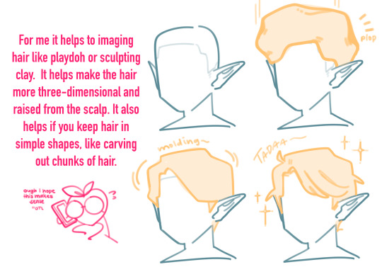
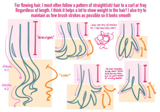
Blah blah blah that probably was a horrible explanation of my process so let’s just see it in action (sorta)
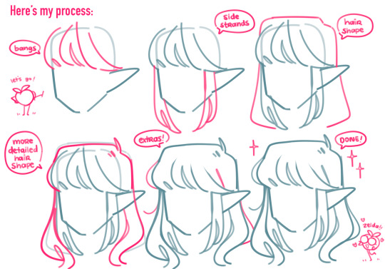
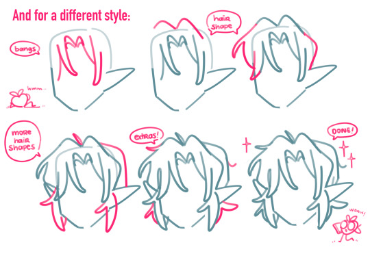
Im sorry if this makes little to no sense, im bad at tutorials bc I don’t know what im doing
#I used to HATE drawing hair bc i thought it had to be detailed#but chunking hair like this I think makes it a lot more fun#legend of zelda#art tutorial#art tips#my art#other tags I don’t remember
622 notes
·
View notes
Text
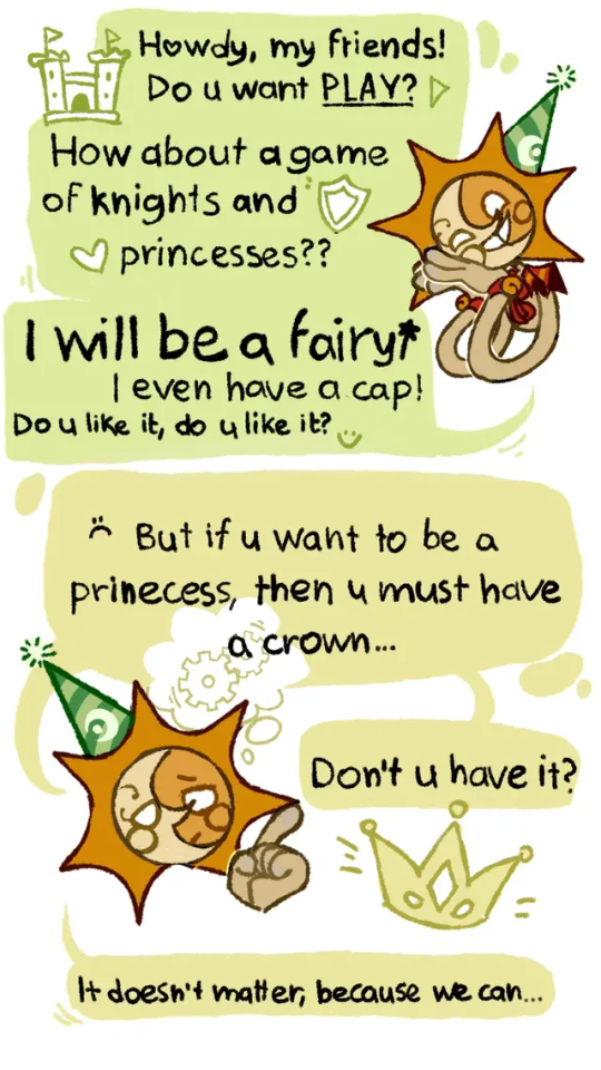
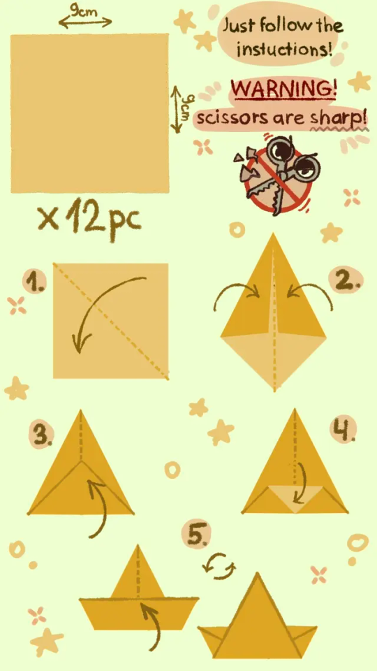
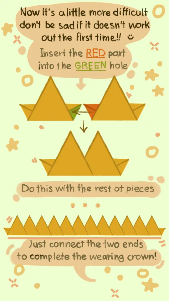
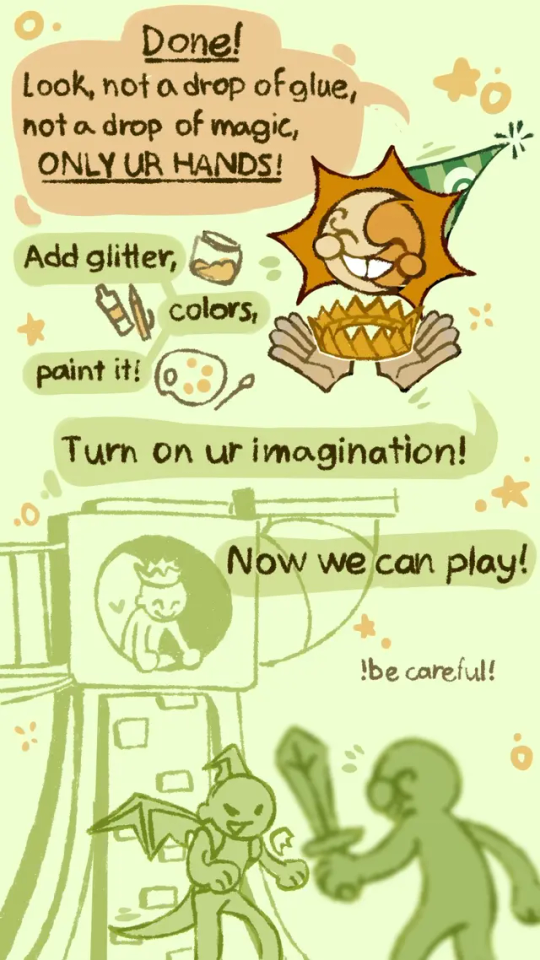
Some old childish shit (I love that and I love Sun so much, someone please treat me like this)
Paper crown tutorial 👑:P
#please treat me like this I'm begging u#hur hur hur hur hur#sundrop#sun#fnaf 9#fnaf 9 security breach#sun fnaf#sun fanart#fanart#tutorial#origami#origami tutorial#crown#paper craft#paper crown#so much tags
2K notes
·
View notes
Note
hii i hope this is ok to ask but i love how fucking HUGE you make curly look, do you have any advice on how to draw muscular frames? :o
thankies!! i love drawing him Robust-Looking <3
as far as advice goes, when it comes to anatomy i always recommend the channel proko on youtube, they have all kinds of videos about how to draw anatomy with each area of the body broken down. basically, if you're trying for anatomical accuracy with muscles and stuff, their vids are a great way to grasp how muscles work!
as far as general shapes and vibes though, i have a couple quick tips of my own <3
the biggest part, if you can imagine, is proportions. typically tutorials will tell you the average shoulder width for a person is about 2-3 heads wide, so if you're making someone Bigger and Beefier, you'll wanna go past that a bit. (and making a character's head smaller is gonna make their body look bigger by comparison, so if you wanna go crazy, shrank that thang)
For example, Daisuke (who i draw as lean, but still with some muscle, especially in his arms) is 4 heads wide at his shoulders, while beefcake curly over here is 5 (sometimes more depending on the drawing lol). something as simple as broadening the shoulders already gives a character a beefier-looking silhouette.

[ID: Simple rough sketches of Daisuke and Curly from Mouthwashing with colored circles showing how many heads wide their shoulder width is. Daisuke is four, Curly is five. end ID]
~~~~
"but what if i don't know how to draw the muscles and am not going for realism/don't feel confident enough in that yet? how do i give a muscular vibe without as much detail?" FEAR NOT it's super easy. here we use the power of SHAPES!!
i draw jimmy and curly with the same "skeleton" or base frame, so i think they're a good example of this next bit. despite having the same bones, i broaden the fleshy parts on curly's limbs (focusing on his shoulders cuz he has big ass shoulders) and keep his upper arms wide before tapering down into his hands (muscles tend to be largest at the base of the limb and get smaller up to the hands/feet but there's plenty of design exceptions). i carry that shape language down into his legs (which i emphasize with his fitted calf-height boots). meanwhile jimmy stays fairly squared, especially when fully clothed

[ID: Simple sketches of Jimmy and Curly from Mouthwashing with notes describing their shapes. Jimmy has a rectangle over his body and is noted as being "relatively rectangular" and the shapes of his limbs are mostly straight. Curly has a trapezoid over his body and has a "top heavy shape" with limb shapes that taper down and in. end ID]
~~~~
and honestly, a good hack to make a character read as more muscular or robust is to give them a buddy that contrasts that. once again, jimmy will assist.
even in a simple drawing like this, giving jimmy the opposite tapering to his limbs just emphasizes curly's hugelargeness by comparison. it also shows that you don't need a lot of detail or realism to convey Beefiness

[ID: Another, more simplified doodle of Jimmy and Curly, pointing out that Jim's limbs taper outwards while Curly's taper in. end ID]
~~~~
another final quick tip i have is: the neck makes a difference!
people with more muscle tend to have thicker necks (it's because of the muscles there, if you can believe it) and it's kinda become one of my fav bits of drawing curly lol. idk why <3 necks fun to draw <3 for him, i draw his neck starting at the very edges of his face and widening out at the bottom to match the shape of his head and to flow a bit more into his trap muscles, but you could go Even Further Beyond if you so Choose. i've found this is a surprisingly good way to convey Beefy Person Beefy even if you don't have as much anatomical knowledge.

[ID: Four bust sketches of Daisuke and Curly comparing their necks. The first two show them both facing forwards. Daisuke's neck is slimmer and straight, while Curly's neck meets the edges of his jaw and has a wider base with higher trap muscles. The second two shows them in profile, with the back of Daisuke's cranium sticking out past his neck, while Curly's is even with his neck, showing how thick is is from the side. end ID]
~~~~
in review we got:
widen shoulders relative to the head to convey a Broad silhouette
taper limbs inwards from base to extremities to emphasize the shape/size of the muscles
give em a less muscular buddy for contrast
thick necks help a lot in conveying a muscular build
and of course, i know i only used men in these examples, but these tips will work just fine regardless of a character's gender. please draw more beefy women ily <3
i hope this made sense and helps you and whoever else might see this uwu
if anyone has any questions about it i will. Try. to answer them. making these posts is oddly difficult lol
#fg's art#mouthwashing#just gonna use the one tag since this mostly has nothing to do with them lol#art tips with major#art tutorial#fg's answers#asks#cursing#WOW AN ART ADVICE QUESTION I ACTUALLY ANSWERED WITH A TUTORIAL. AMAZING. I THOUGHT IT COULDN'T BE DONE AKSDJHAKDJH#the part of me that loves helping people and teaching people art stuff#vs the part of me that finds it SO DIFFICULT TO GATHER MY THOUGHTS INTO A POST#it's hard <3 but we work <3
178 notes
·
View notes