#VisualizationTools
Explore tagged Tumblr posts
Visit Tumblr Blog
Explore Tumblr blogs with no restrictions, modern design and the best experience.
Last Seen Tumblr Blogs


Fun Fact
Tumblr has a low social media market share in South America.
Text
MindManager Professional
MindManager Professional Easy-to-Use Visualization Tools The MindManager product suite provides visualization tools to simplify data organization, project tracking, and effective information presentation.

3 notes
·
View notes
Text
Choosing the Right Chart Type: Navigating the Pros and Cons of Area Charts
Data Visualization – Charts, Graphs and Infographic designs - ThinkCell: Common Questions Answered
1.What is the disadvantages of area chart?
Area charts can be misleading when visualizing data because overlapping areas can obscure important information. They may also exaggerate trends due to the filled space, making it harder to compare individual data series accurately. Additionally, they can become cluttered with too many data sets, reducing clarity and making interpretation challenging for viewers.
2. What is the difference between an area chart and a column chart?
An area chart displays quantitative data over time, emphasizing the magnitude of values through filled areas beneath the lines, making it easier to visualize trends. A column chart represents data with vertical bars, comparing discrete categories. While both show changes over time, area charts focus on volume, while column charts focus on individual category comparisons.
3. Which chart is similar to area chart?
A chart similar to an area chart is the stacked area chart. Both display data trends over time, but the stacked area chart shows multiple data series stacked on top of each other, highlighting the contribution of each series to the total. Both charts effectively visualize cumulative totals and trends, making them useful for comparing parts of a whole.
4. What are the advantages of area chart?
Area charts visually represent data over time, highlighting trends and changes effectively. They show the magnitude of values through the area under the line, making it easy to compare different data series. Area charts also provide a clear depiction of cumulative totals, helping to illustrate how parts contribute to a whole, and are visually engaging for audiences.
5. What is the difference between area and stacked area chart?
An area chart displays quantitative data over time, using filled areas below the line to show trends. A stacked area chart, on the other hand, shows multiple data series stacked on top of each other, illustrating the contribution of each series to the total over time. This highlights both the total and individual parts of the data.
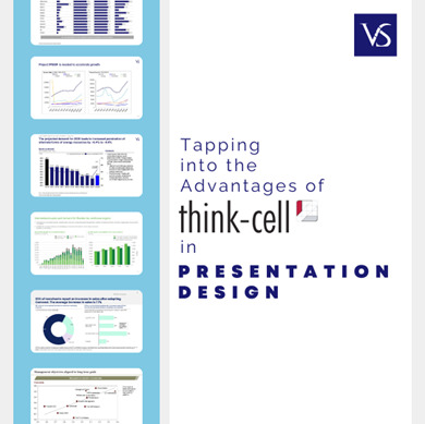
Visit: VS Website See: VS Portfolio
#DataVisualization#AreaChart#ChartTypes#DataAnalysis#StackedAreaChart#DataInsights#VisualizationTools
0 notes
Text
Why 3D Rendering Services Are Essential for Modern Businesses
3D rendering services have become a cornerstone for modern businesses across various industries. Here’s why they are essential:

Realistic Visuals: 3D rendering allows businesses to present hyper-realistic representations of products, spaces, or concepts, making it easier for clients and stakeholders to visualize the final result.
Detailed Presentations: With 3D rendering, businesses can showcase intricate details that might not be evident in 2D images or sketches.

Eliminates Prototypes: Instead of investing in physical prototypes or mockups, companies can use 3D renderings to present their ideas effectively.
Minimized Errors: Visualization helps identify potential design flaws early, saving money on revisions.
Improved Marketing and Branding
Stunning Campaigns: High-quality 3D visuals are perfect for advertisements, websites, and social media, capturing audience attention.
Interactive Content: Many companies are using 3D renderings in AR/VR campaigns to create immersive brand experiences.
Customization and Flexibility
Tailored Solutions: Businesses can easily modify designs to meet client-specific requirements without starting from scratch.
Versatile Applications: 3D renderings are used in architecture, real estate, e-commerce, entertainment, and more.
Competitive Advantage
Stand Out in the Market: Companies that use 3D rendering can create unique, visually compelling presentations that leave a lasting impression on clients.
Faster Decision-Making: Accurate visuals help clients make quicker and more informed decisions.
Applications Across Industries
Architecture and Real Estate: Virtual tours and 3D floor plans for potential buyers.
Product Design: Testing product aesthetics and functionality before production.
Healthcare: Visualizing medical devices or surgical procedures.
3D rendering services bridge the gap between imagination and reality, offering businesses a powerful tool to communicate, innovate, and thrive in competitive markets.
#3DRendering#BusinessInnovation#DesignTrends#VisualizationTools#MarketingSolutions#CreativeTechnology#ProductDesign#DigitalTransformation#ArchitectureDesign#FutureOfBusiness#VisualStorytelling
1 note
·
View note
Text
Top 5 Tools for Data Visualization in 2024

Discover the top 5 data visualization tools for 2024, empowering you to turn complex data into insightful visuals. From AI-powered platforms like AI Swades to cutting-edge software solutions, these tools enhance clarity, creativity, and decision-making. Ideal for professionals and enthusiasts, they simplify analytics while offering dynamic, interactive visual experiences. Explore the future of data storytelling today.
0 notes
Text
#masteryourmood#emotionalintelligence#positivitymatters#mindsetshift#morningroutine#emotionalwellness#selfempowerment#resiliencebuilding#gratitudepractice#visualizationtools#personalgrowthjourney#moodmanagement
0 notes
Text

Data visualization tools transform data into graphical representations, making complex information easier to understand and analyze. Popular tools include Tableau, Power BI, and D3.js.
1 note
·
View note
Text
Explore the world of data visualization, from defining its importance to reviewing top tools like Tableau, Google Charts, and FusionCharts. Learn how to select the best tool for your needs and enhance your data analysis and decision-making processes with visual analytics.
1 note
·
View note
Text
How to master data visualization: 8 intriguing best practices
Data visualization plays a crucial role in the analysis and interpretation of data by transforming raw information into meaningful insights. By visually representing complex data sets, charts, graphs, and interactive visualizations make it easier for individuals and organizations to understand information, identify patterns, and make informed decisions. Importance of Data Visualization Data visualization is important because it allows us to comprehend and communicate data in a more intuitive and impactful way. It takes advantage of the human brain's visual processing power, enabling us to absorb and process information more efficiently than through text or numbers alone. Visualizing data helps identify trends, outliers, and relationships, leading to a deeper understanding of the underlying patterns within the data. https://rahularaj.com/10-essential-python-libraries-every-data-scientist-must-know/ Benefits of Effective Visualization for Decision-Making and Insights - Clarity and Simplification: Visualizations simplify complex data by presenting it in a visually appealing and digestible format. They enable users to quickly grasp the main findings and draw insights from the information at hand. - Identification of Patterns and Trends: By representing data visually, patterns, trends, and correlations become more apparent. This allows decision-makers to identify opportunities, risks, and potential issues that may have been difficult to detect in raw data. - Enhanced Communication and Persuasion: Visualizations are an effective means of communicating data-driven insights to various stakeholders. They can help break down complex concepts and findings, making it easier for non-technical audiences to understand and appreciate the significance of the data. - Interactive Exploration: Interactive visualizations permit users to manipulate and explore data, enabling them to dive deeper into specific data subsets or variables. This interactivity facilitates a more interactive and dynamic analysis experience, encouraging users to ask questions and discover new insights. - Data-Driven Decision-Making: Effective data visualizations empower decision-makers to base their judgments on sound evidence and insights derived from data. By ensuring data-driven decision-making, organizations can minimize risks, optimize resource allocation, and make informed strategic choices. In conclusion, data visualization is a powerful tool that enables us to unlock the true potential of data. By transforming complex information into visual representations, data visualization simplifies understanding, enhances decision-making, and uncovers valuable insights that drive innovation and progress.
Choosing the Right Visualization Technique
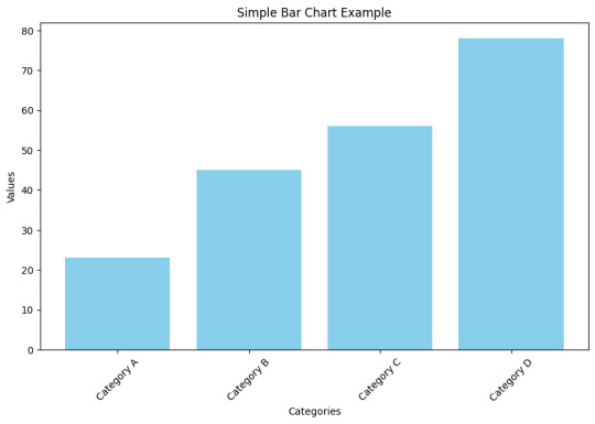
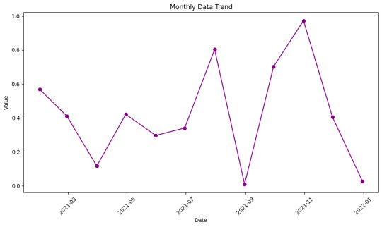
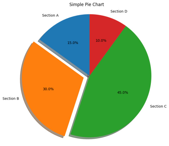
When presenting data effectively, choosing the right visualization technique is crucial. Different types of visualizations are suitable for specific purposes, allowing you to convey information clearly and facilitate better data understanding. Here are five common visualization techniques and their respective applications: - Bar charts and column charts: These charts are ideal for displaying comparisons and trends. They use rectangular bars or columns to represent data values, making it easy to compare different categories or variables. Bar charts are preferable when the categories are distinct, whereas column charts are more suitable when the data points have varying heights. - Line charts and area charts: These visualizations are effective for showing changes over time. Line charts display data as a series of data points connected by lines, revealing trends and patterns. Area charts, on the other hand, fill the space between the lines and the x-axis, making it easier to see the magnitude and distribution of values over time. - Scatter plots and bubble charts: These types of visualizations are useful for exploring relationships and correlations in data. Scatter plots represent individual data points using dots, plotting them along two axes to showcase correlations between variables. Bubble charts take it a step further by incorporating additional information through varying sizes or colors of bubbles, allowing for visual representation of three dimensions. - Pie charts and donut charts: These circular visualizations are effective for illustrating proportions and percentages. Pie charts divide a circle into slices, with each slice representing a different category or value. The size of each slice corresponds to the proportion it represents. Donut charts are similar but include a hole in the center, providing space for additional information or emphasizing the central theme. - Heatmaps and treemaps: Heatmaps are ideal for visualizing complex data patterns. They use color gradients to represent data values and provide a visual summary of a large dataset. Treemaps, on the other hand, use rectangles nested within larger rectangles to display hierarchical data. The size and color of each rectangle represent different variables, making it easy to identify patterns and relationships within the data.
By carefully selecting the appropriate visualization technique based on the nature of your data and the insights you want to convey, you can effectively communicate your data findings to your audience. Remember that clarity, simplicity, and relevance are key when choosing visualizations.
Designing Effective Visuals
When creating visuals, it is crucial to ensure that they effectively convey the intended message and engage the audience. Here are some key strategies to design visuals that are impactful and visually appealing: - Simplify and Declutter: To emphasize the key message and minimize distractions, simplify the visual elements. Remove any unnecessary clutter and focus on highlighting the essential information. Use concise text, clean lines, and minimalistic design to create a clear and uncluttered visual. - Choose Appropriate Colors: Colors play a significant role in visuals as they enhance readability and convey meaning. Select colors that align with the message and the overall tone of the content. Use a limited color palette to maintain consistency and avoid overwhelming the viewer. Consider the psychological impact of different colors and their associations when choosing appropriate colors for your visuals. - Use Proper Scaling: Proper scaling is crucial for accurately representing data values and proportions. Ensure that the size of each visual element, such as bars in a bar chart or icons in an infographic, accurately reflects their respective values. Avoid distorting proportions as it can mislead the audience and impact the understanding of the information presented. - Incorporate Meaningful Labels: Labels provide context and explanations for the visual elements. Include clear and concise labels that help the audience understand the information being presented. Use labels to identify data points, add captions, or provide additional context. Ensure that the labels are easily readable and positioned appropriately within the visual. - Utilize White Space: White space refers to the empty or blank areas in a visual. It is essential for creating visual balance and aiding comprehension. Incorporate sufficient white space between different elements to prevent visual clutter and enhance readability. White space also helps guide the viewer's attention to the most important parts of the visual. By following these strategies, you can design visuals that effectively communicate your message, engage the audience, and improve overall comprehension. Remember to maintain a cohesive visual style throughout your content for a polished and professional look.
Making Data Interactive
To make data more engaging and enhance exploration, adding interactivity is key. By incorporating interactive elements, users can have a more immersive and effective experience while analyzing and interpreting data. 1. Enhancing User Engagement: Adding interactivity to data visualizations, such as charts and graphs, encourages users to actively engage with the information presented. This can be achieved through various methods, including: - Tooltips: Tooltips provide additional contextual information when users hover over data points or elements. They can be used to display specific values, explanations, or relevant details, allowing users to gain a deeper understanding of the data. - Filters: Interactive filters enable users to refine the displayed data based on specific criteria. Users can selectively include or exclude certain categories, time periods, or other variables, allowing for a more focused analysis. - Drill-Down: Implementing drill-down features allows users to explore data at different levels of granularity. By clicking on specific elements, users can dive deeper into the data, revealing more detailed information and uncovering insights that may not be apparent at a high-level view. 2. Improving Data Exploration: Interactive data visualization techniques facilitate effective exploration and analysis. Some strategies to consider include: - Hover Effects: Incorporating hover effects, such as highlighting or enlarging data points, gives users immediate visual feedback and enables them to quickly identify patterns or outliers. - Interactive Maps: Maps that allow users to interact with geographical data through zooming, panning, and clicking on specific regions can be highly effective in presenting location-based information. - Animated Transitions: Smooth animations when transitioning between different data views or visual representations can help users better perceive changes and detect trends. 3. Promoting Data Understanding: Interactive features can contribute to users' comprehension of complex datasets. Examples of how this can be achieved include: - Comparative Analysis: Interactive elements that facilitate side-by-side comparisons enable users to contrast different datasets or subsets of data. This can be done through interactive sliders, checkboxes, or other controls. - Linked Visualizations: Creating connections between multiple visualizations allows users to explore relationships and correlations between variables. For example, selecting a data point in one visualization could highlight related data points in other linked visualizations. - Storytelling: Combining interactive elements with narrative storytelling techniques can guide users through a data-driven story, making the information more understandable, engaging, and memorable. In conclusion, by adding interactivity to data, such as tooltips, filters, and drill-down features, users can have a more immersive and exploratory experience. Furthermore, engaging users with interactive data visualizations helps improve data understanding, promotes valuable insights, and enhances the overall data analysis process.
Telling a Compelling Story with Data
To effectively communicate information through data visualizations, it is crucial to construct a compelling narrative that engages viewers and conveys a clear message. Here are three key steps to follow: 1. Establishing a Clear Narrative Begin by defining the problem or topic that your visualization aims to address. Clearly articulate the purpose of the visualization, whether it is to inform, persuade, or entertain. This narrative framework will serve as the foundation for your data story. For example, if your visualization focuses on the impact of climate change on global temperatures, start by explaining the significance of this issue and why it is important to understand its implications. This context will help viewers grasp the relevance of the data presented. 2. Guiding the Viewer's Attention Once you have established your narrative, guide the viewer's attention towards the key insights and findings within the data. Use visual cues such as color, size, or position to emphasize the most important elements. By directing attention to these key points, you can ensure that viewers understand the main takeaways of your visualization. Additionally, provide contextual information to help viewers interpret the data correctly. This could include labeling axes, providing units of measurement, or offering comparisons to familiar benchmarks. These annotations will enhance the viewer's understanding and facilitate meaningful insights. For instance, if your visualization compares the energy consumption of different countries over time, highlight the countries with the highest and lowest energy usage. Provide explanations or annotations to clarify any fluctuations or patterns observed in the data, allowing viewers to fully comprehend the implications. 3. Incorporating Annotations and Explanations To further augment the narrative, consider adding textual cues and explanations throughout the visualization. Annotations can provide additional context or clarify complex concepts. Use headlines, subheadings, labels, and captions strategically to provide clear and concise information. For example, if your visualization illustrates the impact of a marketing campaign on sales, include annotations that describe the campaign objectives, targeted audience, and any external factors that influenced the results. These annotations will help viewers understand the story behind the data and connect it to real-world scenarios. Remember to keep the text concise and focused, avoiding excessive clutter that may distract from the main narrative. Use a combination of heading levels, paragraphs, and bullet points to structure the content and create visual hierarchy. By following these steps and incorporating effective annotations, you can transform raw data into a compelling story that engages and informs viewers, allowing them to derive meaningful insights from the visualization.
Ensuring Accessibility and Responsiveness
In order to create an inclusive and user-friendly experience, it is important to prioritize accessibility and responsiveness when designing visualizations. This ensures that all users, including those with disabilities, can effectively engage with the content. Furthermore, optimizing for different devices and screen sizes allows for seamless interaction across various platforms. Designing Accessible Visualizations: - Color Contrast: Ensure that there is sufficient contrast between the text and background colors in the visualization to make it easy to read for individuals with visual impairments. - Alternative Text: Provide descriptive alternative text for images and graphics within the visualization. This allows users with visual impairments to understand the content through screen readers. - Keyboard Accessibility: Design the visualization in a way that users can navigate and interact with it solely using a keyboard, without requiring a mouse or touch input. This accommodates individuals with motor disabilities who may have difficulty using a traditional pointing device. - Assistive Technologies: Test the visualization with assistive technologies, such as screen readers and voice recognition software, to ensure compatibility and proper interpretation of the information. Optimizing for Different Devices and Screen Sizes: - Responsive Design: Employ responsive design techniques to ensure that the visualization adapts and scales appropriately across different screen sizes, from mobile devices to desktops. This allows users to easily view and interact with the content regardless of the device they are using. - Flexible Layouts: Use flexible layouts and grids that automatically adjust and reflow based on the available screen space. This ensures that the visualization remains visually appealing and user-friendly on different devices. - Mobile Optimization: Consider the limitations of mobile devices, such as smaller screens and slower internet connections. Optimize the visualization by minimizing unnecessary elements, optimizing image sizes, and prioritizing essential content for a smoother mobile experience. - Touch-Friendly Interactions: Implement touch-friendly interactions, such as swipe gestures and pinch-to-zoom, to accommodate users accessing the visualization on touchscreen devices. By prioritizing accessibility and responsiveness in visualization design, you can ensure that your content is widely accessible and provides an enhanced user experience for all users, regardless of their abilities or the devices they are using. This commitment to inclusivity and usability fosters a positive and inclusive digital environment.
Utilizing Advanced Visualization Techniques
Advanced visualization techniques play a crucial role in effectively presenting complex data and insights. By leveraging these techniques, you can enhance comprehension and make data-driven decisions. Let's delve into some of the prominent methods: - Network Diagrams and Sankey Diagrams: These visualizations are ideal for presenting connected data and flows. Network diagrams display relationships between entities, such as social networks or organizational structures. On the other hand, Sankey diagrams demonstrate the flow of quantities or values through a system. Both diagrams enable users to identify patterns, bottlenecks, and interactions within complex systems. - Geographic Maps and Choropleth Maps: When spatial patterns and distributions need to be visualized, geographic maps and choropleth maps are valuable tools. Geographic maps display data on a geographical layout, providing insights into regional variations. Choropleth maps, on the other hand, use color-coding to represent data at a specific geographic level, such as countries or regions. These visualizations help understand spatial relationships, identify trends, and make location-based decisions. - Tree Diagrams and Sunburst Charts: Visualizing hierarchical relationships is made easier with tree diagrams and sunburst charts. Tree diagrams display hierarchical structures, with parent nodes branching out into child nodes. They are widely used to represent organizational hierarchies or categorize data. Sunburst charts, on the other hand, show hierarchical data in a circular layout. They illustrate the proportion of each category within the hierarchy, helping users understand the distribution of data. By incorporating these advanced visualization techniques into your data analysis and communication, you can effectively convey complex information, identify patterns, and make data-driven decisions. These visualizations enhance understanding and simplify the interpretation of complex data structures, resulting in more impactful insights.
Testing and Iterating
Testing visuals is crucial for ensuring the usability and effectiveness of designs. Read the full article
0 notes
Text

📊 Dive into the world of data visualization with our guide to the best tools for the job!
Whether you're a data analyst, business owner, or simply curious about your data, these top visualization tools will help you turn numbers into insights.
KPH Trainings offers comprehensive courses in data visualization tools, including Tableau, Power BI, Python libraries empowering learners to create impactful visualizations and communicate data insights effectively.
For Further Details walk-in to our Institute KPH Trainings.
Flot No.315, Annapurna Block, Mythrivanam, Ameerpet, Hyderabad.
Map Direction Link: https://goo.gl/maps/MQwYQs9BWa2mTFDG9
Contact us Now to Know more!
Mobile Number: 91217 98535
WhatsApp: https://wa.link/te14su
Email: [email protected]
Visit Our Website: https://www.kphtrainings.com
Follow on us: https://www.facebook.com/profile.php?id=100083418515493 https://twitter.com/kph_it https://www.linkedin.com/in/kph-trainings-373aa7239/ https://in.pinterest.com/kphitraining/
#VisualizationTools#PowerBICourse#TableaucourseinAmeerpet#DataVisualization#BItraining#LearnPowerBI#PowerBIinAmeerpet#DataAnalytics#DataTools#SkillDevelopment#CareerBoost#TableauCourse#Ameerpet#TableauTraining#BusinessIntelligence#CareerDevelopment#LearnTableau#TableauCertification#SkillBuilding
0 notes
Photo

Managing dimension value colors in your Data Studio account is an important aspect of creating visually appealing and effective reports. In this step-by-step guide, we'll walk you through the process of changing dimension value colors, so your reports stand out and provide valuable insights. Step 1: Open Data Studio and select the report you want to edit. Once the report is open, navigate to the right-hand side menu and select the "Style" tab. Step 2: On the "Style" tab, you'll see a section labeled "Color Palettes." Click on the "Edit" button located beneath this section. Step 3: In the "Edit Color Palette" window, you can choose from pre-existing palettes or create your color palette. To modify individual dimension values, locate the "Dimension Values" section. Click the drop-down arrow next to the dimension name, and select "Modify." Step 4: In the "Modify Dimension" window, you can select the color you want to use for that dimension value. Once you've chosen the color, click "Apply." Step 5: Repeat steps three and four for each dimension value you want to update. Step 6: Once you've made all your changes, click "Save" to save the new color palette. By following these steps, you can easily manage your dimension value colors in your Data Studio account. For even more advanced and automated color decisions, check out https://bit.ly/3JGvKXH. https://bit.ly/3JGvKXH is a powerful data analysis tool that automates the color decisions for your reports, saving you time and ensuring your reports are visually appealing and effective. Check it out today.
0 notes
Text
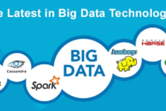
🚀 Unlocking the Power of Big Data: Top Tools for Storage, Mining, & Visualization 🔍📊
🚀 Big Data is the Future — But Are You Using the Right Tools?
In today’s data-driven world, information is growing at an unprecedented rate. To stay ahead, businesses need the right big data technologies for storage, mining, analysis, and visualization.
At Analytics Jobs, we’ve curated a list of the top tools every data professional should know — from open-source giants like Hadoop and Apache Spark to cutting-edge platforms like RainStor, RapidMiner, and QlikView.
Whether you're a data scientist, analyst, or business leader, this guide will help you harness the power of big data to drive smarter decisions.
📊 Dive into our blog and explore the best-in-class technologies: 👉 https://analyticsjobs.in/best-big-data-technologies/
#BigData #DataScience #DataAnalytics #AnalyticsJobs #DataStorage #DataMining #VisualizationTools #TechStack #Hadoop #ApacheSpark
0 notes
Photo

Here are Top 10 Business intelligence and data visualization tools in 2021 that provide easy ways to mine and represent data. The cloud-based applications represent raw data into graphical formats that provide actionable insights for business growth.
#businessintelligence#datavisualization#datavisualizationtools#businessintelligencetools#visualizationtools
1 note
·
View note
Photo

Las 30 Mejores Herramientas de Visualización de Datos en 2021
¿Cuál es la mejor herramienta de visualización de datos? Aquí hay una lista de las 30 mejores herramientas de visualización de datos en 2021, incluidos sus pros, contras y ejemplos. Luego puedes decidir cuál se adaptaría a tus necesidades.
Las dividimos en dos categorías: herramientas que no requieren programación y solo para desarrolladores. En cada categoría, las herramientas se clasifican en subgrupos según la especialización. Algunas como Tableau tienen una amplia gama de gráficos y tablas; Algunas herramientas como Infogram son bien conocidas para hacer infografías; Algunas herramientas comienzan a ganar popularidad debido a gráficos interactivos como Gephi.
0 notes
Text
Creative visualization techniques for Law of attraction सही कल्पना कैसे करे

आज के टाइम में Law of attraction बहुत सारे Motivational speaker, successful businessman द्वारा इस्तेमाल की जाती है. आकर्षण के सिद्धांत में कई तरह की Visualization techniques का इस्तेमाल किया जाता है क्यों की हमारे subconscious mind programming करने के लिए कई अलग अलग tool-set की जरुरत होती है. इसमें Visualization meditation, positive affirmation, mindset और सबसे बड़ी बात belief का होना बेहद जरुरी है. ये एक तरह की mindfulness exercise है जो हमारे सपनो को पूरा करने के लिए हमें तैयार करती है. हम क्या चाहते है इसके बारे में हमें पता होना चाहिए क्यों की जब तक हमें इसके बारे में सही से जानकारी नहीं होगी हम कामयाब नहीं बन सकते है. Creative Visualization meditation हमें उस स्थिति के बारे में एक जानकारी देता है जो हम चाहते है. इसमें हम क्या चाहते है, कैसे हासिल कर सकते है, क्या क्या हमें चाहिए इन सबके बारे में एक basic idea मिलता है. हम जिन Visualization Tools का इस्तेमाल करते है वो सब The law of attraction का एक हिस्सा है.
अगर आप चाहते है की आकर्षण का सिद्धांत आपके लिए काम करे तो आपको उन सभी basic चीजो के बारे में पता होना चाहिए जो इसे पूरा करती है. अगर हम बार बार किसी thought को बार बार repeat करते है तो वो सीधे हमारे Subconscious mind में जाते है. हम कुछ खास तरह के Positive affirmation का इस्तेमाल करते है जो सीधे हमारे Self conscious programming पर focused होते है. आज हम बात करने वाले है Visualization techniques for Law of Attraction के बारे में.
Visualization techniques for Law of Attraction
अपने daily life में Visualization techniques को use करने से आप Law of Attraction में perfection पा सकते है. किसी भी प्रोग्राम को पूरी तरह से सफल बनाने के लिए उसकी clear picture यानि एक मॉडल बनाना बेहद जरुरी है. Visualization Tools के जरिये हम जो चाहते है उसके लिए खुद को तैयार कर सकते है. किसी की कल्पना करने से हम उसे पूरा कर सकते है और जब हम अपने goal को लेकर focus and manifest रहते है तब positive and motivated mindset बनाए रख सकते है. किसी भी बड़े प्रोजेक्ट से पहले हम उसकी डमी बनाते है जो की mentally or physically हो सकती है. ऐसा इसलिए क्यों की इससे हम खुद को strong positive message देते है की हमारा future कैसा होगा. आकर्षण के सिद्धांत में different visualization tools का इस्तेमाल होता है. अगर आप इसका प्रयोग करके अपने सपनो को पूरा करना चाहते है तो सबसे पहले आपको इसके महत्त्व को समझना होगा. पढ़े : Binaural beats Lucid Dreaming Guide Benefit and Side effect आकर्षण के सिद्धांत में कल्पना का महत्व Visualization का प्रयोग करके हम एक dream life का निर्माण करती है. आज के समय में successful people अपने गोल को हासिल करने के लिए Visualization meditation practice करते है. आइये जान लेते है की इसका महत्त्व क्या है Strengthen your motivation dream life को create करने के लिए खुद को motivated और excited feel करना. Program your brain हमारी visualization skill हमारे brain programming में help करती है. इसके जरिये हम how to manifest your dreams and goals की process को समझते है. ऐसा होने की वजह से Law of attraction की सही शुरुआत कर पाते है. Feel more confident हम अपने गोल को लेकर जितना ज्यादा visualize करते है उतना ही खुद को confident पाते है. खुद को हर रोज अपने goal को achieve करते हुए महसूस करे तो ऐसा करना हमें अपने टारगेट के नजदीक ले जाता है. Visualization can help with stress जब हम कल्पना करते है तब हम calm state of mind में होते है. इसकी वजह से हम अपनी समस्याओ के प्रति अवगत होकर उन्हें समझ पाते है. ये सभी वो important point है जो इसे खास बनाते है. अगर आप Law of attraction में सफलता पाना चाहते है तो आपको most popular visualization techniques में से किसी एक तकनीक पर काम करना चाहिए. पढ़े : किसी भी व्यक्ति से अपना काम कैसे निकलवाए 6 Easy And Effective Visualization Techniques हम चाहे जिस तकनीक का इस्तेमाल करे हमें इसका benefit मिलता है. अगर आप आकर्षण के सिद्धांत को सफलता पूर्वक अपने लाइफ में लागू करना चाहते है तो आपको इन 6 खास तकनीक को समझकर चुनाव करते हुए अपने लाइफ में अपनाना चाहिए. वैसे तो इसके लिए एक आसान तरीका है की हम अपने बेड पर बैठ जाए और खुद को relax कर ले. इसके बाद आँखे बंद कर उसकी कल्पना करे जो हम चाहते है. हमें मालूम होना चाहिए की जो हम चाहते है उसे कैसे हासिल किया जा सकता है. हमारा goal कैसे achieve होगा और इसके लिए हमें किस तरह के belief की जरुरत होगी. आज हम बात करेंगे उन great visualization tools के बारे में जिनके जरिये हम खुद को Law of attraction expert बना सकते है. Dream board इसे Vision board के नाम से भी जाना जाता है. इसके जरिये हम अपने उदेश्य को एक फिल्म की तरह तैयार करते है. ये financial, romantic, spiritual या कोई भी और उदेश्य से जुड़ा हुआ हो सकता है. इसे बनाना inexpensive and very creative way है जो हमें अपने future की desire से जोड़ता है. इसे बनाने का मतलब है खुद की इच्छा को एक भौतिक रूप में समझना और महसूस करना और साथ ही daily affirmations को लागू करना. ये dream board ऐसी जगह होना चाहिए जहाँ आपकी नजर इस पर बार बार पड़ती हो. जैसे आपके बेडरूम की दीवार या फिर ऑफिस में. ऐसा करना आपके लिए एक free toolkit for law of attraction की तरह काम करता है और आसानी से आप खुद को बार बार motivate रख सकते है. आपको हमेशा एक Ideal dream board बनाना चाहिए जिसमे आपके dream life से जुड़ी basic detail हो. पढ़े : negative energy को दूर करने का सबसे आसान उपाय Daily affirmation जैसा की हम पहले की पोस्ट में पढ़ चुके है की affirmation वास्तव में एक set of statement होता है. इसका main purpose होता है हमारे belief system को एक shape देना ताकि हम अपने goal की तरफ लगातार बढ़ते रह��े के लिए खुद को motivate करते रहे. अगर आप चाहते है की ये आपके पक्ष में काम करे आपको positive affirmations पर ध्यान देना होगा. Positive affirmation को हम लगातार बोलकर, लिखकर या फिर visual affirmations के जरिये खुद पर लागू कर सकते है. अगर बात करे daily affirmation example की जिसे हम अक्सर दोहराते हो तो वो है mirror face gazing के दौरान खुद को motivate करना. हम बार बार खुद को किसी भी नई स्थिति के लिए तैयार कर लेते है जब बार बार आइने के सामने खड़े होकर positive affirmation को दोहराते है. अगर आप इसमें कामयाबी चाहते है तो आपको मालूम होना चाहिए की The Law of Attraction के अनुसार इस universe में हम जो भी Thoughts and energies को भेजते है सभी की एक पहचान होती है. ऐसे में अगर हम Positive affirmation के साथ energies को अपने काम में लगाते है तो universe उस पर जरुर अपनी प्रतिक्रिया देगा. हम एक thought को जितनी ज्यादा बार अपने आप पर दोहराते है उतने ही जल्दी हम उस मेसेज को self-conscious तक पहुंचा पाते है. Meditation मैडिटेशन एक great visualization technique है जिसके जरिये हम खुद को वर्तमान में रखते हुए शांत मन से विचारो को एक कल्पना शक्ति का रूप देते है. जब हम ध्यान लगाते है हम अपने inner self पर access हासिल करना शुरू कर देते है. ये access सामान्य स्थिति में नहीं होता है. ध्यान लगाने का सबसे बड़ा मकसद खुद को वर्तमान में रखना होता है और इसी का फायदा उठाते हुए हम खुद पर focus हो पाते है. जो ह��� चाहते है उस पर clear mind में रहते हुए विचार कर सकते है जिसकी वजह से एक साफ तस्वीर बनना शुरू हो जाती है और ये Law of attraction के लिए हमारा connection सीधे universe से जोड़ना शुरू कर देती है. इसके लिए आपको कुछ समय निकालकर thought और energy को universe में भेजना होता है. meditation practice एक जरिया है अपने negative energy and thought को बाहर करने का. हम जो चाहते है उसे हासिल कर सकते है बशर्ते इसके लिए खुद को स्पेस दिया जाए. इसकी यही खासियत इसे one of top tool-set for visualization के लायक बनाती है. आपको इसके लिए strong visualizations though meditating की जरुरत होगी क्यों की आप अपने brain को इसके लिए allow करते है लेकिन उस लायक space ( समय ) नहीं दिया गया तो ये काम नहीं कर पायेगा. आप इसके लिए कोई भी विधि का चुनाव कर सकते है. mindfulness meditation हो या फिर box breathing या फिर vipassna meditation technique ये सब अलग अलग खासियत के साथ special benefit देती है बशर्ते आप एक fix time इसे dedicate कर सकते है. Gratitude Journal ये भी एक great visualization tool है जो हमें न सिर्फ positive mindset बनाए रखने में मदद करता है बल्कि अपने success and goal में विश्वास बनाए रखने के लायक भी बनाता है. ये एक तरह रिकॉर्ड होता है जिसमे हम हर उस चीज का रिकॉर्ड बनाते है जिसके लिए हम grateful होते है. ऐसा आपको हर रोज करना चाहिए. हर रात को सोने से पहले उन 5 से 10 चीजो के बारे में लिखे जिनके लिए आप universe के प्रति grateful है. ऐसा करने से आप खुद को positive mindset में बनाए रख पाते है और इसका असर आपके लाइफ में बन रही अच्छी आदतों में दे��ने को मिलता है. ऐसा करने से आप खुद को happy present experience देते है जो आपके भविष्य से और ज्यादा की कल्पना करता है. ये एक basic secret है जिसकी वजह हम Law of attraction में success बनते जाते है. सिर्फ future ही नहीं बल्कि past में आप जिन बातो के लिए grateful थे वे आपको positive message देती है जो आपको आगे बढ़ने के लिए positive mindset बने रहने में help करती है. ऐसा करना आपके belief को और ज्यादा strong बनाता है और goal को achieve करने के लिए भरोसा दिलाता है. पढ़े : दूर बैठे व्यक्ति पर वशीकरण करने के लिए सबसे आसान दिगपाल साधना Magic Cheque आपने अब तक dream wish के बारे में तो सुना ही होगा. अपने सपने को एक कागज पर लिखना यानि खुद को एक condition में रखना. ज्यादातर successful people इसका इस्तेमाल financial support को मजबूत बनाने में करते है. इसके लिए आपको एक ऐसा चेक चाहिए जिसे आपने खुद बनाया हो और उसमे साफ साफ लिखा हो की आप वास्तव में क्या चाहते है. एक उदाहरण के लिए आपके खाते में अभी 10,000 रूपये है. आप चाहते है की आने वाले 6 महीने में ये राशी 50,000 बन जाए. इसके लिए सबसे पहले अपने ही चेक में वो राशी लिखनी है और अगले 6 महीने की तारीख डालनी है. अब इसे ऐसी जगह पर रखे जहाँ आपकी नजर इस पर हर रोज पड़ती हो. ये अमाउंट उतना होना चाहिए की आप उसे खास समय पर हासिल कर सके. इसके इस्तेमाल से आप खुद को हर रोज इसके लिए तैयार कर सकते है. ये आपके affirmation, positive mindset को तैयार करता है आपके target को achieve करने के लिए. Creative visualization अगर आपके पास हुनर है तो आप कल्पना शक्ति को अपने हुनर के साथ मिलाकर कुछ नए Creative visualization बना सकते है. ये एक drawing, painting, graphic, sketch कुछ भी हो सकता है. कुछ लोग इसे बाकि सब से better visualization techniques मानते है क्यों की अपने goal को पूरा करने के लिए उनके पास creative skills होती है. एक Vision board की तरह आप इसे अपने रूम में टांग सकते है. हम अपनी स्किल को एक रूप देते है जिसकी वजह से हम ये जान पाते है की वास्तव में हम चाहते क्या है. ये सब आपको motivate करता रहेगा ताकि आप अपने Law of attraction के लिए खुद को तैयार कर सके. पढ़े : Telekinesis practice step by step 2020 एक खास बात जिन्हें हम Ignore करते आये है Step by step Guide for Creative visualization इसके लिए आपको निचे दी गई इन स्टेप को follow करना होगा जैसे की सबसे पहले अपने मूड को सेट करे. ध्यान की अवस्था में खुद को ले जाए. अपने गोल को लेकर कल्पना शक्ति का इस्तेमाल करे कल्पना करते समय जो अहसास आपके अन्दर पैदा हो रहे है खुद को उनसे जोड़ ले. हर रोज रचनाशील कल्पना के लिए खुद को तैयार करे. अपने target को हासिल करने के लिए हार्ड वर्क करे इन सभी स्टेप को follow करते हुए आप खुद को रचनाशील कल्पना के जरिये खुद को तैयार कर सकते है. Benefits of Creative Visualization Techniques हम सब जानते है की Creative Visualization techniques के जरिये हम खुद की प्रतिभा को निखारने के साथ साथ कल्पनाशक्ति का बेहतर इस्तेमाल भी कर पाते है. इसके कुछ amazing benefit भी है जैसे की Reduce stress Increase focus Gain self confidence Bring you joy Gives You Inspiration Improved Relationships इन सब वजह से Creative visualization अपने आप में एक खास tool set है. अगर आप एक creative skill के मालिक है तो आपको Step by step guide के जरिये अपनी स्किल में आगे बढ़ना चाहिए. ध्यान दे : आपको पता होना चाहिए की सिर्फ कल्पना करना काफी नहीं है. कल्पना करना हमें सिर्फ हमें काम से जुड़े idea दे सकता है उसे पूरा नहीं कर सकता है. पूरा करता है तो आपका positive mindset और आगे बढ़ने का मोटिवेशन. पढ़े : सपने में आने वाले कल को जानने की तंत्र साधना .Creative visualization technique final conclusion हम सब जानते है की Law of attraction किसी भी कार्य को हमारे लिए संभव बना सकता है बशर्ते हम इसके सही इस्तेमाल को अपनी लाइफ में apply कर सके. किसी भी कार्य को संभव बनाने के लिए आपको उसकी सही कल्पना करना बेहद जरुरी है. यहाँ share की गई Most popular great visualization technique आपको आकर्षण के सिद्धांत के लिए सही तैयारी करवाता है. खास तरह की Positive affirmation, mindset and belief आपके लिए एक tool-set की तरह काम कर सकते है और process को आसान बना देते है. अगर आप आगे बढ़ना चाहते है और वो सब पाना चाहते है जिसके लायक आप है तो आपको इसके जरिये एक सही शुरुआत करने की देर है. अपनी स्किल का सही इस्तेमाल करे और आगे बढे. Read the full article
#Creativevisualization#CreativeVisualizationmeditation#Lawofattraction#VisualizationtechniquesforLawofAttraction#VisualizationTools
0 notes
Photo

INTERIOR MODELLING WITH 3DS MAX & PHOTOREALISTIC VISUALIZATION WITH LUMION
Get Trained in:
Modelling a living room
Modelling a bed room
Assigning materials and maps
Rendering the imported max file in Lumion.
For more Information
+91-8518832525
CADD CENTRE Indore
204-205, III Floor, Mishika Tower, Opp Sapna Sangeeta Multiplex, Plot No. 28, Sneh Nagar, Sapna Sangeeta Road, Indore, Madhya Pradesh-452007
◙ Apply: https://bit.ly/CADDCENTREIndore
◙ visit: WWW.CADDCENTREINDORE.COM
.
1 note
·
View note
Photo

INTERIOR MODELLING WITH 3DS MAX & PHOTOREALISTIC VISUALIZATION WITH LUMION
Get Trained in:
Modelling a living room
Modelling a bed room
Assigning materials and maps
Rendering the imported max file in Lumion.
For more Information
+91-8518832525
CADD CENTRE Indore
204-205, III Floor, Mishika Tower, Opp Sapna Sangeeta Multiplex, Plot No. 28, Sneh Nagar, Sapna Sangeeta Road, Indore, Madhya Pradesh-452007
◙ Apply: https://bit.ly/CADDCENTREIndore
◙ visit: WWW.CADDCENTREINDORE.COM
.
1 note
·
View note