#a fully rendered piece? on my blog?? more likely than you think. apparently
Text
NOTHING LEFT TO LOSE // LET ME WRAP DOWN TO MY SKELETON
taglist (opt in/out)
@shellibisshe, @florbelles, @ncytiri, @hibernationsuit, @stars-of-the-heart;
@vvanessaives, @katsigian, @radioactiveshitstorm, @estevnys, @adelaidedrubman;
@celticwoman, @rindemption, @carlosoliveiraa, @noirapocalypto, @dickytwister;
@killerspinal, @euryalex, @ri-a-rose, @velocitic, @thedeadthree
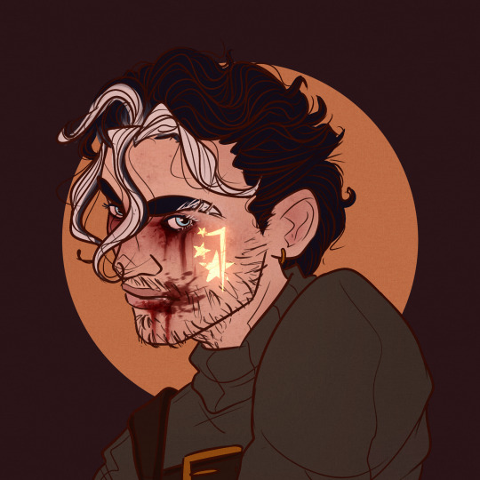
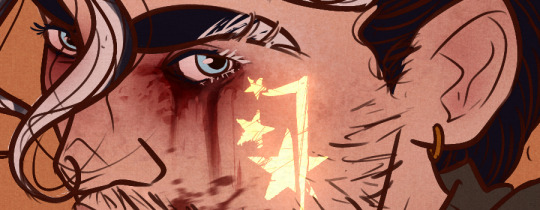
#tew#art#art:nathan#nuclearocs#nuclearart#blood //#a fully rendered piece? on my blog?? more likely than you think. apparently#anyway hi hello sorry if this is not your cup of tea feel free to ignore LMAO i just needed to get this out of my system#have been spinning the evil within around in my brain at incredibly high speeds again so. nathan time. he is so fun#i think his design is the one design that has stayed the most consistent over the years. he is a very very old oc#just added some extra details to his skin and eyebrow and lashes to match the rest of his appearance a little better + made his hair curlie#he joins the story of the games in the second game!! and then in classic bones quickhacked fashion i also have like#a whole post-game story going on because basically i need ruvik to come back because he is mein meow meow. sorry#there's a lot of parallels between nathan and ruvik :3 giggles and dies in the explosion
63 notes
·
View notes
Text
[ad_1]
Grimes is a jack of many trades—a singer, a producer, an aspirant sailor and, apparently, something of a cyber hacker. In a Vanity Fair video interview released March 10, the musician revealed that, back in 2012, she blackmailed the founder of the once-prominent music culture blog Hipster Runoff, in order to force them to take down a photo of her kissing a friend at a party.In the interview, she explained that she asked a friend who worked for a video game company to assist her in hacking the blog, who ran said photo with an accompanying “mean story”. She said they performed a DDoS (Distributed Denial of Service) attack, which floods a particular server with traffic, rendering it unusable.“We were actually able to DDoS Hipster Runoff and basically blackmail them. We were like, like, ‘We’re not gonna let you put your site back up until you take the story down.’ And he did, in fact, take the story down. And it was like my coolest hacker moment,” Grimes said.Hipster Runoff was a website that ran during the late 2000s and early 2010s, reporting on, but also poking fun at indie culture (think: the heyday of Urban Outfitters and American Apparel). Run by an individual under the pseudonym Carles, the blog attracted a large following covering figures like Grimes, Best Coast, and Lana Del Rey. According to a Vulture retrospective on the blog, it was kind of an art piece unto itself: “Carles is a caricature of someone whose identity is constructed entirely on being in the know.”Hipster Runoff never fully recovered after the attack, and was sold for a little over $21,000 in 2015. In March 2012, Carles did an interview about Hipster Runoff being hacked with Motherboard. At the time, they speculated that a musician or someone “in the indie community” could possibly have been the perpetrator. Apparently, what happened was more serious than a standard DDoS attack, as Carles told Motherboard that the site’s “server disk [had] crashed and remote backups were sabotaged.”In a blog cited by Pitchfork, the cybersecurity professional Jackie Singh wrote about the potential repercussions Grimes could face. According to Singh’s Medium site, “Canada does not have a statute of limitations on cybercrime,” meaning that what the musician admitted to could have legal blowback. (In June 2020, an American man was sentenced to five years in prison and fined over $500,000 “in restitution” for a series of DDoS attacks he had coordinated against media outlets.) As Pitchfork noted, DDoS attacks are illegal in both U.S. and Canadian law—and at the time the hack took place, Grimes was living in Montreal.Singh also noted that the photo in question first appeared on another popular website, Last Nights Party, which documented the indie social culture of New York City. “It seems like a misrepresentation to imply this was a private photo for which the blogger was deserving of retribution for publishing,” she wrote.
[ad_2]
Source link
0 notes
Text
Know What You're Worth
Recently I had an experience in business that made me realize something; you don't have to take every single job opportunity that comes your way. That goes for everyone who is in business for themselves, but more specifically photographers.
Let me explain the backstory.
I got an email from a man who we'll call Bob, wanting to set up a TFP (Time For Print) shoot for a male fitness model, who we'll call Joe. Keyword: fitness. Sports and fitness photography is not something that I specialize in, but I have shot a couple fitness events before, so I thought that this would be interesting and maybe even fun. Another piece to this whole mess of a pie was that Joe was a male model, and the majority of the models that I work with are female. I told Bob that I would love to do a TFP shoot, then asked for the model's social pages so that I could get an idea of what he looked like and what his style was. I also asked what Bob and Joe had in mind for the shoot. I explained that I use natural light for my photos, so a location outdoors would be ideal.
Bob responded back with a few more details about Joe, and then created a group chat on Instagram with Joe, himself, and I. I thought that this was a bit odd, but went with it anyway. Here is how the conversation started.
Hold the phone.
By this point, I had made up my mind. I had decided that I was not going to go through with this TFP shoot for a few different reasons other than being a little uneasy.
1. Normally when someone is contacting me and they don't have the correct grammar or they make mistakes with their spelling, I try to give them the benefit of the doubt and assume that they are just not thinking about it or maybe they grew up in a foreign country and are still trying to learn the english language (which is already a confusing language to outsiders). But, there are other times where is seems lazy, or a little suspicious, and unprofessional. This would be one of those times.
2. The look and aesthetic of what Bob told me they were wanting was not something that I wanted to do. As you'll see me explain in the third photo above, I was under the impression that Joe would be fully clothed, and doing some type of fitness activity, like working out in the gym or running on the track. The photos that Joe sent me were more for showing off the body in a different way, and I didn't feel comfortable around that kind of modeling. Furthermore, I have never done a boudoir session, let alone this type of session for men. The photos that I would have gotten from this shoot would have been useless to me, because I wouldn't have been able to put them in my portfolio, and it's not something I'm looking to specialize in now or anytime soon.
And after these messages were sent, the third reason became apparent to me:
3. Spamming me with messages trying to get me to agree to do the shoot after I had already said no and recommended two other local photographers is not going to change my mind.
I later sent him a final message saying that I would have to decline, and that I wished them luck. The spam messages stopped after that.
Wether you are going to be paid or not, if the job that comes your way makes you feel uncomfortable (and I mean in a bad way, like something or someone makes you suspicious or is doing inappropriate things or you just have a gut feeling that is telling you to leave) then you shouldn't feel like you have to take it. For one, this is your time that you would be spending, and that means all of your creative talents too. It's going to be your gas, wear and tear on your gear, your energy spent talking with the other people involved in the project or shoot, and most definitely the hours you spend editing photos.
The purpose of TFP shoots if for all parties involved to get something out of it, and this is what makes up for the fact that no one is getting paid. Photographers, models, make-up artists, hair stylists, fashion stylists, and sometimes videographers all get to use the photos and/or videos attained from the shoot in their portfolios and on their social media, and everyone gets tagged and credited in everyone's posts. It's beneficial for everyone involved, and those are the shoots that are worth not getting paid for. Now obviously, you can't live off of TFP shoots, but it's an excellent way to collaborate with other artists.
In my situation with Bob and Joe, I felt uncomfortable, and I knew that the time and energy that I would use to get the photos that would be rendered useless to me was not worth it. I knew my worth, and I said "No thank you." in the politest way that I could. If it had been a paid shoot, I would have been a little upset that I had missed out on the money opportunity, but ultimately I would have been glad that I realized that I would not be a good fit for the client and what their expectations were.
My point is, know what your time is worth and what you are worth, so that you don't feel like you have to take every project you come across, and ultimately avoid the situations in which your time and talents are wasted.
I decided to make a blog post dedicated to this topic because I want fellow photographers that might see this to take this empowering and insightful practice and apply it to their business, dreams, and ambitions.
Cover photo by: Visually Bias Photography
1 note
·
View note
Text
How can Typing express a Tantrum ?
This week I focused on the question "How can taken-for-granted technologies express queerness?", a question posed in the article I read last week by Adrienne Shaw and Katherine Sender. The question wasn't exactly addressed quite as literally as I'd like it to be, so I chose to focus on that as my main question for the week. This week I created two lists, one representing taken-for-granted technologies, and other elements of "queerness", or what I think might encompass queerness in the context of technology. I've included the list below:

I then wrote a script that essentially matched elements of tech with those of queerness at random, and generated new questions.

The three questions that it generated are the following:
1) How can Typing express a Tantrum ?
2) How can Close Buttons express Promiscuity ?
3) How can Computer Windows express Silliness ?
"How can Typing express a Tantrum?" Felt like a good place to start to simply see what came from trying to modify typing to represent such a human expression. I first started thinking about technology associated with typing in order to see if I could tap into anything that might be an entry point for creating a tantrum.
Below I've listed out a few typing-based technologies:
• QWERTY keyboard
○ Meant to make typing faster by grouping frequently used letters closer to the sides of the keyboards (where the hands sit)
• "Texting" acronyms
○ Meant to speedily communicate commonly used multi-word phrases
• Autocomplete
○ Meant to "predict" what a user might want to type next
• Autocorrect
○ Meant to correct a misspelling by guessing the closest word to the misspelling
• Speech to Text
○ Meant to comprehend spoken words and translate them into written text
My main question became: how might we envision these productivity, efficiency-based technologies expressing the actions and feelings associated with a tantrum? First I decided to think about the physical symptoms of a tantrums and their cause.
Wikipedia classifies a tantrum as an "emotional outburst"
typically "characterized by stubbornness, crying, screaming, violence, defiance, angry ranting, a resistance to attempts at pacification". A tantrum, I could say might consists of the following:
• Unpredictability
• Increase in speed/ out of control-ness
• Resistance to pacification
• Erratic-ness
• Nonsense/ incomprehensible-ness
• Destruction (?)
Now, what might the above typing-technologies look like with these properties applied?
• QWERTY keyboard
○ A shifting of keys, moving away from fingers.
○ Sudden replacement of keys with other letters
○ Keys springing off the keyboard
○ Taking on the opposite speed of the user's hands (keys moving even faster away if the users attempt to calmly type)
• "Texting" acronyms
○ An erratic transformation of any string of words into an acronym
○ Acronyms appearing more like code for a phrase rather than corresponding to the first letter of every word in that phrase
• Autocomplete
○ Nonsense prediction, predicting words that don't make sense in the context
○ Nonsense prediction, predicting words that aren't real words, but rather strings of characters
○ A prediction of negative words
○ A rapid cycling of words
• Autocorrect
○ Automatically correcting any and all words to nonsense words
○ Choosing words at random to "correct"
○ Correcting words to misspellings
• Speech to Text
○ Blatant mistranslation
○ Negative, threatening translation
○ Nonsense translation
○ Translating speech back into more speech, but perhaps someone else's voice, saying something else
After thinking more about my prototype, I eventually decided to abandon focusing on a specific piece of technology associated with typing! Instead I found it more productive to try and think about typing in the context of the internet, via a text box or form, something that I think the majority of computer-users have some degree of familiarity with. To me, this felt like a good basis to explore typing from.
Below is a video of the results!
vimeo
I decided to try and create a text box that essentially responds to how you interact with it. While you type, the box begins to shake, the size of the font changes, and words and phrases such as "UGH!" or "I'm BORED" are typed at random, interjecting the user's typing. At it's most furious, the background changes colors rapidly, the box shakes uncontrollably, and the content of the text both is illegible. This felt like I was able to capture a tantrum, and others seem to think it also felt that way, and that the experience provoked a pretty intense reaction of frustration and anger.
Takeaways
The takeaways are still not totally apparent to me just yet. While the experience was jarring and not something I had experienced before, I'm not quite sure what to make of it. How might experiencing this on a day to day basis change the way I reacted with the internet? Would there be a way to calm down the text I had generated? After doing a bit more research on tantrums, it sounds like they stem from an inability to cope with the situation, resulting in a meltdown instead. Interestingly, a site called parents.com suggests that parents try and give their children their full attention and be mindful of their need to be an autonomous person, with needs and desires. "Look for opportunities to point out his good behaviors, even the small ones. The more favorable attention he gets for a desired behavior, the more likely he is to do it again." Who knows if I should be taking parenting advice from a site called parents.com, but alas, I chose to think more deeply about tantrum prevention according to their tips. How might I praise the text I type for doing a good job of appearing on the page? What might that look like? Ultimately I think this research sent me down the rabbit hole, and I don't quite know what to make of it. Something about it does feel fruitful, I think I need a little more time to fully piece it together.
The big question that comes to mind: should I be creating technology that mirrors human behavior?
I don't have an answer to that, and think this week I should probably do some research on this subject.
After struggling to interpret my work above, I wanted to do another deep dive on why exactly I'm choosing to focus on this question. I've dumped my brain out about this below:
I want to see if actively destroying the system that most technology is based on might change the way we engage with it. In "[In Situ] Art Body Medicine" Zack Blas writes about queer technology as necessity to counter a society increasingly defined by technology. He asks "Or, is there a subcultural technology that offers empowering, subversive structures and processes to all bodies, producing a freedom that exists as fact—a freedom that is foreign to no one?" How might creating queer technology, specifically that subverts or resists these power paradigms, carve out a space for all kinds of oppressed people to find safety and freedom in their existence? When thinking about destabilizing or disempowering, my first question revolves around how I might create in order to take power away. After reading another interview with Zack Blas, it became clear that technology is rendered "powerless" when it is no longer useful. Blas also writes "I think Queer Technologies wants to work in the interstices of useful and useless, or to find new uses through the useless. Importantly, this is not about deconstruction, it is about use, about doing something, experimenting with new ways of doing and making things happen." The system that I refer to above casts out "useless" as un-useable. In this week's thesis adventure, I plan to focus on the "useless" first. How might I strip certain features of usefulness? This week feels more about the experimentation, meaning, what might com from this? I think the weeks prior will hopefully be able making sense of the useless and how I might "find new uses through the useless".
Secondary Research
In order to think more about human-like technology I think I definitely need to do more research on that. I also want to do more research specifically on "useless" tech, to see what others have done and have to say about it. I plan to check out the internet mostly, but I plan to also contact any designers or artists who might be able to help. Lastly, I've been thinking a bit about "Chindogu" meaning strange/curious tool or device, a practice created by Kenji Kawakami of making useless or mostly useless tools. While I don't know a ton about it, I think it might be interesting to research to see how it might benefit/ the overlap with the queer tech I'm trying to design.
I plan to document this research in a section in my online notebook entitled "research", and also bookmark the articles, text, and literature I find on either Zotero or Are.na. I hope this week can be research-filled, but I'm also wary of getting too deep into research.
The Letter
Thinking about who my research might impact still remains a difficult question. While my question might seem pretty academic in nature, I'm wary of it becoming that, as I'm not someone who really ever felt truly comfortable in academia. So, I don't think the audience is folks in academia, but I'm hoping it'll be accessible to perhaps, young people. Truthfully, I'm struggling to come up with 5 different people that my design is for, but I think young people feels right. I know personally growing up I really heavily relied on spaces like Tumblr that allowed me to express myself and discover who I was and in some ways, continue to be at the time. Of course, Tumblr became more commercial, ended up limiting people with new rules, and users started to drop off, not feeling like it was quite *their* space any longer. I hope at the very least the tech that I end up building can create a system that isn't incentivized by the need to grow larger and create more efficient, productive blog systems.
-----------------------------------------
To those that feel trapped by their technology, but compelled to use it nonetheless,
I certainly feel this way. I grew up totally enamored by the idea of technology, hoping that I could one day feel powerful using it. Perhaps you felt this too, and today, you feel the ways that this vision has never quite manifested. Yes, technology is "more powerful than ever" but it's never really helped empower you. Instead, you feel that it's using you in the name of success for faceless entities. You have a hard time putting down your phone after scrolling for hours, the systems you use don't quite recognize the person that you are, or perhaps they aggressively try to categorize you into a neat box. Perhaps if you're like me, you feel let down.
I'm interested in breaking down this system, and while I recognize that it's a giant task, I plan to start small. What might a world of personal technology look like that doesn't rely on us, for example? How might we redefine what's "useful" on an individual level, veering away from productivity, efficiency, speed. What would it look like to interact with something that like you, is socially anxious, is gentle when you're feeling particularly vulnerable, or unreasonable when it hasn't had its need met? I'm not quite sure how to answer these questions just yet, but I'm curious to see what might come of it.
Write to me to tell you about your story! I'm so curious…
Love,
Elena
Final Thoughts
Though I've peppered my week's reflection throughout this blog post, I wanted to close out this post with a brief summary. I believe I've gotten closer to the *why* but I still don’t totally understand the *how* or even the *what*, and feel a bit thrown off by it. I understand that the thesis process can sometimes become increasingly confusing as you get more detailed, but I'm definitely having a hard time. My goals for this week are to continue to research, and perhaps think more deeply about my project in the context of how other people have thought about this subject. I plan to do more secondary research and hope that that informs a new project for me to create by next weekend.
0 notes
Text
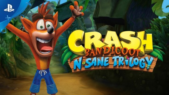
The Crash Bandicoot N. Sane Trilogy is a (fun) shallow novelty
In a recent Time interview, Sony Europe Exec Jim Ryan argued against the concept of backwards compatibility à la Xbox as a viable business plan, positing that for as many people that ask for it, very few actually take advantage of it. “That,” he said, “and I was at a Gran Turismo event recently where they had PS1, PS2, PS3 and PS4 games, and the PS1 and the PS2 games, they looked ancient, like why would anybody play this?” His statements may reflect the actual opinions of a certain segment of the gaming community, but they also come off as shortsighted and just kinda...dumb. He’s (first of all) bashing products once made by his own company, which for pure business reasons sounds some alarms. But more than that, he’s making an argument against the durability of games, asserting that unlike other forms of art, they have an expiration date, largely connected to the visual style allowed by the hardware limitations of the time they were made in.
While the Activision-produced Crash Bandicoot N. Sane Trilogy is removed from Sony’s legal grasp, to a degree, this ground-up remake of the classic O.G. Playstation platformer series is in line with Ryan’s realm of thinking. This isn’t a “remaster” in the way that most games that bear that designation are, no mere cleaning-up and up-resing to make those chunky 90’s polygons tolerable on modern TVs, though perhaps it should have been. Rather, this is more a Gus Van Sant’s-Psycho-kind of shot-for-shot recreation of the original games in a brand new engine, and the good news for the Jim Ryans of the world is that it looks great. Fans of the original trilogy such as myself, whose ravenous nostalgia for all things pre-aughts knows no bounds, will undoubtedly spend the first few minutes of this game in slack-jawed awe at their childhood game rendered in all its colorful, rounded, shiny 2017 glory.
Some of that awe may go away, however, once those players get to, say, the second level of any one of the three games packaged, and start dying. Players at this point might have one of two reactions - “Shit, I forgot how hard this game was,” or “Shit, I don’t remember this game being so hard.” Both of these reactions are valid. The original Crash Bandicoot games, once you got past the rollicking soundtrack and vaguely-creepy but mostly-cute anthropomorphisms, were occasionally grueling obstacle courses fraught with trial-and-error frustrations. They were awkward 3D platformers that had trouble grappling with the idea of what a 3D platformer could even be, requiring the precision controls of 2D genre classics like Mario but in practice, controlling in the stiff, wonky way many games of the 32-bit era did. Even if this was a straight remaster of the original games, many players may have found themselves running sideways off a straight platform because of the bafflingly 3D controls in ostensibly 2D sections only so many times before they became a little disillusioned at how unflatteringly these games have aged. Naughty Dog may have gone on to be one of video game’s greatest and most celebrated developers, but it took a while to reach that peak.
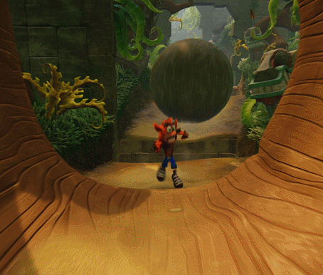
But there’s more to it than that. Sure, on the surface level, everything pretty much looks the same - Crash (or, in a welcome addition to these versions, his sister Coco) jumps, spins, slides and bodyslams his way through the same exact levels with the same exact enemy and box locations that he always has. But upon mere days of the N. Sane Trilogy’s release, many articles and blogs ran about the ways the new game’s engine failed to fully replicate the physics and mechanics of the originals. Now the developers at Vicarious Visions themselves have confirmed these departures, the two most egregious of which are faster falling animations and pill-shaped collision boxes - meaning that many would-be close-call landings of the original games are now perplexing misses of the new games. As someone with the physics of the original games ingrained into my muscle memory, this deviation was particularly hard to accept for me; it wasn’t until probably ⅔ of the way through Cortex Strikes Back that I felt I may have finally mastered these new mechanics, just in time for the most hand-wringingly, hair-pullingly stressful levels of the game.

One can only wrestle with this kind of no-cigar approximation for so long before one starts questioning what the point is. Why remake these games in this way? Most players of the original games will be put off by the subtle-but-ever-present gameplay changes, while newcomers will likely be nonplussed by games that, graphical overhauls and Unity-based physics changes aside, still feel stuck in gaming’s awkward pre-teen phase. The answer, unfortunately, is probably financial. An HD remake of a nostalgic favorite among a certain generation of gamer is an easy cash-grab - $40 seems like a reasonable enough price for three whole games that have been completely made over from scratch, and even if the details of the way the games play start to grate on players, most will presumably still get what they wanted from the experience, a quick and shallow indulgence in nostalgia with little critical considerations. Truly replicating the original in every way likely would have been a costlier endeavor than deemed necessary for the kind of experience this was meant to be. The apparent success of this release has even sparked conversations about giving other PS1 classics, such as Spyro the Dragon, a similar treatment.
All of this complicates the question set out at the beginning of this review, about the aging process of video games, graphically, mechanically, or otherwise. I will always assert that no such expiration date exists. Developers of console generations long past were limited by the technology they were working with, but that doesn’t mean the art they made wasn’t intentional and worth celebrating. The early 3D era, both in play and look, may have not aged as gracefully as the late 2D era that preceded it, but the blocky, fuzzy-textured art of Crash Bandicoot and other games of its era will always hold a strange sort of appeal to me, and not entirely for nostalgic reasons. This was an era of radical, thorny change, full of potential both realized and missed by developers who had no clue what they were doing, but did it anyway, in a brand new dimension. Exploring the games of this time can be both exhilarating and slightly embarrassing, but rarely boring.
That’s all to say that the Crash Bandicoot N Sane Trilogy really never had to happen. A remaster would have been nice, and I will never argue for anything less than the total preservation and accessibility of video game history, but to gloss over the style seems to me the creation of a wholly different thing, just as it would if one were to modernize the English in an old piece of literature. This kind of remake feels like little more than a shallow novelty. It’s a fun shallow novelty, for sure. Despite whatever complaints I maintain about its mechanics, I still played it enough to 100% Cortex Strikes Back and enjoy a considerable amount of the other two games. In returning to them, I still felt the same itch to smash every box, collect every gem, and even give those speed runs a shot. Pulling off a difficult clusterfuck of obstacles unscathed in the later levels is still as exhilarating as ever, and breezing through the early ones is still as satisfying. I expect that others will appreciate it equally. But a shallow novelty it remains. Thankfully, though, the game prepared me to expect little more, so at least it’s not a disappointing shallow novelty.
6.3/10
#Crash Bandicoot N Sane Trilogy#Crash Bandicoot#Games#Video Games#Criticism#PS1#Playstation#Sony#Retro Games
2 notes
·
View notes
Photo
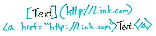
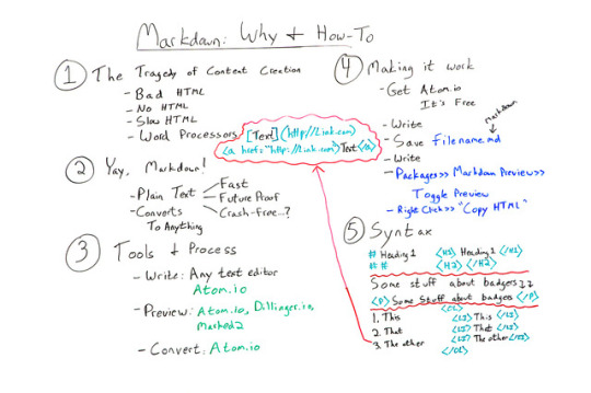
Writing with Markdown for Better Content & HTML: Why & How To - Whiteboard Friday
Posted by wrttnwrd Content creation is hard enough without adding bad HTML into the mix. Echoing his recent talk at MozCon , we’re excited to welcome Ian Lurie from Portent, Inc. on this episode of Whiteboard Friday. Learn how to cut out the cruddy code produced from writing in word processors by adopting Markup and text editors as your go-to writing solution.
Click on the whiteboard image above to open a high-resolution version in a new tab!
Video Transcription Hey, Moz fans. My name’s Ian Lurie. I am the CEO and founder of Portent Inc. I am also the Chief Content Badger there. I’m here today to talk to you about Markdown and how you can use Markdown to avoid all sorts of content and HTML tragedies.
1. The tragedy of content creation So first thing you’ve got to understand: The one great tragedy of content creation is HTML. If you’re a writer or producer or someone like that and you’re creating content, you always run into the problem of trying to get that blog post live or trying to get that page live or whatever else, and you end up with one of four possibilities.
You get bad HTML , because you’re trying to write it yourself and you don’t know how. I’m one of those people, at least I was until recently.
You have no HTML at all because you can’t do it, and there’s no one else to do it, so you end up pasting plain text directly into your word processor.
You get really slow HTML , because it takes you a long time to punch in all of those tags, or you can find a producer, but it’s going to take a long time to find that producer.
You get really bad HTML, because you write in a word processor , like Word or OpenText or something like that, and you save as HTML, which delivers something that would make any decent HTML programmer pretty much weep tears of blood because it looks so horrible. It adds all this extra stuff. It doesn’t render correctly in most browsers, so you don’t want to do that either.
So the problem is: How do you create HTML as a writer, without having it interfere with your writing process, right? You don’t want to be typing stuff in and all of a sudden you have to stop to write in tags. Without slowing things down because you don’t want to have to go back and edit all the HTML either. How do you do that?
2. Yay, markdown! Well, yay for us, there’s this thing called Markdown, and Markdown was created by a developer who runs a blog called Daring Fireball, and I will link to the Markdown Syntax Guide on that site so you can very easily look at it and see it. It is designed to be a really simple way to write in plain text and, with a few simple characters, tag it so that it will turn into really clean, really good HTML.
The great things about Markdown:
You do write in plain text , so any text editor. You can use one on your phone. You can use one on your laptop. It can be TextEdit, Notepad, anything. I’m going to name a specific text editor in a minute that I think is the best one for you to use. But it could be anything, and you can edit it in anything. It’s fully portable.
That means it’s really fast , right? Text editors don’t bog down with updates, generally. They don’t run into those kinds of problems, so they run really, really fast.
Text is future-proof . When the day comes that we’re no longer reading stuff in text and opening text files, we’ll all be communicating directly head-to-head, and we won’t worry about all this stuff anyway because you won’t need HTML. I’m getting a little bit ahead of myself, but it is future-proof, because 50 years from now you will still be able to open a plain text file.
It’s relatively crash-free . I’ve always said I’ve never had a text editor crash. It’s true. I’ve never had one, but as soon as I say that, everybody starts raising their hands and saying, “I had my text editor crash.” Maybe it’s because you’re on Windows. I don’t know. I shouldn’t say that. But it’s relatively crash-free, all right? So it’s much more stable than using a word processor.
So you’ve got all these big advantages. You’ve still got the problem of how are you going to turn it into what you want it to be?
Well, Markdown converts to just about anything . If you’re willing to go out and study the tools and learn more advanced things like Pandoc , which I’m not going to really talk about today, you can convert Markdown into Word documents. You can convert them into HTML. You can convert them into slides. I’ve turned them directly into PDFs. You can even do this really fancy typesetting with a piece of software called LaTeX . So there is nothing you can’t do with Markdown.
3. Tools & process How do you do it? Well, the first thing is you need certain tools to fit a process. Like almost any writing process, you write , you preview , and then you convert . If you do that in Microsoft Word, you use Microsoft Word to do your writing, you use Word to do your preview, and then you convert by either saving the file and giving it to someone else, or converting it to PDF or, and please don’t do this, converting it to HTML.
If you’re doing Markdown...
You do your writing in any text editor . I will strongly recommend Atom.io , and you’ll see why in a minute. And I’ll include a link in the text. But just understand Atom.io has many, many advantages. It’s really lightweight. It’s fast. It’s built to handle Markdown, so everything you need is built into it. There’s tons of advantages.
Then you preview it . Well, you can use a website called Dillinger.io . You can use a piece of software on the Mac called Marked 2 . But the best way is to just use Atom.io, because it has preview built into it.
Then you convert it to HTML , and again you can use Atom.io.
I should point out just five to seven days ago, I talked about using a tool called Sublime Text. Sublime Text is excellent for this. I hadn’t fully tested Atom.io yet. I have now, and I’m actually switching. I’ve been using Sublime Text for probably five years now. I’m very sorry Sublime folks, but I’m actually switching to Atom.io, because as a primarily Markdown writer and a very basic text writer, it’s very good for me.
4. Making it work So now it’s time to actually get to work, right? So you need to go and download Atom.io. Install it. It’s free, by the way. It costs nothing. Did I mention free? Like zero dollars.
You start writing . Usually, as soon as I start writing, I...
Save my file and then I save it a lot. And again, because it’s a text editor, saving only takes a couple seconds, so it’s much, much easier. You save it whatever you want your file name to be with a .md on the end. The .md tells Atom.io and, by the way, almost any other Markdown-literate tool out there, that this is a Markdown file so that when you open it, it will highlight your syntax correctly. I’m going to get to syntax in a minute, but it will highlight and differentiate between the markup and the actual words and sentences that you’re writing. So it’s very easy to spot that you formatted something as a heading, for example.
You do more writing . You keep saving. Always save it. They don’t crash. I’ve never had them crash, but apparently other people have.
Then you go to Packages in the menu , click Markdown Preview and you click TogglePreview . Now, you can do that at the very start, and then what you’ll have is two parallel panes where in one pane you’re doing your writing, and in the other one it’s showing you exactly how the page is going to look. Or you can just do it at the end. I do it at the end because it’s distracting. I don’t like seeing how it’s going to look at the same time.
You right-click in that preview. You click Copy HTML , and you’ll have flawless HTML. I mean flawless. It even converts little single quotes and double quotes to the correct smart quote, so double left-hand, double right-hand curly quotes, whatever.
5. Syntax Syntax is really simple. Again, I’m going to link to the syntax . I’m not going to give you the complete course on the syntax. The truth is this is 50% of what you’ll probably need right here.
But just as an example, if you want to do a level one heading, you do a single pound sign or a hash, a space, and then whatever your text is. When you convert it to HTML, it will automatically become H1, heading one, closing H1. Same thing with H2. You just do two hashes. You can imagine what you do for H3. It’s three hashes.
Paragraphs are created automatically. So if you write some text and you hit Enter or return twice, you’ll get a clean paragraph. If you want, by the way, for this to be a hard break instead, then you just do two spaces and then return, and it’ll put a BR there instead of a paragraph.
Lists become lists, and this is one of the toughest things for writers. It was always the thing that slows me down the most is lists are pretty complicated in HTML. Well, here, you just go one, two, three, just normally your text, and when you save it and convert it, it’s going to become order list, list item, list item, list item, closing order list. It’s that easy. If you want to do a bulleted list, you just use asterisks instead. It’ll do the same thing.
Links , I got really excited so I had to add this up here. Links are also really simple and in fact, again, super simplified in Markdown. What you’ve got here is you put your text in brackets, then in parentheses you put your web address. It will convert to a full link with the text as your proper link text. You can do the same thing with images. All you do is add an exclamation mark at the start.
So Markdown really lets you take your skills as a writer, focus on those skills, write really well, and convert it to equally good HTML. Then you’ve got HTML that’s ready to be pasted into WordPress or whatever other system you want, or just to be used as a separate page.
That’s it. I hope you have fun working with Markdown, and please leave any questions you have in the comments and I will get to them and answer them as quickly as I can. Thanks.
Video transcription by Speechpad.com
Sign up for The Moz Top 10 , a semimonthly mailer updating you on the top ten hottest pieces of SEO news, tips, and rad links uncovered by the Moz team. Think of it as your exclusive digest of stuff you don’t have time to hunt down but want to read!
http://bit.ly/2weijqJ
#seo #blogpower #smallbusinessmarketing #contentwriting #huntingtonbeachseo #leadgeneration #internetmarketing #linkbuilding #socialmediamarketing #newportbeachseo
#seo#blogpower#smallbusinessmarketing#contentwriting#huntingtonbeachseo#leadgeneration#internetmarketing#linkbuilding#socialmediamarketing#newportbeachseo
1 note
·
View note
Text
Elmwood (Ch 18)
New Chapter up. I tried to wait, but, here it is I could no longer keep from posting it. I guess the good thing about having an empty ask box is I can work on my bigger projects, lol. Sadly though, that means my blog is pretty empty. Hmm, I could just make more Yooran!!!!!!
Elmwood Reading List
AO3
Saeyoung bounded up the short flight of stairs to knock on Vanderwood’s door. He hoped the man would be in. He was tired of walking around eggshells in the estate and thought to ask Vanderwood if he knew anything about the first men. The door was answered by the same grey-haired boney man as before. Saeyoung reminded himself to at least ask what the man’s name was.
“I remember you!” The man said, his raspy voice grating to the ears. “Come, come. The master will be delighted to see you. He talked of nothing else for months after you left.” He grabbed Saeyoung’s wrist and pulled him in, shoving the door closed behind them. They tramped through the hallway and into the same study as before. Vanderwood sat by the window, a book in his hands, his fine clothes perfectly fit to accentuate his body. There were ruffles around his throat and at his wrists, yet, they made him look regal and not effeminate. He stood, dropping the book as soon as he saw who was being dragged in.
“Saeyoung!” he thundered towards him and engulfed him in an embrace. A very long and tight embrace. Saeyoung patted the man on the back until he was set free. He looked around him. “Are you here alone? Is Jumin back?” he asked, his hands still on his shoulders.
“Yes, and yes.” Saeyoung clarified.
“It is wonderful to see you! But why is Jumin not here?” he asked, eyebrows furrowed.
“Oh, I think he has his mind on other things.” He did not want to tell Vanderwood about V, he felt it was not his place. Jumin would eventually, he was sure.
“Well, no matter! Fitz! Bring us some tea, and cake, those little ones I like!” he ordered. The lanky man turned and shuffled out the door.
“You do not have to go to any trouble.” Saeyoung called after the man, he was not sure he would be able to even carry a loaded tray.
“Nonsense!” Vanderwood waved his concern away and led Saeyoung to the chair next to the one he had been sitting on. There was a round table between them. Vanderwood picked up the book he had dropped and lay it on the table. “Now, what brings you here? You look as if you have a question you need answered. Have you found your brother yet?”
“Oh, yes.” Saeyoung brightened at once. “He, well, so much happened, but, in the end we were able to get him out of the lich’s grip.”
“Will you be bringing him here?”
“Perhaps, if he is willing. He is no longer in her thrall, at least, we hope. But it might be a good idea if he lets you probe his mind for anything hidden within it.”
Vanderwood nodded, “I am impressed. I did not believe you would be able to sever the connection so easily.”
“It was not easy, believe me, the price was Yoosung’s life.” Saeyoung exhaled.
Vanderwood’s hands flew to his neck, “Oh, oh my goodness, not that sweet angel boy.”
“Oh, no, no no no, I am sorry, Yoosung is fine, he is alive. It, it would take too long to explain it all, but, Saeran is fine, Yoosung is fine, they are both fine. I would certainly appreciate you taking a look at my brother, but that is not why I am here now.”
Vanderwood sat back, “Well that is a relief! You must tell me the story some day!”
Saeyoung nodded, a half smile on his face.
“I was actually wondering if you had any information of the first humans?”
“The first humans?” he questioned and looked askance as if trying to remember. His finger tapped on his lip and then his eyes brightened. “Of course, come, here.” He jumped up and Saeyoung followed at his heels.
Fitz walked back in with a trolley, the tea and cake set on top. Well, that answered that question. He began to pour the steaming liquid and waited to be noticed.
“Here we go.” Vanderwood reached up and pulled two volumes out of the bookcase. They were old and leather bound. He handed one to Saeyoung, “This is the history of the first man, at least, what we know of it. Much of it is conjecture, pieced together from different writings at different times in history. This one,” he lay the book on top of the first, “is an illustrated history. What artists presume the first men looked like.” His eyes lit up as he realized something. “Of course!” he yanked the book back and placed it on the hardwood reading table in the room. He flipped through the book until he reached what he was looking for. He picked it up and turned towards Saeyoung. He looked at the illustration, then back at Saeyoung, and back again.
“What?” Saeyoung asked. Vanderwood set the book back down and let Saeyoung take a look. It was a very rough drawing and appeared to be set against something rough. On the next page was another drawing that someone later had made, extrapolating what the face would look like if it was smooth. “Who, who is he?”
“The first king of the first men. Cerulean. The first drawing is a rendition of one found on a cave wall. The second was done hundreds of years later, remind you of anyone?” the face was round with a pointed chin, the eyes were the color of amber in the sunshine, the hair was the color of fire, pure and strong. Saeyoung shook his head, how could this be? He was a bastard, not a king. How was he related to this regal and sturdy man? He had united all the clans into one kingdom, under one ruler, him. What kind of fortitude must he have had? All Saeyoung wanted to do was keep his brother and best friend safe. He was even contemplating leaving Jumin and walking away from his vendetta against Rika. But he knew that Yoosung would never let him. Yoosung would stay and fight because it was the right thing to do. And Saeran would stay with him. He sighed heavily and rubbed at his temples.
Vanderwood handed him a cup of tea and he absently took it. “You look like you have a lot on your mind, want to talk about it?” he asked, pulling out a chair for Saeyoung to sit at the table. He took the one next to it., setting his own cup and saucer down.
Saeyoung sat, the tea forgotten in his hands. He shook his head, it was too full, he just wanted things to go back to the way they were. Too much had changed. Magpie was gone, Yoosung was a god’s champion, Jumin’s brother showed up on his own, walking away from the lich, and his own brother was safe. On top of all of that, apparently, he was the descendant of the first human king.
Vanderwood placed his hand on Saeyoung’s, bringing him out of his reverie. Saeyoung sighed, closing his eyes and leaning against the back of the chair.
“Ah, I don’t know what to do.” He exclaimed.
“About?” Vanderwood sat back as well and pointedly asked.
“About all of it!” Saeyoung was once more animated. His eyes flaring, hands clenching and unclenching. “What does it even mean? The descendant of the first human king? Why would I be so important to anyone?”
“You mean the lich?” Vanderwood guessed.
“Yes! The reason she took Saeran was because I said no to her. Because, I was cocky and thought I didn’t need anyone’s help. I was ready to take care of myself and my brother. I had finally made enough money to rent a small place for us and get us at least out of the gutter. And when I said no, she took Saeran, and used him. She turned a sweet, innocent boy into a killer with no conscious. And why? To trap me. To get to me because of him.” he pointed to the artist rendering of the first king of man.
Vanderwood leaned over, his elbows on his thighs. “What does she want with you?”
“My heart. My still beating heart, only, I have to hand it over willingly.”
Vanderwood sat back up with a laugh, “That would never happen.”
“No? I thought about it. To save my brother, and Yoosung. I would have given it to her. But, that wouldn’t be enough either. She said I had to love her. I cannot imagine at any point in time that I could love a lich, but she was so sure. All I want is to run away, run away some place that she will never find me.”
“Why do you not?”
Saeyoung snorted, “You met Yoosung! He will not stop until the lich is eradicated from the world. She is pure evil, and he would not be able to live with himself if he turned away from a duty like that.”
Vanderwood shrugged his shoulders. “And what does that have to do with you? You can leave him behind as well.”
“No, never. He and I are connected now. I could no more leave his side than I could my brother’s.” Saeyoung stated gloomily.
“And if you had to choose?” Vanderwood wondered out loud.
“I wouldn’t have to, they, well, Saeran…he will follow Yoosung wherever he goes now.”
Vanderwood narrowed his eyes, “I see. When, how?”
Saeyoung waved it all away.
“Another long story?” Vanderwood concluded.
“Not particularly, but, confusing and winding, ending with Yoosung’s death…and…well…” Saeyoung sighed.
“I understand. Well, not really, but, I understand that it is not something you wish to retell. Let us move on then. If you cannot run away, then you must find a way to fight. Yes?” he clapped Saeyoung on the shoulder.
Saeyoung nodded, finally sipping some of his tea. “This is really good.” He commented.
“Of course it is! Only the finest for me.” Vanderwood laughed, Saeyoung joining in, the brevity lifting some of his own stress from his shoulders.
“I have to admit, I miss adventuring, perhaps, if you find the location of the lich, I might join your party!” Vanderwood insisted.
“Jumin would appreciate that, I am sure. And so would I.” he shook his head. “It is difficult trusting people, I feel slightly ashamed that I do not fully trust my own brother as well. I wish I could, but, my instincts tell me that I should not.”
“It is a valid feeling. Which is why you should bring him here as soon as possible, especially if he now shares a bed with your best friend. The young half-elf is powerful, but, naïve, he lets his heart lead when his head should.”
Saeyoung snorted. “Yes, but try and tell him that! Ahh, I do not know. There are times when I wish I could so easily trust those around me. But, I have learned from experience that most people only desire to use you in one form or another, for their own benefit.”
“Is that so? And how do you supposed I intend to use you?” Vanderwood asked, eyebrow cocked.
“For adventure, of course!” Saeyoung shot back. They stared at each other for a heart beat before they both broke into companionable laughter. Fritz stuck his head in shortly after, curious. The men were sitting at the large table, speaking amiably and nibbling on the sweet cakes. He popped back out with a smile. It had been years since he had seen his master so alive and animated. He hoped it would bode well and not ill.
…………………………………………………..
Saeran lay awake, Yoosung cuddled up against him, his head on his chest, his arm loose across his belly. Saeyoung had returned during dinner and regaled them with his musing on someone named Vanderwood. Jumin had seemed quite amused and promised to go see him. Saeyoung had asked Saeran if he would like to meet the man, Yoosung had pressed him as well. He acquiesced in the end but wondered what their motivation was.
Yoosung stirred and mumbled something. Saeran’s body reacted, infusing with heat and desire. Their lovemaking had been soft and gentle. Saeran had wanted to be rougher but was unsure what Yoosung was used to. He let the blonde set the pace. In the beginning, he had been annoyed at the slow progression, wanting to mount the half-elf and take what he wanted, yet, the soft touches, the gentle kisses, the lingering caresses all served to fuel his burning fire. In the end, he had had the best orgasm of his entire life. He wondered if it was always like that. The last thing he remembered was plunging his dagger into Yoosung’s chest and the triumph he had felt. The memory faded after that, the last thing remaining were Yoosung’s eyes staring at him in complete peace and acceptance.
V had needed to fill in the gaps. He told him what had happened, as much as he could before he fled with Rika. He could not tell him what had happened for the several months he had already spent with this company. Saeran had to be careful what he said and did. He would have to let them drive the conversation, sit back and just listen for the time being. Yet, the most danger came from the one that lay on his chest right now. He would be the one who had gleaned the most about Saeran, even more than his brother.
They lay naked under the sheets, not bothering to put their nightclothes back on after making love. Saeran ground his teeth at that description. Making love. But that is what they had done. He had never taken his partners feelings into consideration when he had sex, relishing any pain he might inflict on them. The more they cried out in pain, the more he enjoyed it. However, he found that he felt the same whenever Yoosung cried out in pleasure, so much so, that he continued to find ways to illicit those soft and erotic moans from the blonde. He had lost himself and worried that it was just the beginning.
He stared at the underside of the canopy surrounding their bed, trying to find an ounce of hatred for the figure atop him. He understood he did not need to hate him, but he did not want to love him either. It was an alien feeling and one he did not care for. Even Rika had not asked it of him. He was loyal and he was devoted, it was enough. What he did for his master was because he wished to stay with her. He never questioned her decisions or her orders, including the one to kill Yoosung, yet, here he was, still alive. Why? How had his life changed so much in such a short amount of time? V assured him that it was all a part of his master’s plan. Then why could he not remember the details? Why was there a gap in his memory?
He breathed in and let it out slowly. Yoosung stirred and flipped to his other side, letting go of Saeran. He felt strangely empty without the blonde’s touch. But the pushed the feeling away. Maybe now he would be able to sleep. He closed his eyes and tried to remember anything, even a small fragment of his time with this current party. He remembered nothing. He drifted into dreams where he circled Yoosung, alternating between kissing him, and stabbing him.
…………………………………………..
Saeran felt awkward in the man’s home. Vanderwood had attempted to hug him as he had the others, but one look at his face had stopped him cold. Instead he shook his hand. He now sat with Yoosung on one side of him and Saeyoung on the other. Jumin had wanted to come with them, but he had been wary of leaving V alone. He should be wary Saeran smirked.
He noticed that Vanderwood was studying him, his head cocked, legs crossed, elbow on his knee and finger tapping his lower lip.
“What?” he asked tensely.
“Nothing, I am sorry, it is just, well, twins fascinate me.” Vanderwood chuckled. Even if it had not been for the bleached color of Saeran’s hair, it would be easy to tell the twins apart. They were identical, but while Saeyoung was robust, square and wide shouldered, with a full face, Saeran was leaner, his shoulders rounded and his face thinner. He also appeared to be shorter than his twin. He wondered if it had been poor nutrition that had aided in the discrepancy between the two.
Saeran wiped his palms against his pant legs, he did not like this man. His eyes were too curious and eager to root out his secrets. Psyonicist? What the hell was a Psyonicist?
“Saeran?” Saeran tore his eyes away from the man and fixed them on Yoosung. “Are you alright?” he looked as if he was about to throw up. Yoosung hoped he would not, the carpet appeared to be very expensive.
“What? What is a Psyonicist?” he asked. Yoosung turned to Vanderwood as he laughed, easing the tension somewhat. Saeran’s face flushed, he hated feeling like an idiot.
“Not many of us around I am afraid. It is something that one must be born to, many do not even realize they have this gift. I am able to read people’s minds.” Saeran’s eyes widened and the only thing holding him to the sofa was Yoosung.
Yoosung felt the change in Saeran’s body and patted his arm to comfort him. “Not to worry Saeran, Vanderwood does not intrude on other people’s minds without permission. Is that not so?” he turned to the man.
“Of course not! That would be incredibly rude and invasive.” Vanderwood stated, shocked at the mere idea of it.
“You see? You can relax.” Yoosung soothed Saeran and his shoulders did indeed relax and he gave Yoosung a grateful smile.
Interesting, Vanderwood thought. The man was hiding something, something he did not want Yoosung to know. But what? He had been telling the truth, he would not invade Saeran’s mind without permission, but body language was easy to read, and Saeran was too tense by far. He clasped Yoosung’s hand, but his upper body pulled away from the blonde whenever he tried to close the gap. On the one hand, he showed his affection, on the other hand, there was a barrier between them that was of Saeran’s own making.
“What, what else can you do?” Saeran asked pointedly.
“Well,” Vanderwood uncrossed his legs and leaned towards the twin. “I can manipulate people, convince them to believe something that is not true. Take over their bodies for a short period of time. I can also open a portal between spots, as long as I have been to the other end at least once. I need to be able to see it in my mind’s eye in every detail.”
Saeran’s eyes widened even more. “That, that is powerful.”
“Not really.” Vanderwood sat back against his chair. “I can only do those things if someone’s mind is weak. Take Saeyoung here for instance, I could try to break into his mind, but he has learned how to close it from psionic influence, and all without even realizing that such a thing even existed.”
“Have you…?” Saeyoung began.
Vanderwood held his hands up, “I prodded! Just to test, and your mind is sealed as tight as a steel vault.” He chuckled. “So is yours.” He pointed to Yoosung. “I assume that is the influence of your god. But I am sure that even without that, it would be difficult to break through your defenses as well. You see Saeran, intelligence is important. A weak man will have a weak mind, and those minds can be easily manipulated with words alone. An intelligent mind however, needs more than mere words. I might be able to push someone along the lines of where they were already heading, but, I would never be able to make them believe something they fundamentally do NOT believe in.”
He steepled his hands. “Of course, if I truly wanted to break into someone’s mind who had good defenses, I would be able to, unfortunately, they would know right away of the intrusion, and they would be even more on their guard.” He sighed.
“So then, how do you help people?” Saeran asked.
“It depends on what they want. Some people have a memory they want erased, some want one retrieved, some want help through a traumatic experience. If I have permission, it is easier to slip into someone’s mind. It is…very unsettling however. Rummaging in someone else’s mind. Seeing them at their most vulnerable. Which is why I do not discuss my clients with anyone. I take my job very seriously.”
Saeran turned to Saeyoung and then Yoosung, “Is that why I am here? To let him root around in my mind and find any nook and cranny Rika might have laid her eggs?” his mouth was a thin white line, his eyes bristling with unshed tears.
“Saeran.” Saeyoung put his hand on his brother’s shoulder. “Even you agreed that it was possible for Rika to have a hold on you still. Maybe, maybe Vanderwood can lay that fear to rest.
Saeran stood, shaking Saeyoung’s hand off, he clenched his fists, panting, his mouth hanging open.
“Saeran.” Yoosung tried to grab his hand but Saeran pulled away. Shit! What was he supposed to do? If he let this man in his mind he would know. He would instantly know. How could he hide the fact that he was following his master’s orders? He walked to the window, laying his forehead against the cool pane. Maybe he could hide his true nature. He could lock it away in an area of his mind that Vanderwood could not access. He had learned a lot from Rika on how to compartmentalize his mind. He could stuff some random bits away for him to find, but the truth could still be hidden. But what if he found it anyway? It was a chance he had to take. If he did not, Saeyoung and Yoosung would still have doubts. He needed them to have none.
“Fine, but we do it alone. I…I do not want them to hear any of what transpires between us.” He turned and glared into Vanderwood’s eyes.
“Of course.” He bowed to Saeran slightly. “It is the way I normally work. What comes out will stay between us if that is your wish.”
Saeran nodded. Yoosung stepped up to him and wrapped his arms around the man, laying his head against his chest. “You do not have to do this.” He whispered, and he genuinely meant it. He trusted Saeran, with his very life, yet, there was that small nagging doubt. But he would take Saeran’s word for it, he would believe him and trust him. He could do nothing else.
Saeran returned the hug and kissed Yoosung’s head. “I do. Or this question will be hanging over our heads forever. I have to know.” Yoosung looked up into Saeran’s green eyes and saw the sorrow there. He pulled the other man down and kissed his lips, lingering lovingly on them.
“Saeyoung and I will be right outside, remember, you can stop it at any point. You have nothing to prove to me.” Saeran grinned at how naïve the cleric was. Could he not see? Could he not tell? Was his love so strong and pure that he was blind? He let go of him and pushed him towards the door. Saeyoung was already standing under the door frame. He gave a short nod to Saeran and a quick glance to Vanderwood then turned and walked out, Yoosung behind him. Vanderwood closed the heavy door behind them and turned back to Saeran, who still stood by the window.
“Come.” Vanderwood beckoned Saeran to a chair next to the one he had been sitting on. They both sat, Vanderwood clasping his hands in front of him. Saeran sitting on his. His legs bouncing nervously.
“There is nothing to be nervous about. This room is soundproofed, against magic as well. No one is going to hear what we say in here.” He tried to reassure the man, but he only looked more nervous. Vanderwood contemplated calling this off himself. Whatever it was that he was trying to hide, if he found it, how would he react?
“If at any time you feel you need to stop, please, let me know and I will. I will not go anywhere you wish me to stay away from. Understand?” Saeran nodded.
“Are you ready?” Vanderwood asked.
Saeran took a deep breath, held it, then let it out slowly. “Yes. What do I do?”
“Try to keep your mind open. Your instinct will be to close it, picture a house, with a large heavy door. Now, picture you opening that door and welcoming me in. Can you do that?” Vanderwood prodded.
“Yes.” Saeran closed his eyes and did as Vanderwood had requested. The home looked more like a dilapidated castle, the stones weather beaten and crumbling. But the door was solid wood with steel bindings. He stood on the inside, where it was dark, no windows at all to let in the light. He reached hesitantly for the door handle, his eyes flicking to a door down a dark hallway, tiny compared to the others, behind that in an even smaller chest he had locked away his secret. As he stared, even the small door disappeared, leaving only empty wall behind. Saeran nodded and opened the door. Vanderwood stood there, framed in the light, wearing a flowing robe of black and purple.
“May I come in?” he asked. Saeran stepped aside and gestured for him to come inside. Vanderwood stepped through and took in his surroundings. He was not sure what he had been expecting, but he should not have been surprised that Saeran’s house was in such disrepair and falling apart. The man had been through so much, being torn down and rebuild constantly. The stairs suddenly crumbled to the ground and dust flew upwards, enshrouding them in a billowing cloud.
“I…I am sorry about that.” Saeran whimpered. Vanderwood turned to see a much younger version of Saeran. His eyes were large, and the same amber as Saeyoung’s, of course his mint green eyes must have been a manifestation of something the lich had done to him. Vanderwood knelt by the child and took his hand in his.
“There is no reason to apologize. What is your name?” he asked.
“Saeran, but, we are not supposed to talk to strangers.”
“No? Well, my name is Vanderwood, there, now we are not strangers anymore.” He smiled.
“I…I guess…” Saeran’s mouth widened into a smile and he giggled. He grabbed Vanderwood’s hand and pulled on the man. “Wanna play?” he asked as he ran down a long corridor and out into a courtyard that had been similarly unkempt. It was overgrown with weeds and grass, a single tree stunted in the center. Then he saw another red head in the grass.
“Boo!” screamed a younger Saeyoung. Saeran fell back and tears sprang into his eyes. “You are such a baby Saeran!” Saeyoung turned away from his brother, his eyes rolling in exasperation. Saeran’s lip trembled and he fought hard to keep from letting the tears fall. Vanderwood helped the boy up and dusted him off. He wiped his tears away.
“You do not have to be ashamed of crying Saeran. I do it all the time too.” He soothed.
“R…really? A…a big…man like you?” he sniffled.
“Yes. Sometimes it is the only way to let out your emotions. When else do you cry?” he asked.
“When I am hungry. When mother hits me. When…” he glanced at his brother, “when I let my brother down.”
“You know he loves you right?” Vanderwood stated.
Saeran nodded and even smiled, but then his smile faded and he morphed into a slightly older child, 12, perhaps, 13? His eyes were still on his brother who was now much bigger than him, his face furious.
“Fuck Saeran! What are we going to eat now? You are such an idiot! How did I get stuck with you!” he turned and walked away, disappearing into the grass. Saeran stood, tears falling down his face.
“I…I did not mean to. I…it…it was still alive…” he sobbed.
“What was?” Vanderwood prodded.
Saeran turned to the man, eyes widening, as if he had not realized anyone was there. “The crab. The crab Saeyoung brought for us to eat. It was still alive, I, I could not…” he did not finish the sentence
“I understand, you did not wish to kill the crab?” Saeran shook his head.
“He was so mad at me, I think, I think he hates me now. I wish I could be a better brother. He is always so good to me and I am always such a disappointment.”
“I am sure that is not true Saeran. I am sure your brother does not hate you.” Saeran’s lower lip trembled, his eyes shut and he shook his head. This was an ingrained fear in the boy, in the man now. He believed himself to be inferior to his brother, a burden, so much so that Saeyoung had had no choice but to hate him.
Suddenly there was a beautiful woman standing in front of the boy. Her hair was long and flowing, the color of the sun. She smiled radiantly at him as she knelt before him. His eyes were all on her.
“I can help you Saeran. I can make it so that your brother will love you forever. I can make you stronger, and wiser, and a better partner to him. If that is your wish.” She whispered melodically. Vanderwood tried to intervene, but this had already happened, and nothing he did here would change it. he could see the desire in Saeran’s eyes as he agreed. There was a darkness that began to grow in the boy, soon enough it encompassed his entire body, the blackness roiling over and around itself inside of him, as he grew into a man. He now appeared much like he was as he sat in his chair. His eyes darkening into the minty green he now possessed. The sky grew dark as well, clouds creeping steadily above them, the shadows taking over. The darkness began to extend from Saeran as he roamed the empty halls of his mind.
Vanderwood realized that over the years, Saeran had spent a lot of time here. In his own mind, away from the rest of the world. He followed the young man as he trailed shadow across the walls and floor. They consumed him, but he was either oblivious, or uncaring.
A spark of light burst into being, then faded, yet it was enough to send Saeran in a different direction, searching for it, even while trying to extinguish it. It flared again and again then was stamped out by the blonde woman’s feet. She turned into a skeleton before his eyes and Saeran was suddenly a puddle of dark mass on the floor.
Vanderwood reached out to him but all he felt was the slimy oil of the darkness. The woman disappeared and Saeran wept, tears of blood falling through the cracks. “What just happened?” he asked hesitantly, unsure if Saeran would even answer him. he looked up at him, crimson trails falling down his hollowed-out cheeks.
“She, she wants me to kill the light.” He gasped through his tears.
“What is the light?”
Saeran shook his head vehemently.
“Who is the light?” Vanderwood knew what the answer was going to be.
“Yoosung. Yoosung is the light. He is my light, but I will extinguish it, and I will rejoice.” He smiled and threw back his head and laughed, his tears still dropping rapidly. His body arched backwards, his hands turned into claws and he sounded as if he was choking. He let out a blood curdling scream and Vanderwood clasped his ears, but he did not take his eyes off Saeran. His body was beginning to shine, the darkness, the shadow, the oily residue burning away as the light ignited every inch of him and he exploded with brightness. Vanderwood closed his eyes until it faded, he gingerly opened his eyes and saw that Saeran was again in the courtyard, his back towards him. the weeds were mostly gone, the grass not so overgrown and the tree was leafing. He walked towards the man and there was a smile on his face. A radiant smile. He glanced at Vanderwood.
“You were right. He does still love me, even after everything I did. And, someone else loves me too.” He said happily.
Vanderwood grinned and sighed in relief. Then he noticed the single spot of darkness just beneath Saeran’s left eye. It crawled across his cheek and down his nose. He watched as it made its way down his throat and disappeared under his shirt. He did not need to see where it ended up, he was sure it most likely was his heart. He looked back up into Saeran’s eyes, which were now full of anguish.
“I love him.” he said. “Even now, I love him. But…” the darkness spread across his skin, crawling upwards out of his shirt.
“Saeran.” Vanderwood cried.
In the end Saeran was not able to hide what he had become, and in a way, he was glad.
His eyes sprang open a split second before Vanderwood’s. It was enough. He yanked out his garrote and wrapped it around the other man’s throat, pulling it tight. Vanderwood struggled, he clawed at Saeran’s sleeve, trying to get to his face. It was no use. He tried to infiltrate his mind once more, but he was too strong. In the end Vanderwood died, mourning the loss of that sweet little boy, and regretting that he would not be able to warn Saeyoung or Yoosung.
Saeran let go and Vanderwood’s body fell to the floor. He used the man’s cape to wipe the blood from his garrote and his hands. Thankfully none had soiled his clothes. He looked down at the man’s open eyes. They had been full of compassion. Now they were empty. Saeran felt his heart race, it had been a long time since he’d killed anyone, not since… He let that thought end.
He picked up the man and sat him back on his chair. His head lolled a bit, but did not look too awkward, he would have to get the others out quickly. He took off his coat and set it on the sofa, then walked out, Saeyoung and Yoosung glanced into the room but Saeran closed the door quickly.
“Can we go now? I…I need to process what just happened.” He started towards the front door.
“Sure, let me just say goodbye to Vanderwood.” Saeyoung approached the door but Saeran grasped his wrist.
“No, he’s wiped, let him rest.” He eased up on Saeyoung and with only a cursory glance towards the closed door, Saeyoung agreed. Yoosung put his arm around Saeran and they all three walked out. As they headed down the street Saeran stopped.
“I forgot my coat, keep going, I will catch up.” He told them, turning and dashing back towards the house. Saeyoung and Yoosung exchanged a glance and shrugged. Both feeling a bit uneasy, what exactly had happened in that room?
Saeran walked right in, not bothering to knock. He stalked down the hallway into the kitchen where Vanderwood’s assistant stood, cleaning the evening dishes. Saeran pulled out his garrote once more and strangled the poor man. In his advanced age, it did not take long for him to give up his life. Saeran dragged the man back to Vanderwood’s room and sat him in the opposite chair, where Saeran had so recently been.
He gathered the rope he had seen behind one of the desks and set it in front of the two men. He grabbed his coat and stepped back into the night, making sure to leave the door unlocked. He would return tonight and hang them. No one would look too closely. Maybe he should make it look like a robbery? There would be questions, but hopefully the party would not need to see Vanderwood any time soon. He quickly caught up to his brother and Yoosung. A satisfied smile on his face. It somewhat comforted Saeyoung and Yoosung. Saeran seemed in a much better mood than he had been in lately.
Elmwood Reading List
AO3
#my posts#Elmwood#Yooran#Saeyoung#Saeran#Yoosung#Jaehee#Jumin#Zen#Fantasy AU#MysMe Fanstasy AU#mm fanfic#mm fantasy fanfic#ch 18#ao3#read it#leave a comment#please#lol#i live for comments
11 notes
·
View notes
Note
Masterpost of fics or at least a list of drarry classics? Thanks! :D
Wowwie Anon, you certainly put me to work with this! I hope this is what you were looking for?
I have updated my blog to include a masterlist of all these fics, and a place where I can much easier update and add as I go.
I have tried to section off everything as best I could. Where I didn’t have enough for a section, or didn’t really have a section (??) I added them to the bottom. If there are any other tropes, AUs, UAs or anything you would like added, let me know.
If some of the links don’t work, also please let me know (I put this all together at about 2am after too much coffee).
I really wanted to put in all I have read… but by the time I got to page 13 of my history on A03 I knew that was just not going to happen. There are SOOOOO many great fics out there, and I want to say a big THANK YOU to every single person who takes the time to create these wonderful pieces of art.
So I have put in what I can, and will add everything else to my masterlist.
Happy reading!
Drarry+Animals
All Life is Yours to Miss by Sara’s Girl
Words: 114k. Rating: Mature
Professor Malfoy’s world is contained, controlled, and as solitary as he can make it, but when an act of petty revenge goes horribly awry, he and his trusty six-legged friend are thrown into Hogwarts life at the deep end and must learn to live, love and let go.
Turn by Sara’s Girl
Words: 306k. Rating: Explicit
One good turn always deserves another. Apparently.
The Owl and the Pussy-Cat by Khalulu
Words: 8k. Rating: Mature
Harry, Draco, an owl, a cat, green peas, moon-cheese, an elf in a toga, a few Golden Snidgets, and some messing about in boats. Takes place 11 years after the war.
Slithering by Astolat
Words: 27k. Rating: Explicit
Draco found the nest down in the Manor’s cellars, while he was clearing them out.
8th year Drarry (Hold on to your hats, this is going to be long)
Azoth by zeitgeistic (faire_weather)
Words: 88k Rating: Explicit
Now that Harry is back at Hogwarts with Hermione for eighth year, he realises that something’s missing from his life, and it either has to do with Ron, his boggart, Snape, or Malfoy. Furthermore, what, exactly, does it mean when one’s life is defined by the desire to simultaneously impress and annoy a portrait? Harry has no idea; he’s too busy trying not to be in love with Malfoy to care.
Strangeness and Charm by FeelsForBreakfast
Words: 45k Ratings: Explicit
One November night during his eighth year at Hogwarts, Draco ends up in the forbidden forest. That’s how it starts.
or: If two boys fall in love in a magical forest, does it still make a sound?
Right Hand Red by lumosed_quill
Words: 129k Rating: Explicit
Harry felt Malfoy’s breath on his lips as they came together over the bottle, hands firmly planted on the floor as though they each needed their familiar soil, refusing to cross into enemy territory.
Except that Malfoy no longer felt like his enemy.
Malfoy felt inevitable.
Prompt:Insomina by bahnhofsblumen
Words: 1k. Rating: Not rated
Based on a tumblr prompt/post where Harry and Draco both have trouble sleeping and they walk around the school at night and slowly become friends…or more?
The Morning After The Night Before by Oakstone730
Words: 3k. Rating: Explicit
Waking up after the Hufflepuff New Year’s Eve Party is an eye-opening experience for Draco. Prompt: Walk of Shame. Eighth Year. Warnings: Slash, Explicit, Language.
In Evidence of Magical Theory by bixgirl1
Words: 43K. Rating: Explicit
In which Harry and Draco can’t fight, and so they fall in love instead.
When a hex meant for Draco accidentally catches Harry as well, the pair are forced to learn to understand each other in ways they previously might have thought impossible.
The Art of Cooking the Muggle Way by Sophie_French
Words: 24k. Rating: Explicit
Cooking. The Muggle Way. Without any Magic. Definitely Draco’s idea of hell. Unless, of course, it leads to much more interesting activities with one Harry Potter. But wait. Draco’s into girls, right?
Tug-O-Want by dysonrules
Words: 16k. Rating: Mature
Harry is back at Hogwarts minding his own business when he finds himself magically drawn to Draco Malfoy. Over and over again.
Starts With a Spin by Maxine
Words: 119K Ratings: Mature
It started with the spin of a bottle, and now Harry and Draco have gotten themselves so far into their own game there’s almost no way out again. Except to keep playing.
Light Up the Sky by FleetofShippyShips
Words: 4k Rating: Teen and up
As a house unity event, Hogwarts celebrates Guy Fawkes. Harry finds Draco while the fireworks go off over the lake.
Alive by FleetofShippyShips
Words: 3k Rating: Mature
After the war, Harry is just angry, until finally, he’s not.
He Had Time by jeni_andtheafterthought
Words: 689 Rating: General
Harry stays up late alone in the eighth year common room until one night, Malfoy joins him.
Everybody Wants Some by bottomdraco_mod, PollyWeasley
Words: 6k Rating: Explicit
Harry comes back to finish his Eighth year at Hogwarts and it seems like the summer after the war has worked miracles on him. He’s totally hot, muscular, and sexy - basically every gay boy’s (and girl’s) dream. Apparently Draco’s body agrees, and all he can think every time he sees Potter is how badly he wants some of him.
Making Malfoy Blush by FleetofShippyShips
Words: 18k Rating: Mature
Malfoy walks in on Harry in the showers after Quidditch and is surprisingly flustered. Spying the chance to embarrass him, Harry teases him at every opportunity to bring that blush back.
It’s all harmless winks and lip biting, and maybe a few heated looks; until it’s a kiss, and then another, and then Harry realises he never wants to stop.
If only Malfoy was as clear about what he wants.
9 times Harry kissed Draco and the 1 time Draco kissed Harry by LockWhoSuper
Words: 4k Rating: Teen and up
‘Harry grinned, Draco fell into his trap perfectly. Surging forwards, Harry wrapped his fingers around Draco’s tie and pulled him forwards until their lips met over their cauldron. The pressure lasted for three seconds, Harry’s eyes shut and Draco’s wide in surprise. When Harry let Draco go, he slid back into his seat slowly, eyes still wide, tie crooked and a blush painting his cheeks.’
Good to Me (And I’d Be So Good to You) by AWickedMemory (ReadyPlayerZero)
Words: 8k Rating: General
Everyone returns to Hogwarts after the war, but nothing is quite the same. Harry’s groupies are creepier than ever, Ron and Hermione are snogging all over the place, and the once-proud Draco is shuffling around like a kicked puppy. But that’s okay: Harry’s got a plan.
The Standard You Walk Past by bafflinghaze
Words: 46k Rating: Mature
On returning to Hogwarts for their Eighth Year, Headmistress McGonagall decided to room Draco Malfoy and Harry Potter together. She may have hoped for a leading example of house unity; the other students fully expected insults and fights. But nothing happened.
Then Comes a Mist and a Weeping Rain by Faith Wood (faithwood)
Words: 21k Rating: Explicit
It always rains for Draco Malfoy. Metaphorically. And literally. Ever since he had accidentally Conjured a cloud. A cloud that’s ever so cross.
Good company by Greenflares
Words: 8k Rating: Teen and up
With Hermione and Ron always together, Harry’s return to Hogwarts to complete his education isn’t exactly fun. Somehow, it’s his unlikely friendship with Malfoy that keeps him sane.
Hey, Potter by SunseticMonster
Words: 5k Rating: Mature
Harry returns to Hogwarts for his 8th year, determined not to let Malfoy get to him. But when the snarky teasing starts up again, Harry finds that returning the jibes with compliments has a far more interesting outcome.
The Lip-Lock Jinx by Cassis Luna
Words: 21k Rating: PG-13
The Lip-Lock Jinx, a jinx that renders the victim mute that can only be undone in two ways: if the caster reverses the spell on the victim, or if the victim serves the purpose of the jinx and kisses the person that they desire. It’s just Harry’s luck that he gets jinxed by Ginny Weasley and that he’s in love with Draco Malfoy.
Vanilla and Sweet Spices by FleetofShippyShips
Words: 19k Rating: Explicit
After the others leave an eighth year party, Harry still has the rum he snagged off Dean. But the only person left to drink it with is Draco Malfoy.
in between the silences by orphan_account
Words: 13k Rating: Teen and up
Harry and Draco are sent to a safe house immediately after the battle of Hogwarts, where they’re supposed to be spend three weeks together, much to their anger. Television serves as both therapy and a bonding opportunity, coffee and tea get drunk in large quantities, and they try to reconcile themselves with life after the war.
1,000 Points From Gryffindor by blithelybonny
Words: 25k Rating: Mature
The story of how Harry Potter single-handedly lost Gryffindor the House Cup while attempting to have a “normal” year at Hogwarts. Featuring Harry’s suspicious nature turned up to eleven again, a new DADA teacher who is so not here for Harry’s fame, multiple detentions, Slytherins being sneaky, Hufflepuffs being sneakier, and the mystery of Draco Malfoy’s hoodie because seriously Hermione who gave that to him and is he wearing it just to torment me? This is ridiculous!
Veritaserum by pottersslytherin
Words: 1k Rating: Not rated
Someone slips Draco Veritaserum. That wouldn’t be all too bad - if only he didn’t have Potions with Potter that day.
Temptation on the Warfront by alizarincrims0n
Words: 180k Rating: Explicit
Draco Malfoy is forced into hiding with the Golden Trio and dragged into their search for horcruxes. What ensues is a journey of redemption, unexpected friendships and an unwanted, turbulent romance with Harry Potter. Warnings for swearing, sexual content, and dark themes.
Lumos by birdsofshore
Words: 41k Rating: Explicit
Harry never expected to spend eighth year listening to Draco Malfoy wanking.
Salt on the Western Wind by Saras_Girl
Words: 60k Rating: Mature
When the war isn’t quite as over as it first appears, a guilt-ridden Harry is sent to a mysterious safe-house. Among sandwiches, insomnia, and Mills & Boon, he discovers something quite unexpected.
In the Interest of Interhouse Cooperation by firethesound
Words: 11k Rating: Explicit
Organizing a Duelling Club was supposed to be a fun extracurricular activity for Harry’s 8th year. But add in Draco Malfoy and a malfunctioning Room of Requirement, and things can’t help but get complicated.
Professor!Drarry (In where either one, or both of them are Professors at Hogwarts)
Professor Potter and his Magical Menagerie by dracogotgame
Words: 7k. Rating: Teen and up
Harry Potter descends on Hogwarts with a horde of magical beasts. Professor Malfoy is not amused.
Only For The Lucky by SunseticMonster
Words: 19k Rating: Mature
Things seem to be going well for Draco Malfoy after the war. He’s working as a professor at Hogwarts and makes the papers all the time for his charitable contribution to Muggle causes.
But when Malfoy is rushed into St Mungos hospital for a psychotic break, Healer Harry Potter realizes that Malfoy’s success is not all what it seems and sometimes luck can have more than one meaning.
More Than That by joosetta
Words: 2k Rating: Explicit
This is a story about two 52 year old men who refuse to age gracefully.
Lessons in Humility by playout
Words: 37k Rating: Explicit
After the dissolution of his marriage and a good bit of soul-searching, Harry returns to Hogwarts as the new Defense teacher. Go figure, it happens to be the same year Draco takes over the role of Potions Master. Neither man is happy about this turn of events. Will they be able to set aside their differences and learn a thing or two about trust and humility on the way? (Spoiler Alert: Yes. Very much so.)
Newts by astolat
Words: 3k Rating: Explicit
“I’m twenty-eight!” Harry said. “I’ve been an Auror for ten years! You want me to go back to Hogwarts now?”
Boom Clap (The Sound of My Heart) by femmequixotic, noeon (noe)
Words: 39k Rating: Explicit
Post-war Hogwarts has been energized by its new teaching fellows program. Where once bitter enmity divided the wizarding community, Malfoy and Potter chummily patrol hallways together whilst Granger and Zabini seek lost parts of the castle at McGonagall’s behest and Chang supervises Quidditch when not lecturing in Charms. It’s a veritable wizarding utopia and life is predictable for the first time in years. Which is, of course, when everything blows apart as the result of a drunken dare and Malfoy’s life is ruined beyond his capacity to repair it. Ever. In a million years.
Love Actually by DracoWillHearAboutThis
Words: 17k Rating: Explicit
“Harry,” she said quietly. “How long have you been teaching at Hogwarts now?”
Harry frowned, caught off-guard by the question.
“Six years, three months, and I guess about two weeks?,” he answered hesitantly.
“And how much of this time have you spent pining over our Charms professor?,” she continued, eyes flashing dangerously.
When even Minerva McGonagall wants to have a conversation about Harry’s love life, Harry realizes that it might be time to actually do something about this little crush of his. Since apparently, everyone knows, anyways.
“Everyone?!,” Harry repeated, his voice uncomfortably high-pitched in his panic.
“Everyone!”
Post Hogwarts
Silky Smooth by FleetofShippyShips
Words: 2k Rating: Teen and up
Some accidental magic has amusing and enjoyable consequences for Draco and Harry.
Another Mask Behind You by lettered
Words: 57k Rating: Explicit
Draco is a high-end prostitute who hides his identity. Harry unknowingly hires him. And then there is porn, questions about identity, domestic bliss, more porn, and truth as seen through a web of lies. (And then more porn. Seriously, if you don’t want sex scene after sex scene you probably shouldn’t read this. And please read the warnings.)
your heart’ll race, hard to sleep by watsoff
Words: 3k Rating: Explicit
Draco’s bed is cursed. Don’t ask him about it.
Draco Sodding Malfoy by Shewhxmustnxtbenamed
Words: 250k Rating: Mature
Harry finds Draco outside a pub and takes him back to his place, only to find out that Draco is in an abusive relationship. Harry invites Draco to stay until he can get back on his feet. They go to
Draco’s ex-boyfriends house, and come back with more than they bargained for.
Bound To You by agentmoppet
Words: 28k Rating: Explicit
Hag magic is capricious and unruly, and Harry and Draco are bound to stay by each other’s side until they can solve the riddle. In between long car trips, misty rain, and midnight star charts, they begin to understand each other.
Drarry Drabbles and Ficlets by FleetofShippyShips
Just all my drabbles and ficlets all in one place. Most of them were originally posted on my tumblr. Connected drabbles are also in their own series.
The ficlets belonging to the Making Malfoy Blush Series can be read independently of the Making Malfoy Blush story. Just treat as Established Relationship.
Charmed Confections by Alisanne
Words: 35k Rating: Explicit
There’s a new bakery in town, and Harry is obsessed with the luscious lemon fairy cakes. And with discovering the identity of the mystery chef.
Life Is The Flower (For Which Love Is the Honey) by bafflinghaze
Words: 15k Rating: Teen and up
The Malfoy Manor lands are lush and verdant. Bees hover over carpets of flowers, and ducks paddle in the pond. It is a place far removed from bustling London and pesky reporters; it is a place where Harry finds what—and who—he didn’t know he was missing.
Under Pressure by VivacissimoVoce
Words: 21k Rating: Mature
Harry Potter has quit magic and left the wizarding world. Draco, a top-notch Tracker, has been hired to find him and save his life.
The Way Down by lettered
Words: 65k Rating: Teen and up
Harry is overwhelmed by his own power and fame and angst, so he’s become a hermit. Draco Malfoy is tired of the melodrama.
Insane Ideas Make The Finest Aphrodisiacs by JBankai89
Words: 4k Rating: Explicit
Harry has a hard enough time getting a date on his own, and his adoptive parents’ methods for ‘helping’ him are little more than a thinly veiled excuse to embarrass him to no end.
However, one fateful night out as Harry tries to escape Sirius and Remus’s ridiculous attempts to get him laid, he runs into an old schoolmate in the lavatory…
The Park Bench by plumeria47
Words: 2k Rating: General
Over the years, the gardener has seen a lot - but when two particular men catch his eye, he can’t help but find himself intrigued.
A Cock In Hand (Is Worth Two In The Bush) by decanthrope
Words: 4k Rating: Teen and up
Draco is in his mid twenties when the stress gets to him and he goes down faster than a sinking ship. It’s completely unexpected, but then again, midlife crises do have the tendency to be unpredictable. For the Malfoys, Potter always has been an ultimate cock.
Auror!Drarry (In which one, or both are Aurors/ works or MLE)
Running on Air by eleventy7
Words: 74k Rating: Teen and up
Draco Malfoy has been missing for three years. Harry is assigned the cold case and finds himself slowly falling in love with the memories he collects.
Stop All the Clocks (This Is the Last Time I’m Leaving Without You) by firethesound
Words: 44k Rating: Explicit
Living with Draco was difficult; living without him is unbearable. But if there’s one thing Harry learned from the war, it’s that even when one life ends, the rest of the world goes right on living.
Magic Man by dracogotgame
Words: 8k Rating: Mature
Draco has been exiled to live in the Muggle World, where he’s actually doing alright as an amateur stage magician. Harry has been tasked to determine if he’s using real magic to enhance his performances.
The Boy Who Only Lived Twice by lettered
Words: 54k Rating: Explicit
Harry Potter is an Unspeakable. Draco Malfoy is the wizard who shagged him. Adventure! Intrigue! Secret identities, celebrities, spies! It’s all right here, folks.
check this hand 'cause I’m marvelous by lumosed_quill
Words: 7k Rating: Explicit
Harry’s had a crush on Malfoy for months now. But it will take a bar full of his friends, some Firewhisky, wagers made on his behalf, and Malfoy himself to get him to act on it.
Peeking behind the Curtain by calrissian18
Words: 23k Rating: Mature
Draco sees things he really, really wishes he didn’t. If only to get out of all the homework that comes with it.
Stately Homes of Wiltshire by waspabi
Words: 57k Rating: Explicit
Malfoy Manor has mould, dry rot and an infestation of unusually historical poltergeists. Harry Potter is on the case.
Lift Your Open Hand by firethesound
Words: 18k Rating: Mature
With Draco Malfoy as his assigned partner for the next six weeks of Auror training, Harry had been prepared for things to go poorly. But getting themselves accidentally bonded to each other in the first twenty minutes of their very first assignment seemed going above and beyond, even for them.
Bitter Honey, Green Night by Faith Wood (faithwood)
Words: 14k Rating: Explicit
An inn, an Auror, a criminal, a mystery.
Seeing Draco Malfoy by Khalulu
Words: 12k Rating: Explicit
It’s a few years after the war, Harry is an Auror, Ginny’s broken up with him, and Draco runs a “Magical Repairs and Reparations” service. And then there’s Ignatius – devastatingly good-looking, temperamental, and addicted to gingernut biscuits. When Harry loses his glasses in a fight and learns that they’ve landed in Draco’s hands, he’s suspicious. But soon after that, life starts looking up.
Bad Faith in Name, But Gracious in Nature by megyal
Words: 13k Rating: Mature
Wizarding children have developed a life-threatening condition caused by an old curse. The cure is to be found in the Malfoy Library; surprisingly, Malfoy is willing to help, but only if Harry helps improve his standing in the Wizarding community. (Contains a fair amount of Ted 'Teddy’ Lupin.)
All Our Secrets Laid Bare by firethesound
Words: 149k Rating: Explicit
Over the six years Draco Malfoy has been an Auror, four of his partners have turned up dead. Harry Potter is assigned as his newest partner to investigate just what is going on.
#fic rec#fic recs#drarry#drarry squad#my fic rec#masterpost#masterlist#drarry fics#auror!drarry#hogwarts eighth year#post hogwarts#Drarry and animals#Professor!Drarry#draco malfoy#harry potter#ask#anon#updated
229 notes
·
View notes
Text
Is Google's Redesign Good for Ads or Brands?
Posted by Dr-Pete
At the end of last week, Google announced a major design change for mobile search results. Minor design tests and changes happen frequently, but this roll-out included two major changes. First, the green [Ads] indicator was replaced with black, bolded text ...
Below is the new ad format in a local pack result. Note that I've removed the surrounding design elements (including rounded boxes) to focus on the elements that have changed ...
Reactions from the marketing community were swift and often sarcastic, but one reaction clearly missing was surprise. Google has been moving to make ads look more like organic results for years.
Has Google finally gone too far?
Does this latest change do too much to blend ads and organic results? If we just go back one iteration, it doesn't seem like a huge shift. The most recent version, shown below, also matched the color of the "Ad" marker to the display URL, substituting a thin rounded rectangle for the newer, bolded text ...
Compare both 2019 versions to a desktop ad from 2017 ...
The mismatched color and white-on-yellow block stand out quite a bit more than the two most recent treatments. If we go back to 2013, the evolution is much more obvious ...
For years, Google ads were displayed in a single block, clearly separate from organic results and with a distinct background color. While that color changed over the years, even this subtle background tied the ads together and separated them clearly from other result types.
What about organic results?
Unlike some previous ad redesigns, this change arrived with a redesign of organic results. Here's what an organic result for Moz's Algorithm History looked like on most mobile devices last week ...
While fonts and sizing and the surrounding UI have changed over the past couple of years, the core placement has been the same: (1) display title, (2) display URL or breadcrumb, and (3) snippet. Like the new ad format, the new organic format flips lines (1) and (2) ...
The new format also adds a small version of the site's favicon. Google seems to also be shifting toward showing the brand name, when available, versus the site's root domain, but this is another change that Google has moved gradually toward over the recent past.
When do the lines blur?
While Google isn't using the exact icon we'd prefer at Moz, the square, color-filled logo representation is clearly pretty different from Google's black "Ad" marker. Some brands aren't so lucky. Consider these two results for Adidas.com ...
The Adidas logo doesn't render well at this size, and ends up looking like a black triangle, which may be hard to distinguish from the "Ad" text at a glance. Associated Press has a similar problem ...
At this size and resolution, "AP" could arguably be mistaken for "AD". For well-known brands, this may not pose a problem (the AP logo is fairly recognizable), but it could impact click-through rates on smaller brands.
These are extreme examples, of course, but in the previous iteration (the green "Ad" text in a rounded rectangle) there was no analogous text or shape for organic results. The addition of a favicon to organic results adds an element that could mirror the "Ad" text in paid results, creating potential confusion.
Should I update my favicon?
Marketers were quick to brainstorm ideas and more than a little mischief over the weekend. That may be fun for a while, but Google has already pushed back on manipulating favicons and posted their guidelines. Long story short, manipulative, inappropriate, or constantly changing favicons are probably going to be removed.
If you don't have a favicon, Google will serve up a default. Here's an example from my personal site:
The default icon isn't terrible, but if you don't currently have a favicon, it's worth putting one together that matches your branding. Google currently recommends providing a favicon at 48X48 pixels (or a multiple of 48). There are many free tools on the web to convert standard graphics formats to a favicon (.ico) file.
I created a new favicon on Tuesday, May 28, and resubmitted the home-page to Google Search Console. The updated favicon appeared the morning of Thursday, May 30 (just under two days) ...
Anecdotally, most people are reporting favicons being updated in a day or less. My personal site has some mobile-friendly errors, which could have caused delays, but there are currently no errors or updates within GSC to tell you when to expect your favicon to appear in search results.
Is Google's future brand-first?
It's easy to get hung up on the ad changes, but by moving the brand or domain to the first line and adding a favicon, this design reflects a brand-first approach, an emphasis of brand and site over specific content. Reading between the lines of Google's announcement, this design shift makes it clearer that everything in the "card" (the search result container, essentially) belongs to a single brand. Consider the Moz blog, for example:
The wrapper makes the card a bit more apparent, but by leading with the brand, the new design makes it clearer that all of these elements — the organic result, site-links, and blog posts — are tied to a single source. Taking a brand-first approach may also be a part of Google's larger strategy to combat false information and help searchers attribute content to its source.
Of course, like all changes, we don't know how long this one will last. Like most major design shifts, we can assume that Google has been testing this one for some time, but if favicons are manipulated or abused to the point that automation can't handle the problem, they may have to change course.
For now, I'd make sure your favicon accurately reflects your brand and doesn't look too similar to the black "Ad" text. Ultimately, you want your organic listings to positively represent your brand and drive relevant clicks. While these changes are unlikely to impact rankings, I would recommend monitoring your click-through rates (CTRs) on both major organic pages and paid results. It may be some time before we fully understand the impact of these changes.
Sign up for The Moz Top 10, a semimonthly mailer updating you on the top ten hottest pieces of SEO news, tips, and rad links uncovered by the Moz team. Think of it as your exclusive digest of stuff you don't have time to hunt down but want to read!
0 notes
Text
Is Google's Redesign Good for Ads or Brands?
Posted by Dr-Pete
At the end of last week, Google announced a major design change for mobile search results. Minor design tests and changes happen frequently, but this roll-out included two major changes. First, the green [Ads] indicator was replaced with black, bolded text ...
Below is the new ad format in a local pack result. Note that I've removed the surrounding design elements (including rounded boxes) to focus on the elements that have changed ...
Reactions from the marketing community were swift and often sarcastic, but one reaction clearly missing was surprise. Google has been moving to make ads look more like organic results for years.
Has Google finally gone too far?
Does this latest change do too much to blend ads and organic results? If we just go back one iteration, it doesn't seem like a huge shift. The most recent version, shown below, also matched the color of the "Ad" marker to the display URL, substituting a thin rounded rectangle for the newer, bolded text ...
Compare both 2019 versions to a desktop ad from 2017 ...
The mismatched color and white-on-yellow block stand out quite a bit more than the two most recent treatments. If we go back to 2013, the evolution is much more obvious ...
For years, Google ads were displayed in a single block, clearly separate from organic results and with a distinct background color. While that color changed over the years, even this subtle background tied the ads together and separated them clearly from other result types.
What about organic results?
Unlike some previous ad redesigns, this change arrived with a redesign of organic results. Here's what an organic result for Moz's Algorithm History looked like on most mobile devices last week ...
While fonts and sizing and the surrounding UI have changed over the past couple of years, the core placement has been the same: (1) display title, (2) display URL or breadcrumb, and (3) snippet. Like the new ad format, the new organic format flips lines (1) and (2) ...
The new format also adds a small version of the site's favicon. Google seems to also be shifting toward showing the brand name, when available, versus the site's root domain, but this is another change that Google has moved gradually toward over the recent past.
When do the lines blur?
While Google isn't using the exact icon we'd prefer at Moz, the square, color-filled logo representation is clearly pretty different from Google's black "Ad" marker. Some brands aren't so lucky. Consider these two results for Adidas.com ...
The Adidas logo doesn't render well at this size, and ends up looking like a black triangle, which may be hard to distinguish from the "Ad" text at a glance. Associated Press has a similar problem ...
At this size and resolution, "AP" could arguably be mistaken for "AD". For well-known brands, this may not pose a problem (the AP logo is fairly recognizable), but it could impact click-through rates on smaller brands.
These are extreme examples, of course, but in the previous iteration (the green "Ad" text in a rounded rectangle) there was no analogous text or shape for organic results. The addition of a favicon to organic results adds an element that could mirror the "Ad" text in paid results, creating potential confusion.
Should I update my favicon?
Marketers were quick to brainstorm ideas and more than a little mischief over the weekend. That may be fun for a while, but Google has already pushed back on manipulating favicons and posted their guidelines. Long story short, manipulative, inappropriate, or constantly changing favicons are probably going to be removed.
If you don't have a favicon, Google will serve up a default. Here's an example from my personal site:
The default icon isn't terrible, but if you don't currently have a favicon, it's worth putting one together that matches your branding. Google currently recommends providing a favicon at 48X48 pixels (or a multiple of 48). There are many free tools on the web to convert standard graphics formats to a favicon (.ico) file.
I created a new favicon on Tuesday, May 28, and resubmitted the home-page to Google Search Console. The updated favicon appeared the morning of Thursday, May 30 (just under two days) ...
Anecdotally, most people are reporting favicons being updated in a day or less. My personal site has some mobile-friendly errors, which could have caused delays, but there are currently no errors or updates within GSC to tell you when to expect your favicon to appear in search results.
Is Google's future brand-first?
It's easy to get hung up on the ad changes, but by moving the brand or domain to the first line and adding a favicon, this design reflects a brand-first approach, an emphasis of brand and site over specific content. Reading between the lines of Google's announcement, this design shift makes it clearer that everything in the "card" (the search result container, essentially) belongs to a single brand. Consider the Moz blog, for example:
The wrapper makes the card a bit more apparent, but by leading with the brand, the new design makes it clearer that all of these elements — the organic result, site-links, and blog posts — are tied to a single source. Taking a brand-first approach may also be a part of Google's larger strategy to combat false information and help searchers attribute content to its source.
Of course, like all changes, we don't know how long this one will last. Like most major design shifts, we can assume that Google has been testing this one for some time, but if favicons are manipulated or abused to the point that automation can't handle the problem, they may have to change course.
For now, I'd make sure your favicon accurately reflects your brand and doesn't look too similar to the black "Ad" text. Ultimately, you want your organic listings to positively represent your brand and drive relevant clicks. While these changes are unlikely to impact rankings, I would recommend monitoring your click-through rates (CTRs) on both major organic pages and paid results. It may be some time before we fully understand the impact of these changes.
Sign up for The Moz Top 10, a semimonthly mailer updating you on the top ten hottest pieces of SEO news, tips, and rad links uncovered by the Moz team. Think of it as your exclusive digest of stuff you don't have time to hunt down but want to read!
#túi_giấy_epacking_việt_nam #túi_giấy_epacking #in_túi_giấy_giá_rẻ #in_túi_giấy #epackingvietnam #tuigiayepacking
0 notes
Text
Is Google's Redesign Good for Ads or Brands?
Posted by Dr-Pete
At the end of last week, Google announced a major design change for mobile search results. Minor design tests and changes happen frequently, but this roll-out included two major changes. First, the green [Ads] indicator was replaced with black, bolded text ...
Below is the new ad format in a local pack result. Note that I've removed the surrounding design elements (including rounded boxes) to focus on the elements that have changed ...
Reactions from the marketing community were swift and often sarcastic, but one reaction clearly missing was surprise. Google has been moving to make ads look more like organic results for years.
Has Google finally gone too far?
Does this latest change do too much to blend ads and organic results? If we just go back one iteration, it doesn't seem like a huge shift. The most recent version, shown below, also matched the color of the "Ad" marker to the display URL, substituting a thin rounded rectangle for the newer, bolded text ...
Compare both 2019 versions to a desktop ad from 2017 ...
The mismatched color and white-on-yellow block stand out quite a bit more than the two most recent treatments. If we go back to 2013, the evolution is much more obvious ...
For years, Google ads were displayed in a single block, clearly separate from organic results and with a distinct background color. While that color changed over the years, even this subtle background tied the ads together and separated them clearly from other result types.
What about organic results?
Unlike some previous ad redesigns, this change arrived with a redesign of organic results. Here's what an organic result for Moz's Algorithm History looked like on most mobile devices last week ...
While fonts and sizing and the surrounding UI have changed over the past couple of years, the core placement has been the same: (1) display title, (2) display URL or breadcrumb, and (3) snippet. Like the new ad format, the new organic format flips lines (1) and (2) ...
The new format also adds a small version of the site's favicon. Google seems to also be shifting toward showing the brand name, when available, versus the site's root domain, but this is another change that Google has moved gradually toward over the recent past.
When do the lines blur?
While Google isn't using the exact icon we'd prefer at Moz, the square, color-filled logo representation is clearly pretty different from Google's black "Ad" marker. Some brands aren't so lucky. Consider these two results for Adidas.com ...
The Adidas logo doesn't render well at this size, and ends up looking like a black triangle, which may be hard to distinguish from the "Ad" text at a glance. Associated Press has a similar problem ...
At this size and resolution, "AP" could arguably be mistaken for "AD". For well-known brands, this may not pose a problem (the AP logo is fairly recognizable), but it could impact click-through rates on smaller brands.
These are extreme examples, of course, but in the previous iteration (the green "Ad" text in a rounded rectangle) there was no analogous text or shape for organic results. The addition of a favicon to organic results adds an element that could mirror the "Ad" text in paid results, creating potential confusion.
Should I update my favicon?
Marketers were quick to brainstorm ideas and more than a little mischief over the weekend. That may be fun for a while, but Google has already pushed back on manipulating favicons and posted their guidelines. Long story short, manipulative, inappropriate, or constantly changing favicons are probably going to be removed.
If you don't have a favicon, Google will serve up a default. Here's an example from my personal site:
The default icon isn't terrible, but if you don't currently have a favicon, it's worth putting one together that matches your branding. Google currently recommends providing a favicon at 48X48 pixels (or a multiple of 48). There are many free tools on the web to convert standard graphics formats to a favicon (.ico) file.
I created a new favicon on Tuesday, May 28, and resubmitted the home-page to Google Search Console. The updated favicon appeared the morning of Thursday, May 30 (just under two days) ...
Anecdotally, most people are reporting favicons being updated in a day or less. My personal site has some mobile-friendly errors, which could have caused delays, but there are currently no errors or updates within GSC to tell you when to expect your favicon to appear in search results.
Is Google's future brand-first?
It's easy to get hung up on the ad changes, but by moving the brand or domain to the first line and adding a favicon, this design reflects a brand-first approach, an emphasis of brand and site over specific content. Reading between the lines of Google's announcement, this design shift makes it clearer that everything in the "card" (the search result container, essentially) belongs to a single brand. Consider the Moz blog, for example:
The wrapper makes the card a bit more apparent, but by leading with the brand, the new design makes it clearer that all of these elements — the organic result, site-links, and blog posts — are tied to a single source. Taking a brand-first approach may also be a part of Google's larger strategy to combat false information and help searchers attribute content to its source.
Of course, like all changes, we don't know how long this one will last. Like most major design shifts, we can assume that Google has been testing this one for some time, but if favicons are manipulated or abused to the point that automation can't handle the problem, they may have to change course.
For now, I'd make sure your favicon accurately reflects your brand and doesn't look too similar to the black "Ad" text. Ultimately, you want your organic listings to positively represent your brand and drive relevant clicks. While these changes are unlikely to impact rankings, I would recommend monitoring your click-through rates (CTRs) on both major organic pages and paid results. It may be some time before we fully understand the impact of these changes.
Sign up for The Moz Top 10, a semimonthly mailer updating you on the top ten hottest pieces of SEO news, tips, and rad links uncovered by the Moz team. Think of it as your exclusive digest of stuff you don't have time to hunt down but want to read!
0 notes
Last Seen Blogs

rosiemarieyn
Our Honeymoon


terpmansion
Terpmansion

iamfreeagain
Keep Shining On

airbuzz2007
ellie's page!