#actually its a really good song
Text
tell me wheeeeere is the roaaaaad i can caaaaall myy ooooown that i leeeeeft that i looooost soo looooong ago-oooo all these yeaaars i have waandered ooh whenn will i kno-ow there's a waaaaay there's a roaaaad that will leaaaad mee hoooome
#its stuck in my head#and has been since twelve#so you guys get to appreciate it too#actually its a really good song#im just. pls get out me head
0 notes
Text
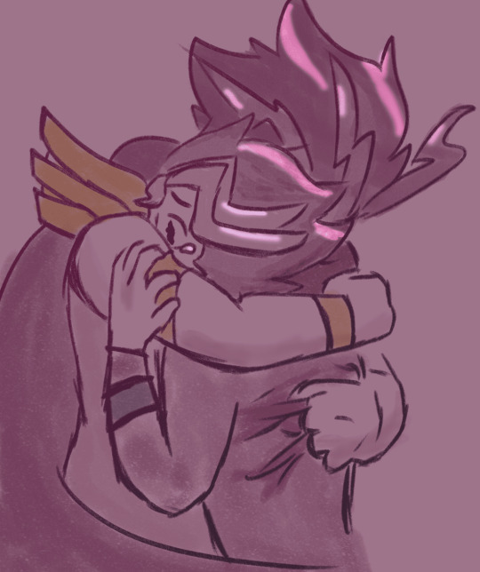
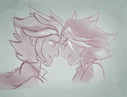
In the world I love
_
In a different world
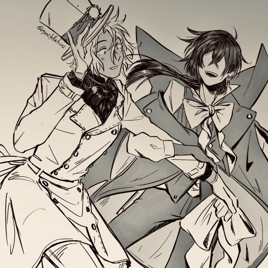
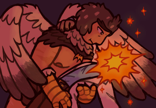
#vanitas no carte#vanoé#doomed yaoi save me...save me doomed yaoi#play on the opening song + visual sequence + the fact that vanitas could only ever be happy in an alternate universe also#+ the other fun little fact we learn about him from episode one#i have complex feelings about this anime#its pretty damn fucking good#but im a leeeeetle iffy about the way it developed the female characters.....they had potential and i was actually excited to#to see some good solid female characters even the respective romances with their l/i's felt good at the start#not jeanne obv. they fucked up a perfectly good woman and her whole dynamic with v could have gone sooo well without the reall#really forced flirting behaviour.... i liked the more serious relationship they had it made me actually not hate what they had at the start#but yknow. whatever. sorry about going off about another ship on this but im just....i love jeanne a lot. i wish they didnt do her so dirty#my girl deserves better than this asshole#you want white/black dynamics??? let her get married to domi and then we can talk#i enjoy this show and i enjoy vanoe a lot#very yuriyaoi if you ask me#my art
667 notes
·
View notes
Text

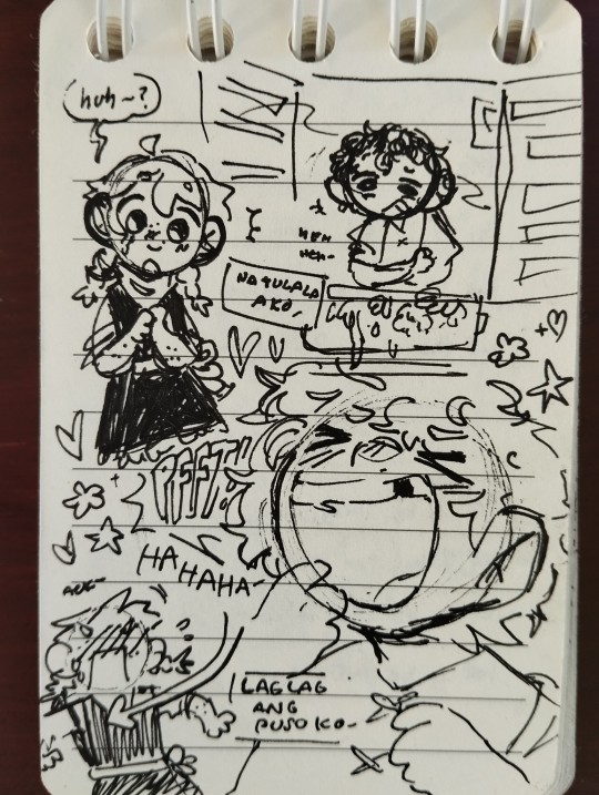
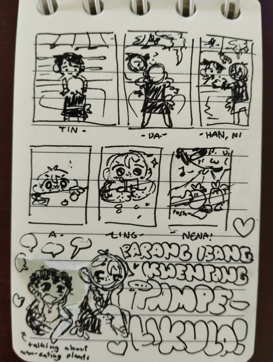
miscellaneous au doodles + a VERY self indulgent song lyric comic :D
+ extra evil comic below the cut :


"chil!" "don't look at me like that..."
#ill be honest this is all so self indulgent that its embarrassing but whatever. peace and love. i will live my truth#yes the song lyric comic is childhood friends t4t chilchuck + his wife. what of it.#yes i also put chilaios. SUE ME OKAY#anyways im really proud of that first comic i think i did the format justice#also to the fellow filipinos out there i salute to you all#if anyone who doesnt speak filipino google translates the song and talks to me about it i will uhhhhhh. kiss you <- joking#(BUT I DO ENCOURAGE TALKING TO ME ABOUT IT I WILL SCREAM)#now time for actual tags#dungeon meshi#dungeon meshi spoilers#<- technically#chilchuck#chilchuck tims#should i tag his wife? ill tag his wife#chilchuck's wife#laios touden#not gonna tag the others in the first comic cause theyre not the focus#chilaios#<- feed on angst with me. play with me in this space.#by the by im slightly dissatisfied with how i drew that evil comic i think it looks a little weird but i love the concept of it#i mean none of you have any context except for my friend whos working on this au with me but. i prommy that its good#oh yeah i should probably tag this au huh#[ tragedy au ]#<- dont worry about the name. d. dont worry about it.#PRAYING BEGGING PLEADING THAT THIS WILL POST PROPERLY THIS TIME
248 notes
·
View notes
Text
i love the stars (j'adore les etoiles)
#rick and morty#birdrick#birdperson#rick sanchez#artsbotz#I DID IT I DREW THEM YAYYYYYYYY <- normal#idk if im totallyyyy happy w the colours etc but watever im not spending any longer on it. lol#LOL sorry if this kinda doesnt make any sense. its a result of my enorrmmouss brain#i usually think abt rick more when it comes to birdrick simply bc. hes more fleshed out#butttt ive been rhinking abt bp a bit recently.#i rlly strongly associate bps feelings towards rick w stars. bcccc of a bunch of stuff#that one quote ->#how often do you suppose you might look up at the stars. and wonder what might have been had you just put your faith in rick.#anddd a couple songs. this one which is i love the stars by the orion experience#and more loosely starstruck by ummm#by sorry.#ANDDDDD the beacon. on ao3#i beleive by abed with a knife. really super good makes me pass out#umm ok i actually dont have more to say. my brain is fried#guys. dont forget to set like hourly timers when u draw. to like remind u to drink and stretch. and blink#dont be like me.
299 notes
·
View notes
Text
alright, here it is: ZENO'S COLOR GUIDE 3.0 !
here, i'll have three "chapters" regarding color:
CH1: how i color in illustrations
CH2: color and character design (in zeno's case)
CH3: how zeno makes his colors cooler
CH1: HOW I COLOR IN ILLUSTRATIONS
it must be noted that, as of lately, i heavily use halftones in my art and the way i use them for gradients effects my color choices. of course you don't need to use halftones if you don't want to, as it's just my personal choice, but anything regarding halftones here could (probably) also apply to regular gradients!
when choosing colors in an illustration, i usually have three things in mind: mood, character, and contrast. we'll be using "gloomy bunny naptime" as an example here.
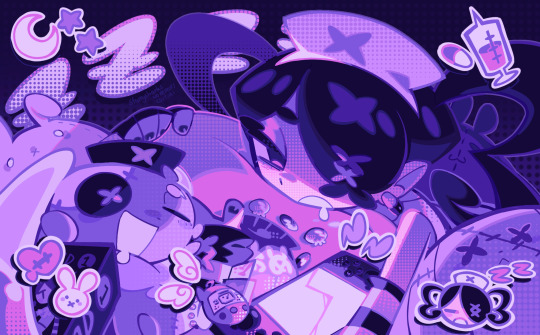
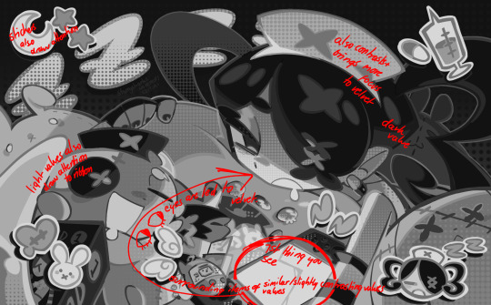
MOOD: what's the vibe of the piece? for example, here in "gloomy bunny naptime", wanted a mellow, sleepy vibe, so purples and pinks seemed like the best choice. these colors also have a dreamy effect due to being common in real-life early mornings/summer nights - basically, i tend to use associative colors in illustrations.
i usually only use a pallete of 3-7 colors, though of course more characters calls for more colors. for multi-character pieces, i would actually make a "rainbow" of colors based on the mood of the piece - essentially, a bank of colors to use for your colorful casts based on the actual rainbow. you can alter this based on the saturation levels you want! hope that makes sense. i'm not the best at this though, so i would heavily recommend looking for guides from artists who are more skilled in that department.
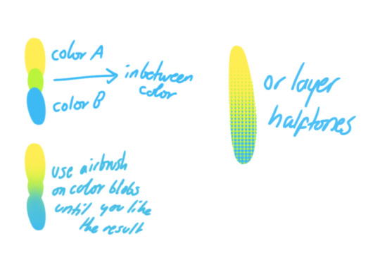
CHARACTER: velvet is the focus of the piece, and as a character her palette is made up of many purples and pinks. of course, it's easier because she and ribbon both have similar designs, but i would still recommend using colors based on/complementary to the focus character's pallete, though this is a rule that can and should be broken if needed. gradients can be used to provide a smooth transition from color-to-color and add depth to the piece, as well as showcase velvet's pallete. when making any gradient, you probably want to have a vibrant middle color. this is difficult to achieve in most art programs, so i'd do it like this:
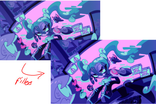
you can use gradients in lots of cool ways to make stuff pop! (i think this collage shows i use too much purple and pink though.)

CONTRAST: the context of the piece also aids the color through contrast. (that's a lot of Cs!)- we see that velvet is just waking up, and the light from her switch is glowing brightly. i wanted to convey something like her switch suddenly turning on in the middle of the night, waking her up - so the console emits "light" in the form of illuminating the contrasting color of pink against the purples. it might seem specific to this piece, but what i'm trying to say is that contrasting colors can lead the eye to the focal point of the piece, that being velvet herself. because a great deal of the rest of the piece is dark, we look at the contrasting switch screen - the brightest thing in frame - and our eyes move around and up to take in the focal point character. at least that's how i wanted it to be ;w; i guess you could convey it as something like this?
CH2: COLOR AND CHARACTER DESIGN (IN ZENO'S CASE)
this is where i start to get annoying, so stand back! when deciding on colors for a cast of characters, there are many factors: time period, variety, personality, and more that i can't think of.
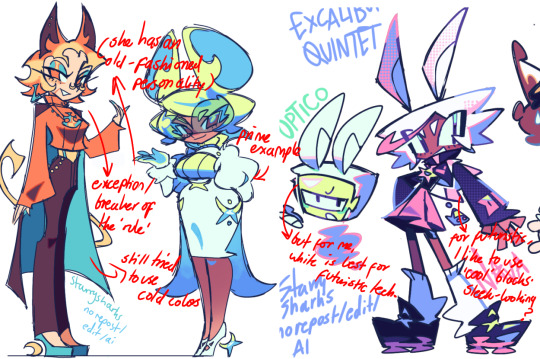
TIME PERIOD: this one is simple. for example, a futuristic time period (such as that in x-calibur) calls for colder colors, such as greens and blues. for characters involved in futuristic professions such as space exploration, this works incredibly well. for modern time periods, less focus can be on colors and more on the shapes of the clothes, but this is not a shapes tutorial! i don't have any ancient times oc stories, but i'd probably use earthy and warm tones.
VARIETY: this is also rather simple. i try to be aware of the palletes that i used, and the similarities they might have with other characters. i try to use similar colors for characters who belong to certain organisations or have a uniform, but of course, it's not like catholic school students adhere their entire look to their uniform, so this is a rule that can be broken yet again. art is all about learning things and breaking them, remember that!!!
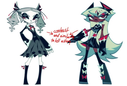
color can also be used for symbolism. my absolute fav example for this is vivica and octavia - the amount of red in their designs is supposed to represent the amount of freedom/passion/anger/confidence they have or are allowed to express under their different circumstances. as vivica belongs to a strict organisation, she has far less red in her design, showing her emotions are stifled - meanwhile octavia has it as her main complementary color because of her freedom to express her emotions, though those emotions may be destructive because of her circumstances.
PERSONALITY: what colors are associated with your character's personality? i actually usually refer to magical girl groups to see what's commonly associated with different colors. here's the main trend:
red: hot-headed, passionate, firey
orange/yellow: bright, happy-go-lucky, sunshine personality
green: wise, mellow, kind
blue: serene, graceful, elegant
purple: magical, regal, fancy
pink: usually the main character (though this because magical girl anime tends to be marketed towards young girls), sweet, relatable, determined
of course these are only stereotypes from one genre of anime, and different colors have tons of different meanings. color theory is the best way to learn this! these colors can also express different moods, which ties into ch1. i myself constantly ignore these rules - v-con, a bombastic hyper DJ, is purple (though he does have yellow accents) for example. basically, i just take them as a general rule and try to have them in mind while drawing.
CH3: HOW ZENO MAKES HIS COLORS COOLER
this might be the most important part of this guide. once again, there are a few things to consider here: filters, hue, overlays, and more!
FILTERS: for ibispaint, you can use an adjustment layer on your whole piece to use a filter. i usually only use brightness/contrast here - upping the brightness (or darkening it based on the mood of the piece) and upping the contrast. this helps to better express values and intensify the colors if that's what you want. i often use it in all my pieces to some extent.
hue/saturation/lightness is also helpful in moderation. you can alter the hue - though it usually only helps if you bring it back or forward by just a few points, or the entire pallete will change. saturation is what it sounds like, and slightly over/desaturating the piece can help with atmosphere. lightness is what it sounds like - lightens the colors in the piece. i don't use it at all.
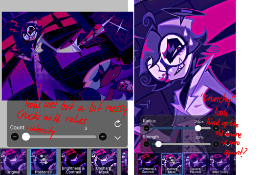
posterize and sharpen mask are some that i've used recently. posterize can add some crazy effects to your art, but i'd probably need to edit it slightly after using it because it can mess with certain colors.
HUE: it's a layer type that can change the overall hue of the piece. i usually use it at a low percentage for atmosphere. kind of like a gradient map but nothing like it? idk
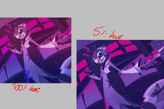
and OVERLAYS: i just use a very saturated blue/purple color over the entire piece at a very low percentage, around 5-10%. it can wash out the piece at too high a percentage.
and that's basically it! sorry it kind of derailed at the end i spent like 2 hours on this and got super tired. goodnight i'm going to sleep please also look at other artists etc etc. bye.
#zeno's art#long post#color tutorial#liar by korn is actually a really catchy song yea the lyrics are weird but its so good tbh#peak drums and bass and guitar and vocals and then the lyrics are hot booty. this is what nu metal's all about people#ask questions if you want#about nu metal or art i dont care
327 notes
·
View notes
Photo
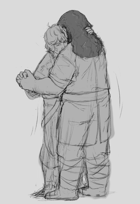
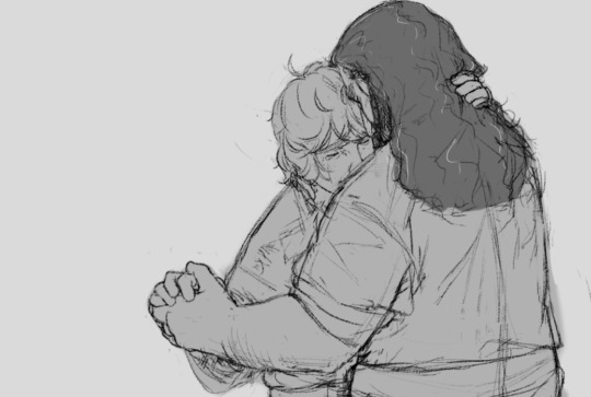
I adore you, I do, I do.
We’ll be just fine.
this song and this fic go so well together and reading it while listening to the song makes everything hurt even more O;IAERGO;IAHEO;RGIHAERO;GIAO;RGIH ITS SO GOOD
#the hobbit#bilbo baggins#Thorin Oakenshield#bagginshield#my art#(also the mv is really good too it makes me cry O;AERIGHAO;EIRG)#i had this idea months ago but i couldnt work on it cuz i was doing the collab project#BUT AS SOON AS I FINISHED I STARTED ON THIS AND I CRIED THE WHOLE TIME CUZ I HAD THIS SONG ON BLAST THE WHOLE TIME#its hard to tell too but they have wedding rings on both of their left hands--#i struggled with this actually a lot and id pick at it more BUT I NEED TO MOVE ON AND DOODLE OTHER BAGGINSHIELD THINGS#I'M STILL SUPER HAPPY WITH IT TOO SO!!!!
1K notes
·
View notes
Text
Oh how could I face the faceless days
If I should lose you now
#yugioh#ygo#yugi mutou#puzzleshipping#art#artists on tumblr#this song is so THEMcoded how come nobodys had this connection yet im going inSANE#its so tragic and thoughtful and romantic and AUGHHHH#the yearning is REAL!!!!!!!!#i have so many thoughts about the ceremonial duel and their last days together#its really particular how they manage to convey so many feelings without being able to touch each other#and its v poignant to me that sort of physicality is missing yet theyre connected in literally every other way#which makes the moments when they actually DO have that opportunity even more impactful!!#and especially so when theyre so clearly holding back#i imagine if they actually took advantage of being able to hold each other the world would implode on itself#the heat cosmos of the universe couldnt compare#also watch enchanted its a damn good movie
120 notes
·
View notes
Text
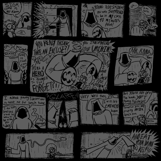
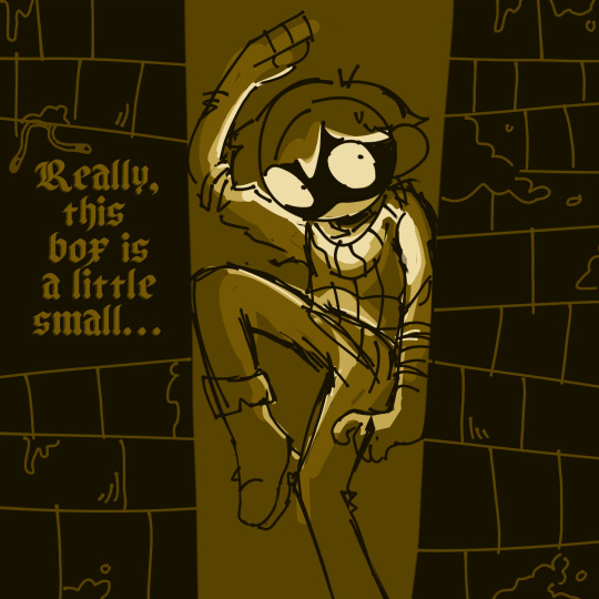
[<==PREV PAGES] [NEXT PAGE==>(not out yet.wait a year.or maybe more.imagine.]
saw alot of comments on prev pages; saying 'i HATE that mean teacher! im gonna FIGHT HIM!!' & i LOVE the energy!! it WOULD be nice. to have that catharsis. but the story of young tidestrider is Not one of catharsis. it is a story of being so small and so special and sucking so bad.
#jrwi fanart#jrwi show#jrwi riptide#gillion tidestrider#GONNA START FORMATTING MY COMICS BETTER. W THE PROPER 'PREV' 'NEXT' LINKS#REALLY DIDNT EXPECT TO CONTINUE THIS SERIES BUT AAAUUUHH MY BRRAAAIN MY BRAIN IS SO IDEASSS. I HAVE 3 OTHER PAGES SKETCHED OUT#NO PROMISES ILL FINISH EM ANY TIME SOON OR EVER. MY WHIMS ARE THEIR OWN BEAST AND I ONLY DRAW ON MY WHIMS#THAT BEING SAID IF U COMMISSIONED ME ILL GEEETT TO YOUUU IM SORRYYYY. ART IS AN EMOTIONAL RELEASE FOR ME N BABY I HAVE EMOTIONS.#ESPECIALLY ABOUT GILLION TIDESTRIDER CHAMPION OF THE UNDERSEA HERO OF THE DEEP.for the desc here i put smth that i typed up in the tags of#another thing i made. i gotta make a proper Baby Gillion tag or smth. eventually.. eventually...I LOVE DRAWIN THIS LIL BABY GUY..#i also LOVE depicting the teachers as just being so fuckin mean. ofc theres variation in that. just like in all things.like the teacher her#idk if itll be mentioned but the octo lady is named Ms Octburn.an octopus pun based off the name of an actual councilor i had#when i was in elementary school i got bullied alot but teachers never did anything. i hated adults and didnt trust them.#but this councilor o mine was so genuinely sweet. i remember spending alot of time w her. she doesnt work there anymore.#but that one school adult that actually earns ur trust and is there for you when they can be.its SO important for a child i think#i hope she knows how much she helped me.youll see in the next page that ms octburn isnt perfect either.but she tries. they all try.somehow.#ALL these comics are gonna be inspired by somesorta experience o mine in the school system. school is so fucked up u ever thing abt that#AND GILLIOOOOONNN IN THE MOST FUCKED UP LITTLE SCHOOL OF ALL. MAINTAINED BY A CULT. CENTERED AROUND HIM. OUR CHOSEN ONE#I IMAGINE ALOT BANKS ON HIS SUCCESS. THIS IS THE WORLD. THE WHOLE WORLD. THE PROPHECY IS GOING TO COME TRUE N UR TELLIN ME#THAT ITS THIS LITTLE IDIOT THATS GONNA BE SAVING US? WHAT IF HE FAILS. IF HE CANT GET THIS RIGHT THEN HE WILL FAIL AND WE WILL DIE#WE NEED TO TRAIN HIM. WE NEED HIM TO LEARN. AND TO SUCCEED. OR ELSE WE'RE DEAD. WE'RE ALL FUCKING DEAD. I IMAGINE THAT MUST BE STRESSFUL#in other news i hope ppl actually giggle when they read these. they ARE intended to be comical. dark humor or whatever. like its also sad#this is intended to be a sad comic series. but a funny one too. does that make sense? god i hope so.saw some1 say they had flashbacks-#-reading this. like YES!! THE INTENDED EFFECT!! YOU GET ME!! i love seeing ppl get upset on this lil baby boys behalf. i LOVE seeing ppl-#-wail n weep n cry in the comments. i LOOOVE seeing ppl RELATE to baby gillion. and i love letting u all know that this wont be a happycomi#gillion gets his happiness arc in the actual show. this series is one of unfortunate events. teehehehe. do u guys remember that show#i keep listening to the lil songs from A Series of Unfortunate Events for inspiration. GOOD STUFF!!#anyway uuhh uhh thats all i got in my brain. for now. feed me ur comments give me ur input i NNEEEEEDD THHEEEMMMM
133 notes
·
View notes
Text
I really dislike the "country music went bad post-9/11" theory that so many non-country listeners spout constantly tbh. it's a little true! but it really oversimplifies how the beer trucks and country girls subgenre evolved.
there's also the snap track pop sound overproduced instrumentals i love my wife and god subgenre which is even more heinous to me.
and both of those come down to a lot of weird behind the scenes stuff going on with music labels in Nashville and with Approved radio music. it's not as though the top 40 country stuff on the radio is the pinnacle of the music in the genre being put out right now.
anyway I even think there is boobs beer country girl music that can be charming and very good music to listen to and it all comes down to good lyricism and something approaching decent instrumentals. it's not wholly the content but the presentation.
#i really like hardy's lyricism and soun and its literally largely bro country#also luke combs is of the i love my wife variety but god every song of his slaps lyrically and melody wise#well luke is a little of both but how dare you come in my house and slander actual good bro country#it's also funny when someone says that there is good country out there and they name like. folk artists lol.
77 notes
·
View notes
Text

I HOLD MYSELF IN CONTEMPT
#a hat in time#ahit#the snatcher#ahit snatcher#snatcher ahit#will wood#potatart#yay finally drawing the snatcher with. colors#thermodynamic lawyer babyyyyy#sorry for drawing a goofy character to a very angry song it will happen again/j#i dont know exactly how 2 describe thermodynamic lawyer actually.... its not really edgy ? thay feels like an insult#i like this song a lot#will wood is just very loud. which is good
214 notes
·
View notes
Note
Tell me about a song you like right now, maybe an animation you just watched that made you think thoughts and feel things

Only Acting by Kero Kero Bonito!! I want to make an animatic for Macaque using this song and some parts of Shadow Play and the s4 special.. although im still mapping it and deciding whether I want to use the radio edit or not lol
#its like really really rough and mostly in my head rn bc i havent drawn lmk in a while so im a little rusty. probably need to rewatch some#eps if i want to get a good idea of what i wanna include. im also debating if i should wait until we get more context on his and wukongs#past before i do anything bc the last thing i wanna do is butcher it @_@... i was thinking of paralleling the song with the pilgrims#but because i dont actually know what HAPPENED or why mac even thinks wukong killed him thats probably gonna be important to know#but its like really cool in my head.. if u listen to the song sarahs voice uses an audio filter and there are some random glitch effects#which could be good visually for macs smoke monster and him fucking with MK in general.. spooky stuff!!!#the lyrics also speak from the pov of a performer which is what reminded me of mac in the first place so it would be fun to animate to#its in my shower playlist so when i listen to it i get really intense visualizing for what scenes i wanna do. hitting 2 birds with 1 stone#actually thats smth i do when i wanna storyboard smth.. i add it to my shower playlist bc thats where i come up with my ideas lol#but yea!!! if i ever get around to doing it id be really excited to share what i have.. i have another in mind with pigsy and MK#which is way shorter and i could probably get it done during my break... ;o)#my art#myart#ask#answered#lmk#lego monkie kid#lmk macaque#six eared macaque#liu er mihou#doodles#yapping
134 notes
·
View notes
Text
Okay I'm ready now
#its not perfect but im done workinf on it#idk. is this good? idk it was supposed to be funny but idk#and goes without saying ill have to wait a few years until im ready to listen to this song again lolll#i am having so much fun making these though. really this is the dream ive wanted to make amvs since i was like 12 but i never had the means#well actually i made one when i was like 13 but that's it. back when you could download shit off youtube for free#i downloaded so many clips of jean havoc onto my dads laptop lol. i wonder if he ever found them. it was his work laptop too tehee#farscape#farscape john#john crichton#farscape scorpius#johnscorpy? jorpy? do they even have an official name loll#suckers and fuckers?#amv#sir i protest i am not a merry man
186 notes
·
View notes
Text

WHO NEEDS GOD WHEN YOU CAN BE WORSHIPPED LIKE ONE?!
#shep arts#content smp#csmp#doctor4t#this was supposed to go up after i finished it but again i went back to sleep so uhm good morning part two here's more contentsmp#my friend said it was a crime for me to draw arathain without R4T cause i talk about them together so much#anyway lol drew this really quick so it doesnt parallel arathains properly also its just kinda wack in some places#i think they were just teasing me but i mean yeah.. I cannot shut the fuck up about them once i get started#honestly i still have no idea how to draw R4T... I think this is like the third time I've drawn him :/#scratch that actually i dont know how to draw anyone on the csmp and thats a sin I need to atone for#we'll see if i draw more lol. i keep going I should draw this and then not drawing that at all#typical neurodivergent swag moment tbh#btw the caption is roughly taken from attention seeking demon by winchifrost#i think that's the lyric but tbh rn all the stuff bouncing around my head are all just song lyrics but a bit wrong so ¯\_(ツ)_/¯
143 notes
·
View notes
Text
datasha au where everything is the same but yar sings i wont say im in love with worf/wesley/troi/riker as the backup singers
#datasha#data soong#tasha yar#star trek#im such a genius#itll be really funny because#yar really dont like to say shes in love with an android#after the naked now#she knows its not possible#but shes just so in love with him#IMAGINE WORF ACTUALLY SINGING THO?#geordi trying to be the best bro as he drags data#he drags him and tries to tell him that yar is 'in love' with him#data is just standing there confused and calculating what's the name of the song#wherein yar is singing#actually think that yar is good at singing though#in the end of the au data is just#'yes'
31 notes
·
View notes
Text
this is REALLY wonky but this has been stuck in my brain for weeks and I had to get it out
#I literally could not find any good isolated vocals anywhere but I think the song is just like that#because every other isolated track sounds fine#bugsnax#sillyposting#shitpost#its also really funny how much tweaking of the vocal track I DIDN'T have to do. these songs are weirdly similar structurally and bpm wise#volume warning#?#I could probably make this better in an actual music program I used an editing software to make this so it's not great lmao
40 notes
·
View notes
Text
make your choice
Digory didn’t think much on making choices. The whole world would be over when his mother died anyhow.
Of course, this didn’t keep him from being curious or adventurous. It was exciting to meet new people, exciting to go exploring and to speculate about whatever mischief his Uncle Andrew was up to. Being a lively young boy was perhaps the best distraction from being a boy about to lose his mother.
Going after Polly was so obviously right that it might as well not have been a choice at all. What else could he do? It was easy to be righteous in the face of an evil old magician who said things like "Ours is a high and lonely destiny."
Yet once they were there in that rich, in-between place, with all the worlds there were splayed out before them— ((Make your choice, adventurous stranger)) Well. What sort of lively young boy would he be if he turned back now?
Digory could feel the bell’s magic ((strike the bell and bide the danger)) beginning to work on him. There was no use in resisting. He felt tendrils of magic sinking deep beneath his skin, laying claim to any free will he’d ever had. He said as much to Polly, but she wasn’t listening.
Polly said ((or wonder till it drives you mad)) that he looked exactly like his uncle when he said that.
Jadis’s whole world had ended. Everyone had died, and she’d just gone to sleep. She might have stayed sleeping forever if he hadn’t woken her. Sitting outside his mother’s sickroom, Digory wondered ((what would have followed if you had)) if that was really so shocking. Hadn’t he been preparing for just such an end? Were Charn and Mabel Kirke so different?
Narnia was not an end. It was a beginning.
And face to face with the Lion, Digory was forced to admit that the bell had not been magic. Nothing had caused him to strike it. Make your choice, the writing had said. Digory had chosen.
I’ve spoiled everything. There’s no chance of getting anything for mother now.
The enormous Lion asked him, "Son of Adam, are you ready to undo the wrong that you have done?" and Digory sputtered his maybes.
"I asked, are you ready?" the Lion said again.
At that very moment, an ultimatum flashed through Digory’s mind. If I salvage your beginning, will you prevent my end? If make amends, will you save my mother? He thought of refusing, of holding his choice hostage until his future was secure. Could the Lion be bargained with? Could Digory twist his arm, as he'd twisted Polly's?
But what Digory said was, "Yes."
Jadis conjured such lovely visions of the future. His mother's face would lose its gray sheen and she would say, Why, I'm beginning to feel stronger. There would be no more morphia, no more of the terrible drawn look about her when she slept. She would rise from her sickbed, vibrant and whole ((Come in by the gold gates or not at all)) rise and walk to the door and fling it open and then Digory would go running into her arms.
He gasped as though he'd been mortally wounded. Perhaps he had been in a way. After all, had the gate not said ((take my fruit for others or forbear))?
Jadis ((for those who steal and those who climb my wall)) called Digory the Lion's slave. Years later, he would think back over all that those words implied. The Witch seemed to think that Digory had no will, if he was willing to subordinate himself to Aslan.
But was it not Aslan who made Digory realize his own culpability ((shall find their heart's desire and find despair)), and in the same breath gave him a way to repair it? Had not Aslan given his will back to him?
And at the foot of the tree, Aslan gave Digory his future back as well.
He was old, but now he is young again, watching as the stars fall headlong across the black of the world-that-was. The world is ending at last, but Digory does not fear such things any longer.
#'let's get some half-finished stuff done and posted before the Inklings Challenge' challenge#i'm not 100% satisfied with this but I quite like all the concepts. we'll see#i actually have a bunch of these type of character study things from back in the day that i'd like to keep revisiting#anyway. i have always always always been fascinated by the writing on the bell#curiosity would totally be MY fatal flaw in a fairytale/myth so i can absolutely see where Digory is coming from#like of course he has to strike the bell. of course#but the way it gets frames in relation to Choice and Will and Responsibility is just really cool#a neat counterpoint to all the stories of those overcome by curiosity whom the narrative justifies#it was your fault. you need to own that#curiosity for its own sake is not inherantly a good thing#and then of course i can't write about Digory without pulling in the dymanic with his mom's impending death#that is by far the most compelling aspect of MN it is the linchpin of the whole thing#so yeah#founded in song#the magician's nephew no longer#narnia#leah stories#pontifications and creations
118 notes
·
View notes
Last Seen Blogs

karinalover
제목 없음

wang49howe
The Journaling of Boyd 295

irresistiblyhungry
HERE YOU GET WHAT IS REALLY IN MY HEAD

isoart
ISO