#actually really happy with how the sketch looks
Text
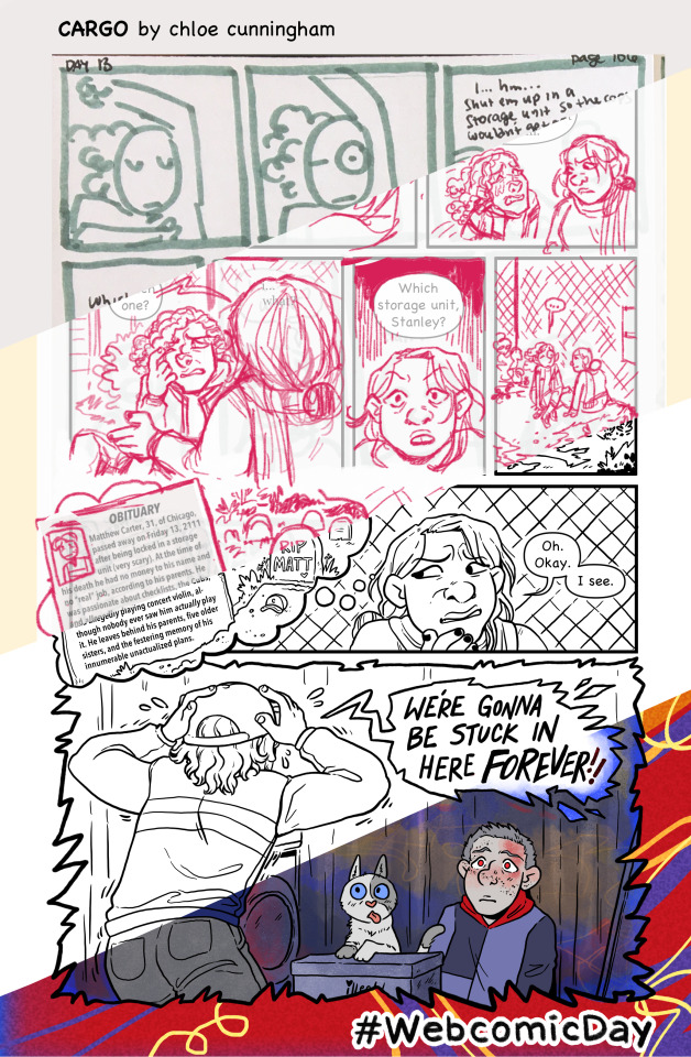
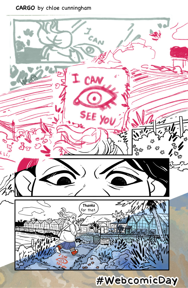
Happy #WebcomicDay!! :D
This year we're celebrating the process of making pages... so below the cut I've got a bunch of pictures sharing how I go about making pages of my evil post-apocalyptic workplace sitcom, Cargo!! :D
So! My process!!
Writing-> I think sometimes there's pressure to "write" your comic a certain way, I see people talking about script format and stuff a lot. That really doesn't work for me, though! I write my "first draft" script in short scenes on scrap paper, in whatever order they come to me. Sometimes a scene will just be one or two lines, and then a little description of what I want to happen in the rest of the scene.
Later I type the scene up, and write the "connective tissue" that fits between the disjointed scenes so they all flow together like they ought. I don't do page breaks or even character tag or action notes hahahaha I like it to be as BASIC as POSSIBLE so it's easy to edit. And since I'm the person drawing it I can almost always remember who's supposed to be saying what lmao
I edit a lot, but the most major editing is also probably the last bit... when I letter my pages usually I realize "they would never say that" and so I end up rephrasing everything. My art brain is sometimes waaaaay better at phrasing hahaha. Like you can see in the finished page for this script I rewrote like basically all of it, and actually went back to the original "sketch" script in a lot of places.
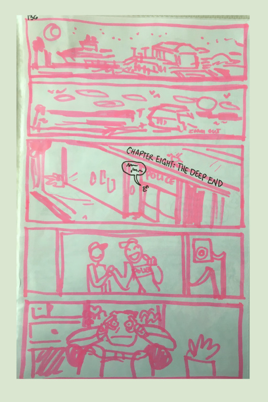
Thumbnailing-> my thumbs are really big, I draw them with markers on printer paper and keep them in a binder!! I like to thumb scenes in batches and I also usually write my dialogue on them, just so I can read through them before (and while) I draw to get a feel for how the pacing works. :)
youtube
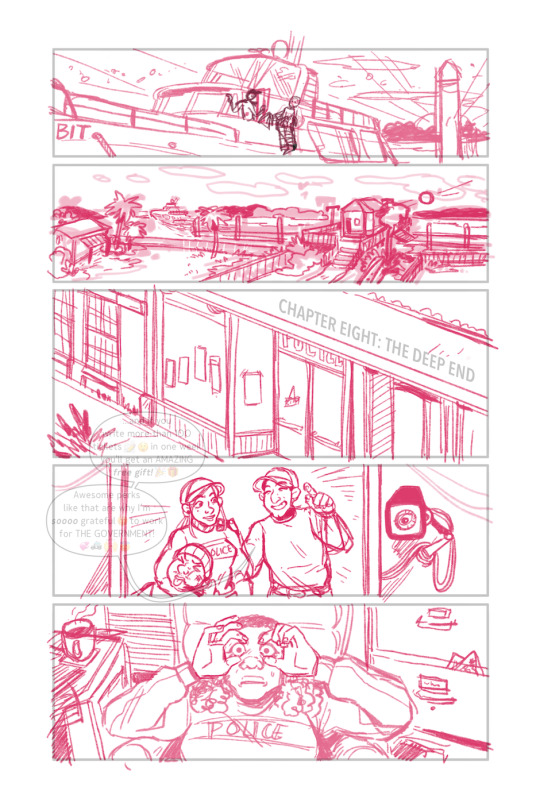
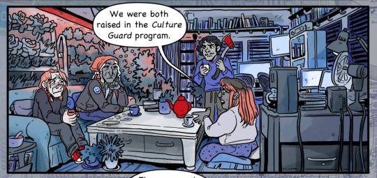
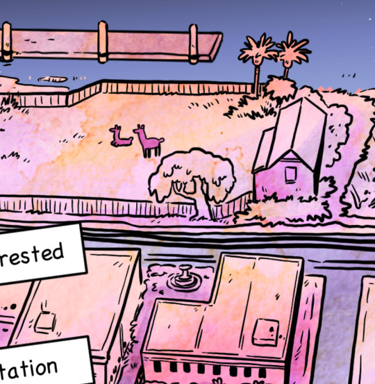
Sketching-> OH sketching is also really hard for me! I don't have a good visual imagination so it's really important for me to make sure I have good references. Last year I was especially focusing on setting.
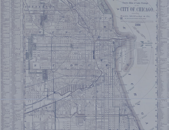
My comic is set in Florida. I'm lucky in that I used to live there and still go back to visit sometimes, so sometimes I can gather my own reference images! But more often I start on Google Maps or Zillow, trying to find buildings that have interesting features or the right kind of "look" for what I want. I'll also look up other interesting elements, my comic is set in a post-apocalypse and I'll research home gardening and things like that which people would probably have.
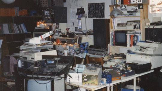
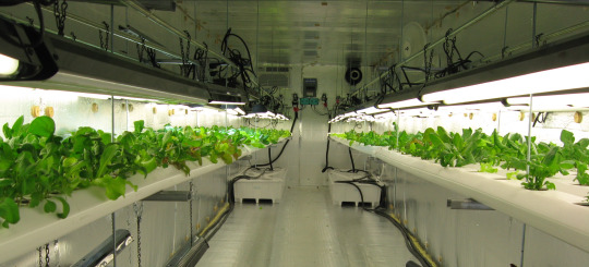
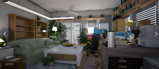
For example, in this set in chapter 7, I used Google Maps images, photo references of indoor hydroponic gardening, and like, 90's-00's hacker computer setups haha. Also my BFF Roomstyler.com, where you can make 3d house interiors haha!!
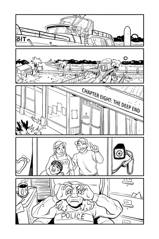
Lineart-> I LOVE lineart it is my favorite!!!! I sketch and ink two pages at a time, and it usually takes somewhere between 10-12 hours to do both steps.
I actually think my art looks best when it's just lineart... but I think my STORY is better with color, like it makes it clearer and easier to read and it has a better atmosphere HAHA.
Colors-> I think it usually takes me 4-6 hours to do 2 pages (I haven't timed myself as consistently as I time my lineart and sketching). I have a big file with small copies of my previous pages that I color drop from, and my characters are all flats only. The limited palette that I use is also really handy, it streamlines coloring a LOT.
Finishing Touches-> aka I steal mercilessly from my one true love, my internet home, the beautiful and blessed Wikimedia Commons
I put lots of overlay layers on my art! I like textures so having some strange little textures or pictures on things makes my art feel a lot more finished to me.
And finally my very most favorite ✨finishing touch✨ is the bright colored/patterned gutters that I use. Here are some of my favorites that I've made and used in the past!
And that's all!! I hope you guys have a very happy Webcomics Day and find lots and lots of wonderful new things to read!!!
36 notes
·
View notes
Text
ooughgGGHAJUIOKIJHHAHWWAAAAAWAAGRGGRRRRRGRRRGHJUEKISJUHGRYBHERBGVEBHUJSIKAOIJEUHRYGBGR
@bubbiethesaur
YOU
GRGRGRHGUJIAHRG
cries wails
this scene
was running around in my brain this morning
explodes
ok thats it
egrgyhusnjbevdrjsoiubvygf
everyone should go read long road ahead i think
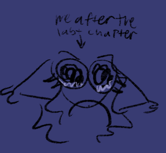
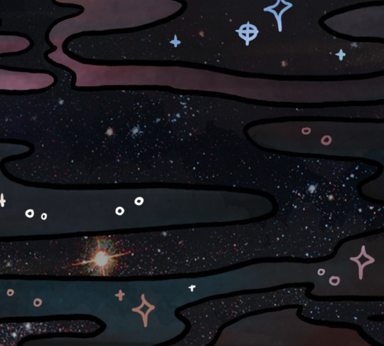
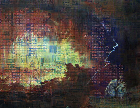
#wip#myart#long road ahead#fnaf moon#fnaf moon x reader#oOYUUGYGFGYRHJGFRGRGRRGBEHJN#idk if ill actually finish this#rhrghurijdbf#actually really happy with how the sketch looks#it looks how i wanted it to >:)#YIPPEEYIPPEE#cries#aaanyywayyy#RGYRHGVRGRRGHYEJN#idk what else to put here#expldoes#hehrbedwjiofhbvbu3qjiehugbo#id in alt text#edit: OOPS FORGOT TO ID THE LAST ONE#Its good now#yippee
292 notes
·
View notes
Text
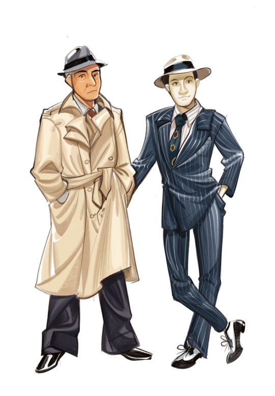
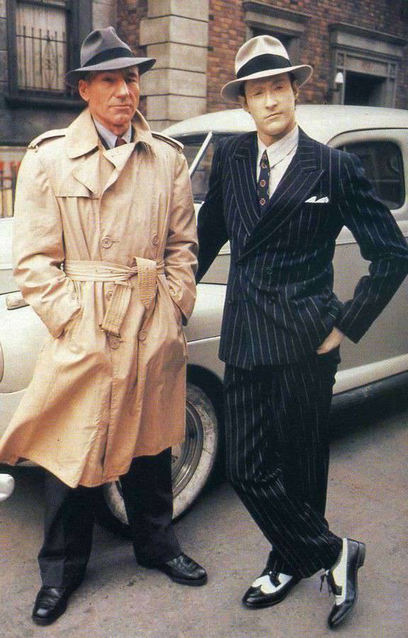
GOOD AFTERNOON!! TODAYS UNI SKETCH IS : a redraw/study/doodle/whateva you wanna call it of this very dapper image of Picard and Data!! first time drawing Picard so I struggled a lil but otherwise I had so much fun drawing Data! :Pc og pic under the cut!
picard you smoke too tough... your swag too different ...
#churro art#my art#digital art#illustration#fanart#star trek#star trek the next generation#star trek tng#jean luc picard#captain picard#picard#data soong#YKNOW FOR THE FIRST TIME DRAIWNG PICARD I ACTUALLY DONT HATE HOW HE LOOKS!!! AHAHA#granted ill prob change my mind when i draw him again and look back on this but SSHSHHS FRO NOW ITS GOOD#AGHHHH i worked on this all throughout my classes bro LOLLL#from 7 am till 2 pm these two were being sketched away at...#no not really this probably took like 2 hours elapsed time i just had a heavy day today so. thats why HSHJASHJKAS#so many homeworks... so little time to take little naps and watch silly space show...#ALSO its my second time drawing Data and even though this is just a doodle im so happy with how his face came out!!!! GRAH 😭😭😭#the best way to draw a smile that didnt look too ooc was to just mimic the rankin bass smiles#u know the ones the little :3#ANYWAYS I GTG GOODBYE MORE CLASSES AGH#gotta draw more data
940 notes
·
View notes
Text

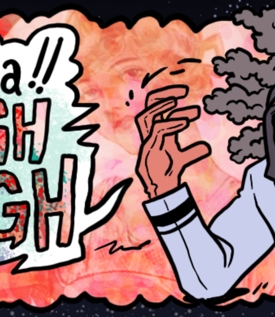
happy sonadow to all that celebrate LMAO
#sth#sonic the hedgehog#miles tails prower#tails the fox#tails is tired of watching these bastards hate flirt#should i even tag this as ship???#this is how some of my sonadow mutuals got me frfr#THIS IS A JOKE BTW#i like sonadow#I FINALLY FOUND A BRUSH THAT ACTUALLY FEELS LIKE A PENCIL im SO HAPPY YIPPE#i can sketch and not cry now sdmf;skm#dont look too hard at the colors alright?? i was trying something out and didnt really like it kalnfkl#dunkinsart
181 notes
·
View notes
Text
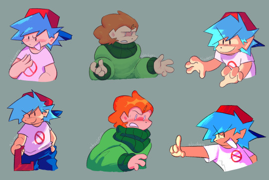
#fnf#pico fnf#pico newgrounds#bf fnf#i guess these'll work?#^|^; in terms of tagging#i had made a doodle sheet during school or at least half of one and my buddy wanted me to umm#digitize my sketches#.............asked him to pick a couple and here we are now#im? actually really! proud! of how these turned out#ive had trouble drawing these guys foreeeeeeeever#this is kinda from a couple days ago by now i think but#:^)#im happy with them. verrrrry happy#ive felt like i can actually draw things recently without um#everything looking a little off#things may be going kind of good for me in terms of drawing#:^)!!
59 notes
·
View notes
Text
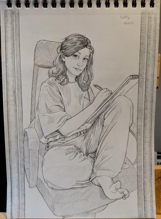
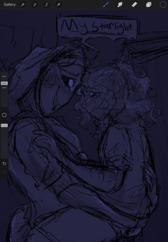
Self Portrait I drew in front of my mirror ฅ^•ﻌ•^ฅ
#art#drawing#doodle#artwork#illustration#sketch#self portrait#my art#sketchbook#sketchbook drawing#mirror drawing#pencil sketch#pencil illustration#self portrait drawing#portrait drawing#mechanical pencil#this would not be possible without my trusty 0.03mm mechanical pencil#ty graphgear#not sponsored I just enjoy the razor thin lines I get from my absurdly thin mech pencils#ew I probably sounded so gross and cheesy in this post#I swear I'm actually an emo bad bitch#Now that I posted this drawing I'm noticing all the little mistakes like the warping on my desk chair and how rushed the hair is lolololol#would you believe me if I told you that the most difficult part of this drawing aside from the arm was the sketchbook#I can easily falsify clothing folds and they don't have to be extremely accurate to still look believable#but godamn it was really hard for me to get the angle of the sketchbook and the loose paper in the back etc etc#This probably doesn't even look all that impressive to most and it may be cringe to be this happy with the result but what can you do#I doubt anyone will read these tags anyhow lolol this is just free vent space#oh and if you are reading these#thank you#also you just lost the game HAHA
21 notes
·
View notes
Text
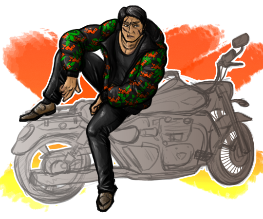
so how's everyone enjoying gaiden
#shishido kosei#like a dragon gaiden#gaiden#ryu ga gotoku#art#i can't say yet whether or not i'm enjoying it#because i'm scheduling this on the 21st of october#but i'm sure i will be... i'm sure i am? how do i say that#for as much as that motorbike demoralised me for the entire rest of the time i spent drawing this i'm pretty happy with it#i'm just out here trying to line his face and then i zoom out to look at it and realise#actually#no i don't want to line a bike#but then it locked me into this rendering style because cel shading looks like ass with that brush#BUT the design pencil feels really nice to sketch with#so here we are.#pose + the presence of the motorbike are inspired by... some movie motomiya was in...#i don't actually know the name of it. just that he was serving
32 notes
·
View notes
Text
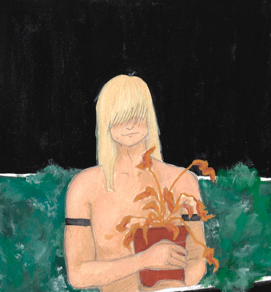
dead things
#boyfriend to death#lawrence oleander#btd lawrence#im actually kinda happy with this one despite the slightly weird composition :) i really forgot how much i love painting like this#if this looks like off or whatever my excuse is that i had a migraine when i was sketching this ¯\_(ツ)_/¯
41 notes
·
View notes
Text

jonathan sims head archivist of the magnus institute london
#IM JUST POSTING HIM RANDOMLY BECAUSE I CANNOOOOOT FOR THE LIFE OF ME DRAW ANYONE ELSE. I HAVE APHANTASIA MAN IT'S HARD OUT HERE#i just started season 3 and heard him mention the graying hair i was like hm.. what if i tried drawring some characters.#i'm actually super happy with how he looks... i had some prior inspiration bc i followed one artist who's posted fanart b4--#(which is how i first heard of the series) and so i already kinda had a picture of him in my head bc of that (i love their art sdfghgfdjh)#so i was jus sketchin and i was like.... yeah this looks ok. i wanted his hair to be kinda just pokin up every which way in front--#--because i imagine him constantly running a hand through it. otherwise it'd look nice n tidy. i just sketched til it looked good enough#the eyes were easy because i wanted sharp and tired. the color was just me testin shit out and being like oooo that looks pretty#the outfit..... i just googled some like business casual stuff LOL. i thought it looked nice#bag and flashlight because he's dungeon crawling#he's also filipino for no reason other than i said so#OHHH YEAH freckles. freckles are cute. also worm scars.#i gotta say i didn't wanna put glasses on him but i thought he looked nakey without em.. but also it might be bc i was strugglin w lineart#the glasses make him look younger i think. which is bad!! he needs to look at least 35!!!#i dunno if i have it in me to draw the others;;;;;;;;;; martin i can't figure out a color scheme for-- and tim & sasha.... waauugghhh....#it's hhhhaaardd because when i'm like reading anything i cannot *picture* characters.... i just get like..... a feeling yknow.....#again i already had some vague images for jon (and martin) bc i saw fanart before lol so that's what showed up in my head#i have a good *feeling* of what sasha should look like but i cannot for the life of me draw it....#i keep sketching and going “noo this doesn't look like her” <- i DON'T know what she looks like#i've somehow instead ended up with a sketch that really feels like melanie tho lmao#if you're somehow at the bottom of this long ramble i will send you $500.#the void given form
11 notes
·
View notes
Text
Wow, more guzma sketches! Who woulda guessed lol. I ended up drawing this to make me feel better, since this cold is pissin me off


#the second one i drew earlier this week#and i hate it#so while it looks different because my styles been changing lately and its a week older then the rest#i still decided to include it since its technically the first one of these three that was drawn#so i hope you guys like these!!#jeep.jeep#talon.scribbles#guzma#guzma pokemon#pokemon guzma#team skull guzma#skull leader guzma#pkmn guzma#pokemon#pokemon sun and pokemon moon#pkmn sun and moon#also im absolutely in love with the first one#im actually rlly proud of out it turned out#also really happy with how golisopod came out :D#even if its not a full sketch lol
52 notes
·
View notes
Text
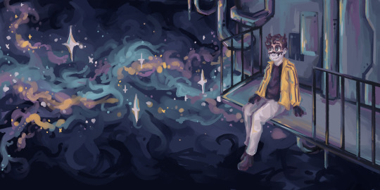
finally got around to finishing this piece!
#captain disillusion#happi's art#had this idea like. back in july-august-ish#make a rough sketch and generally liked it but i had art block so i never finished it#still been in the back of my mind so here it is!#honestly im really happy with how the colors turned out. actually looks pretty nice i think
48 notes
·
View notes
Text

alphys WIP
#alphys#undertale#im actually really happy with how she´s turning out so i´m definitely going to finish her the next few days#i think im gonna stop trying to do lineart and really just work on smoothing out my sketch lines#i just like the was my sketchy doodles look#when i try to line it looks too rigid and unnatural#sighsssss#i love her she is everything#she is awkward and imperfect and she has fucked up on such a grand scale but#sighs deeply and thinks about alphys#i need to draw undyne as well she is just *shakily exhales through nose*#bug.wip
4 notes
·
View notes
Text
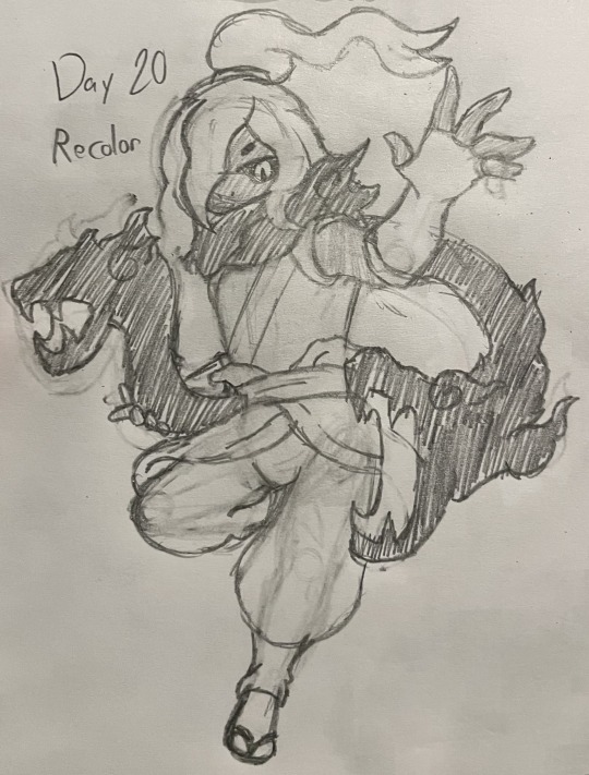
ykw 30 day 20 VEN MOMENT AYYY!! my silly boy y’all have no idea the Lore I have for this guy in my shitty au
#imagine trying to make an evil clone of one of the strongest warriors in yokai history. a killing machine to murder ur enemies#and then he’s a healer AND an empath. how do you fuck something like that up so badly#anyways I’m really happy with this one actually. I hated drawing ven’s scarf dragons but it still looks good imo#a lot of this is me trying to step out of my comfort zone and improve my style and I think this one is really nice :)#ven my friend ven :)#my art#traditional sketch#shadow venoct#yw30day
1 note
·
View note
Note
How did you learn to draw fat bodies but still keep it cartoony? I love how you draw different types of bodies and make them all seem normal instead of certain body types sticking out like a sore thumb next to others. I struggle to draw fat bodies without it looking weird with the rest of my art. Do you have a specific tutorial you followed or something?
This is a really good question! I'm glad you like my depictions of different body types, i worked really hard to get better at that so im happy folks enjoy em!! I didn't actually learn from a book or tutorial, it was mostly looking at fat bodies IRL and learning to incorporate those features onto what I already drew. As it turns out, we're all human, so if you understand the anatomy enough to draw a skinny person, you have the tools to understand the anatomy of a fat person.
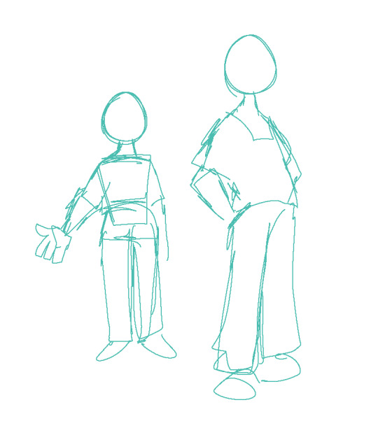
So, like, here, this is my sketch of someone with a very average build. If I were to draw a fat body, I would still use all the basic principles I use here. One mistake I think folks run into is "isolating" parts, which can lead to things like this
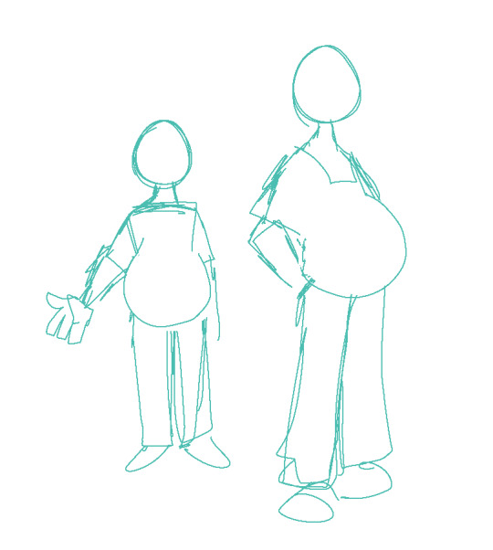
which isn't necessarily bad, but if its not what you're going for, the issue is pretty apparent. Weight affects ALL of the body, not just the stomach or the face or the limbs. If you think about how that weight affects everything in tandem then you can start drawing fat bodies that work more in your style.

for this, this is the same quick sketch using the same pose and principles as the first one. but! I allowed the weight to be distributed across the body. Notice how the legs, belly, arms, etc all got thicker? The key to drawing fat bodies and making them look like they fit is allowing that weight to affect everything. without it, it just looks like you're adding on features to someone rather than considering everything at once.
my other tip is: don't be scared! things like fat arms or chins or bellies or stretch lines are not something that's bad to depict. if you want to draw fat bodies, you gotta not be scared to draw things the way they are. someone having a fat body is not bad, and you drawing that fat body is not bad either. Experiment! To me, art is about representing ideas, and the only way to get better is to experiment with how you represent those ideas. I'm by no means an expert, and I think you can also get a ton done by looking for resources aside from me, but I hope this helps, and have fun!!
4K notes
·
View notes
Text
Today is Dungeons & Daddies’s 5th Anniversary!

I haven’t been listening for nearly that long but the podcast and all its characters means a lot to me. Happy Anniversary!!!
Throwing the cropped sections under the cut because there’s a lot of stuff going on and I know Tumblr likes to throw half the pixel quality out the window. And also so I can ramble a bit about this piece!!!
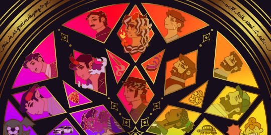
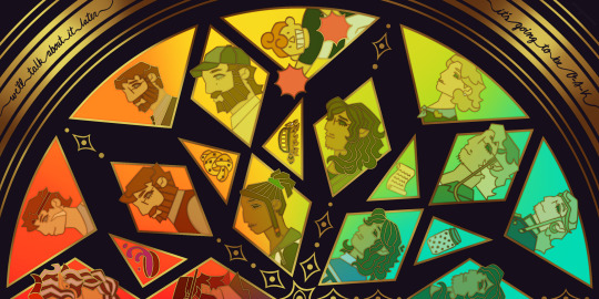
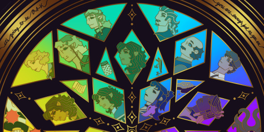
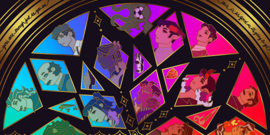
This piece has been months in the making, possibly an entire year. And by that I mean I’ve had a sketch of the comp scribbled on my whiteboard for ages because I wanted to save this specifically for 5th anni art. Now onto design stuff!
(First off a random thought: I really love how the garlic knot came out, I kind of want it as an enamel pin.)
I knew I wanted to make this a stained glass piece since the beginning, but I was also going to add flowers at one point but quickly dropped the idea. It felt like too much and I also didn’t want to fuss over flower language assignments for everyone. I was also going to add Doodler tentacles, but also dropped that idea pretty early. Kind of on accident, right at the end, I figured out how to make it even more stained glass-like but taking a duplicated lineart underneath the regular layer and turning the brightness all the way down, then setting it to overlay and adding a guassian blur. It’s very subtle but it adds that tiny bit of depth that makes it look more real. As for shading on the lineart/gold, I tried adding more highlight on the characters who died but once I evened everything out it wasn’t as noticeable anymore so I’m throwing that thought here so the attempt at least known lol.
The order of characters only changed a little bit from my original comp, I flipped the Wilsons and the Oaks so the rainbow could work. As for the anchors, specifically in season 2, I lined them up to the teens since the season 1 anchors lined up with each dad:
Tony —> Scary: his death was the beginning of Scary’s betrayal arc and also Willy killed him.
Guitar Pick —> Taylor: it’s not really aligned with Taylor at all, but the anchor was with Glenn so I put it next to his blunt.
Scroll —> Normal: was only because it was the last left to give him, but there’s the whole scene of him and Hermie in the Green Room so it still works!
Garlic Knot —> Link: one of two that he broke, but the more significant of the two with him telling Grant he never wants to see him again.
Small notes on the season 1 anchors: I put the layer of mold in the overnight oats but you can’t really tell with the overlay. And to make the supper bowl more interesting I added the fantasy sodas mix they dumped into it. The lure of actually drawn before so I just traced my own art lol.
As for the other smaller triangles, it took me a bit to figure out what I wanted to put there. I didn’t even think of adding the vehicles until two days ago but I’m so glad I did. I don’t really have my own take on the mascot version of the Doodler (yet?) so I borrowed the design from one of the stickers in their merch shop. Teeny was terrifying as just a front facing head so I made him cute again.
In the outer circles, I put what I felt was the most significant quotes for each family. I really wanted to use “It’s okay to be angry, it’s not okay to be cruel” but it was just a little too long.
That’s all I can think of! If you read all the way through, thank you for indulging me in my excitement to gush over this piece.
#dndads#dungeons and daddies#dndads fanart#dndads s1#dndads s2#dndads glenn close#darryl wilson#henry oak#ron stampler#jodie foster dndads#nick close#nicholas foster#nicky swift#grant wilson#sparrow oak#lark oak#terry jr#taylor swift dndads#lincoln li wilson#normal oak#scary marlowe#hermie unworthy#bill close#paeden bennetts#barry oak#willy stampler#meryl streep dndads#robert wilson#hildy russet#stud stampler
2K notes
·
View notes
Text
hmm
#the bin#ive felt like i havent posted much art which is the main reason i made an art only blog so i can actually see that ive posted quite a bit#i barely posted anything in 2021. only like 15 drawings but this year i posted way more. i actually went through and counted and theres#around 100 if i could each thing on a page with a bunch of drawings separately which i would consider them separate. not incliding wips#its mostly sketches and doodles but im still happy with that number. ive made far more that i havent posted but im happys i was able#to break out if my shell a but and post my art again. after i stopped using amino i just felt like my art isnt good enough to post here#amino was a much less public thing bc it was limited to that individual amino instead of the entire app. here felt was more intimidating#and idk. on amino i used to see so many other begginer artists aswell bc they had a feed of all the new posts made in that amino#but here i only ever saw more polished stuff made by more skilled artists. im quite happy with my art as it is now tbh#like. i know my art is very simple and stuff but i have gotten a handle on how i want it too look and its much better than my old stuff#im just happy that ive been able to. throughout my entire time using tumblr ive been making tons of art but i jist never posted it despite#wanting to. and it just feels nice now to call myself an artist on here bc its the most fundamental part of my person#i do intend to post most if the rest of my art from previous years aswell as the stuff from this year i didnt post bc i think its cute#anyway. ill stop talking now. its just been about a year since i really started posting my art here and im happy that i actually did it#my art doesnt really get much notes (except for that one reimu doodle for some reason) but it usually gets a few and it makes me happy#idk. its just nice. the only other experience ive had with posting my art here was a different blog and it ended horribly#got harrased a lot for drawing vent art and even just blood in art
0 notes
Last Seen Blogs