#adobe photoshop layer masking tutorials
Explore tagged Tumblr posts
Visit Tumblr Blog
Explore Tumblr blogs with no restrictions, modern design and the best experience.
Last Seen Tumblr Blogs


Fun Fact
Tumblr has a 66 index score for customer satisfaction in the US.
Note
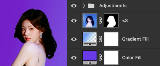
if you ever have time/feel so inclined, i would love to see a tutorial or some tips from you about how to do color isolation sets!! they are absolutely incredible and I love them so much! <3
absolutely! thank you so much 💙
here are a few examples of my color isolation sets:
the substance (yellow) || beetlejuice (red) || us (red) || conclave (blue) || sleeping beauty (cyan/blue) || crimson peak (yellow) || smosh (purple) || conclave (red)
beneath the cut, i'll walk you through my coloring process!
notes: tutorial assumes basic gifmaking knowledge & i'm using adobe photoshop 2023 (though afaik, your version shouldn't matter much)
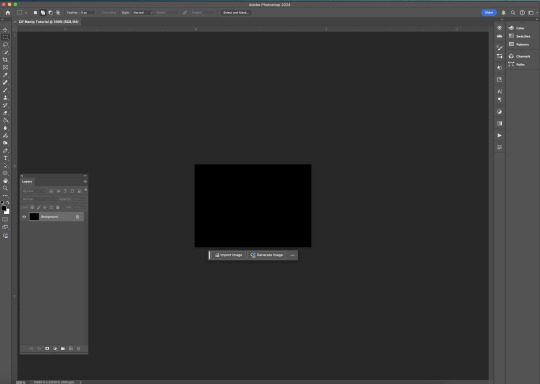
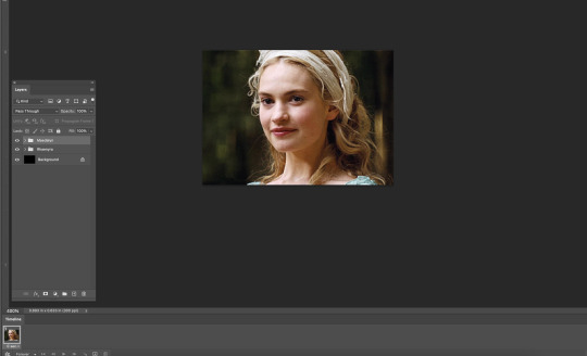
i don't color my gifs until they're sharpened and i'll give you a quick overview of my process: file -> import -> video frames to layers -> trim any extra frames -> crop to desired dimensions -> run sharpening action (i used this tutorial and just made it into an action) which also converts to timeline
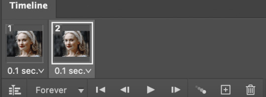
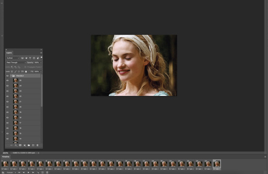
once i'm in timeline, i go through my normal coloring process. unless i'm giffing similarly colored scenes that i've already colored and saved a psd for, i usually color from scratch every time. obviously, some adjustment layers vary depending on the source material, but these are almost always my main adjustments, just with differing values
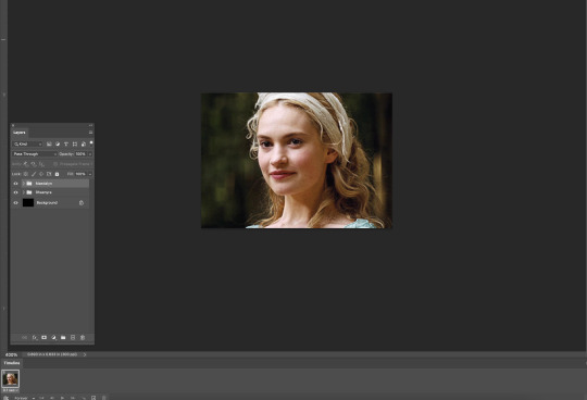
a brightness/contrast layer set to screen - this is a gamechanger for especially dark scenes. note: i do not adjust the values, i leave them both at 0 and just change the blending mode
a curves layer utilizing the black & white eyedropper tools. first, i select the black eyedropper and then click on the blackest area of the gif. i do the same with the white one, using it to select the brightest/whitest spot. this can help a lot if you're dealing with heavily tinted scenes!
a selective color layer (set to absolute, not relative) where i adjust the blacks usually anywhere from 1-5 notches higher and the neutrals either up or down the same amount depending on the scene. be careful with the neutrals when giffing poc as lightening them can result in whitewashing. if need be, i will also adjust the whites, making them slightly whiter with the black slider. selective color is by far my fave adjustment layer and i use it in every single coloring.
after this, i sometimes add a black & white gradient map adjustment layer set to soft light. i'll play around with the opacity, leaving it anywhere between 5-100% depending on the scene. i think this adds depth to your colors and adds some contrast, but i don't use it in every psd.
occasionally, i'll mess around with vibrance/saturation, and that'll be my final layer, but oftentimes i won't actually add this layer until i've finished the rest of the coloring. this is just where the layer will go.
these are the main 5 layers i almost always start every single coloring with and they act mostly as a base and to color-correct any weirdly tinted or exceptionally dark scenes.
now, let's talk about scene selection. i try to set myself up for success by choosing scenes that either already have a very noticeable pop of color or have a color i know can easily be manipulated. you'll want to pick scenes that aren't drenched with the color you want to isolate though, or you won't have the contrast of the black & white.
here are a few examples of good scenes:

the only red here is the covered bridge and it will be easy to adjust only that and not the blue, green, or yellow.

same as above, apart from ralph fiennes's face, which obviously contains red undertones. i'll go more in-depth on this in a bit, but because this scene doesn't have a lot of movement, this will be able to be fixed with layer masks.

again, here we have one bright occurrence of yellow surrounded by blue that we'll easily be able to neutralize.
and a few of bad/less than ideal scenes:

while this scene is an absolute dream for making super vibrant sets or color palettes, it's no good for color isolation. this yellow covers basically everything, leaving no other colors to cancel out.

while i definitely did try this one out, the scene is ultimately too dark and too cyan-tinted to properly isolate the red of the blood or the cyan in her eyes and on the walls.

just like the first one, this scene is fully just. color drenched. would make a great base for a vibrant or color palette set but not useful for color isolation.

bad and wrong!! coloring this movie, however beloved, was a test of my sanity. you have this yellow/green filter over everything and so much of it that isolating or changing one or the other is pretty much impossible.
with all that being said, play around! the best way to learn what does what is to try it out yourself. selective color, though there are other ways of getting the same or similar effects, will be your best friend. it's how i'm able to make sets like this & this!
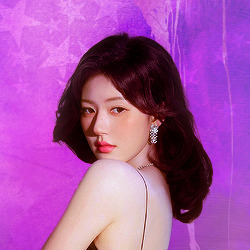
let's look at this adjustment layer using a scene from conclave:

truthfully, you could either isolate the orange of the wall or the blue of her outfit. i'm going for the latter at the moment.
add a selective color layer by clicking this button:

i like to really emphasize the color i'm going to isolate, make sure it's as consistent with the other scenes i'm using and that it pops. from the dropdown in the layer properties, i select blue.

each color from the dropdown will look like this. you have adjustable sliders for cyan, magenta, yellow, and black. the more to the right, the more you're emphasizing that color in any blues in your image. the further to the left, the more of that color's opposite you'll adjust. each opposite pairing is as follows:
cyan + red magenta + green yellow + blue black + white
if you're struggling with this (i did at first), visualize it. pull up one of those "bad" examples. say we take the yellow scene from the gorge. add a selective color layer to it and select yellow from the dropdown. play with the sliders to see how AND how much each adjustment changes the coloring. decreasing the yellow slider all the way to -100% is adding blue to anything ps identifies as yellow. because yellow and blue are opposites, it pretty much neutralizes the scene. instead, if you use the magenta slider and push it all the way to the left, you make any yellows become green. if you move the magenta slider all the way to the right, you'll add magenta to any yellows, making the scene orange. it's all about knowing the color wheel and experimenting!
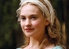
back to the conclave gif! i want to bring out the blue as much as possible, under the blue dropdown, i crank the cyan slider all the way up and bring the yellow all the way down.

is it a massive difference? no, but you can definitely see the difference between the left (with the adjustment) and the right (without).
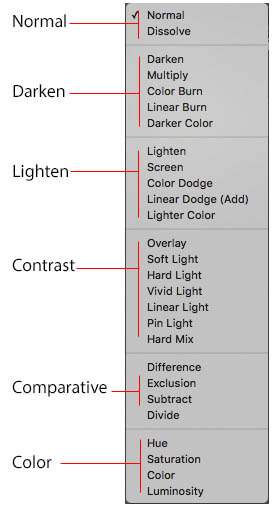
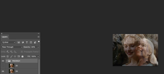
depending on the scene and color i'm working with, i'll play around with other layers from the dropdown. but i prefer to do each color in a different layer and i right-click on the box with the eye in the layers panel and change it to the applicable color. that way, it's easier to adjust something later on. you can also rename your layers, but this is quicker and easier imo.

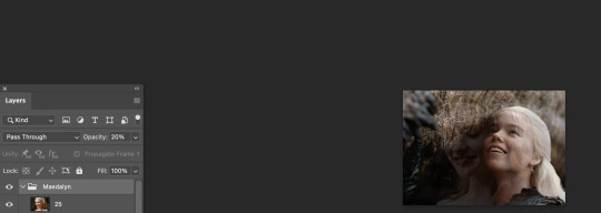
with this particular scene, this is the only adjustment i want to make to the blue for the time being. now, it's all about getting rid of any other colors. to do this, add a hue/saturation layer and select every color, one at a time, EXCEPT the color(s) you're isolating and bring the saturation all the way down to -100. in this case, it's everything but the cyans & blues.

and this is what i'm left with:

from here, you can leave it, but a lot of the time, i'll add a vibrance layer or even another blue/cyan selective color layer and crank that shit up.

this is after adding a vibrance layer (increasing both vibrance & saturation to 100) AND a selective color layer (decreasing the yellows to -100 in the blues).
i would consider this finished, but this can also be super fun to mess around with, again, using selective color:


and if the way her hair changed colors is bugging you, toggle your layers on and off until you find which one(s) changed it and add a layer mask, coloring over her hair with a soft black brush:

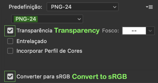
once you're happy with everything, save your gif in your preferred way. these are my save settings just for shiggles:


et voilà!
overall, the best advice i can give is to try. experiment! if you're not sure a scene will work, give it a shot. even if it doesn't, you've still learned something. i know it can seem confusing at first, especially if you're not super familiar with these layers or the color wheel, but please feel free to ask any questions. also, let me know if anyone wants another tutorial(s) where i go more in-depth on other colors. i'm happy to do it!
#answered#daynascullys#my tutorials#gif tutorial#gifmakerresource#completeresources#dailyresources#emilyblr#usercats#userholloway#tuseruta#usertina#userrobin#uservivaldi#userchibi#userbunneis#userbambie#useraljoscha#tusermira#userelio#userscourt#userishh#angelblr#heymaur#elwintersoldado#tuserhol#usermaguire#useraashna
109 notes
·
View notes
Text

HOW TO: Make an iPhone Layout + Downloadable Template
Hi! I've gotten a few messages asking for a tutorial on my iPhone gifsets — but instead of only doing a tutorial (that would probably be triple the length this one already is), I decided to turn my layout into a template with all the bits and bobs! In the "tutorial" under the cut, I'll share everything you'll need, a free template download, and quickly go over how to use this template. :)
Disclaimer: This template uses Video Timeline and this tutorial assumes you have a basic to intermediate understanding of Photoshop.

PHASE 1: THE ASSETS
1.1 – Download fonts. These are the fonts used for all assets I've included in my template: – SF Pro or SF Pro Display (Regular, Medium, Bold): Either version works, they look nearly identical. You can download directly from https://developer.apple.com/fonts/ or easily find it via Google – Bebas Neue: Free on Google Fonts, Adobe Fonts, and dafont – Times New Roman (Bold): Should be a default font in Photoshop

Make sure to download and install any of the fonts you don't already have before opening my template. That way, once you open the template file, all the settings (font size, weight, spacing, color, opacity, etc.) are as intended.
1.2 – Download my template. Before you use my template, all I ask is that you don't claim or redistribute it as your own and that you give me proper credit in the caption of your post. Making these iPhone gifsets takes me a longgg time and turning this layout into a template took several hours too.
DOWNLOAD TEMPLATE VIA KO-FI ← This template is completely free to download (just enter $0), but if you feel inclined to tip me, I appreciate you! 💖
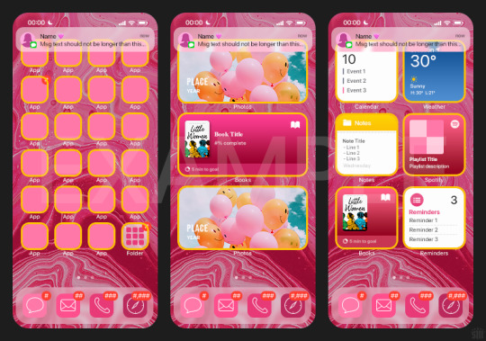
BTW this template also includes some of my frequently used icons!
NOTE: If, for some reason, you open the template and see the pop-up shown below, click "NO" — otherwise, the fonts will be all messed up:
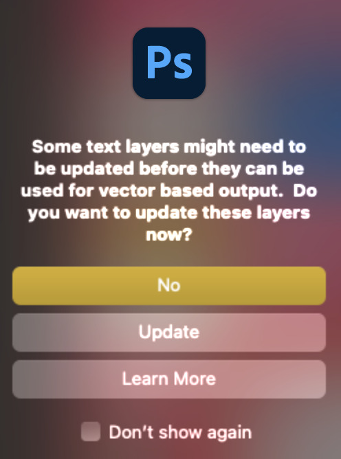
And if you see this triangle with an exclamation point by a text layer, don't double-click it — it'll mess up the font as well:

PHASE 2: THE GIFS
I'm just going to briefly go over gif sizes and my recommendations. Also, keep in mind when grabbing your scenes, you'll want all of these gifs to be the same amount of frames.
2.1 – Background Gif: 540 x 540 px. I recommend this size so you have a good amount of visibility for the gif behind the iPhone wallpaper. I also recommend making this black and white (or in my case, black and white with a slight blue tint — idk I just like the way it looks) so the wallpaper coloring can stand out.
2.2 – Wallpaper Gif: 230 (w) x 500 (h) px. Keep in mind the very narrow dimensions of the wallpaper! And also keep in mind that you'll have a bunch of apps and widgets covering the image. I try to use wide shots (or layer my clips into looking like wide shots). Also, keep in mind your color scheme for your set and your character's aesthetic! I tend to focus on one or two colors for the wallpaper.
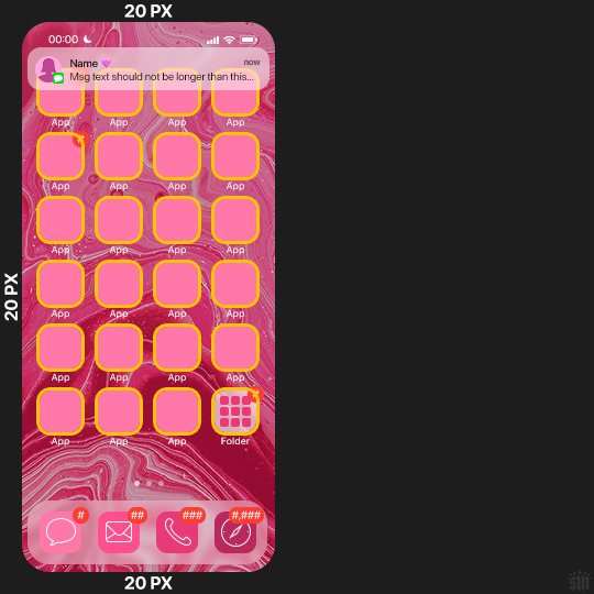
I usually position the wallpaper to the side with 20px bumpers, so there's lots of space to see the background:
2.3 – Large Photo Widget Gif: 201 (w) x 96 (h) px.
2.4 – Small Photo Widget Gif: 94 x 94 px.
PHASE 3: THE TEMPLATE – "IPHONE" FOLDER
In this section, I'll try to quickly walk you through how to use this template and some bits that may require extra instructions. I'll be going through each folder from top to bottom.
3.1 – Status Bar. Time, Service, and WiFi are pretty self-explanatory. In the Battery folder, you can use the shape tool to adjust the shape layers labeled "Fill (Adjustable Shape!)" to customize the battery level.
3.2 – Message Notification. Again, these are pretty self-explanatory. I've already masked the circle for the contact photo, so you can simply import any photo and use the transform tool to shrink it down. The circle is 24x24 px. If you don't want to use a photo, there's another folder called Default Initials.
If your message text can't fit the text box, the message should end with ellipses which is how iOS caps off long texts.
3.3 – Blurred Banner (IMPORTANT) This folder is easy to miss because there's only one placeholder layer in there. On iPhones, the area behind a banner notification and the dock get blurred (including the wallpaper and any apps).
What to do: Make a duplicate of the apps in Row 1 and/or widgets that intersect the message banner, convert them all into one smart object, apply a Gaussian Blur filter (Radius: 3.0 pixels) on the smart object, and move the smart object into this masked folder!
(There's another masked folder in the Wallpaper folder for the dock which I'll go over in that section.)
3.4 – Apps Turn off the yellow guide if you don't need it to keep things aligned and turn off layers you don't need by clicking the eye icon. Replace the "App" placeholder text with your app name, change the color or gradient of the square to compliment your color scheme, and add your custom app icon overlay!
If you can't find an app icon you need from the ones I provided, flaticon.com is a great resource. Also, if you can only find the filled version of an icon, check out this tutorial for how to make any text or shape into an outline.
Also, each app folder has 4 notification bubble options (1-4 digits). Again, you can toggle these on and off as you need!
3.5 – Big Widgets I like using these when my wallpaper has A LOT of negative space to fill. I included the Photos and Books widgets in my template, but there are lots of widgets available on iPhones. You can check some of the other ones I've done here, or if you have an iPhone, simply try adding some widgets to your phone!
There are also widgets bigger than these, but they would take up half of the phone screen which is why I don't use them for these edits.
3.6 – Small Widgets The only thing I'll say about these — because they're pretty straight forward — is there are a lot more weather themes than I included in my template. Also, if you set your character's phone to evening, the weather widget will show a dark background (sometimes with stars), so keep that in mind.
Speaking of, I've included Light Modes and Dark Modes for, I think, every applicable widget.
3.7 – Page Dots These barely perceptible dots indicate that your character has more pages of apps than shown in your gifset (so if an anon tries to come at you, you can just say "it's on the next page of apps" /j /lh)
3.8 – Dock Again, the dock has notification bubble options and I've included the default app designs, custom filled designs, and custom outlined designs for iMessage, Phone, Email, and Safari (there's also a FaceTime alternative if that's how your character rolls). These are usually the apps people keep in their Dock, but this is fully customizable too. So, if your character is, like, super obsessed with Candy Crush or something and needs it in thumb's reach — you can put it in the dock.
3.9 – Wallpaper This whole folder is masked already to a 230x500 px rounded rectangle.
Inside, you'll find another "Blurred Portion" folder for the area behind the message banner notification and the dock.
What to do: Duplicate your gif layer and place it in this folder, remove any sharpening filters, and apply a Gaussian Blur filter (Radius: 3.0 px). Be sure to add any coloring/adjustment layers ABOVE this folder and your original sharpened gif layer.
PHASE 4: EXPORT
We made it!
I hope this template makes it super easy for you to recreate this layout! If you decide to try it out, feel free to tag me with #usernik.
If you notice anything wonky about the template, kindly let me know so I can fix it! And if you have any questions about how to use this template, please don't hesitate to send me a message! I just ask that you try to be specific in your question so I'm able to answer you the best I can!
#gif tutorial#completeresources#userpickles#usersmia#userabs#usertreena#alielook#userkosmos#usershreyu#userzaynab#tuserabbie#useryoshi#usersalty#tuserlucie#usernanda#userelio#userhella#usercats#gfx*#resource*
962 notes
·
View notes
Note
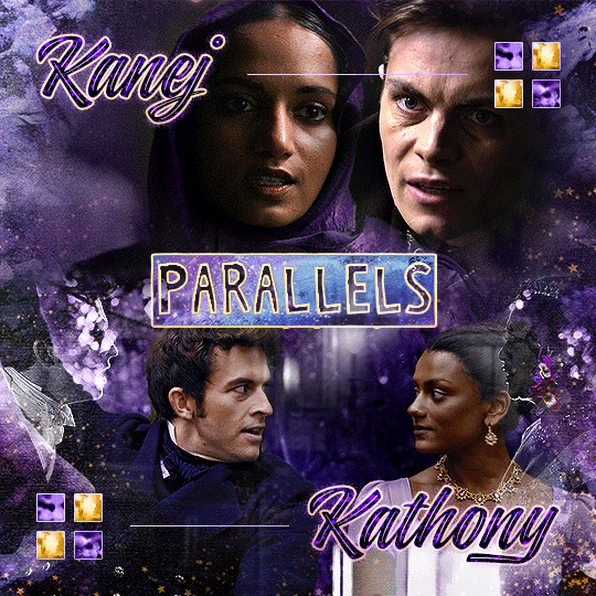
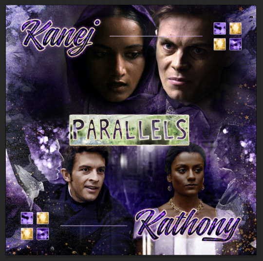
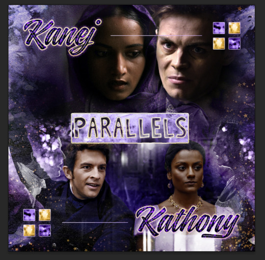
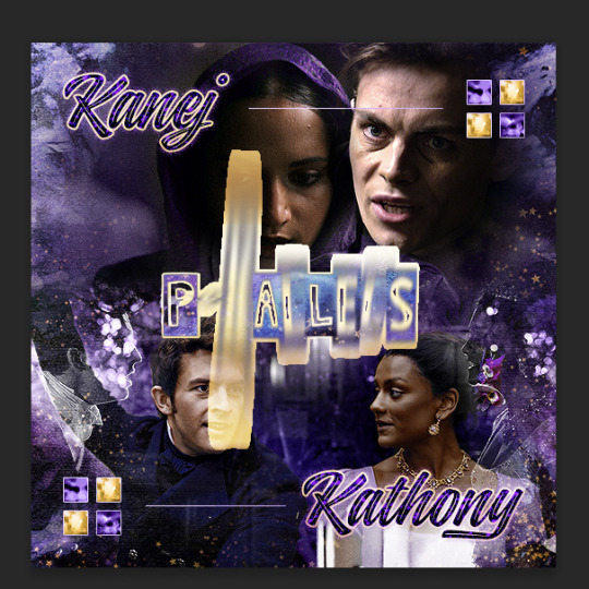
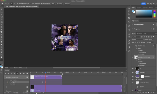
Oh I’m sorry I have GOT to ask! How did you do the text animation in the first gif of 718688291365502976/pscentral-event-15-favourite-ships-kanej?? It’s just. It’s so beautiful
Hi anon! I've used After Effects to create the text animation in the first panel of this post. I'll show you the basic idea of how I've created the animated text effect here :D
What you need:
A cutout font (the font that I've used is Trouble Child Outblack by @justlikethistrain)
Adobe Photoshop with Video Timeline feature
Adobe After Effects
Supplementary files: gif prep action pack / golden outline layer style / assorted textures
Difficulty: advanced; knowledge in gifmaking with the video timeline interface assumed
Note: This tutorial assumes that you're working with all of the composite gifs in a Photoshop composition file and using the video timeline interface
Other useful tutorials to refer to: Text overlay effect / After Effects text animation / clipping mask vs layer mask
Tutorial under the cut. Like / reblog if you find this useful!
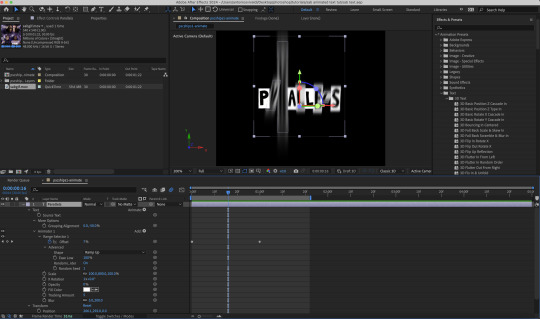
1) Photoshop: Preparing your gif panel
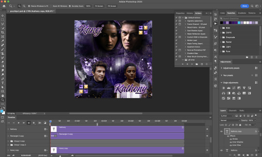
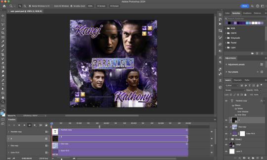
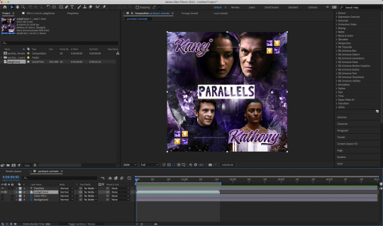
Setting up your PSD composition panel: Create a blank PSD file and set it to Tumblr dimensions (540px x 540px in this particular gifset)
Enable Video Timeline and drag all of the component gifs from your folder to the PSD composition file. Resize / move these gifs around until you're happy with the placements.
Trim the timeline work area so it's the same length as the shortest component gif you've added to the PSD composition file. You can also add some textures & additional adjustment onto this panel.
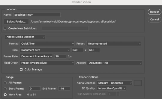
2) Photoshop: Exporting your base gif
I highly recommend exporting the base gif right now, to ensure a smoother experience scrubbing through the video timeline when adding finishing touches later on in the workflow.
My preferred method is to render the composition as a video clip from File > Export > Render video.
To get the optimal export quality, I use the following settings:
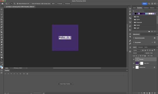
3) Photoshop: Preparing your text layer
Make a new Photoshop composition file of Tumblr dimensions

Drag in the video clip that you've just rendered (the base gif) to this composition file
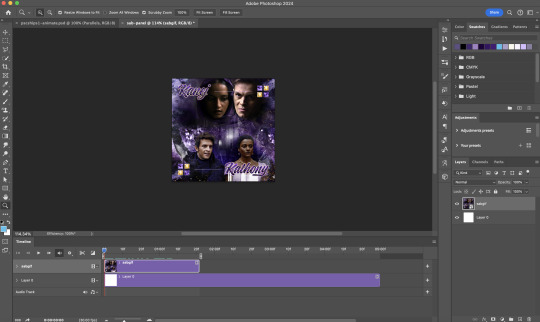
Add a new text layer in your PSD composition file and set the colour to white then tweak this layer until you're happy with the text placement.
For performance optimisations on After Effects, I duplicate the PSD composition file and delete all other layers. This PSD file contains only the text layer that will be animated.
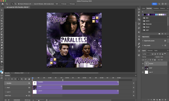
4) Photoshop: Adding overlays & decorations on the text layer
This step allows you to preview the text effect without the animations (i.e. allows you to tweak the texturings & colourings)
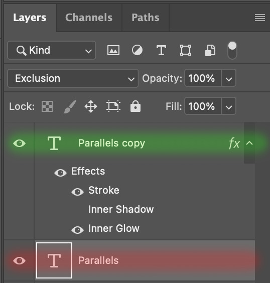
Duplicate the text layer. Set the bottom layer's (highlighted in red) blend mode to Exclusion and apply the gold outline layer style to the top layer (highlighted in green). Make sure the Inner Shadow is disabled!
The panel now looks like this
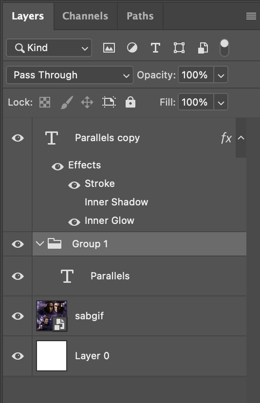
I want to have the liberty to use different colours & textures on the bottom text layer with animation, so the next thing I do is to right click on the bottom text layer and select "Group from Layers"
To change the colour of the filled text layer to purple:
Collapse the Group that you've just created
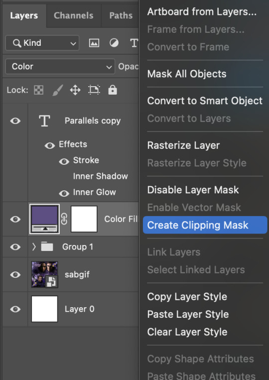
On top of the collapsed Group a purple Colour Fill layer,
Set the Fill layer's blend mode to "Colour"
Right click on the Fill layer and select "Create Clipping Mask"
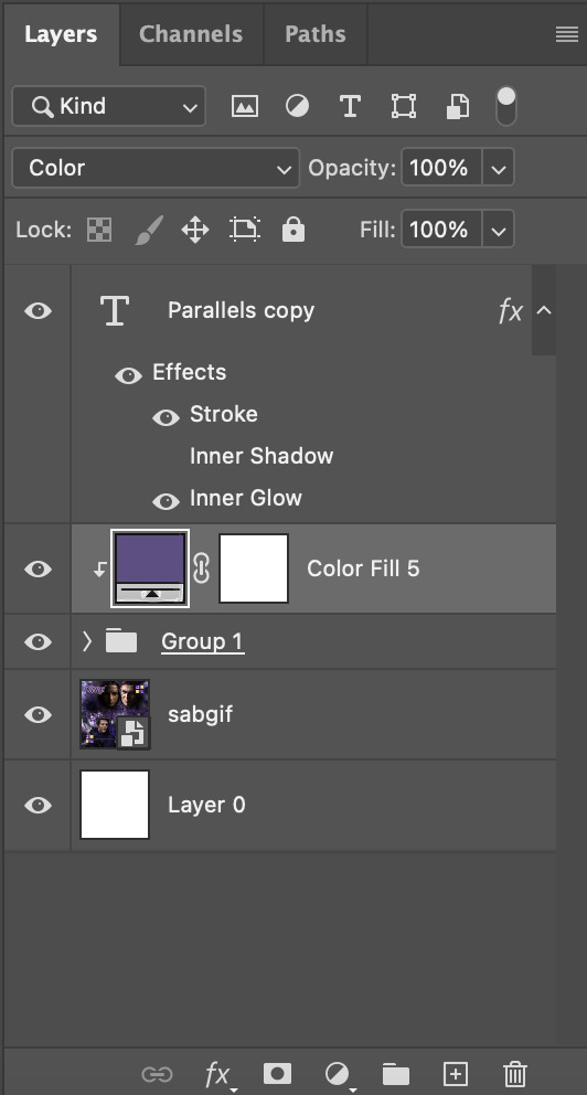
Now the colour of the filled text layer is purple
After adding more textures & decorations on the text layer (with photo negative effects) I get the following:
5) Photoshop: Adding overlays & decorations on the text layer
To avoid performance issues on After Effects, I make a new PSD file of the same dimension. With both the PSD files open, I select the text layer (highlighted in red) while holding Shift, I drag this to the blank PSD file (see the green arrow)
Holding Shift ensures that the layer's placement is preserved when it's copied to a separate PSD file.

In the new PSD file, I set the text layer's blend mode to "Normal"
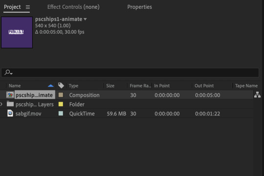
6) After Effects: Animating your text layer
Make a new project on After Effects and drag in the text layer PSD file. Import this file as a Composition

Also drag in the base gif video clip to the AE project.
While we won't be exporting anything with the base gif visible, having this file in the project file is useful if you want to have a better picture of how the animation will look in tandem with the gif.
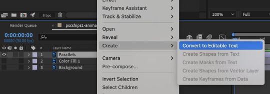
Double click on the composition. Hide the colour fill and background layers. Then right click on the text layer, go to Create > Convert to Editable Text
To be able to preview the animation with the base gif, drag the video clip to the composition file and below the text layer. The visibility of the layer can be toggled on / off anytime in the After Effects workflow
Now we prepare the text layer to be animated. Because the final animated effects is 3D & has motion blur, right click on the text layer and select "3D layer" (highlighted in green) and Switches > Motion Blur (highlighted in red)

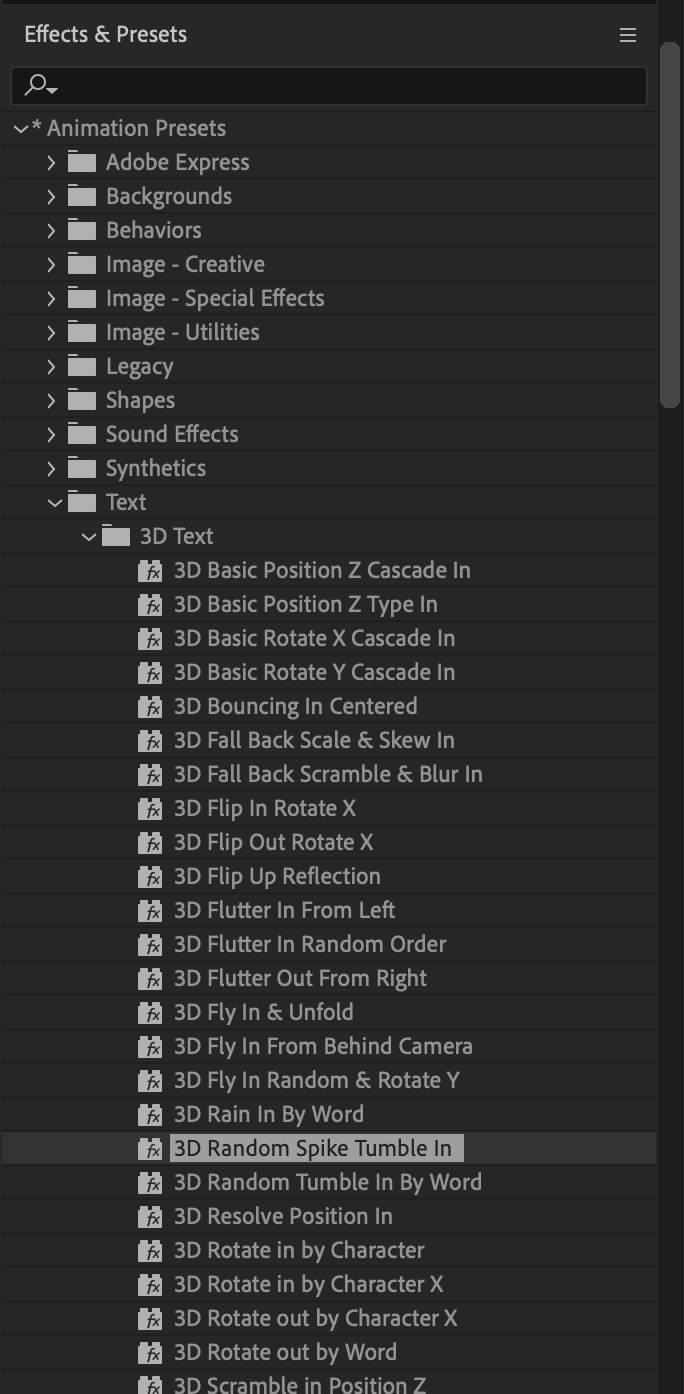
Go to Animation Presets > Text to browse through some presets that you could use to animate the text layer. For this gifset, I've used a preset within the 3D Text folder called "3D Random Spike Tumble in".
While selecting your text layer, press U to view the keyframes and you can adjust the position of these keyframes until you're happy.
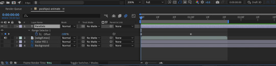
For more finishing touches, press U again to tweak more options in this preset. In this case, I do to Animato 1 > Range Selector and changed the Colour Fill to #fff (the default colour is light yellow)
Then do you File > Export > Add to Render Queue
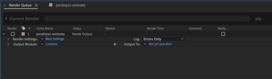
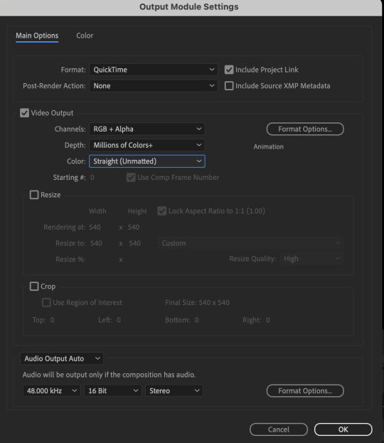
Click on the Output Module and use the following settings to render the text layer as a video file with transparency
Then after specifying the folder in which you'll export the video to, click "Render" to render the video file containing your animated text layer.

7) Photoshop: Adding the animated text & finishing touches
On Photoshop, drag the rendered clip containing animated text, to the PSD composition file with the static text layers.
Duplicate the animated text video layer
Drag one of the layers inside Group 1 and set the blend mode to "Exclusion" (Highlighted in green)
Move the other layer to the top and apply the gold outline layer style with Inner Shadow disabled (highlighted in red)
Hide both text layers (highlighted in yellow)

By scrubbing through the timeline, I've noticed that the animation didn't look clean enough, so I'll add some finishing touches
By selecting the upper text layer containing layer styles, go to the timeline and add opacity keyframes going from opacity 0% to 100% a few frames apart
Once you're happy with the finishing touches, flatten / render your PSD composition file, change the frame delay to 0.05s and export your gif and voila!

I hope this helps 💖
#tutorial#gif tutorial#photoshop tutorial#after effects#chaoticresources#dearindies#userriel#useralien#userraffa#usershreyu#user.tee#useryoshi#usernik#userjoeys#usersole#arthurpendragonns#userhallie#*#my tutorials#my resources
152 notes
·
View notes
Note
your icons are soooooo so cute honestly!!! i wanted to ask if there's any way you can make a tutorial on how to make them? of course if you want, if you don't want to, that's okay :)
Hi! I really appreciate that you like my icons, thank you so much! 💖💖💖🥹
It's been a long time since I've done a tutorial so I hope I can explain it well haha
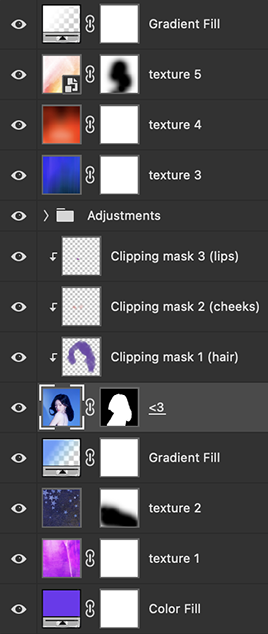
So I will explain how i go from the original picture and the final icon below:
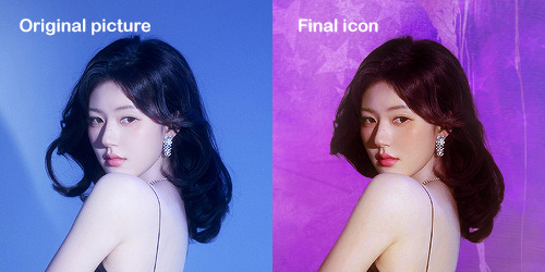
I'm using Adobe Photoshop 2024 but you can use other versions too!
First, I create a 250x250px document and apply a random color fill layer to be the background color of the icon, you can do it by going on Layer > New Layer Fill > Solid color (the color in this moment doesn't matter because I change them later according to the picture I choose to edit).
Then I place the picture I want, adjust the size to make the subject on the center and apply some smart sharpen:
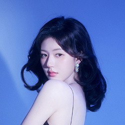
I apply some adjustments to try to color correct if the original picture using Levels, Selective Color and Color Balance to get something like this:
If you want to know the exact adjustments settings I used on this picture you can download the psd here.
To remove the background, I do the hack where I go to the Properties panel (Window > Properties) and click on the "Remove background" option. It's not always that I will get a perfect result but I think it makes easier for me to adjust the little details such as hair and accessories, etc. And I do that using the Lasso tool (shortcut L).
Now, with the background removed I pick a color that I think will match the icon in the Color Fill layer that I created before. To make the background more "fun" I like to add a Gradient Fill layer (Layer > New Layer Fill > Gradient) with a color that might go well with the one I picked earlier to make a smooth and light gradient.
My result until now:
Now it comes the fun: adding textures! I like to add some textures to make the icon more lively and I usually download them on deviantart or on resources websites. You can download some cool textures here, here and here. On this part I really test a lot of textures with different Layer blending. There are a lot of different blending options so you can try as much as you want.
Other thing I like to do is add a clipping mask above the subject layer when I want to color something specific in my picture such as the hair, the clothes or even applying some "fake" blush on the cheeks. I do this adding a new layer, then using the shortcut option (or alt) + command (or ctrl) + g to make it a clipping mask and then using the Brush layer to color what I want. For the blending mode I usually use Soft Light and sometimes Color if I want the color to really stand out.
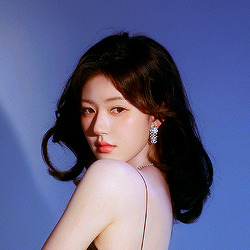
And in the end I will have something like this:
And my layer tab will be like this:
For using on the dashboard I usually resize it to 100x100 to make it look more sharper and defined but it's really a choice, you can already start making your icon using the size you want, I just prefer doing on 250x250px because i'm used to.
To save it I use the shortcut shift + option (alt) + command (ctrl) + s to save it for web with these settings:
And that's it! Sorry for not going to deep in each step but I guess you can get the feeling when you try making your own icons! Is really about trying different methods and things until you became satisfied with your result.
104 notes
·
View notes
Text
question from my YT I wanted to give a more in depth answer to with visuals!
Why I like CSP animation better than photoshop: mostly just more organized/easier workflow! because:
Video groups can be clipping masks
Groups can be frames + CSP remembers previous frame's settings
also tl;dr go watch finchwing's photoshop and then clip studio paint animation tutorials if you want to compare the two programs for animation!!
youtube
Photoshop can have INDIVIDUAL layers or regular non-video groups clipped onto video groups. But CSP can have video groups clipped onto other video groups, so for me the workflow in CSP is much simpler/cleaner. (+The visual clutter of photoshop animation can kinda get overwhelming for me lol but that’s personal pref).
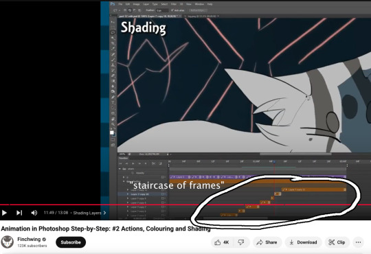
Finchwing has an Amazing video tutorial on photoshop animation including a video on colouring+shading animation in photoshop; it’s where I first learned how to animate on photoshop and I highly recommend taking a look. But even just to compare what their photoshop timeline has to look like for shading compared to CSP, CSP looks much more organized while photoshop is a “giant staircase of frames” (as Finch describes) just because photoshop has to use individual layers to maintain their clipping mask functionality (turning it into a video group makes it unable to be clipping masks, which Finchwing mentions at 10:50).
Actually speaking of Finchwing, they made another animation tutorial with CSP if you want a more in depth comparison I’d really recommend just watching both their photoshop + CSP tutorial to compare the two programs!!
2. Groups can be frames in CSP. Again this makes for easier cleaner organization, and CSP does this cool thing where if I insert a new frame, it will REMEMBER the settings of the previous frame. So my previous frame was 1 group, with two layers in it (one for line one for colour). When I insert a frame it automatically creates 1 group with two empty layers in it. Very convenient. Photoshop can’t have groups within Video Groups, If you try it just puts the layers you’re trying to group together side-by-side like two separate frames. (which tbh i was fine with having separate video groups for line and colour in photoshop lol i can see benefits to just keeping them separate even in CSP as well)
IN CONCLUSION:
It really is more of an organization/quality of life thing. photoshop served me well for many years! Animation is so totally doable in photoshop (just look at finchwings photoshop animation work as evidence that you can POP off in there), but now that I won’t have access to adobe as I’m graduating and preferred a 1-time purchase over a subscription, I went and got CSP.
I admit after photoshop the learning curve was a little tough (CSP's distinction between 'frames' vs 'cels' confused me for a bit + I really missed how visual the ‘cutting’ of frames looks in photoshop lol?), but it only took me about 3-4 small test/practice projects, some googling, and a few custom keyboard shortcuts to get me preferring CSP over photoshop animation now C:
(also bonus gripe with photoshop: idk if there is a way to do this and i just never figured it out, but. i couldn't find a way to use arrowkeys/other keyboard shortcuts to scrub to frame to frame?? I had to use my mouse to drag the header along lol. CSP i set a keyboard shortcut for going to previous/next frame and bam that was that)
#tutorial#clip studio paint#animation#photoshop#adobe photoshop#art programs#ppmpost#if you or anyone else has any qs about comparing csp n photoshop feel free to ask while i still have photoshop until end of May lol#that way i can show more direct visual comparisons while i still have both programs
15 notes
·
View notes
Note
hiiii just wanna start off by saying I love your art style and general vibes ✨️ I'm a stay-at-home partner always in search of fun things to do, and I've recently gotten back into art after not engaging with it since I was a kid (largely because your sun n moon fixation rubbed off on me 😭). I've never tried digital art and it looks cool! Do you have any advice for a beginner like me?
Oh it makes me so happy when people say I inspired them to start creating again 😭 The DCA and the fandom brought me out of my own years-long artistic funk last spring. Clown power, yeehonk 🤠 🤡
I’m planning a significantly longer post in response to an ask I got ages ago all how I learned to draw the way I do, so lookout for that.
But in the meantime, here’s a couple things I can think of off the top of my head:
Specific tools don’t matter much. I currently use Procreate and would recommend it if you have an IPad. It’s an extremely simple but effective program.
On desktop, I use Clip Studio Pro, but Krita is another program I’ve used and liked AND it’s completely free.
I do also have loads of experience with Photoshop and other Adobe products but can’t recommend them at the price, not to mention they’re not super beginner friendly.
Hardware-wise, I almost exclusively use my IPad to draw because it’s so portable. I also have a Huion Kamvas pen tablet monitor that hooks up to my desktop. But I started doing digital art with a dinky lil Wacom tablet that was less than $100. There’s definitely a bit of a disconnect at first, not looking at where you’re drawing but rather on a screen, but you get used to it.
Bottom line is to use whatever tools are convenient and comfortable for you! I even know of a great artist that exclusively draws with their mouse. I realized I hated sitting at a desk and that stopped me from practicing digitally. I got an IPad and now it’s much easier for me to work comfortably on what I love.
Point two I’d like to make is take advantage of the capabilities of working digitally. This means using the godsent undo button to your heart’s content. Download fun brushes to play with and add texture. Use perspective grids. Turn on line stabilization so your strokes are extra smooth. Like what you’ve sketched so far but want to try something different? Duplicate the layer and work from there so you can go back to the old version if you change your mind. Radically change the colors or values with adjustment layers. Use clipping masks. Abuse the liquify tool.
A lot of this might sound like gobbledygook to a digital art beginner but just googling any of this terminology will get you loads of tutorials and information for your specific setup. Also I’m happy to go into details about specific digital art techniques I’ve picked up with over a decade and a half of experience.
Finally, and most importantly—make what you want to see in the world AND what feels good to make. This ofc is not exclusive to digital art, but I always want to stress this to new artists. I realized after I got into the DCA fandom that I had been letting shame, fear, and perfectionism keep me from creating the content I was really interested in making. But then man, idk. Frickin’ robot clowns amirite ¯\_(ツ)_/¯ it’s like there was a secret agent sent into my brain and he uploaded a DCA virus into my mainframe or smth idk hacker style. tktktktkt. they’re in.
Anyway. Hope this helps! Feel free to send another message if u have more questions :3
15 notes
·
View notes
Note
Hello! How are you? I hope you are well, I saw some of your posts and I think it's really cool how you edit GIFs. I would like to know how you edit them?
Hello there! I'm doing good, just really busy with work and life! Nothing new for me lol! I hope you are doing well also. Thank you so much for your kind words! I love that people like how I edit and want to know how I did them. I'm so sorry I'm getting to your ask so late! I've never done much tutorials so I hope mine makes some sense!
Before I get going into this, I use Adobe Photoshop! My tutorial is just gonna be a simple gif manip tutorial I use for my intros. Like this for example.
I wasn't sure what exactly kind of gif edit you want to know how I did.
And for a more complicated gif manip that I use for intros, like this:

I use mask layers and text, which would be a different and longer tutorial I can do if anyone is interested.
ANYWAY Let's get started!
First up you want to create a new document. The size and everything that I did before editing my gif are right in the screenshot below.

Next up this is what you should have when you push the create button and follow the preset details above.
To make a gif you have to have a timeline, there are a few different ways people do this inside Photoshop. But if you don't see the timeline on your Photoshop layout here you can find this by clicking the window bar at the very top of your screen.
Once you click the window bar there should be a whole column of options. Make sure Layers and Timeline is checked off like this.
After doing that This is what you should have.
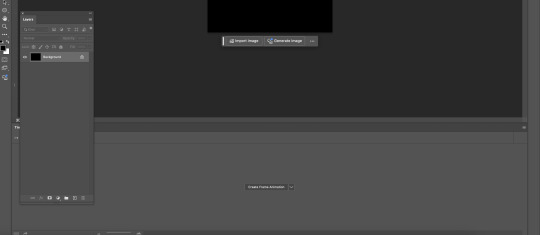
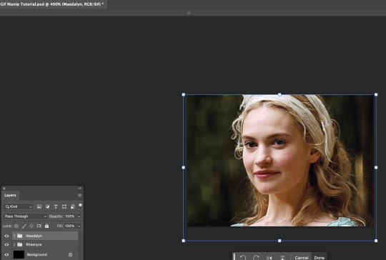
Now like I said there are a few different ways people edit or create their gifs in Photoshop. I do this by the Create Frame animation option. Click that button and a timeline should be created. Next up you need to find and open the gifs for your scene in mind. I recommend trying to find gifs that match in some way. Make sure you number the gifs into the open file BEFORE copying and pasting them into your canvas.
After that,use the transform tool to make sure they fit onto your canvas like this.
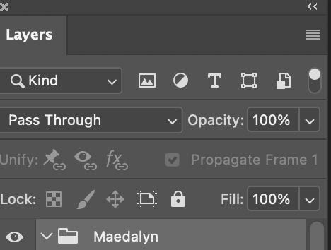
I would try to get into the habit of naming your layers and grouping them up like how you see mine. Since it will be confusing at times if you have a lot of layers to keep track of. Once your layers are named and gifs are placed the way you want. I would try finding colorings and or using the adjustment tool for your gifs. Right now I don't have any on. So after that this is how your layout should look.

Your timeline is at the very bottom, right now the speed of your gif is 0 sec, which is SUPER fast and could make your gif look REALLY fast pace and mess up with the natural flow of your scene.
Make sure you click the v beside the sec on your timeline. Like this.

Click 1 second to start. Once you finish the gif and get to exporting you can try out what speed is best. Now we can finally start to edit. If you grouped your files click the > where the group file is in the layers tab. This is what it should look like before and after.

Now, this is how your timeline should look.

You are gonna need to click this symbol right here at the bottom. The + with the box around it.
That creates another frame for your gif. When it does your timeline should now look like this. (I forgot to take a screenshot of this part so this is what mine looks like with the adjustments I added later)
When you are on the second frame you need to go to your gif, find that second layer to match, and click the box beside it. It should reveal the eye.


Repeat that step all the way to the end of your first gif.
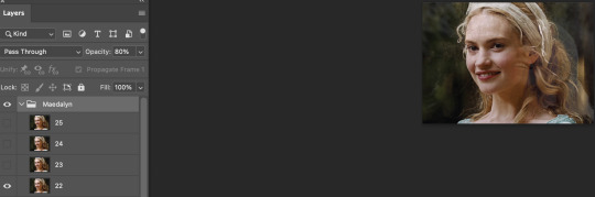
Now you don't have to do this but I like to fade out some scenes to make it flow better. Click the timeline number where the gif is about to end. For mine, it's layer number 22.
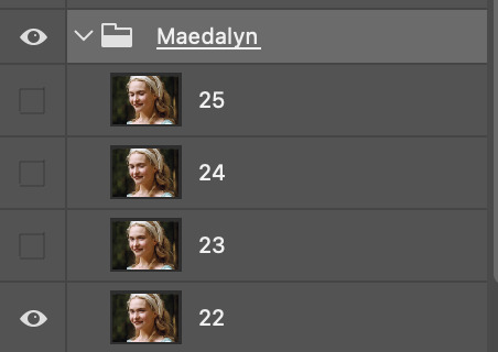
When you click the timeline number it follows right to the number in your layer. You see how my group is highlighted because I clicked it? I would stay right there. Because we are going to click the Opacity for that ENTIRE layer.
Just click the 100%, or click the V beside the 100, it doesn't matter, and put in 80%. It should start to fade and you can see the layer underneath it. The next part of our scene, this is what we wanted.
Repeat that by clicking the next number up on your timeline and change the opacity to 60%. Like for me the next one is 23. The pattern that I do for my opacity changes is 80%, then 60%, then 40%, and finally 20%. Example below.
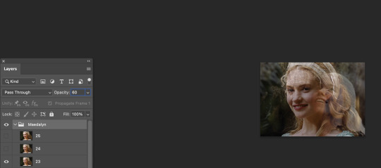
But now you need to make your second gif move right alongside your first so it flows. So now click back to the number on the timeline you change the opacity to 60% and click the visibility box of the second gif.

It should look like this now. I exported the gif so you can see the fade from playing with the opacity.
Next, repeat the same steps you did above for your second group gif. BUT, when your opacity on your gets to the 20%, the next frame make SURE you click OFF the visibility or put the opacity to 0.
The example below is just following where you should start the 2nd frame with the new group.

After repeating the first steps, your gif is now complete and should flow nicely!

NOW we just gotta export it so you can eventually post it! In my example below I ended up using this coloring and just tweaked some adjustments. So go to file, export, and click the save for web button just like you see below.
Now after clicking that this is what should pop box should pop up. In that same box I have below, is the settings I use to export.

NOW!! After you click on save and save that beautiful work into the file area you want...you are now finished!!
I hope I made sense! I'm not used to doing tutorials and I had a lot of more step by step screenshots, but Tumblr's 30 image limit made that impossible to put together!
#mimi replies#ask answered#answered asks#asks answered#mimi does a photoshop tutorial#photoshop tutorial#gif manip tutorial#gif tutorial#Kill your queue. you'll feel better
9 notes
·
View notes
Text
How to add image to text in Photoshop
Adobe Photoshop tutorial video shows how to add image to text in Photoshop. In this video, we will show how to use 2 layers, image layer and text layer, for making image in text by using clipping mask. All steps are easy to follow for Photoshop beginners. Happy sharing and I hope this helps. More Adobe Photoshop Tutorial are available here. How to add image to text in Photoshop We can follow…
1 note
·
View note
Text
week 8 blog post
In class on Monday we showed professor Valdes what we had worked on over the weekend. After we talked about where I'm at he suggested that I try to animate and procreate and write my typography rather than painting it on then scanning it in. I went and watched a few tutorials on how to animate in procreate then started playing around. As of right now I think recording it looks really cool and gives the effect I'm going for. I then worked on finding a brush that matches the effortlessly painted look that I'm going for to look like someone sloppily painted on top of the image.
This week I watched a tutorial on youtube about creating standout illustrations on adobe illustrator and how to pair photoshop in with illustrator. I felt like this was a good video to watch because this week I'm working on my mindfulness poster and I'm going to be using mixed media to create it. The first thing they talked about in the video was to start with lightroom. They say that even editing the color on lightroom will make your image and design that much better. One cool side thing they talked about was creating mockups of your posters on photoshop to get a better idea of what your design will look like in the real world especially when you're working with clients. One thing that I've been trying to figure out is how to put text or other images behind an already established image and they demonstrated how you can use a layer mask and manipulate the layers from there. One thing that confused me more was about making compound paths and making text a shape. I still need to play around with this but the video I watched honestly just made me more confused.
0 notes
Text
Unlocking the Power of Adobe After Effects: A Creative's Dream Tool
Adobe After Effects is a game-changer for designers, animators, and video editors. This software opens up a world of possibilities for visual effects (VFX) and motion graphics, empowering creatives to bring their ideas to life in stunning, cinematic ways. Whether you're working on a Hollywood blockbuster, a YouTube tutorial, or an artistic project, After Effects is the perfect tool to enhance your content. Let’s dive into its many features and see how it can elevate your creativity.
What Makes Adobe After Effects Stand Out?
Adobe After Effects stands as the industry standard when it comes to creating motion graphics, VFX, and compositing. Its versatility and wide range of tools make it a go-to software for anyone looking to push the boundaries of visual storytelling. After Effects is designed for professionals and newcomers alike, offering intuitive interfaces and advanced capabilities to cater to all skill levels.
Powerful Motion Graphics
After Effects is known for its ability to create stunning motion graphics. Whether you’re animating text, graphics, or illustrations, the possibilities are endless. With powerful features like keyframing, easing, and path animation, you can easily control the movement and style of elements. It’s the perfect platform to design dynamic and eye-catching animations.
Advanced Visual Effects (VFX)
For those working with video, After Effects excels in adding breathtaking visual effects. Whether you're creating explosions, integrating CGI elements, or enhancing color grading, After Effects provides the necessary tools to make your footage look professional. It supports 3D compositing, chroma keying (green screen), and advanced tracking, all crucial for seamless VFX work.
Seamless Integration with Other Adobe Products
One of the strongest features of Adobe After Effects is its smooth integration with other Adobe Creative Cloud tools like Adobe Premiere Pro, Photoshop, and Illustrator. This interconnectivity ensures that your workflow remains efficient. You can easily import assets from Photoshop or Illustrator, and the round-trip workflow with Premiere Pro allows for seamless video editing, giving you a cohesive creative process.
Why Adobe After Effects is Essential for Creators
Enhance Your Videos with Stunning Animations
For video creators, After Effects is essential for creating engaging animations. Whether you're designing intros, lower thirds, transitions, or visual storytelling elements, After Effects makes it easy to take your videos to the next level. Its powerful tools allow you to manipulate and animate objects with precision, creating content that stands out.
Create Professional-Grade VFX
With After Effects, you can turn your footage into something extraordinary. Advanced features like 3D camera tracking and particle simulations allow you to add realistic effects that blend perfectly with your video. Whether you’re working on sci-fi, fantasy, or dramatic sequences, After Effects makes it possible to achieve stunning results.
Edit and Composite Like a Pro
After Effects is not just for animators; it’s also a powerful compositing tool. You can layer multiple video clips, apply masks, and create complex composites that blend perfectly with each other. For professional video editors, After Effects provides the tools needed to fine-tune every detail, making your video look polished and seamless.
Getting Started with Adobe After Effects
Easy-to-Learn for Beginners
While After Effects offers a range of complex features, it is also beginner-friendly. Adobe offers a wealth of tutorials, templates, and resources to help you get started. The software’s interface is intuitive, allowing you to quickly learn the basics and gradually explore more advanced techniques as you gain experience.
Expansive Community and Resources
After Effects has a vast community of users, which means a wealth of tutorials, forums, and plug-ins are available to help you learn and grow as a creative. Whether you need advice on a specific effect or want to learn how to speed up your workflow, you’ll find resources and support within the After Effects community.
0 notes
Text
Mastering Graphic Design: From Basics to Professional Excellence
Course Structure:
This course is divided into 8 modules to take learners from the fundamentals to advanced-level expertise in graphic design.
Module 1: Introduction to Graphic Design
Duration: 1 week
What is Graphic Design?
Understanding the Role of a Graphic Designer
Tools of the Trade: Overview of Design Software (Adobe Photoshop, Illustrator, Canva, etc.)
Basics of Visual Communication and Design Principles
Module 2: Fundamentals of Design
Duration: 2 weeks
Elements of Design: Line, Shape, Color, Texture, Space
Principles of Design: Balance, Contrast, Hierarchy, Repetition, Alignment, Proximity
Typography Basics: Fonts, Pairing, and Readability
Understanding Color Theory and Psychology
Module 3: Adobe Photoshop Essentials
Duration: 2 weeks
Navigating the Interface and Tools
Working with Layers and Masks
Photo Editing and Retouching
Creating Simple Designs: Posters, Social Media Posts
Module 4: Adobe Illustrator Essentials
Duration: 2 weeks
Introduction to Vector Graphics
Creating Logos and Icons
Working with Shapes, Paths, and Pen Tool
Designing Business Cards and Flyers
Module 5: Branding and Identity Design
Duration: 3 weeks
What is Branding?
Designing Logos: Concept to Final Design
Creating Brand Guidelines: Colors, Typography, and Style
Developing Stationery and Marketing Materials
Module 6: Advanced Design Techniques
Duration: 3 weeks
Designing for Web vs. Print
Introduction to UI/UX Design
Motion Graphics Basics (using Adobe After Effects)
Advanced Photoshop and Illustrator Techniques
Module 7: Portfolio Building
Duration: 2 weeks
Choosing Your Best Work
Structuring a Professional Portfolio
Creating Mockups and Case Studies
Building an Online Presence: Behance, Dribbble, Personal Website
Module 8: Starting a Career in Graphic Design
Duration: 1 week
Freelancing vs. Working for a Company
Finding Clients and Networking
Pricing Your Services and Contracts
Staying Updated with Design Trends
Course Materials and Resources
Video tutorials and downloadable resources
Practice files and design templates
Access to a private community for peer reviews and support
Assessment and Certification
Quizzes and Assignments after each module
Final Project: Design a complete brand identity
Upon completion, students will receive a Professional Graphic Design Certificate.
Course Outcome:
By the end of the course, learners will have the skills to:
Create professional designs for print and digital media.
Build a strong portfolio and start a career in graphic design.
Confidently use industry-standard tools like Photoshop and Illustrator
#graphic design#graphic art#graphic novel#graphic source#design#graphic tee#Graphic#trending now#viral#trending shorts#trending on tumblr#trending news#trending video#instagood#follow#market#safaris
1 note
·
View note
Text
Exploring the Key Topics Covered in Adobe Photoshop
Image editing using adobe photoshop : Key Queries Explained
1.What are layers in adobe Photoshop?
Layers in Adobe Photoshop are individual levels that can contain images, text, or effects, allowing for non-destructive editing. Each layer can be edited independently, enabling users to manipulate and organize elements without affecting others. This feature helps create complex compositions, control visibility, and apply adjustments selectively, making it a fundamental tool for graphic design and photo editing.
2. How many topics are in adobe Photoshop?
Adobe Photoshop covers a vast range of topics, including photo editing, retouching, compositing, typography, digital painting, and graphic design. Additionally, there are many specific features and tools within the software, such as layers, masks, brushes, and filters. Overall, the number of topics can easily exceed a hundred, depending on how detailed one categorizes them.
3. What are the steps to adobe Photoshop?
To use Adobe Photoshop, follow these steps:
1. Open the application.
2. Create a new document or open an existing file.
3. Use the toolbar to select tools for editing (e.g., brush, lasso, text).
4. Adjust layers as needed.
5. Edit images using filters and adjustments.
6. Save your work in the desired format.
Explore tutorials for specific tasks!
4. What are 4 main purposes of adobe Photoshop?
The four main purposes of Adobe Photoshop are:
1. **Photo Editing**: Enhancing and retouching images.
2. **Graphic Design**: Creating visuals for print and web.
3. **Digital Painting**: Allowing artists to create artwork using various brushes and tools.
4. **Image Composition**: Combining multiple images or elements into a single cohesive design.
5. What are the main functions of adobe Photoshop?
Adobe Photoshop primarily allows users to edit and manipulate images. Its main functions include retouching photos, creating graphics, applying filters and effects, working with layers, and enhancing colors. It also supports vector graphics, text manipulation, and design for web and print. Additionally, Photoshop is widely used for digital art creation and photo compositing.

Visit: VS Website See: VS Portfolio
0 notes
Text
The book is password protected so it is not useful: The password is 4444
////////////////////////////////////////////////
Adobe Photoshop is a powerful raster graphics editor developed by Adobe Inc. It's widely recognized as the industry standard for image editing, graphic design, and digital art. With its extensive range of tools and features, Photoshop allows users to manipulate images, create stunning visuals, and bring their creative visions to life. Key Features and Uses: Image Editing: Retouching: Removing blemishes, smoothing skin, and enhancing features. Color Correction: Adjusting color balance, contrast, and saturation. Cropping and Resizing: Modifying image dimensions and composition. Layer-Based Editing: Working with multiple layers to isolate and modify specific elements. Graphic Design: Creating logos, icons, and other graphic elements. Designing layouts for print and digital media. Combining text and images to create visually appealing designs. Digital Art: Painting and drawing with various brushes and tools. Creating digital illustrations and concept art. Manipulating photographs to create surreal and artistic effects. Basic Tools and Techniques: Selection Tools: Select specific areas of an image to edit. Layer Masks: Control the visibility of specific areas within a layer. Adjustment Layers: Non-destructively adjust color, exposure, and other image properties. Filters: Apply various effects to images, such as blurring, sharpening, and artistic styles. Blending Modes: Combine layers in creative ways to achieve unique effects. Learning Resources: Adobe's Official Tutorials: A comprehensive library of tutorials covering various aspects of Photoshop. Online Courses: Platforms like Udemy, Coursera, and Skillshare offer in-depth courses for beginners and advanced users.
#photoshop art#beauty#books & libraries#celebrities#actress#singer#tumblr milestone#hot celebs#photoshop psd#photoshop resources#photoshop flowey#photoshop express#books and reading#anime and manga#architecture#graphic design#illustrator#portfolio#graphic art#poster design
0 notes
Text
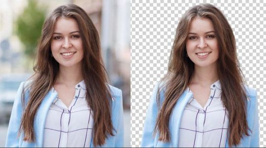
How to Remove the Background from Hair in Photoshop
Introduction
It can be an easy and simplest way to remove the background of an image. However, hair is an exception. This is a nightmare for the best editors because of fine hair strands, intricate details, and stray hair lines; however, photography is a critical skill for photographers, retailers, and e-commerce pros. They have to represent their items or Impersonations with pro-perceived foundations.
Photoshop In this tutorial, we will explain how to remove the background from hair perfectly in Photoshop. It is a process with steps. By the end of this article, you can feel comfortable handling any sort of image. Because your photos will be super crisp and professional-looking.
Challenges in Hair Background Removal
Hair is incredibly difficult to work with in photoshop. It, being soft and blending with the background makes it difficult. Because hair is made of really thin strands and is transparent, unlike any other solid object. The different surfaces make it impossible to isolate it cleanly. Poor implementation results in clunky, contrived, or unprofessional output.
Common Mistakes:
Ragged Edges — This happens more often with less precise selection tools.
These settings make for artificial or overly processed edges.
Fringing: another problem we run into often, where a nebulous halo will of the previous BG color is left on the hair.
But this is obviously some of the challenges you need to understand before diving in. You address their issues head-on.
Editing Your Image for Photoshop
Step #1: Open Layer and Duplicate
First, open the pic you want to edit in Photoshop. When the image is opened, create a duplicate of the layer by pressing Ctrl + J (Windows) or Cmd + J (Mac). This way the original image is untouched and you can work on it without modifying it.
Step 2: Check the image.
Now Test the Image for a while. Re: Hair - [Note the complexity of that hair and how it contrasts with the background] Does the Background have one color or is it noisy? Faster or slower and the tools you will need filling on your belt.
Step 3: Choose the Right Tool
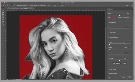
You might start with the Magic Wand or Quick Selection Tool for some images. Great for pin-pointing general areas However, you cannot use this tool while cutting the hair. We need advanced tools like Select and Mask workspace.
Step by Step: How to remove a background where hair is involved
Step 4: Select and Mask
You do that by selecting the Select and Mask tool which is magic when creating selections – especially wakes like these are! This offers a more controlled method for selecting hair from the background.
Change layer to view mode: Once the duplicate is created select it first. Next up is Select > Select and Mask Change the View Mode in the Select and Mask workspace as to how you like it. Helpful if you are using On Black or White view mode They contrast with the hair, which is great for visibility in your work.
By Refine Edge Brush: You can also paint on the hair strands using this brush in Adobe Photoshop. It detects hairs and picks them up for accurate selection. Even the minute details are known.
Tip 5: Touching Up Your Selection.
Refine Edge Settings: In the Select and Mask workspace, you can customize the refined edge settings to have a more fine-tuned output.
Radius: This control changes the size of your selection area. The greater the radius better, the more fine details it will capture.
Smooth: Smoothes over any jagged characteristics.
Feather: Blurs the edge of selection.
Contrast sharpens the edge of your selection making it cleaner.
You can use these two options to shift Edge: Move the edge of your selection in or out. It's useful for fine-tuning.
For those fine, flyaway hairs — give the Refine Edge Brush Tool a whirl. Set a small brush size. Do not add much from the background.
Step 6: Output Settings
Decontaminate Colors:– This option is used to de-fringe colors. Replacing the colors of edge tiles with their nearest neighbors. This is for when you see a little halo around the hair after your selection.
Select the area you want to output as a New Layer with a Layer Mask, once you are satisfied. You can use it to do this without modifying the original image.
Complex Backgrounds Techniques
Hair Selection with Channels
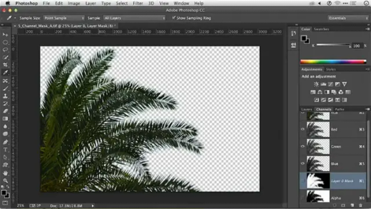
When your images have complex backgrounds, you might want to consider using channels for a better selection. To begin with, head to the Channels panel. Seek out the channel which provides the most contrast between hair and environment. Duplicate this channel. Followed by Image > Adjustments> Levels. This will only make the contrast higher. Afterwards, use this channel as input. Ctrl+click (Windows) or Cmd+click the channel thumbnail.
Painting Over Specific Areas with the Brush Tool
Once you select this, the Brush Tool can be used for any manual touch-ups. Paint out where the selection may miss finer details using a soft round brush (B). This is super helpful for adding back in lost strands or taking out unwanted background elements.
Merging edges with Blur and Smudge Tools
Use the blur tool to blend in the hair´s edges with a new background area. The Smudge Tool can be used to blend in areas with a hard hair-background boundary.
Applying a New Background
Selecting the Right Background
When you pick out a new hiding place remember lighting, color, and composition. The background should serve as an enhancement to the subject, not a distraction.
Adding the new background
The new background layer should be placed below the hair-masked layer. Form a layout with the background, positioning it and resizing as necessary.
Final Adjustments
Finally, make some final finishes to ensure the hair is natural against its new background. This may involve modifying levels, putting in shadows, or managing color balance for the new background light.
Troubleshooting and common problems
Dealing with Fringing
If you have a little fringe from the old background color then choose decontaminate colors inside select and mask in this case. Gently brush over the fringing with paint on the layer mask.
Fixing Unnatural Edges
Sharp hair edges, refined to the definition with the Blur Tool. This can be accomplished by using the smudge tool to push and blend along these soft edges into your new background.
Restoring Lost Hair Details
However, if you lose any details in the selection then just paint them back with a fine brush over your layer mask. For a softer, more subtle hair effect, layer your strokes gently and with purpose.
Tips for Different Hair Types
Curly Hair
In general, having curly hair can be incredibly difficult due to all the twists and turns it must go through. Select a smaller brush size (B) and use the Refine Edge Brush Tool to capture these details. Well, in areas where the curls are very complex, you may have to spend a little extra time perfecting this section.
Straight Hair
Precision is always important but at least straight hair makes things easier for you in most cases. Grab the Quick Selection Tool, or use Refine Edge Black. This guarantees a clean, accurate pick.
Textured and ethnic hair
If you have textured or ethnic hair, like afro-hair for example, this will require a lot more consideration of certain details. Combine Channels and Select & Mask Workspace. Tracks the volume and texture of records accurately.
Tips for Consistency in E-commerce Photography
Alignment in Product Photos
Consistency in product images is the most important factor for e-commerce. Apply the same background removal methods to all images. This gives your website or catalogs a cohesive feel.
Batch Processing Tips
constantly repeat the same steps repeatedly If constantly repeat the same steps repeatedly. If you are constantly repeating the same steps again and again, Adobe has a super video on how to create an action or use batch processing in PS. This is useful when you have to process a lot of images. Record an action with your method of removing the background and batch it to the images.
Quality maintenance in Export
So, while exporting your image you need to pick the correct format with a proper setting to maintain the quality. PNG (Good for e-commerce: PNG is good when you need transparent background images. Jpeg images work best for solid backgrounds on products.
Conclusion
It may sound like hard work for you to remove hair backgrounds in Photoshop. It is doable but it will take time to master. In this article, we will teach you how to improve your images by taking these steps. You will have commercial outcomes.
These methods will make a difference in your results, regardless of what you do for work. For photographers, retailers, and e-commerce pros. We want a portrait that's just right, the product we're showcasing to look perfect throughout each photo, and an overall clean image along with resemblances in look mood.
1 note
·
View note
Text
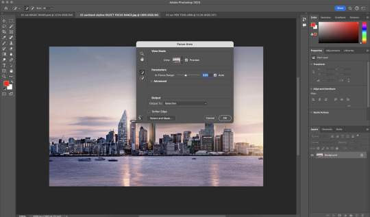
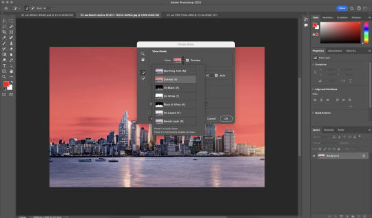
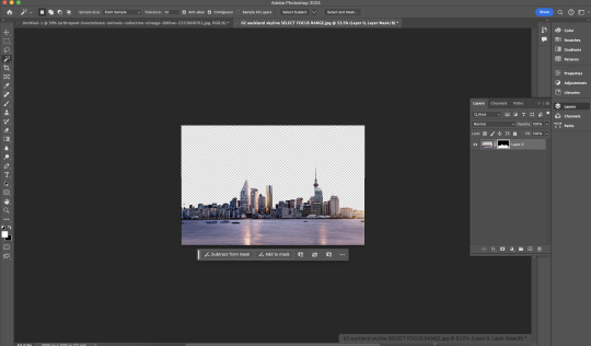

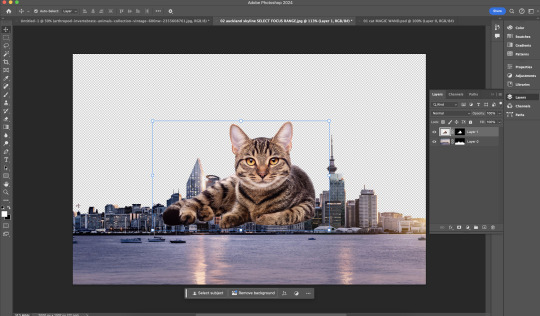
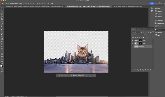
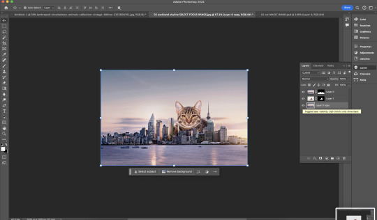
Week 2 In Class Exercise: Selection Methods #2
File: 02 Auckland skyline SELECT FOCUS RANGE
This tutorial offers an easier method for selecting subject matter in Adobe Photoshop, using a focus range and the same tools as the first tutorial. By following these steps, users can quickly and accurately isolate the subject of their image without the need for complex selection techniques. This streamlined approach can save time and effort when editing photos in Photoshop.

File: 02 auckland skyline with cat. FINAL
Select - Focus Area (Faster way of selecting the subject matter)
Layer Mask
0 notes
Text
Photoshop how to fade out image using gradient layer mask
Adobe Photoshop tutorial video shows how to fade out image using gradient mask for image layer. In this tutorial, we can apply a Gradient Mask to image layer, then, we can make photo fading to transparent background. If we place an image under this layer, then, we can blender two images together. Also, in the tutorial, we will show how to apply linear gradient and circle gradient. If you want to…
0 notes