#affinity designer tutorial
Explore tagged Tumblr posts
Visit Tumblr Blog
Explore Tumblr blogs with no restrictions, modern design and the best experience.
Last Seen Tumblr Blogs


Fun Fact
130K people were victims of a chain letter scam that affected Tumblr in May 2011.
Text
:-) Vector Art Help Pls :-)
Ok so,,,,
I’ve been desperately trying to get myself to do more vector art for the last idk how many years, and finally sat down and tried again yesterday.
AND HOOOO BOYYYYY did I forget how frustrated it makes me .^.

(It’s me being punched by illustrator and affinity)
Everything I make just looks so gd awful and I just feel like I’m probably doing everything in the most inefficient way possible (especially just Line art) :’-)
So, basically:
I would really appreciate some advice / tips on how best to use vector based illustration apps if anyone has any???
Genuinely anything, even the most basic “this is literally common sense but for some reason you might not have thought about this (because you sound dumb)” would be so helpful right now - I am getting so frustrated (´°̥̥̥̥̥̥̥̥ω°̥̥̥̥̥̥̥̥`)
Any advice at all would be so hugely helpful and I will love you forever
(Honestly, thank you if you’ve even read this far - I’m going to stop rambling now)
Ta!
・:*+.\(( °ω° ))/.:+
#or good tutorials that you recommend maybe???#I find it hard to find ones that aren’t either incredibly simple or ridiculously complex#I use procreate regularly and am fairly computer literate#but sometimes the amount of new stuff / terminology just feels overwhelming#thank you so so so much#:’)#art advice#art help#vector art#vector#vector illustration#vector advice#vector tutorial#art tutorial#art help pls#2D vector art#adobe#adobe illustrator#adobe illustrator help#Adobe advice#Adobe tutorial#Adobe illustrator tutorial#illustrator#affinity designer#affinity designer help#affinity tutorial#affinity iPad#affinity designer tutorial#art advice needed#art help needed
7 notes
·
View notes
Video
youtube
Affinity Designer Tutorial - Manually Tracing with the Pencil Tool This video shows you how to easily trace a photo using the Pencil Tool to create a simple lineart illustration. Seeing Affinity Designer has no automatic tracing tool, and most tools can't properly simplify the subject, doing it manually is a quick and easy approach if you own a tablet or work with an iPad. Make sure the photo has good quality and the elements you want to trace are clearly readable. Lower the photo's opacity, lock the layer, and work on a layer above. Set up the stroke to a good size, adjust the pressure curves, and start with the main lines. Don't lose yourself in detail. Less is more.
#youtube#tutorial#affinity#affinity designer#vector art#tracing#pencil tool#lineart#goldfish#illustration#basic
3 notes
·
View notes
Text
😱 [Contient un spoiler de l’épisode 5 !]
Et ben, alors ? Pourquoi tu dessines en bleu ?!
La réponse est une astuce de filou pour éviter de gommer ses pages avant de scanner !
Et sinon, on se retrouve le 11 avril pour l’épisode 5 de la BD 📆
#french side of tumblr#upthebaguette#drawing#bande dessinée#affinity designer#affinity#dessin#tutorial#photoshop
1 note
·
View note
Text
AFFINITY IS HAVING A SALE!!! EVERYTHING IS 50% OFF!!!
Here's your chance to get a creative suite analogous to Adobe's, except without Adobe's bullshit!
#I've been waiting for a sale because the V1 suite lacks a lot of functionality that I see in tutorials for V2#Affinity#creative#digital art#publishing#design#photo editing#Affinity Designer#Affinity Publisher#Affinity Photo#Photoshop#adobe#fuck adobe#universal licence#flash sale
0 notes
Text
How to Cancel Photoshop Subscription
Are you here as you don’t want to retain your Adobe Photoshop subscription anymore? Oh yes, you can cancel it seamlessly!!
Do you know that even after you cancel your Adobe Creative Cloud subscription, you can still access your Adobe account.

#learn#how to cancel#photo editing#GIMP#GNU Image Manipulation Program#photoshop#graphic designing Adobe#Photoshop Tutorials#manage subscriptions#View Your Plans#cancel subscription#follow the prompts#blogs#confirmation#adobe account#edit your Photoshop files#Status Post Cancellation#Alternatives to Photoshop#Photoshop Elements#Affinity Photo#bloggers#adobe photoshop#Pixlr#cloud platform#indesign#graphic design#illustrator#adobe stock#technical support#bug fixes
0 notes
Text
so, you wanted to start bookbinding?
so @princetofbone mentioned on my post for "factory settings" about wanting to know more about the binding style that i used for it. so i thought i might make a post about it.
i was as terrible as i always am for taking in progress shots, but i can link you to the resources i used in order to make my book. i would also like to point out that "factory settings" is my 120th bind, and i have been doing bookbinding as a hobby for just over 3 years now. unfortunately this means some of the methods that i used for that bind aren't particularly beginner friendly, just in terms of the tools and methods i have used, but i would love to point you in the right direction when it comes to resources. i dont say this to sound pretentious which i fear i might come across, just so that youre fully informed. getting into this hobby is fun and rewarding, but it can definitely be intimidating.
with that caveat, heres a list of links and resources that i have used for bookbinding in general, with additional links to methods i used specifically in regards to this bind.
ASH's how to make a book document. it gives you a great introduction into typesetting fics (where you format the text of fics to look like a traditionally published books) and then turning them into a case-bound book (the style i used for "factory settings"). it is comprehensive, and explains how to use microsoft word to do your bidding. it was invaluable to me when i was just starting out! currently i use affinity publisher to typeset/format my fics for printing, but i only bought and learned how to use that after i had been binding books for a year and a half. i made some beautiful typesets with word, and some of my close friends use it still and design stuff that i never would be able to in my wildest dreams (basically anything by @no-name-publishing)
DAS Bookbinding's Square Back Bradel Binding. a great style to do your first bind in! this method requires, when making the case, to attach the cover board and the spine board to a connecting piece of paper, which makes it so much easier to match the size of the case to the size of the text block (your printed out and sewn fic). using this method is what allowed me to get much more accurately fitting cases, and made me much more confident with the construction of the books i was making. a well-made book is something that is so wonderful to hold in your hands!
DAS Bookbinding's Rounded and Backed Cased Book. This is the specific method that i used to create my bind for "factory settings"! even before i could back my books, i found that watching DAS's videos in particular helped me see how books were traditionally made, and i was able to see different tips and tricks about how to make nicer books.
Book Edge Trimming Without... i trim the edges of my text block using my finishing press and a chisel i have sharpened using a whetstone and leather strop with buffing compound on it. i follow the method for trimming shown in this video!
Made Endpapers. i follow this method for my endpapers, as i used handmade lokta endpapers, and they can be quite thin, but they look beautiful! i used "tipped on" endpapers (where you have your endpaper and then put a thin strip of glue on the edge and attach it to your text block) i used for a very long time before this, but these feel like they are much more stable, as they are sewn with your text block.
Edge Sprinkling. this is the method that i used for decorating the edges of my text block. but the principle is basically clamping your text block tight and then sprinkling the edges. i do not believe you need to trim the edges in order to do sprinkles on the edges, and that's what makes it accessible! i personally just use really cheap acrylic paint that i water down and then flick it onto the edges with my thumb and a paint brush.
Double-Core Endbands. i sew my own endbands, which i followed this tutorial for. that being said, it's kind of confusing, and this video is a bit easier to follow, but it is a slightly different type of endband.
Case decoration. i used my silhouette cameo 4 to cut out my design for "factory settings" in htv (heat transfer vinyl). i also used my cameo 4 to cut out the oval of marbled paper on the front, as i honestly didn't want to try my hand at cutting an oval lol. i also glued some 300 gsm card with an oval cut out of the centre of it onto the cover before covering it with bookcloth, to get a kind of recess on the cover. i then glued the oval of marbled paper onto the top of the recessed area once it was covered with bookcloth, so that it was protected. the images i used were sourced from a mix of rawpixel, canva and pixabay. a more accessible way to get into cover decoration is by painting on a design for your cover as described in @a-gay-old-time's tutorial just here. or even doing paper labels, which look classy imo.
physical materials. sourcing these will depend on your country. i am located in australia, and have compiled a list with some other aussie bookbinders of places to buy from. here is a great post describing beginning materials for getting started binding.
@renegadepublishing. this tumblr is great! its what got me started bookbinding, and being in the discord has been inspiring, motivating, and honestly just one of the best online experiences i have ever had. it is full of resources, and most people in there are amateur bookbinders, with a couple of professionals thrown in. the discord is 18+, and anyone can join!
i'm sorry this post got so long, but i hope that this has a lot of information for you if you would like to get started bookbinding. its one of the best hobbies ive ever had, and i genuinely believe i will have it for the rest of my life.
4K notes
·
View notes
Text
as per a request in my local renegade server: here is my process (such as it is) for the stenciled covers i've done for my binds. obviously, huge thanks to everyone in the renegade discord for teaching me most of what i know about bookbinding. this tutorial only exists thanks to the resources they've made available and the conversations i've had there.
material list
vinyl cutter (i have a silhouette portrait 3) + mat + blade
stencil vinyl (i have this one, but have had some adherence troubles with it. unclear whether this is just The Nature Of Stencil Vinyl or whether there's a better brand out there. adhesive vinyl can also be a viable option, although i haven't personally experimented with it yet.)
transfer tape (i have this stuff. it's fine.)
weeding tools (i have this hook and a very fine tip pair of tweezers. i highly recommend getting a hook, especially if you—like me—are haunted by the specter of carpal tunnel. get an off-brand one or get one on sale, though. i only have the silhouette brand one because it was on clearance.)
acrylic medium (i have this one because it was on sale at the time i was buying acrylic medium. when i replace it, i will be replacing it with a matte one. the gloss definitely has a noticeable sheen that i don't love.)
acrylic paint (literally any paint will do. i've been mostly using the decoart extreme sheen because it's $4 at michaels. you may be noticing a theme here.)
stiff stenciling brushes (the ones i have are similar to these but cost even less. again, there's a theme here.)
an iron and some parchment paper (jury is still out on whether using heat to "set" the pattern is necessary, but i do feel like it melts the paint a bit into the bookcloth and lessens the extent to which the pattern sits above the bookcloth.)
your trusty bone folder
instructions and a truly hideous number of words under the cut.
step 0.5: discern what will make a good stencil and what will make you hate yourself, your life, and the art of bookbinding
there are a LOT of different ways to put titling on a book. you could do a paper cover with a printed design or paste paper labels onto bookcloth or foil your title onto your cover with heat activated foil. the best method depends on what kind of design you have in mind, what tools you have available to you, and what materials you're working with (for example, i've had very bad luck getting acrylic paint to adhere to Allure bookcloth, but Allure does foil like a dream).
as far as stencils are concerned, you can kind of sort cover designs into three categories:
BEST for stencils: big, bold shapes on larger format books (think letter folio or letter/legal quarto)
OKAY for stencils, but you might hate yourself: intricate detail at a large enough form factor for it to be cut well by your vinyl cutter
BAD for stencils, you will die and it will hurt the entire time you are dying: lots of intricate detail and lots of fine lines
below are examples of category 1, 2, and 3 (all designed for letter folio). to be clear, category 3 can technically be possible, depending on the design. but only undertake it with the awareness that you will die, and it will hurt the entire time you are dying.
step 1: design a thing to put on your cover
i'm not going to go too in depth on this because cover design is a HUGE can of worms. a few pointers, though:
i never start designing my cover until my text block is done. this allows me to design my cover at "full size" based on the measured size of my text block and cover boards.
i fully lay out my cover in a separate program before exporting a transparent PNG to silhouette studio (or whichever proprietary software you have to use to communicate with your particular vinyl cutter). i use affinity designer. some free options would be inkscape (if you want to work with vectors) or gimp.
i design my cover on a document with dimensions of (HEIGHT of boards + 20 mm) x (WIDTH of boards or spine + 20 mm) and 10 mm margins. the area within the margins represents the actual dimensions of the thing i'm designing, while the area outside of the margins creates a mask that prevents me from getting paint on things i don't want paint on (like the covers, if i'm creating a spine stencil).
i always outline my document with a 3 or 4pt black line. this creates the outer edge of my stencil and provides my vinyl cutter with a cut line. if you're working with a smaller vinyl cutter (like the cricut joy) there are ways to jigsaw designs together from smaller pieces of vinyl, but i'm not the person to ask about that. i specifically bought a portrait so that i didn't have to worry about that.
here's an example of one of my affinity files from a recent cover. i've exaggerated my outline to make it clearer. you can also see that i use affinity to experiment with color combinations. before i export, i turn all my elements black and make any backgrounds transparent, meaning that the PNG i import into silhouette studio looks like the one on the right.

step 2: cut and weed your stencil
again, not going to go terribly in depth here. there is a veritable army of youtubers out there with tutorials about how to use [insert propriety vinyl cutter software here]. but, again, a few pointers:
with my particular vinyl cutter and stencil vinyl, i usually cut my stencils with the material set to "washi," depth at 1, force at 13, and speed at 4. google, experiment, see what works. also, you want to put your stencil vinyl on the mat with the blue vinyl facing UP, and you don't want to mirror your design. with stencils, what you see is what you get.
i cut my vinyl a bit bigger than necessary because i'd rather waste a bit of vinyl than have to worry about a stencil falling off the edge of my vinyl because i misaligned it on the mat.
unlike HTV, you will be weeding out all the black parts of your original image. be prepared to hate the letters "e" and "a" forever, because you will have to somehow keep the little eye of them in place while you pry out the rest of it.
step 3: apply your stencil to your case
alright, now let's get into the meat of it. i always stencil after my case is finished but before i case in my book. this means that if i totally fuck it up, i can trash the case instead of the entire book.
additionally, i completely stencil my spine first (as in lay down stencil, paint, remove stencil) and then stencil my covers. i've found that it's easier when you don't have stencils overlapping and sticking to each other.
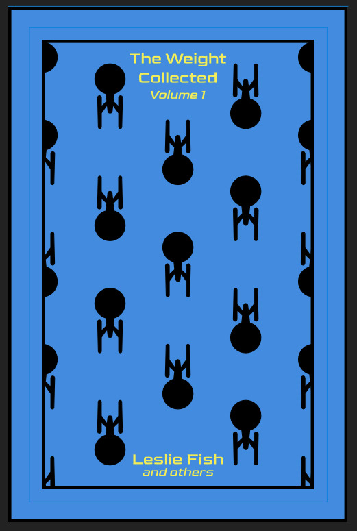
OPTIONAL STEP: mark guides onto your cover to help you position your stencil. whether or not i do this step depends on the design. a lot of the time, i just eyeball it. but for some designs, precision is key. for those projects, i use my ruler to mark out guides in white chalk for where i need certain elements of the stencil to fall. (i used guide marks for the "penguin clothbound" copies of the The Weight Collected that i've been using as an example in this post—the black rectangular boarder would've made uneven placement REALLY obvious.)
use transfer tape to remove your vinyl from its slick backing. what i've found is that you really, really don't want your transfer tape to be too sticky. you want it just barely sticky enough to pick up the stencil if you rub it down with a bone folder or your fingernail. i have a piece of transfer tape that i stuck to my jeans a bunch of times and then proceeded to use for 8 books in a row. it is, frankly, still a little bit too sticky. i have rolled it up so that i can use it for the next 8 books, at which point it will presumably be the right level of stickiness.
position your stencil. when you're happy with it, rub it firmly down with your bone folder. then do it again. then use your fingernail to score down over the titling text. then pray. in my experience, stencils prefer to stick to transfer tape rather than bookcloth. ymmv.
start at one corner of your stencil. carefully begin peeling back the transfer tape. i've found that essentially folding back the transfer tape (like, the corner that's been freed from the stencil being folded back away from the stencil) helps the tape to release. go slowly, rubbing down with the bone fold as necessary.
after you've finally manage to pry the tape off, go back and smooth down the stencil and firmly rub it down to get it to adhere to the bookcloth as thoroughly as possible with as few ripples or air bubbles as possible.
step 4: paint time!
here is a secret that the renegade discord taught me that i am now passing on to all of you: before you put any paint on your stencil, put down a layer of clear acrylic medium. the medium will finish the job of pasting down the stencil to your cover, and any leaks that happen in the process will be clear medium instead of colored paint (and will therefore be basically unnoticeable). ergo:
stipple a thin coat of acrylic medium over your stencil. you want to use an up-and-down daubing motion, not a brushing motion. brushing will get paint under your stencil. let dry.
after your medium is dry, stipple a few thin coats of your colored acrylic paint onto your stencil. let dry between coats. (i usually find that two coats is enough.) again, try to keep your coats thin. you don't want a thick layer of paint because that will create a raised surface above your bookcloth.
let your paint fully dry. i usually leave it overnight, but if i'm feeling especially impatient, i still make sure to at least give it a good three or four hours.
peel up your stencil. your weeding tools will once again come into play here to pry up little bits and pieces of stencil (like the stupid eyes of the "a"s and "e"s that were so annoying during the initial weeding stage).
step 5: optional setting stage
again, jury is still out on whether or not this is necessary, and the effects are pretty subtle. but i do it every time anyway. some tips:
use an iron on very low heat (i keep mine at the low end of the synthetic setting) and with steam turned OFF
keep a piece of parchment paper (NOT waxed paper. you want the slick paper that you put under cookies to keep them from sticking to the pan.) between the iron and your cover.
press the iron down, don't rub it like you're ironing a shirt. it's possible to smear your paint doing that (ask me how i know).
i usually lay the iron down on a section for 10-15 seconds at a time, then lift it and move it to another section.
start with less of everything (less heat, less time) and build up. always better to be conservative with this.
i usually continue until the paint is warm to the touch, then move onto another section. after it's cooled, i evaluate if i feel like it's melted into the cloth enough. if not, i repeat the process.
step 6: BOOK
congrats, you have put a design on a book cover. the world is your oyster. go forth and make books. become ungovernable.


113 notes
·
View notes
Text
Unaffected UI - ReShade
REST ini for TS3 (REST 32x v1.2.3)
What this does? This edited ini file from REST allows the UI in the game to be viewable while using ReShade presets.
I will be leaving this as is for now until REST has better compatibility with dxvk with a x32 version that shows up in the addons (if it does in the future), since dxvk is essential for ts3 in a way.


Installation:
Install ReShade normally for TS3, at least making sure it is 5.8+ in order to use REST (you may need to select TS3W.exe, dunno if it makes a difference vs selecting TS3.exe though).
Important!! - When selecting ReShade's addons, don't select ReshadeEffectShaderToggle as it won't work on 32x nicely. Download the specified version of REST from the creators github instead, which will be linked in the step below. This will save you some frustration.
2. Then download ReshadeEffectShaderToggle v1.2.3 (release.zip file, Important!!), placing the content inside (step 3) it in the games bin folder. (There are other versions that work nicely with 32x version of ReShade but this one plays more nicely with shaders in the game. I will test to see at later dates to find one that works nicer if possible. [I don't think the version you use matters too much but v1.3.0 works I believe as well])
3. Place only the file "ReshadeEffectShaderToggler.addon32" in your games bin folder where you downloaded ReShade to. If you are on GShade and it's ReShade v5.0+ Equivalent (5.8+ required for REST v1.2.3), place it into your addons folder.
4. Download the addon .ini file here that's edited for ts3
sfs <- download
5. Then place "ReshadeEffectShaderToggler.ini" (The file from this post/sfs) into the same place as "ReshadeEffectShaderToggler.addon32"
This version of GShade v3.5 doesn't work with REST unless a version is made by someone for it (This goes for the regular GShade equivalent and older version of GShades). I don't recommend using official verions of GShade, especially the newer ones.
In-Game:
Make sure that anti-aliasing/edge smoothing is disabled in the in-game setting or Reshade effects will turn off with the REST ini after loading a save ( most likely the REST toggle shader I enabled is tied to the anti-aliasing shader of ts3).
Setting Up ReShade Properly & Enabling REST:
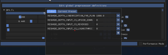
In the global preprocessor definitions, set it to look exactly like this in order to get ambient occlusion and etc. working properly. vvv
2. go into the "Add-ons" tab of ReShade, ticking ReShade Effect Shader Toggler on and then making sure the Toggle Group 1 or "TS3 Pixel Shaders" on the left, is activated.
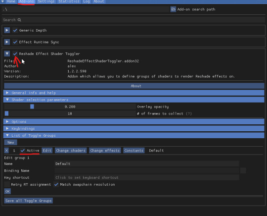
Something Neat:
When hiding the UI with "F10" the shader toggle group doesn't affect that part of the game and your ReShade/GShade preset should be back to normal. (Tested on REST v1.3.0 I believe)
Downsides (Not REST's fault):
Existing Presets will need to be tweaked back to original form.
Some shaders may not work properly (maybe more than some dunno).
If you want to use existing presets without them looking wrong, you can disable the Toggle Group at anytime (one you activated in above picture).
Compatibility:
REST doesn't work properly with dxvk. It could also be the latest version of REST I tested which doesn't show up in the addons in-game, or the specific version in their github I linked to, which isn't working properly (shaders do show up in toggle groups though but that's as far as it works correctly).
References Used:
Clear UI by vyxated
Tutorial by Redronn
More by Me:
FO4 Version by me
Credits:
4lex4nder for creating ReShadeEffectShaderToggler
Frans Bouma for creating ShaderToggler
ReShade & ReShade Community
Clear UI by vyxated as reference
Tutorial by Redronn as reference
Affinity Photo & Designer for Title & Text Images
242 notes
·
View notes
Note
That National Geographic leather binding for Yellowstone is fucking Gorgeous!!! (Pardon my Language)
How long have you been binding, and what would you recommend to someone who wants to try it for themselves?
hello and thank you so much!! I worked really hard on that one (and no pardon needed haha)!
I started binding in February of 2021, which means in a few months I'll have reached 4 years. It's been an awesome journey!!
If you'd like to try it for yourself, I'd recommenda few things!
1) You can 100% try out the basics with near free or cheap materials. People typeset in Word or Google Docs or Pages. You can print on printer paper & use regular sewing thread & scavenge board from old books or notebook backs or do a limp leather binding & use no boards at all. You can make paper pamphlets. Any comments I make following this are about my preferences for best results. The most expensive part that cannot be avoided is printing. On the other hand expenses can wildly escalate if you're committing to it; once you are doing leather it becomes somewhat unavoidably expensive.
2) Check out some tutorials from SeaLemon or DAS Bookbinding on YouTube for the physical construction. SeaLemon is really clear for a beginner starting out, but then I'd move to DAS for better technique (DAS also has a beginner series though). I watched DAS Bookbinding videos for three weeks straight before I was able to start, & while that doesn't maybe work out for everyone I do think it gave me a pretty strong basis of understanding for structural techniques. DAS is *really* good at explaining why he thinks you should do something. The structure of the NatGeo bind is basically DAS's video on a rounded & backed bradel binding (but with leather & sewn on recessed cords). There is some good stuff on Tiktok/IG, but watch short-form videos/reels with caution. They move a little fast and I've seen a couple give instructions that can result in structural flaws (not that this is unique to the form, cross-referencing on instructions from any source is a good practice). They are good for if you're looking for a specific technique (particularly modern decorative ones, like cricut use, edge gilding, HTV application). There are also published books you can buy or maybe request through your library, such as Hollander's Introduction to Bookbinding. Renegade Bookbinding Guild runs a whole bunch of technique-specific in-house zoom classes annually.
3) Look to other fanbinders for tutorials on how to format the text (this is because most pro bookbinders do not do both text design & book creation! it's a pretty unique feature of fanbinding). @renegadeguild has some publically provided resources on our website here and more typesetting tutorials for a whole host of softwares (Affinity Publisher is my choice - one time purchase, fuck you very much Adobe InDesign) located in the discord server. Anyone 18+ can join the Discord. The NatGeo inspired book (text & dust jacket) was created in Affinity Publisher.
4) Join a community of fanbinders! It's really lovely. The space has exploded & there are tons of people to be friends with, trade tips, & cheer each other on. I'm part of @renegadeguild and we do a whole bunch of events throughout the year, and we have an in-person retreat every other year. I've met with over 20 different renegaders so far, in three different countries, and it's been such a blast. Definitely the community helps keep up the motivation. Renegade isn't the only community out there though! There's groups more rooted in IG/tiktok circles that have their own discords, plus a number of FB groups. I do think most people who are comfortable on tumblr enjoy Renegade's vibe.
5) While I learned most of what I do online, some things really benefit from in-person learning. If you want to do leather binding I would really recommend trying to take an in-person class. I did two attempts at a leather binding on my own before I decided to hold off until I'd had at least one in-person class. Leather binding can be extremely frustrating, especially when you can easily end up with a book that looks worse than a cloth binding at your same skill level but for double the cost. Imo this is mostly because the leather specific skills like paring, warp management, and assessing a random piece of leather for bookbinding suitability are all pretty tactile experiences, all of which are difficult to assess through a screen and can result in an unpleasantly bulky/stiff/shapeless book if ignored. For example- while this book of mine is a pretty popular post, I don't enjoy holding it and reading it, especially in contrast to the NatGeo bind. Part of this was the material I chose; part was not being able to adhere to the instructions quite well enough; part was just not knowing enough about what I was doing; part is they're different constructions. This might just be a me thing though; I'm sure others have had success with online only tutorials for leather.
6) I'm not going to get into specific tools bc that could be a whole post, but some things are necessary (printer access), some things are necessary depending on style, some things are "makes life easier but only drop the money if it's stopping you from making books out of frustration", some things are just technique-specific tools. Examples - sewing frames are often brought up but are never necessary unless sewing on cords; cricuts & cutting machines are commonly used in fanbinding circles but I don't have one (& don't intend to atm).
7) Don't be shy to offer the author a copy!! Like other fan activities, fanbinding is part of our fandom community ecosystem. Your fanbinding is in communication with the author's story. Giving a bind to the author is a great way of keeping the ecosystem going. I tend to think of binds as a combo of comment, fic rec, and fan art inspired by the fic.
8) Paper grain sounds stupid but it IS IMPORTANT! My personal hierarchy of give-a-fuck for grain: Board grain, spine card grain, endpaper grain, cover paper grain, text block grain, book cloth grain. The only thing I personally sometimes ignore is book cloth grain; but many people will not worry too much about text block paper grain.
Gonna stop there for now. If you've got specific questions or want elaboration, feel free to ask. As with all things, YMMV, this is my own opinions/experience and may not apply in all cases. There's a whole lot of different techniques out there, and it's hard to ever say something is wrong, per se - but I think it's important to understand if a method has an outcome you may want to avoid. Prioritize your goals & adapt for them - what's your goal? Longevity, readability, aesthetics? You might make different choices depending on them. My choices influence the techniques I chose to focus on, the tools I buy, and thus the final aesthetic of my binds.
32 notes
·
View notes
Text
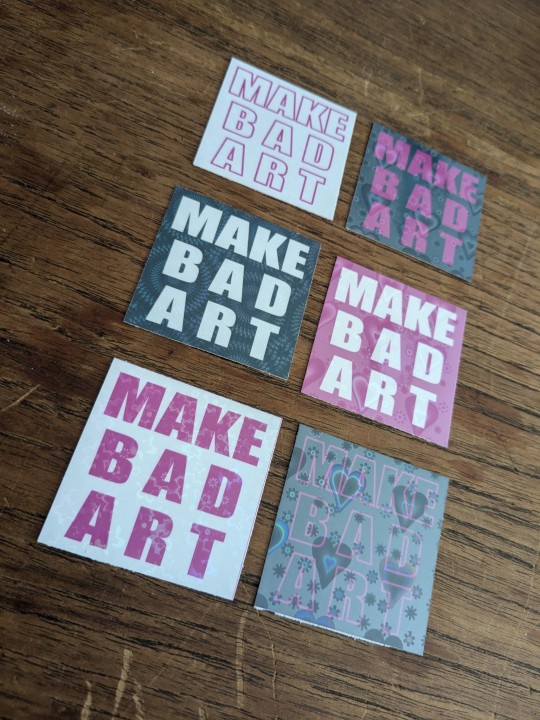
did u know the affinity suite has a six month free trial, no card needed? stumbled* into it and have been slowly teaching myself how to vector in designer
(*this is not hashtag sponsored, i legit did stumble into it and have been having fun, a+ marketing affinity)
these bad boys are STICKERS and involved a lot of trial and error
> MAKE BAD ART stickers measure apx 2"x2" and are home printed, laminated with holo film, and hand cut
the og black with white text was perhaps not ideal to start with, i definitely chewed through a lot of ink troubleshooting, but the end result makes me very happy. they're a lil janky but full of love, and truly fit the goal of making bad art
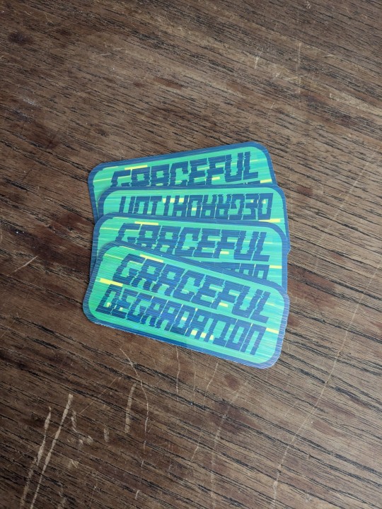
> GRACEFUL DEGRADATION stickers measure 3"x2" and are a love letter (love sticker?) to several of my favorite people, because i have a type and that is type includes chronically ill techno wizards
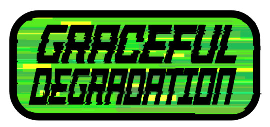
@craftsbyrom helped me a ton with some explanation on how to create the glitch effects i desired via a bespoke text based tutorial (why do those not exist anymore), which i then layered with this streaky holo film following the direction of the glitches. the end result is super cool!!
font was made by the typography artist yutaONE (insta: @/yuta_ptv_jp )
you can find these guys listed on my ko-fi shop for a couple bucks each, along with a bunch of other fun goodies
#cybercore#punk art#queer artist#graceful degradation#handmade stickers#diy#mochi rambles#mochi crafts#mochi makes stickers#mochi makes graphics#graphic design
43 notes
·
View notes
Video
youtube
Affinity Designer Tutorial - Creating and polishing simple shapes This video is all about different ways to polish, shade, and texture simple objects. I chose the humble button as an example. It's easy to create but can be changed into infinite designs. There are many different ways to shade an object from flat colours and gradients to combined effects using bevel and 3D.
#youtube#affinitydesigner#affinity#affinitybyserif#tutorial#video#designer#illustration#graphic design#vector#buttons
2 notes
·
View notes
Text
The Yarn Thief

Dedicated to that intrepid starcat that somehow found a skein of yarn in all those vanguard tactical crates in the HELM. Where did it come from?! Trying out Affinity Designer this week - if anyone knows a tutorial for that program they specifically like I would love to check it out. - Miko, wondering what her own indefatigable yarn-stealer is up to
#destiny 2#starcats absolutely steal yarn#how much do you think Mara owes Zavala#season of the wish#affinitydesigner
97 notes
·
View notes
Text
Ostrichmonkey Hack: Layout Behind the Scenes
Been procrastinating on this enough! So here is a look at some of the process and decisions that went into doing the layout for the Ostrichmonkey Hack.
Let's start with the goals I had in mind:
Keep it simple.
Keep it easy to make.
With those goals set, next step is gathering materials and resources (not all of this was done as cleanly as I'm making it out to be, but this is the gist).
Materials used:
Classic Explorer Template
Affinity Publisher and Photo
Fonts
Art
The text itself
The Classic Explorer Template was critical in getting this layout done efficiently, since it does a lot of the work for you. It's not a replacement for having a rough idea on how to do layout, but it can serve as a nice tutorial/explainer on different elements of layout and typesetting, and honestly, is worth its (digital) weight in gold. There's a free version available if you want to check out what it offers.
I use the Affinity Suite for my layout work. It's a nice set of programs with a manageable learning curve, but there are plenty of other alternatives so go with whatever works for you (one of my favorite elements of using multiple Affinity programs is that within Publisher, you can access both Designer (vector illustration) and Photo (photo editing, illustration etc) functions, which is just a nice workflow).
Here's what my setup looks like, with all the guidelines/base grid stuff turned on;

Normally I start with some style tests and “sketches” to get a feel for what I want the layout to look like, but the Classic Explorer’s does a lot of that heavy lifting for me already so I get to skip this step for this project. Speed and efficiency is one of the main reasons I wanted to use the template - this was envisioned as a “I just need to get something done” kind of project.
So next up on getting it done, fonts!
There are lots of great places to get fonts from, just make sure you're getting them from legitimate sources. Do your homework and make sure that "free" font is actually free to use in commercial projects.
I pulled three fonts from the depths of my collection.
One for the title and main headers (Wallau Deutsch)
One for the second header (Rakkas)
One for the body text (PT Serif)
Technically a secret fourth font for some "bullet points" (1651 Alchemy)

I picked these fonts out because they work together well and are readable. The title/main header fonts are comparatively less readable, but you can get away with that since headers are Big and used less frequently. The second header (Rakkas) is a nice middle ground between a full on blackletter font like the main header, and the classic-y serif of the body text. It creates a transition between the two fonts.
I used PT Serif since it was already in the template, but it also had the bold/italics versions I knew I would need, is readable at a variety of sizes, and had all the special glyphs I would need (it actually did not, but whoops, we'll get to that later).
Normally when I start layout, I do a quick "sketch page" where I try out different fonts and style tests that can look something like this;

But that wasn't necessary for this project (another advantage of the using the template).
Now, let's get to some choices in formatting the text itself.

Each time a key term came up, it was highlighted by bolding and italicizing it. Any time after that, it was just normal text. I went back and forth on highlighting it every single time, but the current format just looked cleaner so it won out.
Additionally, in several places in the text, rather than introducing a third header (which just broke up the page too much, disrupting the flow and clean look), I instead put what would have been the new third header (HP or WOUNDS in the above example) in all caps and behind a colon. This ended up not disrupting the text too much, and was only necessary a handful of times. But when it was necessary, I made sure to stay consistent. Consistent and organized formatting is one of the key ways to make your layout look nice and clean.
Aside from changing some font choices, one of the other ways I tweaked the template was with some spacing (between "sections", like in the above text, introducing an extra line break between the Attributes and Staying Alive sections) and the "bullet points".
The large bullet points that accompany the second headers are actually a glyph pulled from a different font. I picked that one out specifically because its just a little irregular and handwritten looking (1651 Alchemy is a handwritten styled font), and it also helped pull you to the start of new sections, further enhancing the second header. It helps make each section discrete and more "modular".
Back to extra spacing for a second now. So each "chapter" of the text uses the main header to designate it as a full "chapter".

"Characters" up top there is one of those chapter headers. It's nice and big and special, and also takes up a good chunk of space. One a full spread, this also means that the second page of text begins higher up than the text on the first page (compare where Attributes starts vs where Dying starts).
I played around with the format of spreads that did not have a main chapter header on them, starting the first page text up toward the top to have it line up with the second page. Which, probably would have been totally fine, but I preferred the look when each spread had the same kind of spacing. But repeating the main header on each spread was too clunky. So the solution;

Bam! A line!
Blank empty space looked too empty, but slapping a quick line there took up just enough visual space for it to work. Then, I carried that line-design-language to other places (to separate footnotes from the body text, within the tables, and sort of on the cover). This then made the line choice feel even more cohesive and purposeful.
And speaking of footnotes, that was another extra tweak/flourish I added not present in the template (the sidebars are part of the template, but sidebars rule so they would have happened regardless). The footnotes served as a way to share specific references as an informal "works cited". A lot of NSR/OSR design is super iterative, so I thought it would be cool to shout out some of the more direct inspirations and references I used when making my game.
But the footnotes were also kind of not really my downfall. Turns out PT Serif didn't seem to have all the necessary footnote glyphs, nor did it want to make proper superscripts of integers past 3. So, rather than trying to find a new body font (or deal with the headache of using a font solely for superscript notation), I just fudged the formatting some and stuck to asterisks, and restarting "numbering" on each spread. Oh well.
Let's now briefly touch on laying out tables.
It sucks.
My advice is find an example of a really nice looking table and then try and figure out what makes it look nice, and then doing that forever. Luckily, the template saves me again by including multiple examples of tables, ripe for tweaking. Which ended up looking like this;

Nice and clean! Hooray!
Okay, there's a lot of small decisions that goes into making text properly formatted and look nice, but I skipped some of those decisions and didn't go ham on typesetting, but whatever. That all about covers the important parts regarding the text. Now let's talk about art.
Public domain art is your best friend.
I went and trawled through a bunch of art I've saved from the Met's Open Access collection (there's plenty of great open access collections out there, just happened to have some from the Met handy), and settled on this piece;

Which I then dropped into Affinity Photo and played around until I ended up with this;
Nothing too wild, but it Felt Right, so it's done.
I then immediately dropped that onto the cover page, slapped the title on, added a quick border (and also spent some time trying to fix some weird issues that ended up being solved by just rasterizing it, whoops) and bam;

And that's the only art piece used throughout the zine! But I made the most out of it. Between each chapter, I had a single splash page and dropped in different zoomed/cropped versions of the art. Like so (and even on the back cover!);


The original image was high resolution, so zooming in worked, plus the effects/distortions I created hid any imperfections.
So that's the art sorted and the zine finished!
Now, this is getting pretty long, so if there's anything anyone reading this is interested that I didn't touch on, shout in the notes!
38 notes
·
View notes
Note
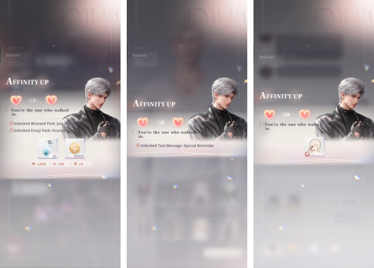
Hello I noticed you shared the ss of affinity for requirement and iirc for Sylus we jumped from lvl 1 to 5 right? Do you know if it's the same with other LI?
And I recently saw someone shared a quote from the affinity but sadly they don't specify which one and I don't remember if I already passed it. I thought we can check it at the affinity level on the LI profile so I only ss a few. If you don't mind, is it okay if you shared the affinity ss for Zayne? Only if you feel it's not a burden and if you have records of it of course. Thank you for everything 🩵
Hi
Whoever anon is I hope you get the response you wanted .
Please read the whole thing where I will try to explain the whole affinity quote thing based on my experiences..I have been meaning to talk about this
Let's talk about affinity first -
Let's start with latest man of the hour ,Sylus
Yes if u unlock sylus in main story you immediately jump from 1-4/5+ (depending whether u did the chat and then replied to his posts) immediately.
Reasons being - fighting with him ,getting cards so unlocking companion , chatting with him and interacting in posts.
I did all that as they designed a player to do and Got to 1-5
if you skip socials then it will be 1-4 jump.
For Zayne
He is the 3rd LI we meet in game ,And 2nd companion we unlock in destiny cafe after chapter 1
Mind you you can take a break after Chapter 1 with no one to rush you .
There's a [story] we get from him .
AND the BOND tutorial makes you do HIS bond as tutorials.
so with all that thing ,his affinity jump is very High overall in your first day of playing . But since everything happens After he is unlocked as companion you might be lucky to see the 💓1-> 💓2/3 and gradual progress if u don't do alotta stuff together because then the jump would be 2->6 ,8->13 due to catching up in affinity level .
but you can get 10-12+ affinity overnight if u are new player and you main him .
Same goes for Xavier .
You can unlock him BEFORE zayne in fact u can stop story midway where u didn't meet zayne and interact with Xavier .
Although he doesn't have the bond tutorial buff .
He is the face for the rest of tutorials ,name it Touching in destiny cafe ,Trial stages ,very first card u ever level up or equip Protocore to .
And you what comes with it? Affinity level up!!
Add choosing him in beginner standard banner.
Yeah..
you can get 10-12+ affinity overnight as a new player if u are new player and you main him .
For Rafayel
He is locked in Chapter 2.. a lot of new players makes the mistake of not finishing chapter 2 but pulling for him .resulting the delay of his affinity level up
When we unlock him in story we use our very first Burst with him .and then there are two Text back to back that helps his affinity.
But for rest you have to be clever and him focused .Because with all the tutorials ,Zayne & Xavier's status has higher advantage of boost without you even trying ..
Just like how everyone has advantage in terms of affinity level against Sylus but you can still see Some fans hitting affinity 70 with him .
About quotes-
When you unlock sylus
his first quote is always
💓1->5/1->4
"You are the one who walked in "
In fact he goes on and on
But in my second alt I didn't respond to the chat .
So I had💓 1->4 jump
Then I got new and interesting quotes due to Cycle being different (4->5 & 6->8 for example)

Then you might think "oh it's the unique cycles that gives the unique quotes"
True BUT
They are just early access & not locked in that particular affinity change.
LIs has chances of saying one single Quotes in a row .
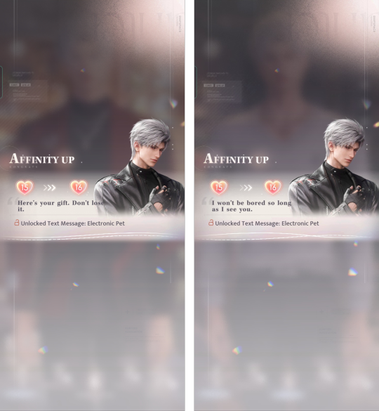
Zayne once went "you are like a dessert" "you are like a dessert " "you are like a dessert " "you are like a dessert" from 22->23->25->26->27->28->29->31 affinity IN A ROW . I think he thinks of mc as dessert idk guys what do you think?
Likewise sylus sometimes he goes on tangent on one singular quote

But it doesn't guarantee he will say same thing for you..he didn't do for me
But one thing stays consistent is the affinity where moment post / chat / phone call unlocks .
for those affinities you will get quotes that stays consistent for most part .
that's why I try include the screenshot of them because chances are they are same for you .
unless you are odd one out-
But 100% consistency?? Are they though??
🙃🙃🙃🙃🙃🙃🙃🙃🙃🙃🙃🙃🙃🙃🙃🙃🙃
another example ,same quote but entirely different stage of affinities .
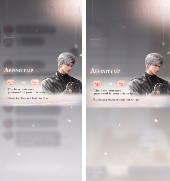
So yeah it's hard to tell "exact" affinity you will get your quotes .
when the new companion unlocks
The very first affinity quote from every LI will and should be same for everyone
then as you progress ,When everything is new about them ,that's where it's same quotes for affinities for every player .
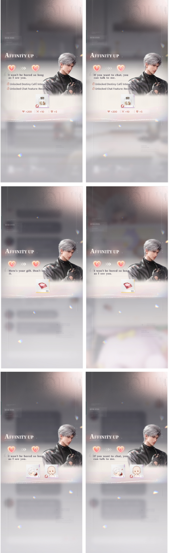
For zayne
his first quote for me was always
💓1->2
"it's a wonderful thing to see you again"
then these following quotes will come through (this is based on last encounter SS)
💓 2->3
" it's a wonderful thing to see you again"
💓4->5
" it's a wonderful thing to see you again"
💓5->6
" it's a wonderful thing to see you again"
💓 6->7
" for a long time ,my gaze has always been yours "[text unlock:waiting room]
💓 7->8
" we have been meeting each other a lot as of late"[moment post :rabbit]
💓 8->9
" it's a wonderful thing to see you again"
💓 9->10
" I am more than just your doctor"[gift for room]
💓 10->11
" I am more than just your doctor"
💓10->11
" contact me even if for no particular reason"
💓 11->12
" contact me even if it's for no particular reason"
💓 11->12
" you are the best medicine I have"
💓11->14
" contact me even if it's for no particular reason"
💓19->20
"your destination is where I want to go "
💓20->21
"you are like a dessert "
For Rafayel
First quote was
💓 1->4
"let's look at the sea together next time "
then these following quotes will come through (this is based on last encounters SS)
💓5->6
"let me see if there are new requests"
💓5->6
"we meet again ,miss bodyguard"
💓6->7
"we meet again miss body guard"
💓5->7
"let's look at the sea together next time"
💓7->8
"let's look at the sea together next time"
💓8->9
"let's look at the sea together next time"
💓 8->9
""we meet again ,miss bodyguard"
💓 9->10
"you seem to always appear with the sun"
💓 9->11
"you always bring refreshing inspiration"
💓10->11
"you always bring refreshing inspiration"
💓11->12
"you always bring refreshing inspiration"
💓11->12
"you seem to always appear with the sun"
💓 11->13
"you seem to always appear with the sun"
💓13->14
"everyday is worth commemorating"
💓 13->14, 16->17, 17->19
"you seem to always appear with the sun"
💓14->15
"you always bring refreshing inspiration"
💓15->17
"everyday is worth commemorating"
💓19->21
"you are my only choice "
💓21->22
"all my weekends are for you to use"
For Xavier
First quote last time was
💓1->3
" lets meet at a safer place next time "
then these following quotes will come through (this is based on last encounters SS)
💓3->4
" lets meet at a safer place next time "
💓4->5
"companionship sounds like a good idea"
💓5->7
"companionship sounds like a good idea"
💓9->10
"I should leave my oven to you"
💓11->12
"I won't be a player short in two-player game anymore "
💓11->12
" now I have someone I can share food with"
💓12->13
"I won't be a player short in two-player game anymore "
💓13->14
" now I have someone I can share food with"
💓14->15
" now I have someone I can share food with"
💓16->17
"I won't be a player short in two-player game anymore "
💓16->17
" now I have someone I can share food with"
💓 17->19
" now I have someone I can share food with"
💓18->19
"I won't be a player short in two-player game anymore "
💓18->19
" now I have someone I can share food with"
💓19->20--20->21--21->23->
"every promise to see each other will be kept "
A lot repeating and eventually new stuffs comes as you get into new double digits ig . But the line up-
that isn't 100% same for everyone.
Personally I pick the one I get the most times for all 3 options combined ,but I could be wrong too ,there is a chance.
But in the end you will get the quotes sooner or later [it's only a matter of time].
So now we know even though there's serial of when the news quote arrives ,there also isn't.
So what we need is a list of all existing quotes possible,because some players can get stuck with getting one repeatedly ,correct .
There's an awesome player who has been archiving the Affinity quotes for all the LI Boyz @its-de
Check their threads out here's a link of sylus .you can click around and see them as there are also zayne ,rafayel & Xavier's threads.
❄️🖤🐚⭐💓💓💓💓💓💓💓💓💓
#its fay speaking#love and deepspace xavier#love and deepspace#love and deep space zayne#love and deepspace rafayel#love and deepspace sylus#sylus lisharchivez#rafayel lisharchivez#xavier lisharchivez#zayne lisharchivez#lisharchivez#lisharchievez#l&ds#zayne#rafayel#xavier#sylus#affinity#love and deepspace affinity#zayne affinity#sylus affinity#rafayel affinity#xavier affinity
23 notes
·
View notes