#affinity tutorial
Explore tagged Tumblr posts
Visit Tumblr Blog
Explore Tumblr blogs with no restrictions, modern design and the best experience.
Last Seen Tumblr Blogs


Fun Fact
US Tumblr user growth rate is estimated to slow down to 4.1%.
Text
:-) Vector Art Help Pls :-)
Ok so,,,,
I’ve been desperately trying to get myself to do more vector art for the last idk how many years, and finally sat down and tried again yesterday.
AND HOOOO BOYYYYY did I forget how frustrated it makes me .^.

(It’s me being punched by illustrator and affinity)
Everything I make just looks so gd awful and I just feel like I’m probably doing everything in the most inefficient way possible (especially just Line art) :’-)
So, basically:
I would really appreciate some advice / tips on how best to use vector based illustration apps if anyone has any???
Genuinely anything, even the most basic “this is literally common sense but for some reason you might not have thought about this (because you sound dumb)” would be so helpful right now - I am getting so frustrated (´°̥̥̥̥̥̥̥̥ω°̥̥̥̥̥̥̥̥`)
Any advice at all would be so hugely helpful and I will love you forever
(Honestly, thank you if you’ve even read this far - I’m going to stop rambling now)
Ta!
・:*+.\(( °ω° ))/.:+
#or good tutorials that you recommend maybe???#I find it hard to find ones that aren’t either incredibly simple or ridiculously complex#I use procreate regularly and am fairly computer literate#but sometimes the amount of new stuff / terminology just feels overwhelming#thank you so so so much#:’)#art advice#art help#vector art#vector#vector illustration#vector advice#vector tutorial#art tutorial#art help pls#2D vector art#adobe#adobe illustrator#adobe illustrator help#Adobe advice#Adobe tutorial#Adobe illustrator tutorial#illustrator#affinity designer#affinity designer help#affinity tutorial#affinity iPad#affinity designer tutorial#art advice needed#art help needed
7 notes
·
View notes
Video
youtube
Affinity Designer Tutorial - Manually Tracing with the Pencil Tool This video shows you how to easily trace a photo using the Pencil Tool to create a simple lineart illustration. Seeing Affinity Designer has no automatic tracing tool, and most tools can't properly simplify the subject, doing it manually is a quick and easy approach if you own a tablet or work with an iPad. Make sure the photo has good quality and the elements you want to trace are clearly readable. Lower the photo's opacity, lock the layer, and work on a layer above. Set up the stroke to a good size, adjust the pressure curves, and start with the main lines. Don't lose yourself in detail. Less is more.
#youtube#tutorial#affinity#affinity designer#vector art#tracing#pencil tool#lineart#goldfish#illustration#basic
3 notes
·
View notes
Text
😱 [Contient un spoiler de l’épisode 5 !]
Et ben, alors ? Pourquoi tu dessines en bleu ?!
La réponse est une astuce de filou pour éviter de gommer ses pages avant de scanner !
Et sinon, on se retrouve le 11 avril pour l’épisode 5 de la BD 📆
#french side of tumblr#upthebaguette#drawing#bande dessinée#affinity designer#affinity#dessin#tutorial#photoshop
1 note
·
View note
Text

Another new blog post for you: "2025 Photo Calendars (part two)"
#Adobe Photoshop Lightroom#Affinity Photo#Affinity Publisher#calendar#CorelDraw#Lightroom#MS Word#photo#photography#Photoshop#template#tutorial#Word
1 note
·
View note
Text
after discovering this game less than a month ago, me at any point in time: man i wish I was playing limbus company rn
#the withdrawl...Ouyhg...the withdraawal (i havent played the game in 15mins because i was eating)#I DIDN'T EVEN USE THW GACHA SYSTEM EVEN ONCE YET and im only on canto I BUT IM ADDICTED ITS SO FUN#limbusposting#i also kinda only half understand the combat system i kinda just Know by heart the numbers meanings and stuff but if you asked me to explain#them to you id just . uhhhh. so theres some stuff and uhhh idk google it. i understand the sin affinity thing well tho#its fuun im understanding more as i go#(i didnt listen to anytthing in the tutorial caue im NOT listening to Faust infodumping sorry)#i love faust but like girl rhis a horror rpg supposedly why am i getting slapped with walls of text#i should play lobcorp and ruina too but uh ummmmm *broke*#extraterrestrial noises
1 note
·
View note
Text
AFFINITY IS HAVING A SALE!!! EVERYTHING IS 50% OFF!!!
Here's your chance to get a creative suite analogous to Adobe's, except without Adobe's bullshit!
#I've been waiting for a sale because the V1 suite lacks a lot of functionality that I see in tutorials for V2#Affinity#creative#digital art#publishing#design#photo editing#Affinity Designer#Affinity Publisher#Affinity Photo#Photoshop#adobe#fuck adobe#universal licence#flash sale
0 notes
Text
How to Cancel Photoshop Subscription
Are you here as you don’t want to retain your Adobe Photoshop subscription anymore? Oh yes, you can cancel it seamlessly!!
Do you know that even after you cancel your Adobe Creative Cloud subscription, you can still access your Adobe account.

#learn#how to cancel#photo editing#GIMP#GNU Image Manipulation Program#photoshop#graphic designing Adobe#Photoshop Tutorials#manage subscriptions#View Your Plans#cancel subscription#follow the prompts#blogs#confirmation#adobe account#edit your Photoshop files#Status Post Cancellation#Alternatives to Photoshop#Photoshop Elements#Affinity Photo#bloggers#adobe photoshop#Pixlr#cloud platform#indesign#graphic design#illustrator#adobe stock#technical support#bug fixes
0 notes
Text
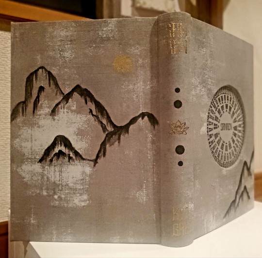
Book Decoration: AKA All The Ways I Don't Use a Cricut
(this post is for people who don't want to buy an expensive cutting tool, or for those that do have an expensive cutting tool that would like to mix things up a little)
1. Print That Shit
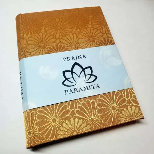
If you're already printing your own textblocks, an easy step for titles is to print them. Above is a title printed onto an "obi" of decorative paper. I measured out where I wanted things on the finished book and laid it out in Affinity, then printed it on a full sheet & trimmed it down to wrap around the book. A more simple method is to print & glue on the label into a slight indent in the cover (to protect it). A third option is to do the spine in bookcloth, while you print on paper for the cover and then glue that paper onto the boards (this usually looks even better when it is a three-piece bradel bind).
2. Foil Quill / Heat Pens
The heat pen is one of my go-to tools, but it can be a bit touchy about materials. The most popular version is the We R Memory Keepers' Foil Quill (which is one of the most ergonomic), but other pens exist that can get you to a higher heat temp, finer lines, or more consistent foil. For example, I have a pen created by a local Japanese bookbinding studio that fares way better on leathers than the WRMK quill & with a finer tip, but it's hell to control. Best results in general are on paper or smooth bookcloth (starched linen, arrestox, colibri - even duo will work but its less solid). The fuzzier a bookcloth is, the less your foil quill wants to deal with it. This means the heat n bond method of making bookcloth does not play nice with a heat pen usually, but there are two solutions: 1) use this tutorial on paste + acrylic medium coated bookcloth instead that will get you a perfect surface for the heat pen, or 2) use the pen on paper & then glue onto the cloth. I did a video tutorial for both foil quill use and this type of homemade bookcloth for @renegadeguild Binderary in 2023.
You get the most consistent results by tracing through a printed template that is taped in place, as I do in the video above.
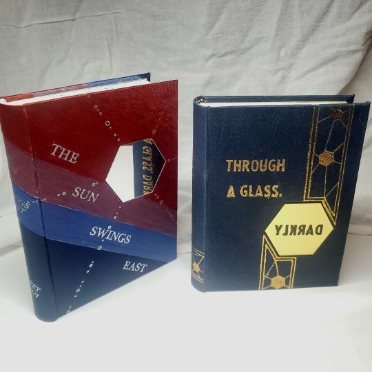
3. Paint That Shit
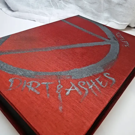
Acrylic paints will do you fine! The above is free-handed with a circle template, because I wanted that vibe. If you need straight lines that won't seep, lay them down with tape first & then paint over it first with a clear Acrylic medium, then your color. Same goes for stencils. Two more examples of painted bookcloth:
4. IT'S GOT LAYERS
By using layers of thinner boards, you can create interesting depths & contrasts on your cover. You can also make cutouts that peep through to the decorative paper behind. The most important part to this technique is the order in which each edge is wrapped. To get a good wrapped inside edge, you will split the turn in into tabs to get them to conform to a curve. You can also layer multiple colors of bookcloth without multiple layers of board, as seen below left, so long as you mind your cut edges for fraying.
5. Inlaid... anything
Mirrors! Marbled paper! I saw someone do a pretty metal bookmark once! The key is creating a little home for it to live in, which is pretty similar to the above layering method. On one layer you cut the shape, & glue that layer onto the bottom solid board before covering. You can do the top layer as an entire 1 mm board (like I did for the mirrors) or a sheet of cardstock, like I would use for inlaid paper.
6. Decorative Paper
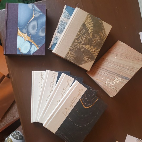
Decorative paper is always helpful & adds to the paper hoard... & its effects can be layers with other techniques, as below. Marbles, chiyogami, momi, or prints & maps of all kinds can be great additions. Some papers may need a protective coating (such as wax or a sealer).
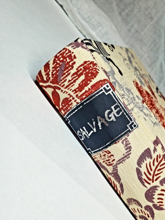
7. Stamps (with optional linocut)
While I've not used many more regular rubber stamps, I do know some who have, successfully! And I've used one once or twice with embossing powder (see photo 3 up, the gold anchor on the little pamphlet bind). What also works is to carve your own linocut or stamp, & then use block printing ink to ink it onto your fabric (as i did above). A bit time intensive, but it was nice how easily reproducible it was, and I liked the effect I got for this particular bind.
These methods are not exhaustive, just ones I've used, and there are of course many others. I haven't gone too into detail on any of these for the sake of length (& post photo limits) but feel free to ask about more specifics. Usually I'm using them in combination with other options.
#fanbinding#bookbinding#celestial sphere press#ficbinding#in progress review#bookbinding how to#i am not particularly anti-cricut or anything#it's just a very expensive tool#and its prevalence sometimes makes new binders think they HAVE to get one#when they absolutely do not#you can make pretty books without it
1K notes
·
View notes
Text
so, you wanted to start bookbinding?
so @princetofbone mentioned on my post for "factory settings" about wanting to know more about the binding style that i used for it. so i thought i might make a post about it.
i was as terrible as i always am for taking in progress shots, but i can link you to the resources i used in order to make my book. i would also like to point out that "factory settings" is my 120th bind, and i have been doing bookbinding as a hobby for just over 3 years now. unfortunately this means some of the methods that i used for that bind aren't particularly beginner friendly, just in terms of the tools and methods i have used, but i would love to point you in the right direction when it comes to resources. i dont say this to sound pretentious which i fear i might come across, just so that youre fully informed. getting into this hobby is fun and rewarding, but it can definitely be intimidating.
with that caveat, heres a list of links and resources that i have used for bookbinding in general, with additional links to methods i used specifically in regards to this bind.
ASH's how to make a book document. it gives you a great introduction into typesetting fics (where you format the text of fics to look like a traditionally published books) and then turning them into a case-bound book (the style i used for "factory settings"). it is comprehensive, and explains how to use microsoft word to do your bidding. it was invaluable to me when i was just starting out! currently i use affinity publisher to typeset/format my fics for printing, but i only bought and learned how to use that after i had been binding books for a year and a half. i made some beautiful typesets with word, and some of my close friends use it still and design stuff that i never would be able to in my wildest dreams (basically anything by @no-name-publishing)
DAS Bookbinding's Square Back Bradel Binding. a great style to do your first bind in! this method requires, when making the case, to attach the cover board and the spine board to a connecting piece of paper, which makes it so much easier to match the size of the case to the size of the text block (your printed out and sewn fic). using this method is what allowed me to get much more accurately fitting cases, and made me much more confident with the construction of the books i was making. a well-made book is something that is so wonderful to hold in your hands!
DAS Bookbinding's Rounded and Backed Cased Book. This is the specific method that i used to create my bind for "factory settings"! even before i could back my books, i found that watching DAS's videos in particular helped me see how books were traditionally made, and i was able to see different tips and tricks about how to make nicer books.
Book Edge Trimming Without... i trim the edges of my text block using my finishing press and a chisel i have sharpened using a whetstone and leather strop with buffing compound on it. i follow the method for trimming shown in this video!
Made Endpapers. i follow this method for my endpapers, as i used handmade lokta endpapers, and they can be quite thin, but they look beautiful! i used "tipped on" endpapers (where you have your endpaper and then put a thin strip of glue on the edge and attach it to your text block) i used for a very long time before this, but these feel like they are much more stable, as they are sewn with your text block.
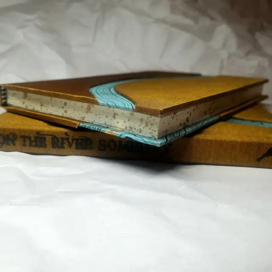
Edge Sprinkling. this is the method that i used for decorating the edges of my text block. but the principle is basically clamping your text block tight and then sprinkling the edges. i do not believe you need to trim the edges in order to do sprinkles on the edges, and that's what makes it accessible! i personally just use really cheap acrylic paint that i water down and then flick it onto the edges with my thumb and a paint brush.
Double-Core Endbands. i sew my own endbands, which i followed this tutorial for. that being said, it's kind of confusing, and this video is a bit easier to follow, but it is a slightly different type of endband.
Case decoration. i used my silhouette cameo 4 to cut out my design for "factory settings" in htv (heat transfer vinyl). i also used my cameo 4 to cut out the oval of marbled paper on the front, as i honestly didn't want to try my hand at cutting an oval lol. i also glued some 300 gsm card with an oval cut out of the centre of it onto the cover before covering it with bookcloth, to get a kind of recess on the cover. i then glued the oval of marbled paper onto the top of the recessed area once it was covered with bookcloth, so that it was protected. the images i used were sourced from a mix of rawpixel, canva and pixabay. a more accessible way to get into cover decoration is by painting on a design for your cover as described in @a-gay-old-time's tutorial just here. or even doing paper labels, which look classy imo.
physical materials. sourcing these will depend on your country. i am located in australia, and have compiled a list with some other aussie bookbinders of places to buy from. here is a great post describing beginning materials for getting started binding.
@renegadepublishing. this tumblr is great! its what got me started bookbinding, and being in the discord has been inspiring, motivating, and honestly just one of the best online experiences i have ever had. it is full of resources, and most people in there are amateur bookbinders, with a couple of professionals thrown in. the discord is 18+, and anyone can join!
i'm sorry this post got so long, but i hope that this has a lot of information for you if you would like to get started bookbinding. its one of the best hobbies ive ever had, and i genuinely believe i will have it for the rest of my life.
4K notes
·
View notes
Text
I wann learn how to do art digitally but my biggest obstacle is that I've always had a natural affinity for physical media and the idea that I might actually have to sit down and patiently follow a tutorial to achieve tge same effect that I've been able to just manually shit out on a page instinctively since childhood makes me wanna jam a fork into my leg
397 notes
·
View notes
Text
𝙱𝚊𝚔𝚒𝚗𝚐 𝙳𝚒𝚜𝚊𝚜𝚝𝚎𝚛 | 𝚆𝟸𝚂
𝗽𝗮𝗶𝗿𝗶𝗻𝗴: harry lewis x fem!reader
𝘀𝘂𝗺𝗺𝗮𝗿𝘆: the one where you and harry try baking together, leading to a kitchen disaster and cookies that are more chaotic than delicious, but still a lot of fun
𝗺𝘂𝘀𝗶𝗰: too sweet - hozier
𝘄𝗮𝗿𝗻𝗶𝗻𝗴𝘀: none!

.・。.・゜✭・.・✫・゜・。. .・。.・゜✭・.・✫・゜・
It had started innocently enough. You and Harry had been lounging around the house, bored out of your minds, and it didn’t help that the weather outside was miserable—rain pounding against the windows, dark clouds hanging heavy in the sky. Harry had been flipping through YouTube, and you were scrolling aimlessly on your phone when he suddenly piped up.
“I’ve got an idea,” he said, his voice laced with enthusiasm.
You glanced at him, raising an eyebrow, immediately suspicious. “You? An idea?”
Harry was quick to defend himself. “Oi, I’ve got loads of ideas! Not all of them are stupid.” He leaned forward, the mischief in his eyes giving you a feeling you couldn’t quite place. “Let’s bake something.”
You blinked. “Bake? You?”
He shrugged innocently. “I watched a tutorial. I reckon I could bake cookies. You know, chocolate chip. The classics.”
You leaned back, crossing your arms. “Right, sure. I’m not sure I trust you in the kitchen.”
His grin widened. “Well, that’s what makes it fun. Let’s give it a go.”
You hesitated for a second but found yourself standing up and walking towards the kitchen anyway. “Fine. But if this ends in disaster, I’m blaming you.”
“Oh, come on. It’ll be fun!”
You gave him a skeptical look as he pulled open the pantry and grabbed the flour, sugar, butter, eggs, and vanilla extract. “Okay, so what’s the first step?”
Harry scanned the recipe on his phone for a second. “Uh… well, we need to cream the butter and sugar first.”
You watched as Harry grabbed the butter and tried to “cream” it with the sugar, but it didn’t quite look right. He was using a fork like he was fighting with a stubborn piece of dough, and you couldn’t help but laugh.
“You’re supposed to use a mixer, mate,” you teased, leaning against the counter.
Harry frowned, clearly not getting the memo. “Nah, I’ve got this. Who needs a mixer?”
You sighed but kept your comments to yourself. After all, you had agreed to this. You grabbed the eggs and started cracking them into a bowl, only to have Harry stare at you like you were performing some grand, complex task.
“Wait,” he said, his eyes widening. “You just cracked that so easily. I thought that was a skill only chefs had.”
You rolled your eyes, smiling. “It’s not that complicated. You crack the egg, and the good stuff goes in the bowl.”
His face lit up. “Ohhh. Got it.”
While you were focused on cracking the eggs, Harry was tackling the flour. He poured the entire bag into the bowl in one go, and a white cloud erupted into the air, dusting his entire shirt. His eyes widened as he looked down at the flour-covered fabric.
“Um, Harry… you’re wearing that for the rest of the day?”
He chuckled sheepishly, brushing off some of the flour. “It adds to the authenticity of the moment.”
You snorted, shaking your head. “That’s one way to look at it.”
At this point, you were both getting covered in flour. You couldn’t even remember how, but somehow the kitchen was now covered in a light dusting of the stuff. You had flour on your nose, in your hair, and all over your shirt. Harry, who had an affinity for making everything into a competition, tried to “out-flour” you. Before long, it was a full-on flour fight, with both of you laughing so hard you were barely able to stand.
“Alright, alright,” you said, trying to catch your breath, “let’s get back to it before we turn into flour-covered mummies.”
You turned back to the dough, which was now a bit of a sticky mess. You had to admit, it wasn’t looking much like cookies yet.
“So… what’s next?” you asked, slightly out of breath from laughing.
“Uh, let’s see…” Harry checked the recipe again, only to suddenly drop his phone on the counter in frustration. “This thing’s a nightmare. I think it’s broken. Help me out here, please?”
You rolled your eyes good-naturedly but walked over to check. “It’s not broken, Harry. Just—okay, we need to mix it all together. The wet ingredients first, then the dry.”
As you began mixing, Harry, still trying to look competent, decided he would take care of the chocolate chips. You had to admit, he was doing better now. His usual overconfidence was coming through, and you could tell he was trying to make it look like he was doing more than he was.
“Do you need some help with those?” you asked, eyeing the chips.
He winked at you, attempting to act casual. “Nah, I’ve got it.”
You watched as Harry began pouring the entire bag of chocolate chips into the mixing bowl—without measuring it.
“Mate, what are you doing?”
His face turned red. “What? More chocolate is never a bad thing.”
“Yeah, well, if we wanted to eat pure chocolate and nothing else, we would’ve just eaten the chips straight from the bag,” you teased.
But it didn’t stop Harry. He kept adding more and more chips until the dough looked like it had turned into a sea of chocolate with a touch of flour.
“Well, I think this is looking great,” Harry said proudly, as if he hadn’t just created a gooey mess.
You couldn’t help but laugh, and you started spooning the dough onto the baking tray.
When the cookies finally went into the oven, you both stood back, watching the timer. The kitchen now looked like a disaster zone—chocolate chips scattered across the counters, flour everywhere, and half a dozen utensils left haphazardly on the counter.
“So,” you said, looking at the clock, “what do we do now?”
Harry leaned against the counter, casually glancing over at you. “I guess we just wait for the magic to happen.”
You raised an eyebrow. “If by ‘magic,’ you mean a pile of cookies that might collapse into goo when we try to take them out, then sure.”
Harry laughed. “It’ll be fine. You’re overthinking it.”
The timer dinged, and both of you jumped. You rushed to the oven, and Harry leaned in to peer at the cookies. They were… well, they were cookies. Some were perfectly golden, others were slightly burnt around the edges, and the ones in the middle looked like they were still half-dough.
“I think we may have made… interesting cookies,” Harry said cautiously, peering at the uneven batch.
You both stared at the cookies for a long moment, both of you trying to figure out if this was a total failure. Finally, you grabbed one and gave it a taste. The texture was soft and a bit gooey in the center. Not perfect, but not terrible either.
“Well,” you said, popping a bite into your mouth, “they’re… edible.”
Harry grabbed one and took a bite, his face lighting up in a way that made you laugh. “Hey, they’re not that bad. I’d say we nailed it.”
You raised an eyebrow. “Nailed it? They look like something I could have made in my sleep. Half of them are burnt, and the other half are… mushy.”
“Still, they’ve got character,” Harry replied with a grin.
You laughed, shaking your head. “Character, sure. That’s what I’m calling it too.”
“I mean, if we can’t cook, at least we’ve got fun out of it,” Harry said, holding up his cookie in a mock toast.
“True,” you agreed, “I’ll give you that. But I think next time, we’re just going to order pizza and let someone else handle the food.”
“Deal,” Harry agreed, his smile widening as he stepped closer to you. He reached out, taking another cookie. “But this was a good time, wasn’t it?”
You nodded, smiling back at him. “Definitely. Even if we did nearly destroy the kitchen in the process.”
“Next time, we make cupcakes,” Harry said.
You raised an eyebrow. “Are you sure that’s a good idea?”
He winked. “What could possibly go wrong?”
“Famous last words,” you muttered, but you knew you’d do it all over again. Because with Harry, even the messiest, most chaotic moments were the ones you’d never forget.
.・。.・゜✭・.・✫・゜・。. .・。.・゜✭・.・✫・゜・
masterlist
#harry lewis#w2s#wroetoshaw#harry lewis imagine#harry wroetoshaw#harry w2s#harry x reader#w2s x reader#british youtuber#british youtuber x reader#wroetoshaw x reader#wroetolando
149 notes
·
View notes
Video
youtube
Affinity Designer Tutorial - Creating and polishing simple shapes This video is all about different ways to polish, shade, and texture simple objects. I chose the humble button as an example. It's easy to create but can be changed into infinite designs. There are many different ways to shade an object from flat colours and gradients to combined effects using bevel and 3D.
#youtube#affinitydesigner#affinity#affinitybyserif#tutorial#video#designer#illustration#graphic design#vector#buttons
2 notes
·
View notes
Text
as per a request in my local renegade server: here is my process (such as it is) for the stenciled covers i've done for my binds. obviously, huge thanks to everyone in the renegade discord for teaching me most of what i know about bookbinding. this tutorial only exists thanks to the resources they've made available and the conversations i've had there.
material list
vinyl cutter (i have a silhouette portrait 3) + mat + blade
stencil vinyl (i have this one, but have had some adherence troubles with it. unclear whether this is just The Nature Of Stencil Vinyl or whether there's a better brand out there. adhesive vinyl can also be a viable option, although i haven't personally experimented with it yet.)
transfer tape (i have this stuff. it's fine.)
weeding tools (i have this hook and a very fine tip pair of tweezers. i highly recommend getting a hook, especially if you—like me—are haunted by the specter of carpal tunnel. get an off-brand one or get one on sale, though. i only have the silhouette brand one because it was on clearance.)
acrylic medium (i have this one because it was on sale at the time i was buying acrylic medium. when i replace it, i will be replacing it with a matte one. the gloss definitely has a noticeable sheen that i don't love.)
acrylic paint (literally any paint will do. i've been mostly using the decoart extreme sheen because it's $4 at michaels. you may be noticing a theme here.)
stiff stenciling brushes (the ones i have are similar to these but cost even less. again, there's a theme here.)
an iron and some parchment paper (jury is still out on whether using heat to "set" the pattern is necessary, but i do feel like it melts the paint a bit into the bookcloth and lessens the extent to which the pattern sits above the bookcloth.)
your trusty bone folder
instructions and a truly hideous number of words under the cut.
step 0.5: discern what will make a good stencil and what will make you hate yourself, your life, and the art of bookbinding
there are a LOT of different ways to put titling on a book. you could do a paper cover with a printed design or paste paper labels onto bookcloth or foil your title onto your cover with heat activated foil. the best method depends on what kind of design you have in mind, what tools you have available to you, and what materials you're working with (for example, i've had very bad luck getting acrylic paint to adhere to Allure bookcloth, but Allure does foil like a dream).
as far as stencils are concerned, you can kind of sort cover designs into three categories:
BEST for stencils: big, bold shapes on larger format books (think letter folio or letter/legal quarto)
OKAY for stencils, but you might hate yourself: intricate detail at a large enough form factor for it to be cut well by your vinyl cutter
BAD for stencils, you will die and it will hurt the entire time you are dying: lots of intricate detail and lots of fine lines
below are examples of category 1, 2, and 3 (all designed for letter folio). to be clear, category 3 can technically be possible, depending on the design. but only undertake it with the awareness that you will die, and it will hurt the entire time you are dying.
step 1: design a thing to put on your cover
i'm not going to go too in depth on this because cover design is a HUGE can of worms. a few pointers, though:
i never start designing my cover until my text block is done. this allows me to design my cover at "full size" based on the measured size of my text block and cover boards.
i fully lay out my cover in a separate program before exporting a transparent PNG to silhouette studio (or whichever proprietary software you have to use to communicate with your particular vinyl cutter). i use affinity designer. some free options would be inkscape (if you want to work with vectors) or gimp.
i design my cover on a document with dimensions of (HEIGHT of boards + 20 mm) x (WIDTH of boards or spine + 20 mm) and 10 mm margins. the area within the margins represents the actual dimensions of the thing i'm designing, while the area outside of the margins creates a mask that prevents me from getting paint on things i don't want paint on (like the covers, if i'm creating a spine stencil).
i always outline my document with a 3 or 4pt black line. this creates the outer edge of my stencil and provides my vinyl cutter with a cut line. if you're working with a smaller vinyl cutter (like the cricut joy) there are ways to jigsaw designs together from smaller pieces of vinyl, but i'm not the person to ask about that. i specifically bought a portrait so that i didn't have to worry about that.
here's an example of one of my affinity files from a recent cover. i've exaggerated my outline to make it clearer. you can also see that i use affinity to experiment with color combinations. before i export, i turn all my elements black and make any backgrounds transparent, meaning that the PNG i import into silhouette studio looks like the one on the right.

step 2: cut and weed your stencil
again, not going to go terribly in depth here. there is a veritable army of youtubers out there with tutorials about how to use [insert propriety vinyl cutter software here]. but, again, a few pointers:
with my particular vinyl cutter and stencil vinyl, i usually cut my stencils with the material set to "washi," depth at 1, force at 13, and speed at 4. google, experiment, see what works. also, you want to put your stencil vinyl on the mat with the blue vinyl facing UP, and you don't want to mirror your design. with stencils, what you see is what you get.
i cut my vinyl a bit bigger than necessary because i'd rather waste a bit of vinyl than have to worry about a stencil falling off the edge of my vinyl because i misaligned it on the mat.
unlike HTV, you will be weeding out all the black parts of your original image. be prepared to hate the letters "e" and "a" forever, because you will have to somehow keep the little eye of them in place while you pry out the rest of it.
step 3: apply your stencil to your case
alright, now let's get into the meat of it. i always stencil after my case is finished but before i case in my book. this means that if i totally fuck it up, i can trash the case instead of the entire book.
additionally, i completely stencil my spine first (as in lay down stencil, paint, remove stencil) and then stencil my covers. i've found that it's easier when you don't have stencils overlapping and sticking to each other.
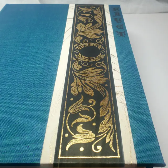
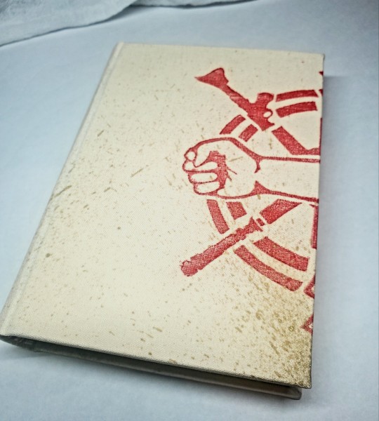
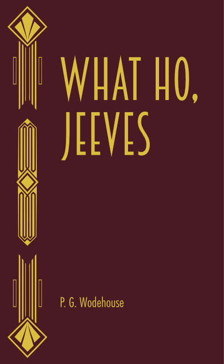
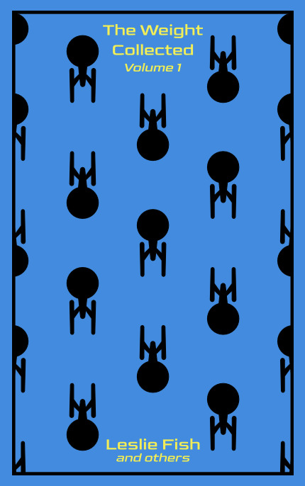
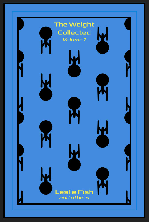
OPTIONAL STEP: mark guides onto your cover to help you position your stencil. whether or not i do this step depends on the design. a lot of the time, i just eyeball it. but for some designs, precision is key. for those projects, i use my ruler to mark out guides in white chalk for where i need certain elements of the stencil to fall. (i used guide marks for the "penguin clothbound" copies of the The Weight Collected that i've been using as an example in this post—the black rectangular boarder would've made uneven placement REALLY obvious.)
use transfer tape to remove your vinyl from its slick backing. what i've found is that you really, really don't want your transfer tape to be too sticky. you want it just barely sticky enough to pick up the stencil if you rub it down with a bone folder or your fingernail. i have a piece of transfer tape that i stuck to my jeans a bunch of times and then proceeded to use for 8 books in a row. it is, frankly, still a little bit too sticky. i have rolled it up so that i can use it for the next 8 books, at which point it will presumably be the right level of stickiness.
position your stencil. when you're happy with it, rub it firmly down with your bone folder. then do it again. then use your fingernail to score down over the titling text. then pray. in my experience, stencils prefer to stick to transfer tape rather than bookcloth. ymmv.
start at one corner of your stencil. carefully begin peeling back the transfer tape. i've found that essentially folding back the transfer tape (like, the corner that's been freed from the stencil being folded back away from the stencil) helps the tape to release. go slowly, rubbing down with the bone fold as necessary.
after you've finally manage to pry the tape off, go back and smooth down the stencil and firmly rub it down to get it to adhere to the bookcloth as thoroughly as possible with as few ripples or air bubbles as possible.
step 4: paint time!
here is a secret that the renegade discord taught me that i am now passing on to all of you: before you put any paint on your stencil, put down a layer of clear acrylic medium. the medium will finish the job of pasting down the stencil to your cover, and any leaks that happen in the process will be clear medium instead of colored paint (and will therefore be basically unnoticeable). ergo:
stipple a thin coat of acrylic medium over your stencil. you want to use an up-and-down daubing motion, not a brushing motion. brushing will get paint under your stencil. let dry.
after your medium is dry, stipple a few thin coats of your colored acrylic paint onto your stencil. let dry between coats. (i usually find that two coats is enough.) again, try to keep your coats thin. you don't want a thick layer of paint because that will create a raised surface above your bookcloth.
let your paint fully dry. i usually leave it overnight, but if i'm feeling especially impatient, i still make sure to at least give it a good three or four hours.
peel up your stencil. your weeding tools will once again come into play here to pry up little bits and pieces of stencil (like the stupid eyes of the "a"s and "e"s that were so annoying during the initial weeding stage).
step 5: optional setting stage
again, jury is still out on whether or not this is necessary, and the effects are pretty subtle. but i do it every time anyway. some tips:
use an iron on very low heat (i keep mine at the low end of the synthetic setting) and with steam turned OFF
keep a piece of parchment paper (NOT waxed paper. you want the slick paper that you put under cookies to keep them from sticking to the pan.) between the iron and your cover.
press the iron down, don't rub it like you're ironing a shirt. it's possible to smear your paint doing that (ask me how i know).
i usually lay the iron down on a section for 10-15 seconds at a time, then lift it and move it to another section.
start with less of everything (less heat, less time) and build up. always better to be conservative with this.
i usually continue until the paint is warm to the touch, then move onto another section. after it's cooled, i evaluate if i feel like it's melted into the cloth enough. if not, i repeat the process.
step 6: BOOK
congrats, you have put a design on a book cover. the world is your oyster. go forth and make books. become ungovernable.


113 notes
·
View notes
Text

Another new blog post for you: "2025 Photo Calendars (part one)"
NB: We've updated this post to include creating output with Capture One Pro
#Lightroom#Affinity Photo#Affinity Publisher#calendar#CorelDraw#photo#MS Word#photography#Photoshop#template#tutorial#Capture One Pro
1 note
·
View note