#alexa play without me by eminem
Text
I'm back bitches
#to the anon bothering my friends - come here i just wanna talk#anyways#glad to be back 🥰 i missed you guys#alexa play without me by eminem
17 notes
·
View notes
Text
Alexa, play “without me” by eminem (guess who’s back, back again)
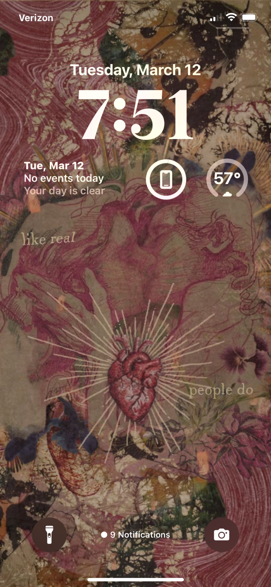

#iphone widgets#pink aesthetic#hozier#guys new development#I’m obsessed with Hozier#andrew hozier byrne#i love him#hand in marriage please
7 notes
·
View notes
Note
Hey Alexa, play without me by Eminem bc miss nova is backkkk
back agaaaain 🕺
3 notes
·
View notes
Text
Alexa … play Eminem’s Without Me 🦹♂️
0 notes
Note
I miss you!!! 😩
I’VE MISSED YOU MORE ♥️
1 note
·
View note
Note
Do you know of any good fics where Peter passes out and tony takes care of his? Thanks!
Ooh I do love a good fainting fic
Vein Drain by @ciaconnaa
Peter Parker faints at Midtown's annual Halloween themed blood drive. Tony Stark gets called to pick him up.
Alexa? Play Lose Yourself By Eminem by @losingmymindtonight
5 Times Peter Passes Out Because Of Needles.
Of Needles and Ice Cream by @forensicleaf
“Now’s probably a bad time to tell you I don’t really like needles, huh?” Peter says, eyeing the one in Tony’s hand with trepidation.
(In which Peter's blood isn't compatible with any other type, and Tony is adamant about making sure they have an emergency supply, just in case.)
peter parker fainting like a victorian madame for ten minutes straight by @floweryfran & peterstank
or: 5 times peter parker passes out in front of various friends and family members + the 1 time he passes out in front of tony (and tony flips his shit)
When you fall like a statue by @xxx-cat-xxx
When Cap and Spidey go 36 hours without eating while having overly heightened metabolisms.
5 Times Peter Passed Out In Front of Tony + 1 Time He Passed Out Alone by @wordscorrupt
Peter has an issue with passing out. Thankfully Tony is there to catch him...for the most part.
5 Times Peter Struggled with Spider Metabolism, +1 Time Tony Helped by @sickficlurker
Prompt fill for Sickdays Day 4: Not the Norm.
And a couple from me:
Five Times Peter Passes Out in Inconvenient Places + One Time it’s the Perfect Spot by @awesomesockes & @whumphoarder :D
In which Peter has a habit of fainting in precarious situations and a very exasperated Tony has to deal with it.
The Five Times Peter's Enhanced Metabolism Screws Him Over + the One Time He Gets Help by @whumphoarder :D
Peter only knows how to be empty or overflowing. Nothing in between.
(Or, in which Peter's enhanced metabolism causes him to essentially develop an eating disorder.)
Beanimia by @whumphoarder
While Peter is visiting Tony and Morgan at the lake house for a long weekend, the six-year-old manages to accidentally break Peter’s nose.
Unfortunately, Spider-Man's super-healing decides to go on holiday the same weekend that he does.
197 notes
·
View notes
Text
Stan: isn’t at the reunion
Me: this is so sad alexa play without me by eminem
9 notes
·
View notes
Text
21 questions game
Answer 21 questions and tag 21 people you want to know better.
Tagged by: @maizonikkoku ,thank you for tagging me!
Nickname(s): Rosa
Zodiac Sign: Gemini
Height: 5′1
Hogwarts House: Hufflepuff
Last thing I googled: How to convert cm in feet 😳
Favorite Musicians: Shakira, Rihanna, Selena Gomez, Lady Gaga, Eminem, Nicki Minaj, Kailee Morgue and Melanie Martinez
Song stuck in my head: https://www.youtube.com/watch?v=0qteLWSgiIQ (It’s an Italian YTP/parody of Bad Guy by Billie Eilish and it’s so fucking catchy, you can’t change my mind 😤👊)
Following: 1676
Followers: 269
Do you get asks: Really rarely, and this is so sad Alexa play Despacito
Amount of sleep: 6-7 in school week, 139720372893628926492771927 in the weekend and/or in summer
Lucky number: 7
What are you wearing: My ugly pink pajama
Dream Job: I’d really like to be a voice actor, but I’d also like to do something connected with languages
Dream Trip: Maybe in Japan
Instruments: A cheap ass clarinet I played only in third middle and then 🅱️YE, and a guitar
Languages: Italian & English
Favorite Songs: Umbrella by Rihanna, Love you like a love song by Selena Gomez, Without me by Eminem and Medusa by Kailee Morgue
Random Fact: I have a shelf filled only with plushes
Aesthetic: Pink sunset or a starry sky, videogames/anime/memes and exercise books with Greek phrases
Tag time!
@milich96 @cisgenderheterosexual @strawberrysimstorys @nanominyo @sixamart
4 notes
·
View notes
Text
to the boy that broke my heart on a thursday.
who breaks up with someone on a thursday? you told me you wanted to wait until i was done with my last final so you drove to my house at 10:30 the day before summer break to drop the worst news on me. you fell out of love the day before and rather than try and figure it out, ended the entire relationship so you wouldn’t drag me along. i hope you patted yourself on the back for being such a gentleman in those regards.
it has been 75 days since you ended things. for a week, i cried every day.
on day 1 i cried more times than i can count and threw up for the first time in years. oh, how great it is to watch a girl suffering with an anxiety disorder crumble after an unexpected, unclear breakup.
on day 2 i was stupid enough to go to the place i knew you’d be at. and there you were. smiling, unbothered, and day 2 became just like day 1. every day is the same when your heart gets ripped out of your chest, thrown to the floor, and stepped on.
on day 12 i thought i was ready to talk. my stupid idea of needing closure came from a part of me that was still in love with you. and we sat and talked and you told me you would one day look back on our relationship as something to smile at when you told your grandchildren. you pointed to your heart in the most casual way possible and told me, void of emotion, that you had stopped feeling it “in here”. i cried the whole way home.
on day 20 i kissed another boy and his lips were not as comforting as yours, his arms not as protective as yours, and his presence not the same. on day 20 i wondered if i’d ever get over you.
on day 24 began the gradual demise of the friendship between me and her. you know exactly who she is. you know that she was my best friend, the only one who seemed to understand me. yet for some reason you just needed that friendship. you needed to smoke with her, the one thing i couldn’t stand while we were dating.
on day 40 you fell in love with her and no one thought to let me know. you told her you thought there could be something between the two of you and i can only hope she shut you down with as much aggression as you posed the question with.
from days 41 to 61 i was forced to spend every single day with you. i struggled through conversations and uncomfortable moments and the most difficult task of getting over you, all while you had feelings for who i thought was my best friend.
on day 67 she finally told me and there it was again- the feeling of having the wind knocked out of me. i was the only one that didn’t know. suddenly you turned me into a joke because somehow i couldn’t get over you and there you were, moving on to her.
on day 75 i cried for the first time in weeks. today i cried for 60 minutes, somehow forgetting the shitty way you’ve treated me since the breakup.
it all became too much, too real. how you’ll date another girl and how she’ll stand on her tiptoes when she kisses you. how she’ll play with your curls and laugh at your facial hair and comment on your use of the word “savage”. how you two will have matching water bottles and listen to AJR together, nap together and hold hands in the car, make jokes about Eminem movies and lie down on your bed while you look at the glow in the dark stars on your ceiling. she’ll giggle as she tells your Alexa to turn the oxygen off and giggle when you obsess over cars and houses and wear your pink Bethany shorts. she’ll watch the office with you and get you that teapot and dance with you though she never knew how.
despite everything and every part of how terrible you are, i can’t help but miss the perfect parts. temporarily i can forget how you lied about your smoking frequency, how you never prioritized me, how you broke my heart on a fucking thursday. who breaks up with someone on a thursday?
you ruined my summer and i wish yours had been affected, too, for in your case you got a summer without the burden of your girlfriend and rather with the amazing presence of her hot best friend.
i wish part of me will stop loving you one day.
i talked about you on this blog- i called you lion, i called you e, and now you’re the boy that broke my heart. all i ask is that you just call me one day to tell me you’re sorry. okay?
yours never again,
dream boat
30 notes
·
View notes
Text
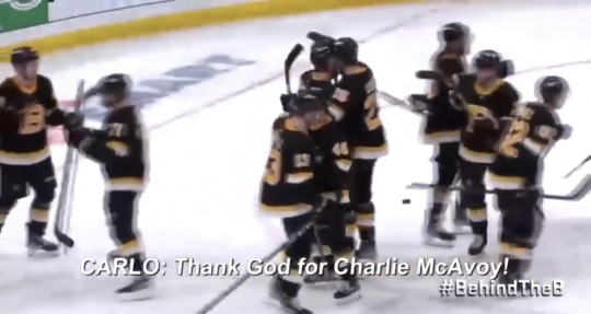
Alexa, play without me by Eminem
1 note
·
View note
Text
- tagging game -
I was tagged by @inconspicuouslesbian
Rules: tag ten people you want to get to know
name: Alexa
gender: female
star sign: libra
height: 5’4”
middle name: Catherine
put your itunes on shuffle… what are the first six songs that pop up?:
Hands on Me - Vanessa Carlton
Lucy - Skillet
The Real World - Owl City
Epilogue - The Antlers
I Need a Doctor - Dr. Dre ft. Eminem and Skylar Gray
Champagne Supernova - Oasis
grab the book nearest to you and turn to page 23. what does line 17 say?
Well I don’t have a book near me but I do have a school notebook in my backpack. Page 23 and line 17 are blank so I’ll write everything down that I wrote in it because it’s short: add more shadows, make sure shadows aren’t flat, follow curves of objects, composition, volume, depth
when was the last time you played air guitar?: I don’t know, it must’ve been a while ago
who is your celebrity crush?: Lucy Lawless as Xena, Jennifer Lawrence, Ashly Burch (yes it’s spelled without an E, she voices Aloy in Horizon Zero Dawn and though my crush is on Aloy and not Ashly I can’t use a fictional character for this question)
what’s a sound you love? The sound of storms (rain, thunder, etc.) and people whispering (ASMR, anyone?)
and hate?: I hate the sounds that loud vehicles make, it hurts my ears! I also really don’t like certain warning sirens..
do you believe in ghosts?: hell yes
do you drive and if so, have you ever crashed?: I do drive, and not a crash exactly; I was parked and tried to reverse and knocked into a telephone pole, scratching up the paint and breaking an light on my poor Victoria (my Volkswagen Beetle)
what was the last book you read?: I was reading The Infinite Sea by Rick Yancey. I loved the Fifth Wave but I was in a slow part of The Infinite Sea and put the book down a few months ago. I haven’t read a novel recently.
do you like the smell of gasoline?: I guess? It depends. I haven’t really thought about it.
what was the last movie you saw?: I don’t remember! That’s how long ago it was.
what’s the worst injury you’ve ever had?: Well I’ve never broken a bone but I did hurt my ankle in middle school during track and field and it hurt to walk/run for a few weeks. Not sure if it was a sprain though.
do you have any obsessions right now?: Coffee, tea, The Walking Dead, RWBY, MLP:FiM, Steven Universe, flannel, snapbacks, Baja Blast Mountain Dew, Pokémon Ultra Moon, Fallout 4, drawing
do you tend to hold grudges against people?: Oh lord, I’ve held grudges over people who I’m sure have forgotten about me by now! I’m a bitter little shit.
in a relationship?: Nope
I tag: @arkb1rd @agnosticalchemist @a-c-g-diabolo-procyon
I don’t really know anyone else aaaaa
Have fun guys!! Also don’t feel obligated to do it just because I tagged you.
4 notes
·
View notes
Text
alexa can you play without me by eminem...... guess who’s back. az is back. tell a friend. hmu with plots pls i miss all y’all and my ray of sunshine mixed with an angst storm.

0 notes
Text
2011 Top Karaoke Pop Songs #1 - Rolling In The Deep - Adele (Many people assume Adele becoming a black singer due to sound of her voice but she's not. What you hear from her are powerful vocals while using feel of emotion behind every note. That is precisely what an excellent singer wants coming from a song. The challenge bluetooth speaker with microphone for almost any singer with 'Rolling In The Deep' is matching the emotion and feeling that Adele puts in her original version. Of course you can get away with the inability to match Adele's vocal quality yet still please your audience if you are a six years old girl singing this song with your heart, as did Alexa Narvaez on YouTube with currently over 13 million views.) #2 - Someone Like You - Adele (Yes, Adele comes in with all the top two Pop songs for 2011. 'Someone Like You' speaks of somebody going to terms with the fact that her past lover has moved. She wishes him the top and sings that she will quickly realize 'someone like you', claiming to possess come to terms with all the status with their break-up but obviously revealing otherwise. Perhaps this song became so popular since the majority individuals experienced our hearts broken in the same way that this song relates.) #3 - Party Rock Anthem - LMFAO with Lauren Bennett & Goonrock (Well I thought LMFAO must be a band, with possibly each letter of this group's name representing one of these members. Man, am I ever from the loop. LMFAO is short for for Laughing My Freaking Ass Off. LMFAO is truly a duo consisting of Motown founder's Berry Gordy's youngest son Stefan aka Redfoo and his grandson Skyler aka SkyBlu. The song was considered one of the most popular dance songs of 4 seasons. If it's fun to dance to then it have to be fun to sing.) #4 - On The Floor - Jennifer Lopez & Pitbull (If anybody remembers the Lambada from 1989 you'll without doubt see the borrowed beat for the main riff. What can we expect for J-Lo's newest single? Maybe a reworking technique main riff from 'Islands In The Stream' or 'Afternoon Delight'.) #5 - You And I - Lady Gaga (Unlike the majority of Lady Gaga's tunes as well as perhaps only a shade less successful as several of Gaga's dance songs, this tune was highly requested as being a karaoke song. 'You And I' is often a bluesy, rock and country inspired ballad that mildly samples the classic Queen song 'We Will Rock You'.) #6 - Moves Like Jagger - Maroon 5 with Christina Aguilera (This song has a catchy hook and was popular among the karaoke crowd, and what has got more inviting is that it is really a female/male duet.) #7 - Mr. Know It All - Kelly Clarkson (The original American Idol continues to be going strong five studio albums later. This song yet again capitalizes on strong vocals as well as the hook 'you do not know anything about me' will remain in your thoughts long after the final note from the song is played.) #8 - Lighters - Bad Meets Evil & Bruno Mars (Bad Meets Evil is a duo consisting of rappers Royce da 5'9" and Eminem. This duo actually was formed before Eminem gained his mainstream popularity in 1999, they broke up and now have since reunited. The song 'Lighters' is an alternative hip-hop song, completely different from serious rap, especially with all the added vocals of Bruno Mars.) #9 - We Found Love - Rihanna (Rihanna yet again hits the very best with the charts having a catchy dance song. Many versions of this song also list Calvin Harris inside the credits but we have not heard a duet version or any version that feature vocals aside from Rihanna's.) #10 - I Do - Colbie Caillat (Like Colbie Caillat's first single Bubbly, this song is a happy, happy-go-lucky sunny day song that speaks of taking relationships one stage further. A perfect tune for the optimistic romantic.) Honorable Mention: Mistletoe - Justin Bieber (Some people may wonder why Justin Bieber is once more and not on the most notable 10. He also didn't make the very best ten with some of his songs this year, possibly because although his songs use a broad appeal, with regards to singing them you will see an extremely smaller audience. Collectively karaoke versions of his songs sold more than another artist in 2011; Justin Bieber was the best selling Karaoke artist of 2011. The late season discharge of 'Mistletoe' nearly made the superior 10. It was highly requested in late November and December. Many long for a whole new, new holiday song this also song filled that need precisely.) Top 2011 Karaoke Country Songs #1 - Dirt Road Anthem - Jason Aldean (This song covers country life but adds just a little 'country rap' within the mix. Very popular tune and choice for karaoke singers.) #2 - Just Fishin' - Trace Adkins (This song is approximately a father and daughter fishing together. Another feel good country song that pulls in your heart strings.") #3 - Country Girl (Shake It For Me) - Luke Bryan (This song is pretty not the same as the sooner hit by Luke Bryan 'Rain Is A Good Thing'. The title should be a clicking giveaway until this song is not a ballad or a story song. It is often a coming-right-at-you dance tune that caught on and became one of the most requested country songs to sing.) #4 - Hell On Heels - Pistol Annies (There are some songs which are country cross overs; songs that may be played on both the Pop Charts as well as the Country Charts. Not this song, it's definitely country. The Pistol Annies produce a statement of the woman's wrath, singing 'sugar daddy I'm comin' for you'. ) #5 - You Lie - The Band Perry (Another country tune about an unhappy relationship. You lie like a Persian rug, being a coon dog basking in the sun, as being a penny in the parking lot. It seems many a country song is all about that bitter feeling that you can achieve after they find out that their lover isn't so significant the ones really adore to sing about it.) #6 - Honey Bee - Blake Shelton (This catchy tune did well about the Billboard 100 in addition to going Number 1 for the country charts. The broad appeal from the song (along with the undeniable fact that individuals were singing it) helped use it into the superior ten of our list.) #7 - Barefoot Blue Jean Night - Jake Owen (This song reminisces about the fun one had on his southern summer barefoot blue jean night. His buddy Frankie got installed with a Cadillac with horns on the hood! ) #8 - Story Of Us - Taylor Swift (an upbeat tempo song that by it's title might indicate the song could be of a happy relationship. Unfortunately the chorus is 'the story people is a tragedy now.') #9 - This Is Country Music - Brad Paisley (Though significantly less commercially successful as a few of Brad Paisley's earlier hits, 'This Is Country Music' epitomizes what many feel a country song is all about. Country music fans usually takes pride in that their music often has some substance in it's lyrics or message, which is not typical with a pop tune.) #10 - Just A Kiss - Lady Antebellum (Lady Antebellum songs are extremely popular within the karaoke world because with their duet capability. The way that Charles Kelley and Hillary Scott effortlessly switch lead vocals of their original renditions make many singers want to do the same inside the karaoke versions. The challenge is finding two singers with all the same vocal abilities of Lady Antebellum's lead singers.) So, again, another year has provided us with a slew of new music. So you, the karaoke singer, must stop singing the same old tune. You don't want to subject the group to at least one more time of singing exactly the same song that you just sing week after week, it doesn't matter how good you sing that song. There is plenty of new karaoke music from which to choose. Sometimes it may seemed that there is no good new music on the market. However it might appear this way as you have gotten in the habit of playing your 'iPod' together with your pre-selected choices in music. Start making it a habit of listening to radio or activating a music channel more regularly, you are going to find plenty of the latest selections from which to choose.
0 notes
Text
UX for Lizard Brains
Technology can make magic happen. In seconds, you can find all the blue sandals in a warehouse of millions of shoes. A million people can read the same article without killing one tree. You can undo, unsend, and even unfriend! But here’s the buzzkill: if unanticipated or unwelcome, the magic of technology is confusing, disorienting, and unintuitive—a UX designer’s worst nightmare.
So how can we ensure that the magic we create is intuitive? Designers will often say, “If a design is intuitive, it behaves how a user expects it to.” Well, then … what do users expect?
We want to know the following whenever we find ourselves in a new environment (physical or digital):
What are the objects?
Where are the objects?
How do these objects relate to me?
How do these objects relate to each other?
What is my role as an object within this environment?
In physical spaces, these don’t require explicit thought to answer. However, in digital spaces, they often do. That is because our “lizard brains”—the part of the brain involved in motivation, emotion, learning, and memory—evolved alongside the physics of solid objects. Consequently, users may feel unsure when designers flout the perceptual expectations forged in the physical world. Without knowing what and where the objects are, we feel blind. Navigating feels uncomfortable. Taking action might even feel impossible.
The remainder of this article introduces three ways to design digital objects that “play nice” with our evolved expectations of the physical world. By doing our best to concretize the dematerialized things of our screen-based world, we give our lizard brains better affordances for understanding.
Lesson one: avoid shapeshifting objects
The properties of user interfaces need to be consistent for us to learn them well. We hunger for stable landmarks in the often ambiguous maze of digital interfaces.
Andrew Hinton, Understanding Context
Objects in the real world don’t usually change form as they change context. When I bring a new toaster home from the store, it doesn’t change into a different toaster. When I remove a vase from the cabinet, it doesn’t turn into a coffee mug. Humans expect object permanence; we are taken aback when objects unexpectedly change shape.
Why do babies love peekaboo so much? It’s a great way to practice the fundamentals of object permanence, an important lesson in survival (e.g., just because the tiger went behind the rock does not mean it has disappeared). Because babies are still coming to terms with this concept, peekaboo makes for a rollicking good time. So we might assume that if we up the ante on the surprise-factor, the game would be even more fun, right? Nope. Researchers measuring the level of toddlers’ delight during a series of hacked games of peekaboo discovered that the game loses its appeal when a different face pops up after hiding. The older the child, the more this hack kills the game. Evolution seems to be telling us: it’s not cool when objects suddenly change. But all that peekaboo practice is for naught when trying to navigate a digital world of shapeshifting objects.
For instance, when this article was in the form of a Google Doc, it lived in both the Google Docs and the Google Drive environments. Depending on the environment, the article’s module changed form and function.
Different menu options in Google Docs and Google Drive.
Moving from Docs to Drive, the shape of the document module shifts from about a 3:5 rectangular ratio to a 1:1 square ratio. If I want to see when I last opened a document, I will find that information directly on the module while in Docs; but within Drive, I must look to a disembodied side panel (not shown). Both modules have a menu of actions, but accessing it requires different interactions. (In Docs, I click the “more” icon; in Drive, I right-click the module.) Worst of all, the menu contains almost completely different options in each module! Only “Remove” and “Rename” are found in both menus. Adding insult to injury, even the icons for “Rename” are different.
The form and behavior of the document module are significantly different on Google Docs than on Google Drive.
We could chalk up the inconsistencies of Google Drive and Google Docs to siloed teams, but shapeshifting objects are common within products, too. On Meetup.com, the digital representation of my next meetup morphs multiple times across the site. Looking at the homepage, it displays as a big red banner at the top of the screen.
Meetup’s next-up module is highlighted in bold red at the top of the homepage when you’re logged in.
Scrolling down the homepage to the calendar section, the same meetup is displayed as a white box sporting some green accents that signal my relationship with this particular object.
Meetup’s calendar module makes the same meetup look like a totally different type of thing.
And finally, within the context of its parent group—in this case Ladies that UX ATL—the meetup object is represented differently yet again. (Let’s not even get started on the ontological ambiguity between Meetup the Group and Meetup the Event.)
The meetup module on the Ladies that UX ATL parent page.
Not only is my lizard brain trying to reconcile all these changes for potential threats, but these inconsistencies are making me work harder in a practical sense. I have to learn three displays for RSVP status, three positions for date and time, and three ways to find the number of people going. Every time the object changes, I have to make adjustments both to recognize it and to interact with it. These adjustments are small, but they add up across the experience. Designers can eliminate this cognitive load simply by creating a canonical object structure and sticking to it.
Many users don’t log the deltas between modules explicitly. Users furrow their brows and simply do their best to relearn objects and keep track of what’s what. They might harbor a vague feeling that the website or app is “hard to use.” Or worse, they blame themselves for “stupidly” attempting to interact with an object in a way that worked in one context but does not work in their current context.
Sure, there are complex platforms where it might make sense to re-prioritize object elements depending both on who is viewing it and under what conditions. But if we design screen-by-screen instead of object-by-object, we run the risk of doing this unintentionally and arbitrarily, introducing more shapeshifting than is absolutely necessary.
Key takeaway In this example, a veterinary portal might have multiple modules that represent “pet.” Instead of designing a different module for each context, design one module that works well for ALL contexts.
When we move elements around within an object, we need to remember that we are making a sacrifice—we are sacrificing consistency. Sometimes it will be worth it, like perhaps in professional tools used by power users. But often, our users will be happier with a single, rock-solid representation of that object.
Lesson two: avoid masked objects
On the flip side of shapeshifters (i.e., various packages for the same object), designers also have a tendency to shove different objects into the same package. With the good intention of designing a system of reusable parts, we’ll often create one-size-fits-all modules. This might seem like a smart simplification strategy, but it actually hinders users from distinguishing various object types. Distinguishing them is critical for the user to understand the system.
Modules on Amazon homepage
Check out this bank of candy-colored modules on my Amazon homepage. Sure they house different colors and content, but they follow the same basic structure. If the text were in Latin (or if the user were skimming rapidly, which we should always assume is true), these modules would translate as the same type of thing. In looking at the first two, PRIME and FRESH, I might get the impression that these modules represent “services.” And indeed, when I click these modules, I enter sort of informational, sale-sy pages describing these services (although they follow completely different templates).
PRIME and FRESH module link to services
But when I get to VIDEO, I have to pause. VIDEO…the service? Or does this module represent a TV series? The next module (MUSIC) brings up the same question. And the ALEXA module—will this take me to a service landing page or, perhaps, a product detail page?
VIDEO, MUSIC, and ALEXA modules linking to different types of content
In fact, each module takes me to a different type of place. PRIME and FRESH take me to two separate templates for a “service.” VIDEO takes me to a detail page for The Americans. And MUSIC opens up Amazon Music in a new tab (with no sign of the ill-recommended Eminem album). The ALEXA module takes me to another “snowflake” landing page.
Like opening identical doors in a game show (but not as fun), I never know what to expect when clicking on one of these tiles. (View a video of my full rant on these Amazon modules.)
Let’s look at one more example. The Apple App Store leverages a small rectangular thumbnail module that can house apps, curated collections, broad categories, developer-based app suites, and even operating system updates.
youtube
The same module represents various objects in the Apple App Store.
In both the Amazon and Apple App Store examples, instances of the modules have distinct graphics and labels, but they are the same shape and size and they are grouped together, like apples at the market. As a general rule of thumb in Gestalt psychology, when objects are grouped together, we assume they are the same type of thing, especially if their overall shape is identical. When the same packaging (i.e., the module) turns out to contain various types of things, as in the App Store, users may feel confused or even tricked. This is like taking a sip from your Starbucks coffee cup and getting a mouthful of orange juice: objectively tasty, but if unexpected, you might spew it onto your barista.
Key takeaway Continuing with the veterinary portal from lesson one, we have pet, appointment, and medication modules all leveraging the same basic module design. Instead, create distinct modules for distinct objects. Different things deserve different packaging!
Designing one-size-fits-all modules might seem like a good idea for an efficient modular system, but this practice doesn’t allow users to predict what’s “behind the door.” Instead, design packaging (i.e., modules) that reflects the unique things inside. This way users can learn to recognize and understand the objects in your system, making for a more intuitive environment.
Lesson three: avoid broken objects
In the real world, our environments are made of surfaces and clear edges. We rarely have the problem of understanding where one object stops and another begins. If we happen across a tangle of snuggling kittens, our brain might freeze up—not only from cuteness overload, but also because we are compelled to figure out which paws belong to which head. We want objects to be whole; if they are not, our brain does its best to connect the dots. In digital environments, an object might not only shapeshift across screens or mimic other objects, it might also be broken. The information and interaction triggers of broken objects are scattered across their digital environments.
Winc Wines, a lovely service that delivers algorithmically-recommended wine to your doorstep, prompts customers to rate their wines. Often, I’ll do this 3–4 months after receiving wines. Recently, I decided it would be a great form of procrastination to log into Winc to rate my past wines.
The Ratings tab of Winc.com. These wine modules include the ability to star a wine and add a note, but don’t show the user when the wine was received.
At a dinner party I hosted in May, we drank a delicious sparkling wine. I think it was Finke’s Widow, but I’m not positive. Hesitating to give it five stars until I am sure, I need to find out when the bottle of Finke’s was delivered. On the “Ratings” tab, I see all my past wines. But delivery dates are not displayed.
The Winc’s wine detail page displays descriptive information about the wine, but nothing about the user’s past interactions with the wine.
Clicking into the detail view, I am presented with a generic detail page, the same view of Finke’s Widow that everyone sees. Here I can find information about the wine, but no information about my relationship with the wine—mainly, when it was delivered and how (or if) I rated it.
As a wild guess, I click the “Hello, Sophia” menu, where I see a link to Order History. Seems promising.
Winc’s Order History is not much more than a table of dates.
The Order History page gives me a list of orders with no preview of the wines that were included in each order.
Winc’s Order History detail view is where I finally find the delivery date of the wine in question.
After clicking into the April and May orders, I finally find Finke’s Widow. Mystery solved. So, can I rate the wine from here? Nope! I have to navigate back to the Ratings tab and then scroll down to find Finke’s Widow again. In the Winc world, relevant pieces of a bottle (like a customer’s order date, rating, and tasting notes) are scattered about, forcing a user to hop around to piece together the broken object. (Watch a video of this screen-hopping.)
Key takeaway Avoid scattering an object’s data and actions across settings, buried menu commands, and hierarchical navigation.
In the Winc world, I have to be in Order History to see a wine’s delivery date and I have to be in Ratings to tell the system how much I liked a bottle of wine. But what if I am browsing wine and one of my past wines shows up in a curated collection? I’ll want to be reminded that this wine was delivered to me six months ago and I gave it 4 stars. Or, if I haven’t rated it yet, but I remember loving it, I’ll want to add my stars then and there. I definitely do not want to navigate over to Ratings, only to have to scroll down to re-find that bottle.
We need to do our best as designers to encapsulate our digital objects, making them feel whole and directly manipulable, just like in the real world. I might be more likely to use the blender in the kitchen, but it still works just as well in the garage.
Building a better mind palace
Humans love to concretize things. Greek orators memorized their long speeches by visualizing the speech as rooms in a palace. Sherlock Holmes himself, a genius at making connections between the most subtle clues, did so by entering his mind palace, a visualized place where bits of information were concretized and manipulable.
If the internet is the chaotic product of the human genius, this article is a call to action for designers to build a stronger mind palace for it. When we avoid shapeshifting, masking, and breaking digital objects, understanding will emerge more naturally. It’s a simple matter of making our digital environments feel a little more like the real world in which our ancestors evolved.
http://ift.tt/2yCMoV4
0 notes
Last Seen Blogs

radak1985
Untitled

ask-funtime-kaxy-and-bros-blog
Untitled


acatwitha3ds
mew the gamer

iveldie
Iveldie ART