#also a little clip studio paint test!!
Text
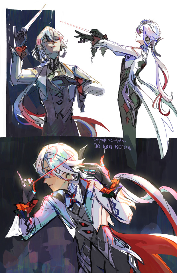
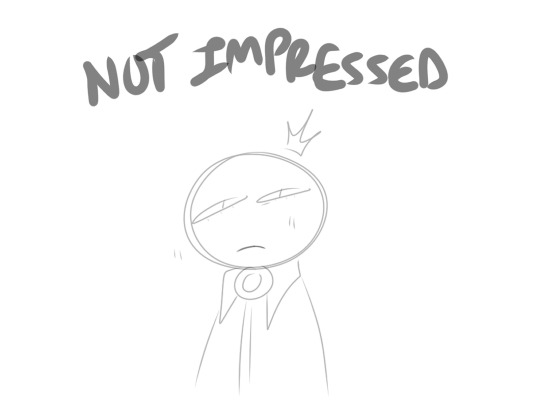
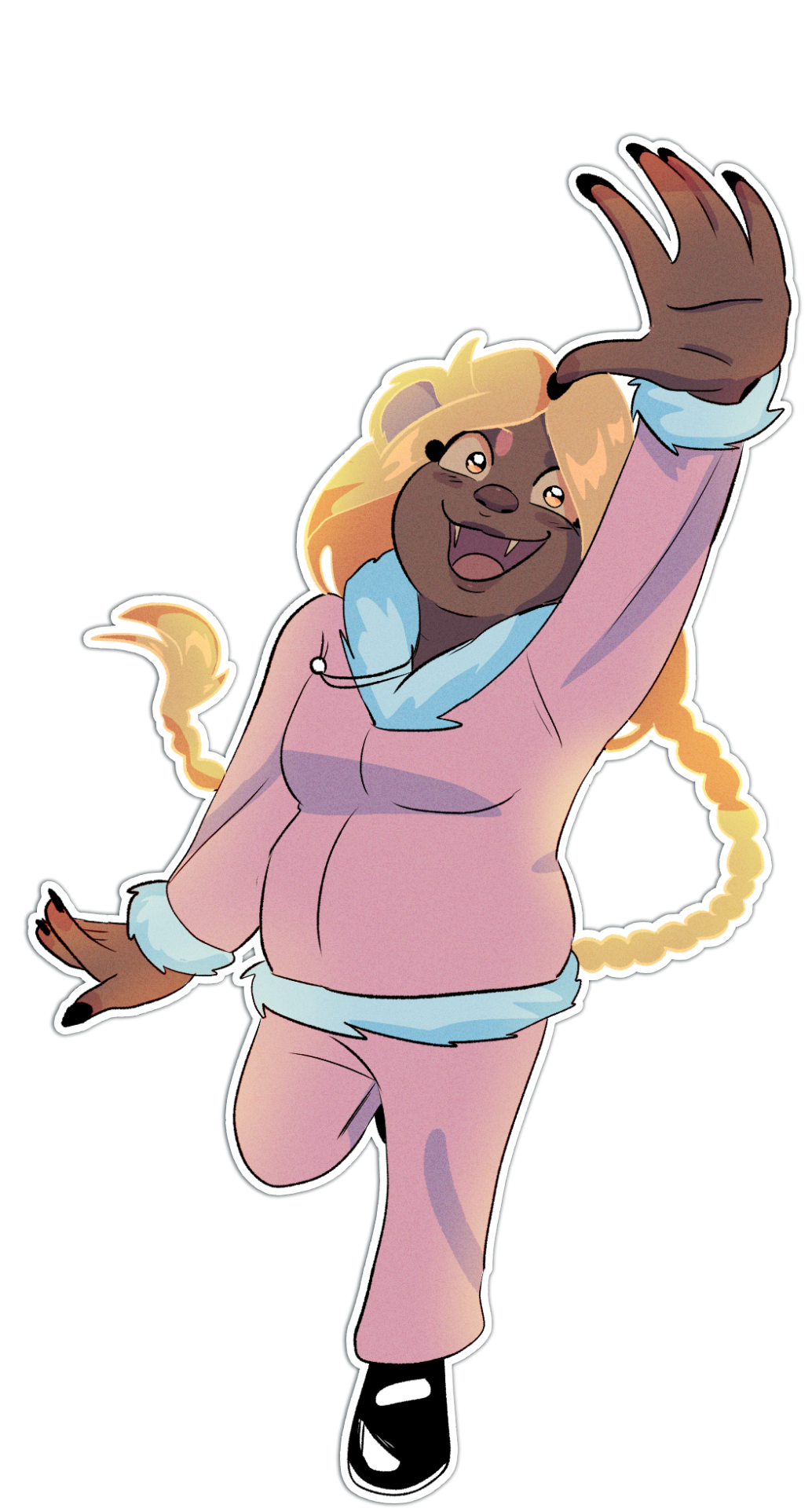
conductor pose studies ft. arlecchino
(refs below!)
#genshin impact#arlecchino#my art#also a little clip studio paint test!!#gotta move over there since sai is refusing to work sadly#it wont let me save any of my files...#still need to find brushes that click with me and figure out how csp works but this was fun!!#anyway i love arle i love her arms and tattoos i need to draw them too#i hope shes unhinged
7K notes
·
View notes
Note
Hi there! Your pieces often have this hazy, glowy quality and it’s beautiful! Do you use any overlays? I love your art!!
Oh yes I actually use a filter!
So here is how I add that slight glow to my drawings:
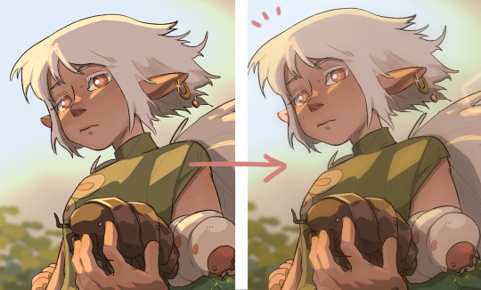
(This is for Clip studio paint users)
Easy version: Have your art as a png. Duplicate your only layer so you'll have two layers (the two same pictures). Select the upper layer
Go to:
Filter > Blur > Gaussian blur
Choose how much blur you want (not too much) and....BOOM!
You have a nice glow!
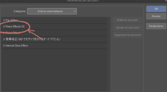
For CSP folks who know about Auto actions and want to be able to do it in one simple shortcut (with other cool effects):
So first you need to download the auto action retro effect v2:
(bear with me because everything is in french for me so I'm roughly guessing what it must be in english)
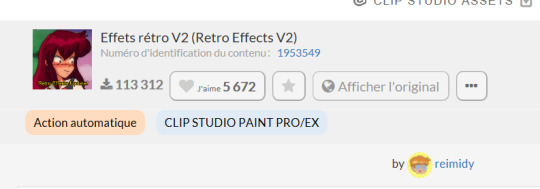
(Number: 1953549)
Then you are going to check your downloaded assets for that effect and click on this small thing at the bottom of your screen
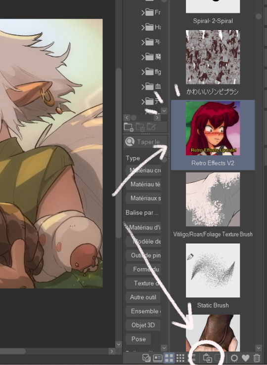
This will add your effect into your automatic actions. To reach it, you need to click: File > shortcuts settings > Auto action
(this is for any auto action you might download so remember to do that each time)
This will open and you'll have your effect:
You'll have several actions available (which I invite you to test), but the one that's important is retro blur with a little bit of the others (sometimes I only use that blur)
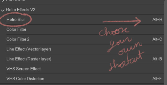
Choose a shortcut of your choice (click on it and just tap it down) then click on "ok".
NOW you should have the blur effect. What I advise you is that once you finish a drawing, you make it into a png, jpeg, whatever file you want to post and use the effect on it (that way all the drawing is affected)
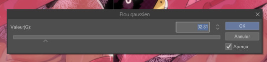
This will appear and you can play with it if you want more or less blur. If you don't want to hurt your eyes too much I would advise not put too much of blur. I also add a little bit of overlay (pink or purple, very little opacity)
And here you go!
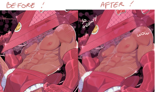
Hope this helps ∠( ᐛ 」∠)_
1K notes
·
View notes
Text
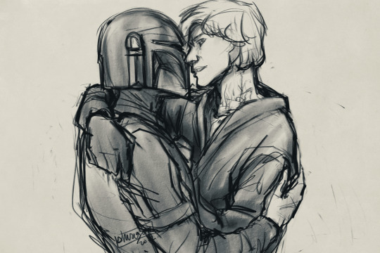
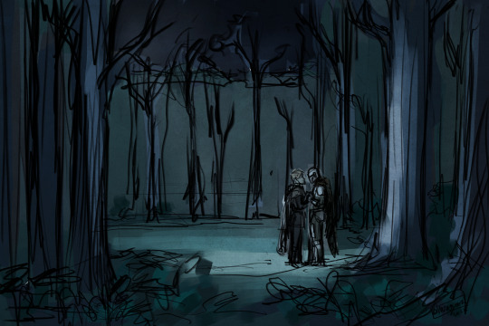
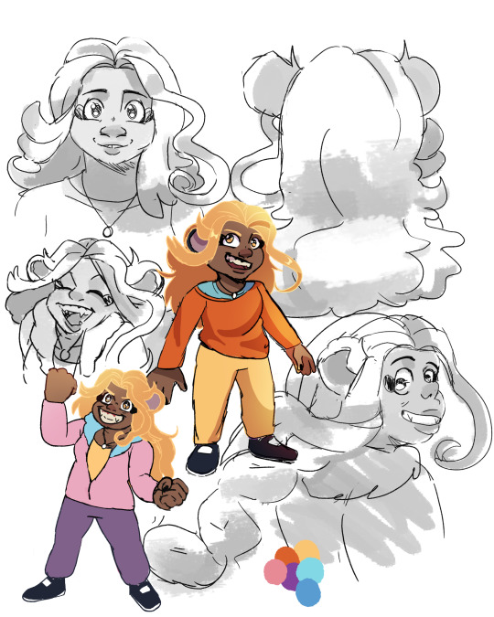
... so anyway, I'm a lying liar who lies about not drawing for the rest of the month. If I say I'm gonna "doodle something real quick and then write", grab my access to Clip Studio Paint and all my tablets, and run.
One is a sketch/color test based on a scene in the staircase fic and inspired heavily by Eyvind Earle's work for Disney's Sleeping Beauty. The other is me feeling a bit spicy and also letting my brain build up on a sliver of an idea. But it's mostly me feeling a little bit spicy, as a treat.
#shirozora draws#dinluke#lukedin#skydalorian#din djarin#luke skywalker#the mandalorian#star wars#the truth is I wanted to test CSP's companion mode where I scan in a QR code to turn my phone into an extension#I kept losing connection to the test failed hard... and then I didn't stop drawing#I actually have multiple sketches but we only need to worry about these two#anyway we are really seriously done doodling#I have a goddamn fic to finish writing before NaNoWriMo starts#which I'm using to finish writing Part 1 of the 3quelfic#so that maybe after my december disneyland trip I can start posting the 3quelfic? maybe?????#sorry print shop project but you are postponed until I'm back on schedule with all these goddamn words
462 notes
·
View notes
Note
Hii me again. I'm not sure if I sent the ask I'm talking about on anon, so maybe that's why you didn't see it? It partially got answered with a recent ask you got anyway so no worries. I was just wondering if you use 3d in your process and if so, how? I've seen other illustrators use it to varying degrees and it seems like a really helpful tool to push your work.
Oh that's so weird! No I periodically go through my asks in chunks and I didn't see anything like that. I've had a few people in the past few months send me asks that looked like the second half of something else with no context, so maybe it's Tumblr fuckery. Sorry!!
I recommend learning Blender so you can help sculpt shapes and render lighting onto them in order to get the weirder/more complex shadows right. You can also apply colors onto the things you sculpt in order to see how the colors act in different lighting. It's pretty much an invaluable tool to me as it keeps me from having to problem-solve too much. I did a lot of digging around in my house to build references to photograph but it was just impractical to achieve the things I want to a lot of the time. I still do that, and you would not believe how many goofy photos I have of my husband in the poses you've seen me paint Astarion in lmao...
I do think that it needs to be used in moderation if you are a more beginner artist- I think that using 3D is DANGEROUSLY close to becoming a massive crutch for a newer artist and improper usage or over reliance on it can lead to stiffness or artificial looking colors. You need to be able to train your eye to create compelling compositions by bashing things together, and train your hand to replicate/add/subtract as needed from your references with an organic feel.
I will say this as a total committer of this crime myself in the past, it's VERY easy to tell when an artist relies too much on, for example, Clip Studio Paint posed models as bases for pieces without a good enough grasp on their fundamentals. And I also used to prickle when I saw more advanced artists warn of this, so I do think maybe it just has to run its course sometimes, because I know that using 3D for reference seems like an easy-button.
I've taken a lot of in-person classes for live figure drawing and painting, as well as just totally done drills, basically, on sketching and painting from life before relying too much on static imagery/3D/etc.
I often fret over every piece I do looking too stiff even still.
You have to do a LOT of the boring hard stuff the old fashioned way. And I regularly go back to it over and over when needed.
For example, I recently did a stupid amount of rose petal/flower studies deconstructing and painting ugly little paintings/doodles over and over because I know that I've been horribly weak at painting flowers for years (actively avoiding them). And I've been doing a lot of floral stuff lately due to that.
Whenever I start a new piece in new territory, I know it's going to mean several 3AM nighters where I have two other tabs open on Photoshop where I test out different textures or do a couple of studies. I'm working on a piece of my OC right now that has a lot of gore/medical instruments and I've been working on testing out different methods for shiny metal painting and some anatomical studies. I'll come to a snag in a painting and go "here we go" and work through it one piece at a time.
My Halsin piece, "Secret Spot" in the hot spring, was a massive undertaking with a lot of these moments. The Karlach x Dammon piece took 3 times longer than it should have due to me just having to go back and fix things knowing I could do better after doing some studies.
Ultimately I personally find art tutorials to be quite useless overall once you get to a certain point, unless they are teaching the use of a tool/software because you HAVE to figure out what works for you. And even then I use Blender like a monkey with a keyboard, I suspect, because I've just bruteforced through it, so I could probably use a tuneup from a good teacher on that haha.
I hope this helps some, and sorry if I overstepped if I sound preachy.
22 notes
·
View notes
Text
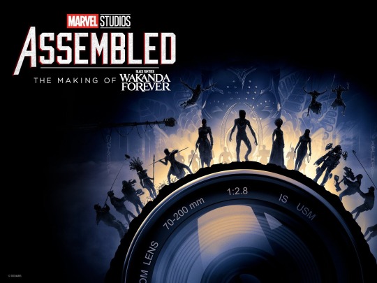
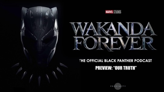
Marvel Studios Assembled & Wakanda Forever Podcast: Namor/Shuri + Tenoch/Letitia Moments
- - - - - - - - - - - - - - - - - - - -
Marvel Studios Assembled: The Making of Wakanda Forever [available on Disney +] [w/ time stamps to follow along]
▻ The whole cast comforted and gave Letitia a group hug at San Diego Comic Con as she broke down [Tenoch kissed her shoulder] [0:27]
▻ “We know what Black Panther is but what makes it a Black Panther movie? If we were to do another one….how would audiences recognize it?” - Ryan Coogler [Director] [5:44]
▻ We learn that Namor’s character was discussed to be in Black Panther 2 while the first movie was being written. “In the comics, the two worlds have a great rivalry” - Joe Robert Cole [Screenwriter] [13:25]
▻ Ryan was interested in Meso-American culture for the Talokanil and “…upon research it became more clear that the people of the Yucatán made a ton of sense.” - Ryan Coogler [Director] [14:40] They wanted to give Namor a culture/background different from the comic book version [a white man]. “Their [Mayan] artwork and their advanced agriculture…all of these things that they accomplished, it was a perfect palette for us to delve into.” - Joe Robert Cole [Screenwriter] [16:40]
▻ Namor’s costumes and headpieces are curated from post Yucatec Mayan culture roots. “We used a lot of kelp and things to make the headdress and hand wove his cape, but we kept it pure to what he looked like in the comics.” - Ruth Carter [Costume Designer] [17:50]
▻ Ryan and Hannah Beachler [Production Designer] show us the set of Namor’s cave and explain the time/labor that went into creating this elaborate set. Ryan points to the mural painting of Namor and the Black Panthers fight. “This one’s my favorite one” - Ryan Coogler [Director] [22:25] We learn that the style of art is “Bonampak”
▻ Letitia had to learn how to swim for her role, along with the majority of the cast. “I struggled with it. Ryan called me and he was like ‘Tish, can you swim?’ I was like ‘Sir, sir, I’m in the lab. What more do you need from me coming out of that lab?” - Letitia Wright [Shuri] [26:06]
▻ All of the water scenes were half filmed under water, called “wet for wet”, and filmed outside of the water, called “dry for wet” scenes. The exosuits [Shuri is shown wearing one when exploring Talokan] were real suits that were also filmed underwater and were about a million and a half dollars each [explained by Chris Denison, Stunt Coordinator] [29:40]
▻ A clip of Letitia Wright’s “Screen Test (2016)” from the first Black Panther is shown [41:54] and we learn that Dominique Thorne [Riri Williams] also auditioned for Shuri’s role a while back
▻ The cast had differing emotions/opinions than Ryan about the decision to kill Queen Ramonda [played by Angela Basset]. “When I read that Ramonda was going to die by the hands of Namor, I was very upset. I think I almost cried on the phone to Ryan.” - Letitia Wright [Shuri] [43:43] Ryan and the writers felt her death would be a big “motivator”/ transformative moment in Shuri’s development and the eventual break down of her character to become the Black Panther [her arc]
▻ Ryan supported and pushed Letitia during the whole process of becoming the Black Panther to do her best work and continuously reminded her of who she was and what she was capable of when stepping into the role. Letitia wished Chad could have passed the torch to her himself to do it [46:02] + [55:03]
▻ [Referring to the making of Shuri’s Black Panther suit] “We were working with the design language of silver being representative of T’Challa, gold being representative of T’Chaka, and the little bit of where Killmonger’s coming from…We’re essentially taking those two elements and combining them.” - Ryan Meinerding [Head of visual development] [46:58]
▻ “Shuri vs Namor. We put alot into that fight.” - Aaron Toney [Fight Coordinator] [49:59] We see that a lot of the BTS of their big fight on the desert were shot with different individual sets with Tenoch, Letitia and stunt actors, separately and together. “I’m so proud of it. Shuri’s looking amazing, Namor’s looking amazing.” - Letitia Wright [Shuri] [50:27] Their fighting styles are explained to be very different, where Shuri is more calculated and Namor is more in his body. “With Namor, when it came to fighting styles, I pulled from….cultural aspects like Lucha Libre…asian cultures…I pulled from a style called Baji.” - Aaron Toney [Fight Coordinator] [50:49]
▻ “Processing in a way of expressing her pain and fury towards Namor, she thinks that’s going to be satisfying to her soul and it’s not….I think that’s a beautiful way to complete that arc, to realize that my brother wouldn’t do this, my mother wouldn’t want this for me….We see Shuri become a woman in her own right.” - Letitia Wright [Shuri] [53:00]
- - - - - - - - - - - - - - - - - - - -
Wakanda Forever: The Official Black Panther Podcast [Hosted by Ta-Nehisi Coates]: Chapter 5 w/ Letitia Wright, Tenoch Huerta, Dr. Gerardo Aldana [available on Spotify]
▻ “What does it mean when Wakanda and Talokan give us a beauty created not to justify enslavement but to celebrate freedom?” - Ta-Nehisi Coates [Host]
▻ Tenoch continues to put the spotlight back on indigenous communities/culture and does not claim to be apart of their experiences. “I don’t practice the culture so it is impossible to name myself indigenous….I’m not pretending to be something that I’m not…I’m just trying to honor my ancestors.” - Tenoch Huerta [Namor]
▻ A fan went to the movies with his Mayan grandma and she began to translate scenes herself while watching the film with him. “The Mayan group in LA said it [the character’s Mayan in the movie] sounds beautiful. You have an accent, it sounds good! They were happy with it.” - Tenoch Huerta [Namor]
▻ “Why are these two groups [Wakandans and the Talokanil] fighting each other? Why can’t they get together and go beat the colonizer?…I am a huge Black Panther fan but I was sitting there and found myself rooting for the Talokanil!” - Ta-Nehisi Coates [Host]
▻ Letitia was bullied in school for her appearance when she was growing up (ex. her size, being African, etc) “I kind of let that go…I talked myself out of the idea that I should be like anyone else.” She found comfort/ amusement in going viral on TikTok. “It’s definitely flattering but I’m really shocked…I’ve never been crushed on before in school…As a black woman, I’m moving into a space where I’m finally being called beautiful but I didn’t wait for them [the media/world] to tell me that at first. I told it to myself.” - Letitia Wright [Shuri]
▻ “This is the highest grossing movie with the lead character as a black woman and it’s you [Letitia]. How does that feel?” - Ta-Nehisi Coates [Host]
▻ “The love that Shuri has for T’challa is the love that Letitia has for Chadwick and that’s intertwined.” Letitia shares her initial hesitancy about doing the film without Chadwick after his passing and taking on the mantle as Black Panther. “I see it as I’m a vessel. I’m a trusted vessel that’s here to honor my brother.” - Letitia Wright [Shuri]
▻ Letitia laughs about fun moments they had on the set of Wakanda Forever. “He [Ryan Coogler] would say Namor and the Black Panther are having a conversation. It’s a big movie. Turn your phones off!” - Letitia Wright [Shuri]
#this is for my people who don’t have Disney +#i got y’all#not a huge podcast person either so I’m looking out for those folks too lol#marvel assembled#wakanda forever#Black Panther podcast#Black Panther#behind the scenes#tenoch huerta#letitia wright#namor#shuri#nashuri#namuri#tenitia#Letitia deserves the world#YOU ARE BEAUTIFUL AND IM SORRY THE WORLD MADE YOU FEEL OTHERWISE GROWING UP#i love that fans are telling Tenoch different stories of their experiences with his character and feeling represented with the culture#they both did such a tremendous job on set and in this movie#i need gifs tho bc these scenes were cute/cool#im in deep y’all
165 notes
·
View notes
Text
Psychonauts Adult Lili Speedpaint
Finished illustration below vvv

I wanted to test out a new (painting?) Process and I'm pretty proud of the result, I like how it turned out. The song Lyrics are from Smells like teen spirit by Nirvana. I don't really like that choice of lyric but I couldn't find any other song lyrics for the life of me so I decided to settle for these ones. Ka-sigh I guess they'll have to do...
Also, little speedpaint! I decided to give the Clip Studio built in time-lapse feature a try and it went pretty good! I wish I had an actual recording software though, because it doesn't make the video go to fast and you can probably see the process a lot better.
#psychonauts#psychonauts 2#doodle17#lili zanotto#psychonauts lili#Psychonauts future#psychonauts fanart
50 notes
·
View notes
Text

Adam and Victor Frankenstein , Clip Studio Paint , 4?? hours
So for some reason, I decided that the best way to test out the new drawing program would be to make a little comic page. Honestly? I don't hate it— though I'm sure you can tell at what point I gave up.
(Didn’t want to make the post too long, but I also wanted to put a separate picture of the one panel I spent the most time on)
#frankensteins creature#gothic lit art#gothic literature#dark academia art#digital arwork#frankenstein#adam frankenstein#frankenstein a new musical#frankenstein or the modern prometheus#victor frankenstein#hearing that line the first time shocked me So Much#i know i said i draw more than just adam#and i promise that wasn't a lie#look!#you can see Victor's back!#that counts!!#ars corvinī
208 notes
·
View notes
Text

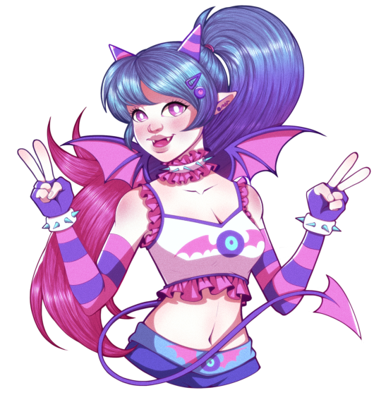

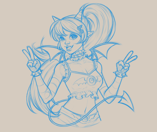

CUTE DEMON GIRL 🦇 DTIYS CHALLENGE
First squiggle of the new year! I actually started this piece last year as part of an art experiment. Although I originally created the final sketch in Clip Studio Paint, recently I've decided to make the full switch to Photoshop.
I've been using PS for years---since the dawn of my venture into digital art to be exact. PS has been that one go-to app that I've used pretty much for everything that I do when it comes to my art. No matter how many art apps I've tested and used over the years, PS is the one that has remained constant in my workflow throughout my entire digital art journey, both in my personal and professional work whether I'm using it for graphic design or animation projects or even in my 3D art and design work.
Before, when I work mainly in Paint Tool Sai, I mostly used PS for final touch ups and text. I've never been able to fully commit to using PS for digital art until now. Took me a couple of year but I finally got here.
And what has helped me make this transition is through doing experiments with these DTIYS challenges. Not only do they provide a nice and well welcomed change of pace from doing nothing but fanart most of time but they are also great for practice in developing confidence in one's art style. I honestly haven't spent much time honing and improving my style. It's something I began working on last year and I'm aiming to maintain that same energy moving forward for this year.
This DTIYS Challenge is from @onitaytay on Instagram. Really liked working on your little demon/vampire girl character and hope I did her justice.
LittleMissSquiggles (2024)
13 notes
·
View notes
Text
Attack Dog - Rendering Breakdown
OK here's an attempt at explaining how I go with illustrations. This isn't necessarily an 'effective' way to paint, but rather it's a process to maximize my personal enjoyment. I encourage you to do the same! Find those steps you have the most fun with, and exploit the hell out of them.
For this post, I'll be going step-by-step for this illustration
1- Sketching
A Mess. I don't like making lineart unless I'm super in the mood for it. In this case, I couldn't be bothered to spend a lot of time in the sketch. I often use 3D models as a base for paintings because, if I'm making a painting I only want to paint, not to stress out on anatomy.
2- Blocking values
I only start painting with colour if I'm certain about what I want to do. In this case, I wasn't. When it comes to visual information, values (light and shadow) are more important than colour, so it's easier to block those out first than trying to improve the values in an already coloured piece.
This is a very insightful video if you want to see if a greyscale-first process could be useful for you. Marco Bucci's content in general is a treasure.
Here's a link to the head model used for light reference
3- Paintinggg hell yeah babyyyyy
Not much to say here except, look at a lot of reference. I only limit my canvas to one or two reference pics to not get it super crowded, but I'll always have more pictures open on my browser, tablet, etc.
There's this little app you can use to compile reference pics. I don't use it because the act of opening it is too much work for me but, it's a neat tool.
The main brushes I use for rendering are the following:
Regular round brush with pen-pressure opacity.
Custom triangle brush. It's just a triangle with some texture layered on.
Clip Studio Paint's textured paint. Unmodified.
Custom square brush. Same as the triangle, but it's a square.
Clip Studio Paint's gouache brush. Unmodified. Good for blending.
"Fur block-in" from this pack. Excellent for blocking in feathers.
"triple line" from this pack. Very good for adding texture.
You don't need this many brushes, but I like the variety to keep things interesting. I'd say that only #1, #2 and #7 are essential to me.
A quick trick I used for the muzzle was to make the wires with a white brush, on a layer with border effect.

I considered explaining how to shade feathers here but, it was making this post a little too long. Even more than it already is. But, let me know if a guide on drawing feathers is something you'd be interested in seeing!
4- Colours
For this one I kept it simple. I liked the values and I wanted to have a very stark contrast with the red blood. I made some quick tests with gradient maps trying out different palettes, using gradient maps and overlay layers.
While I enjoyed #1, at the end I went with #5 as it worked better narratively. The clinical white and silvery shadows give a stoic indifference to the blood, which fits with Blackbird's character.
The muzzle and situation on itself aren't a canon event happening, so it also felt more fitting to keep a more stylized 'colouring' rather than actually putting in the character's colours and scene. For this colouring, I only used a single gradient map, but it's not rare if I end up using several, placing masks for areas of different colours.
When it comes to colouring greyscales in character colours I follow a different process, for which I'll use another illustration as an example.
(this is Loketh, he belongs to my partner)
So, for this drawing I also started with a grayscale, but started adding colour in much earlier.
1- Black and white base render
2- New layer with a flat colour, put it on overlay. This will serve as a base for colouring, kinda like glazing on a canvas for a traditional painting
3- Adding character colours, in a new layer on overlay mode. You can do this in a single layer, or make new layers for each new colour. Just keep it loose, no need to add all detail yet.
4- Colouring the shadows. I used a gradient map adjustement layer, set to overlay. Made the lights green, and the shadows purple.
5- Flatten and paint! Now this is the step to add all intricate colour details missing from step 3.
5- Post-Processing
This is a term more used in 3D renders, where it refers to colour corrections and final tweaks. Things like adding depth of field, motion blur, vignette, any final filter.
For almost all my art I'll add a grainy noise layer and chromatic aberration, I just think it looks neat. You can also add paper textures or flat colours on top of you image and set that layer to overlay, it helps to tie everything together.
AND THAT'S ITTT
I hope this was useful, and remember to just have fun with it :)
Further reading:
Marco Bucci's youtube account
Jason Rainville's blog with breakdowns of his illustrations
Sinix Design's video on colouring skin
Anatomy For Sculptor's 3D models for muscle reference (cw nudity)
9 notes
·
View notes
Text
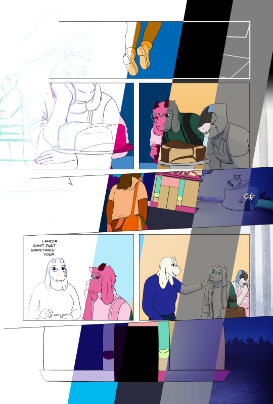
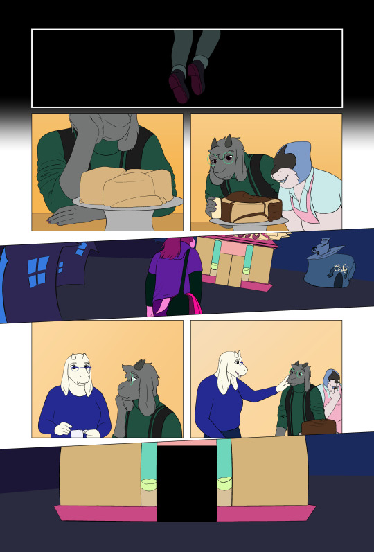
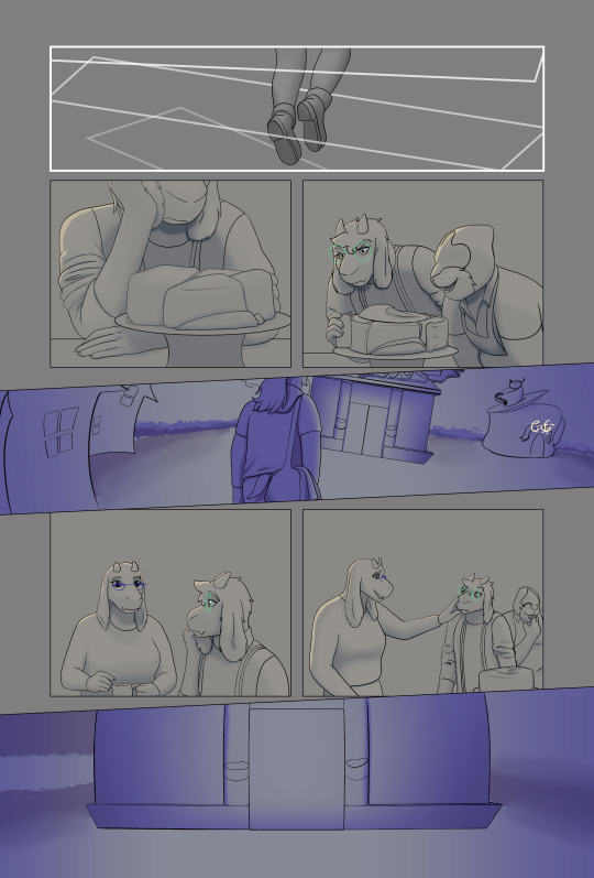
Looking Glasses Behind the Scenes #1
Here's a look at my process for building a comics page
Let's use Page 55 of Looking Glasses as an example
Roughs
I start with a layout, roughly sketching scenes from my script, trying to puzzle out how they'll fit into panels on the page. I don't usually specify panel layouts in my scripts, I find it kind of hard to picture layouts until they're actually on the page. Here's my initial layout
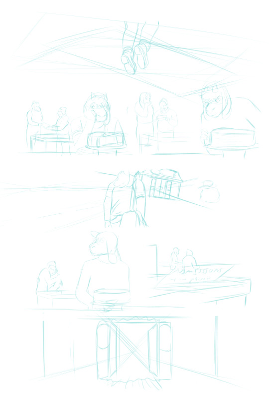
You can see there are some major differences from the final product. I initially planned for Lancer to get his admissions letter in the background of this page, with no dialog, but I came to realize that it needed more space to breathe. It was harder to tell what was going on here and I wanted Lancer to get a moment with Toriel, so I ended up moving that scene to the previous page and scrapping most of these panels, although I reused some elements that I liked. After a round of revisions I got this:
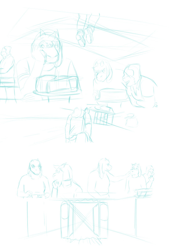
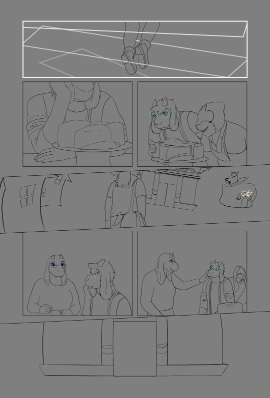
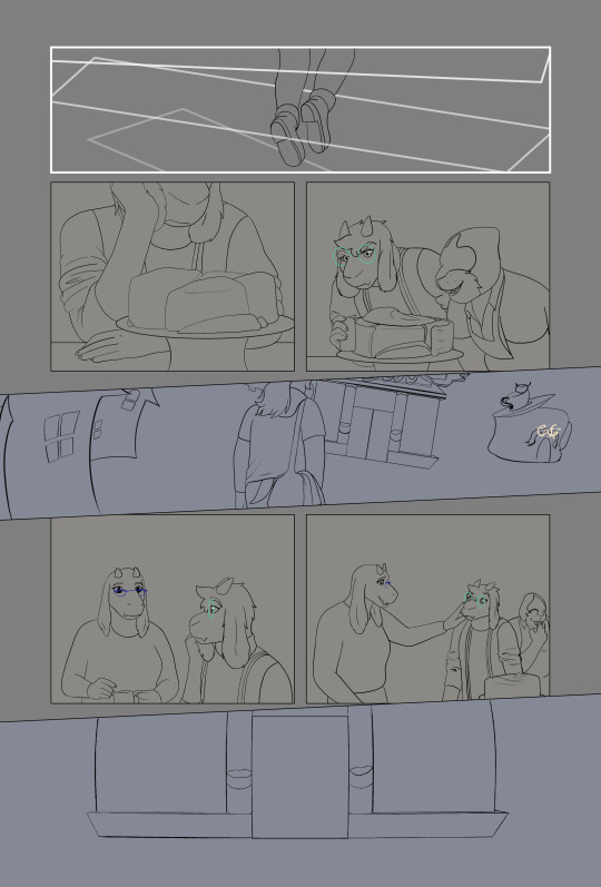
Sketch Phase
From here I move my sketches around and test out panel borders until I find something I like, roughly place the text, then I refine the weaker sketches. This page went through so many versions that most of the roughs were pretty sketched out already, sometimes my roughs are practically just have stick figures.
I have strict rules about paneling Looking Glasses, which are pretty evident here. The Light world has exclusively gridded panels with gutters. For the dark world, panels aren't allowed to be rectilinear, they have to overlap with each other, and they're always full bleed. The space between the dark and light world literally uses panel borders to transform from one to the other (you can see how the shapes Susie is passing through in the final page are just transformed versions of the panel border)
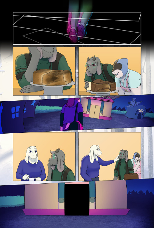
Inking
Next, I ink over my sketches. Sometimes I have to come back and re-draw something after this stage, but I try to keep from changing my inks after this.
Flatting
Using the Close Area Fill tool in clip studio, I add flat colors to a layer behind my inks. My lineart is aliased, so I could just use a paint bucket, but I work professionally as a flatter, and I prefer the types of flats I get from the Close Area Fill.
I flat my work in three stages. First I do the figures, making sure that I use the same colors for each repeated element, then I duplicate that layer and do any background elements. After this I flat the panel backgrounds separately. This allows me to select the figures or the panels quickly and easily during later steps.
Coloring! (My favorite bit)
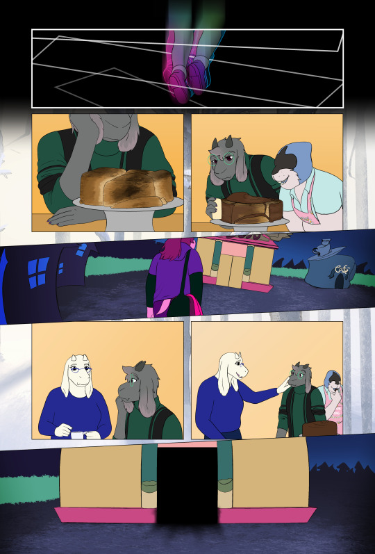
I duplicate my flats and merge them, use the paint bucket to drop the correct colors into place, and then do any detail work/painting/effects in a separate group.
Shading
I like to shade over a neutral background, so I add a layer of grey under the lineart. Then I adjust the colors of each scene with a minor tint, to help unify my colors. Toriel's house is very orange, so I give it a little bit of extra warmth, where as the dark world is otherworldly and vibrant, so I push it towards blue. Then I render the work. Each location in looking glasses gets a different treatment. The dark world gets really strongly colored shadows, but because there's no light in the dark world I don't add highlights unless there's an obvious light source. The light world gets fully rendered (shadows, highlights, fill lights, rim lights, etc.) but I make sure to use desaturated colors. In the space between the dark and light worlds, I only shade with black shadows and white lights, it's also the only location that doesn't get a tint.
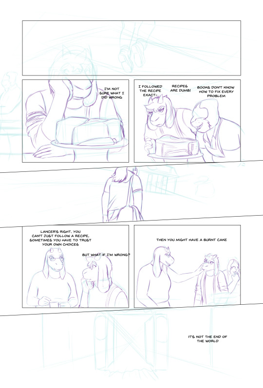
Finalizing
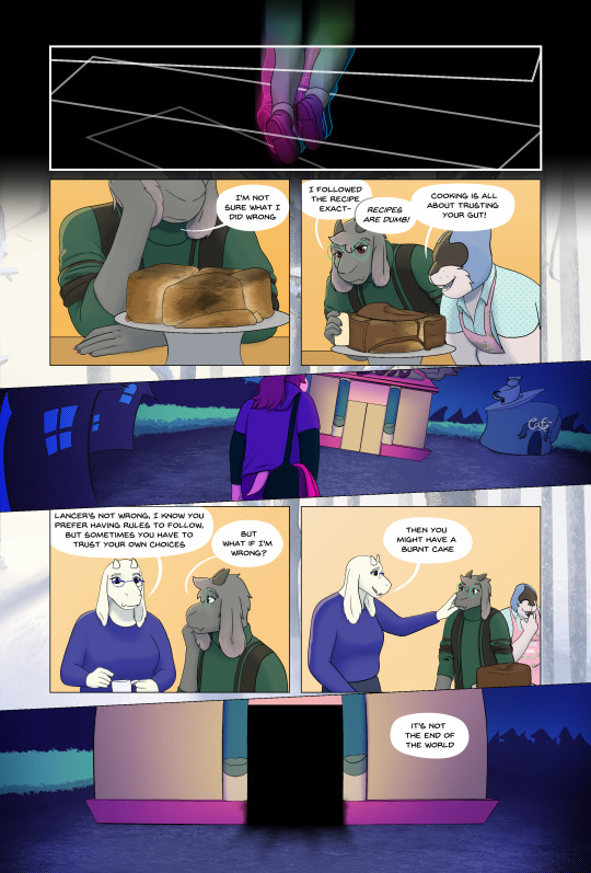
Lastly I finalize my dialog, which often goes through a couple of wording changes once it's on the page (You can see that happened here). Then I add my balloons, give them tails, and export the page.
And that's it!
#looking glasses#ferrousart#ferrouscomicscraft#I really wanted to do a breakdown of this page because of the three different visual styles#I know the “and then I color” step leaves a bit to be desired#maybe I'll do one of these just about my coloring process
15 notes
·
View notes
Note
Are stop motion characters made into toons? I would assume the cast of The Nightmare Before Christmas were made into toons. But what’s about the characters from studio laika?
A good question, especially for this month. I’m going to answer this because Dawn wanted to send nothing but conspiracy theories and ghost stories. So, you’re about to get maybe a more analytical answer.
First, I want to bring up what toons are. We’re mostly light. There’s paint and ink in us, or at least some of us. A lot of digital toons now, but still, we have light in us the same way you have water in you. In fact, the first toon was nothing more than drawn lines of light.

They weren’t really sentient, but they could take orders and perform tasks like jumping and walking.
Light is still in us and, fun fact, it’s why you can still see our eyes in the dark.
Digital Toons have this, but they don’t have the same binding of paint and ink. At first, this was a problem because they could easily drop things or clip through things because they were mostly a thinking hologram. It’s been perfected now, no more floating or non shadows on them.
So what does this have to to with stop motion puppets? Well, though there have been tests on old clay puppets, adding this element to a puppet hasn’t been easy and also, became a little frowned upon. As time went on. The living puppets were seen as only creepy. Tiny creatures springing to life, studio heads didn’t care for it and it was hard to classify them. Toon? Real? still a puppet? New kind of animatronic? In the end, Stop motion remained a hand made medium. Much like muppets, you need an animator to bring them to life.
I honestly don’t agree with this. I think there are a lot of lovely characters who are not creepy. Wallace and Gromit for example. But the stigma has remained.
But there are rumors of living puppets. Ones studios keep secret. Ones we never see animated frame by from by an animator. And this is where I get into Dawn’s favorite part. Theories and Toon Ghost stories.
I’ve heard the rumors of Tiny Chef being sentient, and honestly, I haven’t seen anything to go against this, so maybe. Along with that, Laika uses a lot of computers in their films and for the puppets, especially after Paranorman (something I don’t know if I agree with). Because of that, there’s a rumor that they have a secret office that houses these characters along with some of the old Will Vinton characters. These rumors vary depending on who you talk to.
Aside from secret living puppets, there are also the ghost stories. That whole “They’re creepy” Thing brings up a lot of camp stories for toons. One was actually told on a radio show. The No sleep show? The story is called “The Toy Box” and it’s one Dawn really likes. If you ever want to hear what a Toon ghost story is like, that’s one of them.
So, this has been a long way of saying stop motion toons may exist in secret, in small forms. But most likely, they still need hands to bring them to life.
Thank you for the question,
Doris
11 notes
·
View notes
Text
My reviews of free art apps I'm testing on my phone:
NOTE: These are based on my preferences and opinions. I don't use a lot of apps and tend to stick to just 1. Please do not use this as a basis for whether or not you yourself should get the apps, it is best if you test them out yourself as they may be beneficial or even different for you and your set up.
Medibang Paint: 8/10 (not uninstalling, keeping for the files)
it was a 10/10 but then they updated and now it's not as great. lost another point when it started bugging out. Otherwise the app is extremely good. zooming, the image is still crisp, the strokes may be pixels, but I don't mind it. the UI is very clean and clear. you can see and understand the icons for each button and tool, easy access to everything you need + you are able to customize the brush settings and get some fun and unique textures out of it. it's super user and beginner friendly without the need for a "tutorial" to hold your hand in figuring out what things do and what they are.
I would gladly accept suggestions for free drawing apps similar to Medibang. or any cheap app that may cost money, because if Medibang refuses to behave, I may need to make a decision that I really would rather not make.
Ibis Paint X: 1/10
confusing UI. doesn't matter the DPI, you zoom in and every brush stroke is extremely blurry for some reason and that really messes with my eyes. extremely tedious to figure out, you would need to spend an extensive amount of time trying to find everything to understand the app. this app is like the opposite of Medibang. Even with the tutorial holding your hand to figure out what is what and where, it is still extremely confusing and unclear.
Autodesk Sketchbook: 2/10 (used to use you on kindle)
nothing like how it was on my kindle. on an older phone of mine it lagged so bad and had a different type of overall UI setup going for it, but I was able to at least draw something on that one despite the ungodly lag. this one? just as bad and unclear as Ibis Paint X, except the tools and settings are not scattered on the screen. you have to click an unclear button to find the brushes to change them and then another unclear button to customize them. the quality of the strokes are just about the same as Ibis Paint X in that they are extremely blurry.
Infinite Painter: 3/10
the UI is still sparse. a tutorial is shown telling you what is what and overall less tools visible than the previous 2 apps, this is unfortunate. However, the brushes are not blurry, but are pixelated like Medibang. a slight odd latency when making a stroke, not something I'm fond of, personally, but the selection of brushes aren't too bad, I suppose. Not for me tho. got distracted playing with the brushes and textures, but I don't think I'll be drawing anything. I would say if you're not put off by things here, you could probably get used to this and enjoy it. definitely better than the others listed besides Medibang.
the brush collage:
Clip Studio Paint: 1/10
first time trying this one out. took the longest to install. it takes a weirdly long time to start up?? definitely not a great first impression here. too clicky and sticky with the rotation, tedious to navigate to do anything. wow this app is not great. it looks horrible with the UI, too. clean screens are not good. it's off-putting. also it is by default recording me draw??? the heck? seems to be only 1 brush option, little to no actual customization of the brush. no clue where the layers were if there were any at all. overall?
Sketchbook Lite: 0/10
immediate ads. forces you into an ad that says 'start free trial then pay $14.99 a month uwu' instant hate. stroke quality is blurred, UI is WAY too empty. I like the dark mode, but YIKES. you exit out of the app for a sec and then back in and you are smacked in the face with the same invasive ads as you started out with. you are NOT getting my money that I do not even have to begin with. instant uninstall.
#ghostie mumbles#//long post#I uninstalled all except medibang. none of these were good sdkjfsddhsf#these are all the apps I could find. anything else is extremely cheap and is for very little kids to entertain them for a few minutes.#but even I would get bored after a minute or two. seriously not good for actually drawing.
9 notes
·
View notes
Text
February 10th 2024 - Blog 2
Roughly every week or so, I would like to share some behind the scene progress of my series One of the Powerful, as it has been going through some developments, which we shall be discussing starting with this blog.
Rigging
After hand drawing two, over 10 minute animatic episodes. While storyboarding Episode 3 (which will be heavily action focused) I began thinking about how I could save time drawing as I noticed each episode taking longer and longer to make due to me being a one-man animation team. One of these ideas was creating 2D puppet rigs, that could allow me to pose characters like an action figure. And since I learned how to use control points to rig hair strands in Clip Studio Paint, I thought I could settle with that. As yes, it saves time, however since the program is very limited when it comes to puppet animation, being more of an illustration and frame by frame 2D animation software, I felt like there could be a better way to do what I felt would be best for this series.
I proceeded to study a few cartoons that I noticed used 2D rigged puppet animation, and looked into the software that some of the shows were made in. One that really interested me was Toon Boom Harmony, I saw that some people were able to give the appearance that a character is 3D by using controls even though it was all 2D, like this. I knew I wanted to learn something like this for my series, being able to pose a character’s head in different angles with some adjustment here and there would save so much time!! However, Toon Boom is WAYYY out of my budget sadly, but then I saw that Blender Grease Pencil and its rigging tools could give me a very similar if not the exact same result:
youtube
youtube
I’ve used Blender in the past, however only for creating basic camera movements for some of my animations. I had made a donut a couple of years ago but that was just about my experience with the program, my knowledge with Blender is very much limited. However, I was dedicated to try and give this whole rigging idea a chance so I proceeded to watch some tutorials to learn not only 2D rigging, but also Blender’s Grease Pencil, due to it being able to draw with vectors. Over a month later, I thought I’d share my progress:
After learning how to rig an eye, mouth and eyebrow to understand the basics of rigging; I noticed just how time consuming and tedious the whole process is, there is a lot of steps and A LOT of trial and error as anything can go wrong, it can take multiple rigging attempts to get the result you are after. But once you finish a rig, it’s such a rewarding time saver in the long run!
Once I understood the basics of rigging, for the past few weeks I have been chipping away at a 2D rig head turn, following this tutorial series! Using Hoshi as a test, since I thought he would be the easiest out of the main cast to rig, and well… that was until I was drawing out and rigging his hair - I had to really think about how each strand was all layering on top of one another and it was extremely time consuming, however I have got it mostly working now!
Currently, all of Hoshi’s facial features are rigged, this past week or so I’ve been rigging his mouth using what I learned rigging the last one. And it’s decent -but like most of the rig, it needs more refinement, being all a bit unpolished. I have also been having a lot of trouble rigging his lips, as they don’t deform the same way as the mouth rig, causing me having to place the lips manually, every time I change the mouth pose - which is a pain, so I’ve been trying to get it working with little luck at the time of writing. I also need to add in proper controls for the rig to make it more easier to animate, which will be done once everything is rigged and working as it should.
Down below, are some expression tests I did with Hoshi's rig, keep in mind these are all still a work in progress as I mentioned the rig is quite unpolished, however I’d love to hear your thoughts on it!! ^^

Concepts
While working on the rig, I have been making some minor rewrites, like adding more depth to events and characters in the story of OotP - which at this point in time I cannot speak much on due to heavy spoilers. However, Season 1 may end quite differently than originally planned, the ending being more polished and more organically linking things up, instead of things just coincidently happening. This all leading into season 2 more smoothly! ;)

Since I’ve been rigging, I’ve been thinking about character design a lot and thought since Episode 1 and 2 are likely going to be remade using 2D puppets for consistency sake. I’ve been wanting to slightly update some character designs, as I’ve barely changed the main casts' civilian designs since 2021 if memory serves me right, and there is somethings I want to change more with Cassidy and Hoshi’s designs - Erin’s design is fine for the time being, but I will change a few minor things like simplify their hair slightly for rigging, however their design changes will come up at a later date.
With Cassidy since she is based off a lion, I had her hair be in a braid to sorta resemble a lion tail.
However, for her new civilian design I’m considering having her hair more curly and bushy to fit her more happy, chaotic, bubbly personality, and to have it now sort of look like a lion’s mane? Then when she goes into her Powerful State (where a Powerful, someone who has magic, transforms to use their full abilities) I will have her hair transform in a long braid like before! Imagining the transformation for that is super fun!! 😀
I am also considering changing her outfit a little to be more casual and to have it easier to rig? I think changing her colour scheme to fit more with her blonde hair and the whole lion resemblance would be cool, however I might leave that for her powerful state outfit? I’m still figuring out her outfit, but I like the bright colours of the middle illustration (down below) as it fits her loud, outgoing personality!!
Also did you know that once a Powerful’s magic awakens (this can happen from when they are a child, like Erin’s case, or when they are a teen like Hoshi) it can sometimes alter their appearance when in their civilian form or "disguise", most commonly their hair. For an example, Cassidy used to have dark hair, however once her magic awakened, her hair changed to blonde. However everyone in this world, Powerless or not can be born with any hair colour, or people can choose to dye it. :D
Onto Hoshi, I have drawn some expression tests, being reference for the rig!
While working on Cassidy’s redesign sketches I thought I’d tweak Hoshi’s outfit a little as well. Without spoiling much, Hoshi wants to become as unnoticeable as possible, like he doesn’t exist (at least in his civilian design). When I designed Hoshi a few years back, I didn’t really flesh out his past or motivations all that much. So now looking at his current design, the contrasting colours of red and green could symbolise his messed up mental and physical state, but I’m not sure how much it really fits him outside of that, and I think the colours also stand out a bit too much for what Hoshi wants. So I’ve been thinking of toning his outfit's colour palette down a bit. I still don’t know if I will get rid of his red jacket as that has stuck with him since the very start back in 2020:

For rigging, you really want to avoid placing details on joints, and I knew that Hoshi’s knee ripped jeans would most likely make things quite complicated, so I am going to also play around with different designs for that in the near future!!
Down below are a couple of colour variations of a sketch from a potential updated Hoshi design:
I would absolutely love to hear your thoughts on this!! I hope these blogs provide more insight on the progress of the series behind the episodes!!
Thank you all very much for reading! ^^
#Youtube#oc#web series#indie#orginal character#animation#blender 3d#2d rig#2d rigging#kritaart#original character#character design#update
5 notes
·
View notes
Text
Hi I'm a nobody asked digital artist, here's my thoughts on all the digital art programs I've tried. These are based entirely off my own memory, and I'm not picking up any of these programs again to test them. Just going off vibes.
Autodesk Sketchbook - Mobile:
This is more or less the definitive Draw You In To Art program. No exaggeration, I think if you asked maybe 50 digital artists in the modern day, most of them would've tried this one at least once. It projects an illusion of polish to distract you from a number of critical missing features, but overall, it's not even remotely bad to start out with. I think if my mobile tablet had a halfway decent degree of pressure sensitivity I could make something okay with it.
A more detailed explanation of my thoughts is hard, but to sum it up, this program bombards you with a million brushes for free, something rarely done by digital art programs, but, it also has extremely limited layer behaviors, you can't change canvas size anymore, and the stablizer is pits. I won't say it's bad. It's not. It's just not good. 5.8 out of 10.
Ibis Paint X - Mobile:
Comedically simple, this is the program you pick up when you're doing digital art a little better, and want to actually have fun. Bread and butter of the mobile digital artist. It has literally everything you need, it's just not fancy in any way. Getting every brush isn't worth paying for, but you'll live. They recently tried to step into AI and got punched in the gut so hard they stopped, which I like.
In general, this program doesn't do anything in particular extremely well, but it also doesn't do anything poorly. It's well rounded. I'd say if you're gonna do digital art on mobile, you'll always find yourself coming back around to this. It's just too solid. 7.8 out of 10.
Medibang Paint - Mobile:
I am biased against this program. I just don't like it. Maybe I was using it wrong, or maybe the mobile version is just worse, but it felt like drawing with mashed potatoes and gravy. Also it seems to be no longer available on my tablet, so fuck it.
In truth, my memory on this program is hazy despite me using it probably the second most out of all of these. No clipping mask, limited layer styles, an extremely limited number of brushes, no way to get more on mobile, anti aliasing made everything pixelated, and I don't think it can change canvas sizes, or if it can, I never figured out how. I just don't like anything about how the program feels. 3 out of 10.
Clip Studio Paint - Desktop:
Goddamn. I wanna recommend it. I really do. But. You have to know things.
First and foremost, the new subscription model for CSP essentially means that after a year, whatever version you have is obsolete, and won't even get updates while you have it. You have to pay a yearly subscription to get the updates for your current version. if you pay for the 3.0 version when it drops in march, it will be 10 dollars extra to get any of the updates to the 3.x version until 4.0 drops, when you can pay 25 dollars to upgrade to that and get all the 3.x updates, plus whatever came in 4.0. On top of that, it can cost anywhere from 25 to 200 dollars depending on which version you get, and if it's on sale.
But goddamn. It's pretty worth it. The brush engine is fluid, works great for making your own, I've never seen the program fail to do something. It has limits, but I've never hit them. 8 out of 10.
Rebelle 5 - Desktop:
Listen to me carefully. This one is extremely specific. You have to WANT a digital art program that replicates IRL media PRECISELY. If you don't care about that, this program is not worth it. I got it on sale for 10 dollars. Can I reccomend it at that price? Heartily. But at the near 200 dollar price point it usually goes for? FUCK NO. Rebelle caters to a specific demographic. Nothing else matters.
That said. When it works, it works well. I do like how rebelle feels and works. But not enough for me to ever tell someone to get it for full price. 4 out of 10, but if you really want to replicate traditional media, 9 out of 10.
Corel Painter - Desktop:
Never before has a program sent me on such an emotional rollercoaster as this one. It's just so much. It's a midpoint between Rebelle and Clip Studio, but for the worst. It's expensive beyond comprehension, you can't make your own brushes, only pay for new ones, it's a yearly format meaning a new, barely distinguishable version goes on sale every year for another 300+ dollars, and I only got it as part of a Humble Bundle for 25 dollars, and I still feel like I wasted my money.
And you know what? I didn't just dick around in this program. No, I made a full drawing in it. Nothing spectactular. Just a simple drawing. And I felt accomplished. and I went to export it, to share. Only to find out you can only email images to the email associated with your account to get a regular image version. Now. This made me irrationally angry, but, I calmed down, and tried it.
It only works with microsoft emails, and I have a gmail account associated with my Corel account.
This program is 300 dollars, and lacks the functionality to simply export a png to your computer. 2 out of 10.
#squidzard.txt#squidzardart#art#artists on tumblr#digital painting#digital art#digital illustration#art programs#rant
3 notes
·
View notes
Text
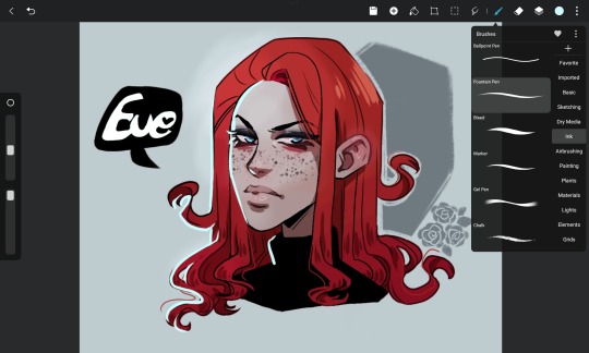
Quick doodle to test a new drawing app called HiPaint (formerly Huion Sketch).
It's meant to be the Android version of Procreate and it's free. I think it's perfectly fine for doodles eventho I'm missing the gradient features and I can't make the soft brushes as big as I would like to makeup for it. I also heard the brushes aren't as nice as the Procreate ones but I never used that app so I can't judge that personally. The standart brushes were working fine enough for me.
I think I will be using HiPaint instead of Clip Studio Paint on my Android in the future since I'm not doing more than doodles on my tablet anyways. I need a PC for proper drawings because I like to draw on a big canvas with a million lagers RIP- and I don't really want to pay for the CSP App considering how little I use it.
Btw it has a screen recording feature that is on by default so that was a nice surprise .3.
Regarding the character, that is Eve (Eveline) a new character for the Eldritch Magic Verse. Her desing is still subject to change and I don't think the expression fits her character that well but I really like how her hair turnd out.
#Eveline Ashwood#my ocs#Verse eldritch magic#hipaint#huion sketch#artwork#artists on tumblr#my stuff#my artwork#speedpaint
12 notes
·
View notes
Text
Review: XP-PEN Deco L
As someone who prefers screenless "normal" pen tablets for ergonomical reasons, I'm happy to test this simple graphics tablet provided by XP-Pen.
Let's see how it compares to my old Wacom Intuos 4 M! That is my favorite tablet that I have been using for many years and which is the standard I compare all other tablets to.
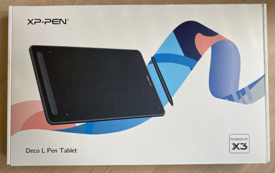
The XP-PEN Deco L is small and light, but the active drawing area is very similar to a medium one from either Wacom or the XP-Pen Deco Pro line. So that is perfect!
There's also a wireless Bluetooth model available but Bluetooth hasn't always worked well for me in the past, so I chose the cabled version.
It has some keys on the side but I've never really used those anyways (I prefer the keyboard, which is always right above the tablet) so I can't speak to their efficiency. But what I noticed is they have little nubs on them so you can differentiate them by touch alone, which is a nice detail!
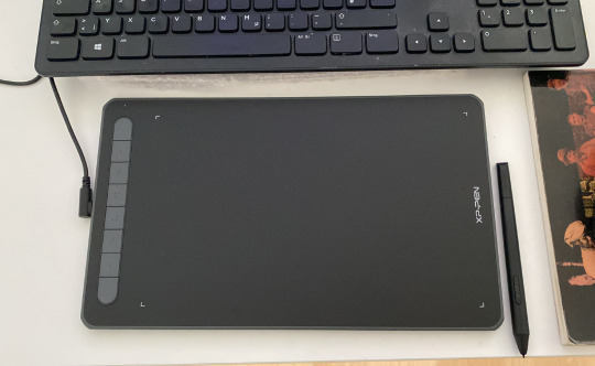
The pen is relatively thin and light, a little more so than I'm used to, but that's not really an issue. It would probably be ideal for artists who can't easily hold heavier pens for long.
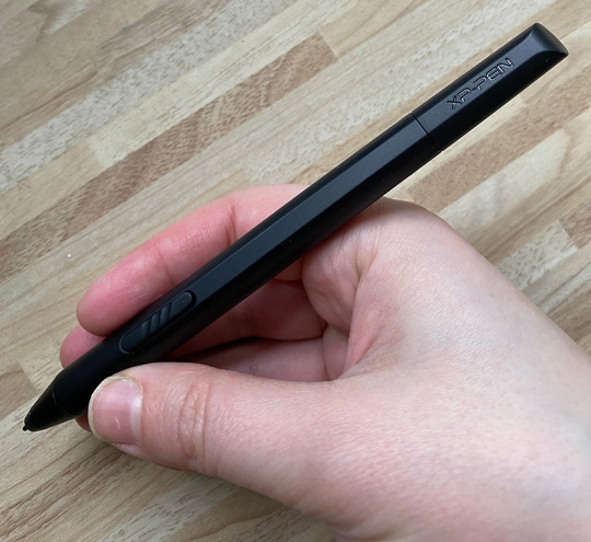
Importantly for me, it has those 2 keys/buttons on the side -- just like the Wacom pen -- that can be set individually. I use it for Alt (color picker in Photoshop) and right click.
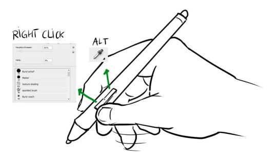
The installation was super quick and easy (I use Windows 10). Just plug the Deco L in your computer, download the latest driver from the website, install that, restart, and you're ready to draw!
Drawing, painting and sketching is fluid and easy enough in both Photoshop and Clip Studio Paint that I can work with this tablet professionally. The pressure sensitivity is very much like the one from the Wacom Intuos 4 that I'm used to. This is the most important aspect for me.
I also noticed that it works very well as an input device for the PC in general, even in the browser (which some tablets don't work perfectly with, especially when it comes to scrolling and copypasting). I still assume it may vary depending on your OS and browsers.
Who the XP-Pen Deco L is for:
- anyone who wants an affordable basic pen tablet that works perfectly
- artists who need a mobile tablet that can easily be carried around to places.
Hope you enjoyed this review!
Store link: https://www.storexppen.de/buy/deco-l.html?channel=Kristina
19 notes
·
View notes
Last Seen Blogs

drcwgraham
Drew Graham

kokichaai
★🎀kokichi oma(⸝⸝⸝╸w╺⸝⸝⸝) 🍮❤︎

satulimaenam
Untitled

bloomingcloudz-blog
moonlight

nonbinaryautism
Untitled