#also did you know you can add alt text in desktop but you have to use the html editor. extremely annoying.
Photo

For the first time in a long while, I got to go to a white elephant gift exchange this December! We had a low price ceiling and my practically wins out over any practical joke sensibilities every time, so on the designated shopping day I left my local overstock store with a nice chopstick set, some fancy (not at all mess-free) popcorn, and a dream.
When I was growing up, my mom was an intrepid homeschooling parent who loved event planning, valued cultural exploration, and had married into a Japanese family. Multiple times - sometimes in the setting of a multicultural fair, at least once as a kind of class party (with celebratory takeout at the end) - she faced teaching large groups of children how to use chopsticks quickly and with as little cost and cleanup as possible.
Her answer was popcorn! It's edible, so you get the full motion down, and lightweight but large enough for less coordinated sticks to pinch. It has tons of nubbins to grab and widely varied shapes to experiment with. Specifically, we used air-popped kernels, without oil or toppings, so when it gets overzealously crushed or bounces away and gets missed by a broom, it's basically biodegradable styrofoam.
What I'm saying is, this is my mom's fault. Other than the choice to draw so many hands in one afternoon on the same day as the party, while also baking a snack. That's all me. This primer was delivered in the format of a tiny booklet (if you look up an "eight page zine" that's also a method I learned from my mom, to turn single-sided misprints into notepads), with fewer jokes and tips than I'd have liked because I simply did not have time to transcribe a hashi rest fold or hairstyle. But reformatted (for Mastodon) it looks fairly respectable.
Lengthy image descriptions and full poster format under the cut.
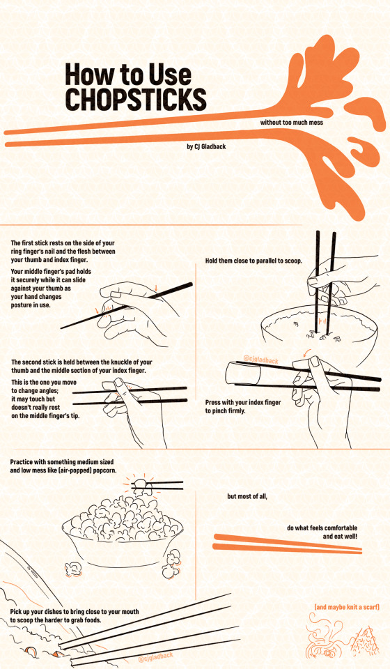
[ID: A title page reads "How to Use Chopsticks" in all caps. The words "without too much mess" are between two straight, orange lines, which start with round points at the left, evoking chopsticks, and end in flared shapes of a silhouetted splash on the right. Below the lower line are the words "by CJ Gladback." All the text is in black, the background is white but appears light orange due to a repeating geometric watermark pattern of CJ's logo in orange overlaid on the whole image; her handle on most sites is included once on each of the following spreads: @cjgladback
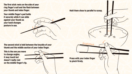
Next is the first spread of four illustrations with their instructions. On the left half of page are two line drawings of a right hand holding one and then two chopsticks, with the text, "The first stick rests on the side of your ring finger's nail and the flesh between your thumb and index finger. Your middle finger's pad holds it securely while it can slide against your thumb as your hand changes posture in use. The second stick is held between the knuckle of your thumb and the middle section of your index finger. This is the one you move to change angles; it may touch but doesn't really rest on the middle finger's tip." In orange, two arrows indicate the rest points for the first stick while small hashes emanate from the points pressed on the middle and ring fingertips and under the thumb's joint holding the top stick. On the right upper quadrant of the page is the text "Hold them close to parallel to scoop." A hand holds two sticks poked into a bowl of rice between the viewer and the palm; a series of parallel orange lines emphasize the space between the sticks. The remaining quadrant's text reads, "Press with your index finger to pinch firmly." This hand is holding an indistinct rounded shape in its chopsticks, with an orange arrow indicating the rotation of the index finger's tip to press the top stick's point toward the bottom's.
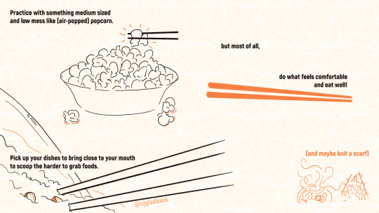
Next is the final spread of the pamphlet. The upper right text reads, "Practice with something medium sized and low mess like (air-popped) popcorn." A single piece of popcorn is held in disembodied chopsticks above a full popcorn bowl, with several kernels fallen to the surface below it. Text below reads, "Pick up your dishes to bring close to your mouth to scoop the harder to grab foods." An implied tilted bowl of food (fried rice or porridge with diced pieces) protrudes off the page, covering only the lower left corner. Close-up chopsticks have their points buried in the food and their lines fade out toward the right. The final black text, underlined by two orange chopstick shapes, reads, "but most of all, do what feels comfortable and eat well!" In orange in the lower right corner, the parenthetical "(and maybe knit a scarf)" is followed by a small orange drawing of a steaming bowl of noodles and sliced egg with a noodle line trailing toward two upward angled sticks with loopy hashes indicating knit fabric hanging from them.
The final image is the full booklet in its web format, with the three previous images from this post stacked vertically. Some orange lines have been added between what were pages in the print booklet, to aid reading flow. /end ID]
#straight up ripping my entire caption from instagram cause (as you can see) i wrote it in a blogging mood#cj gladback#zine#how to#gift ideas#chopsticks#hashi#food#artists on tumblr#illustration#hold up -- once I uploaded multiple photos#not all at once but by clicking the ''add another'' button#THEN i can mouse over to add alt text?#or did the feature just finally reach me?#in the middle of starting this post#why would this be more captionable than the single image version of this#or the accidentally misordered sequence of these same files if i add them all at once#i want to understand but i do not#i guess since the little alt boxes started showing up on mobile relatively recently i could try scrolling back through the official pages#see if there's a full explanation of all processes#would expect the crowd i follow to have already reblogged and celebrated/critiqued if there were one but maybe they were busy#...and then i tried using my previous alt text copy pasta'd in there and it took about half of the first and shortest description so#i know i'm wordy but in this case it really only does its job for people who can't see it with a ton of description#could make it shorter but it would be a lot of editing time for probably still not getting it clear under the character limit#so hey have a clunky read more anyway#yep i started just typing the text on the pages and made it halfway through the second sentence#i'll try to remember to not complain about the lack of desktop alt text only very specific factors of it now#also having the read more gives me the excuse to share the full poster version of this without worrying about it being less legible#depending on the screen you're viewing from#gallery
43 notes
·
View notes
Text
Alt Text on Tumblr
Did you know you can add alt text to your images on desktop and mobile? Images with alt text have a label like this in the corner:

Its usually faint but gets more opaque when you hover on the image. When you click on the label it will show the image description like so:

Whenever you make a photo post or add an image you should have a meatballs menu (this is what those three horizontal dot menus are called) pop up on your image when you hover over it:

Add your image description and there you go! Many users will appreciate you doing so! Especially users with visual impairments. If you are unsure of how to write alt text basically the key things you should add are:
The type of image. Is it a screenshot? Is it artwork? Etc...
Key context that's important to understanding the image's content. Basically what would be necessary to know in order to engage with it?
Any key text.
You don't need to describe every single little thing of an image with great detail, just whats important to understand. It may help to look around and see how others do it too! Don't be afraid to ask for help from the community. There's also many guides online on how to write them. For example here's a guide on alt text by Veronica With Four Eyes.
If you can't add alt text for whatever reason, you can tag your posts #undescribed so visually impaired users can filter it out and signal the community to help out.
93 notes
·
View notes
Note
Hi, hello, I a in desperate need of css help because I'm a beginning trying to do something for my story on a workskin.
I have 3 images: Left(100×100), Center(100×200), and Right(100×100). I would like the Left to be left-aligned, Center to be center-aligned, and Right to be right-aligned all in the same paragraph/sentence so that when it's seen on the screen, they'll be aligned. However what I do this, the images fall out of alignment.
On desktop, the Left and Right images are perfectly placed but the Center is more left-aligned following after the Left image. I checked the html and it's clear that Center is "centered-aligned".
Is there a simple fix? Or is there some hidden rule or easier way that I'm not seeing?
Ok so fair warning that 99% of my CSS dabbling is in tag blocking and urls, so this is the result of a bit of fucking around and trying stuff moreso than actually knowing what I'm doing.
That said, using this tutorial, I did manage to get this result:

The workskin looks like this:
#workskin .column {
float: left;
width: 33.33%;
padding: 50px;
}
#workskin .row {
display: flex;
}
and the html in the fic itself should look something like this, though I had to retype it to not have tumblr auto-format it:
<p>======================================================================================================================================================</p>
<div class="row">
<div class="column">
<p><img src="https://image1.jpg" alt="" /></p>
</div><div class="column">
<p><img src="https://image2.jpg" alt="" /></p>
</div><div class="column">
<p><img src="https://image3.jpg" alt="" /></p>
</div></div>
<p>======================================================================================================================================================</p>
(the paragraphs of equal signs were just so I could see what the width of the actual text space was supposed to be)
Increasing the value under "padding" should make the images smaller and farther apart, and decreasing it will make them closer together.
Also, if you want the center image to be wider (I think it's just taller? idk how the order of height and width goes lmao) then you can make two column classes in the work skin like this:
#workskin .column1 {
float: left;
width: 25%;
padding: 50px;
}
#workskin .column2 {
float: left;
width: 50%;
padding: 50px;
}
and give the <div> the middle image is in "column2" as a class and the others "column1"
I think that should work for any combination of column size/number, as long as the percentages of all of them add up to 100.
*Fair warning also that from what I read in the tutorial the flex container used here isn't supported in some versions of internet explorer (10 and before I think???), so this might not work in those browsers.
also, hehehe:

5 notes
·
View notes
Note
i'm the one who made the star trek pride post, i was wondering how to add alt text to an image properly? i've always struggled with it, that post is literally the only time i figured out desktop captions as well
Hi!
Okay, let me first say that I am an exclusive mobile user, I'm not sure if it differs on the desktop instead of the app. And, in reference to the pride post, several people pointed out that it did have text, you just needed to click onto the image to see the caption. But that just wasn't there on mobile, I click the image and it's just an image with no caption.
However, I know on mobile that there are three little dots you can click to add it.

[Image description: a screenshot of a post in progress, the post has two pictures on it, on the right-hand corner of each image are three little dots, circled to show where they are. Clicking it brings up the option to add alt text. /end image description]
Clicking that will give you a small box to write your description.

"Alt text. Adding a description of this image makes your post more accessible for individuals using a screen reader."
You get 4000 characters, so spaces, punctuation, and spelling matter.

Once added there will be a small box in the corner. [The pink bear photo has a small black box in the left hand corner labelled, "alt."]
However, I always find that the box is quite faded, I don't notice it when I do use mobile browser unless the OP or someone tags the post as, "ID in alt."

But, with the added text, you get given a box of your description in the middle of the image post. [Image description: A photo of a light pink water bottle, it is shaped like a bear, has two black eyes on its face and a small black nose. The tummy of the bear says, "smile" in a pink font."]
Although, plain text captions are always the preferred method of writing an image description. Alt text can be quite glitchy, people also have trouble with using it, so plain text captions are the preferred way to go.
And if you do use alt, and I come across the post, I will just copy and paste your caption into plain text anyway.
I hope this helps.
#lmao trying to find an image that isn’t blorbo‚ too much personal info‚ or just a meme was tricky#so my two bear water bottles will have to do#i hope this helps#i hope this sounds okay and eloquent enough that you can understand it
4 notes
·
View notes
Text
How do I rank our blog on Google?
Easy Steps on How to Rank Higher on Google
1. Target the Right Keywords
By targeting the right keywords, you can help Google understand what your content is about. This increases the likelihood of popping up your articles in response to a search.
2. Focus On Low Difficulty Keywords
Keyword difficulty is an important metric you need to keep an eye on while choosing a keyword for your blog articles. The higher the keyword difficulty, the more fierce the competition is and the harder it is to rank for.
When choosing keywords, the general rule of thumb is to find the ones that have a decent traffic volume with low competition.
3. Focus On Long Tail Keywords
Long Tail keywords are three or four-phrase keywords that are very specific to what you’re selling. They are generally easy to rank because of their low competition.
4. Use Your Keywords in the Title and Subheadings
There’s some correlation between keywords in the title tag and Google rankings.
Alongside, I recommend you use your primary keyword and its different variation in your content’s heading tags as well.
But don’t stuff your keywords in an attempt to manipulate your site’s ranking because that can have a negative impact.
5. Write Compelling Titles and Meta Descriptions.
Did you know that the click-through rate (CTR) for your page in the search result is also a blog ranking factor on Google?
In order to receive high CTR and ensure that you stay in the top spot, you’ll need to write titles and descriptions that grab the attention of the searcher and entices them to click.
Bear in mind that for the title, you only have 55 characters, so you need to give it some thought before you write it.
6. Make Your Blog Responsive
Google uses mobile-first indexing. That means that it looks at your mobile site to determine how to rank it in search results, even if the search is on a desktop.
That means it’s important that your site works well on mobile devices, even if most of your traffic is on a desktop.
To ensure this, you need to pick a responsive WordPress theme.
7. Optimize for Featured Snippets
If you want to get the most out of your content, then it’s smart to optimize your blog to show up in featured snippets.
Visit Seotoolskit for more exciting and free SEO Content.
8. Optimize Your Images to Drive More Traffic
Here’s a secret that most bloggers don’t know about: Google Image Search can send a lot of traffic to your blog if you optimize your images properly!
All you need to do is add alt text to your images.
9. Ensure That You Have User-Friendly URLs
To ensure that you have user-friendly URLs, you need to make sure your URLs are short and descriptive.
If you’re starting out, make sure to change the default permalink structure so your URL looks shorter and pretty.
Never use URLs that have special characters or dates in your URL. They make them unnecessarily long and ugly.
10. Improve Your Site’s Load Speed
Page load speed is a ranking factor, which means that if you want to outrank your competition, you’ll need to make your pages load faster.
Even if the Page load speed wasn’t a ranking factor, it’s still important if you are serious about delivering the best quality to your readers.
You can also install a caching plugin on your WordPress to improve your page speed. We recommend WP Rocket, one of the best caching plugins available.
11. Submit a Sitemap to Google Search Console
Submitting a sitemap helps Google understand the structure of your blog, and it also helps Google crawl all your pages.
Check out: How to Submit WordPress Website to Google Search Console.
12. Get High-Quality Backlinks
You can’t rank high on Google if you don’t have good quality backlinks. In order to rank higher on Google, you need backlinks that act as votes of authority.
13. Improve Your Website’s User Experience
Having a good user experience is directly related to achieving higher search ranking and organic traffic.
Visit Seotoolskit for more exciting and free SEO Content.
0 notes
Text
Not the Life has interesting parts in it, but I wish that someone would approach in-depth biography of My Chem from a queer/trans perspective. Like it is completely unthinkable to me that this section discusses Gerard’s frustration about being seen as more mainstream while recording Conventional Weapons, but does not bring up how gender performance affected that perception at all:
--
---
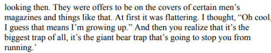
Gerard goes ‘I cut my hair and wore a tie and got offers to be on men’s magazines and I felt trapped.’ That’s absolutely about him being seen as gender-conforming for the first time in his career and hating it!
Especially notable is that 2 chapters previously, Bryant discusses Mexico City attacks on emo youth that associated themselves with MCR. He explicitly names homophobia and enforcement of gender norms as the driving force. There are dots to be connected here!
[ID in alt text]
#gerard way#my chemical romance#not the life it seems#mcr tag#the gender/sexuality stuff is so weirdly underanalyzed in this book#there's stuff said that bryant just completely breezes past#transgay mcr biography when#also did you know you can add alt text in desktop but you have to use the html editor. extremely annoying.
35 notes
·
View notes
Text
Ravelry and accessibility
Most knitters and crocheters will be familiar with Ravelry, a website hosting tons of patterns for various fibre arts.
There's been some discussion about Ravelry's accessibility status due to the layout change the website underwent last year. As I've read a lot of contradicting information on said accessibility problems, I decided to take a quick look based on the Web Content Accessibility Guidelines (2.1).
A few notes:
I didn't test with a screenreader, so take the screenreader comments with a grain of salt. I only checked the code.
I only checked a few pages, not the entire website.
This post is a quick overview, not an in-depth analysis.
These notes are based on what the website was like on the 6th of November 2021. I don't know what the website was like back when the new layout was first released (I have memory issues and to be honest I just don't remember).
I used the Merino theme while testing.
I'm just one person. I'm disabled, but I don't have all of the disabilities mentioned in this post. The points I make are based on WCAG, not lived experiences of daily users, and therefore theoretical. Your experiences will be different than mine.
Did you encounter any issues that contradict this post, or that are missing? Feel free to add your own comments! They may be helpful to others.
TL;DR:
Generally speaking, the website's not the best but not the worst either. Its accessibility needs work, but some efforts have been made to make the website WCAG-friendly. Your mileage may vary, depending on your needs.
If the website gives you migraines, the different colour modes might help. I haven't encountered any flashing imagery so far.
Screenreader users will likely experience issues, but theoretically speaking the majority of the website should be fairly doable. The same goes for keyboard users.
If animations give you trouble, check out the motion reduction options.
Colourblind users may encounter some minor issues.
If you're a desktop user who uses the browser's zoom function, I've got bad news for you. While it might just be my personal PC/browser combo, the website doesn't seem to be responsive on desktop. Reflow seems fine on mobile devices though (at least the one I tested).
The nerd stuff:
In general:
Ravelry has multiple themes available with different colour schemes, including a dark mode.
Ravelry's accessibility settings include three different fonts, allows you to (slightly) increase font size, and has motion reduction settings. That's pretty cool!
Ravelry has unique page titles and language attributes, and has multiple ways to find content.
The majority of the website is mobile-friendly when checked on my phone, but won't reflow or switch to mobile view when zooming in on my desktop PC.
Log-in page:
The Ravelry's log-in page isn't perfect, but pretty okay.
Logo has a proper alt text for screenreaders.
Form labels and fields are linked. Could benefit from autocomplete attributes, but that'd be more of a nice extra rather than a blocking issue.
Form has decent error messages.
Headings have been used for layout purposes rather than hierarchy, which is not ideal.
Background has animation, but must be triggered by user with a play button which solves potential sensory/concentration issues.
Page is keyboard accessible and has visible focus outlines.
Page is missing landmarks.
Code seems clean according to W3C.
Colour contrasts are OK except for the "play" button which might be difficult to see if you've got vision issues.
Home page (logged in)
The Ravelry homepage is also imperfect, but pretty okay.
Images have decent alt texts except for ads and avatars beside articles.
Headings are OK. Could use an H1, but isn't mandatory.
Page has landmarks.
Page has skip link. Nice.
Page works with keyboard, including expandable menu. Focus is visible.
Code seems clean according to W3C.
Page has screenreader support as far as I can tell (ARIA). Posts and messages buttons are missing an aria-expanded attribute though.
Search bar placeholder would benefit from using a darker shade of gray regarding legibility. Gray input field borders should be darker to ensure everyone can see them. Other colour contrasts are OK.
Pattern search page:
The pattern search page has a few issues.
Several images that should have an alt text have been indicated as decorative to screenreaders: this is bad.
Heading structure could benefit from having an H1, but is OK.
Page has landmarks.
Colour contrasts are OK.
Page is keyboard accessible.
I'm not sure why the page has a seemingly empty div with an aria-live function?
Discussions page:
The discussions page mainly consists out of tables, which is old-fashioned but not necessarily inaccessible.
Page is keyboard accessible.
Tables are structured OK and use headings where appropriate.
Input field borders would benefit from using a darker shade of gray. Same goes for the unread thread icon
Users are informed of post states by use of colour. Could cause issues for colourblind users. Post states have decent text alternatives for screenreaders.
Post state options window is not keyboard accessible. Will probably cause issues for screenreaders, too.
Thread option arrows can be activated by keyboard, but tabbing order is incorrect.
Advanced search:
The advanced search has some issues. The personal project pages have similar issues.
Pattern preview pictures are indicated as decorative to screenreaders, but are links and therefore need textual alternatives.
Page has landmarks.
Page might benefit from having more headings.
Page is keyboard accessible, but needs more fine-tuning.
Collapsible elements lack aria-expanded attribute.
Interactive icons have screenreader alternatives (as titles, so might cause compability issues with certain screenreader/browser combinations).
Results paragraph has an aria-live element for when new filters are added or for when users go to a new page within the search results. Can't tell how well it works without a screenreader, though.
Pattern options icon works with keyboard, but tabbing order is incorrect.
Pattern page:
I've picked a random pattern page, which again is flawed but not horrible.
Page has landmarks.
Ravelry shop link in bread crumbs is both a link and an expandable element. Rather unusual for bread crumbs. Link can be activated by keyboard, but expandable element only appears on hover. Rest of page is keyboard accessible.
Images are links but indicated as decorative to screenreaders.
Icons are either hidden or described to screenreaders, depending on function.
More options link is keyboard accessible, but tabbing order is incorrect.
#wasteless crafts#ravelry#accessibility#wcag#long post#this is just a super quick and largely theoretical overview so again take it with a grain of salt#i think the site's accessibility could be improved a lot with some minor changes#it feels like one of those sites that was built with good intentions but a lack of experience/knowledge when it comes to accessibility#working out some aria and keyboard issues and changing a few colours and adding in more alt texts where appropriate would go a long way#and probably wouldn't be very costly or time consuming#then again i don't know what their back-end's like
114 notes
·
View notes
Text
Scripting tutorial for Tags and Captions
I often mention that I use a AutoHotkey scripts for adding the tags and captions to all my uploads, and in this post I will explain how I actually do it.
Getting started:
First of all, this tutorial only works with a windows PC. I don’t know of any equivalent programs like this for Mac, Linux or mobile.
Step one is downloading the “current version” of the program: AutoHotkey and install it. Now you can get started with scripting.
You can write scripts in any text editior, I personally would recommend Notepad++ but window’s regular notepad will do the job just fine.
Creating a Script:
To write your first script, simply right click on your desktop and select “New > AutoHotkey script, then right click on the new file and select “edit script”.
Alternatively you can just create a “.txt” file and change the file extension to “.ahk”.
A newly created AHK script will already have a few lines of text in it, for a script as simple as the one we’re writing you can ignore that text.
Please note: anytime you make a change to your script you have to save and reload it for the changes to take effect.
A much more detailed Explanation for how to get started can be found here
Hotkeys and Hotstrings
This is what a normal hotkey command looks like:
F6::
Sendinput, hello
Return
In this case, the F6 key is the hotkey, designated as such by the “::” behind it.
In the next line we have the actual command that get’s triggered by the hotkey, in this case it is “Sendinput,” which will send whatever text you put behind it, in this case “hello”, you can also send other key presses by putting them into these: {} brackets, for example adding {space} which will have the same effect as you pressing the space bar.
Please note: anything you want to send with the sendinput command needs to be in the same line as the command itself.
“Return” tells the script that whatever action your hotkey is supposed to perform ends here which allows you to add the next hotkey or whatever in your script.
I would also recommend to add a modifier key such as control or alt to your hotkeys so you can still use the keys original function.
To use alt as a modifier key simply add a exclamation point to your hotkey like this: !F6::
Now this hotkey will only trigger if you press alt and F6 at the same time.
A much more detailed Explanation for hotkeys and modifier keys can be found here
Hotstrings
Hotstrings basically work the same as Hotkeys with the main difference that you use a word or phrase to trigger the a command instead of a key. This is what it looks like:
::wha::
Sendinput, Witch Hat Atelier
Return
Your trigger phrase or word get’s designated by putting “::” in front of it and behind it. The command will trigger as soon as you hit the space bar or the enter key once you’ve written the word or phrase, however it will not trigger if you just keep writing, so for example if you write “what” instead of “wha” the command will not trigger.
There are many, MANY commands other than “Sendinput” you can trigger, but for now, this is all we need for what we’re trying to do.
A much more detailed Explanation for hotstrings can be found here
Tagging and caption script for tumblr
This is a simplified version of what my command for captioning and tagging Berserk posts looks like,
Berserkk with double k is the trigger word so this command doesn’t trigger every time you write the word Berserk:
::berserkk::
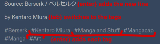
sendinput, Source: Berserk / ベルセルク {enter}by Kentaro Miura{tab}Berserk{enter}Kentaro Miura{enter}Manga and Stuff{enter}Mangacap{enter}Manga{enter}Art{enter}
Return
Please note: everything after “sendinput” needs to be in the same line, tumblr’s formatting just added line breaks.
And this is what the result of this command looks like:
And here with a visual explanation what all these {words} did
And that’s basically it...
AutoHotkey is an immensely powerful program and it can do much more elaborate stuff than tagging your tumblr posts, but you’ll have to learn that yourself.
Some resources:
-AutoHotkey documentation
-AutoHotkey help forum
-AutoHotkey subreddit
I really hope this tutorial is somewhat clear and understandable, I’ve tried to keep it as short and on point as possible.
#the and stuff part of manga and stuff#AutoHotkey#tutorial#this post will also be added to my pinned post
42 notes
·
View notes
Note
Hi there! I know you're just one person, but do you know if there's a preference in the communities that use image descriptions of either having alt text in images vs below the image, if that makes sense? I've been using the add alt text option, but ik there also people (like yourself) that put image IDs under your images, and I'm wondering if I should switch to that as well.
Hi! I myself am sighted, so I can’t speak for people who use screenreaders regularly. In general, though, I put IDs under the images for a few reasons:
IDs under images benefit people who need them but don’t use screenreaders.
Tumblr’s alt text has a character limit which can be very limiting for longer IDs.
I’ve also heard that alt text on Tumblr in general is unreliable, especially on mobile.
For people who don’t use screenreaders, it’s hard to tell whether or not an image has alt text. You can inspect the image on desktop or activate a screenreader, but not everyone is able to do that.
Part of why I caption is also to increase awareness about the need for accessibility, which alt text doesn’t do. I like that people can look through the notes of a post and might find and share captions.
This one is may not be applicable to you, but since I’m not the OP of the images I caption, I can’t add alt text to them myself.
Shoutout the people in the People’s Accessibility Discord Server (linked in this post) for having talked about this before. I did a quick search through the message history there to see if I missed anything (and I’m sure I did, so if anyone wants to add anything, please do).
Thank you for the ask and for making your content accessible!
15 notes
·
View notes
Text
Did you know you can add image descriptions directly into the image on tumblr? HTML code has a handy little thing called the “alt” attribute.
This was originally designed to be text that shows up when an image failed to load, so that the user would still know what was meant to be there. This is what a screen reader uses to tell a visually impaired user what an image is about - but it can only provide that information when someone has bothered to add an alt attribute to their image element.
The way of doing it can be a bit impractical - if there is a way to do it in the images of an Image post, I haven’t found it. BUT if you add your image within a post, that’s a different story.
Once your post is all done, you click on the little gear at the top right of your post, then select HTML as the text editor more.
There, each of your images will be represented by an <img> tag. This tag contains the URL of your picture (the src= part), and maybe some height and width attributes.
Within this <img> tag, you can add the alt attribute.
The image tag for my TUA pikachu meme looks like this:

[Imade description: a screenshot of the HTML content of my aforementioned post. The following text is highlighted:
<img src="[a very long URL edited out for better readability]" data-orig-height="784" data-orig-width="1354" alt="shocked pikachu face">
/end ID.]
You can see the alt there at the end.
⚠️ Careful:
The = sign and the quotation marks are really important, don’t forget them
Make sure to put your alt text into the <img> tag, meaning before the final >. This can be a bit tricky as the html has various different tags, so you have to pay attention.
Your alt text should be no longer than 125 characters, so this method will not be suitable for longer image descriptions
DO NOT use special characters such as <> or quotation marks, since those will interfere with the HTML
In general avoid any special characters beyond the alphabet and very basic punctuation to make sure you don’t risk breaking the HTML.
this also means no Emojis!
Basically, this method is most effective with very simple images such as a common, unedited meme, like the shocked pikachu face.
I should also note that this did not originally work when I posted the aforementioned post. The alt simply disappeared. If this happens, just edit the post and add it in again. If you have multiple images, it may be easier to post first without the alt attributes, and then immediately edit the post to add them.
AND ANOTHER THING!
Before adding an image description to someone else’s post, you can check whether they have already added an alt attribute! Right-click on the image and select “Inspect element”. You’ll see the same basic html I screenshotted above, but most often, the alt will only say “image”, meaning no one has added an alt, and tumblr’s post creator has auto filled that in.
Here, practice on these two images of - because I have no imagination - the shocked pikachu. (one of them is mirrored to look right instead of left)


You can see only one of them has a real attribute, while the other was automatically fileld in an just says "image".
As I’ve said, the alt attribute method cannot be used with all images due to constraints of length and character type. But when it’s a very simple, short description, it can be very useful. : )
This post was written for desktop as I almost never use mobile. If you know how to do this on mobile, feel free to add onto this post.
If you have questions about the alt attribute that aren’t covered here, you can find most of your answers via a search engine or on the W3 schools website.
Disclaimer: I am a sighted person, and writing this post based on the fraction of knowledge I have about this topic thanks to writing image descriptions every so often, and knowing a bit of HTML. If you see an issue with this post, please let me know so I can fix it.
#image descriptions#accessibility#long post#okay 3 edits later i hope this post is not broken anymore#can you believe tumblr deleted my bullet point list#thank fuck i copy paster everyhing before hitting post jfc
1 note
·
View note
Photo

BASIC GIF TUTORIAL (detailed)
In this tutorial, I’ll try to show you the basics of making a gif. Of course, there are many ways for that, but this is how I’ve been making them for a couple of months now, and it’s never failed.
I use Photoshop CS5 Portable (you can get it here)
for taking caps, I’m using PotPlayer (you can get it here)
Please, like / reblog if you find this useful


Videos
To make good quality gifs, you need videos with good quality. Best one for you would be 1080p, so always check if the video you want to gif is available in such quality:

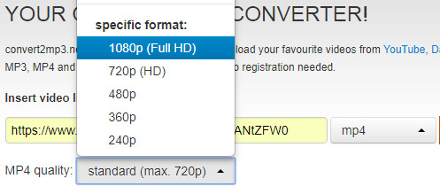
I use this website to convert videos from YouTube. Select the formats to MP4 and highest quality:
Then convert, and download.
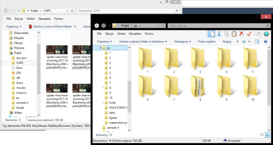
You can use videos from YT or movies you have on your computer. The movies also should be in the best quality possible. For example, this is the movie I’m gonna use for this tutorial:
You can learn about torrents somewhere else, or contact me about that. I suggest visiting YT, though, they have good tutorials for torrenting movies.
PotPlayer
After you’ve installed PotPlayer, it’ll be for the best if you add it to your taskbar or wherever else you consider it easy to click and use.
1) Open the video
In this tutorial, I’ll be working with Spider-Man: Homecoming, so I open it in the program.
2) Settings
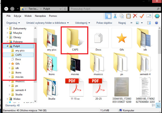
After pressing CTRL + G, this window should show up:
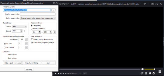
Make sure your settings look like that:
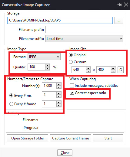
Storage is where your caps will be stored. It’ll be easier when you’ll create a folder on your desktop, and then set the storage setting to it:
3) Taking caps (image capture)
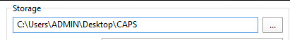
Play the movie on the scene you want to gif, and pause it.

Now, click Start on the CIC window

and play the movie. Click Stop after taking the caps you need.
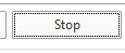
Your caps should be in the folder you chose in the storage setting
You can also have your movie playing and click start/stop whenever you want (if you know the movie/clip enough to know when to take caps).
Turn off PP after you’ve taken caps you need.
You can take as many caps as you want to, and then sort them into folders:
Photoshop: making frames into a gif
After you’ve installed it (search for tutorials how to properly install it, it takes unpacking and simple installing to do so; I’m more of a self-taught person and I can’t remember how I did it). Again, it’ll be easier for you to have PS in the task bar.

Open your PS,
then try to follow these steps:
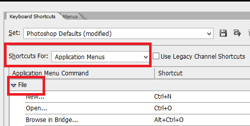
[ window > animation - opens the animation window on the bottom ]

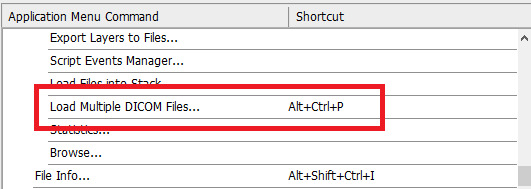
1) File > Scripts > Load multiple DICOM files > choose a file
You can give that command a keyboard shortcut.

This window shows up:
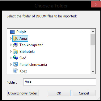
It’s important your folder with caps is on your desktop, so that the access to it is easier:
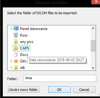
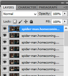
Click OK. The more caps you try to open at once, and the bigger they are (better quality), the longer it takes to open them. Don’t try to open more than 150 caps at once, it may work, but it’ll lag your PS and may even ruin a bit of your gif.
This is how it looks now:

As you can see, on my right I have specific tabs. I set them myself in the most comfortable for me way, but with time you should find your own way to set them to suit your liking. My tabs look like that:
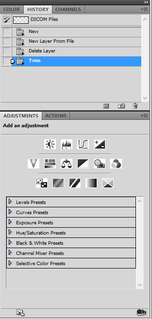
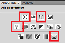
I only use history, actions, and adjustments. Of course, there’s also a tab with layers and paragraphs (text):
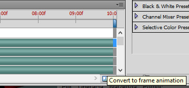
2) Convert to frame animation

4) Make frames from layers
For that command, you can also set keyboard shortcuts.
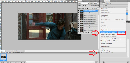
result:

5) Select all frames > set the time delay
(again, you can have a shortcut for this)
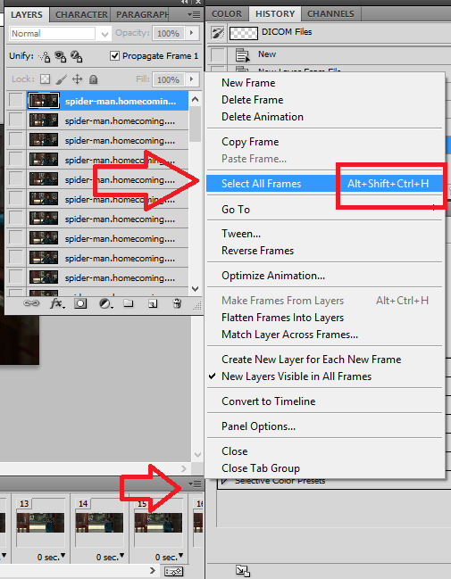
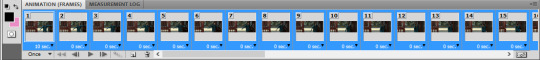
Make sure all the frames are selected, then:

For almost normal speed, choose 0,05. 0,04 can make your gif a bit too fast. The bigger the number (0,06 or 0,07), the slower the gif.

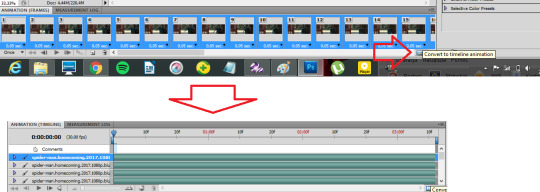
7) Convert to timeline
Make sure the frames are still selected.
8) Select > similar layers
(again, you can set a shortcut for this)

9) Convert to smart object
Right click on one of the selected layers:

Choose convert to smart object. Result:

Photoshop: editing a gif
There comes the fun part. The most important thing is dimensions. Be sure to stick to tumblr width dimensions: 540px / 268-268px / 177-178-177px, depending on how many gifs per row. That way you’ll definitely get the best result when your gif is posted. Visual:

1) cutting/cropping
To crop your gif, use the crop tool.
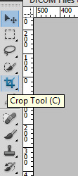
Now, it’s important your gif has the proper size. The bigger the dimansions, the bigger the gif’s size. The maximum size you can post is 3MB. Use this bar to set your crop tool:

5x2 (make sure it says ‘cm’, not ‘px’) is what I use for 540px gifs. For the 268 gifs I use 5x3, 9x5, 11x7 or any other sizing that I think looks good. We’re gonna use the 11x7 for a 268px gif.
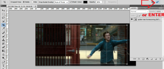
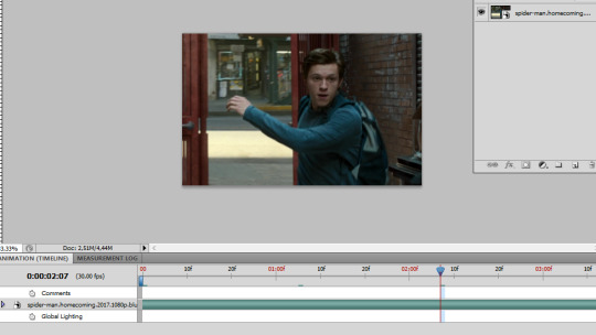
advice: to check if the gif looks good, click on different places in the animation bar:

2) size
image > size or Ctrl+Alt+I:

We’re making a 268px gif (width), but I’m gonna make it 230px so it won’t stretch in the post.

Ctrl + + will enlarge your view:

Make sure the thingy says “100%” so that you have the 100% accurate view of your gif.
3) sharpening
You can either experiment yourself or use actions. Search for actions that you like here, and download the action (make sure to like/reblog the post of the action maker)
Opening downloaded actions:
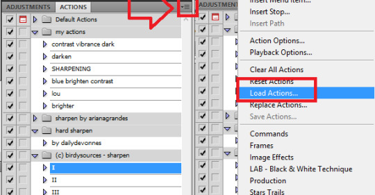
Choose the actions you want to load (it should be in the downloads folder).
Using/playing an action (make sure your gif is selected):

before:

after:

4) editing
This is the fun part when all you can do is to experiment. I’ll show you in parts what I do with that gif, but the fun part is when you try it, yeah?
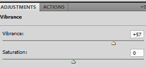
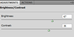
I use these adjustments: brightness, curves, vibrance, and selective color.

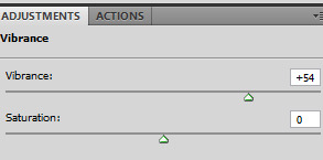
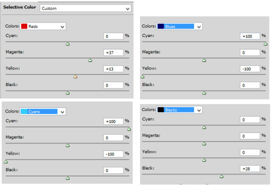
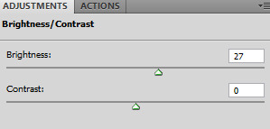
After all of these, the gif looks like that:

5) Saving


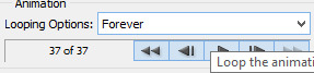
Make sure the looping option says “forever”:
you can play your gif to check if it looks like you wanted:
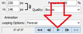
And save the gif:
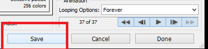
(wherever you want, preferably on your desktop)
so, before editing:

after editing:

P.S. To cut your gif after making it, you can move that thingy:
wherever you want.
P.S. 2. Clean up the mess after making gifs. Delete the caps and clean up the trash folder.
That’s basically it. Advanced gif making takes using layers, brush tools, and the eraser tool, playing with colors, and a lot of other stuff.
As you can see, it takes time, patience, energy, and having the movies you want to gif. It’s fun, but it’s a lot of work.
Have fun!
#completesources#gif making#gif tutorial#my tutorial#gifs#yeahps#photoshop#itsphotoshop#iamlouistomlinson#go through it and think another time you try to repost a gif#it takes TIME.#sorry for typos#and grammar#it's MORNING.
841 notes
·
View notes
Text
Why Organic Search Results & Leads Aren't Actually Free

Google's "People also ask" Suggestions:
You could spend some serious time looking at ideas by doing this It's a good use of your time though Don't skip it! It's going to be a good way to find "long-tail keywords," that are pretty specific, but very helpful to those who are looking for that specific information It's a time-consuming process, but so important! How to Know What is a Good Key Phrase
When you use something like Keywords Everywhere, you'll be able to see a few things at the right side of a desktop screen Volume - This is the number of searches a keyword gets per month in the US on Google - ISH It's not an exact science But a phrase with 2,000 searches vs one with 20 searches per month gives you an idea of what's popular You want to choose a keyword that people search for regularly If not, you won't get much traffic to your site, even if you did rank high on the SERP CPC - This gives a general idea of what this key phrase would cost in Google Ads Again, this is a broad stroke, but gives you some sense of how much competition there is for that phrase out there Comp (meaning Competition) - This is sometimes called Keyword Difficulty for organic search results It measures your competition, that is, other sites that use your target keyword The close the Comp number is to 10, the harder it is to rank for (Sometimes this on a scale of 1 - 100 where 100 is the hardest to rank for) And a big long list of other key phrase ideas - Some of these keywords, sometimes referred to as key phrases, are more specific than your average keyword For example, instead of using "shoes," you'd use "brown sandals for women" This is a more focused keyword and would satisfy searcher intent better than the other keyword Long-tail keywords are a good addition to your targeted keyword and phrases because, often, they give you a higher chance of ranking for a searcher that is looking for a specific result 2 Writing content to match the phrases
Once you've spent a considerable amount of time identifying the right keywords to target, you will then have to spend more time writing content that includes these keywords in a meaningful way Content creators used to get away with "keyword stuffing" to make their page show up in the search results But now, Google can read things like a human It's not about how many times you can cram the same exact phrase into a page, over and over It's about crafting content that a human can read using a mixture of phrases We will get into more of this in the on-page SEO section below
Side note: You can always have someone create content for you including ideas about what to write about This is an alternative cost to your time
Finally, once you have your content and it's published you'll need to bundle related topics together using a pillar page format This is an ongoing process If you have questions about pillar pages you can read: What are Pillar Pages? 3 On-Page SEO
There's more than just writing new content too You should also constantly evaluate the pages you already have Based on your keyword research, are you using relevant key phrases on your web pages? Does your page answer questions that people may be searching for?
Part of the process for getting your website to rank at the top of organic results is taking long-standing content making it work harder for you Add more text 1000+ words is good 2,000+ is better Break it up so you don't overwhelm visitors And don't worry about scrolling. It's really not a problem Add videos that are related to the topic for that page And be sure your transcript is included for Google read it Make sure you haven't overlooked your Meta Title and Meta Description These elements are needed so that Google can understand what your content is about and at the same time, produce the most relevant results for searchers Meta Title - Read by Google, appears in the search results, and should be related to your key phrases. The title of the page isn't always good enough take some time to understand these and write them so that Google makes a good connection with your phrases Meta Description - Not so much about ranking but matters when your page shows up in search results. Make someone want to click your result with a good description Image alt-tags - Give those pics a name where Google can read it Most content management systems make this an easy task, but it can be time consuming if it wasn't done at the time your website was built Cross-linking - You also need to link to related content within your website. This linking action shows search engines that you are an authority in your industry, offering more than just one page on a specific topic. This increases your chances of ranking well
Related Read: What You Need to Know About Your Website Content
If you do want to run paid ads, SEO is important because it determines your quality score, which is Google's rating of the quality and relevance of your keywords and pay-per-click (PPC) ads The quality score affects how your ads appear or if they appear at all This is because Google wants content that best matches searcher intent, solves a problem, or answers a question The higher your quality score, the better your ability to satisfy searcher intent The better you satisfy searcher intent, the better your ad rankings will be at the lowest possible cost 4 Link Building
So you've performed thorough keyword research, sprinkled those keywords throughout your content, and fully optimized your content for the search engines But if your website still isn't ranking, then it's probably because you haven't built any links And Google loves links
Why?
Because when there are many high-authority sites linking back to your website, Google sees it as a high-quality site with quality and authoritative content Link building takes quite a bit of time because you need to do some foot work and build relationships with other reputable sites Some people do email outreach and partner with other sites to get links. Others do what's called black-hat SEO and pay for links Google doesn't like this method and will penalize you for it. Mozcom has a great guide for link building. Whatever method you choose, just be aware that quality is better than quantity 5 Monitoring and Reporting
When you put this much effort into getting your website's content developed around a specific set of topics, you have to make sure it's working That means someone needs to own this responsibility Along with some software, like HubSpot or SEMRush, you will need to consistently keep track of where your website is ranking
NOTE: We don't recommend randomly Googling to see if you appear
Google produces very specific results based on your geography, past searches, etc The software gives a much more objective overview of your ranking Be sure you know what you're looking at and what it means so you can provide reporting to the highest levels of the organization What Is "It" Worth to You?
"It" - could be referring to the value of a lead generated from the website your time your marketing budget
Or all of the above There's a direct correlation between your SEO success and the amount of time and/or budget that you invest.
Ultimately, it's up to your company to decide how to allocate each of these, but if you want to rank in the top of the organic search results, there is a cost associated
If you'd like an honest, unbiased opinion of your current marketing efforts and how your currently ranking in the organic results, let's talk We can spend 15 minutes with you to review your SEO strategy
Read the full article
#contentmanagement#Google#searchengineoptimization#searchengineoptimization2019#searchengineoptimizationcrashcourse#searchengineoptimizationforbeginners#searchengineoptimizationtutorial#searchengineoptimizationtutorialforbeginners#searchengineoptimizationyoutube#UnitedStates
1 note
·
View note
Text
Evernote Mendeley

Evernote f839 expeditedssl f23e facebook f09a facebook-f f39e facebook-messenger f39f facebook-square f082 fantasy-flight-games f6dc fedex f797 fedora f798 figma f799 firefox f269 firefox-browser e007 first-order f2b0 first-order-alt f50a firstdraft f3a1 flickr f16e flipboard f44d fly f417 font-awesome f2b4 font-awesome-alt f35c. Previous video: Evernote, Zotero, Keynote, Calendar, Microsoft Word.Downloads for software mentioned:Evernote: https://eve.
Mendeley Evernote 連携
Evernote Mendeley Login
Today, you don’t have to spend hours in a library reading different journals, taking notes, and conducting extensive research. With technology, you don’t have to follow this routine when working on your research paper. However, writing a research paper is still tedious and time-consuming. That’s why you need to know and use the best software tools to conduct extensive research on sensitive subjects with ease.

Research is gradually becoming dynamic as we progress into the future. Most students use the internet to watch videos, browse websites and explore different types of content. While the internet has made it easy for researchers to access all kinds of information in seconds, it has also created problems. It’s quite difficult for students to verify and use reputable sources of information. Here’s why you need these five apps.
1. Grammarly
Research work usually involves hours of spellchecking and proofreading to make your paper look professional. Grammarly is a writing improvement tool that will save you a lot of time and effort doing these tiring tasks. Apart from corrections and spellchecking, Grammarly includes a vocabulary, grammar, and punctuation checker. When you pay for a premium account, you’ll get a plagiarism checker too. This amazing tool looks for different types of grammar mistakes in different genres thus leaving you with writing free of errors. You’ll get lots of errors and progress reports from the app. Grammarly is one of the most important research tools. You can also get it as a browser extension or Microsoft add-in.
2. Evernote
Evernote is an amazing app that will allow you to write and take notes while conducting extensive students research. The app helps in storing personal ideas, assignments links, and notes in a single place. You can create folders and separate tags for different types of information that you want. As a college student, you ask yourself, “Should I pay someone to write my research paper to save time?” Yes, you should because professional writers use the best research tools. Evernote syncs across all devices automatically including smartphones, desktops, and tablets. This means that you can switch between different devices without losing important information. Evernote web clipper is an amazing add-on for your Chrome browser.
3. Scrivener

Scrivener is a great research writing tool that helps in keeping organized notes. It is used by screenwriters, non-fiction writers, novelists, academics, translators, journalists, and lawyers. Scrivener is the ideal tool for big projects. Upon signing up, you’ll be presented with an editor that will keep everything in place. You can also break content into sections of different sizes and put them together. For storytellers and novelists, there’s a board to help you visualize your plot and make it as interesting as possible. You can keep a record of what you’ve written with the outliner along with the metadata and word count data. You can arrange your articles in folders and subfolders quickly and easily.
4. Mendeley
Mendeley is a tool that makes the research process easy when it comes to creating citations, references, and bibliographies in different journal styles. You can easily access your library wherever you are at any time. With a few clicks, you can add papers from your browser on Windows, Linux, and Mac or import documents from your computer to your online library.
With an extensive research network, researchers can connect to thousands of reputable sources. You can create groups to discover more sources, carry out discussions and follow bibliographies. All the sources that you’ll find here will help you advance your research and career. To get more functions, you’ll need to pay $55.
5. ContentMine
ContentMine is a tool that offers text mining services to help you find, download and use knowledge to write your academic paper. ContentMine has an open-source code that helps researchers find reputable papers without wasting time surfing. You can also convert online academic sources to any format that works for you.
Conclusion
These are the best apps and software to use while doing your research. Research is difficult and time-consuming. You need to find reputable sources, manage content and organize it for publishing. Since all these steps require a lot of time and effort, you need to use the best tools out there. With the tools that we’ve discussed here, you’ll get the most out of your time and effort. Most importantly, don’t hesitate to seek help when you need it. You cannot do everything alone. You need the help and cooperation of others to succeed. Did I miss any amazing tools that researchers should use? Let me know by writing a comment.
If you’re running into errors and your system is suspiciously slow, your computer needs some maintenance work. Download Outbyte PC Repair for Windows, Outbyte Antivirus for Windows, or Outbyte MacRepair for macOS to resolve common computer performance issues. Fix computer troubles by downloading the compatible tool for your device.
See more information about Outbyte and uninstall instructions. Please review EULA and Privacy Policy.
1. Zotero
Zotero is free and open-source reference management software to manage bibliographic data and related research materials (such as PDF files). It can create citations in a variety of styles as well as generate in-text citations, footnotes and bibliographies. Also, Zotero allows you to sync citations between your computers.
Zotero has no dedicated customer support service, but the Zotero website provides a wealth of information, including instructional screencasts, troubleshooting tips, a list of known issues, and user forums. Zotero comes with 300 MB of free online storage, and additional file storage can be purchased.
See also: Library Guide on Zotero
2. Mendeley
Mendeley Evernote 連携
Mendeley is a desktop and web program for managing and sharing research papers, discovering research data, and collaborating online. It combines Mendeley Desktop, a PDF and reference management application (available for Windows, Mac and Linux) with Mendeley Web, an online social network for researchers. Mendeley is available as a basic free version, and also in premium commercial versions.
See also: Library Guide on Mendeley
Evernote Mendeley Login
3.Calibre
Calibre is a free and open source e-book computer software application that organizes, saves, groups and manages e-books. Calibre can sync with a variety of popular e-book readers and will, within DRM restrictions, convert e-books between differing formats, which helps it work with many different reading devices. Additionally, Calibre can convert online content sources, including news articles, into e-books.
0 notes
Text
eight Picture Search engine optimization Finest Practices to Make Your Content material Extra Discoverable
New Post has been published on http://tiptopreview.com/8-image-seo-best-practices-to-make-your-content-more-discoverable/
eight Picture Search engine optimization Finest Practices to Make Your Content material Extra Discoverable

To think about the significance of visible search in 2021, let’s begin with an instance.
The opposite day, I Googled “how to conduct a vlookup in Excel”. I skimmed a couple of articles however nonetheless felt dissatisfied — I did not wish to examine vlookups, I wished to see it.
Enter: The facility of photos.
As soon as I clicked on “Images”, I discovered what I wanted shortly:
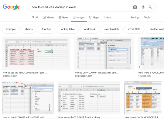
I do know I am not alone. In reality, these days, half of all Google searches end on the search results web page, with out the person clicking by means of to any outcomes.
In 2021 and past, it’s vital entrepreneurs start being attentive to the significance of visible photos as a strong alternative to achieve new audiences on the SERPs.
Plus, as HubSpot’s Advertising and marketing Supervisor Kristen Baker informed me, “After running an image experiment on the HubSpot Blog, I discovered that ranking in Google’s image packs increases impressions and clicks to our content.”
However … simpler mentioned than carried out, proper?
Right here, let’s discover what picture Search engine optimization is, and the most effective practices you may wish to comply with to make your webpages extra discoverable in picture search outcomes.

What’s picture Search engine optimization?
Picture Search engine optimization refers back to the apply of optimizing your photos for search engines by means of considerate alt textual content, applicable captions, good file dimensions, and extra. Picture Search engine optimization could make your content material simpler to interpret by search engine crawlers, which can provide it an Search engine optimization increase on each search outcomes pages and picture outcomes pages and make your website extra discoverable.
Picture Search engine optimization Finest Practices
1. Use related, correct alt textual content for person accessibility and Search engine optimization.
As a fast refresher: Alt textual content is written copy that describes a picture. For example, in case you click on on Pipcorn’s popcorn product and examine the web page, you may see the alt textual content describes the product picture precisely as “Popcorn Family Pack Popcorn Pipsnacks LLC”:

Alt-text performs two essential roles in Search engine optimization.
First, alt textual content — often known as alt tags, or alt descriptions — helps search engine crawlers index your web site extra successfully, which has a optimistic impact on search outcomes.
In reality, Google states on its Developers page, “You can aid in the discovery process by making sure that your images and your site are optimized for Google Images … [and] increase the likelihood that your content will appear in Google Images search results.”
Second, alt textual content improves the person expertise. Alt textual content can describe a picture to a visually impaired reader, and likewise helps if a reader cannot load or see the picture accurately on their gadget.
To get a full run-down of the way to write high-quality alt textual content, check out Picture Alt Textual content: What It Is, The best way to Write It, and Why It Issues to Search engine optimization.
2. Think about using captions to explain a picture.
Captions aren’t sometimes obligatory if the context of the web page may also help readers perceive what the picture is depicting — for example, on this weblog submit I have not used any captions as a result of I’ve used textual content to introduce every picture I’ve proven.
Nonetheless, you probably have a visual-heavy web site, think about using captions to assist readers perceive a picture in context. For example, on Tom Hull’s photography portfolio, he captions his photos so viewers can contextualize the place, or what, the picture represents:

Use common sense in relation to including captions, however in case you really feel it may assist readers (and bots) higher discern a picture, then it could be a worthwhile addition to a web page.
three. Compress photos for quicker load time.
Compressing photos is an important element of any good web site optimization technique.
Why?
As a result of, merely put, it helps your internet pages load quicker, which gives a greater person expertise and likewise helps increase your web site’s search engine rankings.
To compress your photos successfully, strive a device like Compress JPEG or Squoosh.
Usually, lower than 100 KB is right when it comes to good file measurement.
Nonetheless, it is vital to notice — Google does not have a look at every particular person picture measurement. As an alternative, it seems at whole web page measurement.
So, you probably have a small picture the place high quality variations are much less substantial, then you definitely would possibly strive compressing that picture to 30-50 KB … which provides you further room to maintain one other picture 30 KB greater, significantly if that picture loses high quality after compression.
For those who’re nonetheless fearful about picture high quality after compression, check out The best way to Guarantee Your Photos are Excessive Decision.
four. Submit unique photos — not simply inventory photographs.
In the end, Google (and readers) prioritize unique content material — which suggests, in case you’re hoping your photos will rank on picture outcomes pages, it is vital you employ unique, distinctive photos.
That is significantly vital in case you work for an ecommerce web site and also you’re posting visuals of your product. Many patrons use photos to buy shopper items. In reality, 50% of online shoppers say images helped them determine what to purchase.
In case your picture does not precisely display your product, it would get buried underneath higher, higher-quality photos from rivals.
Think about using merchandise like Canva to design in-house infographics, graphs, or animated photos to assist your model stand out on search outcomes pages and make your photos extra shareable.
5. Identify your file photos earlier than importing them.
Your file title can impression how straightforward it’s for search engine crawlers to interpret your picture, so it is useful to rename your file earlier than importing it onto your webpage.
Slightly than holding the title a generic “IMG_0883”, strive utilizing related key phrases to explain what’s within the picture, just like your alt textual content. This could additionally assist guarantee your picture seems on the picture search outcomes web page, which can enhance site visitors to your website.
6. Use responsive photos.
Responsive photos are essential for guaranteeing your readers can see your photos on any sort of gadget. These days, it is vital your pages are optimized for cellular to impression search engine rankings, in addition to person expertise.
In case your photos aren’t responsive, the web page will not seem as clear on cellular because it does on desktop — which negatively impacts Search engine optimization, in addition to your reader’s notion of your model.
Happily, some web site internet hosting providers, together with HubSpot, mechanically guarantee your photos are responsive.
Nonetheless, if want be, you may make your photos responsive through the use of fast code. For example, you possibly can add this code to your HTML:
<img src=”https://blog.hubspot.com/nature.jpg” alt=”Nature” class=”responsive”>
Or this code to your CSS:
.responsive
7. Leverage photos as a backlinking alternative.
Creating high-quality, distinctive, unique photos is not simply nice to your personal web site — it is also a unbelievable alternative to earn backlinks when different web sites use your picture for their very own pages.
For example, take into account the next graph created by Broadband Search:
The picture at present ranks within the first spot on the picture search outcomes web page for the key phrases, “how many people use mobile to search”.
Moreover, based on Ahrefs, this weblog submit has over 3,000 backlinks. I am prepared to guess that these backlinks are, partially, attributable to different firms wanting to make use of Broadband Search’s distinctive graphs for their very own content material.
For those who create high-quality photos, different firms might wish to showcase these photos on their very own websites — with hyperlinks again to your enterprise. This implies, finally, photos can have a direct impression on the quantity of site visitors, leads, and prospects you get for your enterprise by means of your marketing efforts.
eight. Add photos to an current sitemap.
Google suggests adding images to an existing sitemap — or making a separate sitemap only for photos — to assist search engines uncover your photos. Specifically, that is useful for photos Google cannot discover by means of crawling, equivalent to these accessed through JavaScript types.
Here is a sample sitemap, with two photos included:

Happily, in case you do not wish to add photos to a sitemap manually, you are in luck — there are instruments, equivalent to Angeldigital.Marketing (one of many solely free ones out there!), that may mechanically generate a picture sitemap when you enter a URL.
Hopefully, you should use these greatest practices to stage up and earn new site visitors by means of search picture outcomes pages. Keep in mind, an image is price a thousand phrases … so simply think about the worth of an Search engine optimization-optimized image.

Source link


0 notes
Text
Top 10 Current Ranking Factors for Google
1. A Secure and Accessible Website
Unsurprisingly, the first of our SEO ranking factors has to do with having the right kind of URL. Specifically, that’s a URL that Google’s bots can easily reach and crawl.
2. Page Speed (Including Mobile Page Speed)
Page speed has been cited as one of the leading SEO ranking factors for years. Google wants to improve users’ experience of the web, and fast-loading web pages will do that.
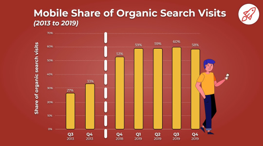
3. Mobile Friendliness
While we’re on the subject of mobile, mobile-friendliness is another major SEO ranking factor. More people use mobile devices than desktops to access the web, and that’s one reason there’ve been changes in how Google ranks search results.
4. Domain Age, URL, and Authority
Did you know that nearly 60% of the sites that have a top ten Google search ranking are three years old or more? Data from an Ahrefs study of two million pages suggests that very few sites less than a year old achieve that ranking.
So if you’ve had your site for a while and have optimized it using the tips in this article, that’s already an advantage.
5. Optimized Content
We’ve talked a lot about content in this guide to Google SEO ranking factors. That’s because it’s one of the most important search ranking factors (right up there with user experience, links, and RankBrain, which we’ll get to in a while).
Now let’s dig down and see what optimizing content for SEO really means.
6. Technical SEO
We said earlier that getting the code right is one aspect of optimizing content for better search engine rankings. This can be intimidating, especially if you’re more of a wordsmith and less of a “techie.”
Here are some of the aspects you can control even if you’re not a coder:
· Add keyword phrases in page titles, which is where Google first looks to determine which content is relevant to which search
· Use header tags to show content hierarchy starting with your title at h1 and then use h2 or h3 for subheads
· Create a meta description that both entices readers and includes your keyword phrase
· Keep those meta descriptions short and catchy at around 160 characters
· Use keyword phrases in image alt tags to show how those images are relevant to the main content
· Include alt tags also help people who are visually impaired enjoy your site with screenreaders
· Use schema markup to tell Google what kind of content you’re producing
7. User Experience
For a while now, Google’s been using artificial intelligence to better rank web pages. It calls that signal RankBrain. This includes other signals that affect your search engine ranking. These include:
· Click-through rate: the percentage of people who click to visit your site after an entry comes up in search results
· Bounce rate (especially pogo-sticking): the number of people who click on your page and quickly go back to the search results
· Dwell time: how long visitors stay on your site after they’ve arrived
8. Links
As we said at the start, the web is built on links. So, naturally, links are a crucial SEO ranking signal. There are three kinds of links to think about:
· Inbound links
· Outbound links
· Internal links
All three are typically tied to a descriptive anchor text.
Inbound Links
Google uses inbound links as one way to help determine how authoritative and relevant your content is.
The best-case scenario is where an authoritative site includes a relevant link to yours in a piece of their content. So, if the Content Marketing Institute includes a link to your content marketing resource, that’ll be perceived better than if a random person with a low-quality site links to it.
You’ve likely heard inbound links referred to as “backlinks.” Your goal is to get as many highly authoritative sites to link back to you. That also means you want to have very few inbound links from low-quality domains.
You can find your inbound links using a tool like SEMrush or one of the keyword research tools shared earlier in this guide.
Outbound Links
At the same time, you want to show that you’re creating quality content for your visitors. That involves using outbound links by linking to relevant, authoritative sites in your niche.
So does that mean you should just give out tons of outbound links to boost your authority? Absolutely not.
All it means is that as you’re doing research, you should only pull from reliable sources with high domain authority. To be honest, for your users’ sake, you should probably be doing this anyway to ensure you provide the most value.
Internal Links
Finally, linking to your own content can help tie pages together for both Google and your visitors, making each page more valuable. If you have an authoritative page and link to another page on your site, that helps your visitors find the other page and also passes on some authority.
9. Social Signals
When people share your content on social networks, that’s another sign that it’s valuable. Cognitive SEO’s study of 23 million shares found a definitive link between social shares and search engine ranking.
10. Real Business Information
This last tip is important for businesses targeting particular local areas. The presence or absence of business information is one of the most crucial local SEO ranking factors.
For more details on our products and services, please feel free to visit us at: Internet Marketing, Search engine marketing, Internet Marketing Company, Best Online Marketing Company India, Online Marketing Company India.
0 notes
Text
Checking mobile site speed and SEO with Google Lighthouse
With Lighthouse you have a new Google tool for checking mobile site speed and SEO. In this post, I explain what this tool is and how to use it to improve the performance of your site.
Lighthouse is a page experience tool built by Google and was initially meant to audit Progressive Web Apps (PWA). The tool executes five audits for accessibility, performance, SEO, Progressive Web Apps and an extended list of best practices. Powered by the new Core Web Vitals, these audits together give you an excellent overview of the quality and performance of your mobile website as well as your desktop site, or web app.
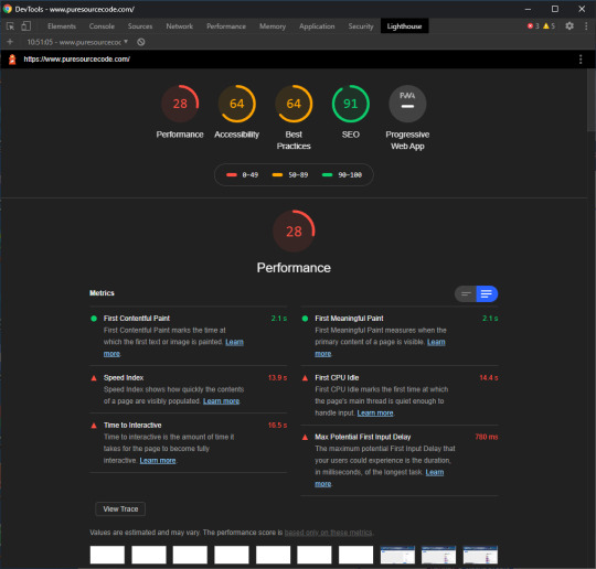
Lighthouse for PureSourceCode.com: we have to work on that
Site speed is all about perception and user experience. Speed in numbers means nothing if your site still feels slow. Loads of users around the world are on rather crappy mobile connections of 3G or less. Even with lightning-fast 5G connections, a site can simply feel laggy and slow. And we all know what a devastating effect a slow site can have on your conversion. Shaving milliseconds of the time needed to load your site could make a world of difference. Not to mention the frustration that happens when a slow-loading ad pushes down the button you just wanted to click.
While testing, Google Lighthouse simulates visiting your mobile site via a flaky 3G connection on a slightly underpowered device. Packets are lost in an attempt to simulate real-world conditions as authentically as possible. These insights are combined with other data. After running the test, you’ll get a report with a score and actionable advice with issues to tackle.
PageSpeed Insights vs. Google Lighthouse
PageSpeed Insights is probably the most used site speed analysis tool out there. It gives you a nice score and a list of possible improvements, plus it gives you an idea of the perceived loading speed of your site.
Also, PageSpeed Insights gives recommendations and identifies opportunities to improve the performance of your page. Some of these do tend to be hard implement, so getting a 100/100 is a pipe dream for most sites.
PageSpeed Insights and Lighthouse used to be two different tools for the job. They both provided valuable insights, but were hard to combine. With the advent of Web Vitals and the page experience update, Google improved the metrics across the board. Not only did they become easier to understand, they were also shared metrics. Of course, each tool is made for a specific subtask and offers specific metrics. These metrics come from different environments.
Field data vs. lab data
Web Vitals introduced new ways of determining performance. Some of these metrics can be calculated in a lab setting — simulated, so to say, while other metric only make sense if there are tested and collected in the field. In addition, some metrics work well in both settings. Google page experience tools use a variety of the metrics to provide you with the data you need to improve your site.
If you look closely, you’ll notice that some metrics only work in lab tools like the Developer Tools and Lighthouse. The field metrics appear in tools like the Web Vitals report in Search Console and PageSpeed Insights. The Core Web Vitals like LCP, FID and CLS will work everywhere.
Core Web Vitals
The brand-new Core Web Vitals will appear in all Google tools that measure site speed, performance and experience — even in the new Web Vitals report in Search Console. Now, you simply have to understand three basic metrics to get a sense of how your site or specific pages are performing. These Core Web Vitals are:
LCP, or Largest Contentful Paint: Or, how long it takes for the largest content element you see in the viewport to load.
FID, or First Input Delay: Or, how long it takes for a browser to respond to an interaction first triggered by the user (clicking a button, for instance)
CLS, or Cumulative Layout Shift: Or, how much of the screen is affected by movement — i.e. does stuff jump around on screen?
These new Web Vitals take a much more practical approach and put user experience front and center. The tools visit your site over a throttled connection on an average device so it can emulate what a real visitor in the real world might experience. Instead of just loading your site like the classic speed tools used to do, these Web Vitals-powered tools check how and when it responds to input — and if stuff happens after the initial load. It finds the exact moment when your content is ready to use, so you can try and optimize that when it feels too slow. Plus, you can find annoyances that hinder a good page experience.
Also, keep in mind that Lighthouse not only measures performance, but also checks SEO, various best practices and accessibility. It is a complete tool that helps you improve your site holistically.
What to look for in Lighthouse results
As I said, Google Lighthouse is trying more realistic angle, taking page experience into account checking mobile site speed and SEO.
The whole concept of speeding up your mobile site is two-pronged; your site must be fast, and it must feel fast. You, therefore, need to get your content on screen as fast as possible. Don’t let people wait. Also, users must be able to interact with your content as soon as possible. Since Google announced that page speed and page experience are ranking factors for SEO, you need to fix these issues.
What should your priority be? Load your content first. Awesome graphics and killer animations can wait. Your message – and what people are looking for – is most likely in the content. You can load the rest of the content in the background and ease it on the screen later on.
Performance metrics used by Lighthouse 6.0
While measuring the performance of your site, Lighthouse 6.0 uses the following metrics:
First Contentful Paint: FCP measures how long it takes the browser to render the first piece of DOM content after a user navigates to your page. This includes, images, non-white <canvas> elements, and SVGs but excludes stuff inside an iframe.
Speed Index: The Speed Index measures how quickly content is visually displayed during page load.
Largest Contentful Paint: The LCP is all about how long it takes for the largest content object (for instance, an image or a block of text) to load. This is one of the most important new metrics. Here, having a good score means users perceive your site as loading quickly.
Time to Interactive: TTI measures the time it takes from loading the page to when it is capable of reliably responding to user input quickly. The page might look quick to load, only to find that pushing some buttons doesn’t do anything yet.
Total Blocking Time: The TBT measures the time between the FCP and TTI where blockades can happen, preventing responsiveness.
Cumulative Layout Shift: The CLS looks at the number of layout shifts that happen during the full loading process of the page. Every time an element jumps around on the screen from frame to frame, this counts as a layout shift. Remember those nasty ads that load at the last moment?
You can see how your score is calculated by going to the Lighthouse Scoring Calculator:

Lighthouse Scoring Calculator
The Lighthouse report also features some opportunities to improve the site speed of your mobile site, including how much loading time they will save. These include reducing render-blocking stylesheets, render-blocking scripts, properly sizing images and fixing offscreen images.
The Lighthouse SEO check
Lighthouse doesn’t do just performance, it also has an accessibility test, suggestions on improving your site based on best practices and a PWA analysis. Another cool Lighthouse feature is the basic SEO check. With this check, you can run a simple SEO audit to uncover basic SEO issues a site may have. It gives you suggestions to fix them as well. Since Lighthouse runs locally in your browser, you can run the checks on your staging environment as well.
Currently, Lighthouse checks:
The mobile-friendliness of a page
If the structured data is valid
Does it have a <meta name="viewport"> tag with width or initial-scale
Does the document have a <title> element?
Is there a meta description?
Does the page have a successful HTTP status code?
Do links have descriptive anchor text?
Does the document use legible font sizes?
Is page not blocked from indexing?
Is the robots.txt valid?
Do images have alt attributes?
Does the document have a valid hreflang implementation?
Does the document have a valid rel=canonical set up?
Are there any unwanted plugins like Java or Flash?
Although basic, the Lighthouse checks will alert you of any SEO problems to fix.
How to install Google Lighthouse
With the new Web Vitals metrics (checking mobile site speed and SEO), Google Lighthouse is trying more realistic angle, taking page experience into account. To use this tool, you have to download Google Chrome and then install a new plug-in.
Getting started with Google Lighthouse is very easy as it is built into Chrome’s Developer Tools Audit panel (Mac: Shift+Cmd+I. Win: Ctrl+Shift+J or F12). From there, you can run the test and get the full report. In addition, there is a separate Chrome add-on for Lighthouse that adds a button to your toolbar, though using it stays the same with a few restrictions: you can’t validate sites on your local server and authenticated pages also won’t work.
You can also run Lighthouse as a Node package. This way, you can incorporate the test into your build process. When using the Node package, you will also see that there are a couple of audits that only work in a Node environment and not in the Audits panel of the DevTools.
To install Lighthouse globally from the command line use:
npm install -g lighthouse
If you want to run a test for https://example.com use:
lighthouse https://example.com
The full results of the audit will be available in the terminal, but also in a separate HTML file.
The post Checking mobile site speed and SEO with Google Lighthouse appeared first on PureSourceCode.
from WordPress https://www.puresourcecode.com/tools/google-tools/checking-mobile-site-speed-and-seo-with-google-lighthouse/
0 notes
Last Seen Blogs

dubailifebiz
Untitled

law-and-0rder
Downtown. Uptown. Chinatown...

comic-o-manga
comi
comic-o-manga
comi

sammuelcreedslblogs
Sammuel Creed Blogs