#and he's also trying to ignore will
Text

Mike low-key fuming here bc Will was a little too quick to turn down going to see a movie
#byler#stranger things#i think mike's feeling really guilty about last night here (he should)#that's why he keeps looking back at el's plate worriedly#and he's also trying to ignore will#mike in real time worrying about el and feeling like he has no choice but to ignore will#otherwise he gets fucking distracted and everything goes to shit#but this part where Jonathan recommends they go see a movie#and wills just like nah we'll stay home and mikes just like whatever man#back to worrying about el again#back to ignoring will#leading to him going to give her that eggo w/ syrup and no fork (michael..)#all the while the will the wise drawing is in the frame when she confronts him about not being able to write love in her letters....#all the while wills just sitting there like unrequited love is a bitch#yeah there are layers here ppl#st 4x03
195 notes
·
View notes
Text
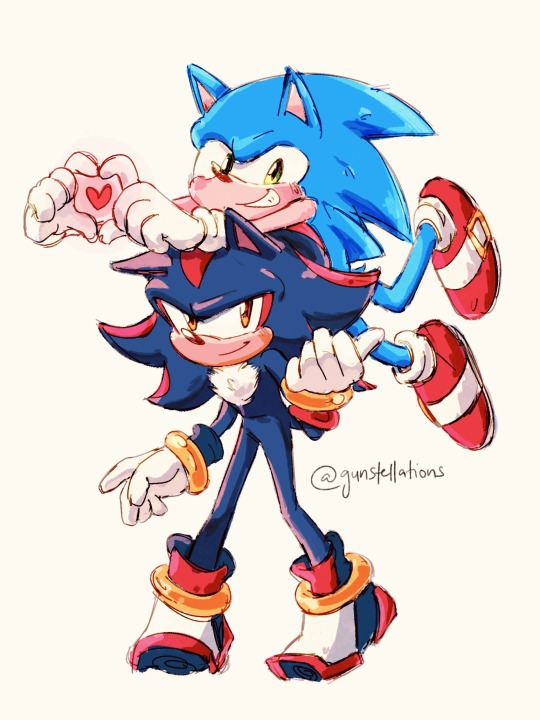
happy pride!! 💙🫶🖤
#sonic the hedgehog#sonadow#wanted to make something a little more but im pressed for time today (its already late but lets ignore that-)#shadow the hedgehog#my art#gay hogs :')#still think sega shouldve gone a step beyond and incorporated pride into year of shadow#anyway! take my lil doodle and have a great day to everyone reading this 💖#also yes shadow is Trying to make a heart with his hands hes not as cool as he thinks buddy is Failing#nerd ass
2K notes
·
View notes
Text
The "Sansa reminds Sandor of his sister" motive that some people try to hitch to his character really just flies in the face of his actual attachments to her, doesn't it? Sansa reminds Sandor of himself. He sees the little boy who used to love knights in this girl who's been swept up by the same romanticism. He sees his abuser in her abusers, the much larger knight(s) beating on the helpless child. He sees how she is betrayed by every level of authority that should have saved her and remembers his father's neglect and Tywin and Robert's apathy for Gregor's crimes. He's protective of Sansa because he was Sansa.
And GRRM's design, that one of the strongest warriors in the series, a fearsome and cynical 6'8" guy who's "muscled like a bull" and has the face of death itself, sees himself in this soft and effeminate teen girl, and empathizes with her because he was an abuse victim too, is INFINITELY more compelling than "Oh yeah I bet she just reminds him of his sister," who he's never mentioned and who we know literally nothing about. Way to unnecessarily water down a character, you couldn't have ignored the black and white text more efficiently if you tried.
#sorry for the rant i saw this sentiment in a yt video recently#sansa stark#sandor clegane#sansan#asoiaf#asoiaf meta#and this is only one facet of why he has so much affection for her too#these people act like his attachment to her is limited to projection and not also bc she treats him like he's an actual human being#or that they can be themselves when they're with each other -that he can openly show his weakness to her and be comforted and validated#or like even just the physical attraction aspect - which is so obvious that you'd have to be willfully ignorant to miss it#how do you read him trying to kiss her and come away thinking “he thinks of her as his sister” lmfao#things that make me feel like people dont actually read the books
1K notes
·
View notes
Text
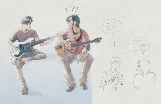
giving jay one of the highest blorbo badges of honor i can offer (giving him my joint issues)
#marble hornets#tim wright#jay merrick#mh jay#mh tim#id give it to tim but he has enough issues as that are also mine in canon. so jay gets hit with the hypermobility beam instead#also decided to play with the coloring cause ive wanted to try this style out for a while. its fun :D#virgil arts#oh yeah#jam#<- i guess#not intended but sure might as well#also ignore the guitars i hate drawing guitars they arent real <3#for those curious though. tims was based loosely on a maegen wells archtop and jays was a squier precision bass#also note the skull knobs on the body. i think they mentioned it had that in the disc commentary so i added it cause its funny
574 notes
·
View notes
Text
Can we agree that the "Thats two things" line from Mike was autistic as shit
#i love how William very clearly thinks he’s trying to play smart or something but. no he’s just like that#in general hes sooooo autistic. Same goes to Abby.#when aunt Jane noted how abbys meltdowns reminded her of mike I was cheering in my fucking seat#SO autism#fnaf movie#five nights at freddy's#Fnaf#five nights at Freddy’s movie#Mike Schmidt#can’t wait till this movie comes out anywhere that isn’t peacock. please I wanna watch it again but peacock doesn’t even have a free trial#also Just his general anti socialness??????? hello?#the way he just. walks off during the pharmacy scene#or the way he basically ignores max CANNOT be neurotypical#also with the former that his stand-offish nature is seen as rude#ALSO near the beginning of the movie where he tells his coworker about the dream theory-#-and he completely avoids eye contact and just fiddles with his Walkie-Talkie#like that cant be nt behavior
2K notes
·
View notes
Text
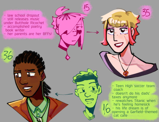
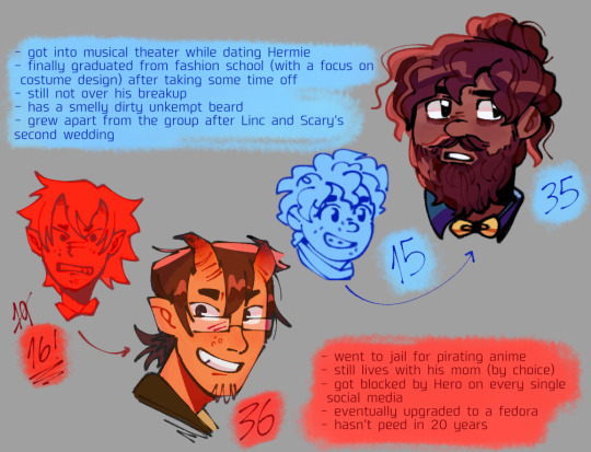
#dungeons and daddies#dndads#scary marlowe#taylor swift not that one#lincoln li wilson#normal oak#dndads spoilers#epilogue headcanons#linc started to like cats after he got over (at least a bit) his previous jealousy towards his dads#but mainly bc he grew attached to Scary's cat after they started to live together yes she is a cat lady to me#normal still isolates himself when he's feeling shitty tho this time it went on for several years#despite the others not giving up on trying to contact him#they wanna give him space but they're also worried so that's why they try to be nonchalant about it during the reunion#which i also already have a sketch of but college's been taking up most of my time sorry#not described#ignore the inconsistencies please and ty
508 notes
·
View notes
Text
One of the earliest examples of Leo’s “I’ll do my own thing to accomplish our goal without discussing it with my team first” is in episode one. It’s super, super quick, and ultimately inconsequential, but it subtly sets up a great precedent that I think is very interesting.
When the boys need to grab the medallion from Splinter without Splinter noticing, Raph, Mikey, and Donnie huddle together with Raph taking the lead in trying to devise a plan to get the mystic device. Meanwhile, Leo slinks away and grabs the device by clocking the situation (by knowing his father well enough to predict his actions - something he does with each family member multiple times in the series) and making a move on his own.
It works out perfectly fine, and is ultimately the best move, and it’s honestly okay that he didn’t consult everyone for something so small when it’s such a non issue to get it, but it nicely sets up how this tends to go in the series, including how it goes in the movie.
To be honest episode one is actually really good at setting up a lot of things for each character in the long run, this is just one example that caught my attention, as small and unassuming as it is.
#rottmnt#rottmnt leo#rise of the teenage mutant ninja turtles#im just ranting at this point feel free to ignore me I’m tired lol#anyway#Leo constantly just goes off and does his own thing#and yeah honestly his own thing often works??? but he alienates his brothers/team in the process#BUT also this isn’t necessarily a one way street#when Leo DOES try to consult his brothers or give his thoughts on matters he’s not really taken seriously#best example here is bug busters where he CONSTANTLY makes his worries and suspicions known only to have them ignored#so it’s almost understandable that he doesn’t often open up about his thought process when it’s easier to just do it#than to try and fail to justify it#after all it almost always works out for him when he does so why not?#and then the movie happens#and that line of thinking doesn’t quite hold up does it?#BUT ON ANOTHER NOTE#like I said episode one is super good at setting characters up#from showing off Donnie’s preference for tech vs magic/mystic#from showing Mikey’s innate talent for mysticism#from showing Raph’s anxieties and how easily they can stack up#there’s more but I’d have to do a closer deep dive on the ep and man am I tired#so off the head rambles it is for now#sorry everyone for my constant spam of Too Many Words into things that are prob Not That Deep#it’s honestly just fun haha#EDIT: bc I saw someone mention it! yeah all the boys have communication issues through the series and it’s super interesting and realistic#Leo in particular stands out to me here because his communication issues are a constant theme that pop up much more often#but each of them experiences this in some form
847 notes
·
View notes
Text

The ceiling is looking very ceiling today!
#fanart#anime#manga#doodle#fairy tail nalu#fairy tail#nalu#natsu x Lucy#lucy heartfilia#natsu dragneel#nalu fanart#hiro mashima#redraw of the couch incident#he bout to snap#on god#I would#he’s got too much resistance here#also first time I’ve colored in a very long time Ik they look kind of off ignore that#just trying to post without being overly critical of myself anymore#ummm#tag#tag2
870 notes
·
View notes
Text
why Aurora's art is genius
It's break for me, and I've been meaning to sit down and read the Aurora webcomic (https://comicaurora.com/, @comicaurora on Tumblr) for quite a bit. So I did that over the last few days.
And… y'know. I can't actually say "I should've read this earlier," because otherwise I would've been up at 2:30-3am when I had responsibilities in the morning and I couldn't have properly enjoyed it, but. Holy shit guys THIS COMIC.
I intended to just do a generalized "hello this is all the things I love about this story," and I wrote a paragraph or two about art style. …and then another. And another. And I realized I needed to actually reference things so I would stop being too vague. I was reading the comic on my tablet or phone, because I wanted to stay curled up in my chair, but I type at a big monitor and so I saw more details… aaaaaand it turned into its own giant-ass post.
SO. Enjoy a few thousand words of me nerding out about this insanely cool art style and how fucking gorgeous this comic is? (There are screenshots, I promise it isn't just a wall of text.) In my defense, I just spent two semesters in graphic design classes focusing on the Adobe Suite, so… I get to be a nerd about pretty things…???
All positive feedback btw! No downers here. <3
---
I cannot emphasize enough how much I love the beautiful, simple stylistic method of drawing characters and figures. It is absolutely stunning and effortless and utterly graceful—it is so hard to capture the sheer beauty and fluidity of the human form in such a fashion. Even a simple outline of a character feels dynamic! It's gorgeous!
Though I do have a love-hate relationship with this, because my artistic side looks at that lovely simplicity, goes "I CAN DO THAT!" and then I sit down and go to the paper and realize that no, in fact, I cannot do that yet, because that simplicity is born of a hell of a lot of practice and understanding of bodies and actually is really hard to do. It's a very developed style that only looks simple because the artist knows what they're doing. The human body is hard to pull off, and this comic does so beautifully and makes it look effortless.
Also: line weight line weight line weight. It's especially important in simplified shapes and figures like this, and hoo boy is it used excellently. It's especially apparent the newer the pages get—I love watching that improvement over time—but with simpler figures and lines, you get nice light lines to emphasize both smaller details, like in the draping of clothing and the curls of hair—which, hello, yes—and thicker lines to emphasize bigger and more important details and silhouettes. It's the sort of thing that's essential to most illustrations, but I wanted to make a note of it because it's so vital to this art style.
THE USE OF LAYER BLENDING MODES OH MY GODS. (...uhhh, apologies to the people who don't know what that means, it's a digital art program thing? This article explains it for beginners.)
Bear with me, I just finished my second Photoshop course, I spent months and months working on projects with this shit so I see the genius use of Screen and/or its siblings (of which there are many—if I say "Screen" here, assume I mean the entire umbrella of Screen blending modes and possibly Overlay) and go nuts, but seriously it's so clever and also fucking gorgeous:
Firstly: the use of screened-on sound effect words over an action? A "CRACK" written over a branch and then put on Screen in glowy green so that it's subtle enough that it doesn't disrupt the visual flow, but still sticks out enough to make itself heard? Little "scritches" that are transparent where they're laid on without outlines to emphasize the sound without disrupting the underlying image? FUCK YES. I haven't seen this done literally anywhere else—granted, I haven't read a massive amount of comics, but I've read enough—and it is so clever and I adore it. Examples:


Secondly: The beautiful lighting effects. The curling leaves, all the magic, the various glowing eyes, the fog, the way it's all so vividly colored but doesn't burn your eyeballs out—a balance that's way harder to achieve than you'd think—and the soft glows around them, eeeee it's so pretty so pretty SO PRETTY. Not sure if some of these are Outer/Inner Glow/Shadow layer effects or if it's entirely hand-drawn, but major kudos either way; I can see the beautiful use of blending modes and I SALUTE YOUR GENIUS.
I keep looking at some of this stuff and go "is that a layer effect or is it done by hand?" Because you can make some similar things with the Satin layer effect in Photoshop (I don't know if other programs have this? I'm gonna have to find out since I won't have access to PS for much longer ;-;) that resembles some of the swirly inner bits on some of the lit effects, but I'm not sure if it is that or not. Or you could mask over textures? There's... many ways to do it.
If done by hand: oh my gods the patience, how. If done with layer effects: really clever work that knows how to stop said effects from looking wonky, because ugh those things get temperamental. If done with a layer of texture that's been masked over: very, very good masking work. No matter the method, pretty shimmers and swirly bits inside the bigger pretty swirls!
Next: The way color contrast is used! I will never be over the glowy green-on-black Primordial Life vibes when Alinua gets dropped into that… unconscious space?? with Life, for example, and the sharp contrast of vines and crack and branches and leaves against pitch black is just visually stunning. The way the roots sink into the ground and the three-dimensional sensation of it is particularly badass here:

Friggin. How does this imply depth like that. HOW. IT'S SO FREAKING COOL.
A huge point here is also color language and use! Everybody has their own particular shade, generally matching their eyes, magic, and personality, and I adore how this is used to make it clear who's talking or who's doing an action. That was especially apparent to me with Dainix and Falst in the caves—their colors are both fairly warm, but quite distinct, and I love how this clarifies who's doing what in panels with a lot of action from both of them. There is a particular bit that stuck out to me, so I dug up the panels (see this page and the following one https://comicaurora.com/aurora/1-20-30/):

(Gods it looks even prettier now that I put it against a plain background. Also, appreciation to Falst for managing a bridal-carry midair, damn.)
The way that their colors MERGE here! And the immense attention to detail in doing so—Dainix is higher up than Falst is in the first panel, so Dainix's orange fades into Falst's orange at the base. The next panel has gold up top and orange on bottom; we can't really tell in that panel where each of them are, but that's carried over to the next panel—

—where we now see that Falst's position is raised above Dainix's due to the way he's carrying him. (Points for continuity!) And, of course, we see the little "huffs" flowing from orange to yellow over their heads (where Dainix's head is higher than Falst's) to merge the sound of their breathing, which is absurdly clever because it emphasizes to the viewer how we hear two sets of huffing overlaying each other, not one. Absolutely brilliant.
(A few other notes of appreciation to that panel: beautiful glows around them, the sparks, the jagged silhouette of the spider legs, the lovely colors that have no right to make the area around a spider corpse that pretty, the excellent texturing on the cave walls plus perspective, the way Falst's movements imply Dainix's hefty weight, the natural posing of the characters, their on-point expressions that convey exactly how fuckin terrifying everything is right now, the slight glows to their eyes, and also they're just handsome boys <3)
Next up: Rain!!!! So well done! It's subtle enough that it never ever disrupts the impact of the focal point, but evident enough you can tell! And more importantly: THE MIST OFF THE CHARACTERS. Rain does this irl, it has that little vapor that comes off you and makes that little misty effect that plays with lighting, it's so cool-looking and here it's used to such pretty effect!
One of the panel captions says something about it blurring out all the injuries on the characters but like THAT AIN'T TOO BIG OF A PROBLEM when it gets across the environmental vibes, and also that'd be how it would look in real life too so like… outside viewer's angle is the same as the characters', mostly? my point is: that's the environment!!! that's the vibes, that's the feel! It gets it across and it does so in the most pretty way possible!
And another thing re: rain, the use of it to establish perspective, particularly in panels like this—

—where we can tell we're looking down at Tynan due to the perspective on the rain and where it's pointing. Excellent. (Also, kudos for looking down and emphasizing how Tynan's losing his advantage—lovely use of visual storytelling.)
Additionally, the misting here:

We see it most heavily in the leftmost panel, where it's quite foggy as you would expect in a rainstorm, especially in an environment with a lot of heat, but it's also lightly powdered on in the following two panels and tends to follow light sources, which makes complete sense given how light bounces off particles in the air.
A major point of strength in these too is a thorough understanding of lighting, like rim lighting, the various hues and shades, and an intricate understanding of how light bounces off surfaces even when they're in shadow (we'll see a faint glow in spots where characters are half in shadow, but that's how it would work in real life, because of how light bounces around).
Bringing some of these points together: the fluidity of the lines in magic, and the way simple glowing lines are used to emphasize motion and the magic itself, is deeply clever. I'm basically pulling at random from panels and there's definitely even better examples, but here's one (see this page https://comicaurora.com/aurora/1-16-33/):

First panel, listed in numbers because these build on each other:
The tension of the lines in Tess's magic here. This works on a couple levels: first, the way she's holding her fists, as if she's pulling a rope taut.
The way there's one primary line, emphasizing the rope feeling, accompanied by smaller ones.
The additional lines starbursting around her hands, to indicate the energy crackling in her hands and how she's doing a good bit more than just holding it. (That combined with the fists suggests some tension to the magic, too.) Also the variations in brightness, a feature you'll find in actual lightning. :D Additional kudos for how the lightning sparks and breaks off the metal of the sword.
A handful of miscellaneous notes on the second panel:
The reflection of the flames in Erin's typically dark blue eyes (which bears a remarkable resemblance to Dainix, incidentally—almost a thematic sort of parallel given Erin's using the same magic Dainix specializes in?)
The flowing of fabric in the wind and associated variation in the lineart
The way Erin's tattoos interact with the fire he's pulling to his hand
The way the rain overlays some of the fainter areas of fire (attention! to! detail! hell yeah!)
I could go on. I won't because this is a lot of writing already.
Third panel gets paragraphs, not bullets:
Erin's giant-ass "FWOOM" of fire there, and the way the outline of the word is puffy-edged and gradated to feel almost three-dimensional, plus once again using Screen or a variation on it so that the stars show up in the background. All this against that stunning plume of fire, which ripples and sparks so gorgeously, and the ending "om" of the onomatopoeia is emphasized incredibly brightly against that, adding to the punch of it and making the plume feel even brighter.
Also, once again, rain helping establish perspective, especially in how it's very angular in the left side of the panel and then slowly becomes more like a point to the right to indicate it's falling directly down on the viewer. Add in the bright, beautiful glow effects, fainter but no less important black lines beneath them to emphasize the sky and smoke and the like, and the stunningly beautiful lighting and gradated glows surrounding Erin plus the lightning jagging up at him from below, and you get one hell of an impactful panel right there. (And there is definitely more in there I could break down, this is just a lot already.)
And in general: The colors in this? Incredible. The blues and purples and oranges and golds compliment so well, and it's all so rich.
Like, seriously, just throughout the whole comic, the use of gradients, blending modes, color balance and hues, all the things, all the things, it makes for the most beautiful effects and glows and such a rich environment. There's a very distinct style to this comic in its simplified backgrounds (which I recognize are done partly because it's way easier and also backgrounds are so time-consuming dear gods but lemme say this) and vivid, smoothly drawn characters; the simplicity lets them come to the front and gives room for those beautiful, richly saturated focal points, letting the stylized designs of the magic and characters shine. The use of distinct silhouettes is insanely good. Honestly, complex backgrounds might run the risk of making everything too visually busy in this case. It's just, augh, so GORGEOUS.
Another bit, take a look at this page (https://comicaurora.com/aurora/1-15-28/):

It's not quite as evident here as it is in the next page, but this one does some other fun things so I'm grabbing it. Points:
Once again, using different colors to represent different character actions. The "WHAM" of Kendal hitting the ground is caused by Dainix's force, so it's orange (and kudos for doubling the word over to add a shake effect). But we see blue layered underneath, which could be an environmental choice, but might also be because it's Kendal, whose color is blue.
And speaking off, take a look at the right-most panel on top, where Kendal grabs the spear: his motion is, again, illustrated in bright blue, versus the atmospheric screened-on orange lines that point toward him around the whole panel (I'm sure these have a name, I think they might be more of a manga thing though and the only experience I have in manga is reading a bit of Fullmetal Alchemist). Those lines emphasize the weight of the spear being shoved at him, and their color tells us Dainix is responsible for it.
One of my all-time favorite effects in this comic is the way cracks manifest across Dainix's body to represent when he starts to lose control; it is utterly gorgeous and wonderfully thematic. These are more evident in the page before and after this one, but you get a decent idea here. I love the way they glow softly, the way the fire juuuust flickers through at the start and then becomes more evident over time, and the cracks feel so realistic, like his skin is made of pottery. Additional points for how fire begins to creep into his hair.
A small detail that's generally consistent across the comic, but which I want to make note of here because you can see it pretty well: Kendal's eyes glow about the same as the jewel in his sword, mirroring his connection to said sword and calling back to how the jewel became Vash's eye temporarily and thus was once Kendal's eye. You can always see this connection (though there might be some spots where this also changes in a symbolic manner; I went through it quickly on the first time around, so I'll pay more attention when I inevitably reread this), where Kendal's always got that little shine of blue in his eyes the same as the jewel. It's a beautiful visual parallel that encourages the reader to subconsciously link them together, especially since the lines used to illustrate character movements typically mirror their eye color. It's an extension of Kendal.
Did I mention how ABSOLUTELY BEAUTIFUL the colors in this are?
Also, the mythological/legend-type scenes are illustrated in familiar style often used for that type of story, a simple and heavily symbolic two-dimensional cave-painting-like look. They are absolutely beautiful on many levels, employing simple, lovely gradients, slightly rougher and thicker lineart that is nonetheless smoothly beautiful, and working with clear silhouettes (a major strength of this art style, but also a strength in the comic overall). But in particular, I wanted to call attention to a particular thing (see this page https://comicaurora.com/aurora/1-12-4/):

The flowing symbolic lineart surrounding each character. This is actually quite consistent across characters—see also Life's typical lines and how they curl:

What's particularly interesting here is how these symbols are often similar, but not the same. Vash's lines are always smooth, clean curls, often playing off each other and echoing one another like ripples in a pond. You'd think they'd look too similar to Life's—but they don't. Life's curl like vines, and they remain connected; where one curve might echo another but exist entirely detached from each other in Vash's, Life's lines still remain wound together, because vines are continuous and don't float around. :P
Tahraim's are less continuous, often breaking up with significantly smaller bits and pieces floating around like—of course—sparks, and come to sharper points. These are also constants: we see the vines repeated over and over in Alinua's dreams of Life, and the echoing ripples of Vash are consistent wherever we encounter him. Kendal's dream of the ghost citizens of the city of Vash in the last few chapters is filled with these rippling, echoing patterns, to beautiful effect (https://comicaurora.com/aurora/1-20-14/):

They ripple and spiral, often in long, sinuous curves, with smooth elegance. It reminds me a great deal of images of space and sine waves and the like. This establishes a definite feel to these different characters and their magic. And the thing is, that's not something that had to be done—the colors are good at emphasizing who's who. But it was done, and it adds a whole other dimension to the story. Whenever you're in a deity's domain, you know whose it is no matter the color.
Regarding that shape language, I wanted to make another note, too—Vash is sometimes described as chaotic and doing what he likes, which is interesting to me, because smooth, elegant curves and the color blue aren't generally associated with chaos. So while Vash might behave like that on the surface, I'm guessing he's got a lot more going on underneath; he's probably much more intentional in his actions than you'd think at a glance, and he is certainly quite caring with his city. The other thing is that this suits Kendal perfectly. He's a paragon character; he is kind, virtuous, and self-sacrificing, and often we see him aiming to calm others and keep them safe. Blue is such a good color for him. There is… probably more to this, but I'm not deep enough in yet to say.
And here's the thing: I'm only scratching the surface. There is so much more here I'm not covering (color palettes! outfits! character design! environment! the deities! so much more!) and a lot more I can't cover, because I don't have the experience; this is me as a hobbyist artist who happened to take a couple design classes because I wanted to. The art style to this comic is so clever and creative and beautiful, though, I just had to go off about it. <3
...brownie points for getting all the way down here? Have a cookie.
#aurora comic#aurora webcomic#comicaurora#art analysis#...I hope those are the right tags???#new fandom new tagging practices to learn ig#much thanks for something to read while I try to rest my wrists. carpal tunnel BAD. (ignore that I wrote this I've got braces ok it's fine)#anyway! I HAVE. MANY MORE THOUGHTS. ON THE STORY ITSELF. THIS LOVELY STORY#also a collection of reactions to a chunk of the comic before I hit the point where I was too busy reading to write anything down#idk how to format those tho#...yeet them into one post...???#eh I usually don't go off this much these days but this seems like a smaller tight-knit fandom so... might as well help build it?#and I have a little more time thanks to break so#oh yes also shoutout to my insanely awesome professor for teaching me all the technical stuff from this he is LOVELY#made an incredibly complex program into something comprehensible <3#synapse talks
752 notes
·
View notes
Text
one of my favorite headcanons with little to no canon support is that xue yang and mo xuanyu were guidao jin disciples at the same time, and mxy mentioned a few times wanting to ressurect the yiling laozu to kill his mom's evil family, so when xy saw him (or rather his body) entering yi city AS the yllz, he was like "son of a bitch he actually did it"
#mdzs#the window of time for them to have been disciples at the same time is small but IT COULD have happened#and with mxy having had access to the sacrificial ritual (and his lack of progress on “proper” cultivation)#it's perfectly possible he was one of the jins' demonic students#also at yi city xue yang attacks wwx#who asks if he's trying to take advantage of that body's low spiritual energy.#BUT HOW DID HE KNOW BEFOREHAND THAT MXY'S BODY HAD LOW SPIRITUAL ENERGY HUH‼️⁉️‼️⁉️🤔🤔🤔🤔🤔#(please ignore the lack of sword-carrying)#i just want mxy and xy to have been buddies idk#it's very fun to me if xue yang recognizes wwx in his old classmate's body#modao#lace speaks
609 notes
·
View notes
Text
"if we make america worse and more of a dictatorship that will be even harder to unravel and make it the way we want the country to be, maybe then everyone will join our Glorious Revolution!" bb girl you cant even be in the same room with someone who thinks you should vote, how in tf do you think you're gonna unite people to fight in The Revolution with you? it's gonna be you and your 5 friends, i hate to break it to you.
#i dont think you realize how repelling you and your politics are to everyone else#you get all of your validation for how Smart You Are from your friends and ignore any kind of feedback that suggests you should#change or do something differently. thats the only reason you're so convinced average people will go along with you bc you keep getting#affirmation from the people who ALREADY agree with you- but you have NO IDEA how to bridge the gap between people who agree#with you and disagree with you. you're horrible at convincing people of your side of things outside of straight up guilt tripping them#or bullying them like a highschooler. im sorry but the tools you learned to survive with as a kid aren't gonna help you in this situation.#the ONLY THING you can come up with to bridge that gap is a bloody revolution. thats how bad you are at this.#and you're also so bad at this and unimaginative that you dont even realize how THAT might not even be enough.#you cant imagine ANY kind of avenue to getting people to change AT ALL outside of blood and fire. and thats why people call you#an authoritarian.#i'll be honest- i really do think the world would be a better place if we did incremental change under a democratic president who wont#set the world on fire vs the godkingemperor republican WHO WONT EVEN LISTEN TO YOU AT ALL EVER AND MIGHT KILL YOU#FOR PUTTING UP A STINK. idk if you noticed but if that evil fuck gets into office we are severely outnumbered if he gets police#n shit to go after his own citizens. letting trump win is making this battle so much harder than it needs to be.#you are choosing trying to fix the world while its exploding vs trying to fix it before it explodes at all.#what is this like a procrastination thing? you wanna wait till the last minute to try? idfgi. wtf is wrong with you#throwing minority lives away to prove a point. and then you try to tell me you care. gtfoh.#accelerationists should never be taken seriously.
339 notes
·
View notes
Text
number #1 tactic that people use to not sound as racist as they are when they talk to black people: 'uhh so you AMERICANS need to stop pretending everything is about YOU. why should i know this im not from the us :/' (= is talking about like. a phenomenally internationally well-known black artist)
#myposts#kendrick lamar#drake#i updated it from 'white europeans' to 'people' because some people pointed out that 'gringo' is probably more south american lingo#but the point i wanted to make is like. there is this subset of european people (quite a lot of them)#who try to deflect by saying them not knowing these things isn't because of an active lack of disinterest in black culture and influences#and like. them not knowing who a certain black person is is never an educational failing on their side of any sorts#but instead are pretending that like. they are by virtue of being european always correctly educated on What History And Art Is Important#like. 2 months back that one post pretending that 'us europeans dont need to know all your AMERICAN writers 🙄' talking about james baldwin?#like just because that person didnt know who james baldwin was#they immediately were mad at the implication that They Didn't Know Someone Of Cultural Significance#and twisted it into 'well he cant be that important by virtue of me not knowing him'#like completely ignoring that the european school system also has. race problems and also ignoring that he lived and wrote in France too#but like. its this really racist defence mechanism of like. 'well you stupid americans always make everything about yourselves'#i hope i make sense i didnt think this would blow up lol#and like some people in the notes of that post were so smug about not knowing who Kendrick Lamar is#bc to them thats like 'oh im too cultured to be listening to rap of any sorts' like completely dismissing his music as kind of second class#by virtue of it being rap and black music and him not being in the White Mainstream as much as other musicians#(i mean hes still like 24th most listened artist worldwide but you get what i mean)
167 notes
·
View notes
Photo
team fortress three
#jerma985#jerma985 fanart#jerma#ignore how wonky these look they were warm ups over a month tht i colored in to post but yayyyy#also the jerma stream last night was sooooo fun. his brain confuses me#sorry for so many doodles btw im trying to get some finished art out soon smiles and waves#sure we have newyears jerma catboy jerma (small) criminal jerma baseball jerma acid jerma whatever shirt jerma but what rlly matters is#gay jerma . (joke) i love tht that is still his twt banner#okay bye. BYEEEEEEEEEE baiiiiiii buh biiiiiii !!#i liked his hair in the old new years stream where it was long and he was chicken girl coded
3K notes
·
View notes
Text


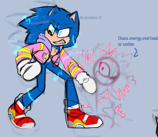
An assortment of Sonic doodles while I still try n figure out how to draw these creatures
(also as an apology for not posting in like. forever lmao)
Side note but I need Surge and Shadow to fight so badly. Like I NEED them to fight listen to me boy (gender neutral)
#my art#chipillustrates#sonic#sth#sonic the hedgehog#silver the hedgehog#princess elise#Sonic Prime#Surge the Tenrec#Sonic idw#Shadow the hedgehog#sonic movie 3#<- I have so many thoughts about this. btw. I have so many theories in my brain that connect to that doodle#sth fanart#sonic the hedgehog fanart#also I'm sorryyyyy I know it's GGY week I have nothing prepared I'll try and do something for that soon I prommy I prommy I prommy#Sonic 06#ignore the fact I have zero clue how to draw movie Sonic idk why he's so hard to draw#The 06 art isn't ship art btw but it can be tagged as whatever idc
226 notes
·
View notes
Text

Perfect Couple
They need to be right beside each other or they'll die
#svsss#moshang#shang Qinghua#mobei jun#sqh#mbj#scum villains self saving system#scum villain self saving system#the scum villain's self saving system#scum villans self saving system#scum villian self saving system#Mobei juns trying his best making Shang Qinghua his noodles ok#can you look Mobei in the eyes and say you wont eat what he made???#no#Shang Qinghua cant either#thats why he WILL down that charcoal that was ones noodles#how did it get like that??? no one but Mobei knows#also Mobei trying to handle court alone without Qinghua means hes gonna be WAYYY more irritated at stupid demons#he'd think about how Qinghua could deal with all the court work EASY and then hea ignoring the demons talking to him to go hunt down his#husband to hold him and not let him go for an hour#ahh theyre so#💕💕💕💕#nibbelraz#my art
564 notes
·
View notes
Text
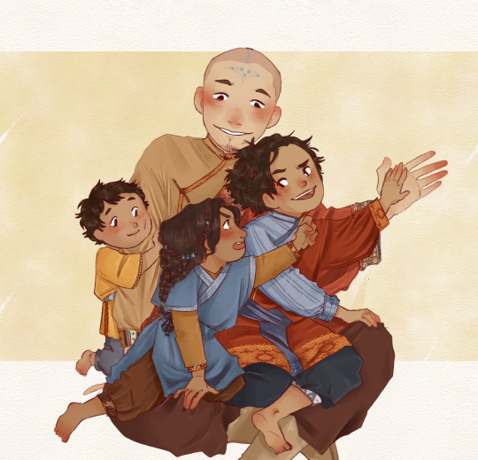
i'm watching tlok and hearing Bumi and Kya saying that aang only focused on Tenzin made me wanna eat cement so i drew loving aang out of spite
[ID found by clicking alt on the piece]
#i'm sorry but im salty#aang didn't hold sokka so highly#talked about how he was special even without bending abilities#just to turn his back on his non bender son#and ignoring everyone except tenzin#also! im trying to mix aang and katara's fashion and colors#bc it's fun#my trashy art#avatar the legend of korra#avatar the legend of korra fanart#atlok#atlok fanart#aang#aang fanart#tlok bumi#tlok bumi fanart#tlok kya#kya ll#kya II fanart#tenzin#tenzin fanart
605 notes
·
View notes
Last Seen Blogs
lavenderr-starrs
Lav


tobyemmanuel
T E D A

drippingviolets3
Dripping-Violets

disillusionedstories
hestia