#and like so i used to use speedball india ink all the time but then switched to kuretake because the speedball bottle is evil
Note
as an aspiring comic artist looking to move from graphite and oil painting to more ink/inkwash/watercolor like you- could you explain your process a bit? any tips for beginners? i love your art and you're at the top of my inspiration list right now :,)
Thank you! I've been using ink and watercolour for a long time, and ink/inkwash is definitely my favourite medium. A key tip for getting started would be to know the different kinds of ink available because they all work differently. The three main ones are:
Dye-based ink - these have their uses, but they are not lightfast at all (fade quickly) and they act kinda weird. The colours are very vibrant, but they tend to dry very fast, not be waterproof (tricky for layering), and stain the paper. I use very few dye-based inks. Some ink brands look like they have a big colour range, but when you look at the boxes half of them say "dye based" - don't buy Higgins those.
Acrylic ink - think of this as very liquid acrylic paint. There are a lot of fancy options, many specialty kinds (metallics, pearls, neons), but they aren't going to give you the transparent inkwash look. It's good for drawing opaque lines over colour, and you can dilute it with water for a wash, but it gets chalky. Waterproof may vary (test it first), and it usually has a matte finish. White acrylic ink is well worth having as you can detail over solid black or tint it with coloured pigmented inks, and god knows I love using neons, but I treat acrylic ink like "effects" ink. It’s not my main drawing ink. Daler Rowney is good and widely available (pigment-based is not the same as pigmented ink, this is still acrylic ink), they have a few lines at different prices. Liquitex is decent.
Pigmented/India ink - this is my favourite kind of ink and probably what you want! Pigmented ink dilutes well (it’s a transparent medium like watercolour) and often has a glossier finish depending on shellac content, and it will say on the bottle if it’s waterproof (test that first). It’s good for brush or nib, good for layering, works nicely with watercolour and other types of ink, can be mixed to make new colours/tints...she’s got it all. If you’re in Australia, Art Spectrum is great, I stock up every time I’m back there. If you’re elsewhere, I recommend Speedball for black ink (Blick Black Cat in the US is good). Dr Martins Bombay India Ink has great colours and they’re usually affordable.
There are many brands and everyone has their preferences, and over time you will find your own. I have a mix of different types and brands, though probably fewer than you’d think. Get a small bottle in one or two colours and play around, see if you like it before investing in a set. Don’t buy fountain pen ink or Rapidograph ink for nib/brush, those are best suited to being used in specific types of pens.
The nibs I use are Hunt #512s. #102s (called crow quills) are popular and I like them too, but they are very sharp and will rip up your paper, and can be a little too flexible and hard to control. The #512 is a good all-rounder with a smooth line capable of variation, and I think they’re a solid choice for a beginner. These nibs and holders are cheap and widely available. I don’t buy expensive watercolour brushes because ink will wreck them a lot faster than watercolour will. What you want to look for is the fibers holding a point - the brush should not have bedhead.
My only real advice to someone looking to try watercolours is to not buy the cheapest shittiest kind. You know from oil painting that all paints are not created equal and bad paint is going to frustrate you, especially when you’re starting out. I started with one of these twelve years ago and I still use it in conjunction with other sets I’ve built myself, I just refill the pans from (better quality) tubes when they get low. They last a long time. So do bottles of ink.
I’d like to do a process post, but I’m not sure what would be interesting or helpful to you, and I use ink/watercolour/gouache in a lot of different ways. If there’s a specific piece you liked the look of, I’m happy to demonstrate that method, or I can just go through my favourite approach.
As for comics...the best advice I can give you is pretty general.
Anatomy is a rewarding life-long study, but what really counts for narrative art, over technical accuracy, is GESTURE, EXPRESSION, and BODY LANGUAGE. Look at people. Look at how they move, look at their faces, look at their hands, listen to how they talk. In comics, you are the director and the actors.
Environments are a bonus character in your story and can add a lot of depth and atmosphere! Understanding perspective will make using them a lot easier.
Do not start with your graphic novel idea, start with a short story (under eight pages) and finish it. Finish it. Fucking finish it. Then do some more, getting longer over time. The best idea you never do is worth less to your progress than the worst finished piece.
There aren’t a lot of books that dig into the nuts and bolts of sequential storytelling for artists in a way I like. Filmmaking books are handy, but they’re dealing in moving images and don’t have to worry about page design. There are some good “how to make comics” books (the two Will Esiner did are my favourites), but as a genre it can be very hit or miss. I always look at what the writer/artist has made to see if I want to listen to their instructions - if you hate their art and think the graphic novel they made sucks, don’t buy their how-to book.
Bob McLeod, one of my teachers, gave us all this list:

These rules aren’t inflexible, but they cover the big issues.
For actual storytelling advice, the best one I have read was Directing The Story by Francis Glebas. It’s aimed at storyboard artists, which I was, but it discusses visual storytelling and explains how to approach it and the reasoning behind choices in a way that is useful for anyone making sequential art.
237 notes
·
View notes
Photo


these ocs are really developed for ocs who don’t have names KJFLDSJHKDL
my witch woman and her friend from work~ she doesnt have a lot of friends ‘cause she has trouble expressing her emotions but these two ended up in a cubicle together and her coworker doesn’t mind talking about different species of frogs with her so they’re pals
#art#ocs#oc art#traditional art#watercolour#i desperately need to name these guys. witch woman. coworker. the cat man. all NAMELESS#because im a cruel cruel oc creator.....developing everything but leaving them all unnamed hjkfdldfhKSDLS#also unrelated but i recently had to get some new india ink cause my old bottle finally gave out#(it was nearly 8 years old and only had a few mls left so one day i opened it and it was completely separated and dried out RIP)#and like so i used to use speedball india ink all the time but then switched to kuretake because the speedball bottle is evil#(it WILL mysteriously splatter ink everywhere while also drying the cap to the body)#and like i think those inks are basically super comparable like straight up almost the same#(its india ink so i mean. theres not much to mess up there BUT i have had some really shitty india inks before!!)#(hated the demco stuff cause it didn't flow well on dip pens (too slippery?) and both demco and higgins was too gray)#(i need my india ink to be BLACK like WHY would i want dark gray india ink when i can get the same dark gray from markers)#(i use dip pens and india ink BECAUSE i want the waterproof darkness only carbon water and shellac can provide hejfdkslflhjfkdls)#but now that my kuretake ran out and buying it rn would be super hard (i was very lucky and was able to get it for like 9 bucks years ago)#(but now i'd have to pay like thrice the price and wait super long orz) so i went back to speedball despite their wretched bottles#and now that im using it again after so long using kuretake i am noticing some interesting subtle differences#like i said theyre both just as good. speedballs bottle sucks. kuretake is a bit thick sometimes. pros and cons lol#but interestingly i forgot about how speedball dries so like. convex? like they both dry shiny (thats da shellac baby!!!!) but kuretake goes#like pretty flat? while speedball feels more raised and ever so slightly more shiny? ive also noticed the watercolor like slides off it#maybe speedball has way more shellac? its not bad its actually kinda nice. bottle still sucks tho. hopefuly i can transfer it to another LOL#anyway this has been. impromptu ink reviews with your host bmpmp3 thank u and goodnight
4 notes
·
View notes
Note
hi, siobhan! i love your art and was wondering what materials you use with your sketchbook? and what type of sketchbook you use. the pictures you upload on instagram of your sketchbook look really nice and have a really interesting texture
thank you so much!!! i put a lot of effort into making my sketchbook look cool so it’s really nice to hear that you like it <3
the sketchbook that i’m using right now was a gift from my sister, it’s a leather (i think, it might be fake) hand bound book she got for free from a celtic gift store at the mall here, and it has a little tree of life symbol on the front... so i don’t know what the brand is unfortunately, but it has really textured paper that isn’t super thick, & it might be recycled because there’s some little fibres in there too... it’s almost definitely not intended for all the mediums i use in it (especially not the paint) but i don’t really care that much.
i kind of use anything that i have on hand and i like trying different mediums, but for paint i pretty much only use gouache. i bought myself the himi gouache set from amazon and i really like it (they do dry out over time, it’s not true that they don’t- BUT they can be reactivated with water easily). anything in pen is either some kind of Pilot brand pen just from the stationary aisle, or a fountain pen (i have a platinum plaisir fountain pen and a preppy platinum fountain pen), or my speedball dip pen that i use with india ink (i also have red ink which is very fun). i also have a white gel pen i use sometimes.
i really like the dip pen i have and i definitely recommend everyone try them out, they’re not very pricey and using one makes you feel very fancy.
9 notes
·
View notes
Photo
Another year, another Inktober materials post! WOOHOO!
We are have officially 7 days until Inktober starts, and you can bet I’m being a complete nerd and crossing the days in a countdown in my calendar.
So let’s move on to a bit of a more in depth look at the materials I’ll be using this year, shall we?!?!
(I also apologize for the long ass text post, but the Read More seems to not be working so we´ll have to deal with it. tumblrgetyourshiztogetherwillyou)
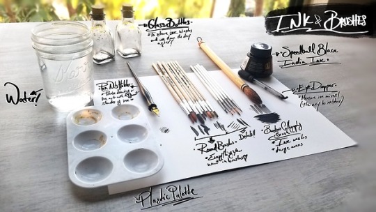
Ink & Brushes
Speedball Black India Ink - Oh yes ma’am! I broke up with Higgins Black India Ink this year and got myself a bottle of Speedball’s Black India Ink! From the few tests I have done so far, Speedball’s ink seems a bit more viscous, more opaque, and dries smoother than Higgins’s ink.
Pen Nib Holder - I’m mostly going to use it with different ink mixes to shade different areas in which I want a certain level of opacity that I can’t get with my other pens. And yes, it totally makes you feel like you are in the Harry Potter world writing about spells on parchment. Win win.
Round & Detail Brushes - As you can see, not much change in a year in regards to the brushes I’ll be using. I did find last year that I gravitated towards the rounded brushes almost every time, so I ditched the flat ones this time around and instead stole a detail brush set from my brother :3. Why buy when you can thrift? ;D I use these to shade my art with black India ink!
Calligraphy Bamboo Brush - Oh yis, I’m bringing back this bad boy! I mainly use it to cover large areas of the paper with water and then plop ink washes all over. It is like the grown up version of finger painting, but while looking stylish af and pretending you know what you’re doing.
Eye Dropper - My existence had absolutely no meaning until I started using an eye dropper to measure my ink washes. I know you might think you can do without it and just wing it, but for the love of the art Gods - just get one. It’ll make you happier than drawing hands easily.
Glass Bottles - Aha! What is this nonsense you say?! I often have leftover ink mixes by the time I’m done drawing, and you know what?! There is nothing better than having a little bottle in which to store your really dark, dark, semi dark, light dark, very light ink mixes. Plus, it makes you look like a bad ass witch ready to poison someone when you have them all together. Bonus.
Palette - Yes, it is the same cheap 60 cent palette from last year. Yes, it is still kicking like the little miracle it is. Yes, there is some golden ink that I seem to not be able to get off of some edges. I’m still not gonna spend another 60 cent on a new one. Come at me.
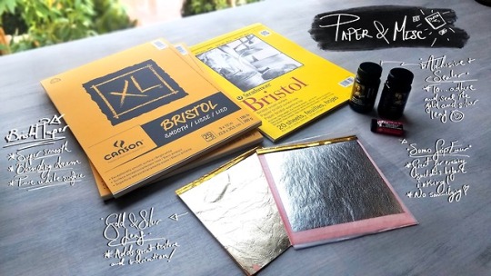
Paper & Misc
Bristol Paper - By far the best paper I’ve used when working with ink. Yes, it does warp a little. But I haven’t found a paper that is as smooth to work with in ink. It has the perfect texture for ink washes as well as sketching away with thin pen nibs without damaging them! No real reason as to having two different brands other than Canson was on sale at my local art store, and a girl’s gotta save the chaching.
Gold & Silver Leaf - OKAY. EVERYONE HOLD STILL. I might have been squealing about these every time I see them since I got them. I have always loved to incorporate little gold or silver accents and textures into my dawings, and I just think the way they combine with ink drawings is even more orgasmic. So this year I’ll be diving into the wonderful unknown world of leafing and I. Can’t. Wait! I have absolutely 0 idea of how to use them, but I can promise swords, crowns, and costumes decorated with these little beauties.
Adhesive & Sealer - These just came with the gold and silver leaf kit and since I haven’t used them yet, I can only assume they do exactly as they say they do. Shocker!
Sumo Grip Eraser by Sakura - I needed a new eraser for getting rid of the sketches after inking them, and saw a lot of people rave about this guy so now here we are! It promises to not smudge on the paper, and I’m all about that life.
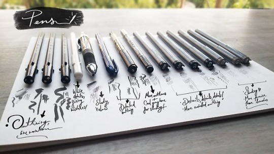
Pens
Sakura Pigma Brush Pens - YES, THIS IS THE SAME SET FROM LAST YEAR. Yes, they still have ink in them. Isn’t that bonkers?! I seriously cannot recommend these enough for outlines and line variation. The little guy was the most heavily used last year, and while it is running a little low, I plan on using it mainly to create textured brush strokes.
White Gel Pen - I mean. Is there anything more satisfying than creating little white details on pitch black stuff? Probably not. This has also saved me multiple times from a sudden mistake that was able to be remedied easily.
Itoya Aqua Roller Ball Point Pen - I don’t use this dude as much as my brush pens or Copics, but there are certain moments when inking when you just wish you had a pen that you could lightly shade and control opacity with. That’s what this dude is!
Zebra Brush Pen (Super Fine) - It is even thinner than the Sakura Brush pen, which means even more neurotic detail making is definitely happening this time around. Yay!
Kuretake Cartoonist Mangaka Pen (Fine) - As I mentioned above, the little Sakura Pigma brush pen is running a little low, so I needed something to replace it with and I decided to try this one out! The ink is pitch black and the handling and line variation are just dreamy.
Tombow Fudenosuke Double - Sided Brush Pen - Okay yes, this was totally a compulsive buy, BUT IT IS TWO PENS IN ONE! Bless it. The black end seems very similar to the Kuretake Cartoonist pen, with the added bonus of a gray to quickly shade with on the other end.
Copic Multiliner 0.3 - 0.05 (Black) - Literally the holy grail of my Inktober materials. If you want to do Inktober but are on a tight budget (art materials are expensive af, I’ve been accumulating these over the last few years), get these! Don’t even think about it. I use them for literally everything from outlining, to precise and meticulous detailing, to shading. I completely ran through my previous set last year, and there was not a single piece I did not use these on. Just do yourself a favor and pick a few. Thank me later :)
Copic Multiliner 0.3, 0.1 and 0.05 (Warm Gray) - They are exactly the same as the above, but in a warm gray tone! I got these mainly to be able to shade certain areas of my drawings without having to deal with the in-yo-face opacity from the black ink set while maintaining total control and precision of the lines, unlike when I use brushes. I am literally itching to try these for little areas like eye lids, freckles, etc!
AND THERE YOU HAVE IT! That’s all I got for you beautiful creatures this time around. I’ll be posting a little intro video to this year’s theme just like last year, so keep an eye out for that! I’m also planning weekly giveaways, daily timelapses of each piece being created, livestreams so you can hang out while I do that day’s drawing and other fun stuff like that :D I’m literally so excited to step into the Inktober madness again!
Feel free to check out my instagram, where I’m the most active and post all of my art at!
#inktober#inktober2018#inktober materials#art materials#art#brushes#pens#ink#traditional art#game of thrones#stranger things#harry potter
1K notes
·
View notes
Note
mind if i ask how the making of the stick n poke tattoos went? im planning to do one but some ppl say it isnt safe and i dont want to get infections
personally they went really well! i used actual pre sterilized tattoo needles and real tattoo ink (my friend got me this kit for my birthday) but that can be really expensive. heres my advice if you dont wanna use a kit (since it is pretty expensive)
(more under the cut since this is really long)
DO YOUR RESEARCH! im not a tattoo artist. this is just my personal advice. if anything happens to you, youve been warned. giving yourself a snp is never 100% safe.
set up a sterile area. tape down cling wrap then put paper towels over it. its not 100% sterile but its much cleaner than a surface you use everyday.
make sure to wear gloves!! latex free is ideal because it doesnt have that powder coating on the outside.
DO NOT USE PEN INK UNDER ANY CIRCUMSTANCES my friend did and it got infected and all nasty.
if you cant get professional materials, use a very sharp sewing needle and non toxic india ink. for my first one, i didnt have the kit so i used a very sharp needle (do NOT use a blunt one. i know using a sharp one makes it seem like it would hurt more but it doesnt. the point is thinner so it pokes easier making it wayy less painless) and dr ph martins black star matte ink. any other non toxic india ink will work (speedball, higgins). make sure to sterilize the area thoroughly, first with antibacterial soap and lukewarm distilled water, then with alcohol pads (there just little towelette pads that are meant to sterilize cuts and scrapes. you can get a bunch for a few bucks at places like target, cvs, walmart, etc.).
before you start, hold the tip of your needle in a flame from a lighter for 30 seconds to a minute to sterilize it. then wipe it down with an alcohol pad.
during the process of the stick n poke, wipe down the area with an alcohol pad every few minutes to clear up the excess ink to make it easier to see and to clean it. also wipe down your needle every few minutes. try not to reuse the alcohol pads more than 3 or 4 times. it may be a bit wasteful but it helps keep them more sterile.
if it hurts really bad, take a break! nothing bad is gonna happen if you do.
once youre done, apply a thin layer of anti bacterial cream (i used this one for both of my tattoos. this is the one part where you cant skimp out on money. NEVER use neosporin or vaseline or any petroleum jelly based product. this will block the tattoo from getting air and wont hydrate it leading it to fade drastically and possibly get infected). you wanna make sure to wash of the ointment and reapply it every few hours.
after the tattoo is done, avoid swimming for two weeks and tanning for a month. this can cause damage to the skin and tattoo. also avoid hot sunlight that could cause sunburns. do not use any fragranced soaps or creams on the tattoo for a month.
if your tattoo fades thats normal! itll look very dark for the first few days then the top layer of skin will come off and itll start to look fainter. you can go over it if you want!
heres some video resources as well!
stick n poke tutorial
aftercare tips
i hope everything goes well!! good luck!
6 notes
·
View notes
Text
Dip pen tips
Alright, here is a list of advice/tips based of my own experience with using dip pens.
I don’t pretend that it’s the end all of it and if you have questions, want more details let me know and I’ll do another post (feedback is always appreciated).
Also, this isn’t meant to turn you into a pro with the dip pen, but rather help you start/progress. It’s not an easy tool but the effort is worth it in my opinion.
It’s a long post so it’s all under the cut.
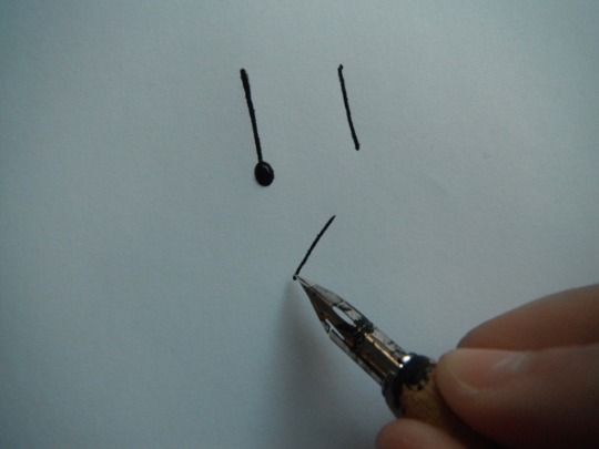
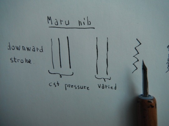
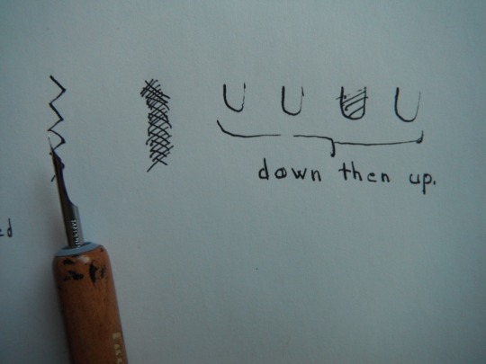
Let’s start with the nibs and the ones I’m using at the moment (I have a dozen more gathering dust).
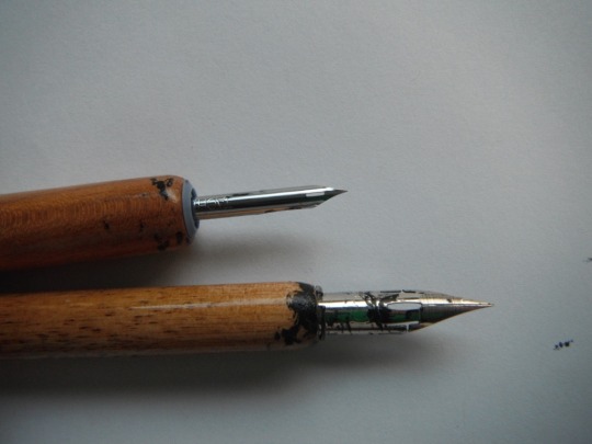
I have a maru nib (top) and a g-pen nib (bottom). I’m using those because I like how they feel and they are easy to find. Before the maru nib I used a crow quill nib, but it started feeling weird and the maru nib was easier to find. If you don’t own any nib or pen holder Speedball has a good set for drawing with different nibs and two nib holders (that’s what I started with). The pen holders I have, the one for the g-pen is a generic nib holder that you can find anywhere; for the maru nib I got a Tachikawa T-25, it’s harder to find nib holder for small nibs and I didn’t like the one that came in the speedball set (too narrow hurt my fingers...).
I use these two because the line weight variation in the two kind of cover me from a 0.5 to 0.05 size for fineliners with only two tools.
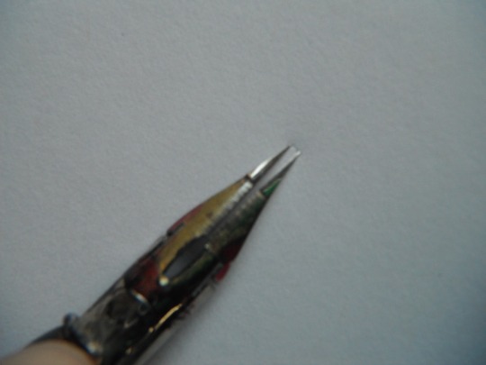
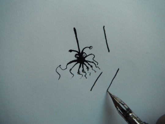
Now about the nibs, although they might feel like a solid object they have a certain amount of flexibility, which is what allow for varying line width. Look at the space for this older g-pen nib (I applied more pressure than necessary though).
As the name says you have to dip the nib in the ink for drawing, and do it often. You’ll want to dip the pen past the eye in the nib (you can see “tide mark” on my nib in the first picture) and then give it a little tap on the rim of you bottle to get rid of excess ink (or beware of ink drops). It can get messy, and I’ve started to use an eyedropper to drop the ink on the nib (concave side).
Just a note about paper: you’ll want paper that’s as smooth as possible to avoid the nib snagging on the paper fiber. If not smooth produces an obvious scratching noise but in some cases one of the nib point snags causing the two half to either temporarily overlap or be spread wider than you want, as well as potentially messing up your line work.
Now onto techniques. If you have time I’d recommend having a look at calligraphy examples Why? Well if you look at different hands and how to make each letter you’ll notice that all strokes are downward or to the side. Very rarely is there an upward stroke.
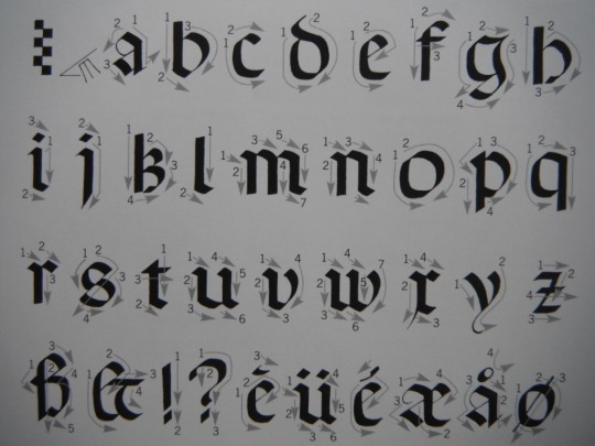
See? the reason for that is that the nib doesn’t handle upward strokes well. Unless you apply little to no pressure and even then it’s best not to go for a true upward but have a slight angle to it (look at copperplate and italic hands). My first go with nibs was for calligraphy (and I’ve been writing with a fountain pen forever) so I’ve build a muscle memory of no upward stroke, or little pressure on the up movement. I’m not saying you should do it but in my opinion it’s a good exercise for familiarizing oneself with using a nib, no need to try a specific hand, your usual writing is fine just pay attention to when you feel the snag, how you instinctively end up putting a little more pressure on a downward stroke and get a thicker line for it.
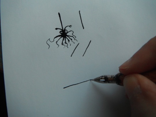
Now about how to hold the pen, I’m not talking about how to hold it in your finger but in relation to the paper. On the photo above the little glyph looking think just on the left of the “a” shows the angle at which to hold the pen, about 30degree.
For a full on downward stroke I’d recommend holding the pen at 90degree it’s easier.
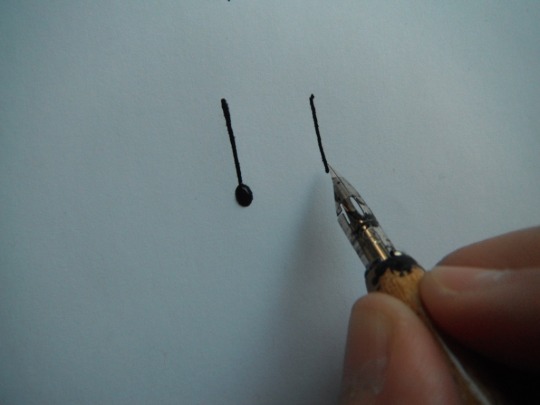
Like so. Warning do not leave the pen on the paper too long or the ink will leak and make a puddle which is what happened with the first stroke.
For any other stroke hold the pen at a 30 to 45 degree angle.
By the way ink puddles can be used to add embellishments to your drawing they don’t always mean it’s a total disaster.
Changing the angle of the pen can make drawing some lines easier, like a full on horizontal line.
You can also rotate the paper, which I do just as much as varying the angle of the pen. The short version: always pull the nib, never push!
Next varying line width/weight. It all comes down to how much pressure you apply, keep the pressure constant and you’ll have a nice line, but you can also vary it for effect. The photo belows are for both of my nibs for different stroke: downward stroke with constant and varied pressure; zig-zig; shading strokes; and a ‘U’ for a downward followed by an upward stroke and you can see clearly the difference in line weight when doing that (the g-pen tolerated the upward stroke better than the maru nib).
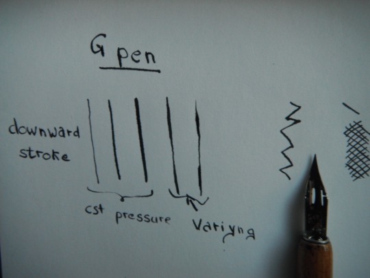
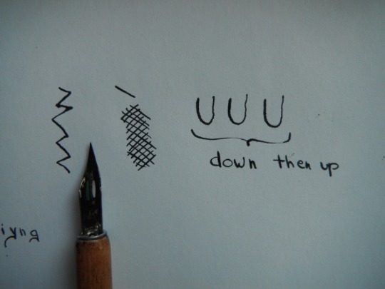
At the start I’d recommend using slow strokes, a fast strokes work best with little pressure to avoid the nib tip from separating too much
Now about some various practical aspects:
-the ink doesn’t dry as quickly as when using other pens, so there is a risk of smearing some of it. So I plan my inking in such a way that I’ll not need to go over an area that isn’t dry (start in a corner, ink from top to bottom, ....) and I keep a piece of paper to put under my hand, because sometimes the ink look and feel dry (tap it lightly with your fingers) but one corner with overlapping lines might not be fully dry and it will get you, believe me it happened.
-dip the pen often generously, don’t wait for it to run dry in the middle of a stroke, best is to ink it in between stroke.
-keep your ink bottle away from your paper to avoid accidental spillage.
-if the nib snags a lot it can be a few things: the paper isn’t smooth enough, you are pushing the nib, or you are moving fast while applying a lot of pressure and the nib point is spread more than necessary.
-clean your nib after each use dip it in water and use some absorbing paper to make sure you get all the residue out. I have some nib cleaning liquid for when the accumulated dry ink impact the nib function (likely because I use india ink, which has a lot of “particles”)
-You can use any ink with a nib, india ink, sumi ink, acrylic ink, etc. The viscosity of the inks is a little different so I’d recommend doing a few marks on scrap paper when using a new ink to see how different.
.... I’ve run out of things to say. Hope it helps and do let me know if you’d want to know more or I forgot about something.
100 notes
·
View notes
Text
Peter Steiner.
Bio: I first showed cartoons to The New Yorker in 1965 and then tried again in 1977 after a brief career as a college professor. All that time, though, I was selling cartoons to little underground papers and the like. Once I started submitting seriously in '77, it took about 2 years to sell something to The New Yorker. I eventually got published lots of places as a freelance—The Wall Street Journal, The Nation, Saturday Review, Saturday Evening Post, and eventually had a regular job as a cartoonist with The Washington Times and The Weekly Standard. I'm also the author of five novels, with a sixth one on the way.

Find this print here!
My favorite New Yorker cartoon is difficult—they're all my children. I suppose maybe "Human resources." I'm fond of the drawing and the idea.

Find this print here!

Tools of choice: I use a speedball pen with a B-6 point, although toward the end of my career I started carving my own pens from hollow weeds. Each one was completely different, and you had almost no control over the line.

I often use a watercolor wash (although these days, for my blog, I work fast so I use Pigma pens and color pencils). I use india ink and draw on Fabriano cold press watercolor paper. It's got a rough surface; I like the unpredictability (although these days, for my blog, I work fast so I use Pigma pens and color pencils). I use a light table to redraw until the drawing loosens up. Being left handed, I always draw from upper right to lower left.

Tool I wish existed: I pretty much like what's available.
Website, etc.
Blog
Website
Books
Editor’s note: Peter has a lot of great political cartoons on his blog!
Follow Case on Twitter and Instagram for fun quotes!
#peter steiner#on the internet nobody knows you're a dog#how to be a new yorker cartoonist#new yorker cartoonist#artists on tumblr#how to be a cartoonist
8 notes
·
View notes
Text
Calligraphy for beginners – Guide on learning calligraphy
Are you interested in learning calligraphy?
If that’s the case, you’ve just come across the perfect article to do that.
Learning calligraphy is not an easy process, but with the right guidelines in place it may take less time than you think.
What is calligraphy?
The term is borrowed from old Greek and refers to the skill of beautiful writing.
Rather than a simple ability to write pretty letters, calligraphers are expected to follow a number of rules and conventions, including such that govern how letters are positioned and arranged in the text.
How to do calligraphy? More importantly, does it really make sense to do it?
If you’re a designer, for instance, modern calligraphy will be a great skill to add to your resume, and the fastest way to attract clients with elegant logos, signs, cards, invitations, and more.
Our calligraphy for begginers article will help you familiarize with all these things and help you in learning calligraphy, and give your work a recognizable and personalized touch.
Here comes our compact calligraphy guide:
Learning calligraphy – where to start
Image source: Colin Tierney
How to learn calligraphy? The first step down the road is to get the right equipment, including the best calligraphy pens. Pointed-pen calligraphy will require you to learn how to use a dip pen, referring to the ones made of metal tips and nibs, and attached to special nib holders.
All similar guides on calligraphy basics recommend these pens, as they don’t contain ink inside and can’t cause any damage – instead, you dip them into the special container while writing, and benefit from their flexibility to experiment with line variations. This way, your pen will never corrode or clog; despite of the number of different inks you have to use to complete your project.
How to use calligraphy pens? These are the tools you will need:
Nibs
Nib holders
Paper suitable for fountain pens
Ink
The nib
Image source: Mike I Creative Mints
The nib we’d recommend to beginners learning how to use a calligraphy pen is Nikko G-Nib, having in mind that it is relatively firm, and produces this and nice lines with the desired level of flexibility.
The nib holder
There are two types of nib holders: Straight and oblique. The first time suits better upright calligraphy styles, while oblique holders facilitate the combination of several different styles.
A high-quality and affordable alternative is the Speedball Oblique Pen Nib Holder, as well as Tachikawa Comic Pen Nib Holder for Various Pen Nib – Model 25 (great choice for upright styles, as it holds the nib more firmly than other similar alternatives).
There are also designers who use the same holder for all calligraphy pens, but we advise beginners to try several different options before they choose a single holder.
The paper
Image source: Matt Vergotis
The roughness of ordinary paper will make it impossible for you to use it for calligraphy purposes. Among other problems, you will encounter situations of your nib catching on the paper, and creating annoying ink splatters.
On top of that, regular printing paper has more fibers and consequently absorbs the ink and lets it spread inside, which will likely prevent the smooth and clean lines calligraphers are trying to achieve.
In order to make calligraphy more effective and enjoyable, purchase paper that can withstand fountain and dip pens, as for instance popular brand Rhodia that is very smooth and ink tolerant. There are several types available: blank, lined, or with dot grids.
The ink
Image source: Matt Vergotis
There are several types of ink suitable for dip and calligraphy pen, but beginners should always go for quality black samples. Our choice here would be Speedball Super Black India, as this ink is very dark, waterproof, and on top of that reasonably priced.
Preparation tips
The same as any creative practice, calligraphy is done the best in a pleasant working environment.
A convenient and well organized desk where you can place all your supplies, and feel positive and relaxed is the best place to work on your calligraphy skills.
Choosing the best writing location
Image source: Eddie Lobanovskiy
To make the most of your calligraphy practice, pick a comfortable and relaxing place where you can rest your feet flat on the floor. Organize supplies well, and keep the place uncluttered to ensure enough moving space for your arm.
The writing paper should be placed over a special writing board, or at least 5-6 sheets of scrap pieces to write on. This way, you will have a soft surface that allows you to write more naturally than you would on the tabletop, and the surface won’t let your paper move around.
Preparing the tools
Image source: Jason Carne
Make sure there are a non-linty towel and a cup of water around, so that you can clean the nib here and there. Paper towels are also fine, but have in mind that their fibers happen to snag on the nib and cause frustrating splatters.
Your ink should be placed in a wide-mouth bottle or jar to avoid touching the sides, and placed where you won’t easily knock it over. Basically, your working tools should be within your reach, but yet on a safe distance. For instance, we’d place them inside a tape roll, or even keep them closed to avoid any risk.
As mentioned before, you should place the nib inside a nib holder. The easiest way to do that is to grasp the nib somewhere close to its base, and then push it inside the holder using its outer ring.
Make sure you’re not holding the nib by its tip, as it may bend out of shape. To do this right, look for a YouTube tutorial and follow the instructions.
The basic strokes of calligraphy
Image source: Paul von Excite
Calligraphy’s building blocks are thick downstrokes and thin upstrokes. The thin upstrokes are easy to draw, as you hold your pen lightly and move it upwards.
Thick ones, on the other hands, require more pressure as the nib is being moved downwards. Of course, you should balance and combine both movements to produce the best possible line variation.
Before you begin, dip the nib deeply inside the ink jar, making sure that the breather hole on the nib’s back is completely covered. Wipe the excess ink on the sides off, and you can begin writing.
These are the rules you should follow:
Image source: Jeroen van Eerden
Downstrokes come first. As you hit off, don’t apply any pressure, as this will help observe the changes in line thickness. This way, you will also protect your nib.
Experiment with different loops, and combine thinner upstrokes and thick downstrokes. The continuous line loops will help you connect them, and come up with the perfect combination.
The following step is to press the drills, and then release them. Proceed with thick downstrokes, and release the pen slowly as you move towards the bottom.
Change the order. Draw your downstrokes in a way that they seem to flow into the downstrokes.
Continue with ovals. Apply heavy pressure on the left hand side and lighter pressure on the rights side.
It happens often that a new nib draws two parallel lines instead of a single one, or ‘railroads’, as experienced calligraphers describe it. The reason is that you either applied too much pressure, or have no more ink to work with.
Equipment and stroke tips for professionals
For those of you who feel confident to start writing professionally, we’ve prepared some pizzazz to add to your beautiful lettering.
Modifiable characters
Image source: Mike I Creative Mints
An easy way to give your writing a proficient look is to change the slant, something you can easily do adjusting the width of the strokes and the length of their connectors. Start by changing the distance between letters, and giving the baseline an angled, staggered, or curved look.
Such modifications will help alter the feeling your writing inspires, as well as the message it conveys. Is it formal, dynamic, or whimsy? Think about it!
You can also change the way in which you form letters, and make them a bit thinner, rounder, or even joined in a different way. Do this several times, and you will for sure come up with a brand new design.
Flourishes and frills
Image source: Paul von Excite
Your are learning calligraphy so you need to do some flourishes. Flourishes can be added to your text as curlicues and loops, so that it will turn our more beautiful and easy to notice. For instance, you can cross heavy lines with lighter ones to show that you do care about the text’s visual balance.
Another alternative is to trim the calligraphy with special drawings coordinated with your words, or use banners to highlight important lines. The more complicated your design is, the smarter it will be to start out with a pencil drawing and test it.
Traditional calligraphy
Image source: Inkration
Spencerian and Copperplate are the perfect examples of traditional calligraphy scripts, as there is little of their modern descendants’ variations to be seen on them, but the classic elegance is undisputed. Special projects may require you to familiarize with them, an idea that is also useful to improve your calligraphy discipline.
The perfect nibs
Image source: Kemal Sanli
Your ideal nib should be sharp, flexible, and very responsive. In such way, you will be able to draw thinner lines, and enrich them with dramatic and fine finishes. For sensitive projects, we recommend three great nibs in particular:
Speedball No. 101
Brause 361 Steno Blue Pumpkin
Brause 66 Extra Fine Arrow
None of these nibs will be easy to use, but the effort is absolutely worth it.
Useful tricks
Image source: Matt Vergotis
You’ve just started monetizing your calligraphy skills, but something still looks quite wrong with it. It may be that you’re having problems using the nib, in which case you may find the following tips useful:
If you’re facing problems with the strokes:
Instead of jumping on the bandwagon, try out faux calligraphy and see how the strokes look and fill. Write cursively, and fill in the spaces for the downstrokes. This way, you will mimic the ideal line variation, and see what you’re actually supposed to do.
Practice on printable sheets until you’ve learned perfectly how to shape your letters. It shouldn’t be difficult to find some basic stroke and capital samples on the Internet.
Start with lighter pencil drawings, and trace over them slowly with your pen. Once the ink is dry, erase all pencil traces.
Large letters make it easier to depict critical mistakes.
If you got a sloppy-looking slant
Use slanted guidelines while practicing. Draw one of your own using a protractor, or even apply regular paper. A guide sheet under the paper will make the process easier.
In order to create the right slant, rotate the paper. You will see immediately which the best position for you is.
In order to skip rotating the paper, replace your current nib holder with an oblique one.
If your hand is too shaky or tired to work:
Use practice strokes to warm up
Hold the pen loosely, and shake the hand out
While writing, move the entire arm instead of the wrist.
Spend more time practicing. Do more drills, even when you’re simply using your phone. This will help move the hand smoothly and naturally.
If the ink simply won’t stay on the nib
Some of the new nibs have a very thin oil coat that may not coincide with your ink. To prevent a serious problem, rub it with alcohol (or with a softer toothbrush and paste), or simply pass it through flame.
The problem may also be that there is some remaining, dry ink on the nib that is interrupting its flow. In such case, take a pen cleaner and scrub it off.
Keep in mind that a regularly used nib requires occasional cleaning and maintenance. To clean it properly, remove it from the nib holder, brush it thoroughly, and let it dry completely before you apply it again.
If your work could use some refreshment:
Change the nibs, and try several new ones.
Change the ink. You will find many types of calligraphy-friendly ink to work with, but dip pens can usually tolerate any liquid able to leave lasting marks when applied over paper. Some designers even choose to use nontraditional methods, and make their drawings with watercolors, coffee, or berry juice.
Choose a style
Image source: Paul von Excite
Unlike calligraphers of the past, designers today are free to choose whatever style they like, or even professionalize in several ones to complete different projects. As discussed before, knowledge on several calligraphy styles is useful to showcase the writer’s personality, convey an important message, or simply complement a formal occasion. Here are some popular ideas that could inspire you:
Formal flourishes
Image source: Eddie Lobanovskiy
If the tone is classic and vintage, that doesn’t mean that the script won’t look modern. Combining styles like these will impress everyone who sees your work, starting from your friends to the Queen of England!
Elegant calligraphy
Image source: Joshua Bullock
Writings can be fun and sophisticated at the same time, and elegant calligraphy is there to prove it. Mixing classic lettering with dynamic flourishes is the best choice you have to design invitations for weddings and other special occasions.
Romantic and artistic
Image source: Matt Vergotis
Did it happen to you that a particular slender script reminds you of romance?
These lace-like writings have scrolled and high angle flourishes, and are thus suitable for delicate letterforms and invitations that will captivate your guests’ attention.
Whimsy
Image source: Paul von Excite
Whimsy writings feel breezy and relaxed, and usually inspire us to think of fairytales and getaways. It is because of their fluid baseline and dynamic angles that these writings capture our mood, the way a well written poem makes us dream of adventures.
Bouncing balls
Image source: Eddie Lobanovskiy
Regardless of your age, you will always be attracted by good-looking invitations, a trick designers often use to get the fun rolling and sell well. The perfect script for such invitations is the romping one, achieved with playful baselines and rounded letters to set the good time tone.
Important calligraphy facts
Calligraphy doesn’t happen overnight. You must practice, as much and as often as you can.
It won’t take more than a couple of hours and few attempts to understand whether you can actually do calligraphy.
If you’re not 100% focused, it won’t work. And that’s the end of the story.
Calligraphy is not only about how you write, but also what you’ve written. This is why you should always write ‘real’ words, and convey a meaningful message.
You must learn continuously. While doing so, you will discover a vast and fascinating world that sucks you in with and keeps you looking for more. The fun involved is just unparalleled.
What makes the difference is quality, so make sure you buy some top quality supplies.
Calligraphers are usually friendly people and awesome communicators. Thus, they are your best source of information and inspiration, and you should immediately start looking for a mentor.
The top five calligraphy options
Next, we will set down the most important calligraphy outlines categorized in five different approaches and sets of lines and letterforms. The section will also help learn on diverse tools and techniques that can be used for your projects, and we recommend you to try all of them.
Double-pencils
Double-pencils are both simple and very helpful for those constructing calligraphic letters. They can also be applied to create large and captivating lettering for posters, banners, and similar promotional materials.
youtube
You need a couple of well-sharpened pencils with two rubber bands. First, shave some of the pencils’ side surface off to place them in an adjacent position, and to make sure they are close enough.
Rest them together in a vertical, point-down position, and make sure their peaks are at the very same level when touching the paper. For the purpose, you can fasten them with tapes or rubber bands on both ends.
Then, take the double-pencil and hold it in your usual drawing position. Ideally, it should be pointed front-left, and at an angle of about 45 degrees.
While both pencils are placed upon the paper, press them lightly, and point them both forwards and left. The distance between their points is what forms the so-called ‘invisible nib’.
As you move your hand, you will be drawing a double line, and if you decide to make circles while pointing it in the same direction, your double pencil will create unique thin-and-thick ribbons with unparalleled precision.
If you don’t feel familiar with pen angles, or are lacking the confidence to produce the thin-and-thick effect, think carefully of all moves and directions involved.
This process will require three different skills: working with the pen angle; directing the hand movement; and putting the right pressure on the paper.
Felt-tip pens
These pens are more than convenient, very cheerful, and most importantly – much cheaper than all similar tools.
Of course, this doesn’t come without a toll, and the ink of these pens tends to fade in time, or maybe look too heavy and be damaged easily under the slightest pressure. This is why these pens are a great tool to practice, but not a top rated alternative when completing important projects.
youtube
To get one of your own, get a pen and a piece of paper. In case you tend to mess around with first-time experiments, get two – a 3-5mm and a 1.5-2 mm pen. Start with the broader one.
You won’t have to worry about paper either: felt-tips pens will work just fine on printer samples, parchment (not ideal for beginners), or similar materials.
The pressure here must be light and even, as many calligraphers undergoing training make the mistake of pressing too heavily. Doing so won’t help your felt-tip pen work perfectly, but only soften and splay the only tool you have to practice with. Keeping clinging contact with the paper, on the other hand, will produce much better results.
Touch the paper with only one corner of the nib, and then proceed with the other to get an overview on how your writing is going to feel.
Rest all of the nib’s end-width on the page, and then rock it slowly: does it feel that one of the corners is leaving the paper while the other still remains there? It is almost like magic!
This time, place the full width of your nib on the page, making sure that both corners are touching it appropriately. Remember that this is the ideal writing contact, and that pressing harder may cause any of the nib corners to lift.
The pen angle and the pressure are two different points, and the pen should point out to the left and the front at approximately 5 degrees. Doing that, the hand should be moved to form light and beautiful ribbons.
For sharper and crisper lines, consider getting a higher quality marker, but you should be considering this only once you feel confident to practice calligraphy professionally.
The best value and best-buy pack we recommend is Sharpie Calligraphic, which contains 12 nibs with different colors and sizes; and Staedtler Duo, a 2-piece fair quality marker set. The superior pack that doesn’t smudge and bleed is called Calligraphy Pen Set, and comes with four light-fast ink pieces in the primary colors.
As discussed previously, it makes no sense to buy special calligraphy paper while you’re practicing, as printer paper is both satisfactory and affordable.
Still, if you find yourself annoyed by constant ink stains you can consider Ampad’s Dual Ruled Pads or thin at cartridge paper such as the one used in UK, but have in mind that they will cost slightly more.
Writing calligraphy with refillable, cartridge, and fountain pens
Image source: Moran Goldstein
What you will need is: a pen, a separate ink supply (a refill bottle, or an included cartridge).
If looking to understand how refillable and cartridge pens work, think of their fountain counterparts: Each pen will hold a large reservoir filled with thinner ink, and that ink will flow through the barrel’s baffles controlled by an internal mechanism. This way, it will run straight inside the nib unit, and spread easily onto the page.
With a pen like this, you will also get multiple nib units in different sizes, and a wide selection of cartridges to use with the pen’s main body.
The biggest benefit of using refillable and cartridge pens is that they’re easy to work with on horizontal surfaces, thanks to their advanced mechanism for mechanical control of ink flow.
Unlike dip pens, they’ll prevent you from running out of ink in the middle of a word, and are certainly a much safer option for clumsy beginners.
Cartridge ink is slightly thinner, in order not to dry out and clog on the innards of your pen, and this also gives it a jolly thin look when applied on paper.
The nib unit is also notably rigid, having in mind that its mechanisms have to screw within the barrel. This means that cartridge ink combined with a flexible and responsive nib may indeed revamp your whole calligraphic experience.
The same as fountain pens, cartridge calligraphy pens leak in a spectacular manner.
This doesn’t change the fact that the ink left inside them over time can dry out and clog, which imposes the need to maintain them properly. Here and there, you will have to wash their nib unit really carefully, but you can never remove all ink stuck on their basin.
A bonus tip
Image source: Paul von Excite
Refillable and cartridge calligraphy pens are considered most productive by calligraphy professionals, and are also typical for many popular websites. For this reason, beginners are highly recommended to use them.
Dip-pens and quills
There are many different types of dip pens, but there are few essential principles that apply to all of them. For instance, all dip pens are built with these elements:
Handles and nib holders – Holders and handles are the area where the writer will grip while working, and should therefore be comfortable and soft to his hand. Most of the time, they come with internal metal arrangements on both ends of the nib, so that you can move them in and out securely.
Nibs – Nibs are the pen’s metal endings that have two separate parts, and an extending ‘tongue’ that keeps those together. Their tip is square-cut to make full contact with paper, and usually flexible enough to allow ink to spread crisply and evenly on your surface.
Reservoirs – Reservoirs are sometimes built within the structure of your nib, and look like small depression cups on the side used to feed the slit. Some of them are provided as separate metal cups you have to fiddle on the nib before you can use them, including such that are place on top and underneath the nib. The main function of reservoirs is to accommodate a small ink supply and keep it ready at the slit’s top, so that you’re able to write at least few words before you replenish with ink.
The reservoirs will not always be built within the nib, which makes it possible to buy each of the three elements separately, namely to mix-and-match between them. The options are endless, and can’t possibly be put together in a single guide, but the experience of popular calligraphers may help you make the right decision.
As a beginner, you may also want to save some time and effort, and thus consider buying a preassembled dip-pen kit. In most cases, you will be given 4-6 different nibs with holders and reservoirs, and they will cost less put together than what you’d pay buying them separately. We once again recommend Speedball’s Calligraphy Lettering kit, where you will find a holder and even 6 different nibs.
Ink may or may not be included in your set, so start looking for a suitable one.
The best ink types for dip pens
These are the best inks you can use with dip pens:
The best results are achieved with opaque and thicker inks such as Chinese stick ink, India ink, or even gouache paint you’ve previously diluted to make its consistency half-creamy.
For wishy-washy and undefined strokes, you can consider watery inks typical for fountain pens.
What you can do instead is to get a medium-sized brush suitable for watercolors, and then refill the reservoir at the nib-slit’s upper portion.
Writing calligraphy on slopes
With a dip pen as your preferred tool, you will find it easier to write on slops than writing desks, including easels and boards perched within your lap and supported by the desk’s edges. Calligraphy will take its time, so make sure you’re comfortable.
First and foremost, choose a stable writing surface that won’t slide away.
Adjust seating, and make sure you’re comfortable and set up on a working height you find relaxing.
If possible, fix the paper surface on the slope (you can use blu-tac and masking tapes such as the ones medieval monks used to hang weight on).
If you’re using a quill or a dip pen:
Keep the ink/paint opened, and placed close to your non-writing hand.
Choose a good ‘parking place’ to load the brush safely once you’ve dipped it, and avoid ink from splotching on other surfaces. You can get a small saucer that will accommodate your tools while you’re having a coffee break or attend a call.
Pay attention: Resting the loading pen/brush across the open ink bottle will cause ink to spread on the handle, and eventually end up messing up your fingers while working.
How to load a quill/dip pen
Take the pen in your writing hand, and hold it in a horizontal position
Dip the loading brush in a way that allows you to take only few drops.
Preserve the pen’s horizontal position while applying ink from the dropper/brush tip to the reservoir.
Replace the saucer and the brush on their saucer, and preserve the pen in a horizontal position. Otherwise, you may end up cleaning ink stains from your lap.
Take a piece of scrap paper and test the flow of the ink on each side of the sloping board. Only after you’ve done that you can proceed with your main tasks.
The choice of your ink, nib, and writing surface will determine how often you have to reload your reservoir. In the best scenario, you will do so after few words instead of few letters, but this may also depend on the speed you’re working at.
The very same rules apply when you’re using a quill. Unlike steel nibs, quills are more flexible and wear down easily, especially when you’re using them on cheap and abrasive paper.
Because of the slit nibs of quills and dip pens, these tools happen to damage paper when handled by a non-professional.
Unless you’re absolutely sure that you know what you’re doing, we recommend you to look at similar calligraphy methods that take less effort to learn.
Writing calligraphy with sponges and square-end brushes
Image source: Matt Vergotis
Here comes the ‘messiest’ calligraphy approach we prepared in this guide:
The thinner the brush’s sides are the better results you will achieve. The recommended width is somewhere between 6 and 20 mm, preferably with a firmer texture (sable and nylon instead of bristle, for instance). Brushes are also categorized as flat and bright, the later being consider as a better option that preserves line control with its shortness and stiffness.
You can take a normal cleaning sponge and cut it into block, and then turn it into the most remarkable calligraphy tool. When using it, don’t forget to protect your hands with ink-proof gloves.
There are several important differences between writing calligraphy with a nib and a square brush.
The brush, for instance, is very flexible and soft, and will respond to higher pressure by creating thicker lines, and that’s not what traditional nibs actually do. Another characteristic of brushes is that they tend to run out of ink quite fast, and happen to produce a modern texture and unique, scratchy look.
The best way to use brushes is on a sloping surface (approximately 30 degrees). Horizontal writing surfaces will also do well, as long as you they grip the color well.
We recommend using sponge nubs for bold and large letters, as their firmness can make your strokes unbelievably crisp.
You must, however, control the pressure you apply, as any variation may squash the finesse of your lines and cause paint to run down the page, but you can of course do this deliberately (looks absolutely adorable!).
Another interesting effect of sponges is that when running out of ink, they produce patchy effects similar to the ones of the brush, and create interesting contrasts and fading lines that are very attractive.
Ideally, you should use a thick and opaque ink as for instance India, extra thin poster paint, or diluted gouache colors for your sponges and brushes. All other runny and watery ink won’t stay long on the sponge, and will thus make your letters look drippy and patchy.
The biggest advantage of using sponges and large brushes is that they leave enough space and wet ink on the letter line for you to add additional colors, blend them in an interesting manner, or simply let them flow.
When mixing several colors in a single letter, take a slight scope is whatever bright color (white is also fine), and draw a basic letterform. Afterwards, place it on a horizontal surface, and pour several drops of darker and contrasting colors. Don’t move it until it dries completely, unless your original intention was to blend it more, and make it look unique.
Mastering faux calligraphy
Faux calligraphy is in fact modern calligraphy that has been created with a standard pen (gel, ballpoint, and so on). For many designers, standard pens help get acquainted with calligraphy altogether, and there are two important reasons for that:
The thing with standard pens is that they’re not intimidating, and are often more flexible and more approachable than other types. At the end of the days, these are tools you’ve used ever since you can remember, and there’s already enough muscle memory to work with and create beautiful calligraphy.
Faux calligraphy, nevertheless, is not only there for beginners. Regardless of your proficiency level, you can find it useful to practice for your important projects.
Assembling a great calligraphy dip pen kit of your own
Here is what you’re going to need:
A couple of Nikko G nibs – At the beginning of this post, you had the chance to read more on the quality of these nibs, often referred to as the best beginner-friendly nibs on the market.
A straight pen – A good choice is a Manuscript pen, as it has a universal nib insert. We also recommend General’s cork pens because of their flexibility and ease of use.
32# Laser jet paper – Or simply put –printing paper. This is a cost-effective solution that nevertheless prevents ink from bleeding and feathering.
Screw-top containers and Sumi ink (India ink will do as well). Both of these inks are opaque, and will provide your work with smoother viscosity.
‘Art water’ – To clean the nib from time to time, you will need a cup of water.
Non-fibrous towels and cloths – You can also use paper towels, but you should be careful keeping the nib away from catching their fibers
Instead of buying expensive, overrated calligraphy kits for beginners, we recommend you to put together one of your own, and pick only the tools that are beginner-friendly, affordable, and genuinely useful to you.
Cleaning the nibs
Upon purchase, all nibs come with manufacture oil on them, as this oil helps keep them sellable and well-preserved. It will be almost impossible to keep oil and ink on the nib at the same time, so clean the nib thoroughly before you start using it.
Once done, you will see how ink flows off the nib smoothly and seamlessly, and doesn’t blob on your paper as it would with oil in it.
Assembling the dip pen
Most beginners opt for Speedball’s plastic pens because of their Nikko G nib, but there is nothing wrong with using universal-insert dip pens either.
These pens have a rim and even 5 metal petals, and can thus accommodate many different sizes and types of nibs.
Holding the pen
Gripping a dip pen is no different than gripping a standard one, which means you’re still supposed to use the thumb and the forefinger, pinch the holder with them, and place the middle finger behind the pen for additional support. While drawing, use the ring finger and the pinky to drag light lines.
Dipping the pen in the ink jar
The nib you’re using won’t matter – the quality will still depend on whether you’ve dipped it deep enough.
In technical terms, this means dipping slightly above the vent hole (the central one), in order to avoid putting too much ink on the nib, and letting it flow down while you’re writing.
You should also shake the nib firmly over the art water to make sure all excess ink has fallen off.
You are ready to go!
The main difference between regular ballpoint pens and dip pens is the angle: modern calligraphers should be looking to keep the nib angle related to the paper constant.
You should never hold your pen vertically, but shoot for an angle of 45 degrees between your pen and the paper.
Holding it too upright is not a good idea either, as the nib may catch on the paper’s fibers, and affect the way in which your ink flows.
The post Calligraphy for beginners – Guide on learning calligraphy appeared first on Design your way.
from Web Development & Designing http://www.designyourway.net/blog/typography/learning-calligraphy/
0 notes
Last Seen Blogs

797489-blog
Untitled

certifiedfinejewellry
Certified Fine Jewellry

hiiammsunieee
Nỗi Cô Đơn Của Kẻ Lữ Hành
mocha-ramen
𝑴𝟎𝒏𝟐𝒕𝟑𝒓

kadriyeee
𝐄𝐌𝐏𝐓𝐘 𝐃𝐀𝐖𝐍.