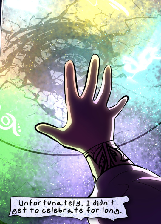
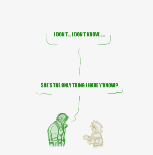
#and never before did lineless
Text
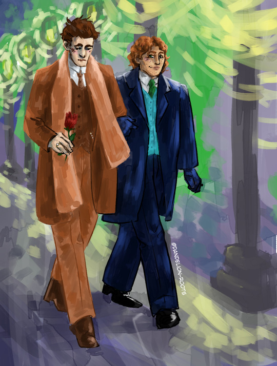
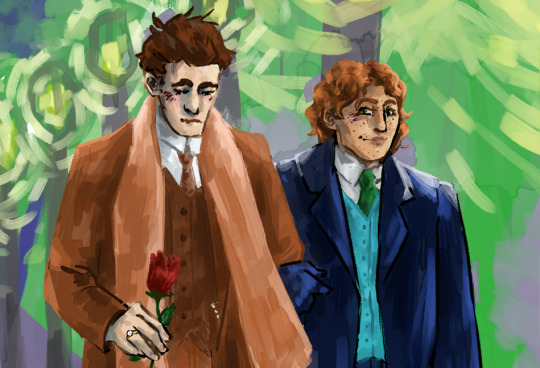
[Image description: the first image is a digital drawing in a semi-painterly style of Whyborne and Griffin walking arm in arm down the street. Whyborne is holding a red flower and blushes as he looks down at it, and Griffin is looking at him and smiling. The background is painterly and shows the street and lampposts lining it. The second image is a closeup of the drawing. End description]
Valentine’s day stroll through the bestest horrible murder town!
#dan draws#whyborne and griffin#widdershins#jordan l. hawk#jordan l hawk#whyborne#percival endicott whyborne#griffin flaherty#griffin widdershins#whyborne widdershins#the lore ive got in my mind about this#is that griffin definitely railed his husband into a mattress like 10 minutes prior to this#after a whole day of valentine shenanigans#and now theyre on their way to have a fancy dinner#where theyll definitely run into kander and christine#and itll just be a nice lil found family dinner <3#super happy w this drawing since i was just planning on doodling#and never before did lineless#bcs it scawes me#now im gonna go nurse my poor hand and watch yt#have fun widdershins fans#widdershins book
39 notes
·
View notes
Note
what brushes do you use? your lines are gorgeous!
thanks :D my favorites are this shale brush and copic marker brush!! examples below
shale brush:

copic brush:

#ask#anon#its so. intriguing that people seem to really like my lines recently#mostly because i never liked them until i decided to stop caring about them so much lmao#hated how my lines were a few years ago so i did lineless for a while before coming back to lines and just kinda approaching them as#somewhat cleaner sketches#anyways. none of that matters lmao#thanks!!
65 notes
·
View notes
Text
I drew TSC, requested by @floxy-offical
I also used it as an excuse to draw him in the first place <_<
#tsc avm#animation vs minecraft#My Art :D#Art requests#Did I do good?#Nobody look I'm fixing something#If you hadn't seen this before you'll never see the mistake I made :D#mmmmmmm lineless
100 notes
·
View notes
Text

sunlight, moonlight

+ a few bonus alternate hues that i thought looked neat
#I DONT KNOW HOW I DID THIS. I DONT FUCKING KNOW HOW I DID THIS#I DID THIS AT 2AM IVE NEVER DONE LINELESS BEFORE???? WHY DOES IT LOOK GOOD#this was supposed to be a value practice doodle of like. one eye. i dont know what happened#plush.txt#my art
14 notes
·
View notes
Text

O BTW b4 i go to bed. heres some silly stupid doodles of my redesigned trollsona since im rereading hs now anyway ^__^
#in a style i have NEVER USED BEFORE#i didnt mean for it to look so similar to the hiveswap style lol#i just wanted to try making lazy doodles while still doing lineless to try it out#bc its been sooooooo long since i did that. and i always obsess over shading when its my usual lineless so they always end up needing more#effort than theyre supposed to#so i tried something new! except its not really new its actually totally old i just tried doing it again after a long time!#anyway. heres everyones beloved zairku after all these years 😁#was debating on whether or not to put this on my main rather than my selfship blog but i decided its ok#my selfship blog is primarily meant for (believe it or not) the actual shipping part#so just sonas and stuff is fine on here<3#doodle#zairku edjera#had fun wit these designs btw it feels so weird to draw any kind of homestuck art again after so so long#also whoops. forgot their gt wings lol#OK EDIT. added god tier wings heehehe ^_^
20 notes
·
View notes
Photo
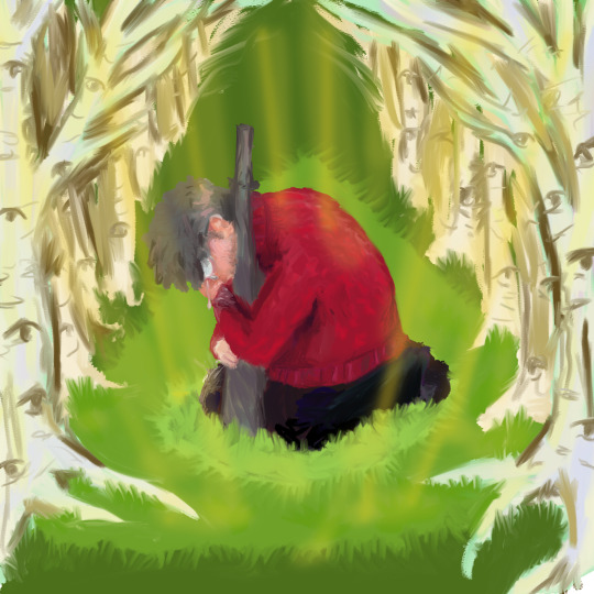
you’ll always be my favorite ghost - Big God, by Florence + The Machine
[Image description: Lineless digital painting of Ford kneeling in front of the stone statue of Bill, hugging it and crying. He is in the woods, surrounded by birch trees, with beams yellow light streaming down from the treetops. The grass around Ford is shaded to be reminiscent of the shape of the portal.]
#original art#billford#god I havent drawn in ages let alone lineless art#i dont know how to draw tears or anatomy at All#I looked up 'man hugging dog' to find a good hugging-while-kneeling reference image.#sometimes you gotta say fuck it and draw the thing before the idea of it eats you alive#i'm writing a fic about ford confronting the statue. the feelings are just so Complicated#he is so angry and relieved and exhausted.#angry at everything bill did. angry that hes gone forever. angry at himself for spending any energy on thinking about bill#most of all angry at himself for missing bill. he doesnt even Miss Bill#he just misses the version of bill that he thought he knew pre-betrayal. but that doesnt make the complicated feelings any less real#i imagine he would avoid the statue for a long long time and then one day accidentally walk past it#and feel a ton of repressed feelings bubbling to the surface#and he would want to kick the statue or run away or yell at it but all of those feel so silly to do to a statue. basically a gravestone#so he ends up hugging it and feeling like an idiot for hugging it but he just has to sob for a little while#sometimes you gotta cling to the tombstone of your horrible toxic ex and sob about how much you miss them#and sob about how bitter and angry and lost and Tired you feel. there will Never be any Resolution. he's just. Gone Forever#i can picture him laughing through the sobs and muttering 'we'll meet again huh. as if.'#'i never want to see you again you asshole. and having the chance to meet again would be too good to be true.'#he's just So Heartbroken about it all. and he wishes he could get some kind of closure or something. but there IS none.#even if bill came back what would he say? nothing new. He would keep feeling no remorse about any of it. he would keep being horrible.#ford is kinda mourning the final tiny little irrational ray of hope in him that got crushed when bill died.#the irrational hope that maybe bill Could end up regretting what he did and become better and then he could have his best friend back.#the irrational hope that the betrayal was all just a bad dream and any second now he will wake up and bill will be benevolent and good#none of these feelings are things that ford can admit to himself. not even all these decades later.#but it Does Something To You to see your ex-closest-friend's tombstone!!#regardless of how deep and terrible the betrayal was.#ford so badly wishes he could stop having any kind of feelings about bill anymore. especially the lingering remains of fond feelings#but i dont know if those feelings even Can be completely gotten rid of. hes stuck with the knowledge that he feels upset about bills death.#and he hates it. he hates feeling upset about the death of an evil dream demon who tried to destroy his family and his dimension.
38 notes
·
View notes
Text
And down we go
And down we go
And down we go
And we all fall down…
I TRIED
I TRIED
- I Never Told You What I Do for a Living by My Chemical Romance
happy birthday Ames @tattooine
#hbd!! can’t believe I’ve only known you for a year n some change it feels longer and too short all at once#been a delight to see you grow and explore and be more confident than before I think you a year ago would be really proud#sebastian vettel#anakin skywalker#caro.art#my wrist hurts bc I did the font by hand bc my dumbass forgot I could load fonts into procreate#anyways I’m really proud of this bc it’s fuckin LINELESS and I’ve never done that before#also I tried to make it look like an edit? hope that checks out visually#cool I’m done talking#what if I tagged this f1 edit sjiwkeksi#userxoames
25 notes
·
View notes
Text
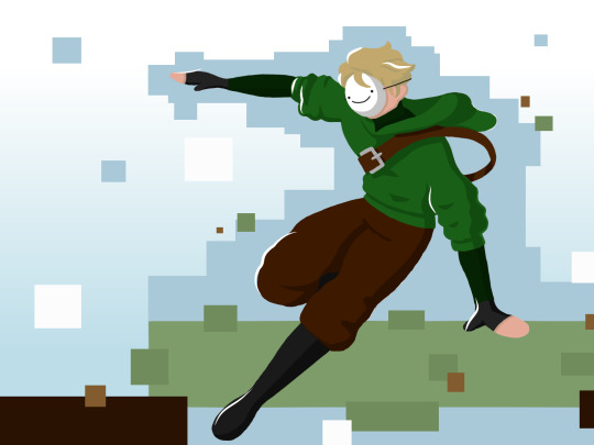
parkour
#first time doing digital in like over 5 years#i've never done lineless before#it's not too bad i guess#i should probably make the canvas size bigger or maybe fiddle with some exports settings#either way i was bored and did something#mcyt#dream#dreamwastaken#fanart#genny's art
47 notes
·
View notes
Photo


brigig
#my art#digital art#artists on tumblr#ocs#bridgette#ok ive never posted about her here before but here she is#btw SOORYRRY i am working on attacks and revenges rn i just got the urge in the middle of the night to do lineless and did it#was blasting my middle school soundcloud pl while drawing this which is never never ever a good idea#but anyway. i will be finishing my attacks now
1 note
·
View note
Note
Question about the Unknown Fazbear entities. Are they constructs made by Fazco, or did they just suddenly appear? Where did they come from?
Also, can I make a little friend for your Sun and Moon variant?
hi hi !!! im so so so sorry for taking so ridiculously long to respond to this but ah! this is something im hoping to get more into throughout the videos :) this is going to be long so i'll answer ur second question here: if ur still interested yes!!!! oh my god that would be so cool!!! what!!!
and for ur first question:
(actual answer + VD below the cut !)
they are a bit of both! Fazbear Entertainment being Fazbear Entertainment (and especially with the new AR mask stuff from the ruin dlc) was experimenting with a brand new virtual companion kind of thing ever since the pizzaplex burned down! its similar to the AR app (that.. isnt very canon as far as im aware but doesnt seem too far of a stretch from what they would do) & scp-1471 - with the fun twist being that its not an app. it's almost like a reality-warping virus, ig??
so to answer your question: yes, they were made by fazco! but (and i tried to hint at this in the third video but im honestly not sure how well they came across) despite limiting the first batch of these "virtual companions" to the beta testers that signed up for the program, a couple of strays ended up on the front porch of other people's brains (including "you"/the pov you play as throughout the videos)
the current idea im working with is that the entities are linked to the original (decommissioned) animatronics, but duplicated - think the way that freddy comments on there being other freddies in other pizzaplex locations. im really liking the idea of subtle variations between entities: same original source, same memories, but slightly different reactions, personalities and effects on their host!! i imagine especially so for entities based on aggressive animatronics like monty. some of them are a tad confused on why theyre there.
thank you for sending this ask!!! again im SO so sorry for taking so long to respond!!! at least part of it was waiting for myself to finish the third video and the other part of it was just me never getting around to it i fear :( i hope u have such a wonderful day !!!
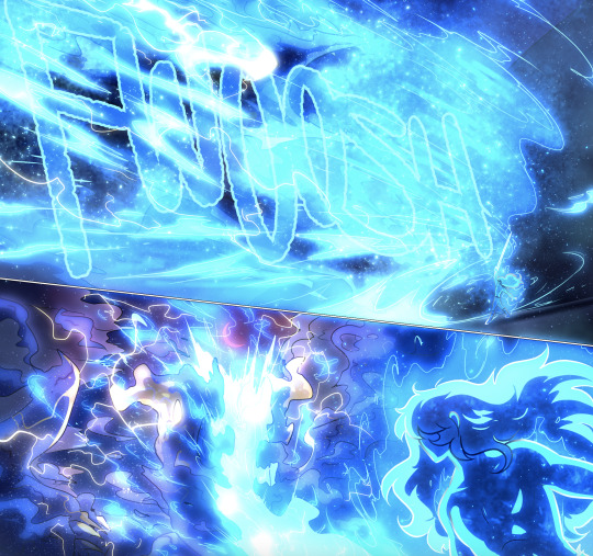
[VD: a video of entity sun speaking to the viewer through captions. entity sun is drawn in a simplistic lineless style. their face is half shadowed and they are missing a ray; they are cropped below their neck ruffles, which are larger than their canon ruffles and have a second pair of sheer ruffles underneath. sun stares at the viewer before saying, “where i came from?”. they tilt their head to the right. “a lot of thoughts you’re having there, friend.” “i don’t know if you need to worry about all of them.” Silence. “do you?” Silence. “Do you think you need to worry?” Longer silence. “Are you worrying about anything, starlight?”. This last dialogue lasts longer than the others. In the last few seconds of the video, moon faintly appears behind sun, looking distraught. The video cuts to black. / end VD.]
79 notes
·
View notes
Text
Okay, I don't know what's going on with Tumblr and everything has been absolute chaos with my life the past few months, so y'know what, screw it. I think I'm actually brave enough to share some of my art. At least it won't just be sitting on my tablet that way.
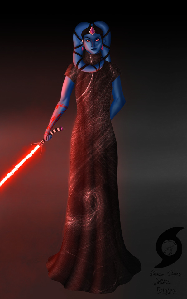
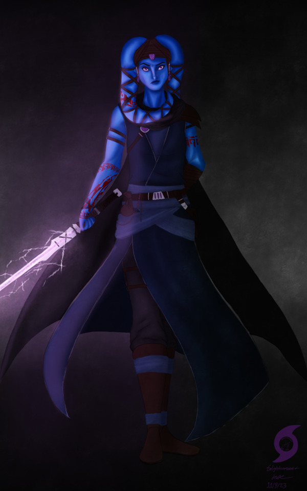
This is my Sith Inquisitor turned Force-sensitive Outcast from SWTOR, Roodaka Greatstorm-Kallig. I haven't really plotted everything out with her regarding her story, but she's not my Outlander. She leaves the Empire right after Ziost, after losing all of the family she'd used her Dark Council connections to find and save from slavery, and Lana recruits her to help Sana-Rae run the Enclave about two years before the Outlander (my Knight Aja Verdona) is rescued. She's prickly and petty and spiteful but I love her dearly. And because I've never posted art before, art process and a little bit of character lore ramble under the cut, I guess?
I usually work with lined art/sketches that are admittedly very messy, but when I did the first one back in May I was experimenting with actually rendering/painting, and I saw a fashion post thing that looked like something Roo would wear, so I was mostly just playing around, it's not a solid outfit design for her. It's janky and wonky and oh Lord please don't look closely at the anatomy or face it is not up to my usual standards, but I was so proud of myself for the lighting on this one, as well as how I managed to render the muscle. Like, the lighting! I have no idea what I'm doing but I think it looks so flipping good! And I was happy with how the crackly lightsaber blade turned out—it is supposed to be Aloysius Kallig's lightsaber, meaning it's at least over a thousand years old, right? It should be a little janky with age!
The second one is supposed to be post Fallen Empire, after she's left the Sith and become sort of a wandering Force-user—think Ahsoka as of, well... Ahsoka, but more on the side of Ventress if she'd survived TCW (don't get me started on that choice 🙄🙄🙄). I came into it knowing a little more of what I was doing, but I kinda got in over my head and gave up on the 100% lineless thing, you can definitely tell with the sword/clothes. 🥴 The second piece has been sitting unfinished in my WIP folder for months, so I just said screw it, finished up some details and called it because I am SO PROUD of her face and hands (I DREW A GOOD HAND WITHOUT LINEART WHO AM I?!?!) and how I rendered her skin, I don't want it to live in WIP purgatory forever. You can actually tell that's muscle! And a neck!
I'm proud of how her tattoos turned out, too. I played around with Cham Syndulla's tattoo pattern, turning it at different angles. It felt like a good way to root her in Twi'lek culture despite the Kallig bloodline having been separated from it for so long. She gets the first one to cover up a slave tattoo, and the rest after Ziost to further reclaim her identity and culture, leaving the Sith behind.
I have no idea how to close this post. Um... thanks for reading all this, if you have? I've never posted art before, I'm kinda terrified. 🤣🤣🤣🤣🤣
#K8's Art#(never thought i'd have the guts to make that tag!)#K8 Rambles about SWTOR#swtor#swtor sith inquisitor#swtor fanart#star wars the old republic#SWTOR OC: Roodaka Greatstorm-Kallig#i am utterly terrified of posting this but if i don't do it i dunno if i ever will#so here we go! deep breaths kate 🤣🤣🤣#edit: i'm gonna pin this at the top rather than that meet the artist because if i look at that self portrait anymore i'm gonna combust 🤣
51 notes
·
View notes
Note
So far, has there been any sort of art technique or process you've tried that made you go "that was surprisingly easier/harder than I expected"?
Oh man, yea. So many things. Doing this comic has been a learning experience and a half because of all the textures and effects I have to do, most of which I figure out on the fly because I've either never done them before or I've never done them that many times before.
The first "surprisingly easy" effect I'd never succeeded at before was the scales on the Storm Drake in the interlude after chapter 6:
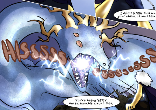
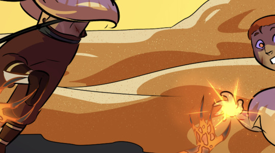
It's a Droplet particle brush used on two layers, one set to Multiply and the other to Screen. It produces a very easy texturing effect that works on everything from scales to sand to rock, making the surface look like it's catching the light in complicated ways. I used it again in Dainix's desert flashback in chapter 19 to make the sand look like it was catching the light.
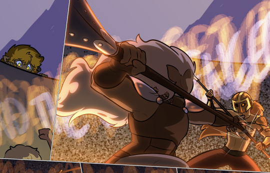
I actually used a similar method to draw the background in the arena fight in chapter 12 - using a rounder particle brush, but the same combo of Multiply and Screen to produce a chaotic pattern that gave the illusion of a massive background crowd without making me hand-draw ten thousand tiny people.
This one was an effect that didn't surprise me and that I sadly had very little cause to replicate, but I LOVED the multicolored highlighting effect in Erin's chapter 6 flashback in the heart of the Storm. It ended up being very simple to do and it just looked SO pretty.
Changing the highlighting colors to just the cool-tones for this page just made me like it more.

When we hit Falst's intro arc and I had to draw about a million forested backgrounds, I decided to refine the process I'd used in the first few chapters, because I wasn't happy with those results:
Starting in chapter 8 I tried a lineless style for forested backgrounds, and it worked out better than I'd hoped. Not only did it produce a feeling of depth and shadow, I didn't even need to plug in my drawing tablet to do it - I could literally do these backgrounds with my trackpad and mouse, which was a huge timesave. Combined with a little experimental sunbeam stuff and these forest backgrounds ended up both shockingly simple to make and VERY nice to look at.


I used a similar technique for the soulcrystal in The Collector's lair - stacked Multiply and Add layers with nested rough shading patterns similar to the ones I used for foliage, but with more overlap to produce the effect of chaotically scattering light.

This was another no-drawing-tablet one, and I liked this texture so much that I willingly redrew it for the stinger in chapter 18 rather than copying the texture from the earlier chapter.
In terms of effects that took longer than I anticipated, Dainix's fully-realized Crucible form has been giving me trouble for literally as long as I've conceived of the comic. Drawing fire is already hard enough, but giving that fire a semi-solid, tangible form that was clearly readable as a humanoid figure was a HUGE pain in the ass. The head and arms were easy to design, but what to do with the bottom half was always a struggle, and beyond that I wasn't always sure how opaque to make him - real fire is a semi-translucent light source in constant motion with no clearly delineated edges, and if you draw it in a way that deviates from that too much it can make it feel less like fire. It took a while before I was happy with the color balance on him to make him suitably glowy without losing the internal detailing that made his expression readable.

Similarly time-consuming, working out how to do Vash's "nova mode" took some trial and error. I wanted to make it clearly visually distinct from Paladin light magic and regular fire magic, so I focused on trying to replicate the texture of the surface of a star, with sunspots and flares rather than licks of fire or sharp-edged lightsaber vibes. I'm happy with how it ended up, but if I recall correctly it took upwards of two days just getting all those glowy effects sorted out.
Then drawing the actual starfire blast was an even bigger pain, because again I didn't want it so glowy that it was completely unreadable. To be honest I'm still not sure if it worked.
This is a very recent one, but it took me a while to figure out an effect I was happy for to communicate "this place is really, really dark." I didn't settle on a blanket dusty purple desaturation layer until quite late, to sort of replicate what night vision supposedly looks like for animals that can see decently well in the dark. Lights and darks are preserved, but color isn't so much, and this way I wasn't way-overshadowing everything and making it impossible for US to see. And conveniently the actual effect is quite simple to do - it's just a universally gray layer at 50% opacity set to the "Saturation" combine mode, stacked with a universally dusty purple layer at 70% set to the "Color" combine mode. Very easy to add quickly and copy/paste across different pages.
There's probably more, but yea. Almost all of the "that was surprisingly difficult" effects either get easier with time or I figure out ways to simplify them and make them work in fewer layers. This is the really fun thing about a longform project like this - I keep finding new ways to challenge myself I'd never even thought of before.
225 notes
·
View notes
Text
VERY funny how I'm getting to the end of this queue right as stuff is starting back up again (Read More!!)


Sadly (at least to me), this is all that I had managed to do in the time frame of one school year. College is a new beast in terms of managing motivation, but I still really liked the stuff I did!!
Once again, my habit of going back to 23 to Feel. I'm real proud of the acting I was able to convey. Quad is such a tragic guy :')
The Shadow Fandub came out right before I left for school, and was pleasantly surprised that Ryan ended up doing a similar arc to Quad's. This was also inspired by Quad's moment of Catharsis in an ncct (3 i think?) against Dr Order because he deserved it <3
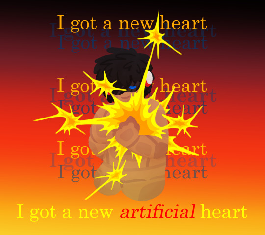
Lyric pieces are fun, this one is Artificial Heart by Jonathan Coulton. I wanted to have fun with a lineless style, and I think it came out really good!! ohhh J0hn4th4n you have been Ship of Theseus'd
Jack for a club contest piece, I wonder what his life on the tundra was like...
And a bunch of other doodles I managed to get out sporadically through the year
Quad and Blora are attached at the hip to me, if you can't tell. That's not really it but they Go Together so much in my mind it just Makes Sense
Wow look at that wonderful family I hope they aren't narratively doomed to never be together :) But on another note, I loved how all of them turned out. Getting to differentiate between slightly different versions of someone really makes you savor the details.
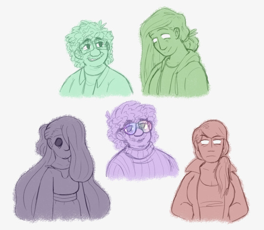
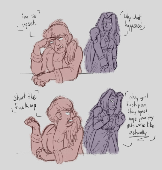
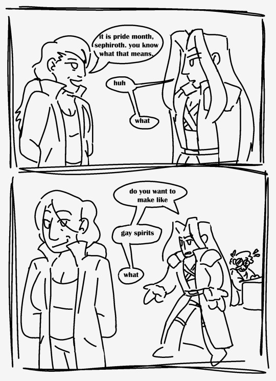
Some silly Order and Sephiroth doodles, I had realized just how Goofy those two were. Mad scientist/doctor tampering with life and the universe itself. And Sephiroth from Sephiroth is here and has probably been her closest working partner for years.
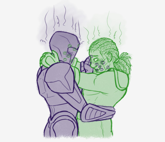
And sappy gay people because I Live for that shit :] Man drawing HamHel is hell but it was worth it
#cpu kerfuffle#cpuk#and thats the end of the queue!!!#stay tuned for Majestic Kerfuffle stuff in the coming days >:)
25 notes
·
View notes
Note
yoooo do you have any tips for loosening up figures in art :O my people in my drawings are WAY too stiff (prolly bc I learned to draw by drawing poses from historical portraits lol)
i'll warn you that i am not the best with words, but i'll do my best to kind of explain how i go about things!!
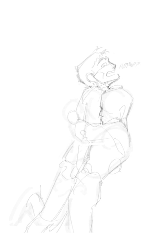
okay so, to keep things loose, when im sketching i really try to focus on only the general shapes and lines of motion. in the drawing of merlin and arthur i just did my very first sketch looked like the one on the left, before being refined to the one on the right!! i do. probably too much refining of my sketches. but i figure i should still show how i got there haha


honestly for a lot of my first sketches i zoom in a ton and draw them reeeally tiny because it gives me less pixels to work with and therefore i actually cannot do any detail or it would all be lost haha. then i just scale them up to do some more refined sketching on top.
one of the most important things for me is to use quick, long strokes because then your lines form a more natural curve!! if you're using short, slow strokes it can impede the flow and make things look stiff. this is super important to maintaining that energy in linework too (and the edges of colors, if youre working lineless) ill give this sketch i never finished as an example


long strokes help to keep the flow of the initial sketch without getting lost in the details (which you can see me getting a little lost and repeatedly drawing over pacifica’s skirt, it lacks the energy of the rest of the sketch lmao)
an unfortunate reality of course is that just drawing things a gazillion times will help you loosen up your sketching a lot because you'll form your own sort of shorthand for things in your sketches. its tedious as hell but it sure does work lmao
anyways none of this is like. the end all be all of art or anything, its just what works for me!!
#example of that last one is i didnt know ho w to draw horses until i had to draw 80 of them in a day for a class i was in#and now i know how to draw horses forever and they are in fact my favorite animal to draw. entered my horse era#ask#anon#how i draw
69 notes
·
View notes
Text
Love is Blind [HSBB]
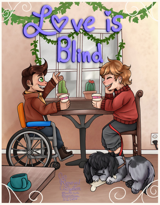
You know that moment when you've known someone for so long that it feels like you've own them forever? That how this fic reads :D It's so light, and fluffy. In this AU Grian is blind and has a massive crush on Scar, whom he shares an apartment building with. How does the rest unfold? You'll have to read the fic and find out yourself!
[Link here!]
Maggiee did such a wonderful job, and was our biggest supporter during this! So let's go show them some love! Another huge shout out to the mods and specifically Dux for putting this event together! Check out the #hsbb 2023 tag for more works and fics like this!
Extras under cut - Wips, rambles, the whole nine yards
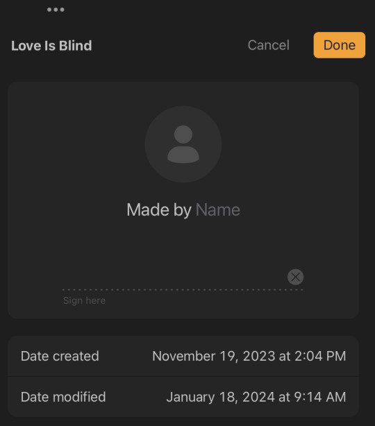
Over the course of 2 months, this piece took us nearly 16 and a half HOURS. Up until switching to Procreate I never had an art program that timed how long I worked on something. If CSP has this feature I must've not been able to find it.
The amount of time is pretty stunning to me. I'd say 16 hours isn't that bad! At least by my own standards.
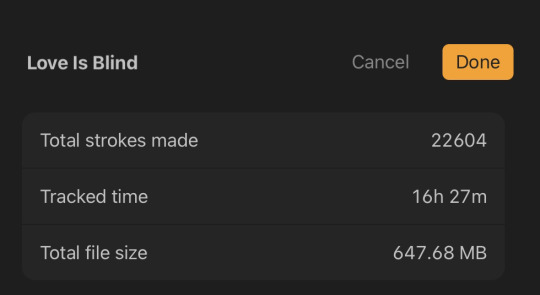
Absolutely shocked by the amount of strokes btw. That's fucking insane.
So for once I actually went at this with a few thumbnail sketches and this was the winner out of the 3 and I blew it up to size and started the finalized sketch.

The funniest thing is I started this right before my art style decided to change so I hope you enjoy the old art style :P <3
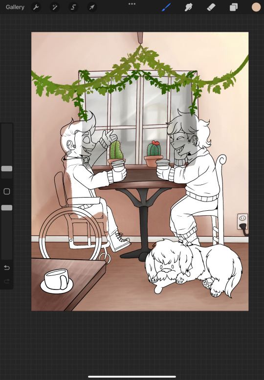
So, I did something interesting here. In the past when we would do full pieces we would do a lineless background, so everything besides the characters were painted lineless.
THIS time we decided to line the background with maroon instead of black to help break up the characters from the background so they pop! more and I really like how it turned out and we're happy to say this has carried over into other pieces. :]

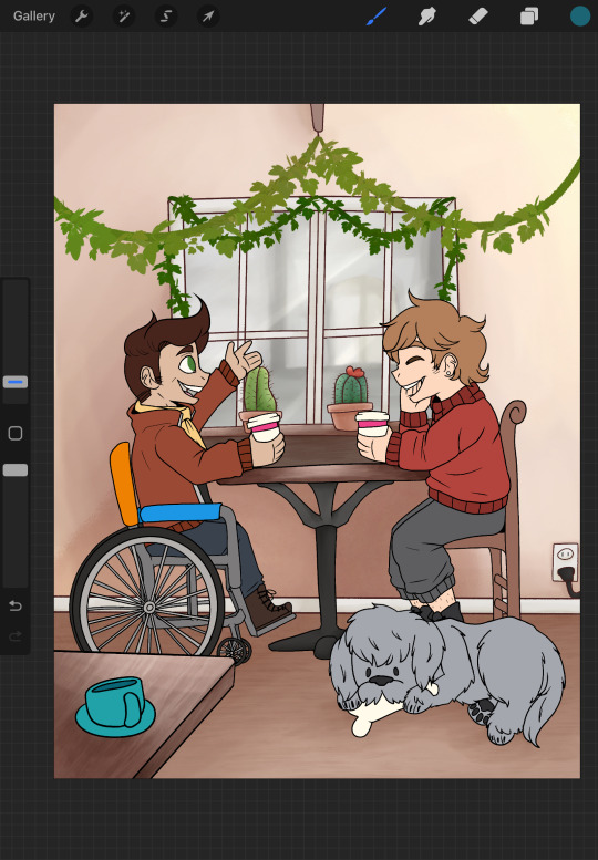
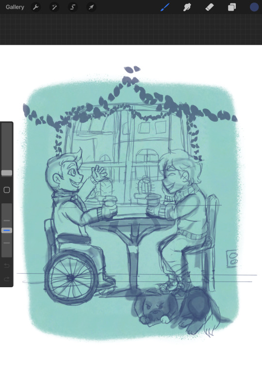
I want you to pay attention to Scar's wheelchair in these shots, it's the only thing that changes. I remember doing the shading on the background and main color on the characters all in one night because I was having a bad bout of insomnia and I posted my progress in the artist wip-sharing channel on our event server and looked back at it the next morning and was SO embarrassed I had to fix it. This is also when I changed references.
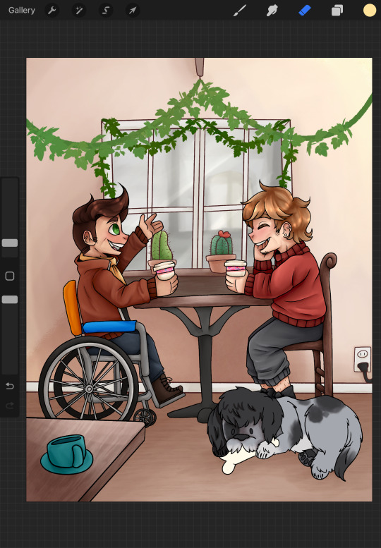
For some reason I didn't capture any in progress shots of the shading but we did manage to get a few shots of Grumbot. :] He's modeled after a labadoodle! While working on this the team and I discovered that's what they were originally bred for, to be hypoallergenic guide dogs! Isn't that cool!?
[With the source we found here]
My partner and I own a poodle and he was kind enough to be my reference/model. He was well compensated with treats don't worry.

Anyways, thank you for reading our rambles! Whether you're here from a reblog, from the fic itself, or were already following us. I hope you enjoyed! Be sure to keep your eyes peeled for the rest of our pieces for the event.
From the Reserved System,
Happy HSBB everyone!! <3 <3 <3
#hermitshipping big bang#hsbb 2023#HSBB#hermitshipping#grian fanart#Scar fanart#gtws fanart#goodtimewithscar fanart#grumbot fanart#<- TECHNICALLY#He's the pupper#hermitcraft fanart#Love is Blind AU
15 notes
·
View notes
Note
Hey mootagen :)
So, I'm in the process of making a mini comic for a scene from my AU and I wanted to make it fully rendered and colored.
I was wondering, what do you do to color your comic? More specifically, is there a step by step process that you do? Or do you have any tips or anything?
I'm mainly concerned about getting the background right. You do backgrounds really well, in my opinion, so I thought that maybe you would have some advice for doing backgrounds.
i think this is all advice more for longer comics but oh well
alpha lock/layer masks, lasso brush and fill bucket tool all save me a bunch of time colouring
just do what you can first, not every panel needs to be perfectly drawn and pretty and rendered, you can save better drawings for most important/impactful panels
for BACKGROUNDS though i really iust try to make it understandable before anything else. not every panel needs a background too, a flat colour is fine and sometimes better
you can always look at other comics you like and see what they do :)))
this is all stuff ive learnt and am still learning and am trying to do better at myself. im still making mistakes- backgrounds and rendering are the biggest things i need to cut down on to make pages more time manageable
like the last page i did? page 24? that one has only one or two panels fully "rendered" and the rest were only single colours or rushed shades of purple and yellow and very very simplified? compared that to page one. thats a lot easier and faster to do
another thing!! lineless blocking out shapes with colour before lineart helps me a lot when im struggling with shaping something
i use lineless a lot for backgrounds, its faster and easier, i am not aiming to have my perspective line up as long as its understandable (take some shots inside the treehouse of adventure time for example, theyre super detailed but still time manageable because theyre never asked to be perspective accurate)
ye!!!!
17 notes
·
View notes
Last Seen Blogs

420blondehippie
Kitty Cat


suckit-aynrand
Suck it, Ayn Rand
thefrostedfeather52
catthew lloyd and meowritz stiefel stan account
muse-unknown
a cosmic illusion