#arkitekt magazine
Text
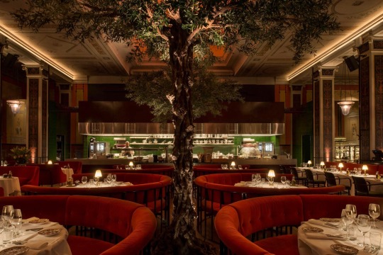

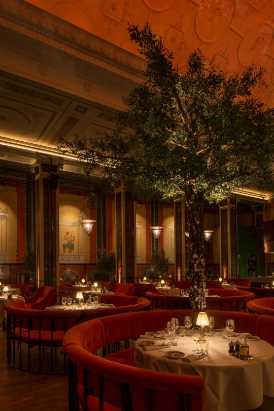

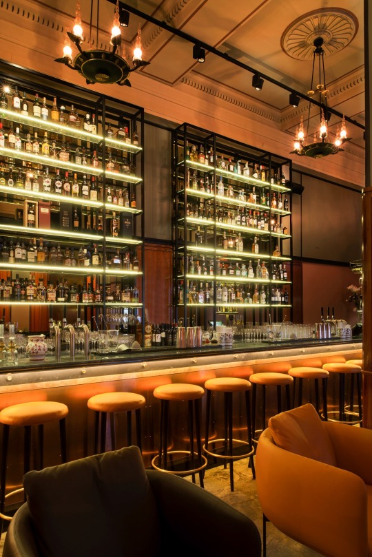

🇸🇪 Stockholm cinema enjoys second life as decadent Italian restaurant L’Avventura 🇮🇹 • Photography: Andy Liffner
Millimeter Arkitekter has transformed a defunct cinema in Stockholm into gourmet Italian dining spot, L’Avventura.
The Metropol-Palais cinema was designed in 1927 by Swedish architect Björn Hedvall in the heart of the Vasastan neighbourhood. Millimeter Arkitekter has taken cues from the original design to create the sumptuous new eatery while giving the space a Mediterranean twist.
‘We tried to create a new interior with its own design language that could stand for itself, and at the same time speak well with the existing interior,’ Millimeter’s interior architect Tina Marin told Dezeen, an influential architecture, interiors and design magazine.
As part of the building’s adaptive reuse, the studio has retained the cinema’s towering 20-metre-high ceiling and classical frescoes by artist Nils Asplund. These wall-paintings provide inspiration for the furnishings, which continue the red colour scheme and set the tone for the restaurant’s opulent atmosphere.
Red velvet banquettes curve around classic round dining tables, decked in white linen tablecloths, while tall glass shelving provides a contemporary element behind the bar, contrasting the dark green bar top and bar stools.
L’Avventura is helmed by restaurateur Karl Ljung who says: ‘I married into an Italian family, and have drawn a lot of inspiration with regard to food and atmosphere from our many trips through the country.’
Channeling the Italian vibe are a pair of mature, imported olive trees that have been planted in the centre of the dining room space to make the most of its soaring volume. Smaller saplings also dot L’Avventura’s two bars.
Ljung’s team serve modern Italian dishes, so expect the likes of saffron risotto with mussels, Italian-style tuna tartare, and fresh pasta with truffle oil and shaved Parmigiano.
12 notes
·
View notes
Text
‘the lantern’ maritime center by WERK arkitekter & snøhetta lights up the danish west coast
‘the lantern’ maritime center by WERK arkitekter & snøhetta lights up the danish west coast
esbjerg’s maritime center opens its doors to the public. The post appeared first on designboom | architecture & design magazine .
Source: ‘the lantern’ maritime center by WERK arkitekter & snøhetta lights up the danish west coast

View On WordPress
0 notes
Photo

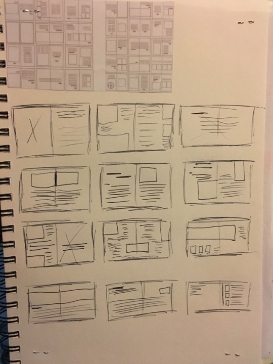
Scamps for my ‘ARKITEKT’ magazine
#bcu#l42017#graphic design#graphic communication#viscom#visual communication#second module#arkitekt#magazine#arkitekt magazine#scamps
2 notes
·
View notes
Text
RESEARCHING INTO THE MAGAZINES I COULD POTENTIALLY CHOOSE:


For part of this module, we have to create a front cover including a masthead, a contents page and 2 double-page spreads; on one of the three magazines, Arkitekt, the gentlewoman and Filmmaker.
Before choosing the magazine, I decided to briefly research them to get a general understanding of them.
ARKITEKT - this is a high-end fictional architecture magazine. The target audience seems to be people who have an interest in architecture, students and even professionals. If I were to estimate I think that the target audiences’ age would be around 18 - 40+, this is because due to the minimalistic layout/colour palette and sleek design the magazine seems to appeal to a wide demographic.
I think the main purpose of the magazine is to show appreciation for architecture and to showcase architecture from all across the globe. I think that this could be a very interesting magazine to look at.
THE GENTLEWOMAN - the gentlewoman showcases a new and bright perspective on fashion, that illustrates the way in which women actually look and dress. By having a quick glance at the magazine, I think that this magazine would most likely be targeted at women around the ages of 20-40. The stylistic appearance of some of the issues within the magazine creates quite a nostalgic feel which leads me to think that this magazine also targets an older generation as well. The main purpose of the magazine seems to be highlighting influential designers, new designers and also creating wholesome content that depicts women in realistic imagery.
FILMMAKER - quarterly publication magazine covering issues relating to independent film. The magazine was founded in 1992. The main purpose of the magazine is to highlight independent films emerging talent, which usually contains directors, producers, actors and animators. When researching into the magazine, the main things that are included within the magazines are interviews, case studies, financing and distribution information etc. I think that this magazine would be targeted at people who enjoy films, especially independent films. Not just that but the magazine seems to appeal to a wide demographic.
#graphic design#student#typography#uni#typeface#design#filmmaking#movies#the gentlewoman#filmmagazine#filmmaker#ARKITEKT#architecture#building#studyblr#art study#art#magazine#one piece zine#editorial#fashion#film
11 notes
·
View notes
Photo


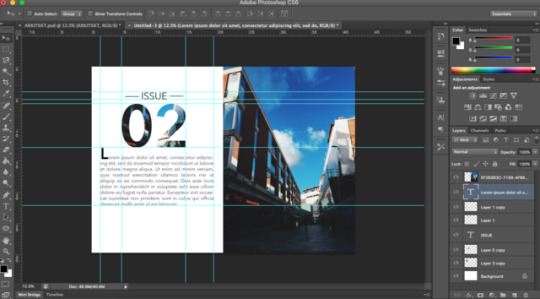
Final outcome for my week’s brief for Arkitekt Magazine
Front cover, two double page spreads with images and text colums with sample (filler/placeholder) text and an additional back cover
#module2#arkitekt#magazine#final#editorial#layout#adobe#indesign#photoshop#lightroom#nikon#photography#deadline#brief#solutions
6 notes
·
View notes
Photo

Process of Editorial Magazine Task
#editorial#magazine#photography#architecture#arkitekt#layout#grid#composition#typography#graphic design#graphics
6 notes
·
View notes
Photo

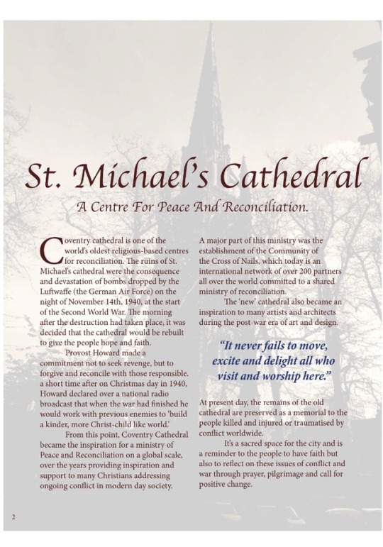
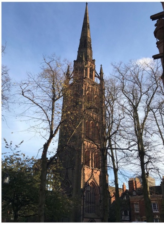

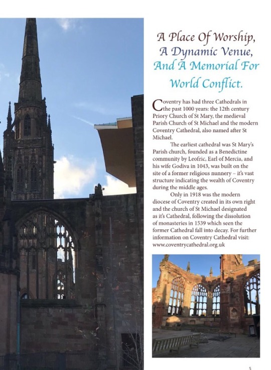
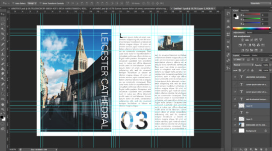
Day Brief: Create 2 double page spreads and a front cover for a magazine called Arkitekt. Above is my editorial design for the brief created in Adobe Indesign, basing my magazine on the architecture and history surrounding Coventry Cathedral. All my own photography and any information and facts in the text were taken from the Coventry Cathedral website at www.coventrycathedral.org.uk
2 notes
·
View notes
Photo
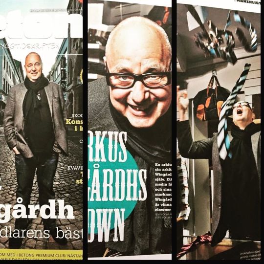
För några år sedan fotograferade jag @gertwingardh för @tidskriften_betong på uppdrag av chefredaktör @rogerbetong Tack så kul uppdrag! Gert sa ”du får tio minuter”, det var den tid han hade. Jag riggade studioljus i en butik medan Roger intervjuade. Gert Wingårdh är en glad och charmig människa som bjöd på sig själv. Lycka när han började kasta slipsar i luften. 📸 #arkitekt #betong #concrete #magazin #magazincover #photographer #professionalphoto #portrait #porträtt #yrkesfotograf #fotograf #göteborg #bestofgothenburg #gothenburg #architect https://www.instagram.com/p/B8MYw1qJ0CR/?igshid=1skl1nzdeerly
#arkitekt#betong#concrete#magazin#magazincover#photographer#professionalphoto#portrait#porträtt#yrkesfotograf#fotograf#göteborg#bestofgothenburg#gothenburg#architect
0 notes

Photo


magazine made for Arkitekt, university project
0 notes
Photo

Front cover editorial Magazine task
1 note
·
View note
Text
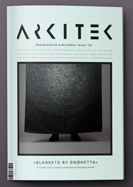
ARKITEKT Magazine
The Brief
1 - Design a front cover and two double page spreads for a new magazine called Arkitekt
2 - The target audience is both male and female readers with an interest in architecture and architectural design. Arkitekt is a high end-end magazine aimed at students, professionals and amateurs who value an informed awareness of and knowledge of international contemporary design.
3 - The format of the magazine is up to me. The double page spreads should include in the region of 1,000 words, selected by myself. The opening spread must include images, introductory copy, and a title detail. The second spread should house the remaining copy and images. I must originate a masthead for Arkitekt magazine and apply this to the front cover together with imagery and supporting text. The design system you adopt must demonstrate scope so that the design solution can function well for future issues.

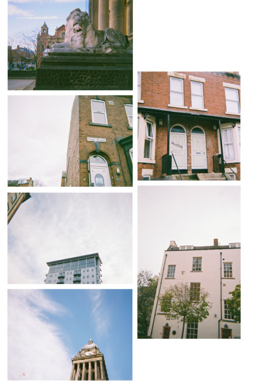
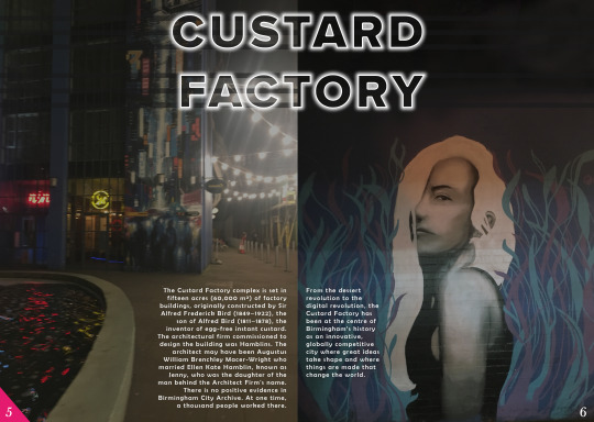
Photo used is a photo I took in the Custard Factory.
Title, sub-title and Issue No. is Proxima Nova with no fill and stroke and outer glow applied.
Century Gothic was used for the slogan/catchline
You will notice through all the photos that there is a theme going on and I even tried to utilise that in second front cover design to show that this could be made for future issues.
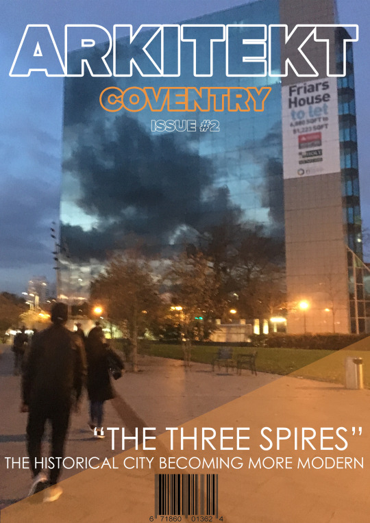
Just like the last front cover, the typeface are the same. However the changes are the name and colour of the edition, the colour of the triangle fade, the slogan, the barcode and last of all the building in coventry.
This was just to show there could be progression so this is not linked to my double page spreads
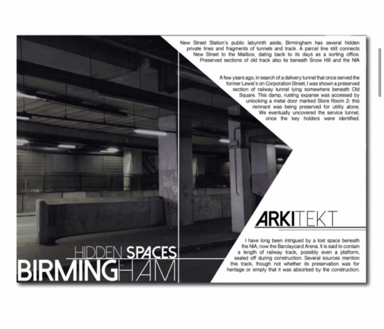
The double paged spreads are linked to the Birmingham edition as you will be able to tell.
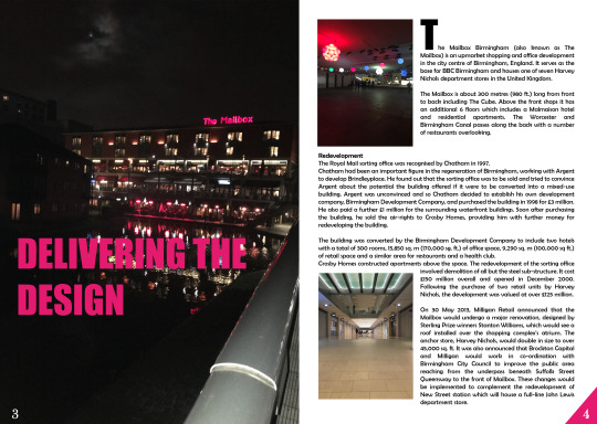
As you can see from what I have said; they have a certain theme about them. I noticed in all the birmingham photos I took and actually liked, there was a use of pink somewhere so I thought I would incorporate that into my design. it’s strong and bold and really works with most sans-serif typefaces. The left image is from the canal side of The Mailbox, I wanted the slogan to in a sense be a pun linking to the mailbox. The typeface for this and the ‘T’ on page 4 are ‘Impact’.
I used ‘Berlin Sans FB’ for the body text and ‘Baskerville old face’ for the number pages. The top right image is taken on the way to The Mailbox and the last image is taken inside the The Mailbox on the ground floor.
My last double page spread for my ‘Arkitekt’ magazine
The ‘CUSTARD FACTORY’ is designed to emulate the actual sign board at the Custard Factory. ‘Proxima’ Nova is used again for this title. Body text being ‘Berlin Sans FB’ again and same typeface for the page numbers. The images used are taken from the Custard Factory; the images speak truthfully on what place is like as a whole; a very modern and urban/street environment.
If you have any questions about this module/project, or just anything at all then you’re free to ask me
Just send me a question or a message
#bcu#l42017#graphic design#graphic communication#viscom#visual communication#second module#arkitekt#magazine#arkitekt magazine#coventry#birmingham#The Mailbox#custard factory#photography#photoshop#Typography
1 note
·
View note
Photo
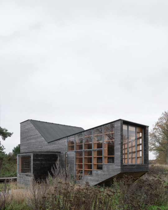
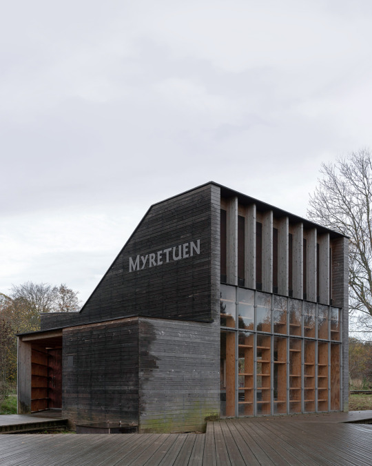


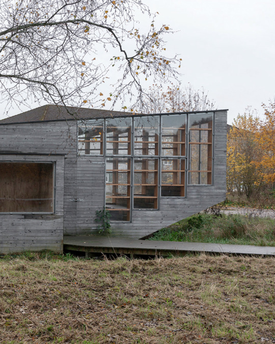

“ByNaturrummet Myretuen” | Architects Leth & Gori, Elkiær + Ebbeskov Arkitekter, Photography by Kim Høltermand | aⓂ
Aesthesia Magazine™ on Instagram
#architecturedesign#photography#industrial#design#architecture#architectural#interiordecor#interior#arquitetura#インテリア#interieur#interieurinspiratie#interiores#인테리어#art#artwork#architettura#建築#건축학과#architect#photographie#architektur#arte#kunst#fotografie#fotografia#architecturephotography#arkitekter#arkitekt#architecturelovers
6 notes
·
View notes
Photo


1-on-1 Tutorial with Tony with Regards to InDesign Dilemmas
Pictures of Adobe InDesign on iMac are sourced from my iPhone from the meeting with Tony.
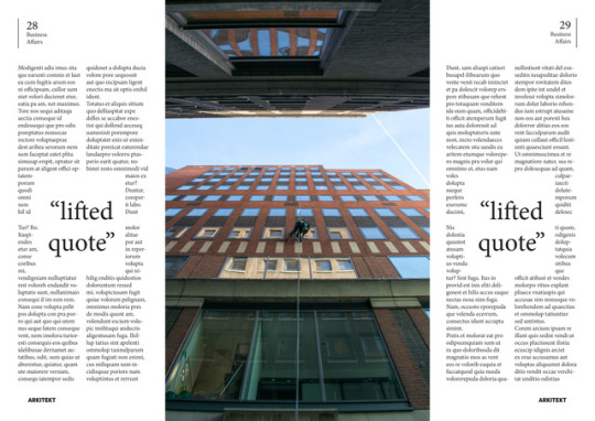
I arrived to my time slot early, eager to creatively solve my problem with the text alignment on my ‘Editorial Essay’ double page spread. It was quickly that Tony showed me how to create random rectangle boxes and hide them, wrapping the box to have filler text try and follow the path I wanted it to. By manipulating my double spread in this way I was able to get a clean cut way of making the text follow a certain direction and credit goes to Mr. Davis for helping me come to such a solution. Without his help, I would still be lost. I then learned the methods he taught me and applied it to my own work and executed my plan pretty much perfectly. I must say it looks much better than compared to the three columned, boring look the double spread had previously. Fellow peers also liked how the directional flow of both the text and image complimented each other and its consistency in following these lines.
Due to me not wanting to waste this opportunity to receive crucial feedback from a member of staff highly looked up to within the School of Visual Communications, I asked Tony to review my works. He commented on my front page being “very nicely done”, that he loved “how you see all these text columns compliment the image, replicating the windows and square shapes, the grid lines” with my Business Affairs double spread page. Due to him not being able to see how my actual Editorial Essays double page spread actually came out, I could not ask him for a review of something which I had yet to finish but he did like the concept of what it was that I was trying to do as well as my photography. I was very pleased with this image as well as receiving similar feedback from my peers, including one student having said, “Your front cover actually looks real”.
#module2#adobe#indesign#tutorial#creative#solutions#help#arkitekt#magazine#layout#editorial#text#alignment#line#tony#nikon#photography#double#page#spread
5 notes
·
View notes
Text
MOODBOARDS ON SUCCESSFUL ARCHITECTURE MAGAZINES:


After choosing the Arkitekt magazine, I then decided to create a mood board on mainstream/popular architecture magazines. The reasoning for this is to see if they all fit a similar style and also to see what they look like so that I can see how I could go about separating it from mainstream magazines and make it stand out from an overcrowded market.
For the images, I decided to gather a range of front covers and double-page spreads and mastheads.
Once I gathered the images, I then created a simple colour palette to see what the most used colours were in these magazines. I think that the colour palette looks quite good and shows me clearly what works well.
After that, I then decided to annotate the mood board, using the notes I took from the anatomy of a magazine & hierarchy of type lecture. I annotated the mastheads, lead article line, white space, magazine deck etc.
Overall, this process was very useful as it helped me to see what the mainstream magazines on architecture look like and how I could separate my design from theirs. It was also useful as it allowed me to further familiarise myself with applying relevant terminology when discussing the anatomy of type.
#graphic design#student#typography#uni#design#typeface#graphics#studyblr#adobecreativecloud#art#moodboard#annotations#architecture#magazine#editorial#student life#studying#uniblr#study inspo#colour
2 notes
·
View notes
Text
Reading through potential Arkitekt magazine article content:
Having a read through the given text, thinking about what time period of building I would like to photograph, and from that, which building/buildings do I want to focus on. I think that the theme of my layout and colour scheme will match the building that I choose to focus on.
#graphics#graphic design#art#aesthetic#university#student#studyblr#illustration#sketchbook#college#architecture#interior#magazine#editorial
2 notes
·
View notes
Last Seen Blogs