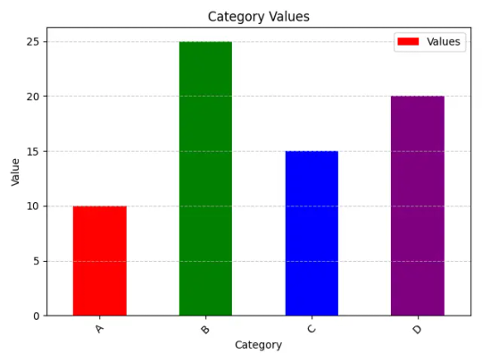
#bar plot python pandas
Explore tagged Tumblr posts
Visit Tumblr Blog
Explore Tumblr blogs with no restrictions, modern design and the best experience.
Last Seen Tumblr Blogs


Fun Fact
Tumblr has 16.74 million mobile monthly users in the US.
Text
Pandas Plot Bar Chart: A Guide to Visualizing Data in Python
Introduction In the world of data analysis and visualization, Pandas, a popular Python library, plays a pivotal role. In this article, we will delve into the fascinating world of Pandas and explore how to create and customize Pandas Plot bar chart using this powerful library. If you’re looking to present your data in an easily understandable and visually appealing way, you’re in the right…
View On WordPress
#bar chart python pandas#bar plot pandas#bar plot python pandas#pandas bar chart#pandas bar plot#plot bar pandas
0 notes
Text
Python Libraries to Learn Before Tackling Data Analysis
To tackle data analysis effectively in Python, it's crucial to become familiar with several libraries that streamline the process of data manipulation, exploration, and visualization. Here's a breakdown of the essential libraries:
1. NumPy
- Purpose: Numerical computing.
- Why Learn It: NumPy provides support for large multi-dimensional arrays and matrices, along with a collection of mathematical functions to operate on these arrays efficiently.
- Key Features:
- Fast array processing.
- Mathematical operations on arrays (e.g., sum, mean, standard deviation).
- Linear algebra operations.
2. Pandas
- Purpose: Data manipulation and analysis.
- Why Learn It: Pandas offers data structures like DataFrames, making it easier to handle and analyze structured data.
- Key Features:
- Reading/writing data from CSV, Excel, SQL databases, and more.
- Handling missing data.
- Powerful group-by operations.
- Data filtering and transformation.
3. Matplotlib
- Purpose: Data visualization.
- Why Learn It: Matplotlib is one of the most widely used plotting libraries in Python, allowing for a wide range of static, animated, and interactive plots.
- Key Features:
- Line plots, bar charts, histograms, scatter plots.
- Customizable charts (labels, colors, legends).
- Integration with Pandas for quick plotting.
4. Seaborn
- Purpose: Statistical data visualization.
- Why Learn It: Built on top of Matplotlib, Seaborn simplifies the creation of attractive and informative statistical graphics.
- Key Features:
- High-level interface for drawing attractive statistical graphics.
- Easier to use for complex visualizations like heatmaps, pair plots, etc.
- Visualizations based on categorical data.
5. SciPy
- Purpose: Scientific and technical computing.
- Why Learn It: SciPy builds on NumPy and provides additional functionality for complex mathematical operations and scientific computing.
- Key Features:
- Optimized algorithms for numerical integration, optimization, and more.
- Statistics, signal processing, and linear algebra modules.
6. Scikit-learn
- Purpose: Machine learning and statistical modeling.
- Why Learn It: Scikit-learn provides simple and efficient tools for data mining, analysis, and machine learning.
- Key Features:
- Classification, regression, and clustering algorithms.
- Dimensionality reduction, model selection, and preprocessing utilities.
7. Statsmodels
- Purpose: Statistical analysis.
- Why Learn It: Statsmodels allows users to explore data, estimate statistical models, and perform tests.
- Key Features:
- Linear regression, logistic regression, time series analysis.
- Statistical tests and models for descriptive statistics.
8. Plotly
- Purpose: Interactive data visualization.
- Why Learn It: Plotly allows for the creation of interactive and web-based visualizations, making it ideal for dashboards and presentations.
- Key Features:
- Interactive plots like scatter, line, bar, and 3D plots.
- Easy integration with web frameworks.
- Dashboards and web applications with Dash.
9. TensorFlow/PyTorch (Optional)
- Purpose: Machine learning and deep learning.
- Why Learn It: If your data analysis involves machine learning, these libraries will help in building, training, and deploying deep learning models.
- Key Features:
- Tensor processing and automatic differentiation.
- Building neural networks.
10. Dask (Optional)
- Purpose: Parallel computing for data analysis.
- Why Learn It: Dask enables scalable data manipulation by parallelizing Pandas operations, making it ideal for big datasets.
- Key Features:
- Works with NumPy, Pandas, and Scikit-learn.
- Handles large data and parallel computations easily.
Focusing on NumPy, Pandas, Matplotlib, and Seaborn will set a strong foundation for basic data analysis.
9 notes
·
View notes
Text
Python for Data Science: Libraries You Must Know
Python has become the go-to programming language for data science professionals due to its readability, extensive community support, and a rich ecosystem of libraries. Whether you're analyzing data, building machine learning models, or creating stunning visualizations, Python has the right tools to get the job done. If you're looking to start a career in this field, enrolling in the best Python training in Hyderabad can give you a competitive edge and help you master these crucial libraries.
1. NumPy – The Foundation of Numerical Computing
NumPy is the backbone of scientific computing with Python. It offers efficient storage and manipulation of large numerical arrays, which makes it indispensable for high-performance data analysis. NumPy arrays are faster and more compact than traditional Python lists and serve as the foundation for other data science libraries.
2. Pandas – Data Wrangling Made Simple
Pandas is essential for handling structured data. Data structures such as Series and DataFrame make it easy to clean, transform, and explore data. With Pandas, tasks like filtering rows, merging datasets, and grouping values become effortless, saving time and effort in data preprocessing.
3. Matplotlib and Seaborn – Data Visualization Powerhouses
Matplotlib is the standard library for creating basic to advanced data visualizations. From bar graphs to histograms and line charts, Matplotlib covers it all. For more visually appealing and statistically rich plots, Seaborn is an excellent choice. It simplifies the process of creating complex plots and provides a more aesthetically pleasing design.
4. Scikit-learn – Machine Learning Made Easy
In Python, Scikit-learn is one of the most widely used libraries for implementing machine learning algorithms. It provides easy-to-use functions for classification, regression, clustering, and model evaluation, making it ideal for both beginners and experts.
5. TensorFlow and PyTorch – Deep Learning Frameworks
For those diving into artificial intelligence and deep learning, TensorFlow and PyTorch are essential. These frameworks allow developers to create, train, and deploy neural networks for applications such as image recognition, speech processing, and natural language understanding.
Begin Your Data Science Journey with Expert Training
Mastering these libraries opens the door to countless opportunities in the data science field. To gain hands-on experience and real-world skills, enroll in SSSIT Computer Education, where our expert trainers provide industry-relevant, practical Python training tailored for aspiring data scientists in Hyderabad.
#best python training in hyderabad#best python training in kukatpally#best python training in KPHB#Kukatpally & KPHB
0 notes
Text
Transform Your Skills in 2025: Master Data Visualization with Tableau & Python (2 Courses in 1!)

When it comes to storytelling with data in 2025, two names continue to dominate the landscape: Tableau and Python. If you’re looking to build powerful dashboards, tell data-driven stories, and break into one of the most in-demand fields today, this is your chance.
But instead of bouncing between platforms and tutorials, what if you could master both tools in a single, streamlined journey?
That’s exactly what the 2025 Data Visualization in Tableau & Python (2 Courses in 1!) offers—an all-in-one course designed to take you from data novice to confident visual storyteller.
Let’s dive into why this course is creating buzz, how it’s structured, and why learning Tableau and Python together is a smart move in today’s data-first world.
Why Data Visualization Is a Must-Have Skill in 2025
We’re drowning in data—from social media metrics and customer feedback to financial reports and operational stats. But raw data means nothing unless you can make sense of it.
That’s where data visualization steps in. It’s not just about charts and graphs—it’s about revealing patterns, trends, and outliers that inform smarter decisions.
Whether you're working in marketing, finance, logistics, healthcare, or even education, communicating data clearly is no longer optional. It’s expected.
And if you can master both Tableau—a drag-and-drop analytics platform—and Python—a powerhouse for automation and advanced analysis—you’re giving yourself a massive career edge.
Meet the 2-in-1 Power Course: Tableau + Python
The 2025 Data Visualization in Tableau & Python (2 Courses in 1!) is exactly what it sounds like: a double-feature course that delivers hands-on training in two of the most important tools in data science today.
Instead of paying for two separate learning paths (which could cost you more time and money), you’ll:
Learn Tableau from scratch and create interactive dashboards
Dive into Python programming for data visualization
Understand how to tell compelling data stories using both tools
Build real-world projects that you can show off to employers or clients
All in one single course.
Who Should Take This Course?
This course is ideal for:
Beginners who want a solid foundation in both Tableau and Python
Data enthusiasts who want to transition into analytics roles
Marketing and business professionals who need to understand KPIs visually
Freelancers and consultants looking to offer data services
Students and job seekers trying to build a strong data portfolio
No prior coding or Tableau experience? No problem. Everything is taught step-by-step with real-world examples.
What You'll Learn: Inside the Course
Let’s break down what you’ll actually get inside this 2-in-1 course:
✅ Tableau Module Highlights:
Tableau installation and dashboard interface
Connecting to various data sources (Excel, CSV, SQL)
Creating bar charts, pie charts, line charts, maps, and more
Advanced dashboard design techniques
Parameters, filters, calculations, and forecasting
Publishing and sharing interactive dashboards
By the end of this section, you’ll be comfortable using Tableau to tell stories that executives understand and act on.
✅ Python Visualization Module Highlights:
Python basics: data types, loops, functions
Data analysis with Pandas and NumPy
Visualization libraries like Matplotlib and Seaborn
Building statistical plots, heatmaps, scatterplots, and histograms
Customizing charts with color, labels, legends, and annotations
Automating visual reports
Even if you’ve never coded before, you’ll walk away confident enough to build beautiful, programmatically-generated visualizations with Python.
The Real-World Value: Why This Course Stands Out
We all know there’s no shortage of online courses today. But what makes this one worth your time?
🌟 1. Two for the Price of One
Most courses focus on either Tableau or Python. This one merges the best of both worlds, giving you more for your time and money.
🌟 2. Hands-On Learning
You won’t just be watching slides or lectures—you’ll be working with real data sets, solving real problems, and building real projects.
🌟 3. Resume-Boosting Portfolio
From the Tableau dashboards to the Python charts, everything you build can be used to show potential employers what you’re capable of.
🌟 4. Taught by Experts
This course is created by instructors who understand both tools deeply and can explain things clearly—no confusing jargon, no filler.
🌟 5. Constantly Updated
As Tableau and Python evolve, so does this course. That means you’re always learning the latest and greatest features, not outdated content.
Why Learn Both Tableau and Python?
Some people ask, “Isn’t one enough?”
Here’s the thing: they serve different purposes, but together, they’re unstoppable.
Tableau is for quick, intuitive dashboarding.
Drag-and-drop interface
Ideal for business users
Great for presentations and client reporting
Python is for flexibility and scale.
You can clean, manipulate, and transform data
Build custom visuals not possible in Tableau
Automate workflows and scale up for big data
By learning both, you cover all your bases. You’re not limited to just visuals—you become a full-spectrum data storyteller.
Data Careers in 2025: What This Course Prepares You For
The demand for data professionals continues to skyrocket. Here’s how this course sets you up for success in various career paths: RoleHow This Course HelpsData AnalystBuild dashboards, analyze trends, present insightsBusiness Intelligence AnalystCombine data from multiple sources, visualize it for execsData Scientist (Junior)Analyze data with Python, visualize with TableauMarketing AnalystUse Tableau for campaign reporting, Python for A/B analysisFreelancer/ConsultantOffer complete data storytelling services to clients
This course can be a launchpad—whether you want to get hired, switch careers, or start your own analytics agency.
Real Projects = Real Confidence
What sets this course apart is the project-based learning approach. You'll create:
Sales dashboards
Market trend analysis charts
Customer segmentation visuals
Time-series forecasts
Custom visual stories using Python
Each project is more than just a tutorial—it mimics real-world scenarios you’ll face on the job.
Flexible, Affordable, and Beginner-Friendly
Best part? You can learn at your own pace. No deadlines, no pressure.
You don’t need to buy expensive software. Tableau Public is free, and Python tools like Jupyter, Pandas, and Matplotlib are open-source.
Plus, with lifetime access, you can revisit any lesson whenever you want—even years down the road.
And all of this is available at a price that’s far less than a bootcamp or university course.
Still Not Sure? Here's What Past Learners Say
“I had zero experience with Tableau or Python. After this course, I built my own dashboard and presented it to my team. They were blown away!” – Rajiv, Product Analyst
“Perfect combo of theory and practice. Python sections were especially helpful for automating reports I used to make manually.” – Sarah, Marketing Manager
“Loved how everything was explained so simply. Highly recommend to anyone trying to upskill in data.” – Alex, Freelancer
Final Thoughts: Your Data Career Starts Now
You don’t need to be a programmer or a math wizard to master data visualization. You just need the right guidance, a solid roadmap, and the willingness to practice.
With the 2025 Data Visualization in Tableau & Python (2 Courses in 1!), you’re getting all of that—and more.
This is your chance to stand out in a crowded job market, speak the language of data confidently, and unlock doors in tech, business, healthcare, finance, and beyond.
Don’t let the data wave pass you by—ride it with the skills that matter in 2025 and beyond.
0 notes
Text
Data Analysis and Visualization Using Programming Techniques

Data analysis and visualization are crucial skills in today’s data-driven world. With programming, we can extract insights, uncover patterns, and present data in a meaningful way. This post explores how developers and analysts can use programming techniques to analyze and visualize data efficiently.
Why Data Analysis and Visualization Matter
Better Decisions: Informed decisions are backed by data and its interpretation.
Communication: Visualizations make complex data more accessible and engaging.
Pattern Recognition: Analysis helps discover trends, anomalies, and correlations.
Performance Tracking: Measure progress and identify areas for improvement.
Popular Programming Languages for Data Analysis
Python: Rich in libraries like Pandas, NumPy, Matplotlib, Seaborn, and Plotly.
R: Designed specifically for statistics and visualization.
JavaScript: Great for interactive, web-based data visualizations using D3.js and Chart.js.
SQL: Essential for querying and manipulating data from databases.
Basic Workflow for Data Analysis
Collect Data: From CSV files, APIs, databases, or web scraping.
Clean Data: Handle missing values, duplicates, and inconsistent formatting.
Explore Data: Use descriptive statistics and visual tools to understand the dataset.
Analyze Data: Apply transformations, groupings, and statistical techniques.
Visualize Results: Create charts, graphs, and dashboards.
Interpret & Share: Draw conclusions and present findings to stakeholders.
Python Example: Data Analysis and Visualization
import pandas as pd import seaborn as sns import matplotlib.pyplot as plt # Load data data = pd.read_csv('data.csv') # Analyze print(data.describe()) # Visualize sns.histplot(data['sales'], bins=10) plt.title('Sales Distribution') plt.xlabel('Sales') plt.ylabel('Frequency') plt.show()
Common Visualization Types
Bar Chart: Comparing categories
Line Chart: Time series analysis
Pie Chart: Proportional distribution
Scatter Plot: Correlation and clustering
Heatmap: Matrix-like data comparisons
Best Practices for Data Visualization
Keep it simple and avoid clutter.
Use colors to enhance, not distract.
Label axes, legends, and titles clearly.
Choose the right chart type for your data.
Ensure your visualizations are responsive and interactive if web-based.
Useful Libraries and Tools
Pandas & NumPy: Data manipulation
Matplotlib & Seaborn: Static visualizations
Plotly & Dash: Interactive dashboards
D3.js: Custom web-based visualizations
Power BI & Tableau: Business-level dashboarding (non-programming)
Real-World Use Cases
Sales Analysis: Visualize revenue trends and top-selling products.
Marketing Campaigns: Analyze click-through rates and conversions.
Healthcare: Monitor patient data, diagnostics, and treatment outcomes.
Finance: Analyze stock performance and predict market trends.
Conclusion
Combining data analysis with programming unlocks powerful insights and allows you to communicate results effectively. Whether you’re a beginner or an experienced developer, mastering data visualization techniques will significantly enhance your ability to solve problems and tell compelling data stories.
0 notes
Text
Essential Skills Every Data Scientist Must Learn in 2025

The world of data science is evolving faster than ever, and staying ahead of the curve in 2025 requires a strategic approach to skill development. As businesses rely more on data-driven decision-making, data scientists must continuously refine their expertise to remain competitive in the field. Whether you're an aspiring data scientist or an experienced professional, mastering the right skills is crucial for long-term success.
1. Mastering Programming Languages
At the core of data science lies programming. Proficiency in languages like Python and R is essential for handling data, building models, and deploying solutions. Python continues to dominate due to its versatility and rich ecosystem of libraries such as Pandas, NumPy, Scikit-learn, and TensorFlow.
Key Programming Skills to Focus On:
Data manipulation and analysis using Pandas and NumPy
Implementing machine learning models with Scikit-learn
Deep learning and AI development with TensorFlow and PyTorch
Statistical computing and data visualization with R
2. Strong Foundation in Statistics and Probability
A deep understanding of statistics and probability is non-negotiable for data scientists. These concepts form the backbone of data analysis, helping professionals derive meaningful insights and create predictive models.
Why It’s Important:
Enables accurate hypothesis testing
Supports decision-making with probability distributions
Strengthens machine learning model evaluation
3. Expertise in Machine Learning and Deep Learning
With AI and automation becoming more prevalent, machine learning and deep learning skills are in high demand. Data scientists need to stay updated with advanced techniques to develop intelligent models that can solve complex problems.
Key Areas to Focus On:
Supervised and unsupervised learning techniques
Reinforcement learning and neural networks
Hyperparameter tuning and model optimization
Understanding AI ethics and bias mitigation
For those looking to upskill in machine learning, the Machine Learning Course in Kolkata offers practical, hands-on training. This program is designed to equip learners with the latest industry knowledge and techniques to advance their careers.
4. Data Wrangling and Preprocessing Skills
Data in its raw form is often messy and incomplete. Being able to clean, structure, and preprocess data is a vital skill that every data scientist must master.
Essential Data Wrangling Skills:
Handling missing and inconsistent data
Normalization and standardization techniques
Feature selection and engineering for improved model performance
5. Knowledge of Big Data Technologies
The rise of big data has made it essential for data scientists to work with tools and frameworks designed for handling massive datasets efficiently.
Tools Worth Learning:
Apache Spark for large-scale data processing
Hadoop for distributed storage and computation
Google BigQuery for cloud-based data analytics
6. Data Visualization and Storytelling
Turning raw data into actionable insights requires effective communication. Data scientists should be adept at using visualization tools to present findings in a compelling and understandable way.
Best Practices:
Choose the right visualization type (e.g., bar charts, scatter plots, heatmaps)
Keep charts clean and easy to interpret
Use tools like Matplotlib, Seaborn, Tableau, and Power BI
7. Cloud Computing and MLOps
Cloud platforms are transforming the way data scientists build and deploy models. A strong understanding of cloud-based tools and MLOps practices is crucial in modern data science workflows.
What You Should Learn:
Deploying ML models on cloud platforms like AWS, Google Cloud, and Azure
Implementing MLOps for model lifecycle management
Using Docker and Kubernetes for scalable deployments
8. Domain Knowledge and Business Acumen
While technical skills are critical, understanding the industry you work in can set you apart. A data scientist with domain expertise can develop more impactful and relevant solutions.
Why It Matters:
Helps tailor data-driven strategies to specific industries
Improves collaboration with stakeholders
Enhances problem-solving with business context
9. Soft Skills: Critical Thinking and Effective Communication
Technical know-how is just one part of the equation. Data scientists must also possess strong analytical and problem-solving skills to interpret data effectively and communicate findings to both technical and non-technical audiences.
Key Soft Skills to Develop:
Clear and concise storytelling through data
Adaptability to emerging technologies and trends
Collaboration with cross-functional teams
10. Ethics in AI and Data Governance
As AI systems influence more aspects of daily life, ethical considerations and regulatory compliance have become increasingly important. Data scientists must ensure fairness, transparency, and adherence to privacy regulations like GDPR and CCPA.
Best Practices for Ethical AI:
Identifying and mitigating bias in machine learning models
Implementing robust data privacy and security measures
Promoting transparency in AI decision-making processes
Final Thoughts
In the ever-changing landscape of data science, continuous learning is the key to staying relevant. By mastering these essential skills in 2025, data scientists can future-proof their careers and contribute to the advancement of AI-driven innovations. If you're looking to gain practical expertise, the Data Science Program offers industry-focused training that prepares you for real-world challenges.
Whether you're just starting or looking to refine your skills, investing in these areas will keep you ahead of the curve in the dynamic world of data science.
#best data science institute#data science course#data science training#ai training program#online data science course#data science program#Best Data Science Programs#Machine Learning Course in Kolkata
0 notes
Text
What are Python’s key libraries for data science?
Python is one of the most popular programming languages for data science due to its simplicity, vast ecosystem, and extensive support for statistical and machine learning tasks. Several key libraries make Python the preferred choice for data science professionals.
NumPy – This library provides support for large, multi-dimensional arrays and matrices, along with mathematical functions to operate on them. It forms the foundation for many other scientific computing libraries.
Pandas – Essential for data manipulation and analysis, Pandas offers powerful data structures like DataFrames and Series, making it easy to clean, process, and analyze structured data.
Matplotlib – A popular visualization library that enables the creation of static, animated, and interactive visualizations such as line charts, bar graphs, and scatter plots.
Seaborn – Built on Matplotlib, Seaborn simplifies the process of creating aesthetically pleasing statistical visualizations with just a few lines of code.
Scikit-learn – One of the most widely used libraries for machine learning, Scikit-learn provides tools for classification, regression, clustering, dimensionality reduction, and model evaluation.
TensorFlow & PyTorch – These deep learning libraries support building and training neural networks, making them indispensable for AI-driven data science applications.
Statsmodels – Designed for statistical modeling, Statsmodels includes functionalities for regression analysis, hypothesis testing, and time-series forecasting.
SciPy – Used for scientific computing, SciPy extends NumPy with modules for optimization, integration, interpolation, and signal processing.
NLTK & spaCy – These libraries are essential for natural language processing (NLP) tasks, enabling text analysis, tokenization, and named entity recognition.
For anyone looking to master these tools and build a career in data science, enrolling in a Python certification course can provide structured learning and hands-on experience.
0 notes
Text
Analyze Student Data to Identify Strengths and Weaknesses in Subjects

In the age of digital learning, analyzing student data has become essential for identifying strengths and weaknesses in various subjects. This process combines data science, programming basics, and interactive learning to enhance personalized education. Whether for coding for kids, math and coding, or STEM education, analyzing data helps educators and students alike improve performance.
1. Understanding the Importance of Data Analysis
Student data, such as test scores, assignment grades, and attendance records, provide valuable insights into academic performance. By analyzing this data, teachers can identify patterns, such as subjects where a student excels or struggles. This information can be used to design targeted interventions, making learning more effective and engaging.
2. Setting Up the Tools
Python is an excellent tool for analyzing student data. Libraries like pandas and numpy help process data, while matplotlib and seaborn are useful for visualizing trends. You can also use SQL database management to store and retrieve student information efficiently.
3. Analyzing Student Data with Python
Here's an example of analyzing student performance in math and coding subjects.
python import pandas as pd import matplotlib.pyplot as plt
Sample student data
data = { "Student": ["Alice", "Bob", "Charlie", "Diana"], "Math": [85, 72, 90, 60], "Coding": [95, 88, 78, 70], "Science": [80, 75, 92, 65] }
df = pd.DataFrame(data)
Calculate strengths and weaknesses
df["Strength"] = df[["Math", "Coding", "Science"]].idxmax(axis=1) df["Weakness"] = df[["Math", "Coding", "Science"]].idxmin(axis=1)
Print insights
print(df[["Student", "Strength", "Weakness"]])
Visualize data
df.set_index("Student")[["Math", "Coding", "Science"]].plot(kind="bar", figsize=(8, 6)) plt.title("Student Performance by Subject") plt.ylabel("Scores") plt.show()
4. Expanding the Project
Interactive Learning: Build a simple app using Python and Tkinter to let teachers input scores and get instant feedback.
Artificial Intelligence Basics: Use machine learning to predict future performance based on past trends.
HTML and CSS for Kids: Create a user-friendly web interface to display analysis results interactively.
5. Applications in Education
This system can recommend personalized online math courses, coding tutorials, or robotics programming challenges based on each student’s needs. By identifying strengths and weaknesses, educators can promote interactive learning and help students excel in subjects like Python for Beginners, data science, or app development.
Analyzing student data not only boosts academic outcomes but also introduces students to the power of programming and data analysis, laying the foundation for future STEM careers.
0 notes
Text
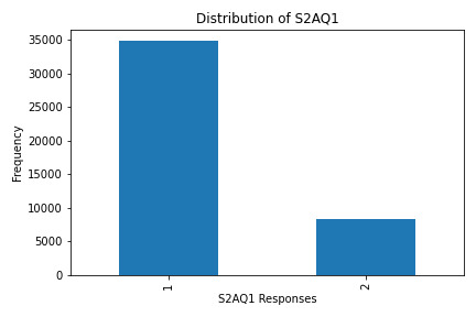
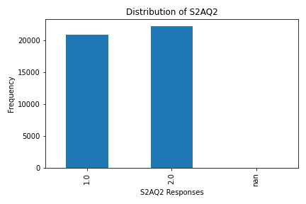
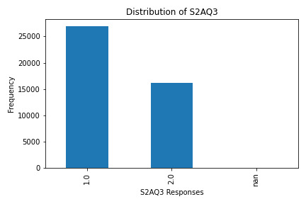
Uncovering Alcohol Consumption Patterns with Python Data Visualization
Assignment Overview
For this analysis, I worked with four variables:
S2AQ1: Ever consumed alcohol?
S2AQ2: Consumed at least 12 drinks in the last 12 months?
S2AQ3: Frequency of drinking (occasional to regular).
S2AQ18: Frequency of alcohol consumption over time.
This code generates individual (univariate) and paired (bivariate) graphs to analyze the center and spread of each variable and explore relationships between them.
Code and Graphs
Python Code
To recreate this analysis, save this code in a Python file and ensure your CSV dataset is in the same directory. Here’s how to do it:
import pandas as pd import numpy as np import matplotlib.pyplot as plt # Load the dataset data = pd.read_csv('nesarc_pds.csv') # Ensure the CSV file is in the same folder # Selecting variables of interest variables = ['S2AQ1', 'S2AQ2', 'S2AQ3', 'S2AQ18'] # Handling missing data by replacing 9 with NaN data = data.replace(9, np.nan) # Plotting each univariate graph separately # Distribution of S2AQ1 plt.figure(figsize=(6, 4)) data['S2AQ1'].value_counts(dropna=False).sort_index().plot(kind='bar', color='skyblue') plt.title('Distribution of S2AQ1') plt.xlabel('S2AQ1 Responses') plt.ylabel('Frequency') plt.tight_layout() plt.show() # Distribution of S2AQ2 plt.figure(figsize=(6, 4)) data['S2AQ2'].value_counts(dropna=False).sort_index().plot(kind='bar', color='lightcoral') plt.title('Distribution of S2AQ2') plt.xlabel('S2AQ2 Responses') plt.ylabel('Frequency') plt.tight_layout() plt.show() # Distribution of S2AQ3 plt.figure(figsize=(6, 4)) data['S2AQ3'].value_counts(dropna=False).sort_index().plot(kind='bar', color='lightgreen') plt.title('Distribution of S2AQ3') plt.xlabel('S2AQ3 Responses') plt.ylabel('Frequency') plt.tight_layout() plt.show() # Distribution of S2AQ18 plt.figure(figsize=(6, 4)) data['S2AQ18'].value_counts(dropna=False).sort_index().plot(kind='bar', color='plum') plt.title('Distribution of S2AQ18') plt.xlabel('S2AQ18 Responses') plt.ylabel('Frequency') plt.tight_layout() plt.show() # Bivariate analysis between S2AQ1 and S2AQ18 plt.figure(figsize=(8, 6)) pd.crosstab(data['S2AQ1'], data['S2AQ18']).plot(kind='bar', stacked=True, colormap='viridis') plt.title('Association between Alcohol Consumption and Frequency (S2AQ1 vs. S2AQ18)') plt.xlabel('Ever Consumed Alcohol (S2AQ1)') plt.ylabel('Count') plt.tight_layout() plt.show()
What the Graphs Reveal
S2AQ1 (Ever Consumed Alcohol): Most respondents answered "yes," indicating a significant percentage have tried alcohol.
S2AQ2 (12+ Drinks in Last 12 Months): A smaller group responded affirmatively, showing fewer people have consumed 12+ drinks recently.
S2AQ3 (Frequency of Drinking): Responses varied, with data showing a range of drinking frequencies among participants.
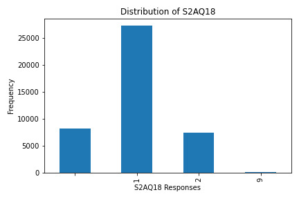
S2AQ18 (Frequency of Alcohol Consumption): This variable had the highest counts for lower-frequency responses, indicating occasional consumption.
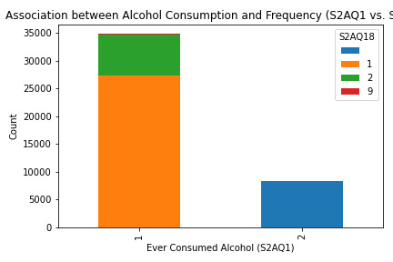
Bivariate Analysis (S2AQ1 and S2AQ18)
The stacked bar chart shows an association between ever consuming alcohol (S2AQ1) and consumption frequency (S2AQ18). While many respondents have consumed alcohol, fewer continue to drink regularly, reflecting a potential drop-off in consistent drinking habits.
Summary: In this assignment, I analyzed alcohol consumption data by examining four survey variables using Python. Through univariate graphs, I visualized the distribution and frequency of responses for each variable, revealing that while many respondents have tried alcohol (S2AQ1), fewer reported frequent consumption. Additionally, the bivariate analysis between initial alcohol consumption (S2AQ1) and recent drinking frequency (S2AQ18) highlighted a drop-off in regular drinking among participants. This exercise demonstrated how data visualization can clarify behavioral trends and provided a practical approach to understanding patterns in alcohol use.
0 notes
Text
Your Essential Guide to Python Libraries for Data Analysis
Here’s an essential guide to some of the most popular Python libraries for data analysis:
1. Pandas
- Overview: A powerful library for data manipulation and analysis, offering data structures like Series and DataFrames.
- Key Features:
- Easy handling of missing data
- Flexible reshaping and pivoting of datasets
- Label-based slicing, indexing, and subsetting of large datasets
- Support for reading and writing data in various formats (CSV, Excel, SQL, etc.)
2. NumPy
- Overview: The foundational package for numerical computing in Python. It provides support for large multi-dimensional arrays and matrices.
- Key Features:
- Powerful n-dimensional array object
- Broadcasting functions to perform operations on arrays of different shapes
- Comprehensive mathematical functions for array operations
3. Matplotlib
- Overview: A plotting library for creating static, animated, and interactive visualizations in Python.
- Key Features:
- Extensive range of plots (line, bar, scatter, histogram, etc.)
- Customization options for fonts, colors, and styles
- Integration with Jupyter notebooks for inline plotting
4. Seaborn
- Overview: Built on top of Matplotlib, Seaborn provides a high-level interface for drawing attractive statistical graphics.
- Key Features:
- Simplified syntax for complex visualizations
- Beautiful default themes for visualizations
- Support for statistical functions and data exploration
5. SciPy
- Overview: A library that builds on NumPy and provides a collection of algorithms and high-level commands for mathematical and scientific computing.
- Key Features:
- Modules for optimization, integration, interpolation, eigenvalue problems, and more
- Tools for working with linear algebra, Fourier transforms, and signal processing
6. Scikit-learn
- Overview: A machine learning library that provides simple and efficient tools for data mining and data analysis.
- Key Features:
- Easy-to-use interface for various algorithms (classification, regression, clustering)
- Support for model evaluation and selection
- Preprocessing tools for transforming data
7. Statsmodels
- Overview: A library that provides classes and functions for estimating and interpreting statistical models.
- Key Features:
- Support for linear regression, logistic regression, time series analysis, and more
- Tools for statistical tests and hypothesis testing
- Comprehensive output for model diagnostics
8. Dask
- Overview: A flexible parallel computing library for analytics that enables larger-than-memory computing.
- Key Features:
- Parallel computation across multiple cores or distributed systems
- Integrates seamlessly with Pandas and NumPy
- Lazy evaluation for optimized performance
9. Vaex
- Overview: A library designed for out-of-core DataFrames that allows you to work with large datasets (billions of rows) efficiently.
- Key Features:
- Fast exploration of big data without loading it into memory
- Support for filtering, aggregating, and joining large datasets
10. PySpark
- Overview: The Python API for Apache Spark, allowing you to leverage the capabilities of distributed computing for big data processing.
- Key Features:
- Fast processing of large datasets
- Built-in support for SQL, streaming data, and machine learning
Conclusion
These libraries form a robust ecosystem for data analysis in Python. Depending on your specific needs—be it data manipulation, statistical analysis, or visualization—you can choose the right combination of libraries to effectively analyze and visualize your data. As you explore these libraries, practice with real datasets to reinforce your understanding and improve your data analysis skills!
1 note
·
View note
Text
Getting Started with Python’s Data Visualization Libraries
Data visualization is a vital component of data analysis, enabling us to present data insights in a clear and compelling way. As the world becomes increasingly data-driven, the ability to effectively visualize data is a sought-after skill. Python, with its rich ecosystem of libraries, has emerged as a powerful tool for data visualization. In this blog, we’ll explore some of the most popular Python libraries for data visualization and provide practical examples to get you started.
Why Data Visualization Matters
Data visualization transforms complex data into visual formats like charts and graphs, making it easier to understand and interpret. It allows analysts and decision-makers to spot trends, identify anomalies, and communicate findings effectively. For instance, a well-constructed line graph can reveal sales trends over time more intuitively than raw data in a spreadsheet.
Effective visualization not only enhances comprehension but also engages the audience. In a world inundated with data, the ability to distill and present information visually can differentiate impactful communication from overwhelming information.
Popular Python Data Visualization Libraries
Python boasts a variety of libraries tailored for data visualization. Here are some of the most widely used:
MatplotlibMatplotlib is the foundational library for creating static, animated, and interactive visualizations in Python. It is highly customizable, making it suitable for a wide range of applications.Installation:bashCopy codepip install matplotlib Basic Example:pythonCopy codeimport matplotlib.pyplot as plt x = [1, 2, 3, 4, 5] y = [2, 3, 5, 7, 11] plt.plot(x, y) plt.title('Simple Line Plot') plt.xlabel('X-axis') plt.ylabel('Y-axis') plt.show() This code snippet generates a simple line plot. You can easily customize the appearance by adding labels, titles, and styles.
SeabornBuilt on top of Matplotlib, Seaborn simplifies the creation of visually appealing statistical graphics. It offers built-in themes and color palettes for more attractive presentations.Installation:bashCopy codepip install seaborn Basic Example:pythonCopy codeimport seaborn as sns import matplotlib.pyplot as plt tips = sns.load_dataset('tips') sns.barplot(x='day', y='total_bill', data=tips) plt.title('Total Bill by Day') plt.show() In this example, we visualize the average total bill across different days using a bar plot. Seaborn also provides advanced features like categorical plots and pair plots for exploring relationships in data.
PlotlyFor interactive visualizations, Plotly is a fantastic choice. It allows users to create complex visualizations that can be embedded in web applications.Installation:bashCopy codepip install plotly Basic Example:pythonCopy codeimport plotly.express as px df = px.data.iris() fig = px.scatter(df, x='sepal_width', y='sepal_length', color='species') fig.show() This code creates an interactive scatter plot that displays different species of iris flowers based on their sepal dimensions. Users can hover over points for additional information, making it great for exploratory data analysis.
Pandas VisualizationWhile primarily a data manipulation library, Pandas has built-in capabilities for quick visualizations, allowing you to plot directly from DataFrames.Basic Example:pythonCopy codeimport pandas as pd import matplotlib.pyplot as plt data = {'Year': [2018, 2019, 2020, 2021], 'Sales': [150, 200, 250, 300]} df = pd.DataFrame(data) df.plot(x='Year', y='Sales', kind='line', title='Sales Over Years') plt.show() This approach offers a quick way to visualize data directly from your DataFrame, facilitating a seamless workflow from data analysis to visualization.
Getting Started with Basic Examples
To begin, it’s essential to install the necessary libraries. Use the following command to install all the libraries discussed:
bash
Copy code
pip install matplotlib seaborn plotly pandas
Now, let’s dive deeper into how to use these libraries effectively. For example, combining Matplotlib and Seaborn can enhance your visualizations:
python
Copy code
import seaborn as sns import matplotlib.pyplot as plt # Load the Titanic dataset titanic = sns.load_dataset('titanic') # Create a count plot of survivors sns.countplot(x='class', hue='survived', data=titanic) plt.title('Survivors by Class') plt.show()
This code creates a count plot showing the number of survivors by class on the Titanic, demonstrating how you can combine datasets and visualizations to glean insights.
"Take the First Step Towards Your Coding Career: join python training institute.
Advanced Visualization Techniques
Once you're comfortable with the basics, you can explore more advanced visualizations. Libraries like Bokeh and Altair provide functionalities for creating complex and interactive plots, such as time series analyses or geographical data representations.
Bokeh: Best for creating interactive plots that can be easily integrated into web applications.
Altair: Focused on declarative statistical visualizations, which make it easier to create complex plots with less code.
Best Practices in Data Visualization
To create effective visualizations, consider the following best practices:
Keep it Simple: Avoid clutter. Focus on the most important data points and minimize distractions.
Use Color Wisely: Choose a color palette that enhances readability and accessibility.
Label Clearly: Ensure all axes and legends are clearly labeled, providing context for your audience.
Tell a Story: Structure your visualizations to convey a narrative, guiding the audience through the data.
Conclusion
Mastering data visualization in Python is an invaluable skill that can significantly enhance your data analysis capabilities. By leveraging libraries like Matplotlib, Seaborn, Plotly, and Pandas, you can create compelling visual representations of data, making it easier to communicate insights and drive decision-making.
As you embark on your journey into data visualization, practice is key. Experiment with different libraries and visual styles, and always keep the principles of effective visualization in mind. With time and experience, you'll be able to craft stunning visual narratives that bring your data to life.
Call to Action
Ready to dive deeper into Python and data visualization? Join our upcoming courses at [Your Training Institute Name] to sharpen your skills and connect with like-minded learners. Let’s explore the fascinating world of data together!
DO YOU WANT TO LEARN PYTHON TRAINING COURSE WITH US?IF YES THEN MEET US IN PYTHON TRAINING INSTITUTE...
1 note
·
View note
Text
How to automate twitter or tumblr posts using scripts ! Thank me later
1. Automate Content PostingAutomating the posting of content on Twitter can help increase engagement and followers. You can use Python scripts in Termux to interact with the Twitter API for automated tweeting.Install Required PackagesEnsure you have Python installed and install required libraries:pkg install python
pip install tweepySet Up Twitter Developer AccountCreate a Twitter Developer Account: Sign up for a developer account and create an app to get API keys: Twitter Developer Portal.Get API Keys: You need the Consumer Key, Consumer Secret, Access Token, and Access Token Secret.Write a Python ScriptHere’s an example script to post a tweet using the Twitter API:import tweepy
# Replace with your own credentials
consumer_key = 'YOUR_CONSUMER_KEY'
consumer_secret = 'YOUR_CONSUMER_SECRET'
access_token = 'YOUR_ACCESS_TOKEN'
access_token_secret = 'YOUR_ACCESS_TOKEN_SECRET'
# Authenticate to Twitter
auth = tweepy.OAuth1UserHandler(consumer_key, consumer_secret, access_token, access_token_secret)
api = tweepy.API(auth)
# Create a tweet
tweet = "Hello, this is a tweet from Termux!"
api.update_status(tweet)
print("Tweet posted successfully!")Run the ScriptSave the script as tweet_bot.py and run it:python tweet_bot.py2. Monitor Twitter EngagementYou can use Termux to run scripts that analyze engagement on your tweets, helping you optimize content for better monetization.Install Required Librariespip install tweepy pandas matplotlibWrite a Python ScriptExample script to analyze tweets:import tweepy
import pandas as pd
import matplotlib.pyplot as plt
# Replace with your own credentials
consumer_key = 'YOUR_CONSUMER_KEY'
consumer_secret = 'YOUR_CONSUMER_SECRET'
access_token = 'YOUR_ACCESS_TOKEN'
access_token_secret = 'YOUR_ACCESS_TOKEN_SECRET'
# Authenticate to Twitter
auth = tweepy.OAuth1UserHandler(consumer_key, consumer_secret, access_token, access_token_secret)
api = tweepy.API(auth)
# Fetch recent tweets
tweets = api.user_timeline(screen_name='your_twitter_handle', count=100)
# Create DataFrame
data = {
'Tweet': [tweet.text for tweet in tweets],
'Likes': [tweet.favorite_count for tweet in tweets],
'Retweets': [tweet.retweet_count for tweet in tweets]
}
df = pd.DataFrame(data)
# Plot engagement
df.plot(x='Tweet', y=['Likes', 'Retweets'], kind='bar')
plt.title('Tweet Engagement')
plt.xlabel('Tweets')
plt.ylabel('Counts')
plt.xticks(rotation=90)
plt.tight_layout()
plt.show()Run the ScriptSave the script as analyze_engagement.py and run it:python analyze_engagement.py3. Engagement AutomationAutomate interactions like following, unfollowing, and liking tweets. Be cautious as excessive automation may violate Twitter’s policies.Install Librariespip install tweepyWrite Automation ScriptsExample script to follow users:import tweepy
# Replace with your own credentials
consumer_key = 'YOUR_CONSUMER_KEY'
consumer_secret = 'YOUR_CONSUMER_SECRET'
access_token = 'YOUR_ACCESS_TOKEN'
access_token_secret = 'YOUR_ACCESS_TOKEN_SECRET'
# Authenticate to Twitter
auth = tweepy.OAuth1UserHandler(consumer_key, consumer_secret, access_token, access_token_secret)
api = tweepy.API(auth)
# Follow a user
user_to_follow = 'user_handle'
api.create_friendship(user_to_follow)
print(f"Followed {user_to_follow}")Run the ScriptSave the script as follow_user.py and run it:python follow_user.py4. Monitor Trends and AnalyticsUse Termux to track Twitter trends and analytics to identify opportunities for monetization.SummaryAutomate Posts: Use Termux and Python to automate tweeting.Analyze Engagement: Track and analyze tweet performance.Engage Automatically: Automate interactions like following or liking.Consider Policies: Ensure compliance with Twitter’s automation policies.These steps will help you use Termux to support your Twitter monetization strategy, but direct monetization typically involves more comprehensive strategies, including content creation, advertising, and partnerships.
0 notes
Text
Can somebody provide step by step to learn Python for data science?
Absolutely the right decision—to learn Python for data science. Segmenting it into something doable may be a good way to go about it honestly. Let the following guide you through a structured way.
1. Learning Basic Python
Syntax and semantics: Get introduced to the basics in syntax, variables, data types, operators, and some basic control flow.
Functions and modules: You will be learning how to define functions, call functions, utilize built-in functions, and import modules.
Data Structures: Comfortable with lists, tuples, dictionaries, and sets.
File I/O: Practice reading from and writing to files.
Resources: Automate the Boring Stuff with Python book.
2. Mastering Python for Data Science Libraries
NumPy: Learn to use NumPy for numerical operations and array manipulations.
Pandas: The course would revolve around data manipulation through the Pandas library, series, and data frames. Try out the cleaning, transformation, and analysis of data.
Familiarize yourself with data visualization libraries: Matplotlib/Seaborn. Learn to make plots, charts, and graphs.
Resources:
NumPy: official NumPy documentation, DataCamp's NumPy Course
Pandas: pandas documentation, DataCamp's Pandas Course
Matplotlib/Seaborn: matplotlib documentation, seaborn documentation, Python Data Science Handbook" by Jake VanderPlas
3. Understand Data Analysis and Manipulation
Exploratory Data Analysis: Techniques to summarize and understand data distributions
Data Cleaning: missing values, outliers, data inconsistencies.
Feature Engineering: Discover how to create and select the features used in your machine learning models.
Resources: Kaggle's micro-courses, "Data Science Handbook" by Jake VanderPlas
4. Be able to apply Data Visualization Techniques
Basic Visualizations: Learn to create line plots, bar charts, histograms and scatter plots
Advanced Visualizations: Learn heatmaps, pair plots, and interactive visualizations using libraries like Plotly.
Communicate Your Findings Effectively: Discover how to communicate your findings in the clearest and most effective way.
Resource: " Storytelling with Data" – Cole Nussbaumer Knaflic.
5. Dive into Machine Learning
Scikitlearn: Using this package, the learning of concepts in supervised and unsupervised learning algorithms will be covered, such as regression and classification, clustering, and model evaluation.
Model Evaluation: It defines accuracy, precision, recall, F1 score, ROC-AUC, etc.
Hyperparameter Tuning: GridSearch, RandomSearch
For basic learning, Coursera's Machine Learning by Andrew Ng.
6. Real Projects
Kaggle Competitions: Practice what's learned by involving in Kaggle competitions and learn from others.
Personal Projects: Make projects on things that interest you—that is scraping, analyzing, and model building.
Collaboration: Work on a project with other students so as to get the feeling of working at a company.
Tools: Datasets, competitions, and the community provided in Kaggle, GitHub for project collaboration
7. Continue Learning
Advanced topics: Learn deep learning using TensorFlow or PyTorch, Natural Language Processing, and Big Data Technologies such as Spark.
Continual Learning: Next comes following blogs, research papers, and online courses that can help you track the most current trends and technologies in data science.
Resources: "Deep Learning" by Ian Goodfellow, Yoshua Bengio, and Aaron Courville, Fast.ai for practical deep learning courses.
Additional Tips
Practice regularly: The more you code and solve real problems, the better you will be at it.
Join Communities: Join as many online forums as possible, attend meetups, and join data science communities to learn from peers.
In summary, take those steps and employ the outlined resources to grow in building a solid base in Python for data science and be well on your way to be proficient in the subject.
0 notes
Text
What libraries do data scientists use to plot data in Python?
Hi,
When it comes to visualizing data in Python, data scientists have a suite of powerful libraries at their disposal. Each library has unique features that cater to different types of data visualization needs:
Matplotlib: Often considered the foundational plotting library in Python, Matplotlib offers a wide range of plotting capabilities. Its pyplot module is particularly popular for creating basic plots such as line charts, scatter plots, bar graphs, and histograms. It provides extensive customization options to adjust every aspect of a plot.
Seaborn: Built on top of Matplotlib, Seaborn enhances the aesthetics of plots and simplifies the creation of complex visualizations. It excels in generating attractive statistical graphics such as heatmaps, violin plots, and pair plots, making it a favorite for exploring data distributions and relationships.
Pandas: While primarily known for its data manipulation capabilities, Pandas integrates seamlessly with Matplotlib to offer quick and easy plotting options. DataFrames in Pandas come with built-in methods to generate basic plots, such as line plots, histograms, and bar plots, directly from the data.
Plotly: This library is geared towards interactive plots. Plotly allows users to create complex interactive charts that can be embedded in web applications. It supports a wide range of chart types and interactive features like zooming and hovering, making it ideal for presentations and dashboards.
Altair: Known for its concise syntax and declarative approach, Altair is used to create interactive visualizations with minimal code. It’s especially good for handling large datasets and generating charts like bar charts, scatter plots, and line plots in a clear and straightforward manner.
Bokeh: Bokeh specializes in creating interactive and real-time streaming plots. It’s particularly useful for building interactive dashboards and integrating plots into web applications. Bokeh supports various types of plots and offers flexibility in customizing interactions.

Each of these libraries has its strengths, and data scientists often use them in combination to leverage their unique features and capabilities, ensuring effective and insightful data visualization.
Drop the message to learn more!!
0 notes
Text
Lasso Regression Analysis
To run a Lasso regression analysis, you will use a programming language like Python with appropriate libraries. Here’s a guide to help you complete this assignment:### Step 1: Prepare Your DataEnsure your data is ready for analysis, including explanatory variables and a quantitative response variable.###
Step 2: Import Necessary LibrariesFor this example, I’ll use Python and the `scikit-learn` library.#### Python```pythonimport pandas as pdimport numpy as npfrom sklearn.model_selection import train_test_split, KFold, cross_val_scorefrom sklearn.linear_model import LassoCVfrom sklearn.metrics import mean_squared_errorimport matplotlib.pyplot as plt```###
Step 3: Load Your Data```python# Load your datasetdata = pd.read_csv('your_dataset.csv')# Define explanatory variables (X) and response variable (y)X = data.drop('target_variable', axis=1)y = data['target_variable']```###
Step 4: Set Up k-Fold Cross-Validation```python# Define k-fold cross-validationkf = KFold(n_splits=5, shuffle=True, random_state=42)```###
Step 5: Train the Lasso Regression Model with Cross-Validation```python# Initialize and train the LassoCV modellasso = LassoCV(cv=kf, random_state=42)lasso.fit(X, y)```###
Step 6: Evaluate the Model```python# Evaluate the model's performancemse = mean_squared_error(y, lasso.predict(X))print(f'Mean Squared Error: {mse:.2f}')# Coefficients of the modelcoefficients = pd.Series(lasso.coef_, index=X.columns)print('Lasso Coefficients:')print(coefficients)```###
Step 7: Visualize the Coefficients```python# Plot non-zero coefficientsplt.figure(figsize=(10,6))coefficients[coefficients != 0].plot(kind='barh')plt.title('Lasso Regression Coefficients')plt.show()```### InterpretationAfter running the above code, you'll have the output from your model, including the mean squared error, coefficients of the model, and a plot of the non-zero coefficients. Here’s an example of how you might interpret the results:- **Mean Squared Error (MSE)**: This metric shows the average squared difference between the observed actual outcomes and the outcomes predicted by the model. A lower MSE indicates better model performance.- **Lasso Coefficients**: The coefficients show the importance of each feature in the model. Features with coefficients equal to zero are excluded from the model, while those with non-zero coefficients are retained. The bar plot visualizes these non-zero coefficients, indicating which features are most strongly associated with the response variable.
### Blog Entry SubmissionFor your blog entry, include:-
The code used to run the Lasso regression (as shown above).- Screenshots or text of the output (MSE, coefficients, and coefficient plot).- A brief interpretation of the results.If your dataset is small and you decide not to split it into training and test sets, provide a rationale for this decision in your summary. Ensure the content is clear and understandable for peers who may not be experts in the field. This will help them effectively assess your work.
0 notes
Text
Run a lasso regression analysis
To run a Lasso regression analysis, you will use a programming language like Python with appropriate libraries. Here’s a guide to help you complete this assignment:
Step 1: Prepare Your Data
Ensure your data is ready for analysis, including explanatory variables and a quantitative response variable.
Step 2: Import Necessary Libraries
For this example, I’ll use Python and the scikit-learn library.
Python
import pandas as pd import numpy as np from sklearn.model_selection import train_test_split, KFold, cross_val_score from sklearn.linear_model import LassoCV from sklearn.metrics import mean_squared_error import matplotlib.pyplot as plt
Step 3: Load Your Data
# Load your dataset data = pd.read_csv('your_dataset.csv') # Define explanatory variables (X) and response variable (y) X = data.drop('target_variable', axis=1) y = data['target_variable']
Step 4: Set Up k-Fold Cross-Validation
# Define k-fold cross-validation kf = KFold(n_splits=5, shuffle=True, random_state=42)
Step 5: Train the Lasso Regression Model with Cross-Validation
# Initialize and train the LassoCV model lasso = LassoCV(cv=kf, random_state=42) lasso.fit(X, y)
Step 6: Evaluate the Model
# Evaluate the model's performance mse = mean_squared_error(y, lasso.predict(X)) print(f'Mean Squared Error: {mse:.2f}') # Coefficients of the model coefficients = pd.Series(lasso.coef_, index=X.columns) print('Lasso Coefficients:') print(coefficients)
Step 7: Visualize the Coefficients
# Plot non-zero coefficients plt.figure(figsize=(10,6)) coefficients[coefficients != 0].plot(kind='barh') plt.title('Lasso Regression Coefficients') plt.show()
Interpretation
After running the above code, you'll have the output from your model, including the mean squared error, coefficients of the model, and a plot of the non-zero coefficients. Here’s an example of how you might interpret the results:
Mean Squared Error (MSE): This metric shows the average squared difference between the observed actual outcomes and the outcomes predicted by the model. A lower MSE indicates better model performance.
Lasso Coefficients: The coefficients show the importance of each feature in the model. Features with coefficients equal to zero are excluded from the model, while those with non-zero coefficients are retained. The bar plot visualizes these non-zero coefficients, indicating which features are most strongly associated with the response variable.
Blog Entry Submission
For your blog entry, include:
The code used to run the Lasso regression (as shown above).
Screenshots or text of the output (MSE, coefficients, and coefficient plot).
A brief interpretation of the results.
If your dataset is small and you decide not to split it into training and test sets, provide a rationale for this decision in your summary. Ensure the content is clear and understandable for peers who may not be experts in the field. This will help them effectively assess your work.
0 notes