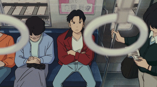
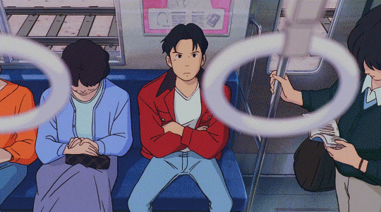
#basically the only way i can get some saturation is with filters lol
Text
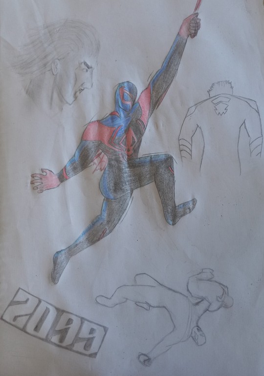
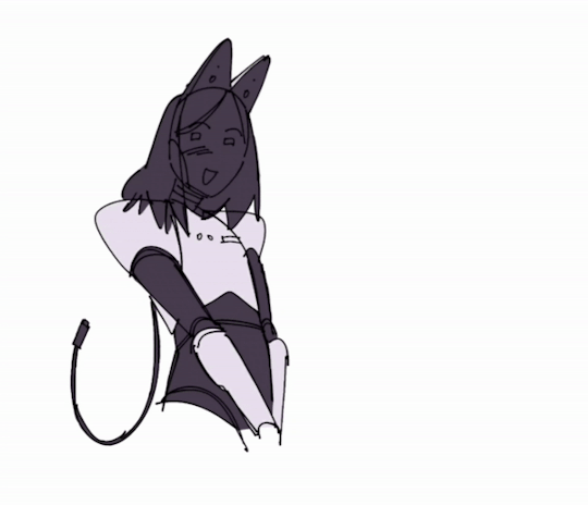
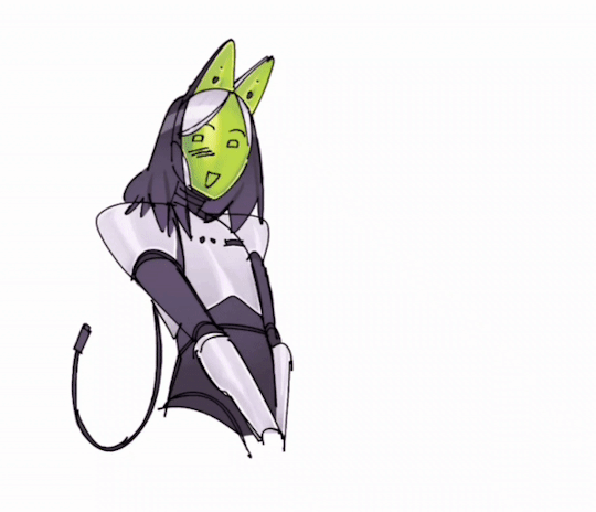
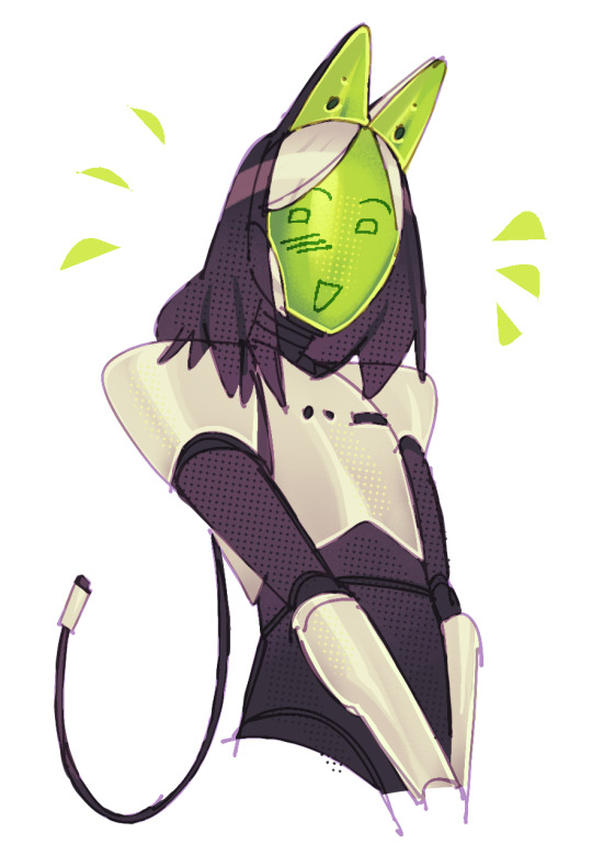
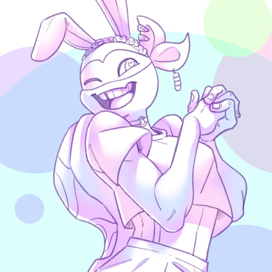
Hey its finally his time!
Miguel was a long time coming and well
Honestly it was real tough lol
Im not used/good at drawing expresions aaaand im not 100% on the pose and comosition so this os mixed bag but eh
Didnt turn out thaaat bad methinks
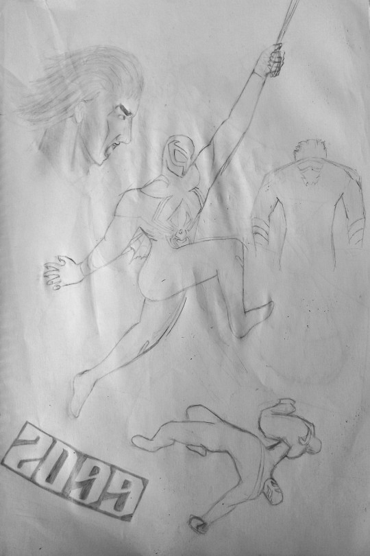
Also black and white version just because
#art#traditional art#black and white#spiderverse#across the spiderverse#character design#Miguel O'Hara#im still mad with theese pencils#basically the only way i can get some saturation is with filters lol#and dont even get me STARTED on dark atmospheres#and yes the page is wrinkly#if i spent 5 more seconds working on it the page would disintegrate lol
7 notes
·
View notes
Text
Genshin men Instagram HCs
Ft. Xiao; Scaramouche; Zhongli; Childe; Alhaitham; Kaveh; Tighnari
(gender neutral reader but wears a dress in Scara & Zhongli's parts)

Xiao // @ a1atus
★ ★ pre-relationship ★ ★
Very rarely posts
Never pictures of himself, you’ll only see his face in tagged photos
If he does post, it’s probably a new album cover of a band he likes, a particularly good plate of almond tofu from his favorite café, or—if he’s in a particularly good mood—a cute stray cat that befriended him on the street
Never edits anything but still takes pretty decent photos because he understands basic composition rules
Never tags anything but will sometimes write simple captions like “new guitar”
His pfp has not changed since he made his account and its literally just the blandest selfie you’ve ever seen—but he’s effortlessly photogenic so even when he’s just staring at the camera with a blank expression he looks hot
★ ★ in a relationship ★ ★
Xiao will unintentionally do his loyal boyfriend duties and like all of your posts but he never actually leaves a comment unless you specifically ask him to but you have to tell him what to say or else you’ll just get something like “your hair is nice” LOL
Maybe makes one post related to you but it doesn’t have your face—just picture of your hands holding each other or a photo he secretly took of you from behind as you admire some paintings from when he took you on an art gallery date
Still doesn’t write much in captions but if the post includes you, he always adds a little black heart emoji 🖤
Scaramouche // @ balladeer
★ ★ pre-relationship ★ ★
Vehemently claims he’s not chronically online but he definitely is
Def has a dark / emo aesthetic profile and puts more effort into it than he’d ever admit
Uses stories pretty frequently
Usually to show off his game stats and victories or to vent about some annoying inconvenience that's just happened to him
balladeer Jfc the train is late again I may as well just walk home everyday ffs
All his late night gaming photos are so highly saturated in his pitch black bedroom, the only source of light being his screen on max brightness and his violet RGB keyboard. If you raise the screen brightness on your phone you might be able to make out some empty Monster cans and ramen cups on his desk—he absolutely gives Discord / Reddit mod vibes 🤢
Definitely has a story archive just for Valorant 🤮
I wanna fuck him so bad it makes me look stupid—
Posts a few selfies to show a new piercing or the very rare occasion where he’s feeling really confident in his looks
unintentionally thirst traps the emo boy lovers; yes, I am talking about you and I—
Lightly edits photos or uses filters to make them look good but nothing extreme or super aesthetic, mostly just for decent contrast
Usually the first one to see any of his friends posts but never ‘likes’ them
Will leave snarky or sarcastic comments when the mood strikes tho
His pfp is a candid picture someone else took that he thinks he looks decent in—sticking his tongue out and giving double middle fingers to the camera
★ ★ in a relationship ★ ★
Makes a post or story for every date you guys have, even if it’s just a vague picture of your shoes together
He likes to show off that he has such an attractive s/o but also lowkey just wants to have a memory to look back on for the nights he feels lonely
Doesn’t post just you though, he’s always in frame holding you or touching you in some way—he feels the need to put some sort of claim cause he thinks people are gonna shoot their shot with you—he’s kinda paranoid and insecure, pls have patience w him
Likes and comments on all of your posts. Sometimes it's a snarky quip like if you post about you and your friends doing something funny he might comment “lmao ur so dumb” but if its a selfie or something you’re proud of, he leaves a little compliment and heart emoji.
YN0103 [bedroom mirror selfie of you shyly posing in a dress]
YN0103 Bought a new dress today…it’s not my usual style but I rlly like it 🥺
balladeer cute 💜
If anyone ever confronts him in person about his nice comments on your posts tho he’ll get flustered and claim his account was temporarily hacked LOL
His heart def flutters when you post a picture of him on your own account
He kinda can’t believe you’re proud enough of him to publicly post about him
Changes his pfp to the two of you together and, if you zoom in and squint, you can tell he’s kind of smiling <3
Zhongli // @ rex_lapis
★ ★ pre-relationship ★ ★
I’m sorry but I have to do it…
He has Facebook grandpa vibes
Like he has no idea how to use half of the features; stories are an absolute mystery to him. What is a reel?
But he tries to be supportive of his friends and will leave way-too eloquent comments with a Wikipedia levels of supplemental information
a1atus [ photo of a shiny Fender acoustic guitar laying on what seems to be a bed]
a1atus new guitar
rex_lapis Lovely new instrument, Xiao. You seem to have quite good tastes – that particular model is popular among many professional musicians. It is well renowned for its clear sound and beautiful mahogany exterior. If you wouldn’t mind, I would love to hear you play it someday over tea.
a1atus @ rex_lapis thanks
the way I cackled writing that exchange ygweyufgwyu Xiaos just like ‘thanks for commenting dad’
His pfp is not him—it’s probably a famous painting he likes or a beautiful white flower from a garden he visited
★ ★ in a relationship ★ ★
If you want him to improve his Insta game, you’re going to have to teach him, I’m sorry
On the up side, Zhongli is a great student and is eager to learn anything you teach him
Will try to post pretty regularly; usually somewhat mediocre photos of beautiful scenery like sunsets and flowers
Like Scaramouche, he enjoys the idea of documentary your time together so he posts something at the end of each of your dates
Your heart lowkey melts when Zhongli, very earnestly, asks after dinner if you’ll allow him to take a selfie with you to post on his Instagram
Regularly asks for feedback on his posts to ensure he’s properly taking your advice and improving :,)
He even starts organizing and naming story archives on his profile—simple titles like “tea,” “nature,” “friends,” and “my dearest”
Likes and comments on every single one of your posts and replies to all of your stories, even if he was there with you
Usually just lathers you in compliments on your beauty or tastes but they’re so thoughtfully written that it’s obvious he’s not “just saying it” and genuinely believes all the kind things about you he writes
YN1231 [photo of you twirling in a summer dress amidst a colorful of bed of flowers in a botanical garden, take by your friend]
YN1231 It’s finally starting to feel like spring! 🌸🌼🌺
rex_lapis While the camelias are lovely, they pale in comparison to your radiance. Your yellow sundress is also quite lovely and compliments your complexion in the morning sunlight. Truly a divine sight.
balladeer @ YN1231 @ rex_lapis ugh can you guys keep it in the DMs
- Changes his pfp to a selfie of himself smiling after you told him he should. The angle is a little odd but he’s so naturally attractive that he still manages to look good.
Ajax // @ tartaglia_on_top
★ ★ pre-relationship ★ ★
Doesn’t post too often but when he does, it kinda gives stereotypical frat boy
Like, lots of parties and shirtless beach photos with his friends
The surprise is the occasional posts of his little siblings and kids he volunteers with in between
He sometimes posts championship and practice photos from his martial arts competitions with captions thanking his team and mentors
Is pretty popular—has a few thousand followers, many are people he met just once or twice at parties or genuine friends and classmates, but the vast majority are online fans who just follow cause he’s hot LOL
Is the type of person you followed once after meeting a long time ago and never talk to again but you can’t bring yourself to unfollow cause he’s nice and his updates are kinda interesting and he’s hot
Isn’t online that much so he doesn’t like/comment on his friends’ every post but usually tries to leave congratulatory messages when someone accomplishes something or graduates
His pfp is a closeup of himself with a boyish grin he cropped from a group photo
★ ★ in a relationship ★ ★
It is super obvious when you guys start dating cause almost every post from that point is about you in some way LOL
tartaglia_on_top [photo of Ajax, sweaty and exhausted but clearly excited as he holds a trophy in one hand with the other wrapped around your waist while he presses a kiss to your cheek]
tartaglia_on_top Officially a 3 year championship winner! Thanks to my biggest supporter @ YN0720 😘
He’s not even consciously trying to post you all the time, it just happens because you are either always together or any memorable moment he thinks are worth an Insta post involve you in some way
You’re the only person, aside from his family - that he actually likes/comments on all posts for
Is the type of boyfriend to leave those super dramatic, embarrassing comments on your selfies like “DAAAMN BABE 🥵 finna make me act UP” and, in one particularly shameless case, “god youre so hot pls step on me queen 😍”
Please block him
He shamelessly liked all your past posts from before you too met as well—you were kinda mortified to wake up one morning to a notification that just said “what a lil cutie ❤️” on a post of yourself from seventh grade.
Changes his pfp to a couple selfie he took of the two of you kissing on a winter vacation in the mountains
Kaveh // @ kaveh.designs
★ ★ pre-relationship ★ ★
Obsessed with having an aesthetic profile
Like, the color palette of the background and clothing in his pfp selfie are carefully matched with the cover of each of his story archives, down to the hex code
He carefully edits every post and uses filters to make them all fit with his theme no matter how inaccurate to real life they may become
“Huh…I thought your bedroom wall was a bit more orange than this…”
“Oh, that’s cause I use 30% Juno in all my bedroom photos for a warmer finish.”
“???”
Despite his aesthetic profile, he doesn’t come off as particularly vain or narcissistic—only posts selfies when he’s has a particularly good hair day or changed his accessories
Most of his posts are of places he travels to (museums and big cities with interesting architecture) or his own sketches and rendered design projects
Online pretty frequently, always checks insta when he wakes up, before bed, and during lunch breaks
His stories are often project updates, interesting things he encounters throughout the day, or food photos
Only likes posts he actually likes and sometimes comments with photography critiques
tighnar1 [photo of a cluster of three bright blue mushrooms clustered against vibrant green grass and patches of dark, wet soil]
tighnar1 Proof the forest is an amazing place: found this beautiful little cluster of juvenile Rakkhashava mushrooms on my hike today. Great spotting by @ colleeei. Check my story for some cool mushroom facts. 🍄
kaveh.designs great photo composition, Tigh, perfect golden ratio on the caps.
tighnar1 @ kaveh.designs Thanks I guess…
Has a decent number of followers, many of whom are also artists familiar with Kaveh’s reputation from the Kshahrewar. Others just like his OOTD stories and charming smile
★ ★ in a relationship ★ ★
Kaveh revamps his entire profile once you two become official
His pfp becomes a candid taken by a stranger of the two of you together at an aquarium, holding hands as you point something out to him through the glass
It was taken by a photographer working at the aquarium as part of a promotion—the photographer showed you two the photo and asked for permission to post it on their official website and Kaveh was absolutely obsessed with the photo—it’s still one of his favorite and it doesn’t even show your faces
He still matches his archived story covers to his new pfp but his actual feed had become a lot more relaxed and natural now
He still slightly edits photos so they look as good as possible, but he doesn’t like using filters on photos of you or the two of you together because he thinks it would be a disservice to your natural beauty
Like Ajax, his posts and stories naturally become mostly about you whether scenes from your dates—candid photos he takes of you where he insists you look like art even though you’re just in pajamas with an unmade face—or even photos of things he sees throughout the day that remind him of you
Sometimes he posts stories of funny reels or art pieces he knows you’d like and tags you in them with messages like “@YN0709 omg remember when we were talking abt this?” and “me & @ YN0709💕”
Similar to Childe, leaves the most downbad, dramatic comments on your posts
YN0709 [swimsuit selfie]
YN0709 happy summer! ☀️🌊
kaveh.designs Oh my god my heart– 💘 I cannot believe I get to come home to this every night 👅💦
YN0709 @ kaveh.designs omg kaveh pls 💀
al_haitham @ kaveh.designs Every time I see one of your comments I regret ever learning how to read.
Alhaitham // @ al_haitham
★ ★ pre-relationship ★ ★
Only made an account so his friends would stop bothering him about not keeping up with things tbh
Checks his feed a few times a day but skips through stories if they’re too long/too many
Absolutely hates concert stories the most cause they’d loud, long, and filled with off-key drunken singing
Never likes or comments on anything unless it’s really interesting to him
Occasionally shares reels in his story that are like interesting history facts or official Akademiya announcements
Has a few posts (and only cause Kaveh would not shut up about it) but they’re mostly just pictures of book covers he’d just finished reading with a detailed review or literary analysis as the caption—but he’s mindful of avoiding spoilers for those who haven’t read it
However, he does have one post that stands out quite a bit
He posted an unintentional gym third trap because he just happened to be working out, as is routine, and thought it might be nice to share some tips on proper rope pushdown form
If you’re not a gym babe and don’t know what this is, I beg of you, please look up a gif or video and imagine Alhaitham doing this, shirtless. You’re welcome.
It has become his most popular post by far
His pfp is probably taken straight from his faculty ID card: plain background, bright lighting, neutral facial expression
★ ★ in a relationship ★ ★
After you two have become official and are pretty comfortably established in your relationship, he’ll post a photo of the two of you—probably one you took - with a simple caption like “Late night at Puspa Café with my favorite person 💚”
Everyone who knows him freaks out in the comments with variations of “omg hathie got an s/o???” and “wow he finally posted a normal pic of himself, y/n is a good influence” but he doesn’t reply to any of them lmao
If you use Instagram a lot, he’ll naturally become more active too because he enjoys learning more about what you like through your posts and stories
He likes all of your posts but never comments—if one of your posts interests him, he’d prefer to wait until he sees you later to ask you about it in person
He just wants an excuse to talk to you more
As he becomes more active, little bits and pieces of your relationship naturally infiltrate his feed
His latest book review post has your favorite mug in the background because the two of you had breakfast together
His informational story post of an antique Sumerian emerald he found at a street vendor is being modeled by your pretty hands because you were with him when he saw it and later given to you after the vendor insisted on Alhaitham gifting it to his “beautiful spouse”
He changes his profile picture to the two of you from one of your many reading dates, comfortably lounging on a loveseat in a quiet corner of the library—and this time, he’s softly smiling
Tighnari // @ t1ghnar1
Surprisingly active on social media
He thinks social media is a great way to share information about the importance of forest conservation and get people to appreciate the beauty of Avidya forest
Makes one post almost every day and multiple stories
Needless to say, 90% of his posts are of plants or small animals he finds on his hikes or while working
His most popular posts are those of cute squirrels and birds that are being nursed back to health after being found wounded—animals just seem to naturally love him so the pictures are usually taken by his coworkers because his arms are full with cuddly animals that refuse to move
The other 10% of his posts are from the occasional hang outs with friends or coworkers after work—snaps of iced fruit teas from Puspa café or colorful clay plates overflowing with Collei’s homemade pita pockets.
He makes sure to reply to or at least like every comment, particularly those from people asking questions about the plants he posts or how to become a forest ranger. Even simple “wow that's so cool” comments often get at least a “thanks, glad you liked it” from Tighnari
He tends to use some cute forest or food emoji when they fit with his posts. For example, 🍄,🥙,🦊,🐦, etc.
Also tends to use “:)” when replying to his followers because he knows it can be difficult to read tone in text-based communications
Tigh is basically a social media manager at this point oops
Because he is online so much, he naturally keeps up with almost everything his friends post and will like or comment on things he finds interesting
His pfp is a selfie of himself with a small yellow bird perched on his shoulder from one of his patrols
★ ★ in a relationship ★ ★
All Tighnaris written by me WILL follow the “fennec foxes mate for life” trope regardless of AU, it is an indisputable law of the universe
If you’re in a relationship with Tighnari, you should be prepared for stability and commitment in general
While he doesn’t go out of his way to make an official announcement post or anything like that, you become a regular feature on his page
Will tag you in anything you’re related to, unless you specifically ask him not to
t1ghnar1 [photo of a small, cream-colored fox brushing itself against Tighnari’s leg and looking up at the camera with large eyes]
t1ghnar1 On a walk with @ YN1229 this morning we spotted this cute little kit without her mom. 🦊 While adorable, foxes - even kits - are wild animals and should never be approached unless by professionals. We have informed the local animal control where she will be taken care of until we can locate her family. Photo by @ YN1229
He never outright announces you as his lover but he seems to spend so much time with you and refer to you so casually that his followers who don’t know him just assume you’re his spouse LOL
He doesn’t bother to correct them either :,)
bennie_boy Wow, that mountain is so high up - wasn’t ur spouse scared to go up there?
t1ghnar1 @ bennie_boy Y/n has been on so many trips like this with me that they’re pretty used to it. :)
Likes your posts as he see them on his feed and occasionally leaves a short comment like, “beautiful <3”
#genshin x reader#genshin impact x reader#genshin imagine#genshin scenario#genshin hcs#tighnari x reader#scaramouch x reader#wanderer x reader#kunikuzushi x reader#xiao x reader#childe x reader#ajax x reader#tartaglia x reader#kaveh x reader#alhaitham x reader#zhongli x reader#sm au#genshin sm au
5K notes
·
View notes
Note
hii!! i was wondering if I could ask what is your usual colouring process? how much time one fully coloured piece and doodle take! I adore your ocs so much they inspire me to draw more myself:3 they feel so alive!
hi anon! thank you vey much, i'm very happy to hear that you feel inspired!
i wrote up a little something for your questions under the cut:
so, first of all, the way i color things ranges from drawing to drawing, especially if i feel like playing around in the process. sometimes i decide to try something out (palette, filter, technique, brush etc) and if i really like how it looks i may recolor the entire drawing lol. point is, there's a lot of sidetracks to my process (especially now, since i'm trying to get used to a different art program than the one i used previously) but the very basics of it are as follows:
1. i sketch and line whatever it is that i want to draw (this might take a while depending on whether i have a solid idea right away or not; in the latter case i might do some thumbnails first to figure out how i want the drawing to look. you can't really see here, but when i line things i usually draw on the same layer as the sketch, and after i'm done i adjust the brightness/contrast settings of the layer to get rid of the sketch underneath. it might seem like i'm just making my life harder this way, especially since this method only works if you sketch with a lighter color (or make it lighter in settings before starting lineart) and your lineart is drawn with a solid opaque brush (which is how i always draw), but it helps me to not get caught up on trying to make the lineart precisely follow the sketch. it also makes changing things on the go much easier, since i only have to erase on one layer.
2. after i'm done lining, i underpaint with a solid color (usually the skin color, but sometimes something random), then block the alpha channel and color over it with flats;
3. i don't color everything at once, instead going piece by piece, which helps to keep the drawing balanced color and contrast wise. i pick a desired area with magic wand and then go about rendering it properly (which usually involves adding some value variance with an airbrush and then laying down shadows/highlights/etc). you can't see this here either, because for some reason i forgot to do it this once, but i also usually lower the opacity of the lineart layer halfway when i color. it helps me concentrate on colors and how they look together better;
4. when i'm satisfied with color, i recolor the lineart to be whatever color i think fits the piece better and change lineart layer settings to either multiply, color burn, or linear burn. after that i just play around with filters, add decorative details, and clean everything up. it's also worth noting that sometimes i starts trying out filters/effects directly while coloring because i want to explore some alternative colors or palettes; i also have a tendency to pick very pale & unsaturated colors so messing around with HSB (hue/saturation/brightness) & depth/contrast settings while coloring helps a lot.
5. cropping it & there you go!
this one took me 1,2 hours. depending on how complex the drawing is it might take me much longer (especially if im working on a commission) so i'd say my average time drawing is somewhere between 2-6 hours. if a drawing takes longer than that i break it apart into several days of work. don't draw for too long! it's bad for your health.
as for sketches, as i mentioned previously, it all depends on whether i know what i want to draw or not, and if i do, i usually just go straight at it:

this one took me 20 minutes. on average, a doodle can take anywhere from 10 to 40 minutes, more if i want to make it look fancy, but at that point it enters the vast limbo between sketch and finished piece.

that's it! sorry the gif quality is really bad, it's the best i could do. here's a video of the same stuff, hopefully in somewhat better resolution
#character: kotya#character: shurik#setting: robot#artist: cbge#askbox#had to cut out footage of me playing with filters bc it was flashing rly bad
27 notes
·
View notes
Note
I started seeing Maribat crossover here and there and i was like "oh?? interesting" cause i love crossovers and they usually were like "oh i was inspired by [user]" who might have had the idea originally which is normal in things like that. And then large influx of fics started popping up with basically the same summary and "miracuclass salt" tags and i was like what the hell is happening?? I tried reading some of them cause I wanted to see what was happening but eventually i specifically had to filter out Miraculous cause it was just a lot of bashing. It shows up in the top ten listed under fandom filters for a lot of Batman related tags. Even then it's not perfect cause there's no unified way of tagging it, it might just be tagged as Maribat, Bruce Wayne is Marinette's Biological parent + its variations, or not at all (the tags list on the userscript i use to autohide fics with certain tags is only as long as it is because I've had to add so many variations of the same tags or various marinett/[insert batfam member here]) doesn't get filtered out. On top of that but since they're written from people who aren't part of the DC fandom (not saying it's inherently a bad thing) but especially if the fics are by people who just wanna write salt with Marinette being the most badass bitch in the universe, a fair amount of them have the DC heroes being impressed with just like, the bare minimum? The worst offenders are like, she'd a civilian and she punches a mugger or acts sassy towards Batman or some super scary Gotham Rogue (have these writers met the batkids? apparently not) and they're throwing themselves at her feet.
Sorry this turned into a rant but yeah the idea of ML/DC crossovers is genuinely interesting but it's just so saturated with salt that i lost interest and it's just unfortunate.
lol YEAH
Those fics are a combination of character bashing on every ML character other than Mari, combined with a very Mary Sue fantasy. All the rest of the class(except for a chosen few on occasion) are awful horrific people. Marinette is sad. But she's so perfect in every way and can totally take down a literal trained assassin barehanded with her year and a half of superheroing while magic boosted.
Double points on the salt for the narrative of "It's okay Damian I forgive the fact that you've killed people before. You were basically brainwashed into it and you feel bad about it now! Oh but my former friends who were gaslit into thinking I was a bully and decided to 'get revenge' through petty namecalling and pranks and have now realized what they done and feel awful? Fuck them they're horrible people who don't deserve shit. Oh Dami honey won't you use your father's money and influence to get them blacklisted from every career path they've ever wanted?"
15 notes
·
View notes
Note
how long does it take you to draw and colour? since you post everyday which is great for me :D
any tips for colouring cause Im still tryna figure all that out
hmm welllll, i don't exactly time how long it takes to draw but my partner said that sometimes i'll be working on a piece when they go to sleep and i'll still be working on it when they wake up 7 hours later so...my guess is anywhere from 3-8 hours each depending on complexity? at least for the art that i normally post, most of which is relatively simple.
not entirely sure what kind of tips you were looking for, but i'll just throw out some of my thought processes and stuff i try to keep in mind whenever i color. i'm gonna try and keep these relatively to the point so i won't go into much detail on art terms n whatnot, BUT i am also pretty terrible at explaining things so if you need clarification on anything, feel free to ask!
(sorry it's so longggg, i got carried away. i am...very wordy when it comes to art lol)
i like to block in the colors during the sketching stage before i do the lineart, especially for pieces where i know i want to do something funky with the color palette. you can see this in a lot of my process shots. doing colors in the planning stage just gives me a lot more freedom to focus purely on the colors and shading and how they work with the composition, without having to worry about the minute details like making sure the colors are inside the lines.
in order to save time while coloring, i'll usually just select the negative space (after making sure all the lineart is closed) > expand selection by 1 pixel (to make sure the edges are hidden within the liineart) > invert selection > fill bucket, then use clipping layers above that to color individual areas.
layer modes are your friend! i use multiply, overlay, and glow dodge (this one may be specific to mangastudio?) in almost every one of my drawings, but it's definitely worth playing around with all of the modes just to familiarize yourself with them if you haven't already.
color is honestly SO subjective. i'm never a fan of color picking (from source material or my own refs or whatever) bc while it may have its uses when it comes to consistency, imo it's much more fun to make them up as i go. you get a lot more variety from piece to piece while also familiarizing yourself with the character's palette that way. usually i'll start by deciding on the overall mood/palette (cool/warm, de-saturated, neon, pastel, etc), filling in the background color, then picking the characters' colors based on that. like with this venti pic, i started with a purple background and based my colors around that purple so they all fit the specific look i was going for. i could maybe get a similar effect by starting with the normal colors and using filters, shading, layer modes, etc to get the funky colors, but it will be much harder/more work and doesn't get as drastic of an effect imo.
on that note, don't be afraid to use shades/colors that may seem odd! you'd be surprised how many times i've used gray in place of blue, orange, purple..basically any color. in the above example, you can see just how different the colors ended up being from the original. after i decide on my palette + bg color, i'll just throw down the color i think will work and then (bc that first guess is usually wrong and meant only as a ballpark estimate) see if it needs to be warmer or cooler/darker or lighter/more or less saturated/etc and adjust accordingly. it's like mixing paint or tuning an instrument! it takes a little bit of practice, but after a while you start to get the hang of what colors will look like in which color palettes. white is usually the easiest to start with bc it will always just be tinted whatever color your palette is (like how the "white" in the above example is just a light purple).
this and the next point are more about shading but i include it as part of the coloring process: the easiest way i've learned to do shading is to darken the entire image/character/part you want to shade (usually with a solid color multiply layer) then add in the lighting either by erasing parts of the multiply layer or by using a separate layer set to overlay or glow dodge (or a similar lightening layer mode). it works a lot better than drawing the shadows imo because it kind of mimics how light works in real life; things are dark by default until you let light in and it hits what it can while leaving the rest still dark.
if you want to blend shadows, i usually still use the above method, but just blur certain areas of it and when i'm deciding which parts to blur (bc i don't just do so indiscriminately) i'll mentally sort all of the shadows into 2 categories:
shadows created by light being blocked by an object: like putting your hand in front of a flashlight. these shadows will retain their sharp edge, but can transition into the 2nd category if they are far enough from the obstruction, like how your hand's shadow will become blurrier the further you move it from the flashlight. the more distance between a light source and the surface it's projecting onto, the more chances for the light to scatter = softer edges
shadows created by light "rolling" off the surface: like the shadows on a ball or rounded surface. these will get blurred and i usually like to put a little bit of color along the blurred edge (a different and usually brighter/more saturated color than the rest of the shadows) just to add some life to the shadows.
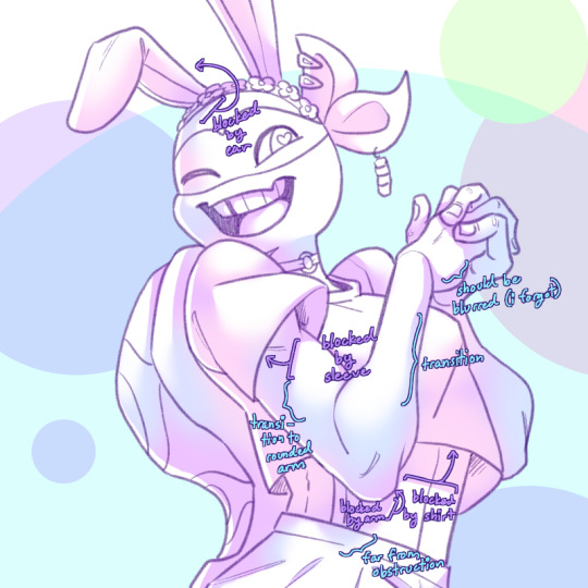
here's an annotated version of this mikey pic with just the shadows so it's a lot easier to see :) sorry im bad at annotating..
aaaand this post has probably gotten way longer than you were hoping for so i'll cut it off here 😭 hope this has been at least somewhat useful, and good luck with your art!
27 notes
·
View notes
Note
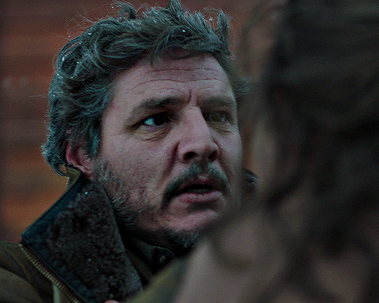
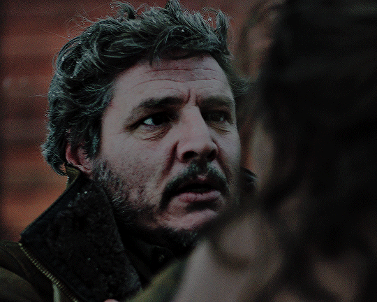
Hi!!!! No worries if you don’t want to tell me or respond lol. But I really like the colour grading you did on that most recent Joel Miller gif set. I do photography and I’ve been struggling for ages to find a way to bring out the warm sort of brown tones without making things feel too muddy or red. Just curious about what HSL adjustments you made / what colour grading helped you get that look?
ohhhh my god thank you so much??? this might be a convoluted answer/unnecessary rant so i apologize in advance lol but i tend to keep the colorings/psds i use for gifs saved in a folder so every gif i make in a set is consistent with color/lighting/shading/whatever. i get anxious if there's even a little bit of difference per gif lol
a lot of what turned out in those gifs has to do with the lighting/coloring that's already in the show/that specific episode/scene. i've got the rest of the episodes' gifsets made and finished but i can try and kind of show what i'm talking about. they all look different color-wise, at least in my opinion, because of the differences in each episode's lighting. if that makes sense.
the goal with any gif i make, regardless of show/movie, is to make them either
1) better than what was there before (for example, if the movie is INCREDIBLY blue/yellow then i try and color correct that blue or yellow to be more neutral)(i'm looking at you triple frontier and your dark, blue ass scenes dfjkdflh)
and
2) not whitewash pedro. this is incredibly important (at least in my opinion) because i've noticed a lot of gifmakers (or least they used to) went for a really pastel/pale look and it whitewashed poc so dramatically and it was ~problematic~ to say the least. (i used to make gifs for a band that consisted of all mexican band members and i got hate a few times/people policing how i should color my gifs so the band wouldn't get whitewashed, so it's something i've been hyper aware of ever since)
so, even if i'm going for a more moody/darker aesthetic like i am with these gifsets of tlou, i never try and diminish the color pedro has in his skin tone. he's got a lot of color in his skin and i want to be able to see it, y'know what i mean?
basically, that boils down to keeping a lot of the warmer tones while also going for an ~aesthetic~ and it can be really hard sometimes. sometimes a show or movie, in this case the last of us, every episode is lit a little differently since it takes place over the course of a year.
i'll put some examples under the cut:
ok so i'll use episodes 2 and 8 as my examples.
to begin with, the last of us has, what i call, a "post-apocalyptic filter" over the top of it so i kinda have to work with that from the start. lots of greens/earthy brown tones and stuff.
this is with only sharpening applied and no color or anything:
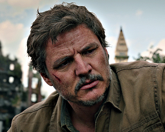
and this is with my previously mentioned ~dark and moody~ psd applied on top of that sharpening:
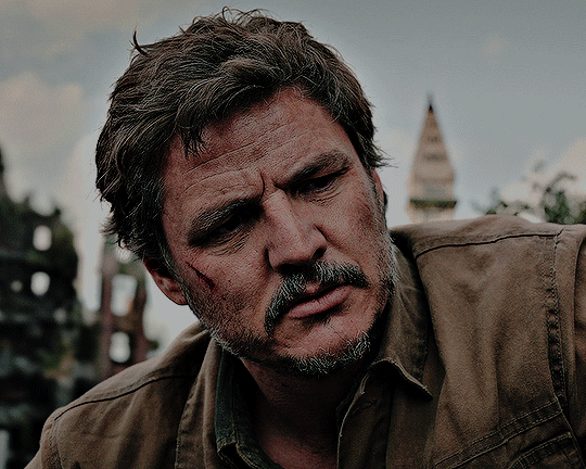
now, this is the same color grading i used on that gifset you were mentioning.
this is also the same color grading i used on episode 8, which takes place in the winter/snowy areas so the coloring to begin with is going to reflect that:
and now with the coloring:
the big thing between these two scenes is that in the winter one, he's also recovering from actively dying and being deathly pale so any color he had in his face is really minimal lmao
so this is already way too fucking long and i don't think i even actually answered your question i am so sorry lol
to start, i ALWAYS start with an automatic curves layer and then adjust accordingly.
the actual color grading part mostly consists of vibrance, hue/saturation, selective color, channel mixer, gradient map, and level layers. i'm willing to give you the psd privately if you'd like to have a closer look at them!
thank you so much for asking and for putting up with my ranting lmao
#toointojoelmiller#asks#i really hope i answered this jfc#if i didn't i'm really sorry#it felt like i was trying to explain like 7 things at once lmao
3 notes
·
View notes
Text
Has anyone ever told you that you were really pretty?
yeah but way too much of my life, still is, has been severely the opposite to where I never believe it no matter who it is...:(
Do you relate to main characters in novels often?
it depends on the book and situation/backstory
Do you listen to a wide variety of music?
yeah
Does nature feel magical to you?
yeah
What holiday are you looking forward to next?
Halloween, always
Do you take a lot of pictures?
no I really wish I did, just always forget or not in the mood only to regret it later
Did you ever go through a phase when you didn’t want to take medicine?
I don’t think so, although any type of pill or capsule has been very hard since 2014 due to a medical condition, I gag really really bad and it sucks that most meds don’t have a liquid or ODT (dissolvable) version
Do you love popsicles?
don’t eat them very often but yeah definite nostalgia of ice cream trucks with them!
Do you have to hem up a lot of your pants?
no actually most pants are short around the ankles cause I’m so tall...I mostly wear my fiance’s pants which at least reach my shoes when standing lol
Do you shop at Goodwill?
I have in the past and got some really cool clothes, I haven’t gone in forever so I’m definitely due!
What’s your natural hair color?
it was dirty blonde with natural blonde highlights growing up but overtime, especially as I isolated a lot more and mostly stayed inside it got darker so now it’s brown grrr
Do you like your smile?
HELL. FUCKING. NO. major trigger for me all my life....
Was the last book you read good?
honestly’ I can’t even remember the last book I fully read and finished...I just can’t sit down and read the last several years, too much personal shit going on to where mentally I’m just not into it
Do you make grocery lists?
sometimes but most of the time I forget to and just wing it, then again we mostly get the same shit every time so it’s easy
Do you take walks often?
ha no that’s a disaster waiting to happen...my health has severely depleted my physical ability for even basic functions on my feet :(
Does sunlight make you feel happier?
yeah especially a nice cool warm day, not too chilly not too hot
Do you make wishes on the moon?
no
What are you most looking forward to this spring?
nicer weather, top down doors off backroad cruising in my fiance’s Jeep with music blaring and the wind blowing, and I am DYYYIINNNGGGG to swim! preferably pool but beach works too!
Are you fulfilling your passion in life?
nowhere near
Do you daydream a lot?
no, more like zone out and get too lost in my head which is never a good thing especially alone which is most of the time anyway...sigh
What are your dreams?
fucked up nightmare fuel and night terrors...all the time
Do you take medications?
yeah several
When was the last time you went to the doctor?
actually last week on March 28th to the cancer institute
What helps you fall asleep?
pssh jack shit, I’m an insomniac and when I do actually doze? it’s rarely longer than an hour at a time...needless to say I’m the walking dead
Do you love sushi?
GIMME RIGHT NOWWWW!!! I LOVE sushi I’d live on it in a heartbeat if I could!
What’s your favorite type of seafood?
pretty much anything, there’s some things I haven’t gotten to try but I’ve got a decent range that I have and I love
Do you have stomach problems?
you don’t even know the fucking half of it and can never fully understand unless you suffer like I do every single day. period.
Do you enjoy editing photos?
back in the day I did Photoshop quite a bit through free trials but it’s been so long, I don’t know where to even begin especially thinking about how updated it must be now. I’ll occasionally throw a minimal filter on a pic every now and then on my phone but rarely
What was the last photo filter you used?
ha wow considering I just mentioned filters...ummm I usually will do like something to do with the saturation in the pic..maybe a bit faded, grayscale, etc.
Do you live a simple life?
not exactly the word I’d use...complicated is better
Do you own a pair of pajamas with foxes on them?
nope
Peace signs or hearts?
depends, guilty of being one of “those” that early FB days I’d throw up the peace sign a lot in pics lol and pretty much every card (holiday, bday, etc.) I’ll throw in a heart when signing at the end
What kind of pie is your favorite?
cheesecake, hands down
Do you think you could go a whole year without eating dessert?
hmm probably yeah, I’m more of a junk food junkie so I can probably make a year without sweet stuff like candy, chocolate, etc.
0 notes
Text
gif coloring tutorial
for @sappho-mia
a photoshop tutorial on how to make gifs that look like the ones in this gifset. I will only explain how to do the coloring, so if there’s any other part of gifmaking that you’d like for me to explain, let me know and I’ll make another tutorial or send you some tips!
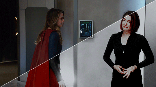
I’ll show you how to go from this:
to this:
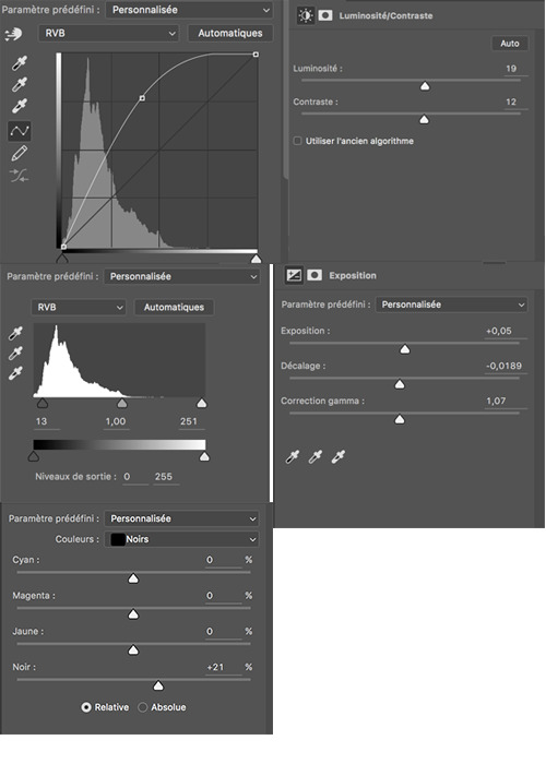
1. exposure
shows have the lovely habit of underexposing every scene, but you don’t want people looking at your gifs like this
so: time to brighten that shit up!
I have a psd (an edited version of the one in this tutorial by @redkrypto) that I use and adjust for basically all my gifs, but for the sake of this tutorial I’ll do this step by step.
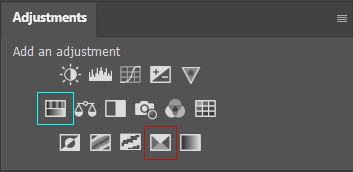
photoshop has a few good options for changing the exposure. first, go to window > adjustments to get this:

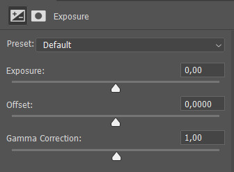
which is your biggest friend. the ones on exposure are these 4:
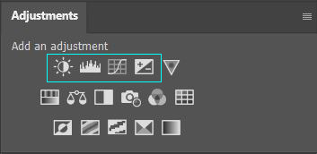
I’ll be honest, I have no idea what the difference between levels (the second one) and curves (the third one) is. they both adjust the tone of your gif - with the option to make the dark tones, the light tones and the midtones either brighter or less bright, separately. this’ll make your gif look less flat!
let’s take a look at levels:
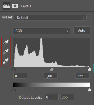
this might look daunting but I promise I don’t really know how to read the histogram either, I just use the little sliders (cyan) and see how it looks. you can also use one of the eyedroppers (red) and click on a part of your gif that you want to be black, white or grey, and the rest of the image will adjust to this. it might be a little too intense - in that case you can lower the opacity of the layer (see image below).
then there’s brightness/contrast and exposure. the difference between these two is that brightness will mostly affect the parts of your image that are already bright, while exposure will affect the whole image. the exposure window has another option I use often too, gamma correction. with gamma correction you can change the gamma levels of your gif, and I have no idea what that means but it sure does look good lmao
there not one ‘right’ way to do this, so just play around a little and see which ways you like the most :)
after brightening, our gif looks like this. yay!

for comparison:

2. coloring
I remember feeling very overwhelmed with all of photoshop’s options at first. I will discuss all of the ones I used to create this gif, but you definitely don’t have to use or understand all of them in order to make beautiful gifs!
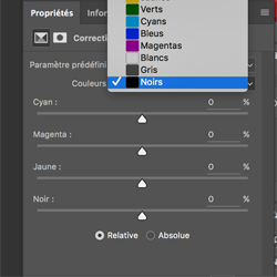
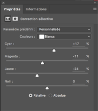
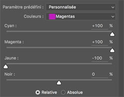
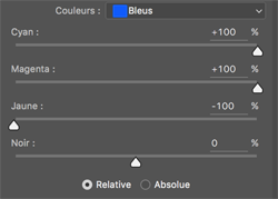
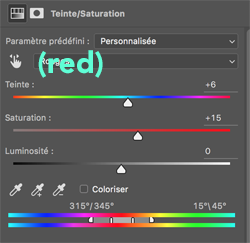
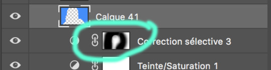
two adjustments I use in pretty much every gif are hue/saturation (cyan) and selective color (red).
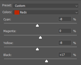
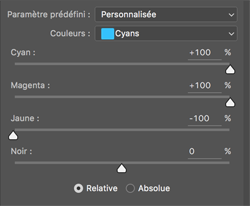
first, selective color. selective color basically gives you the option to single out a color in your gif and change it. the most important thing to understand here is which colors are opposites: red and cyan, green and magenta, blue and yellow. so if you’d want your yellows to be green, you use the magenta slider.
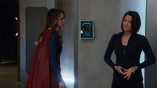
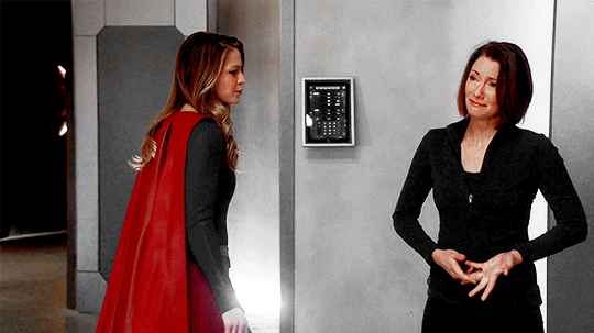
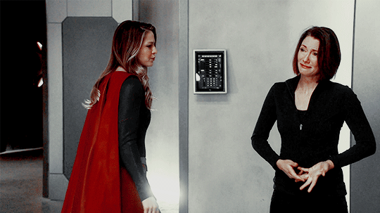
for the gif we’re making, we want kara’s cape to stand out, because red is going to be the only color left. these are the settings I used:

now it’s gonna look a little oversaturated, but we’ll fix that later on. I also made the yellows more red and less yellow and increased the blackness a little.
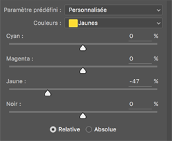
another way to make a color stand out is by removing the other colors -- the background is mostly yellow, green, cyan and blue. so we’re gonna go to hue/saturation and completely remove their saturation, which will make the wall behind them look gray.
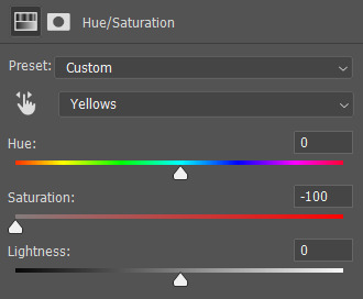
in the saturation window, you also get the option to reduce the lightness (and the hue, but we’ll get to that later). reducing the lightness does not do the same thing as increasing the blackness in selective color: reducing the lightness will give it more shadow, while increasing the blackness in selective color will make for example a lilac go to a purple, or a red to a deep red.
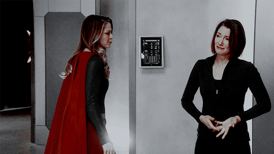
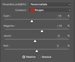
for our gif, I reduced the lightness (-13) and the saturation (-3) of the reds. now it looks like this:
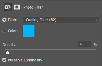
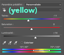
the next step will make the gif look weird at first but after we add the other layers, it’ll look better. go to adjustments > photo filter and select ‘sepia’ (it’ll be a warming filter first - click on that and you’ll see all the other options). then increase the density:

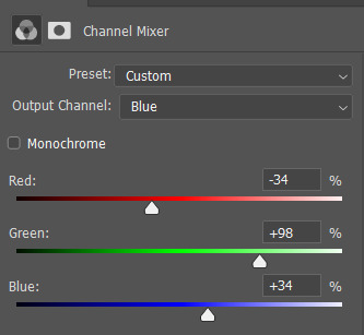
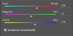
next, we’ll move to channel mixer. channel mixer is one of my favorite adjustment layers because it’s the easiest way to make your colors look really different. there are three channels (red, green and blue) and the best way to use it is to just try things out and see how it looks. my settings for this gif were:

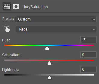
then I added another saturation layer and reduced the saturation for the yellows, greens, cyans and blues, and removed the saturation completely for the magentas. for the blues, I also decreased the lightness, and for the reds, I changed the hue a bit so it looks less yellow:
another selective color layer (with opacity and fill both at 65%):

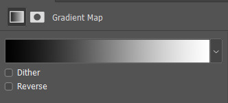
then add a gradient map (bottom right in the adjustments window). make sure it goes from black to white, and isn’t reversed. this will make the gif look a little softer! opacity: 20% fill: 50% (or your whole gif will be black and white)
increase the red saturation a bit and increase the blackness with selective color, so it’ll look like this:
see if your exposure needs some tweaking, remove all the colors you don’t want (the background is mostly yellow now) and add another photo filter, a cooling filter this time, and set it at 4%.
finally, one last selective color layer:
and that’s it, we’re done!!

3. some final tips
it matters which layer is on top. if you use selective color to turn all the green into cyan and put a saturation layer on top of that, not a lot will happen if you increase or decrease the green saturation. but if you increase the cyan saturation, every part that photoshop recognizes as cyan now will become more saturated.
some scenes are a lot harder to color than others, and you’re allowed to just ignore the existence of those scenes. :-)
use folders or “groups” to put layers together. my psds are very chaotic but this helps me find things!
when making a set, your gifs should look good together, not just on their own - sometimes seeing my gifs together makes me realize I need to change the coloring / brightness in some of them. to make sure this realization doesn’t happen when I’ve finished all of them already, I always put them in a tumblr post in my drafts while I’m still working on them.
use creator tags when posting your gifs. so don’t just tag it as “supergirl” but also “supergirledit” and not just “kara danvers” but also “karadanversedit” - this is the easiest way for other people and other creators in your fandom to find you! if your set doesn’t show up in the tags (when you search supergirledit and click on “recent”), send me a message and I’ll help you figure out what went wrong.
try to make your coloring match the ‘mood’ of your gifset - is it dramatic? soft? angsty? romantic? should there be intense contrasts? lots of reds, or calmer blues? same goes for the font you choose, but that’s a whole other tutorial (that I am probably not qualified to give haha, but I can point you in the direction of some people that are really good at it!).
you’re going to make a lot of gifs you don’t like, and that’s okay. it doesn’t mean you’re not good at it, it means you’re learning and improving! and it can also mean that you forgot to turn off the night shift on your laptop and your ‘red’ gif turns out to be... definitely not red. lol

if you have any questions, don’t hesitate to ask!! good luck & have fun :)
#completeresources#allresources#gif tutorial#coloring tutorial#photoshop#photoshop tutorial#ps tutorial#dailyresources#mytutorials#I didn't use color balance for this one but that's a very useful one too!#and vibrance too#though that one makes ALL of your colors more vibrant and that's not always ideal
147 notes
·
View notes
Note
I used to want to be an artist but then i stopped drawing for like 7 years. I want to go back but i'm scared and dont know where to start. So yes, i am interested in those drawing videos can you post them if you dont mind? ^_^
Of course!! I am in the same situation as you actually. I used to draw a lot in middle school (2010-2012) but my depression worsened during high school and in college, I’d only draw as a distraction, never seeking to study or improve. I decided to get back this year, since I decided drawing was the only thing I could see myself doing professionally. I felt very lost, because how do you get back? How do you know what’s your actual, current, art skill? What are your weaknesses? Your strong points?
That’s how I learned to study the fundmentals of art. Because visual art is not a skill. It is a set of skills, if you are very good at anatomy but not really when coming to painting your art is going to look differently than someone who learned anatomy in how to draw manga books but paint like a pro. I am going to divide this post in categories, Also, all the videos I link I also recommend all the channels they are from! My favorites are The Drawing Database, Sycra and Ganev, Sycra and The Drawing Databse have a little of everything and are great at explaining. Ganev is a bit sarcastic but I like the way he teaches. I took some parts of the text of this post from here.
How do I begin?
How do you even get back at art? What tips should you use? These are general tips videos, usually nice to draw along.
/the fundmentals and how to get started/ /5 tips for better drawing/ /perfect pratice/ /beginner’s guide/ /5 tips for digital art/ /10 tips to improve/ /why your drawings are stiff/ /what level is your art/ /improve your art fast/ /drawing basics/ /how to hold and control your pencil/ /intuitive drawing method/ /iterative drawing/
The Fundamentals: Proportion & Placement
Proportion is relationship between one element and another.
In the visual arts proportion relates most importantly to the abstract quality of scale and placement. You know how stereotypically an artists puts a pencil to their eye when looking at an object? They’re mesuring the proportion of the object in question and how to represent it corectly in the drawing.
/principles of proportion/ /ways to create illusion of space/ /drawing the human figure/
/how to draw proportions playlist/ /how to use proportion in character design/ /basic anatomy and proportions part one/ /part two/ /part three/ /part four/ /proportion basics/
Form & Construction
The idea of form is how we see the 3D objects in or world and transform them into 2D in the paper/canvas. It’s understading that eveyrthing is made up of basic forms.
/dynamic sketching part one/ /part two/ /how to draw forms/ /structure/ /building form/ /another how to draw forms/ /how to visualize 3D forms/ /form study process/
Perspective & Depth
Perspective is knowing that as things move away from the viewer’s eye, things seem to get smaller. Get familiarized with terms like horizon line and vanishing point. This is the basic that must be understood to learn perspective.
Here’s a good article about this.
/an intro video on the subject/ /step by step tutorial/ /perspective basics part one/ /part two/ /part three/ /part four/ part five /part six/ /another basics video/ /20 perspective lessons/ /eye level tip/ /linear perspective/ /simple form perspective/ /drawing the figure in perspective/
Anatomy
Anatomy is something I think it’s one the most crucials things to learn in order to make your drawing look good. Once you understand how joints work you’ll be able to see how bones and muscles move. And this goes for anything with a skeleton. It’s one of those things of you learn the rules before breaking them. I am linking different playlists, since linking different videos on various parts of anatomy would take forever. Just study a body part at time: head, eyes, nose, lips, ears, shoulders, neck, hairline, breats, torso, hands, feet etc.
/how to do an anatomy tracing/ /playlist 1 / /draw the head from any angle/ /anatomy for artists/ /draw facial features/ /how to draw and paint/ /playlist 2/ /draw 3/4 head with loomis method/ /playlist 3/ /drawing a head in 3 hours (this one is great to draw along with the artist)/ /how to draw a body/ draw a head with loomis method part 1/ /part 2/ /part 3/ /decipgering bridgman’s anatomy/ /anatomy quick tips/
Gesture
Gesture drawing is a method of capturing figures in exaggerated poses, usually drawn quickly. It is important to undersand that the goal of all gesture is to study the figure and see how it moves. I like looking at poses and copying them. Here’s a good article.
/how to draw gesture/ /how to draw any pose/ /draw interesting poses/ /a guide on gesture drawing/ /tips for expressive dynamic poses/ /figure drawing tips/
Composition
The overall layout of a piece is very important. Artists often consider things like the rule of thirds or the infamous golden ratio. Neither truly defines a composition, but they can both go into your decision making.
/composition in art/ /understanding composition/ /10 composition tips/ /beginner’s guide to composition/ /art fundamental: composition/
Value
Studying value is very much the study of light and shadow. But there is a technical side of light that you’ll want to pay attention to if you’re going for technical rendering.
/guide on rendering/ /seeing light and shadows in daily life/ /10 minutes to a better painting/ /understaing colors and values/ /shading basics/ /ambient occlusion/ /shadow colors/ /tips on how to shade/ /draw shadows on objects and people/ /lighting tutorial/
Color Theory
Color theory is understanding which colors go good with eachother, and knowing the pyschology behind it. (what are cool colors? what colors make someone feel comfortable?) It is fundamental in art for you to understand the relationship between colors and what makes them look good. Best color theory books. A comprehensive guide to color theory.
/hue value saturation in photoshop/ /color theory for noobs/ /understanding color/ /what you should know about colors/ /warm and cool colors/ /the basic elements/ /choose colors that work/
Traditional Media
If you draw in traditional media, all videos above can be used easily. These are just videos for general tips in traditional media, there isn’t many since my focus is digtal ^^’
/watercolor tips/ /draw with colored pencils/ /blending colored pencils/
/4 how to draw lessons/ /Block in colors/ /holding the brush/ /
Digital Media
Digital art is how everyone’s been doing art these days. It doesn’t matter if you’re doing with your phone or your computer. I don’t do art on my phone, I know the most used app is mediabang for android and procreate for apple, and I think anyone who is able to do art with their finger is very skilled. If you are like me and prefer doing art on your computer, you probably have your tablet. If not, well you should have. Not having a tablet is not an option if you want to get better at art ^^’ Best tablet for beginners in 2020. Or you can just buy an old used one, if it still works, and you are a beginner, a small intuos is all you need. When talking about softwares, the three big ones I see people using are: Photoshop, Clip Paint Studio and Paint Tool Sai. The best one is CPS, but I find Sai easier to navigate, but CPS is extremely complete and I hope to be able to master it someday. CPS Tutorials. I don’t have much to say about photoshop, people use it mostly because they’ve been using it forever lol I divide my digital painting process in steps: Sketch/Lineart/Color Blocking/Shading/Blending/Color correction.
Sketch is the basics, draw your idea. Lineart is to clean your sketch. Color Blocking is to color your drawing one color, so it’s easier to work in it. Shading is to understand where the lighting sources are coming from and apply them. Blending is to blend the colors of your drawing with brushes. Color correction is when I use filters of hue/saturation and others to make the drawing more appealing. These require understadings of the software of your choice which I am not very good at the moment so I can’t give you more tips than that ^^’ Hopefully these videos can help.
/perspective grid/ /clean line art/ /coloring process/ /make lineart interesting/ /best brushes for digital painting/ /skin shading tutorial/ /lineart vs painting/ /art in clip studio paint/ /hair tutorial/ /3 tips for improving/ /10 digital art mistakes/ /color block tutorial/ /shading skin/ /from lineart to painting/ /cleaner lineart/ /add texture to your art/ /improve your art with better shadows/ /the importance of brushes/ /use layer modes/ /improve your lines/ /how to blend colors/ /another blending tutorial/ /color blocking/
Exercises
It’s no secret that to improve on art, you must pratice. Everyday, even if it’s just a little! A great way to pratice is make use of youtube picture in picture function to draw along in your software of choice.
/pratice drawing forms/ /proportion exercises/ /perspective exercises/ /value studies/ /creative drawing exercises/ /simple drawing esercises/
Resources
Senshi stocks, a deviantart page full of poses photos.
Quick poses, pictures of models, contains nudes.
Character design references
DesignDoll, create a personalized sketch doll and make it pose.
Phew!!! This took forever to make and is way more than you asked for, but I decided to go all in so I can have a masterpost for me too and for anyone else interested in art. As soon you can understand the fundamentals, you can do your own research and study, youtube is really great for this. I hope this helps, let’s get better at drawing together!!! Ganbarimashou (ง •̀_•́)ง
#anon#askbox#I feel there's a lot more to add but I'm tired I've been working on this sicne yesterday ^^'#Like there's more softwares and resources I could link you I know of that#So when I think of something else I may add to this psot#post#if you feel overwhelmed because this is a lot of info you can start with the beginner section of this psot#and sycra's channel
82 notes
·
View notes
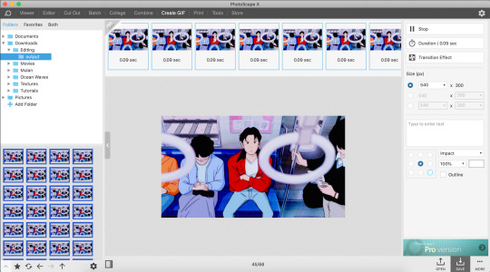
Photo

Hello! I’m going to show everyone how to make gifs using Photoscape, which is a easier-to-use and more cost effective photo editing app than Photoshop!
Please like/reblog if you find this useful because this my first tutorial and it literally took me hours to make lmao <3 The colouring I’ll be showing you is the same one used in this gifset.
The rest is under the cut!
You can download Photoscape here or from the App Store if you have a Mac like me. It’s basically free unless you want to get the pro version, which you literally don’t need. The only catch is that the free version doesn’t have curves :( but just use photoshop for that. Okay, so getting to it ...
Step #1: Getting the frames
I won’t go into detail about this step because there are literally a million tutorials on Tumblr about this. Check completeresources or something lol.
Whatever video you're using, try getting it in 1080p or at least 720p so that your gifs are nice and sharp. I’m gonna be using this scene from Ocean Waves (It’s not edited except for some resizing):
Step #2: Batch Editing
The easiest way to edit your gif is to pull all the frames you want into the batch editor. This is where you can do resizing, cropping, colouring, adding text, etc. This is what your screen should look like when you load it up:
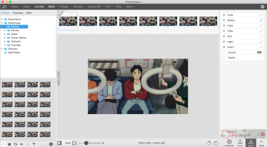
All your editing tools are on the bar on the right.
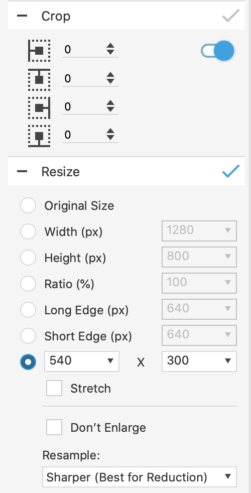
Step #3: Cropping & Resizing
Tumblr dimensions are 540 px for single gifs (example) and 268 px for gifsets where the images are side by side (example). This is rly important for clear gifs so remember it!!
Because our gif is a single one, we’re gonna make the width 540 and the height 300 (the height rly doesn't matter as much). I’m not cropping anything this time.
Step #4: Colouring
Everyone knows this is the best part! Go crazy, go stupid! Have fun!
Everything you need is under colour. I usually just play around here until I find something I like. For this colouring, it looks like this:
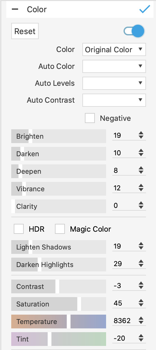
Usually the most important things to edit here are the saturation and contrast, because they really make your colours pop! I also like making gifs with lighter colours and one way to do that is to ‘lighten shadows’ and increase the ‘brighten’ option.
This is what our colouring looks like now:
You can see the colours are brighter now! It’s not bad, but we're gonna edit it some more. The second half of the colouring tools look like this:
The exposure, gamma correction and brightness are your friends! They're super important for the brightness of your gif so utilise them!
The hue and the colour scales are how you edit the actual colours in your gifset! With these settings, our gif now looks like this:

Playing with the hue and colour scales can make your gif look like:
Okay, these are bad examples that I’d never publish, but you get the point lol. Bear with me, we’re almost done.
Step #5: Filter
The MOST IMPORTANT tool here is sharpen. Literally can’t emphasise enough how much you should sharpen your gifs!! Try not to overdo it though because your gifs can turn out grainy. I usually set sharpen at a 3 and never more than 5.
Bloom is also a nice tool which softens your gifs and gives them a dreamy (?) effect.

With the bloom and sharpen on, our gif now looks like this!
Step #6: Making the gif!
This part is pretty self-explanatory. Save and drag your edited images to the part of the app called Create GIF. Photoscape usually saves your flies into a subfolder called output.
Your screen should look like this:
Keep your gif speed between 0.07 and 0.10 depending on what looks right. Also, remember to double check the dimensions of your gif before saving!
The very last thing to remember is that Tumblr only allows gifs up to 10mb, so while saving, make sure not to exceed that size or it won’t load.
And now you have your gif!
If you have any questions, feel free to message me, but this is mostly everything! Have fun giffing!! <3
#literally how do I tag this lol#completeresources#chaoticresources#tutorial#gif tutorial#making this post made me realise yeahps doesn't exist anymore ... rip our fallen soldier#ok hope this helps <3 <3 <3#I'm out
99 notes
·
View notes
Note
Hello! I am so in love with your art and was wondering if you have some tips for digital art? I've tried it once or twice before, but your work really inspired me to give it another shot. I hope you have a wonderful day! <3
tysm!!!! id say to start by watching speedpaints on youtube of whatever subject matter you’re interested in drawing, and then try it yourself! also learn to use layers bc no matter what you’re planning to draw, only using 1 layer is hard haha!!
Watch tutorials on how to use the basic tools of the drawing program you’re planning on using (SAI, photoshop, procreate, etc.). This is really important because navigating through the tools and features can get really frustrating if you don’t know how to use them, or where they’re located.
DONT STRESS!! Digital art is efficient in the way you can simply undo or redo the strokes you make to your piece :) And if you’re using a lot of layers, be careful not to draw something on the wrong one :0 it can get super frustrating when you realize you colored something or drew something on the wrong layer lol
also i dont really see a lot of people mention this when giving tips, but after you’re done with your drawing, feel free to use a separate app to add special effects or put funky filters over them!! play with the brightness and saturation of your piece, add cute lil stickers on it -- maybe you’ll like it better, who knows? picsart is good and i use it sometimes to refine a finished piece.
these are all the tips i can think of atm but i hope these can help u!! good luck <33
26 notes
·
View notes
Note
i saw ur tags on that last post and i am a beginner digital artist and i would love to hear ur tips ^-^ tysm!
hello anon! sorry it took me a hot sec to respond to this, i hope you see this aha
here are some tips i have for beginner digital artists! please keep in mind that i am not a professional, and that what is best for me might not be best for you! also i primarily use paint tool SAI and photoshop, for reference. i just have been doing this for a while so i have figured some shit out:
play with brush settings!! having different brushes with different settings to serve different purposes can make your life so much easier. my suggestion would be to have at least 5 different brushes in your wheelhouse set to your own preferences: custom all-purpose brush, eraser brush, pencil brush, airbrush tool, brush for blending (i have a custom paint brush to use for this but a standard water brush also works pretty well for this). turning whatever brush you are using into eraser mode will also be very helpful. for paint tool SAI users, i can share some of the brushes i use + what i use em for
map your undo keys (ctrl + z) to somewhere convenient, and set up your desk/devices to optimize your comfort. i work on my laptop, which i put on a raised surface on my desk so that i can sit straight and look straight ahead at the screen instead of hunching over my desk to work. i’m getting older and my back is so messed up so this important for me LOL. my drawing tablet has buttons, so i map my ctrl + z keys to the buttons so i can use the undo button quickly. this is a really simple thing to do and it helps to streamline your process by a LOT
the magic wand tool is so helpful for filling in outlined spaces and streamlining your coloring process a little. it won’t be perfect but often i think it’s easiest to magic wand things spaces and then go in and fill in the gaps
for ALL stages of your art (lining, coloring, painting, etc) using transparent eraser functions are actually really useful. this one is hard to articulate fully, but instead of just repeatedly drawing a line and undoing it because it looks bad, it’s often a lot easier to get a little sketchy and loose with your lines and then go in and touch them up with an eraser. i use basically all my different brushes on the eraser mode to make things look more natural. if you are curious about this one i can try to explain further with visuals in a separate post
you can window your files so that you can work with your references right next to your art, which i personally find very convenient.
layers can be SO USEFUL!! they are something that really sets digital art apart from traditional art. you can compartmentalize different parts of your drawing into different layers, adjust each layer differently, move and transform layers independently, add different filters/effects to each layer, etc. i can’t really dictate to you how exactly to use your layers, because some people like to use a ton of layers and some people prefer to use very few to only one layer, but it is worth playing around with different methods of using layers to see what works best for you. personally, i am someone who uses like 30+ layers in a piece. if you use a lot of layers, PLEASE keep them organized and label them in a way that makes sense to you
transform tool (ctrl + t ) is your friend! i use this tool so much, it is excellent for resizing things, tweaking shapes, fixing perspectives, and more.
play with the hue/saturation and brightness/contrast sliders. those are really good for adjusting colors, shadows, highlights, etc etc
save often, and save multiple sets of your files in multiple forms. this shouldn’t happen too often, but sometimes your files can just arbitrarily get corrupted beyond repair and you just lose all your work. i’ve gotten into the habit of saving my works at various stages into .sai files, .psd files, and .png files. SAI files are especially vulnerable, i’ve noticed.
these are just some things i could come up with off the top of my head, it’s hard to be comprehensive in one post, but feel free to shoot me some questions! i can try to make some more helpful tutorials if any of you are curious about my process.
52 notes
·
View notes
Note
Hiya! First off I just wanted to say your rnm palette ask sets are just utter perfection! They're legit so gorgeous I keep staring at them! And I was wondering if you had a tutorial or tips/tricks on how you made the Isobel+alien girls set with the mixed colours? Keep up the amazing work!!!
hey!! firstly thank you so much!! ❤️❤️
i tried to do a tutorial, i apologize in advance for any english mistakes and if i’m not good at explaining or you’ve got any questions, don’t hesitate to hmu :))
this will be a tutorial to make gifs in the style of this. i won’t go too much into the practical how to make a palette part.
there’s probably a lot of other better tutorials out there for this, but that’s my way of doing it:
(If you want a very quick summary of all this + just tips i put them at the end, because this is gonna be a long walk through.)
(edit: if you use this pls send me your stuff i wanna see it lol)
Detailed tutorial:
So one important thing is to choose the right kind of scene and to know what you’re going to be able to do with it. For example it’s easier to color a well lit scene but if it’s too bright it might also be annoying, it also depends on the colors you’ll be going for. Your life is going to be a lot easier if there isn’t too much movement. If it moves a lot, it can still work well if the background is a solid color, by using the selective color adjustment layer. Also sometimes you just have to try to see if it works!!
Since there isn’t a strict rule on how to do it i’m gonna walk you through how i make it personally.
for this i’ve chosen this palette

I like it because it’s bright and there’s a colors that are gonna be nice to use with the scene I picked.
Once you’ve made your gif and you’ve cut it/sharpened it how you please (for this kind of gifsets I like a smooth sharpening but it’s really your choice) we can start to bring do the light and then the colors.
This step is like, to each their own. I usually go with curve first, then light/contrast, levels, exposure, then the selective colors layer for the blacks, and vibrancy.
(i’m putting the settings i used here for reference but it really depends on the scene, i don’t always use the light/contrast, exposure, either.)
(sorry it’s in french but it’s the exact same thing in english, and they’re in order)

I added another curve because i thought it was too dark and now i’ve got this.
Now we’re gonna start with the selective colors:
(I add another selective color layer because to me it doesn’t have the same use as the one I put before.)
technically you can start with the blacks and go up (blacks, greys, whites, magentas, blues…) here i didn’t change the blacks because i already did that layer before or the greys because it changes the picture globally and here i didn’t see the point to do that at this stage, but on some gifs it can be helpful.
i like to take off some yellow in the whites and add some blue.
then for magenta i do this:
it works because there isn’t that much magenta in the picture but it’s also something that you have to see case by case for the different colors.
same for blue and cyan:
don’t really care about the greens, on this particular picture it doesn’t change much.
then i took off some yellow and did this with the red. my goal with this is to have her skin not be yellow. for now i don’t worry about her hair, just worrying about her skin.
then i added a color balance adjustment layer
i also added another curve bc it was still too dark in my taste and at this stage i’ve got this:
so now we’re gonna start to try and color specific elements, it’s like imagining the gif as blocks of colors that i gotta get from one color to another.
i start with her lips. they’re pink and i want them to be more red to match the red in the color palette. so i use a hue/saturation layer.
basically i change it so it matches the palette, less pink and more red.
i also changed the yellow a bit so her skin looks closer to the color i’m aiming for, and i made it lighter.
then i’m gonna start on the background.
i’m gonna try to make it blue like the blue in the palette.
for this we’re gonna add a new transparent layer and we’re gonna paint on it with a soft brush. that’s what we’re gonna do for the rest of the “color blocks” (background, hair, jacket). since she doesn’t move a lot in the frame, i decided to (roughly) select her silhouette and then color the outside of the selection.
then i changed the blending mode of this layer to “color” (it doesn’t have to be color, i usually try a few different blending modes until i find the one that works). and since it still doesn’t look very good on the edges, i duplicated it and went to filter, gaussian blur, at about 4,5, to smooth it up.
it doesn’t have to be perfect in my opinion, i think it works pretty well.
now moving on to the hair: i want them to be yellow to match the yellow of the palette. i add a new transparent layer, repeat.

here i didn’t select them, i painted directly with the soft brush. i changed this layer to “soft light” because it’s the one that works the best. i also added a hue/saturation layer where i made the yellow a little more vibrant.
then i still think her face is a little bit too yellow so i added a selective color layer where i removed some yellow, i put it under the first transparent layer and then i erased it on the layer mask on the places that aren’t her skin so that it doesn’t have an effect there.
then it’s great because her jacket is already kinda green and there’s green on the palette!
so i do the same thing with a transparent layer and i color it with the green of the palette. changed this one to color and added a hue/saturation layer to make it brighter and worked on the mask so that it only has an effect on the jacket.
and you’ve got your result!!
you can still make your adjustments but i’m gonna stop there for this one :D
now since it was very long and some of you already know how to do all of this
general tips:
- pick the right scene.
- see the different parts of the gif as “blocks of colors”
- use the drafts on tumblr. to see what the gif looks like on its own, to see what it looks like compared to the others, post it as a draft, look at it, change it, change it again, change it again.
- if you wanna match a palette open the palette in ps and go back to it all the time lol. i’m bad at this but it’s what you should do!!
quick summary if you don’t feel like reading my blabbering:
pick the right scene
make your normal gif
do the light first
do what you can with the general colors of the gif, think of the skin. selective colors is your friend.
paint the different blocks of colors, change the blending modes, use selection if you have to
final adjustments!!
once again, if you’ve got any question i’ll try my best to answer them. hope this helps somewhat!
#tutorial#resource#gif tutorial#photoshop#photoshop help#idk how to tag this#myseryluvscompany#mypshelp*#answered#long post
26 notes
·
View notes
Text
How Do I Make Gifs? - A Photoshop CC Giffing Tutorial
(for @elektrawwf, and anyone else interested in how I make gifs I guess, lol)
So, I feel like I should preface this by saying that I'm certainly no expert on this, nor am I a Professional Giffer™, but I’ve been making gifs for a few years now, and have developed a pretty standard system for doing so. Hopefully it works for you like it’s worked for me! :)
Basic Tutorial Steps:
Step 1 - Recording the scene you want to gif
Step 2 - Importing, deleting, and cropping your gif frames
Step 3 - Adding adjustment layers
Step 4 - Resizing your gif and setting the frame delay
Step 5 - Converting and sharpening your gif
Step 6 - Trimming and saving your gif
BONUS STEP - Adding text (OPTIONAL)
-
Programs Used/Needed:
- QuickTime Player
- Photoshop CC 2018
-
The finished gif that I’ll be making:
This tutorial is VERY screenshot-heavy, so the rest of it will be below the cut. Happy giffing!
STEP 1 - Recording the scene you want to gif.
All gifs start as videos. I use the Screen Recording feature on QuickTime Player to create videos of whatever scenes I want to gif. If you have a Mac, you can find QuickTime in the Applications folder:
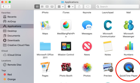
Right click, then select New Screen Recording.
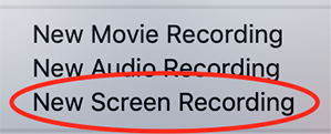
You can then play the scene you want to gif on your computer, and your screen with the video on it will be recorded. Hit the stop button when you want to end the recording, and then save the video.
It’s best to not record more than a minute or two at a time - basically, just record the exact scene that you’re looking for - because the longer the video is, the harder it’ll be to select the portion of it that you need for giffing.
You can technically screen-record any type of video, but I (and most giffers) vastly prefer videos that are 1080p, which is the best kind of HD. That’s why I usually don’t gif things unless I can find them either on Netflix, Youtube (in HD) or the CW site (or NBC, CBS, whatever). There are definitely other (less legal) ways to get your hands on HD videos, but I’m just not super comfortable using those lol.
That being said, 720p videos are usually okay for smaller (268px-wide) gifs - they’re just less ideal (I wouldn’t really recommend using them to make 540px-wide gifs, but you can still technically do it).
STEP 2 - Importing, deleting, and cropping your gif frames.
Now that you have your video, you have to import it into Photoshop. Once you open Photoshop, you need to go to File > Import, then select Video Frames to Layers.
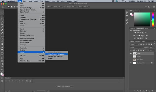
A window will pop up, where you can set the amount of frames that you want Photoshop to import, and select the exact section of the video that you want to import. Here are my settings:
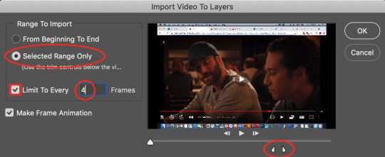
The two little toggles below the video are meant to be dragged around, and you use them to section out the specific Range of the video that you want to turn into a gif. Once you have all of this set up to your liking, hit OK.
-
NOTE: The selection of Limit To Every 4 Frames is more my personal preference than anything else. If you want Really Smooth Gifs, then you can uncheck that box and simply import every single frame in your Selected Range. This is what High Quality Giffers always say to do. Unfortunately, while those gifs do end up really smooth, they also end up being really short, which I don’t particularly like.
So basically, I’m personally willing to sacrifice some smoothness in favor of an increased gif length, but you do NOT have to do that if you don’t want to. Choose whichever option you like best - these Steps work no matter which one you do. (We’ll come back to this later though, once we get to setting the frame delay in Step 4).
-
Okay, back to the tutorial.
Once the scene is imported, you can delete any extraneous frames at the beginning and end of the frame animation Timeline, which can be found at the bottom of the screen.
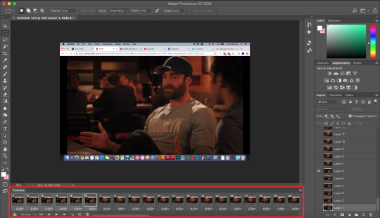
As you can see, I have the first 6 frames selected. Those are the ones I ended up deleting (among some others at the end of the Timeline).
You can also go to the Layers panel on the right, and delete the corresponding layers from there, once you’ve deleted the frames. This isn’t technically necessary, but it might help free up some computing space if you’re deleting a lot of frames.
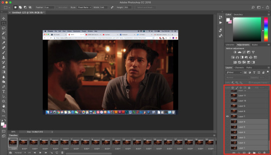
Next, you need to click the Selection Tool in the top left corner of the screen. Then, set your selection preferences (circled below) as follows:

Style: Fixed Ratio
Width: 540
Height: 250
This is specifically the ratio to set for a 540 x 250px sized gif, which are the dimensions of the example gif I’m making. If you want to place two gifs beside each other in a gifset, each gif needs to be 268px wide. (The heights can be whatever you want them to be.)
Use the Selection Tool to select the area that you want to be your gif, and then go to Image > Crop.
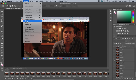
STEP 3 - Adding adjustment layers.
Now it’s time to make your gif look pretty™. For this part, you’ll be using the Adjustments panel above the Layers panel.
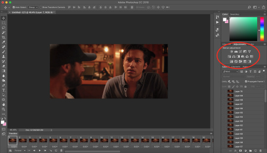
Adjustments will affect all the layers below it, so you want to make sure that your adjustment layers are placed above all of your gif layers.

These are the adjustment layers that I used for this specific gif, but they’re also just generally the same three adjustments that I use for every gif I make. (I also usually add a Hue/Saturation adjustment to my gifs, which I set to +15 Saturation, but since this scene was already so heavily saturated, it didn’t need it.)
Here are the specifications for the Brightness/Contrast and Levels adjustment layers:

Regarding the Curves adjustment layer (pictured below), if you click on the RGB dropdown menu, you can single out specific colors in order to color-correct the gif, which I did here (by removing a lot of extra reds and yellows).
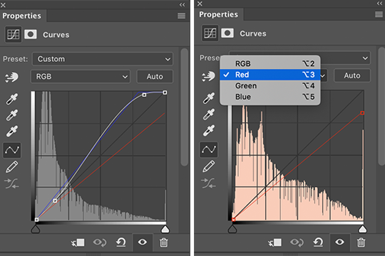
While these are good general adjustment examples, just take note that the values pictured here won’t be exactly the same for every gif, and you need to toggle and play around with them to make every new gif look its best.
Here’s the example scene before any adjustments:
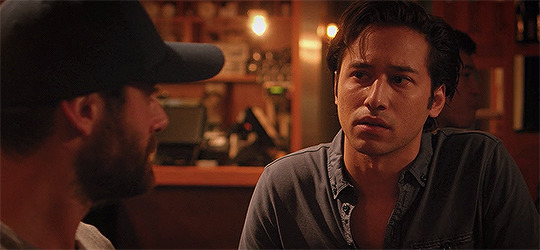
And here’s the scene after my adjustments:
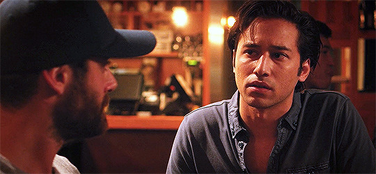
STEP 4 - Resizing your gif and setting the frame delay.
To resize your gif, go to Image > Image Size, and then change the gif’s width (in this example, I change the gif’s width to 540px).
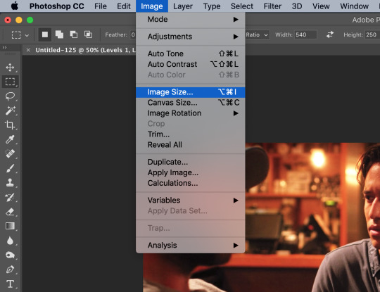

As long as Resample is checked the you’re working with Pixels, the gif should resize properly. Hit OK.
Next, to change the Frame Delay of the gif (basically how fast it goes), look for this button in the right corner of your Timeline, then click it and Select All Frames.

Once all the frames are selected, you can hit one of the little downward arrows next to the 0.02 values, and select Other.
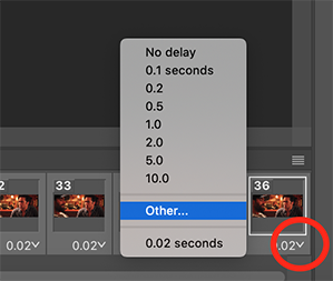
Now you can set your new frame delay. I always set my delay to 0.09 seconds, which produces gifs that are a bit slower than the Professional Gif Standard™. This is due to a combination of personal preference (I just like slower gifs) and an effort to maintain as much smoothness as possible, given how I choose to import my frames.
-
NOTE: Remember the NOTE from Step 2? Now, if you chose to import every frame, rather than “Every 4 Frames” like I do, then you should set your frame delay to 0.04.
Doing so will produce a final gif that looks like this:

Notice how this gif is smoother and faster, but also shorter than my example gif? Yeah. Like I said, whichever style of gif you choose to make is up to your own preference.
STEP 5 - Converting and sharpening your gif.
You never quite realize how blurry a gif really is until you Sharpen it. To do this, you first need to convert your Timeline from a Frame Animation to a solid Timeline. You can do this by making sure all your frames are still selected, and then clicking the Convert to Timeline button in the bottom left corner of the Timeline.

Now your Timeline should look purple, like it does in the picture below.
Next, you need to select all of your layers (MINUS the adjustment layers) on the right side of the screen. Once all of your layers are selected, go to Filter > Convert for Smart Filters.
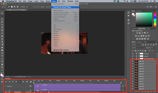
Once your gif layers have been compressed into a Smart Object (see circle below), you can select Filter > Sharpen > Smart Sharpen.
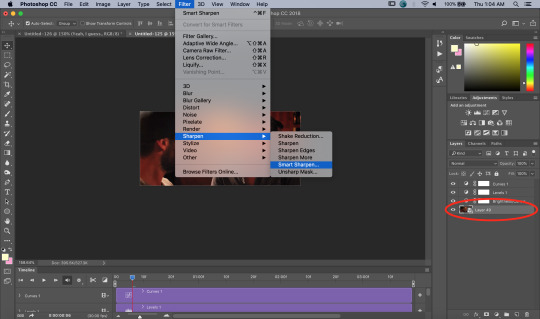
The first time you select Smart Sharpen, you need to set all the parameters for it. But once you do that the first time, you shouldn’t have to set them again. Basically, make sure your window looks exactly like this one:
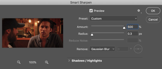
Then hit OK.
You’re going to do this TWICE (so you’re going to end up with TWO Smart Sharpen layers below your Smart Object layer). Then, you need to click the button to the right of the top Smart Sharpen layer, and change the opacity of that layer to 30%. (Otherwise, your gif will be way over-sharpened.)
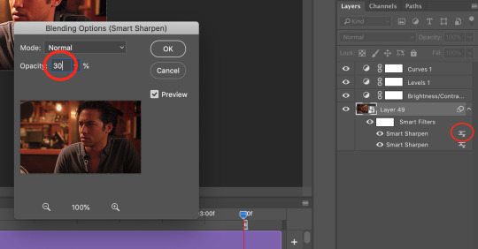
STEP 6 - Trimming and saving your gif.
You’re almost done! It’s time to save your gif.
To save a gif, you must go to File > Export > Save For Web (Legacy).
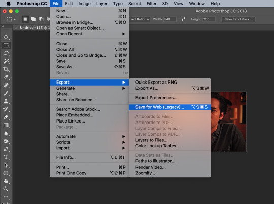
However, this gif has a problem.


This number in the bottom left corner of the Save For Web window tells you the current size of your gif. As you can see, this gif’s size is currently 3.541 MB. That size wouldn’t be a problem if you were intending to upload this gif to Twitter, because Twitter has a gif size limit of 5 MB.
Tumblr, however, only has a size limit of 3 MB. So, to get your gif to work on tumblr, you need to Trim it.
Trimming is the process of changing the length of a gif without actually deleting any part of it permanently. This gives you the freedom to edit your gif and pick the portion of it that you like best.
You can easily trim your gif in the Timeline, by clicking the dragging the Gray Sliders at each end of it (see the arrows below). Wherever you leave the stoppers will become the new beginning and end of the gif. You can make this process more precise by using the Blue Slider (circled below) to choose where you want your stopper to go before you drag it there.
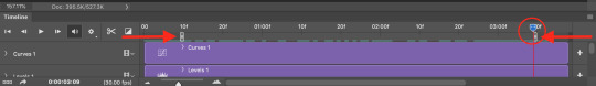
The Timeline pictured here has already been trimmed.
Trimming your gif will often require some trial and error. Whenever you want to check the length of your gif, simply go to Save For Web again and check the amount of MBs in your gif. (Click Cancel if your gif is still too big.)
Once your gif falls below 3 MB, you can finally save it!

The last thing you need to do before saving is change your Looping Options from Once to Forever in the bottom right corner of the window. Then, click Save.
You now officially have a finished gif!
Mine looks like this:
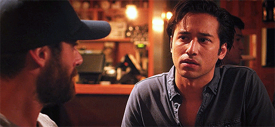
-
BONUS STEP - Adding text (OPTIONAL)
Now, I’ve just shown you how to make and save a gif. But what if you want to add text to that gif? I’ll show yow how to do that too.
First off, you should only add text after the rest of your gif is completely done and ready to be saved (basically, once you’ve already completed Steps 1-5). Then, before you save it, you can click on the Text button on the left side of the screen.
Click on the gif to create a new Text layer, and then type whatever you want. Generally, dialogue captions are placed in the middle of a gif towards the bottom, while other, more artistic types of Text can go wherever you want.
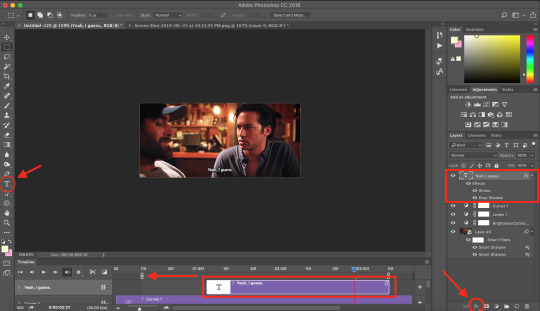
Now that you have a Text layer, you want to make sure of a few things. First, make sure that your Text layer is your TOP layer on the right side of the screen, above all of the Adjustment layers.
Next, you want to make sure that your Text layer spans your entire gif Timeline. Notice how my Text layer (depicted as a purple rectangle in the Timeline) doesn’t reach the Gray Slider on the left? To fix this, simply click and drag the Text layer until it extends past both Gray Sliders.
And finally, I always add Effects to my Text. You can do this by hitting the fx button in the bottom right of your screen. Specifically, I use the Stroke and Drop Shadow effects to make my gif stand out from whatever background it happens to be on.
My Stroke is always set to 1px thick, and my Drop Shadow settings are as follows:

As a final note, if you want your text to look exactly like mine, then you need to use the font Myriad Pro in size 14, which I then italicize and bold. You can also open Window > Characters, and make sure that your preferences look like this:

ALRIGHT. Now that you’ve added your extra text, you can FINALLY go to Step 6 and save your gif.
Now, your finished gif should look like this:

I hope this tutorial was helpful! I tried to be as thorough as possible to avoid any confusion, but if you have any additional questions, you should always feel free to ask me!
Have fun giffing!! :)
#my tutorials#my gifs#idk what else to tag this lol#gif tutorial#personal shit#long post#I'm so sorry to anyone on mobile with no read more
55 notes
·
View notes
Note
i’m looking into making and selling my own charms, do you have any advice?
yea sure! idk if i’ll be the MOST helpful with this, or even if this is the advice you were looking for, but these are just things that i messed up/didnt realize while making charms, and also some expectations stuff, in NO ORDER: (THIS GOT WAY LONGER THAN I THOUGHT)
1) You might make them at a loss of money. usually people make charms to make a profit, but I have basically never made money on any of mine! I made the early ones JUST for me and my itabag, and even when i held pre-orders it was at a loss, since production is expensive
2) if you are making them for other people to buy and want them to look real nice, i know it hurts the bank, but buy the test run size (one charm, or whatever) cause MAN, that froppy bottle charm i made? the test run came back and its like “OH SHIT! I NEVER MERGED THE LAYERS” and so the charms came out with silly holes all in them lol, didn’t make that mistake in the final print
3) depending on where you get them printed the colors WILL print out differently. for my charms, the file for printing is a little over saturated than what i would post online, and with a light pink filter, cause the printing always dulls the colors just a LITTLE bit, but i notice...
4) if your charm is going to be made tiny tiny, like 2″ or less, idk what your art style looks like but thick line art will make the charm design more obvious when printed tiny. it couldnt just be your art shrunk, its gotta look right from a distance, and some tiny details just wont show on a small sized charm (but if shes a big one then do whatever!)
5) i have only ever sold on etsy, and just like, from direct messages. etsy is pretty easy to use, but there is a small fee for having a listing up, but on the other hand you can get labels printed from etsy for a 1$ off normal USPS prices, and its more organized than just keeping a list of who wanted what
6) if you only sell 1-3 charms and you are confident with your colors/file, you can just order “1 charm” from the printer. the place i print them always sends me 3-4 charms even if i only order one, but that might be because i only ever make small charms, might not be the same for larger charm designs
7) I dont do this enough but advertise! i feel bad for spamming my followers, but tbh most people wont see ever self promotion you run, like tumblr is a little dead and i STILL dont see every post my friend makes and gotta go back to their blog ever once in a while to see what else they posted. SO ADVERTISE!
8) idk if people talk numbers much but i think its good to know: ”1 charm” order is ~16$, 50 rings are ~4$, 100 cellphone straps ~8$, 30 extra dangly things (little stars i put on my bottle charms) ~9$, 8 padded shippers ~4$, 1 shipping label inside the USA ~3$.
If you can sell a LOT of charms, you can actually make a profit, cause the chrams themselves get cheaper the more you buy, but if you only sell a few well.. it’ll be a loss, cause almost no one wants to buy a 40$ charm. That isnt to say dont do it, i sell more of the charms I make each time i make new ones, and rings and stuff can be saved for later projects, but just to know there is some upfront costs.
I dont mean for all this to be negative, I dont actually regret making any of my charms, cause tbh at the end of the day I really made them for myself to have, and put on the itabag! Any extras i sell is just bonus!
#this got so long#i am so sorry#just i didnt know how to explain any of it shortly#and prices may vary with what site you use and how you ship and lots of stuff#but yea#i think at the end of the day you should make them for fun not profit#but maybe i only think that cause i sell so few? lol#Anonymous
6 notes
·
View notes
Text
Manga Colouring Tutorial
youtube
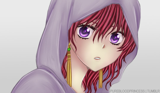
Dedicated to @aphrodytevalentine, @eternalpassions and @vk-crzy! I hope you will find this useful girls!
Hello everyone~! <3
I put together a manga colouring tutorial. It’s more like a recording of the process of what I usually do, but I hope it can still be useful for some people. I’m not saying my way of doing things is the only way to colour manga. There are numerous methods you can use, I think most of it depends on personal preference. This is just simply what works best for me.
Rest of the explanation is under the cut.
Programs used:
- Adobe Photoshop CC 2015
- Paint Tool Sai
- Wacom Intuos Draw (graphic tablet)
It’s perfectly possible to colour without a graphic tablet, but I’m not gonna lie, having one certainly makes life easier. Same can be said about Sai. Doing everyting in Photoshop is possible, but some of Sai’s tools are so good that once you try them you never wanna go back.
I’m not going to go into super detail with my explanation, I don’t think this is the place to teach how to use Photoshop (and Sai). So please ensure you have a basic knowledge of things before you attempt this.
You can download the finished PSD here.
Steps:
I always start with Photoshop. I fix the scan and put on the base colours, but I don’t use a tablet for this. Then I open up Sai and shade with the tablet. Once that’s done I use Photoshop again to change the background and add any effects/filters that I want or find suitable for the image.
Basically, Sai and the tablet is for shading only, everything else is done in Photoshop.
1. Use good quality scan.
I’m not kidding, having good scans means you have to work less on trying to improve the quality before colouring. It’s super helpful.
2. Fix your scan.
If you want to get rid of the background or speech bubbles, start with that. Do some redrawing if needed. Remove any excess dust and make sure the scan is clean. I usually remove the shading on the skin area as well. Level the image properly and if needed, use Topaz Clean and Topaz Denoise. Basically, fix the scan as if you were attempting a black and white edit.
3. Set your layers up.
Make sure you always group and name them, it’s super helpful when you have to work with 100 or more layers. Also make sure that you make a new layer for everything. Easier to backtrack and correct mistakes.
This is how it looks like at the end:

With one group open:

Lineart layer is always at the top, set to multiply. I always put a layer mask on it and fill that with a mid-toned grey, this is going to make the lines less harsh and overall more pleasing to look at. After that I have the lineart layer locked so that I don’t accidentally paint on top.
Background layer is always at the bottom. While I colour I usually have it filled with a random colour, it’s to make it easier to look at, pure white is very blinding after staring at it for a long time. Then, just like the lineart layer, I lock it to avoid accidents. After the colouring is done, I change the background to whatever I find fitting for the current image.
The colour layers are in between the lineart and the background. As you can see I always have them grouped. I made a screenshot of the “hair group” open so you can see how it looks. Others look the same. At the bottom I have the base colour, above that those are the shading layers. I always use Clipping Mask so that the shading doesn’t flow outside of the base colour.
4. Put on all your base colours.
I usually use the Pen Tool to select the area I want selected, and then I simply fill it in. You can save yourself some time if you remember the general rule that a layer that is on top of another one, is going to hide the one under. So basically you don’t always have to follow the outline if you know that a layer you will make on top will hide the excess anyways. Please watch the video to better understand, it’s hard to explain lol.
5. Do the shading in Sai.
After the base colours are on, open up Sai and shade. Try to place the light source in one corner. What I mean by that is try to decide and keep in mind where the light is coming from, the shades depend on that. For shading I usually use the Marker Tool, the Brush Tool, the Blur Tool, the Eraser Tool and sometimes the Water Colour Tool. In Sai you have loads of settings and options for the brushes and the graphic tablet makes all of it pressure sensitive so you can have very delicate strokes. For highlights I usually set the layer to Luminosity. Another good function of Sai is that you can use Hue/Saturation for the entire layer group and not just one layer. That way it’s easy to fix the colours after you finished shading.
6. Add the remaining extra touches in Photoshop.
After I’m done shading, I fix the background and add effects/textures/etc in Photoshop. Make sure you resize the finished image to Tumblr dimensions and you are done. :)
#there is no music under the video so far but i might add something later#manga coloring#tutorial#manga coloring tutorial#digital colouring
38 notes
·
View notes
Last Seen Blogs
theres-a-way-out-of-any-cag-blog
Let's Punch It

sparkingaconspiricy-blog-blog
Sparking a conspiracy

mikemike123sblog
Untitled

a-k-mu
200%
stabosins4
Stabby