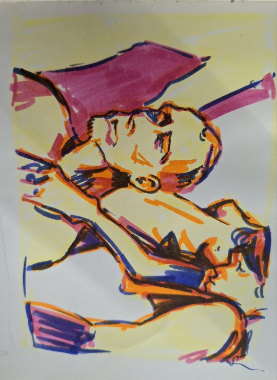
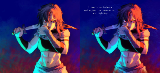
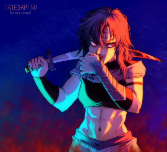
#been trying to work on improving colour and shading in my art
Explore tagged Tumblr posts
Visit Tumblr Blog
Explore Tumblr blogs with no restrictions, modern design and the best experience.
Last Seen Tumblr Blogs


Fun Fact
BuzzFeed published a report claiming that Tumblr was utilized as a distribution channel for Russian agents to influence American voting habits during the 2016 presidential election in Feb 2018.
Text

I will finish this at a later date probably
Work in progress of Judy Hodiah*, the secondary main character of Copyright Free Snowbird (still no name)
@randosfandos be my cheerleader (please)
*not her surname anymore don't freak out
#my art#digital art#snowbird adjacent#copyright free snowbird#judas hodiah#judy#gasp WORDS for a background?? inconceivable!!#just realised her coat is almost the exact same colour as her skin. whoops#ive been writing both copyright free snowbird and snowbird at the same time#ive actually been making a lot of progress on snowbird because of it!#when i lose focus on snowbird (they cant always be in hell all the time after all) i switch to my original story and vice versa#tbh the girlies are still going through it but now there's less of the whole torment subplot#im trying a different style (because i am better at art now) and idk how i feel about it#obviously the more realistic faces (wouldnt call it realism tho) are an improvement but the line weight? the colouring method? the shading?#its all a little ehhhhhh#ill work on this i think i should have more free time later#im working on snowbird i promise i promise#judas kinnunen#KINNUNEN dipshit why would you even uh why would you even type anything else hah mean spirited laughter#i canf be bothered to move the tags tbh and you know what why SHOULDNT people see my progression#the characters being finnish isnt super relevant to the story tbh i just want a little consistency with the setting#obvioudly theres gonna be a lot of suspension of disbelief but i think it would help make the characters feel a little more real
4 notes
·
View notes
Note
why do you draw them all so.... white
Hi anon, thanks for sharing your concerns!
This ended up a tad long, so please find my answer below the cut (:
I’d like to start with the fact that the purpose of my art is to enjoy myself during my time off and to (hopefully) entertain the Tumblr clone community with my creations. I do not intend to hurt or attack any individuals or groups with either my art or my writings; if that happened with any of my creations, it was never on purpose and never my intention, and I do apologise for it.
Now back to the colours I use for my clones. I know mine aren’t the darkest skinned clones around, but I didn’t consider them exactly white either. I’m sorry to hear that’s your perception of my art. Although I really love TCW and TBB, I am saddened about some of the decisions the creators made, and I truly wish they’d incorporated more (or rather, any) Tem likeliness into the clones.
I’ve only started drawing humans a year ago, and to be fair, it’s been a struggle to figure out anatomy and proportions and such, and I’m still learning. I’ve gradually started to add more Tem likeliness into my art, mostly the facial features (I truly hope that it’s visible, because that’s really something I’ve been aiming for, and am still trying to improve).
I did colour pick a Tem ref for the colour palette I’m currently using, but that’s pretty tricky due to different lighting in photographs. I did use a darker tone at first, but since screens have slightly different colour settings, it looked great on my laptop, but ended up super orange on my phone?! So I did some experimenting, and ended up with the colours I’m currently using.
I’ve had ‘experimenting with colours’ (read: figuring out a ‘better’ colour palette for the clones) on my ever growing to-do-list for a while, but haven’t found the opportunity to sit down to do so. You see, I use a colour palette for all the different aspects: colours of the skin, lips, hair, eyes, and rendering like blush, shading, highlights, but also the lines of the face, lips, cheeks, scars, etcetera etcetera. So when I change the skin colour, I need to change almost all of those colours, because it would look off otherwise. And I simply haven’t found the opportunity to sit down and take the time to experiment yet.
As an artist, I’m always trying to improve my creations. Especially with being quite new to drawing humans, still figuring out how ‘we’ work, and with creating clones (for which we all have our own visions and headcanons about their appearances). So please be patient with me, I’m always trying to improve, and I’ll definitely look into the colour palette. And again, it was never my intention to offend anyone, and I’m truly sorry if I did.
Thanks for reading (:
43 notes
·
View notes
Note
hihi not a creature au ask sorry but do u have any tips to improving art skills? /gen, second question how did u get into digital art?
dont be sorry the asks are for anything really
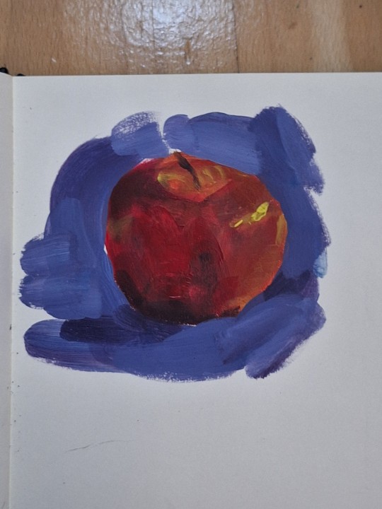
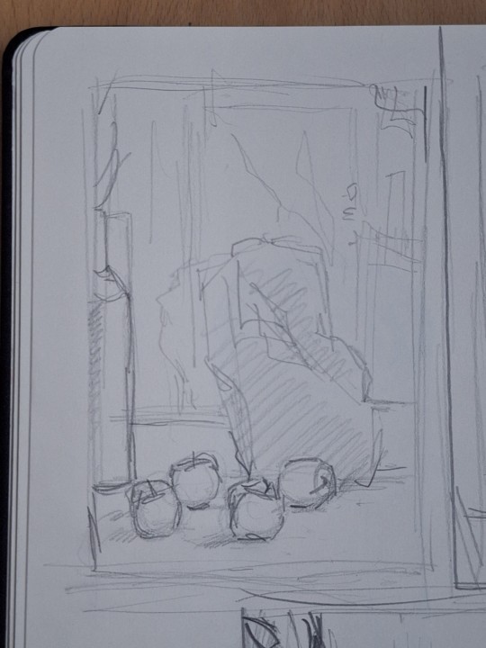
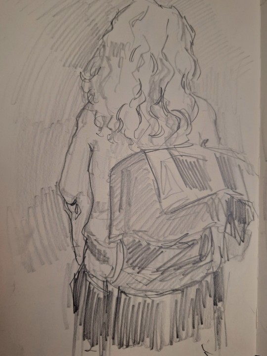
my biggest tip is pretty boring and has been said a billion times probably but you u fortunately need to do the boring basics. you can go anywhere you want from there and its gonna be much easier. ex. - drawing alot of boring 3d shapes in dofferent types of perspective. boom now you can draw backgrounds. drawing from models in realism (live ones are better but photos are great too). boom now you have the skill and knowledge on how the human body works and can play around with it to develop ur own art style. greyscale form practice (like shading cubes or drapery or still life). boom u understand how light and shadow works. the hardest thing really (imo) is learning colour. me personally, traditional painting (acrylic, oil, guache, tempera) helped the most (again ALOT of still life). but learning colour theory, or just fucking around with whatever colour medium you like until it looks good is also very helpful. so again basics are really important.
next thing is, use resources. theres so many free art resources out there and theyre very helpful. my personal fav lately are quickposes and david finch on youtube. use refs, if needed take ur own.
also mindset stuff like being okay with making "bad" drawings. shitty sketches, wierd colour xombinations, wonky perspective. making art is not abt not making mistakes, but abt making them and learning from them cuz if u dont try ull never get it right, even if its bad at first. also always go from overall to detail. make 5 minute sketches, that forces u to focus on form and translatinf the overall idea more than hyperfocusing on detail. and ofc alot of consistent practice. draw every day, whether its a 5 min aketch or something more polished. (im gonna attach some of my oractice sketches so u get the idea of what im talking abt cuz i feel like im not the best at explainin)
as for digital art, i was first drawing on a regular ass samsung tablet with a pen wrapped in tin foil (it makes it work like a stylus fun fact) on ibis paint which is free and honestly it was great. on thing is if ur starting digital get some free simple program cuz if u try to start with something thats "industry standard" its just making ur life harder cuz on top of learning how to draw oj a tablet, you have to learn the software, and u dont need that when u start. i got my actual drawing tablwt after like two years and i was working in krita (also free and really good). now i work in csp and its amazing but theres alot going on and it is pricey (but well worth it imo) digital is easier in alot of ways but i still recommand learning traditionally
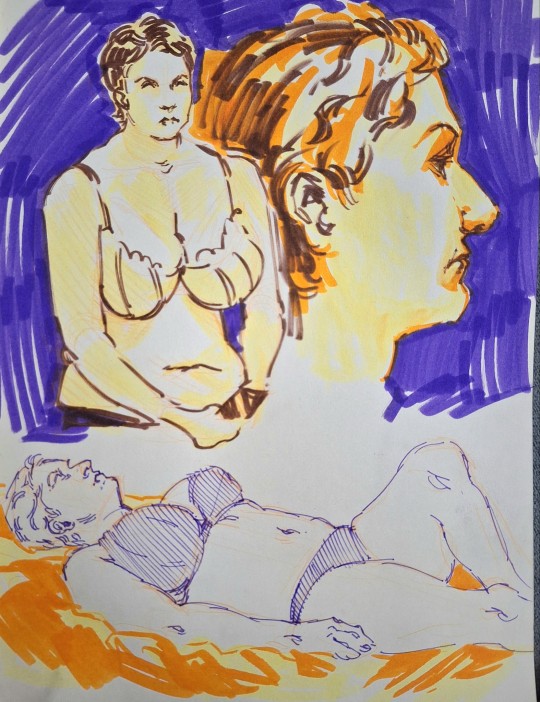
sorry for the shitty photo quality im bad at posting traditional art. but thats what im talking abt these are like 10-15 min each, focusing on form and the overall and not going into much detail
49 notes
·
View notes
Text
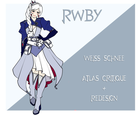
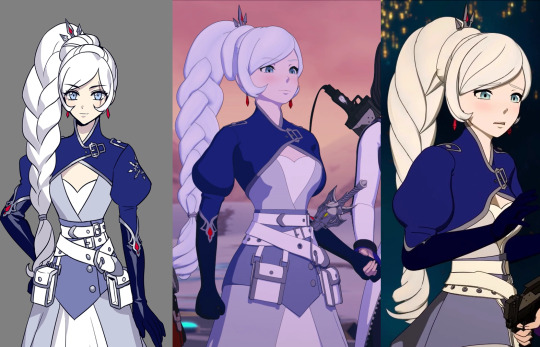
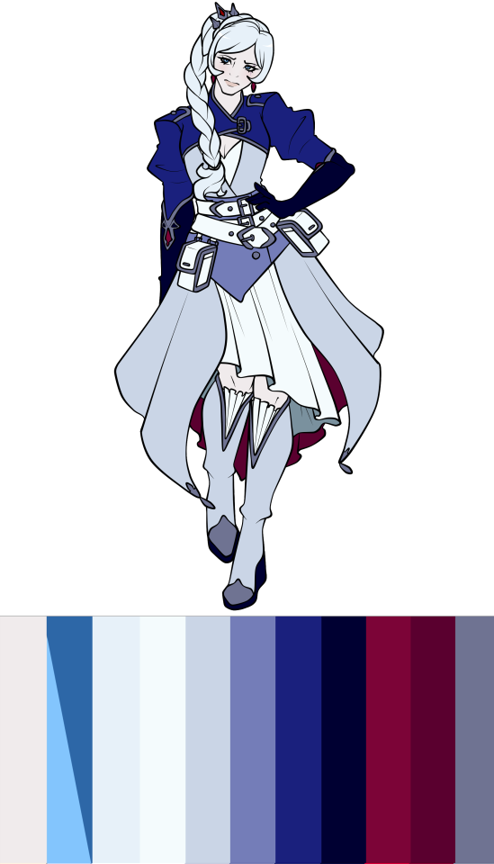
RWBY Design Review - Weiss Schnee (Atlas)
Overview
Actually comng out with Weiss, and straight off the bat we're gonna be struggling tonight. After Ruby's pretty alright design, the rest of her team really dropped the ball and Weiss is one that I know is gonna be more negative than the previous one.
Pros
I have to give something to Weiss' design so it's not all bad, and there's a few things I at least like the idea of here.
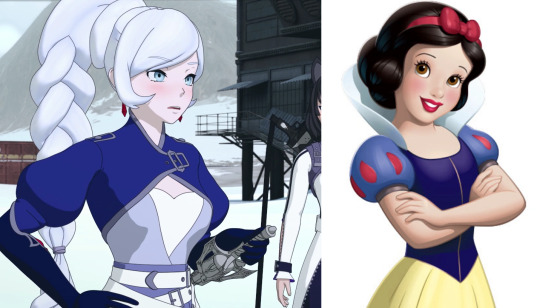
I appreicate the attempt to mimic Snow White's sleeves as a way to allude back to Weiss' allusion, even if I actually don't like how the bulbous sleeves are modelled and feed into her gloves.
On top of that, I do also like her long gloves and the detailing, as well as most of the show design with the wavy style shoecaps.
A final thing was that, while her colour palette is more a con since it's way too many blues and very little white, which is - you know- Weiss' colour, it is still a pretty nice colour palette. Blue is my favourite colour so Weiss does get away with this more than others would.
I will also say that I like the idea of Weiss' bangs being more smooth and preticious compared to the choppy bangs she had before, mostly because loads of characters already have the choppy bangs and it helps to differentiate Weiss from the others.
And that's it for this design.
Cons
Now there is just so much about Weiss' design that I straight up do not like that I gotta do this in designated paragraphs to avoid my thoughts jumping all over the place.
Hair
First up is Weiss' hair.
I won't even blame the modeller solely for this because even in Ein Lee's art, where others at least looked cute at least, Weiss' braid is still not all that great.
This braid is just so obnoxiously thick and top heavy with the addition of the bun that it's on top of. Weiss' hair is clearly thin and her previous ponytail showed that with how thin and flowy it was, but this braid somehow manages to double the volume. If it was way thinner and the bun bit taken off, it wouldn't look half as bad!
I am also just a short haired Weiss truther. Given the storytelling behind her braid that the creators pointed out, Weiss' position of her ponytail correlated with the position in her life under her father. What better way to show her complete freedom from his control than cutting off that control through her hair.
It's a far more drastic and compelling for her character than Blake randomly looking at her hair and deciding a haircut was in order, and I'm somehow who actually likes the idea of Blake having shorter hair to distinguish her hair silhouette from Yang.
It also doesn't help that her braid is just modelled terribly. I try to be understanding for the modellers and such because this time in RWBY was just so bad for crunching and underpaying them, but I will still criticise this work because it's not good.
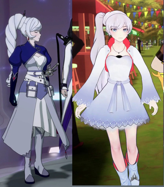
They tried to improve it between Volume 7 and 8, and they did a good job in mimicing how Ein Lee drew the braid, but it's still a bad looking braid.
Outfit
Going past of the braid itself, the outfit itself is so cluttered and clunky throughout the entire outfit. Weiss is exposing her chest and knees for no reason in the tundra, repeating the same issues as I had with Ruby but even worse, because at least Ruby covered most of her body with something. Weiss didn't even do that!
There's also the four different layers of different shades of blue and white. The navy bolero, the periwinkle dress and the white dress with a darker blue sash. Nevermind Weiss having 3 belts around her waist.
The longer skirt, the shorter dress underneath that needs to flash her legs in the arctic, and the constricting bolero collar and sleeves have taken away from Weiss' established silhouette. She no longer has the wider sleeves, shorter dress and popped collar that would've been suitable for her style of fighting.
Now she looks bogged down and constricted, which coincidedly matches how the writers wanted Ein Lee to design Weiss to be a spellcaster wizard type, which... is not her fighting style and is a problem in all of Weiss' fights because now she mostly stands around and waves her sword around like a fancy wand and spams her summons.
There's also the issue of this outfit being in the wrong style for the position that Weiss is in at this point of the story. The embezzeled jewels and details, the almost princess style of clothing with the jewelled crown, is completely off when compared to Weiss who, at this point, has completely cut off her rich family and is making a name for herself.
This style with the constricting clothing and fancy detailing would've fitted much better for Weiss at the start, who was the ideal heiress to the SDC. Both the clothing and the smoothed out hair could then moved out of this neat and tidy image the further Weiss distanced herself from the Schnee family and name.
Right now, this just looks like the story going backwards on what it's trying to say.
Colour
Now, while I think the colour palette overall is nice 'cause I love blue, it's an issue on this character who's meant to represent white.
Don't get me wrong, putting these characters in mostly their colour is not the right way to go because then it's just boring. Weiss works with white, black, red and an icy shade of blue as an accent. Blue isn't Weiss' colour because A. that doesn't go for any of character, and b. the outfit she wore while trapped at home under her father was a majority of blue.
Nevermind the issue of her associated colour being on the bottom most layer, overpowered by the different shades of blue, the inside of the dress is a dark, desaturated red.
Because the closed collar of her bolero means that Weiss can't have the signature red collar that pops against all the cold colours of her palette, including her pale skin that ends up grey in the Atlas lighting.
But most of the time, you can't even see the red underside of the dress because the white dress covers it, so it's completely unnecessary and just drags the eye down to the bottom of her design whenever she moves.
Similar to Ruby, Weiss' concept at least shows how the bright white and colours of blue compared to the washed out palette of the show, but Weiss does not need four different shades of blue, nevermind that her black gloves and soles are not even black.
They're dark navy. I don't know what it is with some characters in this show and using a darker shade of a colour rather than just using black. It would also add Blake's colour since both Weiss and Blake have consistently used each others colours in their designs and have important relationships with each other in the show.
At least they should but whatever-
I did also draw the dress a bit too short so the underside of the upper dress is showing when it doesn't in the show, but regardless it does highlight just how bad the eye is dragged down to Weiss' legs when you want to be draw to the character's face and whatever body parts they use for fighting.
In Weiss' case you want to pay attention to her arms, but the black dark navy gloves blend more in with the navy blue bolero compared to the warm red contrasting her mostly cool colour palette.

These colour palettes really highlight how grey Weiss is. Grey girl energy, give us nothing Weisssss-
I have to say that, again, if Weiss was blue or if you have a blue themed character, then Atlas lighting at least does well for them. Even Weiss and other white themed characters wouldn't do that bad, but if you're a human with a human complexion, every scene if gonna make you look like an extra of Corpse Bride.
Redesign
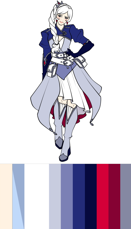
I will be absolutely honest with you all, my girls and gays, I tried with the first redesign to try and see if you could at least make the outfit less ugly, but the answer is no. The style and the colour palette just were not helping me.
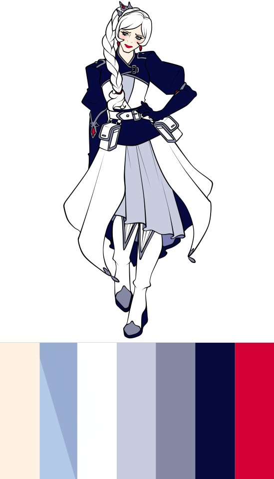
Using the black dark navy to make the bolero and sash stand out with her white dress, and using the lighter shade of grey blue for the dress underneath. The red underpart of the upper dress was also changed so the dress and shoes stood out from the long skirt, but that also means that what little red Weiss wore was now even less with just the jewels and earrings.
I did change her lips to a red lipstick to add to the Snow White aesthetic. I like that.
But other than that, I just do not like this design and no amount of jiggling around will make me like it.
Onto the actual full redesign.
Short haired Weiss SUPREMACY-
So one of the most drastic changes I made was changing Weiss' hairstyle. She now has a wavy, more choppy bob and a cute little ahoge. I totally didn't stare at Furina's hairstyle from Genshin while drawing Weiss, absolutely not-
That wasn't the only thing I shortened either. Both her jacket dress and the dress underneath are shortened to show more of Weiss' legs from both the front and the back, while keeping the bell shape silhouette. On top of that, she now has her wide sleeves and her popped collar back, meaning that the pop of red in Weiss' design is back and frames her face nicely, keeping the viewer's eyes on the face.
I also ditched the dark navy and made the black of her design actually black, providing more contrast between the jacket and her dress, while also illuminating the white on the upper layer where the colour belongs.
I did keep the style of her shoes, but rather than the frilly fabric of her canon shoes, I changed it to inlaid fur for additional coziness. I did add the details of Weiss' canon gloves onto the shoes for a little extra.
While I took away the Snow White-esque sleeves for the wider sleeves, I did add some other bits for Weiss' allusion; including the red lips and the red apple shaped button on her jacket pocket. It's a shame that Weiss doesn't have black hair like Snow White is described as having, but her white hair also fits for her colours and differentiates her from Blake.
And I forgot to add this to Ruby's design, but I did keep the idea of the friendship bracelets that Ruby was meant to buy for her team back in Volume 6. So each member of the team now has them with Weiss' hanging out of her jacket pocket.
So honestly, I do really like this redesign for Weiss.
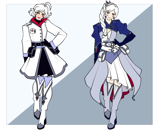
Conclusion
Overall, Weiss' design is a severe drop from Ruby's and is easily one of the worst designs out of the team, maybe even the Atlas cast in my opinion.
She managed to lose more of her signatures shapes and styles from her Mistral one, which was already a worser continuation of Weiss' Beacon outfit. The colour palette now completely overpowers the white, it's so clunky and cluttered with unnecessary fabrics and looks like it just bogs Weiss down.
And it was made even worse in the show through the modelling, especially her braid. Just a terrible outfit, I have to put it at the bottom with an F.
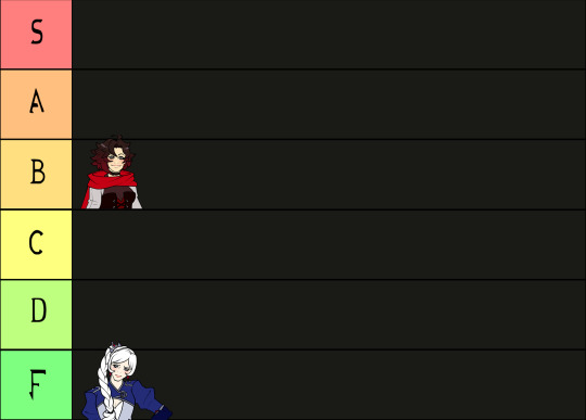
Thanks for sticking around! Next one will be Blake's Atlas design, which is only ever so slightly better than Weiss'.
Until next time!
35 notes
·
View notes
Text

(Click the image for better quality)
Yipeeee that Keiki and Mayumi fanart I posted the WIP of is finally done woooo- This piece was a very experimental one that I'm kind of OK on. Maybe because I've just gone insane looking at it for so long and I'm my own worst critic lol.
Artist's Notes;
So I've once again been playing around with my rendering style, mainly because I have been wanting to improve my lighting for a while now and as I was just scrolling through Tumblr, I saw some of the official art for that one webcomic-turned-animated-TV-Show Lackadaisy and was immediately inspired. I also have seen a technique a few times in the past where the lineart and shading are merged together, so I've been meaning to try that for a little while.

I did some experimentation on this one sketch of Keiki I posted in my sketch dump and I really liked the results of it, so I carried those over to this piece.
I ended up scaling up Keiki and Mayumi from the original WIP because I felt like they were both getting lost in the composition, and I'm glad for that because I think it works a lot better. I'm not a fan of how Mayumi's sword turned out at all, but it's not really meant to be the focus of the piece so eh. Overall, I think I could do better with my colours, probably because with Keiki and Mayumi's colours, I did them flat in greyscale and then used a brush on the overlay blend mode to colour all of them over, after which I changed the base layer for their colours from white to yellow and then lowered the opacity so it all went together better. I also decided to use gradient maps for a lot of the background elements, mainly to experiment with getting in my values first to make them pop out more. I ended up finding a really nice sky gradient on Clip Studio Paint that I really liked, and that kinda helped to establish the colour scheme of the background a lot. I think the whole "start in greyscale then colour" thing really works better with painterly styles rather than more illustrative ones, and while it is good at making sure your values are more readable, I honestly don't think I have the skill level to pull that off yet. Honestly, I think I've been looking at this drawing too long or maybe I added too much to it, but I wish I could've made the colours less monochromatic, but I'll just save that for the next piece I do.
I do love how the flame (...well it's more of a weird space rift than anything in this piece) and the lighting turned out, those were fun to do. I was initially struggling with the flame and how Mayumi is positioned in front of it before realizing "Oh wait! This is a weird abstraction of a weird creature! I don't have to follow the laws of anatomy!" and just dislocated it's flamey bottom jaw from the main body. I also changed the colours of it since I was really not liking how incredibly bright it was when it had lighter colours. Again, the gradient maps served the more painterly style of the flames well.
I also love how Mayumi turned out. I could do her sleeves better but that's more of just me needing to study how those types of sleeves fold in that position more. I'm also very happy with the posing, the technique I used for that was taking photos of myself in the positions I wanted, blocking in the silhouette and then modifying that by adjusting it to my lines of action that I drew on top of the original photos, and then sketching over the silhouettes and drawing in the shapes of the hands overtop of the photo if I needed to get the fine details right. As for what I do to take the pictures myself, I use a tall chair I have, prop up my phone with a phone stand, put on a ten second timer and scramble to get in position. Yes, I did have to use a bunch of thin markers I had to try and get the hand positioning on Keiki's pose right, yes I do have a fake sword that I used to get the positioning of Mayumi's arms and hand right, the sword was for an old Halloween costume from several years ago. I really like how both Keiki and Mayumi turned out in this drawing, I'll have to play around with these designs for them more in future drawings.
Also, if you wanna know why I draw buildings like that, when I watched Fantasia 2000 as a kid (One of the Disney movies where they make really beautiful animations to classical music) the way they drew the buildings in the first few sections Rhapsody in Blue segment (the jazz one with the cities) changed my brain chemistry and now whenever I need to draw buildings really quickly, I refer back to that. Since the buildings aren't really the main subject, I didn't put much thought into them.
As you can tell I am very tired of this piece, mainly because I made things harder for myself by overcomplicating the process compared to what I usually do, mainly with the whole "starting in grayscale then adding colour." I'd honestly just prefer having a black layer set to colour that I can just toggle on and off when I need to see the values, but it was good to experiment. And that was mainly the point of this whole drawing, to experiment. I'm definitely going to have to play around with this new style I'm going for, mainly because I liked how it turned out a lot in the augmented Keiki sketch, and also because I want to find ways of making it suit my style more. I also really want to keep experimenting with my lighting like this, it's very fun. Last but not least I am never starting in greyscale again because dear god I do not like the workflow it forced me into. I don't have a problem with the method itself it's mainly just a skill issue lol.
If you wanna read my headcanons for these two, I put them in my WIP post, so you can read them there if you want to. The more I look at this the more I prefer the simplicity of my WIP. I might go back to this and just take away the fancy colours and effects to see what it looks like without all of that stuff and reblog this post with that drawing, but for now, I don't think I can look at this drawing again for a while.
#touhou project#art#fanart#touhou fanart#touhou 17#wily beast and weakest creature#keiki haniyasushin#mayumi joutougu#haniyasushin keiki
118 notes
·
View notes
Text
Had issues with layout in the ask post so here's the rest!
However 1 artist comes to mind for now and that's Murata Yusuke; I'm rereading Eyeshield21 (again lol) and each time his art makes me go "wah so damn good".


From colours, to how dynamic and alive pieces can feel, to lighting/shading, to textures, etc. Lot of the pieces also have this feel of mundanity in it which I really like, and I also how at time I feel like I'm there as well. I love the mixture of realism in lighting/shading (and at times anatomy) with the manga/comic style!
The last image also was a bit of an inspo for my latest Luffy art!
As for tutorial, I might elaborate in another post at some point (cus it's quite a broad thing to go about). Like I've mentioned before, I'm soaking up things along the way! Which includes things like colour theory, lighting/shading, composition, etc. But I personally don't recommend forced research/practice; art needs to be fun after all, take things at a time but it might be nice to try something new with each piece, however how subtle.
I can recommend Saito Naoki's YT channel! I watch his 'whimsical correction' videos during lunch at times haha - Each 'correction' (more like professional advice) has a certain goal/theme which can be improved upon, which can be story wise, appeal, anatomy, etc.
--
Anyway, some advice I have for now are kinda my 'cheats' will follow now! [Disclaimer: these are things that work for me and are by no means the 'correct' way of doing things. So if I say things like "avoid this", it's something I personally do.]
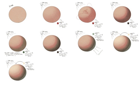
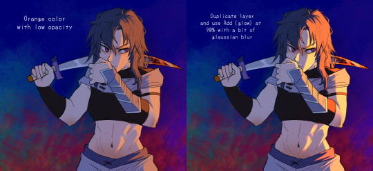
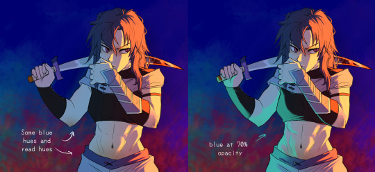
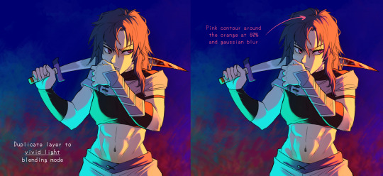
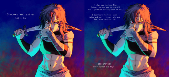
My strength lies I think mostly in my lighting/shading at this moment!


My flats aren't bad or anything, but I feel like it really comes alive after shading. And the first thing to do is to establish where the light source is. Try to avoid 'pillow shading', work in bigger shapes and don't be afraid to do so. Working digitally, I can recommend to take a big brush and just put it very roughly on your character. You have the means with digital art to easily erase parts that are too much and to refine shapes afterwards.
One cheat is bouncing light.
(This was a Multiply mode layer set back to Normal mode for sake of visibility.)


You gotta have a bit of understanding of volume of where to apply it, but it's light that's been reflected by e.g. the ground back up again. This little variation in shading can add a lot. Note that it's better to go from the OG shading colour and sliding it on the colour wheel (hue) to be either warmer or cooler and then sliding in the square/triangle (saturation and value).
More examples of bouncing lights:


It depends how intense the light is reflected; the more, the harsher the contrast is compared to the OG shading colour.
Second cheat is 'light terminator' and 'substance scatter', not sure if it's really the correct terms but oh well.


This reddish tone (again on the Multiply shading layer) is kinda the border line from light to shade. It's reddish on skin (if you have red blood haha) but you apply it on other things with other colours too!


Make sure you don't overdo it and put it everywhere, also note if you use harsh or blended brush strokes, maybe even both for variation! Try it out and see what works best for you!
--
That's it for now; this took more time out of me than planned 💀 you better appreciate this anon! /jk
My main motto regarding art is "fck around and find out". This mindset also helps with keeping art fun!
#hopefully it wasn't too overwhelming lol#this became kinda lengthy after all#with 'cheat' I meant something quite easily achieved to add an extra oomph to your art btw#ask kawaii
66 notes
·
View notes
Note
hi!!! how long does an average panel of one of your comics take??
i love your work so much!! it got me into silmblr hehe
HI NONNIE!!! thank u sooooso much for checking in and for ur lovely ask! it means a lot to hear that my silly ol scribbles were what introduced u to the glorious landscape that is the tolkien fandom! on tumblr no less!! i hope you stay a real long time, and have a blast while you're at it 💖💖
now onto your question! that's some good food for thought uhhhh i can try to estimate?? its been a while but i shld have some rough ideas abt each that i can share! the time frame each comic/panel takes is highly dependent on WHAT kind of comic it is. i hv two kinds of comics I usually do: 1) full-length, and 2) goofy/4koma.
i have a few full-length comics laying about in my archive, but my most recent one/best example is Ghosts which was around uh.... 7 pages excluding the bonus panels! in terms of the process, i usually divide it into 5 stages:
Drafting: this is either the fastest stage OR the slowest depending entirely whether i know what im doing LMAO,, if i have a set idea for what i want to happen, i might get drafts done in a few hours, but if i flounder, it can take a few days 🤔
Lineart: relatively simple enough once i hv the draft down, so id say anything ranging from an hour to half a day if theres nothing else going on irl
Block colouring (main actors): there are DEFINITELY easier and more professional ways to do this with mass-selection and the lasso fill/bucket tool, but idk how to do that on SAI (my art program) so i colour everything by hand HAHA which makes the process longer.... half a day to a day?
Shading: THE WORST!!! definintely my least favourite bc i find it tedious due to all the details/prettification of elves that i am legally obliged to pour into this stage 😭😭 as a result, it can take days!!!
Background + Lighting + Final Rendering: similar to the previous stage haha it just depends on how much effort i wanna put into the final product looking nice. roughly a few days? it kind of meshes with stage 4 anyways haha
just for fun, i hope this process gif for page 6 can illustrate that 👇

these are just rough estimates, bc all in all, the time it takes so finish a page is really dependent on how free I am hahaha. Also, I usually work on full-length comics like Ghost which have more than one page all at once, which means I drafted all 7 pages at once, then did the lineart for all 7 pages at once, coloured at once, shaded rendered bla bla bla 😚 iirc, i think it took me 11 days in total to finish Ghosts before the end of June last year!
For goofy/4-koma, its usually just one page with less detailed/more cartoonish/chibi character styles so it takes a day or two days at most! again, it all boils down to how free i am hehe
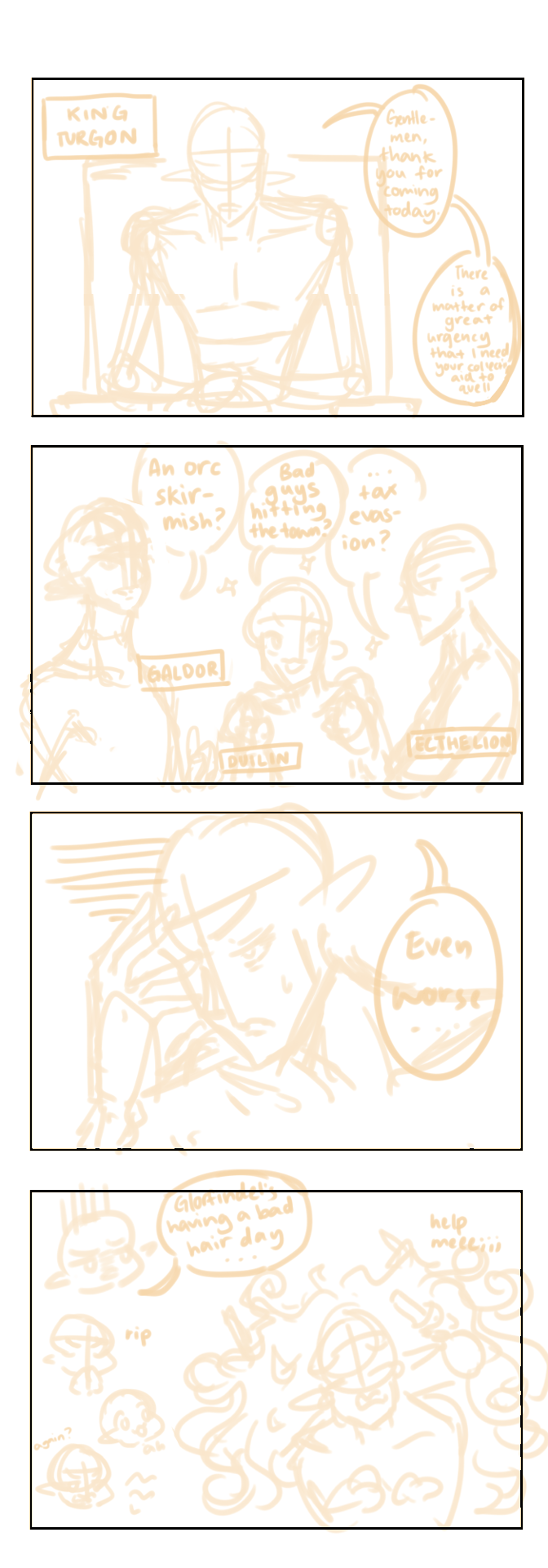
YEAH SORRY THIS ENDED UP BEING AN INFO DUMP but thank you so much again for asking and letting me ramble! <3 i ended up having a lot of fun looking back on my drafts n thinking back on my processes.... theres defininitely room for improvement, but thats another worry for another day heheh 😎
#rin replies#anon asks#silmarillion#yeah sorry again this turned into a yap fest 💃💃#i never knew all those wips wld come in handy but maybe its a good thing i like sending myself things hehe#cannot reiterate enough how much i HATE colouring :((((#thank you again for ur kind message nonnie <33#silm#silm comic#wip#behind the scenes stuff
89 notes
·
View notes
Note
do you have any colouring or lineart tips?? I'd love to know anything you found out over your journey, your art is literally adorable asf <3
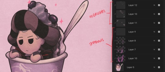
oh em gee thank you (*゚▽゚*) for me personally i don't make a sketch and lineart separately, i usually only do that for commissions so the client can see the sketch and stuff, but for me it's easier and less stressful to do lineart in one go and clean it up after! i like to use different line weights (aka pressing down harder on curves and corners and lighter in other places) and i also tend to make a new layer once i'm finished colored to thicken lineart more to make it more cartoony. for coloring i'm not amazing at it but i do flat colors, give some sort of reddish color for cheeks knees elbows etc and usually shade the clothing normally/based on shadows, but sometimes i will make a light or shadow source and color based on that. i don't have perfect techniques, i try to stay loose and just color messily when i'm doing non-commission work bcuz i like it! i also almost never stress about perfecting lineart since my style isn't hyper realistic or like highly detailed or anything it's mostly simplified.
my best pieces of advice that have worked the best for me is looking at other peoples art!! i have been inspired by a lot of different artists in the past, and when you keep incorporating some of their style into your art you eventually have your own unique style. for instance you can look at some of my 2022 art and see i mimic the omori art style in a lot of them but it's more unique now. it's honestly just improving over time and looking at other artists work and taking inspo of them!! i've never done this but for some people, privately tracing someone's art or real pics of people can help with practicing anatomy or lineart. of course, traced art should never be posted esp without consent, and if you want to be careful you can also ask the artist if they're okay! a lot of artists also post videos about their art process or tutorials.
tldr, just continuing to draw over time and taking inspo from people is the best way i've personally improved!!
14 notes
·
View notes
Text
A GUIDE : HOW TO CONSTANTLY IMPROVE IN ART
A little guide! I tried observing why I was improving so quickly in the span of just a few months, and at the age of fourteen no less, and I wanted to share them! Of course, I've been drawing since I was 3, and practiced seriously and listened to industry professionals since I was 10, but even those who are just starting can take this guide! So, lets start.
GENERAL TIPS
A lot of people have overheard this, but practice whenever you can, and take it seriously.
Try learning from industry professionals/Art school graduates (I recommend Ethan Becker , Jackie Droujko, and Lemoncholy)
In contrast to the first tip, learn how and when to take breaks-- Listen to your body! I stepped away from drawing for a week, and it ended up giving me a splurge of new animatics and ideas. Get another hobby, learn something else. (don't give urself carpal tunnel my guy)
Get out of your comfort zone. Draw poses you never have before, draw expressions if you're not good at them, or backgrounds if you struggle! If not now, then when?
Experiment with different programs and settings and find out what works for you, because every artist is different. (I'm someone who prefers no stabilizers and thick lines. Someone else might like it differently.)
Copy art styles. Mix them to find your own! You can even trace as long as you don't rely on it a bit too much, and you use it to practice.
Practice gestures and structures (balance your knowledge of anatomy and posing/flow)
LITTLE ART TIPS
Add more contrast to make things really POP! in your drawings.
In designing characters, make big shapes or shapes that can really help with your characters'' silhouette
Same tip applies for posing, make it big and clear and expressive. One side will have more action, the other will be a bit more calm.
In shading skin, for shadows, don't go darker. Instead, go slightly diagonally towards the saturated color.
Remember where the light source is!
In side profiles and 3/4 views, remember that the eye doesn't go to the edge of the face.
for anatomy, separate the body parts into simpler shapes.
if you're planning on drawing a few characters repeatedly, make sure the character design is easy to follow. As much as possible, make them easy to draw without a reference. AKA, make them memorable
give the character you're designing a defining feature (in example, my character Amaryllis has his missing eye, his infamous burn mark, his tall stature, his green and black colour motifs, and his crazy hair.)
Characters/things going up/posing upwards and forward shows confidence, wishfulness, arrogance, or basically any high and/or positive emotions/characters.
Character/things going down/posing downwards show more timidity, sadness, and more negative or mellow emotions/characters.
For expressions, every single facial feature matters. Observe yourself and others, learn the different names of emotions. Exaggerate!
Try out different angles and perspectives
If you're facing art block, try out a new pens!
Most important of all, take care of yourself. Your best work comes from your best self!
13 notes
·
View notes
Note
I don’t know how you do it… if you have time , I would like to know which program you use for your digital art and how do shade in digital art. And most importantly, I want to know if you use filters for your digital art.
-From another artist
I am no professional artist, but I’ll share.
I use Procreate for digital art (it has been 6 years since I first started using that program). I often refer to real-life photographs and paintings from artists (Salvador Dali etc.) for dynamic colours and shadow ideas (hard / soft shadows or both combined). I use the smudge tool to make “soft shadows” and it literally saves my life (thanks Procreate). Practice takes time so patience is important.
Below are some of my past works.
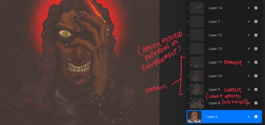

For the final touches, I go for the chromatic aberration and noise to create a “nostalgic” and “oldie” feel of my art. I always use the “paper” texture for my artworks, because I admire the “classic” and “traditional” style of art.
I hope this answers your question. My tip is to try experimenting with different artstyles (lineart, colours, shading, lighting etc.) by finding art references online (Instagram, Pinterest etc.) that can help you improve your art.
15 notes
·
View notes
Note
Tate pls can you explain shading and lighting to me I don't understaaaaand 😭
It looks so pretty and I... kinda get it but also not really? I've tried YouTube and stuff but it's pretty unhelpful and generally just people marketing their procreate brushes at me
And your art is so PRETTY and is wish to know your secrets please give 🙏
oh brother, I don't know if you are in the right place to ask for any advice because I SUCK at it but I'm gonna try
Gotta be honest, I still barely understand shading and lighting, I go ahead and expect everything to turn out okay like 99% of stuff in my life, I think when you get the hang of art you can do things blindly more frecuently.
What I find pretty useful it's not tutorials per se but speedpaints or real time drawing, if you observe a professional doing their stuff and learn the basic of the program you can get an idea of whatever the hell they are doing. Looking at pretty art and analyzing the light and trying to figure out how the artist does something is also something that has worked for me pretty well, I'm gonna divide you my specifics:
TUTORIALS
I know you haven't found any good tutorials but youtube is very big and you can find some really good ones. I have lately been watching this channel, this guy even gives you the PSD files.
Marc Brunet also has some really cool ones, not all of them are super specific but he's pretty good.
Aaron Blaise has a very professional undesrtanding of light and shadow.
REFERENCES
Use references! Pinterest has a lot of cool photos with pretty lighting, just search "lighting and shadow" "photo with lighting", stuff like that. References are very important, don't let anyone tell you otherwise.
For the next tutorial below I used this for example:
PATIENCE
Let's be real, the art journy needs a lot of patience. I have been drawing digitally for 9 years and it's just now when I'm seeing results I'm happy with. I look at art from just one year ago and I go "EEEW"
I think hyperfixating on something helps a lot, doing fanart is important like I wouldn't be as good as I am (right now) if it wasn't for doing TDP fanart. Ovbiously other things count since all drawings help you improve but I think you probably get my point, basically, get obsessed with something lol if you don't get a certain obsession just find something you enjoy drawing, I honestly can't draw stuff that don't give me joy (for free at least)
PERFECCIONISM
Something that I have discovered along the way is that perfeccionism in your art will restrain you a LOT. Sometimes you don't need a super accurate light and shadow for the drawing to look okay, ovbiously if you are aiming for full realism then yeah but overall? If it looks right it's probably right, trust your instincts
Maybe in a couple of years you will look at a certain piece and go "why tf did I do this??" but that's part of learning. The next tutorial isn't accurate at all but I had fun and I think it looks pretty enough.
Of course, the technique might vary from drawing to drawing, with my most recent Pyrrah art I just coloured the lineart for example, I later used said filters. Don't be afraid to experiment, art is about experimenting, the tools from your program also there for you to use.
I know it may seem difficult at first but you will eventually figure things out, study and practice a lot and you will get there.
Good luck! sorry if this is too messy, explaining stuff is just not my forte and thank you for liking my art, it makes me really happy.
#you dont need to take everything here seriously#im a noob after all#art#artists on tumblr#art tutorial#asks#how do I tag this!!
9 notes
·
View notes
Note
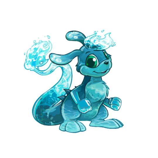
Neopet review: the Zafara! Last in the alphabet of neopets, but certainly not last on how cool they are!
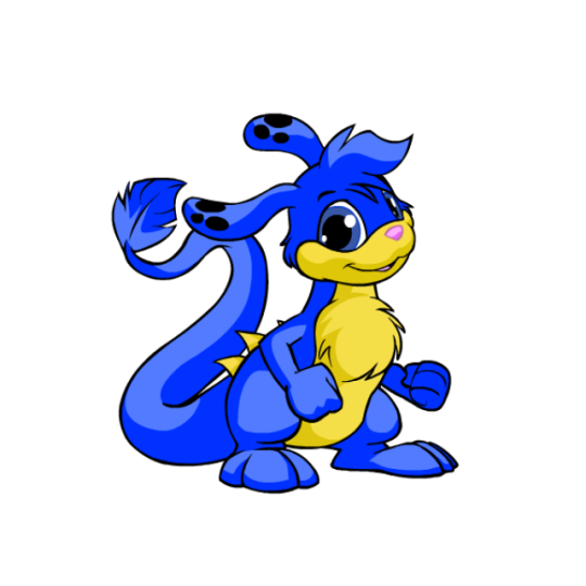
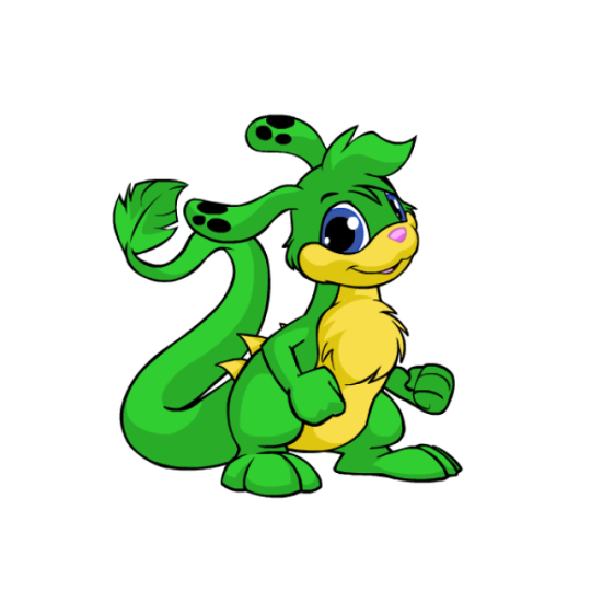
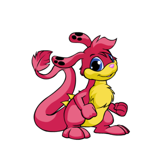
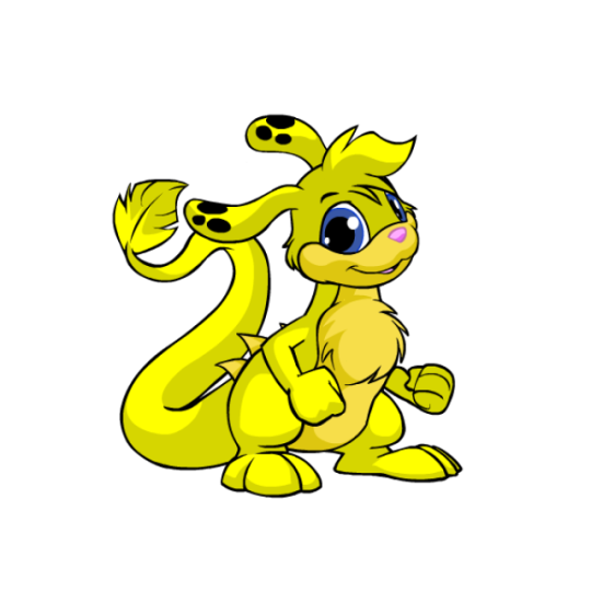
I always enjoy a good abstract creature that's still a believable animal, so unsurprisingly, I like Zafaras a lot. They've got a really unique body shape amongst Neopets that's vaguely like a kangaroo, but that's where the similarities stop. I really like the feathery structure to their tails, their long ears, and that random set of spines they have along their back.
Visually, my only nitpick is that I'm not a big fan of the base color's palettes—most PB colors fix this, but the base colors have a weird mix of beige, pink, blue and black going on with their accents and none of it goes together. I feel like the back spines should've been black along with the nose, or the spots should've been beige instead or black, etc etc.
I'd argue Zafaras mostly benefited from customization as their old art was getting very dated by the time the conversion happened, and they likely would've received a redraw even if customization didn't become a thing. Plus a lot of the updates look really good, such as the tail tip shape being improved, fluff being added to the chest so they don't have a weird shape jutting out there, the feet being lengthened, etc. The only downgrade are the fists, and that's just a standard thing for customization.

My only other minor nitpick is that old Zafara eyes were almost pitch black and it gave them what I can best describe as a sopping wet meow meow vibe that gets lost nowadays. Even when they had color in their eyes, it was more of a crescent shape and overall cuter. Granted, though, the new eyes are more in line with other Neopets, so I get the change.
Favorite Colours:
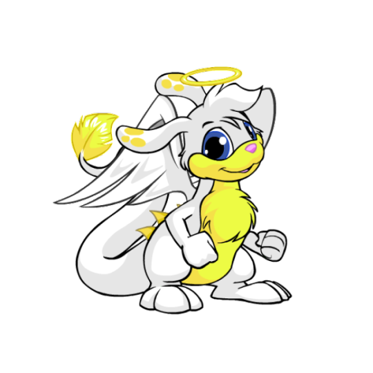
Christmas: While most Christmas pets are just the standard reds and greens, the Christmas Zafara goes in a completely different direction by being an angel with a very pretty white and yellow color palette and a nice get of wings. It's super simple but very pretty. I also like how they fixed the color balancing that I mentioned above by changing the ear spots to yellow and making the tail tip match. (I do kind of wish the nose were black or something, but that's an extreme nitpick.)

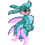
Maraquan: I am 100% cheating by including this one because I usually try to stick to only pet colors you can obtain in the present day, but with UC styles becoming a thing I'm hopeful we'll be getting the old design back one day.
Because yeah, I absolutely love the pre-customization design; making it a sort of sea horse/leafy seadragon cross works perfectly with the Zafara's body shape, the pose is lively, and I love the bright pink fin accents to contrast with the teal body striping.
(The converted is... okay, but the concept was completely lost by changing the pose, the striping was reduced too much, and the body has this bizzaro lumpy shape instead of being a smooth curve like it should be.)
Water: Technically speaking this isn't too fancy, but I just think they did such a nice job with this one. There's so much gorgeous detail in the shading along the head and tail splashes, and the artist really did a good job at capturing that watery look. The choice to make the head tuft and tail splashes in the first place was a great choice, and I especially love how the ear spots are water bubbles. Super pretty all around.
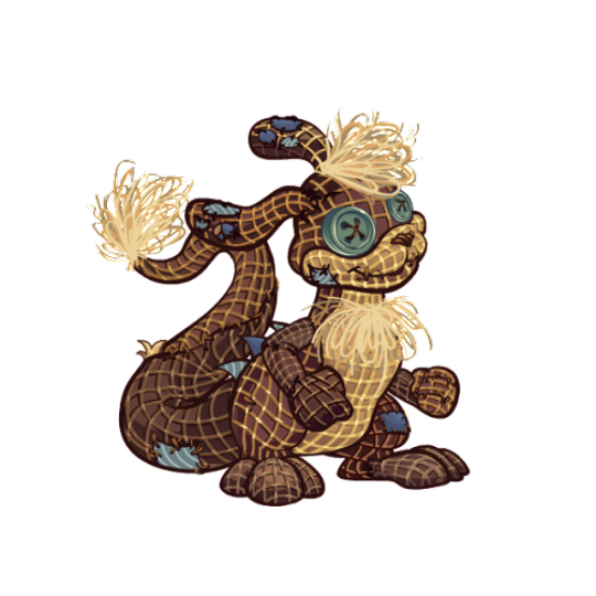
BONUS: I really like burlap pets and think it's an underrated color, so I figured I should give the burlap Zafara a shoutout for being one of the best burlaps out there. The colors are kept muted, the uncanny valley vibe is present, the way they handled the fur tufts looks great, and I like the various slate blue patches on the body, which match with the back spines, spots, and eyes.
47 notes
·
View notes
Note
hi hina i have some art related questions! 1) is it easy to go back to an old art style on account of already having drawn in it or do you actively have to train yourself to go back? for example, i notice that your lmhs art style is softer and your current one is sharper (that's the extent of my technical art terms knowledge gomen) 2) which of your own art styles/eras is/are your favorite(s)? 3) do you prefer more stylized or more realistic art styles? 4) are you easily influenced (consciously or unconsciously) by other art styles? i know when i read something i really love, i start to mimic that style in my own writing. 4) do you have any favorite classical paintings? i know the fallen angel is one.
hi mariam!!! sorry it’s taken me so long to this so late fjhdskgdjf i won’t lie some of these questions Stumped me but i will try my best to answer !
it depends? I think a lot of my art style shifts come naturally as the result of growing and improving my skills, so “going back” to an older style might be hard to do without falling back on bad habits that I might have grown out of, or simply things that i no longer think look good. i don’t think i would have to train myself necessarily because the muscle memory is still there, but i might have to stop myself from wanting to Improve aspects of the style in ways that might fundamentally alter what made the style recognizable in the first place. in terms of the lmhs art style, or the soft/sketchy look i was using at the time, that specifically would be pretty easy to go back to I think, since it’s basically a slightly cleaned version of how my art looks early in the process :> i would just have to take a clean sketch + add colours w minimal shading, skipping the lineart and intense render
it feels like a copout to say but i love where i am now :’> from what i’ve seen it’s almost like. a gag among artists of arcane being a catalyst fr drastic art improvement but it IS . everything about the art and animation in that show inspires me so much and it’s been great taking what I like from it and trying to mimic and adapt it into something that suits how I like to work. even though it’s frustrating that I take longer to finish a piece, I really am so happy i’m back to painting i’m so proud of my current render and anatomy and use of colour. i think i’ve finally found a good balance of textures as well and overall i’ve just been having so much fun pushing myself into new brushes and finding new ways to use old ones :D
i think i’m somewhere in the middle but leaning more into realism, especially when it comes to the way I colour. obviously there are aspects that I stylize to suit my needs but especially in terms of Other Anime Art i’m aware that I fall more on the realism side of things lol
yes omg i’m so easily influenced and that constant influx of new inspiration and learning how to adapt to it is one of the things i love most about drawing and making art!!! i kind of mention this notion in my lil gush about arcane but i LOVE looking at other artists' works or at things that inspire me and picking it apart in my brain to see what/how i can use it! i got into art by “copying” and even as i’ve grown into being comfortable enough to make my own stuff, I think that there is always value in learning from what you love and figuring out how to make what you love about it your own. maybe it’s not that deep bc i draw anime fanart but art fr me is an amalgamation of every piece of media ive loved and of everything i’ve ever found beauty in
i do love the fallen angel painting but tbh i don’t think classical art occupies a very big place in my brain fhjdskgfj my knowledge is sadly lacking :< i like claude monet and roberto ferri’s work a lot but overall i think modern art and media means a lot more to me in terms of where I draw my inspiration from
11 notes
·
View notes
Note
5, 7 and 20 for the artist ask game :]
5. What piece of art are you still proud of to this day? (Show or describe)
THIS ONE
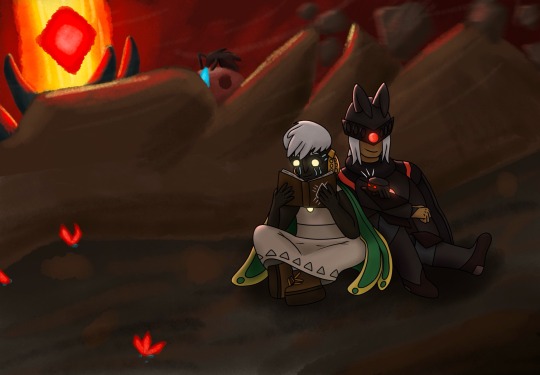
It's two of my Sky OCs, Leon and Mykell. I was using an experimental brush for the background and an experimental way of doing lighting and I am SO proud of how both turned out. I love it. I love the contrast between the watercolour background and the hard colour + lineart characters. I'd love to do something like this one again. I'm definitely not one to say I'm proud of my artworks but THIS ONE. I like it a lot.
I'm also very proud of the Days of Love comic I did, there was a LOT of shading and layering on that one to make it look as shiny as it did.
7. Who are some artists that have inspired you?
One hundred percent recency bias, but I recently discovered Amy Spassov's work and it's been making me rethink my entire use of colour, lmao. MINDBLOWING art, I recommend you look it up.
In general though, I like to take little bits and pieces from all the artists I like. I really like the way that you, Fizz, draw faces and I've been looking at it to see how you break it down.
For some more specific artists though, leslekieuart does REALLY good gore and body horror and black/white art and shading, all things that I enjoy and am hoping to improve at. Oddarette does really cute room design and the colour palettes they use are just FANTASTIC. 0kame-san has a really fascinating art style and way of doing environments as well (can you tell I really like environment design??). Yuumei-art does digital painting so good it is frankly unfair, but it's really interesting to see how they go from lineart to no-lineart painted (they post speedpaints with their work) and the way they combine dreamlike concepts and do anatomy is something I'd like to work on emulating.
Lastly, there's also Nathan Daniel Hernandez, who has frankly the most unique and interesting style of digital painting I have ever seen. It is so unique. The environments are SO good. I keep trying to break down how he does it so I can try doing environments in a similar style. It is legitimately insane.
20. What motivates/inspires you artistically? (topics, emotions, etc)
I really like trying out new styles and mediums with other people around! It's a fun way to share experiences and improve together, and it also helps keep perspective on how you're doing.
I'm also a very big fan of people, like anatomically. I hate faces and think they're an unnecessary part of people, but posing and body shape and emotions expressed through human form is so fascinating to me! Sometimes if I find a piece that really hits that spot, I'll just stare at it for a bit and then zoom in on what that artist is doing so I can note it for later.
And lastly, I get a lot of my artistic inspiration from emotions, although I don't really tend to act on the thoughts I have around that. I have spent upwards of two hours really vividly imagining a relatively simple piece and then not doing it because I'm worried about being cringe or something like that. I wanna draw people cuddling more so badly 😔 I should do that
Thank you so much for the asks! These were really fun to answer!
6 notes
·
View notes
Note
hello dearest this is probably something you’ve been asked before but do you have any tips or advice you recommend to beginning artists?
omg hiii!! okay for beginner artists, the first thing that comes to mind is obviously PRACTICE!! you’ve definitely heard that a lot but i think there’s far more to practicing art than JUST drawing for hours.
of course, you should always learn the fundamentals like anatomy or composition first, but what i consider equally important is to find what you love!! what style of art do you like? any artists who inspire you? experiment with different mediums! which one do you like the feel of? i’ve found that a scrapbook or pinterest board of photos you like really helps with discovering your tastes. personally, i love classical/oil painting so i’ve studied and taken tonnes of inspiration from many historical and contemporary painters (like master copies of their works or using them as references for my fanart). establishing this alongside studying the fundamentals can really help to push yourself past the boredom and mental block and it gives you a clear goal and direction!
similarly, drawing from life is another VERY important thing many beginners don’t do and i find that the things you learn from traditional painting and sketching are applicable to digital!! for example, learning how to shade those stupid cubes and spheres or drawing things surrounded by an actual environment will genuinely improve your imagination/visualisation skills. don’t shy away from realism and draw many many different things! only once you’ve understood and practiced these basics will you see drastic improvement in your art (and when i say ‘many’ i mean draw literally anything and everything in front of you, on your desk, on the ground, or in the sky!! it doesn’t need to be detailed, just an attempt is good enough. you could even go into an art gallery and sketch the artworks! i’ll attach an example down below)
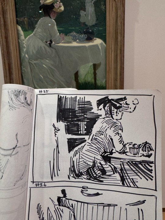
quick sketches like these will help you put what you’ve learned to practice and improve your understanding of line, shape, form, and composition!
also, i remember when i was first starting out, i would hyper fixate on an artist i reaaally liked and try to emulate their style and techniques so don’t be afraid to copy from others (within limits of course)!! copying colours from monet, anatomy from da vinci, or composition from hopper will help you improve SO MUCH. there’s a reason they’re considered masters!
tbh i would consider myself more of an intuitive drawer as i still have trouble with some of the fundamentals lol so don’t worry if you’re not feeling like intensely studying such things, what’s most important is to draw what you love and makes you excited!! and remember to take your time! learning to draw is a slow process, with consistent practice and - most importantly - passion and finding things that motivate you, you’ll be rewarded in no time.
(hehe umm i would also recommend reading blue period 🤓🤓)
okay i hope i didn’t ramble too much!! hopefully this makes sense and i answered your question well enough😓 umm if you have any more questions please feel free to bombard me!!
3 notes
·
View notes
Text
Day 18: "Hear me out, Angel" - Good Omens, Singer Fem!Crowley upcoming? + Important Announcement (♥Print Shop Opening, and promo code for you all!!♥)
Birds flying high
You know how I feel
Sun in the sky
You know how I feel
Reeds drifting on by
You know how I feel
It's a new dawn
It's a new day
It's a new life
For me
And I'm feeling good...

"Hear me out, Angel..."
Yes, hear me out, because I have the pleasure to announce that my Print shop is finally open! (link here)
I am so excited!!!! (And nervous too, but this is quite usual for me as you know :-p)
For this grand Opening, please have this special code for -20% on your first purchase: NAH4QBRN. It will last until the February 8th, but no minimal amount!


You have been quite a few to ask me if I do prints of my art, and more often since my most recent artworks ("We're bound" & "Bliss"). Well, here we are! You’ll find there my most appreciated artworks ("ancient" style and "New Red" style) There are some beautiful close-up shots of my biggest artworks too. If your favourite artwork/close-up shot is missing, please contact me on my Ko-Fi or ask on my Tumblr and I will put it in the shop too!
Come and take a peek!!!
About the sketch
Realisation time: 3 hours 30 minutes
Today's theme: my followers on Ko-Fi discovered last night my first attempt as drawing a new Fem!Crowley of mine. “Attempt” because I lost too much time hesitating on the traits, then the colours, then the shades… And the final result didn’t even please me -_- For the Wives, I usually draw DT/MS physical traits then try to smooth it and feminise it, but it clearly doesn’t work well for me. So, I tried something different here, and started to draw in my ancient style, then slightly changed the physical traits until I obtain a face that look like DT’s Crowley face. Maybe there are some tutorials about how to draw and feminise masculine traits… But, no, it’s funnier to find by myself :-p (for now).
I have an important new project in mind, a “Singer/Musician” ensemble of artworks (AU or Canon, I have yet to decide). But you my dear GO fam, you'll have a role to play in it. So, I HAVE to be able to draw my Wives more classy and sexy than ever. For now I will train a little bit more, but I hope I will be able to talk about it soon, maybe next week?
The Daily Sketch Challenge Rules:
Personal challenge: a simple sketch each day
Goal: forcing me to keep things simple - inking, shading, just a few sashes of colour
Improvement pursued: to get the movement, the emotion, finding how to add depth, learning how to leave things barely finished
Max time allowed: 2 hours Ow bloody hell, what if I change this rule for good? Each time for the last 7 days I had a perfect raison to spend more time on my Daily sketch. (Today it was the Grand Opening =D)
[Previous] [Next Day] [First Day]
Don't forget to 💕/ reblog ;-)
Buy me a coffee? ♥ https://ko-fi.com/elenthya ♥
#Good Omens#Singer/Musician!GoodOmens?#ALL the Ineffables await you in the shop :-p so here we go#Crowley#Aziraphale#Aziracrow#Ineffable Feathers#Ineffable husbands#Ineffable lovers#Ineffable Partners#Ineffable Wives#Ineffable Birds#David Tennant#Michael Sheen#ElenthyaAndGoodOmens#ElenPersonnalChallenge#Elenthya#ElenthyaGallery
39 notes
·
View notes