#billsticking
Text
Abigail Peach Has Her Pussy Stuffed with BBC
Cute Village Bhabhi Outdoor Fucked By Devar
Horny Housewife Angela Aspen Unleashes Her Inner Slut for Cuckold to See
BBW viciada em chuva dourada
delicia de cavala fodendo de quatro
acariciando a mi rica chilena tetona
Skin Diamond Chokes On Huge White Cock
Novinha da bocetinha gostosa
【hololive Shirakami Fubuki2】Shirakami Fubuki2Just cums with hermaphrodite masturbation
Asian anal slut Ember Snow
#nonliquidly#agriculturalist#billsticking#sarcoadenomata#Yid#atomies#Skippy#cyclized#re-entrancy#golden-colored#Basia#dying#scenter#age-worn#wheelbarrows#prussin#unexhaustion#unspilled#magnetism's#impane
0 notes
Text

How I found out about local gigs before the Internet...Fitzroy Street...Cambridge...1982...the irony is that the fly-posting was done by a council employee who supported local bands 😎
0 notes
Photo


I have another design school project for show and tell!! This is what I’ve been working on for the last month.
The brief for this assignment was to create a musical artist based on ourselves and, around that artist, create a campaign launch for their debut album including an artist and album concept, entire brand identity + logos, album artwork and CD/LP mockups, merch mockups, posters for billsticking and bus shelters, art for streaming services, social media mockups and a campaign launch timeline fitting all these pieces together. Sandwiching all of this was a pitch proposal and a final presentation, both which went really well for me (yay!).
My ‘artist’ is called Vitamin K ((a nickname given to me)) and the album is called Neon Noir, fitting somewhere in the artpop genre and exploring cyberpunk and virtual reality themes. I was influenced heavily by Gorillaz and Grimes when I was coming up with concepts for the theming and design.
This was a super fun project to do and I’m so keen to do more branding/logo/album cover design in the future!
#releasing another one of my babies into the wooooorld#ignore tumblr making my print files look gross#art#design#graphic design#digital art#branding#album cover#adobe#album concept#merch#logo design#digital design#album art#procreate
25 notes
·
View notes
Photo


Inject Design
https://inject.co.nz/
Level 2
13/15 Adelaide Rd, Mt Cook
Wellington
New Zealand
About:
Every business benefits from a design-led approach. Should you require a new identity or a brand refresh, Inject takes on the responsibility of understanding your market and works with you to create a response that is mutually beneficial.
Whether a bespoke start up business or a well-established company, our years of branding experience will ensure you receive a beautiful, strategic, and considered response that is tailored to your market and forms a unique identity.
Re-written
Inject believes that every business benefits from a design-led approach. Should a client require a new identity or a brand refresh, Inject takes on the responsibility of understanding their market and works with the client to create a response that is mutually beneficial.
Whether a bespoke start up business or a well-established company, Inject has years of branding experience that will ensure clients receive a beautiful, strategic, and considered response that is tailored to the client's market and forms a unique identity.
Client Work:
Hell
All Good
Fat Freddy’s Drop
Commonsense
Phantom Billstickers
The Black Seeds
Fringe Arts Festival
Flight Coffee
Kaffee Eis
Second Unit
Red Bull
Wellington Chocolate Factory
Weta Digital
Sustainable Coastlines
0 notes
Photo

London, U.K - December 2017 But if there's a CTA on the end... Every time I look at this poster it pushes a button, and sets off a stream different thoughts. Sometimes they contradict the last set. Interesting to see how your thinking changes with time, with mood, with experiences. Strong beliefs held lightly, because they'll probably shift. #billsticking #artactivism #posterart #protestposters (at London Bridge) https://www.instagram.com/courtneymcconnochie/p/CYH_G0uvkUx/?utm_medium=tumblr
0 notes
Text
Design Rationale
For my Type Animation project I focused on highlighting the dynamic nature of my font ‘Rubik’. My main concept was to use texture to make the font appear as if it were in-situ how a potential customers/user might look to use it.
I used the background texture to simulate a billsticker or poster as this is a common use for the font. Through my research I also learnt that type animations often use simpler colour schemes in order to avoid pulling too much focus from the content. The colour scheme is what unifies each animation but also creates a point of difference.
I used a mixture of timeline and frame by frame animations styles in order to showcase as much of my learnings from this assessment as possible as well as show off the font in different ways. I also included different content in each animation to advertise as many aspects of the font as possible.
I found this assessment to be a steep learning curve at first. Learning a whole new skill in lockdown was challenge. However after following the tutorials and just making a start I was quickly able to pick up the animation software. Once I understood how to use timelines and frame by frame techniques I ended up really enjoying this assessment. Despite the number of challenges and walls I hit I am satisfied with the end result.
A lot of my editing and process came with the help of peer and tutor feedback. I found that the opinion of a fresh pair of eyes helped me to correct certain aspects that I had overlooked. Things like speed, legibility and content were pointed out to me and I adjusted my designs accordingly to make them as clean and professional as possible. It was also very useful to document this process through my tumblr blog as each time I came back to work on this assessment I had record of where I left off.
Overall I am very happy with the final outcome of my work despite all the challenges I faced with working on it over lockdown. This is a new skill I am very keen to continue beyond this assessment.
2 notes
·
View notes
Text
Forever young...
Forever young…
Early 80’s with Bernie Griffen when we first met, and the poem that goes with the photo. My friend Sue Belt posted us this morning. I am amazed we were ever that young. The gaze is reversed in the photo from the poem, but that’s how relationships go, we take turns. The poem was made into a giant poster and stuck up by Phantom Billstickers a few years ago, thanks Phantom.

View On WordPress
0 notes
Text
Connections
Message
Educating young people to make informed decisions around festival/party drugs and how to be safe when taking or experiencing other people taking them. A more friendly tone encouraging safety
Mediums
- social media campaign (reaches young people)
- collateral that could be handed out in festival/party environments (cups, wristbands, flyers etc)
- print/digital media placed in areas that attract young people commonly
-billstickers/posters placed in areas where young people hand out or placed in locations near clubs and bars.
-billstickers/posters placed in and around festivals during festival season
Audience
Generation Z in New Zealand who are likely to attend festivals/parties/clubs at ages approx 18-24 (legal drinking age to millennial/gen z borderline)
0 notes
Quote
Not me, no. I don't have to go, I'm not a refugee. I have an honest job, I pay my taxes like a good citizen, I have no hole in my pants... How many of these people... how many will have to go ?...
Jurian Kaufman, billsticker, Levi Chronicles (Les Chroniques de Livaï, par fallenRaziel), chapter 473
#lcquotes473#levi chronicles#les chroniques de livaï#aot#snk#attack on titan#shingeki no kyojin#fanfiction#fallenRaziel
11 notes
·
View notes
Note
"OH my darling starlight! You look so beautiful! and we can swap clothes! I can do your hair and nails! and WE CAN SHARE BILLSTICKS!!! BEST. MAGIC. EVER!!"

“Ah! Stella darling! I’m afraid the magic won’t last much longer... So make whatever you want to do quick!”
1 note
·
View note
Text
The design outcomes I’ve considered
PRINTED
for printed I was thinking about doing poster/billstickers as I think they are quite effective to get my campaign around. I also was thinking of doing a information booklet/pamphlet that could be handed out to people or in a stand area for people to take.
DIGITAL
I was thinking of having a social media account that could promote my campaign but also I think it will be effective to keep my followers up to date with tips and trick or just any informative information as well.
An app was also an idea I had in mind, something user can use to keep track of their sleep hours and maybe have sleep mediation or stories to listen to before they go to sleep.
ENVIRONMENTAL
I think if I can come up with a clever simple design for a billboard, it could work quite well as generally when you see billboards you are driving so I don’t want to take their eyes off the road for a longing amount of time.
TACTILE
Apparel is definitely in the choice for me, as making t shirts/crewnecks could also be an option for sleepwear. David was saying that he as an older gen z does not wear the “typical” pajama attire.
Tote bags are also quite trendy in the gen z audience, we like a cute and fun tote for our groceries and such, I think this could be a good asset to have.
Stickers are also very popular in the gen z times, we like to stick them on laptops, lamppost, elevators, stairwells etc.
I like the idea of having a notebook set, a book that covers all bases; have a dreams page, sleep tracker page, winding down/journaling could be a neat idea because as humans when we keep track of things we like to see improvement and if we start to see improvement we are more inclined to keep tracking the progress.
card set, cards that have sleep tips on how to get better sleep etc.
EXPERIMENTAL
brand partner ship with peter alexander could be nice as we could make a pajama top that is unisex and they already have a name for themselves so it would cater to a larger audience of people. Another brand that could be nice partnering with is Brave Face, they are an skincare company that has focus around sleep and calmness.
The idea of an podcast would be quite interesting, what I have for the idea is to have speakers that tell bedtime/winding down stories as well with some episode which are just a couple hour long session with just calming music playing with rain/thunderstorm sound for background noise/
Another idea that I think would be cool is to have a pop up stage bedroom and their are actors who just sleep in the bed and these could be placed around Auckland CBD or the hang out spots that are popular within gen z. It will raise an eyebrow or two and people will we intrigued and wonder what is going on and then they can go and learn more about the campaign.
0 notes
Text
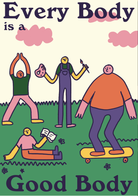
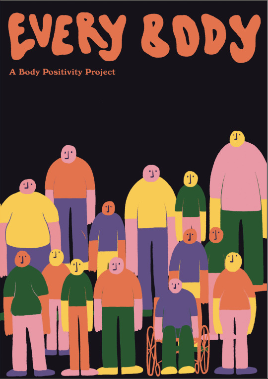
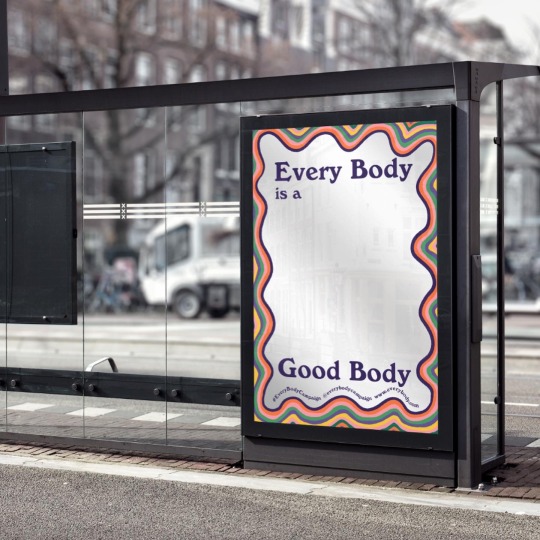
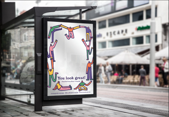
The Every Body Project
This is the campaign concept that I created for my studio class in 2020. The aim of the campaign is to bring attention to the issues that many men face surrounding negative body image. It is intended to raise awareness, work to reduce the stigma surrounding the topic, and act as a source of body positivity. Negative body image is something that many people struggle with; breakingmuscle.com states that 45% of men are dissatisfied with their bodies. The portrayal of ‘ideal’ or ‘perfect’ body types in the media enforces unrealistic body standards that many feel pressured to conform to. In recent years, the body positivity movement has gained popularity, supported by many brands and individuals. However, one shortfall of the movement is its lack of inclusivity. Body positivity aimed at anyone other than females is few and far between. As this is an issue that affects people of all genders, it makes sense for the body positivity movement to be applicable to everybody. Hence, I created this campaign concept in order to help fill the gap in the movement.
Even though many males struggle with body image issues, there is a lot of stigma around the issue and many feel uncomfortable discussing it. Not addressing the issue is not only unhealthy, but can become more serious when people don’t feel confident enough to reach out for help. Men account for 25-36% of people who suffer from eating disorders, but only make up 10% of those who seek treatment. In summary, this campaign is intended to encourage men and non-binary people in New Zealand to embrace body positivity and be accepting of their bodies.
The concept behind this project was essentially to create a campaign that would improve someones day, and make them feel more positively about themselves. I wanted to really focus on the positivity aspect of body positivity, hence why I chose to use such a bright, colourful and fun aesthetic. It is hard to make someone feel more positive when they are looking at something that has a negative or serious tone, so it was important for me to align the messaging with the visual elements. The concept is a non-profit project run through a mixture of online and offline platforms. Social media and a website are the key means of communicating the campaign. Alongside this, billstickers and posters are a large part of the project, as they tie back in to the idea of improving someone’s day by bringing them some body positivity. Posters can be iterated into many different forms, whether that be billstickers, bus shelters, billboards, flyers, etc. This makes them a versatile touchpoint with the audience as they can be displayed in many different environments.
Campaigns are probably the most common example of design used for activism, and the Every Body Project was my take on that. I thoroughly researched the issue through a variety of sources before setting out to design the campaign, and targeted it to those who I felt were most in need. As this project was a year ago now, my design skills have improved with practice, and I would likely design this campaign very differently given the opportunity now. Regardless of this, I still stand by the cause and context that the campaign was about. It was evidently a good starting point to light my interest in design activism.
0 notes
Text


I've started working on some mockups for my advertising concept. The general idea of what I'm wanting to create is a book launch event, where the work from the creatives in the book is displayed in a gallery environment. It will act as a meeting place and a gathering for local creatives, bringing them together in the same way that the book is intended to. The gallery would hold large scale prints of the works, extracts about them from the book, and projectors (second picture) showing any interviews, videos or moving works from the book - in example the Paloma Wool runway show from Barcelona fashion week. If any of the artists from the book were local enough to take part, this could also act as a meet and greet with them. Essentially, this is common ground in gallery form, kind of a preview of what you're going to get in the book. To go alongside this, I'm aiming to make a poster to advertise the event that would go up in cafes or as billstickers, and show how it would be advertised through social media.
0 notes
Photo


This is a collection of different collateral ideas that I have been inspired by.
The ideas that I have for collateral at this point in time include billstickers, billboards, stickers (physical or on instagram), instagram feed/stories, zine, t-shirts, tote bags, and some kind of hashtag or challenge. I think billstickers and content on social media would be really effective as they would be seen in the everyday environment of most people.
Sourced from behance https://www.behance.net/collection/178043483/campaign
0 notes
Text
Lux light festival + Phantom billstickers :


[ promotional posters for the lux light festival in Wellington.]
“LUX Light Festival is a free public light festival that turns Wellington into a captivating celebration of light, art, technology and design. The largest light festival in New Zealand, LUX showcases a fantastical array of light sculptures that wind their way throughout the Wellington waterfront and Frank Kitts Park. LUX approached Strategy Creative to create an exciting, recognisable campaign identity for the 2018 festival. While the light sculptures are the main attraction, the event is nothing without the people who get out on a cold winter’s night to enjoy it. So, with this year’s campaign we wanted to promote the festival atmosphere by encouraging Wellingtonians to ‘get into it’. Working with photographer Steve Boniface and a bunch of UV face paint, we created a series of images showing people getting into the spirit of LUX. These images were used across all of the marketing collateral to create interest in the event and recognisability around Wellington in the lead up to LUX.“
text from: https://www.strategycreative.com/projects/lux#:~:text=LUX%20Light%20Festival%20is%20a,waterfront%20and%20Frank%20Kitts%20Park.
“The largest light festival in New Zealand, LUX will showcase a fantastical array of light sculptures that wind their way through the city. Five new precincts will feature a broad range of outstanding nationally and internationally recognised artists, designers and architects, alongside an array of activities and performance.”
text from their facebook page : https://www.facebook.com/pg/LUXLightfestival/about/?ref=page_internal
main concept: An event which encourages people to come out to the waterfront and enjoy light based works created by a collaboration with artists and designers.
0 notes
Video
The Truth Of Technology
(Rating: G)
A horror film with a twist - there are no monsters here, only social media.
Filmmaker(s): JAPAA
The Outlook for Someday 2017 - Winning Film
Phantom Billstickers Media Empowerment Award
1 note
·
View note
Last Seen Blogs

eetz
Untitled

fanfic-and-ask-1p2phetalia
Welcome to Hell. :D

mx-sinisters
BARK + BITE

sinesofmysoul
Közhelyekkel fűszerezve.