#but it's working for me so far xD
Note
Hey!! So for the blending process ask, could you pls explain how you made the first gif in this set: https://www.tumblr.com/lady-arryn/709147925011365888/blood-in-the-wine-aurora-alicent-hightower ? And the last one in this set: https://www.tumblr.com/lady-arryn/705825404701769728/her-heart-was-a-secret-garden-and-the-walls-were ? (Also which font did you use in the text: “secret garden”?). I’m curious as to how you coloured with two different shades the gifs and the blending part ofc. Thank you in advance!! And sorry to bother, I really appreciate you taking the time to read this🥹🫶🏼 Ps: Pls don’t feel pressured to answer this right away, I know these things can be time consuming. Hope you have a great week🤍
Hi! I don't have the files for them saved and I don't remember the exact steps, but I'll try my best to recreate them for a similar result!
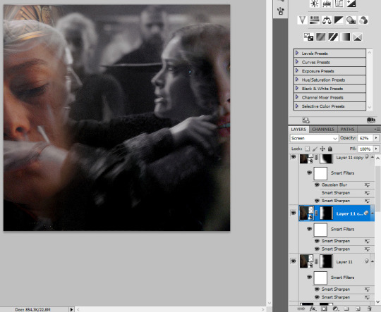
I started with putting all my gifs onto one canvas. The scene with small Otto holding Alicent's hands is on the bottom, then Emily's Alicent and then Olivia's on the top. I used lighten to blend them and that's how it looks. I added color balance for the top scene to make it match the rest in being very warm and yellow.
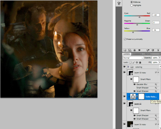
Then I added two separate layers with just some black brush under their faces to hide the background. And then you can see I added three layers where I painted over the top, Emily's face and the right side. The first layer is set on screen 15%, the other two are soft light, but on different opacity and the one on top I blurred a lot more than the middle one.
Then two more layers on top of the gifs, but under general coloring. I basically wanted to make the left side of the gif darker (so black brush with soft light) and then green layer set to multiply to add a bit more color.
And I think that was pretty much it!
Of course there's more to be done here, adjusting the coloring, adding more layers with soft light/screen, just to make the gif look smoother.
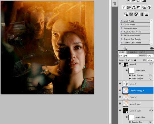
The next one! I loaded all three scenes I wanted to use for this gif onto one canvas and I put the one of them fighting at the bottom. Put my regular coloring on top of everything. Added a black and white layer and some curves for brightness for the bottom scene. I set the two other scenes to lighten blending and erased the parts in the middle.
I know Alicent's gif is different than the one in the linked set, but I couldn't find the exact scene. So it's not looking as good, because it doesn't blend as well, it's too dark, but it's ok, it's just for tutorial purposes and the steps would be the same for a better scene.
Then I added two layers on top of the black and white gif. That's where the color comes from. Layer 13 is set on multiply and low opacity and the Layer 13 copy is soft light (as you can see). For the final result I would definitely play more with those layers, maybe add another one with screen or another soft light, as long as I feel it's needed!

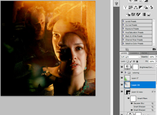
And on the top of everything I added two layers with the same colors, but I painted over the bottom parts of the gif. I could add more of the same if needed, if I saw that there's not enough color etc.
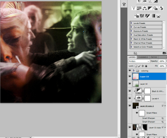
You can also see that I put the scene of them fighting on top, because I wanted to make it pop a little more. I added the black and white layer plus some levels to make it darker. It's not really a big difference and I don't know if I actually did that in the linked gif. But I often do copy bottom layers and add them on top, often erasing small parts of them, just to make the blending look a little smoother!

At that point I would color the two faces, add more vibrance or less (like I would do for Rhaenyra here, she looks way to orange). Maybe add more soft layer layers with the green and pink, adjusting as I go.
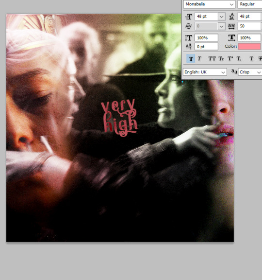
As for the font, its Monabelia. There are two layers there, the first is set to exclusion, the one on top is color - it gives that see through effect. I rotated it a little -it's normally not crooked. I added another text layer underneath but with the green, to give it a shadow.

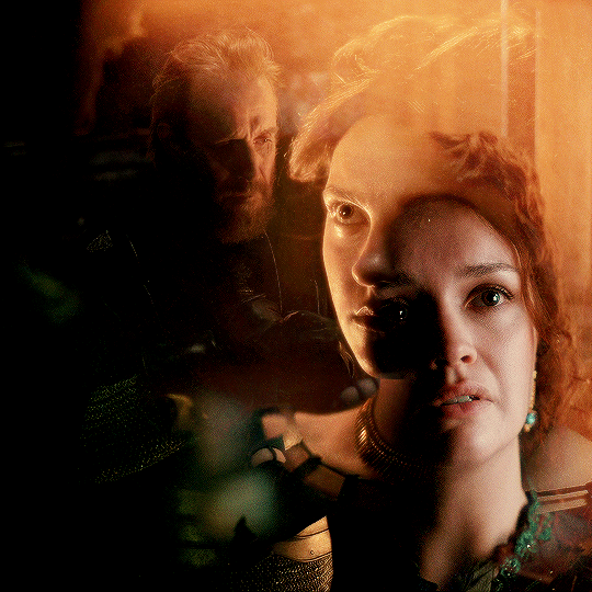
And that's the result! It looks really rough and I would never post it like that xD I would definitely adjust the coloring, maybe add more layers, maybe play more with the colors on the font, just some final touches!
And that was pretty much my process for these gifs! It does vary tho, how I blend and it's often a case by case situation, but in general I like to put a lot of layers with soft light/multiply/screen for the color (and put them in different places in my psd, some on the bottom, some in the middle, some on top). And blending hugely depends on the scenes chosen and I often find that it's what's doing the most work, just pairing what looks good!
I really hope that any of this was helpful <3
#anonymous#asks#*tutorial#i feel like my giffing process is really messy#i never bother to name the layer or group them#but it's working for me so far xD
15 notes
·
View notes
Text

New season's coming tomorrow, so Din's got an upgrade (shiny new weapon) and his kid in hand
(I've got new ideas to explore in this Hades style exploration besides the already existing interactions with Boba and Cobb - and look there is a pocket Luke already next to pocket Din in the background!)
#the mandalorian#din djarin#the mandalorian fanart#grogu#a clan of two#baby yoda#din and grogu#grogu djarin#my art#art style swap#Hades AU#so the plan for the year is to work in Luke (2)#and Bo-Katan and crew because during my rewatch I realized that I actually quite like her as a character#have ideas for the Armorer too#and that's it so far but if I ever get that far it would be deeply unfair to leave out my fave bunch of other characters as well right?#I'm plenty sure I'd lost the actual style in my shading somewhere but this was very good for putting me on my art track#in retrospect I so wish i'd added a pocket Cobb and Bobab to the previous ones.... oh well#look at Din's fancy glow stick tho! I made it shine real pretty#and it only took me about 4 lighting layers XD
2K notes
·
View notes
Text

Frye Fest - Final Countdown
<- Previous - Part 5 - Next ->
[5/20]
👽Team Alien👽
Splatfest 01-04-2023
[Master Post - coming soon]
#okay so like....so far this has been my least favorite one and it actually set ME BACK ON MY BUFFERS#i hated it soooooo much i actually stopped drawing for a whole day out of frustration and today i cried cuz i thought it looked so ugly fkd#the sketch at least#im more happy with the final product but it still isnt one of my favourites XD#i only really liked how well the green and purple mixed lol#im more excited to start working on the next splatfest cuz ZELDA AND I LOVE ZELDA#splatoon#splatoon 3#splatfest#frye onaga#frye fest#nessie vs aliens vs big foor#team aliens#my art#saltys art
38 notes
·
View notes
Text

woah, nutty, buddy, where did you find such a massive lollipop
#my art#happy tree friends#htf#whipped this out as a warm up#i have an ask im working on XD and its a big ol comic#its taking me ages to finish HAH#thats okay tho im rly happy with how its turning out so far#in the mean time take this nutty#i tried a different colouring style#tried to push that purple green palette >:3#this was rly fun to do#htf nutty#digital art
167 notes
·
View notes
Text

Nobody has donated cinnamon rolls to him.
#[ HELLO i would like to report a crime ]#[ hellooo guys! ]#[ man oh man i have been busy ]#[ and worked hard on my book ahaha ]#[ gonna try and queue some stuff up 8) ]#[ cause WOW i'm so far behind xD ]#[ thank you very much for your patience guys! ]#[ i need it xD ]#[ hope you're all doing good!! ]#despair for me. ╱ in character.#burn the city. ╱ main verse.
14 notes
·
View notes
Text

Hibari/Kana art I commissioned from @azaracyy a while ago! (my first skeb commission even!)🥰🥰 Kana's hair is different here because quite some time has passed since they met (some stuff happened in-between lol) and they also get along a little bit more (they still fight tho...🗿). Cyl and I talked about how bothered Hibari would be especially if the sun is shining straight to her eyeballs while she sleeps like that lmao
#khr#khre#khr oc#oc#einart#hibari kyoya#ninomiya kanako#oniyanagi#jan-feb was like my lowest point mentally & physically this year so far (and i hope it stays that way)#so this art and the fun chat we had abt this scenario rlly helped me a lot with my will to live#thank u sm cyl! 😭💖#trope where u accidentally stare too much and too softly at sleeping person's face applies here hehehe 🫣😳#after he's done having “wth u sleep like this...?” thoughts that is#fun fact is that i had this printed into a photoboard XD i have it on display in my hibari shrine#i wanna make a whole comic based on this scenario#so many comic ideas not enough time!! right now!!#i will work hard!
11 notes
·
View notes
Text
Olympics prompt
So I may end up regretting this, taking a long time, or maybe not even following through (fair warning XD), but I like learning about different Olympic sports, so, in an effort to do so, I thought of a prompt idea:
give me a character (or two) [for a fandom I know] + an Olympic sport, and I'll try to draw or write something for it! 😄⚽️🏊🏃🥇
#DuckTales#Owl House#Carmen Sandiego#Star Trek#Legend of Korra#Avatar: The Last Airbender#any other Disney Universe shows or any other fandoms I know XD (maybe even Dragon Prince??)#my prompts#of course I got this idea during my trip last week when I couldn't do anything about it so the motivation was of course high then XD#but this sounds fun!#I've done two fanworks like this before#a fic with Lotor + Allura featuring the Space Olympics and fencing + gymnastics respectively (loved learning about fencing!)#and (the Olympics was a sub-thought for it) I drew Agent Zari (CS) playing beach volleyball a couple years ago and *that* was really fun!#anyway yeah! really fun to learn about the sports (especially the lesser-known sports) and this gives me motivation to learn about#the finer details of them#though again fair warning it might just end up being me writing a quick drabble or list of headcanons XD#random bonus points thought (if you survive reading this far XD)#bonus points for if you give me a medal place (or no podium at all) situation for the characters that I have to work with
8 notes
·
View notes
Text

thing i drew on one of my schools ipads instead of working on my actual art project 👍
#i hate procreate so much how does anyone use this#i feel like this is super jank in part cuz of that but Oh Well#scribbles#furry tag#help this has been in my drafts fr like two weeks now#oops#aforementioned project is allllmostttt done but also its literally the last week of school#im two whole projects behind btw 💀#to be fair this ones really far out of my comfort zone nd our teacher loves making us work on the biggest possible canvases#so its like adding even more to how long its been taking me ( i put off starting it for like a whole week cuz i couldnt come up w anything)#i can maybe probbaly just do the watercolor project at home nd the oil pastels one should be fast im pretty good w them#shes letting ppl go much smaller with it too cuz she just wants ppl to finish stuff up already XD
8 notes
·
View notes
Text
installing another gacha game because 3 aren't enough
#hoping wuthering waves works on my pc without lagging aaa#props to me for being f2p in all gacha games i play i knew being stingy was good for something i am imune to marketing strategies#surprisingly of all games i play the least f2p friendly is a silly otome game#but anyways. excited for wuwa !!!#characters i have my eye on so far: jiyan jianxin yinlin verina and calcharo#if i manage to get 2 i'll be happy xD#i know we can choose one from standard banner or whatever the name is so i might choose the yin yang girl
8 notes
·
View notes
Text

i've been making progress in infinite wealth this week and i got very happy seeing daigo again. so i made a bracelet
#i think i understand the vague posts i've seen regarding chapter 12 xD i haven't finished it yet but hmm#i need to rewatch that whole scene with the jimas#also uhhhh.... ebina is who's what.... huh............ whuh...............#am i insane for saying this game just gives me weird vibes so far. like. Like. idk. i'm having fun but the story/pacing is just Weird#it's not necessarily BAD but like. everything just feels kinda off????? does that make sense¿¿¿¿¿¿¿¿¿¿¿#iunnoool like i said i'm havin fun anyway. i'm enjoying the bucket list stuff a lot#anyway my nay wants me to make a kiryu bracelet for her 🫡 i wish i had a better variety of beads to work with#where do ppl buy beads..........#the void given form#((may as well put this in the art tag? bracelet making is a craft))
11 notes
·
View notes
Text
All I dreamed about last night was booping and getting booped.
#I dreamed I woke up to like so many boops my phone alarm was breaking and made me late for work XD#*boops*#🐾#I miss it already it was far too addictive but well the wars would have never ended otherwise… we’d be booping forever :)#<3 <3 <3
10 notes
·
View notes
Text
ITS 0:11, DAY 2 OF CRINGETOBER LETS GOOOO
Self-insert feat. my Miitopia Hero that’s definitely not based on me, nope
(I may be misinterpreting this prompt lmao)
Banana thoughts, head empty. I frickn love Miitopia, the game is so silly and fun (plus the music and endgame are genuinely pretty cool)
#cringetober#cringetober 2023#toastshark doodles#miitopia#^based on^#back when I first played it which was years ago#and also#as far as it works with the mii maker#the 3DS one is a super big upgrade from the og#but still kinda hard to make certain faces#without them looking weird#so this one isn’t exactly the most accurate#it still better than using that scan irl face to turn into mii face feature#though it did make some pretty funny results XD#3DS best console fr#also MAGE IS THE BEST CLASS FIGHT ME
16 notes
·
View notes
Text
💚
#RDO TOMORROW!!#(thats rostered day off for those who dont know. which i didnt before i got this job.#it means i work an extra half hour every day and that all adds up to a full day off during the week once a month.)#rdo's are my museum/zoo days!!#this is the first one i've had in months where i havent been sick. so i wanna try and do museum. zoo. and a little shopping-#if i can swing it#zoo's free for me cuz i'm a member- and i only really wanna see my favourite gentlemen wilbur and little john (giant tortoises).#museum pricey but i'm a student again!! so- discount 💞💞#i get to see my OTHER favourite gentleman there. he's a taxidermy horse. i have BIG FEELINGS about him.#then not far from that is the biggest book store in the city and i really wanna browse that for a while <3<3<3#i also wanna go back to the comic book store i found that renglund book at. see if theres anything else cool there ^^#i cant wait. its gonna be a good day even if I dont get to everything XD
6 notes
·
View notes
Text


it's finally here!! my actual fem dream version! >:'Dc
i had such a hard time deciding for the colors and overall design istg
(and even then i'm not entirely sold on the final result tbh so do expect some changes in the near future possibly!)
dream belongs to jokublog
these designs are mine :D
#art#my art#my designs#utmv#dreamtale#dream sans#dream#fem!dream#okay but i genuinely don't know what to make of this xD i'm having really mixed feelings about the both of them hh#like it's so drastically different from what i originally had in mind- and it's so far off the og's more colorful bright vibes#but i just CAN'T work with bright colors i found out?? i always de-saturate them automatically for most (but def not all!) of my art#i like having one or two popping colors at most- and the fact that dreamtale is taking place in a secluded village in the middle of nowhere#makes me think they most likely wouldn't even have the means to create specific fabric and colors#and yeah i think dream/night were born with bright blue/yellow/purple royal colors since they ARE princes(ses)#but dream would def stain and rip them at SOME point in their playing/rolling around in the mud and trees soo#also because they must have changes of clothes given by villagers!! (at least dream would be given those idk about night yet)#anyways last bit of info is that the sun earrings she's wearing were given just like the star (and the crescent for night)#as gifts early on in their lives- she's not wearing it because i think she'd give it to night to hold onto#seeing how she could drop and loose/break them in one of her crazy games with other villagers#that's all i have to say (that i remember xd) for now! thank you all so much for the support<333
70 notes
·
View notes
Text
Also, Ruan Mei was the one who lent the Phase Flame to Ratio, wasn't she?
#That Ratio and her were working together seemed to be the case since we first found him but idk#Ruan Mei plays dumb when we ask about him but I thought it was clear that she did know him#Herta also pretends she doesn't know him for some reason#cringefail acquaintance#Jokes aside I wonder why they did that. Is it because they both are ehm working behind each other's back#(Herta when it comes to the IPC‚ the SU and the bet‚ Ruan Mei kind of with everything)‚ or is it due to some other more complex reason?#Based on we've seen thus far I do think Ratio and Ruan Mei were working together in something#and that she was in the known of at least some things. Perhaps not everything#She seems to care about things beyond her research even less than Herta does#But given what we're told it seems fair to conclude the fire Ratio had was given to him by Ruan Mei#Herta said Ruan Mei needed it for some research. So either she didn't need it anymore and didn't mind giving it to Ratio afterwards#or maybe what Ratio was doing was something she was a part of. Or did Ratio steal it when he was around the seclusion zone?#I'm not inclined to think that tbh it seems to me Ruan Mei must have been knowingly implied. Yet now she owes Herta a favour#Which is more valuable according to Herta. This quest has left me very curious about the development of all this#Screwllum suspected Ratio since the beginning. I wonder if he suspects Ruan Mei too#Ruan Mei's line about Screwllum makes it seem like they don't get along too well I think. I have so many questions xD#I am very curious about all this‚ satisfied and potentially excited. Not yet excited but I sure have hopes for an exciting development haha#Maybe it will all end up being nothing but the relationships between the characters in the Genius Society (especially these three)#seems kind of messy and that intrigues me. The relationship the three of them have with Ratio seems intriguing too#Any iteration of these dynamics seems to be very interesting#Maybe it will all end up being nothing or I may be misreading or seeing more than there is but I am looking forwards to knowing more#I talk too much#Traces
7 notes
·
View notes
Text


Figured I would finally put screenshots up. I put Callio in Once Human. >.>
It is very fun and very addicting so far. Still learning the game and I'm not totally sure how the seasons work just yet? But I recently rebuilt her base (for the third time XD) and I want to get pics of it because I'm really happy with it now.
Also she has a giant cat that sleeps with her. What could be better than that? XD
#once human#it's sort of like fallout but also reminds me of outriders a little#kel and callio are neighbors so we're in each other's bases as much as our own XD#we're about halfway through the season i think on our server#it's 100% free but we did both buy the battle pass >.>#but it's been worth it so far \o/#there's still a lot of stuff i haven't messed with yet#we're working through the main story and working on crafting mostly#but there's a TON of sidequests + hubs to clear + farming and stuff#so i think we'll be playing it for a good while \o/
3 notes
·
View notes
Last Seen Blogs

ardemsuo
ardem su o_note

alwaysdrawinq-blog
Artist
milahart
i will make you hurt

landofderp
IN THE LAND OF DERP
shinryjn
for shin ryujin ♡