#character infographic translation
Text
Really cool infographic rounding up (some of) the italian Disney characters combined with the year, the story, the issue of Topolino they debuted in and the name of their creator(s):
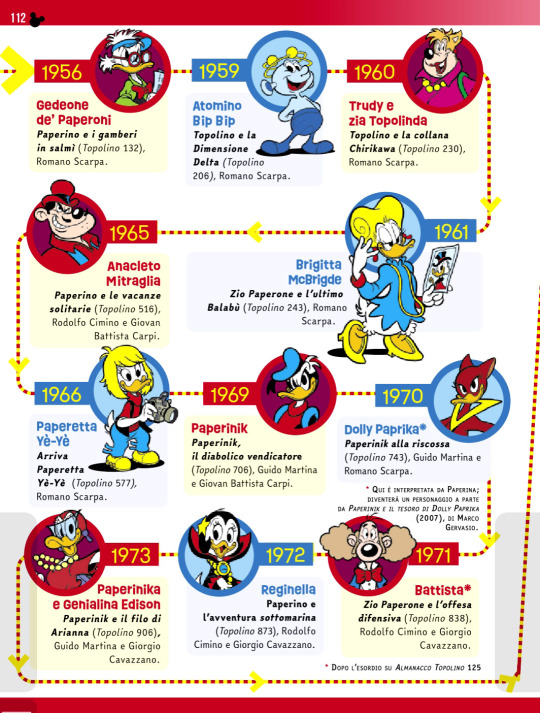
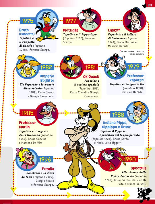
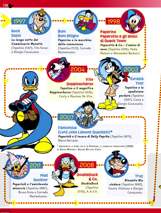
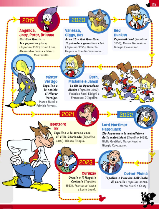
from Topolino #3567.
#i don't think there's the need to translate this#i don't even know the english name for most of them ^^''''#disney characters#italian disney characters#italian disney comics#topolino magazine#infographic#info dump#duck avenger#brigitta mcbridge#lusky#jeeves#albert#quackmore#dickie duck#disney ducks#disney mice
140 notes
·
View notes
Note
Hi! I always find your answers to writing questions enlightening, so I hope you can help me as well. I'm working on my first FFXIV fic, but English isn't my first language and I find staying true to canon characters speech pattern difficult (it's not really the English I'm used to) and I'm completely frightened by when I'll have to write Urianger. Do you have any resources or advice for that? Sorry for the weird question and thank you in advance ❤️
The language in FFXIV, in EN and as far as I know JP, is using a slightly archaic mode of speech that is even difficult for native speakers sometimes. So it's easy to feel confused and intimidated by it! Words like gaol, chirugeon, corse, swiving, and so on are are all real words that have fallen out of common use. The etymology of "gun" in the lore mirrors that of the real world (related to a queen's name). Even the Thieves Cant used by Limsa's Rogues Guild is based in reality (with some substitutions made), and can be looked up. The writers and translators are, funnily enough, language nerds. The names of various things/groups/etc usually actually mean something and aren't just made up entirely.
In universe, the reason EN Urianger talks in a version of Modern English (other translations of Urianger apparently don't go quite so archaic) is due of his childhood tendencies to self-isolate and read older books, adopting those speech patterns cuz he's a quirky nerd. Loiusoix gave that explanation in 1.x, and it's reiterated in Urianger's lorebook entry.
(Modern English starts in the late 14th century and early versions are recognizable if difficult to parse, versus Middle or Old English which are incomprehensible without study.)
Reading (or watching/listening) to Shakespearian English is a good way to get more used to Urianger's speech. Also they really are fun plays and poems; they were written for everyone to enjoy as popular entertainment, and are full of jokes and goofiness, even many of the tragedies. People think they're stuffy highbrow (they're not), and the cultural/social contexts are missing in a lot of cases anymore (the "William Shakespeare" tag on my main blog has more of that).
Writers off the top of my head to subscribe to who ship with the fortune-teller so write him often are @gunbun and @beetlebrownleaf; they've got his speech patterns and mannerisms pretty well down.
Here are some posts in my "language" tag (which I also often tag with Urianger and Midgardsormr, as he and some of the First Brood also speak a bit archaic):
Archaic Words - a short list of archaic words and their meanings.
Urianger Language Infographic - one fun way to try to learn the thy/thou/thee.
How To Thou/Thee/Thy/Thine/Ye Chart - what is says on the tin. Another handy method that may work for folks.
More Infographs - more silly pics explaining those pesky pronouns.
Discussion Thread on Modern English - random info thread from Tumblr users.
Urianger Discuss Thread - beetlebrownleaf and gunbun discussing Urianger-speak and some off-Tumblr resources they use when writing our favorite nerd.
One thing to remember about Modern/Shakespearian/Elizabethan English is "thee/thou/thy/thine" were actually informal, while "you" was formal. Like how some languages now have informal "you" versus formal "you." "Tu" versus "vous" in French, "tú" versus "usted" in Spanish, etc. And then we get into the plurals, and so on.
Which means Ye (subject)/You (object)/Your get used as both Plural and Formal.
Thou is Singular You as the Subject.
Thee is Singular You as the Object.
Thy is used for words starting with Consonants.
Thine is used for words starting with Vowels ("H" counts).
If using "Thine", then that's when you'd use "Mine"; one of the links gives the example of "thine eyes" versus "mine eyes."
Doth = Does
In fact, -eth and -th verb endings? It's just -es and -s endings.
Second person changes this up and we end up with "thou dost", "thou willt", "thou shallt".
"Ye" is actually not used for "The." That comes from an old letter no longer used in English, þ ("thorn"), that used to be the "th" sound, and as the letter fell out of use--especially in early printing--the letter "y" was substituted as a close visual equivalent but still pronounced "th". Which is why we have all those RenFaire signs.
There's more, so please check the links (especially gunbun's offsite resources) as of course there are irregular conjugations and exceptions and substitutions and special circumstances...but honestly for fanfic, just having "you" and basic verb conjugation sorted goes a long way to getting the correct "feel" of Urianger's EN speech.
In the end though: don't actually be intimidated by the language in FFXIV when it comes to writing fanfiction. Getting the NPCs to act and think in character regardless of language use is more important if aiming for authenticity. You can do your best with making the language sound close to the game's writing (avoid modern slang you don't see in game, for instance), but it's fanfic. Don't sweat it, ignore the grousing of your word doc's grammar check as needed, and it'll come easier in time with practice.
#Final Fantasy XIV#Lyn prompts#Urianger Augurelt#Writing#Language#Words#Definitions#Fanfiction#Resources#Reference
131 notes
·
View notes
Note
I just read though your whole infographic, and I wanted to ask, is Hamas basically a Palestinian version of the Irish Sinn Fein?
Reading through your post, it sounded like they are very similar, with a political wing (like the one Bobby Sands was in) and a military wing (the IRA), so I was wondering if that was an apt comparison?
I'm American Diasporic Irish, so your infographic was the first actual description of Hamas I've heard other than the american media explanation of 'scary terrorists,' but I learned a lot about Sinn Fein and the IRA when I was a teenager because one of my favourite TV shows has a character who's in Sinn Fein/the IRA, so it's a frame of reference that's easy to understand for me.
I keep hearing comparisons to South Africa, which I'm sure I'm sure are relevant, but it sounds like Sinn Fein may be a more direct analogy to Hamas. (also, I learned arabic when I was in college and I watched a lot of translated TV shows to help me with comprehension and that same TV show with the character in the IRA/Sinn Fein, when they translated it into Arabic, they just made her be in Hamas and straight swapped NI for Palestine in the arabic version, so I'm assuming it's a pretty comparable situation).
Anyway, I'm sorry if it's a dumb question, but it would help me understand.
Hi anon,
Please don’t apologise for asking a great question ✨
I think you’re right with saying that there are some similarities between the two from what I remember about the Irish Sinn Fein. I am definitely going to refresh my memory. I had posted those screenshots as a means of educating everyone about Hamas because of the lies western media has portrayed over the years. I am so sick of the propaganda.
And about the comparison to South Africa, absolutely! As a South African whose parents and grandparents went through the apartheid, we feel it’s the right of the Palestinians that we stand by them! ❤️ everybody should stand with the Palestinians.
5 notes
·
View notes
Text
Top characters to get an Alt in the new event
1. Shinya - He’s getting a new VA, and that is a TON of work LW is putting into the character if Shinya’s not going to get some new lines related to a variant.
2. Jacob - The infographic has already been translated to mentioning “The Fist of Love” and since this event seems to be focused on the Missionaries, Jacob’s the only guy who fits.
3. Tanetomo - The event focuses on “Love and War” implying the Warmongers, and Tane’s the only one of the Hakkenshi to not have a limited unit, and the Hakkenshi tend to be valentine’s themed (aside from Yasuyori)
4. Marduk, Mephistopheles or Yoritomo - Since Shinya and Jacob and damn near confirmed, and LW likes to balance things between characters, the Warmongers with the most potential for a limited are these 3. I’m feeling Marduk the most since he doesn’t seem to be getting that important in the main quest, and we know the most about him already.
15 notes
·
View notes
Text
In general, I really want to make an animation or a comic book on this story with a Dark Chiro, but I'm still studying and I shouldn't wait for the holidays, and the study is higher than the roof ... so in my posts I will tell a little bit of the story of this character, since finding a person who could translate the story will be very difficult. And I don't have the strength to write it now, again, studying + orders, and taking courses on infographics. So for now, let's make do with this. I will describe both simple facts and pieces of history.
Start. (The whole story begins with the last episodes where they were looking for artifacts for the resurrection of the Skeleton King.)
Valina and Mandarin were collecting artifacts for the resurrection of the Skeleton King, one of them was an unusual sphere located in the temple, having made their way there and almost got the artifact, the couple wanted to take it as our heroes appeared here, after which the battle began. Chiro ordered the monkeys to grab the sphere and get away, but the Mandarin managed to grab the sphere while Valina distracted the team with her witchcraft. The maneuver did not pass, Sparks attacked the Mandarin trying to take away the sphere, Chiro began to fight with the witch, the rest of the monkeys joined in to help the red one, but the Mandarin was able to escape and ran to Valina on the way, a charge was shot at him from behind, which caused him to fall, dropping the sphere that illuminated them three: Valina, Chiro, Mandarin. The girl's skin turned pink, her hair changed color, the evil monkey changed before her eyes ... she began to look like ... before betrayal! It was a miracle! The monkeys couldn't believe their eyes. And he didn't even change with Chiro, only his military clothes fell off, and the guy appeared in front of the monkeys in ordinary everyday clothes. The stunned primates stared at the two villains while they tried to figure out what was going on, clearly not understanding where they were.
This was a brief backstory, I didn't paint it too much, I didn't get to the moment on art, wait for it in the following posts, so fandom.
#art#srmthg#chiro#artists on tumblr#illustration#digital painting#drawing#Antauri#Antari#dark chiro#super robot monkey team hyperforce go
4 notes
·
View notes
Text
Brand Storytelling: Using Photography and Graphics in Branding.
Optimizing Branding with Visual Storytelling Power
Your brand tells your story, and visual components are the best means to communicate that story. Photography and graphics have the unique ability to speak directly to the emotions of your audience, making them an invaluable tool in your branding efforts.
Visual storytelling is a combination of images and text, skills and knowledge, employed to narrate a tale that evokes emotions. We are living in a world where people are habitually exposed to vast amounts of data every day. visuals play a vital role in grabbing attention. Everyone loves a good story. Storytelling resonates with audiences around the world as a way to connect and inspire. Since the beginning of time, cultures worldwide have been using pictures to tell a story — whether it's been caveman paintings or silent films inspiring an audience without words. It is an old saying, yet very relevant in today's age "A picture is worth a thousand words.
Yes, a picture tells a thousand words. But there's an art to visual storytelling. Learn more about the best practices, and visual storytelling techniques in our guide, 8 tips for powerful visual storytelling.
The value of Images
Scientific research has shown that the human brain can process images 60,000 times faster than text. Our memory retention for visuals is significantly higher compared to plain text. When it comes to engaging your audience, visuals are your powerful allies.
Enhancing a Picture with Words and Images
Brands are more than mere labels; they are stories, journeys, and experiences. Photography and graphics assist in translating your brand's unique narrative into a universally comprehensible language. They help humanize your brand and foster an emotional connection with your audience.
"Often, images speak louder than words. Use them effectively and you'll have an engaged audience, ready to be part of your brand's story."
Photography and Graphics: Unleashing Double the Branding Power:
Photographs captivate through the reality they portray while graphics charm with their abstract representation. Both forms of visual communication wield unique powers for brand storytelling.
Photographs can provide authentic snapshots of your products, services, or behind-the-scenes glimpses of your company, creating a strong reality connection with your audience.
Photography brings your brand to life. It adds character, depth, and realism. Quality, professional images can significantly enhance your brand's perceived value.
Graphics: The Visual Catalyst for Social Media Success.
Graphics extend beyond logos and website designs, they are integral to the brand's narrative. They translate complex ideas into easily digestible visual treats. Graphics can break the reality barrier, offering a creative exploration of abstract concepts, data representation, or artful emphasis on certain elements of your story.
Expressing Brand Personality:
Every photo you share contributes to the overall image of your brand. Hence, it's crucial to exhibit consistency in photographic style, tone, and composition, reflecting the ethos of your brand.
Showcasing Your Product or Service
Images of your products or services provide a visual understanding of what you offer. High-quality photographs not only attract attention but also instill confidence in your offering.
Social Media Marketing
To make your brand repetitively visible in front of your audience, social media marketing followed by strategy creation & execution by a digital branding agency is a must. This activity decides whether your brand will reach from the 6-inch screen to the minds of your consumers.
Visual content tends to perform better on social media. Using eye-catching visuals, attractive images, and videos is key to social media success. They grab attention and tell your brand`s story well.
Presenting Information Visually
Infographics, diagrams, and charts make complex data understandable and engaging. They enable your audience to visualize large amounts of data quickly and retain the information effectively.
Some Important And Visual Storytelling Elements
Consistent use of colors and fonts that resonate with the brand
Use of graphic devices like symbols or icons indicative of the brand
High-quality photos of products/services
Use of unique graphics that portray your brand's story or values
Conclusion:
As the final takeaway, always remember -
“Successful branding is not just telling a story but making your audience part of that story.”
Visual storytelling, through photography and graphics, is an essential instrument in the branding toolbox. It is the unsung hero that takes your audience on the brand's journey, making them not just observers, but participants. A captivating
visual story can convert an audience into loyal customers and advocates for your brand.
Embark on your visual storytelling journey today. Piece together images and graphics that encapsulate your brand's narrative and engage the audience at a much deeper emotional levelBegin your visual storytelling journey today and let your brand narrate tales that endure! Remember, every picture, every symbol stands as an ambassador of your brand reciting its unique story. Involve the power of visuals and let your story be heard.
This blog is written by Vox Plus
1 note
·
View note
Text
7 Fundamentals Of Icon Design

Icons play a vital role in digital marketing by conveying meaning visually across websites, apps, infographics, and more. To engage audiences effectively, icons should follow certain design principles. However, creating effective icons requires a deep understanding of fundamental principles and design techniques. Let’s explore seven core considerations for creating professional icon sets.
Why icon design matters
Icons are essential visual elements that play a crucial role in enhancing user experience across various digital platforms. They serve as a powerful tool for conveying meaning, functionality, and brand identity, and they can significantly impact the overall usability, accessibility, and aesthetic appeal of a product or service.

Enhancing usability and intuitive navigation: well-designed icons can effectively communicate actions and functions, enabling users to quickly and easily navigate through interfaces. By providing visual cues that are universally understood, icons eliminate the need for extensive text descriptions, reducing cognitive load and enhancing the overall user experience.
Strengthening brand identity with visual consistency: a consistent icon set can effectively represent a brand’s personality and values, reinforcing brand recognition and establishing a cohesive visual identity across multiple touchpoints. By using a consistent style and color palette, icons can convey a brand’s unique essence and establish a sense of familiarity among users.
Translating concepts and functionality across language barriers: in contrast to text-based interfaces, icons offer an unparalleled advantage in terms of global accessibility and inclusivity. As visual representations, icons transcend language barriers and can be understood by users regardless of their native tongue. This makes them invaluable for creating seamless user experiences for a global audience.
Enhancing aesthetic appeal and engagement: icon design extends beyond functionality, playing a significant role in shaping the overall aesthetic appeal of a user interface. Thoughtfully crafted icons can add visual interest, vibrancy, and personality to a design, injecting charm and character into the overall experience.
Pixel-perfect precision for scalability and professionalism: icons should be designed with pixel-perfect precision to ensure consistent appearance across varying screen sizes and resolutions. This level of detail contributes to a polished and professional brand image, demonstrating attention to detail and a commitment to quality.
Minimalism for scanability and focus: while icons can add visual interest, it’s crucial to maintain a minimalist approach, avoiding excessive detail and clutter. Too many intricate elements can hinder scanability and make it difficult for users to quickly grasp the intended meaning of the icon.
Distilling complexity into intuitive symbolism: effective icon design is about simplifying complex concepts into easily recognizable symbols. By using universally understood shapes, lines, and forms, icons can convey meaning immediately, fostering a sense of understanding and emotional connection with users.
Consistent visual weight
Icons, despite their petite size, play a crucial role in user interface hierarchies. Achieving consistent visual weight among icons ensures that users can easily distinguish between primary and secondary actions, aiding navigation and usability. This can be achieved by adjusting the size, line thickness, color saturation, or overall complexity of the icons.
Example: Imagine a set of icons where one stands out as significantly larger than the rest. This incongruity not only disrupts visual harmony but also erodes the brand’s credibility.
Simplicity and minimalism
Icons thrive on simplicity and minimalism. By stripping away unnecessary details and focusing on essential shapes and forms, icons become more recognizable and memorable. Avoid cluttering icons with overly intricate details or gradients, as these can hinder legibility and clarity.

Example: Picture an animated icon set overloaded with unnecessary details. The result? Icons that appear heavy, confusing, and fail to resonate with the audience.
Creating icons with a consistent brand voice
Icons should seamlessly align with the overall brand identity, reflecting the brand’s personality and visual style. This consistency ensures that icons reinforce brand recognition and contribute to a cohesive user experience. Consider using the brand’s color palette, typography, and overall aesthetic to create icons that resonate with the brand’s essence.
Example: Consider a scenario where a brand uses diverse icon styles across various media. This inconsistency may create an impression of a shapeshifting, unreliable business.
Designing icons with enough white space
White space, also known as negative space, is an essential element in icon design. While it may seem counterintuitive, strategic use of white space can make icons more impactful and visually appealing. White space allows icons to breathe, reducing visual clutter and emphasizing the icon’s essential elements.
Example: Envision a set of icons crammed together without adequate white space. The result? A chaotic and unprofessional appearance that undermines user experience.
Pixel-perfect design
Icons are typically displayed on digital screens, where pixelation can be an issue. To ensure that icons maintain their crispness and clarity, it’s crucial to design them with pixel-perfect precision. This involves paying close attention to line weights, proportions, and overall resolution to ensure that icons look their best across different screen sizes.
Example: Imagine encountering a set of icons that appear blurry on certain devices. This inconsistency detracts from the overall professionalism and cohesiveness of the brand.
Contrast & color palettes
Contrast plays a vital role in icon design, making it easier for users to distinguish between foreground elements and background elements. Use contrasting colors to make icons stand out and ensure that they are easily recognizable. However, consider the overall color palette of the app or website to ensure that icons complement the existing design.

Example: Visualize a scenario where contrasting colors are too dark, rendering icons nearly invisible. Alternatively, excessively light colors may clash with website themes, compromising user experience.
Geometric shapes have more influence
Geometric shapes are often preferred in icon design due to their inherent simplicity and universal understanding. Circles, squares, triangles, and other basic shapes can effectively convey a wide range of concepts and ideas. However, don’t shy away from experimenting with more complex shapes if they effectively represent the intended meaning.
Example: Envision an icon designed with haphazard free-form elements. This lack of structure may instill uncertainty in consumers and diminish their confidence in the associated content.
The bottom line
Consistency, meticulous attention to user experience, and a strategic blend of design elements form the bedrock of creating professional icon sets. Each principle, from maintaining visual weight to embracing geometric shapes, contributes to a cohesive, visually appealing, and trustworthy brand image. As you embark on your icon design journey, remember: every pixel matters, and each shape tells a story.
By adhering to the fundamentals discussed above, designers can create icons that are not only visually appealing but also functional, consistent, and aligned with the overall brand identity.
Interesting headings:
Affiliate marketing case studies
Bonuses
Reviews
0 notes
Text
TASK 1 - Philipp Dettmer
(Nutshell Animations)

About Him
After dropping out of high school at age fifteen, Philipp met a remarkable teacher who inspired in him a passion for learning and understanding the world. He went on to study history and information design with a focus on infographics.
Philipp started Kurzgesagt in 2013 as a passion project to explain complicated ideas from a holistic perspective. When the channel took off, Philipp dedicated himself full-time to making difficult ideas engaging and accessible. Besides being an animation studio, Kurzgesagt is also an agency and a production house for science-related products.
Philipp’s first non-fiction book Immune – A Journey Into the Mysterious System that Keeps You Alive was released on November 2nd, 2021. It has already been translated into many languages and is sold all across the world.
Philipp lives in Munich with his partner and his dog Mochi.
About his Short Animations
His short animation got at least 3 main characters which is a little boy, a girl and a grown man with glasses. Also they are like 2 to 3 minutes long and very funny with a fast dialog system.
What I like about his characters are that they don't have any colour and they kind of look like stick figures. Most of the characters are in a very simple art style and easy to animate.
0 notes
Text
E-learning Dubai | E-learning Development Companies
Adding the E (enthusiasm) to your learning – E learning Dubai.
While books are a great way to share detailed information regarding a topic, e-learning modules allow you to highlight the important points in an interesting and interactive manner to make learning easy.
We at Stylus, develop courses that can be used across multiple platforms, browsers and devices. We provide the following e learning Dubai services:
Custom e-learning modules
At Stylus, we are known to cater to our client’s needs and specifically develop the course keeping our target audience in mind. To create a customized e-learning module, we take references from existing content and we also develop fresh content as and when needed. As we offer e learning Dubai services to our clients across the globe, we develop a number of solutions for you to choose from. The technologies that we usually make use of include Captivate and Articulate. Our custom e-learning courses have various options differing in terms of interactivity and complexity based on your budget and requirement.
Microlearning
While the entire world is engaged viewing short forms of content, we at Stylus too, keep that in mind while suggesting some of our content offerings to our clients. Microlearning is currently trending among other forms of content as people are more interested in small bursts of content. Delivering shorter bites of content engages the audience better and promises a good retention rate. Under microlearning, we create content in the forms of short videos, infographics, articles, PPTs, GIFs, etc. We develop microlearning as an independent form of learning and can also include it as a part of a larger e-learning offering.
Translation and localization
It is very important for our audience to understand what they read or watch. This is where translation and localization play a major role. Translation is where the text is converted to suit the language of the audience without changing the meaning of the context. It is often considered when the content is to be distributed across various countries with people who understand different languages. Localization on the other hand is when a cultural stimulant is used to make the content feel close to the audience’s home. While creating our content, we ensure to weave in the audience’s culture and lifestyle to ensure a quick connection and understanding.
Interactive videos
At Stylus we develop engaging and attractive videos that capture the attention of the audience. We develop videos for marketing purposes and educational purposes. Our instructional designers, animators and graphic artists work in tandem to create such interactive videos. We develop a number of videos based on the requirements of clients, but the most common ones are motion graphic videos, screen-capture videos, basic animation videos, character animation videos and explainer videos, among others.
Blended learning
To prevent the monotony of one mode of learning, Stylus offers a mix of learning aids in the form of blended learning. We create blended learning courses that are an ideal mix of traditional Instructor-Led Training (ILT) as well as modern online or e-learning courses. Before we devise a course, our instructional designers consider the resources and devices available to facilitators and learners. Whether you need online learning or a classroom-based course, Stylus can cater to your requirements keeping the target audience in mind.
Mobile learning
With so much importance given to mobile devices, Stylus offers courses in the form of mobile learning. These courses are created keeping in mind the devices’ dimensions and the compatibility with iOS and Android operating systems. These courses enable learners to learn on-the-go and at their own pace. While our content writers and instructional designers customize the content, our graphic designers and animators ensure that the elements used are user-friendly, attractive and don’t slow the pace.
Online Presentations
A great mix of technology as well as content, presentations are considered an effective tool to deliver information. At Stylus, we develop presentations for courses as well as corporate presentations. While we create these presentations, we ensure to include all the elements that will attract the audience’s attention. Our presentations contain a varied range of colors, images, diagrams, flowcharts, animations, infographics, audios, graphs, charts and in some cases videos too.
Online PDFs
As a part of our digital learning package, we also create simple and interactive PDFs that can be uploaded on an LMS. These online PDFs can include statistics relevant to a topic, the course outline, key points, and added information.
For More Details - https://stylusolutions.com/uae/e-learning-dubai.html
0 notes
Text
Infographics for Boosting Business

“A single Infographic is worth a thousand words.” Infographics are a type of data presented in a visually appealing form. It is simply information that has been combined with images- a method of conveying information or data visually. As a result, it makes the data fascinating, easy to understand at a glance, and grabs the readers’ attention. It is self-explanatory.
After reading a few lines of the material, a reader could lose interest, but with visuals, readers will be drawn to your message.
It draws attention to content, whether it be on a website or social media. It is the most popular trend since one can engage the audience quickly and gain attention. With good infographics, one can rise above the stiff competition in this rapidly changing digital world by communicating complex ideas clearly and succinctly.
The human brain enjoys visual stimuli and reacts to them more quickly. Let us understand more about how infographics can help you exchange your ideas with the world!
Where are Infographics used?
Before spending money on content creation, let us examine the value of infographics and how they may help you run a successful business.
Websites
Visitors can be engaged in a picturesque stimulating way. Website visitors can understand who you are and what you do by pictorial depiction. It makes your brand stand out. Blogs and articles can be made interesting with their use. It makes visual storytelling come alive! As a result, it may aid in a growing business. Visitors may become conversions.
Social Media Promotion activities
According to research, 90% of the human brain processes visual stimuli well, which aids in retaining customers. Infographics in print and digital formats can be utilized to format important data and statistics on social media.
Social media is a vital component of marketing strategy since it is replete with visually appealing content that draws viewers. E.g. Advertisements and Google Ads. Optimizing your content with SEO can be used to boost business.
Contents with visuals work wonders in drawing traffic.
A simple button click, such as clicking on the brand logo, can cause a good infographic to go viral increasing traffic and leading the company to be counted among the top professionals.
PowerPoint Presentation
Complex ideas can be translated into pictures. Visually stunning Infographics have a direct impact on your company. Mixing data with graphic representation makes it attention-grabbing.
How Infographics Benefit Education
Audio-visual aids are a big boon to educators and pupils as it helps gain and retain pupils’ interest and attention.
Infographics aid learners in understanding better because they provide valuable information using text, images, diagrams, drawings, and graphs.
Pictures can be used to highlight, enhance, and explain the textual content, which favours the learner’s ability to retain the information.
Product Animation

Add to the visual appeal of your web pages, Landing pages, etc. Video marketing involving 3D of a product can be done to promote it. Product animation can show all aspects of a product beautifully.
2D Images are used in Cartoon characters
Stories can be easily told and educate children most uniquely.
2D manual Involvement
Current Skincare and Hair care websites provide a manual in text form which is not often read by users. Also, this instruction manual is time-consuming and boring to read. Instead, visual aid of how to use the products can simplify the process and help users grasp the authenticity of the product and its results.
E.g., the Application of a beauty product is shown with instructions visually.
Banners and Hoardings
They are used in banners and hoardings which makes them stand out.
Infographics are a potent and well-liked medium used across a variety of sectors globally. As a result, its use will significantly grow your business.
Conclusion:
Incorporating infographics can boost your website’s traffic, sign-ups, and prospective clicks.
Since audience engagement is essential for a successful business, infographics are efficient for generating leads since they keep the audience engaged.
Bright Pixel, a Graphic design company in Pune, has a built-in team that understands the exact impact of infographics in a digitally growing World. Whether you are redesigning your website or trying to market your products in different ways, we are here to assist your organization with subject-oriented Infographics.
Kindly get in touch to learn more. Our team of experts can make your business thrive.
1 note
·
View note
Text

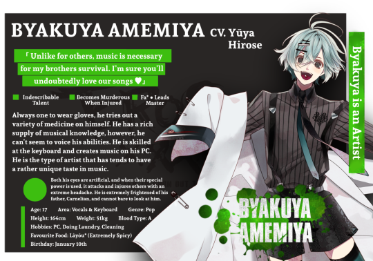
Translation:
「 Unlike for others, music is necessary for my brothers survival. I’m sure you’ll undoubtedly love our songs ♡」
Always one to wear gloves, he tries out a variety of medicine on himself. He has a rich supply of musical knowledge, however, he can’t seem to voice his abilities. He is skilled at the keyboard and creates music on his PC. He is the type of artist that has tends to have a rather unique taste in music.
◉ Both his eyes are artificial, and when their special power is used, it attacks and injures others with an extreme headache. He is extremely frightened of his father, Carnelian, and cannot bare to look at him.
Age: 17
Area: Vocals & Keyboard
Genre: Pop
Height: 164cm
Weight: 51kg
Blood Type: A
Hobbies: PC, Doing Laundry, Cleaning
Favourite Food: Làyóu* (Extremely Spicy)
Birthday: January 10th
Source.
1. The "Fa" is a musical, Italian term, referring to "4th note of a major scale in movable-do solfège".
2. Làyóu is a Japanese variety of hot Chinese chili oil.
#carnelian blood#carnelian blood translations#character infographic translation#translations#byakuya amemiya
34 notes
·
View notes
Text
Masterpost of my ZZH informational posts
(All dates are always listed according to China Standard Time to avoid confusion.)
General Info:
Start here: FAQ
Glossary of names and terms
Timeline of major events relating to 813
At-a-glance comprehensive timeline (outdated)
22-05-12 Venting about how GJ has been affected
22-08-06 #ZhangZhehanIsInnocent event infographics
22-08-08 A testimonial for ZZH’s good character
22-08-09 Temporal comparative with GJ’s lawsuit against an anti
23-04-03 Question about the length of the legal case
Instagram / Zhang Sanjian Shit:
Whalers blocklist
22-03-02 Question about ZSJ and GJ (outdated)
22-04-30 Question about why ZZH doesn’t say anything
22-05-05 Collected discussion and sources about the 05-04 video
22-06-10 Collected information about the Instagram account
22-06-10 Question about the brand’s ownership
22-06-30 Question about the brand’s use of whale iconography
22-07-18 Collected information about the 07-17 video
22-08-28 Question about the bike trip
22-12-17 Question about the stolen song being posted to YouTube
23-01-04 Collected information about the stolen songs (outdated)
23-04-01 Question about the Instagram’s verification
23-05-03 Question about the vocals in the songs
23-05-11 Collected information about the Bangkok concerts
Twitter Space Notes:
22-05-07 Hao Jingfang, the Instagram’s deactivation, and Tantan
22-05-12 The Instagram’s reactivation
22-05-14 Leadup to 813 and events of August
22-05-23 Info about CAPA
22-05-26 Legal Daily article
22-05-27 Xie Yihua’s professional history
22-06-01 Deepfake technology
22-06-05 Endorsement marketing info (ie. GJ’s CP marketing)
22-06-11 Golden Shield, procedural justice, and the legal process
22-06-20 Sophie’s involvement
22-06-21 Sophie’s connections to Mitsui Group
22-06-25 Who’s Who
22-07-18 Fanmeet video
22-07-21 CAPA moles within fandom
22-08-07 One CAPA Minion a Day exposés
22-09-04 Planted CPFs
22-12-31 Year in Review
23-03-31 Songs, Golden Shield incident, and Hewitt
23-08-27 KL Concert and money laundering
23-12-17 Candy and Gaslight-breakers
Just Fun Stuff:
Links to all shows and movies
Links to ZZH and GJ joint appearances
YouTube playlist of ZZH’s music
Spotify playlist of ZZH and GJ’s music
List of movies ZZH and GJ have mentioned (WIP)
My YouTube for ZZH content (WIP)
22-07-31 Candy space notes
22-08-20 WOH filming timeline space notes
22-08-27 Post-filming timeline space notes
22-10-29 Candy space notes
23-01-01 Candy Year in Review
External Resources (aka not by me) About 813 and Related:
★ Zhang Zhehan wiki
Flora’s Cast of Character’s document (comprehensive who’s who)
Justice For People YouTube channel (overview, multi-language video translations up to March 2022)
teddyfoxfluff’s blog (813 breakdown and major translations)
Carrd to further links
Weekly Update Posts:
These posts are all as they were when I initially posted them, with the exception of some minor sentence restructuring to the early ones to make them consistent with the formatting I’ve come to use. Any other changes are only additive, with the date the addition was made clearly indicated.
2022
March 01-12
March 13-19
March 20-26
March 27-April 02
April 03-09 (first Instagram photos)
April 10-16 (Instagram guitar videos)
April 17-23
April 24-30 (divorce letter)
May 01-07 (first deepfake video and deactivation)
May 08-14 (reactivation)
May 15-21
May 22-28
May 29-June 04
June 05-11
June 12-18 (golf videos)
June 19-25
June 26-July 02
July 03-09
July 10-16
July 17-23 (“fanmeet” video)
July 24-30
July 31-August 6
August 7-13
August 14-20 (start of the “bike trip”; photo posted by mountaineering guide showing that the “trip” presented as being shown in real time actually ended on 08-18)
August 21-27
August 28-September 3
September 4-10 (end of the “bike trip”)
September 11-17
September 18-24
September 25-October 01 (ZZH’s registration to dissolve a company)
October 02-08
October 09-15
October 16-22
October 23-29
October 30-November 5
November 6-12
November 13-19
November 20-26
November 27-December 3 (Shanghai Theatre Academy performance)
December 4-10
December 11-17 (first stolen song spread on western platforms)
December 18-24
December 25-31
2023
January 1-7
January 8-14
January 15-21
January 22-28
January 29-February 4
February 5-11
February 12-18
February 19-25
February 26-March 4
March 5-11
March 12-18
March 19-25 (attempted smears against LXZ)
March 26-April 1
April 2-8
April 9-15
April 16-22
April 23-29
April 30-May 6
May 7-13 (Bangkok concerts)
May 14-20
May 21-27
May 28-June 3
June 4-10
June 11-17
June 18-24
June 25-July 1
July 2-8
July 9-15
July 16-22
July 23-29
July 30-August 5
August 6-12
August 13-19
August 20-26
August 27-September 2
September 3-9
September 10-16
September 17-23
September 24-30
October 1-7
October 8-14
October 15-21
October 22-28
October 29-November 4
November 5-11
(Missed about a month and a half due to personal reasons, my apologies.)
2024
December 31-January 6
January 7-13
January 14-20
January 21-27

79 notes
·
View notes
Text
RWBY Volume 8 Crew Commentary Notes!
Here are the writer and director commentary notes for Volume 8 of RWBY! There were almost 4 hours of commentary to get through and it's often hard to figure out what the crew is trying to say at times, so if I missed something it's possible it slipped past me or I couldn't understand the intent. Also, it is often hard to translate what they are saying into a more concise written sentence- so if things seem a bit confusing, that's probably why. Enjoy!
Chapter 1:
Featuring Kerry Shawcross, episode director Kiersi Burkhart
· Originally more Cinder stuff was going to be in this episode. But they figured that out after Kerry already did a draft of this, so Kiersi stepped in to write the rest of the episode and Kerry’s stuff was moved to later on in the volume.
· Kiersi wanted a window in the whale.
· Designing Monstra was a balance between realistic but not extremely gruesome
· It was hard to write the scene where the whole team is talking because they didn’t want it to feel forced or long
· To break up that scene more, they decided to do some cut away scenes as they were talking about their plan
· Having the team divided was something they wanted to do correctly and in a way that made sense
· These teams made the most sense on a base character level, says Kiersi. Ren is practical and wants to do the thing that seems the most correct ‘right now’. Whereas Nora and Ruby see the bigger picture
· Kerry says that there are times in Volume 7 where things may have been a bit more flipped, but through their experiences in that volume they see things differently now
· If they had more time they might have been able to show more about the owners of the restaurant the team was in. But they were able to get across that the place was now abandoned
· Ruby has changed compared to V7 and knows she can no longer trust Ironwood
· Originally they were going to show Clover’s corpse and then the Ace Op’s reaction, but decided to do the opposite to make things more emotional
· The scene of Ironwood shooting a man was written in 2019 but as the world evolved, it became a harder scene to watch.
Chapter 2:
Kerry and Miles Luna and Paula, the director of the episode
· It’s difficult to design a connected jail cell where they can all talk
· There is a square on the ground that can lift up a toilet
· Paula imagines the Happy Huntresses as older counterparts to team RWBY
· Yang getting a hoverbike was a pre-volume 1 idea
· The hound is shown 3 times in the background before its official reveal
· Jaune’s shield grenades were originally supposed to be in V7
· They wanted each team member to have a variety of different upgrades
· This episode has a lot of set up for later things in the volume (Oscar and Ozpin, Jaune and Ren)
· Paula has a headcanon that Weiss has visited the shipping facility before and loved it and takes pride in it
· There was going to be more to seeing the Dust Refinery that the happy huntresses were at
· Miles writing the introduction of the Hound was inspired by a Halo game where the Covenant started running from a bigger threat
Chapter 3:
Kerry, Kiersi, and Dustin
· All the writers were scared to write this episode because of the logistics of it. Kiersi wrote this one thought
· Dustin was inspired by the anime Dr. Stone to make the 2D infographic explaining Ruby’s semblance
· Pietro remoting into Penny is meant to be both funny and weird
· They were nervous about the first big fight being in the third episode, since usually they show up before then
· Dustin had to make a list to keep track of all the effects during the fight because there were so many
· Penny has not had the maiden powers for long, but she does copy what she has seen from Fria and Cinder to start building her repertoire of moves
· They always knew they wanted Nora to do a big super-saiyan move this season. They also wanted her hair to stand up/look fried for a long time.
· The marks Nora got from being electrocuted were inspired by how scars look after someone gets hit by lightning
Chapter 4:
Featuring Kerry, Eddy Rivas, and Connor Pickens, the director
· Some of the animation for this episode was done during the transition to work from home. Assets for this episode were done early so this episode was animated first.
· They changed a board/animatic last minute in V7 to get Qrow and Robyn arrested
· Chase scenes are a much different challenge than fight scenes to create. Star Wars pod racing was a big inspiration
· A lot of the beats for the chase scene were already in the script, rather than all that being figured out in the animatic
· Ren needed to be the MVP at the end of the chase scene to set up his resentment later
· The outdoor sets aren’t meant to be seen from all angles
· During their argument, originally Ren was also going to yell at Jaune for overreacting with Cinder in V5
· Confirmed that Salem was tormenting Oz with the memory of their children (when Oscar is in the whale for the first time)
· They always wanted Oscar and Salem to interact in this volume.
· Eddy was concerned with how intense Oscar’s torture would be
· There was originally a line from Salem that said “I’ll leave you three to it” while she was leaving Oscar after torturing him
· There was originally more framing calling back to the two groups (Jaune, Ren, and Yang, and the other team) and why they split
Chapter 5
Featuring Kerry, Miles, and Paula
· Originally Pietro had grav-boots on the bottom on his chair and he was working on the outside of the tower, and Penny startles him and he drops his wrench
· And then when Cinder was attacking, his chair would get deactivated. The episode got too long for all of this and needed a lot of trimming
· There is some friction with Pietro and Penny because Pietro is overprotective
· They knew that Pietro and Maria wouldn’t have much time in this season, but they wanted to give them a brief moment to shine
· Originally it was supposed to be Maria in the mech fighting Emerald and Neo, but the scene got more dynamic as they developed it
· UI (user interface) compositions are always more complicated than they seem to be, and this episode had a lot of them.
· This is Cinder’s last moment of getting way over her head and fighting recklessly
· They wanted to make clear that Penny will beat Cinder by doing something only Penny could do (super charge her lasers) since she is a robot. At the end of the season, Penny does not have this advantage
· The way Cinder gets hit by Penny’s blast is a reference to how Cinder looked when she gets shocked with a shock color in the next episode (Cinder flashback)
· This is the episode where Penny becomes a full person
· Pietro remoting into Penny the previous episode was to show how often Penny does not have her own autonomy, something which will later change
· The message showcases how many lives the heroes have touched and everywhere they have been because there is the opportunity for so many cameos
· Watts is furious Ironwood chose Pietro over him, but he still cannot figure out what makes Penny herself (her soul)
· The Grimm river was originally a much bigger part of the story
Chapter 6
Featuring Kerry, Miles, and Paula
· Originally most of this episode was written for chapter 1
· We were originally supposed to see this in V5, but it kept getting pushed
· It was also an expensive episode to make since it had so many unique assets
· This episode was to make you almost feel bad, but not sympathize with her too much
· Cinder’s story is about flawed characters and a broken system
· Every time Miles looks at Rhodes he sees Locus from RvB
· They wanted to present the idea that even when Cinder is working under someone, it’s always temporary. She will always want to be on top.
· They always knew this would be Cinder’s volume, but they had to figure out what she would do after Amity. But they figured out a way for Salem to keep Cinder in play
· Cinder doesn’t yet have the strategic mindset with how to treat her underlings, unlike Salem who treats each one differently
· Oscar/Oz/Hazel stuff was meticulously plotted out. The scene with Hazel was the most rewritten for this chapter
· Originally they were going to show what was on Tyrian’s scroll during the scene where he is with Salem (joke about it having too many eggplant emojis)
· This episode has the least amount of the main characters
Chapter 7
Featuring Kerry, Kiersi, Miles, and Connor
· The intro of the episode was inspired by Lord of the Rings
· A character in the park wearing a hat is modeled after the producer
· Its more costly to do more medium level action shots than it is to do a few crazy shots
· They needed Emerald to see Salem being the Queen of death and destruction as she was drawing the grimm goo out of Monstra
· They tried to have Ozpin get through to Hazel by manipulating him. So when Oz is in control the camera is moving around a lot. Whereas with Oscar he is straightforward, so the camera is still
· At the Schnee Manor, they wanted to give the scene a different feel than usual. They wanted it to feel warmer so the fireplace is on.
· The season takes place over 2.5 or 3 days
· Kerry grapples with Ruby’s team drinking tea while there is chaos outside, but he also says they need a moment to rest while they think their friend is dying. As well as they don’t know where everyone else is, so they figure the Manor is a good place to wait for them.
· Miles says its canon that Mercury only has 4 of the same outfit
· Tyrian has issues, but is also extremely observant and is the only one that can actually see what is happening and is totally on board
· Joke about Tyrian and Mercury buddy cop spinoff
· This new aspect of Ren’s semblance needed to first appear at a moment of clarity
· Kiersi now calls his semblance the vibe check
· The scene where Klein returns originally was going to start up in Weiss’s room
· Penny showi
· ng up at the end was not her just crash landing there. But she was actively fighting off the virus as has been crashing into things
Chapter 8
Featuring Kerry, Miles, and Dustin
· They wanted one episode just in the manor, and decided to make it a horror episode
· Miles says he was inspired by Resident Evil when writing this
· Miles says it was a justified piece of criticism that Blake and Ruby didn’t get a lot of screentime together
· Some scenes also took inspiration from Jurassic Park (says this around when we get the scene with Ruby and Blake as well as Whitley on the computer)
· The Cenituar was supposed to show up in V7C3 during the speed semblance comparison. Centinels would ‘evolve’ into Cenituars if you don’t take them out fast enough.
· Miles compares the Hound to a Xenomorph
· Throughout the episode the green on everyone’s clothes (Penny’s robot blood) gets dimmer as time goes on. If it was always super green they were worried it would be too distracting.
· Originally the armor statue that fell on the Hound was going to be made of stone, but they wanted the pieces to fall apart so they changed it to be a suit of armor.
Chapter 9
Featuring Kerry, Eddy, and Paula
· This was Eddy’s most anticipated episode besides the finale
· Oz being back was not just some magic ticket to all their issues
· There was an intention to show more of team FNKI. The Salem fight took priority.
· There is a parallel between Hazel and Marrow, who are both questioning their loyalty and what their next move should be.
· Jinn knows that Neo is in the room with Hazel, Oscar, and Emerald. Which is why she is taunting them with the line, “so you don’t have any questions for me?”
· Jaune does a lot of growing this volume, as commented on by Ren (On how genuine Jaune’s courage is)
· Salem realizing the lamp was missing and gliding away was a reference to the Yubaba glide from Spirited Away.
· The alarm was raised because of the Seer. And it covered the alarm of Neo taking the lamp. These scenes were put back to back so it would be ambiguous as to what set off the alarm.
· Marrow saying “Come on, Juan” was at one point going to be “Come on, Jim”. But that got confusing as to if it was referring to Ironwood.
· Eddy referred to the payload (giant bomb) as Chekhov’s nuke
· Winter being kind to Marrow delays his change of mind for a few episodes
· Salem goes so hard at Emerald because Emerald’s semblance actually fooled her
· There was going to be a moment where Yang hits Salem with her semblance activated and it does nothing
· Hazel knows he will not win this fight again Salem, so he overdoses to do as much damage as he can and bide some time.
· The shot where Hazel moves his fists to create fire was a reference to Henry Cavill in a mission impossible movie (bathroom scene)
Chapter 10
Kerry, Miles, Kiersi, and Connor
· Reiterated that this is Cinder’s volume, and that includes her getting told off
· Watts isn’t known for his physical strength- he is known for his mind and his mouth. So the scene where Cinder was about to kill him required him to go all out with his skills.
· Originally Watts was going to be swearing a lot when he was telling off Cinder. It felt like what he would actually say, but they couldn’t do it
· Blake calling Yang was originally after the scene where the Ace Ops recovered from the explosion. Neo skipping through the haze was going to be a transition to this scene.
· It was difficult in the script to decide on how nice the team could be to Emerald, since at this point they are not supposed to be friends.
· At one point in the script the gang at the mansion was going through the tunnels in the subway to get to the kids at the Monstra site and would have to push through crowds of evacuating people. It was too much to do, and was deemed unnecessary
· Ironwood this volume is a reference to Michael Shannon in the Shape of Water. Desperate, angry man. Watching control slip out of his hands
· It took them a while to figure out how Neo would present some much information, including Jinn’s name. And figuring out they could have her use a scroll was what worked best.
Chapter 11
Featuring Kiersi, Eddy, Miles, and Paula
· All Miles sees when he looks at Winter is Mass Effect
· The scene where RWBY + Oscar + Emerald are in the manor was trying to show each of the girl’s regressing a bit (Weiss is snarky, Yang is aggressive, Blake is closed off)
· While Oscar, due to using a ton of magic previously, he is adapting a lot more of Oz’s mannerisms
· Originally at that scene in the end they were going to pause at the door and Emerald was going to go “nice mansion by the way” and Weiss was going to reply “shut up”. To reinforce that they aren’t yet friends
· This episode brings together many threads , some of which were volumes in the making
· Nora getting her own journey in this volume and the last was super important to the writers
· This episode had many drafts- it was way too long at first
· They laugh about how Robyn is basically a “replacement birb sister”. Paula says Robyn has seen what Qrow is going through before (getting disillusioned), perhaps with herself.
· Yang crying in this chapter reminded Paula of the end of V3 where Yang was wallowing in her room after losing her arm. This is the reverse of that. Yang tries to joke at first but Ruby pushes her away.
· Yang feels guilty with how she talked to Ruby in chapter 1
· Paula thinks that had Penny not died at the end of the season, her and Nora would have been really good friends
· In this episode they wanted to give Penny a hopeful moment before more bad things happen
· Emerald swearing in this episode had Miles chanting “villains get to swear!”
· In the scene where Oz finally talks to the team once again, they made sure to have Emerald in the shot a lot, since both Oz and Emerald are seeking apologies. They’re not quite part of the group yet.
· Eddy loves the friendship name “Emerald City”
Chapter 12
Featuring Kerry, Eddy, and Dustin
· This was one of the more difficult episodes to outline and write since so much had to happen and happen at different times
· This is one of the most eventful episodes, and was very challenging to direct
· They wanted the team (ORNJ) to have a victory after getting dunked on by Neo in V7, so Ironwood lost
· Not a lot is written out in the script for fight scenes, so it is more about feeling when deciding on the final choreography
· The Marrow and Winter talking scene was moved around a lot
· The scene where the rules for the staff were laid out was tricky because there was so much that needed to be explained, while also not explicitly stating the plan
· Ambrosius was known in the writer’s room as Merlin Daddy. However, he is not directly based off of Merlin. He was given that name because he is smart. Though at one point he was bearded and burly.
· Initially they did not know if every relic would contain a character in it
· When first writing the volume they did not know how they were going to use the staff
· They wanted to do something similar to the last relic chamber, but since a lot of time would be spent in this one, they made this one simpler (less distortion)
· Ambro does some finger-tutting, which is dancing using intricate finger movements. They wanted him to be super into making things. The way Ruby cheats by being what she wants with Ambro works because she already cheated once with Jinn (I think this was in reference to how she was able to get him to fix Penny)
· Ship of Thesus Penny was mentioned, and how many viewers picked that up once the episode aired
· Eddy mentions how he made a mini-bible for Volume 9 (in reference to how things are mapped out)
· Penny hugging everyone was one of Kerry’s favorite scenes ever
· At different points throughout the volume, the episode directors asked how brutal they could make certain moments
· Initially Fiona’s semblance was going to give the team the idea for the walkways, but because Fiona was later not going to be in the same space as these characters, it needed to be changed
· They initially pictured the walkway area as a Rainbow Road/Bifrost looking place
Chapter 13
Featuring Kerry, Kiersi, Eddy, Miles, and Connor
· Miles loves the moment of Jaune getting hit by a rock
· Kerry was worried about how showing Penny’s feet would be perceived
· Miles was worried about people thinking that Watt’s verbal takedown of Cinder would lead to her having a change of heart. But nope, she hasn’t changed at all.
· Eddy says they struggled a lot with landing Cinder’s plan and her taking swift action. They decided that her using the lamp selfishly made sense.
· Marrow’s semblance takes a lot of out him, so when a robot hit hits and explodes, it’s enough to knock out his aura
· It was never specified in the show who opened Ironwood’s prison cell, but Eddy confirms it was Watts who did it
· They talked about the order of who was going to fall a lot. Yang ended up being the first one since it felt like a signoff due to her getting a lot of focus this volume. They only wanted one character to fall in this episode.
· Weiss quietly holds her own now in this final fight, showcasing how much she has grown since the beginning
· Vine and Harriet may seem like opposites, but Vine is sometimes the only one that can see to the core of something
· They planned Qrow flying through a window to get to Harriet very early in the volume
· The way Ironwood comes down the vault’s elevator was meant to call back to how Oscar went down it last volume
Chapter 14
Featuring Kerry, Miles, Kiersi, and Eddy
· Eddy comments on how viewers were saying that Clover has a very similar semblance to Qrow’s, and it’s all about perspective. Having Qrow able to make this positive change was nice
· Harriet is not a bad person, and the way that the rest of the Ace Ops were able to understand that she was in a bad place says a lot about how much they are grown since they were introduced.
· The Ace Ops have also gone through trauma like team RWBY but have gotten no support to deal with it, which makes them do some not so great things
· They decided to kick Blake and Ruby off the platforms at the same time to make it as shocking as possible, since they figured the audience would realize everyone was going to go down by then
· There were many small, quiet moments for Jaune that shows he is willing to do the hard thing since he still has a job to do. And that carried through to the ultimate moment with him and Penny
· Eddy added Jaune’s sword breaking while writing the episode- it wasn’t planned beforehand
· Cinder originally had a line where she was like “peace out Jaune” before sending him off
· The scene where Cinder goes to the vault was rearranged a lot
· When planning the last three episodes, Kiersi had to start a graphical timeline to figure out where all the characters were at all times
· A pre-season 1 idea was when the bad guys get everything they need from Atlas, they will walk past Ironwood and will not give him the time of day.
· Atlas was called Chekov’s floating city
· Originally Miles and Kerry thought that this Atlas arc was going to be season 3
· Before volume 7 was started, this volume was going to be V7. But then when they started outlining V7 they realized that wouldn’t be possible
#rwby#rwby v8#rwby volume 8#commentary notes#ruby rose#yang xiao long#weiss schnee#blake belladonna#ironwood#salem#tyrian#watts#robyn#qrow branwen#jaune arc#my post
294 notes
·
View notes
Text
Untitled Wednesday Library Series, Part 45
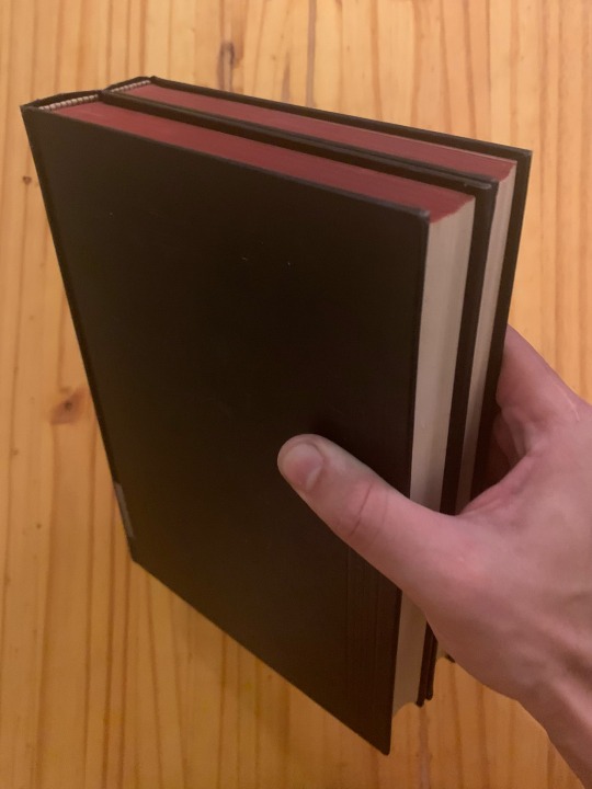
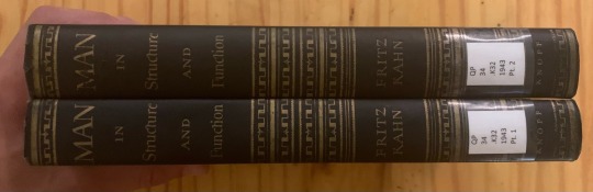
Now that I’ve staked out some blessed free time, I’m working on both the Albers and (more immediately) the Malevich I mentioned a couple posts back. I do, though, need a little more time. To that end, here’s the Fritz Kahn’s 1943 Man in Structure and Function (translated from the 1939 Der Mensch Gesund und Krank, a title I like less, by Dr. George Rosen).
In particular this is from the February 1946 third printing of the first edition, complete with barely palpable and nigh invisible embossing. Points against the necessity for flash to picture it.

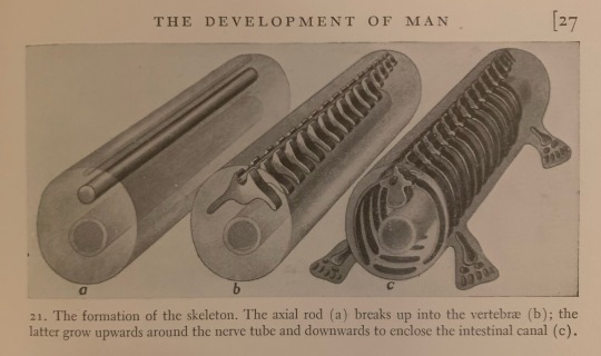
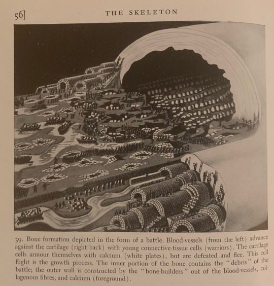
The Text, the Object, etc.
I’m breaking with format here because otherwise I’d talk forever. Not sure who actually reads what I write in these, but in this case the pictures really are the post. Fritz Kahn was maybe the educational illustrator; the modern infographic and textbook illustration both owe huge amounts to him. His work was more in information architecture than data visualization, but it seems he did a little of everything anyway.
His biography and publication history are a little too tangled for me to confidently summarize here. Note, at least, that this book was written in Paris after he fled Germany in ‘37, was initially published in Switzerland, and only got an English translation (along with a couple other works, notably The Cell and Our Sex Life, all subject to significant alteration or destruction in their contemporary German editions) after he eventually secured residency in the US in ‘41.
Beautiful work here, if a little quaint in places. The integration of illustration with text is impressive, and the metaphors are uniformly robust. Calling the whole ‘accessible’ isn’t a cop-out; it’s the point. Plenty of the choices here persist in current biology/physiology/anatomy/chemistry texts. It is a little ra ra ‘industry and efficiency and mechanism-character of biology’ — the guy did make Der Mensh als Industriepalast — but zeitgeist or whatever. Weimar type shit. I’m soft on that, a little.
But anyway, observe ye Man Healthy and Sick as writ in bread and radishes and battles and tubes with feet. ‘Such is science’.


30 notes
·
View notes
Text
clow cards chinese names.
矢, shǐ.
the arrow.
arrow; dart; old variant of 屎.
大, dà.
the big.
big; great; vast; large; high.
泡, pào.
the bubbles.
bubbles; suds; blister; soak.
替, tì.
the change.
change; replace; substitute for.
雲, yún.
the cloud.
cloud.
创, chuàng.
the create.
to begin; initiate; inaugurate; start.
闇, àn.
the dark.
close; shut; dark; dismal.
驱, qū.
the dash.
* 駆 (jp) ku, kakeru 駆ける.
to expel; urge on; drive; run quickly.
夢, mèng.
the dream.
dream; visionary; wishful.
地, dì.
the earth.
earth; soil; ground; region.
消, xiāo.
the erase.
vanish; die out; melt away.
闘, dòu.
the fight.
struggle; fight; compete; contend.
火, huǒ.
the firey.
fire; flame; burn; anger; rage.
浮, fú.
the float.
to float; drift, waft; to exceed; superfluous.
花, huā.
the flower.
flower; blossom.
翔, xiáng.
the fly.
soar; glide; hover; detailed.
霧, wù.
the mist.
fog; mist; vapor; fine spray.
冻, dòng.
the freeze.
freeze; to feel very cold; congeal.
灯, dēng.
the glow.
lantern; lamp; light.
幻, huàn.
the illusion.
illusion; fantasy; mirage.
跳, tiào.
the jump.
to jump; to skip over; bounce; leap.
秤, chēng.
the libra.
balance; scale; to weigh.
光, guāng.
the light.
light; brilliant; shine.
小, xiǎo.
the little.
small; tiny; young; junior.
锁, suǒ.
the lock.
* 錠 (jp) jō じょう.
lock; padlock; shackles; chains.
輪, lún.
the loop.
wheel; to take turns; to rotate; classifier for recurring events.
迷, mí.
the maze.
to bewilder; lost; confused.
镜, jìng.
the mirror.
mirror; lens; glass; glasses.
移, yí.
the move.
change place; shift; move about.
力, lì.
the power.
power; strength; capability; influence.
雨, yǔ.
the rain.
rain; rainy.
返, fǎn.
the return.
返回, fǎnhuí.
* 戻 (jp) modoru 戻る, もどる.
return; revert to; restore; come (or go) back.
砂, shā.
the sand.
sand; pebbles; gravel; gritty.
影, yǐng.
the shadow.
shadow; image; reflection; photograph.
盾, dùn.
the shield.
shield.
撃, jī.
the shot.
strike; hit; beat; attack; fight.
静, jìng.
the silent.
calm; quiet; still; motionless; gentle.
眠, mián.
the sleep.
close eyes; sleep; hibernate.
雪, xuě.
the snow.
snow; wipe away shame; avenge.
歌, gē.
the song.
song; lyrics; sing; chant; praise.
风暴, fēngbào.
the storm.
* 嵐 (jp) arashi あらし.
storm; violent commotion. fig. crisis (e.g. revolution, uprising, financial crisis etc)
甘, gān.
the sweet.
sweet; willing.
剑, jiàn.
the sword.
* 剣 (jp) ken.
sword; dagger; saber.
抜, bá.
the through.
拔出, bá chū.
(jp) nuku 抜く, ぬく.
to surpass; to seize; to go beyond; to rise; to put forth.
雷, léi.
the thunder.
thunder; mine (weapon). (Internet slang) terrifying; terrific.
时, shí.
the time.
time; season; era, age, period.
双, shuāng.
the twin.
set of two; pair; couple; both.
声, shēng.
the voice.
sound; voice; tone; noise; reputation; classifier for sounds.
水, shuǐ.
the watery.
water; river; liquid; beverage; additional charges or income (of clothes); classifier for number of washes.
波, bō.
the wave.
wave; ripple; storm; surge.
風, fēng.
the windy.
wind; air; manners; atmosphere.
樹, shù.
the wood.
tree; plant; set up; establish.
notes:
* these kanji are the logographic used for the title on their respective card. i understand this is logical given CSS is a japanese work. however, the character in the story that created the cards is chinese and the cards themselves are based on daoist concepts. for this reason i did my best to translate them as this is a list of the chinese names that would be (in my opinion) the cards “true” names. the rest of the infographics are mutually understandable between chinese and japanese kanji.
not listed by hierarchy, just sorted alphabetically for easier navigation.
i’m not a native speaker. i’m at a hsk 2 level at best, so feel free to correct me if there’s any mistakes.
30 notes
·
View notes
Text
Monsta x Masterlist
© smileysuh — all rights reserved. reposting/modifying of any fic, reaction, or piece of original writing posted on this blog is not allowed. Translations not allowed.
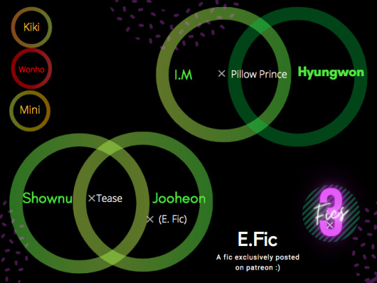
This Infographic shows all my fics posted for Monsta X.
Names/circles have been color coded, with green circles/names being my favourites, followed by yellow, orange, then red.
Oneshots Below :)

SHOWNU
Tease : Shownu & Joohoney
↳5.6k, smut, reader insert
↳best friends to lovers, baby fever, pregnancy kink
↳Synopsis: Your best friends come to rescue you from a family event where you’re left all but baby sitting the kids running around. Although they only stay for a little while before helping you escape, it’s enough to give them both intense baby fever.
HYUNGWON
Pillow Prince : Hyungwon & I.M
↳3.7k, smut, reader insert, *established relationship au*
↳Synopsis: You and Changkyun have been dating forever, and have a spicy reputation. You both figure movie night with Hyungwon can be a lot more fun if less clothes are involved.
JOOHONEY
Tease : Shownu & Joohoney
↳5.6k, smut, reader insert
↳best friends to lovers, baby fever, pregnancy kink
↳Synopsis: Your best friends come to rescue you from a family event where you’re left all but baby sitting the kids running around. Although they only stay for a little while before helping you escape, it’s enough to give them both intense baby fever.
Accidentally In Love : Jooheon - in the reserve
↳16.4k, smut, Original Character
↳non idol au, strangers to lovers, slow burn
↳Synopsis: When Maxine arrived in Mexico at her hotel, where she’s booked a communal room with another girl, she finds out that the hotel booked her in a male room due to her name (Max). At first, rooming with a male stranger is daunting, but soon it becomes evident that Jooheon is exactly the kind of person Maxine needs to get her to enjoy her time in Mexico… especially since lots of activities are offered cheaper in ‘couples packages’.
CHANGKYUN
Pillow Prince : Hyungwon & I.M
↳3.7k, smut, reader insert, *established relationship au*
↳Synopsis: You and Changkyun have been dating forever, and have a spicy reputation. You both figure movie night with Hyungwon can be a lot more fun if less clothes are involved
115 notes
·
View notes
Last Seen Blogs

jessieflyns-blog
Naughty Princess 🍑 💦

farmaceuticodigital
Farmacêutico Digital

masha-lun
Girls

hkindojuditepercaya
HKINDO JUDI ONLINE TERPERCAYA

fikarzakk
Zaky Dzulfikar