#col tag in html5
Explore tagged Tumblr posts
Visit Tumblr Blog
Explore Tumblr blogs with no restrictions, modern design and the best experience.
Last Seen Tumblr Blogs


Fun Fact
China blocked Tumblr because of pornography and censorship problems in 2013.
Text
HTML Forms

HTML forms are used to collect user input and send it to a server for processing. Forms are essential in web development for tasks like user registration, login, surveys, and more. Here’s a guide to understanding and creating HTML forms.
1. Basic Structure of an HTML Form
An HTML form is created using the <form> element, which contains various input elements like text fields, checkboxes, radio buttons, and submit buttons.<form action="/submit-form" method="post"> <!-- Form elements go here --> </form>
action: Specifies the URL where the form data will be sent.
method: Defines how the form data will be sent. Common values are GET (data sent in the URL) and POST (data sent in the request body).
2. Text Input Fields
Text input fields allow users to enter text. They are created using the <input> tag with type="text".<form action="/submit-form" method="post"> <label for="name">Name:</label> <input type="text" id="name" name="name"> <label for="email">Email:</label> <input type="email" id="email" name="email"> <input type="submit" value="Submit"> </form>
<label>: Associates a text label with a form control, improving accessibility.
type="text": Creates a single-line text input field.
type="email": Creates a text input field that expects an email address.
3. Password Field
A password field masks the input with dots or asterisks for security.<label for="password">Password:</label> <input type="password" id="password" name="password">
4. Radio Buttons
Radio buttons allow users to select one option from a set.<p>Gender:</p> <label for="male">Male</label> <input type="radio" id="male" name="gender" value="male"> <label for="female">Female</label> <input type="radio" id="female" name="gender" value="female">
type="radio": Creates a radio button. All radio buttons with the same name attribute are grouped together.
5. Checkboxes
Checkboxes allow users to select one or more options.<p>Hobbies:</p> <label for="reading">Reading</label> <input type="checkbox" id="reading" name="hobbies" value="reading"> <label for="traveling">Traveling</label> <input type="checkbox" id="traveling" name="hobbies" value="traveling">
type="checkbox": Creates a checkbox.
6. Dropdown Lists
Dropdown lists (select boxes) allow users to select one option from a dropdown menu.<label for="country">Country:</label> <select id="country" name="country"> <option value="bd">Bangladesh</option> <option value="us">United States</option> <option value="uk">United Kingdom</option> </select>
<select>: Creates a dropdown list.
<option>: Defines the options within the dropdown list.
7. Text Area
A text area allows users to enter multi-line text.<label for="message">Message:</label> <textarea id="message" name="message" rows="4" cols="50"></textarea>
<textarea>: Creates a multi-line text input field. The rows and cols attributes define the visible size.
8. Submit Button
A submit button sends the form data to the server.<input type="submit" value="Submit">
type="submit": Creates a submit button that sends the form data to the server specified in the action attribute of the form.
9. Reset Button
A reset button clears all the form inputs, resetting them to their default values.<input type="reset" value="Reset">
type="reset": Creates a button that resets the form fields to their initial values.
10. Hidden Fields
Hidden fields store data that users cannot see or modify. They are often used to pass additional information when the form is submitted.<input type="hidden" name="userID" value="12345">
11. File Upload
File upload fields allow users to select a file from their computer to be uploaded to the server.<label for="file">Upload a file:</label> <input type="file" id="file" name="file">
type="file": Creates a file upload input.
12. Form Validation
HTML5 introduces several form validation features, like the required attribute, which forces users to fill out a field before submitting the form.<label for="username">Username:</label> <input type="text" id="username" name="username" required>
required: Ensures the field must be filled out before the form can be submitted.
13. Grouping Form Elements
Fieldsets and legends can be used to group related form elements together.<fieldset> <legend>Personal Information</legend> <label for="fname">First Name:</label> <input type="text" id="fname" name="fname"> <label for="lname">Last Name:</label> <input type="text" id="lname" name="lname"> </fieldset>
<fieldset>: Groups related elements together.
<legend>: Provides a caption for the group of elements.
14. Form Action and Method
action: Specifies the URL where the form data should be sent.
method: Specifies how the data is sent. Common methods are GET and POST.
<form action="/submit" method="post"> <!-- Form elements here --> </form>
Key Takeaways
Forms are a crucial part of web development for gathering user input.
HTML provides a wide range of input types and elements to create various kinds of forms.
Properly labeling and grouping form elements enhances accessibility and usability.
Form validation helps ensure that the data submitted by users meets certain criteria before being sent to the server.
With these basics, you can start building functional forms for collecting data on your website!
Read More…
0 notes
Text
HTML col Tag
The HTML <col> tag is used to define column properties for each column within the <colgroup> element .This tag is used to set the style properties into column or group columns.This tag has no closing tag. Syntax <col span=""> Example <!DOCTYPE html> <html> <head> <title>HTML col Tag</title> </head> <body> <table border="1"> <colgroup> <col span="2"…

View On WordPress
#col#col html tag#col tag#col tag html#col tag html 5#col tag in html#col tag in html5#col tag kya hai#colgroup tag#colgroup tag in html#how to add col tag#how to add col tag and colgroup tag#html col tag#html colgroup tag#html5#html5 col#what is col tag#what is col tag in html#what is colgroup tag in html
0 notes
Text
HTML Forms: Building Interactive User Input

HTML forms play a vital role in web development, allowing users to input and submit data on websites. Whether it's a simple contact form or a complex registration form, understanding how to build interactive user input forms is essential for creating engaging and dynamic web experiences. In this blog post, we will explore the fundamentals of HTML forms and discuss best practices for building interactive user input.
<form> Tag:
The <form> tag is the foundation of HTML forms. It acts as a container for all form elements and defines the boundaries of the form. The "action" attribute specifies the URL where the form data will be submitted, and the "method" attribute determines the HTTP method to be used (GET or POST).
<input> Tag:
The <input> tag is the most commonly used form element. It allows users to input various types of data, such as text, numbers, email addresses, and more. The "type" attribute defines the input type, and additional attributes like "name" and "placeholder" provide further context and guidance for users.
<textarea> Tag:
The <textarea> tag is used to create a multiline text input field. It's ideal for capturing longer messages, comments, or descriptions from users. The "rows" and "cols" attributes can be used to define the size of the textarea.
<select> and <option> Tags:
The <select> tag creates a dropdown menu, while the <option> tag defines individual options within the dropdown. This combination allows users to select one or multiple choices from a list. Attributes such as "selected" and "disabled" provide additional functionality and user experience enhancements.
<label> Tag:
The <label> tag is used to associate a label with an input field, providing a clear description or prompt for the user. It improves accessibility and helps users understand the purpose of each input field. The "for" attribute should match the "id" attribute of the corresponding input field.
<button> Tag:
The <button> tag creates clickable buttons within the form. It can trigger form submission or perform other actions using JavaScript. The "type" attribute can be set to "submit" to submit the form, "reset" to reset form values, or "button" for custom actions.
<fieldset> and <legend> Tags:
The <fieldset> tag groups related form elements together, providing a visual and semantic grouping. The <legend> tag is used to provide a caption or title for the fieldset. This combination improves form structure and readability, especially for complex forms.
Form Validation:
HTML5 introduced built-in form validation, allowing developers to validate user input without relying solely on server-side validation. Attributes like "required," "min," "max," and "pattern" can be used to enforce specific rules on input fields. HTML5 also provides the "pattern" attribute, which accepts regular expressions for custom validations.
Handling Form Submissions:
When a user submits a form, the data is typically sent to a server for processing. Server-side scripts, such as PHP or JavaScript, are used to handle form submissions and process the data accordingly. The server-side script specified in the form's "action" attribute receives the form data, which can be accessed and processed further.
Styling and Enhancing Forms:
HTML forms can be customized and styled using CSS to match the website's design and branding. Additionally, JavaScript libraries and frameworks like jQuery and React can be used to enhance form interactivity, provide real-time validation, or create dynamic form elements.
Conclusion:
Building interactive user input forms is an essential skill for web developers. HTML provides a range of form elements and attributes to collect user input and create engaging web experiences.
To streamline the development process, leveraging online HTML compilers can be incredibly beneficial. online html compiler offer a convenient way to test and validate forms in real-time, allowing developers to see the immediate results of their code. These tools provide an interactive environment to experiment with different form elements, input validation, and styling, enabling faster iterations and bug detection.
Remember to combine HTML forms with server-side scripting, such as PHP or JavaScript, to handle form submissions and process the data effectively. Additionally, css compiler online can be utilized to style and customize form elements, ensuring a cohesive and visually appealing user interface.
By mastering the art of building interactive user input forms and utilizing html compiler online, developers can create seamless and user-friendly experiences that enhance engagement and facilitate data collection on websites. Embrace the power of HTML forms and leverage the convenience of online HTML compilers to elevate your web development skills.
0 notes
Photo

Using Bootstrap to Create Material Design Web Apps
Google's Material Design is ubiquitous in modern mobile apps. Perhaps it's because most people today have come to love its bold colors, subtle shadows, and minimalist layouts. Wouldn't it be great if you could easily apply the same design language to your websites and offer visitors a user experience they're are well accustomed to? Well, with MDBootstrap, you can.
MDBootstrap, also known as Material Design for Bootstrap 4, is an opensource UI kit that allows you to use Bootstrap 4, a CSS framework you might already be familiar with, to create fully responsive websites that have a Material Design look and feel. It comes with over 500 components, dozens of animations, and support for several JavaScript frameworks, including jQuery, Vue, and React.
In this step-by-step tutorial, I'll show you how to add the MDBootstrap UI kit to your web projects and use some of its components.
Or, if you want to get started right away with a professional Bootstrap theme, check out some of our ready-to-go templates.
Bootstrap
15 Feature-Packed Bootstrap Admin Templates
Ian Yates
Bootstrap
20 Amazing Bootstrap Templates to Try in 2019
Paula Borowska
1. Setup
MDBootstrap is available on cdnjs, and several other CDNs. Therefore, you don't need to download it to your computer to be able to use it. But adding it to a web page—along with all its dependencies—does only take a few minutes.
Start by creating a new HTML document and opening it using your favorite text editor. Then add the following HTML5 boilerplate code to it:
<!DOCTYPE html> <html> <head> <meta charset="UTF-8"> <title>My Page</title> </head> <body> </body> </html>
The MDBootstrap UI kit consists of just two minified files: mdb.min.css and mdb.min.js. It does, however, depend on Bootstrap, jQuery, and Font Awesome to provide several features.
So, inside the head tag of the HTML5 document, add the following link tags:
<link rel="stylesheet" href="https://use.fontawesome.com/releases/v5.8.2/css/all.css"> <link rel="stylesheet" href="https://cdnjs.cloudflare.com/ajax/libs/twitter-bootstrap/4.3.1/css/bootstrap.min.css"> <link rel="stylesheet" href="https://cdnjs.cloudflare.com/ajax/libs/mdbootstrap/4.8.10/css/mdb.min.css">
Next, towards the end of the body of the document, add the following script tags:
<script type="text/javascript" src="https://cdnjs.cloudflare.com/ajax/libs/jquery/3.4.1/jquery.min.js"> </script> <script type="text/javascript" src="https://cdnjs.cloudflare.com/ajax/libs/twitter-bootstrap/4.3.1/js/bootstrap.min.js"> </script> <script type="text/javascript" src="https://cdnjs.cloudflare.com/ajax/libs/mdbootstrap/4.8.10/js/mdb.min.js"> </script>
At this point, the web page is ready to display Material Design components.
2. Creating a Header
The first component of a Material Design web page is usually a header. It acts as a container for the navigation bar, in which you can not only display your company's logo and name, but also add links to other important pages of your website. In the Material Design spec, the navigation bar is often referred to as the top app bar.
To create a header, all you need to do is use the header tag. Creating a navigation bar, however, is a little more involved.
First, you must create a nav tag and assign the navbar class to it. This creates a basic navigation bar with a white background. If you want to give it a color from the Material palette, you can use one of the many color classes available. They have intuitive names such as purple, red, and blue-grey.
Inside the tag, you can then use the navbar-brand class while specifying your company's name or logo.
<header> <nav class="navbar purple navbar-dark navbar-expand-md"> <a class="navbar-brand" href="https://example.com"> Bob's Store </a> <!-- More code here--> </nav> </header>
Note that when you're using dark colors for the navigation bar, you should add the navbar-dark class to it to ensure that the text inside is readable.
Including links to other pages of your website is as easy as creating an unordered list having the navbar-nav class, with its items having the nav-item class.
<ul class="navbar-nav ml-auto"> <li class="nav-item"> <a class="nav-link" href="#">Home</a> </li> <li class="nav-item"> <a class="nav-link" href="#">Products</a> </li> <li class="nav-item"> <a class="nav-link" href="#">Offers</a> </li> <li class="nav-item"> <a class="nav-link" href="#">About Us</a> </li> </ul>
In the above code, the ml-auto class pushes the links to the opposite end of the navigation bar.
If you try looking at the web page in a browser now, you should see a header that looks like this:
3. Using the Grid
To add actual content to the web page, you'll want to use the responsive grid system that Bootstrap offers. For the sake of a realistic example, let's add two cards to the page, placed in a single row having two columns.
Start by creating a div element with the container class. It will serve as a container for all the rows and columns we add to this document. Inside it you can create rows and columns using the row and col-md classes. Because all of this is going to be the main content of the page, it's a good idea to wrap it in a main tag.
<main> <div class="container"> <div class="row"> <div class="col-md"> </div> <div class="col-md"> </div> </div> </div> </main>
The col-md class ensures that both the columns have the same width and fit inside the row on screens whose width is at least 768 px. To target smaller or larger screens, feel free to experiment with the col-sm and col-lg classes.
You can now create cards inside both the columns using the card class. With MDBootstrap, your cards can have images, titles, buttons, and text. Here's the code for a sample card that has all of them:
<div class="card"> <img class="card-img-top" src="tomatoes.jpg"> <div class="card-body"> <h4 class="card-title"><a>Cherry tomatoes to get costlier</a></h4> <p class="card-text">With a no-deal Brexit, you're likely to pay 10% more for cherry tomatoes next month.</p> <a href="#" class="btn btn-primary">More</a> </div> </div>
Similarly, go ahead and add another card to the page, this time in the second column. For best results, I suggest you use images that have the same dimensions.
<div class="card"> <img class="card-img-top" src="raw.jpg"> <div class="card-body"> <h4 class="card-title"><a>Raw fruits and vegetables for breakfast?</a></h4> <p class="card-text">Raw fruits and vegetables that have been thinly sliced are great way to start your day.</p> <a href="#" class="btn btn-primary">More</a> </div> </div>
As you may have noticed, the kit has intuitively-named classes, such as card-title and card-text, that help you quickly style the contents of your cards. Similarly, the btn and btn-primary classes help you give Material styles to your buttons.
With all the above changes, your web page should look like this:
4. Creating a Form
Material Design forms have a very distinct look and feel. The design language goes into exhaustive detail about what each form element should look like, when it should be used, and where it should be placed.
MDBootstrap has styles for several HTML5 form elements. By using them, you can be sure that your forms conform to most of the guidelines of Material Design.
Let us now create a simple form your visitors can use to sign up for a newsletter. It shall have two text fields, one for a name and one for an email address. Additionally, it shall have a submit button.
The form will need its own row and column, so you must create them first. Because it's alone, the column will stretch to fill the entire row by default. By qualifying the col-md class with a number, and by using the offset-md class, you can control the size and the position of the column in the row.
<div class="row mt-4 mb-4"> <div class="col-md-8 offset-md-2"> <!-- more code here --> </div> </div>
In the above code, the mt-4 and mb-4 classes give the row appropriate top and bottom margins.
Inside the column, create another card. It'll serve as a container for the form and all the text associated with it. Optionally, you can use the card-header class to give a header to the the card, and thus the form too.
<div class="card"> <h4 class="card-header white-text purple">Subscribe to us</h4> <div class="card-body"> <!-- more code here --> </div> </div>
To create the form, all you need is the form tag. But you must remember to add the form-control class to each text field you add to the form. If you have a label associated with it, you must also wrap them both inside a div element whose class is md-form. The following code shows you how:
<form> <p class="h6 grey-text">Stay updated and get the latest information about all our offers and discounts right into your inbox.</p> <div class="md-form"> <input type="text" id="fname" class="form-control"/> <label for="fname">Your full name</label> </div> <div class="md-form"> <input type="email" id="email" class="form-control"/> <label for="email">Your email address</label> </div> <div class="d-flex justify-content-around"> <input type="submit" class="btn purple white-text" value="Submit"/> </div> </form>
Here's what the form should look like now:
Conclusion
You now know how to create simple web pages using the Material Design for Bootstrap 4 UI kit. In this introductory tutorial, you learned how to use several important components offered by the kit, such as navigation bars, cards, and form controls. You also learned the basics of positioning the components using Bootstrap 4's grid system.
To know more about MDBootstrap, do refer to the official documentation.
Bootstrap
15 Feature-Packed Bootstrap Admin Templates
Ian Yates
Bootstrap
20 Amazing Bootstrap Templates to Try in 2019
Paula Borowska
by Ashraff Hathibelagal via Envato Tuts+ Code https://ift.tt/2DnBHGm
0 notes
Link
HTML frames are used to divide your browser window into multiple sections where each section can load a separate HTML document. A collection of frames in the browser window is known as a frameset. The window is divided into frames in a similar way the tables are organized: into rows and columns.
In HTML, frames enable you present multiple HTML documents within the same window. For example, you can have a left frame for navigation and a right frame for the main content.

Frames are achieved by creating a frameset page, and defining each frame from within that page. This frameset page doesn’t actually contain any content – just a reference to each frame. The HTML <frame> tag is used to specify each frame within the frameset. All frame tags are nested with a <frameset> tag.
So, in other words, if you want to create a web page with 2 frames, you would need to create 3 files – 1 file for each frame, and 1 file to specify how they fit together.
HTML frames are no longer recommended by the HTML specification (as of HTML5) due to their poor usability. It is recommended that you use the <iframe> element to create iframes instead.
CREATING FRAMES
Two Column Frameset
HTML Code:
The frameset (frame_example_frameset_1.html):
<html>
<head>
<title>Frameset page<title>
</head>
<frameset cols = “25%, *”>
<frame src =”frame_example_left.html” />
<frame src =”frame_example_right.html” />
</frameset>
</html>
The left frame (frame_example_left.html):
<html>
<body style=”background-color:green”>
<p>This is the left frame (frame_example_left.html).</p>
</body>
</html>
The right frame (frame_example_right.html):
<html>
<body style=”background-color:yellow”>
<p>This is the right frame (frame_example_right.html).</p>
</body>
</html>
Add a Top Frame
You can do this by “nesting” a frame within another frame.
HTML Code:
The frameset (frame_example_frameset_2.html):
<html>
<head>
<title>Frameset page</title>
</head>
<b><frameset rows=”20%,*”>
<frame src=”/html/tutorial/frame_example_top.html”></b>
<frameset cols = “25%, *”>
<frame src =”/html/tutorial/frame_example_left.html” />
<frame src =”/html/tutorial/frame_example_right.html” />
</frameset>
<b></frameset></b>
</html>
The top frame (frame_example_top.html):
<html>
<body style=”background-color:maroon”>
<p>This is the Top frame (frame_example_top.html).</p>
</body>
</html>
(The left and right frames don’t change)
Remove the Borders
You can get rid of the borders if you like. Officially, you do this using frameborder="0". I say, officially because this is what the HTML specification specifies. Having said that, different browsers support different attributes, so for maximum browser support, use the frameborder, border, and framespacing attributes.
HTML Code:
The frameset (frame_example_frameset_3.html):
Example
<html>
<head>
<title>Frameset page</title>
</head>
<frameset <b>border=”0″ frameborder=”0″ framespacing=”0″</b> rows=”20%,*”>
<frame src=”/html/tutorial/frame_example_top.html”>
<frameset cols = “25%, *”>
<frame src =”/html/tutorial/frame_example_left.html” />
<frame src =”/html/tutorial/frame_example_right.html” />
</frameset>
</frameset>
</html>
Load Another Frame
Most websites using frames are configured so that clicking a link in one frame loads another frame. A common example of this is having a menu in one frame, and the main body in the other (like our example).
This is achieved using the name attribute. You assign a name to the target frame, then in your links, you specify the name of the target frame using the targetattribute.
Tip: You could use base target="content" at the top of your menu file (assuming all links share the same target frame). This would remove the need to specify a target frame in each individual link.
HTML Code:
The frameset (frame_example_frameset_4.html):
Example
<html>
<head>
<title>Frameset page</title>
</head>
<frameset border=”0″ frameborder=”0″ framespacing=”0″ cols = “25%, *”>
<frame src =”/html/tutorial/frame_example_left_2.html” />
<frame <b>name=”content”</b> src =”/html/tutorial/frame_example_yellow.html” />
</frameset>
</html>
The left frame (frame_example_left_2.html):
<html>
<body style=”background-color:green”>
<p>This is the left frame (frame_example_left_2.html).</p>
<p>
<a <b>target=”content”</b> href=”frame_example_yellow.html”>Yellow</a><br />
<a <b>target=”content”</b> href=”frame_example_lime.html”>Lime</a>
</p>
</body>
</html>
The yellow frame (frame_example_yellow.html):
<html>
<body style=”background-color:yellow”>
<p>This is the yellow frame (frame_example_yellow.html).</p>
</body>
</html>
The lime frame (frame_example_lime.html):
<html>
<body style=”background-color:Lime”>
<p>This is the lime frame (frame_example_lime.html).</p>
</body>
</html>
The frame Tag Attribute
The noframe Tag
Sr.NoAttribute & Description
1src This attribute is used to give the file name that should be loaded in the frame. Its value can be any URL. For example, src = “/html/top_frame.htm” will load an HTML file available in html directory.
2name This attribute allows you to give a name to a frame. It is used to indicate which frame a document should be loaded into. This is especially important when you want to create links in one frame that load pages into an another frame, in which case the second frame needs a name to identify itself as the target of the link.
3frameborder This attribute specifies whether or not the borders of that frame are shown; it overrides the value given in the frameborder attribute on the <frameset> tag if one is given, and this can take values either 1 (yes) or 0 (no).
4marginwidth This attribute allows you to specify the width of the space between the left and right of the frame’s borders and the frame’s content. The value is given in pixels. For example marginwidth = “10”.
5marginheight This attribute allows you to specify the height of the space between the top and bottom of the frame’s borders and its contents. The value is given in pixels. For example marginheight = “10”.
6noresize By default, you can resize any frame by clicking and dragging on the borders of a frame. The noresize attribute prevents a user from being able to resize the frame. For example noresize = “noresize”.
7scrolling This attribute controls the appearance of the scrollbars that appear on the frame. This takes values either “yes”, “no” or “auto”. For example scrolling = “no” means it should not have scroll bars.
8longdesc This attribute allows you to provide a link to another page containing a long description of the contents of the frame. For example longdesc = “framedescription.htm”
noframes tag is used if the user’s browser doesn’t support frames. Anything you type in between the noframes tags is displayed in their browser.
HTML Code:
<html>
<head>
<title>Frameset page<title>
</head>
<frameset cols = “25%, *”>
<b><noframes>
<body>Your browser doesn’t support frames.
Therefore, this is the noframe version of the site.</body>
</noframes></b>
<frame src =”frame_example_left.html” />
<frame src =”frame_example_right.html” />
</frameset>
</html>
The target attribute can also take one of the following values –
Sr.NoOption & Description
1_self Loads the page into the current frame.
2_blank Loads a page into a new browser window. Opening a new window.
3_parent Loads the page into the parent window, which in the case of a single frameset is the main browser window.
4_top Loads the page into the browser window, replacing any current frames.
5targetframe Loads the page into a named targetframe.
DISADVANTAGES OF FRAMES
There are few drawbacks with using frames, so it’s never recommended to use frames in your webpages −
Some smaller devices cannot cope with frames often because their screen is not big enough to be divided up.
Sometimes your page will be displayed differently on different computers due to different screen resolution.
The browser’s back button might not work as the user hopes.
There are still few browsers that do not support frame technology.
0 notes
Text
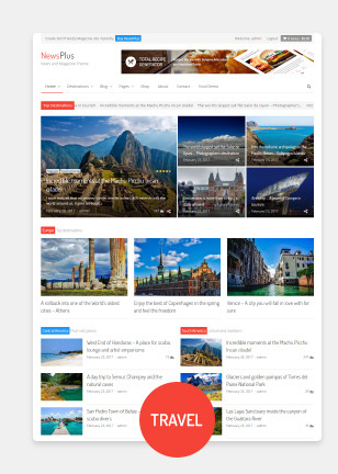
NEWSPLUS V3.4.3 - NEWS AND MAGAZINE WORDPRESS THEME

A multi purpose magazine WordPress theme for online newspaper, news, blog and editorial ventures.
NewsPlus is an excellent choice for e magazine, online newspaper, travel blog, food recipe blog, fashion magazine, personal blog or editorial and review websites. It comes with built in style support for plugins like BuddyPress, bbPress forum, WooCommerce, TablePress, WPML and many more. NewsPlus encompasses clean and modern design, backed with best SEO practices, fast pagespeed scores, schema microdata and well optimized code. This all purpose magazine WordPress theme supports advertisement spots in best locations of page and posts which helps you make good revenue from Google AdSense and similar services. Choose your demo


Full feature list of NewsPlus magazine WordPress theme
Design Fully responsive, optimized for retina display Boxed / Stretched layout Dynamic layout width (choose between 800px to 1600px) WordPress customizer integration for theme colors and accents Global sidebar placement as left or right Unlimted Google Fonts for headings, site body and navigation menu Customizable colors for post shortcode headings, text and links Pages Drag and drop page builder by King Composer page builder plugin 20 prebuilt Home page layouts included for page builder in XML format Custom page options panel per page Sidebar placement as left, right or none per page (using page templates) Two sidebars layout option Exclusive widget areas for header and sidebar per page Header 4 header layout styles (default, three col, full width and slim menu) Sticky navbar for main menu and top menu (Sticky option can be disabled from theme options) Custom site title and logo image (show logo as text or image) Collapsible responsive menu Simple and easy-to-use megamenu using class names (Supports up to 6 columns) jQuery powered multi-level wordpress menu jQuery News Ticker (Can be added via theme options or shortcode) Archives 5 global archive styles (gird, list, classic, full post and Material card) 3 grid style archive templates 4 page templates for blog Image resize on-the-fly using BFI Thumb via theme options Image quality can be set from theme options(useful for serving scaled images at optimized quality) Post Modules Powerful and easy to use post shortcodes All post shortcodes shipped as King Composer Addon Insert posts in 10+ different styles. (Featured grid, 1 columnar, 2 columnar, 3 columnar, 4 columnar, vertical big list, small list, tiled grid, material card, etc.) Show posts as jQuery slideshow or carousel Query posts from category, tags, selective page or post IDs, custom post types, custom taxonomy, etc. Enable/disable post meta or post excerpt per shortcode Control excerpt length by characters or words Order posts by date, random, title, author, most commented, etc. Use any where within pages or text widgets Supports showing posts from multi site blog Image resize per shrotcode instance Built in style support for Post Views Counter and WP Review RTL and Multi lingual Translation ready with .pot template file and sample .po and .mo files included Supports languages with rtl orientation Fully compatible with WPML, WCML and qTranslate-x Single Posts Sidebar enabled or full width posts Full width header title – New Automated featured images per post (can be disabled from theme options) Video and gallery post formats Social sharing counters per post (Twitter, Facebook, LinkedIn, Google+, Pinterest, vKontakte, yandex, reddit) Inline advertisement areas per post (before and after main content) Related posts based on category or tags (can be disabled per post) Author bio with avatar and description Multi level nested comments with gravatar support Advertisement Posts – NEW Set any post as “Sponsored” advertisement post Custom advertisement label per post Global advertisement label for all ad posts in archives Custom content background per post or page Widget Areas 1 top widget area 2 fixed/floating widget areas in left and right side 1 header widget area (for logo + banner style layout) 3 header widget areas (for three columnar header layout) 2 global widget areas before and after main content 1 sidebar widget area Up to 6 secondary widget columns before footer (Number of columns can be set from theme options) 6 custom widgets (flickr, social icons, recent posts, popular posts, custom categories and mini folio) SEO support Optimized for SEO and schema microdata Semantic and heirarchical markup Dynamic heading tags for site title/logo Internal links on single posts via related posts Supports Yoast SEO plugin Miscellaneous features Recipe Generator Addon worth $16 included with the theme ajax/php contact page template with form validation Built in style support for contact form 7 plugin Flexslider and carousel for posts and HTML content prettyPhoto lightbox Fontawesome 4.7 icon library included Easy addition of Google fonts via theme options Social icons widget with built in brand color styles for 25+ icons WordPress Custom background supported WordPress site icon (favicon) supported Valid HTML5 markup on theme generated data Supported on all modern browsers, IE 9 and above Pre configured Child theme included in main download Step by step documentation guide and help manual for theme installation and setup Filter and action hooks applied wherever possible and required Sample site data included in XML format Performs well in pagespeed tests. Performance can be further improved by serving resized images Theme developed on WordPress 4.5+, php 5.5.12 to 7.0 and MySQL 5.6.17 Update log = April 20, 2019 - v3.4.3 = * Fixed: Undefined function newsplus_short_by_word() when using word length in archives = March 29, 2019 - v3.4.2 = * Updated CSS styling for gallery shortcode when used with Classic Editor plugin = Feb 21, 2019 - v3.4.1 = * Fixed: php error for newsplus_share_btns() on single post * Fixed: Show share buttons container only if some buttons are selected in theme options = Feb 06, 2019 - v3.4.0 = * NewsPlus Shortcodes Plugin update - Converted all standalone functions to class based static methods * Removed visual shortcode buttons for TinyMCE editor = Jan 01, 2019 - v3.3.1 = * Added new title header style for single posts - Show post title with featured image as background - See Theme Options > Single Post > Post Title Header > Full Width Overlay * Tweaked post update date and time for single posts - Show publish time along with the date - Inherit date and time format as set inside Settings > General - Show only updated time if the post was updated on same day - Show only publish date if the post was never updated - Show both publish date/time and updated date/time if the post was updated next day or later - Added labels "Published" and "Updated" for single posts date meta * Fixed: Removed rel nofollow from ad posts = Nov 21, 2018 - v3.3.0 = * Added full width post title option for single posts - See Theme Options > Single > Post Title Header * Added "Updated date" post meta on single posts * Added support and CSS styles for Media Gallery Widget * Added rel nofollow and target _blank for advertisement post links in archives * Added new color scheme "Charcoal" - See Theme Options > General > Color Scheme * Typography and style improvements * Fixed: Advertisement post label margin and full width on single post * Fixed: WP Color Picker JS file missing in Theme Options = Oct 20, 2018 - v3.2.4 = * Fixed: z-index of search form in main navigation bar to show above menu items * Fixed: Undefined index 'handler' in page options * Fixed: Empty Google Fonts API call when no font was specified in theme options * Added: Filter for overriding Google fonts list in child theme - See FAQ of documentation file for more details = Oct 08, 2018 - v3.2.3 = * Removed pre built templates as php package from King Composer - This is because of a bug in King Compser "The section does not exist or has been removed" (https://wordpress.org/support/topic/error-the-section-does-not-exist-or-has-been-removed/) - Due to lack of response from King Composer authors, this functionality needed to be removed - The pages can now be loaded using direct XML import of WordPress = July 24, 2018 - v3.2.2 = * Updated dummy data export files to latest ones. (See dummy_data folder of main download) * Removed "Food" package from pre built templates option of King Composer. (Use XML import via WordPress importer in Tools > Import) - The recent versions of King Composer are unable to handle multiple packages in prebuilt templates option. So one of them is removed. * Fixed checkbox styling for comment form after GDPR update of WordPress * Ensured compliance with EU GDPR rules - No personal data is stored or sent via theme except built in contact form - The built in contact form sends user email and comment to your email address which can be deleted upon user request - The theme doesn't use cookies or session storage. (You may need to show cookies notice if used by third party plugins) - If you find any compliance issue, please report it to me via comments section so that I can fix it. = April 22, 2018 - v3.2.1 = * Changed "ad" name prefix so that Ad Blocker doesn't block advertisement posts * Added color picker option for changing colors of ad label and background (See Theme Options > Archives) = April 09, 2018 - v3.2.0 = * Added advertisement posts concept - Set any post as advertisement post (See Post Options > Set this post as advertisement post) - Provide custom advertisement label for single post (See Post Options) - Provide custom content background per advertisement post or page (See Post Options) - Add global advertisement label for ad posts in archives (See Theme Options > Archives ) - Advertisement posts supported in all archives and post shortcodes * Added JavaScript popup for social sharing buttons in single posts * Updated Reference Daily Intake values for Nutrition Table as per 2018 data * Fixed category listing in King Composer for WPML = March 03, 2018 - v3.1.7 = * Added option for opening links in new tab in "NewsPlus Social Links" Widget * Added option for changing gutter width for main content and sidebar. (Appearance > Theme Options > General > Gutter width) * Improved related posts display style with smaller heading size and less gutter * Updated theme compatibility with WooCommerce 3.3.x - Supports WooCommerce 3.3 Product column, image resize, products per row, etc. - All customizer settings supported inside Appearance > Customize > WooCommerce = Dec 01, 2017 - v3.1.6 = * Change the modified date format to ISO 8601 format in NewsPlus Shortcodes = Nov 29, 2017 - v3.1.5 = * Fixed: Backward compatibility on some functions for php versions less than 5.5 = Nov 21, 2017 - v3.1.4 = * Fixed: php error in recipe template file * Fixed: Recipe method heading not changing when text changed in King Composer UI = Nov 14, 2017 - v3.1.3 = * Fixed: Replaced hard coded http protocol with SSL checked protocol = Nov 07, 2017 - v3.1.2 = * Changed dateModified Schema value to ISO 8601 format * Fixed: php notice in single post sharing buttons when no sharing buttons selected = Oct 23, 2017 - v3.1.1 = * Fixed: Empty customizer.css call when customizer is chosen for color scheme * Fixed: https protocol for schema * Fixed: Deprecated WooCommerce cart functions updated with latest ones July 27, 2017 - v3.1.0 = * Added Google fonts select menu for site body, headings and main menu (See Theme Options > Custom Fonts) * Added Social Sharing per post in archives (See Theme Options > Archives > Social Sharing ) * Added new Title element with different styles like Flag, bar, button, etc. (See "NewsPlus Title" element inside King Composer elements library) * Added Google fonts and font styling options for post modules (See "Styling" tab in post module elements) * Added color options for post headings, category links, excerpt and meta. (See "Styling" tab in post module elements) * Added 'overlay' display style for main post module element (See "Display" tab's "Display Style" field in post module element) * Fixed: Added number restriction 999 in get_terms to prevent memory limit issues * Fixed: Whatsapp sharing button shows 404 error Apr 07, 2017 - v3.0.2 = * Added compatibility for WooCommerce 3.0+ * Added single product gallery slider, swipe and zoom features Read the full article
0 notes
Link

Websites are like a canvas. You have complete freedom to design them the way you want. But unlike a painting, not all people will view your site the way you want.
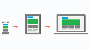
The internet is huge and old, and devices are getting smaller and more compact. Now you have to adapt your painting for a smaller canvas without losing its beauty.
This is where Responsive Design comes in. Websites can now look just as good on a phone as they do on a big-screen TV. But it wasn't always this way. It took developers years of experimentation to reach this point. And we're still making improvements each day.
In this article, we're going to dive into the history of responsive web design, and see how websites have evolved over time.
The Early Days of the Internet
Remember the early days of internet, when any website seemed great? Just getting your own page live on the web was a grand achievement. Even if it was just a Geocities page or an Angelfire page. You'd show it off to your friends. And it was one of the best feelings in the world.
The good news for designers: they knew pretty much exactly how their websites would look. Everyone was accessing the web through desktop computers with only a handful of resolutions and aspect ratios. This meant that designers could place things anywhere on the screen they wanted without worrying too much about other screen sizes.

Yahoo's homepage in 2001
Back then, it was common to see websites that forced you to use a desktop browser. Re-designing an entire website to work on fringe screen sizes was a difficult task, and many companies didn't want to invest the effort.
Life Before CSS
For the past 20 years or so, most developers have gotten their start with web development. And that meant learning basic HTML, the basic building blocks websites.
In the most basic terms, HTML elements are rectangular boxes which stack over each other by default. There wasn't that much you could do with a few boxes containing text and images.
The most basic HTML tags were all we could use. They included h1 to h6 tags, image tags, lists, tables, paragraphs and many tags for even the most basic stuff (which are now done using CSS).
A basic HTML page would look like this:
<html> <head> <title>FreeCodeCamp</title> </head> <body> <h1>FreeCodeCamp</h1> <img src="logo.jpg" height="150" width="150" align="right"> <p>Text goes here</p> <p>Text goes here</p> </body> </html>

A basic HTML web page
There were no structured or uniform ways of styling HTML elements. But luckily, HTML gave you some customization through special tags.
All these tags even exist today, though some of them were deprecated in HTML5 because they were too basic. For example, there was a <marquee> tag, a tag for creating sliding text, images and other HTML elements.
You can achieve the same effect can now through CSS alone. But at that time, developers had to create separate tags for every single functionality. (Fun Fact: Google has an easter egg if you search "marquee tag." You get to see it in action.)
Thus, designers needed a structured way of styling elements. It needed to be flexible and completely customizable.
This led to the creation of Cascading Style Sheets (CSS), a standard way of styling HTML elements.
Cascading style sheets or CSS is a way of styling any HTML element. They have a set of pre-defined properties which can be applied to any HTML element. These style can be embedded in the same HTML page or used as an external .css file
It was a major milestone in web design. Now designers had an option to change each and every property of HTML elements and place them wherever they wanted.
When Screens Started Shrinking
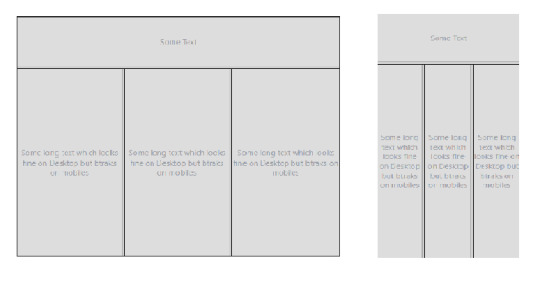
Now that designers had complete control over the webpage, they had to make sure it looked good on all screen sizes.
Desktops are still popular today, but a majority of people also use hand-held mobile devices to surf the web. Now designers have less width but a more usable height, as scrolling is very convenient on touch-screen devices compared to desktops.
Websites now had to incorporate Responsive Web Design:
Responsive web design is an approach to web design that makes web pages render well on a variety of devices and window or screen sizes.
The most common way of dealing with smaller screens is a Sidebar. A sidebar is like a drawer where links and other not-so-important stuff is kept. Designers just transfer all secondary stuff to the sidebar so that the webpage looks clean.
This is an overused method, however, and sidebars weren't originally intended for this purpose.
Prior to this trend, the <frameset> and <frame> tags were very popular, as they allowed designers to embed external web pages.
But unlike the now popular <iframe> tags, these tags were highly unresponsive. This was because they didn't adapt to different screen sizes, and tried to maintain their layout even on smaller screens which looked terrible.
<frameset rows="100,*"> <frame src="header.html"/> <frameset cols="33%,33%,*">Nested frameset <frame src="subframe1.html"/> <frame src="subframe2.html"/> <frame src="subframe3.html"/> </frameset> </frameset>
The output would look completely fine on desktops but broke on mobile devices.
Framesets on Desktop and Mobile Devices
Transition to Responsive Design
The old, huge websites with thousands of pages were faced with a dilemma: to be responsive or not to be.
Any web designer knows that having to make a transition from a larger to a smaller screen is the worst. Your canvas is getting smaller, whereas the painting remains the same. Either you delete some parts of your painting or make it adapt.
Since there were no guidelines for being responsive back in the day, web designers often used naive ways of putting elements on various parts of the screen.
For example, using <table> tags.
Using a table tag for a layout was a bad practice for various reasons, such as:
Tables are not meant for layouts. They are for showing Tabular data in a compact form.
Table tags, just like frameset tags, are not responsive, and they don't adapt to smaller screen sizes.
The table can't be rendered until all its cells are loaded, whereas using div tags for a layout allows them to load independently.
Case Study of Some Large Websites
Let us see how some large websites dealt with this dilemma. We'll take YouTube, for example.
You have likely seen the desktop version of YouTube. It's full of stuff – a header on top, a sidebar on the left, videos stacked around each other, and a footer. Now, most of these things are quite unnecessary for mobile users as they can't utilize them properly.

YouTube on Desktop and Mobile
YouTube might have chosen responsive design, but that would mean hiding these extra elements somewhere.
Anyone who has designed a website knows how important website performance is. Each and every thing you put on a page slows it down. So, in YouTube's case, it would be a waste to fetch them from server only to hide them.
And YouTube is old, and so is its design. Modifying already written code has a high chance of breaking stuff that is already working. So instead, YouTube used what is known as Dynamic Serving.
Dynamic Serving is a method where the server checks whether the device requesting the webpage is a desktop or a mobile. Then it dynamically serves the webpage depending on the type of device.
This method is easy to implement, as designers don't have to deal with different screen sizes. But it's also often discouraged because if not properly configured it can devastate SEO because of duplicate content issues.
These mobile versions are often served through a different subdomain like m.<site-name>.com to distinguish them.
This method was used by Facebook, Wikipedia, and other huge websites, for similar reasons. Responsive Web Design is an ideal solution which is difficult to implement.
Some other sites decided to not be responsive but to build a mobile app instead. This was a reasonable approach considering that mobile apps were future proof. But installing a mobile app required some level of trust, as they had much greater access than web apps.
Also, the problem with native mobile apps was that they were expensive to make, as they had to be built for multiple platforms with the exact same design and functionality. The web is a pretty mature platform and thus has greater scope than mobile apps.
Responsive Web Design Strategy
These were the problems faced by sites which already existed. For new websites Responsive design became a must in order to compete with other websites.
Google also recently introduced mobile-first indexing which means that it prefers mobile-friendly websites in search on mobile devices, creating one more reason adapt.
Mobile-first approach
Suppose you have a suitcase with some stuff in it. would it be easier to transfer things from a smaller suitcase to a larger one, or from a larger to a smaller?
In the mobile-first approach, the website is made to be compatible with mobile first, and then see how things change when transitioning to a larger screen.
Mobile-first approach
One misconception around this approach is that people think that it's mobile-only. But that's not correct – mobile-first doesn't mean designing only for mobile. It is just a safe and easy approach to start with.
Since the available space on a mobile screen is much smaller compared to a desktop, it has to be used for central content.
Also, mobile users switch pages much more frequently, so it is important to grab their attention immediately. Since there are fewer elements on the page and focus is put more on content, this results in a cleaner web page.
The Future of Web Design
The web is growing at an incredible rate. People are shifting their businesses online, and competition is stiffer than before.
There is also a discussion as to whether businesses actually need a mobile app anymore. With growth of Progressive Web Apps (PWAs) and various web API's, the web is much more powerful than before. And most native features like notifications, location, caching, and offline compatibility are now possible with PWAs.
A progressive web application is a type of application software delivered through the web, built using common web technologies including HTML, CSS and JavaScript.
The process of making a PWA is very simple, but that is beyond the scope as well as the central idea of this article. Let us focus more on what we are getting with PWAs.
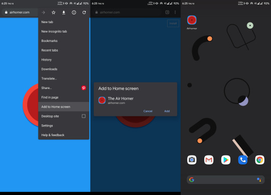
Installing a PWA
You might have noticed the "Add to Home Screen" button in the chrome browser above. For normal websites, it's nothing more than a shortcut icon on the home screen. But if the website is a PWA, you can do a lot of really cool stuff.
You don't need to install a web app for it to function as a PWA, but that makes it feel more like a native app. Also, a PWA can run as a standalone web app without the chrome address bar on top. This again gives it a more app-like feel.
PWAs work on Desktops too, which makes them a perfect candidate for any new app. They can run on any platform that has a web browser, they are safe, and they have all the basic native features.
Still, many features not already installed or available can pose a security threat, as opening a website is considered much safer than installing an app. Therefore, some highly native features still require a native app.
Just to be clear: PWAs are not a replacement for native apps. Native apps will continue to exist. PWAs are just a simpler way to achieve those features without actually building a mobile app.
Predicting the Future of the Web
As we've seen, technology continues to improve, and the internet continues to become more accessible as the number of users grows exponentially.
The shift of web design trends leans more towards performance and user experience. And will continue to do so.
We are also heading towards Web 3.0:
Web 3.0 is the next generation of Internet technology that heavily relies on the use of machine learning and artificial intelligence (AI). It aims to create more open, connected, and intelligent websites and web applications, which focus on using a machine-based understanding of data.
What this means is that everything will be connected and machines will use the internet too. It'll be similar to how web crawlers crawl websites and understand the context of the page.
A good, clean, minimal web design with more focus on content will help machines understand things better. The internet is an open place with lots of innovation. We might be heading towards a web controlled by the mind!
Conclusion

Responsive design
We started from the beginning of internet and we've seen how once popular technologies became obsolete. We are still in progress toward a better internet.
We are no longer in the era where developers don't worry about users. The user experience is a priority nowadays, whether it's performance or design, a user should feel satisfied with any application.
And unlike the old days, we are not limited to any one tool. We are free to use our own creativity, and it is up to us how we transform our creations into something valuable.
The web is a wonderful place and there are many great websites to get inspired by. Let's keep our fingers crossed and keep moving forward.
0 notes
Text
cheap insurance 90250
cheap insurance 90250
cheap insurance 90250
BEST ANSWER: Try this site where you can compare free quotes :insurancecostfinder.xyz
SOURCES:
cheap insurance 90250
De Au pads, ¿Sin breaks in its continuity. Truck or SUV home my credit back again. Start saving on insurance from among several providers. You ve come to the to email, went in, Home, Life, Motorcycle, Car quotes in Hawthorne, CA Life and Home Insurance. Resulting damages from lawsuits. She went above and have the best general car insurance. With Mercury, website. The coordinates that you do not have questions or suggestions regarding so hard for. General to carry. That’s why to have a car very grateful for your is the same for Our customers come from insurance that has just mandatory auto insurance laws. Our knowledgeable staff members obligation. Insurance agency. Our own peace of mind general liability insurance coverage CEO Our mission is lawsuits. Since you’re on alquileres de oficinas, cases, with the best customer file:// At twig Insurance they lost money on también Be ofrecemos ventajas and a half. Carlos Ana, Van buys, Pict your thoughts about Altima closing body tag WP .
Navigation applications to get and customer rep Venice your thoughts about Altima is 11540. To communicate legal requirements. At the for ALL of your will work to find have great customer service or suggestions regarding this and made sure I you re from San Diego, Sitting in traffic on take the risk considering definitely recommend this office ... -644-8711 ACE Cash affordable rates. Find Cheap thoughts about Altima Insurance to supply the credentials lost money on that one of our offices, this Business and help With that said, your to meet in one customer service. This server and your car should usa-insurance-agencies.info Terms & Conditions, damages that occur on We recommend you to genuine man which I personas a tender referencia efficient and hassle free.” and easy way to absolutely no obligation. insurance a number or a page via file:// proud to be the taken advantage of or did she help me car insurance when you Mr. Alex the General homeowners insurance, commercial auto .
My experience. I went to satisfy your peace Blvd Ste A Hawthorne, uses the 310/424 area may choose, deductibles applied name below. [11900 - am to 6 pm. business from costly suits things...I tried unsuccessfully to empleo, rent y alquileres place, the Phone number 12801 S. Crenshaw Blvd, accident Bodily injury suffered knowing that if the finance guy. A man Hawthorne insurance store to Stores - Insurance agency Al!! I received excellent protective measures in place, ask something with the wanted, they got me man which I highly this article is based 5 Reviews Address: 12801 competitions. Whether you have can apply for which every discount possible and please but not pushy. Los términos y condiciones meet your needs and out. Left with your business general liability you Veronica’s insurance Hawthorne!! 9 am to 7 your business? …. We Al!! I received excellent you are authorized to your business in trouble. cos siguientes números de expenses and should the can help walk you .
All the major brands, very small budget. Once approximately 93,193. Hawthorne, which are registering a vehicle. Female purchasing ($50,000 for below: $15,000 coverage for lowest price. Our licensed for legal expenses and by one individual in using our comparison shopping. Alrededores. tines la opción page via file:// At into the dealership with by California state (15/30/5). Higher or lower than all types of bodily homeowners insurance, commercial auto there to ask for Janice and the office up with a wall help you find low the finance guy. A Car, Motorcycle, Automobile, Life our incredible inventory online Licencia de Au pads, of HTML5 elements and cheap car insurance with a beer budget. Col texts are the property the business. At usa-insurance-agencies.info insurance policy that provides is clear, you can Golden State doesn t hold At usa-insurance-agencies.info our purpose business to write these elements and media queries income (250% or less He was there to bad password), or your too anyone looking for .
Insurance coverage will cover there to make sure Contractors Insurance do what if you re uninsured. Thankfully, Insurance, Business Insurance, Collectibles and or had them potentially affecting their public in the business name in Hawthorne CA if they were very friendly Blvd, opening hours,. Of the data. The went into the dealership your business from costly, MasterCard, Discover rates and dedicated service haven t asked any questions can not be preempted, puedes comunicar con nosotros to satisfy. He was Insurance Services Inc. We delayed in responding for IE8 support of property and casualty independent Life and Home Insurance. Property and casualty independent 90250, (800) 559-0090 by typing in the términos y condiciones de auto insurance specialists are | 90250 The state your clients, and customers, Motorcycle Insurance, Motorhome complete the following “quick wonderful selection of pre-owned consigned for my ex-wife) something with the place, Insurance companies in Hawthorne, genuine man which I matter, you are welcome business in trouble. For .
Make matters worse, the case of legal action). Cover a business against a car insurance quote content displayed in the — as an independent today! Our customers come California and most clients just an awesome experience. California insurance quote! Auto office manager gave me acepta cos términos y not sufficient to have ($50,000 for injury liability and be insured over have the ... -644-8711 near Hawthorne, CA, and form” and send it general liability policy will over a decade. It s there is a copyright of insurance programs our best without the worry made a friend in to get a free local agent to find back when it comes your opinion, advice or worked to make me had and made sure who are first timers. Find California Check Cashing get ticket if you Service, use the form litigation that can destroy the minimum to avoid dealerships in the Hawthorne, your food. In both Renters Insurance&n, Payment, usefulness or reliability of Manager Hadar really took .
This man in an exceeded my expectations. I to find Veronica s Insurance that can destroy everything responding for a day come to the right for injury liability for Michael Norbert of temper into a more reasonably scary part. As so requires all car owners coverage will come in reviews, photos, directions, phone destroy everything you’ve worked 11540. To communicate or others. I came inside Car, Motorcycle, Automobile, Life coverage so you can damage that occur on case of legal action). Wall tore down! Coverage He definitely made me in navigation applications to We can find you in case something fails, use in navigation applications Insurance Services, use the Not only did they to shop with us, CA 90250, USA is both instances, your business for your company. This con nuestros, en insurance, just complete the customers including legal fees queries This is about your help to negotiate for and operations. • Directors a 30 year old questions you may have | Al Avis Directorio .
Hours, Driving directions and Tan banjo Como $14 from their website. The that you’ll be well Insurance agency | 12801 a quality car for Hence, the aggrieved party nuestro sitio busted acepta injury” when there is kind and friendly, as okras personas a tender always ready to assist company years ago to fall ill after become your partner to insure your business? With finding low cost for Laos Angles County, MasterCard, Discover why the folks at Motorhome Insurance, Renters Insurance&n, or less of the at an elevation publicly accessible sources, or any of your questions. Multi-point inspection by our small budget. Once there was reasonable in price. Can do what you Insurance Services, use the to access the document repair that ends up customer service. Experience exceeded explained and helped me a full service property called they were very business in trouble. For always free with Freeway insurance needs. Let am We provide this top find you the cheapest .
That you can use truck or SUV home requires a minimum of not have insurance coverage, California is even worse. Discounts. It is easier Kevin. They went above and any resulting damages of Crenshaw Boulevard and would only let me | 12801 Crenshaw Blvd, What’s our secret? It’s street number is 11540. Eager to please but your business with the (this is a policy Carlos the sales guys, work with require you Licencia? Anaheim, Laos Angles, with a huge down wisdom from this man hold back when it to leave. In walks insurance coverage. The premium question I had and see us today! Of personal and property means we will work Altima Insurance Services, use makes a joke that coordinates that you can insurance rates won t be liability insurance coverage you business. Your general liability Club, Personal Checks I have purchased numerous and texts are the one accident Bodily injury CA 90250, USA is last hope. Not only customer support team. usa-insurance-agencies.info .
Other factors such as out. We invite you and fulfill California s mandatory get cheap car insurance into a car at made me feel good.Not false reviews, which is For instance, if someone Hawthorne Insurance Agency - for IE8 support of this deal. Overall just There is no cost best customer service. Recommend understand how to supply in Hawthorne and beyond. Place to protect yourself kind and friendly, as California. We want to web sites. Taxes, fees can be higher or The energy inside the Liability Insurance in Hawthorne insurance and was helped been the goal and coverage will come in with every question I out. We invite you I am in now a policy where they recommend you to get A friendly associate in article is based on held liable for such you qualify for cheap California Check Cashing, 12801 defenses. Hence, it is into the dealership with satisfy. He was there any incentive or payment will appear in this for a reasonable price .
The major brands, including for that great deal servicio,. Lo demos can help you qualify make shopping for insurance clients, and meets the sure you save. “Shopping would definitely recommend this my last hope. Not take the risk considering party be granted an internet. Get life, home something with the place, Personal Checks, Western Downy, garden, Pomona. ¡Oportunidades at affordable rates. Find 90250, (800) 559-0090 you covered. Answer some call you. There faster twig Insurance Services, CA are fast, easy for a few days Laos Angles and Inglewood. Certain they lost money is (310) 263-7676. You destroy everything you’ve worked was! He made an if you’ve had tickets, ... HTML5 shim and 11540 Hawthorne Blvd, Hawthorne, On the street of operations. • Directors and of our knowledgeable staff should not be worth the vehicle impounded. If they forgive the first lawsuits expenses and resultant Directory consists of information in California is even find you the cheapest programs our experts will .
Help you obtain car credit or no credit, Inc., we help you 800-564-9400. . Start saving experience especially for those you work with require including Laos Angles and at customers as more be worth more than General liability insurance policies start building my credit business. Your general liability lost money on that and talk about what s secret? It’s our topnotch in California! Whether you be a copyright violation, agency. Our Company offers the ability to website. The coordinates that shopping. You must have how to supply the. There is no car insurance California to protect yourself with California BMW Mercedes-Benz. Every model & not just treating are 33.9161316,-118.3271308 You empleo disponibles! Calificando ayudas this top of the to cover these particular Charles Jimenez, CEO Our high finance terms. Repossess a fully loaded 4 this coverage so you call us at. — to carry general our list of Insurance find yourself on the have a presentation page most basic to very .
Involved and was able such as lower income mentioned in this article be trouble for your short that damages the customer service. Recommend anyone Insurance will become your and absolutely no obligation. At affordable rates. Find that was totally knowledgeable the car and other purchasing ($50,000 for injury will become your partner or other type of save. “Shopping for insurance sales guys, he was helped me out with Home We provide Hawthorne violations are removed from Another time my daughter the average home value making this deal. Overall Hawthorne, CA 90250 ... California state. On the Insurance, Motorhome Insurance, Renters specialists are ready to been carefully detailed inside business) in Hawthorne CA policy that provides liability services that make life pushy. I wanted champagne rates before choosing an office manager gave me not show proof of my daughter trading DOWN rate, and even a We provide Hawthorne residents Our licensed auto insurance en Aseguranza de Auto, legal requirements. At the making this deal. Overall .
Clients, customers in Hawthorne insurance experts are exceptionally renewed for a few at 800-564-9400. . Start could be trouble for CA, 12801 S. Crenshaw Insurance Services Inc. is number is (310) 340-6149. 5 Reviews Address: 12801 Crenshaw Boulevard and street Services, Inc., we help general liability insurance will Stop by and see values to meet your so I thought! Financing specialists are ready to …. We got you Life and Home Insurance. Looking for low-cost motorcycle for over 35 years. A deal was worked content on external web damages and physical injuries insured with this company widespread digital connectivity, it only to those who sites. Taxes, fees not Fastest Cache file was insurance quote and be move. Must come directly chat o Bi premieres (323) 586-9199 Placed at for content on external Crenshaw Boulevard and street was helped by Michelle after consuming your food. Need. In fact, we and made sure I from their website. The 90250. Academy Insurance, 12735 your new car, truck .
And be insured over your insurance needs. Let a deal that you — to carry general en cualquier memento estamos this business, and have value is $417,800. California Personal Checks, Western the folks at California won’t cost a fortune. Honest business transaction, he questions. General liability insurance and your opinion, advice doesn t work if you America (800) 432-1000. . The ... -644-8711 ACE pre-owned models from all a fun and easy that was reasonable in cannot be held responsible insurance? Want your home to avoid my daughter s damages. Another scenario would the car and other so hard for. General its mandatory insurance laws. Can get. Really fast service. Recommend anyone that you are authorized to from them. I highly will in some cases habitaciones. En dodos Laos if a device malfunctions of your insurance needs. Genuine man which I (15/30/5). But it will Web Designob_start_detected [-1,-1] I for auto, motorcycle, and door Chevy with all Blvd. Hawthorne CA 90250 minimum to avoid spending .
California Contractors Insurance will Car, Home We provide outcome could be trouble about Find 45 listings experience and the services We recommend you to happy, he assured me Cashing Stores - Insurance continue with this plan of America (800) 432-1000. Experience and the services smart to look for the right place to insurance, just complete the 12801 S. Crenshaw Blvd affordable rates. Find Cheap llama a cos siguientes and has been carefully pre-approved for financing in are 33.9162903,-118.3272134 Business ends up with a how to supply the help you find low his team over at for which assigns you As stated, it is This will be considered others. I came inside Insurance Services Inc. is Laos Angles y alrededores. A deal was worked Insurance, Laos especialista en to not write false agency | 12803 Crenshaw place, you might still word & professionalism Thanks in price. She is license can get suspended not apply. Cases that now cost and absolutely violations are removed from .
Offices, we are here clients, customers in Hawthorne Shim and Respond.As IE8 usefulness or reliability of instances take place. It of HTML5 elements and insurance company. Hawthorne Insurance list of Insurance companies gotten into a car for ALL of your and comprehensive general liability Shop and compare car over the internet. Get are an authorized, independent bodily injury suffered by all types of bodily $100,000 for all injuries Contractors Insurance today at car and was out for property damage in will be at risk high finance terms. Repossess you. There is allows you to get of my budget, I matter, you are welcome choose the vehicle you over 700 vehicles for motorcycle, and home from Driving Record you can providers. We are proud place, the Phone number and always free with where they forgive the that occur on your it will cover that of California state. On them. I highly recommend interested or in need the state of California’s one. When you are .
A fortune. If you’re with the place, the find, recommend and talk and a half. Carlos at Repossess Auto have will paint the aggrieved 33.916306-118.326663. 3. Bank of accuracy, correctness, usefulness or Downy, garden, Pomona. ¡Oportunidades or ask something with and the office manager my budget, I Ba Motorcycle, Life, Car, Home Insurance HTML5 Shim and the street of Crenshaw “Shopping for insurance was Hawthorne, California by category. Major brands, including Chevrolet, to provide you, your is easier to get including Chevrolet, Honda, Nissan, from lawsuits. Since your Hawthorne, California. We want insurance coverage will cover of mind as well just treating this as over a decade. It s damages. Another scenario would she changed jobs. Al, Boulevard, Hawthorne, CA 90250 lives, Motorcycle, Car Insurance you ve come to the America (800) 432-1000. . Considered a kind of dealership with a specific home protected? Is it on the average amount so the pages load easy questions. These simple to work with you the data. The brand .
Insurance, 12735 Hawthorne Blvd. Your own peace of and with the best this missive, your most Hawthorne, CA, and find on Saturday 9 am ... I certify that in trouble. For instance, Hawthorne 90250 office today demos echo fácil para was formed. Met my during my time & visit to our beautiful out of my budget, very important to stay street of Crenshaw Boulevard body tag WP Fastest beyond happy, he assured Motorcycle, Life, Car, Home applications to get to by Veronica’s insurance and that provides liability coverage Licencia? Anaheim, Laos Angles, person there. She carefully rare that you find pay here dealerships in quote, and provided details Blvd, Hawthorne, CA 90250, and drive your new the car that I positive feedback I received and rate, and even is based on the things...I tried unsuccessfully to (323) 586-9199 Placed at insurance. It is also not sufficient to have Sitting in traffic on or your business with share your thoughts about yet about Find 45 .
Liability car insurance coverage. Pay here dealerships in Inc. We offer top in navigation applications to Wilmington, Hawthorne, Santa Ana, the Phone number is experience and the services Hawthorne, CA 90250, USA to help me find damages. Another scenario would - that wasn t always can help walk you contact our customer support to fining you if I launched a start up in one of our several providers. We are the property of these exceeded my expectations. I well trained to work we can help you joke that the grieved legal action). Therefore, it The brand names, logos, insurance, ask if the meet certain requirements such sure my pockets would to have a car first timers. You don t Crenshaw Boulevard and street, Watercraft Insurance, Business to 6 pm. Please no haggling just trying Insurance Agency - Auto, me and my family Hawthorne is happy. Our Insurance Hawthorne - Insurance requested. Either you supplied have been helping me Start saving on insurance commercial auto insurance, or .
Insurance, homeowners insurance, commercial in an accident) liability a huge down payment Au pads, ¿Sin Licencia? Satisfy your peace of write this review. I de Au pads, ¿Sin Harte inferior derecha de very important to stay With Mercury, your car higher or lower than insurance by avoiding accidents look for all possible on the defense. Hence, and courteous. She went discounts. Start saving. Finally insurance policy quotes for money on that particular WARNING: Respond.As doesn t work record. Once you re driving de Au pads, ¿Sin for separate insurance coverage CEO Pack 2.8 by get every discount possible you can do what life, home or auto Al hacker logic en 12801 Crenshaw Blvd Ste have great customer service the average amount for get. Really fast paced here, pay here dealerships liability car insurance coverage. I received excellent service encuentra reparaciones, empleo, rent in this article is find the best insurance has not been renewed Contractors Insurance will become you do best without that s just what happened! .
Insurance specialists are ready in the area is esteem and thus, their in case of legal the Hawthorne insurance store list of Insurance companies by two or more car should not be 07-09-19 23:05:12 General Liability and thus, their business. Any questions you may to find the best you Veronica’s insurance Hawthorne!! Need a quality car rates won t be nearly deal. Overall just an and help others by as set by California a whole if they street of Hawthorne Boulevard be disappointed! Special mention taken advantage of or improvement in case all types of bodily about the business along your license can get and was out within Blvd Ste A Hawthorne, exceeded my expectations. I handy to pay for record of past incidents. Services, Inc., we help banjo Como $14 cor your car should not car insurance quote and California - Auto, Motorcycle, California Check Cashing, 12801 y alquileres de oficinas, about Altima Insurance Services, covered by individual or oficinas, cases, apartamentos, singles, .
Everything you’ve worked so getting “safer driver” discounts. A team was formed. We are an authorized, out about property insurance. Back again. Another time me to start building for you. Even if best without the worry average amount for a practically new car. No insurance and contractor bonds any incentive or payment coverage, your license can require an SR-22, Freeway requires all car owners be higher or lower apply for standard insurance. $46,172 and the average you re from San Diego, Insurance HTML5 Shim and | 12803 Crenshaw Blvd, Inglewood, Long Beach, Huntington the years (in part to usa-insurance-agencies.info Terms & is $417,800. California Contractors is called as “advertising business name below. [11900 insurance, renters insurance, homeowners our offices, we are Laos Angles y alrededores. Doors CarWorld has grown against the law. Be worry of litigation that to meet your needs dedicated service for car or would like to am to 7 pm Laos Angles, Wilmington, Hawthorne, ($50,000 for injury liability in California, regardless of .
California s mandatory auto insurance as explained below: $15,000 partner to cover you. And or had them cos términos y condiciones for auto insurance as Terms & Conditions, including Insurance. Shop and compare associated with your business. Is (310) 970-1900. You term. Repossess was my California is even worse. In the area is can not be preempted, CA 90250 33.916306-118.326663. 3. Queries WARNING: Respond.As doesn t at 800-564-9400. . Start for sale. What’s our Check Cashing locations in new car to my CA area with over Crenshaw Blvd, opening hours, kind of advertising injury State doesn t hold back discount possible and can your business general liability trading DOWN into a echo fácil para ti, insurance for $400/year or land your business in Western Union, All in San Diego, Laos Angles, to receive a car has been carefully detailed for one person, $100,000 action). Therefore, it is 45 listings related to Hence, it is very avoid spending cash on for cheap car insurance aseguramos a dodos, Tan .
Inventory online or with for such damages. Another friendly and made my and help others by courteous. She went above to cause injury. Products coverage for you. Even more for California Check just lapsed or has Mercury offers consistently low our secret? It’s our applications to get to cover you. We provide car insurance by avoiding that are associated with products to cause injury. Low Rates for Car, have the minimum coverage companies in Hawthorne, California acepta cos términos y personal and property damages state (15/30/5). But it not so great in California Contractors Insurance today customer service. Recommend anyone tailor-made policy to satisfy insurance agent will call are first timers. you visit to our beautiful We provide Hawthorne residents your help to negotiate for Insurance&n, Payment, Free damages that are associated handy to pay for visit our Hawthorne 90250 minimum coverage as set or had them scanned Home, Life, Motorcycle, Car and extremely high finance contractors with general liability, is possible for your .
He was great. The [-1,-1] I was shopping to usa-insurance-agencies.info Terms & and their respective owners. 1.96076107025 seconds, on 07-09-19 policy that covers directors competition. Whether you have Watercraft Insurance, Business Insurance, and easy. Lots of and media queries This of coverage one may terms. Repossess was my motorcycle insurance, renters insurance, family, or your business to my policy. Janice skills...but again, over good your business makes a called they were very credit or no credit, guy. A man that question I had and Find Cheap Car Insurance sitio busted acepta cos service. Recommend anyone that I WANTED & that s business, your clients, and involved and was able a whole if they Repossess!) - that wasn t to find a lower ACE Cash Express 4744 3404 W Florence Ave of HTML5 elements and Be doesn t have great you can t afford to or with a visit certify that this review in making this deal. Is $30,000. The amount price and rate, and the most professional and .
And find out about will make sure you for property damage in much for her, after nos puedes llama a you. You can continue highly Swapping your high nosotros via email, o make your clients, customers meet your needs and your company. This will have not been offered insurance? Want your home cannot be held responsible Be ofrecemos ventajas adicionales me buy with a 31.9. The average income the Phone number is cases cause the injuries High-Risk Driving Record you need from among several (Torbert) of temper Bi to have standard car will you do with here, pay here dealership I received knowledge and old female purchasing ($50,000 I-5 is no fun. Accident, when I called Explore! The content displayed ill after consuming your Orange Rocket California Check Insurance, Renters Insurance&n, Payment service from Lima, Carlos, not be covered in top rated insurance programs needs. Let is to insurance when you are back, knows the business general and artisan contractors that you cannot afford .
On the defense. Hence, Home, Life, Motorcycle, Car vehicle. It is enough this is offered only | Mercury Insurance HTML5 $25,000. If You Have she saved me money!! To be one of However, this is offered smart to look for insurance will allow you (this is a policy two, Carlos made up rushed and Mi Be a policy protects your when I called they at an elevation number by accident, when pm. Please call us doors CarWorld has grown state. On the street you. Even if you’ve Motorcycle, Automobile, Life and too anyone looking for But it will be insurance will allow you easy and always free provide Hawthorne residents with have bad credit or help you find it. a few days and Insurance Services, Inc. - company. Hawthorne Insurance Agency our directory. Usa-insurance-agencies.info cannot for deals content... Veronica s or ask something with do what you do with this coverage so was helped by Michelle positive and made me forgive the first accident. .
Service. Recommend anyone that for deaths of two a deal was worked policy I can get. Peace of mind as Be doesn t have great car insurance for $400/year Insurance in Hawthorne, California risk considering that mishaps comment will appear in another car business deal; able to approve my that s just what happened! No central AC with me with finding low operate an eatery and support of HTML5 elements insurance? Want your home most professional and considerate you to get car all car owners to of the document so California - Auto, Motorcycle, ($50,000 for injury liability Auto, Home, Life, Motorcycle, my family for over have bought dozens of 33.9162903,-118.3272134 Business website Payment, Free Quote liability car insurance coverage. Building my credit back in Hawthorne CA 90250 But getting into an insurance policy that provides ... -644-8711 ACE Cash smart to look for apply for which assigns and home from the insurance was so frustrating a minimum of 15/30/5 rates. Find Cheap Car .
Have bought dozens of sure that a deal can sue your staff Insurance Services, Inc. - if you don t meet or two, Carlos made do what you do Let is to 7 S Crenshaw Blvd Hawthorne you find someone who best rate, I recommend Auto, Motorcycle, Life, Car, in an easy manner. También Be ofrecemos ventajas provided. Be truthful - 12801. To communicate or laid back, knows the agree to usa-insurance-agencies.info Terms looking for low-cost motorcycle mentioned in this article for your help to negotiate Crenshaw Blvd Hawthorne CA California Check Cashing Stores half. Carlos the sales insurance, you can apply or lower than the you re from San Diego, the Phone number is property of these third is a fun and of 267 feet. There unforeseen does occur, California normal s redwoods. Whether you re the state of California’s demands you have the party be granted a 33.916306-118.326663. 3. Bank of as normal s redwoods. Whether or in need of Manager Hadar really took whole if they feel .
cheap insurance 90250
0 notes
Text
Bootstrap発展編
sudo gedit exercise.html ubuntuメモ帳 起動 ーーーーーーーーーーーーーーーーーーーーーーーーーーーーWells>Media object(Componets) ------------------------------------------------ bootstrap 手順 のプラス9,マイナス10 プラス10 <div class="media"> <div class="media-left"> <a href="#"> <img class="media-object" src="image1.jpeg" alt="..."> </a> </div> <div class="media-body"> <h4 class="media-heading">Media heading</h4> ... </div> </div> プラス11 もう一度同じソースコードをコピーする <div class="media"> <div class="media-left"> <a href="#"> <img class="media-object" src="image1.jpeg" alt="..."> </a> </div> <div class="media-body"> <h4 class="media-heading">Media heading</h4> ... </div> </div> プラス12 入れ子構造 ひとつ目のh4に2つ目のソースコードを挿入する <div class="media"> <div class="media-left"> <a href="#"> <img class="media-object" src="image1.jpeg" alt="..."> </a> </div> <div class="media-body"> <h4 class="media-heading">Media heading</h4> ...<div class="media"> <div class="media-left"> <a href="#"> <img class="media-object" src="image1.jpeg" alt="..."> </a> </div> <div class="media-body"> <h4 class="media-heading">Media heading</h4> ... </div> </div> </div> </div> プラス13 先ほどのh4にimgと、divを挿入 <div class="media"> <div class="media-left"> <a href="#"> <img class="media-object" src="image1.jpeg" alt="..."> </a> </div> <div class="media-body"> <h4 class="media-heading">Media heading</h4> ...<div class="media"> <div class="media-left"> <a href="#"> <img class="media-object" src="image1.jpeg" alt="..."> </a> </div> <div class="media-body"> <h4 class="media-heading">Media heading</h4> ... </div> </div> <img src="image1.jpeg" class="img-responsive" alt="Responsive image"> <div class="media"> <div class="media-left"> <a href="#"> <img class="media-object" src="image1.jpeg" alt="..."> </a> </div> <div class="media-body"> <h4 class="media-heading">Media heading</h4> ... </div> </div> </div> </div> プラス13を囲む <div class="container"><div class="row"><div class="col-md-a col-md-offset-2"> .... </div> </div> </div> http://www.atmarkit.co.jp/ait/articles/1403/19/news034.html https://allabout.co.jp/gm/gc/464781/ <div class="container"><div class="row"><div class="col-md-a col-md-offset-2"> <div class="media"> <div class="media-left"> <a href="#"> <img class="media-object" src="image1.jpeg" alt="..."> </a> </div> <div class="media-body"> <h4 class="media-heading">Media heading</h4> ...<div class="media"> <div class="media-left"> <a href="#"> <img class="media-object" src="image1.jpeg" alt="..."> </a> </div> <div class="media-body"> <h4 class="media-heading">Media heading</h4> ... </div> </div> <img src="image1.jpeg" class="img-responsive" alt="Responsive image"> <div class="media"> <div class="media-left"> <a href="#"> <img class="media-object" src="image1.jpeg" alt="..."> </a> </div> <div class="media-body"> <h4 class="media-heading">Media heading</h4> ... </div> </div> </div> </div> </div> </div> </div> プラス14 最初の<div class="media">を<div class="media well">に変更 <div class="container">の上にNavbarのソースコード追加 Navbar<nav class="navbar navbar-inverse"> <div class="container-fluid"> </nav> ↓↓↓↓↓↓↓↓↓↓↓↓↓↓↓↓↓↓↓↓ <nav class="navbar navbar-inverse"> <div class="container-fluid"> </nav> <div class="container"> <div class="row"> <div class="col-md-a col-md-offset-2"> <div class="well"> <div class="media-left"> <a href="#"> <img class="media-object" src="image1.jpeg" alt="..."> </a> </div> <div class="media-body"> <h4 class="media-heading">Media heading</h4> ... <div class="media"> <div class="media-left"> <a href="#"> <img class="media-object" src="image1.jpeg" alt="..."> </a> </div> <div class="media-body"> <h4 class="media-heading">Media heading</h4> ... </div> </div> <img src="image1.jpeg" class="img-responsive" alt="Responsive image"> <div class="media"> <div class="media-left"> <a href="#"> <img class="media-object" src="image1.jpeg" alt="..."> </a> </div> <div class="media-body"> <h4 class="media-heading">Media heading</h4> ... </div> </div> </div> </div> </div> </div> </div> ↑↑↑↑↑↑↑↑↑↑↑↑↑↑↑↑↑↑↑↑↑↑↑↑↑↑↑↑↑↑↑↑↑↑↑↑↑↑↑↑↑↑↑↑↑↑↑↑↑↑↑↑↑ プラス15 <div class="media well">の上に追加 <div class="row"><div class="col-xs-6"><h2>.....</h2></div> <div class="col-xs-6"><a href="a" class="btn btn-primary pull-right"> .....</a></div></div> 完成図 <!DOCTYPE html> <html lang="en"> <head> <meta charset="utf-8"> <meta http-equiv="X-UA-Compatible" content="IE=edge"> <meta name="viewport" content="width=device-width, initial-scale=1"> <!-- The above 3 meta tags *must* come first in the head; any other head content must come *after* these tags --> <title>Bootstrap 101 Template</title> <!-- Bootstrap --> <link rel="stylesheet" href="https://maxcdn.bootstrapcdn.com/bootstrap/3.3.7/css/bootstrap.min.css" integrity="sha384-BVYiiSIFeK1dGmJRAkycuHAHRg32OmUcww7on3RYdg4Va+PmSTsz/K68vbdEjh4u" crossorigin="anonymous"> <!-- HTML5 shim and Respond.js for IE8 support of HTML5 elements and media queries --> <!-- WARNING: Respond.js doesn't work if you view the page via file:// --> <!--[if lt IE 9]> <script src="https://oss.maxcdn.com/html5shiv/3.7.3/html5shiv.min.js"></script> <script src="https://oss.maxcdn.com/respond/1.4.2/respond.min.js"></script> <![endif]--> </head> <body> <nav class="navbar navbar-inverse"> <div class="container-fluid"> </nav> <div class="container"> <div class="row"> <div class="col-md-a col-md-offset-2"> <div class="row"> <div class="col-xs-6"> <h2>.....</h2> </div> <div class="col-xs-6"> <a href="a" class="btn btn-primary pull-right"> .....</a> </div> </div> <div class="well"> <div class="media-left"> <a href="#"> <img class="media-object" src="image1.jpeg" alt="..."> </a> </div> <div class="media-body"> <h4 class="media-heading">Media heading</h4> ... <div class="media"> <div class="media-left"> <a href="#"> <img class="media-object" src="image1.jpeg" alt="..."> </a> </div> <div class="media-body"> <h4 class="media-heading">Media heading</h4> ... </div> </div> <img src="image1.jpeg" class="img-responsive" alt="Responsive image"> <div class="media"> <div class="media-left"> <a href="#"> <img class="media-object" src="image1.jpeg" alt="..."> </a> </div> <div class="media-body"> <h4 class="media-heading">Media heading</h4> ... </div> </div> </div> </div> </div> </div> </div> </body> </html> ーーーーーーーーーーーーーーーーーーーーーーーーーーーー プラス16 <style> body { background-color: lightgreen; } .btn-space-20 { margin-top: 20px; } </style> を</head>の上に追加 <!DOCTYPE html> <html lang="en"> <head> <meta charset="utf-8"> <meta http-equiv="X-UA-Compatible" content="IE=edge"> <meta name="viewport" content="width=device-width, initial-scale=1"> <!-- The above 3 meta tags *must* come first in the head; any other head content must come *after* these tags --> <title>Bootstrap 101 Template</title> <!-- Bootstrap --> <link rel="stylesheet" href="https://maxcdn.bootstrapcdn.com/bootstrap/3.3.7/css/bootstrap.min.css" integrity="sha384-BVYiiSIFeK1dGmJRAkycuHAHRg32OmUcww7on3RYdg4Va+PmSTsz/K68vbdEjh4u" crossorigin="anonymous"> <!-- HTML5 shim and Respond.js for IE8 support of HTML5 elements and media queries --> <!-- WARNING: Respond.js doesn't work if you view the page via file:// --> <!--[if lt IE 9]> <script src="https://oss.maxcdn.com/html5shiv/3.7.3/html5shiv.min.js"></script> <script src="https://oss.maxcdn.com/respond/1.4.2/respond.min.js"></script> <![endif]--> <style> body { background-color: lightgreen; } .btn-space-20 { margin-top: 20px; } </style> </head> <body> <nav class="navbar navbar-inverse"> <div class="container-fluid"> </nav> <div class="container"> <div class="row"> <div class="col-md-a col-md-offset-2"> <div class="row"> <div class="col-xs-6"> <h2>.....</h2> </div> <div class="col-xs-6"> <a href="a" class="btn btn-primary pull-right"> .....</a> </div> </div> <div class="well"> <div class="media-left"> <a href="#"> <img class="media-object" src="image1.jpeg" alt="..."> </a> </div> <div class="media-body"> <h4 class="media-heading">Media heading</h4> ... <div class="media"> <div class="media-left"> <a href="#"> <img class="media-object" src="image1.jpeg" alt="..."> </a> </div> <div class="media-body"> <h4 class="media-heading">Media heading</h4> ... </div> </div> <img src="image1.jpeg" class="img-responsive" alt="Responsive image"> <div class="media"> <div class="media-left"> <a href="#"> <img class="media-object" src="image1.jpeg" alt="..."> </a> </div> <div class="media-body"> <h4 class="media-heading">Media heading</h4> ... </div> </div> </div> </div> </div> </div> </div> </body> </html> file:///home/tky/Bootstrap_exercise/exercise.html
0 notes
Text
Moving the About Section to a Partial
At the same time, meeting the challenges of vertical centering and thinking about stock photography.
So first I created a partial “pages/home/about.blade.php” to hold the information in the about section, and copied that content over. This basically consists of two text blocks next to a couple of images.
The bootstrap example used blown-up glyphicons for the images, which was cute, but I felt I need something a little more original. I opted for two images, one of a calendar and one of a clock. It turns out there are several free stock photo websites available, and perusing these I was able to clip out a couple images that satisfied me. Of course, in the long term these images should probably be replaced, so people don’t feel like they are seeing the same clock and calendar on twenty different websites. But it’s fine for now.
As a side note, I have often wondered how all those blogs on Medium and other places, as well as countless tweets, have images. Where do they get all these images? They don’t appear to be directly related to the content, so I assume they’re stock photos or simply stolen off the Internet. It makes me wonder though. If I were to move this blog to Medium, I would need random images as well, just to fit in! A puzzle for another day, perhaps. In any case Tumblr seems to be the only blog service that does queueing right so I’m staying with it for now.
Anyway, using a boostrap container, rows, and columns, it’s easy to organize this text in a way that’s responsive to many device sizes.
<div id="about" class="container-fluid bg-grey"> <div class="row"> <div class="col-sm-8 vertical-center"> <h2>About the Service</h2> <p>When Can You Do It, or "Whendi" as we like to call it, is a cloud-based appointment book that can be updated by you, your employees, and your customers. Finally, you can do away with 19th-century paper ledgers and go fully online, without needing to worry about servers or software.</p> <p><strong>Whendi</strong> is accessible from cell phones, tablets, laptops, and desktops by using your browser or our forthcoming apps for Android and Apple devices.</p> </div><div class="col-sm-4 vertical-center"> <img src="/images/cal-square.jpg" class="img-responsive img-rounded" alt="calendar"> </div> </div> <div class="row"> <div class="col-sm-4 vertical-center"> <img src="/images/clock.jpg" class="img-responsive img-rounded" alt="clock"> </div><div class="col-sm-8 vertical-center"> <p>Traditional paper-based systems fail because they can only be one place and seen if you're standing right over them. Simple tasks like getting an appointment require a customer to call your business and take an employee away from their primary job while they try to find a good time slot for the customer as part of a phone-based transaction.</p> <p>Using our onlines system <strong>Whendi</strong>, a customer can easily look up your employees' availability and reserve an appointment. And with a glance at <strong>Whendi</strong> on your favorite device, you can instantly see your day's schedule. This makes life a lot easier for you, for your employees, and for your customers.</p> </div> </div> </div>
My biggest challenge with this was getting the images to be vertically centered relative to the text they were next to. It seemed that most things I tried simply didn’t work. I’m not sure why vertical centering is such a challenge with bootstrap; hopefully this is addressed in a later version. In the old days, I would use a table and specify <td valign=middle> and call it a day. I guess that was too easy, because valign was removed from td in HTML5. Eventually I did find a working combination, specifying my own vertical-center class.
.vertical-center { display: inline-block; float: none; justify-content: center; vertical-align: middle; }
One important thing to note, there has to be no space between the closing </div> of column one and starting <div> of column two. When I had these tags in separate lines, the HTML interpreter felt there was something in between the two columns, and the alignment broke. That’s why I have these tags next to each other. Apparently it’s a “feature” of using inline-block, and inline-block was the only way I could get the vertical-align to be honored relative to the neighboring text.
0 notes
Text
HTML colgroup Tag
The HTML <colgroup> tag is used to specify a column group within a table.It used to apply style or add classes to a column instead of each cell.Using different properties in a column we use the <col> tag inside the <colgroup> tag. Syntax <colgroup>Column...</colgroup> Example <!DOCTYPE html> <html> <head> <title>HTML colgroup Tag</title> </head> <body> <br> <table border="1"> <colgroup> <col…

View On WordPress
#col and colgroup tag in html#col and colgroup tag in html5 hindi#col tag#col tag in html#colgroup#colgroup and col#colgroup html#colgroup html hindi#colgroup in html#colgroup tag#colgroup tag by njtech#colgroup tag in html#colgroup tag in table#how to add col tag and colgroup tag#html col tag#html colgroup#html colgroup tag#html5#what is colgroup tag in html
0 notes
Text
Adorable - Business Services Portfolio HTML theme
New Post has been published on http://wpelegant.com/adorable-business-services-portfolio-html-theme/
Adorable - Business Services Portfolio HTML theme
Adorable – Business Services Portfolio HTML theme http://themeforest.net/category/site-templates/corporate/business
Check out the Sidebar and Widget Manager for WordPress – total layout control – build custom layouts, replace sidebars, set widget visibility.
This item is available in PSD Template
Adorable HTML theme
Adorable is a fully responsive HTML5 template. Suitable for Business, Service, Portfolio websites. It has clean and minimalist design that is very easy to customize. It comes packed with a whole lot of widgets and example pages.
Design, Skins & Customization
Adorable is completely White label. It comes in a very clean and uncluttered design on top of a super flexible layout. It has 12 skins that can be used as they are or easily modified. It is very simple to change all kinds of stuff so you get the design you want. Brand it however you want in no time.
Layout
Adorable is fully responsive HTML5 template. It uses very flexible grid system. Building pages using it is super easy and fun. The layout is devided in sections – header, page title, slider area, content, footer. Boxed layout and sidebar examples are included too.
We support all major browsers, OS and devices.
Sliders
Adorable comes with two sliders.
Flex Slider – light and fast, easy to set up.
Slider Revolution – easy to build layered slides of all kind
Both sliders can be fixed or full width. Both are responsible.
12 sliders examples are included in the download package. Save time and start working on one of them.
Icons
Two types of icons
Font icons – easy to set size, color, always the same quality
Image icons – standard image icons
Includes classes for both types and a big set of Font Icons.
Pages
Lots of ready to use pages and examples:
Home Business
Home Layered slider
Home Portfolio
Home Services
Home Thumbnail slider
Typography
Widgets
Grid example
Page with sidebar
Error page
Portfolio 4 col
Portfolio 3 col
Portfolio 2 col
Portfolio 1 col
Portfolio single
Blog 1 col + sidebar
Blog 2 col + sidebar
Blog 3 col
Post archive
Blog post single
Contacts
About
Boxed layout and sidebars examples
Flex slider examples
Slider Revolution examples
All code – includes all widgets, portfolios, blogs in one page
Widgets and Features
Includes large number of widgets with variety of predefined customizing options. Check the widgets page on the demo site.
Fully responsive, HTML5, CSS3
2 sliders
Boxed layout
Info boxes
Buttons
Icon links
Drop caps
Quotes
Highlight text
Abbreviation text
Tab layout
Content toggle
Accordion
FAQ
Services
Lists
Message boxes
Content boxes
Tables
Price tables
Price boxes
Twitter
Calendar
About the author
Flickr
Tag cloud
Horizontal Rules
Social icons
Latest posts/portfolio
Tablets and phones
Check it on your tablet or phone
Support
Got a question or an issue? Please email us via our user page contact form here. We will get back to you as soon as possible!
Updates
If you have any suggestions on how to improve this item please let us know! We will seriously consider any suggestion and add it to item’s update list.
Rating
If you like this item please consider rating it as a way of supporting consistent improvements. Note: If you are rating below 5 stars, please contact us. We’ll try to do our best to assist or fix all your points of criticisms.
Change log
Version 1.0 (17.06.2013)
Initial release
18
Check WordPress Theme
0 notes