#col tag html 5
Explore tagged Tumblr posts
Visit Tumblr Blog
Explore Tumblr blogs with no restrictions, modern design and the best experience.
Last Seen Tumblr Blogs


Fun Fact
When “GIF” was named word of the year in 2012, Oxford Dictionaries U.S.A. credited Tumblr for pushing the word.
Text
Day 6 [Forms In HTML]
Introduction To HTML
Day 2 [Multimedia Elements In HTML]
Day 3 [Table in HTML]
Day 4 [Link Tag In HTML]
Day 5 [Lists In HTML]
Forms are basically used for collecting user information. And they are really important to learn. Here's a simple form in HTML:
Code:


Line By Line Explanation:
<form>: Used for creating forms. All the form elements go in this tag. Action: When submitted, data is sent to this file or URL [index.html] Method="post": Sends data
<label> : This describes the input tag for="___": Connects the label to the input with id="name" id : gives a unique identification to the tag <input>: It's used to make the form elements
<input> Type Elements :
type="text" : A simple text box is created.
type="email" : A box to input email.
type="checkbox" : A small square that users can tick. Can select multiple options using this.
type="radio" : A small circle, you can only select one option.
type="submit" : A button that submits the data to the server.
<textarea>: Accepts multiple lines of text. rows="4": It creates 4 lines cols="30": It creates 30 characters
<select> : Creates a drop-down list <option>: Creates an item in the dropdown. value="colorname": This is the data sent to the server if chosen.
Output For The Code:

_______________________
Hope This Helps !!
#code#codeblr#css#html#javascript#python#studyblr#progblr#programming#comp sci#web design#web developers#web development#website design#webdev#website#tech#html css#learn to code#school#study motivation#study aesthetic#study blog#student#high school#studying#study tips#studyspo#website development#coding
34 notes
·
View notes
Text
HTML Forms

HTML forms are used to collect user input and send it to a server for processing. Forms are essential in web development for tasks like user registration, login, surveys, and more. Here’s a guide to understanding and creating HTML forms.
1. Basic Structure of an HTML Form
An HTML form is created using the <form> element, which contains various input elements like text fields, checkboxes, radio buttons, and submit buttons.<form action="/submit-form" method="post"> <!-- Form elements go here --> </form>
action: Specifies the URL where the form data will be sent.
method: Defines how the form data will be sent. Common values are GET (data sent in the URL) and POST (data sent in the request body).
2. Text Input Fields
Text input fields allow users to enter text. They are created using the <input> tag with type="text".<form action="/submit-form" method="post"> <label for="name">Name:</label> <input type="text" id="name" name="name"> <label for="email">Email:</label> <input type="email" id="email" name="email"> <input type="submit" value="Submit"> </form>
<label>: Associates a text label with a form control, improving accessibility.
type="text": Creates a single-line text input field.
type="email": Creates a text input field that expects an email address.
3. Password Field
A password field masks the input with dots or asterisks for security.<label for="password">Password:</label> <input type="password" id="password" name="password">
4. Radio Buttons
Radio buttons allow users to select one option from a set.<p>Gender:</p> <label for="male">Male</label> <input type="radio" id="male" name="gender" value="male"> <label for="female">Female</label> <input type="radio" id="female" name="gender" value="female">
type="radio": Creates a radio button. All radio buttons with the same name attribute are grouped together.
5. Checkboxes
Checkboxes allow users to select one or more options.<p>Hobbies:</p> <label for="reading">Reading</label> <input type="checkbox" id="reading" name="hobbies" value="reading"> <label for="traveling">Traveling</label> <input type="checkbox" id="traveling" name="hobbies" value="traveling">
type="checkbox": Creates a checkbox.
6. Dropdown Lists
Dropdown lists (select boxes) allow users to select one option from a dropdown menu.<label for="country">Country:</label> <select id="country" name="country"> <option value="bd">Bangladesh</option> <option value="us">United States</option> <option value="uk">United Kingdom</option> </select>
<select>: Creates a dropdown list.
<option>: Defines the options within the dropdown list.
7. Text Area
A text area allows users to enter multi-line text.<label for="message">Message:</label> <textarea id="message" name="message" rows="4" cols="50"></textarea>
<textarea>: Creates a multi-line text input field. The rows and cols attributes define the visible size.
8. Submit Button
A submit button sends the form data to the server.<input type="submit" value="Submit">
type="submit": Creates a submit button that sends the form data to the server specified in the action attribute of the form.
9. Reset Button
A reset button clears all the form inputs, resetting them to their default values.<input type="reset" value="Reset">
type="reset": Creates a button that resets the form fields to their initial values.
10. Hidden Fields
Hidden fields store data that users cannot see or modify. They are often used to pass additional information when the form is submitted.<input type="hidden" name="userID" value="12345">
11. File Upload
File upload fields allow users to select a file from their computer to be uploaded to the server.<label for="file">Upload a file:</label> <input type="file" id="file" name="file">
type="file": Creates a file upload input.
12. Form Validation
HTML5 introduces several form validation features, like the required attribute, which forces users to fill out a field before submitting the form.<label for="username">Username:</label> <input type="text" id="username" name="username" required>
required: Ensures the field must be filled out before the form can be submitted.
13. Grouping Form Elements
Fieldsets and legends can be used to group related form elements together.<fieldset> <legend>Personal Information</legend> <label for="fname">First Name:</label> <input type="text" id="fname" name="fname"> <label for="lname">Last Name:</label> <input type="text" id="lname" name="lname"> </fieldset>
<fieldset>: Groups related elements together.
<legend>: Provides a caption for the group of elements.
14. Form Action and Method
action: Specifies the URL where the form data should be sent.
method: Specifies how the data is sent. Common methods are GET and POST.
<form action="/submit" method="post"> <!-- Form elements here --> </form>
Key Takeaways
Forms are a crucial part of web development for gathering user input.
HTML provides a wide range of input types and elements to create various kinds of forms.
Properly labeling and grouping form elements enhances accessibility and usability.
Form validation helps ensure that the data submitted by users meets certain criteria before being sent to the server.
With these basics, you can start building functional forms for collecting data on your website!
Read More…
0 notes
Text
HTML col Tag
The HTML <col> tag is used to define column properties for each column within the <colgroup> element .This tag is used to set the style properties into column or group columns.This tag has no closing tag. Syntax <col span=""> Example <!DOCTYPE html> <html> <head> <title>HTML col Tag</title> </head> <body> <table border="1"> <colgroup> <col span="2"…

View On WordPress
#col#col html tag#col tag#col tag html#col tag html 5#col tag in html#col tag in html5#col tag kya hai#colgroup tag#colgroup tag in html#how to add col tag#how to add col tag and colgroup tag#html col tag#html colgroup tag#html5#html5 col#what is col tag#what is col tag in html#what is colgroup tag in html
0 notes
Text
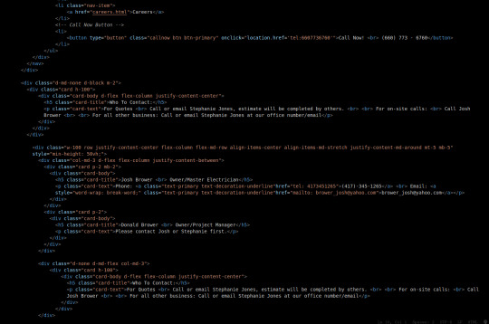
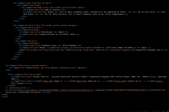
Brower Electric - Commit #6 - Contact Us
This push, I added the Contact Us page.
On Desktop:
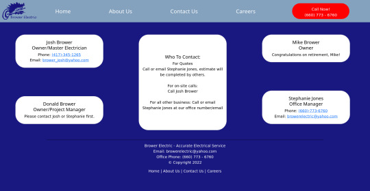
On Mobile:

The HTML:
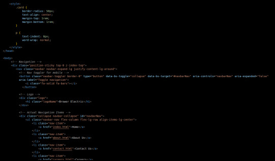
I used some internal CSS in the head tag because I wanted the cards and text on this page to look a little different.
Our nav bar (and this is standard on all pages) is contained in a div that sticks it to the top of the page, even as you scroll. The z-index-top class makes the z index 100 so it overlaps everything.
The rest of the navbar is the same as other pages.
So the first div you see after the nav bar is only visible on medium screens and below. This div contains a card that has been flexed to center it's content. This card is the instruction card for who to contact. On bigger screens, a nearly identical one will appear in the center of the Contact Us grid.
Our Contact Us grid uses Bootstrap rows and cols. The row has a 100% width and a minimum height of 50% of the viewport. It justifies it content to the center of the column on mobile but otherwise it justifies content by the space around in a row. It aligns items center on mobile and stretches them out on other devices. It also has a margin on the top and bottom.
The cols are flex columns that justify their content based on the space between. That's how we get the vertical spacing on desktop.
The cards have some padding and a bottom margin, and the contact links are formatted.
The middle col only contains the who to contact div that reveals on medium devices and up.
The footer is the same as the other pages.
The CSS:
I did not add any external CSS for this page besides the z-index-top class I mentioned earlier. I'm pretty proud of this because it means that I am getting better at utilizing Bootstrap 5 classes.
Conclusion:
I should learn more about Grids. Their responsiveness is powerful because you can manipulate more than one direction at a time but I always find myself using Flexbox tools. Maybe it is because Bootstrap is built on flexbox or more likely because I like my comfort zone. Either way, I need to branch out.
12 notes
·
View notes
Text
Custom item URL’s in Django v3_1
This article explains how to setup custom item URL’s such as /poem-My%20Favorite%Place-1 in order to allow Search Indexes such as Google to get to your website from the root / directory for all the content. I am running a test right now to see if this is more efficient for the Search Indexes or not.
Get the app started in your webserver so you can do changes and check immediately
1. Start the Hyper-V in the Windows Search bar
2. Double click the icon that looks like a screen under the Ubuntu Server 20.04 LTS tab in the middle
3. Login if required
4. Launch the server
5. Change into the ~/OneDrive/code/example.com/git
6. python3.8 manage.py runserver 0:8000
7. Load the site in your browser
8. http://192.168.0.12:8000/
Build the poems app
1. python3.8 manage.py startapp poems
2. Modify the poems/views.py
a. from django.shortcuts import get_object_or_404
b. from .models import Poem
c. def index(request):
d. poems_created = Poem.objects.exclude(hidden=True).order_by('created').reverse()
e. options = {
f. 'poems': poems_created,
g. }
h. return render(request, 'poems/index.html', options)
i.
j. def item(request, poem_id):
k. poem = get_object_or_404(Poem, pk=poem_id)
l.
m. options = {
n. 'poem': poem,
o. 'poem_id': poem_id,
p. }
q. return render(request, 'poems/item.html', options)
3. Add a new directory called templates in the root of the project at the same level as poems
4. Create a file called templates/theme.html
a. {% load static %}
b. <!doctype html>
c. <html lang="en">
d. <head>
e. <title>My Poems</title>
f. <link rel="stylesheet" href="https://stackpath.bootstrapcdn.com/bootstrap/4.5.0/css/bootstrap.min.css" integrity="sha384-9aIt2nRpC12Uk9gS9baDl411NQApFmC26EwAOH8WgZl5MYYxFfc+NcPb1dKGj7Sk" crossorigin="anonymous">
g. <script src="https://stackpath.bootstrapcdn.com/bootstrap/4.5.0/js/bootstrap.bundle.min.js" crossorigin="anonymous"></script>
h. </head>
i. <body class="d-flex flex-column h-100">
j. {% block content %}
k. {% endblock %}
l. </body>
m. </html>
5. Modify the poems/models.py
a. from django.db import models
b.
d. class Poem(models.Model):
e. title = models.CharField(max_length=255)
f. body = models.TextField()
g.
h. def str(self):
i. return self.title
6. Make the migrations and run them
a. python3.8 manage.py makemigrations
b. python3.8 manage.py migrate
7. Create a template for the poems app index page at poems/templates/poems/index.html
a. {% extends 'theme.html' %}
b. {% load static %}
c. {% load poem_tag_extras %}
d. {% block content %}
e. <main role="main" class="flex-shrink-0 pt-2">
f. <div class="container-md">
g. <h1>My Poems</h1>
h. <ul class="list-group">
i. {% for poem in poems %}
j. <li class="list-group-item d-flex justify-content-between">
k. <span class="bold"><a href="{{ poem|poem_item_url:request }}">"{{ poem.title }}"</a></span>
l. </li>
m. {% endfor %}
n. </ul>
o. </div>
p. </main>
q. {% endblock %}
8. Create a template file for each Poem item at poems/templates/poems/item.html
a. {% extends 'theme.html' %}
b. {% load static %}
c. {% load poem_tag_extras %}
d. {% block content %}
e. <main role="main" class="flex-shrink-0 pt-2">
f. <div class="container-md">
g. <h1><a href="/">My Poems</a></h1>
h. <div class="col mb-4">
i. <div class="card h-100 my-2 mx-3">
j. <div class="card-body" id="poem-{{poem.id}}">
k. <a name="poem-{{poem.id}}"></a>
l. <h5 class="card-title">{{ poem.title }}</h5>
m. <div class="card-text">{{ poem.body|linebreaks }}</div>
n. </div>
o. </div>
p. </div>
q. <h4><a href="/#poems">View All Poems</a></h4>
r. </div>
s. </main>
t. {% endblock %}
9. Create a new directory for the custom template tag used in the poems/index.html document at the poems/templatetags/poem_tag_extras.py. Also don’t forget to create a init.py document so it loads the directory properly.
a. from django import template
b. import re
c. import urllib
d. from poems.models import Poem
e.
f. register = template.Library()
g.
h. @register.filter(takes_context=True)
i. def poem_item_url(poem, request):
j. if type(poem) == Poem:
k. poem_id = poem.id
l. poem_title = poem.title
m. else:
n. return False
o.
p. host = request.META['HTTP_HOST']
q.
r. if "inlovelike" in host:
s. host = "https://" + host + "/"
t. else:
u. host = "http://" + host + "/"
v.
w. return host + "poem-" + urllib.parse.quote_plus(poem_title)[:255] + "-" + str(poem_id)
10. Modify the poems/admin.py to include the Poem model
a. from django.contrib import admin
b. from .models import Poem
c.
d. admin.site.register(Poem)
11. Modify your project name’s app urls.py file (Eg. /myapp/myapp/urls.py) so that it includes the shorthand (Eg. /poem-My%Title-1)
a. from django.urls import include, path, re_path
b. from poems import views as poem_views
c.
d. urlpatterns = [
e. …
f. re_path(r'^poem-.*-(?P<poem_id>\d+)$', poem_views.item, name="poem_item"),
h. # path('poems/', include('poems.urls')),
i. ]
12. Create a fixture for the import of some dummy data to play with in the interface at /myapp/fixtures/poems_poem.json
a. [{"model": "poems.poem", "pk": 1, "fields": {"title": "My First Poem", "body": "Here\r\nI\r\nStart"}}, {"model": "poems.poem", "pk": 2, "fields": {"title": "My Second Poem", "body": "This\r\n\Is\r\nA\r\nPoem"}}}]
13. Run the loaddata command to get your content into the database
a. python3.8 manage.py loaddata poems_poem.json
Now here is a project that has poems linked to the nested pages off the root directory of the homepage.
PS. This is live in action on https://inlovelike.com, please do take a look.
PSS. The file paths mentioned now have links to code so you can copy/paste them more simply. I do not have a template yet for Tumblr to create an article. If and when I do, they will be inline code example.
#python3#django3#django#python#poems#poem#programming#tutorial#howto#json#fixtures#urls#regular expressions#regex#bootstrap
0 notes
Text
Forms,Form-validation,FormControl & FromGroup
New Post has been published on https://is.gd/oDoCXw
Forms,Form-validation,FormControl & FromGroup

How to Build a Form,Validation,FormControl,FormGroup in Angular?
Now in our application, we want to create the contact form so we use below ng-cli command to generate all component related data once.
D:\Target Dec-2019\Angular_Application\hello-sagar-jaybhay>ng g c contact-form CREATE src/app/contact-form/contact-form.component.html (27 bytes) CREATE src/app/contact-form/contact-form.component.spec.ts (664 bytes) CREATE src/app/contact-form/contact-form.component.ts (292 bytes) CREATE src/app/contact-form/contact-form.component.css (0 bytes) UPDATE src/app/app.module.ts (1307 bytes)
These are files created by using cli command and added a reference to app.module.ts file.
Now first we build contact form with bootstrap CSS.
<p>contact-form works!</p> <div class="container-fluid" style="width: 50%"> <form> <div class="form-group"> <label for="firstName">First Name</label> <input id="firstName" type="text" class="form-control"> </div> <div class="form-group"> <label for="comment">Comment</label> <textarea id="comment" col=30 rows="10" type="textare" class="form-control"></textarea> </div> <div class="form-group"> <button class="btn btn-primary form-control" >Submit</button> </div> </form> </div>
FormControl
Now we need to add validation for our form elements, so in angular, we have FormControl class by using this we will check the value of field,also field is touched or not touched,is value is dirty or not, is value pristine means value is not changed. So for each input field in the form we need control object.
Tracks the value and validation status of an individual form control. In this FormControl class is inherited from AbstractControl class. This is one of the three fundamental building blocks of Angular forms, along with FormGroup and FormArray. It extends the AbstractControl class that implements most of the base functionality for accessing the value, validation status, user interactions, and events.
FormGroup
All the property of formcontrol class are available to FormGroup class means dirty,value,touched,untouched like properties are present in FormGroup.
A FormGroup aggregates the values of each child FormControl into one object, with each control name as the key. It calculates its status by reducing the status values of its children. For example, if one of the controls in a group is invalid, the entire group becomes invalid.
FormGroup is one of the three fundamental building blocks used to define forms in Angular, along with FormControl and FormArray.
When instantiating a FormGroup, pass in a collection of child controls as the first argument. The key for each child registers the name for the control.
It will send the value is valid or not if all the elements in form are valid else it will give not valid. So accessing properties of FormGroup are easier than accessing all the elements properties are present on that form.

Difference between Reactive Forms in Angular and Template-Driven forms in Angular?
Reactive Forms Template Driven Forms Here we have more control over validation logic. Simple Validation present It is also good for complex forms. It is good for simple forms. It is good for the Unit Test. It is easier to create Less code is required
ngModel
In angular ngModel directive creates the FormControl instance and it will track value, user interaction and also validation status of that respective control. It will keep view sync with the model.
<input ngModel id="firstName" type="text" class="form-control">
It accepts a domain model as an optional Input. If you have a one-way binding to ngModel with [] syntax, changing the value of the domain model in the component class sets the value in the view. If you have a two-way binding with [()] syntax (also known as ‘banana-box syntax’), the value in the UI always syncs back to the domain model in your class.
Now remember ngModel requires name attribute. If you can’t specify the name attribute it will throw an error.
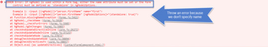
So to avoid this error we simply put name attribute like below.
<input ngModel name="firstName" id="firstName" type="text" class="form-control">
When we add ngModel with name directive on control then angular automatically create an instance of FormControl class and associate with that control.
Now we are going to add change event and for this, we add change event to this input field.
<input ngModel name="firstName" id="firstName" #firstName="ngModel" type="text" (change)="log(firstName)" class="form-control">
To inspect the properties of the associated FormControl (like validity state), export the directive into a local template variable using ngModel as the key (ex: #myVar="ngModel").
#firstName=”ngModel” this is called template variable.
Now you can see below image on change event we get NgModel object.
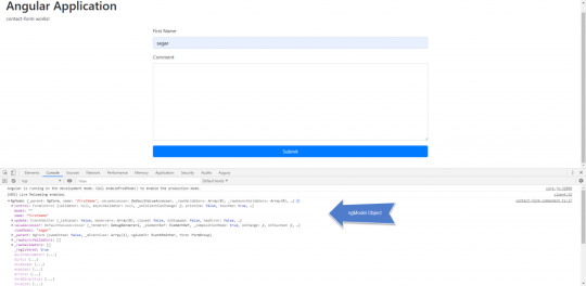
NgModel is an object and below are the properties of that object. And NgModel is the instance of FormControl class.
1. NgModel _parent: NgForm, name: "firstName", valueAccessor: DefaultValueAccessor, _rawValidators: Array(0), _rawAsyncValidators: Array(0), … 1. control: FormControl validator: null, asyncValidator: null, _onCollectionChange: ƒ, pristine: false, touched: true, … 2. model: "" 3. name: "firstName" 4. update: EventEmitter _isScalar: false, observers: Array(0), closed: false, isStopped: false, hasError: false, … 5. valueAccessor: DefaultValueAccessor _renderer: DebugRenderer2, _elementRef: ElementRef, _compositionMode: true, onChange: ƒ, onTouched: ƒ, … 6. viewModel: "sagar" 7. _parent: NgForm submitted: false, _directives: Array(1), ngSubmit: EventEmitter, form: FormGroup 8. _rawAsyncValidators: [] 9. _rawValidators: [] 10. _registered: true 11. asyncValidator: (...) 12. dirty: (...) 13. disabled: (...) 14. enabled: (...) 15. errors: (...) 16. formDirective: (...) 17. invalid: (...) 18. path: (...) 19. pending: (...) 20. pristine: (...) 21. status: (...) 22. statusChanges: (...) 23. touched: (...) 24. untouched: (...) 25. valid: (...) 26. validator: (...) 27. value: (...) 28. valueChanges: (...) 29. __proto__: NgControl
More info on this link-https://angular.io/api/forms/NgModel
Validation Of Input Element
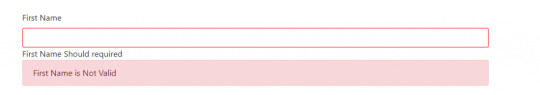
Now if we want to add multiple validation on input field we are added like below.
<label for="firstName">First Name</label> <input minlength="3" required pattern="sagar" ngModel name="firstNames" id="firstName" #firstNames="ngModel" type="text" (change)="log(firstNames)" class="form-control"> <div *ngIf="firstNames.errors?.required">First Name Should required</div> <div *ngIf="firstNames.errors?.minlength">First Name minimum length 3 is required</div> <div *ngIf="firstNames.errors?.pattern">Pattern should match</div> <div class="alert alert-danger" *ngIf="firstNames.touched && !firstNames.valid">First Name is Not Valid</div>
And if validation not matched the output is like below image.

In this we apply html inbuilt validation on control and it is applicable in angular also. So by using errors object we can check the respective validation.
<div *ngIf="firstNames.errors?.required">First Name Should required</div>
So in the above tag in *ngIf we are using firstNames as a template variable and by using that template variable we use errors property of FormControl instance because it creates formcontrol instance why bcoz we use ngModel with name property. If the errors object is not null then it will check the required subfield of that errors object.
Now you want to red the inputbox border to do this we check the CSS and if that all CSS present on that formcontrol we apply style so
.form-control.ng-invalid.ng-touched border: 1px solid red;
This is the style by which we apply red border on input text box. The output of this like below.
Form tag in angular
When angular see <form> tag in Html then angular automatically add ngForm directive to that form.
Ngform have output property ngSubmit. In below html of contact form.
<form #f="ngForm" (ngSubmit)="Submit(f)"> <div class="form-group"> <label for="firstName">First Name</label> <input minlength="3" required pattern="sagar" ngModel name="firstNames" id="firstName" #firstNames="ngModel" type="text" (change)="log(firstNames)" class="form-control"> <div *ngIf="firstNames.errors?.required">First Name Should required</div> <div *ngIf="firstNames.errors?.minlength">First Name minimum length 3 is required</div> <div *ngIf="firstNames.errors?.pattern">Pattern should match</div> <div class="alert alert-danger" *ngIf="firstNames.touched && !firstNames.valid">First Name is Not Valid</div> </div> <div class="form-group"> <label for="comment">Comment</label> <textarea id="comment" ngModel name="comment" #comment="ngModel" col=30 rows="10" type="textare" class="form-control"></textarea> </div> <div class="form-group"> <button class="btn btn-primary form-control" >Submit</button> </div> </form> </div>
In a form tag, we create #f is a template variable and of that form tag we use ngSubmit event for generating the output. Now you can see if we submit that button present on the form the output on a console we get.
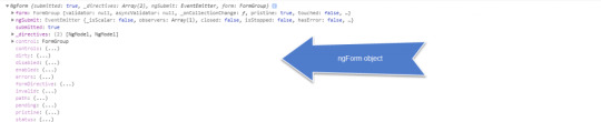
1. NgForm submitted: true, _directives: Array(2), ngSubmit: EventEmitter, form: FormGroup 1. form: FormGroup validator: null, asyncValidator: null, _onCollectionChange: ƒ, pristine: true, touched: false, … 2. ngSubmit: EventEmitter _isScalar: false, observers: Array(1), closed: false, isStopped: false, hasError: false, … 3. submitted: true 4. _directives: (2) [NgModel, NgModel] 5. control: FormGroup 6. controls: (...) 7. dirty: (...) 8. disabled: (...) 9. enabled: (...) 10. errors: (...) 11. formDirective: (...) 12. invalid: (...) 13. path: (...) 14. pending: (...) 15. pristine: (...) 16. status: (...) 17. statusChanges: (...) 18. touched: (...) 19. untouched: (...) 20. valid: (...) 21. value: (...) 22. valueChanges: (...) 23. __proto__: ControlContainer
This is the form object of FormGroup class and has some same properties as the FormControl instance object like ngModel.
In this form object value is JSON object by which we can get value from our form and it is a key-value representation of that form element. Also remember the name we assign is taken into consideration while getting the value.
NgModelGroup
This directive can only be used as a child of NgForm (within <form> tags).
Use this directive to validate a sub-group of your form separately from the rest of your form, or if some values in your domain model make more sense to consume together in a nested object.
Provide a name for the sub-group and it will become the key for the sub-group in the form’s full value. If you need direct access, export the directive into a local template variable using ngModelGroup (ex: #myGroup="ngModelGroup").
In angular, we have two classes to check state of input field and their validity.
FormControl
FormGroup
FormControl:- it will check only one input field like input text box, textarea like that. When we apply ngModel to input field angular create instance of FormControl and associate that with this input field.
FormGroup:- It is used to represent the entire form and also an option we have to make a group within a form. ngForm directive automatically apply to all form element. So this will automatically create formgroup object and associate that with that form. By using this formgroup object we can check the state changes of that form and its validity.
What is the difference between ngModelGroup and ngForm?
In this ngForm have output property ngSubmit by using this we able to submit the form and this property is not present in the ngModelGroup. So ngModelGroup not able to submit the value as a part of a form.
How to disable button till form is completely filled or valid?
<button class="btn btn-primary form-control" [disabled]="!f.valid">Submit</button>
In the above code, we use disabled attribute and in this we check form is valid or not. F is template variable of respective form and it is used to check the validation of all control at once.
ngValue is used to select a complete object.
<option *ngFor="let m of contactMethods" [value]="m.id" [ngValue]="m">m.name</option>
0 notes
Photo

An Introduction to Data Visualization with Vue and D3.js
Web applications are normally data-driven and oftentimes the need arises to visualize this data. That’s where charts and graphs come in. They make it easier to convey information, as well as demonstrate correlations or statistical relationships. Information presented in the form of a chart or a graph is also easier for a non-native speaker to understand.
In this tutorial, we’ll learn how to visualize data in a Vue project. For this, we’ll be using the popular D3.js library, which combines powerful visualization components and a data-driven approach to DOM manipulation.
Let’s get started.
Note: the code for this tutorial can be found on GitHub.
What is D3?
As you can read on the project’s home page, D3.js is a JavaScript library for manipulating documents based on data. D3 helps you bring data to life using HTML, SVG, and CSS. Its emphasis on web standards gives you the full capabilities of modern browsers without tying yourself to a proprietary framework.
Whereas most people will refer to D3.js as a data visualization library, it’s not. D3 is more of a framework comprising different parts — such as jQuery parts (which help us select and manipulate DOM elements), Lodash parts, animation parts, data analysis parts, and data visualization parts.
In this tutorial, we’ll be working with the visualization aspect of D3. The real meat of D3 when visualizing data is:
the availability of functions for decorating data with drawing instructions
creating new drawable data from source data
generating SVG paths
creating data visualization elements (like an axis) in the DOM from your data and methods
What We’ll Be Building
We want to create an app that lets users search for a repo on GitHub, then get a visual representation of issues opened in the past week that are still open. The end result will look like this:

Prerequisites
This tutorial assumes you have a working knowledge of Vue. Previous knowledge of D3.js isn’t required, but if you’d like to get up to speed quickly, you might want to read our D3 by example tutorial.
You’ll also need to have Node installed on your system. You can do this by downloading the binaries for your system from the official website, or using a version manager.
Finally, we’ll be using the following packages to build our app:
Vue CLI — to scaffold out the project
D3.js — to visualize our data
Lodash — which provides a handful of utility methods
Moment JS — for date and time formatting
axios — an HTTP client to help us make requests to an external API
New Vue Project
I prefer creating new Vue projects using Vue CLI. (If you’re not familiar with Vue CLI, our beginner’s guide in this Vue series gives a full introduction.) Vue CLI provides a nice folder structure for placing different sections of the code, such as styles, components, and so on.
Make sure that the CLI is installed on your machine:
npm install -g @vue/cli
Then create a new project with the following command:
vue create issues-visualization
Note: while creating a new project using Vue CLI, you’ll be prompted to pick a preset. For this particular project, we’ll just stick with the default (Babel + ESLint).
Once our new Vue project has been created, we cd into the project folder and add the various node modules we’ll need:
npm install lodash d3 axios moment
Even though this is a simple app that doesn’t have many running parts, we’ll still take the components approach instead of dumping all the code inside the App.vue file. We’re going to have two components, the App component and a Chart component that we’re yet to create.
The App component will handle fetching data from GitHub, then pass this data to the Chart component as props. The actual drawing of the chart will happen inside the Chart component. Structuring things this way has the advantage that, if you want to use a library other than axios to fetch the data, it’ll be easier to swap it out. Also, if you want to swap D3 for a different charting library, that’ll be easier too.
Building the Search Interface
We’ll start by building a search interface that lets users enter the name of the repo they want to see visualized.
In src/App.vue, get rid of everything inside the <template> tag and replace the content with this:
<template> <div id="app"> <form action="#" @submit.prevent="getIssues"> <div class="form-group"> <input type="text" placeholder="owner/repo Name" v-model="repository" class="col-md-2 col-md-offset-5" > </div> </form> </div> </template>
Here we have a form which, upon submission, prevents the browser’s default submission action, then calls a getIssues method that we’re yet to define. We’re also using a v-model directive to bind the input from the form to a repository property inside the data model of our Vue instance. Let’s declare that property repository as an empty string. We’ll also add a startDate property, which we’ll later use as the first date in our time range:
import moment from "moment"; import axios from "axios"; export default { name: "app", data() { return { issues: [], repository: "", startDate: null }; }, methods: { getIssues() { // code goes in here } } };
Now on to creating the getIssues method:
getIssues() { this.startDate = moment() .subtract(6, "days") .format("YYYY-MM-DD"); axios .get( `https://api.github.com/search/issues?q=repo:${this.repository}+is:issue+is:open+created:>=${this.startDate}`, { params: { per_page: 100 } } ) .then(response => { const payload = this.getDateRange(); response.data.items.forEach(item => { const key = moment(item.created_at).format("MMM Do YY"); const obj = payload.filter(o => o.day === key)[0]; obj.issues += 1; }); this.issues = payload; console.log(this.issues); }); }
In the above block of code, we start by setting the startDate data property to six days ago and formatting it for use with the GitHub API.
We then use axios to make an API request to GitHub to get all issues for a particular repository that were opened in the past week and that are still open. You can refer to GitHub’s search API if you need more examples on how to come up with query string parameters.
When making the HTTP request, we set the results count to 100 per page (the max possible). There are hardly any repositories with over 100 new issues per week, so this should be fine for our purposes. By default, the per_page value is 30.
If the request completes successfully, we use a custom getDateRange method to initialize a payload variable that we will be able to pass to the Chart component. This payload is an array of objects that will like so:
[ {day: "Dec 7th 18", issues: 0}, {day: "Dec 8th 18", issues: 0}, {day: "Dec 9th 18", issues: 0}, {day: "Dec 10th 18", issues: 0}, {day: "Dec 11th 18", issues: 0}, {day: "Dec 12th 18", issues: 0}, {day: "Dec 13th 18", issues: 0} ]
After that, we iterate over the API’s response. The data we’re interested in is in an items key on a data property on the response object. From this, we take the created_at key (which is a timestamp) and format it as the day property in our objects above. From there, we then look up the corresponding date in the payload array and increment the issues count for that date by one.
Finally, we assign the payload array to our issues data property and log the response.
Next, let’s add in the getDateRange method:
methods: { getDateRange() { const startDate = moment().subtract(6, 'days'); const endDate = moment(); const dates = []; while (startDate.isSameOrBefore(endDate)) { dates.push({ day: startDate.format('MMM Do YY'), issues: 0 }); startDate.add(1, 'days'); } return dates; }, getIssues() { ... } }
Before we get to the visualization bit, let’s also log any errors we might encounter when making our request to the console (for debugging purposes):
axios .get( ...) .then(response => { ... }) .catch(error => { console.error(error); });
We’ll add some UX for informing the user in the case that something went wrong later.
So far, we have an input field that lets the user enter the organization/repository name they wish to search issues for. Upon form submission, all issues opened in the past one week are logged to the console.
Below is an example of what was logged on the console for the facebook/react repo:

If you start up the Vue dev server using npm run serve and enter some different repos, you should see something similar. If you’re stuck for inspiration, check out GitHub’s Trending page.
Next comes the fun bit — visualizing this data.
Drawing a Bar Chart Using D3
Earlier on, we mentioned that all the drawing will be handled inside a Chart component. Let’s create the component:
touch src/components/Chart.vue
D3 works on SVG elements, and for us to draw anything with D3, we need to have an SVG element on the page. In our newly created component (src/components/Chart.vue), let’s create an SVG tag:
<template> <div> <svg></svg> </div> </template>
For this particular tutorial, we’ll visualize our data using a bar chart. I picked a bar chart because it represents a low complexity visual element while it teaches the basic application of D3.js itself. The bar chart is also a good intro to the most important D3 concepts, while still having fun!
Before proceeding, let’s update our App component to include the newly created Chart component below the form:
<template> <div id="app"> <form action="#" @submit.prevent="getIssues"> ... </form> <chart :issues="issues"></chart> </div> </template>
Let’s also register it as a component:
import Chart from './components/Chart.vue'; export default { name: "app", components: { Chart }, ... }
Notice how we’re passing the value of the issues data property to the Chart component as a prop:
<chart :issues="issues"></chart>
Let’s now update our Chart component to make use of that data:
<script> import * as d3 from "d3"; import _ from "lodash"; export default { props: ["issues"], data() { return { chart: null }; }, watch: { issues(val) { if (this.chart != null) this.chart.remove(); this.renderChart(val); } }, methods: { renderChart(issues_val) { // Chart will be drawn here } } }; </script>
In the above code block, we’re importing D3 and Lodash. We then instantiate a chart data property as null. We’ll assign a value to this when we start drawing later on.
Since we want to draw the chart every time the value of issues changes, we’ve created a watcher for issues. Each time this value changes, we’ll destroy the old chart and then draw a new chart.
Drawing will happen inside the renderChart method. Let’s start fleshing that out:
renderChart(issues_val) { const margin = 60; const svg_width = 1000; const svg_height = 600; const chart_width = 1000 - 2 * margin; const chart_height = 600 - 2 * margin; const svg = d3 .select("svg") .attr("width", svg_width) .attr("height", svg_height); }
Here, we set the height and width of the SVG element we just created. The margin attribute is what we’ll use to give our chart some padding.
D3 comes with DOM selection and manipulation capabilities. Throughout the tutorial, you’ll see lot’s of d3.select and d3.selectAll statements. The difference is that select will return the first matching element while selectAll returns all matching elements.
The post An Introduction to Data Visualization with Vue and D3.js appeared first on SitePoint.
by Christopher Vundi via SitePoint https://ift.tt/2KdTjHU
0 notes
Text
NEWSPLUS V3.4.3 - NEWS AND MAGAZINE WORDPRESS THEME

A multi purpose magazine WordPress theme for online newspaper, news, blog and editorial ventures.
NewsPlus is an excellent choice for e magazine, online newspaper, travel blog, food recipe blog, fashion magazine, personal blog or editorial and review websites. It comes with built in style support for plugins like BuddyPress, bbPress forum, WooCommerce, TablePress, WPML and many more. NewsPlus encompasses clean and modern design, backed with best SEO practices, fast pagespeed scores, schema microdata and well optimized code. This all purpose magazine WordPress theme supports advertisement spots in best locations of page and posts which helps you make good revenue from Google AdSense and similar services. Choose your demo


Full feature list of NewsPlus magazine WordPress theme
Design Fully responsive, optimized for retina display Boxed / Stretched layout Dynamic layout width (choose between 800px to 1600px) WordPress customizer integration for theme colors and accents Global sidebar placement as left or right Unlimted Google Fonts for headings, site body and navigation menu Customizable colors for post shortcode headings, text and links Pages Drag and drop page builder by King Composer page builder plugin 20 prebuilt Home page layouts included for page builder in XML format Custom page options panel per page Sidebar placement as left, right or none per page (using page templates) Two sidebars layout option Exclusive widget areas for header and sidebar per page Header 4 header layout styles (default, three col, full width and slim menu) Sticky navbar for main menu and top menu (Sticky option can be disabled from theme options) Custom site title and logo image (show logo as text or image) Collapsible responsive menu Simple and easy-to-use megamenu using class names (Supports up to 6 columns) jQuery powered multi-level wordpress menu jQuery News Ticker (Can be added via theme options or shortcode) Archives 5 global archive styles (gird, list, classic, full post and Material card) 3 grid style archive templates 4 page templates for blog Image resize on-the-fly using BFI Thumb via theme options Image quality can be set from theme options(useful for serving scaled images at optimized quality) Post Modules Powerful and easy to use post shortcodes All post shortcodes shipped as King Composer Addon Insert posts in 10+ different styles. (Featured grid, 1 columnar, 2 columnar, 3 columnar, 4 columnar, vertical big list, small list, tiled grid, material card, etc.) Show posts as jQuery slideshow or carousel Query posts from category, tags, selective page or post IDs, custom post types, custom taxonomy, etc. Enable/disable post meta or post excerpt per shortcode Control excerpt length by characters or words Order posts by date, random, title, author, most commented, etc. Use any where within pages or text widgets Supports showing posts from multi site blog Image resize per shrotcode instance Built in style support for Post Views Counter and WP Review RTL and Multi lingual Translation ready with .pot template file and sample .po and .mo files included Supports languages with rtl orientation Fully compatible with WPML, WCML and qTranslate-x Single Posts Sidebar enabled or full width posts Full width header title – New Automated featured images per post (can be disabled from theme options) Video and gallery post formats Social sharing counters per post (Twitter, Facebook, LinkedIn, Google+, Pinterest, vKontakte, yandex, reddit) Inline advertisement areas per post (before and after main content) Related posts based on category or tags (can be disabled per post) Author bio with avatar and description Multi level nested comments with gravatar support Advertisement Posts – NEW Set any post as “Sponsored” advertisement post Custom advertisement label per post Global advertisement label for all ad posts in archives Custom content background per post or page Widget Areas 1 top widget area 2 fixed/floating widget areas in left and right side 1 header widget area (for logo + banner style layout) 3 header widget areas (for three columnar header layout) 2 global widget areas before and after main content 1 sidebar widget area Up to 6 secondary widget columns before footer (Number of columns can be set from theme options) 6 custom widgets (flickr, social icons, recent posts, popular posts, custom categories and mini folio) SEO support Optimized for SEO and schema microdata Semantic and heirarchical markup Dynamic heading tags for site title/logo Internal links on single posts via related posts Supports Yoast SEO plugin Miscellaneous features Recipe Generator Addon worth $16 included with the theme ajax/php contact page template with form validation Built in style support for contact form 7 plugin Flexslider and carousel for posts and HTML content prettyPhoto lightbox Fontawesome 4.7 icon library included Easy addition of Google fonts via theme options Social icons widget with built in brand color styles for 25+ icons WordPress Custom background supported WordPress site icon (favicon) supported Valid HTML5 markup on theme generated data Supported on all modern browsers, IE 9 and above Pre configured Child theme included in main download Step by step documentation guide and help manual for theme installation and setup Filter and action hooks applied wherever possible and required Sample site data included in XML format Performs well in pagespeed tests. Performance can be further improved by serving resized images Theme developed on WordPress 4.5+, php 5.5.12 to 7.0 and MySQL 5.6.17 Update log = April 20, 2019 - v3.4.3 = * Fixed: Undefined function newsplus_short_by_word() when using word length in archives = March 29, 2019 - v3.4.2 = * Updated CSS styling for gallery shortcode when used with Classic Editor plugin = Feb 21, 2019 - v3.4.1 = * Fixed: php error for newsplus_share_btns() on single post * Fixed: Show share buttons container only if some buttons are selected in theme options = Feb 06, 2019 - v3.4.0 = * NewsPlus Shortcodes Plugin update - Converted all standalone functions to class based static methods * Removed visual shortcode buttons for TinyMCE editor = Jan 01, 2019 - v3.3.1 = * Added new title header style for single posts - Show post title with featured image as background - See Theme Options > Single Post > Post Title Header > Full Width Overlay * Tweaked post update date and time for single posts - Show publish time along with the date - Inherit date and time format as set inside Settings > General - Show only updated time if the post was updated on same day - Show only publish date if the post was never updated - Show both publish date/time and updated date/time if the post was updated next day or later - Added labels "Published" and "Updated" for single posts date meta * Fixed: Removed rel nofollow from ad posts = Nov 21, 2018 - v3.3.0 = * Added full width post title option for single posts - See Theme Options > Single > Post Title Header * Added "Updated date" post meta on single posts * Added support and CSS styles for Media Gallery Widget * Added rel nofollow and target _blank for advertisement post links in archives * Added new color scheme "Charcoal" - See Theme Options > General > Color Scheme * Typography and style improvements * Fixed: Advertisement post label margin and full width on single post * Fixed: WP Color Picker JS file missing in Theme Options = Oct 20, 2018 - v3.2.4 = * Fixed: z-index of search form in main navigation bar to show above menu items * Fixed: Undefined index 'handler' in page options * Fixed: Empty Google Fonts API call when no font was specified in theme options * Added: Filter for overriding Google fonts list in child theme - See FAQ of documentation file for more details = Oct 08, 2018 - v3.2.3 = * Removed pre built templates as php package from King Composer - This is because of a bug in King Compser "The section does not exist or has been removed" (https://wordpress.org/support/topic/error-the-section-does-not-exist-or-has-been-removed/) - Due to lack of response from King Composer authors, this functionality needed to be removed - The pages can now be loaded using direct XML import of WordPress = July 24, 2018 - v3.2.2 = * Updated dummy data export files to latest ones. (See dummy_data folder of main download) * Removed "Food" package from pre built templates option of King Composer. (Use XML import via WordPress importer in Tools > Import) - The recent versions of King Composer are unable to handle multiple packages in prebuilt templates option. So one of them is removed. * Fixed checkbox styling for comment form after GDPR update of WordPress * Ensured compliance with EU GDPR rules - No personal data is stored or sent via theme except built in contact form - The built in contact form sends user email and comment to your email address which can be deleted upon user request - The theme doesn't use cookies or session storage. (You may need to show cookies notice if used by third party plugins) - If you find any compliance issue, please report it to me via comments section so that I can fix it. = April 22, 2018 - v3.2.1 = * Changed "ad" name prefix so that Ad Blocker doesn't block advertisement posts * Added color picker option for changing colors of ad label and background (See Theme Options > Archives) = April 09, 2018 - v3.2.0 = * Added advertisement posts concept - Set any post as advertisement post (See Post Options > Set this post as advertisement post) - Provide custom advertisement label for single post (See Post Options) - Provide custom content background per advertisement post or page (See Post Options) - Add global advertisement label for ad posts in archives (See Theme Options > Archives ) - Advertisement posts supported in all archives and post shortcodes * Added JavaScript popup for social sharing buttons in single posts * Updated Reference Daily Intake values for Nutrition Table as per 2018 data * Fixed category listing in King Composer for WPML = March 03, 2018 - v3.1.7 = * Added option for opening links in new tab in "NewsPlus Social Links" Widget * Added option for changing gutter width for main content and sidebar. (Appearance > Theme Options > General > Gutter width) * Improved related posts display style with smaller heading size and less gutter * Updated theme compatibility with WooCommerce 3.3.x - Supports WooCommerce 3.3 Product column, image resize, products per row, etc. - All customizer settings supported inside Appearance > Customize > WooCommerce = Dec 01, 2017 - v3.1.6 = * Change the modified date format to ISO 8601 format in NewsPlus Shortcodes = Nov 29, 2017 - v3.1.5 = * Fixed: Backward compatibility on some functions for php versions less than 5.5 = Nov 21, 2017 - v3.1.4 = * Fixed: php error in recipe template file * Fixed: Recipe method heading not changing when text changed in King Composer UI = Nov 14, 2017 - v3.1.3 = * Fixed: Replaced hard coded http protocol with SSL checked protocol = Nov 07, 2017 - v3.1.2 = * Changed dateModified Schema value to ISO 8601 format * Fixed: php notice in single post sharing buttons when no sharing buttons selected = Oct 23, 2017 - v3.1.1 = * Fixed: Empty customizer.css call when customizer is chosen for color scheme * Fixed: https protocol for schema * Fixed: Deprecated WooCommerce cart functions updated with latest ones July 27, 2017 - v3.1.0 = * Added Google fonts select menu for site body, headings and main menu (See Theme Options > Custom Fonts) * Added Social Sharing per post in archives (See Theme Options > Archives > Social Sharing ) * Added new Title element with different styles like Flag, bar, button, etc. (See "NewsPlus Title" element inside King Composer elements library) * Added Google fonts and font styling options for post modules (See "Styling" tab in post module elements) * Added color options for post headings, category links, excerpt and meta. (See "Styling" tab in post module elements) * Added 'overlay' display style for main post module element (See "Display" tab's "Display Style" field in post module element) * Fixed: Added number restriction 999 in get_terms to prevent memory limit issues * Fixed: Whatsapp sharing button shows 404 error Apr 07, 2017 - v3.0.2 = * Added compatibility for WooCommerce 3.0+ * Added single product gallery slider, swipe and zoom features Read the full article
0 notes
Quote
Blogger is very robust and easy to operate CMS platform, you don’t have to be a geek to operate the dashboard or settings. But with easiness, there comes some limitations, By default you can’t create a Contact us page, you have to either you have to use any third party plugin or have to tweak blogger’s official contact widget, so that it can work on static pages. Creating a separate page for contact purpose is very professional and also makes your blog clean by hiding unnecessary widgets and plugins So, Lets move further and see How to create Contact Us page in Blogger. Also Check :- How to Customize Contact From Widget In BloggerFirst Step (Important)Before following the below tutorial we recommend you to install the contact form widget in your blog, it is very easy process and can be done in minutes, with simple click. We have published a tutorial earlier, so you won’t face any difficulties. Please follow How To Add Contact Form Widget In Blogger And Blogspot Blogs.Hiding The widget ( Adding CSS ) Before Editing we recommend you to make a backup of your template, so that anything goes wrong you still have your blog design safe.The First thing you need to do is to login into your Blogger account and go to >> Templates >> Edit HTML and search for the ending ]]> tag and just above it paste the following code..sidebar .widget.ContactForm display: none!important;Creating A Page ( Adding HTML ) Before Editing we recommend you to make a backup of your template, so that anything goes wrong you still have your blog design safe.The First thing you need to do is to login into your Blogger account and go to >> Templates >> Edit HTML and search for the ending ]]> tag and just above it paste the following code.#contact background-color:#fff; margin:30px 0 !important#contact .contact-form-widget max-width:100% !important#contact .contact-form-name,#contact .contact-form-email,#contact .contact-form-email-message background-color:#FFF; border:1px solid #eee; border-radius:3px; padding:10px; margin-bottom:10px !important; max-width:100% !important#contact .contact-form-name width:47.7%; height:50px#contact .contact-form-email width:49.7%; height:50px#contact .contact-form-email-message height:150px#contact .contact-form-button-submit max-width:100%; width:100%; z-index:0; margin:4px 0 0; padding:10px !important; text-align:center; cursor:pointer; background:#27ae60; border:0; height:auto; -webkit-border-radius:2px; -moz-border-radius:2px; -ms-border-radius:2px; -o-border-radius:2px; border-radius:2px; text-transform:uppercase; -webkit-transition:all .2s ease-out; -moz-transition:all .2s ease-out; -o-transition:all .2s ease-out; -ms-transition:all .2s ease-out; transition:all .2s ease-out; color:#FFF#contact .contact-form-button-submit:hover background:#2c3e50#contact .contact-form-email:focus,#contact .contact-form-name:focus,#contact .contact-form-email-message:focus box-shadow:none !important ConclusionCongrats !! You have made it. now you have learned that How to create Contact Us page in Blogger Visit your blog and check the awesome widget live in action, This is the Part -III of the Tutorial, Hope you liked this tutorial, if you enjoyed then please share it with your friends, we are working hard to develop more such awesome widgets please stay tuned with Us. Vaarwel !! (Goodbye in Dutch!! hahaha).
http://www.globalone.com.np/2019/11/how-to-create-contact-us-page-in-blogger.html
0 notes
Text
admin_insert_member.jsp
<%@ page language="java" contentType="text/html; charset=UTF-8" pageEncoding="UTF-8"%> <!DOCTYPE html PUBLIC "-//W3C//DTD HTML 4.01 Transitional//EN" "http://www.w3.org/TR/html4/loose.dtd"> <html style="height: 100%;"> <head> <meta charset="UTF-8"> <title>FMBA</title> <!-- To ensure proper drawing and touchscreen scaling, The Bootstrap required to add a viewport metadata tag to <head>. --> <meta name="viewport" content="width=device-width, initial-scale=1">
<!-- Bootstrap core CSS file --> <link rel="stylesheet" type="text/css" href="${pageContext.request.contextPath}/css/bootstrap.css" /> <link rel="stylesheet" type="text/css" href="${pageContext.request.contextPath}/css/bootstrap-select.min.css" />
<!-- JQuery file --> <script type="text/javascript" src="${pageContext.request.contextPath}/js/jquery-1.11.0.js"></script>
<!-- Bootstrap core JavaScript file --> <script type="text/javascript" src="${pageContext.request.contextPath}/js/bootstrap.min.js"></script> <script type="text/javascript" src="${pageContext.request.contextPath}/js/bootstrap-select.min.js"></script> <!--JQuery UI--> <link rel="stylesheet" type="text/css" href="${pageContext.request.contextPath}/css/jquery-ui.min.css" /> <script type="text/javascript" src="${pageContext.request.contextPath}/js/jquery-ui.min.js"></script> <!--CSS--> <link rel="stylesheet" type="text/css" href="${pageContext.request.contextPath}/css/general.css" /> <link rel="stylesheet" type="text/css" href="${pageContext.request.contextPath}/css/admin-menu.css" /> <link rel="stylesheet" type="text/css" href="${pageContext.request.contextPath}/css/content-area-admin.css" /> <script type="text/javascript"> $(function() { var thumbnail = document.getElementById('Thumbnail'); var container = document.getElementById('ThumbnailContainer'); thumbnail.style.visibility = 'hidden'; container.style.display = 'none'; });
function previewFile() { var thumbnail = document.getElementById('Thumbnail'); var container = document.getElementById('ThumbnailContainer'); var file = document.getElementById('imgupload').files[0]; var reader = new FileReader();
reader.onloadend = function() { thumbnail.src = reader.result; }
if(file) { thumbnail.style.visibility = 'visible'; container.style.display = 'block'; reader.readAsDataURL(file); } else { thumbnail.style.visibility = 'hidden'; container.style.display = 'none'; thumbnail.src = ""; } } </script> </head> <body style="height: 100%;"> <div class="container-fluid element-height"> <div class="row element-height"> <div class="col-md-2 element-height admin-menu"> <div class="img-container2"><img class="adminPhoto" src="#" /></div> <p class="admin-name">Administrator</p> <p class="admin-title">Administrator</p> <!-- find by condition --> <div class="search-area"> <form action="${pageContext.request.contextPath}/admin/adminQueryResult.action" method="post"> <h4 class="search-area-subtitle">NAME:</h4> <input class="findByNameInput" type="text" name="name" placeholder="Search..."> <h4 class="search-area-subtitle">CLASS:</h4> <select class="select-1" name="memberClass"> <option value="" selected="selected">Please choose the class</option> <option value="class 1 of 2017">class 1 of 2017</option> <option value="class 2 of 2017">class 2 of 2017</option> <option value="class 3 of 2017">class 3 of 2017</option> <option value="class 4 of 2017">class 4 of 2017</option> <option value="class 1 of 2018">class 1 of 2018</option> <option value="class 2 of 2018">class 2 of 2018</option> <option value="class 3 of 2018">class 3 of 2018</option> <option value="class 4 of 2018">class 4 of 2018</option> <option value="class 1 of 2019">class 1 of 2019</option> <option value="class 2 of 2019">class 2 of 2019</option> <option value="class 3 of 2019">class 3 of 2019</option> </select> <button class="button-1" type="submit">Query</button> </form> </div> <a class="admin-menu-button" href="mainPage.action?num=1">Return to the main system</a> <a class="admin-menu-button" href="logout.action">Log Out</a> </div> <div class="col-md-10 element-height right-content-area-admin"> <form action="${pageContext.request.contextPath}/admin/insertMember.action" enctype="multipart/form-data" method="post"> <div class="edit-member-content"> <h2 class="title-module"><b>ADD A NEW MEMBER</b></h2> <div class="member-photo-module"> <div id="ThumbnailContainer" class="img-container1"><img id="Thumbnail" class="member-photo-1" src=""></div> <div class="photo-button-module"> <a href="javascript:;" class="a-upload"><input id="imgupload" type="file" name="pictureFile" onchange="previewFile()" accept="image/*">Add photo</a><span>The size of the image is 180px (width) * 320px (height)</span> </div> </div> <div class="edit-member-info-module"> <ul class="col"> <li> <p>Name</p> <input name="name" type="text" /> </li> <li> <p>Gender</p> <select class="selectpicker select-2" data-size="5" name="gender"> <option value ="male">Male</option> <option value ="female">Female</option> </select> </li> <li> <p>Constellation</p> <select class="selectpicker select-2" data-size="5" name="constellation"> <option value="aquarius">Aquarius</option> <option value="pisces">Pisces</option> <option value="aries">Aries</option> <option value="taurus">Taurus</option> <option value="gemini">Gemini</option> <option value="cancer">Cancer</option> <option value="leo">Leo</option> <option value="virgo">Virgo</option> <option value="libra">Libra</option> <option value="scorpio">Scorpio</option> <option value="sagittarius">Sagittarius</option> <option value="capricorn">Capricorn</option> </select> </li> <li> <p>Hobby</p> <select class="selectpicker select-2" data-size="5" name="hobby"> <option value="outdoorsports">Outdoor sports</option> <option value="music">Music</option> <option value="fitness">Fitness</option> <option value="painting">Painting</option> <option value="dancing">Dancing</option> <option value="games">Games</option> <option value="other">Other</option> </select> </li> <li> <p>Nationality</p> <select class="selectpicker select-2" data-size="5" name="nationality"> <option value="Han">Han</option> <option value="Zhuang">Zhuang</option> <option value="Manchu">Manchu</option> <option value="Hui">Hui</option> <option value="Miao">Miao</option> <option value="Uighur">Uighur</option> <option value="Yi">Yi</option> <option value="Tujia">Tujia</option> <option value="Mongol">Mongol</option> <option value="Tibetan">Tibetan</option> <option value="Buyi">Buyi</option> <option value="Dong">Dong</option> <option value="Yao">Yao</option> <option value="Korean">Korean</option> <option value="Bai">Bai</option> <option value="Hani">Hani</option> <option value="Li">Li</option> <option value="Kazakh">Kazakh</option> <option value="Dai">Dai</option> <option value="Naxi">Naxi</option> <option value="Russian">Russian</option> <option value="Taiwanese aborigine">Taiwanese aborigine</option> <option value="Hezhen">Hezhen</option> <option value="Others">Others</option> </select> </li> <li> <p>Resident address</p> <select class="selectpicker select-2" data-size="5" name="address"> <option value="Beijing">Beijing</option> <option value="Shanghai">Shanghai</option> <option value="Guangzhou">Guangzhou</option> <option value="Shenzhen">Shenzhen</option> <option value="Tianjin">Tianjin</option> <option value="Hangzhou">Hangzhou</option> <option value="Wuhan">Wuhan</option> <option value="Chengdu">Chengdu</option> <option value="Others">Others</option> </select> </li> <li> <p>E-mail</p> <input name="email" type="text" /> </li> </ul> <ul class="col"> <li> <p>Class</p> <select class="selectpicker select-2" data-size="5" name="memberClass"> <option value="class 1 of 2017">class 1 of 2017</option> <option value="class 2 of 2017">class 2 of 2017</option> <option value="class 3 of 2017">class 3 of 2017</option> <option value="class 4 of 2017">class 4 of 2017</option> <option value="class 1 of 2018">class 1 of 2018</option> <option value="class 2 of 2018">class 2 of 2018</option> <option value="class 3 of 2018">class 3 of 2018</option> <option value="class 4 of 2018">class 4 of 2018</option> <option value="class 1 of 2019">class 1 of 2019</option> <option value="class 2 of 2019">class 2 of 2019</option> <option value="class 3 of 2019">class 3 of 2019</option> </select> </li> <li> <p>Industry</p> <select class="selectpicker select-2" data-size="5" name="industry"> <option value="Education">Education</option> <option value="Financial">Financial</option> <option value="Internet">Internet</option> <option value="Ecommerce">Ecommerce</option> <option value="Advertising">Advertising</option> <option value="Media">Media</option> <option value="Trading">Trading</option> <option value="Telecommunications">Telecommunications</option> <option value="Transportation">Transportation</option> <option value="Logistics">Logistics</option> <option value="Medical">Medical</option> <option value="Government">Government</option> <option value="Others">Others</option> </select> </li> <li> <p>Company</p> <input name="company" type="text" /> </li> <li> <p>Job</p> <input name="job" type="text" /> </li> <li> <p>Worked</p> <input name="worked" type="text" /> </li> <li> <p>Wechat</p> <input name="wechat" type="text" /> </li> <li> <p>Password</p> <input name="password" type="password" /> </li> </ul> <ul class="col-last"> <li> <p>Birthday</p> <input name="birthday" type="text" placeholder="FORMAT: YYYY-MM-DD" /> </li> <li> <p>Functional scope</p> <textarea name="fs" rows="3" cols="20"></textarea> </li> <li> <p>Honors</p> <textarea name="honors" rows="3" cols="20"></textarea> </li> <li> <p>Personal profile</p> <textarea name="profile" rows="3" cols="20"></textarea> </li> </ul> <div style="clear: both;"></div> </div> <div class="button-module"> <input type="submit" value="SUBMIT" /> </div> </div> </form> </div> </div> </div> </body> </html>
0 notes
Text
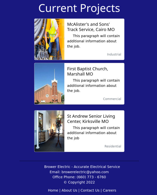
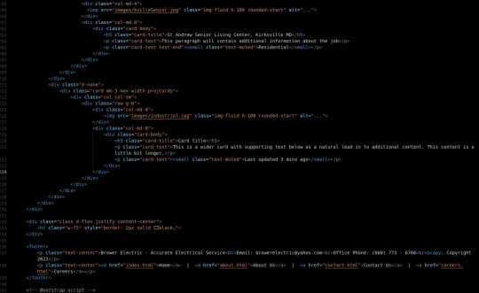
Brower Electric - Commit #4 - Current Project Cards
This commit (or series of commits), I built the current project cards and the small footer on the bottom of the page, as well as some minor changes for typos and such.
On Desktop:

On Mobile:

(If you're viewing this post on desktop, sorry about the image quality here)
In Between:
The HTML:
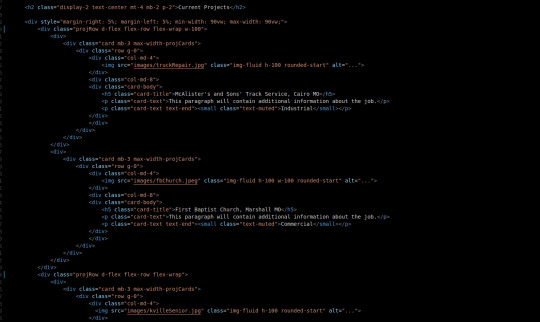
Our Current projects will be contained in a div that is always 90vw wide with 5% margins on either side.
Originally, I wanted to keep everything in a Bootstrap Grid, but they occupy the space between CSS Tables/Grids and Flexboxes. For this particular situation, Flexboxes will be the best utility because the justify-content-between tool sounds like it will be useful for the way I want the responsiveness to work.
There are currently 2 projRow divs with 2 unstyled "col" divs in each that contain one bootstrap card.
The rows are flexed with flex wrap enabled and they take up 100% the width of their parent section.
The cards are the basic Bootstrap 5 card components. They use a grid and have several pre-made breakpoints in the cards and pre-styled classes for card content.
The max-width-projCards helps me control the width of the cards.
We have a div that centers its content. It contains an <hr> (horizontal line) tag that is 75% the width of the page and has a 2px black border.
Then we have our footer. 2 centered <p> tags one has the footer paragraph with <br> tags separating the lines. One is a simple footer nav.
The CSS:
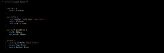
I did not write much custom CSS here. I changed the card-text to black since my default <p> color is white. The title also got some styling to match the page.
The .max-width-projCards sets the max width to 100% of the viewport. But by default it is 500px.
The projRow contains that space around justify content thing I was talking about earlier. It keeps all the divs organized equally apart.
Conclusion:
This commit, I learned more about the peculiarities of the Bootstrap Grid and a situation where a more traditional flex-box is appropriate. I think it is important that I learn more about these core code-design decisions as I improve in my skills as a developer.
You can visit the site's github repository here: https://github.com/Xacheri/BrowerElectric
6 notes
·
View notes
Text
HOW TO CREATE A LANDING PAGE WITH BOOTSTRAP 4?
Bootstrap 4 is currently the most popular front-end framework in the world. You can use it to build any kind of user interfaces, from admin templates to full-featured websites. In this step-by-step tutorial, we will have a look at how to build a responsive landing page with Bootstrap 4. You can even use it as a homepage or connect it to a specific marketing campaign.
Get to know more office.com/setup
The landing page we will build will have five sections:
a fixed navigation bar, a hero section, a three-column “Services�� section, a full-width “Contact” section, and a footer. However, following the same logic, you can create other sections for testimonials, blog excerpts, and other content types, too. Here’s how the final landing page will look like:
1. SET UP BOOTSTRAP 4 There are a couple of ways of getting started with Bootstrap 4. You can:
download the compiled CSS and JavaScript and add it to your HTML page, set up Bootstrap 4 using your own pipeline (choose this if you want to edit Sass files), use the CDN version of the compiled CSS and JavaScript. In our example, we will use the first method. Add the minified CSS file to the <head> section of your HTML page and the JavaScript file right before the closing <body> tag. As all Bootstrap 4 plugins depend on jQuery, you also need to include jQuery before the minified Bootstrap script.
Here’s the starter HTML with the compiled CSS and JavaScript files and style.css file for the custom CSS:
<!DOCTYPE html> <html lang="en"> <head> <meta charset="utf-8"> <meta name="viewport" content="width=device-width, initial-scale=1"> <title>Bootstrap Landing Page by Developer Drive</title>
<link href="css/bootstrap.min.css" rel="stylesheet"> <link href="css/style.css" rel="stylesheet">
</head>
<body>
<!-- Here comes the rest of the code -->
<script src="scripts/jquery.min.js"></script> <script src="scripts/bootstrap.bundle.min.js"></script> </body> </html> 2. CREATE THE NAVIGATION BAR Bootstrap 4 comes with an awesome pre-designed navigation bar component that lets you add a responsive menu to your landing page with just a few lines of HTML. Insert the following code into the <body> section of your HTML file:
<nav class="navbar navbar-expand-lg navbar-light bg-light fixed-top"> <div class="container"> <a class="navbar-brand" href="#">Hello Consultancy</a> <button class="navbar-toggler" type="button" data-toggle="collapse" data-target="#navbarSupportedContent" aria-controls="navbarSupportedContent" aria-expanded="false" aria-label="Toggle navigation"> <span class="navbar-toggler-icon"></span> </button>
<div class="collapse navbar-collapse" id="navbarSupportedContent"> <ul class="navbar-nav ml-auto"> <li class="nav-item active"> <a class="nav-link" href="#">Home <span class="sr-only">(current)</span> </a> </li> <li class="nav-item"> <a class="nav-link" href="#services">Services</a> </li> <li class="nav-item"> <a class="nav-link" href="#contact">Contact</a> </li> </ul> </div> </div> </nav> The most important thing to know about Bootstrap 4 is that it has a utility class for almost everything. For instance, they have .bg-light (see above) that adds a light background and .bg-dark that adds a dark background to any HTML element. With Bootstrap 4, you can prototype your designs by barely touching any CSS code.
However, as the .fixed-top class fixes the navigation bar to the top, you need to make some extra space for it. So, add the following rule to your custom style.css file. Or, if you don’t want a fixed navigation bar, simply omit the .fixed-top class from your HTML code.
body { padding-top: 56px; } 3. COMPOSE THE HERO SECTION Hero sections are an integral part of most landing pages. They usually include a full-width background image, a headline, a short description, and a call-to-action button. Fortunately, Bootstrap 4 has a pre-designed component called Jumbotron that allows you to easily add a hero section to your page. You need to add the .jumbotron class to the element that will hold the hero section:
<header class="jumbotron jumbotron-fluid"> <div class="container-fluid text-center"> <h1 class="display-3">The Best Solution for Your Business</h1> <p class="lead pb-4">We help you maximize performance and build a healthy organization.</p> <p><a href="#" class="btn btn-primary btn-lg" role="button">Learn More</a></p> </div> </header> If you want a full-width hero section, use the .container-fluid and .jumbotron-fluid classes. If you don’t want it to span the whole viewport, use .container and .jumbotron instead (see detailed explanation in the Jumbotron docs).
The code above also makes use of Bootstrap 4’s .display-3 and .lead typography classes and the .text-center text alignment class. Besides, it adds bottom padding to the lead text by using the .pb-4 class. If you want to use other margin and padding sizes check out how Bootstrap 4’s spacing classes work. For instance, the .pb-4 class adds the padding-bottom: 1.5rem !important; rule to any HTML element.
You also need to add a background image to the Jumbotron section in your custom style.css file. If you want you can override the background color of primary buttons, too:
.jumbotron { background: url("image.jpg") no-repeat center; } .btn-primary { background-color: #c60063; border-color: #c60063; } Here’s how our example landing page looks like so far, with the navigation bar and the hero section:
Bootstrap 4 Landing Page Hero Section
4. CREATE A THREE-COLUMN SECTION TO SHOWCASE SERVICES To create a three-column Services section, use Bootstrap 4’s responsive grid system consisting of rows and columns that divide up the screen. By default, every row contains 12 columns (however, you can change this in your Sass settings). You can indicate the number of columns you want to use within the name of the column class. For example, .col-4 takes up 4 columns out of the 12.
Bootstrap 4 has five responsive breakpoints that define five grids: extra small (default), small, medium, large, and extra large. As the breakpoints are based on minimum width media queries, the column classes apply to their own grid and all the grids above.
For instance, in the code below, .col-md-4 applies to the medium, large, and extra large grids. This means that tablets and desktops will display the Services section in 3 equal columns next to each other. And, smartphones with extra small and small viewports will display them below each other (one column per row).
The code above also makes use of Bootstrap 4’s Card component that comes with five pre-built classes: .card, .card-img-top, .card-body, .card-title, and .card-text. The .h-100 class is one of Bootstrap 4’s sizing utility classes you can use on any element you want. It sets the height of each card to 100%.
You can also override the design of secondary buttons in your style.css file to match it with the rest of your landing page, for example:
5. ADD A FULL-WIDTH CONTACT SECTION You can add a full-width Contact section to your landing page using Bootstrap 4’s utility classes:
<section class="container-fluid text-center py-4 mt-4" id="contact"> <h2 class="display-4 pb-4 my-4">Get in touch with us today!</h2> <p class="lead pb-3">Send us a message and we will get back to you as soon as possible.</p> <a href="#" class="btn btn-primary btn-lg mb-4" role="button">Contact us</a> </section> Similar to the Jumbotron section, you also need to add a background image to the Contact section in your style.css file:
0 notes
Text
HTML Form Element in Hindi
HTML से Form कैसे बनाये?
Websites HTML Documents यानि Webpages का संकलन हैं. और एक HTML Document अनेक HTML Elements से मिलकर बना होता हैं. इसमे Headings, Paragraphs, Lists, Images आदि शामिल होते हैं.
HTML Form का परिचय
Users से जानकारी लेने के लिए HTML Forms का इस्तेमाल किया जाता हैं. इस जानकारी में फीडबैक, निजि जानकारी, संदेश, शिकायत या अन्य कुछ सुझाव आदि हो सकते हैं.
आपको Websites में HTML Forms कई रूपों में मिल जाऐंगे. आप इन्हे Sign Up Forms, Log in Forms, Payment Details Forms, Survey Forms आदि के रूप में देख सकते हैं. क्या आप जानते हैं कि Google का Search Box भी एक HTML Form ही हैं?
Forms में Users द्वारा जरूरी जानकारी को भरा जाता हैं. और इस जानकारी को Server पर भेज दिया जाता हैं. जहाँ से इसे Webmasters Access कर पाते हैं.
सभी Form Elements की जानकारी
HTML Forms को Form Element द्वारा Define किया जाता हैं. Form एक Container Tag की तरह काम करता हैं. जिसके अंदर अन्य Form Elements को Define करके Forms को बनाया जाता हैं. Form Element के अलावा भी कई अन्य Important Form Elements भी होते हैं. जिनके बारे में नीचे बताया जा रहा हैं.
input – Input Element HTML Form का दूसरा Required Element हैं. Input Element के द्वारा Form में विभिन्न प्रकार के Data Fields को Define किया जाता हैं. जिनका निर्धारण type Attribute करता हैं.
select – Select Element से Form में एक Drop-down List को Define किया जाता हैं. इससे अधिक जानकारी एक Field में ही समाहित हो जाती हैं.
textarea – वैसे तो Input Element द्वारा Text Field Define किए जा सकते हैं. लेकिन, Multiline Data Fields को textarea Element द्वारा ही Define किया जा सकता हैं. क्योंकि Input Element से सिर्फ Single-line Data Field ही बनाए जा सकते हैं.
Form Elements के प्रमुख Attributes
Form Tag के साथ आप Global Attributes और Event Attributes को Define कर सकते हैं. क्योंकि Form Tag Global और Event Attributes को Support करता हैं.
इन दोनों के अलावा कुछ Attributes को सिर्फ Form Tag में ही Define किया जा सकता हैं, जो Element-specific Attribute कहलाते हैं. जिनके बारे में नीचे बताया जा रहा हैं.
action – User द्वारा Form Submit करने के बाद जो कार्य आप Server से करवाना चाहते हैं से actionAttribute द्वारा Define किया जाता हैं.
Method – आप Form Data को जिस Method से Submit करवाना चाहते हैं उसे Method Attribute से Define किया जाता हैं. यदि आपका Data में संवेदनशील या निजि जानकारी शामिल हैं तो आपको PostMethod Define करनी चाहिए. नही तो आप Get Method को Use कर सकते हैं.
Target – आप Result Page को जिस Window में Open करना चाहते हैं, उसे target Attribute द्वारा Define किया जाता हैं.
एक HTML Form बनाना
अब तक आप जान चुके हैं कि HTML Form को Form Element द्वारा Define किया जाता हैं. और अब हम एक HTML Form बनाने का तरीका बताने जा रहे हैं.
HTML Form बनाने से पहले हम आपको Form Syntax की जानकारी दे रहे हैं. ताकि आप सही तरह से HTML Form बना सके.
HTML Form का Syntax
नीचे Form Syntax दिया जा रहा हैं.
<form>
Form Elements
</form>
Syntax को समझिए
ऊपर आपने देखा कि Form Syntax बिल्कुल आसान हैं. जिसमें सिर्फ Opening Form Tag और Closing Form Tag का इस्तेमाल किया गया हैं. इन दोनों Tags के बीच में अन्य Form Elements के द्वारा Data Fields को Define किया जाता हैं.
HTML Form Define करना
अब हम एक HTML Form बनाऐंगे. यह एक साधारण HTML Form हैं. जिसे सिर्फ आपको समझाने के लिए बनाया गया हैं. नीचे दिए गए HTML Code को किसी Text Editor जैसे Notepad में लिखिए या फिर इसे Copy करके Paste कर दिजिए और इसे form.html के नाम से Save कीजिए.
<!DOCTYPE html><html><head><title>HTML Form Example</title></head><body><form>First Name: <input type=”text” name=”firstname”>Last Name: <input type=”text” name=”lastname”><input type=”submit” value=”Submit”></form></body></html>
अब आप ऊपर दिए गए HTML Code को Save करके ब्राउजर में Open कीजिए तो आपके सामने कुछ इस प्रकार का परिणाम आएगा.
First Name:Last Name:
Form में विभिन्न प्रकार के Data Fields बनाना
HTML Form द्वारा Users से कई प्रकार की जानकारी प्राप्त की जाती हैं. इस कार्य के लिए अलग-अलग प्रकार के Data के लिए भिन्न-भिन्न Data Fields की जरूरत होती हैं. ताकि Users से प्राप्त Data को छांटा जा सके. नीचे हम आपको एक फॉर्म में इस्तेमाल होने वाले Data Input Fields के नाम और उपयोग बता रहे हैं.
Text Input Controls
Text Input Controls सबसे ज्यादा उपयोग होने वाला Data Fields हैं. जब Users से Text के रूप में जानकारी प्राप्त करनी होती हैं तो इस प्रकार के Input Controls को Form में Define किया जाता हैं. Text Input Controls के तीन प्रकार होते हैं.
Single-line Text Input Control – जब Users से केवल एक Line का Data Input करवाने की जरूरत होती हैं, तब इस प्रकार के Data Fields को Define किया जाता हैं. इसके लिए <input> Tag में type Attribute की Value को text लिखा जाता हैं.
Password Text Input Control – यह भी एक प्रकार का Single-line Text Input Control ही हैं. इसमे जब Users Data को लिखता हैं तो इसमे Data किसी खास प्रकार के Characters में बदल जाता हैं. इसके लिए <input> Tag में type Attribute की Value को password लिखा जाता हैं.
Multi-line Text Input Control – जब Users से एक से ज्यादा Lines में Data Input करवाने की जरुरत होती हैं, तब Multi-line Text Input Controls को HTML Forms में Define किया जाता हैं. इसके लिए <textarea> Tag का इस्तेमाल किया जाता हैं. जिसमे हम Rows और Columns Define कर सकते हैं.
Text और Password Input Control Define करना
नीचे दिए गए HTML Code को नोटपेड या किसी अन्य Text Editor में लिखिए या इसे Copy करके Paste कीजिए और इसे input-form.html के नाम से Save कर दीजिए.
<!DOCTYPE html><html><head><title> Single-line Text Input Control Example</title></head><body><form>User ID: <input type=”text” name=”id”>Password: <input type=”password” name=”password”><input type=”submit” value=”Submit”></form></body></html>
जब आप ऊपर दिए गए HTML File को ब्राउजर में खोलेंगे तो आपक सामने इस प्रकार का परिणाम आएगा. इसमे हमने आपको Single-line और Password Input Controls दोनों को एक साथ Define करना बताया हैं.
User ID:
Password:
Multi-line Text Input Control Define करना
नीचे दिए गए HTML Code को ऊपर ��नाई गई HTML File में लिखिए या इसे Copy करके Paste कीजिए और इसे Save कर दीजिए. आप चाहे तो एक नई फाईल भी बना सकते हैं.
<!DOCTYPE html><html><head><title> Multi-line Text Input Control Example</title></head><body><form>Message:<textarea rows=”5″ cols=”30″ name=”message”>Write your message here…</textarea></form></body></html>
जब आप ऊपर दिए गए HTML File को ब्राउजर में खोलेंगे तो आपक सामने इस प्रकार का परिणाम आएगा. इसमे हमने आपको Multi-line Text Input Control को Define करना बताया हैं. आप इसकी लंबाई और चौडाई को क्रमश: rows और cols Attribute द्वारा Define कर सकते हैं.
Message:
Form Check Box
जब Users को एक से ज्यादा विकल्प को चुनना पडता हैं तो इसके लिए Check Boxes का इस्तेमाल किया जाता हैं. इसे भी <input> Tag द्वारा ही Define किया जाता हैं. लेकिन, type Attribute की Value को checkbox लिख दिया जाता हैं.
HTML Form में Check Box Define करना
नीचे दिए गए HTML Code को ऊपर बनाई गई HTML File में लिखिए या इसे Copy करके Paste कीजिए और इसे Save कर दीजिए. आप चाहे तो एक नई फाईल भी बना सकते हैं.
<!DOCTYPE html><html><head><title> Check Box Input Control Example</title></head><body><form>Choose Your Subjects:<input type=”checkbox” name=”hindi”> Hindi<input type=”checkbox” name=”english”> English<input type=”checkbox” name=”maths”> Maths<input type=”checkbox” name=”science”> Science<input type=”checkbox” name=”ss”> Social Sciences</form></body></html>
जब आप ऊपर दिए गए HTML File को ब्राउजर में खोलेंगे तो आपक सामने इस प्रकार का परिणाम आएगा.
Select Your Subjects:HindiEnglishMathsScienceSocial Sciences
Form में Radio Buttons बनाना
जब एक से ज्यादा विकल्पों में से सिर्फ एक ही विकल्प Users द्वारा Select करवाया जाए तो इसके लिए Radio Buttons को फॉर्म में Define किया जाता हैं. Radio Buttons को भी <input> Tag द्वारा ही Define किया जाता हैं. बस type Attribute में Value को radio लिख दिया जाता हैं.
HTML Form में Radio Button Define करना
नीचे दिए गए HTML Code को ऊपर बनाई गई HTML File में लिखिए या इसे Copy करके Paste कीजिए और इसे Save कर दीजिए. आप चाहे तो एक नई फाईल भी बना सकते हैं.
<!DOCTYPE html><html><head><title> Radio Buttons Input Control Example</title></head><body><form>Select Your Official Language:<input type=”radio” value=”hindi” name=”subject”> Hindi<input type=”radio” value=”english” name=”subject”> English<input type=”radio” value=”tamil” name=”subject”> Tamil<input type=”radio” value=”urdu” name=”subject”> Urdu<input type=”radio” value=”bangla” name=”subject”> Bangla</form></body></html>
जब आप ऊपर दिए गए HTML File को ब्राउजर में खोलेंगे तो आपक सामने इस प्रकार का परिणाम आएगा.
Select Your Official Language:HindiEnglishTamilUrduBangla
Form में Drop-down List/Select Box बनाना
आप फॉर्म में Drop-down List भी बना सकते हैं, इसे Select Box Control के नाम से भी जाना जाता हैं. इस प्रकार के Input Control को <select> Tag द्वारा Define किया जाता हैं, और <option> Tag द्वारा विकल्पों को Define किया जाता हैं.
Form में Drop-down List Define करना
नीचे दिए गए HTML Code को ऊपर बनाई गई HTML File में लिखिए या इसे Copy करके Paste कीजिए और इसे Save कर दीजिए. आप चाहे तो एक नई फाईल भी बना सकते हैं.
<!DOCTYPE html><html><head><title> Drop-down List Input Control Example</title></head><body><form>Select Your State:<select name=”dropdown”><option value=”delhi”> Delhi</option><option value=”rajasthan”< Rajasthan</option><option value=”haryana”> Urdu<option></select></form></body></html>
जब आप ऊपर दिए गए HTML File को ब्राउजर में खोलेंगे तो आपक सामने इस प्रकार का परिणाम आएगा.
Select Your State:DelhiRajasthanHaryana
File Upload Controls
Users से किसी प्रकार की फाईल Upload करवाने के लिए File Upload Control भी एक फॉर्म में Define किया जाता हैं. आप फोटो, Text File या किसी अन्य प्रकार की फाईल फॉर्म द्वारा Upload करवा सकते हैं. इसके लिए <input> Tag का ही इस्तेमाल किया जाता हैं. लेकिन, type Attribute में Value को file लिख दिया जाता हैं.
HTML Form में File Upload Box Define करना
नीचे दिए गए HTML Code को ऊपर बनाई गई HTML File में लिखिए या इसे Copy करके Paste कीजिए और इसे Save कर दीजिए. आप चाहे तो एक नई फाईल भी बना सकते हैं.
<!DOCTYPE html><html><head><title> File Upload Box Example</title></head><body><form>Upload Your Resume:<input type=”file” name=”resume”></form></body></html>
जब आप ऊपर दिए गए HTML File को ब्राउजर में खोलेंगे तो आपक सामने इस प्रकार का परिणाम आएगा.
Upload Your Resume:
Submit and Reset Button बनाना
आप एक फॉर्म में विभिन्न प्रकार के HTML Buttons बना सकते हैं. इनमे प्रमुख रूप से Submit और Reset Button का ज्यादा इस्तेमाल किया जाता हैं. आप अन्य प्रकार के Clickable Buttons जैसे Image Button, Send Button आदि भी बना सकते हैं.
HTML Form में Clickable Buttons Define करना
आप Form में Clickable Button <input> Tag द्वारा Define कर सकते हैं. इसके लिए आपको type Attribute में Value को button Define करना हैं. आप नीचे दिए गए HTML Code को ऊपर बनाई गई HTML File में लिखिए या इसे Copy करके Paste कीजिए और इसे Save कर दीजिए. आप चाहे तो एक नई फाईल भी बना सकते हैं.
<!DOCTYPE html><html><head><title> Clickable Buttons Example</title></head><body><form><input type=”submit” name=”submit” value=”Submit”><input type=”reset” name=”reset” value=”Reset”><input type=”button” name=”send” value=”Send”><input type=”image” name=”imagebutton” src=”image url”></form></body></html>
जब आप ऊपर दिए गए HTML File को ब्राउजर में खोलेंगे तो आपक सामने इस प्रकार का परिणाम आएगा.
Grouping Form Data
आप एक ही Form में Users से कई प्रकार की जानकारी पाप्त कर सकते हैं. जिसमें निजी जानकारी, शैक्षिक जानकारी, व्यावसायिक जानकारी आदि हो सकती हैं.
एक प्रकार की जानकारी को आप एक नाम विशेष से शीर्षक दे सकते हैं. इस कार्य को Grouping करना कहते हैं. जिसे Fieldset और Legend Element द्वारा Define किया जाता हैं.
इसे Try कीजिए
<!DOCTYPE html><html><head><title> Grouping form Data Example</title></head><body><form><fieldset><legend>Personal Information:</legend>First Name<input type=”text” name=”fname”>Last Name<input type=”text” name=”lname”></fieldset><fieldset><legend>Log in Details:</legend>User ID<input type=”text” name=”ID”>Password<input type=”password” name=”password””></fieldset></form></body></html>
जब आप ऊपर दिए गए HTMl Code को सेव करके ब्राउजर में खोलेग तो आपके सामने कुछ इस प्रकार का परिणाम आएगा.
Personal Information:
First NameLast Name
Log in Details:
User IDPassword
from Blogger http://bkcomputercafe.blogspot.com/2018/09/html-form-element-in-hindi_5.html via IFTTT
0 notes
Text
Directory
.acc-category ul.nav-item-area li.active a, .acc-category ul.nav-item-area li.active a:hover { color: #fff; background-color: #0099e5; } .cbp-l-filters-list .cbp-filter-item { border: 1px solid #0099e5!important;; } .done-training{ background:#0099e5!important; color:white !important;} #training_done{ color:#0099e5!important; } button, button[disabled]:hover, button[disabled]:focus, input[type="button"], input[type="button"][disabled]:hover, input[type="button"][disabled]:focus, input[type="reset"][disabled]:hover, input[type="reset"][disabled]:focus, input[type="submit"], input[type="submit"][disabled]:hover, input[type="submit"][disabled]:focus { background: #0099e5!important;; } .cbp-caption-activeWrap { background-color: #0099e5!important; } .cbp-l-filters-list .cbp-filter-item.cbp-filter-item-active { background-color: #0099e5!important; } .cbp-l-filters-list .cbp-filter-item { border: 1px solid : #0099e5!important; } .btn-custom { background: #0099e5 none repeat scroll 0 0 !important; border-color: #0099e5 !important; } .range input[type="range"]::-webkit-slider-thumb { background-color: #0099e5; } .range-success input[type="range"]::-webkit-slider-thumb { background-color: #0099e5; } .btn-custom { background-color: #0099e5; border: 2px solid #0099e5; } .btn-custom-search { background-color: #0099e5; border: 2px solid #0099e5; } .cbp-l-filters-button .cbp-filter-item.cbp-filter-item-active { /* @editable properties */ background-color: #0099e5; border-color: #0099e5; } .cbp-l-filters-button .cbp-filter-counter { background-color: #0099e5; } .cbp-l-inline-view { border: 1px solid #0099e5; background-color: #0099e5; } .btn-custom { background-color: #0099e5; border: 2px solid #0099e5; } #profile-account2 label { color: #0099e5; } #profile-account2 .green-haze { background-color: #0099e5 !important; border: 2px solid #0099e5; } .uou-rangeslider .rangeslider__handle { background: #0099e5; } .uou-rangeslider .rangeslider__handle { background: #0099e5; } .cbp-singlePageInline-active .cbp-l-caption-body { background: #0099e5; } .cbp-l-filters-button .cbp-filter-item { border: 2px solid #0099e5; color: #0099e5; } .cbp-l-inline-view:hover { color: #0099e5; background: #fff; border-color:#0099e5; } .cbp-l-filters-button .cbp-filter-item:hover { /* @editable properties */ color: #fff; border-color: #0099e5; background: #0099e5; } .cbp-caption-fadeIn .cbp-caption-activeWrap { /* background-color: rgba(0, 153, 254, 0.6); */ background-color:#0099e5; background: rgba(0, 0, 0, 0.4); } .fa-star{ color: #0099e5; } .icon-blue:hover { color: #0099e5; } .cbp-l-project-details-title span a span { color: #0099e5; } .doctor-slider .cbp-nav-controls .cbp-nav-prev { background: #0099e5; } .btn-custom { background-color: #0099e5 !important; border: 2px solid #0099e5 !important; } .fav-button { border: 1px solid #0099e5; } .specialist-list li:before { color: #0099e5; } #profile-account2 .portlet-title .nav li.active a { background: #0099e5; border-bottom-color: #0099e5 !important; } #profile-account2 .portlet-title .nav li.active a:before { border-top: 10px solid #0099e5; } #profile-account2 a.btn-custom-reverse { color: #0099e5 !important; border: 2px solid #0099e5 !important; } #profile-account2 .green-haze { background-color: #0099e5 !important; border: 2px solid #0099e5; } .listing-table .table-head th { background: #0099e5 !important; } #profile-account2 .profile-usermenu .active{ border-left: 5px solid #0099e5; } #profile-account2 .nav li:hover .icon-round{ border: 1px solid #0099e5; } #profile-account2 .portlet-title .nav li:hover{ border-bottom: 5px solid #0099e5; } #profile-account2 .portlet-title .nav li.active{ border-bottom: 5px solid #0099e5; } .profile-usermenu ul li.active a { border-left: 2px solid #0099e5; color: #0099e5 !important; } .tags a{ background:#0099e5 !important; } .tags a:before{ border-color:transparent #0099e5 transparent transparent; } .cbp-l-filters-button .cbp-filter-counter:before { border-top: 4px solid #0099e5; } .bootstrap-wrapper .btn-danger { background-color: #0099e5 !important; border-color: #0099e5 !important; } .p-nav-tabs-section .nav-tabs li.active a, .p-nav-tabs-section .nav-tabs li.active a:focus, .p-nav-tabs-section .nav-tabs li.active a:active { color: #0099e5 !important; border-bottom: 2px solid #0099e5 !important; } .p-nav-tabs-section .nav-tabs li a:hover { color: #0099e5!important;; } .p-nav-tabs-section .nav-tabs li.active a:hover { color: #0099e5!important;; border-bottom: 2px solid #0099e5 !important; } .p-service-content ul li a { color: #0099e5 ; } .specialties-tab li.active a { color: #0099e5 !important; border-bottom: 2px solid #0099e5 !important; } .specialties-tab li a:hover, .specialties-tab li a:focus, .specialties-tab li a:active { color: #0099e5 !important; } .hire-button { background-color: #0099e5 !important; border: 1px solid #0099e5 !important; text-shadow: 0px 1px 0px #0099e5; } .hire-button:hover { background-color: #0099e5; !important; filter: alpha(opacity=60); /* IE */ -moz-opacity: 0.6; /* Mozilla */ opacity: 0.6; } .user-dir-name:hover { color: #0099e5 !important; } .p-button:hover { background-color: #0099e5 !important; filter: alpha(opacity=60); /* IE */ -moz-opacity: 0.6; /* Mozilla */ opacity: 0.6; } .p-button{ background-color: #0099e5; border: 1px solid #0099e5; text-shadow: 0px 1px 0px #0099e5; } #directory-temp .page-numbers{ border: 1px solid #0099e5; color: #0099e5; } #directory-temp .current{ background: #0099e5; } .photo-setting-single label { color: #0099e5 !important; } jQuery(function() { jQuery("#city").on('keyup', function (e) { if (e.keyCode == 13) { this.form.submit(); } }); }); jQuery(document).ready(function($) { var getWidth = jQuery('.bootstrap-wrapper').width(); if (getWidth < 780) { jQuery('.bootstrap-wrapper').addClass('narrow-width'); } else { jQuery('.bootstrap-wrapper').removeClass('narrow-width'); } }); jQuery(document).ready(function($) { jQuery('.specialties-popover').hide(); jQuery(".js-selector p").on("click", function () { jQuery('.specialties-popover').toggle(); }); }); function call_popup(dir_id){ jQuery('#dir_id').val(dir_id); jQuery('#myModalContact').modal('show'); } jQuery(document).ready(function() { jQuery('ul.specialties_list li').click(function(e) { var select_val= jQuery(this).text(); jQuery('#specialties').val(jQuery.trim(select_val)); jQuery('#selected_specialty').html(select_val); jQuery('#all_specialties').hide(); console.log(select_val); if(jQuery.trim(select_val)=="RESET"){ jQuery('#specialties').val(''); jQuery('#search_form').submit() }else{ jQuery('#search_form').submit(); } }); }); @media (min-width: 767px) { .narrow-width.user-directory-content .col-md-6.col-sm-7, .narrow-width.user-directory-content .col-md-6.col-sm-5 { width: 100% !important; } .narrow-width.user-directory-content .col-md-6.col-sm-7 { margin-bottom: 10px; } }
Photographer specialties
All specialties
Aerial
Architecture
Automotive
Event
Fashion
Food
Interior
Lifestye
Maternity
Newborns
Nature
Land
RESET
Sorry, no data matched your criteria.
×
Send Message
Name Email Message
Send Message
Directory was originally published on Bildnisse.eu
0 notes
Photo

The Benefits of Using CSS Grid for Web Form Layout
Form layout and design is a fundamental yet frustrating part of web design and development. Ask anyone who's ever tried to style a <select> box or align a label consistently in all browsers.
In 2016 I wrote “Make Forms Fun with Flexbox”, which identified how several form difficulties could be solved with Flexbox. A key benefit was HTML source order consistency, with the <label> always following its associated field tag in a container:
<div> <input id="name" name="name" type="text" /> <label for="name">name</label> </div> <div> <select id="experience" name="experience"><!-- options --></select> <label for="experience">experience</label> </div> <div> <input id="html" name="html" type="checkbox" /> <label for="html">HTML</label> </div>
Flexbox could then be used to:
reposition the label if necessary — that is, move it to the left of the field on text inputs, select boxes, and textareas
vertically align the label and field.
It also became possible to style labels based on the state of their field using adjacent sibling selectors — for example, applying bold to a label when its associated checkbox is checked:
input:checked + label { font-weight: bold; }
Flawed Flexboxed Forms
Unfortunately, there are a number of problems using Flexbox to lay out a form. Flexbox creates a one-dimensional layout where each item follows another and wraps to a new line when necessary. Field/label pairs must be placed in container elements with display: flex; applied to guarantee each appears on a new row.
It was also necessary to define a fixed label width, such as 10em. If a long label required more room, its text would either overflow or resize the element and push the field out of alignment with others.
Finally, forms are normally laid out in a grid. Shouldn't we be using CSS Grid now that it's fully supported in all mainstream browsers? Absolutely!
Development Approach
Most CSS Grid articles demonstrate the concepts and may provide graceful degradation fallbacks for older browsers. That approach is ideal when the layout is mostly decorative — for example, positioning page content, headers, footers and menus. It rarely matters when oldBrowserX shows linear blocks in an unusual order because the page content remains usable.
Form layout is more critical: a misaligned label could lead the user to enter information in the wrong box. For this reason, this tutorial takes a progressive enhancement approach:
An initial floated layout will work in all browsers including IE8+ (which doesn’t support Flexbox either). It will not be perfect, but floats never were!
Enhance the layout using CSS Grid in all modern browsers.
The examples below contain very few CSS classes, and styling is applied directly to HTML elements. That’s not the BEM way, but it is intentional to keep the code clean and understandable without distractions.
You could consider using similar code as the base for all forms on your site.
The HTML
A typical HTML form can be kept clean, since there’s no need for containing (<div>) elements around field/label pairs:
<form action="get"> <fieldset> <legend>Your web development skillset</legend> <div class="formgrid"> <input id="name" name="name" type="text" /> <label for="name">name</label> <select id="experience" name="experience"> <option value="1">1 year or less</option> <option value="2">2 years</option> <option value="3">3 - 4 years</option> <option value="5">5 years or more</option> </select> <label for="experience">experience</label> <input id="html" name="html" type="checkbox" /> <label for="html">HTML</label> <input id="css" name="css" type="checkbox" /> <label for="css">CSS</label> <input id="javascript" name="javascript" type="checkbox" /> <label for="javascript">JavaScript</label> <textarea id="skills" name="skills" rows="5" cols="20"></textarea> <label for="skills">other skills</label> <button type="submit">SUBMIT</button> </div> </fieldset> </form>
The only additional element is <div class="formgrid">. Browsers can’t apply display: grid or display: flex to fieldset elements. That may eventually be fixed, but an outer container is currently required.
The post The Benefits of Using CSS Grid for Web Form Layout appeared first on SitePoint.
by Craig Buckler via SitePoint https://ift.tt/2PAuiZi
0 notes
Photo

New Post has been published on https://programmingbiters.com/laravel-5-mail-notifications-using-customized-templates/
Laravel 5 Mail Notifications using Customized Templates
Laravel has a useful Notification system, where you can notify user about something via email, Slack etc. And there is a quite good default HTML template for emails. But what if you want to customize its design?
This is the template I’m talking about:
Let’s remind ourselves how to send this email.
1
2
3
php artisan make:notification HelloUser
It will generate class app/Notifications/HelloUser.php – here’s the main part of it:
1
2
3
4
5
6
7
8
9
10
11
12
13
14
15
16
17
18
class HelloUser extends Notification
public function via($notifiable)
return [‘mail’];
public function toMail($notifiable)
return (new MailMessage)
->line(‘The introduction to the notification.’)
->action(‘Notification Action’, url(‘/’))
->line(‘Thank you for using our application!’);
By default, notification channel is mail, and there is some default email constructed.
You build the email text by using methods like ->line() or ->action(), and actually in the back-end it fills in a beautiful HTML template.
How to fire this notification?
1
2
3
4
$user = User::first(); // or any other way you get User instance
$user->notify(new HelloUser());
Now, we didn’t edit any Blade template or any HTML, where to find it? It’s not that easy, by default it’s not in resources/views anywhere. You need to publish the templates, like this:
1
2
3
php artisan vendor:publish —tag=laravel–notifications
Result: Copied Directory [/vendor/laravel/framework/src/Illuminate/Notifications/resources/views] To [/resources/views/vendor/notifications]
So before you publish – the template is inside of Laravel core in /vendor folder (which you shouldn’t edit, ever). And now – we can modify our HTML.
In fact, there’s only one published template – file resources/views/vendor/notifications/email.blade.php:
1
2
3
4
5
6
7
8
9
10
11
12
13
14
15
16
17
18
19
20
21
22
23
24
25
26
27
28
29
30
31
32
33
34
35
36
37
38
39
40
41
42
43
44
45
46
47
48
49
50
51
52
53
54
55
56
57
58
59
60
@component(‘mail::message’)
— Greeting —
@if (! empty($greeting))
# $greeting
@else
@if ($level == ‘error’)
# Whoops!
@else
# Hello!
@endif
@endif
— Intro Lines —
@foreach ($introLines as $line)
$line
@endforeach
— Action Button —
@isset($actionText)
<?php
switch ($level)
case ‘success’:
$color = ‘green’;
break;
case ‘error’:
$color = ‘red’;
break;
default:
$color = ‘blue’;
?>
@component(‘mail::button’, [‘url’ => $actionUrl, ‘color’ => $color])
$actionText
@endcomponent
@endisset
— Outro Lines —
@foreach ($outroLines as $line)
$line
@endforeach
— Salutation —
@if (! empty($salutation))
$salutation
@else
Regards,<br> config(‘app.name’)
@endif
— Subcopy —
@isset($actionText)
@component(‘mail::subcopy’)
If you’re having trouble clicking the “ $actionText ” button, copy and paste the URL below
into your web browser: [ $actionUrl ]( $actionUrl )
@endcomponent
@endisset
@endcomponent
But wait, you will say – where’s all the HTML?? It’s hiding under another layer – Laravel’s notification components based on Markdown language.
There are three components, mentioned in the official Laravel docs:
1. Button:
1
2
3
4
5
@component(‘mail::button’, [‘url’ => $url, ‘color’ => ‘green’])
View Invoice
@endcomponent
2. Panel:
1
2
3
4
5
@component(‘mail::panel’)
This is the panel content.
@endcomponent
3. Table:
1
2
3
4
5
6
7
8
@component(‘mail::table’)
| Laravel | Table | Example |
| ——————– |:——————–:| ————:|
| Col 2 is | Centered | $10 |
| Col 3 is | Right–Aligned | $20 |
@endcomponent
And yes, you can write Markdown instead of HTML, it may be a convenient thing for some people (developers, mostly).
But if you do want to get HTML and be able to edit it, run this:
1
2
3
php artisan vendor:publish —tag=laravel–mail
This will happen: Copied Directory [/vendor/laravel/framework/src/Illuminate/Mail/resources/views] To [/resources/views/vendor/mail]
This is what we get then:
Now it looks really familiar and we can, for example, go to button.blade.php and add some class or text:
1
2
3
4
5
6
7
8
9
10
11
12
13
14
15
16
17
18
19
20
21
<table class=“action” align=“center” width=“100%” cellpadding=“0” cellspacing=“0”>
<tr>
<td align=“center”>
<table width=“100%” border=“0” cellpadding=“0” cellspacing=“0”>
<tr>
<td align=“center”>
<table border=“0” cellpadding=“0” cellspacing=“0”>
<tr>
<td>
<a href=“ $url ” class=“button button- $color or ‘blue’ ” target=“_blank”> $slot </a>
</td>
</tr>
</table>
</td>
</tr>
</table>
</td>
</tr>
</table>
We change $slot into Click here: $slot and we get this email:
Finally, you can even have THEMES with different CSS styles for each of them – like, for example, different emails for different user groups.
For that, there’s a folder resources/views/mail/html/themes with a CSS file, and you can change the default them in config/mail.php:
1
2
3
4
5
6
7
8
9
‘markdown’ => [
‘theme’ => ‘default’,
‘paths’ => [
resource_path(‘views/vendor/mail’),
],
],
So this is how to customize Laravel email notifications. You can find more information in the official documentation.
0 notes