#what is col tag in html
Explore tagged Tumblr posts
Visit Tumblr Blog
Explore Tumblr blogs with no restrictions, modern design and the best experience.
Last Seen Tumblr Blogs


Fun Fact
Tumblr.com is the 103rd most visited website in the world.
Text
HTML col Tag
The HTML <col> tag is used to define column properties for each column within the <colgroup> element .This tag is used to set the style properties into column or group columns.This tag has no closing tag. Syntax <col span=""> Example <!DOCTYPE html> <html> <head> <title>HTML col Tag</title> </head> <body> <table border="1"> <colgroup> <col span="2"…

View On WordPress
#col#col html tag#col tag#col tag html#col tag html 5#col tag in html#col tag in html5#col tag kya hai#colgroup tag#colgroup tag in html#how to add col tag#how to add col tag and colgroup tag#html col tag#html colgroup tag#html5#html5 col#what is col tag#what is col tag in html#what is colgroup tag in html
0 notes
Text
hi reddit. here are some tips.
i will be putting these below a "readmore" - which is the first lesson. on desktop there is a button for this. on mobile you type :readmore: followed by a linebreak. it is considered common ettique to shorten your long posts in this way.
by the way, are you reblogging a long post that isn't under a readmore? tag that as #long post so users can blacklist it and not have to scroll for five years.
(weird gaps in bullet points due to character limits lmao)
Title. Icon. Banner. blog description. (look around if you need an idea for what to put in your blog description.) Blogs without this information (ESPECIALLY the no icon + no title combo) gets you blocked immediately. This is because tumblr has always had a severe bot problem. Just grab a meme from your camera roll or a picture of a character you like from google.
also, because most users have their pronouns in their bio, it is expected that you will look there to check before addressing them, out of courtesy. don't just default to "they" - only do that if a person's pronoun's are unclear or if the pronouns listed ARE "they."
Disable public likes. the like button is for personal bookmarking. very often, people will like posts they have not read yet, so that they can read them later. a person's likes is not always reflective of their stances, and if your likes are public, people may use them against you in an argument. think of your likes as your browser history. tumblr users value privacy in this instance.
unrelated to the above point: likes are also used to show compassion for a user going through a tough time, or to say "hey, i thought this joke you made was funny." this use of likes is more for friend-to-friend communication.
Disable anything in your settings that is algorithmic including seeing posts based on other people's likes (one, because algorithms exist to make you mad and two, as part of respecting privacy)
set "following" to appear before "for you" (and overall avoid "for you")
Snooze Tumblr Live (sorry. you have to do this once a week bc tumblr sucks.)
Open your askbox so people can communicate with you. Decide if you want to allow anonymous asks and/or public DMs.
Enable the desktop version of your blog. This makes it so that when you use a computer and go to [yourusername].tumblr.com you can have a website with HTML and CSS. tumblr has tried very hard to kill blog personalization but you can find many helpful users posting in the tags, as well as pre-made themes you can install. tumblr users are the ones making the bulk of neocities websites, and in general tend to be friendly in redirecting you to resources.
enabling your desktop blog also allows you to insert links and do very basic editing (like inserting line breaks) in your blog description (we call "bio") which translates to the mobile version of your theme. you have to do this in the editor for the desktop on a computer. also, editing your theme on mobile (like changing color, font) will undo your HTML. your best bet is to edit your mobile theme first and THEN do the HTML/link stuff on a computer. i know it sounds a bit convoluted but you'll figure it out. (this website is made of duct tape)
also while you are on desktop: download xkit rewritten. it won't work on mobile but it gives you a lot of helpful features. also consider installing ublock origin if you haven't already, because tumblr will sometimes add annoying widgets to their website and that tool will allow you to block them. i also use "palettes for tumblr" to customize my dashboard color. tumblr DOES have built-in dashboard themes but i do not like them personally.
pinned posts. you can pin any post you make or reblog. some people use this to pin a funny meme, and other people use the pinned post as an extended bio (or otherwise an alternative to it). a tumblr post made on desktop can hold up to 30 images (the limit is 10 on mobile.) you can also embed links, a video, and even audio. you can change text color, have bullet points, and increase font size. as such, you can express yourself much more in a pinned post than in your mobile blog description. a typical pinned post may include information about the user, a link to an external website (like a carrd, neocities, or linktree), and sometimes an image or two. tumblr allows you to disable reblogs for a post, so most pinned posts are set this way so it just stays on a user's blog.
DNIs (also called "BYF"). not everyone uses them, and they can be divisive. it stands for "Do Not Interact" - and is a boundary set to keep people away. this may include age (example: "minors DNI"), political opinions (example: "prolifers DNI"), and sometimes deeply niche online discourse. DNIs are also sometimes a joke (example: "DNI if you like tuna salad"). there is actually a meme where someone will write a post with a very long, unreasonable DNI and users will count how many apply to them.
If you would upvote a post on reddit, you would reblog it here. If you see something and you think it is cool, you think it is funny, or you think it is helpful, reblog it. Some users have sideblogs (you can have infinite sideblogs attached to your main account) to organize all of the posts they reblog. Others simply use a tagging system for organizational purposes (and so users can blacklist ("filter") those tags in their settings if they don't want to see the post). For example, if I followed a user for Star Trek, but they also posted a lot of Star Wars, I might add "#star wars" to my list of filters. This way, I am only seeing the Star Trek posts. Tumblr's default way of handling this is to display a box that says "this post contains #Star Wars" and you can choose whether or not to open it. on desktop with xkit rewritten, you can have it hide those boxes entirely. please use filters. your sanity will thank you.
In a reblog, Organizational Tags are for /you./ I see a lot of confusion about this from new users. If you reblog someone else's post and add 500 tags..... it's not going to get picked up in tumblr search. You're not going to get any sort of exposure. Because it is not your post. Those tags are only for /you/ - if you want to find the post again.
tags are also used for commentary. most tumblr users do /not/ talk in post replies or in the comments of a reblog. most of them talk in tags. tags have a character limit so these messages are broken up in fragments. tumblr uses a comma (,) to make a new tag, so users often use either no punctuation or a period (.) or a hyphen (-) to break up thoughts. two apostrophes ('') are used instead of quotation marks (because they dont work in tags). this is also where "tumblr writing style" comes from. we all began to write in lowercase and use punctuation in. a weird way. like. for emphasis. there is also the Tumblr Comma, a special unicode character that resembles a comma and works in tags when copy+pasted or put there with a keyboard shortcut. but this is often not used. here it is: ‚
also here's an example of tags. you will notice that commentary goes before organizational: #GOD DHSHSKDDJDL #i cannot BELIEVE i forgot about this. what the fuck #star trek #spock
when leaving tags, most users talk to themselves. but please remember that tags can be seen by anyone, including the original poster. in general, it is discouraged to traumadump or be rude.
"prev tags" (which tumblr staff is trying their damnest to erase sadly) is when a user reblogs a post from another user and tags it simply ''prev'' or ''prev tags" (meaning "i agree with the previous user's tags"). sometimes it's because a thoughtful observation was made, but usually it's a way of saying "hey! that was a funny joke!" without putting the user on blast by screenshotting the tags. it's most common between friends and mutuals (users following each other). i would say it is equivalent to users whispering to each other and giggling rather than getting up on a table and shouting. "prev tag chain" is when users reblog "prev tags" "prev prev tags" - and so on. however, sadly, tumblr has removed the feature of moving backwards in a reblog chain on desktop. i have not updated my app and refuse to, so i so not know if it is gone on mobile as well, but it probably is. EDIT: the browser extension Xkit Rewritten has an option now, in "tweaks" called "restore links to individual posts in post header." it should be the first option. prev tags, on desktop at least, is saved!
screenshotting someone elses tags and adding the image in a reblog is known as "passing peer review." it is, however, considered to be Greatly Annoying to accompany those tags with unnecessary commentary (ex: "these tags pass peer review!" "WHY WOULD YOU LEAVE THIS IN THE TAGS" "LMAAOO THIS IS SO FUNNYYY"). the tags can stand on their own. the only instance in which this is different is during a serious discussion, when you want to build off of another user's perspective. in which case, you address them as normal. some people credit taggers, some people don't. crediting tends to occur in discussions.
when making an original post, do not use irrelevant tags for Exposure. this is Greatly Hated by the userbase and is also against the TOS. you will get blocked at best, reported or yelled at at worst. only add relevant tags, and do not go overboard.
reposting other people's artwork is highly discouraged and is considered the Highest Offense. if you do any sort of reposting, you should credit and link to a creator directly. however, tumblr loves reposted videos, especially ones from tiktok. there are entire accounts dedicated to posting those.
sideblogs! it is possible to have multiple blogs under one email address. tumblr treats these blogs as proxies of your main blog. this means that sending someone an ask/commenting in the replies of a post will always appear with the name of your main blog, your likes will appear with the name of your main blog, and that if you follow someone you will appear on their followers list as your main blog (so you may be mutuals with someone and not even know it because their sideblog interacts with you, but isn't on your follower's list... because their main blog is listed there instead.) however, DMs DO appear as the sideblog name. you cannot swap your main blog with your sideblog. and right now, there is a bug where deleting a sideblog will delete your entire tumblr account so. don't do that lol. anyway, the amount of sideblogs you can make is literally infinite and i think there's just a Daily Limit of creating 10 of them or something. some users make a sideblog for each interest they have. others have no sideblogs and reblog everything to main. and then you have people like me that do both. somehow. some users will make sideblogs to hoard URLs. also sorry i'm just introducing this now, but that is what our usernames are called. because when tumblr was more desktop-oriented, every blog was literally a Personal Website. so ya. we call them "URLs." anyway, if someone wants to hang onto a URL for later, they might save it on an empty blog. this usually pisses people off. a "canon URL" is when someone has a URL that is like One Word or a Company Name or a Fictional character. hypothetical examples: "ketchup" "burgerking" "lukeskywalker." these are highly rare, coveted, and you look cool as hell if you have one.
tumblr's /\/SFW policy (/\/ is an N. i've censored it.) is best described as ???. posts that are safe for work get marked as /\/SFW and hardcore p0rn somehow persists. in general, be very wary of posting even artistic nvdity (even though it is supposedly permitted.) never deliberately mark your own posts as Mature. this is essentially like walking directly into a bear trap and waving a big sign at tumblr staff saying "hey! make it so people can't find my blog and i'm far more likely to get banned!" also do not tag posts with "/\/SFW." too many of those will get your entire blog marked as mature (which makes your posts pretty much invisible to other users.) tumblr users used /\/SFT (/\/ot safe for tumblr) for a long time, but staff caught on. there is now no consensus and people use their own personal tags for it. just pick something and people will catch on and blacklist it if need be. (btw you CAN type whatever you want on this website. i am only censoring in the hopes that this will allow my post to appear in the tags. this isn't tiktok lol)
while it is possible to disable reblogs on a post, this is a very RECENT addition and most users forget it exists. as such, please use common sense. if someone has written a post about, say, how sad they are feeling because they got in a fight with their family... that's not a good post to reblog. a like would be better here, like a pat on the back.
we LOVE polls. we love them. they are like sports to us. most of them are popularity polls - who is the better character? but people also use polls for, say, making bug emojis "race" each other. or "lets build a cake." other people use polls to write poetry, or learn about regional differences, or even to draw a pen!s. if you tag a poll as "poll" it will most likely be seen and voted in, because users look in the tag to find buttons to click.
there is unfortunately a T3RF (this one censored specifically to protect my notifs lmao. 3 is E) presence here. report, block, ignore, move on. common courtesy for users to inform each other if one is accidentally reblogged from. it also helps to blacklist tags related to them to avoid them. use shinigam! eyes browser extension on desktop.
there is NO equivalent to reddit awards on this website. as the userbase hates the staff, it is considered blasphemous to spend your money on checkmarks, etc. - buying them as a gift for another user is seen as a hostile act. it's like receiving a "kick-me" sign. once owned, badges cannot be deleted. thankfully, tumblr now allows you to disable checkmarks and other badges from appearing publically. that said, some users also give checkmarks unironically to show appreciation??? and others buy checks for themselves???? so yeah. tumblr doesnt actually have a verification system - these exist to mock twitter and to make a quick buck.
tumblr blaze. essentially, tumblr has a system in place to showcase user posts instead of advertisements sometimes. this is done by the user paying money. the higher the amount, the more impressions. tumblr users can now also blaze OTHER PEOPLE'S POSTS. MAKE SURE YOU HAVE BLAZE DISABLED!!! blazing another person's post (without asking first) is seen as a hostile act. why? because most blazed posts result in rude comments from strangers who are annoyed to see the post on their dashboard. unless it's like, a cute picture of a cat. or something genuinely helpful. boosting your soundcloud or a selfie or a rant about fandom does not typically garner positive responses. you can blaze just like. watch out. and also always ask the OP if you want to blaze someone else's post. (there is a reason this feature is called "blaze pvp")
tumblr merch is also frowned upon, as tumblr staff steals ideas from the userbase and profits off of them without financially compensating or crediting the users. there was a meme on here, "vanilla extract", that tumblr turned into water bottles while the person who made the meme was having to fundraise to survive :(
BLOCK. LIBERALLY.
umm i think thats it for now. but like if you have questions feel free to launch them into The Void with some tags and users are pretty quick to help out! hopefully i covered some stuff that other ppl haven't
175 notes
·
View notes
Photo
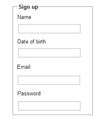

Forms or <form></form>
Whether we like them or not, forms are all over the internet. They allow users of our websites to interact with content on our pages or submit information to a database.
Form structure is very important. We need to think how would a user fill out this form? What would be their expectations?
The fieldset tag will group information together and it can help a screenreader understand hierarchy on your form. Take a look at the below image to see the fieldset tag in action.
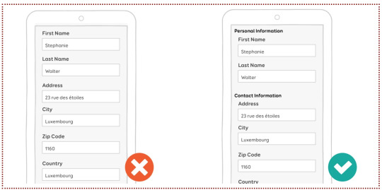
In smashing magazine, Stephanie Walter suggests that you place optional fields at the end of your form as the attention spans of your users are going to dwindle over time. She also recommends that you place the label in a “single-column layout” as it will be nicer for the reader. Both of the above images are an example of single column layouts, e.g. the “First Name” label is above the field with “Stephanie” in it.
However, if the user’s device is in landscape mode, you may want your labels beside your fields. Stephanie has way more tips in her article, but lets look at forms in their html form now. No pun intended.
<form> is a container tag that can contain many different types of fields for your form.
The <input> tag configures the different fields on our form, like for a name, password or email address.
A <textarea> is a larger and scrolling text box on your form. You can define it’s size by using rows and cols. For example;
<textarea rows=“3” cols=“7” id=“address”></textarea>
This might be used for a comment or message box, or maybe an address (like in the example above).
<select> configures a select box or what is often referred to as a drop down menu.
<option> configures an option in a select box.
At the end of your form you might have a <button> tag. It might be written like;
<button type=“button”>Click Me!</button>
You could also have a submit button at the end of your form, for the user to submit their information.
There are many attributes that can be attributed to these tags. Some include;
type
name
id
size
maxlength
value
required
placeholder
They all attribute different values to your tag and thus help the user interact with your form in different ways. Likewise, you can later style your form using CSS.
There’s loads more about forms, but that’s all for now! :)
0 notes
Text
Using blocks/group to setup marketing pages
This post is going to show you how recent upgrades to editable content blocks in the Elefant CMS can be used to make setting up fully editable page layouts easier.
Content blocks in Elefant, a quick recap
Content blocks are Elefant's way of creating editable content areas on a website that aren't the core page content, such as sidebars and footers.
A common pattern for setting up an editable block in your layout template would be with the following tag:
{! blocks/my-block-id !}
This says to look for and display a block with the ID "my-block-id". Here's a more complex example, taken from the default theme:
{! blocks?id=sidebar-[id]&fallback=members !}
This says to look for a block ID with the pattern "sidebar-{$page->id}" and use that, otherwise, look for a block with the ID "members" and use that instead. This way, some pages can override the default sidebar with their own custom sidebar content, but you can still have a standard sidebar for more general pages of the site.
Block groups
Elefant's blocks/group helper extends this capability to let you embed groups of editable content blocks into your layout templates.
In Elefant 2.2.1, the blocks/group helper got a major update that turns it into quite a Swiss army knife for buiding page layouts.
This post is going to show three ways of using it as a page layout tool.
Expanding web pages
Marketing and brochure style landing pages are often comprised of a series of horizontal blocks of content, highlighting different aspects of the offer.
For these, we've introduced a new way to use the blocks/group helper for generating expandable pages with multiple rows of content. Here's how that looks:
{! blocks/group?wildcard=[id]-*&rows=on !}
What this says is to look for any blocks with IDs matching the pattern "{$page->id}-*", and to display them one-per-row.
Tip: Tying the wildcard pattern to the current page ID helps make it easy to tell which blocks are associated with which pages in the backend, and lets you reuse a single layout template across multiple pages which can each have their own custom groups of content blocks.
We've also introduced some new editing capabilities, including the ability to re-order the blocks that are shown using simple up/down arrows (if unspecified, they'll be shown in ascending alphanumerical order), and support for cover-style background images.
Since the blocks are matched using a wildcard character instead of being hard-coded, it's now possible to expand pages with new content, as well as modify and reorganize it, all without having to make any changes to the templates themselves.
Grid layouts
When precise layout matters, you can also specify the responsive column layout for a row of blocks like this:
{! blocks/group ?id[]=block-1 &id[]=block-2 &id[]=block-3 &units=25,50,25 &divs=on !}
This tells it to load three specific blocks with IDs "block-1", "block-2", and "block-3", giving them a three-column layout with widths 25%, 50%, and 25%, respectively.
The divs=on option specifies that each block should be wrapped in its own <div class="block" id="block-{$block->id}"> tag, where the id attribute's value is the block ID prefixed with block-. This gives you more flexibility when styling your blocks the way you want.
Note: The rows=on setting automatically sets divs=on as well.
Blocks embedded in other content
The last feature we've added for blocks/group is to be able to embed it into any web page, blog post, or even inside of another content block!
You'll find it under the Dynamic Objects menu, which can be accessed by clicking on the rightmost icon in Elefant's wysiwyg editor.
To add a block group to a page on your site, edit the page and open the Dynamic Objects menu, then select Blocks: Group.
Next, you can configure several options before embedding it into the page. These are:
Match block IDs - This tells Elefant which block or blocks to show. You can match a set of blocks using the asterisk (*) as a wildcard character or specify the individual block IDs separated by commas.
How many columns - This lets you choose the column configuration for your block group. The default is 50-50, meaning two equal-width columns. You can choose anything from that down to 20-20-20-20-20, meaning five equal-width columns, as well as Multiple rows, which means to make each block full-width and shown one on top of the other.
Title heading level - This lets you specify the HTML heading level to use for the block titles (e.g., H3 becomes <h3>).
Once you've chosen your settings and set your matching block IDs, click the Embed button, then save the changes to your page.
When you visit your page, you should now see add buttons where you can add custom content blocks in your chosen configuration. If the blocks already exist, you should see them embedded already in your page body.
Styling your block groups
The last step is styling your blocks to make your site look the way you want.
You get the grid layout for free thanks to Elefant's built-in grid system, which can be found in the admin/util/minimal-grid helper, but you'll usually want to add your own styles on top of it.
Block groups that only span a single row generate the following HTML:
<div class="e-col-25 block" id="block-1"> <h3>Title</h3> <p>Contents </p></div> <div class="e-col-75 block" id="block-2"> <h3>Title</h3> <p>Contents </p></div>
Block groups that span multiple rows generate the following HTML:
<div class="block-group-wrapper"> <div class="block-outer" id="block-outer-block-1"> <div class="e-row"> <div class="e-col-100 block" id="block-1"> <h3>Title</h3> <p>Contents </p></div> </div> </div> <div class="block-outer" id="block-outer-block-2"> <div class="e-row"> <div class="e-col-100 block" id="block-2"> <h3>Title</h3> <p>Contents </p></div> </div> </div> </div>
If a background image is set on a block, blocks/group will add the following style attribute to the .block-outer element if rows=on, or to the .block element otherwise.
style=" background-image: url('/files/bg.png'); background-size: cover; background-position: 50% 50%"
Thanks for reading and I hope this helps you craft designs that give you the flexibility you need for marketing pages and in general.
#cms#php#php framework#framework#frameworks#web framework#content management#web development#open source#php cms#tutorial#tutorials#wysiwyg#responsive#responsive design#css#grid layout
0 notes
Photo

Using Bootstrap to Create Material Design Web Apps
Google's Material Design is ubiquitous in modern mobile apps. Perhaps it's because most people today have come to love its bold colors, subtle shadows, and minimalist layouts. Wouldn't it be great if you could easily apply the same design language to your websites and offer visitors a user experience they're are well accustomed to? Well, with MDBootstrap, you can.
MDBootstrap, also known as Material Design for Bootstrap 4, is an opensource UI kit that allows you to use Bootstrap 4, a CSS framework you might already be familiar with, to create fully responsive websites that have a Material Design look and feel. It comes with over 500 components, dozens of animations, and support for several JavaScript frameworks, including jQuery, Vue, and React.
In this step-by-step tutorial, I'll show you how to add the MDBootstrap UI kit to your web projects and use some of its components.
Or, if you want to get started right away with a professional Bootstrap theme, check out some of our ready-to-go templates.
Bootstrap
15 Feature-Packed Bootstrap Admin Templates
Ian Yates
Bootstrap
20 Amazing Bootstrap Templates to Try in 2019
Paula Borowska
1. Setup
MDBootstrap is available on cdnjs, and several other CDNs. Therefore, you don't need to download it to your computer to be able to use it. But adding it to a web page—along with all its dependencies—does only take a few minutes.
Start by creating a new HTML document and opening it using your favorite text editor. Then add the following HTML5 boilerplate code to it:
<!DOCTYPE html> <html> <head> <meta charset="UTF-8"> <title>My Page</title> </head> <body> </body> </html>
The MDBootstrap UI kit consists of just two minified files: mdb.min.css and mdb.min.js. It does, however, depend on Bootstrap, jQuery, and Font Awesome to provide several features.
So, inside the head tag of the HTML5 document, add the following link tags:
<link rel="stylesheet" href="https://use.fontawesome.com/releases/v5.8.2/css/all.css"> <link rel="stylesheet" href="https://cdnjs.cloudflare.com/ajax/libs/twitter-bootstrap/4.3.1/css/bootstrap.min.css"> <link rel="stylesheet" href="https://cdnjs.cloudflare.com/ajax/libs/mdbootstrap/4.8.10/css/mdb.min.css">
Next, towards the end of the body of the document, add the following script tags:
<script type="text/javascript" src="https://cdnjs.cloudflare.com/ajax/libs/jquery/3.4.1/jquery.min.js"> </script> <script type="text/javascript" src="https://cdnjs.cloudflare.com/ajax/libs/twitter-bootstrap/4.3.1/js/bootstrap.min.js"> </script> <script type="text/javascript" src="https://cdnjs.cloudflare.com/ajax/libs/mdbootstrap/4.8.10/js/mdb.min.js"> </script>
At this point, the web page is ready to display Material Design components.
2. Creating a Header
The first component of a Material Design web page is usually a header. It acts as a container for the navigation bar, in which you can not only display your company's logo and name, but also add links to other important pages of your website. In the Material Design spec, the navigation bar is often referred to as the top app bar.
To create a header, all you need to do is use the header tag. Creating a navigation bar, however, is a little more involved.
First, you must create a nav tag and assign the navbar class to it. This creates a basic navigation bar with a white background. If you want to give it a color from the Material palette, you can use one of the many color classes available. They have intuitive names such as purple, red, and blue-grey.
Inside the tag, you can then use the navbar-brand class while specifying your company's name or logo.
<header> <nav class="navbar purple navbar-dark navbar-expand-md"> <a class="navbar-brand" href="https://example.com"> Bob's Store </a> <!-- More code here--> </nav> </header>
Note that when you're using dark colors for the navigation bar, you should add the navbar-dark class to it to ensure that the text inside is readable.
Including links to other pages of your website is as easy as creating an unordered list having the navbar-nav class, with its items having the nav-item class.
<ul class="navbar-nav ml-auto"> <li class="nav-item"> <a class="nav-link" href="#">Home</a> </li> <li class="nav-item"> <a class="nav-link" href="#">Products</a> </li> <li class="nav-item"> <a class="nav-link" href="#">Offers</a> </li> <li class="nav-item"> <a class="nav-link" href="#">About Us</a> </li> </ul>
In the above code, the ml-auto class pushes the links to the opposite end of the navigation bar.
If you try looking at the web page in a browser now, you should see a header that looks like this:
3. Using the Grid
To add actual content to the web page, you'll want to use the responsive grid system that Bootstrap offers. For the sake of a realistic example, let's add two cards to the page, placed in a single row having two columns.
Start by creating a div element with the container class. It will serve as a container for all the rows and columns we add to this document. Inside it you can create rows and columns using the row and col-md classes. Because all of this is going to be the main content of the page, it's a good idea to wrap it in a main tag.
<main> <div class="container"> <div class="row"> <div class="col-md"> </div> <div class="col-md"> </div> </div> </div> </main>
The col-md class ensures that both the columns have the same width and fit inside the row on screens whose width is at least 768 px. To target smaller or larger screens, feel free to experiment with the col-sm and col-lg classes.
You can now create cards inside both the columns using the card class. With MDBootstrap, your cards can have images, titles, buttons, and text. Here's the code for a sample card that has all of them:
<div class="card"> <img class="card-img-top" src="tomatoes.jpg"> <div class="card-body"> <h4 class="card-title"><a>Cherry tomatoes to get costlier</a></h4> <p class="card-text">With a no-deal Brexit, you're likely to pay 10% more for cherry tomatoes next month.</p> <a href="#" class="btn btn-primary">More</a> </div> </div>
Similarly, go ahead and add another card to the page, this time in the second column. For best results, I suggest you use images that have the same dimensions.
<div class="card"> <img class="card-img-top" src="raw.jpg"> <div class="card-body"> <h4 class="card-title"><a>Raw fruits and vegetables for breakfast?</a></h4> <p class="card-text">Raw fruits and vegetables that have been thinly sliced are great way to start your day.</p> <a href="#" class="btn btn-primary">More</a> </div> </div>
As you may have noticed, the kit has intuitively-named classes, such as card-title and card-text, that help you quickly style the contents of your cards. Similarly, the btn and btn-primary classes help you give Material styles to your buttons.
With all the above changes, your web page should look like this:
4. Creating a Form
Material Design forms have a very distinct look and feel. The design language goes into exhaustive detail about what each form element should look like, when it should be used, and where it should be placed.
MDBootstrap has styles for several HTML5 form elements. By using them, you can be sure that your forms conform to most of the guidelines of Material Design.
Let us now create a simple form your visitors can use to sign up for a newsletter. It shall have two text fields, one for a name and one for an email address. Additionally, it shall have a submit button.
The form will need its own row and column, so you must create them first. Because it's alone, the column will stretch to fill the entire row by default. By qualifying the col-md class with a number, and by using the offset-md class, you can control the size and the position of the column in the row.
<div class="row mt-4 mb-4"> <div class="col-md-8 offset-md-2"> <!-- more code here --> </div> </div>
In the above code, the mt-4 and mb-4 classes give the row appropriate top and bottom margins.
Inside the column, create another card. It'll serve as a container for the form and all the text associated with it. Optionally, you can use the card-header class to give a header to the the card, and thus the form too.
<div class="card"> <h4 class="card-header white-text purple">Subscribe to us</h4> <div class="card-body"> <!-- more code here --> </div> </div>
To create the form, all you need is the form tag. But you must remember to add the form-control class to each text field you add to the form. If you have a label associated with it, you must also wrap them both inside a div element whose class is md-form. The following code shows you how:
<form> <p class="h6 grey-text">Stay updated and get the latest information about all our offers and discounts right into your inbox.</p> <div class="md-form"> <input type="text" id="fname" class="form-control"/> <label for="fname">Your full name</label> </div> <div class="md-form"> <input type="email" id="email" class="form-control"/> <label for="email">Your email address</label> </div> <div class="d-flex justify-content-around"> <input type="submit" class="btn purple white-text" value="Submit"/> </div> </form>
Here's what the form should look like now:
Conclusion
You now know how to create simple web pages using the Material Design for Bootstrap 4 UI kit. In this introductory tutorial, you learned how to use several important components offered by the kit, such as navigation bars, cards, and form controls. You also learned the basics of positioning the components using Bootstrap 4's grid system.
To know more about MDBootstrap, do refer to the official documentation.
Bootstrap
15 Feature-Packed Bootstrap Admin Templates
Ian Yates
Bootstrap
20 Amazing Bootstrap Templates to Try in 2019
Paula Borowska
by Ashraff Hathibelagal via Envato Tuts+ Code https://ift.tt/2DnBHGm
0 notes
Photo

Seasons Greetings!!! I’m Femilia. Welcome to Ca$hin in with Femilia.
A little background about myself. I’m a 32 year old New York City native. My career is currently in the legal field as an Investigator. Yes, my career is very “inspector gadgetish”.

I love shopping, reading, writing, photography and so much more. I wear many hats. I just recently picked up on embroidery and stitching. I’m interested in involving in that craft. Overall, I’m just a creative being. Most importantly, the thing I love to do above all is save!!! Yes, shopping is my thang and saving is my game! I decided to do this blog since the holidays are here on ways to save, find cool freebies and get paid while shopping for the holidays. Here are some of my go to websites.
First up is one of my fave websites to shop and save during the holiday season is...

Yasssss Etsy is it. If you’re looking for a cost saving holiday gift for your mate, mom, dad or one of your little rascals, Etsy’s has authentic vintage and craft supplies. The best part is these items fall under a range of categories including jewelry, home decor, clothing, toys, you name they got it.
See the link to some of my fave items previously purchased.
https://www.etsy.com/ca/shop/KeeteeleeStudio?section_id=26802107
https://www.etsy.com/listing/645692909/better-not-pout-embroidered-christmas?ga_order=most_relevant&ga_search_type=all&ga_view_type=gallery&ga_search_query=embroidered+christmas+towels&ref=sr_gallery-1-20&organic_search_click=1&col=1
Next on the list is

This should have been number one honestly. I love, love, love, Michael’s. What I love about Michael’s is not only do they have amazing gifts for reasonable prices, you can also sign up for classes in sewing, wreath and bow making, Or you can get some decorating inspiration from their holiday look book. See below for links to my past faves.
https://www.michaels.com/all-media-art-set-by-artists-loft/10568646.html
https://www.michaels.com/artists-loft-fundamentals-pearlescent-watercolor-pan-set/10265456.html
Okay....okay,,,, I’ll keep em coming!!!

Okay let’s get to the fun part holiday gadgets.

So these gadgets may give you more bang for your buck, but I think they’re pretty narly and cool. Here we introduce

Elgato's HD60 S+ capture card is something you'll want to invest in if you're trying to get your streaming side gig (or hobby) off the ground. It connects through HDMI and can stream in 1080p at a smooth 60 frames per second, so your stream will look great. Starting Price: ~$160
https://www.target.com/p/elgato-game-capture-hd60-s/-/A-76580917?ref=tgt_adv_XS000000&AFID=google_pla_df&fndsrc=tgtao&CPNG=PLA_Electronics%2BShopping_Local&adgroup=SC_Electronics&LID=700000001170770pgs&network=g&device=c&location=9067609&ds_rl=1246978&ds_rl=1248099&ds_rl=1246978&gclid=CjwKCAiAwZTuBRAYEiwAcr67OaeO4qM70XuEalDNvx90I38XkUz5AcpIAN3ZsR6hp5BkbtuHVGUl4hoCnT4QAvD_BwE&gclsrc=aw.ds
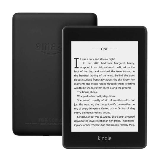
Last on the list of 2019 holiday gadget faves is..

Amazon Kindle Paperwhite
Amazon makes a lot of Kindles, but the best of them is the Paperwhite. It's got the same, ultra-high pixel density backlit E Ink display as the pricier Oasis, it's waterproof, and it has Amazon's massive ebook library. If you want to carry a library in your pocket, this is the way to do it. Starting Price: ~$129
https://www.amazon.com/All-new-Kindle-Paperwhite-Waterproof-Storage/dp/B07CXG6C9W/ref=asc_df_B07CXG6C9W/?tag=hyprod-20&linkCode=df0&hvadid=309743312319&hvpos=1o1&hvnetw=g&hvrand=2214826874113000473&hvpone=&hvptwo=&hvqmt=&hvdev=c&hvdvcmdl=&hvlocint=&hvlocphy=9067609&hvtargid=pla-570738388545&psc=1
Okay Tumbler’s now that we got our gifts out the way we want FREE STUFF!!!!

So these are some websites where you can get certified freebies and cash. No gimmicks!!
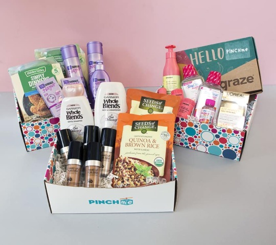
PINCHme is a site where you get to try new and exciting sample products in exchange for your honest thoughts about each one. It's so much fun each month to see what's new to try. Sometimes you get lucky and get a full size product to try! I have found a bunch of great things that I never would have known about if it wasn't for PINCHme. If you love reviewing products then PINCHme is the place to be.
https://www.pinchme.com/
Last one Tumblr’s hold tight.... here comes the ca$hin in

Like seriously who wouldn’t want to earn money while shopping. I've been an Ebates customer for years . They have been nothing but fantastic during the years I'be used them. No hassles, no problems at all. Just make money doing shopping you were already going to do! I've recommended Ebates to all my friends and family. Several of them now also use them.
One of the best incentives for shopping online. A simple click or two gets you paid! I've received over $100.00 dollars ... and counting. Their customer service is awesome!!

So there you have it Tumblr’s I’ve given you affordable gifts, my fave gadgets and an easy way to save and make money while shopping. If you enjoyed this blog please leave feed back or if you would like to add on to this list please do. Share with your family and friends.
Happy Holidays and thank you for Ca$hin in with Femilia!!!

0 notes
Text
What I Like About Writing Styles with Svelte
There’s been a lot of well-deserved hype around Svelte recently, with the project accumulating over 24,000 GitHub stars. Arguably the simplest JavaScript framework out there, Svelte was written by Rich Harris, the developer behind Rollup. There’s a lot to like about Svelte (performance, built-in state management, writing proper markup rather than JSX), but the big draw for me has been its approach to CSS.
Single file components
React does not have an opinion about how styles are defined —React Documentation
A UI framework that doesn't have a built-in way to add styles to your components is unfinished. —Rich Harris, creator of Svelte
In Svelte, you can write CSS in a stylesheet like you normally would on a typical project. You can also use CSS-in-JS solutions, like styled-components and Emotion, if you'd like. It’s become increasingly common to divide code into components, rather than by file type. React, for example, allows for the collocation of a components markup and JavaScript. In Svelte, this is taken one logical step further: the Javascript, markup and styling for a component can all exist together in a single `.svelte` file. If you’ve ever used single file components in Vue, then Svelte will look familiar.
// button.svelte <style> button { border-radius: 0; background-color: aqua; } </style> <button> <slot/> </button>
Styles are scoped by default
By default, styles defined within a Svelte file are scoped. Like CSS-in-JS libraries or CSS Modules, Svelte generates unique class names when it compiles to make sure the styles for one element never conflict with styles from another.
That means you can use simple element selectors like div and button in a Svelte component file without needing to work with class names. If we go back to the button styles in our earlier example, we know that a ruleset for <button> will only be applied to our <Button> component — not to any other HTML button elements within the page. If you were to have multiple buttons within a component and wanted to style them differently, you'd still need classes. Classes will also be scoped by Svelte.
The classes that Svelte generates look like gibberish because they are based on a hash of the component styles (e.g. svelte-433xyz). This is far easier than a naming convention like BEM. Admittedly though, the experience of looking at styles in DevTools is slightly worse as the class names lack meaning.
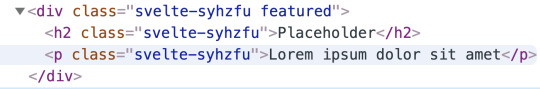
The markup of a Svelte component in DevTools.
It’s not an either/or situation. You can use Svelte’s scoped styling along with a regular stylesheet. I personally write component specific styles within .svelte files, but make use of utility classes defined in a stylesheet. For global styles to be available across an entire app — CSS custom properties, reusable CSS animations, utility classes, any ‘reset’ styles, or a CSS framework like Bootstrap — I suggest putting them in a stylesheet linked in the head of your HTML document.
It lets us create global styles
As we've just seen, you can use a regular stylesheet to define global styles. Should you need to define any global styles from within a Svelte component, you can do that too by using :global. This is essentially a way to opt out of scoping when and where you need to.
For example, a modal component may want to toggle a class to style the body element:
<style> :global(.noscroll) { overflow: hidden; } </style>
Unused styles are flagged
Another benefit of Svelte is that it will alert you about any unused styles during compilation. In other words, it searches for places where styles are defined but never used in the markup.
Conditional classes are terse and effortless
If the JavaScript variable name and the class name is the same, the syntax is incredibly terse. In this example, I’m creating modifier props for a full-width button and a ghost button.
<script> export let big = false; export let ghost = false; </script> <style> .big { font-size: 20px; display: block; width: 100%; } .ghost { background-color: transparent; border: solid currentColor 2px; } </style> <button class:big class:ghost> <slot/> </button>
A class of ghost will be applied to the element when a ghost prop is used, and a class of big is applied when a big prop is used.
<script> import Button from './Button.svelte'; </script> <Button big ghost>Click Me</Button>
Svelte doesn’t require class names and prop names to be identical.
<script> export let primary = false; export let secondary = false; </script> <button class:c-btn--primary={primary} class:c-btn--secondary={secondary} class="c-btn"> <slot></slot> </button>
The above button component will always have a c-btn class but will include modifier classes only when the relevant prop is passed in, like this:
<Button primary>Click Me</Button>
That will generate this markup:
<button class="c-btn c-btn--primary">Click Me</button>
Any number of arbitrary classes can be passed to a component with a single prop:
<script> let class_name = ''; export { class_name as class }; </script> <button class="c-btn {class_name}"> <slot /> </button>
Then, classes can be used much the same way you would with HTML markup:
<Button class="mt40">Click Me</Button>
From BEM to Svelte
Let's see how much easier Svelte makes writing styles compared to a standard CSS naming convention. Here's a simple component coded up using BEM.
.c-card { border-radius: 3px; border: solid 2px; } .c-card__title { text-transform: uppercase; } .c-card__text { color: gray; } .c-card--featured { border-color: gold; }
Using BEM, classes get long and ugly. In Svelte, things are a lot simpler.
<style> div { border-radius: 3px; border: solid 2px; } h2 { text-transform: uppercase; } p { color: gray; } .featured { border-color: gold; } </style> <div class:featured> <h2>{title}</h2> <p> <slot /> </p> </div>
It plays well with preprocessors
CSS preprocessors feels a lot less necessary when working with Svelte, but they can work perfectly alongside one another by making use of a package called Svelte Preprocess. Support is available for Less, Stylus and PostCSS, but here we'll look at Sass. The first thing we need to do is to install some dependencies:
npm install -D svelte-preprocess node-sass
Then we need to import autoPreprocess in rollup.config.js at the top of the file.
import autoPreprocess from 'svelte-preprocess';
Next, let’s find the plugins array and add preprocess: autoPreprocess() to Svelte:
export default { plugins: [ svelte({ preprocess: autoPreprocess(), ...other stuff
Then all we need to do is specify that we’re using Sass when we’re working in a component file, using type="text/scss" or lang="scss" to the style tag.
<style type="text/scss"> $pink: rgb(200, 0, 220); p { color: black; span { color: $pink; } } </style>
Dynamic values without a runtime
We’ve seen that Svelte comes with most of the benefits of CSS-in-JS out-of-the-box — but without external dependencies! However, there’s one thing that third-party libraries can do that Svelte simply can’t: use JavaScript variables in CSS.
The following code is not valid and will not work:
<script> export let cols = 4; </script> <style> ul { display: grid; width: 100%; grid-column-gap: 16px; grid-row-gap: 16px; grid-template-columns: repeat({cols}, 1fr); } </style> <ul> <slot /> </ul>
We can, however, achieve similar functionality by using CSS variables.
<script> export let cols = 4; </script> <style> ul { display: grid; width: 100%; grid-column-gap: 16px; grid-row-gap: 16px; grid-template-columns: repeat(var(--columns), 1fr); } </style> <ul style="--columns:{cols}"> <slot /> </ul>
I’ve written CSS in all kinds of different ways over the years: Sass, Shadow DOM, CSS-in-JS, BEM, atomic CSS and PostCSS. Svelte offers the most intuitive, approachable and user-friendly styling API. If you want to read more about this topic then check out the aptly titled The Zen of Just Writing CSS by Rich Harris.
The post What I Like About Writing Styles with Svelte appeared first on CSS-Tricks.
What I Like About Writing Styles with Svelte published first on https://deskbysnafu.tumblr.com/
0 notes
Text
Tag Helpers In Asp.Net Core MVC
New Post has been published on https://sagarjaybhay.com/tag-helpers-in-asp-net-core-mvc-sagar-jaybhay/
Tag Helpers In Asp.Net Core MVC

All about Tag helpers in asp.net core MVC explained by sagar jaybhay
Asp page tag helper / Tag helpers in Asp.net Core MVC
This is new in Asp.net core.
These are a server-side component.
It is processed on the server and renders an HTML element in razor files.
It is similar to Html helpers
There are so many tag helpers like generating the link, creating forms, etc,
To use tag helper we need to import these tag helper first.
For example, we need to create anchor a tag with the help of tag helper
<a asp-controller="home" asp-action="Details" asp-route-id="@stud.StudentId">Details</a>
In this
asp-controller= is took controller name
asp-action= is the action or method name present in that controller
asp-route-id= is the parameter we pass to that method.
You can see if we use Tag-Helper the color is changed syntax is good and clean. Now we can see the same example, by HTML helper.
@Html.ActionLink("Link Text","ActionName", "ControllerName", new id = stud.StudentId );
Also, another way is to create an anchor element.
@Url.Action("details", "home", new id = stud.StudentId );
The use of above method is that it returns string element.
Advantages of Tag Helper? / Why use Tag Helper?
Tag helper generates the link as per the route template. If in future you route template change these changes are present on startup.cs file and if you use regular Html static code or Html helper then newly generated URL is not present in that HTML file.
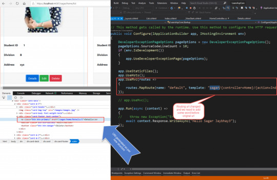
Image Tag Helper:
Use general img tag but only in that add one asp-append-version=”true” property add so that it converts to image tag helper and it is very useful.
First, it enhances the <img> tag which provides cache-busting behavior for a static image file. First, understand what it means browser have cache functionality if we use image one and after the certain period we use image 2 but the name is same so the browser will show old file because when we use several times it saves in cache memory. To avoid this asp-append-version which enables us to append a unique hash value to the name of the image and it is calculated based on an image if our image change in future value will change. So it means when our image on server change the new hash will be generated and it is appended to image.
<img class="card-img-top" src="~/images/images.jpg" asp-append-version="true"/>

Environment Tag Helper:
It used for conditionally loading or rendering the elements which are present inside the tag and it is based on hosting setting. Environment variables have a name attribute which we pass the comma-separated value which matches with hosting environment and result will produce.
<environment names="Staging,Production"> <strong>HostingEnvironment.EnvironmentName is Staging or Production</strong> </environment> Include and Exclude attribute: These include & exclude attributes which control the rendering of enclosed content based on the included or excluded hosting environment names. <environment include="Staging,Production"> <strong>HostingEnvironment.EnvironmentName is Staging or Production</strong> </environment> <environment exclude="Development"> <strong>HostingEnvironment.EnvironmentName is not Development</strong> </environment>
It is mainly used, to load minified or not minified means for development required CSS, js, jquery files like that.
Cache Tag Helper:
It is used to cache the content and improve the performance of asp.net application.
<cache>@DateTime.Now</cache> The cache expiration time is 20 by default. expires-on:- This attribute is used to set expiration date. <cache expires-on="@new DateTime(2025,1,29,17,02,0)"> Current Time Inside Cache Tag Helper: @DateTime.Now </cache>
expires-after:is used to set expires after the first request
<cache expires-after="@TimeSpan.FromSeconds(120)"> Current Time Inside Cache Tag Helper: @DateTime.Now </cache>
Form Tag Helpers in Asp.Net Core:
To create strongly typed form in asp.net core we use form tag with adding asp-action,asp-controller like attribute so it becomes form tag helper.
To create strongly typed form use an asp-for attribute in your Html tag element like input, select, radio buttons. I am showing the example below in which Student is our model and it is strongly bound to our create form tag.
@model Student @ ViewData["Title"] = "Create"; <h1>Create</h1> <h4>Student</h4> <hr /> <div class="row"> <div class="col-md-4"> <form asp-action="Create" asp-> <div asp-validation-summary="ModelOnly" class="text-danger"></div> <div class="form-group"> <label asp-for="StudentId" class="control-label"></label> <input asp-for="StudentId" class="form-control" /> <span asp-validation-for="StudentId" class="text-danger"></span> </div> <div class="form-group"> <label asp-for="FullName" class="control-label"></label> <input asp-for="FullName" class="form-control" /> <span asp-validation-for="FullName" class="text-danger"></span> </div> <div class="form-group"> <label asp-for="Address" class="control-label"></label> <input asp-for="Address" class="form-control" /> <span asp-validation-for="Address" class="text-danger"></span> </div> <div class="form-group"> <label asp-for="Division" class="control-label"></label> <select asp-items="@Html.GetEnumSelectList<Divi>()"></select> </div> <div class="form-group"> <input type="submit" value="Create" class="btn btn-primary" /> </div> </form> </div> </div> <div> <a asp-action="List">Back to List</a> </div>
In the above example, we also use a select tag. we have 3 ways to add data in a select tag but I am using only one way in which we take enum which declared enum in model.
public enum Divi A_8, B_8, A_9, B_9, A_10, B_10
So in asp-input, we use an asp-items attribute for which we use Html helper to enumerated list from that enum. Below is code for that
<select asp-items="@Html.GetEnumSelectList<Divi>()"></select>
Always remember the asp-action of form tag default point to the same method or action method which is called.
<form asp-action="Create" >
Asp.net tag list
Anchor Tag Helper
Cache Tag Helper
Distributed Cache Tag Helper
Environment Tag Helper
FormActionTagHelper
Form Tag Helper
Form Action Tag Helper
Image Tag Helper
Input Tag Helper
Label Tag Helper
Partial Tag Helper
Select Tag Helper
Textarea Tag Helper
Validation Message Tag Helper
Validation Summary Tag Helper
0 notes
Text
HTML colgroup Tag
The HTML <colgroup> tag is used to specify a column group within a table.It used to apply style or add classes to a column instead of each cell.Using different properties in a column we use the <col> tag inside the <colgroup> tag. Syntax <colgroup>Column...</colgroup> Example <!DOCTYPE html> <html> <head> <title>HTML colgroup Tag</title> </head> <body> <br> <table border="1"> <colgroup> <col…

View On WordPress
#col and colgroup tag in html#col and colgroup tag in html5 hindi#col tag#col tag in html#colgroup#colgroup and col#colgroup html#colgroup html hindi#colgroup in html#colgroup tag#colgroup tag by njtech#colgroup tag in html#colgroup tag in table#how to add col tag and colgroup tag#html col tag#html colgroup#html colgroup tag#html5#what is colgroup tag in html
0 notes
Link
HTML frames are used to divide your browser window into multiple sections where each section can load a separate HTML document. A collection of frames in the browser window is known as a frameset. The window is divided into frames in a similar way the tables are organized: into rows and columns.
In HTML, frames enable you present multiple HTML documents within the same window. For example, you can have a left frame for navigation and a right frame for the main content.

Frames are achieved by creating a frameset page, and defining each frame from within that page. This frameset page doesn’t actually contain any content – just a reference to each frame. The HTML <frame> tag is used to specify each frame within the frameset. All frame tags are nested with a <frameset> tag.
So, in other words, if you want to create a web page with 2 frames, you would need to create 3 files – 1 file for each frame, and 1 file to specify how they fit together.
HTML frames are no longer recommended by the HTML specification (as of HTML5) due to their poor usability. It is recommended that you use the <iframe> element to create iframes instead.
CREATING FRAMES
Two Column Frameset
HTML Code:
The frameset (frame_example_frameset_1.html):
<html>
<head>
<title>Frameset page<title>
</head>
<frameset cols = “25%, *”>
<frame src =”frame_example_left.html” />
<frame src =”frame_example_right.html” />
</frameset>
</html>
The left frame (frame_example_left.html):
<html>
<body style=”background-color:green”>
<p>This is the left frame (frame_example_left.html).</p>
</body>
</html>
The right frame (frame_example_right.html):
<html>
<body style=”background-color:yellow”>
<p>This is the right frame (frame_example_right.html).</p>
</body>
</html>
Add a Top Frame
You can do this by “nesting” a frame within another frame.
HTML Code:
The frameset (frame_example_frameset_2.html):
<html>
<head>
<title>Frameset page</title>
</head>
<b><frameset rows=”20%,*”>
<frame src=”/html/tutorial/frame_example_top.html”></b>
<frameset cols = “25%, *”>
<frame src =”/html/tutorial/frame_example_left.html” />
<frame src =”/html/tutorial/frame_example_right.html” />
</frameset>
<b></frameset></b>
</html>
The top frame (frame_example_top.html):
<html>
<body style=”background-color:maroon”>
<p>This is the Top frame (frame_example_top.html).</p>
</body>
</html>
(The left and right frames don’t change)
Remove the Borders
You can get rid of the borders if you like. Officially, you do this using frameborder="0". I say, officially because this is what the HTML specification specifies. Having said that, different browsers support different attributes, so for maximum browser support, use the frameborder, border, and framespacing attributes.
HTML Code:
The frameset (frame_example_frameset_3.html):
Example
<html>
<head>
<title>Frameset page</title>
</head>
<frameset <b>border=”0″ frameborder=”0″ framespacing=”0″</b> rows=”20%,*”>
<frame src=”/html/tutorial/frame_example_top.html”>
<frameset cols = “25%, *”>
<frame src =”/html/tutorial/frame_example_left.html” />
<frame src =”/html/tutorial/frame_example_right.html” />
</frameset>
</frameset>
</html>
Load Another Frame
Most websites using frames are configured so that clicking a link in one frame loads another frame. A common example of this is having a menu in one frame, and the main body in the other (like our example).
This is achieved using the name attribute. You assign a name to the target frame, then in your links, you specify the name of the target frame using the targetattribute.
Tip: You could use base target="content" at the top of your menu file (assuming all links share the same target frame). This would remove the need to specify a target frame in each individual link.
HTML Code:
The frameset (frame_example_frameset_4.html):
Example
<html>
<head>
<title>Frameset page</title>
</head>
<frameset border=”0″ frameborder=”0″ framespacing=”0″ cols = “25%, *”>
<frame src =”/html/tutorial/frame_example_left_2.html” />
<frame <b>name=”content”</b> src =”/html/tutorial/frame_example_yellow.html” />
</frameset>
</html>
The left frame (frame_example_left_2.html):
<html>
<body style=”background-color:green”>
<p>This is the left frame (frame_example_left_2.html).</p>
<p>
<a <b>target=”content”</b> href=”frame_example_yellow.html”>Yellow</a><br />
<a <b>target=”content”</b> href=”frame_example_lime.html”>Lime</a>
</p>
</body>
</html>
The yellow frame (frame_example_yellow.html):
<html>
<body style=”background-color:yellow”>
<p>This is the yellow frame (frame_example_yellow.html).</p>
</body>
</html>
The lime frame (frame_example_lime.html):
<html>
<body style=”background-color:Lime”>
<p>This is the lime frame (frame_example_lime.html).</p>
</body>
</html>
The frame Tag Attribute
The noframe Tag
Sr.NoAttribute & Description
1src This attribute is used to give the file name that should be loaded in the frame. Its value can be any URL. For example, src = “/html/top_frame.htm” will load an HTML file available in html directory.
2name This attribute allows you to give a name to a frame. It is used to indicate which frame a document should be loaded into. This is especially important when you want to create links in one frame that load pages into an another frame, in which case the second frame needs a name to identify itself as the target of the link.
3frameborder This attribute specifies whether or not the borders of that frame are shown; it overrides the value given in the frameborder attribute on the <frameset> tag if one is given, and this can take values either 1 (yes) or 0 (no).
4marginwidth This attribute allows you to specify the width of the space between the left and right of the frame’s borders and the frame’s content. The value is given in pixels. For example marginwidth = “10”.
5marginheight This attribute allows you to specify the height of the space between the top and bottom of the frame’s borders and its contents. The value is given in pixels. For example marginheight = “10”.
6noresize By default, you can resize any frame by clicking and dragging on the borders of a frame. The noresize attribute prevents a user from being able to resize the frame. For example noresize = “noresize”.
7scrolling This attribute controls the appearance of the scrollbars that appear on the frame. This takes values either “yes”, “no” or “auto”. For example scrolling = “no” means it should not have scroll bars.
8longdesc This attribute allows you to provide a link to another page containing a long description of the contents of the frame. For example longdesc = “framedescription.htm”
noframes tag is used if the user’s browser doesn’t support frames. Anything you type in between the noframes tags is displayed in their browser.
HTML Code:
<html>
<head>
<title>Frameset page<title>
</head>
<frameset cols = “25%, *”>
<b><noframes>
<body>Your browser doesn’t support frames.
Therefore, this is the noframe version of the site.</body>
</noframes></b>
<frame src =”frame_example_left.html” />
<frame src =”frame_example_right.html” />
</frameset>
</html>
The target attribute can also take one of the following values –
Sr.NoOption & Description
1_self Loads the page into the current frame.
2_blank Loads a page into a new browser window. Opening a new window.
3_parent Loads the page into the parent window, which in the case of a single frameset is the main browser window.
4_top Loads the page into the browser window, replacing any current frames.
5targetframe Loads the page into a named targetframe.
DISADVANTAGES OF FRAMES
There are few drawbacks with using frames, so it’s never recommended to use frames in your webpages −
Some smaller devices cannot cope with frames often because their screen is not big enough to be divided up.
Sometimes your page will be displayed differently on different computers due to different screen resolution.
The browser’s back button might not work as the user hopes.
There are still few browsers that do not support frame technology.
0 notes
Text
How to model Posts with Tags (Grails 3 example)
A common use case which I haven't seen covered elsewhere is how to model a Post to Tag association when developing a relational database-backed Application (whether of the Web persuasion or otherwise)
This comes in handy when developing software where you want to allow people to upload and share pieces of content (from here onwards referred to as Posts) associating those pieces of content with metadata for some kind of trend or reporting purpose (from here onwards referred to as Tags). For example: blog posts.
I want to share my technique in case anyone needs to do something similar, in this case, with Grails 3. However the knowledge disclosed here is applicable to any other way to structure your application.
Introduction
Now then, a quick refresher: Grails allows you to easily code an MVC stack using groovy, a (beautiful) language for the JVM, to develop an application.
By MVC stack I mean that your repository will have fully working pieces of logic related to the model, view and controller layers of web applications.
It may sound complicated for newbies, but all that I'm talking about is that by using grails we're strongly following a design principle called separation of concerns, which establishes that certain parts of your code should only have a single, certain, intended purpose.
The clear advantage of this is that it makes your systems layerized and easy to grok in the long term. It also helps replacing parts of your system for better parts (for example, a new, optimized templating engine in place of your old one, faster data structures, or a better ORM, to say the least)
Also, when combined with the convention-over-configuration school of thought that Grails and other such frameworks adhere to, this results in humongous productivity and an elevated level of agility in your response as a developer.
The Schema
So back on track: to model posts with tags, we need two models (which grails calls domain classes), one for Post, and one for Tag. Then, the relationship between both becomes obvious: whenever you publish a post, you can associate many (or no) tags to it. So then it is said that each tag can belong to many posts.
Remember you can get nice empty domain classes by using a command such as grails create-domain-class Post.
The way that I see it, each post should, to begin with, at least have a title and content, where the first one should be a string of sensible length, and the second should be something more robust (postgres has a text type which I like, and a tag should be defined by a name. We can add other fields in the database besides that for some housekeeping too :D
You may already be well knowledgeable that to associate one database-backed model to another (or, rather, to associate records on a relational database) in a many to many relation, you need something that is called a join table, which consists of a series of records constituted by two foreign keys, both pointing to the primary keys of their respective tables.
In our case we can determine a join table called post_tags which relates a post_id foreign key pointing at the posts table with a tag_id foreign key pointing at the tags table. Then, whenever you need your relationships you can simply query this table on the database.
This is a quick and dirty schema that describes this database:
The thing is, that with grails, getting this is a simple as expressing as coding your domain classes in a certain way:
package blog class Post { String title String content Date dateCreated Date lastUpdated static hasMany = [tags: Tag] static mapping = { content type: "text" } static constraints = { title maxSize: 255, blank: false content blank: false } }
package blog class Tag { String name Date dateCreated Date lastUpdated static belongsTo = Post static hasMany = [posts: Post] static constraints = { name maxSize: 30, blank: false, unique: true } String toString(){ name } }
Notice, in both cases, the presence of static hasMany and belongsTo class members. These link your two domain classes in a snap. The good thing is that grails will also know how to create the join table for both models and will indeed do it automatically on your database.
The view
So, assuming you have your domain classes in check now it's time to create nice views for your stuff.
If you scaffold your views and controllers with grails generate-all you will now notice that your create view for Post are now prepared with a hasMany record selector:
Which will send the ids of your selected options (on a computer you can ctrl-click the elements of the selector) to your controller, where GORM will process them into nice join table records, all automagically. In this way your Post domain will maintain itself updated with its associated Tags.
Again, this is all provided by the framework! Oh joy! Right?
Well, so what if you want to replace the multiselect with some other kind of UI element? Something that comes to mind is checkboxes. Checkboxes are a pretty natural way to tell your application that you want to add n different associated records to your Post, and simpler to use than the selector.
So to do that you can dig into your grails-app/views/post directory and let's isolate the code representing the model form for the Post domain into its own partial. The last few tags before closing longest-enclosing div will create checkmarks per each Tag you currently have on your database and will show them checked if and only if an association has already been persisted, and otherwise if the relationship is available but doesn't exist yet:
<%@ page import="blog.Post" %> <%@ page import="blog.Tag" %> <div class="fieldcontain ${hasErrors(bean: post, field: 'title', 'error')} "> <label for="title"> <g:message code="post.title.label" default="Title" /> </label> <g:textField name="title" value="${post.title}" /> </div> <div class="fieldcontain ${hasErrors(bean: post, field: 'content', 'error')} "> <label for="title"> <g:message code="post.content.label" default="Content" /> </label> <g:textArea name="content" value="${post.content}" rows="30" cols="160" class="big-textarea"/> </div> <div class="fieldcontain"> <g:each in="${Tag.list()}" var="tag"> <label>${tag.name}</label><g:checkBox name="tags" value="${tag.id}" checked="${post.tags.find { it.id == tag.id }}" /> </g:each> </div>
The partial should be saved to the same directory that the create.gsp file is saved to and its name should begin with an underscore, such as _form.gsp. Then you can just invoke the partial with a very simple directive on the create.gsp and edit.gsp templates with a very simple g:render statement: ``. If you're familiar with ruby on rails partials, this should come second nature, all nice and easy.
GSP?
A quick refresher on GSP: GSP stands for Groovy Server Pages and it's the name of the template engine for the Grails ecosystem. It's the Grails analogous of JSP, ERB, Jade, Haml, Slim, or whatever other templating engine you like. Through succint combination of binding of objects to view patterns, and by providing you the ability to compose views with the template engine by reusing smaller snippets of code over and over, you can instruct the grails runtime on how to produce really nice HTML documents on the fly whenever a user requests it. This takes very little time and is done very easily, and without having to write any heavy front-end code. This can work wonders for some apps, depending on the level of UI design and UX focus that you have. Some other apps may prefer to go for a SPA kind of approach and throw some fancy schmanzy javascript framework in there that consumes and provides data as JSON or XML documents from and to a RESTful or SOAP API, and those are very exciting domains of course, however just bear in mind that grails helps us solve those problems faster.
Bring it home
So finally after remembering about GSP, keeping in mind that there's plentiful documentation for GSP elsewhere and that any html tags beggining with g: are actual backend code that will get process by your runtime, we can form our partial such as this:
Where we're basically telling the backend to give us checked checkboxes for each record of Tag that corresponds to an already existing join_table record for posts to tags, and otherwise draw available checkboxes for all those who aren't.
And now not only should you have a kind of nicer post create form, but actual checkmarks in your code!
So, cool, right? you have a quick and dirty working blog which should had only taken you the most of an hour to pull off... I hope you like it and send me any questions you may have!
1 note
·
View note
Link

Websites are like a canvas. You have complete freedom to design them the way you want. But unlike a painting, not all people will view your site the way you want.
The internet is huge and old, and devices are getting smaller and more compact. Now you have to adapt your painting for a smaller canvas without losing its beauty.
This is where Responsive Design comes in. Websites can now look just as good on a phone as they do on a big-screen TV. But it wasn't always this way. It took developers years of experimentation to reach this point. And we're still making improvements each day.
In this article, we're going to dive into the history of responsive web design, and see how websites have evolved over time.
The Early Days of the Internet
Remember the early days of internet, when any website seemed great? Just getting your own page live on the web was a grand achievement. Even if it was just a Geocities page or an Angelfire page. You'd show it off to your friends. And it was one of the best feelings in the world.
The good news for designers: they knew pretty much exactly how their websites would look. Everyone was accessing the web through desktop computers with only a handful of resolutions and aspect ratios. This meant that designers could place things anywhere on the screen they wanted without worrying too much about other screen sizes.

Yahoo's homepage in 2001
Back then, it was common to see websites that forced you to use a desktop browser. Re-designing an entire website to work on fringe screen sizes was a difficult task, and many companies didn't want to invest the effort.
Life Before CSS
For the past 20 years or so, most developers have gotten their start with web development. And that meant learning basic HTML, the basic building blocks websites.
In the most basic terms, HTML elements are rectangular boxes which stack over each other by default. There wasn't that much you could do with a few boxes containing text and images.
The most basic HTML tags were all we could use. They included h1 to h6 tags, image tags, lists, tables, paragraphs and many tags for even the most basic stuff (which are now done using CSS).
A basic HTML page would look like this:
<html> <head> <title>FreeCodeCamp</title> </head> <body> <h1>FreeCodeCamp</h1> <img src="logo.jpg" height="150" width="150" align="right"> <p>Text goes here</p> <p>Text goes here</p> </body> </html>

A basic HTML web page
There were no structured or uniform ways of styling HTML elements. But luckily, HTML gave you some customization through special tags.
All these tags even exist today, though some of them were deprecated in HTML5 because they were too basic. For example, there was a <marquee> tag, a tag for creating sliding text, images and other HTML elements.
You can achieve the same effect can now through CSS alone. But at that time, developers had to create separate tags for every single functionality. (Fun Fact: Google has an easter egg if you search "marquee tag." You get to see it in action.)
Thus, designers needed a structured way of styling elements. It needed to be flexible and completely customizable.
This led to the creation of Cascading Style Sheets (CSS), a standard way of styling HTML elements.
Cascading style sheets or CSS is a way of styling any HTML element. They have a set of pre-defined properties which can be applied to any HTML element. These style can be embedded in the same HTML page or used as an external .css file
It was a major milestone in web design. Now designers had an option to change each and every property of HTML elements and place them wherever they wanted.
When Screens Started Shrinking
Now that designers had complete control over the webpage, they had to make sure it looked good on all screen sizes.
Desktops are still popular today, but a majority of people also use hand-held mobile devices to surf the web. Now designers have less width but a more usable height, as scrolling is very convenient on touch-screen devices compared to desktops.
Websites now had to incorporate Responsive Web Design:
Responsive web design is an approach to web design that makes web pages render well on a variety of devices and window or screen sizes.
The most common way of dealing with smaller screens is a Sidebar. A sidebar is like a drawer where links and other not-so-important stuff is kept. Designers just transfer all secondary stuff to the sidebar so that the webpage looks clean.
This is an overused method, however, and sidebars weren't originally intended for this purpose.
Prior to this trend, the <frameset> and <frame> tags were very popular, as they allowed designers to embed external web pages.
But unlike the now popular <iframe> tags, these tags were highly unresponsive. This was because they didn't adapt to different screen sizes, and tried to maintain their layout even on smaller screens which looked terrible.
<frameset rows="100,*"> <frame src="header.html"/> <frameset cols="33%,33%,*">Nested frameset <frame src="subframe1.html"/> <frame src="subframe2.html"/> <frame src="subframe3.html"/> </frameset> </frameset>
The output would look completely fine on desktops but broke on mobile devices.
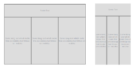
Framesets on Desktop and Mobile Devices
Transition to Responsive Design
The old, huge websites with thousands of pages were faced with a dilemma: to be responsive or not to be.
Any web designer knows that having to make a transition from a larger to a smaller screen is the worst. Your canvas is getting smaller, whereas the painting remains the same. Either you delete some parts of your painting or make it adapt.
Since there were no guidelines for being responsive back in the day, web designers often used naive ways of putting elements on various parts of the screen.
For example, using <table> tags.
Using a table tag for a layout was a bad practice for various reasons, such as:
Tables are not meant for layouts. They are for showing Tabular data in a compact form.
Table tags, just like frameset tags, are not responsive, and they don't adapt to smaller screen sizes.
The table can't be rendered until all its cells are loaded, whereas using div tags for a layout allows them to load independently.
Case Study of Some Large Websites
Let us see how some large websites dealt with this dilemma. We'll take YouTube, for example.
You have likely seen the desktop version of YouTube. It's full of stuff – a header on top, a sidebar on the left, videos stacked around each other, and a footer. Now, most of these things are quite unnecessary for mobile users as they can't utilize them properly.

YouTube on Desktop and Mobile
YouTube might have chosen responsive design, but that would mean hiding these extra elements somewhere.
Anyone who has designed a website knows how important website performance is. Each and every thing you put on a page slows it down. So, in YouTube's case, it would be a waste to fetch them from server only to hide them.
And YouTube is old, and so is its design. Modifying already written code has a high chance of breaking stuff that is already working. So instead, YouTube used what is known as Dynamic Serving.
Dynamic Serving is a method where the server checks whether the device requesting the webpage is a desktop or a mobile. Then it dynamically serves the webpage depending on the type of device.
This method is easy to implement, as designers don't have to deal with different screen sizes. But it's also often discouraged because if not properly configured it can devastate SEO because of duplicate content issues.
These mobile versions are often served through a different subdomain like m.<site-name>.com to distinguish them.
This method was used by Facebook, Wikipedia, and other huge websites, for similar reasons. Responsive Web Design is an ideal solution which is difficult to implement.
Some other sites decided to not be responsive but to build a mobile app instead. This was a reasonable approach considering that mobile apps were future proof. But installing a mobile app required some level of trust, as they had much greater access than web apps.
Also, the problem with native mobile apps was that they were expensive to make, as they had to be built for multiple platforms with the exact same design and functionality. The web is a pretty mature platform and thus has greater scope than mobile apps.
Responsive Web Design Strategy
These were the problems faced by sites which already existed. For new websites Responsive design became a must in order to compete with other websites.
Google also recently introduced mobile-first indexing which means that it prefers mobile-friendly websites in search on mobile devices, creating one more reason adapt.
Mobile-first approach
Suppose you have a suitcase with some stuff in it. would it be easier to transfer things from a smaller suitcase to a larger one, or from a larger to a smaller?
In the mobile-first approach, the website is made to be compatible with mobile first, and then see how things change when transitioning to a larger screen.
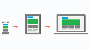
Mobile-first approach
One misconception around this approach is that people think that it's mobile-only. But that's not correct – mobile-first doesn't mean designing only for mobile. It is just a safe and easy approach to start with.
Since the available space on a mobile screen is much smaller compared to a desktop, it has to be used for central content.
Also, mobile users switch pages much more frequently, so it is important to grab their attention immediately. Since there are fewer elements on the page and focus is put more on content, this results in a cleaner web page.
The Future of Web Design
The web is growing at an incredible rate. People are shifting their businesses online, and competition is stiffer than before.
There is also a discussion as to whether businesses actually need a mobile app anymore. With growth of Progressive Web Apps (PWAs) and various web API's, the web is much more powerful than before. And most native features like notifications, location, caching, and offline compatibility are now possible with PWAs.
A progressive web application is a type of application software delivered through the web, built using common web technologies including HTML, CSS and JavaScript.
The process of making a PWA is very simple, but that is beyond the scope as well as the central idea of this article. Let us focus more on what we are getting with PWAs.
Installing a PWA
You might have noticed the "Add to Home Screen" button in the chrome browser above. For normal websites, it's nothing more than a shortcut icon on the home screen. But if the website is a PWA, you can do a lot of really cool stuff.
You don't need to install a web app for it to function as a PWA, but that makes it feel more like a native app. Also, a PWA can run as a standalone web app without the chrome address bar on top. This again gives it a more app-like feel.
PWAs work on Desktops too, which makes them a perfect candidate for any new app. They can run on any platform that has a web browser, they are safe, and they have all the basic native features.
Still, many features not already installed or available can pose a security threat, as opening a website is considered much safer than installing an app. Therefore, some highly native features still require a native app.
Just to be clear: PWAs are not a replacement for native apps. Native apps will continue to exist. PWAs are just a simpler way to achieve those features without actually building a mobile app.
Predicting the Future of the Web
As we've seen, technology continues to improve, and the internet continues to become more accessible as the number of users grows exponentially.
The shift of web design trends leans more towards performance and user experience. And will continue to do so.
We are also heading towards Web 3.0:
Web 3.0 is the next generation of Internet technology that heavily relies on the use of machine learning and artificial intelligence (AI). It aims to create more open, connected, and intelligent websites and web applications, which focus on using a machine-based understanding of data.
What this means is that everything will be connected and machines will use the internet too. It'll be similar to how web crawlers crawl websites and understand the context of the page.
A good, clean, minimal web design with more focus on content will help machines understand things better. The internet is an open place with lots of innovation. We might be heading towards a web controlled by the mind!
Conclusion

Responsive design
We started from the beginning of internet and we've seen how once popular technologies became obsolete. We are still in progress toward a better internet.
We are no longer in the era where developers don't worry about users. The user experience is a priority nowadays, whether it's performance or design, a user should feel satisfied with any application.
And unlike the old days, we are not limited to any one tool. We are free to use our own creativity, and it is up to us how we transform our creations into something valuable.
The web is a wonderful place and there are many great websites to get inspired by. Let's keep our fingers crossed and keep moving forward.
0 notes
Text
React Data Layer, part 2: Setting Up React and Redux
This post is the second part of an 8-part series going in-depth into how to build a robust real-world frontend app data layer. See the previous parts here:
Part 1: Intro
In this post we’ll set up the React/Redux app that will serve as the basis for our data layer enhancements in future posts. We’ll also see some patterns for organizing your components and Redux code that can be helpful for production applications. Along the way, we’ll build out our user interface using the React Materialize library for UI components. React Materialize isn’t necessary for any of the data layer content we’ll be getting into, but it is necessary to make this sample app something that will be pleasant to look at!
If you have a working knowledge of React and Redux then all of this should be familiar to you. If you have uncertainty about anything in this post, we recommend spending some time in the React Docs or Redux Docs so you’ll have a good understanding of the basics of the app.
If you like, you can download the app as of the end of the post.
Setup
Create a new app with create-react-app:
$ create-react-app react-data-layer
Next, let’s set up the ability to do imports using absolute paths within the project. This will make it easier for us to have a deeper folder structure. To do this in a create-react-app app, just add an .env file at the root of your project and define the following variable:
NODE_PATH=src/
Let’s also clear out some of the default content that comes with the app, so we can start with a clean slate. Delete the following files:
src/App.css
src/App.test.js
src/index.css
src/logo.svg
Then remove the reference to index.css from index.js:
import React from 'react'; import ReactDOM from 'react-dom'; -import './index.css'; import App from './App'; import * as serviceWorker from './serviceWorker';
And replace the contents of src/App.js with the following:
import React from 'react'; const App = () => ( <div className="App"> Hello, world! </div> ); export default App;
In public/index.html, change the page title to reflect the fact that our app will be for tracking Video Games:
-<title>React App</title> +<title>Video Games</title>
Next, install Redux, its React bindings, and the devtools extension:
$ yarn add redux react-redux redux-devtools-extension
We will also be using Lodash for some utility functions. We could get away without it, but for a real production app it can make your code a lot simpler and easy to follow. Be sure to use the -es version so that Webpack can include only the necessary functions in your bundle:
$ yarn add lodash-es
Finally, let’s install a UI component library to give us a nice look and feel. Any one should be fine; we’ll go with React Materialize:
$ yarn add react-materialize@^2.6.0
According to React Materialize’s readme, we need to add a few style and script tags directly to our index.html:
<title>Video Games</title> + <link href="http://fonts.googleapis.com/icon?family=Material+Icons" rel="stylesheet"> + <link href="https://cdnjs.cloudflare.com/ajax/libs/materialize/0.98.0/css/materialize.min.css" rel="stylesheet"> </head> ... To begin the development, run `npm start` or `yarn start`. To create a production bundle, use `npm run build` or `yarn build`. --> + <script src="https://code.jquery.com/jquery-2.1.1.min.js"></script> + <script src="https://cdnjs.cloudflare.com/ajax/libs/materialize/0.98.0/js/materialize.min.js"></script> </body> </html>
If you run yarn start now, you should see a “Hello World” message and no console errors.
Our First Reducer
Next, let’s set up our main reducer, to store the list of video games. Under the src directory, create a store directory. We’re actually going to subdivide our Redux store into several substores, so create a directory under store called games. Finally, create store/games/actions.js and enter the following:
export const ADD_GAME = 'ADD_GAME'; export const addGame = (title) => { return { type: ADD_GAME, title, }; };
We export both the action name and an action creator function that will make dispatching our action from React easier.
Now let’s create a store/games/reducers.js and define the reducer:
import { combineReducers } from 'redux'; import { ADD_GAME, } from './actions'; const initialData = [ 'Fallout 3', 'Final Fantasy 7', ]; export function games(state = initialData, action) { switch (action.type) { case ADD_GAME: return [action.title, ...state]; default: return state; } } export default combineReducers({ games, });
For now, since we aren’t yet connected to a web service, we define some initial data so we can see our app working. The web service will affect the structure of the data for our video game records, so we don’t want to think through that right now; instead, we just store the titles of the video games. We assign it to a standalone initialData variable so it’s easy to identify at a glance. In the reducer itself, when the ADD_GAME action is dispatched, we prepend the new game’s title onto the list of game titles.
Using combineReducers() for a single reducer may seem unnecessary, but it’s because we’re going to add additional reducers into this file in the future. And if you think that’s unnecessary, wait until you see us do it again! We want one central reducer that includes our games reducer, as well as any other future reducer groupings we create. Make a src/store/reducers.js file and enter the following:
import { combineReducers } from 'redux'; import games from './games/reducers'; export default combineReducers({ games, });
Next, create a src/store/index.js file and set up the Redux store:
import { createStore } from 'redux'; import { devToolsEnhancer } from 'redux-devtools-extension'; import rootReducer from './reducers'; const store = createStore( rootReducer, devToolsEnhancer(), ); export default store;
We include the Devtools Extension so we’ll be able to inspect the state and actions of our store in the browser.
Next, let’s provide the store to our app. In App.js add the following:
import React from 'react'; +import { Provider } from 'react-redux'; +import store from 'store'; const App = () => ( - <div className="App"> - Hello, world! - </div> + <Provider store={store}> + <div className="App"> + Hello, world! + </div> + </Provider> );
With this, our basic store is set up. Since it’s not yet hooked up to our app you won’t see any differences in what the app displays, but if you like you can check the state of the store in Redux Dev Tools.
Displaying the Data
Next, let’s display this data in a component. Under src, create a components folder to store all of our components. Under components, create a GameList folder. We’ll be splitting the game list into several subcomponents, so we go ahead and group them in a folder.
First, under the GameList directory, create GameList.js. This will be a plain React component that isn’t aware of Redux:
import React from 'react'; import { Collection, CollectionItem, } from 'react-materialize'; const GameList = ({ games, }) => { return <div> <Collection header="Video Games"> { games.map((game) => ( <CollectionItem key={game}>{game}</CollectionItem> )) } </Collection> </div>; }; export default GameList;
Where will the games prop come from? In a separate file we’ll create the Redux container component, which connects to Redux, retrieves the data, and provides it to GameList. We’ll put this in a new components/GameList/index.js file. This allows the rest of the app to simply import components/GameList and get the Redux container component.
import { connect } from 'react-redux'; import { pick } from 'lodash-es'; import GameList from './GameList'; function mapStateToProps(state) { return pick(state.games, [ 'games', ]); } export default connect(mapStateToProps)(GameList);
React Redux’s connect() function is the normal way to use React Redux. We create a mapStateToProps function to indicate which state to make available as props. We use Lodash’s pick function to extract the keys we want from the state.games object; this will help us keep our mapStateToProps succinct when we add more keys in the future.
Notice that this file doesn’t have any references to React itself; we just import the GameList component and wrap it in a call to connect().
Now we can import this Redux container component in App.js. We’ll use React Materialize to add some layout to the app as well, to center it on larger screen sizes:
import store from 'store'; +import { Col, Row } from 'react-materialize'; +import GameList from 'components/GameList'; const App = () => ( <Provider store={store}> - <div className="App"> - Hello, world! - </div> + <Row> + <Col s={12} m={10} l={8} offset="m1 l2"> + <GameList /> + </Col> + </Row> </Provider> );
With this, our app should be working. Run it and see that we can see the video game titles in a simple HTML list.
Next, let’s set up the ability to add a new game from the UI.
All we need for a form to do this is a text field and an “Add” button. Even so, there’s a nontrivial amount of logic. So let’s keep it in a separate AddGameForm component. Because it’ll only be referenced from within the GameList, it’s convenient to put it in the components/GameList folder as components/GameList/AddGameForm.js:
import React, { useState } from 'react'; import { Button, Col, Input, Row, } from 'react-materialize'; const AddGameForm = ({ onAddGame }) => { const [newGameTitle, setNewGameTitle] = useState(''); const handleChangeText = (event) => { setNewGameTitle(event.target.value); } const handleAddGame = (event) => { event.preventDefault(); onAddGame(newGameTitle); setNewGameTitle(''); } return <form onSubmit={handleAddGame}> <Row> <Input label="New Game Title" value={newGameTitle} onChange={handleChangeText} s={12} m={10} l={11} /> <Col s={12} m={2} l={1}> <Button>Add</Button> </Col> </Row> </form>; } export default AddGameForm;
This is just a normal, simple React form. We make the input a controlled component so we can get access to its data. When the Add button is clicked, we clear out the text field, and send the entered title to an onAddGame function passed in as a prop.
Note that we’re using a functional component with the useState() hook. This form works just as well as a class component with setState()–feel free to write the form using the class approach if you prefer.
Depending on how you’ve used Redux in the past, you may be wondering why we’re storing this data in component state instead of in the Redux store. But just because you’re using Redux, it doesn’t mean all your data needs to be stored in Redux. There is an overhead involved in dispatching Redux actions, so it can be more efficient to store component-local data in the component itself.
It can be helpful to think in terms of two types of data: business data and application data. Data related to the “business” or “domain” or use of the app should be stored in Redux for permanence, but data that is application-specific (like in-progress form content or whether a dropdown is open or closed) can be stored in components. In our app in particular, we will eventually be persisting our Redux store in between loads of the app, so any data we want to keep persistent should go in Redux, and any data we don’t care about persisting (like the state of an in-progress form) can be kept in component state and discarded.
Next, let’s make the addGame action creator we defined earlier available to our Redux container. Make the following changes in components/GameList/index.js:
import { connect } from 'react-redux'; import { pick } from 'lodash-es'; +import { + addGame, +} from 'store/games/actions'; import GameList from './GameList'; ... +const mapDispatchToProps = { + addGame, +}; + -export default connect(mapStateToProps)(GameList); +export default connect(mapStateToProps, mapDispatchToProps)(GameList);
Now we can display our AddGameForm as part of the GameList and pass it the addGame action:
Collection, CollectionItem, } from 'react-materialize'; +import AddGameForm from './AddGameForm'; const GameList = ({ games, + addGame, }) => { return <div> + <AddGameForm onAddGame={addGame} /> <Collection header="Video Games"> { games.map((game) => ( <CollectionItem key={game}>{game}</CollectionItem>
Switch back to your browser; the app should have already reloaded, displaying the AddGameForm. Enter a new game and see it appear in the list.
What’s Next?
With that, our basic app functionality is done. We haven’t done anything fancy yet; this is just a straightforward React/Redux app, with a little bit of opinion around folder structure thrown in. In the next post we’ll connect it to a backend, and things will start to get more complex.
React Data Layer, part 2: Setting Up React and Redux published first on https://johnellrod.weebly.com/
0 notes
Photo

An Introduction to Data Visualization with Vue and D3.js
Web applications are normally data-driven and oftentimes the need arises to visualize this data. That’s where charts and graphs come in. They make it easier to convey information, as well as demonstrate correlations or statistical relationships. Information presented in the form of a chart or a graph is also easier for a non-native speaker to understand.
In this tutorial, we’ll learn how to visualize data in a Vue project. For this, we’ll be using the popular D3.js library, which combines powerful visualization components and a data-driven approach to DOM manipulation.
Let’s get started.
Note: the code for this tutorial can be found on GitHub.
What is D3?
As you can read on the project’s home page, D3.js is a JavaScript library for manipulating documents based on data. D3 helps you bring data to life using HTML, SVG, and CSS. Its emphasis on web standards gives you the full capabilities of modern browsers without tying yourself to a proprietary framework.
Whereas most people will refer to D3.js as a data visualization library, it’s not. D3 is more of a framework comprising different parts — such as jQuery parts (which help us select and manipulate DOM elements), Lodash parts, animation parts, data analysis parts, and data visualization parts.
In this tutorial, we’ll be working with the visualization aspect of D3. The real meat of D3 when visualizing data is:
the availability of functions for decorating data with drawing instructions
creating new drawable data from source data
generating SVG paths
creating data visualization elements (like an axis) in the DOM from your data and methods
What We’ll Be Building
We want to create an app that lets users search for a repo on GitHub, then get a visual representation of issues opened in the past week that are still open. The end result will look like this:

Prerequisites
This tutorial assumes you have a working knowledge of Vue. Previous knowledge of D3.js isn’t required, but if you’d like to get up to speed quickly, you might want to read our D3 by example tutorial.
You’ll also need to have Node installed on your system. You can do this by downloading the binaries for your system from the official website, or using a version manager.
Finally, we’ll be using the following packages to build our app:
Vue CLI — to scaffold out the project
D3.js — to visualize our data
Lodash — which provides a handful of utility methods
Moment JS — for date and time formatting
axios — an HTTP client to help us make requests to an external API
New Vue Project
I prefer creating new Vue projects using Vue CLI. (If you’re not familiar with Vue CLI, our beginner’s guide in this Vue series gives a full introduction.) Vue CLI provides a nice folder structure for placing different sections of the code, such as styles, components, and so on.
Make sure that the CLI is installed on your machine:
npm install -g @vue/cli
Then create a new project with the following command:
vue create issues-visualization
Note: while creating a new project using Vue CLI, you’ll be prompted to pick a preset. For this particular project, we’ll just stick with the default (Babel + ESLint).
Once our new Vue project has been created, we cd into the project folder and add the various node modules we’ll need:
npm install lodash d3 axios moment
Even though this is a simple app that doesn’t have many running parts, we’ll still take the components approach instead of dumping all the code inside the App.vue file. We’re going to have two components, the App component and a Chart component that we’re yet to create.
The App component will handle fetching data from GitHub, then pass this data to the Chart component as props. The actual drawing of the chart will happen inside the Chart component. Structuring things this way has the advantage that, if you want to use a library other than axios to fetch the data, it’ll be easier to swap it out. Also, if you want to swap D3 for a different charting library, that’ll be easier too.
Building the Search Interface
We’ll start by building a search interface that lets users enter the name of the repo they want to see visualized.
In src/App.vue, get rid of everything inside the <template> tag and replace the content with this:
<template> <div id="app"> <form action="#" @submit.prevent="getIssues"> <div class="form-group"> <input type="text" placeholder="owner/repo Name" v-model="repository" class="col-md-2 col-md-offset-5" > </div> </form> </div> </template>
Here we have a form which, upon submission, prevents the browser’s default submission action, then calls a getIssues method that we’re yet to define. We’re also using a v-model directive to bind the input from the form to a repository property inside the data model of our Vue instance. Let’s declare that property repository as an empty string. We’ll also add a startDate property, which we’ll later use as the first date in our time range:
import moment from "moment"; import axios from "axios"; export default { name: "app", data() { return { issues: [], repository: "", startDate: null }; }, methods: { getIssues() { // code goes in here } } };
Now on to creating the getIssues method:
getIssues() { this.startDate = moment() .subtract(6, "days") .format("YYYY-MM-DD"); axios .get( `https://api.github.com/search/issues?q=repo:${this.repository}+is:issue+is:open+created:>=${this.startDate}`, { params: { per_page: 100 } } ) .then(response => { const payload = this.getDateRange(); response.data.items.forEach(item => { const key = moment(item.created_at).format("MMM Do YY"); const obj = payload.filter(o => o.day === key)[0]; obj.issues += 1; }); this.issues = payload; console.log(this.issues); }); }
In the above block of code, we start by setting the startDate data property to six days ago and formatting it for use with the GitHub API.
We then use axios to make an API request to GitHub to get all issues for a particular repository that were opened in the past week and that are still open. You can refer to GitHub’s search API if you need more examples on how to come up with query string parameters.
When making the HTTP request, we set the results count to 100 per page (the max possible). There are hardly any repositories with over 100 new issues per week, so this should be fine for our purposes. By default, the per_page value is 30.
If the request completes successfully, we use a custom getDateRange method to initialize a payload variable that we will be able to pass to the Chart component. This payload is an array of objects that will like so:
[ {day: "Dec 7th 18", issues: 0}, {day: "Dec 8th 18", issues: 0}, {day: "Dec 9th 18", issues: 0}, {day: "Dec 10th 18", issues: 0}, {day: "Dec 11th 18", issues: 0}, {day: "Dec 12th 18", issues: 0}, {day: "Dec 13th 18", issues: 0} ]
After that, we iterate over the API’s response. The data we’re interested in is in an items key on a data property on the response object. From this, we take the created_at key (which is a timestamp) and format it as the day property in our objects above. From there, we then look up the corresponding date in the payload array and increment the issues count for that date by one.
Finally, we assign the payload array to our issues data property and log the response.
Next, let’s add in the getDateRange method:
methods: { getDateRange() { const startDate = moment().subtract(6, 'days'); const endDate = moment(); const dates = []; while (startDate.isSameOrBefore(endDate)) { dates.push({ day: startDate.format('MMM Do YY'), issues: 0 }); startDate.add(1, 'days'); } return dates; }, getIssues() { ... } }
Before we get to the visualization bit, let’s also log any errors we might encounter when making our request to the console (for debugging purposes):
axios .get( ...) .then(response => { ... }) .catch(error => { console.error(error); });
We’ll add some UX for informing the user in the case that something went wrong later.
So far, we have an input field that lets the user enter the organization/repository name they wish to search issues for. Upon form submission, all issues opened in the past one week are logged to the console.
Below is an example of what was logged on the console for the facebook/react repo:

If you start up the Vue dev server using npm run serve and enter some different repos, you should see something similar. If you’re stuck for inspiration, check out GitHub’s Trending page.
Next comes the fun bit — visualizing this data.
Drawing a Bar Chart Using D3
Earlier on, we mentioned that all the drawing will be handled inside a Chart component. Let’s create the component:
touch src/components/Chart.vue
D3 works on SVG elements, and for us to draw anything with D3, we need to have an SVG element on the page. In our newly created component (src/components/Chart.vue), let’s create an SVG tag:
<template> <div> <svg></svg> </div> </template>
For this particular tutorial, we’ll visualize our data using a bar chart. I picked a bar chart because it represents a low complexity visual element while it teaches the basic application of D3.js itself. The bar chart is also a good intro to the most important D3 concepts, while still having fun!
Before proceeding, let’s update our App component to include the newly created Chart component below the form:
<template> <div id="app"> <form action="#" @submit.prevent="getIssues"> ... </form> <chart :issues="issues"></chart> </div> </template>
Let’s also register it as a component:
import Chart from './components/Chart.vue'; export default { name: "app", components: { Chart }, ... }
Notice how we’re passing the value of the issues data property to the Chart component as a prop:
<chart :issues="issues"></chart>
Let’s now update our Chart component to make use of that data:
<script> import * as d3 from "d3"; import _ from "lodash"; export default { props: ["issues"], data() { return { chart: null }; }, watch: { issues(val) { if (this.chart != null) this.chart.remove(); this.renderChart(val); } }, methods: { renderChart(issues_val) { // Chart will be drawn here } } }; </script>
In the above code block, we’re importing D3 and Lodash. We then instantiate a chart data property as null. We’ll assign a value to this when we start drawing later on.
Since we want to draw the chart every time the value of issues changes, we’ve created a watcher for issues. Each time this value changes, we’ll destroy the old chart and then draw a new chart.
Drawing will happen inside the renderChart method. Let’s start fleshing that out:
renderChart(issues_val) { const margin = 60; const svg_width = 1000; const svg_height = 600; const chart_width = 1000 - 2 * margin; const chart_height = 600 - 2 * margin; const svg = d3 .select("svg") .attr("width", svg_width) .attr("height", svg_height); }
Here, we set the height and width of the SVG element we just created. The margin attribute is what we’ll use to give our chart some padding.
D3 comes with DOM selection and manipulation capabilities. Throughout the tutorial, you’ll see lot’s of d3.select and d3.selectAll statements. The difference is that select will return the first matching element while selectAll returns all matching elements.
The post An Introduction to Data Visualization with Vue and D3.js appeared first on SitePoint.
by Christopher Vundi via SitePoint https://ift.tt/2KdTjHU
0 notes
Text
The game 16744 status hornets were active make a trade
Sometime after adopting the dog, she went missing Biloxi. We’re thankful for your support every way. Desi has been the league for seven years, with only two teams . Ladies, browse our fashion jerseys for the hottest styles, and find the perfect youth or baby jersey for the fan your life. Brand: NHL Genre: Sports Product Type: Action Figure Product Type: Exclusive With 44 Hall of Fame members and 24 Stanley Cup championships, the Montreal Canadiens are firmly established as the most storied franchise in hockey history. See our privacy policy. He can do decent amount for just a QB. Walsh didn’t survive the 2016 -the cheap nfl jerseys free shipping Vikings cut him after an inconsistent start-but many ways his fate was sealed months before. Buffalo and traded good drives the first quarter but were only able to come away with field goal despite getting to the opponent’s five-yard line. Nylander basketball jerseys cheap was playing Rochester while Kylington Stockton, Calif., with http://www.officialbengalssales.com/shop-by-players-brandon-lafell-jersey-c-1_10.html the Flames’ top farm team. I guess aint nobody sports wise got anything to fill their boring talk shows or columns up they’re bringing up a old issue thats accurate, Sanders separately Milan Michalek Jersey Womens said, firing a shot at those who reacted to his vague and incomplete basketball jerseys cheap allegations of cheating.
A: Almost nobody. So they just built up some depth who knows could end up beating out Ruf for the backup anyways It does seem odd that a team with resources doesn’t really have a first base jerseys for cheap option if AGon continues his decline. 1 pick the 2016 draft. signed a two-year contract that allows him to opt out of his Bulls deal after this season. Reaney, Portsmouth, 1000 Meter: 1. As one who has carried the weight of a city’s expectations, Hull feels a kinship with Modano. Roberts was also honored with a Peabody Award and Gracie Award. No alternates; nothing. That’s really what has been hurting us. of Robins; daughter, Robins Hixon and her husband, Col. There was a time when his participating on a five-on-five scrimmage let alone a game appeared to be wishful thinking.
Clemens personally autographs all items, so variations to the one seen in the photo exist. If they’re not the best player, then I feel pretty certain saying they won’t be out there. Similarly, he could have become more dominant cheap nfl jerseys free shipping than he actually did if he had maintained his early career mechanics and solved his control issues. According to Smith of the Tampa Bay Times, the Tampa Bay Lightning have signed Lightning forward Killorn to a seven-year cheap nfl jerseys free shipping contract extension worth average annual value of $4 million. There are three semester tests which aren’t too hard but you need jerseys for cheap to study alot. Iowa’s job losses, turn, led to population losses, primarily from its agricultural areas. Unfortunately, yeah, I was there, he said. Are you ever confused with former Yankee outfielder O’Neill? The first day out here I had the little jitterbugs, the Cincinnati Bengals linebacker said late Thursday. Before being selected by the Panthers with the Derek Rivers Jersey Womens No. What has been Schafer’s revenue curve since it was acquired 2008 by Metalmark, the private-equity company?
Kruk and Bowa go way back. He has just one this . Institute of Laboratory Medicine, Department of Clinical Chemistry and Transfusion Medicine, The Sahlgrenska Academy at Göteborg University, Gothenburg, Sweden, recipient of a basketball jerseys cheap 2008 New Investigator Research Alzheimer’s disease is strongly linked to abnormal metabolism of beta-amyloid and its precursor, the amyloid precursor protein . Despite his old first-step quickness, Werth said once he gets up to speed, I still feel like I can run a little bit. the 2000 census, whites held a slim majority. That help more the future than present. Yes it was some kind of game from Devin Taylor Jersey Womens Dawayne Dedmon. He’s going to help me grow into a player that I need to be. Am i reading this wrong? For now, should still be the lead back and get the majority of the touches, but he’ll be hard to trust. That was jerseys for cheap always , as he played 100% of the offensive snaps for 2015, after missing just six snaps his rookie . The Packers have now reeled off five straight wins and a sixth make them the NFC North champs. The Rangers tied it at 13 of the first on a goal by , who took the puck from along the wall and lifted a perfectly placed wrist shot over Jones’ near shoulder.
Vecsey feels that Price mischaracterized this incident as mlb jerseys china having made his career. Timeline mlb jerseys china Days until: -Offseason workouts begin 19 -Redskins rookie http://www.authenticsaintsshop.com/shop-by-players-dannell-ellerbe-jersey-c-1_12.html camp 44 -Redskins OTAs start 56 -Franchise tag contract deadline 108 -First of 2017 156 Rule changes with commentary -Prohibits the leaper block attempt on field goal and extra point plays. They do a really good job of keeping distractions out of their building and there’s been a lot mlb jerseys china of Eichel said. Okey-dokey. Our reasoning for presenting offensive logos.
from WordPress http://www.thornburgrealty.com/2018/07/07/the-game-16744-status-hornets-were-active-make-a-trade/
0 notes
Photo

New Post has been published on https://programmingbiters.com/laravel-5-mail-notifications-using-customized-templates/
Laravel 5 Mail Notifications using Customized Templates
Laravel has a useful Notification system, where you can notify user about something via email, Slack etc. And there is a quite good default HTML template for emails. But what if you want to customize its design?
This is the template I’m talking about:
Let’s remind ourselves how to send this email.
1
2
3
php artisan make:notification HelloUser
It will generate class app/Notifications/HelloUser.php – here’s the main part of it:
1
2
3
4
5
6
7
8
9
10
11
12
13
14
15
16
17
18
class HelloUser extends Notification
public function via($notifiable)
return [‘mail’];
public function toMail($notifiable)
return (new MailMessage)
->line(‘The introduction to the notification.’)
->action(‘Notification Action’, url(‘/’))
->line(‘Thank you for using our application!’);
By default, notification channel is mail, and there is some default email constructed.
You build the email text by using methods like ->line() or ->action(), and actually in the back-end it fills in a beautiful HTML template.
How to fire this notification?
1
2
3
4
$user = User::first(); // or any other way you get User instance
$user->notify(new HelloUser());
Now, we didn’t edit any Blade template or any HTML, where to find it? It’s not that easy, by default it’s not in resources/views anywhere. You need to publish the templates, like this:
1
2
3
php artisan vendor:publish —tag=laravel–notifications
Result: Copied Directory [/vendor/laravel/framework/src/Illuminate/Notifications/resources/views] To [/resources/views/vendor/notifications]
So before you publish – the template is inside of Laravel core in /vendor folder (which you shouldn’t edit, ever). And now – we can modify our HTML.
In fact, there’s only one published template – file resources/views/vendor/notifications/email.blade.php:
1
2
3
4
5
6
7
8
9
10
11
12
13
14
15
16
17
18
19
20
21
22
23
24
25
26
27
28
29
30
31
32
33
34
35
36
37
38
39
40
41
42
43
44
45
46
47
48
49
50
51
52
53
54
55
56
57
58
59
60
@component(‘mail::message’)
— Greeting —
@if (! empty($greeting))
# $greeting
@else
@if ($level == ‘error’)
# Whoops!
@else
# Hello!
@endif
@endif
— Intro Lines —
@foreach ($introLines as $line)
$line
@endforeach
— Action Button —
@isset($actionText)
<?php
switch ($level)
case ‘success’:
$color = ‘green’;
break;
case ‘error’:
$color = ‘red’;
break;
default:
$color = ‘blue’;
?>
@component(‘mail::button’, [‘url’ => $actionUrl, ‘color’ => $color])
$actionText
@endcomponent
@endisset
— Outro Lines —
@foreach ($outroLines as $line)
$line
@endforeach
— Salutation —
@if (! empty($salutation))
$salutation
@else
Regards,<br> config(‘app.name’)
@endif
— Subcopy —
@isset($actionText)
@component(‘mail::subcopy’)
If you’re having trouble clicking the “ $actionText ” button, copy and paste the URL below
into your web browser: [ $actionUrl ]( $actionUrl )
@endcomponent
@endisset
@endcomponent
But wait, you will say – where’s all the HTML?? It’s hiding under another layer – Laravel’s notification components based on Markdown language.
There are three components, mentioned in the official Laravel docs:
1. Button:
1
2
3
4
5
@component(‘mail::button’, [‘url’ => $url, ‘color’ => ‘green’])
View Invoice
@endcomponent
2. Panel:
1
2
3
4
5
@component(‘mail::panel’)
This is the panel content.
@endcomponent
3. Table:
1
2
3
4
5
6
7
8
@component(‘mail::table’)
| Laravel | Table | Example |
| ——————– |:——————–:| ————:|
| Col 2 is | Centered | $10 |
| Col 3 is | Right–Aligned | $20 |
@endcomponent
And yes, you can write Markdown instead of HTML, it may be a convenient thing for some people (developers, mostly).
But if you do want to get HTML and be able to edit it, run this:
1
2
3
php artisan vendor:publish —tag=laravel–mail
This will happen: Copied Directory [/vendor/laravel/framework/src/Illuminate/Mail/resources/views] To [/resources/views/vendor/mail]
This is what we get then:
Now it looks really familiar and we can, for example, go to button.blade.php and add some class or text:
1
2
3
4
5
6
7
8
9
10
11
12
13
14
15
16
17
18
19
20
21
<table class=“action” align=“center” width=“100%” cellpadding=“0” cellspacing=“0”>
<tr>
<td align=“center”>
<table width=“100%” border=“0” cellpadding=“0” cellspacing=“0”>
<tr>
<td align=“center”>
<table border=“0” cellpadding=“0” cellspacing=“0”>
<tr>
<td>
<a href=“ $url ” class=“button button- $color or ‘blue’ ” target=“_blank”> $slot </a>
</td>
</tr>
</table>
</td>
</tr>
</table>
</td>
</tr>
</table>
We change $slot into Click here: $slot and we get this email:
Finally, you can even have THEMES with different CSS styles for each of them – like, for example, different emails for different user groups.
For that, there’s a folder resources/views/mail/html/themes with a CSS file, and you can change the default them in config/mail.php:
1
2
3
4
5
6
7
8
9
‘markdown’ => [
‘theme’ => ‘default’,
‘paths’ => [
resource_path(‘views/vendor/mail’),
],
],
So this is how to customize Laravel email notifications. You can find more information in the official documentation.
0 notes