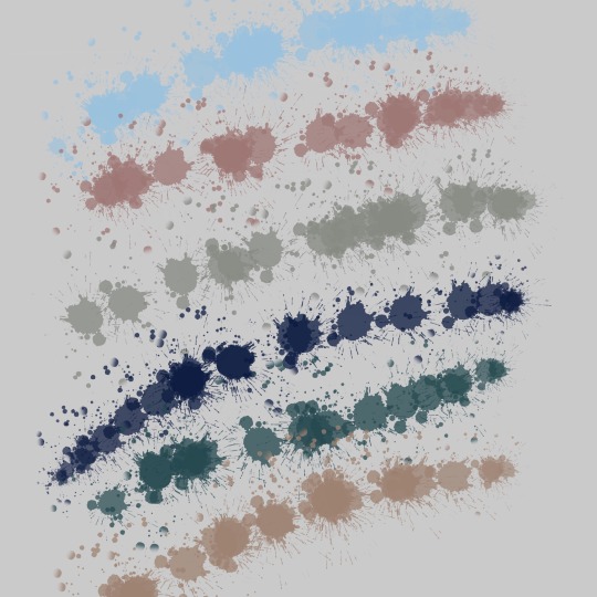
#color analysis
Explore tagged Tumblr posts
Visit Tumblr Blog
Explore Tumblr blogs with no restrictions, modern design and the best experience.
Last Seen Tumblr Blogs


Fun Fact
Post activity is at the highest at 4:00 pm EDT; notes peak at 10:00 pm EDT.
Text
There has been much Discourse™ about the costuming on this show, but one thing we can be certain of is how Bridgerton uses costumes to lend another layer to the story they are trying to tell. With that in mind, I think it's significant how often we are seeing Colin in brown and Penelope in green.


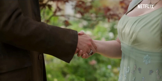
Penelope of course has a lot of these light, sea foam green dresses that we see throughout the trailer and many of the stills released. And Colin is very attached to this long brown coat that we see on several occasions, but we're also seeing a lot of brown detailing on his waistcoats as well.
With wallflowers in bloom as a theme for the season, I'm taking their respective color choices as representatives of that: Penelope, just barely green in these first few episodes, like a small plant on a journey, growing into the full, bright bloom of herself; Colin providing her foundation like soil, the earth from which she grows, providing her a safe and sturdy home, and all the nutrients (read: encouragement, attention, support) she needs to blossom.
I think their color palette will shift as the season progresses and they both grow into themselves and find each other on equal footing, but I think this is such a lovely place to start 🤎💚
730 notes
·
View notes
Text
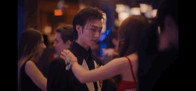
Xo Kitty Outfits: Minho and Kitty
I wanna talk about Kitty and Minho’s outfits this season because I think everything they wear makes them look GOOD together
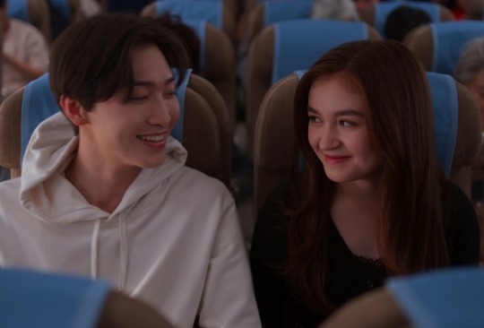
They start the season off dressed completely opposite to each other. Minho is white; Kitty is black. This could represent how there feelings are opposite right now too. Minho is completely in love with Kitty; Kitty has never viewed him in that way.
When there eyes first meet after the plane Kitty is dressed and red and white Minho is dressed in blue and black. Red and blue are complimentary colors, meaning they’ll always look good together (this is why some of the best ships use this color scheme). Red and blue also contrast each other in meaning. Red is, hot, passionate and, loud; Blue is, cold, calm, and subdued. This actually represents their relationship well. Kitty is outgoing sunshine, while, Minho is the pessimistic clouds. Their outfit are opposite but fit together perfectly (like the pair) (Also this is a stretch but Kitty outfit has hints of blue with the overalls and Minhos sweater has hints of red (?) which shows there connection)

During their talk the color palette of there outfits are almost the exact same making them look like a pair. Kitty’s outfit has hints of blue and cooler tone brown that contrast Minho’s warmer brown. Kitty’s outfit is cool and dark; Minho’s is warm and light. They still have opposing feelings for each other, but their emotions aren’t completely opposite anymore.

The kiss boy and girl uniforms directly contrast each other. The girls uniform is dark, cool blue; The boys uniform is light, warm tan. But the uniforms have elements of each other’s color pallets, making them feel cohesive.

In this scene, while, kitty is directly matching Pravienna, her and Minho still look like more of a pair (which makes sense because they spend the bulk of the time together not Kitty and Pravienna) The red of Minho’s jacket matches the red of Kitty’s hair.

In this scene Kitty is wearing the compliment to Minho’s signature color, green. Even when she kisses Yuri her outfit looks better with Minho’s

In the hot tub scene every element of the two’s main color palette this season is present. Minho has the black, blue, and white. Kitty’s outfit is full red. This could also represent the emotion in the scene. Minho’s outfit is calm and quiet, while, Kitty’s outfit is loud and angry. (Also huge stretch but black could represent the unrequited aspect of there love seeing as Kitty is wearing all black when she rejects Minho and Minho TAKES OFF HIS BLACK JACKET to get in the pool and comfort Kitty)

The rain scene has arguably the most iconic Kitty and Minho outfits of the season. It’s what they used in most of the promos and they’re used in the climax of these two’s relationship this season. This makes sense because the outfits are literally perfectly complimentary. Kitty’s outfit is primarily blue and Minho’s is primarily red. Perfection.

In the wet dream, again, every element of the twos color palette is present. Kitty’s outfit is the red and blue; Minho’s is the black. Also, If we’re viewing black as a loose symbol of the unrequited aspect of their relationship then Kitty is literally being confronted by it in the dream, With Minho’s wearing it head to toe.

There are two things of note in this scene’s outfits . One, Minho is introduced to us season one episode one in green; Kitty’s primary/most iconic outfit in season one episode one is blue. So, In a way they’re wearing each other’s color. (Especially Kitty, they really hammer in green being a Minho thing). Two, blue and green are analogous colors, meaning they’re next to each other on the color wheel. After theses outfits they transition into wearing the same colors which could represent them feeling the same way about each other.
Im gonna make a pt.2 with the rest of the outfits <33
165 notes
·
View notes
Text
well, now i raise you this (visual) parallel...
white: cult, powerful, isolation, distant


vs.
white: peaceful, perfection, clarity, familiar


#spop#she-ra#she ra#she ra and the princesses of power#catradora#catra#chipped catra#adora#horde prime#color analysis#color symbolism
180 notes
·
View notes
Text
Ok im seeing a lot of people talk about the colors on my recent, so here's a quick overview of some color choices I did to make stuff work well together !!
Cyno's in front, so I wanted to lead with his color palette. I modeled most of the choices off the skin tone I chose, and focused on the yellow/gold highlights in his design. From the main skin tone, note following the palette to the right gives you the yellow
Since yellow is a common color through his palette, I chose the yellow for the background (and its complementary, that dark blue) as the main focus colors


but what about Tighnari? note how he has mainly a navy blue hair color and green accents. but, that green accent is on exactly the other side of that main yellow we chose as the background. The blue from his hair can also be shifted slightly to match our lighter blue

So in my rendition, I paired this to a lighter gray/blue, and added some darker green transitions to help blend w/ such a strong light green front and center. this helps blend in the green since its analogous to the yellow from the bg!

tighnari also has some pink in his design, so shifting cyno's main outfit color to a lighter pink helps break up some of that contrast

I also made the conscious decision of staying away from pure white and towards a more yellowy-white (esp for Cyno's hair), which helps blend in w/ the background and palette as a whole
The blue stars help break up even more of the contrast we chose and blend everything together :)
I used a lot of fanart references for Cyno's palette, mainly @/shikaEin on twitter's design since I think it works really well! Since I wanted to step in a different direction than the canon design I found fanart super helpful haha
#in retrospect i could have made tighnari's palette as a whole brighter#note for next time ig#genshin#cyno#color analysis#not an art
168 notes
·
View notes
Text

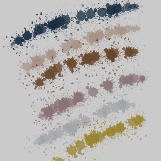
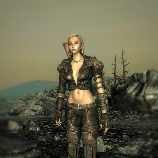

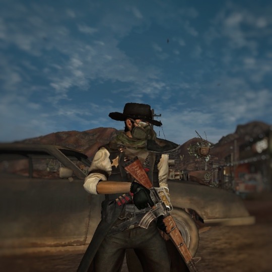

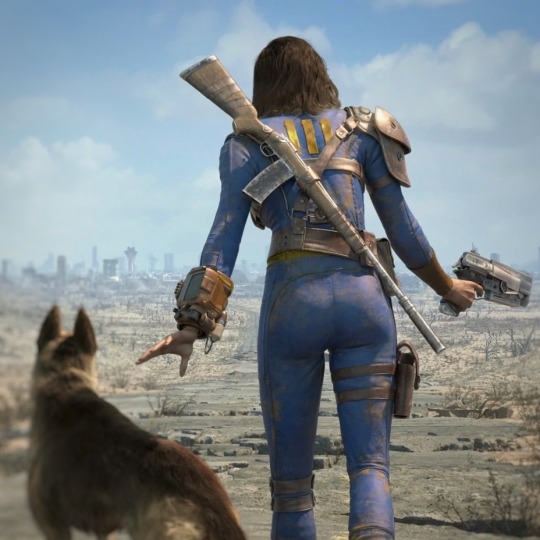


•Fallout: 1997-2018•
✨Palette✨
#fallout#fallout 2#fallout 1#fallout 3#fallout 4#fallout 76#fallout new vegas#fnv#fo4#fo3#fallout edit#fallout aesthetic#color analysis#color aesthetic#fallout fanart#fallout nv#fallout art#fo76#vault dweller#the courier#lone wanderer#piqtpinned
535 notes
·
View notes
Text
Use of white and black (and other colors) in the JRWI Judgement designs
I JUST REMEMBERED I NEVER SHARED THIS HERE- which is a CRIME cause tumblr loves color symbolism
anyways- JUDGEMENT SPOILERS AHEAD!!
Now I’m sure this isn’t really on purpose but goddamn it I love over analyzing-
White often represents purity and goodness, something untainted and perfect
While black often shows the opposite, something evil, unwelcome, unpleasant.
Paeon: almost the entirety of paeon’s outfit is black or dark shades of green, aside from their mask. The way I see this is that the purity of the white/grey of the mask is hidden under all these layers of darkness put up both by Paeon themself and the environment they live in- where most people clearly have a negative opinion of Paeon just in general. But under all the layers of “creepy and off putting” Paeon is an extremely sweet and empathetic person, shown in the mask.
Jaguar: the white and black in jaguars clothing is actually very balanced, white over clothes and black underclothes. The most notable part of his design is this regard is the fact that his skin/body is literally white. In this case I see the white representing the blank slate of purity. Jj is looking for something at all times during judgement, the blade, the real killer, and even companionship. Though he frequently references his past (whether it’s true or not) i think it’s clear he is desperately looking for something to fill his life which is why he has more white in his design.
Buck: buck has a good chunk of white in his design with pretty much no black and barely even any dark colors. The fact that he has just the white is showing how actually pure he is. A good person who means well. A genuine sweetheart and everyone can see it, even if he is in some bad situations. Also the fact that it’s a tank top is very interesting to me because he’s showing off a lot of his skin, being extremely open with the world about who he is, all of his arms visible if you will.
Mel: ooohhh Mel. Mel wears a white tank top/crop top similar to buck but I like him it is not showing her open both because of how much black surrounds it in her design and because of the bandages on her arms. Mel actively covers up more of her arms and hands with white/off white bandages, showing that she’s covering something up covering up things she’s done (with those hands/arms). And aside from the white shirt and her pale skin all of Mel’s design is pure black. Her hair, her pants, her shoes. Aside from a few details it’s all black. This is showing how she is not only not what she says she is but also just.. a little bit evil. The white on her small shirt is genuine, but it is a smaller area than most others. The white on her bandages is n o t. Most bandages are tainted with the color of blood just like Mel is tainted with her lie.
Anyyyyywyaaaayyyysss there’s probably more I could say cause I’m utterly insane and I didn’t even get into their secondary colors but yeahhhh 🫶
#just roll with it#jrwi#Jrwi judgement#judgement jrwi#just roll with it judgement#judgement just roll with it#judgement#paeon pestifus#mel jrwi#jaguar joe#buck barker#paeon jrwi#jrwi mel#buck jrwi#jaguar jrwi#color symbolism#color analysis
52 notes
·
View notes
Text
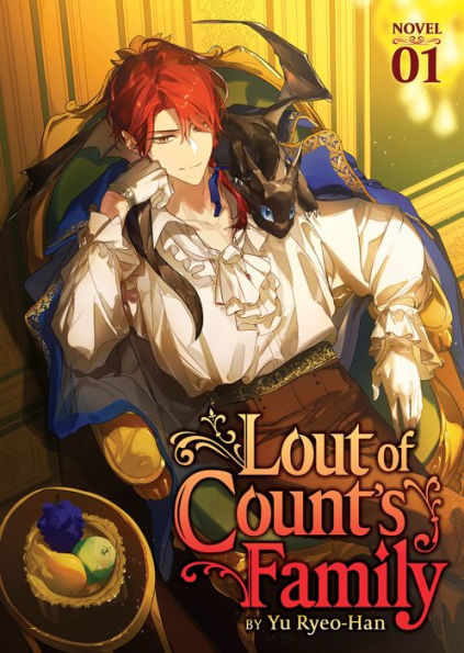

Speaking ab the cover art from a Design pov *aside frm the comments that Cale looks out of character in the lore standpoint of vol. 2 art
(spoiler free, dw)
◇ TLDR; vol. 2 cover is beautiful, but it couldve had better color synergy. I can see why the artists did what they did, its just not my fav.
. man I'm just happy to have an official English print lmao, ill take what I can get
---
At first I didn't like the red shirt cause it was too much the same color as his hair. (Like if it was a darker or desaturated maroon, I feel it would've looked better, at least so he isn't matching with his own hair-)
. But now taking a step back n looking at vol. 2 again, zoomed out, I actually think his Face is the most jarring part [more on that later ◇]
◇ . The bright red of the shirt being lit by a yellower light, altho matching w his hair, actually isn't so jarring to me anymore cause I noticed two things
◇ 1) his pants are also tinted red (if my eyes aren't deceiving me) meaning compared to the background and the other two characters, Cale *in his entirety* is a red-toned silhouette -> this is a illustrative design strategy where the artist assigns a group of colors to a specific subject n *Restrictvely* uses the Hue Differences to their advantage. In my opinion, its a good choice in making him contrast and stand out. You can definitely Tell he's the main character with just the cover art.
. BUT it can also give off an Outlandish or alien feeling because (in this case) Cale is the ONLY red in the scene. Theres no balancing of red tones from his character to the background At All (e.g. the artists doesnt add Any red to the surroundings so his character can "fit in" with the scene- like as if you photoshopped a guy in sunny lighting into a dark room, the lighting differences is jarring n you can tell the guy is just slapped on top [not saying the artist did that at all, but the way they painted Cale to stand out feels jarring in that sense). While this does an insanely good job at putting him in the spotlight, it perhaps does Too great of a job, making him feel isolated or strange compared to the rest of the piece.
. (Then again, you can justify that that was the goal. To isolate Cale n show hes alien from a lore standpoint as he's "not from this world" as an isekai story)
◇ 2) but we're forgetting this is a COVER art. It's not Just an illustration to be pretty. To break my earlier point, altho Cale IS the only red in the *Illustration,* this art piece is - fundamentally - a Cover Art. It has the Title thats a part of its design <-<-<- And if we looksey at the title, what do we see? Red and warm tones. Like what other thing thats only reds? Cale Henituse himself!
. The Title IS the balance I said was missing in point 1). My theory is thats Also why the artist tinted the lighting on Cale to be warmer n more yellow, so as to use the yellow orange in the title (and the contrast of cools n warms from the focal points to the rest of the art) to their advantage. It helps add reds to the lower half of of the piece where the only warm tones are Choi Han's hand (the other character) and the fleeting window curtain; both of those details being at the edges of the piece and Both very small so they hardly have an influence on the overall design.
. So the title, taking up the majority of the lower half of the piece, draws the warmth down n assists in balancing the overall cover design.
So the reds have now been explained, but why are the whites so white now?--
◇ . Earlier I had said Cale's face was the most jarring part of the cover. And I still fully stand by that sentiment. Its the same idea where the reds do Too great a job isolating Cale; the whites do Too great a job contrasting w the background n the two other characters - who are black n cool tones - to the point where it Heavily draws the eye, practically in a violent manner.
. The extreme paleness is quite lore accurate for Cale's character, who hes isekaied as, but the extreme lighting Highlighting just his face compared to Choi Han's face is an extremely bold design decision (again, not a bad thing as he IS the main focal point, but adding onto the Isolating Spotlight trait going on)
◇ Ok then, but why's his jacket also so freakishly bright white? I heard from a fellow lcf fan (love discussing w you dawg <3) that they think the jacket is the worst part of his cover design.
N I agree. The reds standing out can be justified as a design strat, his face is the focal point so thats why that stands out, but why the jacket??
. Here i am on my artist apologist era <3
◇ . The jacket being blindly white is (probably) to Dampen the Harshness of his face being so bright.
. Altho the guy looks great in white ☆°• with how extreme the lighting is in this cover art, I think the artist wanted to balance the laser beam that is Cale's face paleness by spreading it out to his jacket, specifically that left collar fold ( i think that's called the lapel?)
. Basically by making the jacket's collar also intensely white, the artist gives their best attempt at trying to make Cale's skin less jarring so as to not make it so ridgedly highlighted. Like black ink spilt onto fresh paper, they tried to spread it out so its not so condensed in high contrast. ...But that only made the jacket join in on the uncanniness- TTvTT
---
(Posting the pic again so yall don't gotta scroll far o7)
Other notes I've noticed n wanted to just point out while I'm here looking through the Design Lense ☆°•
☆ The red of Cale's hair and the red of his shirt n neck scarf sandwiches his face, making it stand out even More. Ealier I said the contrast of the vibrant red to the paleness makes his face draw the eye, but thats also thanks to the *position* of the colors! Not just the colors themselves B) isn't that so cool (tell me yes even if you have to lie-)
☆ The lighting on Choi Han's cape, chest, to face -> the window arch -> to Cale's entire person being lit up + how he's wearing a long white jacket
. It all creates this general arch of light tones and highlighted features which surrounds and hugs the title! The artists really knows how to use their darks and lights !!
☆ Choi Han's entire person, Cale's pants, and our lovely Roan Miru (the dragon) are the only deepest dark black tones in the entire piece! The privilege of being the subjects <3
☆ cale looks crossed eyed lel
. Im glad I'm not the only one who struggles with eyes still
. Or maybe this artist did it right n I just don't know how to draw eyes- (very plausible tbh)
Man I love artists
---
All in all, Im not a fan of vol. 2 cover art but I can see why the artists did what they did
◇ . One of the most important things of commercial art is that its visually pleasing, regardless of design, lore, or even logic. The design choices are golden but putting them all together couldve been done better. Not that the art is ugly in any way. Its still gorgeous af, there just couldve been more balance or overall color synergy.
This is just my opinion anyways :D! No hate anywhere <33
#textpost#man im a fcking nerd LMAO#lcf#tcf#lout of the count’s family#lout of count’s family#trash of the counts family#trash of the count's family#cale henituse#choi han#art analysis#spoiler free#color analysis#design analysis#oh jeez what a hefty post#i love art man
121 notes
·
View notes
Text
I'm finally coming back to one of my previous posts. (Thank you to @m-eowdy for the reminder to finish the thought. I'm sorry if it's a little disappointing after the wait.)
Specifically these two shots of Edwin being completely covered in our two most important colors, because the symbolism here is significant to me.
I lost the original thoughts that I had (unfortunately migraines make me forget things) and by the time I was feeling kind of okay I knew that there were things I wanted to say but couldn't remember how. So, instead, I sat and rewatched the show, taking notes so that I could make sure that I wasn't making anything up.
So, color symbolism in this show is so stupidly important, and it's called out by characters in universe (thank you, Niko). We obviously see our characters in their colors, Edwin in blue, Charles in red, Crystal in purple, and Niko in pink. But it's also not that cut and dry. Edwin, in all reality, is very grey, Crystal wears a lot of different colors, and so does Niko. Obviously, part of that is because the girls aren't dead and have to change their clothes, but the colors that are worn are still significant to their state of mind and the events happening around them. With Edwin and Charles, it's very similar, though a little different. Charles' red gets darker as he is more and more affected by what happens at the Devlin house. Edwin, though, barely shows his blues most of the time, but when he becomes vulnerable, he sheds his grey layers, and we see it a lot more.
Now, I think that it's worth mentioning that Edwin and Charles swap their afterlife colors, so when they look at each other, they see their afterlife. The red and blue also give us clues as to things that they're hiding. Red being often associated with anger and blue with sadness. That being said, I'm now getting to the symbolism in the fact that Edwin is one of two* characters to be washed in both hell's red and death's (heaven's?) blue like this.
Edwin's entire journey is kind of impeded by the fear of getting caught by the afterlife and being sent back to hell. Red is his constant source of fear, hell being the biggest example, but Charles in his red is also the cause of Edwin's issues. Charles is the reason why both the Cat King and Monty have some type of red associated with them during interactions with Edwin. These colors are omens for Edwin. Charles essentially shared his blue afterlife light with him. They were meant to be detectives together, and that's where it all starts, right there in that attic. The red, on the other hand, is indicative of the bullshitery that is incoming, including the worst-case scenario, aka BEING DRAGGED BACK TO HELL. RIGHT THERE. IN THE APARTMENT THAT THEY GO LOOK AT RIGHT AFTER THIS. (Even though it is definitely at least partially his own darn fault.) The fact that we see these two scenes out of order also indicates that by the end of it all Edwin has overcome the previously stated bullshitery. We see Edwin interact with these two colors as a collective much more in the show, and it's seems it's because this was Edwin's time to learn and grow, and I suspect that if we get a season two at some point, we will see that flip so that Charles can have his turn.
All in all, I am absolutely in love with the colors in this show and I will probably have more to say later but I wanted to finish at least this part of the color analysis so that I could have a resolution to the previous post. I don't think I was able to recover all of my original thoughts about the significance of these two, but I think I got a pretty good chunk of it. I do want to say that I've seen the other color analyses floating around. I will be taking a look at some point, but before doing my own, I will be avoiding them for now because I want to write about my own perception rather than accidentally just stealing other peoples work.
(* Ngl, a little worried about Jenny if we ever see a season two)
#color symbolism#color analysis#that shit slaps#i'm an artist i think i'm obligated to be obsessed with colors#somebody watch jenny please#i'm a little worried about her if we see her again#i'm sorry this took a month#i am an unwell person unfortunately#edwin payne#dead boy detectives#dead boy detective agency#dbda#save dead boy detectives#renew dead boy detectives#renew dbda#revive dead boy detectives#rewatch dead boy detectives
57 notes
·
View notes
Text
Imagine doing a color analysis on Arthur Morgan to figure out what outfits would look best on him. Totally not me rn. 😶
#rdr2#red dead redemption 2#rdr2 community#red dead redemption two#red dead 2#red dead fandom#rdr2 fandom#red dead two#lotsnlotsofsoup talks#first playthrough#arthur rdr2#arthur morgan rdr2#rdr2 arthur#arthur morgan#arthur morgan red dead redemption 2#color analysis
22 notes
·
View notes
Text
beast-yeast 3 color analysis (also spoilers maybe)
i am in the middle of playing beast-yeast 3 and ohhh my god i have so many thoughts. i think the devs did a great job in creating this sense of safety and divinity in the ivory pagoda by simply using colors. white is typically a color associated with all things innocent and truthful, and we can see that white is the main color in the temple. white is also associated with purity, which plays into this theme of deception in the pagoda. we instinctively want to trust that there is little danger in the ivory pagoda, since a temple with such pristine colors MUST be good and safe!!! in many mythos/modern society, white s typically the color of creation. it's used to represent life, which is exactly what mystic flour cookie believes she's doing. she is giving "new life" to these cookies, enlightening them (a concept which is also tied in with white!) to save them from any sort of mortal pain.
the other main color, gold, is more closely associated with the actualization of divinity, especially in religion. whether it be golden temples, golden headpieces, golden gods, golden gates, it's safe to say that where divinity goes, gold follows. the devs wanted to show how godly these beast cookies are, and how being revered as such has changed them. mystic flour cookies was a saint to these cookies who wanted their wished granted.
cloud haetae cookie slams it into the player that mystic flour cookie is all benevolent, but the player can sense that something is off, and that's MAIIIINLY because the color white isn't a pure white, it's a more creamy off-white, almost yellow-ish, clueing the player into the true nature of mystic flour cookie and cloud haetae. they're all literally saying "heyyyy we're not that good but you wanna trust us because you like how this whole temple looks...gotcha bitch".
if the devs used shit like bright orange and green, this illusion of safety and comfort would immediately be shattered, cluing the player in a lot faster than intended and generally just creating a different vibe.
#cr kingdom#cookie run kingdom#cookie run#crk#mystic flour cookie#beast yeast 3#beast yeast#beast cookies#mystic flour crk#cloud haetae cookie#ivory pagoda#colors#color analysis#nerd shit#ramblings#devsisters#im so brainrotted#certified yapper#dont let this flop#hello cookie run nation
34 notes
·
View notes
Text
Xo Kitty Outfits: Minho and Kitty Pt.2
The second and final part of my Minho a Kitty outfit analysis cause I ran out of room last post
Our girl Kitty is IN LOVE. As shown by the all red dress she’s in. As we talked about last post, red is a major part of the two color palette and I’m pretty sure the only time she’s all red is when she’s with Minho. Despite the fact that Minho’s outfit matches Stella’s more on paper, the warm tone flowers on his chest and the black and white flower on her wrist shows who he really wants to dance with.

Minho is in all black and white, trapped by Stella’s color palette and STILL a stripe of red shows through representing his love for Kitty.

Their final red and blue of the season, they are so cute.

These outfits are actually the reason why I made this post. The shade of red Minho is wearing almost matches her hair, the black, the silver accents. This, in my opinion, is the most they look like a couple all season.
Ok for their final look of the season I’m gonna stretch real far so bare with me. So, obviously green and orange are complimentary colors so they visually fit each other, but, as stated in last post green is Minho’s main color. So, I think Kitty being in Minho’s green represents her being what Minho truly wants. And Minho wearing the complimentary color of orange instead of matching her can represent the fact that while he does want her, he isn’t ready to accept what he wants because of what happened with Stella.
And that’s the end. I did skip like two outfits but I think I basically covered everything. The costume design was impeccable this season, especially for these two. Byeee <33
121 notes
·
View notes
Text
COLOR! ANAYLISIS!!
PARAGRAPHS OF THOUGHTS UNDER THE CUT I PROMISE I HAVE A GOOD TAKE ON THIS
so, FIRST OFF, the relationship conflict of this episode is clearly being told from the perspective of Avery, as we hear Avery's thoughts and feeling and fantasies of this episode. We are getting a peak into her 'inner world' (no, that is not a euphemism). We see her clearly desiring both Tristan and Max, (tristan with the running scene, max with the clearly-checking-out-his-ass) but only tristan is pursuing her sexually. It is implied to the audience that avery is still thinking of max (implied by her actions and words, but also by the coloring of this sex scene with tristan). in the majority of this scene, avery is bathed in blue, and tristan is cross lit and bathed in gold. Is this because Phillipa soo looks fan-fucking-tastic in blue and that Sean Teale's skin tone makes him look gilded in this lighting? Yes. BUT ALSO

Avery clearly hesitates/ is distracted in this scene when she's fully in blue, but by the end of the scene Tristan tilts her head so they are both bathed in gold and she fully commits/gets lost in the "easy fun sex with no strings" and then we have a "fade to black" moment.

And who do we see SURROUNDED in a literal sea of blue by the end of the episode? Who do we often see shot in cool-tone environments?

i think avery see's (or feels) like max is the blue/cool tone colors because he is calm and reliable. He will always be available to give her reassurances and safety. He would be easy to settle down with.

Tristan, on the other hand, is mostly addressed in the yellow/warm-tone zone, as an obvious allegory for how he's passion, and energy, and wound up for avery. He makes her feel desired, and she feels like she's able to be free and sexy and pushy when she's with him. (we also see him in the sun a lot more often for this exact reason.)

i also think that the flashbacks to the "best sex of her life" (the threesome) give credence to this theory. Because yes, we are in a room full of warm-tone lights, but the lights are sagnifgantly dimmed, and so you see interesting contrast when it comes to darkness/shadow (aka coolness) v. warmth/light. it's a balance of both [reliability and love], and [passion and getting] lost in the sex.

(The walls in max's cabin are also dark blue.)
In conclusion, ody3 forever
#color analysis#color and light#sorry for the kinda shitty quality screenshots but i just wanted you to understand the vibes#doctor odyssey#ody3#team all three#hayden yaps#hayden yaps about doctor odyssey#hayden writes#bc i might write fanfiction about it#i just think they are so *SCREAMS INTO THE VOID* yknow#avery morgan#tristan silva#max bankman#color theory#this post was being microwaved in my brain the SECOND i saw this scene i was like i have so many fucking THOUGHTS on it like oh my god#what time is it?#hayden goes insane hours
18 notes
·
View notes
Text
₊˚‧︵‿꒰୨ ℳ𝓎 𝓢𝓮𝓋𝓇𝓋𝒾𝒸𝓮𝓈 ୧꒱‿︵‧˚₊

ⲏᵢ! ᵢ'ₘ ₛₒₚₕᵢₑ, ᵢ'ₘ ₐₙ ₐₛₜᵣₒₗₒ𝑔ᵧ ₐₙ𝓭 ₜₐᵣₒₜ ᵣₑₐ𝓭ₑᵣ. ⲏₑᵣₑ ᵧₒᵤ ₕₐᵥₑ ₐ𝓬𝓬ₑₛₛ ₜₒ ₐₗₗ ₘᵧ ᵣₑₐ𝓭ᵢₙ𝑔ₛ ᵢᵳ ᵧₒᵤ 𝔀ₐₙₜ ₒₙₑ 𝜗𝜚
——————–––––––— ⑅ ◟ ͜ ◞ ⑅ ◟ ୨୧ ◞ ⑅ ◟ ͜ ◞ ⑅ —-––––––––––––––—
(30% 𝘰𝘧𝘧 𝘪𝘯 𝘢𝘭𝘭 𝘳𝘦𝘢𝘥𝘪𝘯𝘨𝘴 𝘣𝘺 𝘴𝘶𝘣𝘴𝘤𝘳𝘪𝘣𝘪𝘯𝘨 𝘵𝘰 𝘮𝘺 𝘱𝘢𝘵𝘳𝘦𝘰𝘯)
———————––––––––‐— 𐙚˙⋆.˚ ᡣ𐭩 .𖥔˚ ——––––––––––––––––––—
𝒯ℴ 𝒷ℴℴ𝓀 𝒶 𝓇ℯ𝒶𝒹𝒾𝓃𝑔 𝓎ℴ𝓊 𝒸𝒶𝓃 𝒟ℳ 𝓂ℯ 𝓌𝒾𝓉𝒽 𝓎ℴ𝓊𝓇 𝒷𝒾𝓇𝓉𝒽 𝒾𝓃𝒻ℴ (𝒹𝒶𝓉ℯ, 𝓉𝒾𝓂ℯ, 𝒶𝓃𝒹 𝓅𝓁𝒶𝒸ℯ), 𝒶𝓃𝒹 𝓁ℯ𝓉 𝓂ℯ 𝓀𝓃ℴ𝓌 𝓌𝒽𝒾𝒸𝒽 𝓇ℯ𝒶𝒹𝒾𝓃𝑔 𝓎ℴ𝓊’𝒹 𝓁𝒾𝓀ℯ. 𝒪𝓃𝒸ℯ 𝓌ℯ 𝒸ℴ𝓃𝒻𝒾𝓇𝓂 ℯ𝓋ℯ𝓇𝓎𝓉𝒽𝒾𝓃𝑔, 𝐼’𝓁𝓁 𝓈ℯ𝓃𝒹 𝓎ℴ𝓊 𝓂𝓎 𝒫𝒶𝓎𝒫𝒶𝓁/𝒫𝒶𝓎ℴ𝓃ℯℯ𝓇 𝓁𝒾𝓃𝓀 𝒻ℴ𝓇 𝓅𝒶𝓎𝓂ℯ𝓃𝓉, 𝒶𝓃𝒹 𝑔ℯ𝓉 𝓈𝓉𝒶𝓇𝓉ℯ𝒹 𝓌𝒾𝓉𝒽 𝓎ℴ𝓊𝓇 𝓇ℯ𝒶𝒹𝒾𝓃𝑔!
𝘖𝘯𝘦 𝘲𝘶𝘦𝘴𝘵𝘪𝘰𝘯 𝘳𝘦𝘢𝘥𝘪𝘯𝘨: 𝘐'𝘭𝘭 𝘨𝘪𝘷𝘦 𝘺𝘰𝘶 𝘢 𝘥𝘦𝘵𝘢𝘪𝘭𝘦𝘥 𝘢𝘯𝘥 𝘤𝘰𝘮𝘱𝘭𝘦𝘵𝘦 𝘢𝘯𝘢𝘭𝘺𝘴𝘪𝘴 𝘰𝘯 𝘢 𝘴𝘱𝘦𝘤𝘪𝘧𝘪𝘤 𝘲𝘶𝘦𝘴𝘵𝘪𝘰𝘯 𝘺𝘰𝘶 𝘩𝘢𝘷𝘦. $0.99
Complete Birth chart reading: Detailed and profound analysis on all the planets and aspects, breaking down every point in your chart. $29
𝘊𝘰𝘮𝘱𝘭𝘦𝘵𝘦 𝘊𝘰𝘮𝘱𝘢𝘵𝘪𝘣𝘪𝘭𝘪𝘵𝘺 𝘚𝘺𝘯𝘢𝘴𝘵𝘳𝘺 𝘙𝘦𝘢𝘥𝘪𝘯𝘨: 𝘈 𝘥𝘦𝘦𝘱 𝘥𝘪𝘷𝘦 𝘪𝘯𝘵𝘰 𝘺𝘰𝘶𝘳 𝘳𝘦𝘭𝘢𝘵𝘪𝘰𝘯𝘴𝘩𝘪𝘱 𝘥𝘺𝘯𝘢𝘮𝘪𝘤𝘴: 𝘦𝘮𝘰𝘵𝘪𝘰𝘯𝘢𝘭 𝘤𝘰𝘯𝘯𝘦𝘤𝘵𝘪𝘰𝘯, 𝘤𝘰𝘮𝘮𝘶𝘯𝘪𝘤𝘢𝘵𝘪𝘰𝘯, 𝘤𝘩𝘦𝘮𝘪𝘴𝘵𝘳𝘺, 𝘤𝘩𝘢𝘭𝘭𝘦𝘯𝘨𝘦𝘴, 𝘢𝘯𝘥 𝘴𝘰𝘶𝘭 𝘭𝘦𝘴𝘴𝘰𝘯𝘴. $29
𝘉𝘪𝘨 𝘚𝘪𝘹 𝘙𝘦𝘢𝘥𝘪𝘯𝘨: 𝘉𝘪𝘳𝘵𝘩 𝘤𝘩𝘢𝘳𝘵 𝘳𝘦𝘢𝘥𝘪𝘯𝘨 𝘪𝘯𝘤𝘭𝘶𝘥𝘪𝘯𝘨 𝘚𝘶𝘯, 𝘮𝘰𝘰𝘯, 𝘳𝘪𝘴𝘪𝘯𝘨, 𝘷𝘦𝘯𝘶𝘴, 𝘮𝘦𝘳𝘤𝘶𝘳𝘺 𝘢𝘯𝘥 𝘮𝘢𝘳𝘴 𝘢𝘯𝘥 𝘪𝘵𝘴 𝘢𝘴𝘱𝘦𝘤𝘵𝘴. $19
𝘒𝘢𝘳𝘮𝘪𝘤 𝘞𝘰𝘶𝘯𝘥𝘴 𝘙𝘦𝘢𝘥𝘪𝘯𝘨: 𝘊𝘩𝘪𝘳𝘰𝘯, 𝘚𝘢𝘵𝘶𝘳𝘯, 𝘢𝘯𝘥 𝘚𝘰𝘶𝘵𝘩 𝘕𝘰𝘥𝘦 𝘵𝘩𝘦𝘮𝘦𝘴 𝘢𝘯𝘥 𝘩𝘰𝘸 𝘵𝘰 𝘩𝘦𝘢𝘭 𝘵𝘩𝘦𝘮. $9
𝘍𝘶𝘵𝘶𝘳𝘦 𝘚𝘱𝘰𝘶𝘴𝘦 𝘙𝘦𝘢𝘥𝘪𝘯𝘨: 𝘐'𝘭𝘭 𝘵𝘦𝘭𝘭 𝘺𝘰𝘶 𝘺𝘰𝘶𝘳 𝘧𝘶𝘵𝘶𝘳𝘦 𝘴𝘱𝘰𝘶𝘴𝘦’𝘴 𝘱𝘦𝘳𝘴𝘰𝘯𝘢𝘭𝘪𝘵𝘺, 𝘢𝘱𝘱𝘦𝘢𝘳𝘢𝘯𝘤𝘦, 𝘩𝘰𝘸 𝘢𝘯𝘥 𝘸𝘩𝘦𝘯 𝘺𝘰𝘶’𝘭𝘭 𝘮𝘦𝘦𝘵, 𝘢𝘯𝘥 𝘵𝘩𝘦 𝘬𝘪𝘯𝘥 𝘰𝘧 𝘳𝘦𝘭𝘢𝘵𝘪𝘰𝘯𝘴𝘩𝘪𝘱 𝘺𝘰𝘶'𝘭𝘭 𝘣𝘶𝘪𝘭𝘥. $29
𝘋𝘙𝘌𝘚𝘚 𝘍𝘖𝘙 𝘚𝘜𝘊𝘊𝘌𝘚𝘚 𝘜𝘴𝘪𝘯𝘨 𝘈𝘴𝘵𝘳𝘰𝘭𝘰𝘨𝘺 & 𝘊𝘰𝘭𝘰𝘳𝘪𝘮𝘦𝘵𝘳y: 𝘍𝘪𝘯𝘥 𝘺𝘰𝘶𝘳 𝘣𝘦𝘴𝘵 𝘴𝘵𝘺𝘭𝘦 𝘸𝘪𝘵𝘩 𝘢 𝘤𝘶𝘴𝘵𝘰𝘮𝘪𝘻𝘦𝘥 𝘴𝘵𝘺𝘭𝘦 𝘢𝘯𝘢𝘭𝘺𝘴𝘪𝘴 𝘣𝘢𝘴𝘦𝘥 𝘰𝘯 𝘺𝘰𝘶𝘳 𝘈𝘴𝘵𝘳𝘰𝘭𝘰𝘨𝘪𝘤𝘢𝘭 𝘊𝘩𝘢𝘳𝘵 𝘢𝘯𝘥 𝘱𝘦𝘳𝘴𝘰𝘯𝘢𝘭 𝘊𝘰𝘭𝘰𝘳 𝘗𝘢𝘭𝘦𝘵𝘵𝘦! 𝘐’𝘭𝘭 𝘵𝘦𝘭𝘭 𝘺𝘰𝘶 𝘵𝘩𝘦 𝘣𝘦𝘴𝘵 𝘤𝘰𝘭𝘰𝘳𝘴, 𝘰𝘶𝘵𝘧𝘪𝘵𝘴, 𝘮𝘢𝘬𝘦𝘶𝘱 𝘢𝘯𝘥 𝘣𝘳𝘢𝘯𝘥𝘪𝘯𝘨 𝘦𝘭𝘦𝘮𝘦𝘯𝘵𝘴 𝘵𝘰 𝘦𝘯𝘩𝘢𝘯𝘤𝘦 𝘺𝘰𝘶𝘳 𝘢𝘶𝘵𝘩𝘦𝘯𝘵𝘪𝘤𝘪𝘵𝘺 𝘢𝘯𝘥 𝘱𝘦𝘳𝘴𝘰𝘯𝘢𝘭 𝘴𝘵𝘺𝘭𝘦, 𝘢𝘯𝘥 𝘧𝘪𝘯𝘥 𝘤𝘢𝘳𝘦𝘦𝘳 𝘴𝘶𝘤𝘤𝘦𝘴𝘴. 𝘐𝘵 𝘪𝘯𝘤𝘭𝘶𝘥𝘦𝘴 𝘢 𝘉𝘪𝘳𝘵𝘩 𝘊𝘩𝘢𝘳𝘵 𝘈𝘯𝘢𝘭𝘺𝘴𝘪𝘴, 𝘱𝘦𝘳𝘴𝘰𝘯𝘢𝘭 𝘊𝘰𝘭𝘰𝘳 𝘗𝘢𝘭𝘦𝘵𝘵𝘦 𝘈𝘯𝘢𝘭𝘺𝘴𝘪𝘴, 𝘈 𝘥𝘦𝘵𝘢𝘪𝘭𝘦𝘥 𝘴𝘵𝘺𝘭𝘪𝘯𝘨 𝘢𝘯𝘥 𝘮𝘢𝘬𝘦𝘶𝘱 𝘨𝘶𝘪𝘥𝘦 𝘸𝘪𝘵𝘩 𝘤𝘦𝘭𝘦𝘣𝘳𝘪𝘵𝘺 𝘦𝘹𝘢𝘮𝘱𝘭𝘦𝘴, 𝘢𝘯𝘥 𝘣𝘳𝘢𝘯𝘥𝘪𝘯𝘨 𝘢𝘥𝘷𝘪��𝘦 𝘵𝘰 𝘣𝘶𝘪𝘭𝘥 𝘢 𝘱𝘦𝘳𝘴𝘰𝘯𝘢𝘭 𝘣𝘳𝘢𝘯𝘥.
#colors#color inspo#color analysis#soft summer#tarot#manifestation#makeup#fashion style#street style#style#astrology#astro observations#astro notes#astro community#celebrity#celebs#trending#fashion trends#viral trends#tumblr girls#artists on tumblr#tumblr#tumblr trends#kpop icons#kpop#kpop gg#aesthetic#aespa#katseye#le sserafim
16 notes
·
View notes
Text
Colors in shows and such mean EVERYTHING to me so I'd like to point out how in season 1 Stede's "I'm being a pirate captain" outfit is this very elaborate teal blue outfit, and in season 2 Stede's "I'm a famous pirate now" look is in a dark teal blue top, it's like a more realistic gruffer version of what he was trying to be in the first season. It's Stede but in a darker light.
Meanwhile Ed has traded out all black for a white, but still dirty, ensemble that shows how much he's changed and how much change he wants. Stede's motivations are still the same from episode 1, so he's wearing the same colors but the slight change shows his progress in that goal, but Ed's change shows his entire motivation flip.
It's so good I love it.
#our flag means death#ofmd#ofmd spoilers#our flag means death spoilers#our flag means death season 2#ofmd season 2#ofmd s2 ep 7#stede bonnet#stede bonnet ofmd#edward teach#edward teach ofmd#blackbeard ofmd#color analysis#color symbolism#ofmd analysis#ofmd s2 spoilers#text post
273 notes
·
View notes
Text
OK BUT CAN WE TALK ABT HOW MIKES COLOR HAVE BEEN CHANGED
Mikes color were very vibrant in season1
He had more red and green i think do to childish and his bond with will which is parallel to ells closeness in season 4


lots of grey in season 2

season 3 lots of pastels (color for being fake)


they season 4 he wears lots of black prob to show hes in a dark time as you can imagine EXEPT in the airport scene when hes being fake and not himself even ell is wearing a dark shirt but covers it with a pastel dress her pretending to be someone else the only one who isnt is will wearing dark colors bc hes not lying


THEN IN SEASON 5 lots of navy and hints of pink??


Idk this could be a parallel to ell or but this is to bold like its always HOT pink too
I think its to stand out mikes had tried to fit in all his life but now hes being seen and wants to have confidence with that
Confidence is extremely associated with hot pink too
Im yapping but i keep thinking abt this
#byler#stranger things#byler endgame#mike wheeler#will byers#mike wheeler i know what you are#mike wheeler is gay#im just a lesbian#anti mileven#im gay btw#color analysis#mike is gay
49 notes
·
View notes
Text
ranting abt moonlight again bc holy FUCK THIS FILM IS SO SMART AND SO GOOD WITH ITS COLOR
this hyperfixation will drag me into the ground and i will happily go along
spoilers for the movie (if u havent seen it go watch it mf its pride month) also discussion about religion (kind of), homophobia, black masculinity identity and culture, ect ect
no because how tarell mccraney and barry jenkins used the color blue as a symbolism in this movie is SO FUCKING GOOD i feel like in almost every scene u can see a color being used in a symbolic way
in my interpretation at least, blue here represents both vulnerability, security with one's identity but also masculinity (in the sense how blue is used in society to represent men and masculine gender roles, the expectations that come along), and which meaning of the blue is used is colored (ha get it) by the context of the scenes
at the end we reach the conclusion that masculinity and vulnerability can co-exist without contradicting each other in the final sequence of little in blue moonlight but WE WILL GET TO THAT IN A BIT
in the beginning chase sequence little is getting bullied and chased while he wears a blue backpack -> the blue here represents the vulnerability, and how it paints a target on chiron to get bullied by other kids
even in subtle details like how juan drives a blue car but doesn't wear blue on himself, how teresa wears blue through-out the movie, how there's hints of blue in juan and teresa's home (in that scene where juan has little sitting with his front to the door but back to the blue, but we the audience can see it, smth tells me its supposed to be how juan is trying to put up a front to act as a reliable older figure for little which GUH JUST SHOWS HOW MUCH HE CARES), his house's walls and mother wore blue at the beginning scenes which shows when he was younger he could feel and project vulnerability into his own home at one point
during the little section, after the chase sequence little is shown wearing a red shirt while other kids, including kevin, wear white and blue. white here is sort of used as a neutral color of uncertainty and perhaps innocence, while red is the opposite of blue; it's invulnerability, but also insecurity and femininity (which lines up with how chiron's mother wears red in the scene she yells at him), and it shows how chiron is outcasted with the kids, bc of his quiet nature
during the chiron section, the bully wears red and black, contrasting against chiron's mainly light colored outfits. i thought a long time for what the yellow could stand for, and maybe it's there to represent whenever chiron feels love towards another character (teresa, kevin, in specific scenes with his mother) or that sense of escapism (when he was running to the beach at night), his shirt for 80% of this section is a plaid shirt with yellow blue and white sort of mixed up together and a blank white shirt inside
before and during the betrayal scene, he wears a white shirt with blue lines, no yellow anymore bc it felt like he doesn't need to imagine kevin's love for him only exists in dreams. it's reality now, and it makes things more clear for him and his identity (THEIR SHIRTS EVEN MATCH LIKE THEY COMPLETE EACH OTHER IM GONNA CRY.)
also it might be to distinguish when its masculinity or vulnerability but the shade of blue used during the revenge scene is a more teal blue while the moonlight blue is like a natural real blue without a tint of green (i could yap on abt how green is used but this is getting too much)
now during the black section of the film, yellow is first used to represent anxiety for chiron when he wakes up from the nightmare; that escapism and affection he felt for kevin and his mother now reminds him of what happened years ago. it still haunts him. and it also haunts kevin shown in the scene when he calls chiron to apologize (but at the center the lighting is blue. he calls in vulnerability)
as black travels back to confront his past and familiar ties, his mother now wears light blue which is contrasted against chiron's darker shade of blue shirt in the forgiveness scene (they're on different ends of the spectrum, but they're slowly healing, both on the same page of what they wanna do; heal from the past)
as the movie continues, the yellow in scenes slowly turns to represent familiarity and affection instead of anxiety, but the yellow doesn't look warm or as bright as before; there's still tension, things left unsaid. but at the centre, the focus point of these scenes, there's blue, and it isn't tinted by another color (the car drive scene, how blue light peeks in through the diner scene, when kevin changes into a blue shirt)
and the scene where black fucking says "you're the only man who's ever touched me." good fucking god.
he looks at kevin's shirt. he wants the blue. he wants to share the vulnerability with kevin.
when kevin holds chiron, the lighting is dark, and the yellow now is warmer, it represents familiarity and affection again. a lot of things are still a mystery to them, a lot still left unsaid, but everything feels familiar again in a new way, in a more intimate way.
and that fucking scene where little looks back in the blue moonlight, showing how chiron's vulnerability and masculinity don't have to contradict one another; he reaches security with his child self. he finally heals.
this movie is so, so beautiful.
#moonlight#moonlight movie#chiron x kevin#chiron#kevin#barry jenkins you beautiful man#tarell mccraney you are a genius never stop creating#rambles#fuck why is this film so good#film analysis#color analysis#please im begging yall to watch this film and ramble abt it#i could make 10 more posts on this movie it has so many layers to it#the more u analyze it the more u discover and enter a rabbit hole#exhibit a: me#hyperfixation#im not okay but this movie deffo healed me#most likely overanalyzing#is it extra? yes#is it fun? fuck yeah
56 notes
·
View notes