#color isolation tutorial
Explore tagged Tumblr posts
Visit Tumblr Blog
Explore Tumblr blogs with no restrictions, modern design and the best experience.
Last Seen Tumblr Blogs


Fun Fact
US Tumblr user growth rate is estimated to slow down to 4.1%.
Text

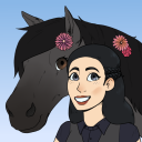
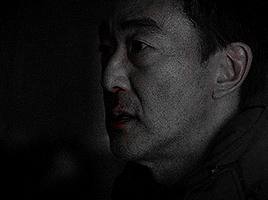
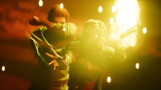
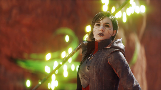
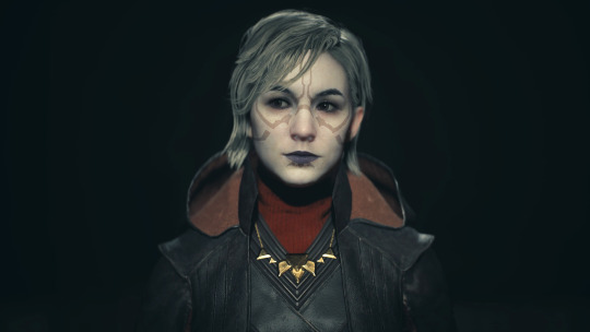
The beacon on the Hightower, do you know what color it glows when Oldtown calls it's banner to war?
#alicent hightower#alicenthightoweredit#house of the dragon#houseofthedragonedit#hotd#hotdedit#corporalicentedit#corporalicentgifs#i was trying the color isolation tutorial by#tuserbea
33 notes
·
View notes
Text
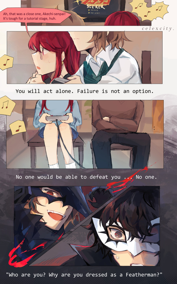
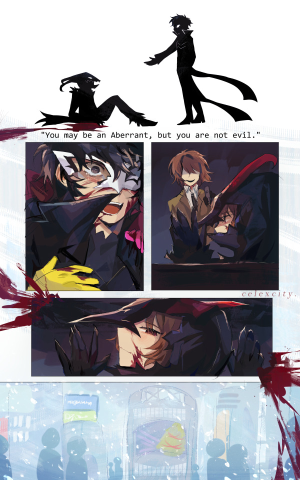

featherman seeker
as usual da cele notes under cut
had to get some food so thsi si late... i lterally gluedm yself to my chair to finish this LMAOAO
all of the not-dialogue is just straight up lines frm featherman seeker LMAOOO just rearranged
this takes place during 3rd semester (see: infiltration log on wall on 4th page, also their winter clothes strewn around akira's room) after drawing it i was rereading like oh u cld prob see this as like post-third semester but nah i intended it to be such BECAUSE
i rock w the canon that sumire has no clue abt akechi's past and black mask and the mental shutdowns and shido and the engine room she doesnt know hes supposed to be dead, that he sacrificed himself, etc. so ofc shes going thru the game like yayyy featherman yay and her sort of naivete Gets thru to goro. i imagine this is like idk a game he played in childhood bc he was a featherman fan but now revisiting it bc sumire wanted to try it, hes like. damn. this kinda. uh. well thats crazy how things line up. so i think it kinda grates at him but sumi's excitement and like. enjoyment! of it kinda helps him also enjoy it more
SO LIKE He knows he's going to die. He knows thats how grey pigeon's story ends. but he's happy here, and now, with the people he loves, so that makes it All right for now. it's a sad story but it's the good ending.
also i forgor how/where/when goro exactly Actualizes back into existence but can u imagine if he spawned right into the winter wonderland of shibuya square like (head in hands) smth so like. isolating abt it. in a crowd of ppl being excited over christmas and hes like what the hell im supposed to be Dead right now.
also "you are not alone" in the first panels very important..... right under hte panel w goro and sumi side by side :') yea
ryuji and ann holding akira back. YEA.
i really like the 3rd slide. the colors mmmm BUT YEAH so its goro/akira fighting/saving sumire, hanging out at jazz jin, last stand against adam kadmon, then goro holding sumi and akira's hands in the snow, then them smiling :') kinda like a procession of memories, or to-be memories or whatever
ANYWAY this is also like part of my whatever canon divergence where the royal trio section of 3rd sem is just longer for no reason . (aka: the thieves take longer to win over to their side, idk maruki gives u a longer time on the deal, etc etcetc.) just more royal trio time :3
sumibun akimeow and gorodog in 4th img... hidden.... also tennis rackets. ALSO THE LITTLE POLAROIDS Important. and all their clothes! i imagine they stay over at leblanc A Lot. akira prob convinces sojiro to Keep morgana at his house LOL and he handles the business and stuff just so they can have their safe haven while they struggle to try and win the thieves back and infiltrate the palace etc . (I kinda have a comic or something in the works for this)
more abt dialogue choices
"it's tough for a tutorial stage" - this means smth. i didnt think this thru 100% ASKJDHASDKJA but its to do w akechi's life and how everything was so fucking difficult for him as a kid when it shouldnt have been.
"is the second phase giving you trouble" - also smth to do w akechi. (As u can see these are all half baked metaphors) smth to do w his 'second life" aka: third semester being Difficult. because now he has sumire and akira and he doesn't want to leave them, so dying the 2nd time is gonna suck real bad.
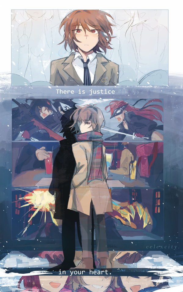
i like shuakesumi btw
#hey guys hows it going#sumire yoshizawa#goro akechi#akira kurusu#royal trio#shuakesumi#persona 5 royal#cele draws#cele comic
1K notes
·
View notes
Text

As a thank you for so many new followers, here's a brand new edition of my editing resources masterposts ✨ (you can find the previous editions here). Make sure you like or reblog the posts below if they’re from other blogs to support their creators! A friendly reminder that some of these are free for personal use only, so be sure to read the information attached to each resource to verify how they can be used.
Textures & Things:
Collage Kits from @cruellesummer that I find myself using basically every single day
Taylor Swift Wax Seals from @breakbleheavens that I also use literally every day
Rookie Magazine Collage Kits (1, 2, 3, 4, 5, 6, 7, 8, 9, 10)
Scribble Textures & Cross-Outs (1, 2, 3)
GIF Overlays (1, 2, 3)
Film Grain & Noise Textures (1, 2, 3)
Paper Textures (1, 2, 3, 4, 5, 6, 7, 8)
PNG Overlays (Paper, Flowers, Clouds, Stickers, Lips, Vintage Paper, Misc. Symbols)
Halftone, Scan Line, & VHS Noise Textures (1, 2, 3, 4)
VHS Tape Textures by @cellphonehippie
Misc. Texture Packs (1, 2, 3, 4, 5, 6, 7, 8)
Photoshop Effects (Halftone Text Effect, Chrome Effect, Glitch Effect, Ink Edge Effect, Photo Morph Effect)
Fonts:
Badass Fonts (free fonts designed by womxn 🤍)
Open Foundry Fonts
Free Faces
Uncut Free Typefaces
Some Google Fonts I Like: Instrument Serif, DM Sans, EB Garamond, Forum, Pirata One, Imbue, Amarante
Some Adobe Fonts I Like: New Spirit, Ambroise, Filmotype Yukon, Typeka, Big Caslon CC (TTPD Font!)
Some Pangram Pangram Fonts I Like: Editorial Old, Neue World Collection, Eiko, PP Playground
Fonts In The Wild (font-finding resource)
Tutorials & Resources:
Comprehensive Rotoscoping Tutorial (Photoshop + After Effects, great for beginners!) by @antoniosvivaldi
Rotoscoping & Masking Tutorial (After Effects) by @usergif
Texture Tutorial for GIFs by @antoniosvivaldi
Color Control PSD by @evansyhelp (to enhance, isolate, or lighten specific colors)
Cardigan Music Video PSD by @felicitysmoak
Picspam Tutorial by @kvtnisseverdeen
Moving GIF Overlay Tutorial by @rhaenyratargaryns
GIF Overlay Tutorial (+ downloadable overlays!) by @idsb
Icon & Header Tutorial by @breakbleheavens
GIF Blending Tutorial by @jakeperalta
Split GIF Tutorial by @mithrandirl
Guide to Coloring Yellow-Tinted Shots by @ajusnice
Slow Motion After Effects Tutorial (useful for GIFs!)
Gradient Map Tutorial by me!
Misc:
How to Make Your Own Textures by @sweettasteofbitter
How to Report Tumblr Reposts of Your Work by @fatenumberfor
Tips for Accessible Typography
915 notes
·
View notes
Text
tutorial — changing the background color in a gif
sofia & remy asked for this tutorial so here it is :)
note: i pay for photoshop and currently own the most recently released version of april 2025 - some things might be different if you're working on earlier versions of photoshop
i've made several gifsets (x, x, x, x) where i've isolated the gif subject so i can change the background into a bright, colorful background or into b&w backgrounds - in this tutorial i'll explain how i do that :)
in this tutorial we'll be going from this:
to this:

putting the tutorial under a read more!
step 1 — open your gif
i usually tend to make my gif beforehand, fully colored and sharpened and everything else, and save it before reopening it (as a gif) in photoshop cause i find it's the easiest way!
you'll have to work in frames mode when isolating the background color (because as said, you'll have to do this frame by frame) and it's important to always have the same frame and layer selected, otherwise you might run into some issues

for the purpose of this tutorial my premade gif (eddie<333) has not been colored, only sharpened
step 2 — selecting your subject
next up we're going to select our subject by going to the select category up top and clicking subject

↓ you'll now have a marching ants line around your subject ↓

sometimes photoshop will be silly and select either too much or too little, and you'll have to manually make sure (for every frame) that your subject is correctly selected - but i'll get back to that later!
step 3 — adding a solid color (/gradient color) layer mask
once you have your subject selected the way you want it, we're going to add a solid color (or gradient color) layer mask by clicking this half filled circle icon in your layers tab - from here on out you can choose whether you want to add a solid color or gradient (for this tutorial - we'll go with a solid color)


photoshop will ask you to pick a color (or gradient) so just go ahead and pick whatever color you wish to make your background! the lighter your color the brighter your background, and the darker your color the duller your background (for b&w backgrounds you can use black or white, it makes no difference) - once you're happy with your color, just press ok :)
step 4 — create a clipping mask
this might seem like nothing, but is actually an important step in the process! you want to make sure that the color fill layer you just created is clipped to the corresponding frame like so:


you can do this by pressing cmd/ctrl + alt + g or clicking right on your color fill layer and selecting create clipping mask

by clipping your color fill layer to the corresponding gif layer, you avoid this happening:
the color fill layer for the last gif layer has been applied on all gif layers before that, which will make it so that your subject will move in and out of the colored background and makes your gif look silly ↓

obviously this is what we want to avoid so clipping your color fill layer to your gif layer is an essential step!
step 5 — invert the layer mask of your color fill layer
next up we're going to select the layer mask and invert it by pressing cmmd/ctrl + i


this way we go from this

to this

step 6 — changing the blend mode of your color fill layer
the final step (!) is changing the blend mode of your color fill layer - i tend to just use the blend mode color on most of these as this mode tends to give the brightest results but you can definitely mess around and see what you prefer :)

(for this set i actually put the blend mode to soft light to create a duller background, for a gradient background just follow the exact same process but in step 3 choose gradient instead of solid color)
and you're done! now you only have to repeat this process for every. single. gif. frame. :)
and that's all there is to it really, so happy creating <3 see more tips/comments below and if you have questions, my askbox is always open!
tips / comments
1.- record this entire process into an action (tutorial on how to create actions) – this way you'll only have to select the correct frame/layer combo before pressing play and letting photoshop do the work for you! i made two general actions;
bw with subject select: use this action when photoshop can select your subject without issues!
bw without subject select: use this action when you need to manually edit the selection of your subject! (see 2.-)
feel free to download and use these actions! they will turn your background b&w - you can change the background color by clicking this square;
sofia @sadgayeddie made an action to select next frame + layer so you don't have to move your cursor around as often and graciously allowed me to share it <3 you can find it here
2.- (circling back to step 2) make sure photoshop correctly selects your subject – when using the select subject feature, photoshop may fuck up the selection of your subject, as such ↓

i don't want the lady in the background included in my subject - you'll have to use the quick selection tool to manually unselect whatever you don't want in your subject and/or manually select what you do want in your subject
from personal experience i know photoshop tends to fuck up with;
hair (especially when it moves around a lot)
blurry subject (eg eddie dancing in 8x06
one or more colors in your subject being too close to the background color(s) (such as bobby's suit in this example)
hands (the smaller the hands, the more photoshop makes a mess)
this is what the subject looks like without the lady in the back selected:
it's a bit more work if you have to edit the subject selection for every frame (and you might make small mistakes), but it's worth it! we want the gif looking like this in the end (sneak peek for my bobby set!!)

#resources#tutorial#itsphotoshop#usergif#i say tutorial but it's just me rambling sjkfhskdf#i hope this makes at least a little sense :') otherwise i'm always ready to answer questions!
228 notes
·
View notes
Text


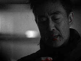
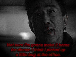

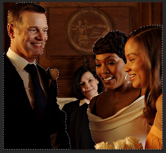
Chimney Han & Maddie Buckley in 9-1-1 | 8.14 • Sick Day
@pscentral event 37: color (isolation) challenge (tutorial credit)
#ruta.gifs#911 abc#madney#chimney han#madneyedit#911edit#otpsource#dailyflicks#filmtvcentral#tvarchive#usersource#userblorbo#userstream#cinemapix#userbbelcher#filmtvtoday#usereerie#useralien#singinprincess#usernoah#userarrow#fourteenthofaugust#usersadie2#tuserju#kallypsos#userahne#flashing gif tw#tw blood
111 notes
·
View notes
Note
if you ever have time/feel so inclined, i would love to see a tutorial or some tips from you about how to do color isolation sets!! they are absolutely incredible and I love them so much! <3
absolutely! thank you so much 💙
here are a few examples of my color isolation sets:
the substance (yellow) || beetlejuice (red) || us (red) || conclave (blue) || sleeping beauty (cyan/blue) || crimson peak (yellow) || smosh (purple) || conclave (red)
beneath the cut, i'll walk you through my coloring process!
notes: tutorial assumes basic gifmaking knowledge & i'm using adobe photoshop 2023 (though afaik, your version shouldn't matter much)
i don't color my gifs until they're sharpened and i'll give you a quick overview of my process: file -> import -> video frames to layers -> trim any extra frames -> crop to desired dimensions -> run sharpening action (i used this tutorial and just made it into an action) which also converts to timeline
once i'm in timeline, i go through my normal coloring process. unless i'm giffing similarly colored scenes that i've already colored and saved a psd for, i usually color from scratch every time. obviously, some adjustment layers vary depending on the source material, but these are almost always my main adjustments, just with differing values
a brightness/contrast layer set to screen - this is a gamechanger for especially dark scenes. note: i do not adjust the values, i leave them both at 0 and just change the blending mode
a curves layer utilizing the black & white eyedropper tools. first, i select the black eyedropper and then click on the blackest area of the gif. i do the same with the white one, using it to select the brightest/whitest spot. this can help a lot if you're dealing with heavily tinted scenes!
a selective color layer (set to absolute, not relative) where i adjust the blacks usually anywhere from 1-5 notches higher and the neutrals either up or down the same amount depending on the scene. be careful with the neutrals when giffing poc as lightening them can result in whitewashing. if need be, i will also adjust the whites, making them slightly whiter with the black slider. selective color is by far my fave adjustment layer and i use it in every single coloring.
after this, i sometimes add a black & white gradient map adjustment layer set to soft light. i'll play around with the opacity, leaving it anywhere between 5-100% depending on the scene. i think this adds depth to your colors and adds some contrast, but i don't use it in every psd.
occasionally, i'll mess around with vibrance/saturation, and that'll be my final layer, but oftentimes i won't actually add this layer until i've finished the rest of the coloring. this is just where the layer will go.
these are the main 5 layers i almost always start every single coloring with and they act mostly as a base and to color-correct any weirdly tinted or exceptionally dark scenes.
now, let's talk about scene selection. i try to set myself up for success by choosing scenes that either already have a very noticeable pop of color or have a color i know can easily be manipulated. you'll want to pick scenes that aren't drenched with the color you want to isolate though, or you won't have the contrast of the black & white.
here are a few examples of good scenes:

the only red here is the covered bridge and it will be easy to adjust only that and not the blue, green, or yellow.

same as above, apart from ralph fiennes's face, which obviously contains red undertones. i'll go more in-depth on this in a bit, but because this scene doesn't have a lot of movement, this will be able to be fixed with layer masks.

again, here we have one bright occurrence of yellow surrounded by blue that we'll easily be able to neutralize.
and a few of bad/less than ideal scenes:

while this scene is an absolute dream for making super vibrant sets or color palettes, it's no good for color isolation. this yellow covers basically everything, leaving no other colors to cancel out.

while i definitely did try this one out, the scene is ultimately too dark and too cyan-tinted to properly isolate the red of the blood or the cyan in her eyes and on the walls.

just like the first one, this scene is fully just. color drenched. would make a great base for a vibrant or color palette set but not useful for color isolation.

bad and wrong!! coloring this movie, however beloved, was a test of my sanity. you have this yellow/green filter over everything and so much of it that isolating or changing one or the other is pretty much impossible.
with all that being said, play around! the best way to learn what does what is to try it out yourself. selective color, though there are other ways of getting the same or similar effects, will be your best friend. it's how i'm able to make sets like this & this!
let's look at this adjustment layer using a scene from conclave:

truthfully, you could either isolate the orange of the wall or the blue of her outfit. i'm going for the latter at the moment.
add a selective color layer by clicking this button:

i like to really emphasize the color i'm going to isolate, make sure it's as consistent with the other scenes i'm using and that it pops. from the dropdown in the layer properties, i select blue.

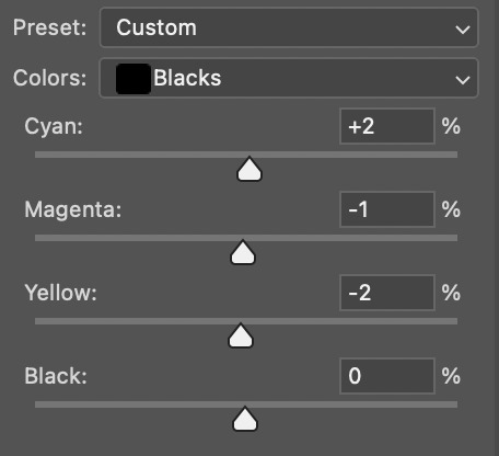
each color from the dropdown will look like this. you have adjustable sliders for cyan, magenta, yellow, and black. the more to the right, the more you're emphasizing that color in any blues in your image. the further to the left, the more of that color's opposite you'll adjust. each opposite pairing is as follows:
cyan + red magenta + green yellow + blue black + white
if you're struggling with this (i did at first), visualize it. pull up one of those "bad" examples. say we take the yellow scene from the gorge. add a selective color layer to it and select yellow from the dropdown. play with the sliders to see how AND how much each adjustment changes the coloring. decreasing the yellow slider all the way to -100% is adding blue to anything ps identifies as yellow. because yellow and blue are opposites, it pretty much neutralizes the scene. instead, if you use the magenta slider and push it all the way to the left, you make any yellows become green. if you move the magenta slider all the way to the right, you'll add magenta to any yellows, making the scene orange. it's all about knowing the color wheel and experimenting!
back to the conclave gif! i want to bring out the blue as much as possible, under the blue dropdown, i crank the cyan slider all the way up and bring the yellow all the way down.

is it a massive difference? no, but you can definitely see the difference between the left (with the adjustment) and the right (without).
depending on the scene and color i'm working with, i'll play around with other layers from the dropdown. but i prefer to do each color in a different layer and i right-click on the box with the eye in the layers panel and change it to the applicable color. that way, it's easier to adjust something later on. you can also rename your layers, but this is quicker and easier imo.

with this particular scene, this is the only adjustment i want to make to the blue for the time being. now, it's all about getting rid of any other colors. to do this, add a hue/saturation layer and select every color, one at a time, EXCEPT the color(s) you're isolating and bring the saturation all the way down to -100. in this case, it's everything but the cyans & blues.

and this is what i'm left with:

from here, you can leave it, but a lot of the time, i'll add a vibrance layer or even another blue/cyan selective color layer and crank that shit up.

this is after adding a vibrance layer (increasing both vibrance & saturation to 100) AND a selective color layer (decreasing the yellows to -100 in the blues).
i would consider this finished, but this can also be super fun to mess around with, again, using selective color:


and if the way her hair changed colors is bugging you, toggle your layers on and off until you find which one(s) changed it and add a layer mask, coloring over her hair with a soft black brush:

once you're happy with everything, save your gif in your preferred way. these are my save settings just for shiggles:


et voilà!
overall, the best advice i can give is to try. experiment! if you're not sure a scene will work, give it a shot. even if it doesn't, you've still learned something. i know it can seem confusing at first, especially if you're not super familiar with these layers or the color wheel, but please feel free to ask any questions. also, let me know if anyone wants another tutorial(s) where i go more in-depth on other colors. i'm happy to do it!
#answered#daynascullys#my tutorials#gif tutorial#gifmakerresource#completeresources#dailyresources#emilyblr#usercats#userholloway#tuseruta#usertina#userrobin#uservivaldi#userchibi#userbunneis#userbambie#useraljoscha#tusermira#userelio#userscourt#userishh#angelblr#heymaur#elwintersoldado#tuserhol#usermaguire#useraashna
109 notes
·
View notes
Text


REAL GENIUS (1985)
When I first brought you into this school, I thought you'd be another Einstein. You were well on your way. And then?
I got a haircut.
@pscentral event 37: color challenge
thanks to @billysjoel for her color isolation tutorial that went okay kind of (that's all on me; tj is brills)
#real genius#filmedit#filmgifs#film gifs#1980s movies#80s movies#chris knight#val kilmer#the gif sutra
94 notes
·
View notes
Note
Hello! Do you have any tutorials of how to make a coloring PSD? I'd like to start making my own, but I have no idea where to even start or how to even start searching for a tutorial on it, I can only find already made ones. Thank you so much!
djarin
magnusedom
arabellas
kinnbig
maziekeen
gwenpendragns
frank-dillanes
arabellas - bright scenes
robin-buckely - dark scenes
whitewolfofwinterfell - dark scenes
completeresources - dark scenes
arabellas - dark scenes
usergif
sabrinaacarpenters - isolate colour
zresources
aubrey-plaza - guide to channel mixer
tesb - how to colour tinted scenes
haknew
snug-gyu
rafael-silva - coloured background
completeresources
cal-kestis
scottstiles - colorize tool
aubrey-plaza - how to fix orange washing
floralovebot - how to fix whitewashing
mohanas - how to fix whitewashing
blueshelp - how to fix whitewashing
haldi-archived - how to fix whitewashing
dailyemeraudetoubia - how to fix whitewashing
meliorn - colourful gifs
bennydemarco - hue/saturation and selective colour layers
and there's probably more in my photoshop tutorial tag!
#photoshop tutorial#rph#rpc#honestly not a fan of a lot of the psds out there which redwash and orangewash people so these are mostly basic colouring tuts!
41 notes
·
View notes
Text

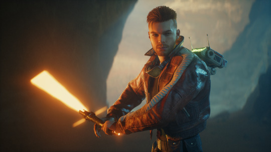
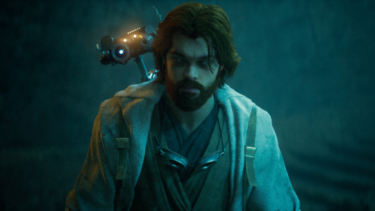
Jedi Survivor Photomode Tips: Portrait Lighting!
There are four lighting features that impact Survivor’s photomode: the environmental light, Cal's lightsaber, the exposure slider, and the three spotlights. Let's use them all 🔆
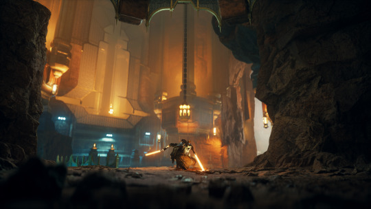
Environment
The environment/lighting teams at Respawn have designed incredible locations across all these different Star Wars planets. Pay attention to how the already-placed lights impact your portrait: I have a running shortlist of favorite locations that I often go back to when creating a specific look.
Environmental lighting also includes effects like fire particles, weapons, Merrin’s magick, etc. If you get your timing right, these can add extra color and visual interest to your photo.
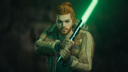
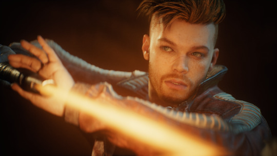
Lightsaber
Cal’s lightsaber! It’s made of light! While everyone has their own color preferences (ginger saber supremacy) keep your color choice in mind when using the saber as a key light.
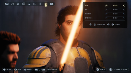
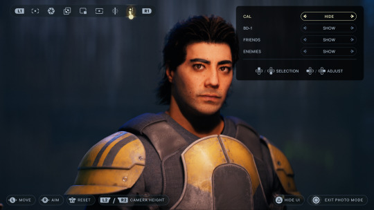
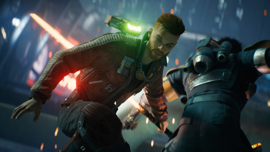
Bonus tip: Cal’s saber can also be used to help light NPCs 👀 Photomode allows you to toggle Cal’s visibility on and off, but the ambient glow from the saber will remain. It’s pretty easy to tell when I’m using this trick: just look for a bar-shaped catchlight in the character’s eyes.
Speaking of catchlights - they’re a great way to add life to your portrait. If the environmental light doesn’t hit the character’s eyes, I’ll often use the first spotlight as a key (main) light to try and create that reflection.
Spotlights
I’m often using spotlights in two ways, either intensifying the environmental light or pushing the image with stylized lighting. The first creates more interaction between the character and their surroundings, while the second adds drama and visual interest. My favorite portraits are often a mix of both.
Here’s a breakdown from a recent photo: the unlit photo (1), a yellow spotlight as a key (2), a red rim light that connects to the neon sign in the background (3), a green rim light for stylization and repeating color (4), and the final image (5)
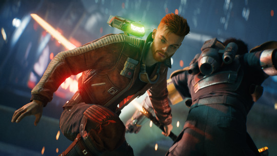
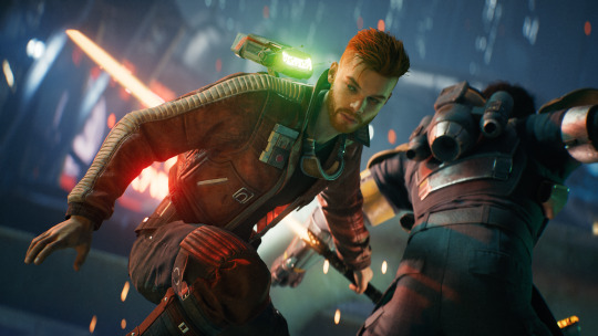
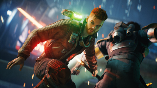
Other spotlight tips: play with moving them closer/further away from your subject, along with the intensity of the light itself. Some colors (white, yellow) are more powerful than others (red, blue). If I can’t get the color I want from one light, I’ll place two in the same location and drop the intensity to blend them - blue and green make turquoise!
If you want to be a nerd like me (though I'm in this industry so it's kind of my job) study lighting that’s used in real life portraiture and cinematography. Techniques like short lighting, three point lighting, butterfly lighting, etc.
Exposure Slider
The exposure slider in photomode is a helpful option when the entire scene is darker/brighter than you’d like. It’s also a good way to isolate your subject from the background: drop the exposure down, then use spotlights to add light back to your subject. Note that the spotlight brightness is impacted by the exposure as well, so you’ll need to crank the spotlights up to compensate.
Photo editing
Survivor’s visuals have a beautiful dynamic range and photomode does a great job protecting its highlights and shadows, though that often means less contrast. So if it’s a favorite portrait, I’ll add some contrast back in and often push complementary color into the shadows (yay color theory!)
--
So I've been slowly writing notes for a full-fledged video tutorial and wanted to try a thread-style post in the meantime. Lighting is such an important part of photography, both IRL and virtual, but it's not the easiest tool to use. This is more theory than a practical how-to, but hopefully some of it is helpful?
If you made it all the way down here, you get... a turbo dog or something. Two turbo dogs! 🌭
#star wars jedi survivor#jedi survivor#cal kestis#photomode#virtual photography#star wars#jen makes jedi tutorials
114 notes
·
View notes
Text
annotatedAmblings's Homestuck Reread Liveblog: Act 1 (part 1, pages 1-125)
Although liveblog posts will contain analysis due to how we like to engage with media, liveblogs are primarily a collection of whatever thoughts came to mind during our reading. Liveblog posts are constructed with each mod drafting their own live reactions separately before combining them, so some sentiments may be repeated due to both mods noting it down. Any analysis within a liveblog post should not be assumed to be our complete thoughts on the subject, and we are not particularly experienced with analysis.
Blue = Mod Aluria Pink = Mod Jasper Arrows (>>>) are used to indicate commentary on each other's commentary.
Almost immediately, I'd like to take note of the usage of color (or lack thereof). The house is mostly white. I don't have any smart comments on this right now but it is an interesting stylistic choice. >Liveblog stitching! Aluria here, I think I was thinking about how it could relate to the feelings of isolation I touch on later in this post.
Page 9: It took way too long for any of this sylladex shit to be even remotely comprehensible to me the first time around. Am I stupid. >No, sylladex mechanics can be a bit tricky to get to, something which narration on multiple pages acknowledges.
Page 10: It's fun to see sylladex shenanigans :]
Page 16: A thing I always liked about the suggestion format is how subject the main character is to the player's dumb fucking whims. I like that about point and click adventures also. >Checked what page is page 16. F in chat for Zoosmell Pooplord and the unwanted desire to shit on his desk.
Page 18: It just occurred to me how the manner in which the sylladex mechanics are encountered via the reader prompts fucking around and finding out really is like a video game without much tutorial.
Page 19: "Films about impending apocalypse fascinate you. Plus, a black president??? Now you've seen everything!" 1. I like the funny foreshadowing 2. ah yes... a tongue-in-cheek ironic joke that feels a little distateful.
Page 22: I do find the Homestuck Beta to be an incredibly charming little gag.
Page 24: the names of his programming projects on his desktop are a fucking MOOD. "FUCK FUCK FUCK" indeed. John's desktop is just like mine fr. I believe I have an audacity file somewhere titled "fuck my life", and our screensavers are equally bad and weird. >Clearly experiencing emotions best conveyed with the word 'fuck' is a universal experience of creators.
Page 26: I think one of Homestuck's strengths is how it pulls off making the dialogue of teenagers feel like the dialogue of teenagers. >THIS. Always this. There are many times that I as a Real Teen (TM) have read a page of Homestuck and gone "yeah, I've had this conversation in real life."
Page 31: Genuinely deranged collection of games. John's bad taste knows no bounds. Also why do you have Bard Quest on DVD. Why would you put Bard Quest on a DVD. It's literally a browser game that's like 100 pages long. >Actually it's 47 pages. That makes it worse.
Page 34:
Infinitely amused by the mood settings in Pesterchum. "happy :) happy :) happy :) happy :) happy :) INCREDIBLY PISSED D:<"
Page 35: Dave is acting as a tutorial npc Me when I fucking lie. Dave honey no one wants you. I'm conflicted about Early Homestuck Dave because he very much fulfills the role he is meant to and sets up his later character arcs perfectly. But he does so by annoying the fuck out of me. >See you're right about that second sentence and it makes perfect sense in context but out of context that sounds so mean lmao.
Page 37:
I could look at the kind abstratus for hours. Also, the planning had to be insane for this. Literally every strife specibus used in Homestuck, no matter how out there, is on here (I think. I only did a quick scan). >Decided to attempt to verify this by looking for all the trolls' strife specibi and immediately failed with Aradia's whipkind. I am sending Jasper to Autism Hell for the crime of being wrong. >>I am being set on fire! Sad! (But hey, there IS still a lot of very specific canon strife specibi in there that I'm willing to bet were there on purpose. Canekind, for one). >>>If I had to hazard a guess, it's possible that some of them were either picked by looking at that page, or just that there are so many potential weapons on there that of course some made it on. In some cases planning ahead may have occurred, but I am not Andrew Hussie so idfk.
Page 39: "EB: yeah, that's fine i guess. i can't imagine it's going to be all that relevant." heh. the fact that Dave knows more about the minutiae of sylladex mechanics, in particular how strife specibi work, takes on a more depressing tone when you contrast his home environment with John's healthier parental situation.
Page 48: First Betty Crocker mention! fun fact once i infodumped about Homestuck to my dad and now the Batterwitch is a running joke we reference whenever we purchase Betty Crocker products. Genuinely surprised the Betty Crocker Wikipedia article isn't protected at this point. >It isn't, but if you go to the talk page it seems like it's been a point of contention before.
Page 50:

"It doesn't matter that it's April and not terribly chilly outside. In a home, a FIREPLACE needs a fire, because that's what FIREPLACE is for. A fire BELONGS in a FIREPLACE, dammit, cata(ptcha)gorically, at all times, without exception." fascinating quote in conjunction with Page 27's "In a kid's yard, a tree without a tire swing is like a proper gentleman without a monocle. That is to say, HE CAN HARDLY BE CONSIDERED A TERRIBLY PROPER GENTLEMAN AT ALL." certain things simply must be the way they are. So there's a lot to be said about the whole fireplace thing but I've had time to ruminate and I'm starting to notice that John seems to have a pretty rigid worldview, maybe? I'm collecting data on this and I don't wanna speak too soon, but a lot of these lines seem to have the underlying implication that he's very much of the opinion that the status quo is not to be questioned or challenged ever, and things are the way they are because that's how they're supposed to be. In perpetuity. Forever. Even if it hurts you. You can see it in the recurring gag on this page and the one with the tire swing; you can see it in the way he talks about his dad; hell, even his joke book is a kajillion years old and described at one point as being at times super racist because of its oldness, as well as being too big to carry around or navigate efficiently. This is an especially fitting trait for him to hold considering he's from the suburbs. Not only are suburbs considered the picture of the American Dream, that idyllic image has historically been upheld through forcible exclusion of anyone who didn't fit into it. No wonder it took her 16 years to transition. >More than 16. :( >>Oh yeah I'm sure it's like. Decades (I haven't read HS^2). But it's been 16-ish years since Homestuck came out.
Page 51: Burn fucker burn.
Page 56: not much comment other than the transition from 55 to 56 and the bit that comes with it got the first audible giggle of this reread!
Page 63: I genuinely believe Rose is a contender for funniest character in Homestuck (speaking only in terms of intentional funniness). >It hasn't had much chance to come up yet, but she is rather silly wrapped up in a dry exterior and I think this fact should be acknowledged more.
Page 68: kinda funny to see John unable to captchalogue the doll because it's 'too big'. Act 1 feels rather quaint on a reread. >Genuinely. By act 6 we're captchaloguing literally whatever the fuck. Planets and shit. >>The fucking Tumor. >>>The fucking Tumor. Gotta get that HTML right. >>>>Oh I'm sorry Formatting King Jasper lemme just format all over the place. Trans women are really cool. That sentence only looks correct if you're on dark mode. sad!
Page 71: Is that. Is that the fucking Cirque de Soleil.
Page 74:

a continuation of the bit regarding the tire swing and the fireplace. this combined with John's willingness to commit to the bit even when it is unpleasant is rather fascinating for his character.
Page 77: FIRST [S] PAGE! "Showtime (Piano Refrain)" is a great song that also hits really different on a reread. Ah, but that is a subject for... *checks notes* 7021 pages from now. >You and your music commentary making me straight up melancholic all the time.
Page 78:

"The peanut gallery over there sure is getting a kick out of it. You are allergic to their scorn." I am unusually fond of this joke. Page 72's mention of John's peanut allergy was a funny enough moment on its own, but the additional reference/pun? Delightful. The jorker.
Page 79: The usage of a Hi-C commercial also hits different on a reread.
Page 82:
"You have a feeling it's going to be a long day." Oh, if only you knew... Homestuck's title page! I love how desolate the audio is, and I think the prose on this page adds to the feeling of isolation. Isolation is a theme throughout Homestuck, and with John as the Heir of Breath in the incredibly isolated environment of suburbia... ah, I just really like this page! This page is also where Act 1 gets its name on the adventure map: "The Note Desolation Plays." There's literally nothing I can say about Windchime Foley that isn't abundantly obvious but GOD does it set a tone. It's the first real hint that this is more than just a silly little adventure comedy.
Page 89: "Your DAD sees right through your costume! You don't know what you were even thinking with this foolish ruse!!!" early example of a recurring pattern of John viewing himself as stupid, foolish, etc.
Page 90:

There isn't much to this Flash, but I do like the animation, and "Showtime (Original Mix)" is a banger. The vibe with John and Dad's strife is SO different from the next two strifes. For obvious reasons (Dad Egbert is a good father). >True! It's very unserious. John is aggressively rejecting his father's cake, for fuck's sake, meanwhile Rose pulls out the empty suicide threat against her mother parrying with alcohol and Dave is. Dave.
Page 110: "TG: im wearing them ironically TG: because theyre awesome TG: the fact that theyre ironic makes them awesome" ah yes the classic "i'm totally doing this ironically and not sincerely".
Page 111: I do enjoy the meta bullshit of the characters being MSPA fans in-universe. Tragically, Midnight Crew will never finish because of the world ending. Sad!
Page 112: I <3 Self-Referential Jokes
Page 122: I should go back at some point and do a cake count of just how many goddamn cakes John's dad made. >I checked. 4. 2 in the room, 1 downstairs, 1 he was actively baking. 4 cakes for 2 people. If June came out to him in a no-Sburb AU every pharmacy stocking HRT in the area would be in crisis mode.

Page 125: Sorry but I will literally never stop finding sylladex failure funny. PDA BANISHED.
7 notes
·
View notes
Note
do you perhaps know any good tutorial that could help with coloring gifs to make the colors pop out?
like in these gifs :
https://www.tumblr.com/3-13-3/694198935284285440/mclaren-unboxed-back-at-it-belgiangp
https://64.media.tumblr.com/4bcfeb6c02c2e15f00c0b656bec0c217/126e205d91c132bc-d0/s540x810/2117d5c8946bf23b6a041b060cdaac534b72f1bb.gifv
i apologize if you already received a question like this your gifs are so well balanced i have no idea how to make might less dull and dead

DO NOT SAY THAT ABOUT YOUR GIFS THAT'S SOMEBODY'S CHILD!!!! all creations made from love is beautiful i will not allow talks like this!!!
anyways first of all thanks for the kind words 💖 im probably not the best person to recommend coloring tutorials bc i didn't really use them but! what i did do a lot was that i would compare my gifs to gifs from experienced creators and try to figure out what they did to get there. ofc we won't be able to replicate exactly what they did just by eyeballing which is acc a good thing bc in the process you develop your own understanding and style. you mentioned @3-13-3's gorgeous belgian '22 gifs so i thought we could try use one of them as inspo and do a coloring exercise together.
this is what we start off with:

2. i always like to adjust brightness first so here is [brightness +70, contrast +10]:

3. levels [25, 1.76, 255] for more brightness:

4. the original is obviously too yellow among other things so the next thing i adjust is color balance:


5. the blacks look a lil too red and the neutrals still look too yellow, so here i try to fix those using selective color:


6. the next thing i notice is that the yellow is too saturated and warm and the og coloring has more magenta tone in the red/lip colors. so that'll be what i try to do next:


7. the main difference is now the blue in the glass in the back. it's looking a lil too pink. with so much red and magenta tones in the gif, it might be a good idea to introduce some cyan or green tones into it. here we isolate the blues and mae it more saturated and green:


8. similarly, we use another selective color to adjust for more green and cool tones:


which would be what we end up with! again the objective is not for your coloring to look exactly like theirs but using theirs as inspo and in the process develop your own understanding and style.

hope this is helpful and happy creating 💖
26 notes
·
View notes
Text

One of the games I bought while in isolation was Prehistoric Kingdom. Which is basically Planet Zoo, only with (accurate! Don't get me started on the fucking Jurassic Park/World movies/games!) non-avian dinosaurs and prehistoric mammals like mastodons, woolly rhinos, and cave lions.
The game's still in early access, but I've read that much of it is functional, so I bought it on sale. I just fired it up tonight to see what it's about and figure out how it works. Which was a little bit difficult because the recent major update of it broke the tutorial, so the tutorial is currently disabled. But as it turns out, at least in terms of landscape sculpting and building stuff, much of it works an awful lot like Planet Zoo -- only with added (and awesome) scaling functionality, not to mention being able to turn off the grid and to paint entire swaths of trees/shrubs instead of placing things one-by-one -- so between that and the in-game help, I could figure out most things.
And then I bred myself some psittacosaurs, shown in the pic, because they're among my favorite non-avian dinosaurs, and plopped them in a habitat....and....Well, a bit of nerding ahead. But before I get to that, I give the game a thumbs up so far, and it has tons of potential ahead of it. I'll probably put the game in unlimited, creative sandbox mode and just check out and build for every dino species in the game before going back and actually playing the game in its challenge mode, where you have to unlock stuff and don't get unlimited money.
Now for the nerding. My psittacosaurs promptly escaped from their habitat because I didn't bother with any natural barriers to block the invisible fences I laid. LOL But that's OK because I just wanted to see what they looked like in the game, given that we actually know a lot about what they looked like in real life in terms of soft tissues and pigmentation and such.
And it turns out that they did a pretty good job with the psittacosaurs! They got the dorky bristles at the base of the tail and the bizarre-o head correct. And they got the countershading right! That is, darker on top and lighter on the belly, which is typical for animals that live in dense forests. We know that psittacosaurs had this because there've been some specimens preserved with soft tissues, which included skin which included preserved melanosomes, so we could find out about the coloration of these buggers. So, the devs got the countershading as well as the subtle stripes/spots correct. I'd say they still look a bit too shiny/plastic-y, so they probably need to crank down the speculars a little, but otherwise? Pretty damn good.
I'd read that the developers of this game were trying to be more scientifically accurate, as opposed to...you know what...but I'm still pretty impressed. Can't wait to see if they did a similarly good job with the dilophosaurs, which are my favorite non-avian dinos. (Fucking Jurassic Park...Dilophosaurs are not tiny, venom-spitting frilled lizards, for fuck's sake, and yes, that was well-known in the early 90s, so there's no excuse!)
#non sims#prehistoric kingdom#for the record my favorite dinosaurs of all#are a tie between cassowaries and corvids#because birds are dinosaurs
29 notes
·
View notes
Note
Hello! I love your gifs! How do you make yours so clear and high quality/What's your process? <3
Hi!! Thank you so much!! I've never really had to explain out my process to anyone and I don't know how much detail you need, but I'll try my best and try to be as thorough as possible just in case!!
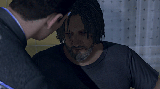
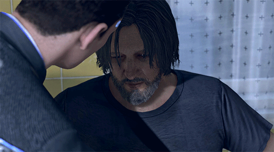
For my D:BH gifs, the process starts out with recording my own game play. I have a gaming computer that already had the GeForce Experience app downloaded, so I use that to record my game play. It records at 1920 × 1080p, 60 frames per second, so the files can get... rather large 😅 The video of my playthrough of the Russian Roulette chapter (~11 minutes long) was just under 4 GB. So its not light...
From there, I figure out what in particular I want to gif (for the timestamp roulette series, I let a random number generator figure out whereabouts I'm looking). Once I know that, I open up VLC and use it to isolate that particular shot + a little more on either end.
After I have the shot(s) I want to gif isolated, I open up Photoshop. I use "File" > "Import" > "Video Frames to Layers" and choose the video I want. You can do this straight from the video of your playthough, but I find that the shorter the video is, the easier it is to work with in this step. I trim my video more, to about a click or two outside of the specific shot I want. Like so:

From there I delete any extraneous frames from the "timeline" section that comes up.
Then is cropping: my go-to crop uses the "W x H x Resolution" option - I put 540 px in the first box, 300 px in the second and leave the third blank.

After that, I have an action in Photoshop that does the next steps for me (to make things quicker), but what it does is sets the frame rate (which will have to be done again after saving the gif because Photoshop hates everyone apparently), converts all the layers into a single object, and sharpens the gif. I've only been gif-ing for about a year and a half, and before that I had exactly zero experience with Photoshop at all, so all the numbers from these steps are still the same as the numbers I pulled from the tutorial I used when trying to figure everything out. For those, you can look at this absolutely AMAZING tutorial, by hayaosmiyazaki, specifically steps 7. gif speed and 8. sharpening.
From there, I start adjusting the colors. From what I've noticed, I seem to do a good bit less color adjustment than some, or maybe even most, other gif makers. It's honestly all about personal preference, so play around with it and find what you like! I personally like to stick as close as possible to the original colors, while still brightening the image up enough to make it clearer and more legible. So, for a majority of my gifs, I only apply an "Exposure" layer, a "Brightness/Contrast" layer, and a "Hue/Saturation" layer (from the "Layer" > "New Adjustment Layer" menu.) The numbers here change dependent upon the lighting in the shot.
For example, here's a before and after of this shot I just did so I could type this out and make sure I got every step 😅 For this one, I did Exposure +1.0 (no change to Offset or Gamma Correction), Brightness +20, Contrast +10, and Saturation +5 (no change to Hue or Lightness).
Once I'm satisfied with my coloring, I go to "File" > "Export" > "Save for Web (Legacy)". I watch the gif there to make sure it looks how I want, maybe go back and do a few tweaks to the coloring if I'm not quite happy, check the file size and then save it!
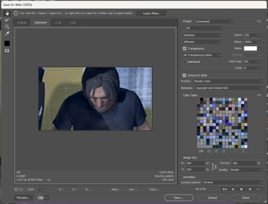
Tumblr's maximum file size is 10MB so if your gif is over that, you won't be able to use it on tumblr - in order to fix that, you may have to delete a few more frames. Or you can crop it to so there's less pixels in the "Save for Web" pop-up by changing the numbers in the "Image Size" section
And now, once I have my gif named and saved. I go back to "File" > "Open" and open up that gif. From there, I go to the little three lines icon in the top right corner of my "Timeline" section, click "Select All Frames" and then click the three dots on one of the frames and change the frame delay. For my DBH gifs, I do 0.02 seconds cause it looks best to me. Depending on how many frames per second your recording software does/what you personally like speed wise, this may be different for you. This is also different for gifs from live action or other media (for those, I prefer 0.05 seconds - it looks the most realistic to me.)
Then, I just save again, overriding the file from before I changed the speed, and voila! That's my process!
I hope this helps; if you have any more questions, my ask box is always open!! And again, thank you so so much 🥰 I'm so glad you like my gifs!!
21 notes
·
View notes
Note
Any tips on how to cosplay Undead Jack Goodman
( context plan on going to a Halloween party as him )
actually yes!!! i’ve gone through a fair bit of trial and error on this one so let me give you some tips!!
here’s how i did it.
so. first. the makeup.
you will need
- cotton balls/pads
- liquid latex
- scar wax (optional)
- paper towel tube
- tissues
- red base makeup
- eyeliner pencil of some sort
- fake blood
- black/brown/yellow/purple makeup
so, first, you’re going to want to block out the shape of the injury. i usually just draw it out with the eyeliner pencil (using a reference of course). you’re going to want to go all the way down your neck to the collar of your shirt and as far back to where your hair falls on your neck. if your hair doesn’t hit your neck well. then follow your heart. then, you’ll follow the guidelines you’ve put down with cotton and liquid latex to make it raised. you’ll want to tear up the cotton balls/pads and roll them into thin strips with your fingers. you can make them as long or as short as you want. i usually make them pretty short though, so it’s easier to make sure they follow the lines. once you’ve rolled them, you can place liquid latex over your guideline, and then stick the strip on. if that doesn’t make sense, check out my video tutorial and also the one i attached at the end. then, once you have that, you can start adding texture. i usually put one piece of scar wax on the side of my cheek like here. it should look somewhat like this (but with stuff on your neck too.) this is also the stage where i start attaching little pieces of tissue in shreds to my face with liquid latex to simulate the little floppy pieces of skin that hang off.
next, you can add the fake windpipe! for this, i cut a toilet paper tube in half and then adjust the size until it fits comfortably over my throat. you can attach it with liquid latex, then cover it with another piece of tissue to make it a little more seamless and use liquid latex again to hold it down.
now, you have to go in with the color. start with a red base, then add yellow and black highlights, with a little bit of purple if you’re feeling bold. but don’t use too much purple. then, go absolutely insane with the fake blood. the most important thing is to respect the lines you made before, cause in the movie all the wounds are isolated to one side of his face.
to modify this for the later stages of decay you’d want to use a green base for the rest of your face and use less red and more of the darker colors in the wounds. you could create texture on the rest of your face with liquid latex i think to sort of simulate the shriveled look but i’m not super sure - i haven’t tried anything past the initial fresh hospital look. i’d look up a few zombie makeup tutorials and see if you can figure anything else out!
i based all of mine off of this tutorial, so it might be a helpful watch if you’re confused at all.
youtube
next, the coat. i really wanted the blood to look fresh, so i had kind of a hard time finding fake blood that would work. most of it dries and soaks into fabric, and since the green coat is dark, it just ends up kinda looking like it’s been stained with an unidentified liquid. so i decided to make my own. i mixed gelatin powder, water, and corn syrup with food coloring - mostly red, but a few drops of blue to get a darker more bloody nasty look. in terms of amount, you just kind of have to follow your heart. then, i poured a little over the shoulder, let it drip, then laid it down and did some spot treatment and made sure the coverage was even and there was enough. i’d recommend doing this maybe two nights before you’re going to need the costume - it takes a while to dry but if you let it dry for too long it’ll start to crack when you move. however, it’s the only way i’ve figured out to keep the blood looking fresh. if you want, you can also cut holes in the coat in some places to match how it is in the movie, but i’ve found it honestly doesn’t need it.
then you’re pretty much set! get some dark jeans and hiking boots and boom. you’re jack. would love to see how your costume turns out!
#matty answers#aawil#an american werewolf in london#jack goodman#vfx#sfx#sfx makeup#horror#horror movie#horror makeup#vfx makeup#sfx tutorial#sfxgore#makeup tutorial
7 notes
·
View notes
Note
hey!! Those gifset for scrubs looks amazing!!
https://www.tumblr.com/billysjoel/776944203704975360/scrubs-jd-elliot-turk-pscentral-event-36?source=share
would you mind doing a tutorial on how you made the colouring and colour isolation and text effects on the second gif?
hi, thank you so much!! this is the post and i'd be more than happy to make a tutorial for you!

so, i'll start with the coloring:

step 1: as with almost every single coloring/psd i make, i start with a blank brightness/contrast layer set to screen. this is especially helpful with really dark scenes! in this case, i left it at 100% opacity, but sometimes i'll decrease it if it blows out the scene.
step 2: curves. i rarely, if ever, manually adjust this layer and instead use the eyedropper tools. click the black eyedropper (1) and then click on the blackest part of the scene and then use the white eyedropper (2) to select the whitest part. in this case, it didn't make a huge difference, but this is a big help with heavily tinted scenes.

step 3: selective color. my next step is always adjusting the blacks and neutrals (and sometimes whites) in selective color. how much i adjust these totally depends on the scene and messing around with the neutrals can definitely affect the skin tone of people of color, so keep that in mind!


step 4: color balance. this step is usually optional for me, but i found the scene was leaning kind of yellow. again, this will vary dependent on the media you're coloring, so my best advice is to play around with the sliders and see what works!


step 5: gradient map. after this, i added a black & white gradient map set to soft light and reduced the opacity to 25% just to add a bit more contrast and depth to the blacks.
step 6: brightness/contrast. another blank layer set to screen and set the opacity to 15% to brighten things up just a little.
step 7: vibrance +50.
step 8: selective color. adjusting the blacks and neutrals again.


step 9: selective color. my favorite part is just cranking the blues and cyans the FUCK up lmao


step 10: selective color (again) on cyan and blue (again).


step 11: selective color under the reds because elliot's face was looking pretty red.

step 12: selective color under the yellows. again, i recommend just playing around to see what slider does what. a little can go a long way!

and that's it for the general coloring that i used for all the gifs in this set. for the next part, you'll either want to be proficient with keyframes or pick a scene where your main character doesn't move much (this will make life so much easier).
step 13: create a new layer (ctrl+shift+n or layer > new > layer). choose the color you want to use and either fill the layer using the paint bucket tool (g) or use a brush (b) to color it all in. you should have something like this now:

step 14: set the layer to color (or another blending mode of your choosing) and apply a layer mask (the 3rd icon across the very bottom).

step 15: with the layer mask selected (as you see above), not the color thumbnail, use a soft black brush and color over your character. this will remove the blue from from whatever areas you color. if you need to "undo" what you've colored, switch to white (x) and that will bring back whatever you color over.
step 16: typography. i've actually done a few tutorials showing how i do my text like this, so check out this one, this one, or this one!
if you have any other questions, please let me know! i'm happy to help however i can!
#answered#Anonymous#my tutorials#gif tutorial#gifmakerresource#completeresources#dailyresources#chaoticresources#coloring tutorial
46 notes
·
View notes
Text
Table of Contents
Easily find all my posts. That way you won't have to scroll through my reblogs to find what you want! ( ꈍᴗꈍ)
Resources for Creatives
Video Tutorials
Surround Sound on YouTube
Downmixing Discrete 5.1 Surround Sound to Dolby Pro Logic II
Upmixing Dolby Pro Logic II to Discrete 5.1 Surround Sound
Manually Encoding Dolby Pro Logic II
Isolating or Removing the Center Channel In Audacity
Custom Closed Captions on YouTube
HDR on YouTube
Optimizing Video Quality on YouTube
Masters for Archiving
yt-dlp: Downloading YouTube Videos the Right Way
Animation and Film Tutorials
Free Animation Production Tracker Spreadsheet
Free Storyboards and Layout Templates
Underlighting
Cel Color Palette
Film Grain
Film Gate Jitter
Animation help reblogs
My Work
Neurodivergent Help and Personal Blog
Autism help
Health help
Personal blog
80 notes
·
View notes