#complimentary color harmony
Text

0 notes
Text
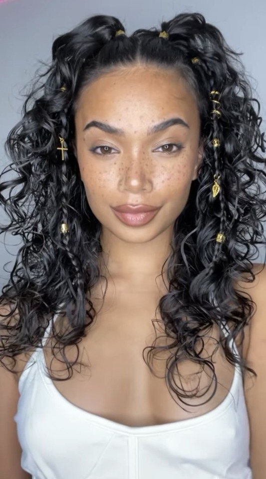
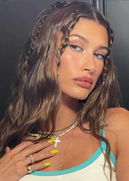
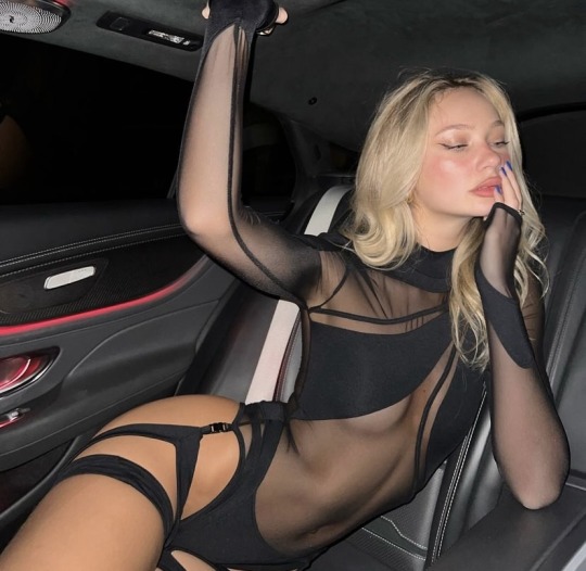
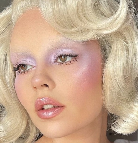
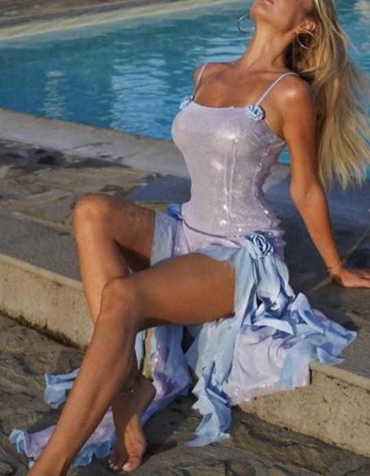
Rising Sign & Your Perfect Festival Outfit
Here are the perfect any music festival outfits for each of the 12 zodiac signs and Ascendants, with details on color schemes, materials, accents, and overall aesthetics:
PSA: Images and descriptions are both complimentary, so they may not be entirely identical, but everything is relevent.
Aries Rising: Bold and daring, an Aries rising would rock a fiery red crop top paired with high-waisted denim shorts. Accessorize with a black leather choker, combat boots, and a statement belt. The outfit screams confidence and adventure.
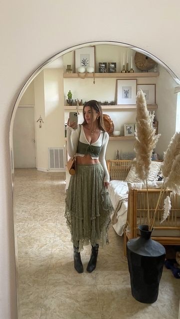
Taurus Rising: Earthy and sensual, a Taurus rising would opt for a flowy, bohemian-style maxi dress in shades of green and brown. Pair with a leather fringe vest, ankle boots, and a wide-brimmed hat. The outfit exudes comfort and laid-back elegance.
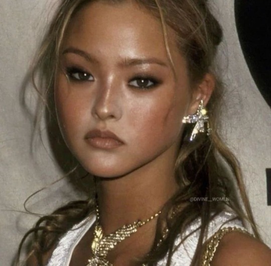
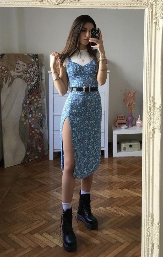
Gemini Rising: Playful and eclectic, a Gemini rising would mix and match patterns and colors. A graphic tee paired with a colorful, patterned skirt, fishnet stockings, and high-top sneakers. Accessorize with layered necklaces and quirky sunglasses for a fun, youthful vibe.
Cancer Rising: Soft and feminine, a Cancer rising would choose a vintage-inspired, pale blue sundress with delicate lace details. Pair with a cozy, oversized cardigan, ankle-strap sandals, and a small, cross-body bag. The outfit radiates comfort and nostalgia.
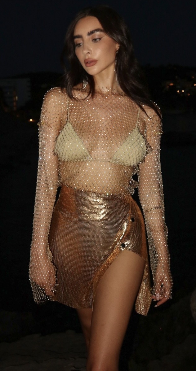
Leo Rising: Bold and dramatic, a Leo rising would make a statement in a metallic gold romper with a plunging neckline. Accessorize with a chunky, gold chain necklace, oversized sunglasses, and platform heels. The outfit screams glamour and confidence.
Virgo Rising: Clean and practical, a Virgo rising would opt for a crisp, white button-down shirt tucked into high-waisted, black denim shorts. Pair with a black leather belt, minimalist jewelry, and comfortable, low-top sneakers. The outfit is polished and effortlessly chic.
Libra Rising: Elegant and balanced, a Libra rising would choose a flowy, pastel pink maxi skirt paired with a white, off-the-shoulder crop top. Accessorize with delicate, gold jewelry, strappy sandals, and a woven clutch. The outfit is feminine and harmonious.
Scorpio Rising: Mysterious and alluring, a Scorpio rising would opt for a black, lace bodysuit paired with high-waisted, faux leather leggings. Layer with a sheer, black kimono, and accessorize with a choker, ankle boots, and a dark, smoky eye. The outfit is seductive and intense.
Sagittarius Rising: Adventurous and free-spirited, a Sagittarius rising would rock a tie-dye, cropped t-shirt paired with distressed, cut-off denim shorts. Accessorize with a woven, multicolored belt, layered anklets, and gladiator sandals. The outfit is playful and adventurous.
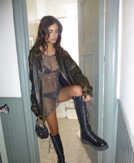
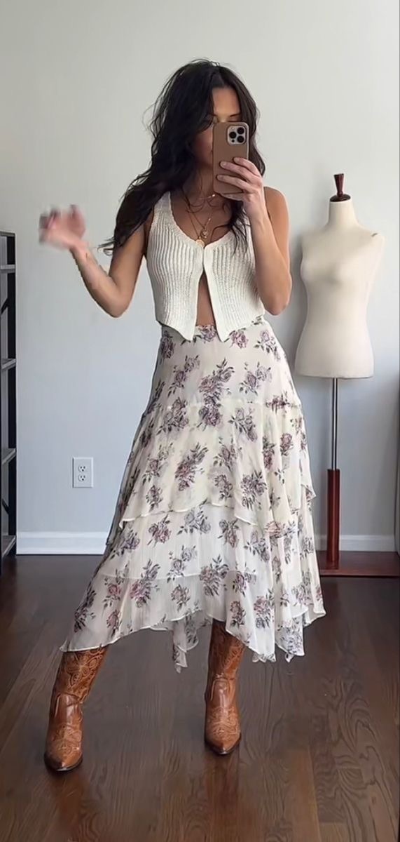
Capricorn Rising: Classic and sophisticated, a Capricorn rising would choose a sleek, solid & colored co-ord with a structured, cinched waist. Pair with knee high or thigh high black boots or dainty shoes, minimalist jewelry, and subtly refined look. The outfit is timeless and powerful.
Aquarius Rising: Unique and unconventional, an Aquarius rising would opt for a holographic, iridescent bodysuit paired with high-waisted, flared pants. Accessorize with a chunky, silver choker, platform boots, and a brightly colored, faux fur coat. The outfit is futuristic and eccentric.
Pisces Rising: Dreamy and ethereal, a Pisces rising would choose a flowy, sheer, pastel purple maxi dress with delicate, floral embroidery. Layer with a soft, crochet cardigan, and accessorize with a flower crown, layered, beaded necklaces, and strappy, barefoot sandals. The outfit is whimsical and enchanting.
527 notes
·
View notes
Text
Ranking Various Cosmere Fantasy Swears
If there's one thing Brandon Sanderson likes, it's avoiding any real swear words in favor of Fantasy Swears. I am genuinely a huge fan of this technique. So here how I'd rank some of the ones I can remember! (And thanks to 17th Shard [here and here] and to Reddit for compiling some lists!).
#14: Colors (Warbreaker)
This one feels a little bit...lazy, I guess? Like yes, Warbreaker's magic is color-dependent, so colors are a big part of the world-building, so I guess it makes sense that people use it as a swear. But it feels like if, in fantasy USA, people swore by "eagles" all the time: "Eagles! I dropped my hamburger!"
#13: Moons (Tress of the Emerald Sea)
I mean same problem as with "colors"! Yes, the moons are a big aspect of the worldbuilding, but it just feels like a semi-boring swear. Although maybe that's just the swear that Tress tends to use.
#12: Shadows/Shades (Shadows for Silence/Sunlit Man)
Okay, maybe this one is a bit boring, but anything Threndy-related gets extra credit from me. So therefore I think this is one of the least boring of the "basically boring descriptors of world building elements" swears.
#11: By the Lord Ruler (Mistborn)
I mean...eh. This one is world specific, but it's basically like swearing by god only in this case the god is the Lord Ruler, right? It makes sense 'n' all but isn't as interesting as some of the later ones.
#10: By the Survivor's Scars (Mistborn)
This one is better because it's more specific--Kelsier's scars are rich with meaning, and swearing by them does feel like it carries cultural weight.
#9: By Harmony's Armbands (Mistborn)
Putting them all in a line like this...I just like how they get ever more specific. Now we're swearing by Harmony's feruchemical armlets? Okay!
#8: God Beyond (Shadows for Silence)
I mean, Threnody is, like, haunted by a god's corpse, so I think any of their god-related swears are more interesting as a result.
#7: Nights / Nights afire (Emperor's Soul)
I like this one because I just don't know what it refers to and it seems kinda creepy. What are nights on fire for??
#6: Rust and Ruin (Mistborn)
Frankly, the alliteration gets this one extra points. And "Rust and Ruin!" just feels like a good thing to shout when you've stubbed your toe.
#5: Storms/storming/Stormfather (Stormlight Archive)
I know this one SHOULD lose points for being exactly the sort of boring descriptive swear I maligned above...but I enjoy this one simply because it's such a clear linguistic stand-in for "fuck" and that leads to such amusing translations as "Kaladin Fuckblessed" or the "Fuckfather" and that just never stops being funny to me.
#4: Herald body parts (Stormlight Archive)
I didn't notice until looking at various compiled lists of Cosmere Fantasy Swears, but Rosharans really like to swear by specific Herald body parts, huh? From here: Kelek's breadth, Kelek's tongue, Ash's eyes, Ishar's soul, Nalan's hand, Pali's mind, Talat's hand...I'm a fan of this. It's interesting and feels culturally relevant.
#3: Glories Within (Stormlight Archive)
This one is just Szeth so far, but people speculate it's probably a Shin curse. That makes it interesting to me since we don't know a whole lot about the Shin. What inner glory are they using to swear?
#2: Starving (Stormlight Archive)
This one is pretty similar to "Storming," I suppose, in being a pretty clear linguistic stand-in for "fucking." But I just like that the food-obsessed Lift has her own personal swear relating to starvation.
#1: Lowly/Highly (Yumi and the Nightmare Painter)
I'm a big fan of the lowly/highly thing from Yumi & the Nightmare Painter, where words can be linguistically marked as meant in either a high way (complimentary) or a low way (insultingly). It's fun worldbuilding and leads to some comic beats in the novel. Plus, this post tickled me greatly: https://www.tumblr.com/cabinetcreature/722030379790401536?source=share. It's so true!
#cosmere#cosmerelists#Stormlight Archive#Warbreaker#Mistborn#Sunlit Man#Tress of the Emerald Sea#Yumi and the Nightmare Painter#Shadows for Silence#Emperor's Soul
258 notes
·
View notes
Text
GUYS GUYS GUYS PLEASE HEAR ME OUT ON THIS
Yellow and purple are opposites on the colour wheel, and what else is purple and yellow? The colour of Newton's filaments.
If we're following the theory that Newton is being influenced by the Titans or merely under their control and not full on possessed, then this could imply a lot.
One thing that immediately came to mind (for me at least) is how the Titans could've been merely taking all of Newton's bottled up hatred and lack of self worth and multiplying that by like a hundred. (think of Mr L from spm and you'll understand what I'm implying here)
While Newton when we first meet him and towards the end of the game (when his filaments are yellow) is what he wishes others to perceive him as, meanwhile when his filaments are purple (so while he's under the control/influence of the Titans) he's showing his true emotions towards those who've most likely hurt him in the past
Another thing I've noticed is what the colours themselves imply.
While yes, yellow is mostly associated with joy and happiness, but it's also commonly seen symbolising cowardice, illness, betrayal, egotism and anxiety.
Which perfectly sums up Newton in the beginning of the game, already showing us what kind of character we're dealing with.
He seems like a joyful and outgoing character, costly showing himself off in the best way he can. But the more you interact with him, the more dialogue you receive from him, the more you start to realise there's more depth to this otherwise 'silly and goofy' character
Newton's whole thing is that he wants praise, he wants affection. He desires it more than anything, which just further feeds into the idea that he's self conscious and struggling from extreme anxiety. Believing that he'll never be good enough, leading him to go to extreme lengths to get people to finally notice him.
Meanwhile, purple is a colour commonly associated with royalty and power, showing Newton's newfound abilities now that Titans are controlling him and basically manipulating into committing mass destruction across his planet.
But what else is purple associated with? Decadence, self-indulgence, conceit, pomposity and pride.
Purple is also sometimes seen as a color of mourning. Which is implying the old Newton, the one the player met at the start of the game, is dead. He's not the same character, not anymore and not right now. He's a twisted corrupted version of himself, letting his hatred and want to prove himself as worthy of attention and love get the better of him.
It's those emotions that allowed him to be manipulated into freeing the Titans, and why he never fought back against their control over him until much later into the game where he finally had enough and snapped.
Going back to my original statement about the two colours, purple and yellow, being opposites on the colour wheel.
These are called complimentary colours. They're exactly opposite eachother and sometimes referred to as 'harmonious colours' and contrast extremely well.
This implies that these two sides Newton has to himself, they CAN co-exist.
One of my friends even pointed out that when mixing light, overlapping purple(or magenta) and yellow gives you white. (Do some research about the additive colour mixing theory if you don't believe me this is true)
And what does white symbolise? Most commonly, purity and peace. Further proving that the two vastly different and seemingly contradicting personalities Newton showed in the game are able to exist alongside one another.
There's nothing wrong with experiencing emotions of jealousy and spite and neither is it wrong to display yourself as overly positive and confident in yourself to others, but the important thing is to not let these feelings and emotions dictate your life.
The Titans merely helped bring the negative bottled up emotions to the surface. They didn't create a whole new snarky personality for Newton while controlling him like a puppet on a string. It was there the whole time.
It was what Newton always wished to have done, to finally let everyone who ever wronged him experience EXACTLY what he did.
#yall im COOKING with these theories recently#i was literally just watching a video on colour theory in art and suddenly thought of this#took me like 15 minutes to write out and do research#lol#littlebigplanet#little big planet#lbp#newton pud#im so normal about this game(mainly newton) guys I swear#still shocked no one thought of this before me
37 notes
·
View notes
Note
LOVE your work!! how do you choose colors? I'm an artist myself and I struggle to find color palettes that feel like me and what I want my art to look and feel like
Color theory is absolute butts and ass and I slept through the classes I tried to take in it so I cheat. I make really ugly flat color layers and then throw a bunch of color adjustment layers on top until I like how they look. Then I smother the skin layers in blush (the naughty artists' technique), do a cold toned multiply layer for shadows on top, airbrush in contrasting warmth, and then top it all off with a gradient map correction layer to bring it all together. (The gradient map is key for color harmony - I definitely recommend looking up how to use them)
The only color theory that rooted in my brain of any kind was complimentary colors, so I use those a lot, with a preference for the green and red combination. Like pretty much on every level I use complimentary colors, when choosing character designs, when making backgrounds and atmospheric lighting, when coloring skin etc etc. I know there's much cooler and smarter things than that but tbh sometimes simplicity is where it's at.
Another random note - it's good to color code character designs in comics and other narrative works. This way you can change their outfits and hair and such and they remain easily recognizeable because of their color coding. It also makes it easier to distinguish them from each other in framing. For example, Gwen wears pale, cool toned colors with gold and Aleksei mostly wears black and silver with bold color accents, usually green and or red. This is so they contrast both in saturation and values and stand out easily in panels against each other.
Simpler color palettes are generally better, it's best to refrain from using more than 3 distinct colors in a design unless it's supposed to be chaotic/flamboyant. You can use as many values and saturations within those colors as you'd like tho so it's not as limiting as it sounds.
48 notes
·
View notes
Note
hi tamelee!
I'm here to ask for a little bit of advice if that's okay (: about a month ago I bought a Wacom drawing pad so I could start experimenting with digital art. artists like you here on tumblr have really inspired me to start making art. but I feel kinda.. lost. I've been mostly drawing naruto manga caps and I'm getting better but I guess I don't know where to go from here. coloring and shading scares me lol. I'm using clip studio paint and it's just a little.. intimidating. I feel discouraged, like I won't be able to do it. how did you do it tamelee? did you watch a lot of tutorials, or did you experiment until you figured things out? any advice you'd have for a beginner artist I'd really appreciate.
thank you veryvery much for your time ^^
Hi Nonee! 🧡
Sure!
Oh I think that’s a very good place to start. As well as drawing subjects you like ^^!
Hmm, tbh I’ve just experimented a lot, but I don’t think my way of having done things was the most efficient. You might want to follow tutorials step by step? You can try coloring only with flat colors until you feel a bit more confident with that as well as cell-shading (toon-shading/non-realistic, like in anime) instead of rendering further as that can all be confusing at first. I personally never truly understood shading until I studied cell-shading and made my art a lot more readable. A lot of Anime uses this;
You see how there is a base color, a darker color for shadows and highlights? (Sometimes not even highlights.)
When you start to study it from existing work you’ll start to notice things like color always being in the same area of saturation and when you suddenly have a color that is way more saturated than the other it can look off. (See example.) But this is a guideline, not a rule. In your own art you can especially use saturation and brightness to help aid you to direct a viewer's focus and even tell a story.
I LOVE ‘How to train you dragon’ and ‘Kung Fu Panda’ for this because their coloring is so inspiring and if you truly want to learn from professionals... well those are the type of media to look for of course! I have an entire folder to inspire me just based on those.
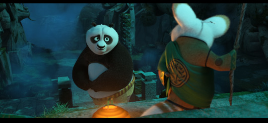
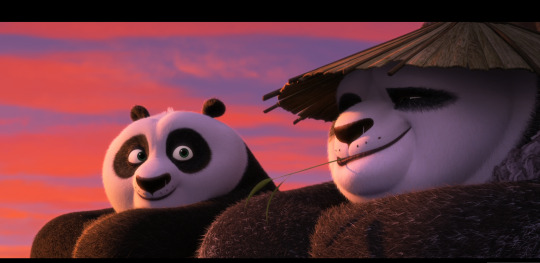
Do you see how calculated those color combo’s are?!?! Here you see both analogous and complementary schemes and it is actually through looking at the things I like that I learned it >< The orangey colors stand out and are bright which helps you to focus on that area whereas the complimentary scheme is used to bring characters together.
If drawing Manga-caps is something you love to do, then maybe for coloring you can study screen-caps from Anime or even other animated films. I’d recommend to take it step by step, though I haven’t really applied it myself, from the video’s I’ve seen and artists I’ve followed it is always advised to have an art-goal that you can work toward. Maybe you first want to focus on lineart and then laying down a base color where the colors are harmonious and next would be cell-shading maybe and then you can start adding another light-source etc- eventually you can decide to create more depth or practice with monochromatic coloring, maybe even greyscale to learn values. But right away that can all sound a bit intimidating doesn't it?
Find things that you like and then maybe you can open them in your program and just study. Find a brush you like, put on some music or a show on the background and for a moment play around with it without needing to create a finished piece. This is also how I learned how things like adjustment layers work or what all the different kinds of tools do. I have to agree with you, CSP is intimidating for me as well >< so this is kinda how I approach it as there are so many add-ons and additions within it but I try to only learn what I need for that moment so I don't overwhelm myself. I definitely try to find video’s that can help me with creating Manga though! ^^ There are plenty!
It'll get easier eventually, you'll learn the program and you start to recognize placements for shadows and you will get a feel for the coloring- no worries 💪 Learning something new will always stay intimidating, every time I open up a new document I feel it too. It's not easy at all, but you kinda have to allow yourself to experiment and even make mistakes because practice is never perfect.
I have some beginner tips written here- I hope any of this is somewhat helpful 🌷🫶
16 notes
·
View notes
Text
When Art Becomes Industry - The Menu Review
For my elementary school yearbook, I was given a slip of paper that had me answer the following prompt: "What do you think you'll be when you grow up?" These would later be printed just below my name and portrait that would proudly beam on the glossy pages of the 5th grade section of the yearbook, among the other classmates off to do wonderful and ambitious things as preteens in middle school. In short, this was like a high school yearbook quote, but a little more hopeful and earnest.
I answered Probably a comic book writer or a piano player. While the use of "Probably" helped me ease into the idea of letting go of my short-lived comic book writing ambitions, it still amazes me today that, at 10 years old, I knew in my heart that the piano would be a part of my life.
My earliest memories come from the time when I was a toddler who could barely walk, stumbling down the soft carpeted hallway of my childhood home in South San Francisco as I approached the mysterious and booming mid-range tones from the piano in the living room. I'd see my dad's legs, rhythmically pressing on the ornate pedals with the balls of his feet at irregular intervals, like he was operating a weave as he conjured up a net of harmonies beneath his palms. While I might not have fully comprehended it at the time, there was a understanding in our family that the piano is a gene in our household, and I inherited it from my dad, whether I liked it or not.
Fortunately, I did like it. My dad took me to my first piano lesson when I was five years old, in the back of a Chinese-owned musical instrument shop on Clement Street. I never saw that teacher again (maybe the first lesson was complimentary, and my dad just didn't like her enough), but I got to keep the book. At home, with the help of 12 colorful cartoon characters printed in my book, I taught myself all 12 notes in the scale (more if you want to count the treble and bass clefs), simply because I was hungry to learn more notes and more songs. I took great pride when my dad clapped for me finishing Mary Had A Little Lamb, and shame when he reprimanded me for improvising wrong notes. I loved learning new songs, and held myself over with nursery rhymes and folk songs until it was time to take formal classical lessons from a teacher who met my dad's approval. At nine years old, I finally was reaching the next step.
My piano teacher introduced me to the world of music education and the rigors of music training. She was compassionate and warm, but demanded dedication. Through her, I internalized the technicalities of finger placements, metronome speeds, hand compartmentalization. I expanded my repertoire to included Russian contemporary composers whose surnames sounded like Harry Potter spells, but whom sometimes wrote the easiest pieces for my nimble fingers. I reckoned with the performance anxiety that dreaded my psyche before every monthly recital, which eventually bled over to my Certificate of Merit performance auditions. While I changed schools and subjects during the day, music became the constant test that loomed over me.
By the time I became an adolescent, I had nothing to show for it. In high school, it dawned on me that, not only was the piano barely used in any high school ensemble, but everyone knew how to play it better than I did. Everyone knew an ensemble-friendly instrument, whether it was a string instrument for the orchestra, a woodwind for the symphonic band, or a brass for both. All I had was piano, an instrument that's barely heard unless there's a solo, a concerto, or a jazz rhythm section involved. If I wanted to be heard, I had to be perfect. All 4 years of high school, I didn't pass a single audition for piano - not for the school jazz ensemble, not for any of the school musical pit orchestras. I dreaded each audition anyway, and probably flubbed them out of nervousness. I only got into orchestra after I begged the music director and offered to be a TA and a percussionist for the orchestra class, and the one time I did play in the musical pit orchestra was for percussion.
The stress and pressure I felt in the rigors of the music world left me jaded; they were a sobering reminder that I would never be cut for a career in music, or at least as a piano player, as my 10-year-old self prophetically proclaimed. My worth was at the whim of directors listening for every perfect note. The world was telling me that I wasted my time with the piano, a constant reminder of my own inadequacy. I became angry. I lost sight of why I was even spending time and money on these piano lessons, when I had schoolwork and college applications to worry about.
It's this jaded feeling that I think The Menu fully understands. Ralph Fiennes' Julian Slowik is a world-renowned chef who uses his reputation and art to seek retribution for the ills of the arts-turned-service industries. His dishes are the visceral expressions of his stoic hatred and rage for the pretentious, capitalist, and opportunistic subculture that has plagued his beloved art. Having been deeply engrossed in the higher world of fine dining, he manipulates and upends the culture to his own vengeful benefit, usurping expectation and surprising his guests (and by extension, us) by forcing them to confront their dismissive participation and moral crimes against art and humanity. In public reference does he create his own personal chaos, a heaven out of a living hell for those he finds undeserving.
There's a point in the film in which we see Slowik's origins. In one photo shown, he's younger, relaxed, and smiling, holding up a greasy burger patty on a flat and wide spatula, like the kind you'd see in cartoons. It's in stark contrast to the Slowik we got used to seeing, a stoic and terse statue of a man with thunderous claps and a commanding presence, arms crossed. And it's this point in the film where we see it's emotional core, an outlet for our own passionate angst and frustrations. We see a man who was once happy, doing what he loved, now grown into a bitter, spiteful shell.
With nothing else to audition for (save for the slightly less rigorous annual piano tests I habitually studied and trained for), my time with the piano became much for personal. Around my early adolescence, my love and ear for music bloomed with The Beatles, and the piano became the perfect outlet for that rediscovered joy and love of music. Like how I was when I was five, I began dedicating myself to learning more and more songs I loved, Beatles and beyond. I sought new territory and creativity in jazz piano and improvisation, a new language that was previously shunned from me.
When I see Ralph Fienne's Slowik as he is, I am reminded of all of those failed auditions, those nights slumped on the piano bench, those feelings of worthlessness, and if I sat through more of those and eventually found the success I was looking for, I'd come out a shell like him. But, when I see Slowik cooking a burger, I am thrust with nostalgia for the days when I learned Beatles songs on the piano, noodled jazz piano solos over wavy chords, and weaving harmonies out of thin air.
So yeah, I got pretty emotional watching this.
59 notes
·
View notes
Text
communal style.
One of my favorite things are friends and lovers who coordinate their outfits. Sometimes it happens unintentionally so you laugh about it because it means you rubbed off on each other. Other times it's almost like a ritual, that phone call early in the morning or at dusk to ask the other what they're going to wear so they can match or wear complimentary colors, textile, silhouette and layering; the borrowing or exchanging of pieces from each other's closet and jewelry, to the point where you start to lose track of who first owned it, to that unspoken agreement of having joint custody of said pieces; the trial and error of building an outfit, remove and adding elements, standing next to each other to see how it all ties together.
It parallels the dress up games on y8.com (or y3.com or the barbie website); the games you had as a child when you played pretend to be royalty, fairies, whatever occupation your parents had, detectives, zombies, scientists, your favorite cartoon characters. You're living out those memories you had as a child when you sat somewhere in the room as your parents get ready for work or your older siblings get ready for a party, and they asked you for your opinion because kids are impartial and honest. You're reenacting all the montages you saw in chick flicks where girl friends get on the landline and the screen splits in two while they do an outfit check for school, or they have nothing to wear and need advice or to borrow something. This color is in; these shoes are out; this dress looks cute but the weather's too hot; wear this jacket because it can make the look go from day to night and we'll be out all day; I'm bringing an extra outfit just in case; do you still have those earrings I lent you? are you gonna wear them? because i have a necklace that goes with it; can I borrow this scarf?; hair up? -- no, not with that neckline; I can't decide between the boots or the pumps.
It's a partnered or group exercise in quick thinking, an exercise of the chemistry and rhythm in your friendships or relationships. Do you know their favorite color to wear, why they hate this type of pants, why they always have that piece of jewelry they wear with everything, what their go-to is in layering, how they style basics, where their favorite places to shop are, why they love and always buy basically the same pair of shoes that they swear are not the same at all, why they think this is tacky in a bad way and this is tacky in a good way?
Is it a love language in itself? I think so. Sometimes it's more fun to dedicate minutes or hours deciding on a perfect outfit together -- and even by yourself -- than whatever it is you do in a day, paying attention to all the little details that hold esoteric meanings of your self-expressions, adding parts of each other in your expressions. Not everyone can see the effort it took to create the harmony between you but it's there. It's not personal style, it's communal style.
11 notes
·
View notes
Note
KYM
I only just noticed, but anything to say about buck and eddie both wearing shirts with the same vertical stripe ribbing, just in different colors???? 👀👀👀👀 (also feel free to tell me about the grey and the maroon 👀) <3333 WHAT A FEVER DREAM OF AN EPISODE
SARAH!!!!!
Sorry I didn't get to this before now - it got lost in the anons!! the ribbing is an interesting choice - I'm undecided if its meant to show us them being on the same path but in different places or if its just a coincidence - one to keep an eye on!
The maroon/grey thing is 👀👀👀 though because they are complimentary colours - they've been doing that a lot more with Buck and Eddie this season when they're together - either putting htem in complimentary colours or putting them in the same tonal shades of their respective colours - the math homework scene from 6x13 is the perfect example - the blue Buck is wearing sits in the same tonal range as Eddies green henley which puts them as equals - they are in balance with each other and niethe rone is the dominant in the scene. The maroon and grey is the same thing - the two shades used balance each other.
One of the things we saw a lot with Buck and Taylor or Eddie and Ana was that they're costumes didn't match each other tonally - one was often in a more dominant colour that didn't compliment the shade the other was wearing in the same scene. It s a great way of suggesting conflict with couples - we've seen it being used well with Madney in the last few episodes - Maddie in bright red while Chim is in dark navy blue - still complimenting each other but also suggesting Maddies arc is the slightly more dominant one in 6x15 etc!
We even saw it a bit with the Buck/Natalia date - the yellow ochre and burnt orange not quite complimenting each other - they're too close together on the spectrum to fully sit in harmony! It's going to be interesting to see if they continue to do this in the next couple of episodes - I'm hopeful we'll see them tonally off while Buck and Eddie are tonally matching.👀👀👀
#kym answers things#sarah asks#theladyyavilee asks#costume things#random things I notice that don't make it into my metas becasue I would be here forever if I included everything!#911 on fox#911 fox#911onfox#eddie diaz#evan buckley#buddie
9 notes
·
View notes
Note
How do u pick colors?? Ur color control makes me go crazy.
IF IM BEING PERFECTLY HONEST: autism (I like it when colors make my brain do a nice noise, I can be picky about color combos to the point its detrimental to the process, I actually get exhausted fairly easily if i feel like the thing is not working and ive been staring at it for a few hours too long - shelf, open up next day, try again)
I like neons and i like complimentaries and i like strong blocks that interact w/ eachother and oftentimes sparkles. the GREAT thing is that color composition and the general reasoning behind it can be learned, it just depends on what YOU like!
I sincerely recommend making a folder of:
Art with coloring you like and want to emulate
Photos with colors / layout / color distribution you like
Art that may not be your style specifically, but that is doing something interesting w/ the colors and may be worth trying out at your own time
Experimental design stuff & old logos and/or advertisements (optional, fun)
A lot of art i enjoy looking at (for example, classic paintings or big hyperrealistic expanses in muddy tones) is crushingly, oppressively unfulfilling for me to do. I think coloring can be very fun, and what I'm looking for are styles that allow me to do just that. This may be different for you, but if you try out a style & find out its not working for you mayyyyybe you shouldn't be discouraged by it and instead take it as a chance to try something different.
References & colorpicking are perfectly healthy ways to learn. Just credit your stuff if you end up making a big piece.
As far as resources with actual explanation go, I recommend Gigidigi's guide to color & GGDG's body of work in general (Last seen in: Deltarune chapter 2 of popular fame, but i adore their comics)
Eskbl's color tips & more & just look at their stuff tbh...
Marco Bucci's Color Harmony video
& understanding the concept that there aren't really 'ugly colors' but moreso badly utilized compositions, flimsy placement, a conflict of personal taste, or an untrained eye. A lot of the examples I'm giving already skew VERY close to my own personal tastes, so id def encourage you to branch out and find more on your own. And don't forget to have fun & get silly with it!
46 notes
·
View notes
Note
hai painting advice. if you're using acrylic paint or anything but oil I highly recommend putting all your dark colors down before the lights because it helps you kinda grasp what you're painting before it's been fully painted. also don't be afraid to go back and redo things later you can always layer paint after it dries(this really only applies to lighter parts of the painting because darker colors like dark brown or black etc are kinda hard to cover up but it's possible) . remember yr brush is yr friend you don't wanna overload it with too much paint but you also don't want her to be dry ok. also this might just be a personal style thing but especially with mural art you want something that's eye catching but not too busy, so focus on keeping pieces of your painting around the sides and edges more flat and really draw the viewers eye to the middle with complimentary colors and bright highlights (blending is always nice too). just.remember - if it feels flat dont go back. add a color that's opposite to the main one in yr painting (ie if you're working with a red guitar, add a blue or yellow or even green highlight to the guitar to make it stand out). it sounds weird but it makes shit harmonious in the end. sorry this ask is mega long I love u forever
I LOVE YOU THANK YOU SO MUCH THIS IS SO HELPFUL
2 notes
·
View notes
Text
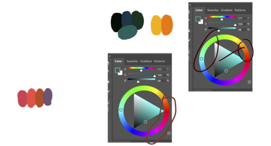
Baby Mekora! If you didn't read the many notes on my post on her mom Mes, let me explain why she looks like a goober greenie: when Mesmerytes are born, they're born the color that is complimentary to their adult colors (or in other less common cases, they can be born colors that are either analogous, split complimentary, intermediate, etc; basically, just color theory and harmony <3). This color will slowly begin to change as they reach their adolescent and teenage years until the baby hues are completely faded out, a phase they call "phading". You can actually tell the age of them by their colors and color phading; especially with the older ones in society, they go through one last color phading where the colors dull down or darken and sometimes go through a split complimentary phase. Yeah, complicated crap I know 😅... Although, there have been cases of when the colors either mix, don't completely fade, or do something totally unpredictable.
All that aside, look at the lil' elf beebee :3c

4 notes
·
View notes
Text
Top Pottery Pots

If you intend on leaving your plant pots outdoors, usebricks, pot toes, or items of wood to maintain them elevated off the ground. Clay pots are best used for crops that choose soil that's dry and well-drained, such as monstera, cosmos, Mediterranean herbs, citrus, agapanthus, succulents, alpines and cacti. The traditional terracotta hue can be harmonious and complimentary to every flower and foliage show, making it the ideal natural choice for lovely shows. Furthermore, the variety of ceramic pots in form, form, and color allows for seamless integration into different residence decor styles. Their long-lasting assist for your favourite vegetation makes them a sustainable alternative - ceramic pots manufacturers in China.
By using ceramic plant pots, you not solely improve your gardening experience but in addition help to make the planet a greener, more sustainable place. They'd look lovely adorning a windowsill or the sting of your desk when you're working from house. For one thing elegant and understated, this glazed terracotta planter is our choice. It's available in a number of colors (but hurry, as some shades are bought out. Clay is a heavier material than plastic too which might have an advantage relying on where you place your pots. If you've you pots outside the have less likelihood of blowing over in windy condition. If the plant goes to be proportionately larger than the pot, the load of the clay pot will add stability so they are excellent for giant shrubs or small bushes - custom made pottery.
Our on-line shop you ought to purchase outdoor flower pots in various in worth, dimension, shape, and color. Always remember to flip empty containers overwhen not in use (drainage holes up). Terracotta pots also referred to as clay plant pots, are a few of the most common outdoor and indoor plant pots. They come in different styles and sizes, from as little as two inches in peak or diameter. Since most clay pots are unglazed, they can take in plenty of water, which is able to dehydrate the crops inside. For more information, please visit our site https://floraldecorimports.com/
0 notes
Link
Check out this listing I just added to my Poshmark closet: Handcrafted Rose Quartz Crystal & Stainless Steel Stud Earrings and Necklace Set.
0 notes
Text
Lead Magnet Ideas for Graphic Designers

Here is a list of 7 ways graphic designers can create more leads:
Social Media Templates
Offer a free social media template showcasing your design skills then make it simple for prospects to develop a harmonious social media presence.
Case Studies
Spotlight your past design work via case studies highlighting your outcomes, challenges, and design process. It’ll help prospects understand your approach and see for themselves how your skillset may benefit their projects.
Resource Libraries
Develop a resource library that has free tutorials, templates, and design tools that prospects may use to improve their skills. It’ll keep prospects engaged and offer ongoing value.
Lead Magnet Ideas for Gyms or Fitness Centers
7 ways fitness centers or gyms can create more leads
medium.com
Branding Workbook
Give out a free branding workbook helping prospects define their brand identity, as well as how they wish to be perceived.
Free Consultation
Provide a complimentary consultation that discusses a prospect’s design needs and offer advice about how to accomplish their goals. It’ll help set up a relationship with the customer and show off your experience.
Style Guides

Provide a free style guide showcasing your design aesthetic and guide prospects on ways to use design elements, like color and typography, to develop a seamless brand identity.
Design Templates
Provide complimentary design templates for highly sought-after design projects, like presentation slides, business cards, or social media graphics. It’ll help prospects see your design skill and style.
🎉Kristen is a contributor on Medium. Sign up here to catch every story when Kristen publishes.
Grab Kristen’s eBooks on Gumroad:
How to Productize Your Services: How to Make Money While You’re Sleeping
How Any Business Can Gain More Leads
Beginner’s Guide To Starting a Podcast
Grab Kristen’s Books on Amazon:
How Any Business Can Gain More Leads
How to Productize Your Services: How to Make Money While You’re Sleeping Audiobook
How to Productize Your Services: How to Make Money While You’re Sleeping Paperback
👉Check out this Library of Business Resources
💙Grow your own newsletter by joining Beehiiv here
Note: This story includes affiliate links. I earn income from purchases through these links.
0 notes
Note
while we're on the ikemoto art hate train can i also bring up his garish choices in colors? the man can't make a pleasing color palette to save his life.
not even my son is safe. what even are these colors. yuck.

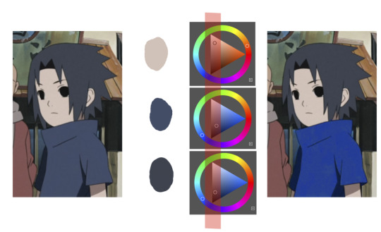
Yeah I wouldn't necessarily pick these either personally. I'm glad the Anime (not that that I care) didn't go for this. It's fun to go through it to see why this isn't pleasing to the eye though.
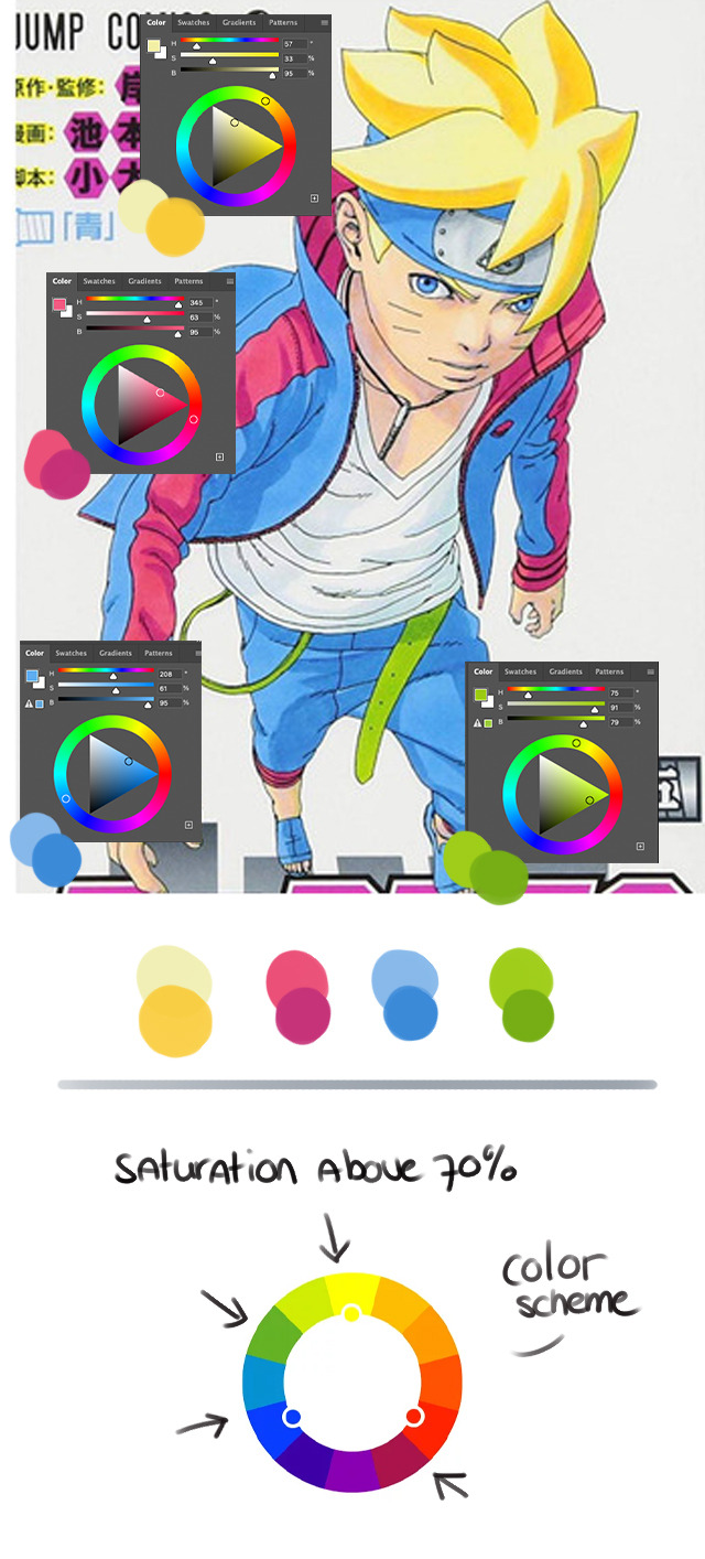
As you can see all 4 of the main colors are really saturated. All of them are above 70% meaning there isn't a main color. All of the values are very high too so nothing stands out either. Not much of a harmony. It's just a handful of skittles.
I get the Magenta as it is part of his design, but if he didn't want to go for black for some reason.. why not something like this?:

Or something similar. If you want to have the Magenta stand out then keep the complimentary color lower in saturation and value. It helps! That includes the SpongeBob hair.
(I don't understand why the Pink and Magenta from the fonts don't match, like why.)
Also I understand that they can't copy Naruto and Sasuke's color scheme's and so they have to create a different complimentary scheme for Boruto and Kawaki but this one is questionable I agree. I haven't seen the Anime so I don't know what they've done with it tbh. A moment of silence for your son.
Hope you're well @dinojisan 💕
23 notes
·
View notes
Last Seen Blogs

dingledraw
“MY PINEAPPLE IS SHIT”
m1x-x1m
x_x

theambersys
amber system!

ndz-10
N.E.A

kittymurking
I don't Stalk I just pay a lot of Attention