#css display
Explore tagged Tumblr posts
Visit Tumblr Blog
Explore Tumblr blogs with no restrictions, modern design and the best experience.
Last Seen Tumblr Blogs


Fun Fact
Tumblr was created by web developers David Karp and Marco Arment.
Text
Hello audience. Unfortunately, I am still on my break. However, I am happy to announce that I am still alive and kicking. In fact, I decided to make use of my unemployment and revisit HTML, CSS, and JavaScript to create... A visual novel.
Good News: code is 100% reusable because I used a JSON (i do not know how that works, someone can kindly explain to me...)
Bad News: this code sucks ass, and NOTHING works except playing the story. Transitions? Doesn't work. UI/UX? Ass. Effects? Hell no... Also, 70% of the features aren't present yet I'm gonna do it later.
Oh, this is CrossDust, if you can't tell.
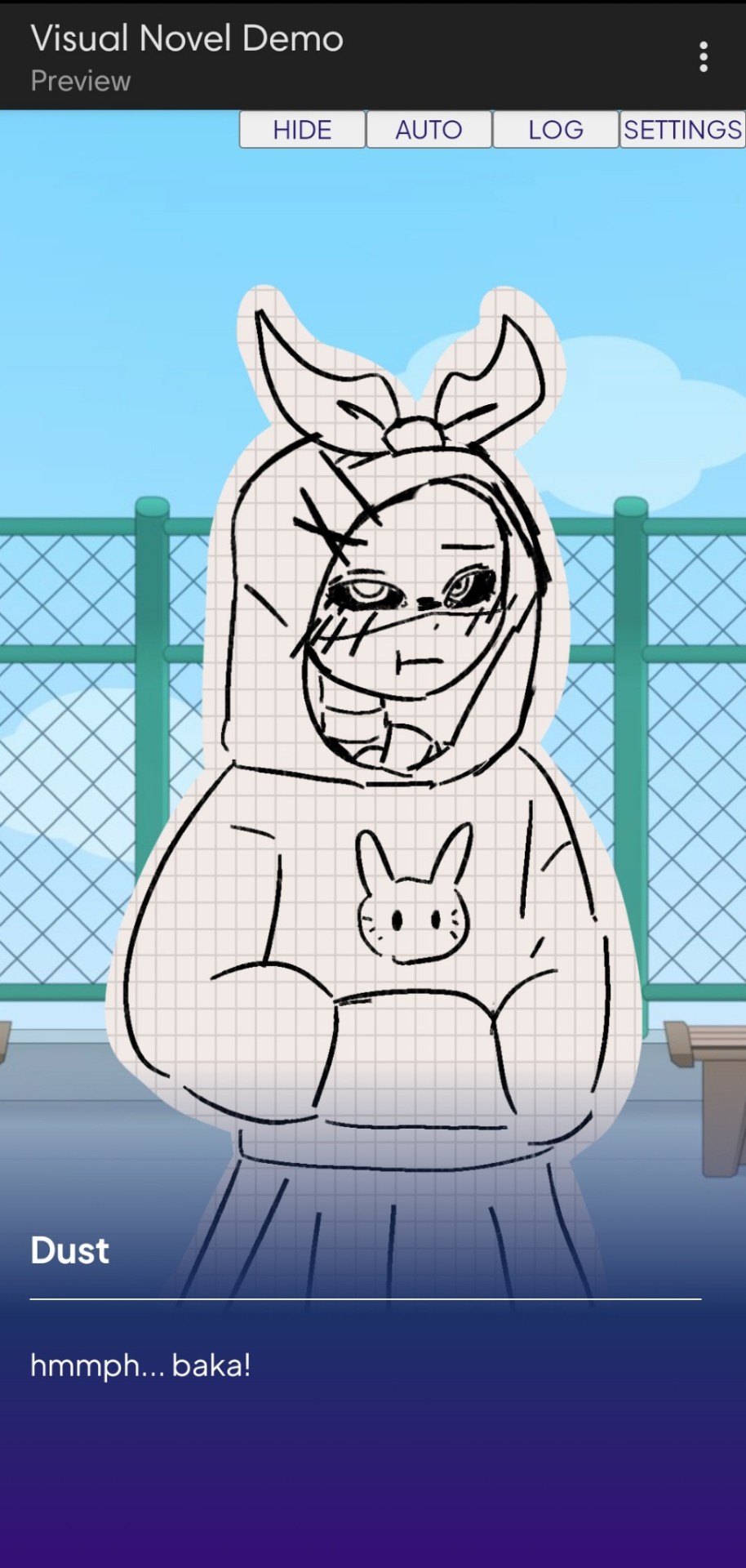
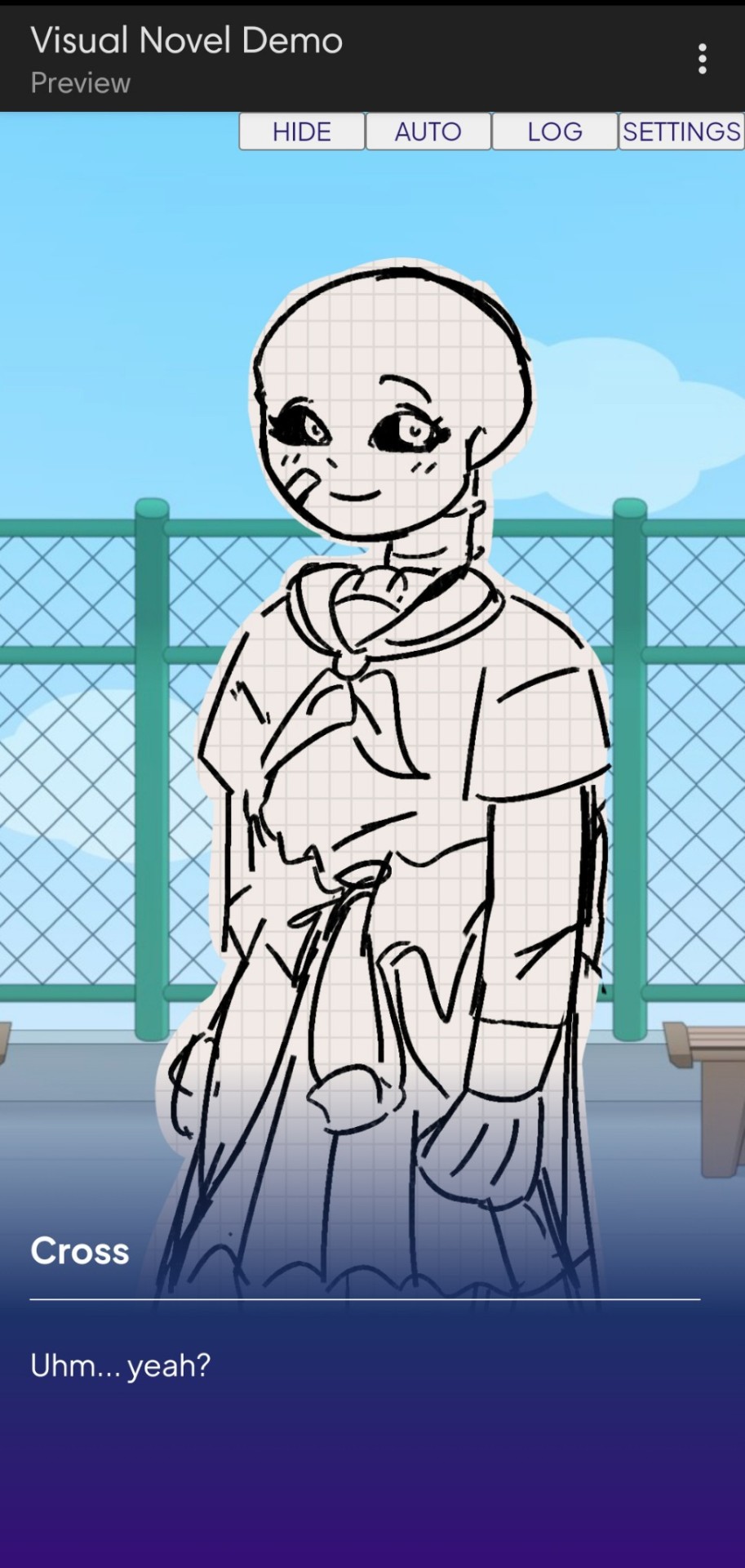
Dust Sans by Ask-Dusttale, Cross Sans by Jakei
I'm gonna respond to asks and do requests later (After my break is over). This is just a small update teehee.
#dsevalyappuccino#TIME TO GO INSANE IN THE TAGS!!#i hate css#i still hate css#css hell no#guys why is css so hard. ive literally been doing this for months and css is still hard#i was about to use css spritesheets for the sprites and emotions#but my ass gave up and instead i just use seperate images#GUYS!!! DISPLAY: FLEX 💪. DISPLAY: GRID?!?!#javascript i hate you tooq#i hate java script naurrrr#what do you mean DOM objects#what do YOU MEAN#also i do not understand error handling and JSON integrations#papaGPT doesn't explain anything#i don't know what I just wrote#coding???????????#kids don't be unemployed#actually maybe if you're unemployed but still making money that's great#also the sprites are just for testing purposes im probably gonna make new better ones if i chose to expand this into#a full blown anime high school visual novel project#i don't wanna think of all that story crap but then again i can just write the cringiest thing on earth
23 notes
·
View notes
Text

Working on a neocities website! So far I have learned how to redirect a page and how to load one html file into another using (extremely simple) JavaScript.
#sewing#sewing patterns#neocities#I thought I already understood#HTML and CSS#but flex and block display#are causing me problems
21 notes
·
View notes
Text
i have the next chapter of stop the world pretty much locked and loaded but I feel like now is a bad time to post angst since we're all still in the phacation photo dump afterglow
#posting it now feels like bringing a cheap bottle of skittles flavoured vodka to a fancy dinner party where everyone else brought wine#the css is pissing me off it's displaying slightly weirdly on mobile and i can't figure out why#but idk if anyone cares about that except me 😭 i mean it's perfectly readable it's just slightly off and idk why
7 notes
·
View notes
Text
changed my desktop theme for the millionth time... we maplestory now
#🗨️ snowbelle city gossip#there's a part that isn't display correctly which im guessing is the result of this theme#being a few years old.... i know enough basic css that i can probably fix it#but the issue is finding out what exactly is causing the problem 😭#ill figure it out later
10 notes
·
View notes
Text
Working on my javascript for my web page. Turns out I have the perfect kind of setup to accomplish some of the project requirements, specifically with even handlers and user interactions
My website, conceptually, will load a different employee details page depending on what employee name is clicked on. But I need to load it dynamically (instead of hard-coding it) so that the user can add or delete employees & it'll be able to still load the relevant shit.
So! Only one employee details page, but depending on how it's loaded, it'll load a different employee's information. Still working on getting down Exactly how to do it (I'm thinking using URL parameters that'll read a different object depending on what ID is used)
It's entirely doable. In fact, it's probably extremely common to do in web pages. No one wants to hard-code information for every new object. Of course not. And thus the usefulness of dynamic javascript stuff.
I can do this. I can very much do this.
#speculation nation#i wasnt very good when i got home and i read fanfic for a while#then took a nap. and now im up again and Getting To Work.#i dont have to have this 100% perfect for final submission just yet. bc final submission isnt today.#but i need to have my final presentation over my thing done by noon (11 hours from now)#and im presenting TODAY. and part of that will be giving a live demo of my project website#so. i need to have all of the core functionality of my website down at the Very Least#might not be perfect yet. but by god if im gonna show up to my presentation with my website not working.#i need to have the employee list lead to employee details with personalized information displayed per employee#i need to create an add employee field that will Actually add an employee. using a form.#and that employee will need to show up on the list and have a new id and everything. the works.#need to set it up so that employees can be deleted. shouldnt be too much extra.#and it would be . interesting. to give an actual 'login' pop-up when someone clicks on the login button#with some kind of basic info as the login parameters. this cant be that hard to code.#the project requirements are: implement 5 distinct user interactions using javascript. at least 3 different eventhandlers#at least 5 different elements with which interaction will trigger an event handler. page modification & addition of new elements to pages#3 different ways of selecting elements. one selection returning collection of html elements with customized operations on each...#hm. customized operations on each... the example given is a todo list with different styles based on if an item is overdue or not#i wonder if my personalized detail page loading would count for this... i also have some extra info displayed for each#but i specifically want the employees to be displayed in the list uniformly. that's kinda like. The Thing.#actually im poking around on my web pages i made previously and i do quite enjoy what i set up before.#need to modify the CSS for the statistics page and employee details to make it in line with what i actually wanted for it#maybe put a background behind the footer text... i tried it before & it was iffy in how it displayed...#but it looks weird when it overlaps with a page's content. idk that's just me being particular again.#theres also data interchange as a requirement. but that should be easy if i set an initial employee list as a json file#good god im going to have to think of so much extra bullshit for these 10 made up employees#wah. this is going to be a lot of work. but. im going to do it. i just wont get very much sleep tonight.#that's ok tho. ive presented under worse conditions (cough my all nighter when i read 3gun vol 10 and cried my eyes out)#and this is going to be the last night like this of my schooling career. the very last one.#just gotta stay strong for one more night 💪💪💪
6 notes
·
View notes
Text
How to Create Multi-Step Forms With Vanilla JavaScript and CSS
New Post has been published on https://thedigitalinsider.com/how-to-create-multi-step-forms-with-vanilla-javascript-and-css/
How to Create Multi-Step Forms With Vanilla JavaScript and CSS
Multi-step forms are a good choice when your form is large and has many controls. No one wants to scroll through a super-long form on a mobile device. By grouping controls on a screen-by-screen basis, we can improve the experience of filling out long, complex forms.
But when was the last time you developed a multi-step form? Does that even sound fun to you? There’s so much to think about and so many moving pieces that need to be managed that I wouldn’t blame you for resorting to a form library or even some type of form widget that handles it all for you.
But doing it by hand can be a good exercise and a great way to polish the basics. I’ll show you how I built my first multi-step form, and I hope you’ll not only see how approachable it can be but maybe even spot areas to make my work even better.
We’ll walk through the structure together. We’ll build a job application, which I think many of us can relate to these recent days. I’ll scaffold the baseline HTML, CSS, and JavaScript first, and then we’ll look at considerations for accessibility and validation.
I’ve created a GitHub repo for the final code if you want to refer to it along the way.
The structure of a multi-step form
Our job application form has four sections, the last of which is a summary view, where we show the user all their answers before they submit them. To achieve this, we divide the HTML into four sections, each identified with an ID, and add navigation at the bottom of the page. I’ll give you that baseline HTML in the next section.
Navigating the user to move through sections means we’ll also include a visual indicator for what step they are at and how many steps are left. This indicator can be a simple dynamic text that updates according to the active step or a fancier progress bar type of indicator. We’ll do the former to keep things simple and focused on the multi-step nature of the form.,
The structure and basic styles
We’ll focus more on the logic, but I will provide the code snippets and a link to the complete code at the end.
Let’s start by creating a folder to hold our pages. Then, create an index.html file and paste the following into it:
Open HTML
<form id="myForm"> <section class="group-one" id="one"> <div class="form-group"> <div class="form-control"> <label for="name">Name <span style="color: red;">*</span></label> <input type="text" id="name" name="name" placeholder="Enter your name"> </div> <div class="form-control"> <label for="idNum">ID number <span style="color: red;">*</span></label> <input type="number" id="idNum" name="idNum" placeholder="Enter your ID number"> </div> </div> <div class="form-group"> <div class="form-control"> <label for="email">Email <span style="color: red;">*</span></label> <input type="email" id="email" name="email" placeholder="Enter your email"> </div> <div class="form-control"> <label for="birthdate">Date of Birth <span style="color: red;">*</span></label> <input type="date" id="birthdate" name="birthdate" max="2006-10-01" min="1924-01-01"> </div> </div> </section> <section class="group-two" id="two"> <div class="form-control"> <label for="document">Upload CV <span style="color: red;">*</span></label> <input type="file" name="document" id="document"> </div> <div class="form-control"> <label for="department">Department <span style="color: red;">*</span></label> <select id="department" name="department"> <option value="">Select a department</option> <option value="hr">Human Resources</option> <option value="it">Information Technology</option> <option value="finance">Finance</option> </select> </div> </section> <section class="group-three" id="three"> <div class="form-control"> <label for="skills">Skills (Optional)</label> <textarea id="skills" name="skills" rows="4" placeholder="Enter your skills"></textarea> </div> <div class="form-control"> <input type="checkbox" name="terms" id="terms"> <label for="terms">I agree to the terms and conditions <span style="color: red;">*</span></label> </div> <button id="btn" type="submit">Confirm and Submit</button> </section> <div class="arrows"> <button type="button" id="navLeft">Previous</button> <span id="stepInfo"></span> <button type="button" id="navRight">Next</button> </div> </form> <script src="script.js"></script>
Looking at the code, you can see three sections and the navigation group. The sections contain form inputs and no native form validation. This is to give us better control of displaying the error messages because native form validation is only triggered when you click the submit button.
Next, create a styles.css file and paste this into it:
Open base styles
:root --primary-color: #8c852a; --secondary-color: #858034; body font-family: sans-serif; line-height: 1.4; margin: 0 auto; padding: 20px; background-color: #f4f4f4; max-width: 600px; h1 text-align: center; form background: #fff; padding: 40px; border-radius: 5px; box-shadow: 0 0 10px rgba(0, 0, 0, 0.1); display: flex; flex-direction: column; .form-group display: flex; gap: 7%; .form-group > div width: 100%; input:not([type="checkbox"]), select, textarea width: 100%; padding: 8px; border: 1px solid #ddd; border-radius: 4px; .form-control margin-bottom: 15px; button display: block; width: 100%; padding: 10px; color: white; background-color: var(--primary-color); border: none; border-radius: 4px; cursor: pointer; font-size: 16px; button:hover background-color: var(--secondary-color); .group-two, .group-three display: none; .arrows display: flex; justify-content: space-between align-items: center; margin-top: 10px; #navLeft, #navRight width: fit-content; @media screen and (max-width: 600px) .form-group flex-direction: column;
Open up the HTML file in the browser, and you should get something like the two-column layout in the following screenshot, complete with the current page indicator and navigation.
Adding functionality with vanilla JavaScript
Now, create a script.js file in the same directory as the HTML and CSS files and paste the following JavaScript into it:
Open base scripts
const stepInfo = document.getElementById("stepInfo"); const navLeft = document.getElementById("navLeft"); const navRight = document.getElementById("navRight"); const form = document.getElementById("myForm"); const formSteps = ["one", "two", "three"]; let currentStep = 0; function updateStepVisibility() formSteps.forEach((step) => document.getElementById(step).style.display = "none"; ); document.getElementById(formSteps[currentStep]).style.display = "block"; stepInfo.textContent = `Step $currentStep + 1 of $formSteps.length`; navLeft.style.display = currentStep === 0 ? "none" : "block"; navRight.style.display = currentStep === formSteps.length - 1 ? "none" : "block"; document.addEventListener("DOMContentLoaded", () => navLeft.style.display = "none"; updateStepVisibility(); navRight.addEventListener("click", () => if (currentStep < formSteps.length - 1) currentStep++; updateStepVisibility(); ); navLeft.addEventListener("click", () => if (currentStep > 0) currentStep--; updateStepVisibility(); ); );
This script defines a method that shows and hides the section depending on the formStep values that correspond to the IDs of the form sections. It updates stepInfo with the current active section of the form. This dynamic text acts as a progress indicator to the user.
It then adds logic that waits for the page to load and click events to the navigation buttons to enable cycling through the different form sections. If you refresh your page, you will see that the multi-step form works as expected.
Multi-step form navigation
Let’s dive deeper into what the Javascript code above is doing. In the updateStepVisibility() function, we first hide all the sections to have a clean slate:
formSteps.forEach((step) => document.getElementById(step).style.display = "none"; );
Then, we show the currently active section:
document.getElementById(formSteps[currentStep]).style.display = "block";`
Next, we update the text that indicators progress through the form:
stepInfo.textContent = `Step $currentStep + 1 of $formSteps.length`;
Finally, we hide the Previous button if we are at the first step and hide the Next button if we are at the last section:
navLeft.style.display = currentStep === 0 ? "none" : "block"; navRight.style.display = currentStep === formSteps.length - 1 ? "none" : "block";
Let’s look at what happens when the page loads. We first hide the Previous button as the form loads on the first section:
document.addEventListener("DOMContentLoaded", () => navLeft.style.display = "none"; updateStepVisibility();
Then we grab the Next button and add a click event that conditionally increments the current step count and then calls the updateStepVisibility() function, which then updates the new section to be displayed:
navRight.addEventListener("click", () => if (currentStep < formSteps.length - 1) currentStep++; updateStepVisibility(); );
Finally, we grab the Previous button and do the same thing but in reverse. Here, we are conditionally decrementing the step count and calling the updateStepVisibility():
navLeft.addEventListener("click", () => if (currentStep > 0) currentStep--; updateStepVisibility(); );
Handling errors
Have you ever spent a good 10+ minutes filling out a form only to submit it and get vague errors telling you to correct this and that? I prefer it when a form tells me right away that something’s amiss so that I can correct it before I ever get to the Submit button. That’s what we’ll do in our form.
Our principle is to clearly indicate which controls have errors and give meaningful error messages. Clear errors as the user takes necessary actions. Let’s add some validation to our form. First, let’s grab the necessary input elements and add this to the existing ones:
const nameInput = document.getElementById("name"); const idNumInput = document.getElementById("idNum"); const emailInput = document.getElementById("email"); const birthdateInput = document.getElementById("birthdate") const documentInput = document.getElementById("document"); const departmentInput = document.getElementById("department"); const termsCheckbox = document.getElementById("terms"); const skillsInput = document.getElementById("skills");
Then, add a function to validate the steps:
Open validation script
function validateStep(step)
Here, we check if each required input has some value and if the email input has a valid input. Then, we set the isValid boolean accordingly. We also call a showError() function, which we haven’t defined yet.
Paste this code above the validateStep() function:
function showError(input, message) const formControl = input.parentElement; const errorSpan = formControl.querySelector(".error-message"); input.classList.add("error"); errorSpan.textContent = message;
Now, add the following styles to the stylesheet:
Open validation styles
input:focus, select:focus, textarea:focus outline: .5px solid var(--primary-color); input.error, select.error, textarea.error outline: .5px solid red; .error-message font-size: x-small; color: red; display: block; margin-top: 2px; .arrows color: var(--primary-color); font-size: 18px; font-weight: 900; #navLeft, #navRight display: flex; align-items: center; gap: 10px; #stepInfo color: var(--primary-color);
If you refresh the form, you will see that the buttons do not take you to the next section till the inputs are considered valid:
Finally, we want to add real-time error handling so that the errors go away when the user starts inputting the correct information. Add this function below the validateStep() function:
Open real-time validation script
function setupRealtimeValidation() nameInput.addEventListener("input", () => if (nameInput.value.trim() !== "") clearError(nameInput); ); idNumInput.addEventListener("input", () => if (idNumInput.value.trim() !== "") clearError(idNumInput); ); emailInput.addEventListener("input", () => if (emailInput.validity.valid) clearError(emailInput); ); birthdateInput.addEventListener("change", () => if (birthdateInput.value !== "") clearError(birthdateInput); ); documentInput.addEventListener("change", () => if (documentInput.files[0]) clearError(documentInput); ); departmentInput.addEventListener("change", () => if (departmentInput.value !== "") clearError(departmentInput); ); termsCheckbox.addEventListener("change", () => if (termsCheckbox.checked) clearError(termsCheckbox); );
This function clears the errors if the input is no longer invalid by listening to input and change events then calling a function to clear the errors. Paste the clearError() function below the showError() one:
function clearError(input) const formControl = input.parentElement; const errorSpan = formControl.querySelector(".error-message"); input.classList.remove("error"); errorSpan.textContent = "";
And now the errors clear when the user types in the correct value:
The multi-step form now handles errors gracefully. If you do decide to keep the errors till the end of the form, then at the very least, jump the user back to the erroring form control and show some indication of how many errors they need to fix.
Handling form submission
In a multi-step form, it is valuable to show the user a summary of all their answers at the end before they submit and to offer them an option to edit their answers if necessary. The person can’t see the previous steps without navigating backward, so showing a summary at the last step gives assurance and a chance to correct any mistakes.
Let’s add a fourth section to the markup to hold this summary view and move the submit button within it. Paste this just below the third section in index.html:
Open HTML
<section class="group-four" id="four"> <div class="summary-section"> <p>Name: </p> <p id="name-val"></p> <button type="button" class="edit-btn" id="name-edit"> <span>✎</span> <span>Edit</span> </button> </div> <div class="summary-section"> <p>ID Number: </p> <p id="id-val"></p> <button type="button" class="edit-btn" id="id-edit"> <span>✎</span> <span>Edit</span> </button> </div> <div class="summary-section"> <p>Email: </p> <p id="email-val"></p> <button type="button" class="edit-btn" id="email-edit"> <span>✎</span> <span>Edit</span> </button> </div> <div class="summary-section"> <p>Date of Birth: </p> <p id="bd-val"></p> <button type="button" class="edit-btn" id="bd-edit"> <span>✎</span> <span>Edit</span> </button> </div> <div class="summary-section"> <p>CV/Resume: </p> <p id="cv-val"></p> <button type="button" class="edit-btn" id="cv-edit"> <span>✎</span> <span>Edit</span> </button> </div> <div class="summary-section"> <p>Department: </p> <p id="dept-val"></p> <button type="button" class="edit-btn" id="dept-edit"> <span>✎</span> <span>Edit</span> </button> </div> <div class="summary-section"> <p>Skills: </p> <p id="skills-val"></p> <button type="button" class="edit-btn" id="skills-edit"> <span>✎</span> <span>Edit</span> </button> </div> <button id="btn" type="submit">Confirm and Submit</button> </section>
Then update the formStep in your Javascript to read:
const formSteps = ["one", "two", "three", "four"];
Finally, add the following classes to styles.css:
.summary-section display: flex; align-items: center; gap: 10px; .summary-section p:first-child width: 30%; flex-shrink: 0; border-right: 1px solid var(--secondary-color); .summary-section p:nth-child(2) width: 45%; flex-shrink: 0; padding-left: 10px; .edit-btn width: 25%; margin-left: auto; background-color: transparent; color: var(--primary-color); border: .7px solid var(--primary-color); border-radius: 5px; padding: 5px; .edit-btn:hover border: 2px solid var(--primary-color); font-weight: bolder; background-color: transparent;
Now, add the following to the top of the script.js file where the other consts are:
const nameVal = document.getElementById("name-val"); const idVal = document.getElementById("id-val"); const emailVal = document.getElementById("email-val"); const bdVal = document.getElementById("bd-val") const cvVal = document.getElementById("cv-val"); const deptVal = document.getElementById("dept-val"); const skillsVal = document.getElementById("skills-val"); const editButtons = "name-edit": 0, "id-edit": 0, "email-edit": 0, "bd-edit": 0, "cv-edit": 1, "dept-edit": 1, "skills-edit": 2 ;
Then add this function in scripts.js:
function updateSummaryValues() nameVal.textContent = nameInput.value; idVal.textContent = idNumInput.value; emailVal.textContent = emailInput.value; bdVal.textContent = birthdateInput.value; const fileName = documentInput.files[0]?.name; if (fileName) const extension = fileName.split(".").pop(); const baseName = fileName.split(".")[0]; const truncatedName = baseName.length > 10 ? baseName.substring(0, 10) + "..." : baseName; cvVal.textContent = `$truncatedName.$extension`; else cvVal.textContent = "No file selected"; deptVal.textContent = departmentInput.value; skillsVal.textContent = skillsInput.value || "No skills submitted"; }
This dynamically inserts the input values into the summary section of the form, truncates the file names, and offers a fallback text for the input that was not required.
Then update the updateStepVisibility() function to call the new function:
function updateStepVisibility() formSteps.forEach((step) => document.getElementById(step).style.display = "none"; ); document.getElementById(formSteps[currentStep]).style.display = "block"; stepInfo.textContent = `Step $currentStep + 1 of $formSteps.length`; if (currentStep === 3) updateSummaryValues(); navLeft.style.display = currentStep === 0 ? "none" : "block"; navRight.style.display = currentStep === formSteps.length - 1 ? "none" : "block";
Finally, add this to the DOMContentLoaded event listener:
Object.keys(editButtons).forEach((buttonId) => const button = document.getElementById(buttonId); button.addEventListener("click", (e) => currentStep = editButtons[buttonId]; updateStepVisibility(); ); );
Running the form, you should see that the summary section shows all the inputted values and allows the user to edit any before submitting the information:
And now, we can submit our form:
form.addEventListener("submit", (e) => e.preventDefault(); if (validateStep(2)) alert("Form submitted successfully!"); form.reset(); currentFormStep = 0; updateStepVisibility(); );
Our multi-step form now allows the user to edit and see all the information they provide before submitting it.
Accessibility tips
Making multi-step forms accessible starts with the basics: using semantic HTML. This is half the battle. It is closely followed by using appropriate form labels.
Other ways to make forms more accessible include giving enough room to elements that must be clicked on small screens and giving meaningful descriptions to the form navigation and progress indicators.
Offering feedback to the user is an important part of it; it’s not great to auto-dismiss user feedback after a certain amount of time but to allow the user to dismiss it themselves. Paying attention to contrast and font choice is important, too, as they both affect how readable your form is.
Let’s make the following adjustments to the markup for more technical accessibility:
Add aria-required="true" to all inputs except the skills one. This lets screen readers know the fields are required without relying on native validation.
Add role="alert" to the error spans. This helps screen readers know to give it importance when the input is in an error state.
Add role="status" aria-live="polite" to the .stepInfo. This will help screen readers understand that the step info keeps tabs on a state, and the aria-live being set to polite indicates that should the value change, it does not need to immediately announce it.
In the script file, replace the showError() and clearError() functions with the following:
function showError(input, message) const formControl = input.parentElement; const errorSpan = formControl.querySelector(".error-message"); input.classList.add("error"); input.setAttribute("aria-invalid", "true"); input.setAttribute("aria-describedby", errorSpan.id); errorSpan.textContent = message; function clearError(input) const formControl = input.parentElement; const errorSpan = formControl.querySelector(".error-message"); input.classList.remove("error"); input.removeAttribute("aria-invalid"); input.removeAttribute("aria-describedby"); errorSpan.textContent = "";
Here, we programmatically add and remove attributes that explicitly tie the input with its error span and show that it is in an invalid state.
Finally, let’s add focus on the first input of every section; add the following code to the end of the updateStepVisibility() function:
const currentStepElement = document.getElementById(formSteps[currentStep]); const firstInput = currentStepElement.querySelector( "input, select, textarea" ); if (firstInput) firstInput.focus();
And with that, the multi-step form is much more accessible.
Conclusion
There we go, a four-part multi-step form for a job application! As I said at the top of this article, there’s a lot to juggle — so much so that I wouldn’t fault you for looking for an out-of-the-box solution.
But if you have to hand-roll a multi-step form, hopefully now you see it’s not a death sentence. There’s a happy path that gets you there, complete with navigation and validation, without turning away from good, accessible practices.
And this is just how I approached it! Again, I took this on as a personal challenge to see how far I could get, and I’m pretty happy with it. But I’d love to know if you see additional opportunities to make this even more mindful of the user experience and considerate of accessibility.
References
Here are some relevant links I referred to when writing this article:
How to Structure a Web Form (MDN)
Multi-page Forms (W3C.org)
Create accessible forms (A11y Project)
#:not#Accessibility#ADD#aria#Article#Articles#attention#attributes#background#border-radius#box#box-shadow#browser#buttons#challenge#change#classes#code#Color#content#CSS#CV#dept#direction#display#email#error handling#event#Events#Exercise
3 notes
·
View notes
Text
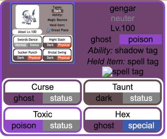
making slow progress toward a (vaguely) dynamic pokémon custom team template that mimics the Bulbapedia team flyout and after ... a ... While ... of essentially redesigning the element hierarchy from scratch with the help of a friend who is MUCH better at programming than me, it is beginning to Look
(the Absol screenshot was just one I had on hand for a stand-in, my final one will probably look a little different since I want to also add Mega / Partner Pokemon indicators if possible, and to also just tweak the info hierarchy a bit)
#from the writer's den#void talks#getting those corners on the moves was ROUGH. initially it was a table structure but after much struggle#my friend found an implementation that just uses css wizardry instead of html#also for anyone curious: the reason I say it's vaguely dynamic is bc it's actually a jinja template and html#with my vague idea being that essentially it prints out pages for any arbitrary team#(though obviously the pages themselves will be static)#also for those familiar with bulbapedia#I wanted to have a proper 'neuter' gender marker so my eventual goal is to write a little if-then in the jinja file#that allows it to convert to arbitrary symbols (to display) in addition to having the custom colors (in the css)#probably in the form of a 'if [m] / elif [f] / else' for the colors#this is solely bc there's enough neutral-gender pokemon on my oc teams that I want it to actually be indicated#where absence actually means unspecified
5 notes
·
View notes
Text
i love workskins. i learnt you can actually just. put rainbow text on ao3. i fully anticipated it eating it (as it does with a lot of things) but no.

apparently this is acceptable.
(ignore the temporary background color & slightly unreadable text. it's a work in progress and i'm just getting the basic idea down. im gonna see if i can get away with text glow to make spoke's text more readable. but also there's a joke about it being unreadable in there. it seems right for him)
#haunted ecosystem#au: anhedonia#also this isnt 100% how itll display on ao3 im using a different thing and periodically putting it into the ao3 workskin to make sure it#actually works and that the general stuff is accepted. ao3 isnt toooo weird about css & html processing but i anticipate having to fix it
11 notes
·
View notes
Text


Today in things i did for some reason: replaced the Flight Rising ad banner, which is actually a static image (that's why it looks so crusty), with a version that's rendered purely through code
#the reason i did that is because i was working on a stylus addon to change the site's colours#for some reason a lot of stuff around the site is rendered with images instead of code#which not only Isn't Customizable (easily) but also it's a pain to load when you've got third world internet lmao#this solution only makes the text visible when an ad isn't displayed just like the original did#yeehaw#rambling#flight rising#fr#since it's done through CSS only i can't make the line breaks as big as the original lol#but you can still read it well so that's good enough for me
8 notes
·
View notes
Text
btw im This close to figuring out a lightbox effect
#which i dont need as much anymore because i already managed to display a bunch of stuff nicely enough just w css i think#but God i hope this works#mar's midnight rambles
6 notes
·
View notes
Text

tuesdays are my day "off" from job hunting/game dev/etc so i am using my free time making my tumblr experience unusable on purpose. i want to thank tampermonkey again for unlocking the ability to fuck up every single disgusting corporate-sanitized website design in existence. i will never again have to see a bland ass website layout
#i still cant figure out how to make the CSS not display the 'navy' background so#my workaround was to override the navy variable with no value so it can't load#and then it shows a background image behind it
6 notes
·
View notes
Text
Ublock Origin
Youtube: SponsorBlock (skips ads within videos), DeArrow (replaces clickbait thumbnails & titles), Blocktube (block channels), Enhancer (Quality of Life features), Youtube-Shorts Block
Youtube Mobile: Youtube Vanced/Revanced Manager
Twitter: Minimal Theme extension
Tumblr: xKit/xKit Rewritten, Dashboard Unfucker, Stylus with "Old Tumblr Dashboard" userstyle
Spotify: xManager (desktop & mobile)
Firefox: High chance you'll love it and curse holding out for so long.
Linux: No whiney search box trying to Edge you, no ads in the start menu, no trending searches reminding you about celebrity gossip & politics.
i would move heaven and earth to avoid hearing one single advertisement
#I'm not going to blindly tell you to “switch to Linux” but you can easily test it out in a Virtual Machine within windows.#There are guides online that will hold your hand through the setup process. Linux Mint is not scary. You might love it.#If setting up a VM still feels like too much? Then yeah stick with Windows. That's understandable.#but if you're reading this far then you must have caught on to how your ability to fight back is tied to your tech literacy skills#If you're already following workaround guides to forcibly disable Windows features that piss you off or install modified apks...#then you're halfway there#we all pick our battles & hills to die on though (My deepest condolences if you require Adobe for work 🥲)#There is also Ublocks 'element picker' but you can cause more confusion than good if#you don't know what you're doing (You can always remove filters)#Or do what uBlock picker does by learning a tiny bit of CSS and you can make anything you want on a website go bye-bye#pssst! ''display: none'' & ''visibility: hidden'' CSS declarations#I originally listed all this in the tags and realized it was a mess. May as well keep the tags now though:#Linux#Firefox#uBlock Origin#SponsorBlock#Youtube-Shorts Block#DeArrow#Youtube Vanced#ReVanced Manager#Revanced#Minimal Theme for Twitter#Stylus#xkit#xkit rewritten#Dashboard Unfucker#xManager#I spent my morning free-time on this 😪
58K notes
·
View notes
Text
People who don't know much about web dev will go "fuck jQuery and the enshittification of the internet! Modern sites are bloated and inaccessible!" (which, to be fair, is true) and then go on to add so many unnecessary iframes to their neocities pages that the latest version of Firefox struggles to render them
#i promise using the display: grid css property will not suddenly turn you into a silicon valley corpobro#tangentially related:#i remember seeing someone boasting that their browser game was ''handcoded javascript''#ah yes i only visit websites that make use of ethically harvested small batch fair trade javascript
1 note
·
View note
Text
Código que genere un menú horizontal en html
código HTML que crea un menú horizontal dentro de un encabezado utilizando la propiedad display y sin un archivo CSS externo, todo dentro de una etiqueta <style>: HTML <!DOCTYPE html> <html> <head> <title>Menú Horizontal con CSS</title> <style> nav { background-color: #f1f1f1; overflow: hidden; } nav a { float: left; display: block; color: black; text-align: center; padding: 14px…
#block#código fuente#CSS#desarrollo web#Diseño web#estilo en línea#experiencia de usuario#float#HTML#inline#interfaz de usuario.#maquetación#menú horizontal#navegación#propiedad display#responsive design#tutorial#UX/UI
0 notes
Text
displayに新しくcontentsという便利なものがでたらしい。 記事読んだけどまぁややこしい。タグとして囲えるがblockとして認識しないという魔訶不思議アドベンチャー。
一見すると何しにいるん?ってなるけど、下にある、例題を読むとコーディングしたことある人なら「あーなるほど」ってなる。
PCでは囲って使いたいけど、スマホのときは囲わずに使いたいとかがflexになってからすごく多くなったのは周知の事実だと思う。
flexやgridで結構使いやすくなったからこそ、このあたりのタグの生成問題はシビアというか。システムで勝手にdiv増やされたら崩れたりなんかもしばしば。
そういう意味でこれはかなり便利なものと理解できた。これって対象の上に2個親がいて、その親2つに対してcontents使ったら親2つ分消えるんかな。そう考えるとすごい便利だと気づく。
今はまだ使えるブラウザも限られているみたいなので、メモっておいて様子をみてまた使おうと思う。
0 notes
Text
fun? update on my neocities i've been figuring out how to implement modals the way i want them which means a little pop-up post type thing ^ both for information about each individual piece that isn't utilising alt text (not what it's for) and also to separate the thumbnail image and modal's image to reduce loading time issues.
which means i've finally learnt css! initially i implemented the pop-ups solely using html but that doesn't work very well in the end ^^". significantly faster this way and different images simply use different class tags (? what is this called) to set them in correctly.
this whole thing has so much of me butting my head against little issues in the code and digging around for solutions (nightmare!) but it's a lot of fun. the modal itself needed adjusting the same way as the pop-up for it to sit in the centre of the viewport but that i sorted out first thankfully.
i still have to figure out how to get the images in the pop-up itself to sit centred and have them take into account the fact that none of the images are exactly the same which is... hopefully possible. it's also incredibly broken with any screen on portrait mode (or at least phones....) but there's not much i can do about that (for now?)
#gryph.txt#this might be the most amount of words i've written in a post bar like. one.#coding has turned into a fascinating interest of mine... using scraps of code and coding things entirely myself out here#fighting for my life trying to get things working the way i want#(ie. why the hell does neocities appear to ignore anything with right settings... why only left i don't want it there?)#coding is a nightmare but an incredibly fun nightmare#doing this with css was the best solution because it means i can use one card/pop-up and have tags for the img class to adjust those#which makes it faster because i only have to add the images text and whatever tag is needed (using portrait/landscape to indicate this)#whereas previously i had to manually adjust the entire card to get it to sit correctly at all. help#this took me like a month of going back and forth because. i coded it in toyhouse initially. decided there had to be a better way then used#cards instead. had to find script for neocities to actually display the cards correctly and open/close#implemented that. came back to it going hang on now i could do this is css like the modal so i don't have to adjust everything. set that up#Did Not Work especially on anything outside my laptop. went back through and fixed it all up to what it is now#< pretty much. probably missing things.#oh i have so much more to say but i won't
0 notes