#css morphing shape animation
Explore tagged Tumblr posts
Visit Tumblr Blog
Explore Tumblr blogs with no restrictions, modern design and the best experience.
Last Seen Tumblr Blogs


Fun Fact
The Tumblr office adopted Tommy, an 11-year-old Pomeranian.
Text

CSS Morphing Shape Animation
#css morphing shape animation#css animation#html css animation#html css#divinector#css#html#css animation examples#css animation snippets#learn to code#css3#webdesign#frontenddevelopment
5 notes
·
View notes
Text
The Ultimate Guide to Scalable Vector Graphics (SVG)
What They Are and Why They Matter
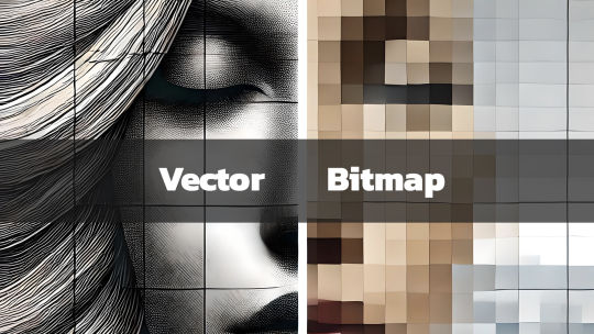
In today’s digital age, graphics play a key role in communication, design, and branding. Whether you're a professional designer, a hobbyist, or someone curious about digital art, you’ve likely come across the term Scalable Vector Graphics (SVG). But what exactly is SVG, and why is it important? What is a Scalable Vector Graphic (SVG)? Scalable Vector Graphics, commonly known as SVG, is an XML-based image format used for defining vector-based graphics for the web. Unlike traditional image formats such as JPEG, PNG, or GIF, SVGs are resolution-independent, which means they can scale to any size without losing image quality. This scalability makes SVG an essential tool for designers, developers, and anyone concerned with delivering crisp, high-quality visuals in a world where screen sizes vary from tiny watches to large 4K monitors. Key Characteristics of SVG: - Vector-Based: SVGs use mathematical equations to define shapes, lines, and colors instead of pixels. This makes them different from raster images, which are pixel-based. - Scalability: Because they're vector-based, SVGs can be resized infinitely without losing quality or becoming pixelated. - Lightweight & Optimized: SVG files are typically smaller in size compared to traditional image formats, which helps improve website loading times. - Interactive and Programmable: SVGs can be styled with CSS and animated with JavaScript, giving them greater flexibility for web design and interactive graphics. - Text-Friendly: SVGs can contain searchable and selectable text, making them great for accessibility and SEO. 2. Lightweight for Faster Load Times SVG files tend to be smaller in size compared to raster images, especially for simpler graphics like logos, icons, or geometric designs. This reduction in file size can improve your website’s load time—a critical factor for SEO and user experience. For eCommerce sites like the Vector Graphic Store, fast-loading graphics ensure that potential customers aren't stuck waiting for images to load, leading to lower bounce rates and higher conversions. 3. Resolution Independence With more high-resolution displays like Retina and 4K monitors becoming the norm, delivering images that look sharp across all devices is essential. SVGs shine in this area since they are resolution-independent. Whether viewed on an old smartphone or a high-definition television, SVG images will appear sharp and clear. 4. Interactive Capabilities SVGs aren���t just static images. Because they’re based on XML, SVGs can be easily manipulated using CSS and JavaScript. This means you can animate parts of an SVG, add hover effects, or even make parts of an image clickable. For example, an SVG logo could morph or change colors when a user hovers over it, providing an interactive experience. This is something that’s difficult, if not impossible, to achieve with formats like PNG or JPEG. How SVGs Are Used in Design SVGs are incredibly versatile, and designers use them in a wide variety of applications, including: - Logos and Icons: Logos, icons, and other small graphic elements are perfect for SVG format. They remain sharp on all screen sizes and devices, ensuring your brand looks its best. - Infographics and Data Visualization: SVG is ideal for creating charts, graphs, and infographics because of its scalability and ability to display crisp, clear text. - Illustrations and Artwork: Artists and illustrators can use SVG to create complex vector illustrations that can be scaled for use on anything from business cards to posters. - Responsive Web Design: SVG is a staple in responsive web design since it adapts perfectly to different screen sizes and resolutions without quality degradation. At the Vector Graphic Store, we specialize in providing high-quality SVG assets for artists, designers, and businesses. Our collection spans various themes, including the popular Gunframe Mech Series, where each vector is designed to be highly scalable and customizable. Pros and Cons of SVG Pros: - Infinite Scalability: Perfect for logos, icons, and detailed illustrations. - Small File Size: Typically smaller than raster images, helping with page load speeds. - Editable and Customizable: Easy to edit in graphic software like Adobe Illustrator and Inkscape, or programmatically in text editors. - Responsive and High-Resolution: Looks great on any screen size or resolution, without pixelation. Cons: - Complexity: SVG is not always the best choice for highly detailed or photographic images, as those require complex patterns that might be easier to achieve with a raster format like JPEG or PNG. - Browser Support: While most modern browsers support SVG, some older browsers (especially legacy versions of Internet Explorer) may have trouble rendering them. - Learning Curve: Editing or animating SVG files programmatically using CSS and JavaScript can require a bit of a learning curve. The Importance of SVGs in Modern Design As design and web development continue to evolve, SVG remains an essential tool for creating fast, scalable, and versatile graphics. Whether you’re working on a website, an app, or print material, SVG can provide the flexibility and quality you need. The Vector Graphic Store embraces the power of SVG, offering a wide range of designs that can be used for everything from product packaging to video game assets. With the rise of mobile-first design and the increasing demand for fast-loading websites, SVG is likely to continue growing in popularity. And with its ability to deliver sharp, clean visuals across all platforms, it’s clear why SVG is here to stay. Read the full article
#benefitsofSVG#bitmapcomparison#bitmapimages#bitmaplimitations#high-qualitygraphics#imageresolution#responsiveSVG#scalablegraphics#scalableimages#ScalableVectorGraphics#SVGadvantages#SVGfileformat#SVGgraphics#SVGimageformat#SVGvsbitmap#vectorart#vectordesign#vectorfilebenefits#vectorillustrations#vectorimagequality#vectorimagescaling#vectorimages#vectorvspixel#vectorvsraster#webdesignwithSVG#whatisSVG
0 notes
Text
Beyond Static: Dynamic Background Animation with CSS

Introduction
Welcome to the world of dynamic background animations with CSS! In this blog post, we'll explore how you can move beyond static backgrounds and infuse life into your web designs. Dynamic background animations have become a powerful tool for web developers, offering engaging visual experiences that capture user attention and enhance overall website aesthetics. We'll delve into the fundamentals of CSS animation and then take a deep dive into advanced techniques that enable the creation of stunning dynamic backgrounds. Whether you're a seasoned developer or just getting started, this post will provide you with the knowledge and inspiration to implement eye-catching animations on your website.
Understanding CSS Animation

Before we embark on the journey of creating dynamic background animations, let's establish a solid understanding of CSS animation basics. CSS animations allow developers to bring elements on a webpage to life, creating smooth and visually appealing transitions. Basic CSS Animations: At its core, CSS animation involves the gradual change of an element's style properties over time. This can include properties like color, size, position, and opacity. Developers define animations using keyframes, specifying the styles at different points in time. Keyframes: Keyframes serve as the building blocks of CSS animations. These are defined using the @keyframes rule, where you set styles for specific percentages of the animation duration. For example, you can define a keyframe at 0% and 100% to represent the starting and ending states of an animation. Static vs Dynamic Backgrounds: To grasp the concept of dynamic backgrounds, it's essential to differentiate between static and dynamic effects. Static backgrounds remain unchanged, while dynamic backgrounds involve continuous movement or transformation. CSS animations, with their ability to create fluid transitions, play a crucial role in achieving dynamic effects. Examples: Let's consider a simple example to illustrate the difference. A static background might be a fixed image, while a dynamic background could involve a color gradient shifting over time or geometric shapes subtly morphing. CSS animations enable the latter, allowing designers to break away from static design constraints. Transition Properties: CSS provides various properties for controlling the transition between different states. The transition property, for instance, allows you to specify which CSS properties should change and the duration of the transition. This adds smoothness to the animation, enhancing the overall user experience. In summary, understanding CSS animation fundamentals is the first step towards creating dynamic backgrounds. As we proceed, we'll explore advanced techniques and properties that take dynamic background design to the next level. Now that we've covered the basics, let's move on to exploring more advanced techniques and pushing the boundaries of what CSS can achieve.
Exploring Advanced Techniques
Now that we have a solid foundation in CSS animation basics, let's delve into advanced techniques that elevate dynamic background animations to new heights. These techniques go beyond the standard animations, incorporating additional CSS properties for more complex and captivating effects. Advanced CSS Properties: One key aspect of creating dynamic backgrounds is leveraging advanced CSS properties. Properties like linear-gradient, transform, and transition offer a wide range of possibilities. For instance, using linear-gradient allows the creation of smooth color transitions, adding depth and vibrancy to the background. Transitions, Transforms, and Gradients: Combining transitions, transforms, and gradients opens up a world of creative options. You can smoothly transition between different background colors, rotate or scale elements using transforms, and apply gradients for visually stunning effects. This combination provides a dynamic and visually appealing backdrop for your website. Case Studies: Let's explore real-world case studies that showcase the application of advanced techniques. Websites often use dynamic backgrounds to convey a sense of interactivity or to reflect the brand's identity. Whether it's a subtle parallax effect, a gradient-based animation, or a combination of transformations, these case studies will inspire your creativity. Responsive Design Considerations: As we implement advanced techniques, it's crucial to consider responsive design. Dynamic backgrounds should adapt seamlessly to different screen sizes and devices. We'll discuss best practices for ensuring that your animations look impressive whether viewed on a desktop, tablet, or smartphone. Optimizing Performance: While pushing the boundaries of dynamic backgrounds, performance optimization is key. We'll explore techniques to ensure that your animations run smoothly without causing undue strain on the user's device. Optimizing images, using efficient code, and minimizing unnecessary calculations are among the strategies we'll cover. In the next section, we'll provide a step-by-step guide on implementing dynamic background animations on your website. By combining the knowledge of basic and advanced techniques, you'll be well-equipped to create visually stunning and engaging backgrounds that captivate your audience.
Implementing Dynamic Backgrounds on Your Website
Now that we've explored the fundamentals and advanced techniques of CSS animations, it's time to roll up our sleeves and implement dynamic backgrounds on your website. This step-by-step guide will walk you through the process, ensuring that you can seamlessly integrate captivating animations into your web design. 1. Define Your Vision: Start by envisioning the type of dynamic background you want. Consider the mood, color scheme, and overall atmosphere you wish to convey. Having a clear vision will guide your choices as you implement the animation. 2. Choose Background Elements: Identify the elements of your website that will serve as the canvas for your dynamic background. This could be the entire page, specific sections, or individual elements such as headers or footers. Make strategic choices based on the desired impact. 3. Select Animation Properties: Determine which CSS animation properties align with your vision. This could include transitions, transforms, gradients, or a combination of these. Experiment with different properties to achieve the desired dynamic effect. 4. Write CSS Code: Implement the chosen animation properties in your CSS stylesheet. Utilize the @keyframes rule to define the animation sequence, specifying the styles at different percentages of the animation duration. Be sure to test and adjust the code to achieve the desired visual result. 5. Ensure Responsive Design: As you implement dynamic backgrounds, prioritize responsiveness. Test your animations on various devices to ensure they adapt seamlessly to different screen sizes. Use media queries and responsive design practices to guarantee a consistent user experience. 6. Optimize for Performance: Pay attention to performance optimization. Compress images, minimize unnecessary calculations, and use efficient code to ensure that your dynamic backgrounds run smoothly without causing delays in page loading times. 7. Test and Iterate: Thoroughly test your dynamic backgrounds across different browsers and devices. Gather feedback and be willing to iterate on your design. Continuous testing and refinement will lead to an optimal user experience. By following these steps, you'll be well on your way to implementing dynamic backgrounds that enhance the visual appeal of your website. In the next sections, we'll showcase inspiring examples from CodePen and discuss future trends in dynamic background design.
Frequently Asked Questions (FAQ)
As we dive into the world of dynamic background animations, it's natural to have questions. This FAQ section aims to address common queries and provide clarity on various aspects of implementing and understanding dynamic backgrounds with CSS. Q1: What are the benefits of using dynamic backgrounds? - Dynamic backgrounds enhance user engagement by adding visual interest to a website. - They contribute to a modern and interactive user experience. - Dynamic backgrounds can help convey brand identity and storytelling. Q2: Can dynamic backgrounds impact website performance? Yes, dynamic backgrounds, if not optimized, can affect performance. It's crucial to implement best practices such as image compression, efficient code, and minimizing unnecessary calculations to ensure smooth animations without compromising page loading times. Q3: Are there browser compatibility issues with CSS animations? While CSS animations are widely supported, it's essential to test across various browsers to ensure consistency. Some older browsers may have limited support for certain features, so consider using fallbacks or alternative solutions for broader compatibility. Q4: How can I make dynamic backgrounds responsive? - Use media queries to adjust styles based on different screen sizes. - Consider percentage-based dimensions for elements with dynamic backgrounds. - Test responsiveness on various devices to identify and address any issues. Q5: Can I combine multiple dynamic background effects? Absolutely! CSS allows you to combine different animation properties such as transitions, transforms, and gradients to create complex and visually striking effects. Experiment with combinations to achieve your desired result. Additional Resources Resource 1 Resource 2 Resource 3 Resource 4 Feel free to explore the provided resources for further information and inspiration. If you have more questions, don't hesitate to reach out, and we'll be happy to assist you on your dynamic background animation journey.
Showcasing Examples from CodePen
CodePen serves as a treasure trove of creative inspiration for dynamic background animations. Let's explore some outstanding examples that demonstrate the diverse possibilities of CSS animations and how they can elevate the visual appeal of your website. 1. Parallax Scrolling: Parallax scrolling is a popular technique where background elements move at different speeds as the user scrolls, creating a sense of depth. Explore CodePen examples that masterfully use parallax effects to enhance the overall user experience. 2. Gradient Animations: Gradients offer a versatile tool for dynamic backgrounds. Witness how developers on CodePen play with gradient animations, smoothly transitioning between colors to create visually stunning and attention-grabbing effects. 3. Geometric Shapes in Motion: CodePen showcases numerous examples of dynamic backgrounds featuring geometric shapes that morph, rotate, and dance across the screen. These animations add a modern and artistic touch to web designs. 4. Particle Systems: Some CodePen examples simulate particle systems, where tiny particles move independently, creating mesmerizing and dynamic backgrounds. These animations bring a sense of dynamism and playfulness to the website. CodePen Examples Example 1 Example 2 Example 3 Example 4 Click on the provided links to explore these CodePen examples in detail. These real-world implementations will inspire your creativity and provide insights into the techniques employed to achieve captivating dynamic background animations. As you explore these examples, consider how you can adapt and customize these techniques to suit your website's unique identity and messaging. In the next section, we'll discuss future trends in dynamic background design, keeping you at the forefront of web development innovation.
Future Trends in Dynamic Backgrounds
As technology evolves, so do the possibilities for dynamic background design. Keeping an eye on emerging trends is crucial for staying ahead in web development. Let's explore the future landscape of dynamic backgrounds and the trends that are likely to shape the visual aesthetics of websites. 1. 3D and Spatial Design: The integration of 3D elements into dynamic backgrounds is gaining momentum. Expect to see more websites incorporating three-dimensional shapes and spatial design, creating immersive visual experiences that go beyond the traditional flat design paradigm. 2. Interactive Backgrounds: Future websites may feature backgrounds that respond to user interactions. This could include dynamic changes based on mouse movements, clicks, or scrolling actions. Interactive backgrounds add a layer of engagement, making the user experience more dynamic and personalized. 3. Integration of AI: Artificial Intelligence (AI) may play a significant role in the evolution of dynamic backgrounds. AI algorithms could dynamically adjust background elements based on user behavior, preferences, or contextual factors, providing a more personalized and adaptive visual experience. 4. Augmented Reality (AR) Elements: The integration of AR elements into websites is an exciting prospect. Dynamic backgrounds could extend beyond the screen, interacting with the user's physical environment through AR. This trend has the potential to redefine the boundaries between the digital and physical worlds. 5. Sustainability-Focused Designs: With a growing emphasis on sustainability, expect to see dynamic backgrounds that reflect eco-friendly themes. Animations and visuals may incorporate elements related to nature, conservation, and green technologies, aligning with the global focus on environmental consciousness. 6. Minimalistic and Elegant Animations: While advanced techniques will continue to emerge, there will also be a trend towards subtle and elegant animations. Minimalistic designs with carefully crafted, non-intrusive animations can create a sophisticated and polished visual identity for websites. Embracing these future trends in dynamic backgrounds will not only keep your web designs fresh and innovative but also contribute to providing users with memorable and enjoyable online experiences. As we conclude this exploration of dynamic backgrounds, feel inspired to experiment with these trends and push the boundaries of what's possible in web development.
Conclusion
Congratulations on completing this journey into the world of dynamic background animations with CSS. We've covered the fundamental principles, explored advanced techniques, and showcased inspiring examples from CodePen. As we wrap up, let's summarize the key takeaways and encourage you to embark on your creative endeavors. Key Takeaways: - Dynamic background animations add a layer of engagement and visual appeal to websites. - CSS animations, keyframes, and advanced properties are essential tools for creating dynamic backgrounds. - Consider the responsive design and performance optimization of your dynamic backgrounds for a seamless user experience. - CodePen provides a rich source of inspiration with real-world examples of creative dynamic background implementations. - Future trends, including 3D design, interactive backgrounds, AI integration, and sustainability-focused designs, offer exciting possibilities for innovation. Next Steps: Now that you have a solid understanding of dynamic background animations, don't hesitate to experiment and implement these techniques in your projects. Use the provided CodePen examples as inspiration, and stay informed about emerging trends to stay at the forefront of web development. Remember, the world of web design is dynamic and ever-evolving. Continuously seek inspiration, stay curious, and push the boundaries of what's possible. Whether you're a seasoned developer or just starting, the journey of creating dynamic backgrounds is an exciting and rewarding one. Thank you for joining us on this exploration. May your websites be vibrant, engaging, and leave a lasting impression on your audience. Happy coding! Read the full article
0 notes
Text
Weekly News for Designers № 687
How Blogs Shaped the Web – A look back at the early days of blogging and how it impacted the online world. Fullscreen Clip Animation – Explore clip-path animations where a fullscreen image moves into a row/grid of smaller images, morphing its shape along the way. Modern Font Stacks – System font stack CSS organized by typeface classification for every modern OS. Jumping Through Hoops for…

View On WordPress
0 notes
Text
Interactive Website
30 pieces 30 species is a narrative website that has interactive features which invites visitors to explore website. The goal of the website is to bring awareness to endangered species. Each entry has its own custom animation and facts about the endangered animal. Animals are represented through puzzle pieces and have an origami effect by using minimal shapes. It intrigues you to keep scrolling since the visuals are interesting and interactive. There’s a section that tells you how the effects were created and there’s even a diagram that shows you how it works. It was made in CSS, by transitioning polygons into shapes which are morphed with each time a new coordinate is assigned. This is an example of how rethinking a typical design is beneficial instead of using a typical design that is commonly used for awareness sites. This will create a new experience while still obtaining the overall message.
http://species-in-pieces.com/
2 notes
·
View notes
Text
The Topmost Free SVG Tools for Better Graphics

The scalable vector graphics or SVG is a file format that allows the users to display vector images on their websites. It is gaining popularity these days in web design. You can create SVG graphics using tools like Inkscape or Illustrator. But, optimizing for lighter results becomes essential when it comes to web design. Nowadays, more than 80 percent of any webpage can be seen studded with images. Unfortunately, these images can’t adapt to the evolution of the web and change so quickly. It is a general concept that when your image takes more the size of your website, it takes your website longer time to load, which means you are going to lose your leads, potential customers, visitors, and ultimately your business. SVG is a powerful format that scales naturally without losing quality.
For users’ convenience, we have a wide range of tools that can help you work with SVG efficiently and quickly. These are mostly online tools that can help you make patterns, conversion, optimization, and many more.
b64
The simple tool can be used to optimize photos and images and then turn them into the format of base64. You can grab the CSS with the image of the base64 background after dropping your SVG images.
Interactive SVG Coordinate System
The exceptional interactive tool introduced by Sara Souiden helps the users learn about the functioning of SVG coordinates. You can use the preserveAspectRatio and viewBox on SVG to play guided by purple and orange lines and a handy ruler while learning SVG’s coordination function.
SVG OMG
The tools turn the SVGO’s command line into the GUI version, which is easy to use and intuitive. You can activate or deactivate every feature only by toggling the buttons. In the end, it will help you to grab the result as code and image files.
SVGO
The users can use this tool to remove hidden elements, comments, or editor metadata. You can install using the GUI versions or through npm. The GUI version offers a drag and drop feature to process the optimization of SVG.
SVG to PNG converter
The SVG to PNG converter tool can help you export your SVG files to PNG form without opening any other application like Illustrator. You can get URI PNG Base64 data and images in PNG format.
SVG Now
The tool helps you to get the optimized version of the SVG that you have exported right from your Illustrator workspace.
SVG Sprite
The tool based on the Node.js module optimizes SVG files in the bunch and bakes them into sprite-types of SVG that includes SVG stacks, traditional CSS sprites for foreground-background images, and many more.
SVG Circus
You can use SVG Circus to create loader animations. The tool enables the users to make their spinner, loader, or anything that resembles looped animation. You will need to set the Actor position, color, size, and other things from the panel. Further, you can export to get the results.
Plain Pattern
The users can use this tool to upload their image, change or scale down the spacing, recolor and rotate them until they get a beautiful pattern.
Quasi
The users can use this tool to generate Quasicrystal images and play around switching to various options. After then, you can use the ‘Save SVG’ button to download the results.
Trainglify Generator
The tool is useful when it comes to creating beautiful geometric patterns based on SVG. You can set the variant, color randomness, granularity size, and then a color palette.
SVG Filters
With SVG, you can add many effects to images like saturation, hue, linear color overlay, blur, and many others. The SVG Filters tool visualizes these effects and gives the users a snippet making it easy for them to embed that effect into their project.
SVG Morpheous
The JavaScript library allows its users to morph an icon based on SVG from one shape to another. Besides, the users can set rotation direction, duration of transition animations, and easing effect.
Chartist.js
It is a type of library that can be used to create highly responsive and customizable charts. The tool utilizes SVG for displaying graphs. You can make pie charts, bar charts, line chart, and many other types of maps. Plus, you can also add animation to these charts.
Clip path generator
The tool helps users click the clip of images with a polygonal shape or many points.
Method Draw: A Simple SVG Editor
The web-based SVG editor has an intuitive interface packed with lots of tools on the canvas’s sides. You can draw shapes, lines, use in-built shapes, or input text. After then, you can edit the drawn objects’ properties and export the image in SVG format or save it in PNG format directly.
Export Flash to animated SVG
You can use this tool to work on CS6, CS5, and CC and export into SVG format when it comes to Shape Tweens, Classic Motion Tweens, Bitmaps, and Symbols.
The users use points, shapes, and lines to create a vector image. They can scale these vector images to any size without losing their quality. These vector images are used in the best ways for various elements like icons, logos, illustrations, and typography. The tools mentioned above help improve your performance and web designing skills to a great extent. With these best graphic design tools, you can stand apart in the crowd and prove your skills.
SOURCES = The Topmost Free SVG Tools for Better Graphics
0 notes
Text
How to Create Super-Simple CSS Animation Effects
Today, we’re going to introduce to you different transitions and effects that can be achieved using CSS alone. Let’s get going!
Resources You Will Need to Complete This Tutorial:
Images (You can download free images here or you can use your own).
Viga Font (Google Font).
You can view the demo here and download the source files here.

Shape
For the shape, I’m going to show you how to morph an image shape from a square (with radius) to a circle. We added the transition value of all 1s ease to animate this.
This means that while hovering over the image, it will transform the shape to circle smoothly within a 1-second duration. We will, then, give it a radius of 50% to create a perfect circle when transformed.
The Markup
All of the HTML markup will have an image wrap with a class of the effect along with the class img. On this part, we’re going to add the class morph (for the morphing effect) along with a class of img for the styling of our images.
</pre> <div class="morph img"><img alt="" src="img/image1.jpg" /></div> <pre>
The CSS
For this part of our CSS, we will give our images a dimension of 200px x 200px and a white border with a 10px thickness. Let’s also put a radius of 15px to have smooth edges.
We’ll hide the overflow for our effects. For the mouse-over state, we’ll set the cursor to pointer to emphasize that we’re hovering on the element.
.img { width: 200px; height: 200px; border: 10px solid #fff; -webkit-border-radius: 15px; border-radius: 15px; overflow: hidden; } .img:hover { cursor: pointer; }
Now, for the morphing effect, we’ll use the CSS3 transitions for the animation. For this class, we will specify first the browser specific properties (-webkit, -moz, -ms, -o) and set the value to all 1s ease. This value will do the process of changing the style of the image from the normal state to the mouse-over state at a 1-second duration.
To give you a clear idea how the CSS transition properties work, check out the syntax below.
transition: [transition-property] [transition-duration] [transition-timing-function];
[transition-property] is used to specify the specific styles or properties you want to select or use, such as background, width etc. In our CSS, we use all to refer to all properties. Both background and padding will transition.
[transition-duration] refers to the speed of the animation or transition. In our example, we use 1s. This means that the animation will happen within 1 second. Please take note that if the duration is not set, the transition will have no effect.
[transition-timing-function] will determine how the speed during a transition will be calculated. The default transition [transition-timing-function] is ease, which means the transition effect will start slowly, then fast, then end slowly. You can check here to learn more about the [transition-timing-function].
Next we added the styles of the mouse-over state. We added the white border with 10px size and a border radius of 50%, giving us a perfect circle shape when the hover state occurs. We also added box shadows to add a glow effect.
.morph { -webkit-transition: all 1s ease; -moz-transition: all 1s ease; -ms-transition: all 1s ease; -o-transition: all 1s ease; transition: all 1s ease; } .morph:hover { border: 10px solid #fff; border-radius: 50%; -webkit-box-shadow: 0 0 40px rgba(255,255,255,.6), inset 0 0 40px rgba(255,255,255,1); -moz-box-shadow: 0 0 40px rgba(255,255,255,.6), inset 0 0 40px rgba(255,255,255,1); box-shadow: 0 0 40px rgba(255,255,255,.6), inset 0 0 40px rgba(255,255,255,1); }

Displacement
For the displacement, we are going to do a zoom effect. We will pull the image close to the borders when hovered and hide the overflows of the box content.
The Markup
Our HTML markup is the same as the morphing effect but this time we’re going to add the class zoom (for the zooming effect) along with a class of img for the styling of our images.
</pre> <div class="zoom img"><img alt="" src="img/image2.jpg" /></div> <pre>
The CSS
In our zooming effect, we will specify a base width and height of 200px x 200px. We will again implement the transition effects but for this, we’ll give it a 2-second generation to put a little drama on its mouse-over state. For its mouse-over state, we will just add 100px on the regular width and height, creating a zooming illusion.
If you go back to our image CSS, we hide the overflow. This will retain the image inside our border. Also, we will add the box shadows style for our glow effect.
.zoom img { width: 200px; height: 200px; -webkit-transition: all 2s ease; -moz-transition: all 2s ease; -ms-transition: all 2s ease; -o-transition: all 2s ease; transition: all 2s ease; } .zoom img:hover { width: 300px; height: 300px; -webkit-box-shadow: 0 0 40px rgba(255,255,255,.6), inset 0 0 40px rgba(255,255,255,1); -moz-box-shadow: 0 0 40px rgba(255,255,255,.6), inset 0 0 40px rgba(255,255,255,1); box-shadow: 0 0 40px rgba(255,255,255,.6), inset 0 0 40px rgba(255,255,255,1); }

Position
For the position, we are going to tilt the image. This will vary on the degrees and duration based on your preference. Take note that you change the duration by changing the value of 0.3s (which means 0.3 seconds).
Meanwhile, you can also declare how many degrees you would like the image to tilt under the transform element. Transform is an effect that lets an element change shape, size and position. You can manipulate the element by changing the value of rotate(10deg) (which means 10 degrees).
The Markup
We still have the same HTML markup for the tilt effect but this time, we just put the tilt class instead along with our img class.
</pre> <div class="tilt img"><img alt="" src="img/image3.jpg" /></div> <pre>
The CSS
Now, for our CSS, we will again add our transition effects, starting with browser specific properties. But this time, we don’t want this to move so slow so we will give it a duration of 0.3 milliseconds.
Next for the mouse-over state, we will use the transform property. This property allows you to rotate, scale, move, skew the elements.
Afterwards, we will add a value of rotate to 10 degrees. So upon the hover state, it will rotate or change its position 10 degrees from the normal state. And finally, we will add the box shadow styles to obtain the glow effect.
.tilt { -webkit-transition: all 0.3s ease; -moz-transition: all 0.3s ease; -o-transition: all 0.3s ease; -ms-transition: all 0.3s ease; transition: all 0.3s ease; } .tilt:hover { -webkit-transform: rotate(10deg); -moz-transform: rotate(10deg); -ms-transform: rotate(10deg); -o-transform: rotate(10deg); transform: rotate(10deg); -webkit-box-shadow: 0 0 40px rgba(255,255,255,.6), inset 0 0 40px rgba(255,255,255,1); -moz-box-shadow: 0 0 40px rgba(255,255,255,.6), inset 0 0 40px rgba(255,255,255,1); box-shadow: 0 0 40px rgba(255,255,255,.6), inset 0 0 40px rgba(255,255,255,1); }

Color
For the color, we’re going to drop all the saturation by creating a grayscale effect using webkit filter when hovered.
The web filter effect is a graphical operation that is applied to an element as it is drawn into the document. It’s just like having Photoshop-like effects where you can change the color or drop its color.
Then, we set the value of the transition to all 1s ease to have a smooth effect and when hovered, we can see a grayscale image or element.
The Markup
Again, we will repeat our HTML markup but this time we’ll put color class instead, along with our img class.
</pre> <div class="color img"><img alt="" src="img/image4.jpg" /></div> <pre>
The CSS
We’ll again repeat the process for our transition effect. We’ll set it to 1 second and timing function of ease.
For our mouse-over state, we’ll use the webkit-filter property and then drop the color by using the grayscale property. And lastly, we’ll add the box shadows to gain the glowing effect.
.color { -webkit-transition: all 1s ease; -moz-transition: all 1s ease; -o-transition: all 1s ease; -ms-transition: all 1s ease; transition: all 1s ease; } .color:hover { -webkit-filter: grayscale(100%); -webkit-box-shadow: 0 0 40px rgba(255,255,255,.6), inset 0 0 40px rgba(255,255,255,1); -moz-box-shadow: 0 0 40px rgba(255,255,255,.6), inset 0 0 40px rgba(255,255,255,1); box-shadow: 0 0 40px rgba(255,255,255,.6), inset 0 0 40px rgba(255,255,255,1); }

Tip: You can also blur, apply sepia, invert, saturate color or manipulate the brightness of the image or element when hovered using the blur or brightness suffix. Just add the value inside the parenthesis.
Blur
-webkit-filter: blur(3px);
Sepia
-webkit-filter: sepia(100%);
Sepia
-webkit-filter: sepia(5%);
Invert
-webkit-filter: invert(0.2);
Saturate
-webkit-filter: saturate(50%);
Final Words
CSS3 transitions are effects that let an element gradually change from one style to another. These are very helpful if you’re not that good at programming and want to create a simple smooth effect. I suggest you explore all of the other transition styles and effects that you can use to do more advanced effects.
On this tutorial, you learned the basics on how to apply these effects (transitions, web filter, web transform) on a real world example. Hope you enjoy the tutorial and I’ll see you next time! Cheers!
from Web Designing Tips http://1stwebdesigner.com/simple-css-animation-effects/
0 notes
Text
185 ofertas Google Play: aplicaciones y juegos gratis y con grandes descuentos por poco tiempo
185 ofertas Google Play: aplicaciones y juegos gratis y con grandes descuentos por poco tiempo
Nunca se tienen suficientes aplicaciones y juegos en Android, y una buena forma de hacerse con material de calidad es aprovechar las ofertas temporales de Google Play: aplicaciones y juegos de pago que puedes conseguir gratis o a un precio mucho menor del normal. Hoy te tremos 76 apps y juegos de pago gratis y otros 109 en oferta.
76 aplicaciones Android gratis
Empezamos, como siempre, por las apps, juegos y paquetes de iconos que puedes llevarte gratis, para siempre, aunque solo podrás aprovechar la oferta por tiempo limitado. Los nombres más conocidos son Hitman Go y Peppa Pig: Un día de deporte, aunque también te pueden interesar CARTOON CRAFT y Neo Monsters.
Aplicaciones
Kosmos - Work Time Tracker, Job Timesheet 2,49 euros gratis
Convertidor de unidades 0,79 euros gratis
AC Calculator Pro 2,09 euros gratis
Compresor HP Pro 3,19 euros gratis
QMAP: Qanon Drops, Alerts, WWG1WGA Wall and Memes! 2,19 euros gratis
Face Video Morph Animator HD 1,09 euros gratis
Mathematical keyboard F 0,50 euros gratis
Workout Timer for HIIT and Tabata trainings 1,79 euros gratis
Face Video Morph Animator HD 1,09 euros gratis
Simple text widget - Text widget for android 0,79 euros gratis
Luci - Intelligent Dream Journal & Lucid Guide 0,69 euros gratis
Scanner Pro: PDF Doc Scan 4,29 euros gratis
SciFi Launcher Pro 1,99 euros gratis
Simple Quote Widget - Quote of the day widget 0,79 euros gratis
Control automático de rotación Pro 1,89 euros gratis
Child Radio Tuner Pro 1,79 euros gratis
Video Enhancer Pro 1,89 euros gratis
Juegos
Hitman GO 6,99 euros gratis
Block Puzzle 1,29 euros gratis
Cannon Master VIP 0,89 euros gratis
Empire Warriors TD Premium: Tower Defense Games 0,79 euros gratis
Hunter Rush - Premium 0,99 euros gratis
Perfect Moon 0,59 euros gratis
puntos héroe - VIP Edition 0,89 euros gratis
Empire Warriors TD Premium: Tower Defense Games 0,79 euros gratis
Solo Halma / Solitario (juego de mesa) 1,49 euros gratis
Ruby Square: juego de lógica (700 acertijos) 0,89 euros gratis
The Rich King VIP - Amazing Clicker 1,09 euros gratis
CARTOON CRAFT 0,50 euros gratis
Dead Rain : New zombie virus 1,99 euros 0,89 euros
Fill Expert VIP 1,89 euros gratis
Levanta una fiesta de guerreros VIP (Grow Heroes) 0,89 euros gratis
Mystery of Fortune 2 0,89 euros gratis
Neo Monsters 0,50 euros gratis
Rusty Memory VIP :Survival 2,19 euros gratis
En Xataka Android
Comparativa a fondo de aplicaciones de mensajería en Android
Shadow of Death: Dark Knight - Stickman Fighting 0,50 euros gratis
The Celestial Tree VIP 0,89 euros gratis
Frontier Wars: Defense Heroes - Tactical TD Game 2,09 euros gratis
Stickman Ghost: Ninja Warrior Action Offline Game 2,09 euros gratis
Tap Town - Soul Event 1,89 euros gratis
Superhero Fruit 2 Premium: Robot Fighting 2,09 euros gratis
Warriors' Market Mayhem VIP 0,89 euros gratis
Wonder Knights PV: Retro Shooter RPG 2,00 euros gratis
Zombie Slaughter House 1,09 euros gratis
Defense Zone HD 2,69 euros gratis
CATHERINE THE VAMPIRE 0,59 euros gratis
Five Words - A Word Matrix Puzzle Game 1,10 euros gratis
Legend Summoners Premium 0,59 euros gratis
Maze tapper - maze for kids, labyrinth, puzzle 0,59 euros gratis
[VIP] DungeonMon : Idle Merge Monster 0,99 euros gratis
[VIP]Infinity Dungeon 2- Summoner Girl and Zombies 0,99 euros gratis
Defender Heroes Premium: Castle Defense - Epic TD 2,09 euros gratis
Héroes Dot Ⅱ : Top Summoner 0,89 euros gratis
Dot Heroes III - Keep the Castle VIP Edition 1,79 euros gratis
Flipzyx 1,09 euros gratis
Man-Eating Plant VIP 0,99 euros gratis
Peppa Pig: Un día de deporte 3,49 euros gratis
Personalización
WhatsArt - Icon Pack 1,29 euros gratis
Disney Stickers: Frozen 2 2,19 euros gratis
Disney Stickers: Mickey & Friends 2,09 euros gratis
Pixar Stickers: Onward 2,19 euros gratis
Pixar Stickers: Toy Story 4 2,09 euros gratis
The Rise of Skywalker Stickers 2,19 euros gratis
Black Army Emerald - Icon Pack - Fresh dashboard 0,99 euros gratis
Xperia Theme - Falling Flowers Red 1,89 euros gratis
Blex UI - Icon Pack 1,19 euros gratis
Color Lines - Icon Pack 1,29 euros gratis
Cubemax 3D - Icon Pack 1,09 euros gratis
Glass Black - Icon Pack 1,09 euros gratis
Glass Neon - Icon Pack 1,09 euros gratis
OS Round - Icon Pack 1,59 euros gratis
Plastimix - Icon Pack 1,09 euros gratis
Plax - Icon Pack 1,29 euros gratis
Rugo - Icon Pack 1,09 euros gratis
Win Metal - Icon Pack 1,09 euros gratis
Luxury Gold Icon Pack 1,69 euros gratis
109 aplicaciones Android con descuento
Seguimos la recopilación con las aplicaciones, juegos y paquetes de personalización en oferta. Tenemos varios juegos de mesa para Android, como Monopoly, Hundir la flota, Cluedo o The Game of Life, además de otros títulos conocidos como Machinarium, Samorost 3, Ganslugs o Kensho.
Aplicaciones
Calculator Locker: Hide Photos & Videos + Applock 2,99 euros 0,59 euros
Intruder Catcher: Lock Screen and App protection 2,99 euros 0,69 euros
Equipaje - Lista de cosas PRO (SIN ANUNCIOS) 1,69 euros 0,79 euros
Bluetooth Splitter Pro 1,59 euros 0,99 euros
ARAMA ve GÖRÜŞME KAYDEDİCİ 5,49 euros 2,59 euros
Día a día (organizador) 4,99 euros 2,79 euros
Animated Photo Widget + 1,99 euros 1,09 euros
LiquidPlayer Pro - music,equalizer,mp3,radio,3D 1,99 euros 1,09 euros
Volume Profiles 1,99 euros 1,29 euros
Historia del mundo 3,49 euros 2,29 euros
Graphie 1,59 euros 0,79 euros
Incognito Browser Pro - Browse Anonymously 4,89 euros 1,69 euros
LayerPaint HD 7,99 euros 3,59 euros
Learn CSS - Pro 4,09 euros 1,69 euros
Learn HTML - Pro 4,09 euros 1,69 euros
Mushroom Identification 5,49 euros 2,79 euros
Skit Premium 2,49 euros 1,19 euros
Bird Mail Pro -Email App 4,79 euros 2,89 euros
Mapa Europy 1,99 euros 1,09 euros
Himnos Nacionales PRO 1,59 euros 0,99 euros
Wifi Auto PRO 1,49 euros 0,99 euros
PDF Editor & Creator , Tool , Merge , Watermark 1,59 euros 0,75 euros
eXpimal - discrete math 2,79 euros 1,19 euros
Word Formation 1,69 euros 0,89 euros
Editor de fotos y filtro Pro 5,99 euros 1,29 euros
Arc Launcher Pro HD Temas, Fondos de pantalla, 5,49 euros 1,09 euros
Filtro de Luz Azul para evitar Migrañas e Insomnio 2,99 euros 1,29 euros
Change DNS Pro (No Root 3G/Wifi) 2,29 euros 0,89 euros
Beber Agua Recordatorio Pro: Planes de Hidratación 2,99 euros 0,89 euros
Juegos
HUNDIR LA FLOTA 4,99 euros 2,49 euros
Cluedo 2,29 euros 0,99 euros
Construction Simulator PRO 5,49 euros 2,69 euros
Samorost 3 4,99 euros 1,99 euros
Machinarium 4,99 euros 1,99 euros
RedSun RTS 1,49 euros 0,69 euros
Aprender Japonés - Leer y escribir 4,79 euros 2,39 euros
M.A.C.E. Space Shooter 2,19 euros 0,99 euros
Mahjong Solitaire Blast 5,99 euros 1,99 euros
Monopoly 4,49 euros 2,79 euros
Pyramid Solitaire Asia 5,99 euros 1,99 euros
Spencer 4,19 euros 1,79 euros
Tap Blox Full 1,79 euros 0,59 euros
El Juego de Life 2,99 euros 1,69 euros
THE GAME OF LIFE Vacaciones 2,29 euros 1,19 euros
Tower UP DX 1,79 euros 0,59 euros
Z.O.N.A Shadow of Lemansk Post-apocalyptic shooter 1,99 euros 0,59 euros
Gunslugs 2,39 euros 0,89 euros
Kaiju Big Battel Fighto Fantasy 10,99 euros 5,49 euros
Monster RPG 2 1,59 euros 0,79 euros
Monster RPG 3 2,39 euros 1,19 euros
ReturnState 5,49 euros 2,19 euros
VGBAnext - Universal Console Emulator 5,49 euros 3,29 euros
A Normal Lost Phone 2,99 euros 0,59 euros
Alt-Frequencies 5,49 euros 2,69 euros
Another Lost Phone: Laura's Story 2,99 euros 0,59 euros
Draw Cartoons 2 PRO 3,29 euros 2,19 euros
Kenshō 4,19 euros 0,99 euros
Minesweeper Genius 1,99 euros 0,99 euros
ArkanoidX - Donate Version 1,69 euros 0,79 euros
Icewind Dale: Enhanced Edition 10,99 euros 5,49 euros
En Xataka Android
Cinco aplicaciones para crear divertidos 'deepfakes' en Android
SnakEscape 2,89 euros 0,59 euros
Super8Pro (NE$/FC Emulator) 3,09 euros 1,59 euros
Bridge Constructor Medieval 1,99 euros 0,99 euros
Bridge Constructor Portal 5,49 euros 2,49 euros
Cooking trip: Back on the road 2,09 euros 1,19 euros
Dead Age 3,49 euros 0,99 euros
Destructive physics: demolitions simulation 9,49 euros 5,99 euros
Gnomes Garden: Halloween 2,09 euros 1,19 euros
Gnomes Garden: The Lost King 2,09 euros 1,29 euros
In Between 2,99 euros 0,99 euros
Lost Artifacts: Time Machine 2,09 euros 1,19 euros
Lovecraft's Untold Stories 9,99 euros 4,19 euros
Pixel Heroes: Byte & Magic 6,99 euros 1,99 euros
Prison Run and Gun 2,09 euros 0,59 euros
race.a.bit 1,99 euros 0,99 euros
Mazmorras y sanador : Raid Manager 2,99 euros 0,99 euros
Retro Winter Sports 1986 1,99 euros 0,99 euros
Shiny The Firefly 2,49 euros 0,99 euros
Shiny The Firefly THD 2,49 euros 0,99 euros
Skilltree Saga 2,99 euros 0,99 euros
Super Blackjack Battle 2 Turbo 2,99 euros 0,99 euros
The Inner World 2,99 euros 0,99 euros
The Inner World - The Last Wind Monk 5,49 euros 2,49 euros
Toby: The Secret Mine 4,99 euros 0,99 euros
Sproggiwood 5,49 euros 2,19 euros
Construction Simulator 3 4,99 euros 2,59 euros
My so-called future girlfriend [Visual Novel] 2,49 euros 1,39 euros
Nobunaga's Shadow (Ninja RPG) 1,99 euros 1,09 euros
River Legends: A Fly Fishing Adventure 5,49 euros 3,29 euros
RPG Knight Bewitched 2,29 euros 1,09 euros
Unhatched 3,29 euros 1,89 euros
Mental Hospital VI - Child of Evil (Horror story) 1,99 euros 0,59 euros
Roguelite: Pixel RPG 1,69 euros 1,09 euros
Her Story 5,49 euros 1,09 euros
Personalización
AmoledPapers - vibrant wallpapers 1,39 euros 0,89 euros
Frosty for KLWP 1,19 euros 0,69 euros
One UI Icon Pack, S10 Icon Pack 1,69 euros 1,09 euros
Dark Sensation -Icon Pack 1,59 euros 0,89 euros
Iggy-Icon Pack 1,59 euros 0,89 euros
Light Sensation Icon Pack 1,59 euros 0,89 euros
Rounded - Icon Pack 1,59 euros 0,89 euros
Alexis Pie Icon Pack: Clean and Minimalistic 1,49 euros 0,59 euros
MATION - Icon Pack (SALE!!!) 1,69 euros 0,89 euros
Hera Dark Icon Pack - Circle Shaped Dark Icons 1,69 euros 0,99 euros
Gray Elegance : Xperia Theme 1,99 euros 0,59 euros
Knots Live Wallpaper 1,99 euros 0,99 euros
Bubbles Live Wallpaper 1,99 euros 0,99 euros
Flamingo KWGT 1,39 euros 0,69 euros
Lines Live Wallpaper 1,99 euros 0,99 euros
¿Más ofertas?
Si tras todas estas aplicaciones gratuitas nuestra sección de los viernes se te queda corta, puedes estar al día de las principales ofertas de todos los sistemas operativos a través de nuestros compañeros de Applesfera y Xataka Móvil. Puedes ver también los mejores precios en móviles y accesorios en nuestro Cazando Gangas de hoy.
Os recordamos que los comentarios, como siempre, están abiertos para que podáis añadir las ofertas de Google Play que encontréis. Y si queréis más, nos vemos la semana que viene. ¡Buen fin de semana a todos!
- La noticia 185 ofertas Google Play: aplicaciones y juegos gratis y con grandes descuentos por poco tiempo fue publicada originalmente en Xataka Android por Iván Ramírez .
Xataka Android https://ift.tt/2xFWjdN
0 notes
Text
SVG Properties and CSS
There are many Scalable Vector Graphics (SVG), but only certain attributes can be applied as CSS to SVG. Presentation attributes are used to style SVG elements and can be used as CSS properties. Some of these attributes are SVG-only while others are already shared in CSS, such as font-size or opacity.
For example, to change the color of a <circle> element to red, use the fill property in CSS. The fill attribute is a presentation attribute, therefore it can be used as a CSS property:
circle { fill: red; }
See the Pen vMqaay by Geoff Graham (@geoffgraham) on CodePen.
So, with that, let's take a deep and thorough dive into all of the SVG elements that are available to us as well as the CSS properties for them. We'll also look at various styling approaches, including general presentational styles and animations.
The presentation attributes that can be used as CSS properties can be found below. For reference, supported elements will be classified by category. This does not include deprecated elements.
Element Type Elements Container elements <a> <defs> <g> <marker> <mask> <pattern> <svg> <switch> <symbol> Filter primitive elements <feBlend> <feColorMatrix> <feComponentTransfer> <feComposite> <feConvolveMatrix> <feDiffuseLighting> <feDisplacementMap> <feFlood> <feGaussianBlur> <feImage> <feMerge> <feMorphology> <feOffset> <feSpecularLighting> <feTile> <feTurbulence> Gradient elements <linearGradient> <radialGradient> <stop> Graphics elements <circle> <ellipse> <image> <line> <path> <polygon> <polyline> <rect> <text> <use> Shape elements <circle> <ellipse> <line> <path> <polygon> <polyline> <rect> Text content elements <text> <textPath> <tspan>
Font properties
Presentation attribute Supported elements font Text content elements font-family Text content elements font-size Text content elements font-size-adjust Text content elements font-stretch Text content elements font-style Text content elements font-variant Text content elements font-weight Text content elements
Text properties
Presentation attribute Supported elements direction <text> <tspan> letter-spacing Text content elements text-decoration Text content elements unicode-bidi Text content elements word-spacing Text content elements writing-mode <text>
Masking properties
Presentation attribute Supported elements overflow <foreignObject> <image> <marker> <pattern> <svg> <symbol>
Interactivity properties
Presentation attribute Supported elements cursor Container elements Graphics elements
Color properties
Presentation attribute Supported elements color Applies to elements using: fill stroke stop-color flood-color lighting-color
Visibility properties
Presentation attribute Supported elements display Graphics elements Text content elements <a> <foreignObject> <g> <svg> <switch> visibility Graphics elements Text content elements
Text properties
Presentation attribute Supported elements alignment-baseline <textPath> <tspan> baseline-shift <textPath> <tspan> dominant-baseline Text content elements glyph-orientation-horizontal Text content elements glyph-orientation-vertical Text content elements kerning Text content elements text-anchor Text content elements
Clip properties
Presentation attribute Supported elements clip <foreignObject> <image> <marker> <pattern> <svg> <symbol> clip-path Container elements Graphics elements clip-rule <clipPath>
Masking properties
Presentation attribute Supported elements mask Container elements Graphics elements opacity Graphics elements <a> <defs> <g> <marker> <pattern> <svg> <switch> <symbol>
Filter effects
Presentation attribute Supported elements enable-background Container elements filter Container elements Graphics elements flood-color <feFlood> flood-opacity <feFlood> lighting-color <feDiffuseLighting> <feSpecularLighting>
Gradient properties
Presentation attribute Supported elements stop-color <stop> stop-opacity <stop>
Interactivity properties
Presentation attribute Supported elements pointer-events Graphics elements
Color properties
Presentation attribute Supported elements color-profile <image> referring to raster image
Painting properties
Presentation attribute Supported elements color-interpolation Container elements Graphics elements color-interpolation-filters Filter primitive elements color-rendering Container elements Graphics elements fill Shape elements Text content elements fill-rule Shape elements Text content elements fill-opacity Shape elements Text content elements image-rendering <image> marker <line> <path> <polygon> <polyline> marker-start <line> <path> <polygon> <polyline> marker-mid <line> <path> <polygon> <polyline> marker-end <line> <path> <polygon> <polyline> shape-rendering Shape elements stroke Shape elements Text content elements stroke-dasharray Shape elements Text content elements stroke-dashoffset Shape elements Text content elements stroke-linecap Shape elements Text content elements stroke-linejoin Shape elements Text content elements stroke-miterlimit Shape elements Text content elements stroke-opacity Shape elements Text content elements stroke-width Shape elements Text content elements text-rendering <text>
While presentation attributes can be used as CSS properties to style SVG, what about controlling the coordinates and dimensions of SVG elements using CSS? SVG 2, which is in Candidate Recommendation at the time of this writing, makes it is possible to style and animate these properties.
The SVG 2 specification states:
Some styling properties can be specified not only in style sheets and 'style' attributes, but also in presentation attributes. These are attributes whose name matches (or is similar to) a given CSS property and whose value is parsed as a value of that property."
Not only does it mean that SVG properties can be styled using CSS as presentation attributes or in style sheets, but this also can be applied to CSS pseudo-classes such as :hover or :active.
SVG 2 also introduces more presentation attributes that can be used as styling properties. These attributes can be found in SVG 2 specification.
It is important to note that not every SVG element will support the same CSS properties. Much like how there are CSS properties that can be applied to certain SVG elements, there are specific properties that are supported by certain SVG elements.
For example, the <circle>or <ellipse> elements support the cxand cyproperties as coordinates of the center of the shape. The <ellipse> element also supports the rx and ry properties as the radius, but the <circle> element cannot use these properties.
Geometry properties
In SVG 2, properties such as rx and ry are defined as geometry properties. Geometry properties can be used as CSS properties, just like presentation attributes such as fill or stroke properties. These CSS properties and the corresponding SVG elements include:
SVG Element Geometry Property <circle> cx cy r <ellipse> cx cy rx ry <rect> rx ry height width x y <path> path <image> height width x y <foreignObject> height width x y <svg> code>height width x y
SVG 2 also makes it is possible to position SVG elements using CSS. Let’s begin with drawing a rectangle shape having the following SVG:
<svg width="170" height="170"> <rect x="10" y="10" width="150" height="150" /> </svg>
And the following CSS:
rect { fill: #6e40aa; }
See the Pen QPeNGj by Geoff Graham (@geoffgraham) on CodePen.
This will produce a rectangle shape with its coordinates set to 10, 10. With SVG 2, x and y can be applied as CSS properties:
/* This will work with SVG 2 */ rect { x: 10; y: 10; ... }
The SVG code would be reduced to this:
<svg width="170" height="170"> <rect width="150" height="150" /> </svg>
You can even set the width and height for the <rect> element using CSS like so:
rect { ... width: 150px; height: 150px; ... }
That leaves us with just the following for SVG markup:
<svg width="170" height="170"> <rect /> </svg>
See the Pen Positioning SVG elements by Katherine Kato (@kathykato) on CodePen.
At the time of writing, the following demos will work in Blink (e.g. Chrome and Opera) and WebKit (e.g. Safari) browsers as these browsers support SVG 2 features. Until then, let’s dive into how to override SVG properties using CSS.
The <path> element can be overridden with CSS to create shape morphing.
The SVG paths that morph one into the other must have the same number of points or else the morphing will not work.
Let’s start with drawing a <path> element in the shape of a triangle. Using the d property will specify the shape of the <path> element:
<svg height="220" width="300"> <path d="M150 10 L40 200 L260 200Z" /> </svg>
To get the triangle to morph into a different shape, let’s override the SVG <path> element with the d property with CSS:
path { d: path("M150, 10 L40, 200 L260, 200Z"); fill: #4c6edb; }
Let’s also add a :active pseudo-class to the <path> property so when the element is clicked, the shape will morph into a square and change its fill color. Let’s also add a transition property to make the shape morphing action appear smooth. Here is the CSS:
path:active { d: path("M150, 10 L40, 200 L260, 200 L260, 200Z"); fill: #4c6edb; transition: all 0.35s ease; }
And the SVG would be:
<svg height="220" width="300"> <path /> </svg>
See the Pen SVG shape morphing by Katherine Kato (@kathykato) on CodePen.
Want another demo? Here is a cool demo from Chris Coyier demonstrating SVG shape morphing on hover!
See the Pen Simple Path Examples by Chris Coyier (@chriscoyier) on CodePen.
SVG properties can be animated using CSS through CSS animations and transitions.
In this demo, we will draw various SVG <circle> elements and create a wave animation. Start by drawing five <circle> elements:
<svg width="350" height="250"> <circle class="shape" /> <circle class="shape" /> <circle class="shape" /> <circle class="shape" /> <circle class="shape" /> </svg>
We’ll be using CSS variables and :nth-child() CSS pseudo-class to define each .shape class. The .shape class will have a cy of 50 and a r of 20. Each of the .shape classes will have their own cx and fill CSS properties set:
:root { --color-1: #6e40aa; --color-2: #4c6edb; --color-3: #24aad8; --color-4: #1ac7c2; --color-5: #1ddea3; } .shape { cy: 50; r: 20; } .shape:nth-child(1) { cx: 60; fill: var(--color-1); } .shape:nth-child(2) { cx: 120; fill: var(--color-2); } .shape:nth-child(3) { cx: 180; fill: var(--color-3); } .shape:nth-child(4) { cx: 240; fill: var(--color-4); } .shape:nth-child(5) { cx: 300; fill: var(--color-5); }
Here is how it should look so far.
See the Pen Animating SVG properties: Pre-animation by Geoff Graham (@geoffgraham) on CodePen.
Now it’s time to animate! Start by using @keyframes rule to define the moveCircle animation:
@keyframes moveCircle { 50% { cy: 150; r: 13; } }
This will get each <circle> element to change their cy coordinates from 50 to 150 and r from 20 to 13. Add the following to the CSS to the .shape class get the animation running infinitely:
.shape { ... animation: moveCircle 1250ms ease-in-out both infinite; }
Finally, add an animation-delay to each of the .shape classes to the CSS with the exception of .shape:nth-child(1) like this:
.shape:nth-child(2) { ... animation-delay: 100ms; } .shape:nth-child(3) { ... animation-delay: 200ms; } .shape:nth-child(4) { ... animation-delay: 300ms; } .shape:nth-child(5) { ... animation-delay: 400ms; }
See the Pen Animating SVG properties by Katherine Kato (@kathykato) on CodePen.
Shapes in SVG <pattern> elements can also be animated using CSS. Here is a cool demo by Dudley Storey showcasing that!
See the Pen Screen by Dudley Storey (@dudleystorey) on CodePen.
Wrapping up
As SVG 1.1 is the current standard, few browsers currently support SVG 2 features. It is not recommended to put these techniques into production yet. SVG 2 implementation is currently at Candidate Recommendation stage, thus support for styling SVG geometry properties with CSS should improve in the future.
The post SVG Properties and CSS appeared first on CSS-Tricks.
0 notes
Text
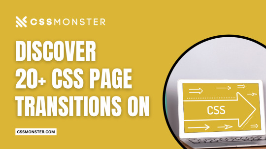
Discover 20+ CSS Page Transitions
At CSS Monster, we recognize the pivotal role of page transitions in enriching the user experience and infusing your website with dynamic flair. Through adept CSS page transition effects, you can weave seamless and visually enthralling transitions between your web pages or sections. If you're in search of breathtaking page transitions for your web projects, you've come to the right place! We're delighted to unveil our latest assortment of hand-picked, free HTML and CSS page transition effect code examples. This November 2022 update brings 2 new additions, seamlessly integratable into your websites. These code snippets originate from renowned coding platforms like CodePen, GitHub, and other trusted sources. From graceful fade-ins and slide-ins to imaginative animations and captivating parallax effects, this collection presents a wide spectrum of page transition effects. It offers transitions that effortlessly fuse one page with another, crafting a coherent and engaging browsing experience for your visitors. Beyond conventional page transitions, we've included unique, eye-catching effects designed to set your website apart. Embrace 3D flips, rotations, morphing shapes, and particle animations, infusing an additional layer of interactivity and visual allure into your web pages. Whether you're a novice or a seasoned developer, these resources will empower you to elevate your website's transitions, resulting in a memorable user experience. Explore different effects, tailor them to harmonize with your website's aesthetics, and fabricate seamless, captivating transitions that etch a lasting impact on your users. Happy coding!
Author Cassandra December 12, 2019 Links Just Get The Demo Link How To Download - Article How To Download - Video Made with HTML / CSS About a code TRANSFORM: TRANSLATE Compatible browsers:Chrome, Edge, Firefox, Opera, Safari Responsive:yes Dependencies:- Author Cassandra December 12, 2019 Links Just Get The Demo Link How To Download - Article How To Download - Video Made with HTML / CSS About a code TRANSFORM: TRANSLATE Compatible browsers:Chrome, Edge, Firefox, Opera, Safari Responsive:yes Dependencies:- Author Jamie Coulter June 12, 2019 Links Just Get The Demo Link How To Download - Article How To Download - Video Made with HTML (Haml) / CSS (SCSS) About a code JUST ANOTHER CSS UI Compatible browsers:Chrome, Edge, Firefox, Opera, Safari Responsive:no Dependencies:font-awesome.css Author Mehmet Burak Erman January 3, 2019 Links Just Get The Demo Link How To Download - Article How To Download - Video Made with HTML (Pug) / CSS (Stylus) / JavaScript About a code MULTI LAYER PAGE REVEAL EFFECT Compatible browsers:Chrome, Firefox, Opera, Safari Dependencies:- Author Milan Ricoul July 18, 2018 Links Just Get The Demo Link How To Download - Article How To Download - Video Made with HTML (Pug) / CSS (SCSS) / JavaScript About a code TILES PAGE TRANSITION Compatible browsers:Chrome, Edge, Firefox, Opera, Safari Dependencies:bootstrap.css Author Muna December 12, 2017 Links Just Get The Demo Link How To Download - Article How To Download - Video Made with HTML / CSS (SCSS) / JavaScript About a code ARTICLE TRANSITION PAGE Compatible browsers:Chrome, Edge, Firefox, Opera, Safari Dependencies:-
Author ktsn October 12, 2017 Links Just Get The Demo Link How To Download - Article How To Download - Video Made with HTML/Pug About a code PAGE TRANSITION
Author Tobias Glaus March 31, 2017 Links Just Get The Demo Link How To Download - Article How To Download - Video Made with HTML About a code REVEAL CONTENT ANIMATION Author SBC January 22, 2017 Links Just Get The Demo Link How To Download - Article How To Download - Video Made with HTML / CSS About a code PAGE TRANSITIONS Compatible browsers:Chrome, Edge, Firefox, Opera, Safari Responsive:no Dependencies:-

Author Paul DeCotiis January 15, 2017 Links Just Get The Demo Link How To Download - Article How To Download - Video Made with HTML About a code SIMPLE CSS3 PAGE TRANSITION

Author Steve Gardner August 01, 2016 Links Just Get The Demo Link How To Download - Article How To Download - Video Made with HTML About a code PAGE TRANSITION Author Timothy Giblin July 3, 2016 Links Just Get The Demo Link How To Download - Article How To Download - Video Made with HTML / CSS (SCSS) About a code SPLASH PAGE Compatible browsers:Chrome, Edge, Firefox, Opera, Safari Responsive:yes Dependencies:- Read the full article
0 notes
Text
What’s New for Designers, September 2018
This month’s collection of new tools and elements for designers has a common theme – productivity. There are so many things here to help you do work better and more efficiently. But there’s fun too…make sure to look for some of the hidden design gems deep in this article. They’ll bring a smile to your face for sure.
If we’ve missed something that you think should have been on the list, let us know in the comments. And if you know of a new app or resource that should be featured next month, tweet it to @carriecousins to be considered!
Brandy
Brandy is a brand asset management tool for macOS. Use it to keep up with colors, logos, gradient patterns and fonts by project. Everything works in real-time and one account can contain as many brand projects as you like. Plus, it works using drag and drop so assets are always at your fingertips.
Picular
What if you could Google a color? That’s what Picular does. The tool allows you to put in a word or phrase and returns color results – by hex code – that represent that word. It works by pulling images of that word and boiling them down to a single hue. (Hover over colors to see the source image.)
Drawser
Drawser is a vector graphics tool that works in-browser so that you can draw and edit on the screen. It includes interactive features so you can collaborate on vector-based projects online. Drawser includes a social component and community as well with the ability to publish projects and allow other users to refine them in the open source platform.
RSSHub
RSSHub is a lightweight RSS aggregator that can grab a feed from pretty much anything. (It does everything you wish some of the old RSS options of the past did.) The documentation is straightforward and implementation is quite seamless with plenty of options to get just the feed you want.
SVG Filters
SVG Filters is a fun playground where you can add different effects to SVG-based images and text with just a click. Use the toggle settings for each filter and watch the image change on the screen. Copy the provided code and your filtered image is ready to go.
Code Surfer
Code Surfer is a React component for scrolling, zooming and highlighting code. You can highlight single or multiple lines of code, scale long snippets and more.
ShrinkMe
ShrinkMe is an image compression app that works in seconds. Drag and drop you photo into the window and get a downloadable file that’s significantly smaller. (My sample image shrunk by 62 percent without image quality loss.) Plus, this tool works offline and you can shrink multiple files at once.
Fake 3D Effect
Can’t make it? Then fake it. This pen by Robin Delaporte features a fake 3D effect with a depth map. It’s definitely an interesting way to use a three-dimensional effect with an image and no fancy equipment.
Splitting
Splitting helps you create a trendy split text effect with CSS. The tool creates elements and adds CSS variables for animating text, grids, and more. It’s lightweight and easy to use with plenty of documentation to guide you through set up.
Tutorial: Advanced Effects with CSS Background Blend Modes
Bennett Feely takes on how to work with a few different CSS properties to create blended background objects. The tutorial primarily focuses on background-blend-mode and how to create impressive patterns.
Food & Drinks Icon Set
The Food & Drinks Icon Set is a collection of 60 icons featuring plenty of edibles. Each icon comes in a cull color style as well as line icon style. Download the vector shapes and customize for projects.
Gradient Icons
Gradient Icons is a pack of 100 icons of varying types with trendy gradient coloring in a flat style. The collection expands to 1,000 icons in the full paid set.
EmojiOne 4.0
EmojiOne 4.0 is a premium collection of emojis restyled for 2018. Each design has been tweaked to reflect current design trends with subtle gradients and a clean finish.
Best Animated Logos
Best Animated Logos is a collection of logos you know with awesome animations attached. From Google to Tumblr to Skype to Reddit, these animations will inspire you for sure.
Heard at Work
Heard at Work is a collection of overheard exclamations that aims to capture what it’s like to work in a New York design studio. It’s fun, honest and maybe a little bit silly. The project was created by Justine Braisted.
The Carlton Dance
The Carlton Dance pen just makes me smile. A favorite move from the beloved Carlton character from the Fresh Prince of Bel-Air (a 90s sitcom) has morphed from a meme to a pure CSS character.
NerdRobe
NerdRobe makes totally cool—albeit geeky—shirts for designers. There’s a new design every other week and shirts are just $10 plus shipping (based on your location). So you’ll want to keep checking back for the design that fits your sensibilities.
Abhaya Libre
Abhaya Libre is a unicode compliant, complete libre version of the widely used Sinhala typeface FM Abhaya and includes Sinhala and Latin support. It includes five weights and is also available as a Google Font.
Brand New Roman
Brand New Roman is a typeface generator that uses brand icons and marks to create a font. The end result can look a little like a ransom note, but it can be fun to play with. Put in your words and download.
Jomhuria
Jomhuria is a stencil style typeface that’s highly readable. It’s designed for large sizes and might not work as well in smaller applications. The full set includes more than 800 characters.
Library 3 AM
Library 3 AM is a somewhat round inline typeface with two styles. It’s great for display or poster designs and is free for all uses.
Space Grotesk
Space Grotesk is a sans serif typeface with five styles available with the open font license. It features a full character site with emphasis on circular elements.
UStroke
UStroke is a handwriting-style decorative typeface with a grunge feel. It includes all uppercase characters with a few alternates and numerals. Although application is limited, it’s an interesting option.
Add Realistic Chalk and Sketch Lettering Effects with Sketch’it – only $5!
Source from Webdesigner Depot https://ift.tt/2O3YZ82 from Blogger https://ift.tt/2MinFYF
0 notes
Text
What’s New for Designers, September 2018
This month’s collection of new tools and elements for designers has a common theme – productivity. There are so many things here to help you do work better and more efficiently. But there’s fun too…make sure to look for some of the hidden design gems deep in this article. They’ll bring a smile to your face for sure.
If we’ve missed something that you think should have been on the list, let us know in the comments. And if you know of a new app or resource that should be featured next month, tweet it to @carriecousins to be considered!
Brandy
Brandy is a brand asset management tool for macOS. Use it to keep up with colors, logos, gradient patterns and fonts by project. Everything works in real-time and one account can contain as many brand projects as you like. Plus, it works using drag and drop so assets are always at your fingertips.
Picular
What if you could Google a color? That’s what Picular does. The tool allows you to put in a word or phrase and returns color results – by hex code – that represent that word. It works by pulling images of that word and boiling them down to a single hue. (Hover over colors to see the source image.)
Drawser
Drawser is a vector graphics tool that works in-browser so that you can draw and edit on the screen. It includes interactive features so you can collaborate on vector-based projects online. Drawser includes a social component and community as well with the ability to publish projects and allow other users to refine them in the open source platform.
RSSHub
RSSHub is a lightweight RSS aggregator that can grab a feed from pretty much anything. (It does everything you wish some of the old RSS options of the past did.) The documentation is straightforward and implementation is quite seamless with plenty of options to get just the feed you want.
SVG Filters
SVG Filters is a fun playground where you can add different effects to SVG-based images and text with just a click. Use the toggle settings for each filter and watch the image change on the screen. Copy the provided code and your filtered image is ready to go.
Code Surfer
Code Surfer is a React component for scrolling, zooming and highlighting code. You can highlight single or multiple lines of code, scale long snippets and more.
ShrinkMe
ShrinkMe is an image compression app that works in seconds. Drag and drop you photo into the window and get a downloadable file that’s significantly smaller. (My sample image shrunk by 62 percent without image quality loss.) Plus, this tool works offline and you can shrink multiple files at once.
Fake 3D Effect
Can’t make it? Then fake it. This pen by Robin Delaporte features a fake 3D effect with a depth map. It’s definitely an interesting way to use a three-dimensional effect with an image and no fancy equipment.
Splitting
Splitting helps you create a trendy split text effect with CSS. The tool creates elements and adds CSS variables for animating text, grids, and more. It’s lightweight and easy to use with plenty of documentation to guide you through set up.
Tutorial: Advanced Effects with CSS Background Blend Modes
Bennett Feely takes on how to work with a few different CSS properties to create blended background objects. The tutorial primarily focuses on background-blend-mode and how to create impressive patterns.
Food & Drinks Icon Set
The Food & Drinks Icon Set is a collection of 60 icons featuring plenty of edibles. Each icon comes in a cull color style as well as line icon style. Download the vector shapes and customize for projects.
Gradient Icons
Gradient Icons is a pack of 100 icons of varying types with trendy gradient coloring in a flat style. The collection expands to 1,000 icons in the full paid set.
EmojiOne 4.0
EmojiOne 4.0 is a premium collection of emojis restyled for 2018. Each design has been tweaked to reflect current design trends with subtle gradients and a clean finish.
Best Animated Logos
Best Animated Logos is a collection of logos you know with awesome animations attached. From Google to Tumblr to Skype to Reddit, these animations will inspire you for sure.
Heard at Work
Heard at Work is a collection of overheard exclamations that aims to capture what it’s like to work in a New York design studio. It’s fun, honest and maybe a little bit silly. The project was created by Justine Braisted.
The Carlton Dance
The Carlton Dance pen just makes me smile. A favorite move from the beloved Carlton character from the Fresh Prince of Bel-Air (a 90s sitcom) has morphed from a meme to a pure CSS character.
NerdRobe
NerdRobe makes totally cool—albeit geeky—shirts for designers. There’s a new design every other week and shirts are just $10 plus shipping (based on your location). So you’ll want to keep checking back for the design that fits your sensibilities.
Abhaya Libre
Abhaya Libre is a unicode compliant, complete libre version of the widely used Sinhala typeface FM Abhaya and includes Sinhala and Latin support. It includes five weights and is also available as a Google Font.
Brand New Roman
Brand New Roman is a typeface generator that uses brand icons and marks to create a font. The end result can look a little like a ransom note, but it can be fun to play with. Put in your words and download.
Jomhuria
Jomhuria is a stencil style typeface that’s highly readable. It’s designed for large sizes and might not work as well in smaller applications. The full set includes more than 800 characters.
Library 3 AM
Library 3 AM is a somewhat round inline typeface with two styles. It’s great for display or poster designs and is free for all uses.
Space Grotesk
Space Grotesk is a sans serif typeface with five styles available with the open font license. It features a full character site with emphasis on circular elements.
UStroke
UStroke is a handwriting-style decorative typeface with a grunge feel. It includes all uppercase characters with a few alternates and numerals. Although application is limited, it’s an interesting option.
Add Realistic Chalk and Sketch Lettering Effects with Sketch’it – only $5!
Source p img {display:inline-block; margin-right:10px;} .alignleft {float:left;} p.showcase {clear:both;} body#browserfriendly p, body#podcast p, div#emailbody p{margin:0;} What’s New for Designers, September 2018 published first on https://medium.com/@koresol
0 notes
Text
Book: The Greatest CSS Tricks Vol. I
Ya know, for a site called “CSS-Tricks” that I’ve run for well over a decade, it’s a little funny we’ve never done a book under that name. I’ve written a book about WordPress and SVG, but never CSS!
Well, allow me to change that. I’ve been working on a “book” called The Greatest CSS Tricks Vol. I, as my attempt to stay true to this site’s name! The big idea is to make it like a coffee-table book for CSS, where each chapter is totally independent and talks about one literal CSS trick that I’ve found to be exceptionally clever and useful — a book about quite literally the best CSS tricks I’ve come across over the years.
I quoted the word “book” above because this is the loosest possible definition of a book. I have not yet made it into an eBook format. I have not even considered printing it yet (although there is a “full book” URL available with the whole book together for printing and print-to-PDFing). This book exists as URLs which are essentially fancy blog posts grouped together. I’m also calling it Volume I as there are already ideas for another one!
Some chapters are broadly known concepts that I’ve written up. But many of the chapters are based on ideas that can be traced back to individual people and I always try to credit them directly.
Here’s the chapter list so far:
Pin Scrolling to Bottom
Scroll Animation
Yellow Flash
Shape Morphing
Flexible Grids
Border Triangles
Scroll Indicator
Boxy Buttons
Self-Drawing Shapes
Perfect Font Fallbacks
Scroll Shadows
Editable Style Blocks
Draggable Elements
Hard Stop Gradients
Squigglevision
I say so far because I might add a few others, rearrange them and such. It could still use a healthy bit of editing. But I think the bulk of the value of the book is already there.
Value? I think there is! While it’s fun to learn some CSS trickery, I think there is value beyond the tricks themselves. Tricks help you see how CSS works at a deeper level. When you understand the trick, you’re seeing how that part of CSS works through a new lens and it helps you be more in tune with the nature of that CSS. It will help you reach for those CSS properties more intuitively when you know what they are capable of.
In another sense, it’s like taking a walk with weights in your backpack. You do it intentionally so it feels easier to walk when they’re removed. The tricks are like mental weights. They make writing less-tricky CSS feel easier.
So about buying the book. You don’t buy the book directly. What you buy is an MVP Supporter membership to this site. When you’re an MVP Supporter, you have access to the book, and more. This is the whole package:
No ads. You see no ads on this site, except for sponsored posts which are just blog posts and I try to make useful anyway.
Extra content. You can read the digital books I’m making (including some chapters that are in progress.)
Easier commenting. You’ll be logged in, so leaving comments is easier and won’t require the delay for approval.
Good feels. And, of course, you get the extreme sense of satisfaction of supporting this site and our commitment to bringing you useful tech knowledge.
It’s just just $20/year.
Have I, or this site, helped you out over the years? This is the best way to say thanks.
Also, if you would really like to have access to read the book, and can’t afford it right now, I totally get it. Email me at [email protected] and we can work that out.
The post Book: The Greatest CSS Tricks Vol. I appeared first on CSS-Tricks.
Book: The Greatest CSS Tricks Vol. I published first on https://brightcirclepage.tumblr.com/
0 notes
Text
Using SVG to Create a Duotone Effect on Images
Anything is possible with SVG, right?!
After a year of collaborating with some great designers and experimenting to achieve some pretty cool visual effects, it is beginning to feel like it is. A quick search of "SVG" on CodePen will attest to this. From lettering, shapes, sprites, animations, and image manipulation, everything is better with the aid of SVG. So when a new visual trend hit the web last year, it was no surprise that SVG came to the rescue to allow us to implement it.
The spark of a trend
Creatives everywhere welcomed the 2016 new year with the spark of a colorizing technique popularized by Spotify’s 2015 Year in Music website (here is last year’s) which introduced bold, duotone images to their brand identity.
The Spotify 2015 Year in Music site demonstrates the duotone image technique.
This technique is a halftone reproduction of an image by superimposing one color (traditionally black) with another. In other words, the darker tone will be mapped to the shadows of the image, and the lighter tone, mapped to the highlights.
We can achieve the duotone technique in Photoshop by applying a gradient map (Layer > New Adjustment Layer > Gradient Map) of two colors over an image.
Choose the desired color combination for the gradient map
A comparison of the original image (left) and when the gradient map is applied (right)
Right click (or alt + click) the adjustment layer and create a clipping mask to apply the gradient map to just the image layer directly below it instead of the applying to all layers.
It used to take finessing the <canvas> element to calculate the color mapping and paint the result to the DOM or utilize CSS blend-modes to come close to the desired color effect. Well, thanks to the potentially life-saving powers of SVG, we can create these Photoshop-like “adjustment layers” with SVG filters.
Let’s get SaVinG!
Breaking down the SVG
We are already familiar with the vectorful greatness of SVG. In addition to producing sharp, flexible, and small graphics, SVGs also support over 20 filter effects that allow us to blur, morph, and do so much more to our SVG files. For this duotone effect, we will use two filters to construct our gradient map.
feColorMatrix (optional)
The feColorMatrix effect allows us to manipulate the colors of an image based on a matrix of rbga channels. Una Kravets details color manipulation with feColorMatrix in this deep dive and it's a highly recommended read.
Depending on your image, it may be worth balancing the colors in the image by setting it to grayscale with the color matrix. You can adjust the rbga channels as you’d like for the desired grayscale effect.
<feColorMatrix type="matrix" result="grayscale" values="1 0 0 0 0 1 0 0 0 0 1 0 0 0 0 0 0 0 1 0" > </feColorMatrix>
feComponentTransfer
Next is to map the two colors over the highlights and shadows of our grayscale image with the feComponentTransfer filter effect. There are specific element attributes to keep in mind for this filter.
Attribute What it Does Value to Use color-interpolation-filters (required) Specifies the color space for gradient interpolations, color animations, and alpha compositing. sRGB result (optional) Assigns a name to this filter effect and can be used/referenced by another filter primitive with the in attribute. duotone
While the result attribute is optional, I like to include it to give additional context to each filter (and as a handy note for future reference).
The feComponent filter handles the color mapping based on transfer functions of each rbga component specified as child elements of the parent feComponentTransfer: feFuncR feFuncG feFuncB feFuncA. We use these rbga functions to calculate the values of the two colors in the gradient map.
Here's an example:
The Peachy Pink gradient map in the screenshots above uses a magenta color (#bd0b91) , with values of R(189) G(11) B(145).
Divide each RGB value by 255 to get the values of the first color in the matrix. The RGB values of the second column result in #fcbb0d (gold). Similar to in our Photoshop gradient map, the first color (left to right) gets mapped to the shadows, and the second to the highlights.
<feComponentTransfer color-interpolation-filters="sRGB" result="duotone"> <feFuncR type="table" tableValues="(189/255) 0.9882352941"></feFuncR> <feFuncG type="table" tableValues="(11/255) 0.7333333333"></feFuncG> <feFuncB type="table" tableValues="(145/255) 0.05098039216"></feFuncB> <feFuncA type="table" tableValues="0 1"></feFuncA> </feComponentTransfer>
Step 3: Apply the Effect with a CSS Filter
With the SVG filter complete, we can now apply it to an image by using the CSS filter property and setting the url() filter function to the ID of the SVG filter.
It's worth noting that the SVG containing the filter can just be a hidden element sitting right in your HTML. That way it loads and is availble for use, but does not render on the screen.
background-image: url('path/to/img'); filter: url(/path/to/svg/duotone-filters.svg#duotone_peachypink); filter: url(#duotone_peachypink);
Browser Support
You're probably interested in how well supported this technique is, right? Well, SVG filters have good browser support.
This browser support data is from Caniuse, which has more detail. A number indicates that browser supports the feature at that version and up.
Desktop
ChromeOperaFirefoxIEEdgeSafari89310126
Mobile / Tablet
iOS SafariOpera MobileOpera MiniAndroidAndroid ChromeAndroid Firefox6.0-6.110all4.46257
That said, CSS filters are not as widely supported. That means some graceful degradation considerations will be needed.
This browser support data is from Caniuse, which has more detail. A number indicates that browser supports the feature at that version and up.
Desktop
ChromeOperaFirefoxIEEdgeSafari18*15*35No176*
Mobile / Tablet
iOS SafariOpera MobileOpera MiniAndroidAndroid ChromeAndroid Firefox6.0-6.1*37*No4.4*6257
For example, Internet Explorer (IE) does not support the CSS Filter url() function, nor nor does it support CSS background-blend-modes, the next best route to achieving the duotone effect. As a result, a fallback for IE can be an absolutely positioned CSS gradient overlay on the image to mimic the filter.
In addition, I did have issues in Firefox when accessing the filter itself based on the path for the SVG filter when I initially implemented this approach on a project. Firefox seemed to work only if the filter was referenced with the full path to the SVG instead of the filter ID alone. This does not seem to be the case anymore but is worth keeping in mind.
Bringing it All Together
Here's a full example of the filter in use:
<svg xmlns="http://ift.tt/nvqhV5"> <filter id="duotone_peachypink"> <feColorMatrix type="matrix" result="grayscale" values="1 0 0 0 0 1 0 0 0 0 1 0 0 0 0 0 0 0 1 0" > </feColorMatrix> <feComponentTransfer color-interpolation-filters="sRGB" result="duotone"> <feFuncR type="table" tableValues="0.7411764706 0.9882352941"></feFuncR> <feFuncG type="table" tableValues="0.0431372549 0.7333333333"></feFuncG> <feFuncB type="table" tableValues="0.568627451 0.05098039216"></feFuncB> <feFuncA type="table" tableValues="0 1"></feFuncA> </feComponentTransfer> </filter> </svg>
Here's the impact that has when applied to an image:
A comparison of the original image (left) with the filtered effect (right) using SVG!
See the Pen Duotone Demo by Lentie Ward (@lentilz) on CodePen.
For more examples, you can play around with more duotone filters in this pen.
Resources
The following resources are great points of reference for the techniques used in this post.
via CSS-Tricks http://ift.tt/2kkHBPw
0 notes
Text
SVG Properties and CSS
There are many Scalable Vector Graphics (SVG), but only certain attributes can be applied as CSS to SVG. Presentation attributes are used to style SVG elements and can be used as CSS properties. Some of these attributes are SVG-only while others are already shared in CSS, such as font-size or opacity.
For example, to change the color of a <circle> element to red, use the fill property in CSS. The fill attribute is a presentation attribute, therefore it can be used as a CSS property:
circle { fill: red; }
See the Pen vMqaay by Geoff Graham (@geoffgraham) on CodePen.
So, with that, let's take a deep and thorough dive into all of the SVG elements that are available to us as well as the CSS properties for them. We'll also look at various styling approaches, including general presentational styles and animations.
SVG Elements by Category
The presentation attributes that can be used as CSS properties can be found below. For reference, supported elements will be classified by category. This does not include deprecated elements.
Element Type Elements Container elements <a> <defs> <g> <marker> <mask> <pattern> <svg> <switch> <symbol> Filter primitive elements <feBlend> <feColorMatrix> <feComponentTransfer> <feComposite> <feConvolveMatrix> <feDiffuseLighting> <feDisplacementMap> <feFlood> <feGaussianBlur> <feImage> <feMerge> <feMorphology> <feOffset> <feSpecularLighting> <feTile> <feTurbulence> Gradient elements <linearGradient> <radialGradient> <stop> Graphics elements <circle> <ellipse> <image> <line> <path> <polygon> <polyline> <rect> <text> <use> Shape elements <circle> <ellipse> <line> <path> <polygon> <polyline> <rect> Text content elements <text> <textPath> <tspan>
Properties shared between CSS and SVG
Font properties
Presentation attribute Supported elements font Text content elements font-family Text content elements font-size Text content elements font-size-adjust Text content elements font-stretch Text content elements font-style Text content elements font-variant Text content elements font-weight Text content elements
Text properties
Presentation attribute Supported elements direction <text> <tspan> letter-spacing Text content elements text-decoration Text content elements unicode-bidi Text content elements word-spacing Text content elements writing-mode <text>
Masking properties
Presentation attribute Supported elements overflow <foreignObject> <image> <marker> <pattern> <svg> <symbol>
Interactivity properties
Presentation attribute Supported elements cursor Container elements Graphics elements
Color properties
Presentation attribute Supported elements color Applies to elements using: fill stroke stop-color flood-color lighting-color
Visibility properties
Presentation attribute Supported elements display Graphics elements Text content elements <a> <foreignObject> <g> <svg> <switch> visibility Graphics elements Text content elements
SVG CSS Properties
Text properties
Presentation attribute Supported elements alignment-baseline <textPath> <tspan> baseline-shift <textPath> <tspan> dominant-baseline Text content elements glyph-orientation-horizontal Text content elements glyph-orientation-vertical Text content elements kerning Text content elements text-anchor Text content elements
Clip properties
Presentation attribute Supported elements clip <foreignObject> <image> <marker> <pattern> <svg> <symbol> clip-path Container elements Graphics elements clip-rule <clipPath>
Masking properties
Presentation attribute Supported elements mask Container elements Graphics elements opacity Graphics elements <a> <defs> <g> <marker> <pattern> <svg> <switch> <symbol>
Filter effects
Presentation attribute Supported elements enable-background Container elements filter Container elements Graphics elements flood-color <feFlood> flood-opacity <feFlood> lighting-color <feDiffuseLighting> <feSpecularLighting>
Gradient properties
Presentation attribute Supported elements stop-color <stop> stop-opacity <stop>
Interactivity properties
Presentation attribute Supported elements pointer-events Graphics elements
Color properties
Presentation attribute Supported elements color-profile <image> referring to raster image
Painting properties
Presentation attribute Supported elements color-interpolation Container elements Graphics elements color-interpolation-filters Filter primitive elements color-rendering Container elements Graphics elements fill Shape elements Text content elements fill-rule Shape elements Text content elements fill-opacity Shape elements Text content elements image-rendering <image> marker <line> <path> <polygon> <polyline> marker-start <line> <path> <polygon> <polyline> marker-mid <line> <path> <polygon> <polyline> marker-end <line> <path> <polygon> <polyline> shape-rendering Shape elements stroke Shape elements Text content elements stroke-dasharray Shape elements Text content elements stroke-dashoffset Shape elements Text content elements stroke-linecap Shape elements Text content elements stroke-linejoin Shape elements Text content elements stroke-miterlimit Shape elements Text content elements stroke-opacity Shape elements Text content elements stroke-width Shape elements Text content elements text-rendering <text>
SVG 2
While presentation attributes can be used as CSS properties to style SVG, what about controlling the coordinates and dimensions of SVG elements using CSS? SVG 2, which is in Candidate Recommendation at the time of this writing, makes it is possible to style and animate these properties.
The SVG 2 specification states:
Some styling properties can be specified not only in style sheets and 'style' attributes, but also in presentation attributes. These are attributes whose name matches (or is similar to) a given CSS property and whose value is parsed as a value of that property."
Not only does it mean that SVG properties can be styled using CSS as presentation attributes or in style sheets, but this also can be applied to CSS pseudo-classes such as :hover or :active.
SVG 2 also introduces more presentation attributes that can be used as styling properties. These attributes can be found in SVG 2 specification.
Element-specific properties
It is important to note that not every SVG element will support the same CSS properties. Much like how there are CSS properties that can be applied to certain SVG elements, there are specific properties that are supported by certain SVG elements.
For example, the <circle>or <ellipse> elements support the cxand cyproperties as coordinates of the center of the shape. The <ellipse> element also supports the rx and ry properties as the radius, but the <circle> element cannot use these properties.
Geometry properties
In SVG 2, properties such as rx and ry are defined as geometry properties. Geometry properties can be used as CSS properties, just like presentation attributes such as fill or stroke properties. These CSS properties and the corresponding SVG elements include:
SVG Element Geometry Property <circle> cx cy r <ellipse> cx cy rx ry <rect> rx ry height width x y <path> path <image> height width x y <foreignObject> height width x y <svg> code>height width x y
Positioning SVG elements
SVG 2 also makes it is possible to position SVG elements using CSS. Let’s begin with drawing a rectangle shape having the following SVG:
<svg width="170" height="170"> <rect x="10" y="10" width="150" height="150" /> </svg>
And the following CSS:
rect { fill: #6e40aa; }
See the Pen QPeNGj by Geoff Graham (@geoffgraham) on CodePen.
This will produce a rectangle shape with its coordinates set to 10, 10. With SVG 2, x and y can be applied as CSS properties:
/* This will work with SVG 2 */ rect { x: 10; y: 10; ... }
The SVG code would be reduced to this:
<svg width="170" height="170"> <rect width="150" height="150" /> </svg>
You can even set the width and height for the <rect> element using CSS like so:
rect { ... width: 150px; height: 150px; ... }
That leaves us with just the following for SVG markup:
<svg width="170" height="170"> <rect /> </svg>
See the Pen Positioning SVG elements by Katherine Kato (@kathykato) on CodePen.
At the time of writing, the following demos will work in Blink (e.g. Chrome and Opera) and WebKit (e.g. Safari) browsers as these browsers support SVG 2 features. Until then, let’s dive into how to override SVG properties using CSS.
SVG shape morphing
The <path> element can be overridden with CSS to create shape morphing.
The SVG paths that morph one into the other must have the same number of points or else the morphing will not work.
Let’s start with drawing a <path> element in the shape of a triangle. Using the d property will specify the shape of the <path> element:
<svg height="220" width="300"> <path d="M150 10 L40 200 L260 200Z" /> </svg>
To get the triangle to morph into a different shape, let’s override the SVG <path> element with the d property with CSS:
path { d: path("M150, 10 L40, 200 L260, 200Z"); fill: #4c6edb; }
Let’s also add a :active pseudo-class to the <path> property so when the element is clicked, the shape will morph into a square and change its fill color. Let’s also add a transition property to make the shape morphing action appear smooth. Here is the CSS:
path:active { d: path("M150, 10 L40, 200 L260, 200 L260, 200Z"); fill: #4c6edb; transition: all 0.35s ease; }
And the SVG would be:
<svg height="220" width="300"> <path /> </svg>
See the Pen SVG shape morphing by Katherine Kato (@kathykato) on CodePen.
Want another demo? Here is a cool demo from Chris Coyier demonstrating SVG shape morphing on hover!
See the Pen Simple Path Examples by Chris Coyier (@chriscoyier) on CodePen.
Animating SVG properties
SVG properties can be animated using CSS through CSS animations and transitions.
In this demo, we will draw various SVG <circle> elements and create a wave animation. Start by drawing five <circle> elements:
<svg width="350" height="250"> <circle class="shape" /> <circle class="shape" /> <circle class="shape" /> <circle class="shape" /> <circle class="shape" /> </svg>
We’ll be using CSS variables and :nth-child() CSS pseudo-class to define each .shape class. The .shape class will have a cy of 50 and a r of 20. Each of the .shape classes will have their own cx and fill CSS properties set:
:root { --color-1: #6e40aa; --color-2: #4c6edb; --color-3: #24aad8; --color-4: #1ac7c2; --color-5: #1ddea3; } .shape { cy: 50; r: 20; } .shape:nth-child(1) { cx: 60; fill: var(--color-1); } .shape:nth-child(2) { cx: 120; fill: var(--color-2); } .shape:nth-child(3) { cx: 180; fill: var(--color-3); } .shape:nth-child(4) { cx: 240; fill: var(--color-4); } .shape:nth-child(5) { cx: 300; fill: var(--color-5); }
Here is how it should look so far.
See the Pen Animating SVG properties: Pre-animation by Geoff Graham (@geoffgraham) on CodePen.
Now it’s time to animate! Start by using @keyframes rule to define the moveCircle animation:
@keyframes moveCircle { 50% { cy: 150; r: 13; } }
This will get each <circle> element to change their cy coordinates from 50 to 150 and r from 20 to 13. Add the following to the CSS to the .shape class get the animation running infinitely:
.shape { ... animation: moveCircle 1250ms ease-in-out both infinite; }
Finally, add an animation-delay to each of the .shape classes to the CSS with the exception of .shape:nth-child(1) like this:
.shape:nth-child(2) { ... animation-delay: 100ms; } .shape:nth-child(3) { ... animation-delay: 200ms; } .shape:nth-child(4) { ... animation-delay: 300ms; } .shape:nth-child(5) { ... animation-delay: 400ms; }
See the Pen Animating SVG properties by Katherine Kato (@kathykato) on CodePen.
Shapes in SVG <pattern> elements can also be animated using CSS. Here is a cool demo by Dudley Storey showcasing that!
See the Pen Screen by Dudley Storey (@dudleystorey) on CodePen.
Wrapping up
As SVG 1.1 is the current standard, few browsers currently support SVG 2 features. It is not recommended to put these techniques into production yet. SVG 2 implementation is currently at Candidate Recommendation stage, thus support for styling SVG geometry properties with CSS should improve in the future.
The post SVG Properties and CSS appeared first on CSS-Tricks.
😉SiliconWebX | 🌐CSS-Tricks
0 notes
Text
Performant Animations Using KUTE.js: Part 3, Animating SVG
New item has been added on CodeHolder.net https://codeholder.net/code/performant-animations-using-kute-js-part-3-animating-svg
The previous tutorial of the series showed you how to animate different CSS properties of any element using KUTE.js. However, the core engine does not allow you to animate properties that are specific to SVG elements. Similarly, you can't animate the SVG morphing of different path shapes or the drawing of different SVG elements using strokes. You will have to use the KUTE.js SVG plugin to achieve any of these tasks.
0 notes