#css animation
Explore tagged Tumblr posts
Visit Tumblr Blog
Explore Tumblr blogs with no restrictions, modern design and the best experience.
Last Seen Tumblr Blogs


Fun Fact
Average visit duration of Tumblr.com is 10 mins and 25 secs.
Text

CSS Rainbow Text Animation
#css text animation#css text effects#css animation#divinector#html css#css#frontenddevelopment#html#css3#code#learn to code
5 notes
·
View notes
Text

Neon Glow Buttons
#neon glow buttons#css buttons#css animation#html css#css#css3#html#frontend#html css animation#css neon glow effect#animation#neduzone#learn to code#webdesign#frontenddevelopment
4 notes
·
View notes
Text
💥 100+ CSS Text Animations 💻✨
Looking to make your web content more dynamic and engaging? Our September 2024 update features 22 new CSS text animation examples!
Ready to add some flair to your site? 🔥 Check it out!
→ https://freefrontend.com/css-text-animations/
9 notes
·
View notes
Text
I've found someone you should follow on Pinterest!
I thought you'd like the ideas this person's been saving on Pinterest... https://pin.it/4ZUJ4bryL
https://pin.it/4ZUJ4bryL
Follow me on Pinterest 😉
#pinterest#html#css3#tamilitmemes#tamilwebdesign#css animation#web design#web development#website#webdesign#youtube#web developer#website development#development#developer#responsive webdesign#responsivewebdesign#responsive design#responsive web design#it memes#office memes#memelife#memes#funny memes#programmers#programminglanguage#programmer#program#work in progress#affiliate program
10 notes
·
View notes
Text

Social Media Icon Hover CSS Animation
#social media icon hover#html css animation#css animation examples#css animation#codenewbies#html css#frontenddevelopment#html5 css3#css animation tutorial#pure css animation#css
3 notes
·
View notes
Text
Orbital Mechanics (or How I Optimized a CSS Keyframes Animation)
New Post has been published on https://thedigitalinsider.com/orbital-mechanics-or-how-i-optimized-a-css-keyframes-animation/
Orbital Mechanics (or How I Optimized a CSS Keyframes Animation)

I recently updated my portfolio at johnrhea.com. (If you’re looking to add a CSS or front-end engineer with storytelling and animation skills to your team, I’m your guy.) I liked the look of a series of planets I’d created for another personal project and decided to reuse them on my new site. Part of that was also reusing an animation I’d built circa 2019, where a moon orbited around the planet.
Initially, I just plopped the animations into the new site, only changing the units (em units to viewport units using some complicated math that I was very, very proud of) so that they would scale properly because I’m… efficient with my time. However, on mobile, the planet would move up a few pixels and down a few pixels as the moons orbited around it. I suspected the plopped-in animation was the culprit (it wasn’t, but at least I got some optimized animation and an article out of the deal).
Here’s the original animation:
My initial animation for the moon ran for 60 seconds. I’m folding it inside a disclosure widget because, at 141 lines, it’s stupid long (and, as we’ll see, emphasis on the stupid). Here it is in all its “glory”:
Open code
#moon1 animation: moon-one 60s infinite; @keyframes moon-one 0% transform: translate(0, 0) scale(1); z-index: 2; animation-timing-function: ease-in; 5% transform: translate(-3.51217391vw, 3.50608696vw) scale(1.5); z-index: 2; animation-timing-function: ease-out; 9.9% z-index: 2; 10% transform: translate(-5.01043478vw, 6.511304348vw) scale(1); z-index: -1; animation-timing-function: ease-in; 15% transform: translate(1.003478261vw, 2.50608696vw) scale(0.25); z-index: -1; animation-timing-function: ease-out; 19.9% z-index: -1; 20% transform: translate(0, 0) scale(1); z-index: 2; animation-timing-function: ease-in; 25% transform: translate(-3.51217391vw, 3.50608696vw) scale(1.5); z-index: 2; animation-timing-function: ease-out; 29.9% z-index: 2; 30% transform: translate(-5.01043478vw, 6.511304348vw) scale(1); z-index: -1; animation-timing-function: ease-in; 35% transform: translate(1.003478261vw, 2.50608696vw) scale(0.25); z-index: -1; animation-timing-function: ease-out; 39.9% z-index: -1; 40% transform: translate(0, 0) scale(1); z-index: 2; animation-timing-function: ease-in; 45% transform: translate(-3.51217391vw, 3.50608696vw) scale(1.5); z-index: 2; animation-timing-function: ease-out; 49.9% z-index: 2; 50% transform: translate(-5.01043478vw, 6.511304348vw) scale(1); z-index: -1; animation-timing-function: ease-in; 55% transform: translate(1.003478261vw, 2.50608696vw) scale(0.25); z-index: -1; animation-timing-function: ease-out; 59.9% z-index: -1; 60% transform: translate(0, 0) scale(1); z-index: 2; animation-timing-function: ease-in; 65% transform: translate(-3.51217391vw, 3.50608696vw) scale(1.5); z-index: 2; animation-timing-function: ease-out; 69.9% z-index: 2; 70% transform: translate(-5.01043478vw, 6.511304348vw) scale(1); z-index: -1; animation-timing-function: ease-in; 75% transform: translate(1.003478261vw, 2.50608696vw) scale(0.25); z-index: -1; animation-timing-function: ease-out; 79.9% z-index: -1; 80% transform: translate(0, 0) scale(1); z-index: 2; animation-timing-function: ease-in; 85% transform: translate(-3.51217391vw, 3.50608696vw) scale(1.5); z-index: 2; animation-timing-function: ease-out; 89.9% z-index: 2; 90% transform: translate(-5.01043478vw, 6.511304348vw) scale(1); z-index: -1; animation-timing-function: ease-in; 95% transform: translate(1.003478261vw, 2.50608696vw) scale(0.25); z-index: -1; animation-timing-function: ease-out; 99.9% z-index: -1; 100% transform: translate(0, 0) scale(1); z-index: 2; animation-timing-function: ease-in;
If you look at the keyframes in that code, you’ll notice that the 0% to 20% keyframes are exactly the same as 20% to 40% and so on up through 100%. Why I decided to repeat the keyframes five times infinitely instead of just repeating one set infinitely is a decision lost to antiquity, like six years ago in web time. We can also drop the duration to 12 seconds (one-fifth of sixty) if we were doing our due diligence.
I could thus delete everything from 20% on, instantly dropping the code down to 36 lines. And yes, I realize gains like this are unlikely to be possible on most sites, but this is the first step for optimizing things.
#moon1 animation: moon-one 12s infinite; @keyframes moon-one 0% transform: translate(0, 0) scale(1); z-index: 2; animation-timing-function: ease-in; 5% transform: translate(-3.51217391vw, 3.50608696vw) scale(1.5); z-index: 2; animation-timing-function: ease-out; 9.9% z-index: 2; 10% transform: translate(-5.01043478vw, 6.511304348vw) scale(1); z-index: -1; animation-timing-function: ease-in; 15% transform: translate(1.003478261vw, 2.50608696vw) scale(0.25); z-index: -1; animation-timing-function: ease-out; 19.9% z-index: -1; 20% transform: translate(0, 0) scale(1); z-index: 2; animation-timing-function: ease-in;
Now that we’ve gotten rid of 80% of the overwhelming bits, we can see that there are five main keyframes and two additional ones that set the z-index close to the middle and end of the animation (these prevent the moon from dropping behind the planet or popping out from behind the planet too early). We can change these five points from 0%, 5%, 10%, 15%, and 20% to 0%, 25%, 50%, 75%, and 100% (and since the 0% and the former 20% are the same, we can remove that one, too). Also, since the 10% keyframe above is switching to 50%, the 9.9% keyframe can move to 49.9%, and the 19.9% keyframe can switch to 99.9%, giving us this:
#moon1 animation: moon-one 12s infinite; @keyframes moon-one 0%, 100% transform: translate(0, 0) scale(1); z-index: 2; animation-timing-function: ease-in; 25% transform: translate(-3.51217391vw, 3.50608696vw) scale(1.5); z-index: 2; animation-timing-function: ease-out; 49.9% z-index: 2; 50% transform: translate(-5.01043478vw, 6.511304348vw) scale(1); z-index: -1; animation-timing-function: ease-in; 75% transform: translate(1.003478261vw, 2.50608696vw) scale(0.25); z-index: -1; animation-timing-function: ease-out; 99.9% z-index: -1;
Though I was very proud of myself for my math wrangling, numbers like -3.51217391vw are really, really unnecessary. If a screen was one thousand pixels wide, -3.51217391vw would be 35.1217391 pixels. No one ever needs to go down to the precision of a ten-millionth of a pixel. So, let’s round everything to the tenth place (and if it’s a 0, we’ll just drop it). We can also skip z-index in the 75% and 25% keyframes since it doesn’t change.
Here’s where that gets us in the code:
#moon1 animation: moon-one 12s infinite; @keyframes moon-one 0%, 100% transform: translate(0, 0) scale(1); z-index: 2; animation-timing-function: ease-in; 25% transform: translate(-3.5vw, 3.5vw) scale(1.5); z-index: 2; animation-timing-function: ease-out; 49.9% z-index: 2; 50% transform: translate(-5vw, 6.5vw) scale(1); z-index: -1; animation-timing-function: ease-in; 75% transform: translate(1vw, 2.5vw) scale(0.25); z-index: -1; animation-timing-function: ease-out; 99.9% z-index: -1;
After all our changes, the animation still looks pretty close to what it was before, only way less code:
One of the things I don’t like about this animation is that the moon kind of turns at its zenith when it crosses the planet. It would be much better if it traveled in a straight line from the upper right to the lower left. However, we also need it to get a little larger, as if the moon is coming closer to us in its orbit. Because both translation and scaling were done in the transform property, I can’t translate and scale the moon independently.
If we skip either one in the transform property, it resets the one we skipped, so I’m forced to guess where the mid-point should be so that I can set the scale I need. One way I’ve solved this in the past is to add a wrapping element, then apply scale to one element and translate to the other. However, now that we have individual scale and translate properties, a better way is to separate them from the transform property and use them as separate properties. Separating out the translation and scaling shouldn’t change anything, unless the original order they were declared on the transform property was different than the order of the singular properties.
#moon1 animation: moon-one 12s infinite; @keyframes moon-one 0%, 100% translate: 0 0; scale: 1; z-index: 2; animation-timing-function: ease-in; 25% translate: -3.5vw 3.5vw; z-index: 2; animation-timing-function: ease-out; 49.9% z-index: 2; 50% translate: -5vw 6.5vw; scale: 1; z-index: -1; animation-timing-function: ease-in; 75% translate: 1vw 2.5vw; scale: 0.25; animation-timing-function: ease-out; 99.9% z-index: -1;
Now that we can separate the scale and translate properties and use them independently, we can drop the translate property in the 25% and 75% keyframes because we don’t want them placed precisely in that keyframe. We want the browser’s interpolation to take care of that for us so that it translates smoothly while scaling.
#moon1 animation: moon-one 12s infinite; @keyframes moon-one 0%, 100% translate: 0 0; scale: 1; z-index: 2; animation-timing-function: ease-in; 25% scale: 1.5; animation-timing-function: ease-out; 49.9% z-index: 2; 50% translate: -5vw 6.5vw; scale: 1; z-index: -1; animation-timing-function: ease-in; 75% scale: 0.25; animation-timing-function: ease-out; 99.9% z-index: -1;
Lastly, those different timing functions don’t make a lot of sense anymore because we’ve got the browser working for us, and if we use an ease-in-out timing function on everything, then it should do exactly what we want.
#moon1 animation: moon-one 12s infinite ease-in-out; @keyframes moon-one 0%, 100% translate: 0 0; scale: 1; z-index: 2; 25% scale: 1.5; 49.9% z-index: 2; 50% translate: -5vw 6.5vw; scale: 1; z-index: -1; 75% scale: 0.25; 99.9% z-index: -1;
And there you go: 141 lines down to 28, and I think the animation looks even better than before. It will certainly be easier to maintain, that’s for sure.
But what do you think? Was there an optimization step I missed? Let me know in the comments.
#ADD#animation#animations#Article#Articles#browser#change#code#CSS#CSS Animation#css-tricks#deal#delete#emphasis#Engineer#functions#Giving#how#it#LESS#math#mechanics#mid#Mobile#Moon#Moons#One#optimization#orbit#Other
0 notes
Link

A gooey cursor background effect with SVG filters and CSS blend modes.
https://www.apaintingfortheemperor.com/2023/07/03/a-free-gooey-cursor-css-animation-effect-for-web-designers/
0 notes
Text
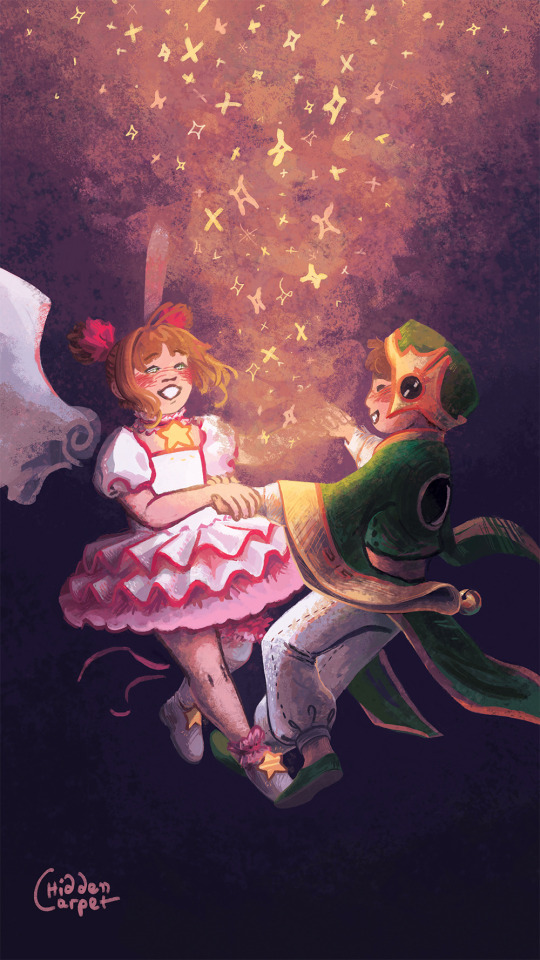
Thinking about these kids again. One of greatest anime love rivals to lovers ever to me. Also here one of my fave artworks of mine from 2023.
#from both of them crushing on the same friend of her older brother to falling for eachother. these kids.. smh#😭❤️#carpet's art#2023#cardcaptor sakura#syaosaku#cardcaptor sakura sakura#Cardcaptor sakura syaoran#Syaoran Li#Sakura Kinomoto#kinomoto sakura#li syaoran#magical girl#ccs sakura#css fanart#cardcaptor sakura fanart#hiddencarpet#mahou shoujo#magical girls#shoujo anime#artists on tumblr#described
249 notes
·
View notes
Text


Theme - Allfire; [preview] [code] [magnusthemes] [buy me a coffee?]
A compact, versatile and responsive header theme.
Features:
Full support for NPF posts
Theme is responsive!
Like/reblog buttons
1, 2 or 3 columns of posts
Custom post size from 250px to 540px
Pagination options: Infinite scroll, manual load or pagination
Background image options: Full-size, repeated, none
Header image options: Full-size, compact, none
Change content opacity from 0 to 1
Optional rainbow accents
Notes:
Built with JSON - thanks to @eggdesign's base code!
To insert links into the menu, simply create a page and check “show a link to this page”.
Please turn off the default mobile theme in Advanced Options if you want to use the mobile version!
Subtitle is optional, and you can add icons if you want!
Updates tab is also optional, and you can also add icons if you want!
Icons cheatsheet: here
Full list of credits: here
Please like and/or reblog this post if you use or plan or using this theme, and consider buying a coffee to support me! Thank you c:
#themes#mythemes#tumblr theme#codingcabin#theme hunter#magnusthemes#html#css#fueled by coldplay bts and 2010s anime osts
84 notes
·
View notes
Text


super happy to share these, i personally adore them...
TRADING CARD(ish) WIDGETS FOR YR SITE OR BLOG OR WHATEVER!!~
FEATURES:
-super cool
-animated af
-mad stylish
-buttons!!!! dynamic effects!!!
DOWNLOAD HERE, AND HERE LIVE PREVIEW ONE, TWO BY NUMBPILLED ON KO-FI (ps if you do end up using these lmk, i wanna see >.>)
#css#cybercore#neocities#old web graphics#neocities template#html#html css#htmlcoding#web graphics#web resources#gif#free widget#widget#neocities resources#carrd resources#rentry decor#rentry graphics#rentry gif#rentry inspo#rentry png#rentry resources#rentry template#trading cards#orrery#celestial#three.js#animation#low poly#neocities themes#neocities theme
154 notes
·
View notes
Text

CSS Card Flip
#card flip animation#css animation#pure css animation#css tutorial#html css tutorial#html css#divinector#css#html#learn to code#animation html css#css card flip effect
4 notes
·
View notes
Text

CSS Animated Text Overlay
#css animated text overlay#css animation tutorial#html css animation#css animation#html5 css3#html css#neduzone#CSS Image Hover#frontend#css#html#frontenddevelopment#webdesign#css animation examples
7 notes
·
View notes
Text
Unleash the power of CSS reveal animations! ✨
Our curated collection of 30+ free CSS examples will transform your website. From fades to dramatic slide-ins, find your perfect animation.
Explore our latest update & start creating today! ➡️ https://freefrontend.com/css-reveal-animations/
11 notes
·
View notes
Text
Responsive Animated Website With HTML & CSS
youtube
#html#tamilitmemes#css3#tamilwebdesign#css animation#web development#web design#website#webdesign#youtube#responsivewebdesign#responsive design#responsive webdesign#responsive web design#webdev#htmlcodes#htmlcss#learn html#html5#html course#css tutorial#html css#html5 css3#css#htmlcoding#frontenddevelopment#javascript#csstricks#websitedesign#website development
5 notes
·
View notes
Text

Animated Dropdown Menu
#animated dropdown menu#css menu#css navigation menu#navigation menu#menu html css#navigation menu html css#css animation#css tricks#css effects#codenewbies#html5 css3#html css#pure css animation#css animation examples
3 notes
·
View notes
Text
Modern Scroll Shadows Using Scroll-Driven Animations
New Post has been published on https://thedigitalinsider.com/modern-scroll-shadows-using-scroll-driven-animations/
Modern Scroll Shadows Using Scroll-Driven Animations

Using scroll shadows, especially for mobile devices, is a subtle bit of UX that Chris has covered before (indeed, it’s one of his all-time favorite CSS tricks), by layering background gradients with different attachments, we can get shadows that are covered up when you’ve scrolled to the limits of the element.
Geoff covered a newer approach that uses the animation-timeline property. Using animation-timeline, we can tie CSS animation to the scroll position. His example uses pseudo-elements to render the scroll shadows, and animation-range to animate the opacity of the pseudo-elements based on scroll.
Here’s yet another way. Instead of using shadows, let’s use a CSS mask to fade out the edges of the scrollable element. This is a slightly different visual metaphor that works great for horizontally scrollable elements — places where your scrollable element doesn’t have a distinct border of its own. This approach still uses animation-timeline, but we’ll use custom properties instead of pseudo-elements. Since we’re fading, the effect also works regardless of whether we’re on a dark or light background.
First, we’ll define our scrollable element with a mask that fades out the start and end of the container. For this example, let’s consider the infamous table that can’t be responsive and has to be horizontally scrollable on mobile.
Let’s add the mask. We can use the shorthand and find the mask as a linear gradient that fades out on either end. A mask lets the table fade into the background instead of overlaying a shadow, but you could use the same technique for shadows.
.scrollable mask: linear-gradient(to right, #0000, #ffff 3rem calc(100% - 3rem), #0000);
Defining the custom properties and animation
Next, we need to define our custom properties and the animation. We’ll define two separate properties, --left-fade and --right-fade, using @property. Using @property is necessary here to specify the syntax of the properties so that browsers can animate the property’s values.
@property --left-fade syntax: "<length>"; inherits: false; initial-value: 0; @property --right-fade syntax: "<length>"; inherits: false; initial-value: 0; @keyframes scrollfade 0% --left-fade: 0; 10%, 100% --left-fade: 3rem; 0%, 90% --right-fade: 3rem; 100% --right-fade: 0;
Instead of using multiple animations or animation-range, we can define a single animation where --left-fade animates from 0 to 3rem between 0-10%, and --right-fade animates from 3rem to 0 between 90-100%. Now we update our mask to use our custom properties and tie the scroll-timeline of our element to its own animation-timeline.
Putting it all together
Putting it all together, we have the effect we’re after:
We’re still waiting for some browsers (Safari) to support animation-timeline, but this gracefully degrades to simply not fading the element at all.
Wrapping up
I like this implementation because it combines two newer bits of CSS — animating custom properties and animation-timeline — to achieve a practical effect that’s more than just decoration. The technique can even be used with scroll-snap-based carousels or cards:
It works regardless of content or background and doesn’t require JavaScript. It exemplifies just how far CSS has come lately.
#ADD#animation#animations#approach#Articles#background#border#container#content#CSS#CSS Animation#css-tricks#custom properties#Dark#devices#digitalocean#gradients#how#indeed#it#JavaScript#Light#linear-gradient#mask#Mobile#mobile devices#One#responsive#safari#scroll
0 notes