#css text glitch animation
Explore tagged Tumblr posts
Visit Tumblr Blog
Explore Tumblr blogs with no restrictions, modern design and the best experience.
Last Seen Tumblr Blogs


Fun Fact
When “GIF” was named word of the year in 2012, Oxford Dictionaries U.S.A. credited Tumblr for pushing the word.
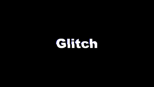
Text

CSS Text Glitch Animation
#css text glitch animation#html css animation#html css#divinector#css3#css#html#css text animation#css tricks
2 notes
·
View notes
Text
CSS Text Glitch Animation
#css text glitch effect#text glitch css#text effects#css animation tutorial#html css#css#html#frontend#codingflicks#neduzone#glitch animation html css#code#css3#frontenddevelopment#animated text#animation
8 notes
·
View notes
Text

My recent foray into CSS for the sake of Ao3 site skins wound up not being as complex as expected—largely because it turns out the complicated thing I wanted to do can't be done on Ao3 at all.
(If I'm wrong about that, and you happen to know how to make text animation work with Ao3's limited CSS guidelines, please let me know.)
But! I did make this!
A work skin allowing for typewriter-style font with or without ominous red and gold shadow and glow. Perfect for dialogue spoken by Alastor from Hazbin Hotel, or any other creepy bitch with a transatlantic accent!
Work skin CSS below the cut:
#workskin .radio { font-family: 'American Typewriter', 'Courier', 'Andale Mono', 'Courier New', monospace; } #workskin .glitch { font-family: 'American Typewriter', 'Courier', 'Andale Mono', 'Courier New', monospace; text-shadow: 2px 2px #FF0000, 0 0 3px #DAA520, 0 0 5px #8B0000; }
87 notes
·
View notes
Text
Typography Trends in 2025: What Designers Need to Know

Typography is no longer just about selecting a readable font—it’s a storytelling tool, a brand voice, and a key driver of user experience. In 2025, the world of typography is evolving fast, blending creativity, technology, and personality. If you're taking a graphic design course in Noida or anywhere else, staying on top of these trends is a must.
Whether you're a beginner or a design pro, this guide will help you understand the top typography trends of 2025—and how to use them in your own work.
🔠 Why Typography Matters More Than Ever
Typography isn't just about fonts—it's about function, emotion, and brand identity.
Visual hierarchy: Guides users through content with ease.
Personality: Fonts help tell a brand’s story before a word is read.
Accessibility: Good typography makes content more readable for everyone.
If you're enrolled in a graphic design course in Noida, you're likely learning that strong typography separates amateur design from professional work.
✨ 1. Expressive & Experimental Typefaces
Say goodbye to safe and predictable. Designers in 2025 are embracing wild, distorted, and hand-drawn fonts that create emotion and grab attention.
Where to use it: Posters, campaigns, branding for creative industries.
🔁 2. Variable Fonts Go Mainstream
One font file, unlimited style variations? That’s the magic of variable fonts, now fully supported in most browsers and design tools.
Benefits:
Faster web load times.
Greater control over weight, width, and slant.
Responsive and scalable typography for any screen.
🌗 3. Dark Mode Typography
With more apps and devices offering dark mode, designers are adjusting typography to work beautifully against darker backgrounds.
Tips:
Avoid pure white; use soft light colors for better legibility.
Increase line spacing.
Use open and clean fonts like Inter or IBM Plex.
🧠 4. AI-Generated Fonts
AI tools are helping designers create original typefaces faster than ever before.
Tools to explore:
Fontjoy (for font pairing)
Fontark (for building custom fonts)
Students taking a graphic design course in Noida are increasingly experimenting with AI in their type and branding projects.
📱 5. Responsive Typography for Multi-Device Design
From phones and tablets to smartwatches and foldables, typography must now adapt seamlessly across all devices.
Tricks:
Use fluid units like clamp() in CSS.
Ensure text maintains contrast and legibility at any size.
🖋 6. Retro Meets Futurism
Old-school vibes meet sleek modern aesthetics. Think vintage serif fonts combined with neon colors or digital glitch effects.
Popular fonts: Mazius Display, Be Vietnam Pro, or GT Super.
👁️ 7. Motion Typography
Text that moves = text that captivates. Designers are using animation to bring typography to life on websites and in videos.
Use cases:
Scroll-triggered animations.
Loading screen effects.
Micro-interactions in apps.
Learn this in advanced modules of a graphic design course in Noida focused on UI/UX or motion graphics.
🧩 8. Custom Fonts for Branding
With every brand fighting for attention, custom fonts have become a way to stand out.
Why it works:
Creates brand recognition.
Offers full creative control.
Hard to replicate by competitors.
💡 Quick Tips for Designers
Pair expressive fonts with simple ones for balance.
Always test your typography across devices.
Use contrast checkers for accessibility compliance.
Stay inspired by following platforms like Typewolf and Fonts In Use.
📍 Why Learn Typography in a Graphic Design Course in Noida?
Noida has become a growing hub for design education and creative tech in India. Enrolling in a graphic design course in Noida gives you access to:
Hands-on projects on modern typography.
Training in tools like Figma, Adobe Fonts, and After Effects.
Industry exposure through design internships and studio visits.
Knowledge of both traditional type and digital trends.
Whether you want to freelance, join a design agency, or start your own brand, mastering typography is a core skill—and Noida offers excellent resources to help you do just that.
✅ Wrap-Up: Stay Ahead with Smart Typography
Typography in 2025 is dynamic, expressive, and tech-savvy. By mastering these trends, you can create designs that are not only beautiful but also functional, memorable, and user-focused.So if you're exploring a graphic design course in Noida, make sure it includes strong modules on typography—because type is more than design. It’s a language of its own.
0 notes
Text
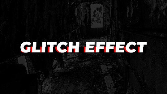
Discover 20+ CSS Text Glitch Effects
At CSS Monster, dive into the captivating realm of CSS Text Glitch Effects. Get ready to infuse your website with retro-futuristic vibes! We're thrilled to unveil our latest update, a comprehensive collection of free HTML and CSS text glitch effect code examples. This compilation showcases an array of mesmerizing glitch effects that will instantly transport your text into the realm of digital distortion. With our November 2022 update, we've diligently scoured reputable sources such as CodePen, GitHub, and other reliable platforms to bring you a range of captivating glitch effects. These effects possess the power to transform your plain text into glitchy, pixelated masterpieces that captivate your visitors and evoke a sense of nostalgia. Embark on a journey to explore the world of CSS glitch effects with our collection. Feel free to experiment with various glitch styles, colors, and animations to craft the glitchy aesthetic of your choice. Happy coding! Author Aldriê September 3, 2021Links Just Get The Demo Link How To Download - Article How To Download - Video Made with HTML / CSSAbout a codeSTACK GLITCH EFFECT CSS ONLYCompatible browsers:Chrome, Edge, Firefox, Opera, SafariResponsive:noDependencies:-Author Monica Ghita July 8, 2021Links Just Get The Demo Link How To Download - Article How To Download - Video Made with HTML / CSS (SCSS)About a codeHOVER TEXT DISTORTION EFFECTCompatible browsers:Chrome, Edge, Firefox, Opera, SafariResponsive:noDependencies:-Author shawn July 3, 2021Links Just Get The Demo Link How To Download - Article How To Download - Video Made with HTML / CSS (SCSS)About a codeGLITCH EFFECTCompatible browsers:Chrome, Edge, Firefox, Opera, SafariResponsive:noDependencies:-Author Matt Gross May 29, 2021Links Just Get The Demo Link How To Download - Article How To Download - Video Made with HTML / CSSAbout a codeCYBERPUNK-STYLE GLITCH WALKTHROUGHCompatible browsers:Chrome, Edge, Firefox, Opera, SafariResponsive:yesDependencies:-Author Christine Banlawi March 15, 2021Links Just Get The Demo Link How To Download - Article How To Download - Video Made with HTML / CSSAbout a codeGLITCH TEXTCompatible browsers:Chrome, Edge, Firefox, Opera, SafariResponsive:noDependencies:-Author Yusuke Nakaya February 3, 2021Links Just Get The Demo Link How To Download - Article How To Download - Video Made with HTML (Pug) / CSS (SCSS)About a codeONLY CSS: GLITCH EFFECTCompatible browsers:Chrome, Edge, Firefox, Opera, SafariResponsive:noDependencies:-Author Tee Diang January 29, 2020Links Just Get The Demo Link How To Download - Article How To Download - Video Made with HTML / CSS (SCSS)About a codePURE CSS GLITCH EXPERIMENTCompatible browsers:Chrome, Firefox, Opera, SafariResponsive:noDependencies:-Author Piotr Galor June 18, 2019Links Just Get The Demo Link How To Download - Article How To Download - Video Made with HTML / CSSAbout a codeCLEAN CSS GLITCHCompatible browsers:Chrome, Edge, Firefox, Opera, SafariResponsive:noDependencies:-

Author Isaac Doud May 18, 2018Links Just Get The Demo Link How To Download - Article How To Download - Video Made with HTML / CSS (SCSS)About a codeGLITCHING TEXT (SCSS)Compatible browsers:Chrome, Edge, Firefox, Opera, SafariDependencies:-
Author Luke Meyrick August 29, 2017Links Just Get The Demo Link How To Download - Article How To Download - Video Made with HTML (Pug) / CSS (SCSS)About a codeSIMPLE TEXT GLITCHCompatible browsers:Chrome, Firefox, Opera, SafariDependencies:-
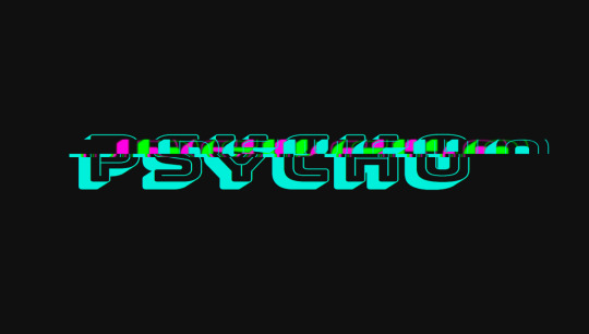
Author Alex Nozdriukhin May 29, 2017Links Just Get The Demo Link How To Download - Article How To Download - Video Made with HTML / CSS (SCSS)About a codePSYCHO GLITCH WITH CSS VARIABLES & @KEYFRAMESCompatible browsers:Chrome, Opera, SafariDependencies:-
Author Maria January 10, 2017Links Just Get The Demo Link How To Download - Article How To Download - Video Made with HTML (Haml) / CSS (SCSS) / JavaScriptAbout a codeVHS TEXTCompatible browsers:Chrome, Edge, Firefox, Opera, SafariDependencies:-
Author Ana Travas November 7, 2016Links Just Get The Demo Link How To Download - Article How To Download - Video Made with HTML (Pug) / CSS (Less)About a codeGLITCH EFFECT IN LESSCompatible browsers:Chrome, Edge, Firefox, Opera, SafariDependencies:-

Author Kevin Konrad Henriquez October 27, 2016Links Just Get The Demo Link How To Download - Article How To Download - Video Made with HTML / CSS (SCSS)About a codeGLITCH HOVER EFFECT CSSCompatible browsers:Chrome, Edge, Firefox, Opera, SafariDependencies:-
Author gstorbeck September 28, 2016Links Just Get The Demo Link How To Download - Article How To Download - Video Made with HTML (Pug) / CSS (SCSS)About a codeGLITCH TEXTCompatible browsers:Chrome, Edge, Firefox, Opera, SafariDependencies:-
Author Fabio September 24, 2016Links Just Get The Demo Link How To Download - Article How To Download - Video Made with HTML (Pug) / CSS (Sass)About a codeGLITCH TEXTCompatible browsers:Chrome, Edge, Firefox, Opera, SafariDependencies:-Author Chris Underdown May 12, 2016Links Just Get The Demo Link How To Download - Article How To Download - Video Made with HTML / CSS (SCSS)About a codeGLITCH TEXT HOVERCompatible browsers:Chrome, Edge, Firefox, Opera, SafariResponsive:noDependencies:-
Author Christian Petersen May 6, 2016Links Just Get The Demo Link How To Download - Article How To Download - Video Made with HTML / CSS (SCSS)About a codeCSS GLITCHCompatible browsers:Chrome, Edge, Firefox, Opera, SafariDependencies:-

Author Chase March 11, 2016Links Just Get The Demo Link How To Download - Article How To Download - Video Made with HTML / CSS (SCSS)About a codeCSS GLITCH TEXTCompatible browsers:Chrome, Edge, Firefox, Opera, SafariDependencies:-
Author Alex Pivtorak December 15, 2014Links Just Get The Demo Link How To Download - Article How To Download - Video Made with HTML / CSS (Sass) / JavaScriptAbout a codeGLITCHED TEXTCompatible browsers:Chrome, Edge, Firefox, Opera, SafariDependencies:- Read the full article
0 notes
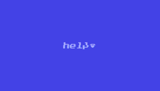
Photo

some text effect ✨
codePen
#texteffect#html css#css#html#artists on tumblr#webdevelopment#codepen#typography#animation#text animation#glitch#blink#hover
3 notes
·
View notes
Video
Text Glitch Animation | Multiple Text Shadow | HTML CSS | Sekhon Design ...
#text#glitch#animation#text glitch#text animation#glitch animation#text glitch animation#html#css#html_css#html css text#html css glitch#html css animation#html css text animation#html css glitch animation#html css text glitch animation#sekhon#design#code#sekhon design#sekhon code#design code#code design#design & code#design and code#code & design#code and design#sekhon design & code#sekhon design and code#sekhon code & design
0 notes
Note
If it's not too much of a bother, how did you create that glitch effect? You don't have to answer at all if you're uncomfortable with it!
hello! it's no problem, i'm happy to answer this. there's a couple of different ways to create a glitch effect depending on what effect you want, i use a (slightly) modified version of HiEv's glitch code which has fairly minor distortion since my eyes are not a fan of flashing lights and what not -- just something to keep in mind for your readers when playing around with effects like these ofc!
the glitch effect here is just on the word 'yellow', where it swaps to display 'scarlet' for a split second.
the code in the passage looks like this:
<div class="glitch" data-text="scarlet">yellow</div>
of course, you're free to replace the data-text portion with whatever you want -- it's not going to be particularly legible just given the duration that it's displayed, and typically (& for p much all other instances that i use it) i'd just use the same phrase so that it matches.
here's the css: i've bolded the important bits but i'd really recommend looking at HiEv's original code since they explain it way better.
.glitch { color: inherit; font-size: inherit; position: relative; width: auto; display: inline-block; } @keyframes noise-anim { 0% { clip: rect(62px, 9999px, 39px, 0); } 5% { clip: rect(99px, 9999px, 35px, 0); } 10% { clip: rect(68px, 9999px, 14px, 0); } 15% { clip: rect(28px, 9999px, 69px, 0); } 20% { clip: rect(82px, 9999px, 79px, 0); } 25% { clip: rect(69px, 9999px, 85px, 0); } 30% { clip: rect(63px, 9999px, 12px, 0); } 35% { clip: rect(47px, 9999px, 1px, 0); } 40% { clip: rect(15px, 9999px, 81px, 0); } 45% { clip: rect(99px, 9999px, 8px, 0); } 50% { clip: rect(73px, 9999px, 7px, 0); } 55% { clip: rect(92px, 9999px, 14px, 0); } 60% { clip: rect(29px, 9999px, 92px, 0); } 65% { clip: rect(19px, 9999px, 44px, 0); } 70% { clip: rect(38px, 9999px, 73px, 0); } 75% { clip: rect(11px, 9999px, 38px, 0); } 80% { clip: rect(35px, 9999px, 83px, 0); } 85% { clip: rect(63px, 9999px, 54px, 0); } 90% { clip: rect(3px, 9999px, 21px, 0); } 95% { clip: rect(93px, 9999px, 89px, 0); } 100% { clip: rect(46px, 9999px, 32px, 0); } } .glitch:after { content: attr(data-text); position: absolute; left: 2px; text-shadow: -1px 0 red; top: 0; color: var(--white); background: var(--black2); overflow: hidden; clip: rect(0, 900px, 0, 0); animation: noise-anim 2s infinite linear alternate-reverse; } @keyframes noise-anim-2 { 0% { clip: rect(18px, 9999px, 44px, 0); } 5% { clip: rect(65px, 9999px, 31px, 0); } 10% { clip: rect(18px, 9999px, 66px, 0); } 15% { clip: rect(60px, 9999px, 55px, 0); } 20% { clip: rect(38px, 9999px, 24px, 0); } 25% { clip: rect(83px, 9999px, 100px, 0); } 30% { clip: rect(5px, 9999px, 5px, 0); } 35% { clip: rect(93px, 9999px, 57px, 0); } 40% { clip: rect(64px, 9999px, 72px, 0); } 45% { clip: rect(99px, 9999px, 11px, 0); } 50% { clip: rect(90px, 9999px, 34px, 0); } 55% { clip: rect(46px, 9999px, 36px, 0); } 60% { clip: rect(85px, 9999px, 6px, 0); } 65% { clip: rect(33px, 9999px, 86px, 0); } 70% { clip: rect(100px, 9999px, 64px, 0); } 75% { clip: rect(80px, 9999px, 6px, 0); } 80% { clip: rect(37px, 9999px, 43px, 0); } 85% { clip: rect(89px, 9999px, 78px, 0); } 90% { clip: rect(46px, 9999px, 42px, 0); } 95% { clip: rect(81px, 9999px, 78px, 0); } 100% { clip: rect(35px, 9999px, 43px, 0); } } .glitch:before { content: attr(data-text); position: absolute; left: -2px; text-shadow: 1px 0 blue; top: 0; color: inherit; background: var(--black2); overflow: hidden; clip: rect(0, 900px, 0, 0); animation: noise-anim-2 3s infinite linear alternate-reverse; }
that's a lot of text! admittedly there's probably a more streamlined way to do it but i haven't bothered to look around just yet and my brain tends to be mush these days so-- on the bright side, the code works! and the important bits are the ones bolded & in red: you just have to make sure that you change the colour to your font colour and background to the background colour of your passage respectively. remember to adjust those settings as well if you have a light & dark mode for your game!
#cer answers#coding#fun fact im p sure i hid some easter eggs in the code#like the bar code in the character creation screen#hit inspect element on that funky lil guy and see what it says hehe
25 notes
·
View notes
Text
The main elements of web design
What makes up a good website design? Does it display your design prowess? Does it prove what a fantastic visuals developer you are? Does your web site design fetch you developing awards? Or does your site layout exist to develop a system for you as well as your site visitors to connect with each various other unrestricted by functionality problems?
What comprises a great web site layout? Does it showcase your design expertise? Does it show what a great visuals developer you are? Does your web style fetch you designing honors? Or does your internet site layout exist to develop a platform for you and your visitors to connect with each other unhindered by functionality glitches? I think the last factor is the most vital element that establishes the basic difference between a successful as well as a not successful website.

Although the understanding of great internet site layout changes from one person to another, there are some well established conventions that you can comply with and these conventions can make sure that your site gets to out to all feasible people. When you are developing your internet site, especially nowadays, you have to be continuously aware of the reality that there are countless web browsers and also various gadgets that individuals may utilize to access your site. No longer do people surf the Internet just through their PCs and laptop computers; there are several portable gadgets that can directly connect to the Internet and also allow individuals to surf your site; individuals can also browse your website using their cellphones. And gone are the days when individuals used just the Net Explorer as their key Web web browser.
Videos and other media
Your site style likewise depends upon what you are planning to display through your website: will you consist of video clips, pictures simply text or perhaps a mixture of all three? You need to create your website appropriately. If it is merely message that you intend to release then try to make it as much less visual as feasible as people coming to your site will certainly be interested in your message and not your photos as well as video clips. In a similar way an internet site showcasing your Flash animation know-how will certainly expect great deals of Flash job so you needn't worry about making your website textually accessible.

Factors to Consider in making your own website:
So when you are creating your site you need to take all these parameters right into factor to consider. However does it mean that you're always suiting internet browsers and creates as well as do not concentrate on your very own service, whatever that is? No, I'm not suggesting that. Simply deal with the complying with site design standards and also you will certainly ensure that 95% individuals (well, there will constantly be those strange 5% who can never ever surf the internet easily whatever they try) surfing the Internet can access your web site:
1) Develop a lighter style. Where feasible do not overuse either Javascripts of Flash that effect the significant functionality of your site, consisting of food selections. For instance if there is some vital information on your site and people require to access that info prior to doing business with you then don't make that information accessible just through a JavaScript on a photo file or a Flash computer animation. It do without claiming that possible you important text ought to be readily available as message and also not pictures, if this is not possible then you need to take into consideration picture replacement techniques.
2) Don't utilize shades that cause stress to the eyes. If you want people to find to your web site once again and also once again and also eat your material or work with you then you should make their stay over your website as pleasurable as possible. Regardless of just how remarkable your layout looks if the shade combinations are strain-full, after a while they will tire of your website and also stop coming. Constantly make sure that your background behind the message is far lighter than the message, and also vice versa.
3) Strategy a very carefully thought about (from the users point of view) navigation system. If you have several web pages on your web site after that there need to be a plainly specified navigating system that is easily accessible to everybody. As stated above don't allow your navigating depend upon photos, JavaScripts, or Flash animation. Ideally develop simply a text-based navigating bar. With CSS designing you can develop fantastic looking navigation bars.
4) Layout your website using CSS due to the fact that after that you can make your content and also your navigation bar appear in a linear fashion. Given that all the layout-related positionings happen with CSS definitions despite exactly how your message appears texturally, graphically it will appear as an enjoyable format. The CSS developing techniques likewise allow you to mess around with complex formats without making your site hard to reach. CSS making will certainly constantly help you prepare your primary content before the navigation link regardless of making it aesthetically appear under the navigation bar or to the right of it.
Adhere to these basic internet layout concepts and also you will certainly have a good internet site design to boast of. Never ever fail to remember that the primary function of your website layout should be to develop a good individual experience for your site visitors, the design is not there to delight your layout impulses and fantasizes, so do not get captured up in the temptation to over complicate points needlessly.
For other inquiries about website lay out, you may call:
Infintech Designs
3436 Magazine St #120, New Orleans, LA 70115, USA (504) 717-4837
Monday - Friday: 10am - 12am Saturday: 10am - 12am Sunday Closed
https://goo.gl/maps/7L2U4U9Eo9p31ja78
1 note
·
View note
Text
Blog Post 3: Websites
My Website
In order to secure my domain, which is digitalartbycorrah.com, and subsequent email address, I used 1&1, and paid a small fee of just £1.20. I was then able to port my domain over to Adobe Portfolio, the website builder that I am using.
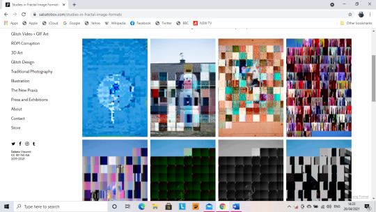
Website 1: Sabato Visconti (www.sabatobox.com)
Sabato Visconti covers a range of different Digital Art Themes such as:
· Glitch Art
· New Media
· Photography
· Illustration
Visconti displays his work by what theme is work comes under:
· Glitch Photography/ Post-Photography
· Glitch Video and GIF Art
· 3D Art and Animation
· ROM Corruption and Video Game Art
· Glitch Design and New Media
· Traditional Photography
· Illustration
· Curatorial Projects
At the bottom of the navigation list for this website is:
· About
· Press and Exhibitions
· Contact
· Store
Interface Features of Sabato Visconti’s Website:
Visconti sets out his website in a 4 row and 3 column display, however he doesn’t have a header bar in his website, instead he utilises the side navigation, and on mobile, the button of the hamburger menu that opens up on the left hand side of the screen, sits on the right.
The website does not harness a bottom navigation and Visconti’s social media links are listed in the side navigation, he also lists the insignia of the Creative Commons and the dates for when his website was founded and when it was last updated, being 2011-2021.
Pages and Collections
I studied two of the collections on this website, I studied the layout to check for continuity, as well as other features. The first of the collections that I decided to study is Glitch Photography and Post Photography.
At the top of the page, Visconti uses too much text to explain the section, and doesn’t not utilise a legible font face, the text actually takes up half of the collection page. The amount of text at the top of the page could actually drive people to look away for Visconti’s website.
The Ghosts of Brimfield Collection
All images used in this collection have the Red hover-overs with magnifying glasses on them in order to zoom in on the images in the collections. The grid system in place across the rest of the website is in place on this page, giving consistency to the general CSS of the website the grid System in place for the collections as a great mixture of sizes to display all the different parts of Visconti’s work. This gives a good sense of dimensionality and depth to Visconti’s collections.
Illustration Collection
In the Illustration collection, the same features regarding layout and also shows a huge depth in collection, there is no set theme for example, in this collection has aminated illustration as well as standard illustration.
Throughout Visconti’s website, formal language is used, giving the correct kind of tone and desired level of professionality. The layout of the website is exceptionally good and has a fantastic structure, and this structure gives a grounding for a huge amount of content to be displayed on the website, proving that content is king.


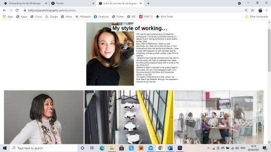
Website 2: Kelly Cooper Photography (www.kellycooperphotography.com)
This website is not as well laid out as Sabato Visconti’s website. There is not a huge amount of structure to the website.
A particularly good example of this is the fact that the website has a header, but it is not a sticky header, meaning that there is not constant navigation through the website. In the header, the logo is placed centrally in the header and below it, the other pages of the website are listed as follows:
· Gallery
· Business (ABOUT ME)
· Fashion & Editorial
· Photo Blog
This website has the contact details of the photographer listed at the bottom, however a huge similarity to Visconti’s website, is that both of them have no link to the CVs of either Cooper or Visconti. She has not listed her phone number in the 5-3-3, meaning it is not clearly listed.
The Photographer has not listed a professional email, e.g., an “info@_________________.com”, a Gmail email address has been listed, which is not hugely Professional.
They have used a small social media icon in order to list a link to the Instagram account associated with the website.
On the home page, the photos used are in a grid, but they need to be downsized, so as to make more room for content or so the page is not as vast.
About Page:
She uses a profile photo of herself and it is a good photo of her. Her about me section however is far too long. A good and catchy about section should be around 30-50 words, rather than 3 paragraphs. However, in the navigation in the header bar, the about me section is actually listed as business.
She lists her experience and location in the Business/About Me section. However, in fitting style to the rest of the website, all of the pictures used in the Business/About Me Section are overly large yet perfectly aligned. The size of the pictures causes too much space to be taken up by the photographs. However, the contact details and social media account are listed in the footer.

Full Site Critique
Across almost the whole website, all of the photograph’s used are far too big and could do with a downsize, so as to make more room for more content…. Unlike Visconti’s website, the space hasn’t been used wisely and content in this website is not king. Content being king in this website is non-existent, what this website does is show off a few pictures, in a neatly aligned grid, but it needs to show off more in the neatly aligned grids that she has used, not just 3 or 4 in a row. However, these grids give for fantastic organisation.
In a difference to nearly the rest of the website, the photo blog page actually uses a decent grid, and all of the photographs are all of a decent size and there is room for more on the page. The blog also carries relevant posts, with the surrounding theme being the work of the photographer.
The overall CSS of the website is pure white and is not hugely aesthetically pleasing, there are also no user interface features, not like Sabato Visconti’s website, where he has colour hover-overs implemented on all images and there are colour changing hovers on all of the titles on the navigation. In Kelly Cooper’s website, on the header navigation, there are white hover overs on the page headers.
The Gallery is no where near as organised on Kelly Cooper’s Website, as it is on Sabato Visconti’s website. Even though Kelly Cooper’s website does not hold as much content as Sabato Visconti’s website, but it requires the same level of organisation.
The way in which Sabato Visconti organises his website, is how I should aim to organise my own as my work comes under many different themes and can’t just smash them all together in to one page, I have to ensure that all of my work is organised in to the right theme so that it is clear that my work encompasses a myriad of different things, not just one. I need to show my versatility throughout my website and not just make myself look like a boring cookie cutter digital artist.
0 notes
Text

Text Glitch Effects CSS
#css text glitch effect#text glitch css#text animation#css text animation#css animation examples#html css#codingflicks#css#html#css3#frontend#frontenddevelopment#html css animation
3 notes
·
View notes
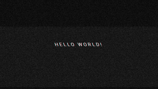
Photo

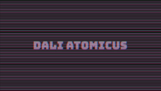
Pure CSS Glitch Experiment (Twitch Intro WIP)
by Tee Diang 🎀 Code and Demo Gen Page second code link
This is an absolutely amazing CSS text animation, the original animated text was ‘CyberCountess’ which I fell in love with. It is displayed on a HTML and CSS sharing website (here is the link). I felt like the glitch was very smoothly done and with nice accents of magenta and green that really enhanced it. I will be checking out the rest of her work because it looks so good!
The song is ‘Nobody” by Mitski. Its a song that at its core(its chorus) about loneliness. The chorus is the word ‘Nobody’ repeated in varying pitch and near the end of the song it is repeated till it fades into nothing. I think the glitch and the underlying message, which is ultimately what Mitski is saying but is drowned out by the sheer immensity of the feeling of Nobody, show that tone.
0 notes
Text
Explore 15+ CSS Glitch Effects

Welcome to our article featuring an exhilarating array of CSS Glitch Effects! In this compilation, we've assembled a variety of free HTML and pure CSS code samples showcasing the mesmerizing and edgy world of glitch effects. As of November 2022, we've introduced 8 new additions, sourced from well-known platforms like CodePen, GitHub, and other valuable resources. Glitch effects have gained popularity in web design, injecting a distinctive and futuristic vibe into websites and applications. These effects replicate digital glitches, distortions, and visual anomalies, creating a visually captivating and dynamic user experience. Each code example in this collection has been thoughtfully selected to highlight the versatility and creativity of glitch effects. From glitchy text and images to glitch transitions and overlays, these animations will infuse a sense of intrigue and visual fascination into your web design projects. Leveraging the power of CSS and HTML, these glitch effects are lightweight, load quickly, and can be easily customized to match your design preferences. Whether you're aiming for a subtle glitch effect or a bold and dramatic glitch style, these code examples provide a solid foundation for achieving your desired visual impact. Each code example is accompanied by its respective HTML and CSS code, simplifying the implementation of these effects into your own projects. Prepare to break the design boundaries with this curated selection of CSS glitch effect code examples. Author Uchiyama@株式会社フォスター July 22, 2022 Links Just Get The Demo Link How To Download - Article How To Download - Video Made with HTML / CSS (SCSS) About a code GLITCH EFFECT BY SVG FILTER Compatible browsers:Chrome, Edge, Firefox, Opera, Safari Responsive:no Dependencies:- Author Uchiyama@株式会社フォスター July 22, 2022 Links Just Get The Demo Link How To Download - Article How To Download - Video Made with HTML / CSS (SCSS) About a code GLITCH EFFECT BY SVG FILTER Compatible browsers:Chrome, Edge, Firefox, Opera, Safari Responsive:no Dependencies:-

Author janein October 9, 2020 Links Just Get The Demo Link How To Download - Article How To Download - Video Made with HTML / CSS (SCSS) About a code MORPHOLOGY - LAPTOP GLITCH - DILATE Compatible browsers:Chrome, Edge, Firefox, Opera, Safari Responsive:yes Dependencies:- Author MinzCode August 14, 2020 Links Just Get The Demo Link How To Download - Article How To Download - Video Made with HTML / CSS About a code GLITCH IMAGE EFFECT. CSS ANIMATION Compatible browsers:Chrome, Edge, Firefox, Opera, Safari Responsive:no Dependencies:- Author Jhey July 10, 2020 Links Just Get The Demo Link How To Download - Article How To Download - Video Made with HTML (Pug) / CSS (Stylus) About a code CSS CYBERPUNK BUTTONS (:HOVER TO GLITCH) Compatible browsers:Chrome, Edge, Firefox, Opera, Safari Responsive:yes Dependencies:-

Author sanchit sharma September 8, 2018 Links Just Get The Demo Link How To Download - Article How To Download - Video Made with HTML / CSS About a code THE GLITCH EFFECT Compatible browsers:Chrome, Edge, Firefox, Opera, Safari Responsive:yes Dependencies:-

Author Alain June 18, 2018 Links Just Get The Demo Link How To Download - Article How To Download - Video Made with HTML (Pug) / CSS (SCSS) About a code IMAGE GLITCH EFFECT Compatible browsers:Chrome, Edge, Firefox, Opera, Safari Responsive:yes Dependencies:-

Author Cassie Evans October 15, 2017 Links Just Get The Demo Link How To Download - Article How To Download - Video Made with HTML / CSS About a code GLITCH Compatible browsers:Chrome, Edge, Firefox, Opera, Safari Responsive:yes Dependencies:-

Author Nazar Kubaty July 28, 2017 Links Just Get The Demo Link How To Download - Article How To Download - Video Made with HTML / CSS (SCSS) About a code GLITCH PRELOADER Compatible browsers:Chrome, Edge, Firefox, Opera, Safari Responsive:no Dependencies:-

Author Agathe June 6, 2017 Links Just Get The Demo Link How To Download - Article How To Download - Video Made with HTML / CSS (Less) About a code DICE ROLEPLAY GLITCH & PULSE Compatible browsers:Chrome, Edge, Firefox, Opera, Safari Responsive:no Dependencies:- Author Colin Horn October 21, 2016 Links Just Get The Demo Link How To Download - Article How To Download - Video Made with HTML / CSS (SCSS) About a code 3D GLITCH TEXT (CSS ONLY) Compatible browsers:Chrome, Edge, Firefox, Opera, Safari Responsive:no Dependencies:-

Author Thomas Aufresne October 12, 2016 Links Just Get The Demo Link How To Download - Article How To Download - Video Made with HTML / CSS (Less) About a code GLITCH EFFECT IN CSS Compatible browsers:Chrome, Edge, Firefox, Opera, Safari Responsive:yes Dependencies:- Author Petr Tichy September 13, 2016 Links Just Get The Demo Link How To Download - Article How To Download - Video Made with HTML / CSS (SCSS) About a code CSS3 GLITCH ANIMATION Compatible browsers:Chrome, Edge, Firefox, Opera, Safari Responsive:no Dependencies:-

Author Matt Popovich May 22, 2016 Links Just Get The Demo Link How To Download - Article How To Download - Video Made with HTML / CSS (SCSS) About a code MIX-BLEND-MODE RENDERING GLITCH Compatible browsers:Chrome, Edge, Firefox, Opera, Safari Responsive:yes Dependencies:-

Author Noah Blon August 30, 2015 Links Just Get The Demo Link How To Download - Article How To Download - Video Made with HTML / CSS (SCSS) About a code GLITCH POP Compatible browsers:Chrome, Edge, Firefox, Opera, Safari Responsive:yes Dependencies:- Author alex baldwin January 15, 2015 Links Just Get The Demo Link How To Download - Article How To Download - Video Made with HTML / CSS About a code GLITCH HOVER Compatible browsers:Chrome, Edge, Firefox, Opera, Safari Responsive:no Dependencies:- Author alex baldwin January 14, 2015 Links Just Get The Demo Link How To Download - Article How To Download - Video Made with HTML / CSS About a code GLITCH HOVER Compatible browsers:Chrome, Edge, Firefox, Opera, Safari Responsive:no Dependencies:- Author ZonFire99 November 8, 2014 Links Just Get The Demo Link How To Download - Article How To Download - Video Made with HTML / CSS About a code 404 - GLITCHED OUT Compatible browsers:Chrome, Edge, Firefox, Opera, Safari Responsive:no Dependencies:-

Author Nils Schönwald January 15, 2014 Links Just Get The Demo Link How To Download - Article How To Download - Video Made with HTML (Haml) / CSS (SCSS) About a code VHS GLITCH Compatible browsers:Chrome, Edge, Firefox, Opera, Safari Responsive:no Dependencies:- Read the full article
0 notes
Link
The best new tools for designers are ones that make your life easier and your workflows faster. You’ll find some of those in this list this month for sure. From tools to help you capture and manage color palettes to AI-powered design analytics to simple animations, there’s something for almost every designer or developer.
Here’s what new for designers this month.
The Hero Generator
The Hero Generator is a fun tool that will help you create just the right hero header without having to write the code yourself. Upload your image, set some specs for spacing and color, add a button, and out comes the code for an example that you can build right on the screen. Make sure to play with the gradient overlay to get just the right color and orientation to ensure that your hero header looks great and includes highly readable type.

Sorted Colors
Sorted Colors groups named CSS colors in a way that shows related colors together. It’s a nice way to check colors side by side when you are trying to make a final decision about a hue or color palette. You could also use it to create a monotone palette.

Attention Insight
Attention Insight is an AI-powered design analytics tool that allows you to compare multiple designs and to measure which object attracts the most attention. It uses a combination of heatmaps, percentage of attention metrics to help measure the overall clarity of your design. New features, such as a contrast checker, are also in the works. It works as a web app, plugin for popular software, or a Chrome extension.

Color Copy Paste
Color Copy Paste is an app that you can use to capture a color from practically anything and then paste it to Figma, Sketch, or a web browser. It’s a quick way to snag little bits of inspiration when you see them.

Runme
Runme, which is still in beta, allows you to build, deploy, and launch an application from any public Git-repo with one click. Enter a URL and a few commands and you are ready to go. This is an open-source tool and contributions are welcome.

Rough Notation
Rough Notation is a small JavaScript library to create and animate annotations on a web page. It uses RoughJS to create a hand-drawn look and feel. Elements can be annotated in a number of different styles. Animation duration and delay can be configured or turned off. Choose from options to underline, box, circle, highlight, cross off, strikethrough, group items, and more.

Trails
This is a simple, but useful goodie. Trails is a simple geometrical trail on an x and z axis that you can attach to Three.js objects. The simple animation is mesmerizing.

Pose Animator
Pose Animator takes a 2D vector illustration and animates its containing curves in real-time based on a recognition result from PoseNet and FaceMesh. It borrows the idea of skeleton-based animation from computer graphics and applies it to vector characters. (It’s a fast way to cartoonize yourself.) You can build from a webcam video or single image in Chrome or Safari.

Neumorphism UI
Neumorphism UI is a user interface kit packed with components in the neumorphic style. It includes more than 200 components, 10 sections, and five example pages to build a website in this style.

3D Photography Using Context-Aware Layered Depth Inpainting
This project by a group of researchers proved that you can convert a single RGB-D image into a 3D photo, much like what you’d see from an iPhone. The included source code shows how to use a layered depth image as part of a learning-based model that creates a three-dimensional effect.

Meanderer
Meanderer is a micro-library for scaling CSS motion path strings. And it looks pretty nifty. All you need is an object with a path (typically an SVG) and you are ready to try it out.

Underline Animation
Sometimes it is the most simple of animations that can have the greatest impact on a design. This Underline Animation pen from Aaron Iker is an example of that with a nifty little underline that moves to an arrow.

Create a Hamburger Menu in SVG & CSS
Love it or hate it, you’ll probably need to create a hamburger menu element at some point. This great tutorial from UX Collective explains how to do it from start to finish using an SVG icon and CSS. (This lesson is designed so almost anyone with a little dev knowledge can follow along with success.)

Blush
Blush is a fun, semi-custom illustration generator. It uses drawings from artists around the world with parts and color options that you can mix and match to get just the right illustration for your design project. Choose your specifications and download a PDF. It’s that easy.

Supabase
Supabase in an open-source alternative to Firebase and adds real-time and restful APIs to Postgres without code. (It’s in Alpha and free to use during that time.)

Fluent Icons
Fluent Icons includes 965 icons in a Microsoft-esque style. These colorful and consistent icons are ideal for use across apps, presentations, websites, and infographics. (Free and paid options available.)

One Word Domains
Looking for a quick and easy to remember domain name? One Word Domains lets you search all the available one-word domains available for purchase.

Free Device Icons
This set of free device icons includes 67 elements that represent user interfaces and devices. They come in multiple file formats – SVG, EPS, PNG, and AI – as a line-style vector.

Windups
Windups is a tool to help you add a typewriter-style animation to text elements. It’s a fun way to help people through your design and build dynamic content. You can see how engaging it is by playing with the Windups site with building blocks of text and “continue” buttons.

Glorious Glyphs Game
Test your typography IQ with the Glorious Glyphs Game game from ILoveTypography.com. The game includes 30 questions about glyph characters, where you have to ID a font. It’s a lot tougher than you might think!

Cosmos
Cosmos is a beautiful and colorful gradient font family. It contains letterforms with hologram, multicolor, minimal, glitch, and blur options is a readable and trendy style. This premium font family is available by the style or altogether.

Ephemera
Ephemera is a groovy novelty-style typeface that has fun lines, plenty of common shapes and elements, and glyphs that pair for exceptional letter combinations. It could make a nice brand mark or an interesting display type element. It includes upper- and lowercase characters, numerals, and some extras.

Kavo Serif
Kavo Serif is clean, modern typeface with five weights, and even includes logo templates. It’s a versatile font that works great in large and small sizes.

Republiko
Republiko is a modern display typeface with regular and outline styles. While it is designed for display, the characters remain readable at smaller sizes as well.

TT Lakes Neue
TT Lakes Neue is a font superfamily with 91 styles. It’s got a nice geometric shape and the package even includes a variable font. This is a premium typeface that you can buy individual styles or the complete package.

Typo Ring
Typo Ring is a super round typeface with plenty of weights (although the free version has limited character sets). It’s highly readable and includes upper- and lowercase letters.

XXIX
XXIX is a bold, futuristic slab with fun shapes and slants. It’s an all uppercase option with a limited set of numerals and glyphs.

Source
0 notes
Text
20 Freshest Web Designs, October 2019

You’ll find a few other trends, and sites that ignore trends altogether, in our roundup of the freshest web design this month, but it’s hard to ignore the vibrancy that’s taking over. Enjoy!
Chevalvert
Chevalvert is a French design agency whose site visually bombards you from the moment it loads. The maximalist approach is visually overwhelming in places, and individual work can be hard to distinguish, but what the site conveys brilliantly is the creative passion and courage of the agency.

#24HourAce
We’ve been vibing on minimalism for a decade or more, but recently a more anarchic, more colorful, more visually aggressive style has taken hold. #24HourAce for Gucci is the embodiment of this maximalist trend with crazy animation, color, and glitch effects. More is more.

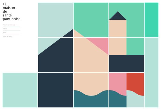
La Maison de Santé Pantinoise
The web’s not all clashing colors and glitch effects. The site for La Maison de Santé Pantinose, a medical practice in a Parisian suburb, calms potentially anxious patients with pastel tones and simple color block animation that sensitively illustrates the conditions treated at the practice.
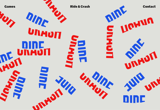
Ride & Crash
Back to anarchy, with Ride & Crash’s energy-packed site. From the variations on its deceptively simple, but carefully drawn logotype, to the text that transforms from gibberish as you scroll, everything about this site communicates creative confidence, admirable in a young project.
Collage Crafting
As if keen to demonstrate that modernist typography can also be expressive, Collage Crafting’s landing page text explodes deliciously as you scroll. But what I really love is the way the hover effects combine in the product page, making the box appear to slide from one item to the next.

Genesis Block
Genesis Block is an impressive site for a fintech company. The line art illustrations reach another level by using gradients to promote the feeling of three dimensions, and the animation that’s tied to the window scroll — not least the animated Rubik’s Cube — is all presented expertly.

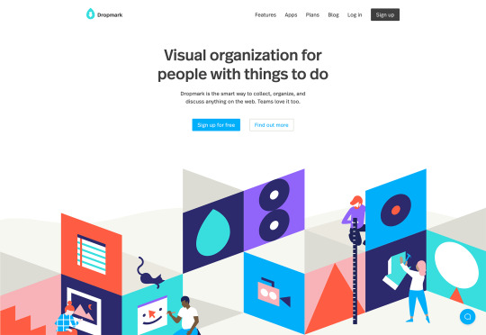
Dropmark
Until the growth of maximalism the biggest trend on the web, favoured by SaaS, was animated blocks of complementary color, looping to produce low file size, high interest motion on a site. Dropmark uses the trend to frame its landing page and divide up the generous whitespace.
Olivia Palermo
As soon as CSS grid was announced we were promised it would herald new web design layouts that broke out of simple RWD grids, and we’re finally starting to see some. Olivia Palermo uses a complex grid to present a fashion magazine-style site that’s vibrant, dynamic, and engaging.

Hest
Hest is a Norwegian photography agency and presents its photographers’ work in a standard way. But in places, the designers have added a sharp drop shadow in pastel, breaking up the grid and creating a sense of depth. It’s such a simple trick, but amazingly effective.

Kaohsiung Music Center
From the moment the brand mark animates as a loader, it’s clear that the Kaohsiung Music Center site is something special. The impressive three dimensional site for a Taiwanese music venue features a flyover of the site based on architects’ renderings. It feels game-like in its futurism.

Ooma
Ooma makes cloud-based home communications services, from security cameras to entry systems. The clean landing page for its home security cameras uses an alternating alignment to create a predictable and reassuring rhythm, perfect for those looking for a safety solution.

Déplacé Maison
Using heavy black outlines and halftone shading, Déplacé Maison’s art directions evokes the feel of graphic novels. An aesthetic reinforced by the lettering-style typography. It’s a look that makes you feel that you couldn’t fail to find adventure in these shoes, exactly what their customers want.

Guzema
Guzema Fine Jewelry mixes images, text, and video to create a design packed into little boxes, that feels part-browsing experience, part-gift receiving. It’s slow, which is usually a disaster online, but for luxury goods, the sense of anticipation actually adds a positive edge to the experience.

Trux Studio
Trux Studio’s site opens with a full screen video that clearly explains the Danish business’ unique offering. Packing a portrait studio into the back of a lorry, the team travels to your location to shoot corporate portraits. It’s a shame for us they couldn’t pack it all into a plane.

Black Futurism 2019
Black Futurism is a conference that took place at the start of October. Organized by the Harvard University Graduate School of Design’s African American Student Union, it’s about exploring liberation and equality through design, and this promotional site is a simple, powerful statement.

Starface
Spots, zits, pimples, and all manner of skin ‘imperfections’ can be crippling on your self-confidence, especially among younger people. Starface is an awesome company that is rebranding its spot treatment as something to be celebrated with its super-positive site.

Old Spitalfields Market
Old Spitalfields Market is a fashionable covered market in East London. Its site uses a classic modernist grid to divide up the page. The grid transforms as you scroll, with different sections pausing, while others glide past. It’s a technique that’s repeated across the sumptuous site.

Graf Lantz
Graf Lantz is an LA-based company producing cute accessories that they market directly to customers in Japan with this dedicated site. It’s fascinating to compare the company’s approach to the Japanese market, with its .com. The Japanese, it seems, love liquid transition effects.

Two Robbers
Convinced the Brutalist trend was destined to be short-lived? Proving there’s life in the harsh style yet, Two Robbers is a site for hard seltzers brewed in Philadelphia. The stark site emphasizes the unique flavors of the drinks by contrasting the black and white with bursts of color.

2nd Street Clothing
Finally, the maximalism trend returns in full effect for the 2nd Street Clothing site, but you’ll have to scroll to see it. With reversed text, colourful animation, spinning images and video, it’s a young, energetic style. This site won’t look the same in a year, which makes it perfect for right now.

Source from Webdesigner Depot https://ift.tt/2peUVu1 from Blogger https://ift.tt/33sDViK
0 notes
Link
http://bit.ly/2DrRQeg
0 notes