#cssflexbox
Explore tagged Tumblr posts
Visit Tumblr Blog
Explore Tumblr blogs with no restrictions, modern design and the best experience.
Last Seen Tumblr Blogs


Fun Fact
Hackers stole 65M passwords from Tumblr in 2013.
Text
CSS (Cascading Style Sheets) is a styling language used to control the appearance of HTML elements. It allows developers to separate content from design, making web pages more visually appealing and easier to maintain.
#CSS#WebDevelopment#FrontendDevelopment#WebDesign#CSS3#TechEducation#CSSForBeginners#TechBooks#CSSStyling#CSSGrid#CSSFlexbox#ResponsiveDesign#WebAppDevelopment#CSSAnimation#CSSLayout#TechLearning#UIUXDesign#WebDesignTips#CSSBestPractices#TechTutorial#FrontendWebDesign#CSSDesign#WebDesignSkills#CSSVariables#MobileFirstDesign#CSSFramework#HTMLCSS
0 notes
Text
Preventing Product Image Height Shrinkage: Latest Solutions

Introduction
When designing product pages, a common challenge arises when the underlying text starts wrapping, causing the product image's height to shrink. This can result in a less aesthetically pleasing layout and potentially compromise the visual impact of your product presentation. In this guide, we'll explore effective solutions to address this issue, ensuring that your product images maintain a consistent and appealing height even as the accompanying text wraps. The goal is to find solutions that not only prevent image height shrinkage but also contribute to an overall visually pleasing and responsive design. By implementing the latest techniques in web development, you can strike a balance between text wrapping and image presentation, creating a seamless and engaging user experience for visitors to your product pages.
CSS Flexbox Solution
CSS Flexbox is a powerful layout model that provides a flexible and efficient way to handle the arrangement of elements in a container. In the context of preventing product image height shrinkage, CSS Flexbox offers a solution by allowing the container to adjust its items' size dynamically. This means that even if the text within the container wraps, the Flexbox layout can maintain the height of the product image. Let's delve into a practical example of using CSS Flexbox for a product card layout: CSS/* CSS Styles for Product Card with Flexbox */ .product-card { display: flex; flex-direction: column; } .product-image { flex: 1; /* Additional styling for the image */ } .product-description { /* Additional styling for the text */ } In this example, the product card container is set to a flex container using display: flex;, and the items (product image and description) are stacked in a column direction with flex-direction: column;. The key part is the flex: 1; property applied to the product image, indicating that it should take up all available space within the flex container. This ensures that the image maintains its height even as the text within the description wraps. HTML Read the full article
0 notes
Video
youtube
This ONE Flex CSS Trick Fixes All Your Divi Layout Problems!
In this tutorial, we show you how to retain your column structures on all devices in the Divi Theme using Flex CSS. If your layouts keep breaking or stacking oddly on mobile or tablet views, this simple fix using Divi Rows, Columns, and the Custom CSS panel is exactly what you need. With just a few lines of CSS, you'll have full control over how your columns behave across screen sizes—no plugins or complex hacks required.
0 notes
Video
youtube
Flexbox #11 - Make the site responsive
1 note
·
View note
Text
A Complete Guide to CSS Flexbox

We are going to give you a complete tour about CSS Flexbox layout. In this we will cover almost every aspect about flexible box, Our focus is to cover all properties for the parent element which is also know as flex container and the child elements as will which is called flex items in term of flex-box. we will provide you demos for every properties with some brief so that you can understand it very easily. First of all i am going to clear what will be my today's agenda: Introduction - What is Flex - Why we need Flex Flex Syntax & Properties - Flex Display - Flex-direction - Flex-wrap - Flex-flow - Justify-content - Align-items - flex: none | flex-grow flex-shrink flex-basis - Flex order We love FloatsIt’s a question not a statement. Nowdays with floats we are facing too many issues that needed to fix but before fixing lets find out what are the issues currently we are facing with elemenets floats. - Weird behaving - Clearfix - Cross- browser issues - Parent container breaking - Content spill over
What you want to change?
- Flexible parent container - No floats Hack - no clear fix - adjustable child container
What is Flex?
CSS Layout Module - Flexbox offers greater control over arranging components of web pages items along one axis. The Flexible Box Layout Module, makes it easier to design flexible responsive layout structure without using float or positioning. - Flexbox or Flexible box is the css3 property - Flexbox is the layout mode - Improvement over the Floats - It helps in displaying the elements on the page as per - Ability to make all neighboring items the same height - It helps in achieving the grid layout - Easy horizontal and vertical centering - Ability to change the display order of the items independent of the html soruce
Let’s Meet the Flex (Flex Vocabulary)

Flexbox Container {}
You can create a flex container by setting the ele’s display property to flex|inline-flex .flex-container{ display: flex; }

.flex-container{ display: inline-flex; } Display: flex creates a block-level flex container Display: inline-flex creates a inline-level flex container
Flex items {}
applying the flex display mode turns the child elements of the flex container into flex items

Note: You can turn any flex item into a flex container by setting its display to flex (resulting in nested flexbox)
Flex Container - Properties {}
Flex container properties allow you to control how items appear within the container flex-direction row | column | row-reverse | column-reverse

Flex items {}
FFlex items line up along one axis Main axis -or- cross axis The main axis is the flow direction you’ve specified for the flex container. The cross axis is perpendicular to the main axis Note: axis direction is specified t the direction of the writing system in use. For Example: write In horizonally oriented languages - ‘row’ would align items horizontally. Vertically oriented languages - ‘column’ would align items vertically When flex-direction is set to row, the main axis is horizontal and the cross axis is vertical

When flex-direction is set to column, the main axis is vertical and the cross axis is horizontal

flex-wrap (flex-direction: row;) { }
nowrap(default) | wrap | wrap-reverse. When wrapping is disabled, flex items squish if there is not enough room, and if they can’t squish any further, may get cut off if there is not enough room in the viewport.

1 ---------------------------------- 10

#container { display: flex; flex-direction: row; flex-wrap: wrap; } .box { width: 25%; }
justify-content (flex-direction: row;) { }
flex-start | flex-end | center | space-between | space-around.

Flex items are, by default, as wide as they need to be to contain the element’s content. The justify-content property defines how extra space is distributed around or between items.
justify-content (flex-direction: column;) { }
flex-start | flex-end | center | space-between | space-around.

Flex items are, by default, as wide as they need to be to contain the element’s content. The justify-content property defines how extra space is distributed around or between items.
align-items { }
flex-start | flex-end | center | baseline | stretch

The align-items property allows you to arrange items on the cross axis (up and down when the direction is row, left and right if the direction is column). Note: you must specify a container height
align-content { }
flex-start | flex-end | center | space-around | space-between | stretch

The align-content property applies only when there are multiple wrapped flex lines .
flex-grow { }
Value: number Default: 0


The Markup 1 2 3 4 5 The Style .box{ flex: 1 1 auto; } A flex-grow value of “3” means the item receives three times the amount of space than the remaining items set to flex-grow:1 .box4{ flex: 3 1 auto; }
flex-shrink { }
Value: number Default: 1

When flex-shrink is 0, items are not permitted to shrink and may hang out of their containing element Flex items stop shrinking when they reach their minimum size (defined by min-width/min-height). .box { flex: 0 1 100px; }
flex-basis { }
Value: length | percentage | content | auto Flex-basis defines the starting size of an item before any wrapping, growing or shrinking occurs. It may be used instead of the width property (or height for columns) for flex items. By default, flex-basis is set to auto (width/height value of item size) If item’s size is not defined or set to auto - flex-basis uses the content width.
Flex order { }
Value: integer | Default order value is ‘0’ The order property give the ability to display items in an order that is different from the order in the HTML source code. If items have the same order value = laid out in order they appear in code If items have different order values = arranged from the lowest order value to highest. .box3{ order: 1; }

.box2, .box3{ order: 1; }

.box5{ order: -1; }

Its all about Flexbox, Hope you liked it. I am attaching a PPT as well with demo & download link. Demo Download PPT File Read the full article
#bootstrapflexbox#cssflexbox#cssgridvsflexbox#css3flexbox#flex-basis#flex-grow#flex-order#flexboxbootstrap#flexboxcenter#flexboxcss#flexboxgrid#flexboxhtmlgrid#flexboxjustify-content#flexboxlayout#flexboxspacebetween#flexboxverticalalign#flexboxvsgrid#htmlflexbox
0 notes
Text
#css#csstutorialforbeginners#cssfullcourse#cssflexbox#cssbattle#cssforbeginners#csscourse#cssandhtmlprojects#cssandjavascriptanimation#cssandbootstraptutorial#cssandhtmlprojectsforbeginners#cssanimation#cssanimationeffects#cssanimationfullcourse#cssanimationproject#cssanimationadvanced#cssanimationexamples#cssanimationcourse#cssanimationkevinpowell#cssanimationforbeginners#cssanimationand#cssanimationandhovereffects#cssanimationandtransition#cssanimationandkeyframes#cssanimationandhover#cssanimationtutorialinhindi
0 notes
Photo

Follow @learn.eternally fir more custom content. Properties for flex container in CSS. Follow 👉 @learn.eternally Follow 👉 @learn.eternally #cssaspirant #csstudents #javascriptbrasil #javascripts #javascriptindonesia #css3code #cssgrid #cssflexbox #webdeveloperslife #weprogrammers #webdesigning #cssmcq #computerscience #computerengineering #computersciencestudent (at Lucknow, Uttar Pradesh) https://www.instagram.com/p/CEO7a64Hmov/?igshid=17jlma7k5t7y5
#cssaspirant#csstudents#javascriptbrasil#javascripts#javascriptindonesia#css3code#cssgrid#cssflexbox#webdeveloperslife#weprogrammers#webdesigning#cssmcq#computerscience#computerengineering#computersciencestudent
0 notes
Text
CSS Flexbox In A Nutshell

As web design trends have evolved since the early days of the internet, there have been different standard ways to arrange elements on a website. CSS flexbox is a relatively new yet powerful way to create layouts and something every web developer and designer should be familiar with. If you don’t know how to use it yet, this in-depth flexbox tutorial aims to change that. The post below will talk about what flexbox is, why it matters, and its underlying concept. After that, we will go over the CSS properties and values associated with flexbox in detail and finish up with an example of a use case. If you don’t know how to use it yet, this in-depth flexbox tutorial aims to change that. The post below will talk about what flexbox is, why it matters, and its underlying concept. After that, we will go over the CSS properties and values associated with flexbox in detail and finish up with an example of a use case.
What is CSS Flexbox?
Flexbox stands for flexible box. It’s a layout module for CSS aimed at giving you an efficient way to arrange, organize, and size website elements to create highly adaptive designs. Of course, the technology to place web components on a page is not new. Since the beginning of the Internet, web designers have used different ways to place images, text, and other content where they wanted it to be. However, these were either not suitable for responsive design (tables), were never intended for as a layout tool in the first place (float), didn’t allow you to define equal heights for elements (inline-block), or had other issues. So, while designers and developers made do for a long time, there were still a bunch of design patterns that were either impossible or needed JavaScript to work. Common examples are vertical centering and equal columns, two of the holy grails of web design. How is Flexbox Different? The way flexbox works is quite simple on the surface: You have a container (flex container) with children (any elements contained within, called flex items), which are placed along flex lines. Lines and items can be manipulated in layout, size, spacing, and more along both the vertical and horizontal axis using a multitude of operators. This allows you to best take advantage of the available space and lets elements arrange themselves automatically according to it. If that is hard to visualize, here’s a schematic (courtesy of W3.org) to make things clearer:

Still not entirely sure? I can’t blame you. Let’s talk about it in more detail. The Underlying Concept As mentioned, flexbox is a whole CSS module, not a single property. Therefore, it comes with a whole lot of its own operators, some for the parent container, some for its children. To understand how they work, it’s important that you know the concepts and terminology of flexbox, which are displayed in the image above: main axis — This is the axis at which the items are laid out. Important: it can be both vertical or horizontal, depending on the flex-direction property. main-start, main-end — These represent the start and end point of where items are arranged. main size — This denotes either the width or height of the flex items, depending on the direction of the main axis. cross axis — The axis perpendicular to the main axis. Its direction, too, depends on how the main axis is defined. cross-start, cross-end — Start of and direction in which flex lines will be filled. cross size — Denotes the other dimension of flex items that is not defined by main size. writing-mode — Allows you to switch the direction of writing from left-to-right to right-to-left or even to vertical. It’s a work in progress with little to no browser support, however, it’s important to know for some of the properties further below. As you can see, a lot about flexbox is rather abstract and not absolutely defined. Consequently, much of the CSS below is dependent on your setup. When to Use Flexbox While you can use flexbox to build entire web pages, however, that’s not the recommended use case. For larger layouts, consider Grid (more on that some other time). Flexbox, on the other hand, is most appropriate for small-scale layouts and applications, such as: navigation menus card layouts media items web forms Browser Support Flexbox was first proposed at the beginning of the past decade and recommended by the W3C for adoption in 2012. Since then, browsers have started supporting it and, by now, all modern browsers are able to deal with flexbox.

Available Flexbox CSS Properties
Alright, now that we have settled the theory, let’s see what flexbox can do. With the properties below, you can manipulate your layout both by assigning traits to the container and also to items individually. We will start with the former and then move on to the latter. flex-direction This defines the main axis and, as a consequence, the direction in which your flex items are placed. This also allows you to change the order of items, which used to require altering the underlying HTML. Available properties are: row — The default. Arranges flex items left to right unless you are in a right-to-left environment due to writing mode. row-reverse — Arranges items horizontally but in reversed order. column — The same as row but vertical with items arranged top to bottom. column-reverse — You can probably guess this one. column-reverse displays items bottom to top.

flex-wrap The default behavior of items within a flex container is to arrange themselves in one row. flex-wrap allows you to change that. nowrap — The default value that places all items in one line. wrap — If a single line isn’t enough, with this, items will arrange themselves into multiple lines from top to bottom. wrap-reverse — Same as wrap but with items ordered from bottom to top.

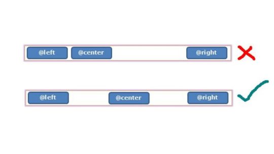
flex-flow This is a shorthand for flex-direction and flex-wrap. Usage: .flex-container { display: flex; flex-flow: row wrap; } The flex-flow property allows you to define both main axes of the container. The default value is row nowrap, all possible values from the two properties above apply. justify-content The next flexbox CSS property defines the item alignment on the main axis. It decides what happens with any available free space and has some control over the alignment when items get wider than their container. Here are the values you can choose from: flex-start — Default value. Items align towards the front of flex-direction. flex-end — Places items at the end of flex-direction. start — Defines the beginning of writing-mode as the starting point. end — Moves items towards the end of writing-mode. left — Aligns flex items towards the left edge of the container. If that doesn’t make sense due to flex-direction, it behaves like start. right — The same as left but for the right edge. center — Items center horizontally. space-between — Distributes items evenly within the container. The first towards the start, the last toward its end with even space between them (hence the name). space-around — Items are evenly placed with equal space around them. Note that it behaves like margin or padding where you have double the space between items as towards the edges. space-evenly — Items reside evenly placed within the container but the spacing between each and toward the container edges is even.

Beware that browser support for these values is a bit spotty. For example, space-between is not supported in some versions of Edge and start/end/left/right aren’t in Chrome yet. The safest values are flex-start, flex-end, and center. align-items This property controls how items align across the cross axis. It’s the equivalent of what justify-content is for main axis. Here are the available values: stretch — Default value that stretches items to fill the container. flex-start, start, self-start — Aligns flex items at the start of the cross axis. start and self-start adhere to flex-direction and writing-mode respectively. flex-end, end, self-end — The same as above but placing items at the end of the cross axis. center — Items reside at the center of the cross axis. baseline — Aligns flex items along their baselines.

Here, too, it’s important to note the browser support. align-content This property is responsible for controlling flex lines if there is extra space available on the cross axis. It’s similar to justify-content. You need more than one row of items for the values below to take effect. stretch — Default value. The lines stretch to take up all available space. flex-start, start — Items align at the beginning of the container. flex-start adheres to flex-direction, start to writing-mode. flex-end, end — Same deal as flex-start and start only that items move to the end of the container. center — Centers items on the cross axis inside the container. space-between — Evenly distributes flex lines inside the container with the first row being placed at its start, the last at the end. space-around — Even distribution with even space around each line. space-evenly — Even distribution with equal space around items.

order Beginning with this one, the remaining rules all apply to flex items instead of the container. The order property controls in which order items appear inside their container.

For example, the default value for all flex items is order: 0;. If you want to move a particular item to the front or back of the line, you can do so by giving it a value like 1 or -1. This also works across row or column boundaries unlike row-reverse or column-reverse which will reverse the order per line individually. Here’s the code for the example image above: 1 2 3 4 flex-grow Controls the ability for flex items to grow within the container as necessary. flex-grow takes a number that describes a proportion. Example: if all items are set to flex-grow: 1; they are all evenly distributed inside their container. However, if one is set to 1 and another to 3, the latter will try to take up three quarters of the available space.

flex-shrink Similar to flex-grow but defines the ability of items to shrink in relation to other items. The higher the number, the more an item will reduce in size and vice versa. flex-basis

Defines the default element size (height or width depending on the axis). It can be a relative value like 15% or absolute like 30px. Here’s how I achieved the above: 1 2 3 4 Other possible values: auto — This is the default. content — Sets the size according to the item’s content. It’s not well supported yet, same as max-content, min-content, and fit-content that also exist. flex Shorthand for flex-grow, flex-shrink, and flex-basis together. Only the first parameter is mandatory and the default value is 0 1 auto. 1 2 3 4 It often makes sense to use this property instead of flex-grow, flex-shrink, or flex-basis individually as it applies sensible values to the operators you are not using. flex can also take initial (adheres to the defined size if there is one), auto (making it fully flexible), and none (making all items inflexible). You can use this, for example, to set some items to a fixed width (via initial) while having others adjust themselves to the available space. align-self This allows you to override the alignment of individual items. It has the same values as align-items.
Flexbox Example: Columns with Equal Height
As a last step, we will go over an example of how to use the above. Let’s create a flexbox layout with columns of equal height. You can build it with HTML like so:
Column 1
Lorem ipsum dolor sit amet, consectetur adipiscing elit.
Column 2
Lorem ipsum dolor sit amet, consectetur adipiscing elit. Morbi interdum et ex a efficitur. Nam consequat elementum tellus, at varius lectus condimentum vulputate.
Column 3
Lorem ipsum dolor sit amet, consectetur adipiscing elit. Morbi interdum et ex a efficitur. After that, add this CSS markup to it: .flex-container { background-color: #aa278c; border-radius: 10px; display: flex; margin-bottom: 10px; } .flex-container > div { background-color: #F7941F; border: 1px solid; border-radius: 10px; flex: 1; font-size: 20px; font-family: tahoma; line-height: 40px; margin: 10px; padding: 16px; width: 60px; } .flex-container > div h2 { text-align:center; } And here is the result:

Why does this work? Well, the only important parts are actually that the flex container is set to display: flex;, while its children take on flex: 1;. All the other markup is just for styling. As you may recall, doing this sets flex-grow and flex-shrink both to 1 and flex-basis to auto. As a consequence, all items take up the same amount of space inside the container and their initial size automatically adapts to the available dimensions. The result: effortless columns of equal height.
Flexbox in a Nutshell
In web design, there are many different ways to create layouts and arrange elements. Flexbox is one that has become more and more common. The CSS module offers a lot of benefits, especially for dynamic layouts, smaller page elements, and mobile design. Above, we have gone over what exactly flexbox is, its abilities, and how to use it. Next time you find yourself wanting use float or inline-block, take a second to think whether or not flexbox might be the better solution. If you enjoyed this post, why not check out this article on how to Add Custom Fonts to your WordPress or ClassicPress Site! Post by Xhostcom Wordpress & Digital Services, subscribe to newsletter for more! Read the full article
0 notes
Photo

How to Create a Pure CSS Animated Flexbox Navigation Bar - Code Injector Make sure to subscribe and hit the bell notifications so you don't miss new videos. Watch My Video Till End. https://youtu.be/DOxZKbYhSXA More from me: https://bit.ly/2ISHHcy #makq #codeinjector #cssmenu #cssflexbox #menudesign (at Abu Dhabi, United Arab Emirates) https://www.instagram.com/p/By-9ZnBnmMS/?igshid=3vs3lxypjod3
0 notes
Link
Tiếp nối hai phần trước về sử dụng CSS Flexbox, phần 3 này sẽ là hướng dẫn chi tiết về các thuộc tính áp dụng cho những thành phần con.Hoàn thành phần này các bạn sẽ đủ kiến thức để làm chủ CSS Flexbox. Hãy theo dõi bài viết ngay để biết thêm chi tiết.
1 note
·
View note
Text
Creating Responsive Images with CSS Flexbox
Introduction to Responsive Design
Responsive design is an essential aspect of modern web development. It refers to the approach of designing and building websites to provide an optimal viewing and interaction experience across a wide range of devices and screen sizes, from large desktop monitors to small mobile phones. The primary goal of responsive design is to ensure that your website adapts seamlessly to different screen resolutions and orientations, allowing users to access your content without the need for excessive zooming or horizontal scrolling. This enhances user experience, improves accessibility, and can positively impact search engine rankings. Key principles of responsive design include: - Fluid Grid Layouts: Using relative units like percentages to create flexible grid systems that adjust to screen size. - Flexible Images: Scaling images proportionally to prevent distortion or overflow on smaller screens. - Media Queries: Employing CSS media queries to apply different styles and layouts based on the device's characteristics, such as screen width, height, or orientation. - Mobile-First Approach: Starting the design process with mobile devices in mind and progressively enhancing the design for larger screens. By embracing responsive design, you can reach a broader audience and ensure your website looks and functions well on various devices, ultimately improving user satisfaction and engagement.
Understanding the Issue: Image Alignment in Responsive Design
One of the common challenges in responsive web design is achieving consistent and pleasing image alignment as the screen size changes. In the scenario you've described, you have an image with a float: right property, and when you resize the page, the image remains on the right side of the content. However, you want it to move to the left as the screen size decreases.

The problem with using float: right for image alignment is that it's not inherently responsive. It positions the image to the right, but it doesn't adapt to different screen sizes effectively. This can lead to undesirable results, such as images overlapping text or becoming too small to see on small screens. Responsive design aims to resolve these issues by providing a flexible and adaptive layout that responds to the available screen space. To address image alignment in a responsive manner, we can use more modern CSS techniques like Flexbox, which allow for precise control over the positioning of elements without the need for explicit floats. In the upcoming sections, we will explore the benefits of using CSS Flexbox for image alignment and demonstrate how to make your images responsive while maintaining a visually pleasing layout across a variety of devices and screen sizes.
The Problem with Using Floats for Alignment
Floats have been a traditional method for aligning elements on webpages, including images. They were widely used in the past to make text wrap around images or to create multi-column layouts. However, using floats for alignment in responsive design presents several challenges:
- Lack of Predictability: Floats are not inherently responsive. When you float an element, it's removed from the normal flow of the document, which can lead to unpredictable behavior, especially on smaller screens or when the content changes. Images floated to the right, for example, tend to stay on the right side regardless of the available space, causing layout issues. - Clearing Floats: When you use floats, you often need to add clearing elements (e.g., clear: both;) to prevent subsequent content from flowing around the floated elements. This can result in extra markup and CSS, making the code less clean and maintainable. - Overlapping and Collapsing: Floats can cause elements to overlap or collapse in unexpected ways, especially when the screen size changes. This can lead to issues like text flowing underneath floated images or elements not aligning as intended. - Complexity and Fragility: Implementing complex layouts with floats can be challenging, and small changes to the content or styles may break the layout. This makes it harder to maintain and update your website over time. For these reasons, floats have become less suitable for creating responsive layouts. To address the challenges of image alignment in responsive design, it's advisable to explore more modern CSS techniques like Flexbox, which provide better control and flexibility while maintaining a responsive and predictable layout.
Introduction to CSS Flexbox
CSS Flexbox, short for "Flexible Box Layout," is a powerful layout model that provides a more efficient way to design complex web layouts with a high degree of control and flexibility. It was introduced to address the limitations and challenges associated with traditional methods like floats and positioning when creating responsive designs. Flexbox is designed to simplify the alignment and distribution of elements within a container, making it ideal for tasks like centering elements, creating equal-height columns, and achieving responsive image alignments. Key features and concepts of Flexbox include: - Container and Items: In Flexbox, you have a parent container and child items that you want to arrange. The container is often referred to as the "flex container," and the items are the "flex items." - Main Axis and Cross Axis: Flexbox operates along two axes, the main axis (usually horizontal) and the cross axis (usually vertical). You can control how items are arranged on both axes using Flexbox properties. - Flex Properties: CSS properties like display: flex;, justify-content, and align-items enable you to control the layout of items within the container, making it easy to center items or distribute them evenly. - Flexibility and Adaptability: One of the primary advantages of Flexbox is its inherent responsiveness. It adjusts the size and position of items based on the available space, making it an excellent choice for responsive web design. Throughout this tutorial, we will explore how to harness the power of Flexbox to create responsive and visually pleasing layouts, including addressing the issue of image alignment that you mentioned. By the end of this tutorial, you'll have a solid understanding of how Flexbox works and be equipped to use it in your web design projects to achieve modern and responsive layouts.
Applying Flexbox to Align Images Responsively
Step 1: Modifying the CSS for the Image Container CSSsection.QuemSou{ float: left; overflow-wrap: break-word; font-size: 1.3em; margin-top: 40px; margin-left: 5%; font-family: 'Century Gothic', sans-serif; } p#Quem_Sou{ line-height: 30px; } /* IMAGE */ div.divimgMAIN{ /* float: right; REMOVING FLOAT PROPERTY */ margin-top: 40px; margin-right: 10%; margin-bottom: 2%; display: flex; /* APPLYING FLEXBOX */ flex-direction: row; /* SETTING FLEX DIRECTION TO ROW */ justify-content: space-between; /* ADJUSTING ITEM SPACING */ align-items: center; /* ALIGNING ITEMS TO CENTER VERTICALLY */ } Step 2: Adjusting the Flexbox Properties for Responsive Behavior Now, to make the image responsive, you can adjust the flex properties to control the behavior of the image within the flex container. By fine-tuning the flex properties, you can ensure that the image adapts to different screen sizes while maintaining its alignment and proportions. In the upcoming section, we will integrate these changes into the provided HTML code to demonstrate how the modified CSS, combined with Flexbox properties, enables the image to align responsively and adapt to varying screen dimensions.
Implementing the Changes in the Provided HTML Code
Now, let's apply the changes to the HTML code to achieve responsive image alignment. We'll modify the 'divimgMAIN' class, remove the 'float: right' property, and add Flexbox properties for responsive alignment. Modifying the 'divimgMAIN' Class HTML In the HTML code, ensure that the 'divimgMAIN' class is applied to the container div that holds the image you want to align. This class will be used to apply the Flexbox properties for responsive alignment. Removing the 'float: right' Property CSSdiv.divimgMAIN{ /* float: right; REMOVING FLOAT PROPERTY */ margin-top: 40px; margin-right: 10%; margin-bottom: 2%; display: flex; /* APPLYING FLEXBOX */ flex-direction: row; /* SETTING FLEX DIRECTION TO ROW */ justify-content: space-between; /* ADJUSTING ITEM SPACING */ align-items: center; /* ALIGNING ITEMS TO CENTER VERTICALLY */ } As a responsive design strategy, remove the 'float: right' property from the 'divimgMAIN' class to allow the image to adapt to different screen sizes without being stuck to the right side. Adding Flexbox Properties for Responsive Alignment With the 'float: right' property removed, apply the following Flexbox properties to the 'divimgMAIN' class to achieve responsive image alignment: CSSdisplay: flex; /* APPLYING FLEXBOX */ flex-direction: row; /* SETTING FLEX DIRECTION TO ROW */ justify-content: space-between; /* ADJUSTING ITEM SPACING */ align-items: center; /* ALIGNING ITEMS TO CENTER VERTICALLY */ These Flexbox properties will help you create a layout where the image adjusts its position and spacing within the container to fit the available space while maintaining alignment with other content. With these modifications in place, you are well on your way to achieving responsive image alignment using CSS Flexbox. In the next section, we will test the changes to ensure that your design behaves as expected on various devices and screen sizes.
Testing the Changes and Responsive Behavior
After applying the Flexbox properties and making modifications to your HTML and CSS, it's crucial to test the design to ensure that it behaves as expected on various devices and screen sizes. Testing will help you confirm that the responsive image alignment is working effectively. Step 1: Resize the Browser Window Start by resizing the browser window to various dimensions, including both larger and smaller screen sizes. Observe how the image and text content within the 'divimgMAIN' container respond to changes in the available space. You should see the image adapting its position and spacing while maintaining alignment with the text. Step 2: Test on Different Devices For a more comprehensive test, view your web page on different devices, such as smartphones, tablets, and desktop computers. Ensure that the design remains visually appealing and functional across the entire spectrum of screen sizes. Step 3: Inspect for Anomalies Pay close attention to any anomalies or issues that may arise during testing. Check for any text overlapping the image, visual distortions, or unexpected behavior. If you encounter any problems, review your HTML and CSS code to identify and resolve the issues. By thoroughly testing your design, you can confirm that the changes you've made to achieve responsive image alignment are effective and that your web page looks and functions as intended on all devices. Responsive design aims to provide a seamless and optimal user experience, and testing is a critical step in achieving that goal. With successful testing and confirmation of responsive behavior, you can now confidently implement these techniques in your web design projects to create modern and adaptable layouts that cater to a wide range of devices and screen sizes.
Conclusion: Achieving Optimal Responsive Image Alignment
In this tutorial, we've explored the challenges of achieving responsive image alignment and the limitations of using traditional methods like 'floats.' We introduced the powerful CSS Flexbox layout model as a solution for creating responsive and visually pleasing designs. By following the steps outlined in this tutorial, you've learned how to: - Modify the CSS for the image container by adding Flexbox properties. - Remove the 'float: right' property to ensure that the image adapts to different screen sizes. - Apply Flexbox properties like 'display: flex,' 'flex-direction,' 'justify-content,' and 'align-items' to achieve responsive alignment. - Test the design on various devices and screen sizes to confirm its responsive behavior. By implementing these techniques, you've taken a significant step toward creating web designs that cater to a diverse audience using different devices. Responsive design not only enhances the user experience but also contributes to better accessibility, improved search engine ranking, and overall user satisfaction. As you continue to develop your web design skills, remember that responsive design is an ongoing process. Keep testing, refining, and adapting your designs to meet the ever-evolving landscape of web technologies and user expectations. With the knowledge gained from this tutorial, you can confidently create modern and responsive layouts that align images optimally across a wide range of devices, ensuring a seamless and engaging user experience. Thank you for joining us on this journey to achieve optimal responsive image alignment using CSS Flexbox. We hope you find this knowledge valuable in your web design endeavors.
Final Thoughts and Additional Resources
Congratulations on completing this tutorial on achieving optimal responsive image alignment using CSS Flexbox. You've gained valuable insights into creating web designs that adapt seamlessly to different devices and screen sizes. As you continue to explore the world of web development and design, here are some final thoughts and additional resources to guide you: Keep Learning and Experimenting Web design is a dynamic field, and there's always something new to learn. Stay curious and keep experimenting with different design techniques, layout models, and frameworks. The more you practice and explore, the more proficient you'll become in creating outstanding web experiences. Stay Updated with Web Standards Web standards and best practices evolve over time. Stay updated with the latest trends, technologies, and standards in web development. This will help you create designs that are not only responsive but also performant and accessible. Explore CSS Grid While Flexbox is excellent for certain layout tasks, you may also want to explore CSS Grid Layout, another powerful CSS layout system. CSS Grid can be especially useful for creating grid-based designs and complex layouts. Combining both Flexbox and CSS Grid in your projects can provide a comprehensive toolkit for handling various design challenges. Additional Resources Here are some additional resources to further enhance your web design skills: - MDN Web Docs: Flexbox - In-depth documentation and tutorials on CSS Flexbox. - MDN Web Docs: Grid Layout - Comprehensive guides on CSS Grid Layout. - A Complete Guide to Flexbox - A helpful resource by CSS-Tricks, offering a detailed guide to Flexbox. - Smashing Magazine - A valuable source for web design articles, tutorials, and best practices. Remember that web design is both an art and a science. It's a creative process that combines aesthetics with technical expertise. Keep exploring, learning, and pushing the boundaries of your skills to create remarkable web experiences that captivate and engage users. Thank you for choosing to expand your knowledge with us. We wish you all the best in your web design journey! Read the full article
0 notes
Video
youtube
Divi Pro Tip: Overlap Any Image or Module On All Devices using Flex CSS
Learn how to overlap any image or module on all devices using Flex CSS in the Divi Theme! In this tutorial, we’ll guide you step-by-step through the process of using margin, padding, and simple CSS flex code to create stunning overlapping designs that work seamlessly across desktop, tablet, and mobile devices. Whether you’re designing a hero section, showcasing a product, or adding creative flair to your layout, these techniques will help you achieve a professional, responsive overlap effect in just minutes.
0 notes
Video
youtube
Flexbox #10 - Convert CSS into SCSS
1 note
·
View note
Photo

Order Property in CSS Flexbox
https://www.youtube.com/watch?v=3nczPZ1sMV0&list=PLYpKYlxlIcb-2axfDOo5cQ-Z4uElzRJ5r&index=9&ab_channel=KishoriTutorials
YouTube Channel Link: https://www.youtube.com/c/kishoritutorials
Website: https://kishoritutorials.in/
0 notes
Photo

CSS 3 Tutorial For Beginners: Learn CSS In One Video In Hindi http://ehelpdesk.tk/wp-content/uploads/2020/02/logo-header.png [ad_1] Source Code: https://codewithhar... #androiddevelopment #angular #c #completecssinonevideoinhindi #css #cssflexbox #csshoudinitutorial #csshtmltutorialforbeginners #csshtmltutorialinhindi #csshtml5tutorial #cssinhindi #cssinonevideo #cssseekhe #csstutorial #csstutorialbeginners #csstutorialheader #csstutorialhindi #csstutorialhtml #css3advancedtutorial #css3tutorialforbeginners #css3tutorialforbeginnersinhindi #css3tutorialinhindi #css3tutorials #dataanalysis #datascience #deeplearning #development #docker #iosdevelopment #java #javascript #learncss #learncssinonevideo #learncss3 #machinelearning #node.js #python #react #unity #webdevelopment
0 notes